To my knowledge, the release of Night Shift in iOS 9.3 is only the second time in recent history Apple has updated iOS to include a change or feature that has potential accessibility ramifications. The other occurrence, in my mind, was iOS 7.1 beta 2, released in 2013. In it, Apple added a Button Shapes option to Accessibility as a way to assuage users who have trouble distinguishing an actionable button from a text label. Generally, however, any significant additions or changes to the Accessibility feature set comes included with a major new version of iOS. That is to say, the version Craig Federighi talks about at the annual WWDC keynote.
Before getting into Night Shift’s accessibility merit, it’s worth examining why it exists. The impetus for Night Shift is better sleep. Apple explains in its marketing material for iOS 9.3 that a person’s circadian rhythm can be disrupted by the “bright blue light” emitted from an iPhone or iPad’s screen, making it difficult to fall asleep. What Night Shift does to combat this, according to Apple, is “use your iOS device’s clock and geolocation to determine when it’s sunset in your location.” After gathering that data, the software then “automatically shifts the colors in your display to the warmer end of the spectrum.” The end result is a display that’s easier on the eyes, thus hopefully making it easier to fall asleep. (The display settings will revert to normal in the morning. There’s an option to schedule Night Shift as well.) For more on why Night Shift is important and how it works, iMore has posted a good explainer on the feature.
Why Display Appearance Matters
Broadly speaking, Night Shift is interesting accessibility-wise because of the way the appearance (brightness and/or resolution) of an iPhone or iPad’s screen can influence readability. While this can impact anyone, it’s especially critical to someone with a vision impairment. In my experience, the brighter (and sharper) a screen is, the better I’m able to see it. The trade-off is worse battery life, but I need all that light in order to get the most out of my iOS devices. This is in stark contrast to my girlfriend, who’s fully-sighted. She oftentimes asks me to look up stuff on her iPhone when we’re in the car – usually directions and text messages – and it’s always jarring to see her screen so dim. It’s always near 50% brightness, much too dark for my low vision, so I immediately bring up Control Center and crank up brightness to maximum level. “I can’t see otherwise,” I tell her. It’s true; anything less than full brightness and I’m struggling to see what I’m doing.1
Of course, my visual needs aren’t everyone’s. For many visually impaired users, the opposite may be true. It’s possible that someone requires less screen brightness to see because too much light negatively affects focus or even causes pain. It all depends on the needs and tolerances of the individual.
Using Night Shift
I used the iOS 9.3 betas on my aging iPad Air 1. As its A7 chip is 64-bit and Night Shift requires a 64-bit processor (A7 or later), I was able to try out Night Shift.
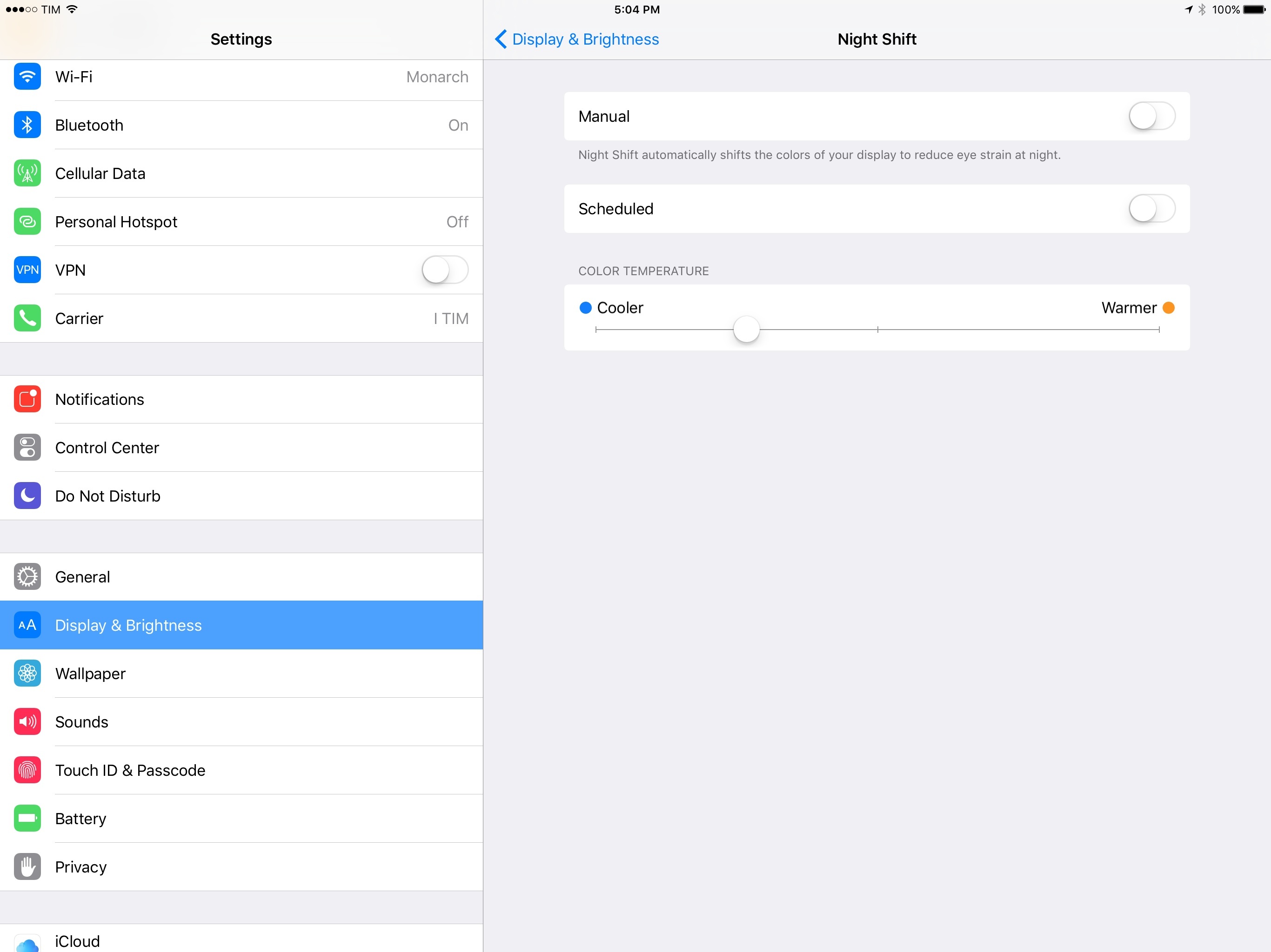
In starting my tests, I left the slider in the default position, in the middle. Moving it all the way to the left, the “cooler” end, the display looks and feels much like the normal display without Night Shift. On the other end, the “warmer” side, moving the slider to the far right gives the screen an orange tint that I find off-putting. In terms of readability, I find the cooler the display, the easier it is to see. After some fiddling, I decided my preferred setting is one notch before the middle. The screen is perfectly usable at the default setting, but I like how this slight adjustment gives me Night Shift’s intended effect while still leaning toward normalcy.
From an accessibility standpoint, I like Night Shift because not only does it tone down screen brightness, it also alters contrast. iOS is full of white space, and I sometimes feel that it’s a detriment to contrast, especially in the daytime. For example, iA Writer and Tweetbot, my current text editor and Twitter client, respectively, are two of my most-used apps. Both make heavy use of white backgrounds with light-colored UI elements. I can deal with this most of the time, but I actually prefer to use dark mode when I feel my eyes start to tire, even during the day. Fortunately, both iA Writer and Tweetbot have optional dark modes, and they’re terrific. The white-on-black color scheme is less harsh on my eyes, and the high contrast makes everything onscreen stand out more and easier to see.
Night Shift is to me very reminiscent of the Reduce White Point feature in iOS’s Accessibility preferences. Apple states Reduce White Point’s purpose is to “reduce the intensity of bright colors,” which is similar to the effect Night Shift has on a screen. Both features are distinct and exist for different reasons, but the ways in which they affect brightness and contrast make them close cousins. In this context, then, an argument could be made that a user could use them interchangeably to increase contrast on their iOS device during daylight hours. Whatever time of day it’s used, though, Apple’s given users quick access to Night Shift by adding yet another shortcut to Control Center, if managing it manually.
The Big Picture
There are two takeaways I have after putting Night Shift through its paces.
First, and I say this all the time but it’s really true: as with things like Markdown and Apple Pay, Night Shift strikes me as one of those technologies that isn’t intentionally built for accessibility’s sake, but works well enough that it also has relevance to people with disabilities. I think this is important to point out because, for all the (valid) gripes, Apple’s software know-how hasn’t completely vanished. A feature meant for the masses that also can benefit someone who’s visually impaired is a good, well-designed piece of software.2
Secondly, all the consideration I’ve put into the brightness and contrast of an iOS device’s screen leaves me longing for a system-wide dark mode. As I’ve written before, there’s precedent for Apple adding it – iBooks, Safari Reader View, and OS X have it – so why not give it to iOS to complement the other contrast-focused features? Here’s hoping it comes with iOS 10.
Despite Night Shift’s role as protector of eyes and brainwaves, it turns out it’s equally great for accessibility.
- My obsession with light isn’t limited to artificial ones like that which comes from my phone. My eyes need natural light too, particularly when reading a menu in a dark restaurant. ↩
- Consider, too, the breadth and depth of iOS’s Accessibility features. Apple didn’t win an award from the American Federation for the Blind for VoiceOver being bad. Point being, while it’s not unreasonable to say that Apple’s software quality has dipped a degree in the aggregate, it’s also not unreasonable to look at the company’s work in accessibility and say all is not lost in the quality department. See also: Music Memos. ↩