The Gestural iOS
iOS on iPhone X is the epitome of a generation that has lived with multitouch for over a decade. Gone is the last abstraction of the user’s input: with the removal of the Home button, iPhone X reaches the zenith of direct manipulation, finally achieving the vision set forth in 2007. The training wheels are off; the iPhone is a gesture-only device now.
The consequences of this decision are profound as they not only affect the iPhone’s physical shape and feel, but the accessibility of iOS, the concept of wayfinding that was core to iOS 11, and our relationship with apps. In a way, the iPhone X has produced a fork of iOS unlike any version running on other iPhones and iPads.
And as with all major software transitions, the exciting discoveries are just as commonplace as the many questions that linger over the future of iOS for iPhone.
A Full-Screen Experience
Before receiving my iPhone X in early November, I was going through levels of excitement I hadn’t felt since at least the iPhone 6 Plus. Arguably, the 6 Plus was the last iPhone model to deliver both a new form factor and new industrial design in an overall experience that challenged our preconceptions. I assumed the iPhone X was going to require a similar period of adjustment and a learning phase of a couple of weeks.
I wasn’t prepared for that initial “new iPhone design” phase to continue to this day. Nearly a month into using the iPhone X, the device still feels impossibly futuristic – when I glance at it with the screen turned on, I keep thinking it looks like a render. The iPhone X isn’t just “new” or “different” like an iPhone 5 or 6 Plus might have been – it’s almost impossible in a way that a concept video shouldn’t suddenly materialize on your desk and actually work.
It all comes down to the screen. When I turned it on and was greeted with the familiar “Hello” message at setup, I thought the screen looked fake. I mean that as a compliment in the best possible way – it just doesn’t seem plausible that we can jump from the sharp-angled, bezel-heavy iPhone 7 Plus to a display that almost escapes the physical boundaries of the device on all four corners in the span of 12 months. The fact that Apple was able to pull this off – a smartphone unlike anything else on the market in late 2017 – is just as remarkable as the hardware itself.
I love how the iPhone X’s display extends in all directions – not just to the sides, but toward every corner, leaving almost no bezel in sight. Apps that embrace the iPhone X’s Super Retina display appear to be breaking out of the device’s frame. The physical curvature of the edges harmonizes with the rounded shape of the dock, which is also consistent with app icons on the Home screen and other roundrects throughout the OS. In taking a holistic approach to designing a pocket computer that is intrinsically tied to its software – where both the screen and the OS complete each other – Apple created a beautiful object that is a pleasure to look at and use.
One of my concerns ahead of getting the iPhone X revolved around adjusting my usage habits for a physically smaller device. For the past three years, I’ve been using Plus-sized iPhones – the Plus was the model for me because it allowed me to use the best iPhone hardware with the highest amount of content displayed on screen. I liked experimenting with an iPhone 7 last year, but, as I expected, I bought an iPhone 7 Plus as soon as I could. My fear was that the iPhone X was going to be either uncomfortable to hold or too cramped for the amount of text I was used to seeing on screen without scrolling.
Much to my surprise, switching from the iPhone Plus to the iPhone X has been mostly fine thanks to the taller screen and iOS’ Dynamic Type. The combination of the edge-to-edge display and the ability to make text smaller system-wide lets me see just as many tweets, email messages, or paragraphs of text on the X as on the Plus. Everything is more compact as the X is narrower than the Plus, but the amount of vertical content that can fit in one screen is more important to me, and the X delivers on that front.
In my daily usage, I’ve noticed two trade-offs with the iPhone X: I have to zoom more frequently into webpages or photos to look at smaller details, and I preferred the way my hands wrapped around the wider body of the iPhone 7 Plus. Neither of these should sound like “problems” for those who have been using 4.7-inch iPhones, but, as a converted Plus user, they are the two aspects of the transition that stand out the most to me.
From a general usability perspective, moving from the Plus to the X hasn’t been a detriment to the experience. The trade-offs mentioned above aren’t enough to make me consider getting an iPhone 8 Plus because of its bigger physical footprint; I don’t want to give up all the changes I appreciate in the iPhone X. However, I also know that if Apple ever releases a Plus version of the iPhone X in the future, I’ll want to upgrade to it. My reasoning will always be the same: I want the best and biggest iPhone I can buy. Right now, the iPhone X isn’t, physically speaking, the largest model, but because of its unique full-screen experience, iOS doesn’t feel constrained on it. As a former iPhone Plus user, I hope Apple makes a bigger iPhone X, but if they don’t, I’ll be okay with the current size.
There have been other side effects to the iPhone X’s full-screen approach. Like others have argued over the past month, the notch – the sensor housing that has turned into the iPhone X’s most distinctive trait – is a non-issue in practice. I don’t pay attention to the notch, I don’t care about it when I’m using apps optimized for the iPhone X, and, if anything, I think it adds some character to the shape of the device. But, I also don’t notice the notch when the screen is turned off, which is actually more problematic as I pick up the iPhone X upside down constantly.
If the iPhone X is somewhere in my living room, or in my bag, and I pick it up without paying close attention to it, I often end up having to rotate it in my hands because it’s in the wrong orientation and Face ID won’t let me in.15 Because the black notch blends into the display and given the lack of a Home button anchoring the correct orientation of the device, I sometimes struggle to tell which side is up when I grab the iPhone X. It’s not a major concern16 and I’m getting used to it, but the edge-to-edge display makes me wonder if we’ll ever see an iPhone that can be rotated in all directions, like an iPad.
The status bar is another longstanding iOS feature that’s been impacted by the iPhone X’s display. For the most part, I haven’t had any issues with the status bar’s new split design; as I mentioned above, assigning two different gestures to it is a clever decision with potential for future changes. It only takes a few days to get used to having the clock on the left and wireless radio information on the right; as someone who disabled battery percentage a long time ago and despises status bars cluttered with icons, the cleaner look works well for me. The iPhone X’s status bar is clearly a byproduct of having a sensor cutout in the middle of the screen, but at least Apple turned the limitation in their favor by giving the status bar a much needed makeover.
The new colored indicators for GPS, tethering, microphone recording – features that used to bring up the gaudy double-height status bar on older iPhones – are much more elegant on the iPhone X without giving up their role as shortcuts to open associated background apps. They’re one of my favorite design touches in the new status bar.

The iPhone X briefly displays icons for GPS and microphone access before highlighting the system clock in blue and red, respectively.
I only have two minor gripes with the iPhone X’s status bar. I miss being able to see at a glance whether Do Not Disturb is active or not. I can swipe down to see the icon in Control Center’s full status bar, but that’s not ideal for all the reasons noted above. This could be remedied by Control Center gaining more personalization and letting you define which system icons show up in the primary status bar (the two “ears”) and which ones can be revealed by swiping. I’d gladly swap the ‘4G’ icon for Do Not Disturb’s moon.
In addition, to accommodate other icons in the new status bar, Apple removed the network activity indicator – the little spinning circle that used to be displayed when apps were refreshing content from the Internet. I remember seeing a new design for it circulating on Twitter a while back, but it never shipped. As a result, there’s no consistent way to tell if an app is loading data on the iPhone X. It was useful to have the indicator when an app was “stuck” due to a bug – you could tell it wasn’t refreshing anything because the indicator wasn’t spinning. Also, the indicator adjusted its rotation depending on the speed of your Internet connection, which was a great design detail that has sadly been removed. I hope Apple brings it back.
On the other end of the screen, the iPhone X adopts a miniaturized version of the iOS 11 dock for iPad, albeit without the same drag and drop interactions for multitasking or recently used apps. I’ve already argued in favor of bringing iPad-like inter-app drag and drop to the iPhone, but there’s something else that strikes me as odd about the iPhone X’s dock. Unlike on the iPad, it hasn’t been integrated with the app switcher.
The lower end of the iPhone X’s multitasking UI seems like the ideal spot to host a dock containing your favorite apps, sitting underneath recently used ones. Essentially, I believe the same iPad design would work even better on the gesture-driven iPhone X: app cards on the left, Control Center on the right, the dock below everything else.17 The dock was one of the best additions to iOS 11 on the iPad; the iPhone X’s fluid multitasking could also use a faster way to open frequently used apps.
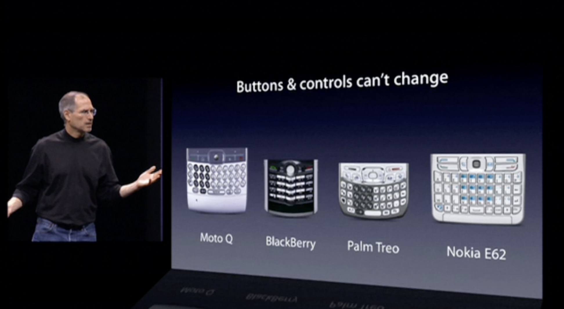
Speaking of apps, it was painfully obvious a couple of days into using the iPhone X that developers who decided not to embrace the notch were going to end up with apps that didn’t feel like part of the system. Apple’s designers were adamant about this in the iPhone X’s HIG: apps that don’t fully extend to the four corners of the display feel constrained and “wrong” – almost as if they haven’t been optimized for the iPhone X at all.
Apps that intentionally block out the status bar with a black background either feel like Android apps or legacy software running in compatibility mode. I know that some designers prefer the black status bar that harkens back to the days of iOS 5, but, in practice, the result isn’t as elegant as they think. Those who tried to hide the notch have changed their mind after using an iPhone X for a while, which doesn’t surprise me. In my opinion, a black status bar that attempts to blend in with the notch draws more attention to it than apps that fill the screen and embrace the notch.18
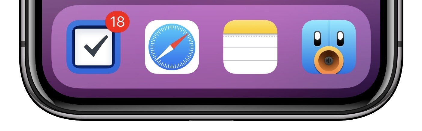
I’ve also seen some interesting uses of the iPhone X’s full-screen and status bar. Halide, an advanced camera app, puts manual shooting controls and details in the two corners of the status bar. The Reddit client Apollo (one of the best app debuts of the year) displays a custom volume slider in the top left corner of the display, temporarily overriding the system clock when you’re clicking the volume buttons. I love this idea, and I could see it become as popular as Tweetie’s original pull to refresh.
From left to right: DEVONthink’s sync status; Apollo’s volume indicator; Halide’s advanced controls.
DEVONthink, on the other hand, puts the extra space at the bottom of the screen to good use: to display sync status and information, the latest version of the app shows a temporary message in between the tab bar and the Home indicator.
The iPhone X’s OLED display is also pushing developers to reconsider dark themes they designed for their apps. As I noted a few weeks ago, dark grays don’t look nearly as good as pure black does on OLED: because black pixels aren’t actually turned on, a true black theme – particularly in low light – creates a seamless transition from status bar to notch. It looks really black.19 I compared apps with true black backgrounds (Grocery and Overcast) between the iPhone 7 and iPhone X, and the LCD version of black on the iPhone 7 looked like an illuminated dark gray.
I understand why friends with Android smartphones have long praised OLED displays: colors look incredibly vivid and more true to life; the effect on the iPhone X’s edge-to-edge display is striking. I couldn’t go back to an LCD iPhone after trying OLED, and I hope we’ll eventually see it on the iPad Pro line as well. From now on, developers of all iPhone apps should offer at least three theme options: light, dark, and true black.20
The iPhone X’s full-screen nature is a dramatic departure from the past ten years of iPhone. Even though it runs the same version of iOS, with the same apps, and is rooted in the same interface conventions, the iPhone X’s display makes everything look fresh and futuristic. It’s a marvel to look at and a bigger leap than Retina was in 2010.
There are trade-offs involved with removing bezels and extending the display around sensors, but, aside from a couple of missteps, Apple handled the transition to an all-screen, button-free iPhone thoughtfully. The full-screen iPhone is, unquestionably, the only way forward.
Fluid Multitasking
Because it lacks a Home button, how the iPhone X’s screen feels during actual usage is now just as important as how it looks. And after a few weeks, I can say that the iPhone X makes using iOS more pleasant than any other device. Every small interaction, every swipe – everything is so smooth, there’s a sense of delight that permeates the entire iPhone X experience that is hard to describe.
But I’ll try: removing the Home button makes iOS feel less mechanical, less tied to a physical input method. Instead, iOS on the iPhone X is software as a natural extension of our touch. The iPhone X breaks the final barrier between our fingers and the screen, creating a positive feedback loop that is reinforced every time our fingers glide across apps. Using iOS on the iPhone X is so rewarding and remarkably efficient, it makes me want to use the iPhone more than my iPad.
The feature largely responsible for all of this is the animation framework. There’s no delay in interactions, no latency between input and animations displayed on screen. The iPhone X is powered by an exceptionally fluid gestural interface that makes the old push-Home-button-for-multitasking iOS feel like the resistive touchscreens we had before multitouch. By removing the intermediary between the user and apps, multitasking on the iPhone X quickly becomes second nature and makes you wonder why we had to push a physical button in the first place.
The initial shock caused by the removal of the Home button quickly subsides once you start swiping the Home indicator to close apps and switch between them. The app you’re currently using stays glued to your finger if you swipe up slowly, but it rapidly lands on the Home screen, morphing back into its icon21, if you just flick it upwards. The system never forces you to sit back and wait for animations to finish, not even for a fraction of a second. After you fling an app back to the Home screen, you can immediately tap another app icon, scroll to another page, or swipe down to reveal Spotlight search.
The iPhone X’s gestural engine doesn’t make you feel like a spectator, watching transitions happen without your direct control; you’re an active participant of its real-time interface. iOS has never felt as fast as it is on the iPhone X – it’s quite simply a joy to use.
I didn’t struggle to learn the basics of the iPhone X’s gesture-based navigation, but some of the new interactions take some time to be fully mastered and appreciated.
In the first few days, there was some debate among early adopters on Twitter as to which method is the best one to reveal the app switcher. Apple’s recommendation is to swipe up vertically and briefly pause so that recently used apps can swoop in from the left side of the screen. However, I thought that requiring a pause seemed to contradict the iPhone X’s fluid and nimble nature. I found swiping up then quickly to the side faster and more connected to the UI itself – I am physically moving an app’s card towards the other ones in the switcher, my thinking was.
The truth is, it doesn’t really matter how you prefer to bring up the app switcher because all methods work. Swiping up in a semicircle gesture has a slightly lower threshold of activation for the switcher (you can feel it by the haptic tap played when the switcher appears), but following Apple’s suggestion is also fine and perhaps more ergonomic for one-handed usage. Even Apple itself doesn’t seem to know which way they prefer. And I believe this is a good thing: it shows that the iPhone X’s interaction scheme is flexible and realistic enough to accommodate multiple paths – multiple ways of swiping or holding a phone – to trigger the same feature.
The other gesture that only started turning into muscle memory well into my second week of usage is the horizontal swipe on the Home indicator to instantly switch between apps without going through the app picker.
At first, I couldn’t understand what order apps were presented in when I was swiping left and right. But since I got the hang of it22, the horizontal swipe has become my favorite way to quickly navigate between apps without opening the switcher or the Home screen. The gesture is like flicking through a stack of cards in your hand, and it feels great in use. It even obviates the need for the back button to return to the previous app in the top-left corner of the status bar; I’m not sure if there’s still a need for that tiny indicator now that you can instantly swipe back through app history.
Another nice (and possibly hidden) perk: both the app switcher and the horizontal swipe can be activated from the Home screen by performing the same gesture on the dock, where the Home indicator isn’t displayed.
There are other consequences to the removal of the Home button worth noting. First, Apple appears to be compensating for the absence of a physical button press with the Taptic Engine, which plays a tap when the app switcher comes up despite not being invoked via 3D Touch. I wonder if, in the future, Accessibility options could offer more types of taps and light thuds when the Home indicator does something.
In addition, assigning key controls to software means they can be updated or customized without shipping new hardware. It’ll be interesting to see if Apple will explore the possibility of personalizing the Home indicator – does it need to be persistently displayed after several months of usage? Or to paraphrase Steve Jobs, does it have to be there whether you need it or not? The beauty of software buttons is that they can always be changed; I wonder if the Home indicator area could become user-configurable in iOS 12.
Finally, using the iPhone X is a quiet experience that produces nearly no sounds. The iPhone 7’s “fake” Home button already was noticeably quieter than, say, the clicky buttons on the iPhone 4 and iPhone 6, but I could still hear its sound in complete silence – especially if the iPhone was laying on a table or nightstand. The iPhone X, because it’s entirely unlocked and navigated through swipes, is always silent. At this point, I wouldn’t mind if Apple removed the physical volume buttons as well, though I assume that would be a problem for all other system features that depend on them.23
With new gestures, full-screen interfaces, and incredibly fluid animations, the iPhone X represents a reset of our interactions with iOS. In hindsight, no other Apple device ever treated the user’s input with the same degree of respect and high performance as the iPhone X. From fantastic color reproduction on OLED to a new breed of one-handed multitasking, the iPhone X undoubtedly accomplishes what Apple wanted for this device: tracing a path for all future iPhones to follow.
The entire iOS ecosystem is going to be affected by the iPhone X’s innovations over the next few years, though it’s unclear when, or to what extent. But one thing’s for certain: by removing its signature button, Apple has liberated the iPhone from its past. Where we’re going, we don’t need Home buttons – just screens. May the iPad be next.
The Impossible iPhone
After using the iPhone X for a month, it’s obvious that it embodies the future of the iPhone today. The iPhone X makes every other Apple device feel old, although not because they’re suddenly flawed. The sheer nature of advancements in the iPhone X elevates it to a different category – thus explaining Apple’s decision to (temporarily?) bifurcate the line. They’re both current iPhones, but the iPhone 8 and iPhone X might as well be years apart.
I’m confident that, a decade from now, the iPhone X will be remembered as the iPhone that changed the course again for the most popular consumer electronics product of our generation. From an entirely gesture-driven interface with no physical affordances to an OS that adapts its features to our attention, the iPhone X is the purest expression of the union of hardware and software – a spectrum where we can’t discern two ends, but only one all-encompassing idea. The iPhone X is a triumph of design and a new beginning for iOS.
Even a month later, there’s a thought I keep coming back to whenever I pick up my iPhone X and look at its screen. It feels like I’m holding an impossible iPhone. In the same year of the iPhone 8 and smartphones that are almost edge-to-edge, the iPhone X leaps so far ahead, it doesn’t seem like a device we should have now.
But Apple can still wish impossible things into existence. And every once in a while, they’re crazy enough to mold the future into the shape of a pocket computer. A seemingly distant concept, redefining what an iPhone can be today.
- Nor does the iPhone X support being used in any orientation, but this has always been a problem for every iPhone. Speaking of which, I like Shahid's idea of using facial recognition to automatically correct rotation using the TrueDepth camera. ↩
- Unlike, say, the Siri Remote, which I consider the worst product Apple designed in at least a decade. ↩
- Handoff, currently displayed below recent apps, could be integrated with the dock, just like on the iPad. ↩
- I have mixed feelings about Apple's design of the Camera app on the iPhone X. Because of the format size Apple is using for photos shot on the iPhone, the app has to put large black bars around the viewfinder in Photo mode. These make the app feel small – almost letterboxed. Video mode fares slightly better – because videos are recorded in 16:9, the camera view can extend to the bottom of the screen and there's only one (narrower) black bar on the other side. I'm not sure if changing the picture size would be the best solution to fill the screen while in Photo mode – perhaps the top bar could be used for additional settings and toggles though? Right now, it just feels empty. ↩
- And it also brings considerable battery life savings. ↩
- The latest version of Overcast gets this right. ↩
- I wish Apple would change the animation for this, though. ↩
- Here's how it works: when you swipe to the right to move from the current app to the one before it, the first app stays on the right side of the switcher for about 5 seconds. This means you can swipe to go from App A to App B, then immediately swipe again to move from App B (left) to App A (right). However, if more than 5 seconds pass, or if an interaction occurs in App B (i.e. you tap something or scroll a view), it becomes the currently active app, and App A moves before it because you're not "currently using" it anymore. It's confusing to describe, but it makes sense given that the app switcher isn't a fixed carousel of apps, but a dynamic list of recently used ones. ↩
- Such as bringing up the shutdown and Emergency SOS UIs, force-rebooting an unresponsive device, or taking pictures with the Camera app. ↩