Provisional Authorization and Critical Alerts
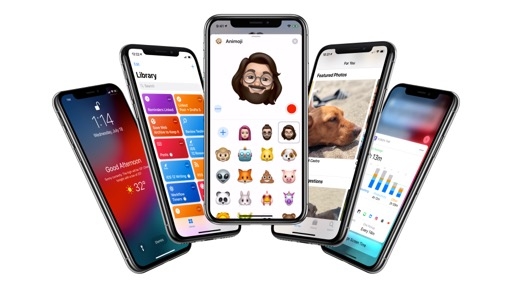
In addition to revamping how users can triage notifications thanks to grouping, Apple is also providing developers with new ways to send notifications that don’t conform to the framework’s standard rules.
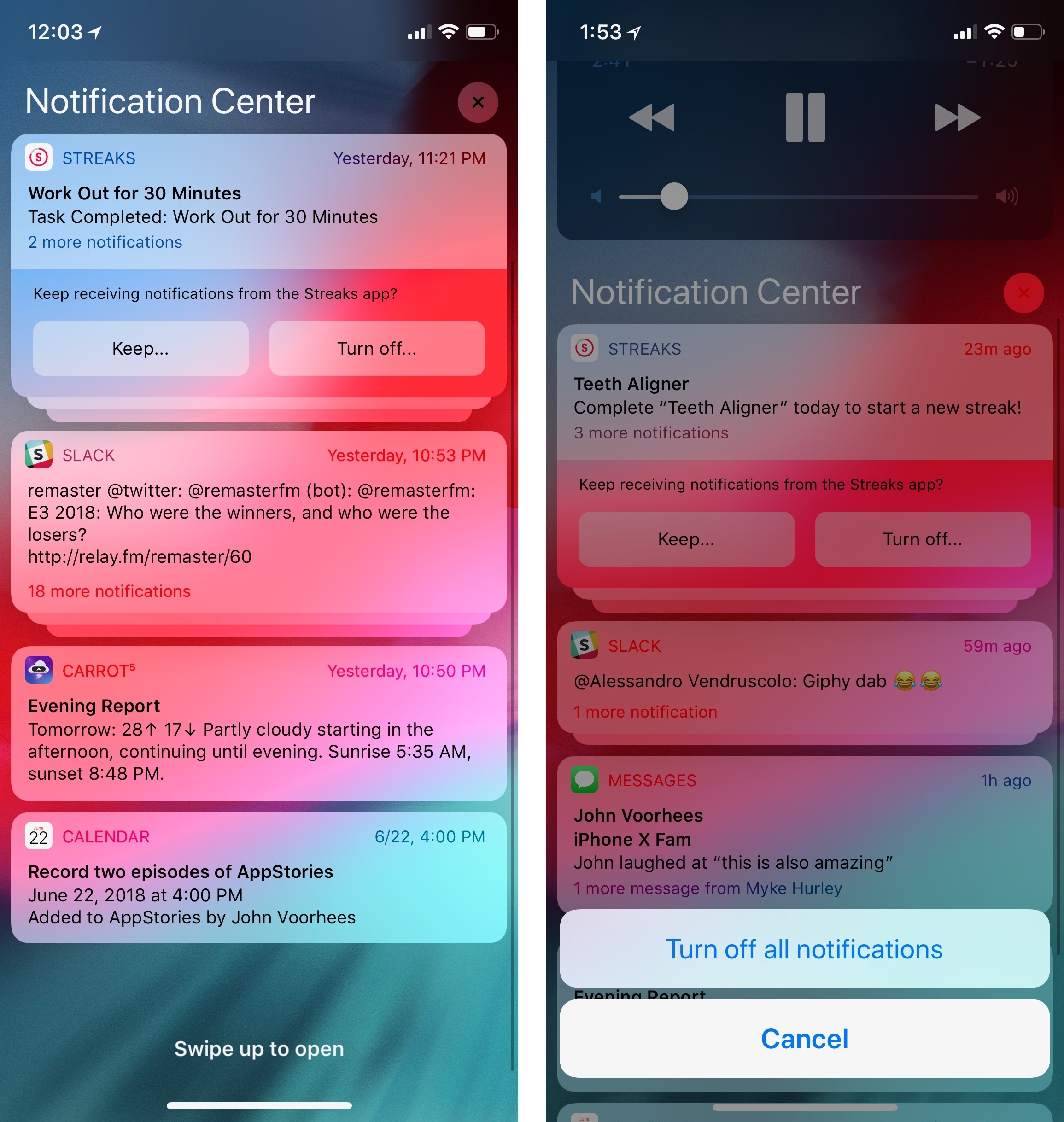
The first new API is provisional authorization, which allows developers to send trial notifications without receiving the user’s consent first. These notifications skip the traditional notification permission prompt and are delivered quietly to Notification Center.
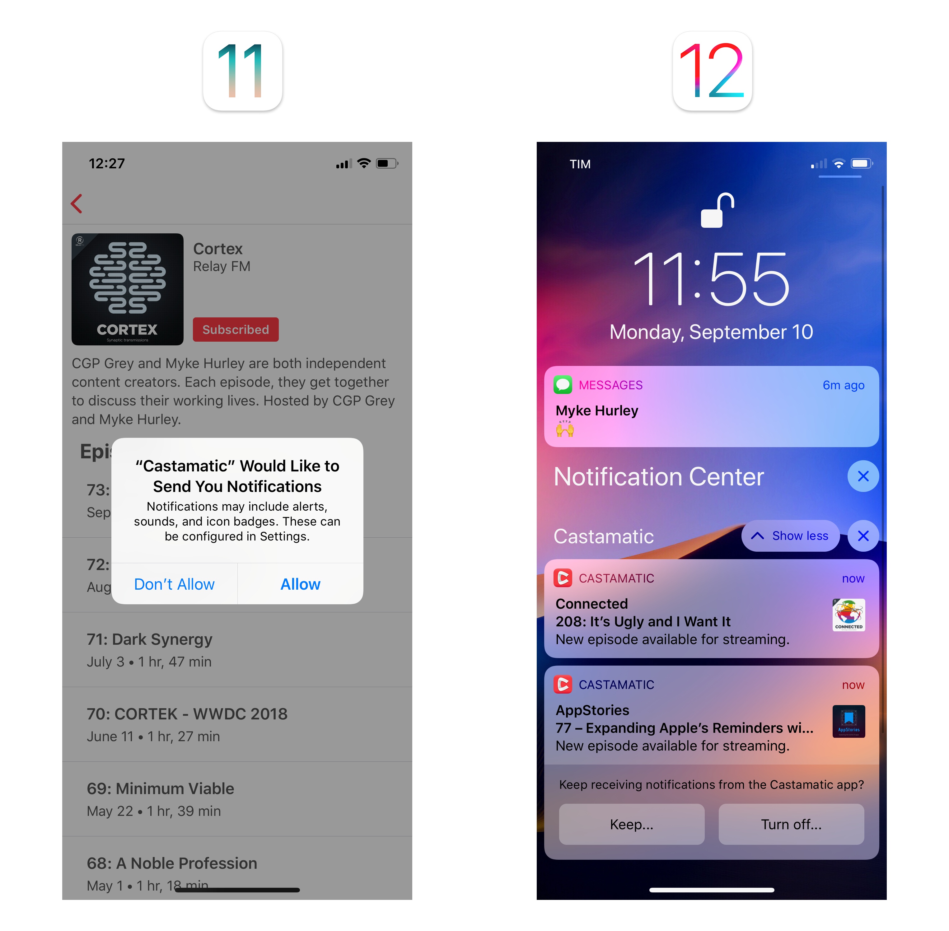
With provisional authorization, apps can skip the traditional permission prompt and send a quiet notification as a trial. This API is optional.
The notification is explicitly marked as a trial by iOS, which includes buttons to choose how future notifications by the app should be delivered. The ‘Keep…’ button embedded in a trial notification lets you decide to continue delivering notifications quietly or switch them to prominently from Notification Center; the ‘Turn off…’ button can disable all notifications immediately or jump to the aforementioned deep-linked notification settings screen inside the app.
Functionally speaking, provisional authorization is a quiet delivery mode enabled by default without the user’s intervention. Apps sending trial notifications are simply marked as ‘Deliver Quietly’ in the Settings app; if an app sends additional notifications after the first trial one, they’ll all be grouped together, but only the first one will retain the special configuration buttons.
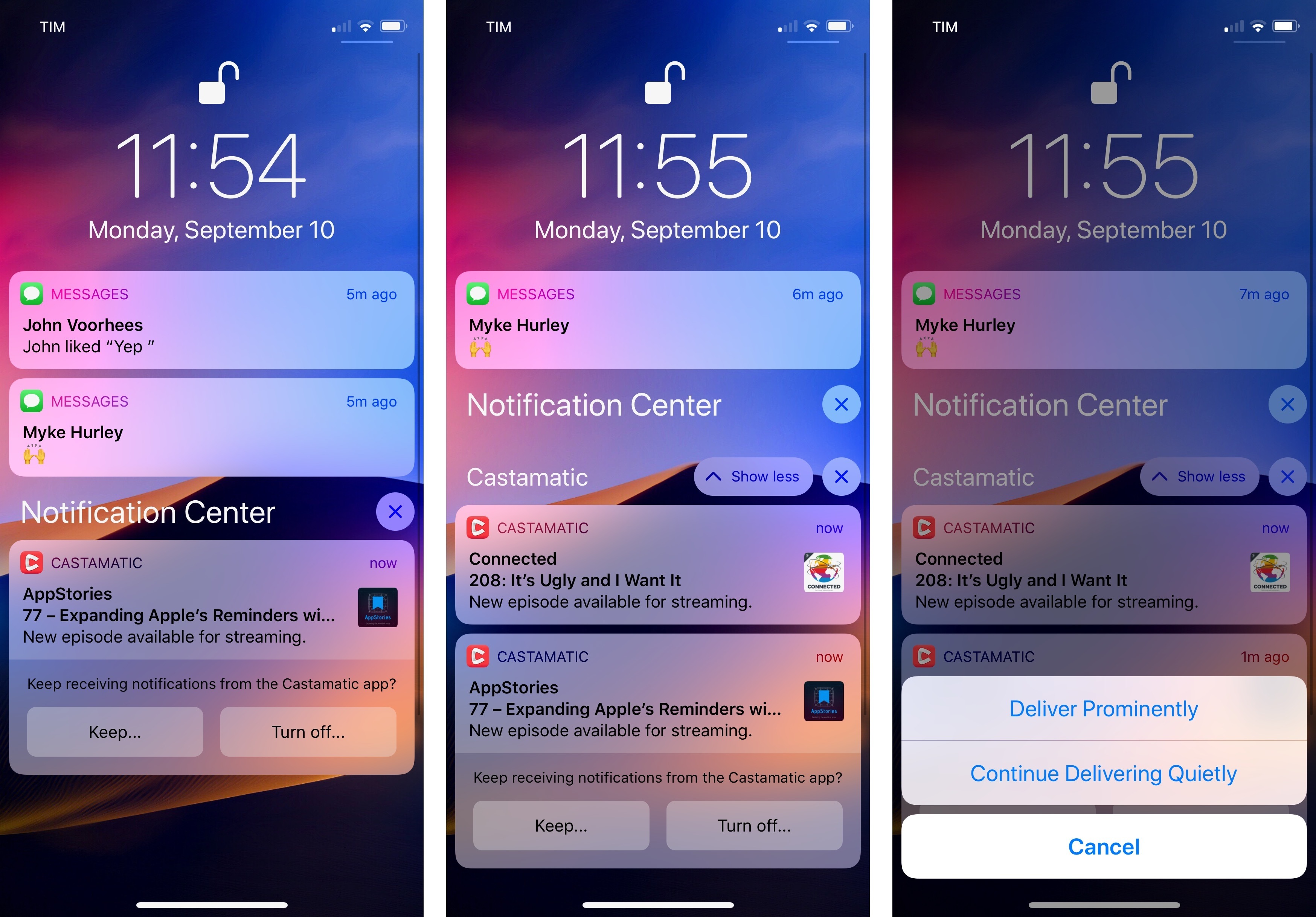
If an app uses provisional authorization, only the first notification it sends will have buttons to keep or turn off future notifications.
The idea behind provisional authorization is that when users are prompted to give an app notification access, they often don’t know yet if notifications from that app will be worth their time or not. This API enables apps to give users a taste of what their notifications look like in practice. This way, developers can avoid describing what their notifications do without having anything to show yet during an app’s onboarding flow; users don’t have the pressure of allowing or denying notifications for an app they’re not familiar with, and they see an actual notification as a trial that won’t interrupt them but will sit quietly in Notification Center instead.
The theory is sound, and while I fear that the system will be abused by companies relying on shady incentives to convince users to green-light the notification trial, the notification is delivered quietly without major disruptions to a user’s workflow. I think it can be valuable to see a real notification without having to make a split-second decision when the prompt comes up – especially because too many developers make the common mistake of bombarding users with permission prompts as soon as their apps first run.
If provisional authorization works, apps that send useful and informative alerts should see their notification engagement rates go up; those who abuse the system will be discouraged from showing their spammy notifications as trials. If used judiciously, this could be a more elegant system than the notification permission prompt we’re used to.
iOS 12 also includes a new type of notification called critical alerts. Designed for apps that deliver urgent and critical information, these special notifications are highly disruptive in that they always play a sound (which can be a custom one at an app-specified level), bypass Do Not Disturb, and always ignore the ringer switch. Critical alerts can be local or push notifications, and they play whether the device is unlocked or not. Moreover, critical alerts carry a special red exclamation point next to their title and have their own dedicated section in the Settings app.
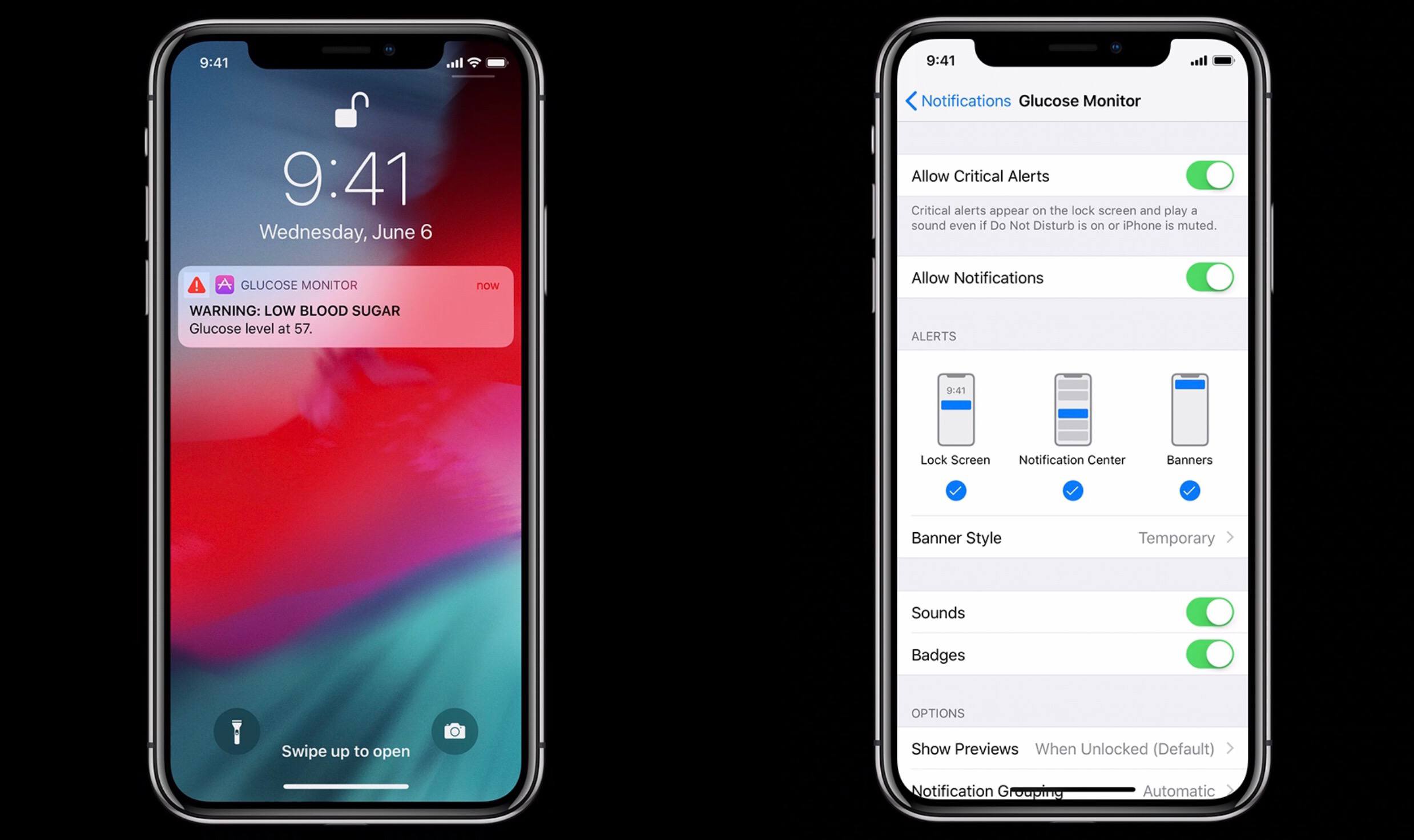
Apple is being extremely cautious with deployment of critical alerts, and rightfully so. The company has suggested that only certain kinds of apps should use them, such as medical and health-related apps, home and security tools, or apps that work with public safety programs. Critical alerts aren’t open to everybody: developers who want to use them have to request an entitlement on Apple’s website. Even though I hope I never see one of these, this feature is a great idea for urgent alerts that the user absolutely needs to see and act upon immediately.
Other Notification Changes
There are three additional changes to notifications in iOS 12 I want to highlight:
The system suggests turning off notifications with low engagement. If iOS 12 notices that you often ignore notifications from a specific app, it’ll suggest you turn them off in Notification Center. This is the same UI used for provisional authorization, and it’s a great little touch as the system can proactively help you clean up your notification list or switch certain notifications to quiet delivery.
Rich notifications now support user interactions. Besides embedding custom interfaces in their notification content, developers can now embed interactivity as well. The content displayed inside a notification now supports touches, so apps can include buttons or other tappable UI elements inside the notification. Apple used this to enable tapbacks in iMessage notifications (finally) and to include multiple Play buttons for Podcasts notifications about new episodes from the same show.
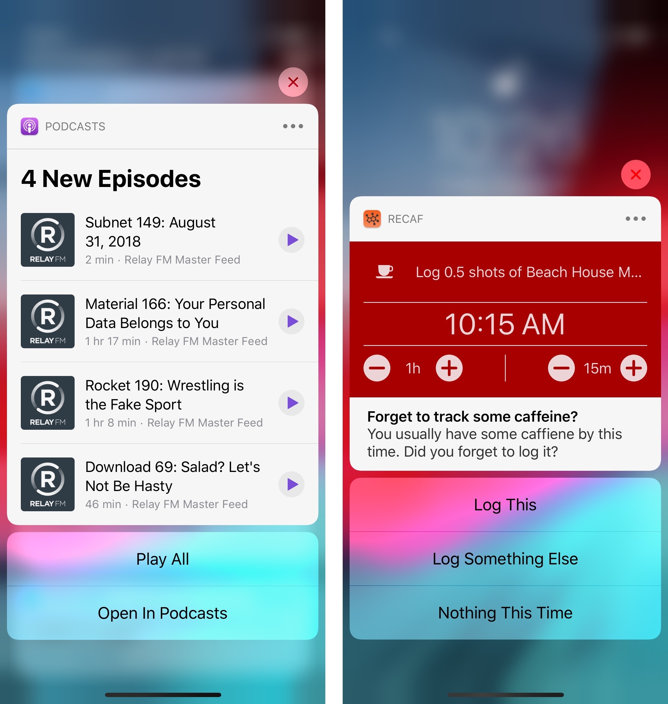
Dynamic actions. Actions included at the bottom of notifications can now be updated dynamically after the user performs an action, resulting in better context. Imagine, for instance, a ‘Like’ action turning into ‘Unlike’ after it’s pressed, or ‘Move to Trash’ becoming ‘Put Back’ while the notification is still shown.
Apple’s goal with iOS 12 was to make notifications more efficient and let users save time managing them. I think they’ve largely succeeded and laid a new foundation to build upon in future releases.
Grouping makes it possible to scroll and triage notifications much more efficiently than before; expanding and clearing groups has become second nature for me, and I can’t imagine going back to a Notification Center without app- or thread-based groups. Even when iOS did offer a ‘Group by App’ notification setting years ago, it wasn’t nearly as smart as the current system in iOS 12. And by leveraging Instant Tuning everywhere – for regular notifications, provisional trials, and system suggestions – iOS 12 puts users in control of their notification experience in a way that is respectful of their time and versatile enough to create personalized notification workflows. The new APIs made available to developers are well-considered, and I’m intrigued by notifications becoming even richer and more interactive.
It took Apple a few years to get to this point, but they nailed the implementation of notification grouping and Instant Tuning on their first try. Now I just hope we won’t have to wait another five years for more updates to notifications.
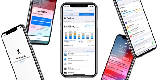
Screen Time
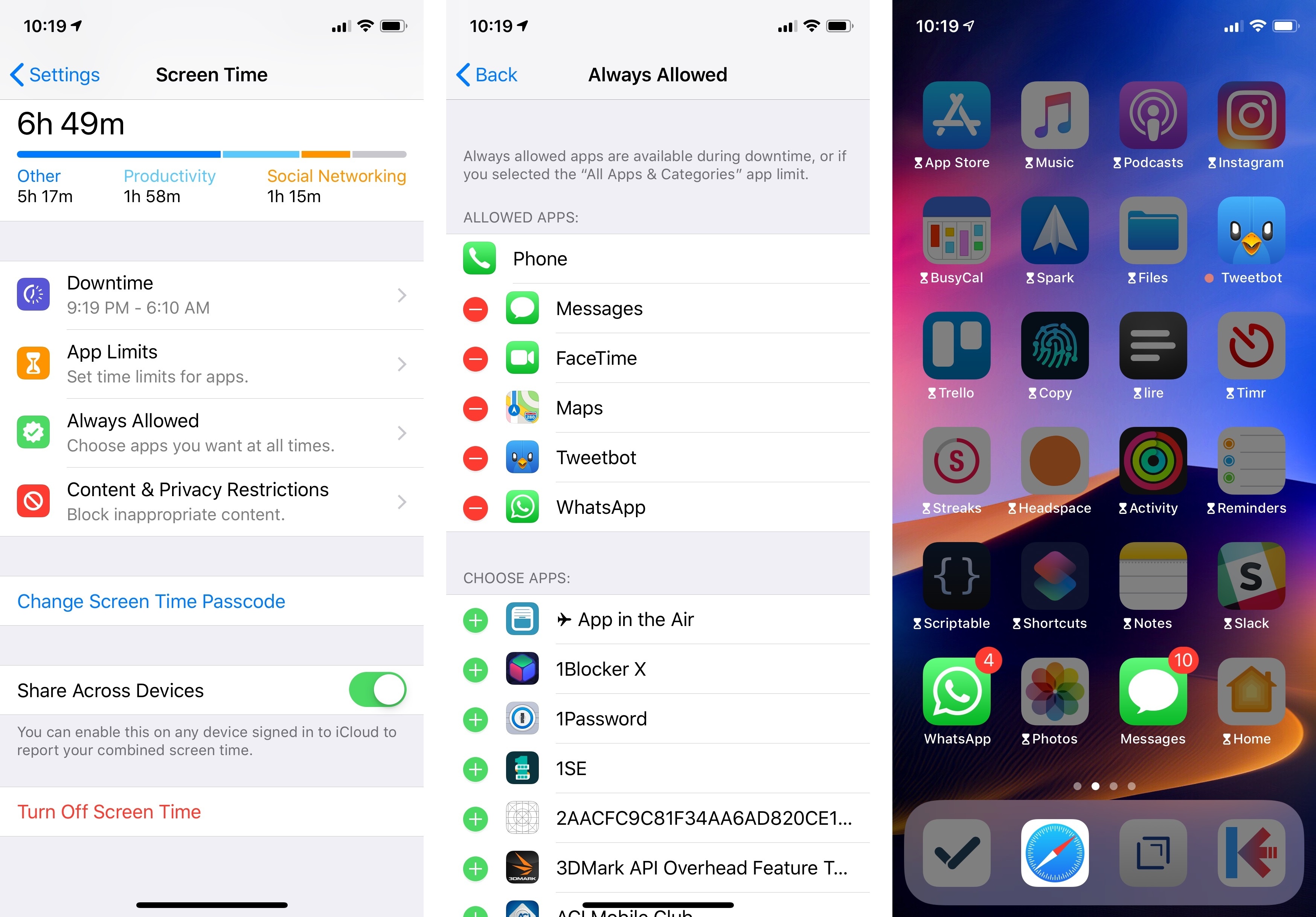
The third leg of the digital well-being tools in iOS 12 is all about numbers and setting restrictions for yourself (or your family). Called Screen Time, this feature encompasses monitoring time spent using apps and websites, setting daily usage limits, and finding ways to spend more time off the screen during the day.
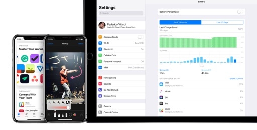
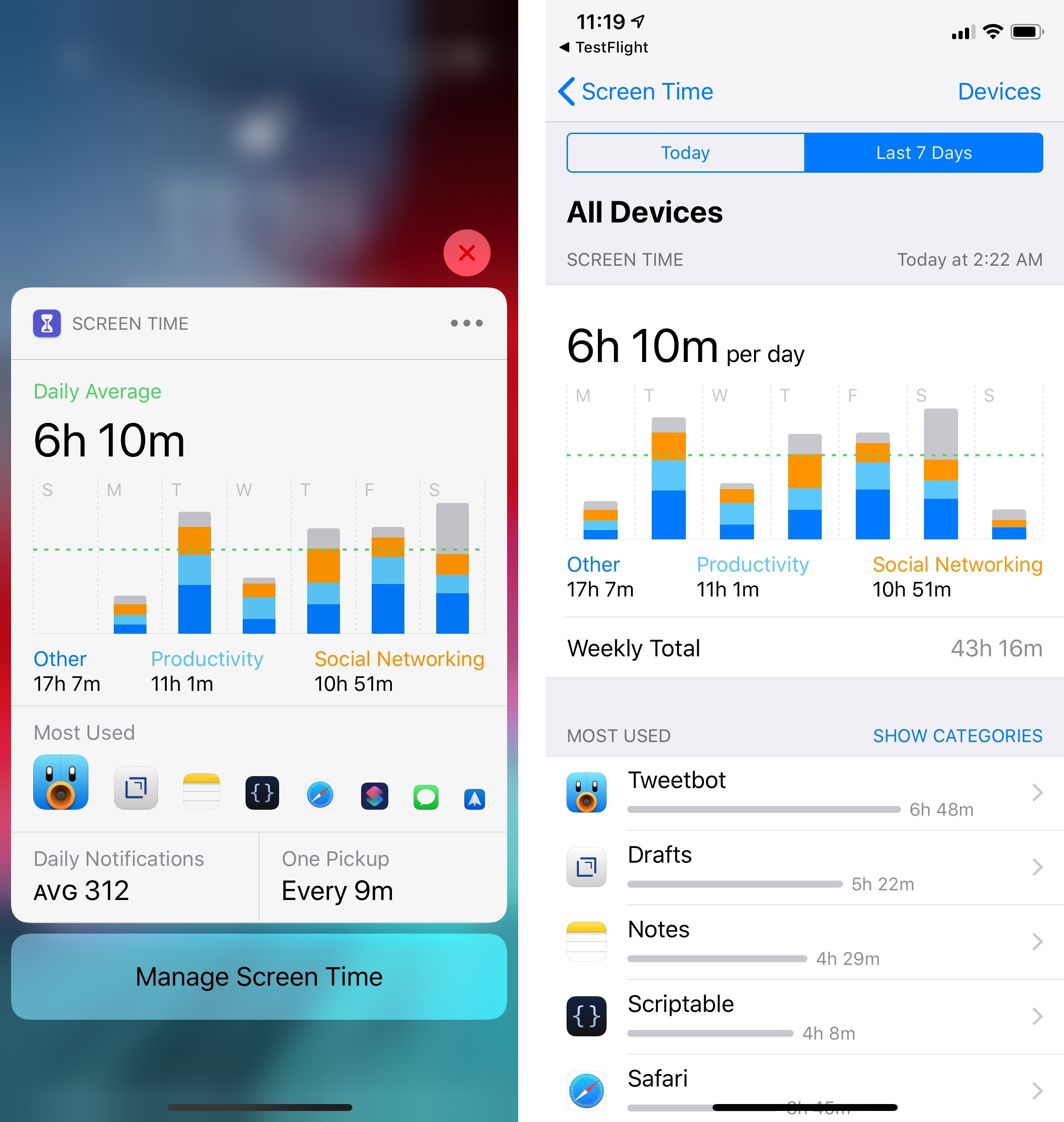
Screen Time is not an app. Located in Settings ⇾ Screen Time8 and disabled by default, it is a dashboard to see how you’ve allocated your time when using iOS devices signed into your iCloud account. At the top of the Screen Time page, you’ll find a chart that visualizes time spent on iOS with colored bars for your most used app categories.9 The default view aggregates data from all your devices for the current day. In this minimized mode, Screen Time also tells you whether your device usage is below or above average.
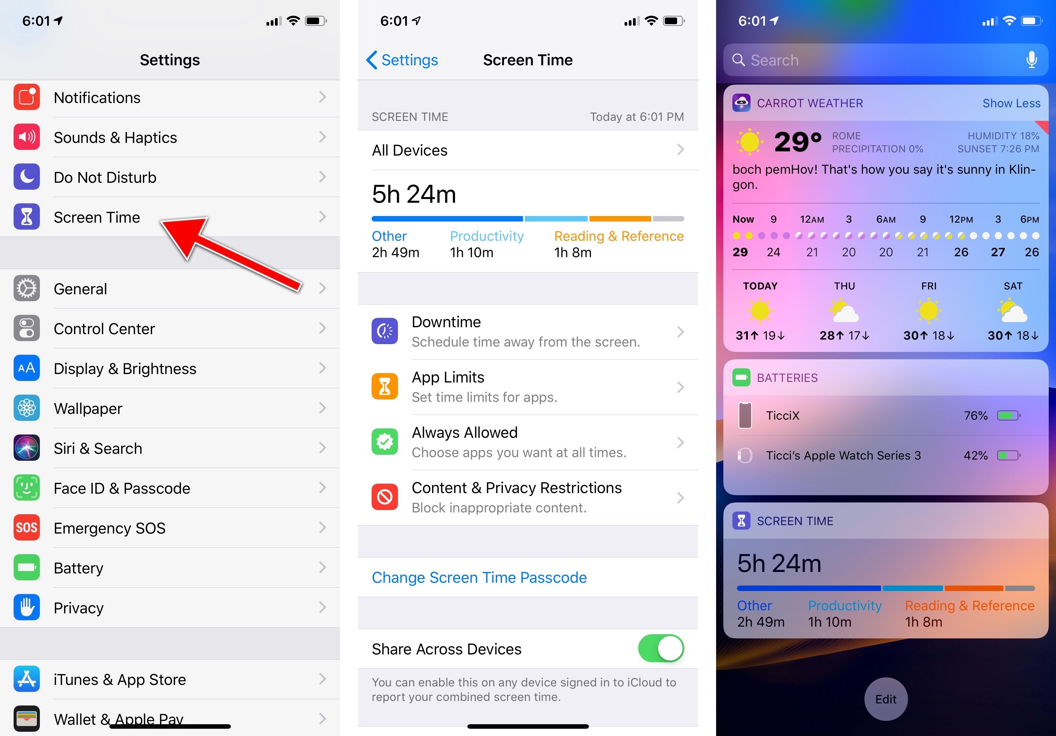
The real fun begins once you tap on ‘All Devices’ to navigate to the full dashboard on a separate page. Here, you can see more details for individual apps (and websites opened in Safari too) with the ability to switch between Today and Last 7 Days at the top. Also in the upper title bar, there’s a ‘Devices’ button that lets you load charts for individual devices signed into your iCloud account should you prefer avoiding the default ‘All Devices’ mode.
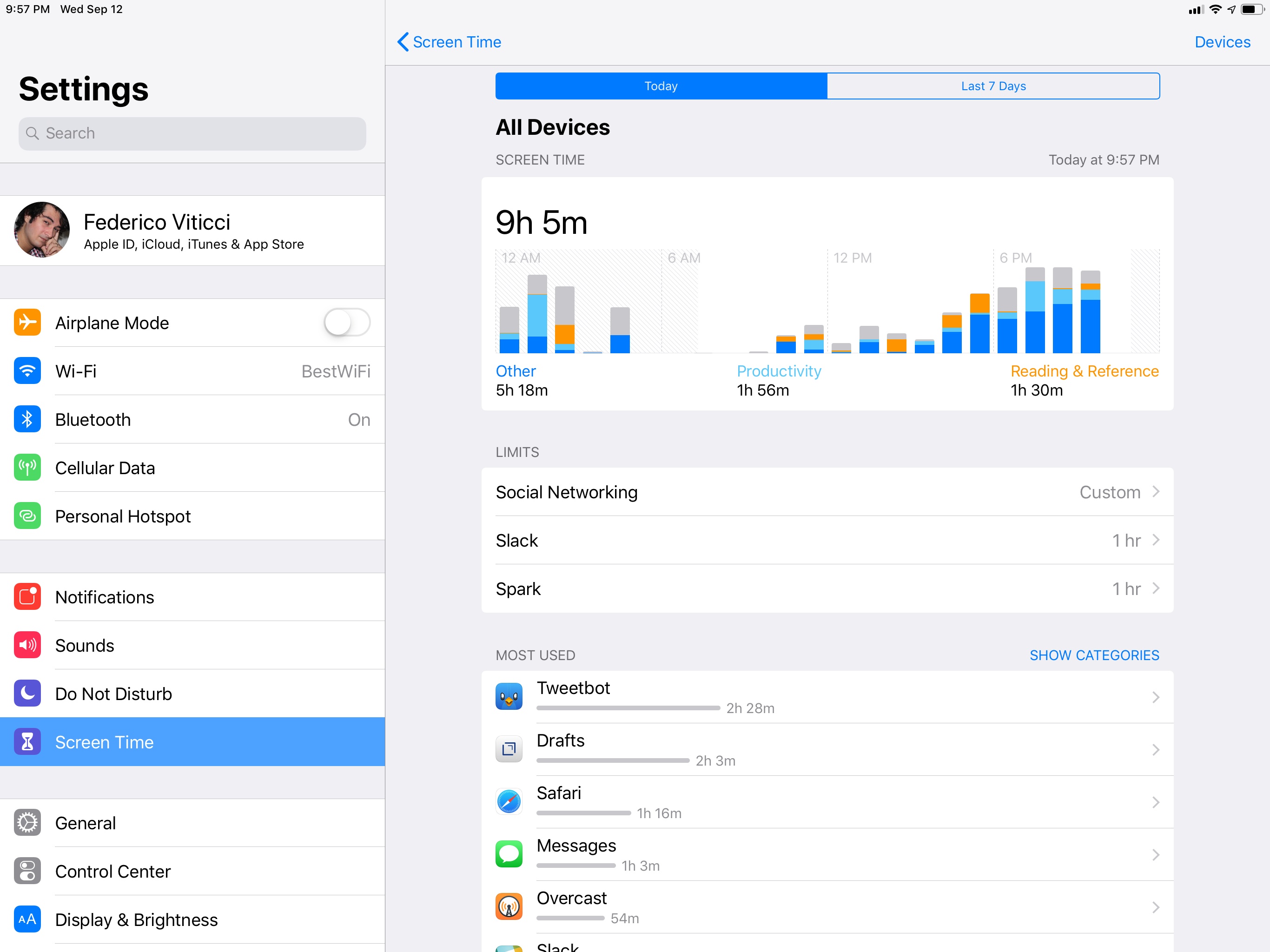
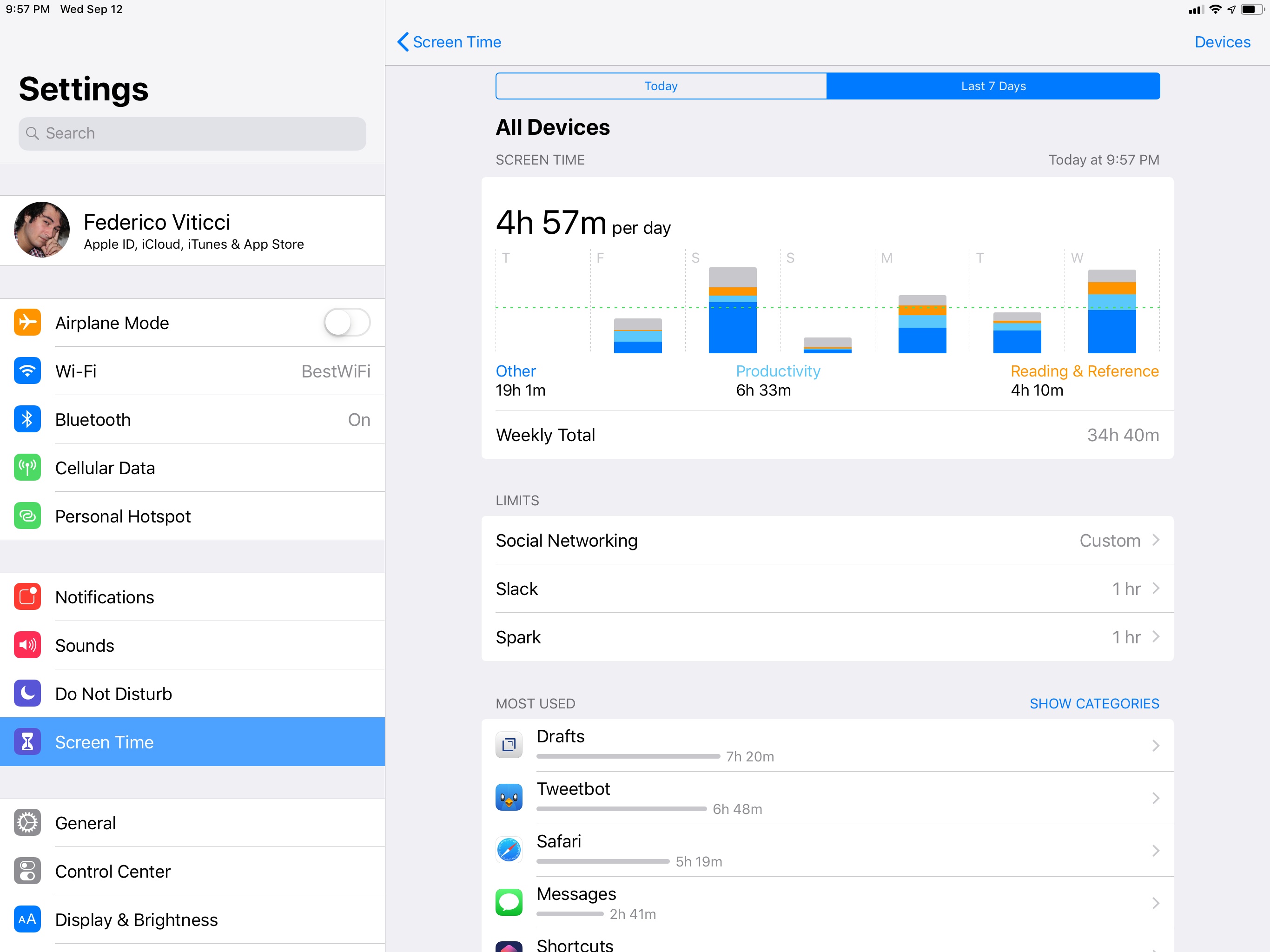
There’s a lot of data to digest on this page, to the extent that I still can’t believe Apple is giving us all these new tools at once in the same iOS release. The main chart uses vertical bars for the top three app categories that represent your device usage. In my case, these are ‘Social Networking’, ‘Productivity’, and ‘Entertainment’. You can tap, hold, and swipe on the chart – both for daily and weekly stats – to show a popup with individual hourly or daily breakdowns.
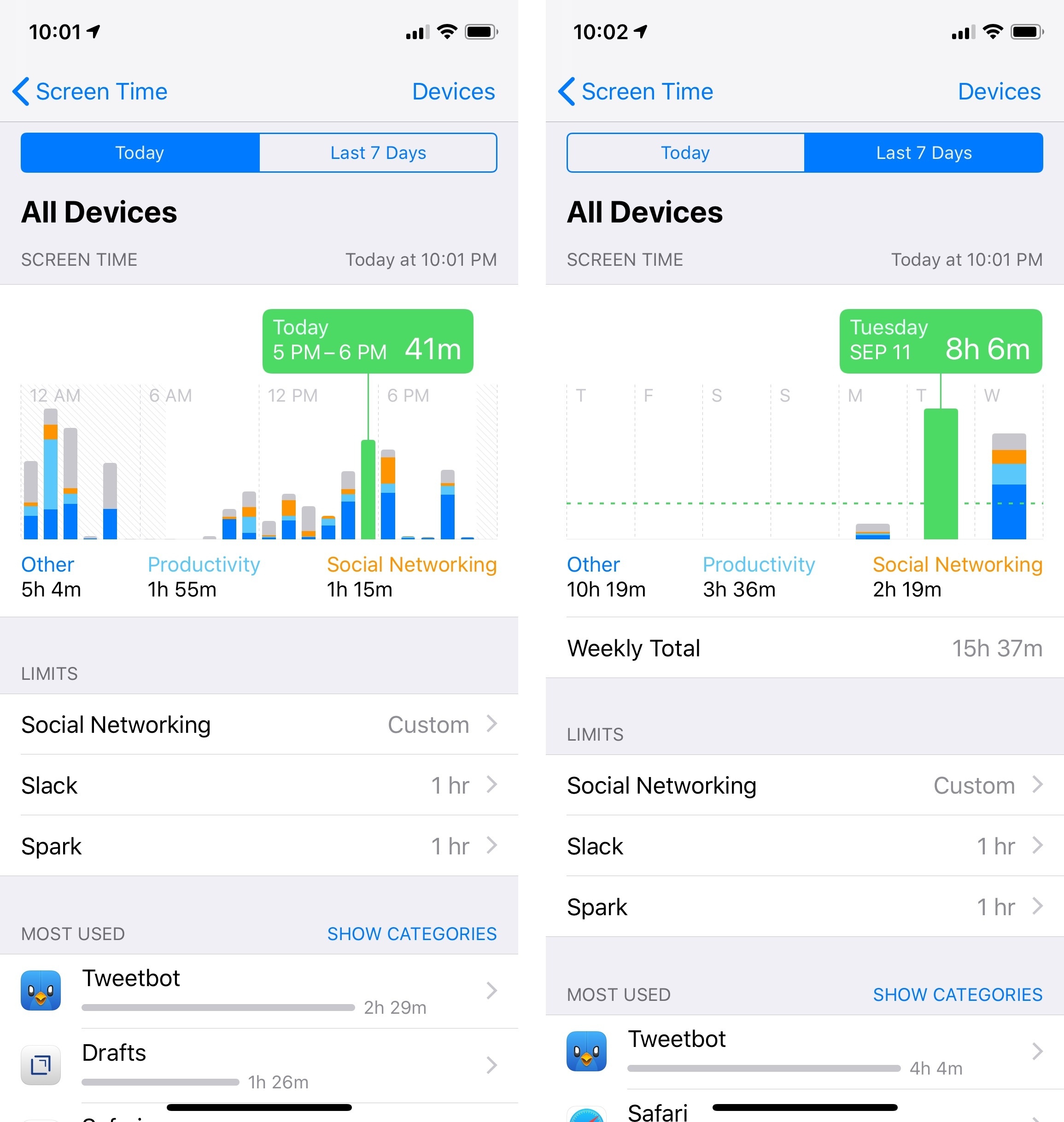
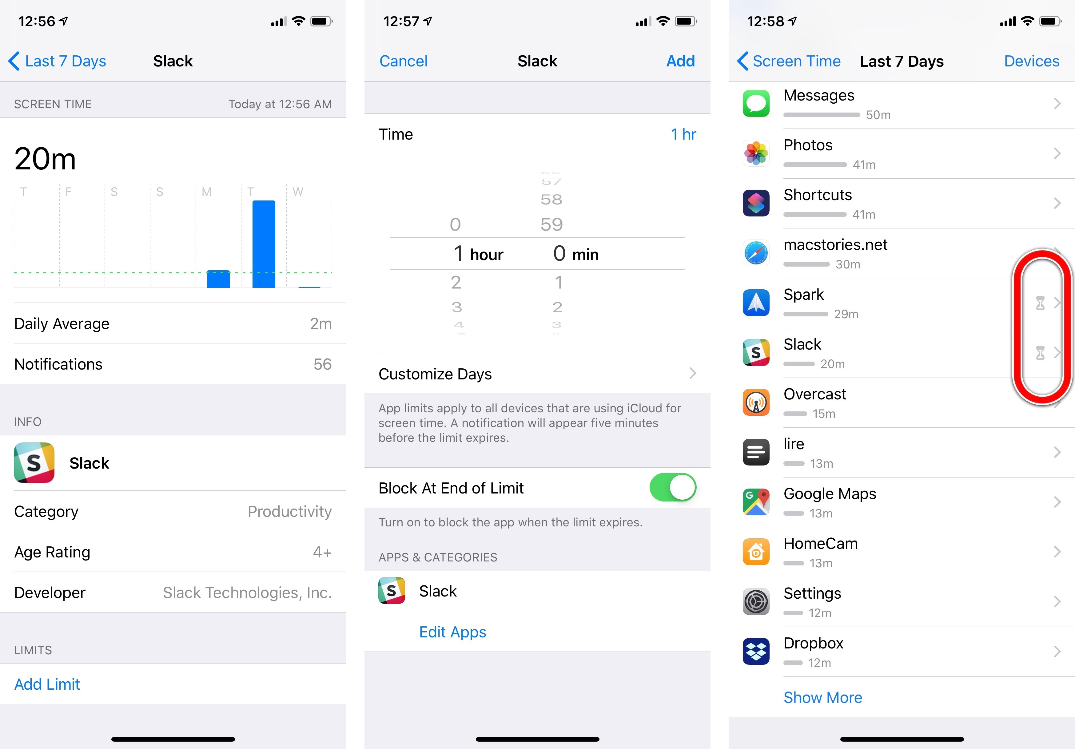
The main charts and stats are useful to get a general sense of how long you’re using your devices and what for, but there’s a lot more waiting for you as you scroll down. First, you’ll find the ‘Most Used’ section, which displays time spent using individual apps and websites or, if you tap a button, entire app categories. You can tap on individual entries in ‘Most Used’ to see granular stats and averages for an app with another chart, plus information that includes category, age rating, and developer name. This is also where you can set a limit for a single app.
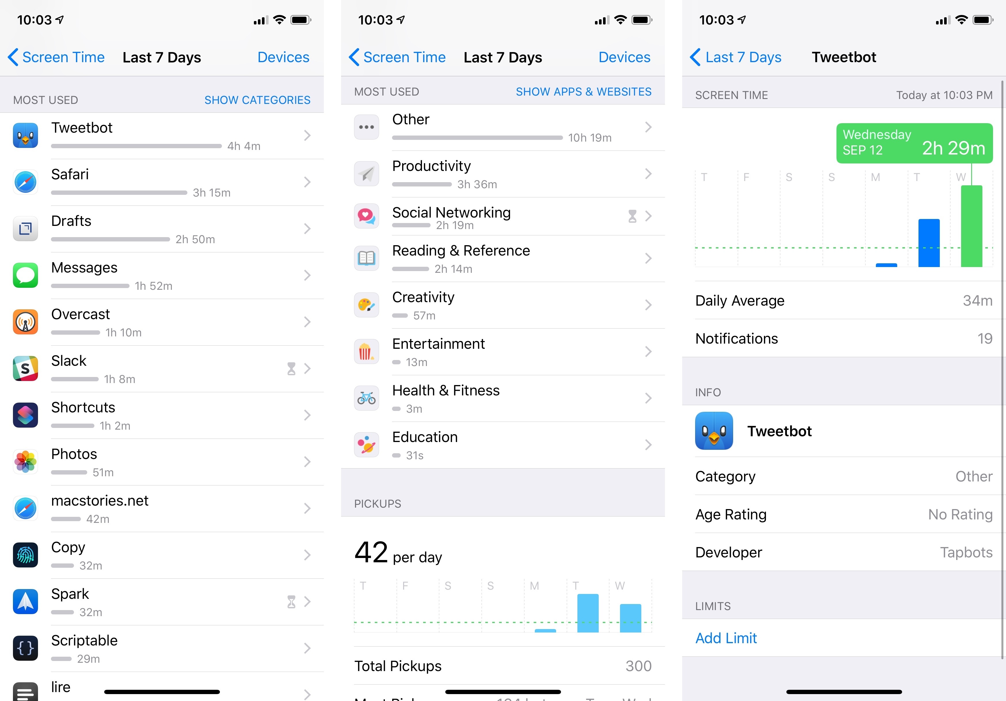
Scrolling through the ‘Most Used’ section has turned out to be an informative and, at the same time, concerning exercise for me. On one hand, on a productive day, I enjoy seeing my text editor and the Shortcuts app at the top of the list, reminding me that I got quality work done; on the other, seeing news websites, Tweetbot, or Instagram populate the weekly view is a cringeworthy experience that makes me realize I waste too much time on social networks. It’s tough to face swaths of personal data dutifully collected by a computer, and I suppose that’s the entire point. I’m not sure how many users will want to know these numbers.
Screen Time can also monitor device pickups. From what I was able to gather from Apple, a pickup logged by Screen Time constitutes a “meaningful interaction” with an iOS device. Interacting with widgets, responding to a notification, or unlocking your device will increase the pickup count. However, Apple doesn’t want to “charge” users if they just look at the time or the screen lights up due to Raise to Wake, which I think is the right approach. In practice, I’ve found the ‘Most Pickups’ statistic useful to quickly understand when I tend to check my iPhone the most during an average day.
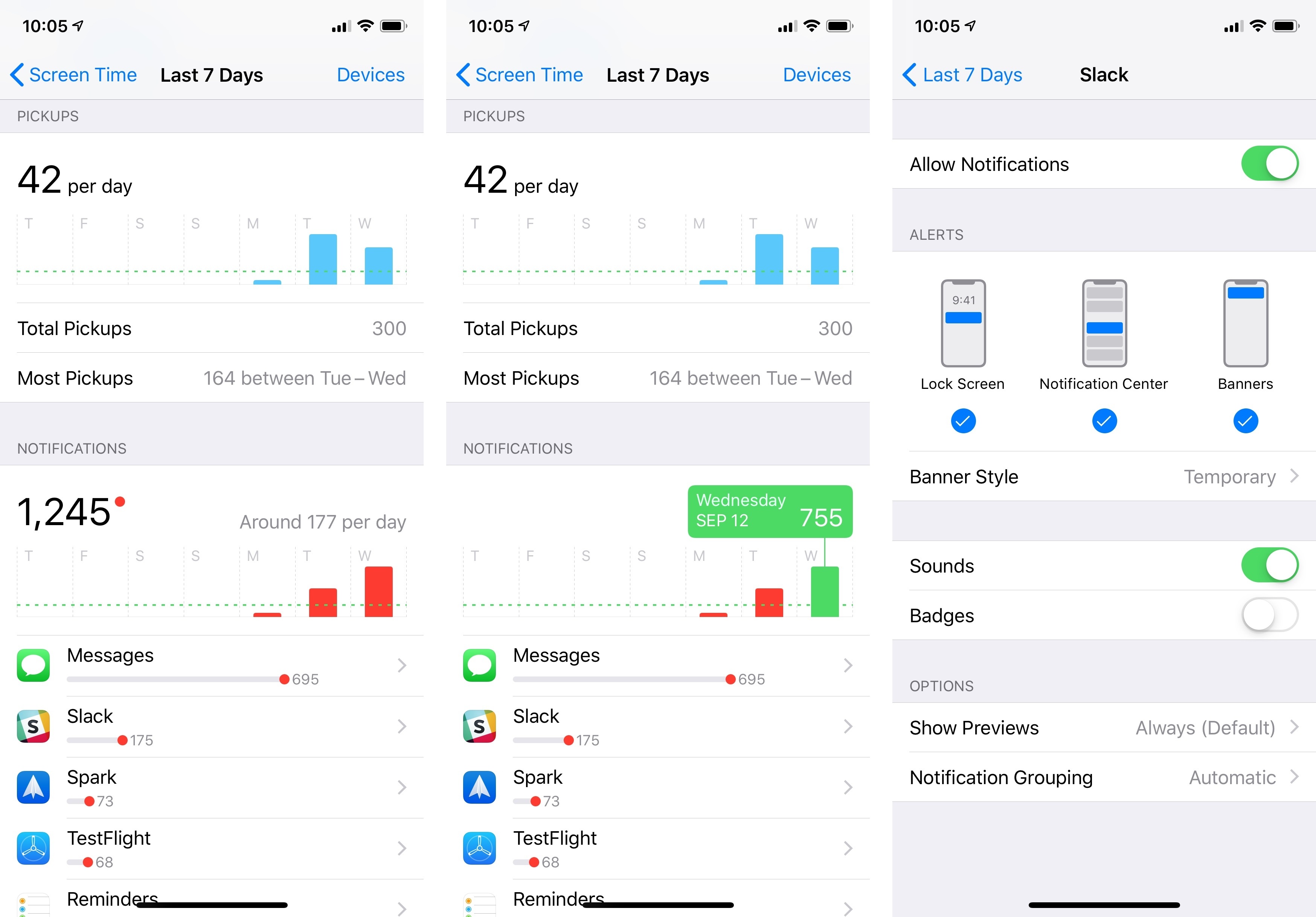
Screen Time can keep track of notifications sent by individual apps too. If you’re anything like me, these numbers will be heavily skewed towards Slack and Messages. Besides hourly/daily breakdowns, the Notifications chart shows you a number for average hourly or daily alerts. Again, it can be difficult to come to terms with these data points when they’re laid out in front of you. There’s something about this section I appreciate though: tapping on an individual app will load its native notification settings screen (the same one you can open elsewhere in Settings) where you can immediately tweak how an app sends you notifications.
Once all these numbers have been collected, Screen Time will send you a rich notification at the end of each week with a report on how you used your devices. The notification card features a weekly chart with total app usage times and daily averages, icons for your most used apps, and more averages for daily notifications and pickups.
I find Screen Time’s weekly report to be a useful tool to keep specific trends under control without remembering to visit the Settings app on a regular basis. Realizing that I was getting hundreds of notifications each day and picking up my devices every 4 minutes wasn’t fun; Screen Time’s weekly check-in has helped me form a better understanding of my iOS habits over time.
In the past three months, I’ve realized that my experience with Screen Time is skewed by using iOS for work. My usage numbers are always going to be high, especially on my iPad Pro, and I don’t necessarily feel bad if I see Safari or Slack at the top of my stats because I get work done and communicate with my team using those apps.
However, Screen Time has opened my eyes to the fact that I was receiving too many iMessage notifications and spending too much time mindlessly scrolling Facebook each day. I believe the latter was genuinely unhealthy for me. Thanks to Screen Time’s invisible monitoring and weekly reports, I was able to take stock of certain aspects of my daily iOS usage and make changes accordingly. I deleted the Facebook app, enabled Do Not Disturb for more iMessage threads, and tried to be more mindful of how much time I spend scrolling news feeds without thinking. Even without setting limits or restrictions, I believe that seeing numbers alone can help people understand where their time is going and how frequently iOS devices demand their attention. In fact, I’d love to see the addition of longer periods in Screen Time (such as monthly and yearly) with trendlines to monitor changes in a user’s habits over a longer span of time.
Whether or not you think you’re addicted to checking your phone, Screen Time acts as a mirror for your digital habits to help you understand which apps you’re using the most. Screen Time doesn’t cast any judgment on the user – it doesn’t imply whether or not certain amounts of time are “bad” or “okay”. It doesn’t offer any actionable advice either. Screen Time just gives you the numbers, and it’s up to you to decide what they mean. You may not like what you find in Screen Time, but you’ll always have the power to start making changes.
App Limits and Downtime
If seeing numbers reported by Screen Time isn’t enough for your self-control, iOS 12 gives you other tools in the form of limits and restrictions to more strongly nudge your iOS usage in a different direction. We covered the family and parental side of these features in a separate story; in this section, I’m going to focus on how you can leverage them for your personal iPhone or iPad experience.
First there’s app limits. These are timers that you set for individual apps or entire app categories to define how much you can use them every day. Effectively, they are personal allowances. App limits can be created from a standalone app category in Screen Time, as well as by drilling into individual app statistics. App limits reset every day at midnight; they can be entered with a standard time picker and they apply to all devices signed into the same iCloud account.
When you’re creating an app limit (both for apps and app categories), you can customize hour allotments for individual days in a ‘Customize Days’ screen. As you can imagine, this allows you to set shorter limits for weekdays and longer ones for weekends. I wish Do Not Disturb had a similar option for its scheduling feature.
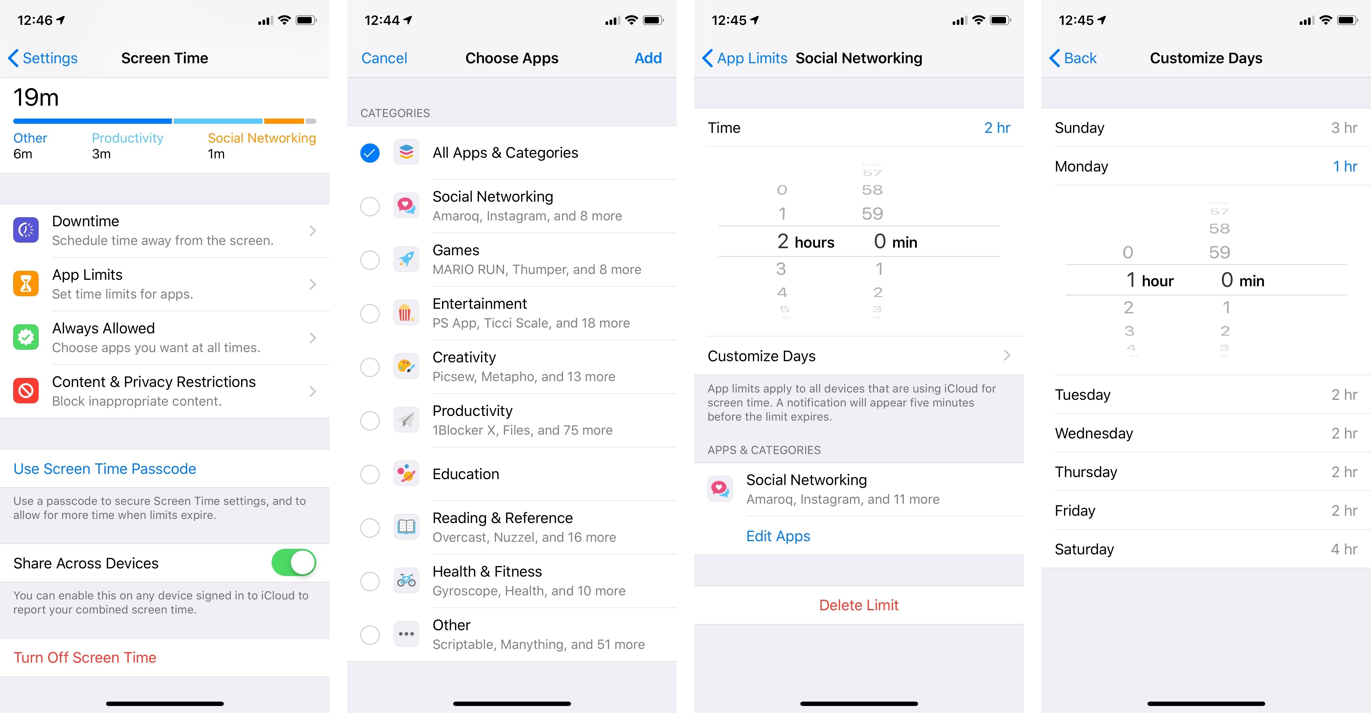
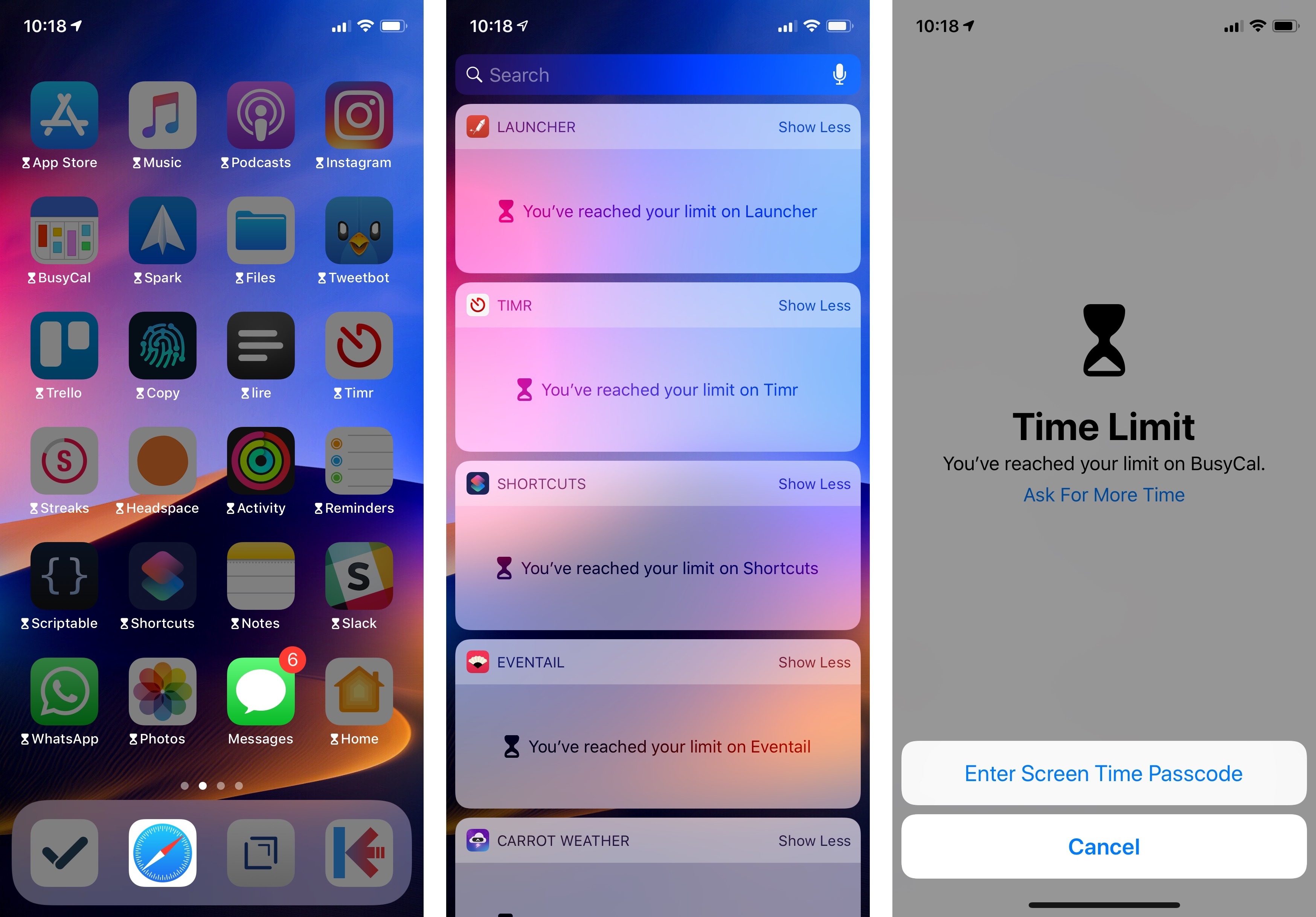
Five minutes before hitting an app limit, iOS 12 will send you a notification telling you to get your affairs in order and prepare to stop using an app. Once the limit’s threshold is engaged, the app icon will be dimmed on the home screen and it’ll gain a new hourglass indicator next to its name. Attempting to open a limited app will load a full-screen view that “prevents” you from using the app. I put that between quotes because there’s a button you can tap for options to override the limit for 15 minutes or ignore the limit for the day.
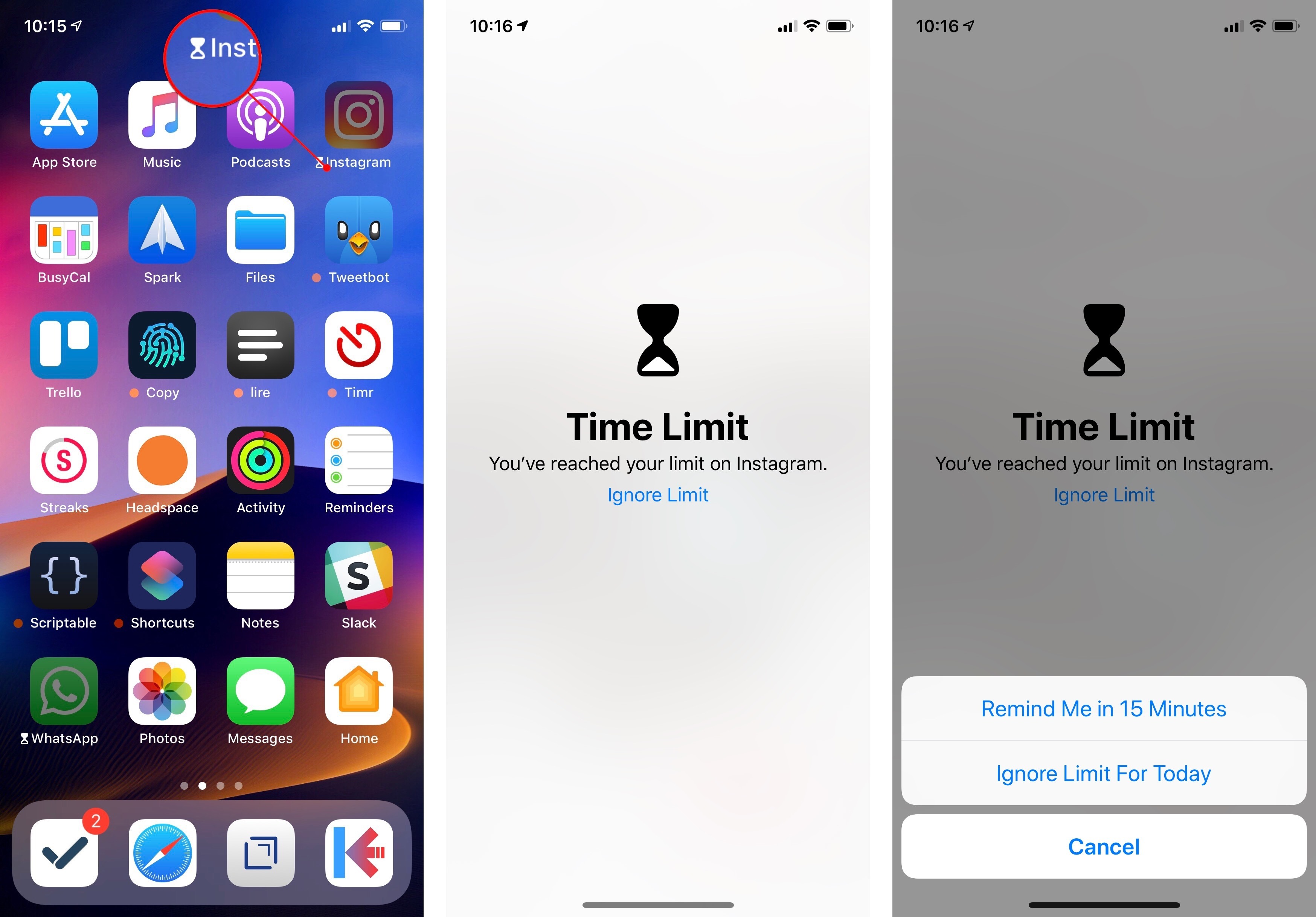
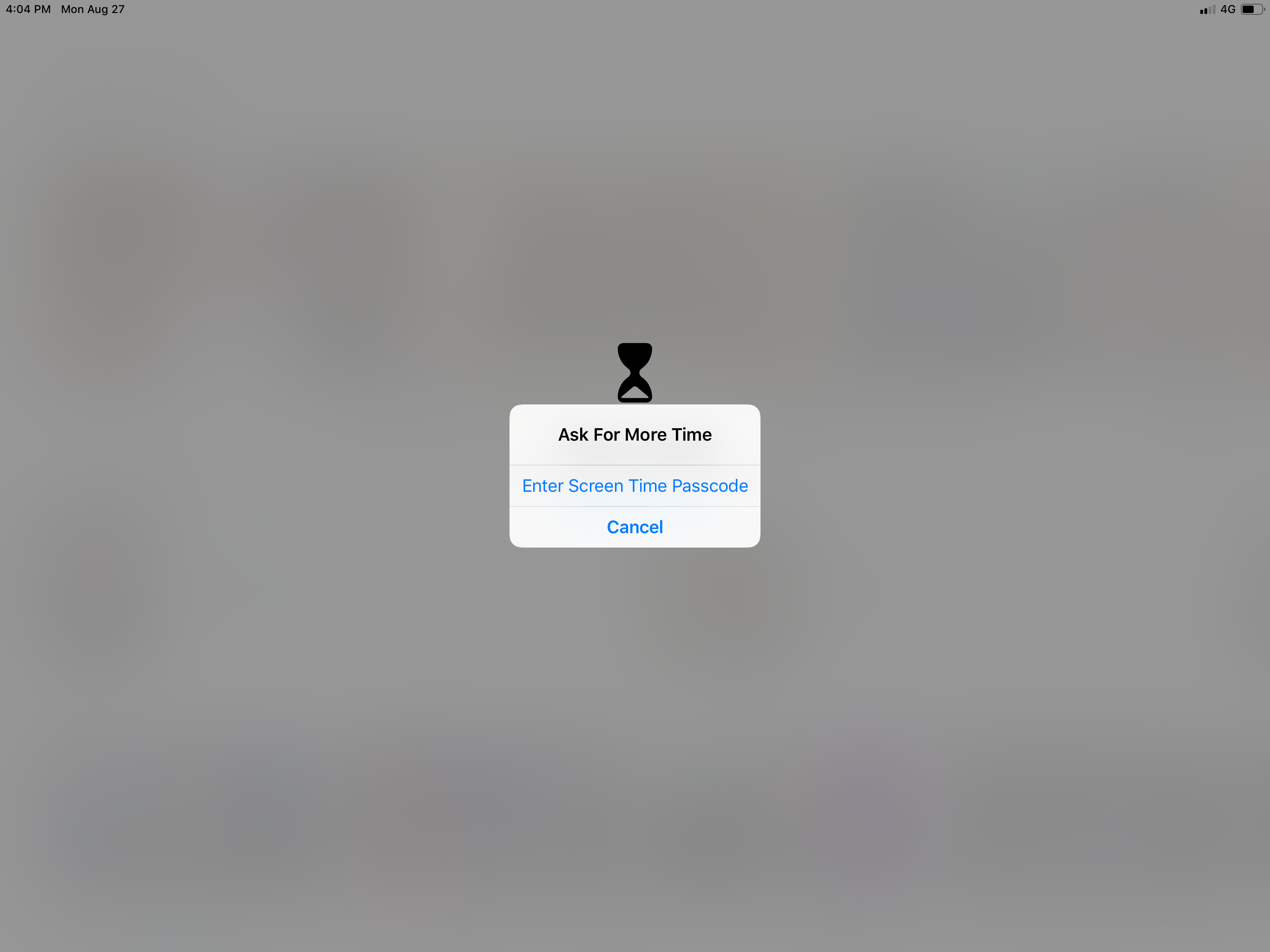
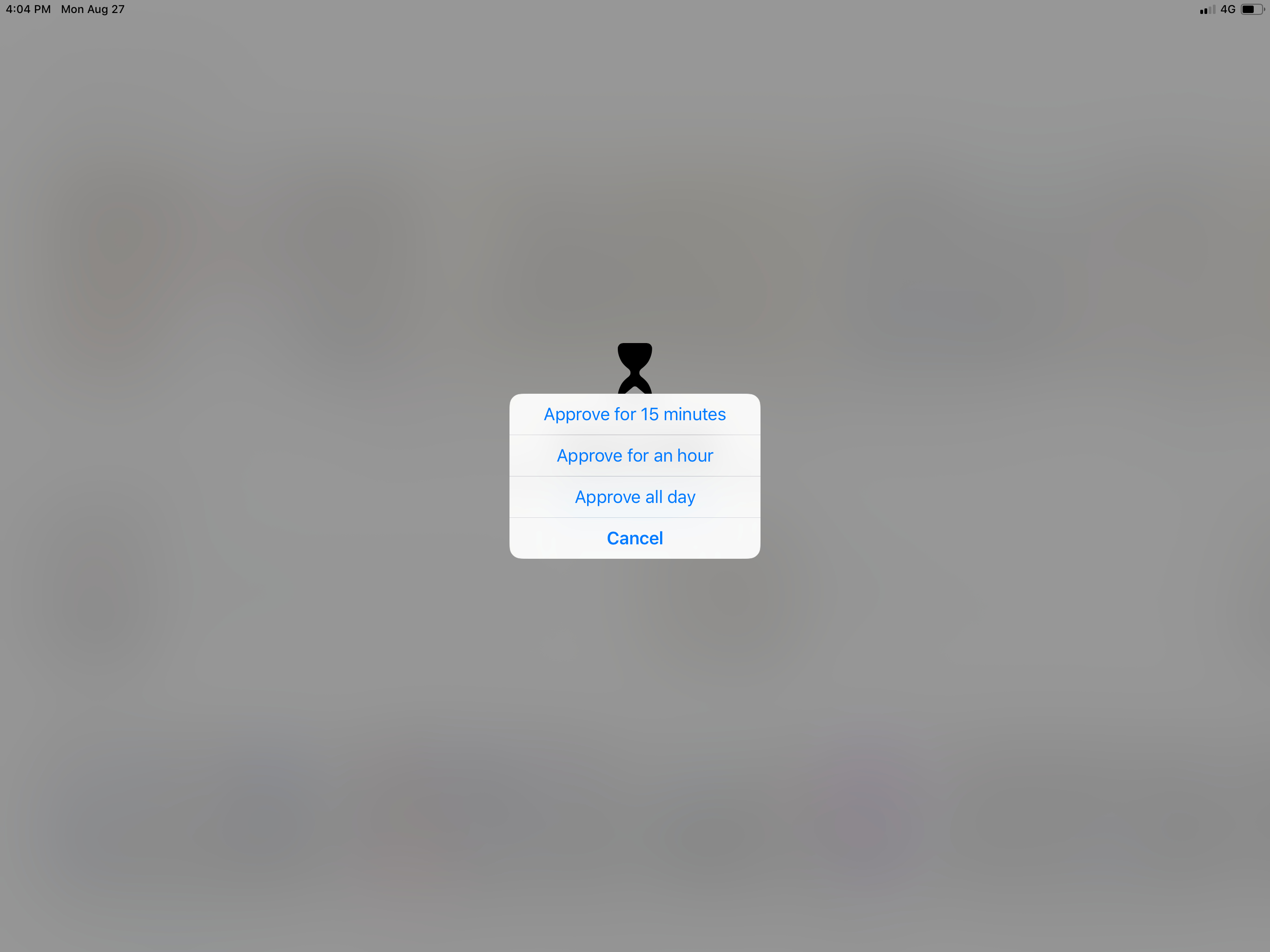
By default, app limits are easy to override and don’t act as a full-on restricted mode. If you want to slow yourself down and increase the likelihood of not opening a limited app, you need to turn on the ‘Screen Time Passcode’ option in Settings ⇾ Screen Time and subsequently enable the ‘Block at End of Limit’ toggle for an individual app limit (the toggle won’t be available unless you add a passcode to Screen Time). By setting a passcode, you’ll secure Screen Time’s preferences (for instance, you’ll be asked for a passcode every time you want to edit app limits) and gain new options when attempting to open an app that has reached its limit. First, you’ll see an alert labeled ‘Ask for More Time’ that asks for your Screen Time passcode; then, in addition to buttons for 15-minute and all-day allowances, you’ll also get a 1-hour option for extended usage of an app.
There’s also a more severe take on app limits in iOS 12 called Downtime. This is a global switch that lets you schedule time away from the screen like you’d schedule Do Not Disturb with a start and end time. In Downtime mode, all apps except some that you’ve specifically allowed beforehand are limited. Thus, if you want to establish a new behavior in your daily routine so that every day at 10 PM you stop using iOS, you can schedule Downtime and all apps will be limited and dimmed on the home screen (including their widgets).
Downtime enabled with the Screen Time passcode option turned on. While widgets are blocked during Downtime, extensions in the share sheet are not.
To whitelist specific apps, you need to visit the Always Allowed section of Downtime. iOS 12 always allows using the Phone app (I assume for emergency reasons), and it whitelists Messages, FaceTime, and Maps by default. In my case, I also added WhatsApp to the list so that friends and family can always get in touch with me and vice versa. Whitelisting apps has the same effect whether you use Downtime or choose to enable app limits for ‘All Apps & Categories’.
I’ve set a handful of app limits for myself over the past couple of months, and, through my ups and downs, I’ve been able to successfully modify my usage of certain apps. These include no more than two hours of social networking (which was tough to follow at first) and one hour of YouTube each day, except for the weekend. Currently, app limits are somewhat of an artificial limitation – you can always ignore them with a few taps – but, in my experience, they’ve been effective in reminding me that I should try to spend more time doing other things.
I strongly believe that, ultimately, we have to understand and be mindful of smartphone app addiction as individuals. There’s always going to be a weird tension in how companies such as Google and Apple give developers APIs to improve how we use apps while they also remind us that using apps too much can be bad. We can’t rely on more software to change our relationship with other software. Just like wearing an Apple Watch doesn’t magically turn you into an athlete, so too improved notifications and Screen Time will not fix your iPhone addiction overnight. If you think this is a problem you need to fix, you will have to want to fix it – just like exercising every day.
That said, the features Apple built in iOS 12 are going to help us limit distractions, focus more, and be more aware of where our time goes. The expansion of Do Not Disturb, although limited, has brought a welcome set of options to silence notifications throughout the day; the new notification system is a resounding success, and hopefully just a starting point for frequent updates over the next few years; Screen Time can be surprisingly effective in making you realize you should stop wasting several hours on Facebook every day.
These are a lot of first steps from Apple – the company that invented the modern smartphone and glossed over its effects on our habits and lifestyles for too long. And even if this strategy doesn’t work out, even if the Time Well Spent movement ends up a fad and this version of Screen Time is all we’ll ever see from Apple – well, at least we finally got proper grouped notifications in iOS 12. Those may turn out to be just enough to restore our iPhone sanity.
- There is also a widget that lets you glance at how much you've been using your device for the current day. ↩
- These are the same primary categories that developers set for their apps to use on the App Store. ↩