iPad
Coming from last year’s bevy of iPad features, it is somewhat odd to be dispensing of iPad changes in iOS 12 with a brief chapter upfront, but such is the nature of Apple’s two-year cycle for iPad software updates. It’s obvious now the company can’t keep an annual streak.
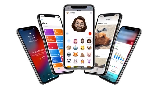
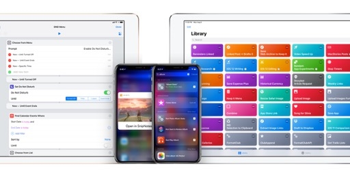
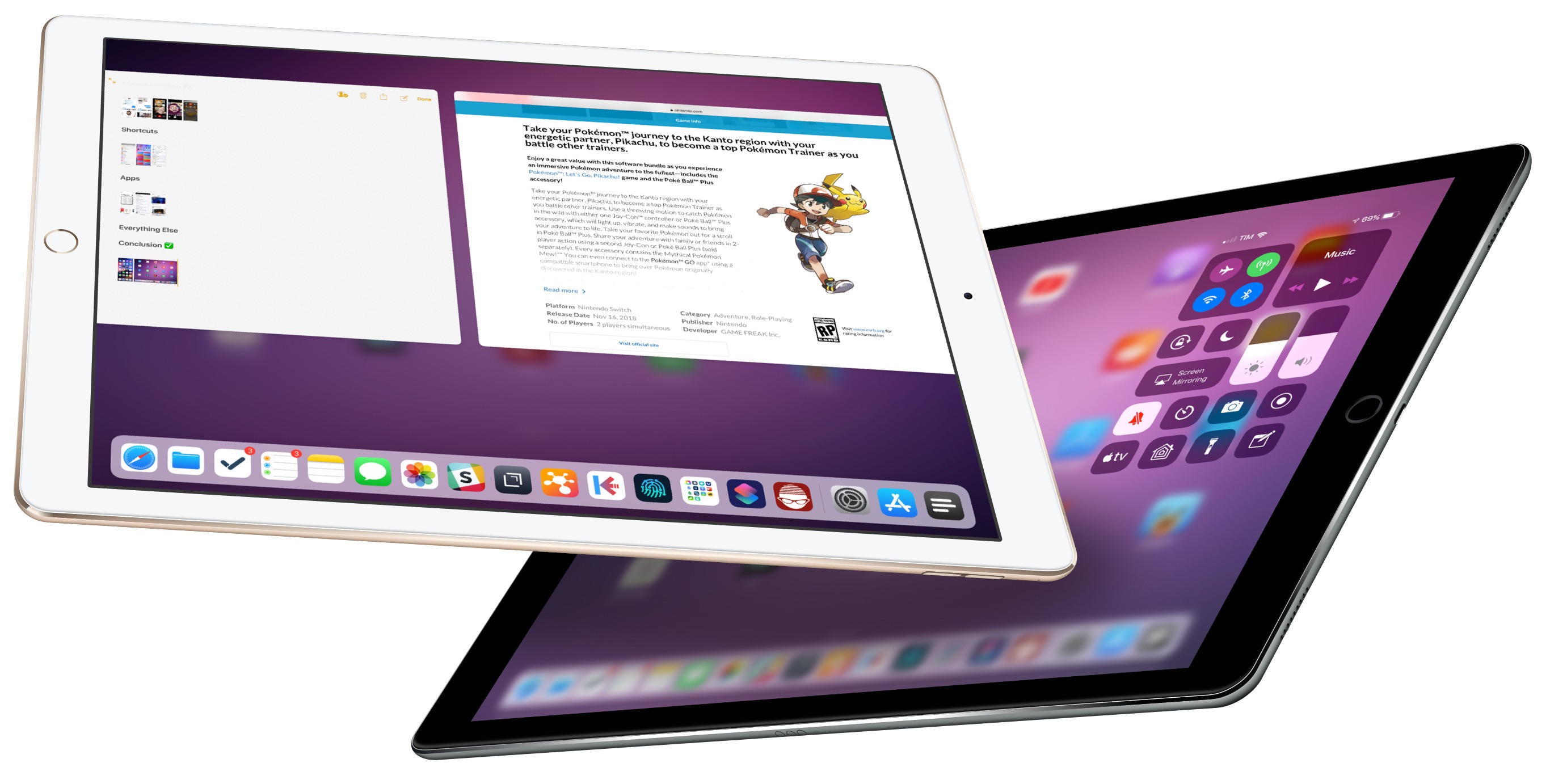
Let’s make something clear first. Aside from a couple newly-imported iPhone apps, there is only one notable iPad update in iOS 12: gestures. In iOS 12, the iPad adopts the same fluid gestural engine that has driven the iPhone X for the past year. A quick upward swipe from the bottom edge of the display exits the foreground app and returns to the home screen; a short swipe-and-pause gesture reveals the dock; a slightly longer swipe-and-pause opens the app switcher.
Here’s what the new gestures look like in action:
The iPad’s new multitasking gestures in iOS 12.Replay
As with the iPhone X, these revamped gestures are incredibly smooth and satisfying to perform. When you flick an app upwards, you can see its window shrink back into its icon on the home screen. The same sense of direct manipulation that permeates iPhone X multitasking is now embedded throughout every interaction on iPad. I’m especially fond of the animation produced by the gesture to enter multitasking: the most recent app from the app switcher quickly swoops in from the side and instantly “attaches” to the current app you’re holding, almost like a magnet, until you swipe far away enough from the switcher that the second app disappears and you can let the first one go back to the home screen.
But the best part of the iPad’s revised gestures is that you can now accomplish everything – be it closing apps or entering multitasking – with just one finger. This feels great in use and makes each interaction more natural and less disjointed than before. This isn’t explained in the interface, but you can even quickly swipe up and immediately move to the right (a semicircle, effectively) to navigate the app switcher horizontally, like an iPhone X.
All of these changes, of course, appear to be necessary measures to prepare for an iPad without a Home button, where interactions such as swiping up on a Home indicator or swiping across it to switch apps would make more sense. iOS 12’s redesigned iPad gestures seem to foreshadow iPhone X-inspired changes coming to the iPad hardware; from a technical standpoint, their implementation doesn’t disappoint. As I noted with the iPhone X before, these gestures redefine what it means to design an interface that is directly manipulated by the user; they perfectly complement last year’s drag and drop, and they look fantastic on the iPad Pro thanks to its ProMotion display. If there’s a company that can design and engineer fluid interfaces today, it’s Apple.
I was critical of iOS 12’s updated iPad gestures when I first got my hands on the beta in June. I thought Apple was prioritizing consistency with the iPhone X at all costs without treating the iPad as its own entity. There’s an argument to be made for following the iPhone’s UI paradigm too closely (more on this below), but, after three months, I believe Apple made the right call here.
Throughout the beta cycle, the company subtly tweaked the bottom-swipe gesture’s activation threshold to make it easier to reveal the dock. There is an adjustment period to rewire your brain and learn the differences between going to the home screen and opening the dock, but I think Apple’s engineers landed in a place where a quick flick and slower swipe are differentiated enough. After a few days of usage, you’ll find that revealing the dock in iOS 12 can still be as easy as in iOS 11 – with the added benefit that it’s also much easier to go back to the home screen now. iOS 12 strikes a good balance of blending the iPhone X’s interface with the iPad’s multitasking nature; it took Apple a few beta iterations to get it right, but I believe they succeeded. I wouldn’t mind having the same swipe-and-pause gesture to reveal the dock on the iPhone X too.
I do have some reservations about relocating Control Center to the upper-right corner of the screen – again, a change aimed at bringing more consistency between the iPhone X and iPad lines.
As a heavy user of the 12.9” iPad Pro, I find reaching to that corner of the display more ergonomically tiring than opening the app switcher, particularly if I’m using the device in laptop mode connected to a keyboard. Control Center still can’t be invoked with a keyboard shortcut, and, overall, I preferred iOS 11’s old placement.
There’s also the issue of tying Control Center to an area of the screen where three separate activation points coexist in close proximity to each other. In the span of a handful of pixels, that corner of the iPad’s display is where you can swipe to open Control Center, view notifications, or detach an app currently in Split View. Let me show you with another video:
The precision required by these gestures can be confusing for some users.Replay
If teaching users the differences between tap and hold/swipe and hold gestures wasn’t enough, imagine training them to memorize the intricacies of a virtual “corner” of the display that doesn’t have a notch to act as a physical boundary.
It’s possible to get used to the new placement of Control Center on iPad – some may even think the issues I mentioned above aren’t a big deal. Unlike the multitasking gestures however, I just don’t think Apple did as good a job in adapting an iPhone feature to the iPad’s larger canvas. Control Center in iOS 12 for iPad feels grafted on from the iPhone X with minimal consideration for the iPad’s ergonomics and form factor. More broadly, as I wrote in my review of the iPhone X, I still think Control Center is in the wrong spot – now on two platforms instead of one. At the very least, if Apple can’t find an optimal solution that can fit both the iPhone and iPad, perhaps it’s time for Control Center’s placement to become a user setting.
The iPad in iOS 12 is a platform that’s settling on a two-year schedule where hardware and software alternate with a typical tick-tock cadence.
When it comes to software, there is still so much left for the iPad to accomplish. The home screen needs a modernized vision that goes beyond a grid of icons; in-app Split View, still exclusive to Safari, should be an API for third-party developers too; Files continues to pale in comparison to the Mac’s Finder, particularly considering Finder’s Mojave updates with even more view options and new quick actions; apps like Things are showing Apple what it means to enable true, desktop-class keyboard control that isn’t just a handful of shortcuts. I don’t believe anyone who says there’s nowhere else for the iPad to go: the road ahead is long and paved with unaddressed questions about the future of laptops and what it means to be a “pro” iPad app. iOS 12 doesn’t answer any of these questions. For iPad, iOS 12 is a quiet release, just like iOS 10 was.
The few changes brought by Apple to the iPad in iOS 12 appear to be the manifestation of an “iPhone X fever” within the company, a desire to make sure that every iOS device, regardless of its resemblance to the iPhone X, adopts the smartphone’s iconic gesture-driven engine.
In the iPad’s case, Apple’s efforts only get halfway there. The new gestures are technically and visually remarkable; they have a learning curve, but ultimately they make the iPad easier to use and even more fun. When evaluated in the context of Control Center and a lack of home screen improvements, however, this year’s iPad software changes appear only skin-deep, seemingly pushed forward for the sake of consistency rather than unlocking deeper power for average iPad users – let alone the professional kind. Perhaps we’ll get used to these features and move on; perhaps we’ll have to process another major structural iPad change next year.