Apps
Improvements to Apple’s suite of built-in apps are more pronounced in iOS 12 compared to last year. From a full-blown iBooks relaunch to redesigned apps and even a brand new pre-installed one, iOS 12 makes for a fascinating exploration of Apple’s native software in 2018.
Safari
With Safari enjoying a relative level of maturity in terms of user-facing features36, Apple has started branching out into more aggressive adoption of new web technologies and system functionalities related to Safari, but not exclusive to the browser. Aside from one notable cosmetic improvement, this year is no different.
iCloud Keychain
iOS’ built-in account management and password generation tool, iCloud Keychain, is turning into one of the most interesting areas of focus for Apple, and I’m surprised it hasn’t evolved into a standalone Keychain app yet.
iOS 12 brings a substantial update to iCloud Keychain, which is now located in Settings ⇾ Passwords & Accounts ⇾ Website & App Passwords (you see why I think this should be its own app). You’ll immediately notice that the password list has been redesigned to accommodate website icons, which improves visual clarity and helps in finding your favorite websites more quickly. The other noticeable change is a password reuse warning icon that highlights accounts with a password that you reused somewhere else. When you tap on a domain with a warning next to it, you’ll be taken to the redesigned account screen that shows your username, password, and a message that lists the other websites where you reused the same password.
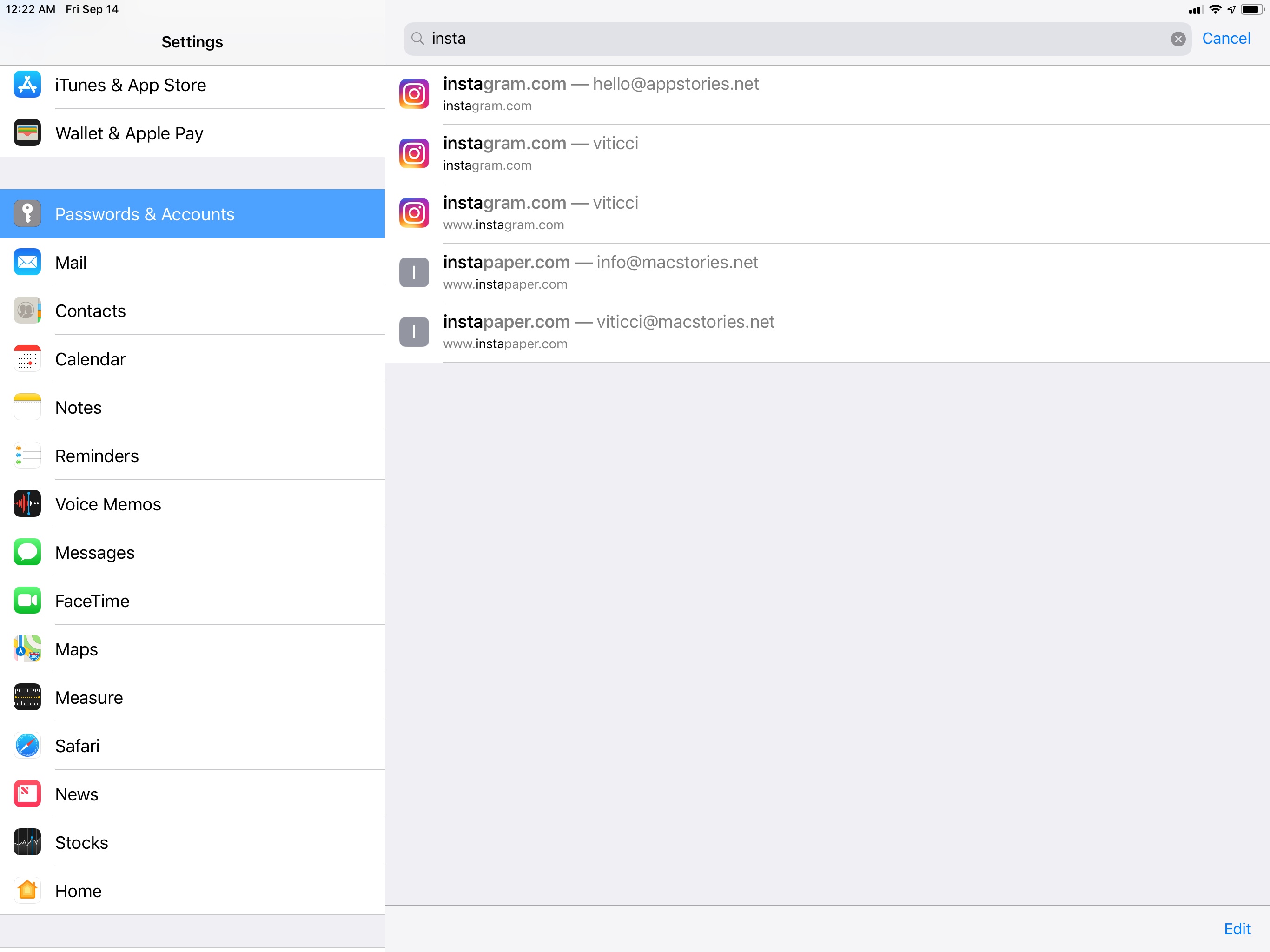
If iCloud Keychain detects a password you reused elsewhere, it’ll include a ‘Change Password on Website’ button that you can tap to open Safari View Controller for the selected website so you can log into your account and change your password.37
In my experience with this feature, I’ve found the warning useful, especially for old accounts I created years ago before I started religiously creating robust passwords for each of my accounts. I wish it was possible to mark certain passwords as “safe” despite being on different domains (for example, my amazon.it account is shared with amazon.co.uk as well, and iOS 12 presents a warning for it), but I’m just nitpicking at this point. For the vast majority of use cases, having a password reuse warning built into the system’s password manager is a fantastic idea.
Other improvements to the Passwords screen include the ability to tap a ‘+’ button in the main list to create new login credentials for a website from Settings. Additionally, you can tap and hold an account to bring up buttons to copy its username or password.38 Furthermore, iOS 12 lets you tap and hold passwords to share them with devices nearby via AirDrop.
The most important addition to iCloud Keychain in iOS 12, however, isn’t about what’s already stored in it, but how you can save new logins with strong and unique passwords.
Save New Passwords
After allowing users to easily log into their accounts in third-party apps with iOS 11’s Password AutoFill for apps, Apple is extending the technology in iOS 12 to the next logical step: creating new accounts in apps using Password AutoFill and saving those credentials into iCloud Keychain during the signup process.
As with last year’s AutoFill, account and password creation in apps requires iCloud Keychain to be enabled and only works with the Apple QuickType keyboard. Password AutoFill uses advanced heuristics to detect login and password fields even in apps that haven’t been updated for iOS 12 or AutoFill specifically.39 Also, in order to suggest an email address or username to use for a new account, iCloud Keychain needs to have at least one item already in it and the ‘AutoFill Passwords’ toggle has to be enabled in Settings ⇾ Passwords & Accounts.
If all these requirements are met when you hit a login screen with username or password fields, Password AutoFill will suggest existing accounts in the QuickType bar like before. When only one login item is available for the current website, Password AutoFill has an elegant new look with a minimized panel at the bottom of the screen. This contains a large button to log into a website with the last account you used, plus buttons to switch to the keyboard and view other accounts.
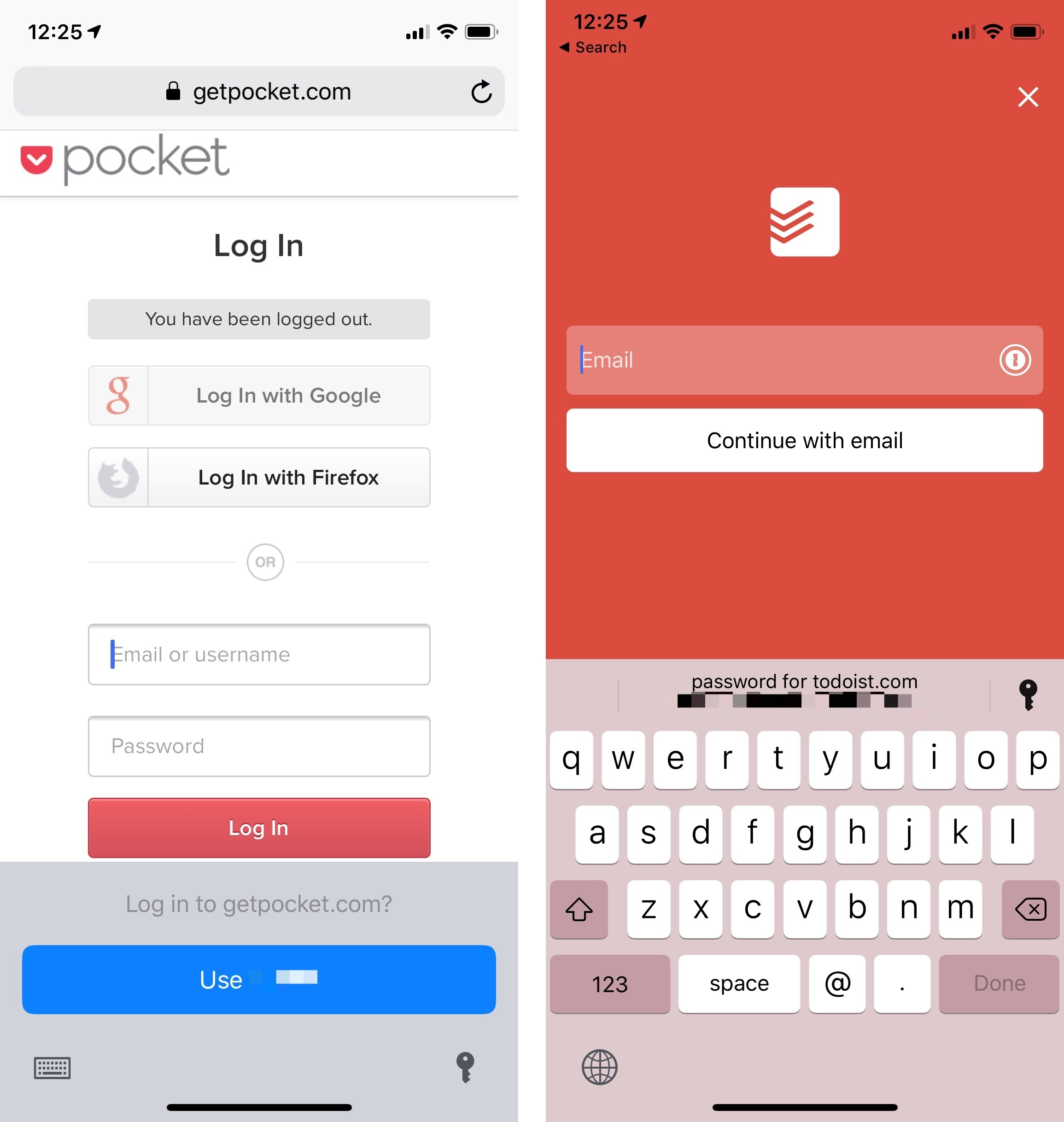
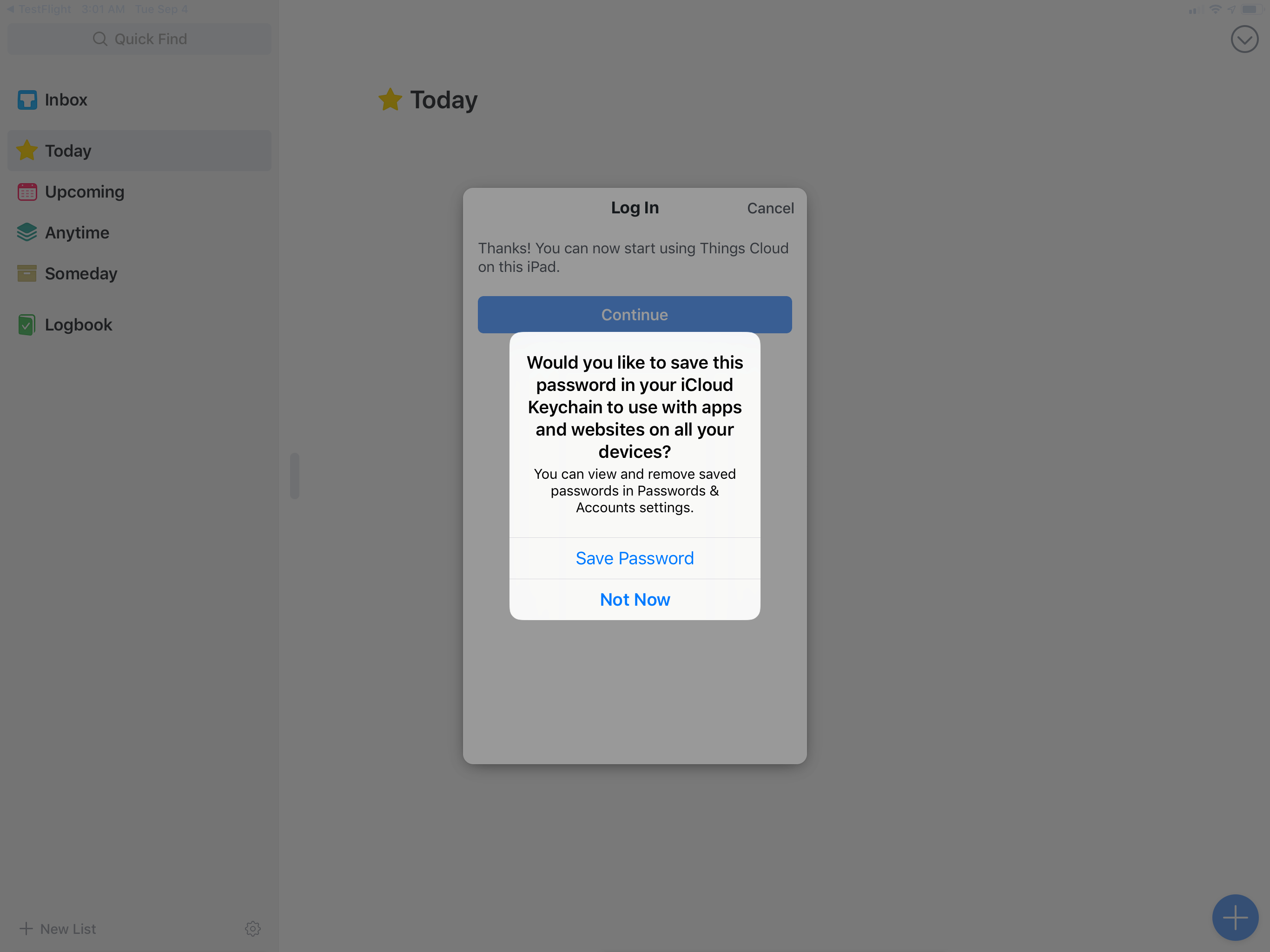
If iOS 12 detects a signup screen instead, the system will first check the eligibility of the app’s associated domain, and, upon recognizing a password field, it’ll automatically create a strong and unique password. Password AutoFill will ask if you want to accept the suggested strong password and save it in iCloud Keychain. iOS 12 gives you the option to type your own password too, but the ‘Use Strong Password’ button is the one selected by default and it’s presented as a compelling option: the password will be saved in iCloud Keychain, used by AutoFill on all your devices, and made available for search via Settings and Siri – for free.
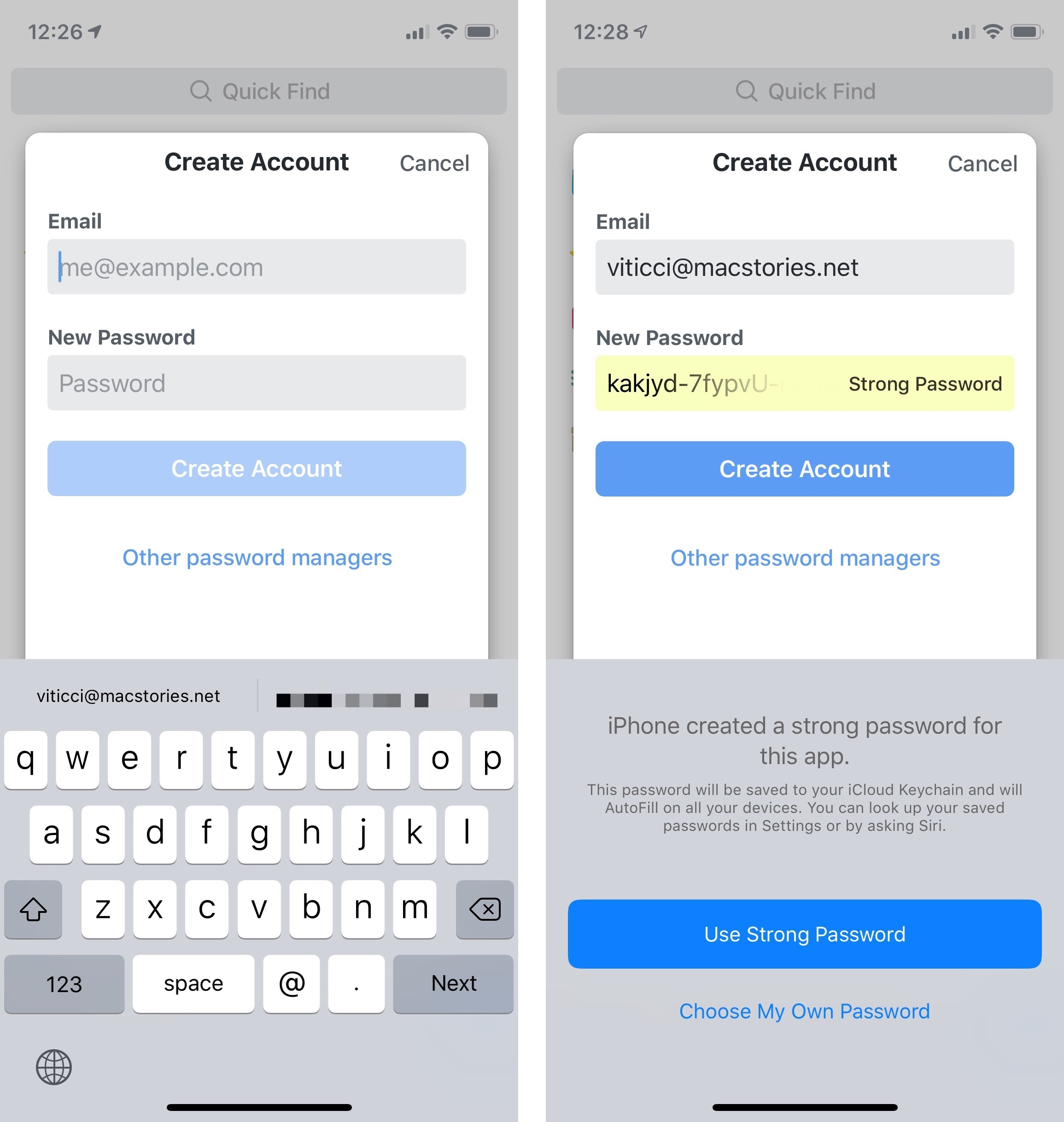
Creating a new account with a strong password in Things 3.7 for iOS 12. Both the username and password are suggested by the system.
After accepting a strong password recommendation, iOS 12 will bring up another prompt to save the password in iCloud Keychain. The entire workflow is seamless and perfectly integrated with iOS and doesn’t involve a web browser at all. In my tests with apps that hadn’t been updated for iOS 12 but which supported last year’s Password AutoFill, password creation worked flawlessly.
From a technical standpoint, there are a couple interesting things occurring behind the scenes. Suggested usernames are based on credentials you have already stored in iCloud Keychain, which means the more accounts you keep in Keychain, the more suggestions for different usernames you’ll get over time. Also, Apple is letting developers define their custom password rules for AutoFill if their service requires certain types or sequences of characters. These rules can be embedded in UIKit as descriptors for secure text input fields, and they can be formatted for HTML too; when Password AutoFill sees a custom password rule embedded in an app or webpage, it’ll create a strong password that can match those rules to be compatible with the password field’s requirements. Apple has even created a Password Validation Tool for developers, available on the web here.
Account and password creation inside apps was the last mile of iCloud Keychain and Password AutoFill, and Apple has provided an elegant, secure, and effortless solution to this in iOS 12. While the company is also opening up a Password Manager API to third parties (more below), having a free default option that supports an end-to-end account creation flow is extremely important for users. Apple’s goal with iCloud Keychain and Password AutoFill has always been removing the complexity inherent to password management by letting the system take care of it. Creating and saving new passwords from apps was an obvious challenge left to take on; the solution offered by iOS 12 is thoughtful, secure, and well integrated throughout the experience.
Security Code AutoFill
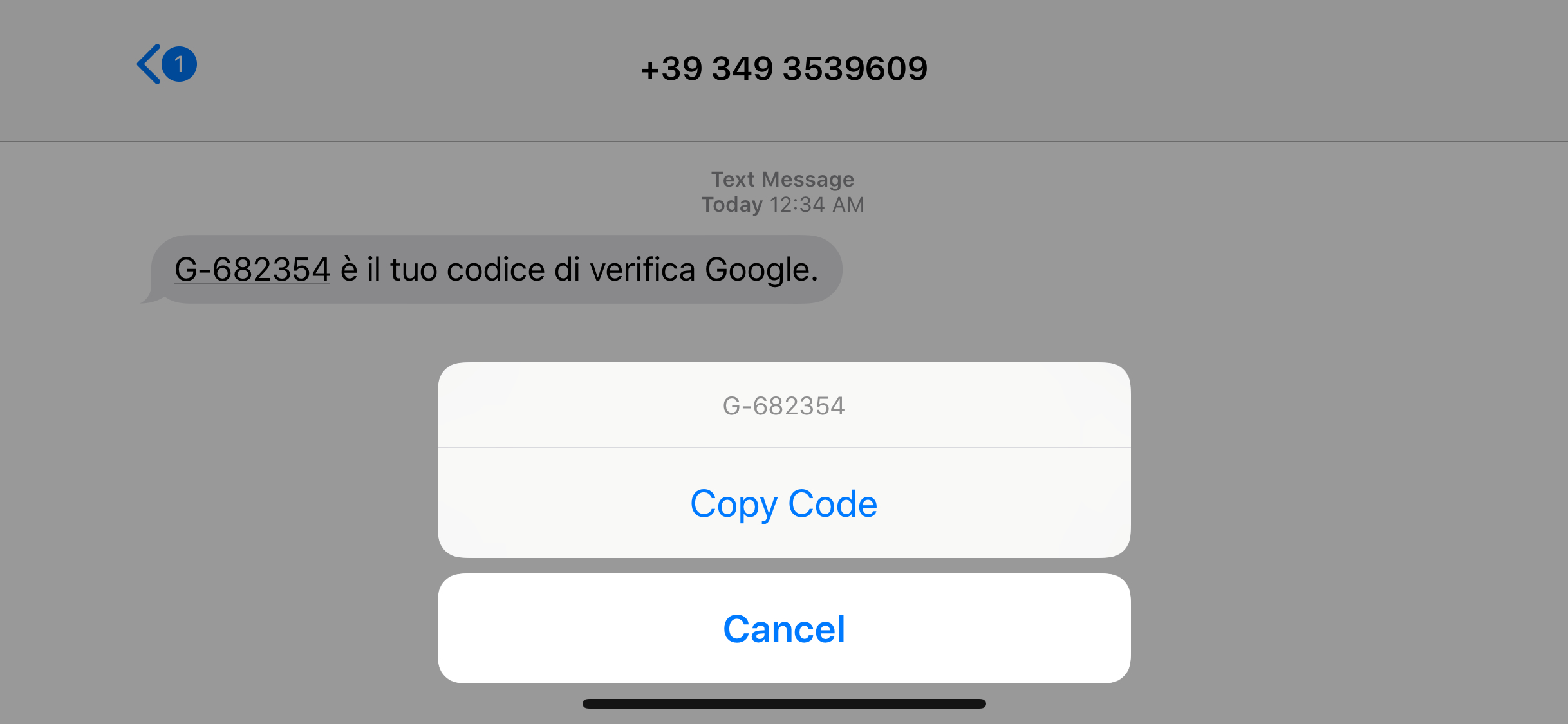
In one of my favorite touches of iOS 12, Apple has extended its AutoFill technology to support two-factor authentication codes sent via SMS. It works like magic: when you’re logging into a website or app and receive a code via SMS in Messages, the QuickType bar will instantly show you a button with a code that you can tap to AutoFill.
As you can see, it’s glorious:
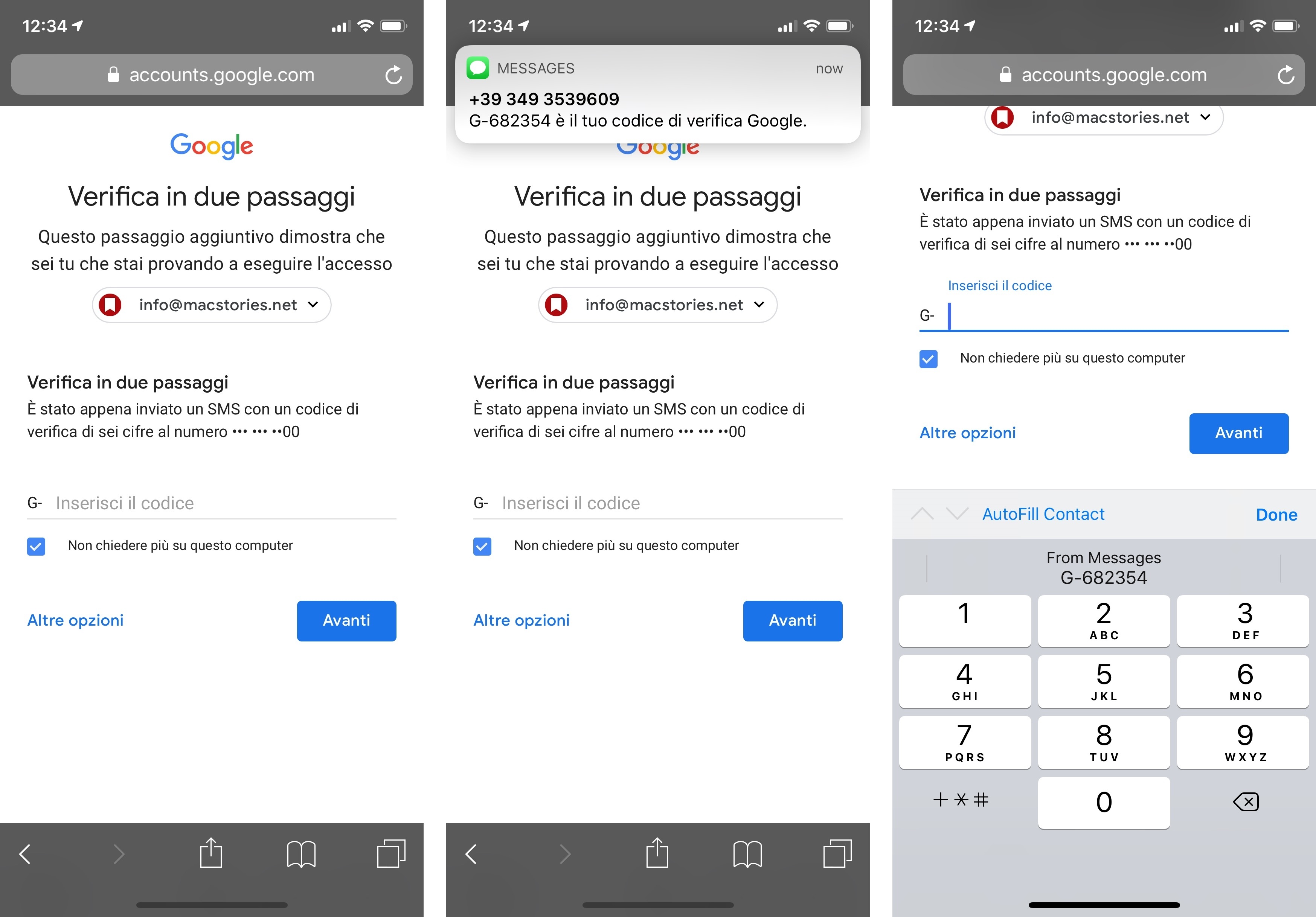
In Apple’s words, they wanted to remove the indignity of typing a security code yourself. We’ve all been there: the constant switching back and forth between an app and Messages to take a look at the code; getting the code wrong by one number and having to open Messages again. All of this is gone in iOS 12, and it makes using SMS-based two-factor authentication so much better than before.
Under the hood, security code AutoFill employs advanced data detectors to infer codes contained in messages in all the locales supported by QuickType’s predictive input. It’s only available for the QuickType keyboard, and Apple says they’ve run hundreds of tests for authentication messages of the most popular websites and online services to ensure perfect compatibility everywhere. To confirm that a security code has been recognized in Messages, you can tap on its message bubble if it’s underlined and you’ll see a new ‘Copy Code’ button.
While SMS-based two-factor authentication may be vulnerable to SIM hacking, it is sometimes the only option for websites that do not integrate with authenticator apps such as Google Authenticator and 1Password. Until Apple starts offering their own, app-based security code generator (maybe next year?), easier code AutoFill with Messages and the QuickType keyboard is an excellent addition to iOS’ password and login management features.
iCloud Keychain and Password AutoFill have become the best reasons to keep using Safari and Apple’s QuickType keyboard on iOS. With logins and strong password creation now available for every website and third-party app, iOS 12 offers a comprehensive suite of security tools for account management and password retrieval. For most people, iCloud Keychain is now a valid and powerful alternative to 1Password, and it’s great to see Apple iterating on it for every major iOS release.
Password Manager API
In the spirit of simplifying password management for users, Apple is also opening up Password AutoFill in iOS 12 to third-party password managers. While it doesn’t offer the same features of iCloud Keychain, this is a significant acknowledgment of the importance of password managers made by third-party developers.
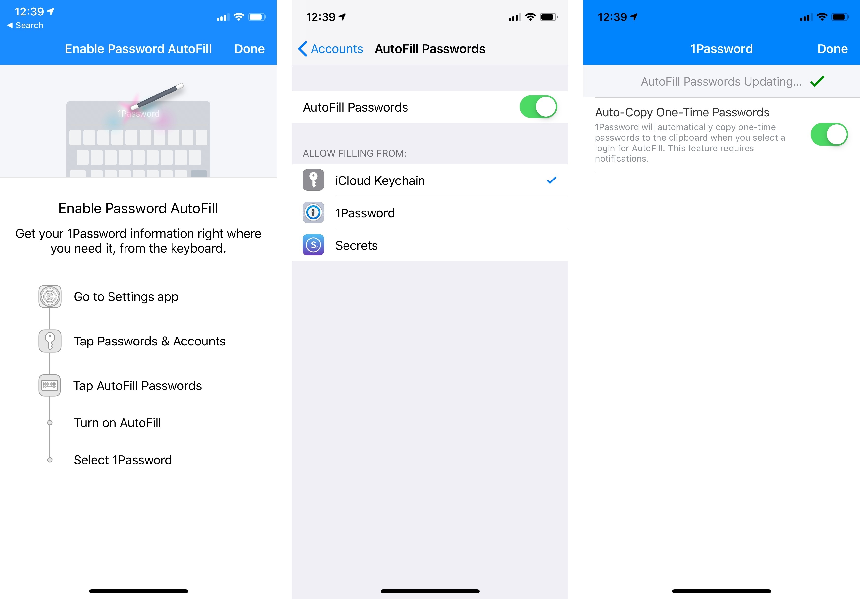
Let’s go over the limitations of this API first. Third-party password managers have to be enabled manually by users in Settings ⇾ Passwords & Accounts ⇾ AutoFill Passwords ⇾ Allow Filling From. The process of enabling a password manager is fairly clunky and reminiscent of adding a custom keyboard to iOS. As is the case with third-party keyboards, in fact, developers can’t bring up a native screen to enable a system-wide password manager from inside their apps; even worse, they can’t direct users to the specific page of Settings where third-party password managers can be activated. Expect to see a lot of in-app tutorials on how to enable AutoFill for password managers in iOS 12.
Furthermore, AutoFill for third-party password managers only supports filling existing logins; the ability to save new accounts and generate strong passwords is exclusive to iCloud Keychain in iOS 12. Similarly, security code AutoFill is only available for the Messages app; third-party password managers can’t fill their 2FA codes in compatible fields.
That said, as someone who uses both iCloud Keychain and 1Password, I find this initial support for third-party password managers to be a welcome change of mind by Apple. Limitations notwithstanding, the ability to see login items stored in apps such as 1Password or Secrets in the system’s QuickType keyboard is exceptional. The integration couldn’t be more intuitive: after enabling a password manager for AutoFill, you’ll gain multiple options in the list of available passwords you can open by tapping the key button in Password AutoFill. Choosing a third-party app from the list lets you authenticate with the app by opening its UI as an extension.

You can find logins from third-party password managers in QuickType, but you can also open an app’s native UI as a modal extension.
Unlike custom keyboards, you can’t leave multiple password managers enabled at the same time: only one can be active in addition to Apple’s iCloud Keychain. A login from the password manager you used most recently will be suggested as the primary item of AutoFill in QuickType; other login items will also be included in the full list of available passwords. You can recognize suggestions from third-party password managers because they carry the app’s name next to them.
In my tests with Secrets and 1Password this summer, having my passwords readily available in the system keyboard turned out to be a superior experience than opening the share sheet and launching an action extension. It’s the best of both worlds: I can fill logins from the keyboard with a couple of taps, and I can use data I’ve been storing in a third-party password manager for years. Unlike custom keyboards, the API is reliable and I never experienced a single crash.
As a longtime 1Password user, the app’s support for the QuickType keyboard in iOS 12 makes for one of its best system integrations to date. Upon first setting up the extension in Settings (a step that always brings up a confirmation screen from the associated app), you’ll be asked if you want to turn on notifications for one-time codes. This is how 1Password circumvents QuickType’s lack of native filling for two-factor authentication codes: upon selecting an account to fill a login in an app or webpage, the 1Password extension will copy its temporary six-digit code in the background. As in the Mac version of the app, you’ll receive a notification informing you that the code has been copied to the system clipboard.
If you have two-factor authentication enabled for your most important web accounts (and you really should), 1Password’s new AutoFill extension provides the most powerful and convenient login flow I’ve ever seen on iOS: it’s better than the old extension as it lives in the keyboard itself, and it’s superior to Apple’s iCloud Keychain because it supports one-time authentication codes. Apple might as well have designed this API for 1Password alone.
There’s another aspect worth considering: because third-party password managers integrate directly with Apple’s AutoFill engine, it means they also benefit from the work Apple does to recognize login fields in apps and webpages. With the old action extension approach, developers had to do the work of identifying username and password fields themselves; with this new API, Apple’s heuristics take care of the process, so most apps and websites will work out of the box for third-party password managers too.
In future versions of this API, I’d love to see full feature parity between iCloud Keychain and third-party password managers. I should be able to let 1Password generate strong passwords for me and save new account information into the app; at the very least, iOS should automatically fill one-time 2FA codes using third-party apps given the lack of support for this option in iCloud Keychain.
Despite these limitations, I applaud Apple’s decision to extend a hand to third-party password managers in iOS 12. The result is a more streamlined login process, with the freedom to use the password manager you prefer. Along with security code AutoFill, this is one of my favorite surprises in iOS 12.
Intelligent Tracking Prevention 2.0
Introduced last year as a machine learning-powered classifier to automatically block privacy-intruding web trackers, Intelligent Tracking Prevention is getting stronger and smarter in iOS 12.
In addition to regular trackers, Intelligent Tracking Prevention can now identify share, like, and comment buttons that are often repurposed as cross-site trackers once you’re logged into the social network they belong to. If Intelligent Tracking Prevention is enabled, iOS 12 will block those trackers by default; when you want to use them, Safari will request permission to see your activities on the third-party site. With this approach, users should see fewer retargeted ads served by social networks when they’re browsing the web in Safari, which I believe is good because those ads are creepy and users have no idea how much they’re being tracked across websites.
Additionally, Intelligent Tracking Prevention has been updated to counteract the practice known as fingerprinting. As it turns out, many websites these days can read your system configuration and list of installed fonts and use those data points not only for presenting a webpage (which should be the only purpose), but also to build a profile of your device. That profile can be used by ad companies to track you across the web and serve you targeted ads. Again, most users have no idea this is happening – I had no idea before Apple explained this – and Safari wants to help users regain the privacy they’re entitled to. In iOS 12, Intelligent Tracking Prevention purposefully presents your device with a simplified configuration profile that also omits your list of custom-installed fonts. This way, more iOS devices will look identical to trackers, and you should stop seeing those pesky ads that follow you on every website you visit.
Extras
There are a couple other features I’d like to highlight in Safari for iOS 12:
Favicons in tabs. I can’t believe it either. After years of lacking one of the features that was pushing users toward Google Chrome, Apple is finally allowing Safari to display website icons (also known as favicons) in tabs.

The feature needs to be enabled under Settings ⇾ Safari ⇾ Show Icons in Tabs, and it’s supported both on iOS and macOS. On iPad, icons are always shown in tabs except when Safari is running in a compact size class; on iPhone, icons are only visible in landscape (on compatible models) or in tab view. As someone who’s been jealous of tab icons in Chrome for a long time, I’m thrilled to see Apple supporting them on all their platforms now. I think icons help a lot when dealing with multiple open tabs, and they add a bit of color to Safari, which is fun.
New keyboard shortcuts. iOS 12 supports a series of new keyboard shortcuts in Safari for iPad that aren’t advertised in the UI:
- Go to Tab: ⌘1–9 (⌘ 1 to go to first tab, ⌘ 2 to go to second tab, etc.)
- Show Bookmarks: ⌘⌃1
- Show Reading List: ⌘⌃2
- Show History: ⌘⌃3
- Add Bookmark: ⌘D
- Previous Reading List item: ⌘⌥↑
- Next Reading List item: ⌘⌥↓
I don’t know why Apple isn’t showing these shortcuts in the discoverability overlay, but it’s good to see more consistency with the Mac’s counterpart of Safari.
Every year I praise Safari as Apple’s crown jewel. In iOS 12, Safari continues leading the industry in terms of password management and privacy-first design. Given our current times, I think those features are exactly what Apple should be focusing on.
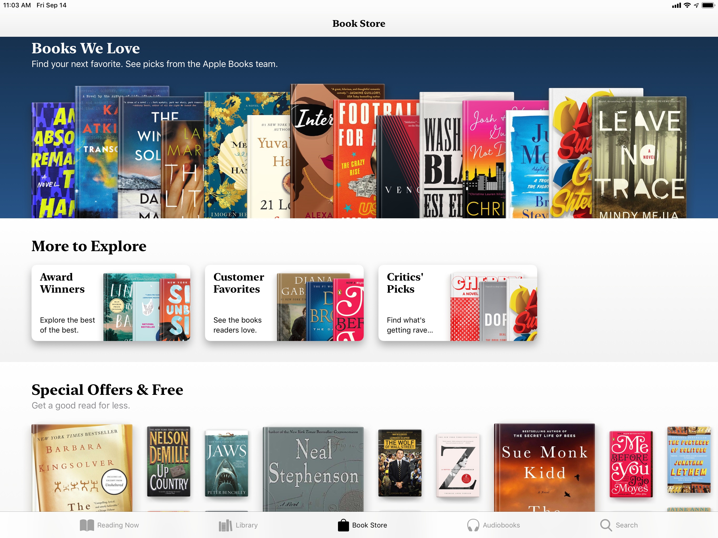
Books
I’m not an avid book reader, so I won’t rehash what Ryan has already written in his in-depth analysis of Apple Books, the rebranded and redesigned version of iBooks launching in iOS 12. Even as someone who’s only somewhat interested in reading digital books though, I want to highlight a few aspects of the Books app that stood out to me.
Visually speaking, Apple Books is striking. The company could have modeled Books after Apple Music and the App Store, like they did for Podcasts last year, and it would have been regarded as a successful redesign. Apple Books goes much farther than that.
The entire app exudes a genuine passion for books and literature. Every single section of the app has been reimagined and rebuilt from the ground up with design choices and navigational improvements that apply some of the design principles of Apple Music and the App Store in a way specifically meant for books and reading.
The app is heavy on typography as an interface element that lays out sections and sub-headings; Apple went as far as creating a new serif flavor of San Francisco for the occasion. In the new Book Store and Audiobooks tabs, books pop open as modal cards that use black-on-white buttons to hint at interactivity but that also help put the focus on books’ colorful covers. The way these cards look and behave is superior to similar implementations in Music and App Store as they’re easier to operate with one hand; now that I’ve played with Apple Books for a few weeks, I want other Apple apps to copy some of its traits.
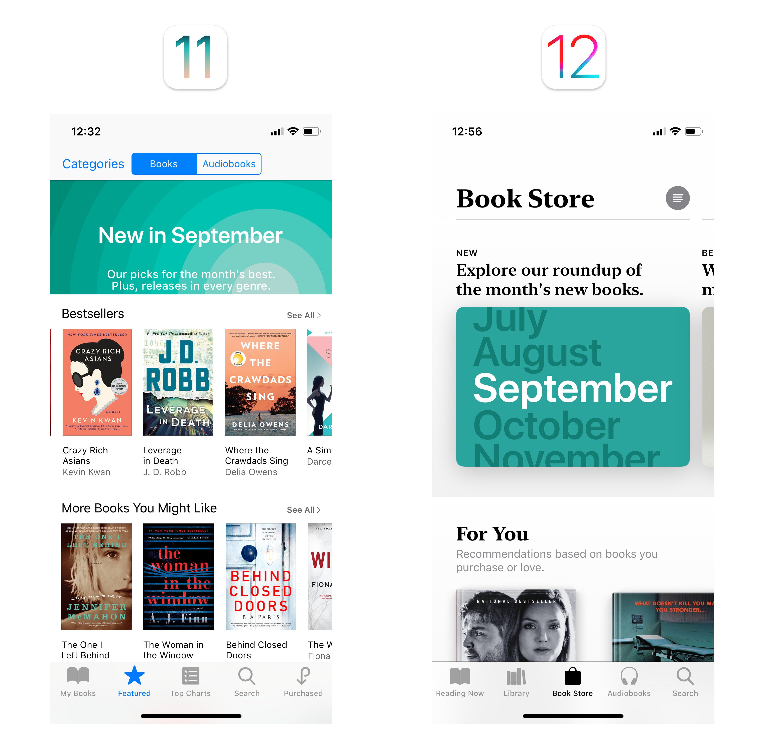
Browsing the new store is a pleasure even if you don’t read much. Apple’s editorial team has assembled a roster of collections, featured items, sub-sections, and top charts that are thoughtfully intermixed with algorithmic recommendations based on your previous purchases. This type of curation is different from the more dynamic and magazine-like approach of the App Store – there are no stories here – but is effective in guiding you across new releases, classics, and books suggested by critics.
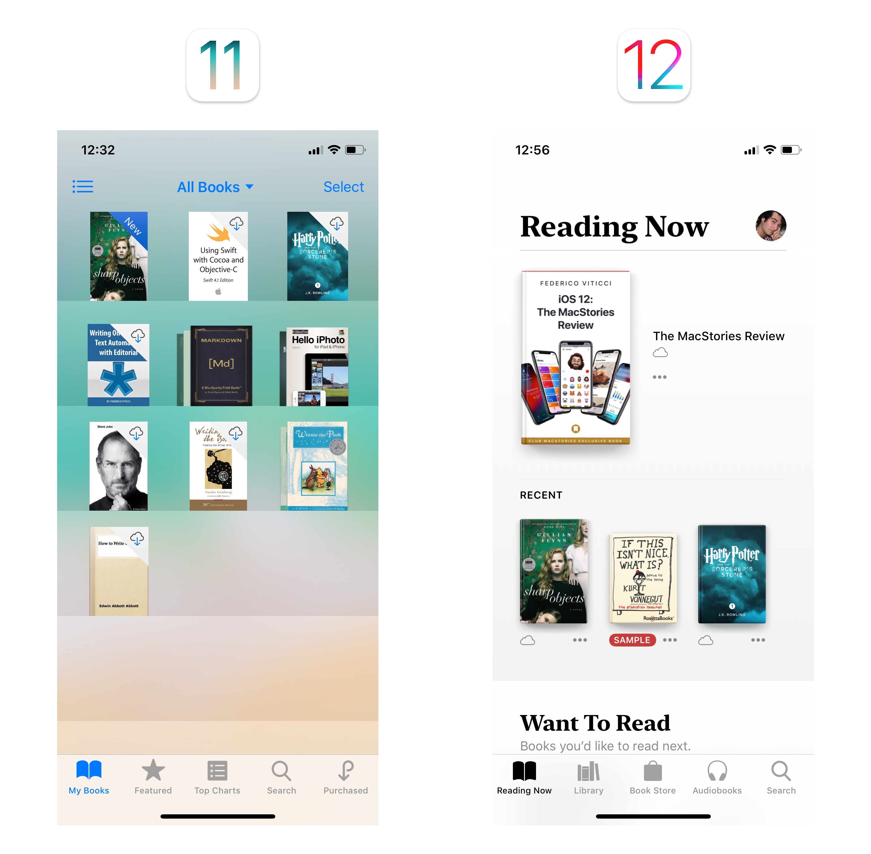
From an organization standpoint, the restructuring of Books around the Reading Now page makes perfect sense. The book you’ve been reading most recently is featured right at the top of the Reading Now view; in a delightful return of some parts of skeuomorphic design, it’s visualized as a 3D book for the first time in years.
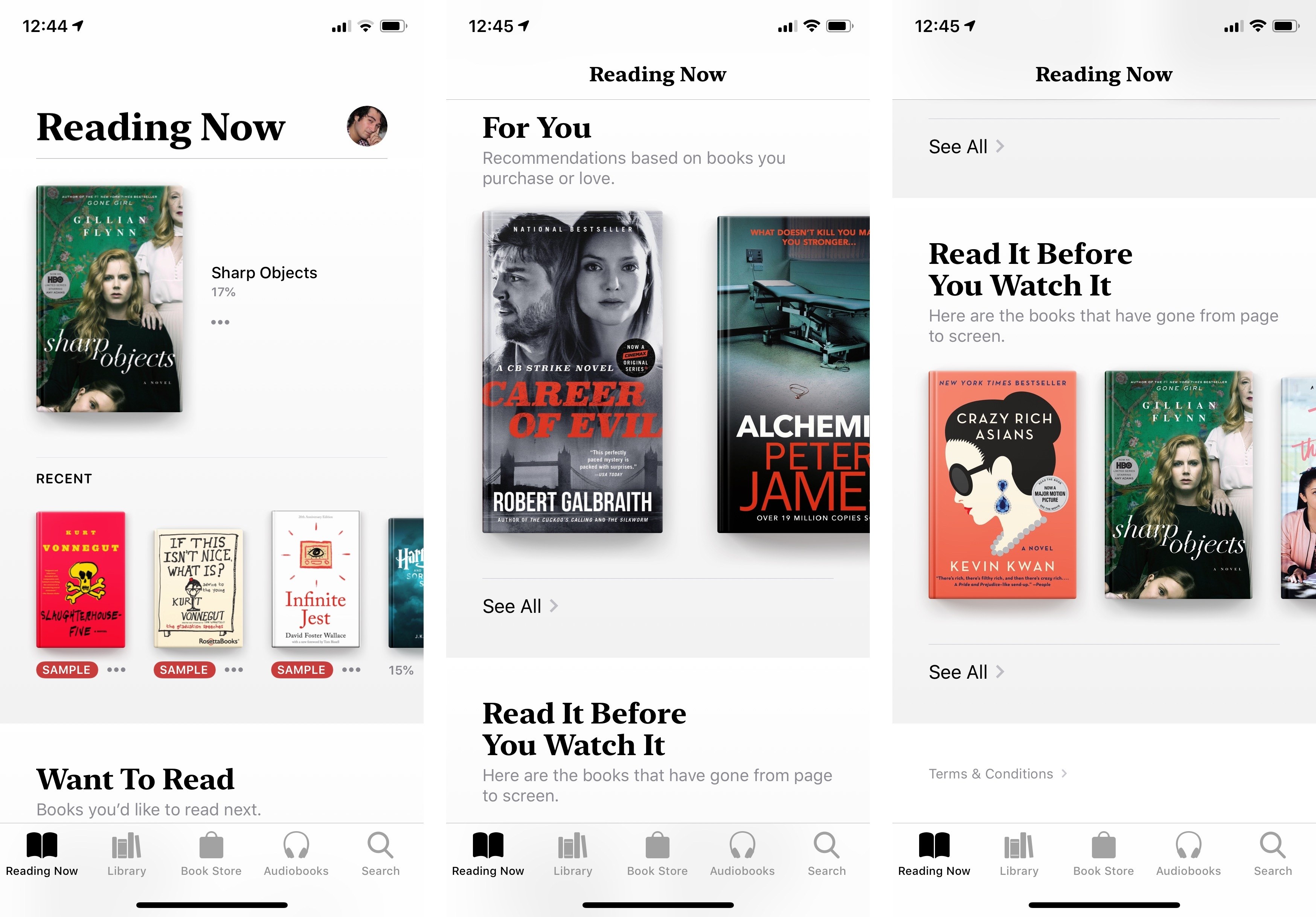
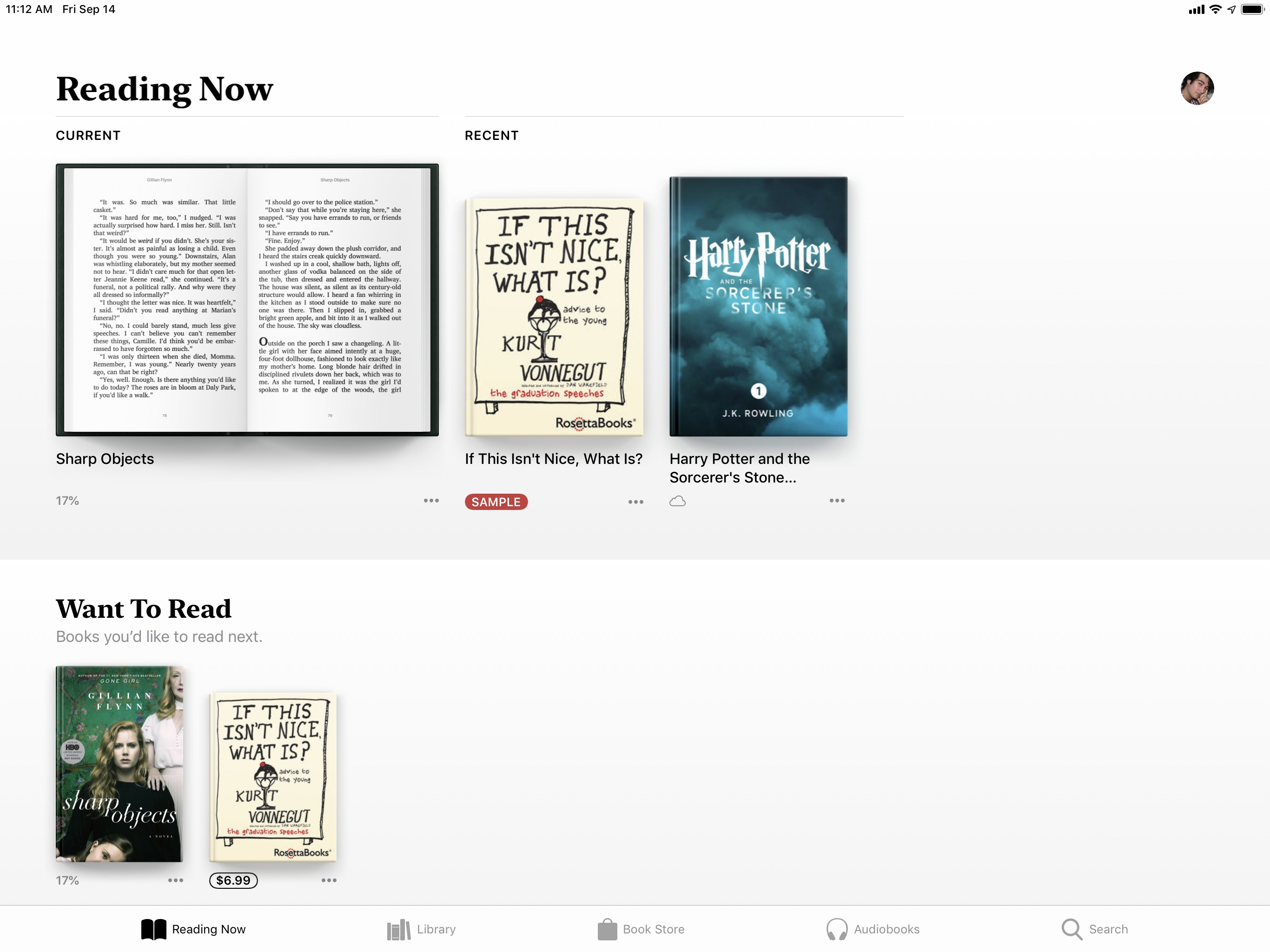
The new ‘Want to Read’ feature also enables curating a smaller selection of books you’d like to get to in the near future. Recommendations based on your purchase history are only available toward the lower end of the page – another sensible decision that underlines the importance of being able to continue reading where you left off. The main page of Books feels less like a file manager and more like a personal shelf without having to employ the actual visual metaphor of a realistic shelf. It’s a correct application of Apple’s mantra that “design is how it works”.
There is so much more to explore in the new Books app, particularly when it comes to its many beautiful design touches (the icon work and subtle use of drop shadows is phenomenal) but, like I said above, I’d prefer you check out Ryan’s complete exploration of the app. What I can say about Books is that, even though the reading experience hasn’t changed, everything around it makes me want to start reading again. I’m drawn to Apple Books in a way I never was to Amazon’s Kindle app; I feel compelled to explore the new store, check out editors’ recommendations, and get back into the habit of reading books that I lost several years ago. Apple Books is further confirmation that Apple isn’t kidding with their media strategy, and it’s an outstanding relaunch for iBooks.
Measure
It wouldn’t be a new iOS release without a new case of Sherlocking; iOS 12 delivers on this front with Measure, Apple’s response to the popular category of ARKit-powered measurement apps.
Measure is a new pre-installed iOS app that supports every device where ARKit is available. As its name suggests, the app lets you measure the length and surface of objects around you using augmented reality. As with other ARKit utilities, when you open the app you’ll have to go through an initial calibration process that asks you to move your device around a little so it can understand your surroundings. Once the camera has found a compatible surface to measure, the app will display a selection tool to add a first point in space.
It should be noted that Measure does a great job at suggesting points where you can start a measurement (such as the edges of objects) by almost “magnetically” attaching the point until you move farther away from the suggestion, which isn’t communicated with a label but is easy to understand. When you place a point with the + button, it creates a line that you can drag around until you find a second point to finish the measurement and view how long an object is. Length is previewed in real-time across the line, and once you’re done you can tap on the result box in the middle of the line, which will open a handy popup containing values in metric and imperial units that you can copy to the clipboard.
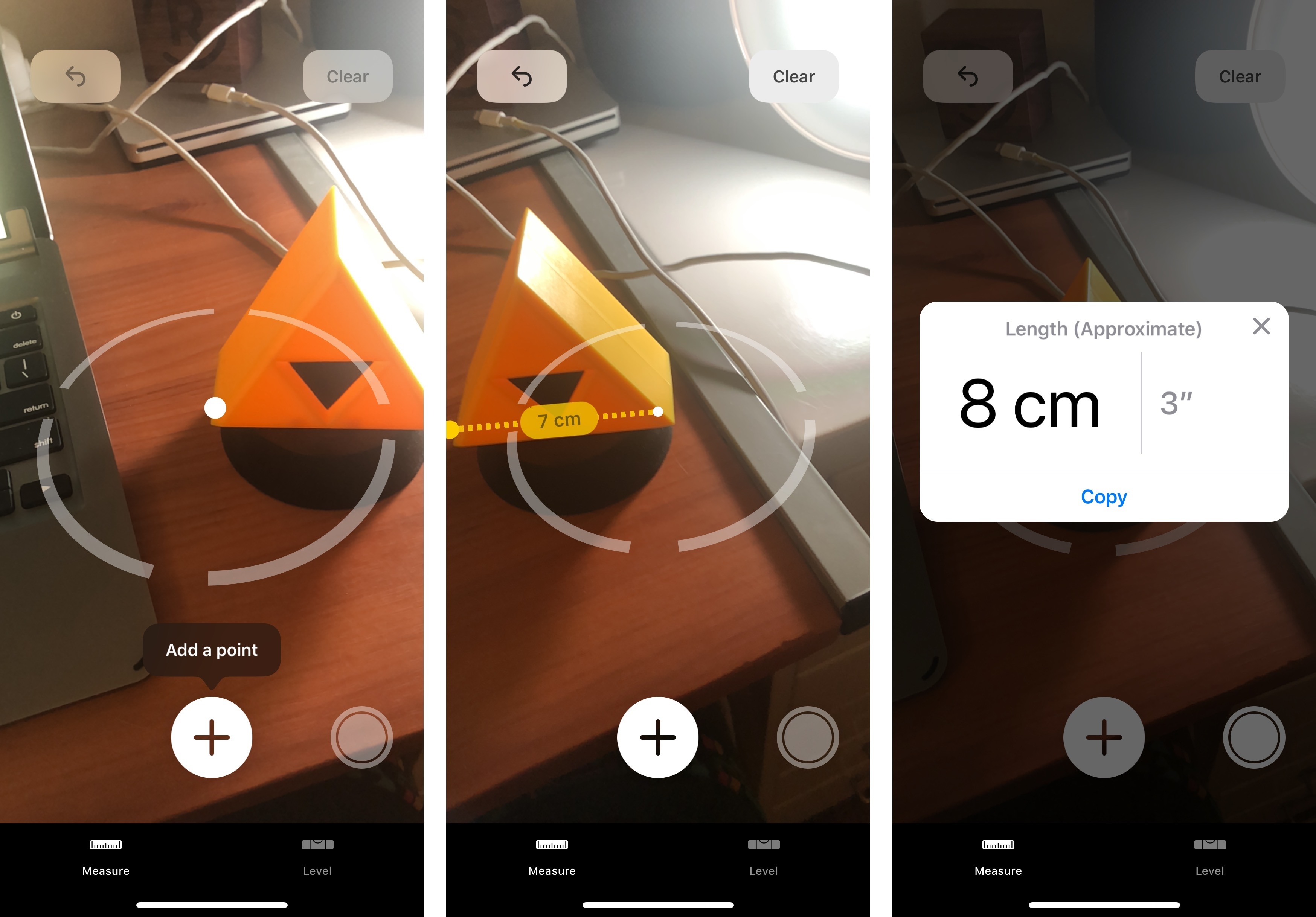
In terms of AR design, Apple has done a remarkable job with Measure, even in the smallest details of the experience. When you place a point, you feel a haptic tap; similarly, when you point with the camera at an existing point or unit of measurement, you feel another tap and the selection tool snaps to the item you’re pointing at. The combination of haptic feedback and automatic selection makes interacting with the app feel natural and fun. The animations when you tap on a unit to enlarge the details popup are well done and it’s especially impressive to see these interface elements animate in the physical world.
There are other features worth mentioning in the Measure app. The Level tool, previously available in Compass, has now been integrated in Measure as a second tab at the bottom. More importantly, Measure can also take advantage of ARKit’s improved shape recognition in iOS 12 to detect rectangles inside objects. These can be posters, computer displays, documents, or anything that contains a rectangular shape recognized by ARKit. When a shape is recognized, Measure previews it directly onto the object and allows you to add a rectangle, which will then let you check the length of each side as well as the total surface area. Now I know that one side of a Split View on my iPad Pro is 228 square centimeters.
Measure doesn’t offer all the advanced options and settings we’ve seen in competing apps such as MeasureKit and Tape Measure. It is, however, a great introduction for iOS users to ARKit, a technology that Apple is betting heavily on and which lacked a proper system showcase until today. Measure may not be a revolutionary idea a year after the debut of ARKit, but I’ve found it reliable and easy to use, and it’s important for Apple to start showing what they can build with ARKit.
Camera
Improvements to the Camera app in iOS 12 are all about enhancing Portrait mode and depth capture for photo and video.
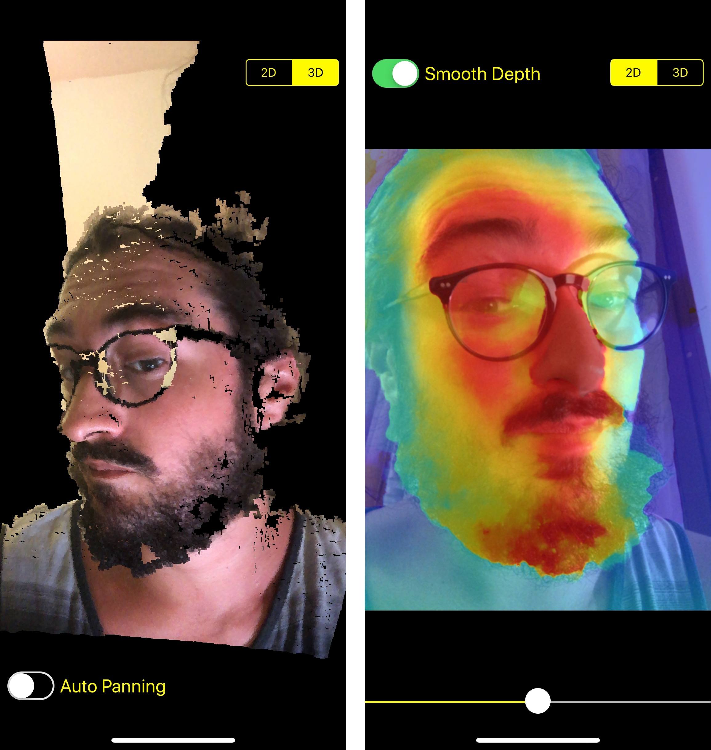
iOS 12 introduces a new API called Portrait Segmentation. This technology allows for the separation of layers in a photo from foreground to the background in a way that is more accurate, and with support for finer details than the depth API launched in iOS 11. Portrait Segmentation is available for the front and rear-facing cameras on devices that can capture Portrait photos, and it’s only available when people are in the scene.

The old depth API for a Portrait shot (center) compared to the new Portrait Segmentation API in iOS 12. Notice the better separation from the background and finer details for hair. You can compare these APIs in an upcoming version of the Halide app.
With the Portrait Segmentation API, iOS 12 can generate a new type of depth map called a “Portrait effect matte”. The matte is a high-quality mask for a person40 in the foreground of a Portrait shot that works better than regular disparity maps for details such as hair. Unlike depth data, which is always made available to apps that use the depth API when capturing photos, the effect matte may or may not be available.41 As a consequence of these improvements, Portrait Lighting is officially out of beta in iOS 12, and Apple claims that certain effects such as Stage Light and Stage Light Mono are vastly improved from iOS 11.
Although not perfect yet, and perhaps still behind some aspects of the computational photography of Pixel phones, I have found Portrait mode to be markedly better in iOS 12 compared to last year. If you’re dealing with a good Portrait shot, the Stage Light effects are actually passable now, particularly the Mono flavor; I’m not a professional photographer, but I think Portrait mode generally does a better job at separating hair from the background now, resulting in more pleasing and eye-catching shots. Opening up the Depth API last year has led to the creation of some incredible Portrait-enabled third-party apps; I can’t wait to see what developers will do with the new Segmentation API.
Finally, a quick note on the TrueDepth camera. In iOS 12, Apple is allowing third-party apps to read a real-time stream of 2D and 3D depth data captured by the front-facing TrueDepth camera. With this new API, developers can access a stream of information that determines the proximity of pixels to the TrueDepth camera, thus enabling the segmentation of background and foreground in real-time video.
Although I haven’t been able to test any examples of this functionality besides the demo app provided by Apple, I believe we’re going to see several apps take advantage of it to offer Clips-like backdrop features to put you in a virtual scene when capturing video. If the results are anything like Clips’ TrueDepth real-time filters, this category of apps will be one to watch closely over the next few months.
- See: in-app split view, content blockers, automatic Reader mode. ↩
- The latest version of Safari uses a Well-Known URI spec (proposed by Apple) to give websites a chance to redirect users to the correct webpage for changing a password. You can read more details in this thread by Safari's Ricky Mondello. ↩
- As I mentioned before, you can also ask Siri to open one of your accounts directly. ↩
- However, Apple strongly recommends associating a web domain with an app (the same feature underlying Universal Links) and requires developers to use secure text input fields in their apps. ↩
- Alas, dogs are not supported by this new API. ↩
- There is, of course, another API for developers to check whether they're dealing with an old depth disparity map or the new matte one in iOS 12. ↩