Do Not Disturb, Notifications, and Screen Time
Over the past 10 years, the iPhone and App Store have redefined our relationship with apps, which are now woven into our daily lives like never before. It’s difficult, if not downright impossible, to think back to a time when we couldn’t get instant directions to any place on Earth, be in touch with friends far and near, or receive breaking news alerts for global events. As the company at the forefront of mobile innovation, Apple has directly enabled all of us to be more connected, productive, or entertained by having a tiny Internet communicator in our pockets. Sometimes perhaps to a fault.
I don’t need to lecture anyone on how smartphone addiction has become a real phenomenon with potentially worrisome effects on kids in developmental ages or society in general. While we may wonder how we ever navigated the world or stayed in touch with family without a smartphone, we’ve reached the point where many of us have begun nostalgically remembering the days when we couldn’t constantly divert our attention to the latest stories on Instagram or horrible events being shared on Twitter. To paraphrase Dr. Ian Malcolm, we were so preoccupied by the fact that we could center our habits around apps, we didn’t stop to think if we should. Smartphones and apps have brought incredible improvements to our lives; at the same time, we’re also more distracted and stressed than ever because of them. This new kind of “digital addiction” has created a set of unexplored problems, and we don’t know what the consequences of this smartphone dependency will be on human psychology in the long term.
Technology companies believe they can help restore a healthier balance by providing new tools to let us be more mindful of our smartphone and app usage. It’s fascinating to observe how tech giants are addressing these concerns; after all, they’re the ones trying to sell more powerful phones every year and profiting off engagement metrics on social networks and mobile games.
Rather than being an admission of guilt, Apple’s message for iOS 12’s digital well-being features feels considerate and honest. Some apps demand more time and attention than we may even realize as we’re using them. The fear of missing out cleverly exploited by social networks is making us more distracted and has become a self-feeding habit we can’t easily break out of. With iOS 12, Apple is trying to help us on three fronts by making it easier to limit distractions, focus on what’s important, and understand how we spend our time with iOS devices.
Do Not Disturb
Apple’s initiative starts with a smarter, more integrated Do Not Disturb. While these changes aren’t as dramatic or customizable as I would have hoped, they’re a good first step.
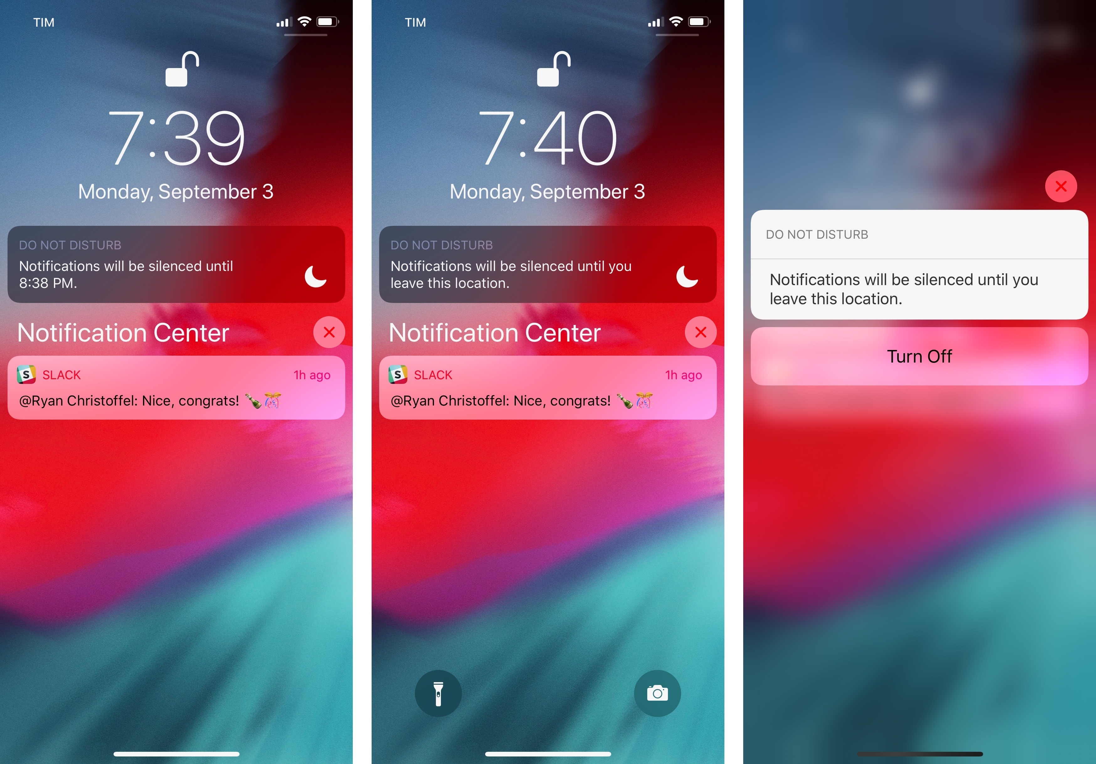
The main addition to Do Not Disturb in iOS 12 is the ability to enable it for different time periods suggested in Control Center or throughout the OS via Siri. Pressing on the Do Not Disturb icon in Control Center reveals an expanded platter with buttons to activate it for 1 hour, until the evening/next morning, or until you leave the current location. If a calendar event is occurring at the time you open Control Center, the Do Not Disturb platter will also offer you an option to activate it until the event is over.
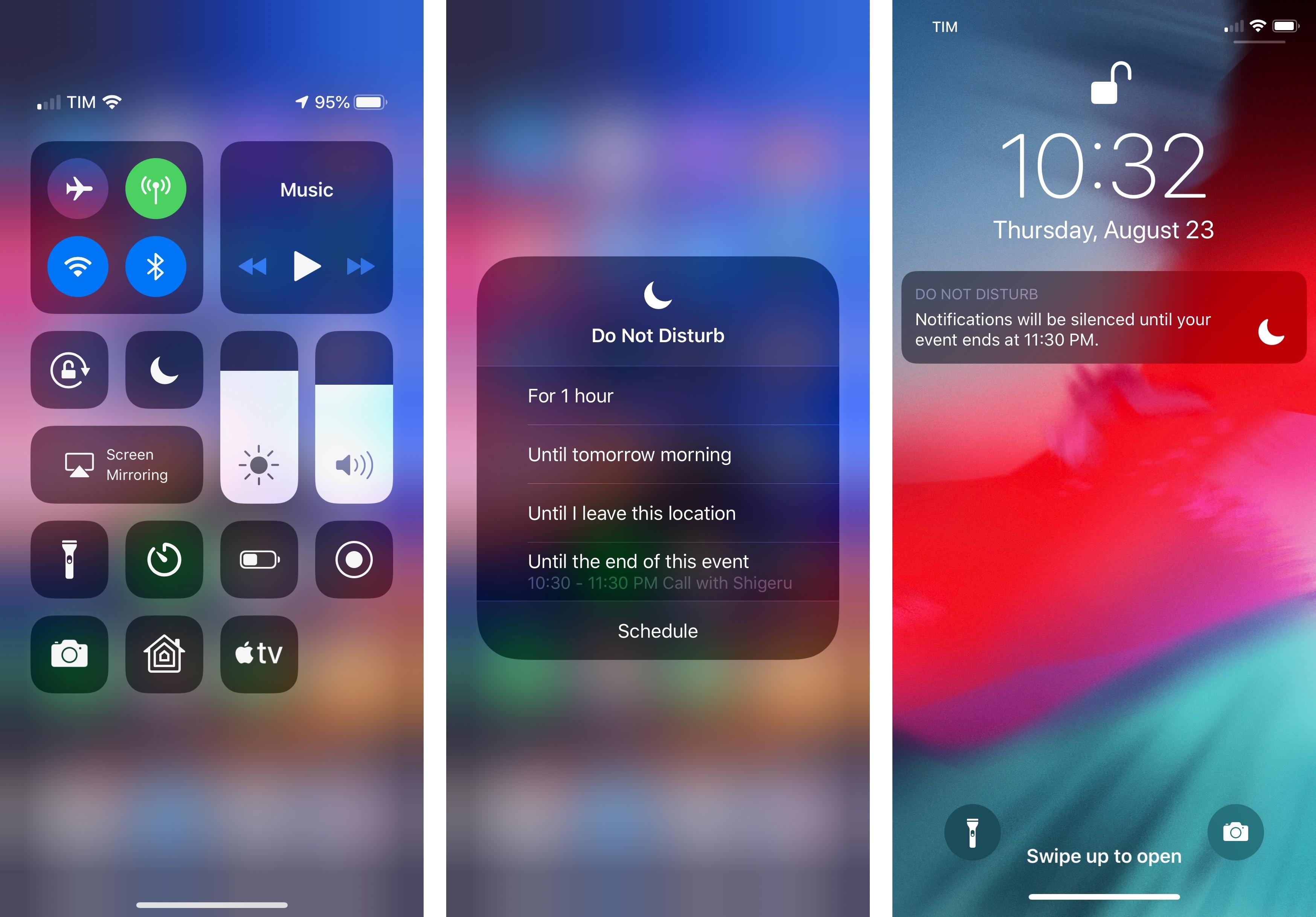
These suggestions open up Do Not Disturb to some interesting new possibilities. The location-based geofence, for instance, means you can enable Do Not Disturb at work and automatically resume notifications when you’ve left the office. If a meeting is on your calendar, you’ll see a button to enable Do Not Disturb until the meeting is over. Or perhaps you’re at the park walking the dogs and don’t want to receive any notifications – activate Do Not Disturb for 1 hour and your iPhone won’t bother you anymore. No matter which option you choose, you’ll always see a new dark notification on the lock screen (used in iOS 12 by shortcuts and audio controls too) that tells you Do Not Disturb is enabled and lets you turn it off by pressing in on the alert.
As I’ll explore later in this review, these activation methods, plus other intelligent shortcuts to enable Do Not Disturb, can also be suggested by Siri on the lock screen and in Search. Do Not Disturb is a new action in the Shortcuts app too, featuring the same options exposed in Control Center.
I should mention one last Do Not Disturb integration: Bedtime. In iOS 12, you can automatically silence calls and notifications during Bedtime. This can be enabled in Settings ⇾ Do Not Disturb ⇾ Scheduled or in the Bedtime Options screen in the Clock app. While this behavior is mostly comparable to what happens when Do Not Disturb is set on a schedule, the Bedtime flavor has a couple of unique differences.
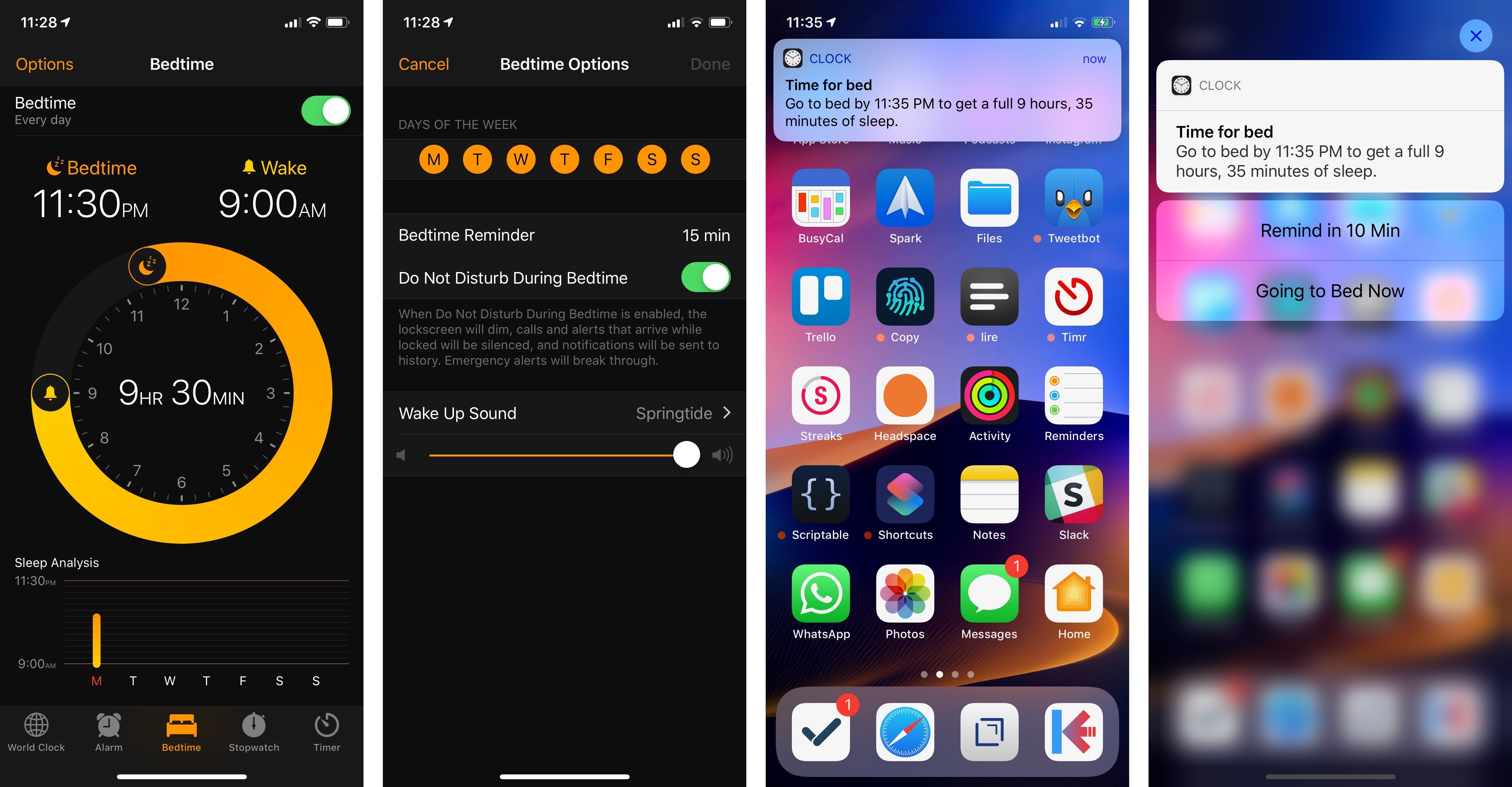
When your device is in Do Not Disturb During Bedtime mode, waking it will show you a dimmed and empty lock screen with a single Do Not Disturb notification. The approach works well as it helps you spot the time more easily at night (the white clock stands out against the dimmed background) and prevents the anxiety of being inundated with a barrage of notifications. Out of sight, out of mind.
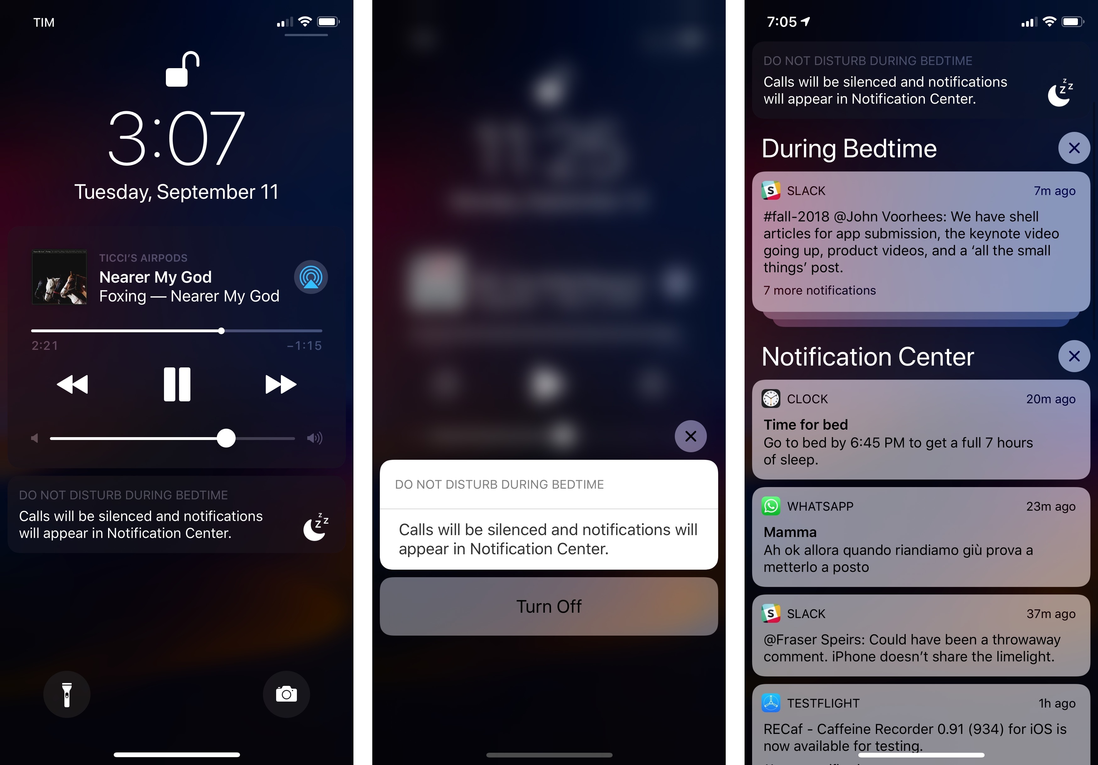
While in Do Not Disturb During Bedtime, notifications are sent to Notification Center, which is now clearly separated from the lock screen. If you want to see your notifications, you can swipe up in the middle of the lock screen to find a special ‘During Bedtime’ section of Notification Center that only contains notifications you received during Bedtime.
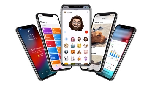
Finally – and this is the best part – when you disable Do Not Disturb During Bedtime, you will be greeted with a nice full-screen message that says ‘Good Morning/Afternoon’ (depending on what your sleep schedule is like) and displays the current weather conditions with a brief forecast.
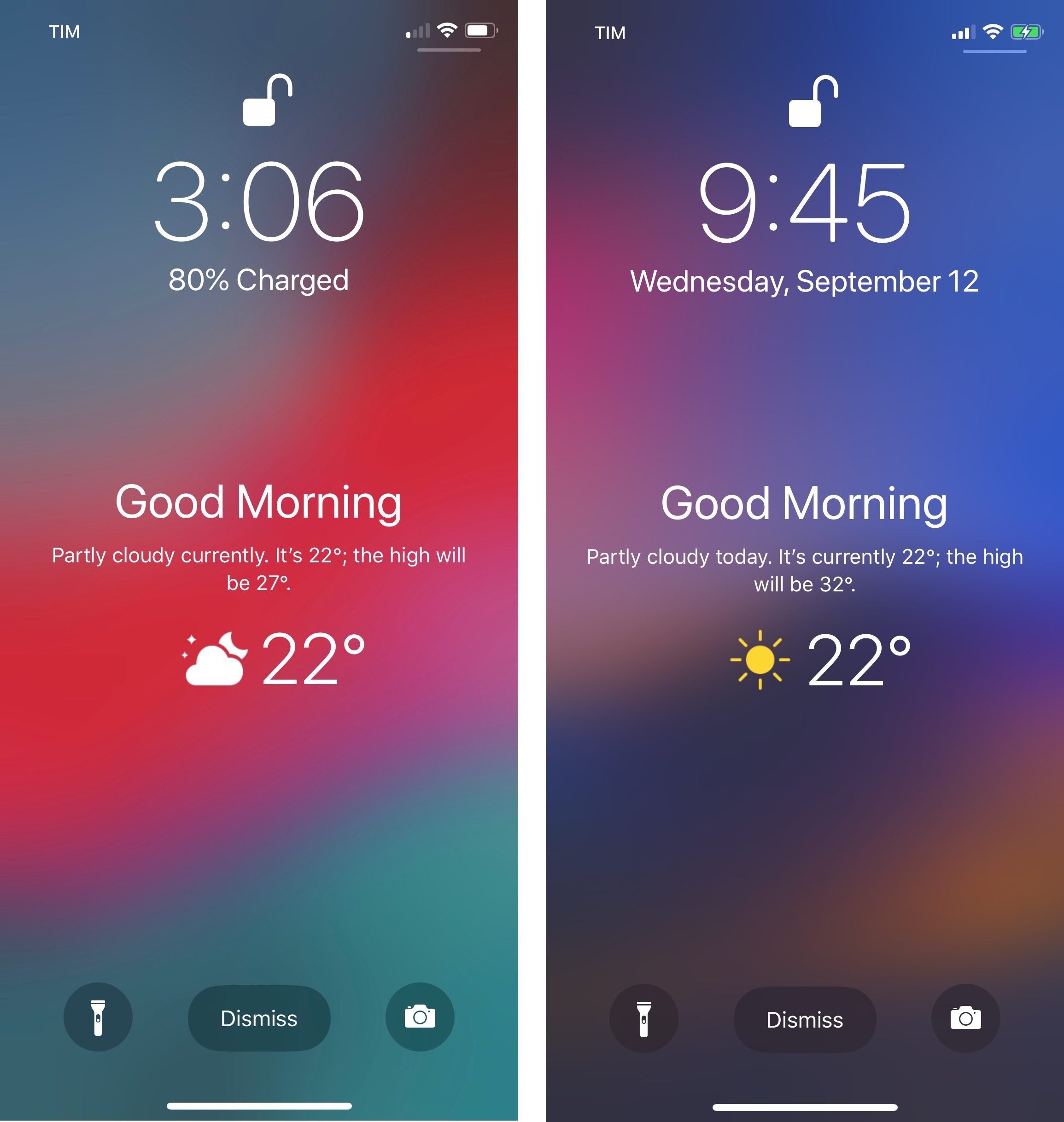
The idea is that rather than having the lock screen immediately explode with notifications in the morning, you get to wake up and be greeted by a calm message that eases you into the day before you move on to missed notifications and everything else. It’s a delightful touch and an example of humane design.4 If Apple ever attempts to do a “smart Siri lock screen” for iOS5, I’d like them to continue down this path.
In the three months I’ve spent on iOS 12, I’ve grown to appreciate the ability to silence notifications for a short period of time or, say, when I’m shopping with my girlfriend for a few hours and don’t want to be distracted by anything or anyone. Even though they’re relatively small additions, I genuinely believe these changes have helped me be more present and focused; the new options in Control Center are more flexible than enabling Do Not Disturb manually or on a fixed schedule. I’m also trying to establish a new morning routine, and the combination of Bedtime with Do Not Disturb is helping me avoid notifications at night and wake up to a nice weather forecast.
As much as I admire the effort Apple put into extending Do Not Disturb, I’m also surprised they didn’t go the extra mile and make the feature even more customizable.
My complaints are twofold: Do Not Disturb lacks any kind of automatic trigger and you can’t create personalized, fine-grained custom schedules for certain apps or days of the week. You can’t have Do Not Disturb be automatically engaged when you arrive at a specific location; you have to manually turn it on once you’re there. I’d love to set up geofence-based rules that enable Do Not Disturb behind the scenes whenever I arrive at the supermarket, the mall, or the dog park; none of this is possible yet. Background Do Not Disturb activation without user input must be something that Apple feels iffy about (there’s still no way for Do Not Disturb to automatically turn on when you’re watching a video, for example).
On a similar note, the scheduling feature of Do Not Disturb is still barebones compared to what Apple has done elsewhere in iOS 12. You can’t create custom time ranges for specific days of the week (I’d be more aggressive with Do Not Disturb on weekdays and more lenient over the weekend) and you can’t define app-based overrides where Do Not Disturb is always enabled or turned off for certain apps regardless of the main system setting.
In the end, while I’d like Do Not Disturb to become smarter and more integrated with apps, its changes in iOS 12 are convenient and helpful. I’m using Do Not Disturb more, which has reduced my notification-induced stress and nudged me to be more aware of people around me in social situations. As I concluded with Do Not Disturb While Driving last year, these features can have a positive impact at scale across millions of different lifestyles that is hard to comprehend.
Do Not Disturb, however, is only a piece of Apple’s digital well-being strategy, and, arguably, a mere stopgap for a bigger problem.
Notifications
Underlying most of our grievances about digital distractions and a constant sense of overwhelmedness is one basic truth: Apple’s iOS notification system has been a subpar experience for too long.
While Google was iterating on Android’s already superior notification design and interaction model, Apple was busy redesigning notifications or confusing users with the difference between Cover Sheet and Notification Center. As a result, not only did iOS notifications grow stale with time, at their very core they were based on a flawed idea – notifications as a stream of individual alerts – backed by an astounding collection of indecipherable settings. iOS notifications were due for an overhaul; thankfully, Apple delivered in iOS 12.
Grouping
It starts with notification grouping, a feature that was met with raucous cheers at WWDC.
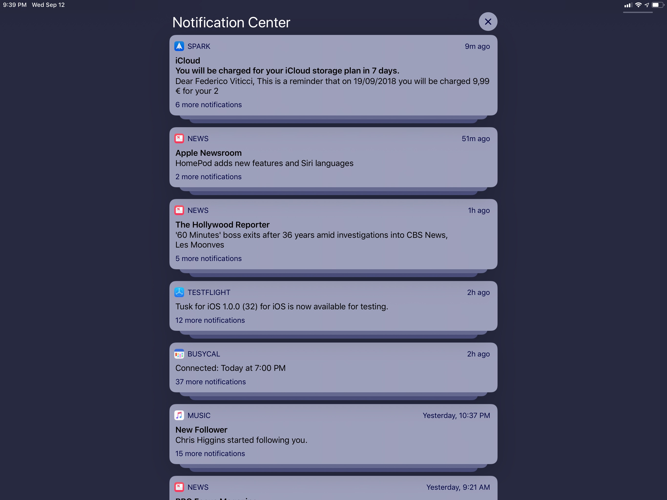
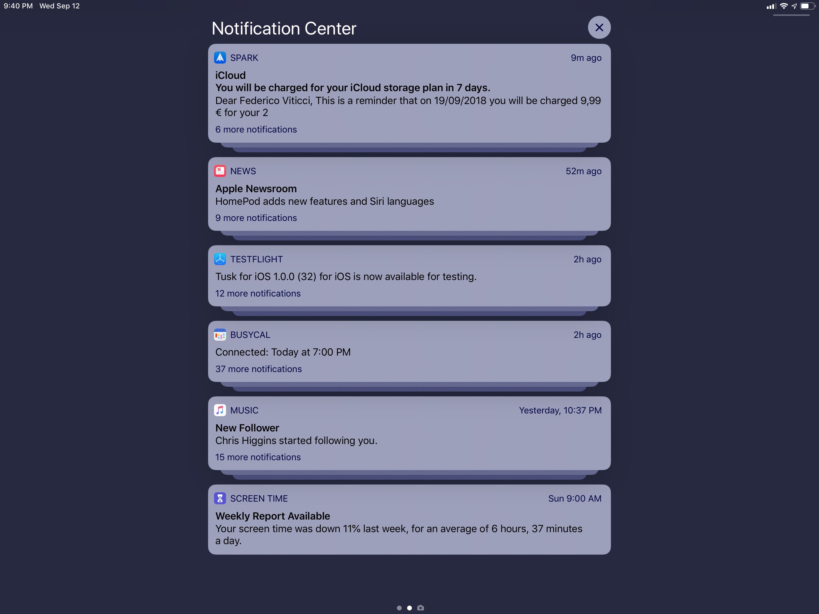
By default, iOS 12 groups notifications from the same app together in a stack, both on the lock screen and Notification Center. The stack shows you the leading notification (usually, the most recent alert from an app) as the frontmost one; tapping the leading notification expands the stack inline, revealing the name of the app and the full list of other grouped alerts as additional notifications. If you want to interact with the leading notification without expanding the group first, you’ll have to press on it with 3D Touch.6
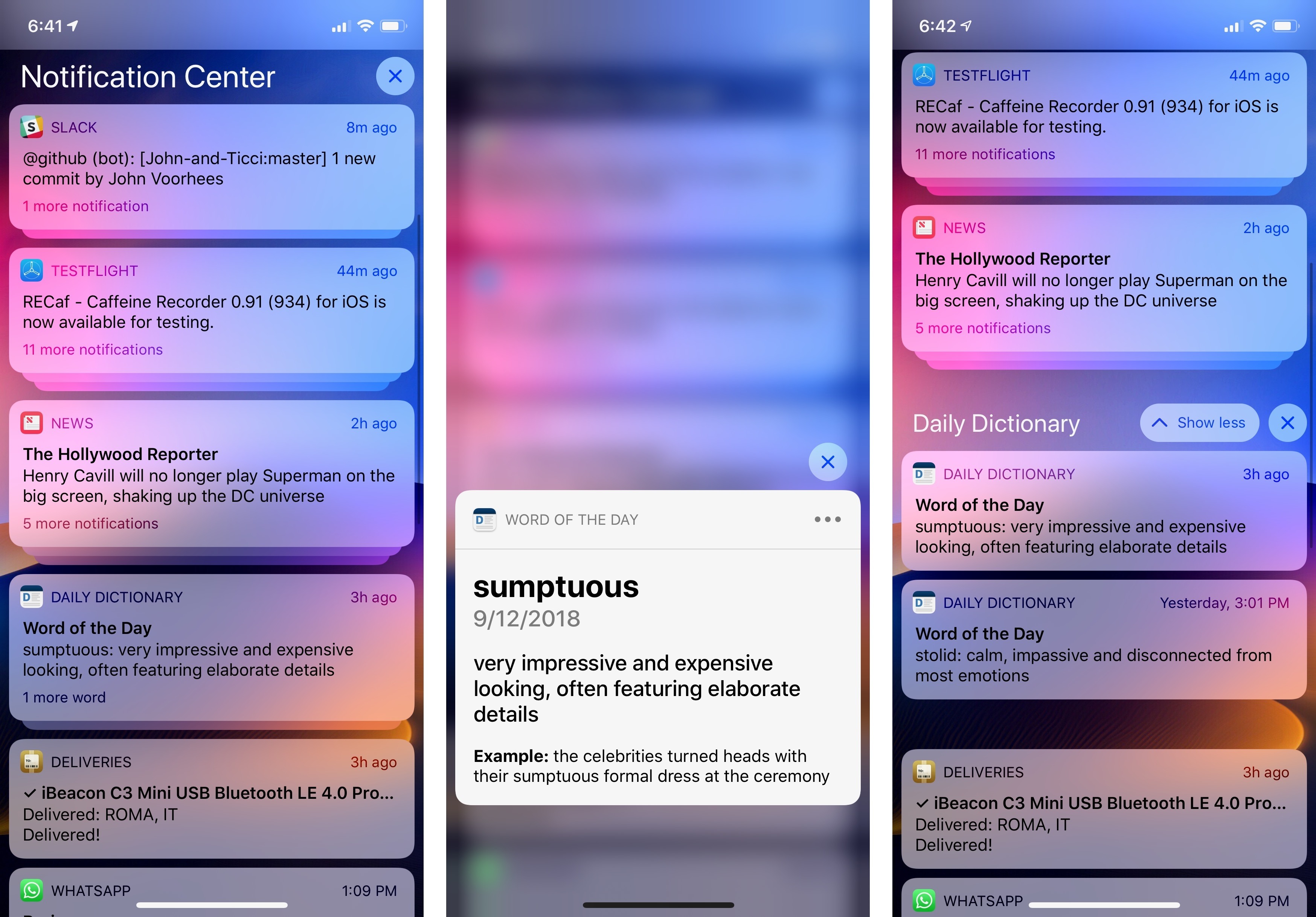
The main interactions with a stack of grouped notifications: pressing to expand the leading notification (center) and tapping to expand the group (right).
Once a group is expanded, you can interact with individual notifications to open them as well as collapse the group with a ‘Show Less’ button or clear all notifications from the group. I don’t mind the dual role served by the normal tap (expand groups and open notifications) as it feels like an obvious interaction method. Expanding and collapsing stacks of grouped notifications yields a pleasing visual effect that I often describe as a “lock screen accordion”.
There’s more to grouping than just collecting all notifications from the same app together though. By default, all notifications from the same app are grouped together (using an app’s bundle identifier). Developers, however, can also use thread identifiers (an existing API) to specify multiple threads for related notifications; in that case, iOS 12 will create multiple groups of notifications for the same app.
Thread-based grouping is the automatic behavior in iOS 12, which users can override on an app-by-app basis by visiting an app’s own Notification Settings page inside the Settings app.
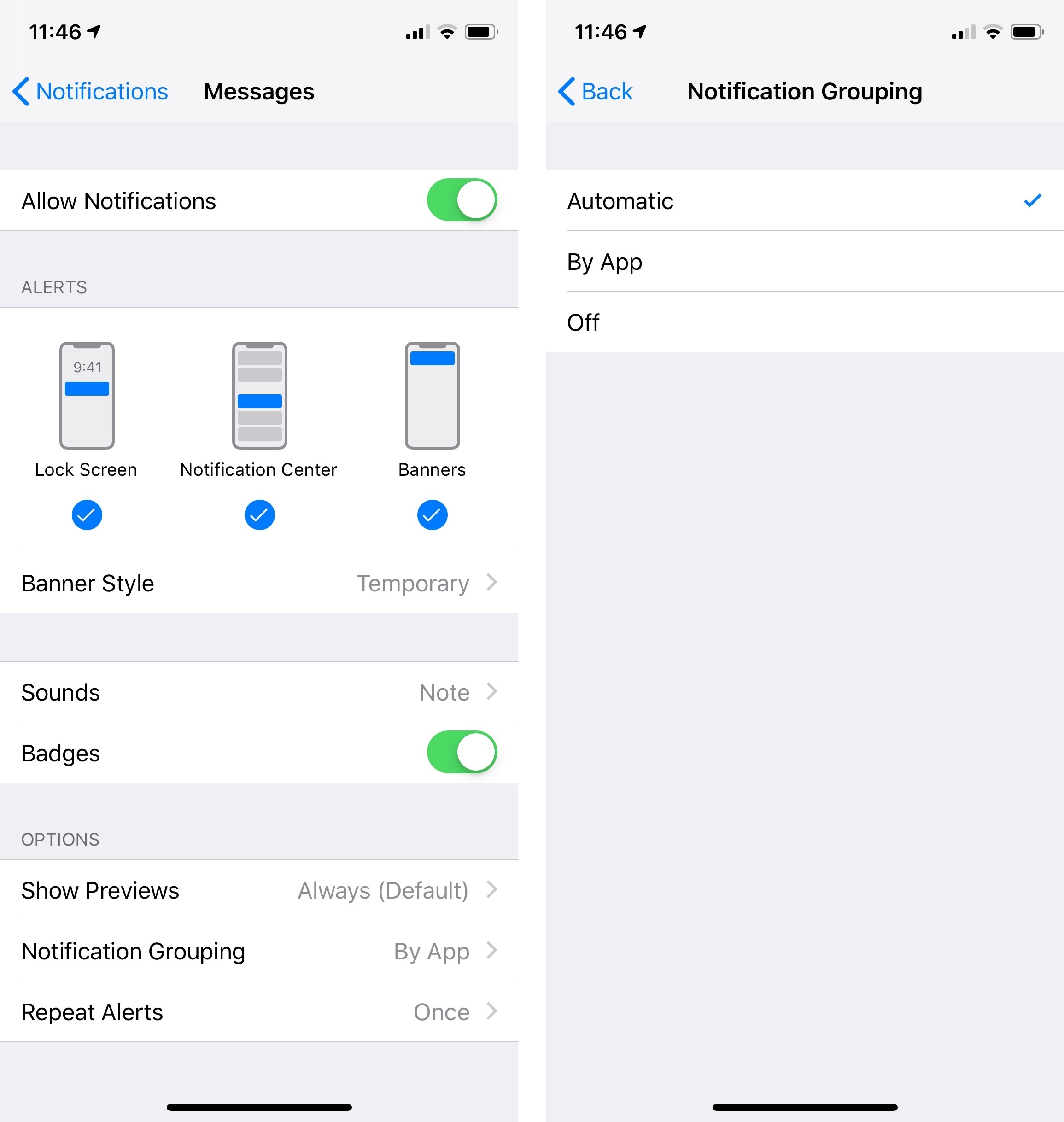
The way Apple has implemented notification grouping is intriguing. Instead of building a complex channels system à la Android or leveraging machine learning to identify related notification content, they’re asking developers to do the work themselves and mark up their apps so the system knows whether multiple threads are available or not.
Developers who want to adopt thread-based notification grouping will have to think about the types of notifications that their apps send, and if it makes sense to split them up in different threads. In my experience with iOS 12 so far, I’ve found threads to be a preferable solution to generic app-based grouping. Apple Mail, for instance, can group messages by account, but also by specific thread, VIP threads, and even favorite mailboxes. Similarly, Messages supports grouping by thread, which makes it easy to catch up on conversations that are more important than others. I hope that services such as Slack and Twitter, RSS and news readers, and other messaging apps start using thread-based grouping because it’s a superior, more user-friendly experience when dealing with several notifications.
In addition to thread identifiers, Apple is also asking developers to support custom summary messages for notification groups in iOS 12. The summary message is a count of how many notifications are contained in a group, displayed in the bottom left corner of the leading notification. By default, if developers don’t do anything to customize this message, it’ll say something like “2 more notifications” because iOS takes care of performing a basic count of items in a group.
There is, of course, an API for developers to customize the summary message and make it more descriptive and useful for their apps. The name of the items contained in a group can be modified by apps so that it’s not a generic “notification”; for example, it could say “events”, “photos”, or “messages” depending on the contents of a notification. Groups from Apple’s Mail app say “2 more messages” while those from Podcasts use the word “episodes”, for instance. Furthermore, developers can pass arguments along with the count to indicate contact names (e.g. “3 messages from Myke”) or other bits of information (“5 articles from MacStories”).
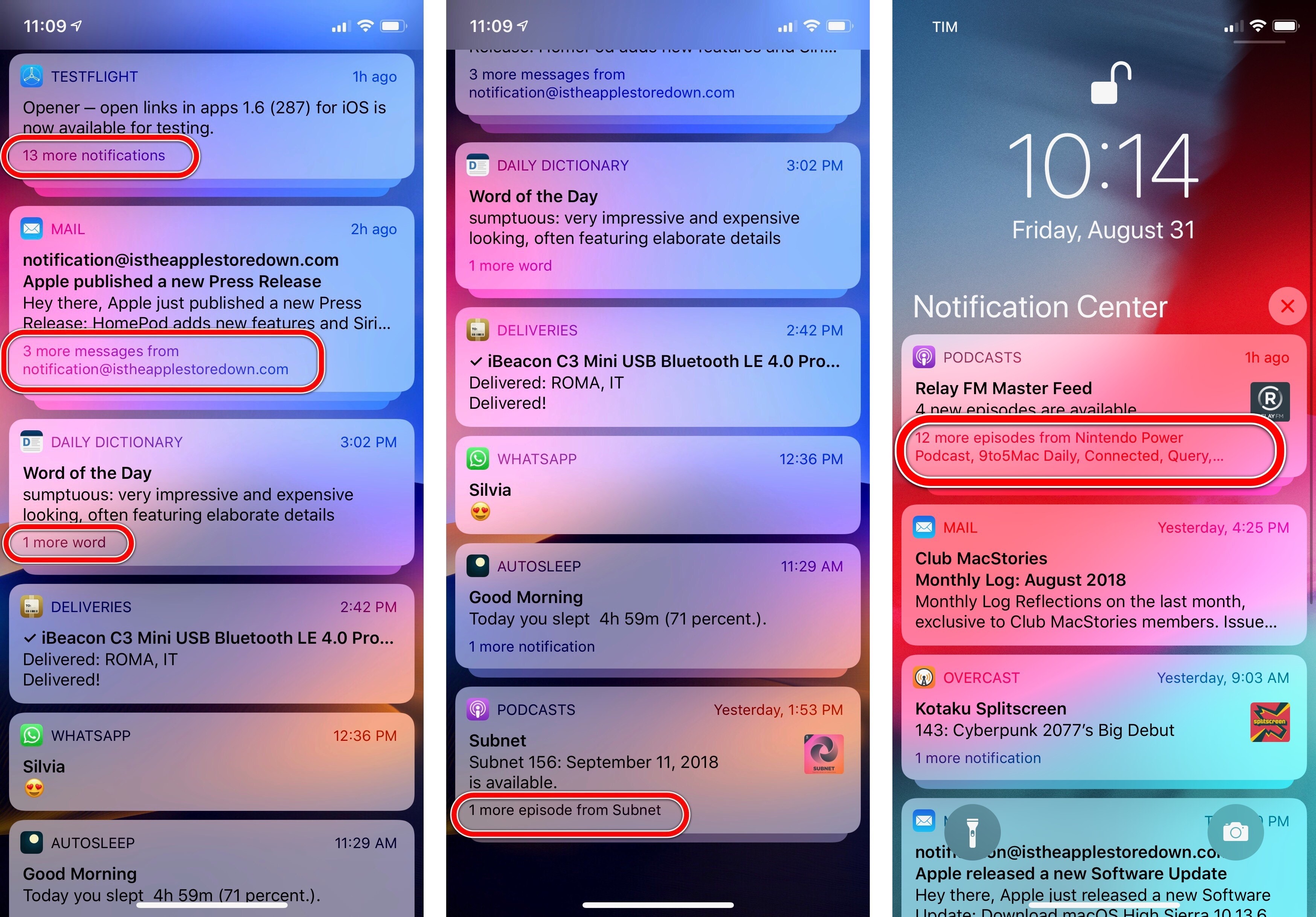
Additionally, in iOS 12 the same notification group can mix and match different types of content and count the total within a single stack, so you can end up with a summary message that says “2 messages and 3 photos” or “1 video and 3 stories”. The system manages grouping and counting, but it’s up to developers to deal with thread identifiers and customize summary messages accordingly. This may sound simple enough on paper, but it’s quite a bit of work when you consider scenarios such as localization in different languages and pluralization of item names. Still, both for accessibility and general organization of notification groups, it’s an important feature to support.
Instant Tuning
Grouping is just the proverbial tip of the iceberg for the work Apple put into modernizing notifications in iOS 12. The company has also shipped a comprehensive set of inline notification management tools to let users tackle notification overload head-on and fine-tune the alerts they receive from apps. Apple refers to this new system as Instant Tuning.
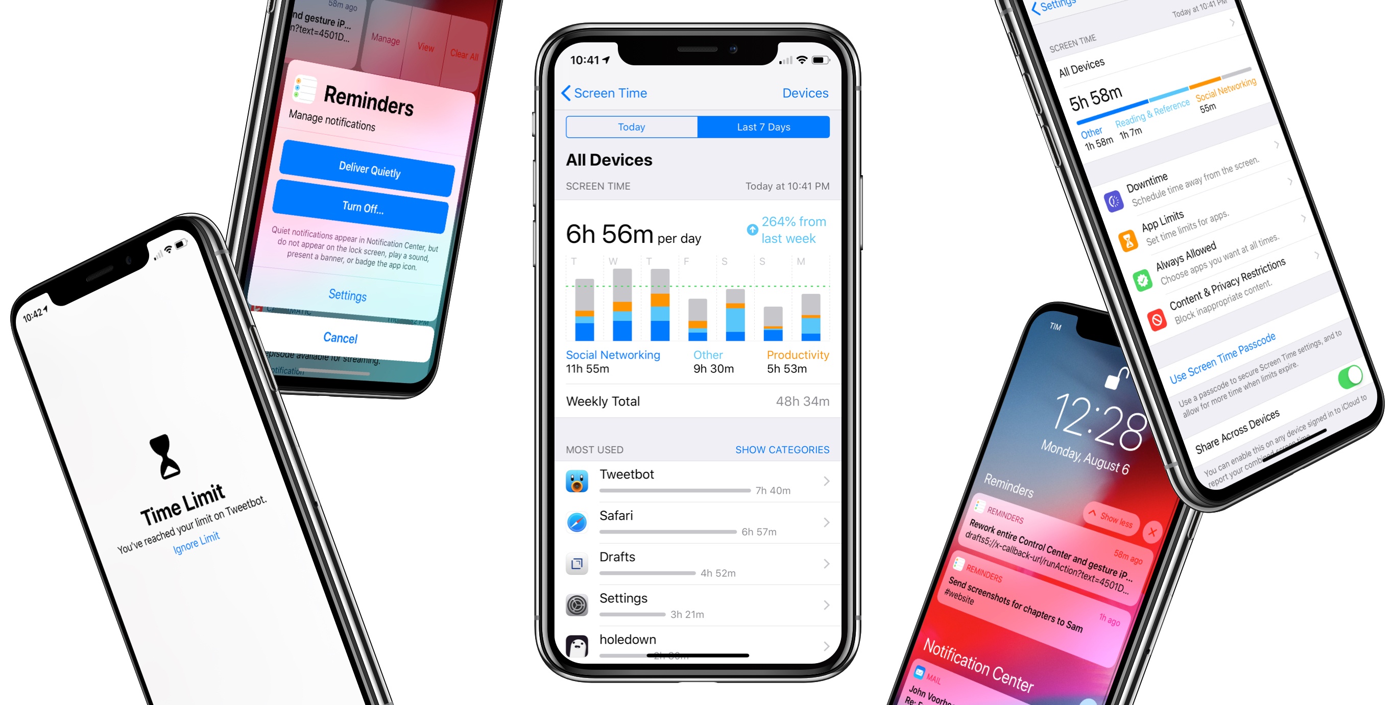
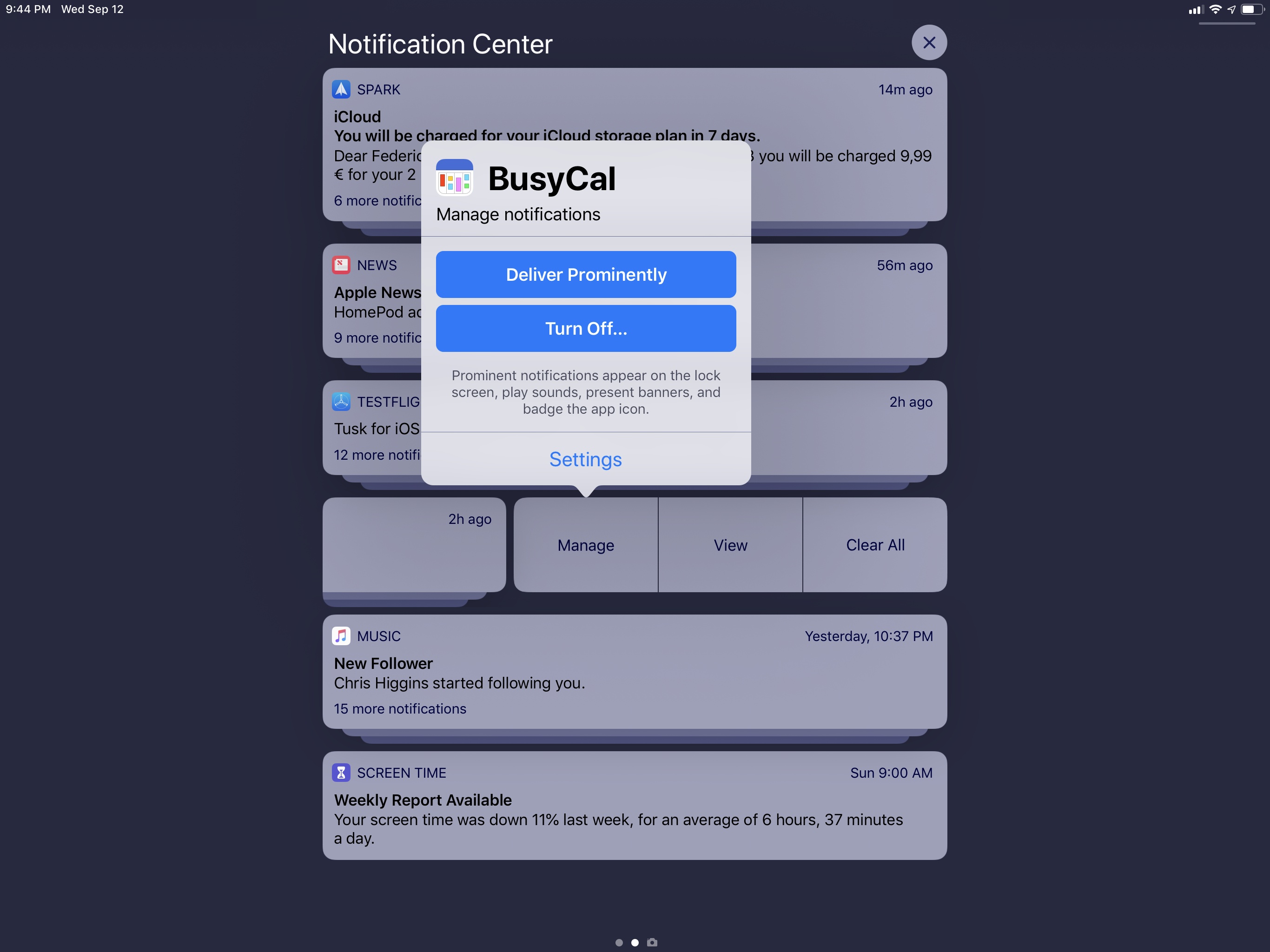
At a high level, Instant Tuning consists of features to customize an app’s notification settings directly from a notification itself without opening the Settings app. Instant Tuning is a contextual sheet you can open by swiping on a notification/group and tapping the ‘Manage’ button or by hitting the ellipsis button ‘…’ at the top right of an expanded notification.
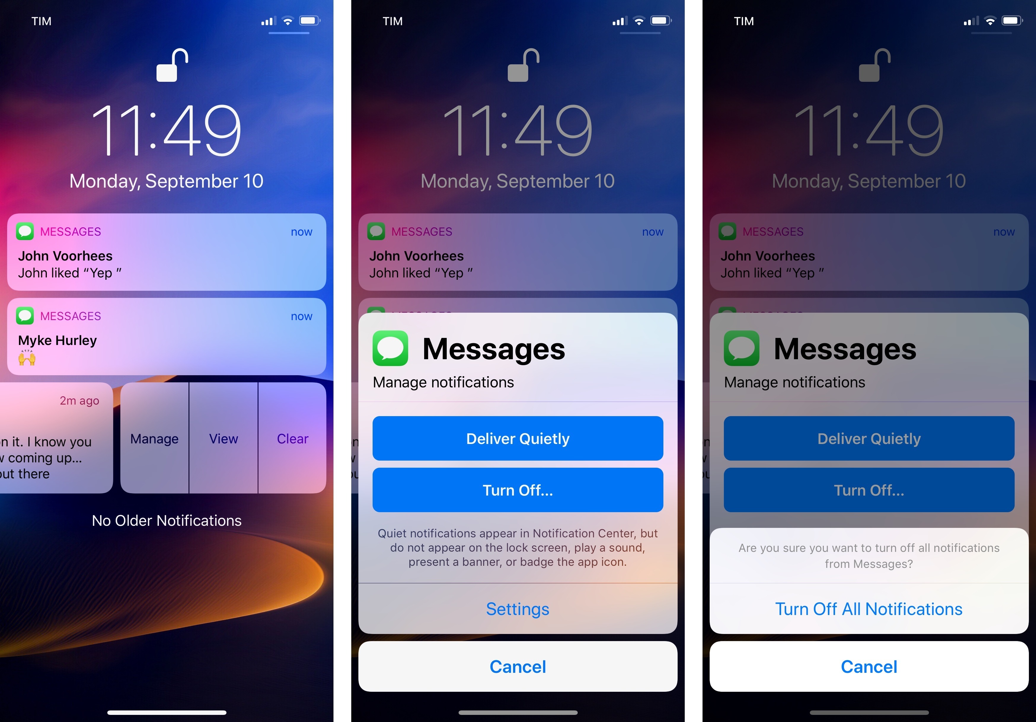
The sheet contains buttons to deliver notifications quietly, turn them off, or open an app’s own notification settings. The ‘Deliver Quietly’ button is the star of the show here, and for good reason: with the single press of a button, you can make an app’s alerts go straight to Notification Center without showing banners, playing sounds, or badging the app icon.
Those of you who have been tweaking iOS notification settings for years may scoff at this addition; with enough time and patience, we’ve always been able to configure app notifications like this from Settings. But that’s exactly the point: Deliver Quietly is a self-contained action that activates several sub-options at once and wraps everything into an obvious name everyone can understand. It’s a user-friendly, visual way to deal with a bunch of related preferences that have always been hard to find and explain.
This is what graphical user interfaces should always do: remove complexity that only hardcore users can overcome while empowering everyone to accomplish the same task. Deliver Quietly doesn’t reinvent notification settings, it reimagines how they’re presented and made accessible to users. This single button is one of the best design and usability decisions Apple has made in years.
Deliver Quietly is ideal for muting notifications from apps that send too many without having to open Settings.
Deliver Quietly reinforces the logical separation between the lock screen and Notification Center: notifications are either important enough so you see them as soon as you pick up your iPhone, or they stay hidden until you go through Notification Center at your own pace, sort of like a universal inbox. I’ve been using Deliver Quietly aggressively as a trial system for notifications I’m not sure about yet: before outright disabling an app’s notifications, I’ll put them in quiet delivery mode and see if I regularly seek them out in Notification Center. If I do, the Deliver Quietly button, now labeled Deliver Prominently, lets me push notifications back up to the lock screen; if I don’t miss them at all, I can turn them off from Notification Center.
Which brings me to the other half of Instant Tuning: from the same modal sheet, you can turn off an app’s notifications straight away or jump to the full notification settings page for the app if you want to have deeper control over their behavior. The ‘Turn Off…’ button is the nuclear option here, and it brings up an extra confirmation step before turning off all notifications for the app. I’ve been using this feature to cull my notifications and get rid of spammy apps that were sending me useless alerts far too often.
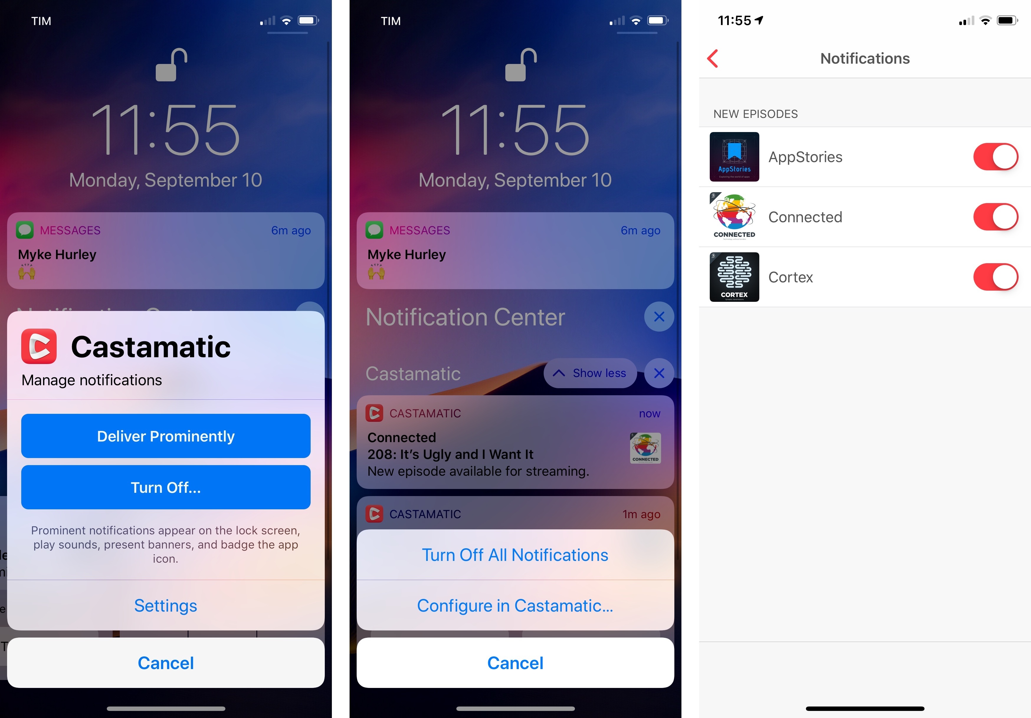
Deliver Quietly becomes Deliver Prominently for notifications that already go straight to Notification Center. In the example above, Castamatic deep-links its notification settings to a screen inside the app.
The Settings button is interesting: by default, it opens the notifications screen inside iOS’ Settings app. However, developers can deep-link this button to notification settings inside their apps to give users deeper controls and customizations.
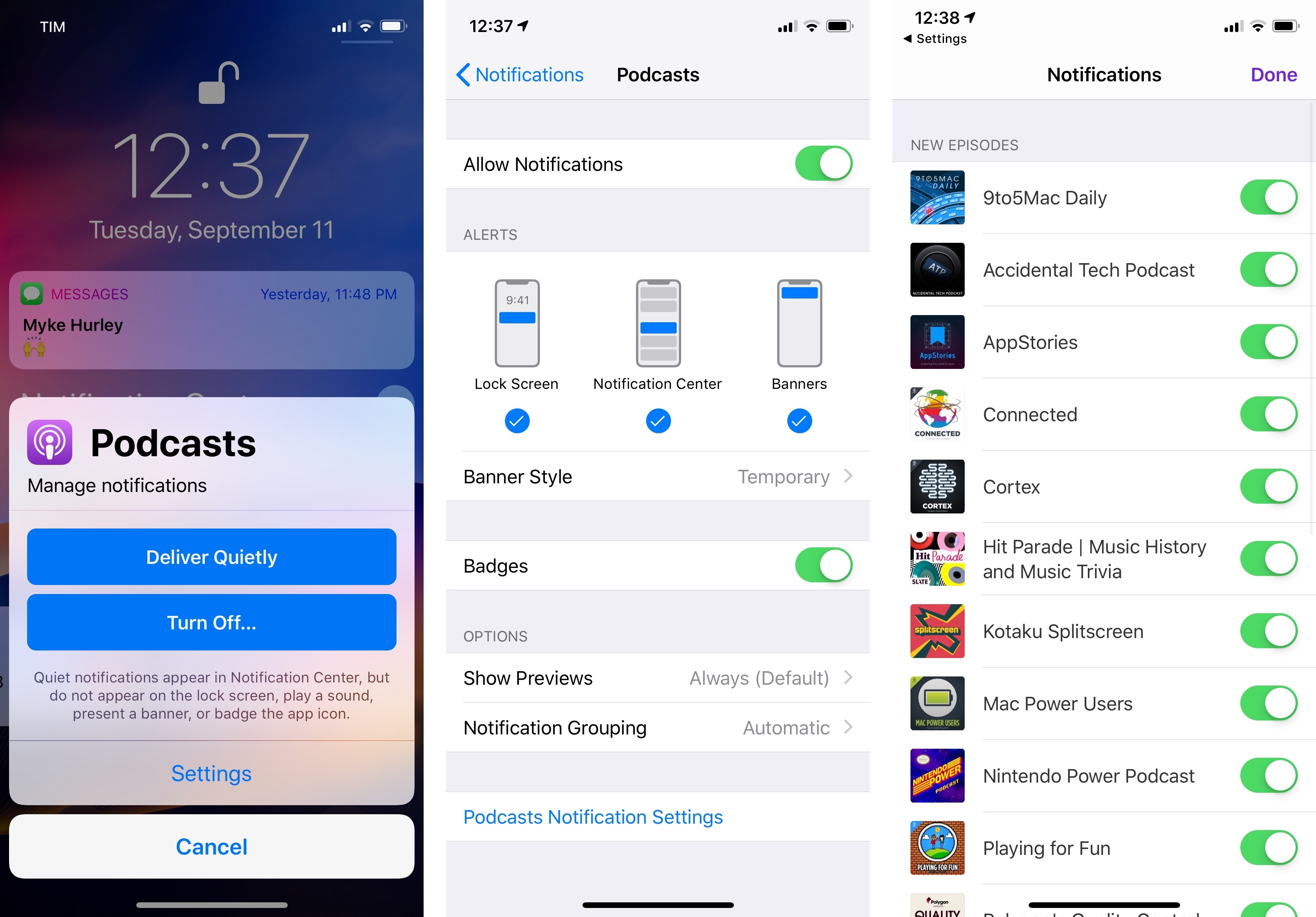
Tapping ‘Settings’ when instant-tuning the Podcasts app, for instance, will open the Notifications view within the Podcasts app itself, where you can disable new episode notifications for individual shows. The same deep-link is also embedded at the bottom of an app’s notifications screen inside the Settings app. Because of these integrations, I think we’re going to see more apps get serious about providing in-app notification settings; it’s in their best interests to ensure customers can tweak notifications to their needs without disabling them altogether.
- It reminds me of those lock screen concepts that were circulating on Dribbble a few years ago. ↩
- We already have a Siri watch face, after all. ↩
- On iPads, it's a regular long press. ↩
- Yes, after years of Lock screen, Apple is going with lowercase lock screen in iOS 12. If you care about Apple's styleguide as much as I do, you should know this. You're welcome. ↩