This Week's Sponsor:

Kolide

Ensures that if a device isn’t secure it can’t access your apps.  It’s Device Trust for Okta.


Search results for "iCab"

Stage Manager in iPadOS 16: At the Intersection of Bugs, Missing Features, and Flawed Design

Stage Manager in iPadOS 16.1.

Stage Manager in iPadOS 16.1.

This article wasn’t supposed to go like this.

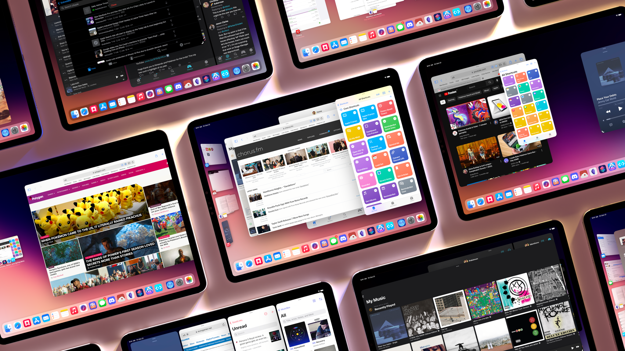
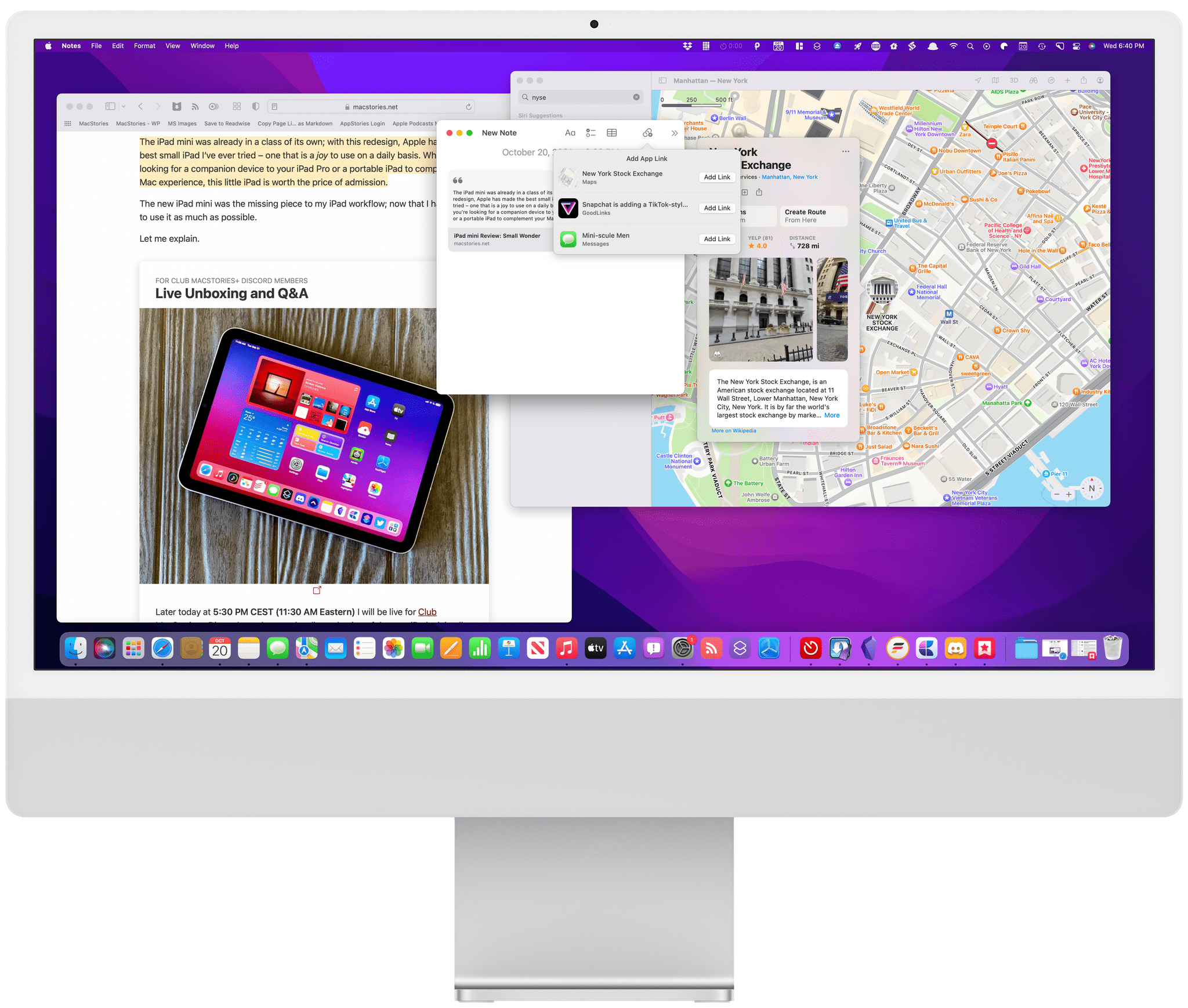
iPadOS 16 is launching to the public today, and it carries a lot of expectations on its shoulders: for the first time since the introduction of the original iPad in 2010, Apple is embracing a Mac-like windowing system that lets you use up to four windows at the same time on the iPad’s screen. You can even resize them and make them overlap. If you’ve been following the evolution of the iPad for a while, you know that’s very unusual.

But the reason this story was meant to be different isn’t to be found in Apple’s design philosophy for iPadOS 16. Typically, MacStories readers would expect a full-blown ‘The MacStories Review’ to go alongside a new version of iPadOS. That’s what I’ve been doing for over seven years at this point, and I don’t like breaking my writing patterns. When something works, I want to keep writing. That’s precisely why I had to stop writing about iPadOS earlier in the summer and until last week.

Stage Manager, the marquee addition to iPadOS that lets you multitask with floating windows, started crashing on my M1 iPad Pro in mid-July and it was only fixed in early October. When I say “crashing”, I mean I couldn’t go for longer than 10 minutes without iPadOS kicking me back to my Lock Screen and resetting my workspaces. And that was only the tip of the iceberg. For nearly two months, I couldn’t type with Apple’s Magic Keyboard or use keyboard shortcuts when Stage Manager was active. Before it was pulled by Apple and delayed to a future release, external display support in Stage Manager was impossible to rely on for production work. The list goes on and on and on.

Normally, I would use the introduction of my iOS and iPadOS reviews to tell you how I’ve been living and working with the new operating system every day for the past three months. I’ve always tried to publish annual OS reviews that are informed by practical, consistent usage of a new operating system which, I hope, has led to highly opinionated, well-researched stories that can stand the test of time. That kind of story hasn’t been possible for me to produce with iPadOS 16 yet.

Effectively, I’ve only been able to sort-of use iPadOS 16 with Stage Manager on my M1 iPad Pro again for the past two weeks. Before that, it’s not that I didn’t want to use iPadOS 16 and Stage Manager because I hate progress; I literally couldn’t unless I was okay with my iPad crashing every 10 minutes. So, at some point over the summer, I made the call to revert to Split View and Slide Over – which are still the iPad’s default multitasking mode in iPadOS 16 – and I’d check back in on Stage Manager on each beta of iPadOS 16. It was only around two weeks ago that, despite some lingering bugs I’ll cover later, I was able to finally leave Stage Manager enabled and go back to where I was when I published my iPadOS 16 first impressions article in July.

Think about my position this way: there’s a hole from early August to early October in my typical “reviewer summer” during which I couldn’t use the biggest addition to iPadOS 16 at all. The fact that Apple delayed, slimmed down, and kept iterating on Stage Manager until the very last minute seems to suggest I wasn’t the only one desperately trying to make it work.

I started using iPadOS 16 and Stage Manager again two weeks ago; what kind of “review” should this be?

Read more


Best Everyday Shortcut: A New Automation April Shortcuts Contest Category

One of our top goals with Automation April is to encourage the participation of Shortcuts users of every level. That’s why the Automation April Shortcuts Contest judges won’t just be looking for the most complex shortcuts with the most actions. They’ll be looking at factors like originality, performance, design, user experience, and usefulness, which are all applicable to simple shortcuts too.

To drive home the message that the contest isn’t just for experts, we’ve added a new category: Best Everyday Shortcut. The category will be judged like the others, but with an emphasis on clever uses of actions to create a shortcut that does one thing particularly well, from which a broad cross-section of users can benefit.

Entries for all categories are being accepted through April 20, 2022 at shortcuts.macstories.net. Full details are available in our Automation April Shortcuts Contest announcement post from last week.

We’ve been incredibly pleased with the response to the contest so far. The MacStories audience has already submitted a lot of shortcuts, many of which are in the running for the new Best Everyday Shortcut category, but we’d love to see more. So, if you’ve got a shortcut that you rely on every day and think would benefit others, we’d love it if you would submit it for consideration.

And remember, we’ve got some terrific prizes for the top shortcuts in each category:

Best Overall Shortcut

  • A 3-year subscription (or membership upgrade and/or extension for existing Club members) to Club Premier
  • An Elgato Stream Deck XL
  • An Analogue Pocket
  • A special Discord contest winner role
  • Induction into the Automation April Hall of Fame

Best Everyday Shortcut, Best HomeKit Shortcut, Best Productivity Shortcut, Best Media Shortcut, and Best Mac-specific Shortcut

  • A 1-year subscription to Club Premier (or membership upgrade and/or extension for existing Club members)
  • A special Discord category winner role
  • Induction into the Automation April Category Hall of Fame

So, whether you have a simple shortcut that you rely on every day or one that’s more complex, visit shortcuts.macstories.net to enter the contest before the April 20, 2022 deadline.


You can also follow MacStories’ Automation April coverage through our dedicated hub, or subscribe to its RSS feed.


macOS Monterey: The MacStories Review

OSes are never truly finished. macOS has been continuously evolving for decades, and it would be foolhardy to declare it ‘finished’ in any sense of the word. It’s not.

However, when you step back and look at macOS over time, trends and storylines emerge from the feature list minutiae of each release. For the past few years, no narrative thread has been more important to the Mac and its operating system than their realignment within Apple’s product lineup. It’s a fundamental transformation of both hardware and software that has taken shape over years, beginning publicly with Craig Federighi’s WWDC Sneak Peek in 2018.

The story begins with a Sneak Peek at the end of a WWDC keynote in 2018.

The story begins with a Sneak Peek at the end of a WWDC keynote in 2018.

A parallel story has been playing out with the iPad’s hardware and OS. The iPad’s trajectory has been different than the Mac’s, but today, we find ourselves with two distinct but more closely aligned platforms than ever before. To get there, the iPad has grown into a powerful, modular computer, while the latest Macs now run on the same processor architecture as the iPad Pro and no longer work differently in places just because that’s the way it’s always been.

The journey hasn’t always been easy, especially in the wake of questions about Apple’s commitment to the Mac. The company took those concerns head-on in an unusual meeting with a handful of tech writers in 2017. Still, it was only natural for users to question whether the direction macOS was heading was the correct one.

It didn’t help that those first Catalyst apps that were part of the 2018 Sneak Peek – Home, News, Stocks, and Voice Memos – were rough around the edges and a departure from long-held beliefs about what constitutes a great Mac app. The Mac’s apps had historically been held out as a shining example of the kind of user experiences and designs to which developers who cared about their apps could aspire. Unfortunately, many early Mac Catalyst apps weren’t very inspiring.

The realignment has been rocky for iPad users, too, especially for iPad Pro uses. The Pro’s hardware has been infrequently updated, and the performance of the Apple silicon processors they’ve run on has outpaced what the apps on the platform can do.

Users’ fears have also been fueled by Apple’s institutional secrecy and the multi-year scope of the company’s undertaking. Early communications about Mac Catalyst and SwiftUI left developers and observers confused about the role of each. The situation is more clear today, but at the same time, the question of how to approach building a Mac app is best answered with ‘it depends.’ That isn’t a very satisfying answer. Nor does it help that despite the added clarity, technologies like SwiftUI still have a long way to go to reach their full potential.

Catalina was full of promise, but the road ahead was unclear.

Catalina was full of promise, but the road ahead was unclear.

Yet despite the bumps along the road, macOS has made great strides since that 2018 Sneak Peek. With Catalina, we saw the first steps down a path that pointed the Mac in a new direction. Although sometimes messy, the promise of Catalina was exciting because, as I concluded in that review:

There’s no greater threat to the Mac than resistance to change that exists not because the change is worse, but because it’s different.

Catalina was a counter-strike against the sort of inertia that would have doomed macOS eventually, even though at the time, it was more a promise than a destination.

Big Sur's design changes brought the direction of macOS into sharper focus.

Big Sur’s design changes brought the direction of macOS into sharper focus.

Big Sur picked up where Catalina left off, adjusting course and clarifying where macOS was heading. The update continued the harmonization of user experiences across Apple’s entire lineup, creating a more natural continuum among the company’s products through new design language and updated system apps without abandoning what makes the Mac unique. I don’t mean to suggest that Catalina or Big Sur were unmitigated successes. They weren’t, and some of the missteps of those releases have yet to be addressed, but there was no mistaking where macOS was headed after the release of Big Sur.

Monterey harmonizes system app updates across all of Apple's platforms.

Monterey harmonizes system app updates across all of Apple’s platforms.

Monterey’s focus is all about system apps, a topic near and dear to me. With the technical building blocks in place and a refined design out of the way, Monterey is one of the most tangible, user-facing payoffs of the past three years of transition. More than ever before, Apple is advancing system apps across all of its platforms at the same time. Finally, everything is everywhere.

However, as much as it pleases me to see the groundwork laid in years past pay dividends in the form of new features being rolled out simultaneously on all platforms, Monterey’s payoff isn’t an unqualified success. Every OS release has its rough spots, but this year, Shortcuts is especially rough. As optimistic and excited as I remain for Shortcuts to be the future of automation on the Mac, it’s too frustrating to use at launch. That’s not to say I haven’t enjoyed any upside using Shortcuts on my Mac, and it has improved over the course of the beta period, but it still gets in my way more often than it should.

Alright, that’s enough looking back. Let’s dig in and see where things work, where they don’t, and what lies ahead when you install macOS Monterey.

Read more


ActiveTab: A Simple Extension to Tell Which Safari 15 Tab is Active

Safari 15, which is already available for macOS Catalina and Big Sur, will be part of macOS Monterey too. One of the design changes to the updated browser is the separation of tab indicators from its web content. Apple has inexplicably interposed the Favorites bar in between the two, and even if you hide the bar, figuring out which tab is the active one can be difficult.

ActiveTab is a new Safari extension inspired by The Tragedy of Safari 15 for Mac’s ‘Tabs’ a story John Gruber wrote on Daring Fireball recently that you should read if you haven’t already. To make it easier to distinguish the active tab, ActiveTab draws a line underneath it along the top of the tab’s web content. There are eight colors to choose from, and the line can be anywhere from 1 to 7 pixels wide. Note that a page needs to be open for the line to appear because it’s being drawn on top of the content. As a result, you won’t see the line if a tab is empty.

I wish ActiveTab offered different colors for light and dark mode browsing.

I wish ActiveTab offered different colors for light and dark mode browsing.

The extension, which Stephen Hackett shared with me earlier today, undeniably makes it easier to spot the active tab in Safari. However, I found myself wishing almost immediately for light and dark mode versions of the color options that could switch between light and dark mode in sync with my system settings because the colors don’t all work equally well in both modes. The colors of the site you visit can affect the visibility of ActiveTab’s indicator too.

Of course, I’d prefer if Apple fixed the design of its tabs, but if you find yourself being tripped up by the new design, ActiveTab is worth considering.

ActiveTab is available on the Mac App Store for $1.99.


iOS and iPadOS 15: The MacStories Review

A quieter release for even stranger times.

In my career as an iOS reviewer, I don’t think I’ve ever seen a response as universally positive and enthusiastic as the general public’s reception of iOS 14 last year. From the “Home Screen aesthetic” popularized by TikTokers to the incredible success of widgets and the resurgence of custom icons, few iOS updates managed to capture the cultural zeitgeist as globally and rapidly as iOS 14 did. The update broke out of the tech community and, perhaps for the first time in decades, made UI personalization a mainstream, easily attainable hobby. For once, we didn’t have to convince our friends and family to update to a major new version of the iPhone’s operating system. They just did it themselves.

The numbers don’t lie: five weeks after its release, iOS 14 was already set to surpass iOS 13’s adoption rate; in April 2021, seven months after launch, over 90% of compatible devices were running iOS 14. Which begs the obvious question: if you’re Apple, you’re planning to follow up on what made iOS 14 successful with even more of it, right?

Well, not quite.

With the world coming to a halt due to the pandemic in early 2020, Apple could have easily seized the opportunity to slow down its pace of software updates, regroup, and reassess the state of its platforms without any major changes in functionality. But, as we found out last year, that’s not how the company operates or draws its product roadmaps in advance. In the last year alone, Apple introduced a substantial macOS redesign, pointer support on iPad, and drastic changes to the iOS Home Screen despite the pandemic, executing on decisions that were likely made a year prior.

Surprisingly, iOS 15 doesn’t introduce any notable improvements to what made its predecessor wildly popular last year. In fact, as I’ll explore in this review, iOS 15 doesn’t have that single, all-encompassing feature that commands everyone’s attention such as widgets in iOS 14 or dark mode in iOS 13.

As we’ll see later in the story, new functionalities such as Focus and Live Text in the Camera are the additions that will likely push people to update their iPhones this year. And even then, I don’t think either of them sports the same intrinsic appeal as widgets, custom Home Screens, or the App Library in iOS 14.


It’s a slightly different story for iPadOS 15, which comes at a fascinating time for the platform.

As I wrote in my review of the M1 iPad Pro earlier this year, Apple needed to re-align the iPad’s hardware and software on two fronts. For pro users, the company had to prove that the new iPad Pro’s hardware could be useful for something beyond basic Split View multitasking, either in the form of more complex windowing, pro apps, or desktop-like background processes; at the same time, Apple also had to modernize iPadOS’ multitasking capabilities for all kinds of users, turning an inscrutable gesture-based multitasking environment into a more intuitive system that could also be operated from a keyboard. It’s a tall order; it’s why I’ve long believed that the iPad’s unique multiplicity of inputs makes iPadOS the toughest platform to design for.

Apple’s work in iPadOS 15 succeeds in laying a new foundation for multitasking but only partially satisfies the desires of power users. Apple managed to bring simplicity and consistency to multitasking via a new menu to manage the iPad’s windowing states that is easier to use than drag and drop. Perhaps more importantly, Apple revisited iPad multitasking so it can be equally operated using touch and keyboard. If you, the person reading these annual reviews, have ever found yourself having to explain to a family member how to create a Split View on iPad, tell them to update to iPadOS 15, and they’ll have a much easier time using their iPads to their full extent.

But after three months of running iPadOS 15 on my M1 iPad Pro, I can’t help but feel like power users will still be left wishing for more. Yes, iPadOS 15 brings extensive keyboard integration for multitasking with a plethora of new keyboard shortcuts and yes, the new multitasking menu and improvements to the app switcher benefit everyone, including power users, but iPadOS 15 is a foundational update that focuses on fixing the basics rather than letting the iPad soar to new heights.


While Apple is probably preparing bigger and bolder updates for next year, there are still plenty of features to discover and enjoy in iOS and iPadOS 15 – some that could still use some refinement, others that already feel like staples of the modern iPhone and iPad experience.

Let’s dive in.

Read more


    Apple Watch Series 7: The MacStories Overview

    At this morning’s virtual keynote event, Apple’s Chief Operating Officer Jeff Williams announced the Apple Watch Series 7. Packing a brand-new display, a more rounded case design, faster charging, and greater resistance to cracking and dust, the Series 7 is a very nice iterative update.

    Display and Durability

    By far the biggest feature of the Series 7 is its gorgeous new display. Apple has reduced the bezels on all sides of the device by 40%, resulting in just 1.7mm borders around the screen. The screen itself has been stretched to fill this new area, and is 20% bigger than the screen on last year’s Series 6. To fit the new screen, case sizes have been increased to 41mm and 45mm — a fairly subtle change from the 40mm and 44mm sizes of the Series 5 and 6 Apple Watches. Thankfully, compatibility has been maintained with existing Apple Watch bands.

    Read more


    Appleā€™s April 2021 Event: All the Little Things

    Apple events are always packed with little details that don’t make it into the main presentation or are easy to miss in the flurry of announcements. Some tidbits are buried in footnotes, while others are tucked into word clouds on Keynote slides or in release notes. Today’s event was no exception, so after having a chance to dig in a little deeper, here is an assortment of details about what Apple announced.

    Note: you can also check out our standalone overviews for the new iPad Pro, iMac, Apple TV, and AirTags with more details about each product.

    Read more


    Inc. Interviews David Smith About Widgetsmith’s Astonishing Success

    Most MacStories readers are undoubtedly familiar with the story of David Smith’s app Widgetsmith, which took off last fall after going viral on TikTok. Yesterday, Jason Aten of Inc. published an interview with Smith about his career as an independent developer and how his 12 years of experience building 59 different apps prepared him for the unexpected success of Widgetsmith, which has been downloaded more than 50 million times.

    As Aten aptly points out:

    Often, the simplest form of success is what happens when a stroke of good fortune meets years of hard work and preparation. Plenty of people work hard their whole lives but never come across the kind of luck associated with having your app go viral on TikTok. At the same time, plenty of viral social media stories flame out immediately. They never put in the work or preparation that would allow them to capitalize on the moment.

    As MacStories readers know, Widgetsmith isn’t Smith’s first App Store success. We’ve covered many of his other apps over the years, but Widgetsmith is in an entirely different universe than anything that came before it. For example, Aten reveals that:

    Smith told me that Widgetsmith had more downloads in a single day than Pedometer++ has had in the entire time since it launched in 2013.

    That’s remarkable given that Pedometer++ was probably the first pedometer app on the App Store and has remained popular in the seven years since it was released.

    There are many valuable lessons in the Inc. story that are broadly applicable beyond app development. Some lessons are as simple as the value of practice and becoming an expert in your field. As Smith explains:

    All of those other apps that I built in the past helped. I need to, for example, get the user’s current calendar events so that I can put it in a widget. I know how to get calendar events and pull them into a widget. I’ve done this in another app before.

    Smith’s story also shows how easy it is to misjudge demand for a product in advance too. Along with Smith and others who have followed his work, I didn’t expect Widgetsmith to be popular beyond iOS power-users. Widgetsmith is a terrific app, but I never imaged its audience would be bigger than Pedometer++, but as Smith says in his interview:

    And it turned out that everybody is that power user who was very fiddly about what they want their Home Screen to look like. I just completely misjudged the size of the market that I was addressing. I thought I was targeting a very specific group of people. And it turned out that that very specific group of people was like everyone.

    If there are MacStories readers who still haven’t tried Widgetsmith, do so because it’s fantastic. But, also, don’t miss Inc.’s interview with Smith, which is an excellent look at the combination of hard work and luck that lead to ‘overnight success.’

    Permalink

    Downloading YouTube Videos on iPad with youtube-dl and a-Shell

    Greg Godwin, writing at NonProfit Workflows:

    There are various apps for the Mac that’ll download YouTube videos, but there’s nothing comparable for the iPad. I discovered that it’s possible to download these videos using the iCab browser if you change the user agent, but I could never get this to work consistently. There is a command-line program you can run called youtube-dl that will download videos from YouTube (and other sites). The problem is, the iPad doesn’t ship with a Terminal app like the Mac does, so while I could do this on my Mac, I struggled to find a way to use this command on my iPad.

    Greg has written an excellent tutorial on how to install the (recently reinstated) youtube-dl utility (which I’ve been using to download YouTube videos on my Mac mini for years) and use it on iPad via a-Shell. I followed their tutorial and was able to get youtube-dl up and running on my iPad Pro – with support for encoding files via ffmpeg – in literally two minutes. There’s probably less of a need for downloading YouTube videos on iPhone and iPad now that the YouTube app supports native 4K playback on Apple platforms, but I think it’s great to be able to download videos offline for research and archival purposes regardless. I always like to download the best possible version of a video in the WebM format, which plays beautifully at crisp 4K in the free VLC app for iPad.

    One crisp Tyler.

    One crisp Tyler.

    Side note: I’ve been trying to use this shortcut to pass the URL of the current video from Safari/YouTube to a-Shell via the share sheet. Unless I’m missing something obvious, the a-Shell app launches but doesn’t run my command, which is passed as a ‘Text’ parameter to its Shortcuts action.

    Update: Thanks to MacStories reader Jay, I was able to make a-Shell’s Shortcuts action work by switching from single- to double-quotes. I’ve made a shortcut that lets you pass a YouTube URL from either Safari or the YouTube app to a-Shell – which will start downloading it – so you don’t have to type the command (and related options) manually each time. You can find it below and in the MacStories Shortcuts Archive. Also, don’t miss this tip by Greg on navigating a-Shell’s local folder structure.

    youtube-dl

    Download a video from YouTube using youtube-dl and the a-Shell app for iPhone or iPad. The shortcut accepts any YouTube URLs passed from Safari or the YouTube app via the share sheet. Detailed instructions on how to set up youtube-dl and a-Shell can be found here.

    Get the shortcut here.

    Permalink