WWDC 2020 brought Mac Catalyst into sharper focus than ever before. Introduced as an unnamed ‘sneak peek’ in 2018, Mac Catalyst offered the promise of a simple and efficient way for iPad developers to bring their apps to 100 million Mac users. The reality was that it can be hard to transition an app from an iPad to a Mac, and the results weren’t always great.
The trouble was the result of a confluence of multiple factors, including:
The first iteration of Mac Catalyst used iPad design conventions in places that felt out of place on the Mac
There was too little documentation
Excitement surrounding SwiftUI left developers wondering whether Apple was committed to Mac Catalyst
WWDC 2020 was different. Apple introduced what was effectively Mac Catalyst 2.0 with its Optimized for Mac initiative, a separate Mac Catalyst path that follows Mac conventions more closely but requires more work. The company also built Messages and Maps, two of its flagship apps, using Mac Catalyst, demonstrating a deeper commitment to the technology than ever before. The result is a brighter future for Mac Catalyst that clearly has a role to play alongside SwiftUI and Apple’s other frameworks.
To understand where Mac Catalyst is heading, though, we first need to understand where it has been over the past two years.
Weeks removed from Apple wrapping up its first all-virtual WWDC, many of us are still digesting what the conference’s announcements mean for the future of our favorite products.
Federico, John, and I have all shared various takeaways from the conference, and I’m sure we’ll have a lot more to report as we continue using the betas this summer and review Apple’s OS updates this fall. But our perspective is limited to our profession as journalists, so we also wanted to hear from the people this conference was really built for: developers.
WWDC has grown into an exciting conference for Apple users all around the globe, but its core identity is still ultimately an event for app developers. As a result, I wanted to speak with a variety of developers to get their reactions to the conference. These included:
My sincere thanks to these developers for taking the time to share their thoughts, and for their years of valuable contributions toward making Apple’s app ecosystem as strong and robust as it is today.
Interview questions for each developer ranged from the things that most excited them at the conference to surprises and disappointments, their read on how in-touch Apple is with the developer community, the current evolution of software development, and each developer was also generous enough to share a sneak peek at new technologies they’re working to implement in their apps.
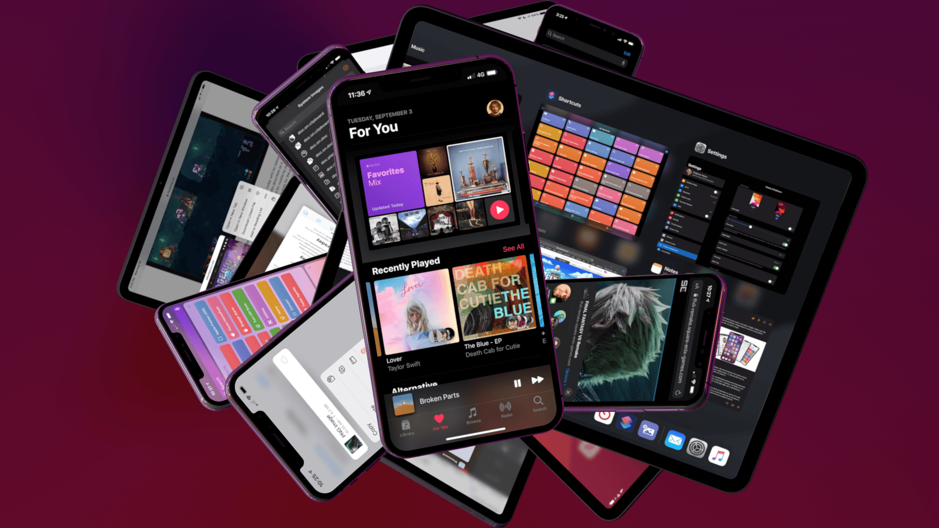
No single feature of the iOS 14 betas has had as immediate an impact on my daily iPhone use as Home screen widgets. Together with the App Library, the features can radically change the way apps are organized and accessed by everyone. Users don’t have to use widgets or the App Library, but they’ve been designed to feel familiar and inviting, echoing the iPhone’s grid layout, folders, and search systems. The result is a deft balancing act that gently introduces the iPhone Home screen’s most significant makeover since it was launched, which I think will be a big hit with users and developers alike.
Widgets’ impact is less pronounced on the iPad, where their placement is less flexible, and there is no App Library. Widgets can’t do quite as much in iOS and iPadOS 14 betas as they can under iOS 13 either. Those are fairly significant caveats depending on how you currently use widgets and should be kept in mind, but it’s also worth remembering that this is the first public beta release. There are still many weeks before iOS and iPadOS 14 will be released, and users’ feedback could influence what the final implementation of widgets looks like.
Despite the current limitations, widgets have profoundly changed the way I use my iPhone and have the potential to do the same on the iPad. The impact surprised me because, after two and half weeks on the developer betas, the only widgets I’ve tried so far are based on Apple’s system apps. As a result, I wanted to share my first impressions and thoughts on widgets, the App Library, and how I’m using both on the iPhone and iPad. I also thought it would be fun to show off some of the ideas being explored by third-party developers, which I’m excited to try soon.
Every year in late October, I start putting together a rough list of candidates for my annual ‘Must-Have Apps’ story, which I’ve historically published in late December, right before the holiday break. As you can tell by the date on this article, the 2019 edition of this story is different: not only did I spend the last months of the year testing a variety of new apps and betas, but I also kept tweaking my Home screen to accomodate MusicBot and new Home screen shortcuts. As a result, it took me a bit longer to finalize the 2019 collection of my must-have apps; in the process, however, I’ve come up with a slightly updated format that I believe will scale better over the next few years.
In terms of app usage, 2019 was a year of stabilization for me. Having settled on a specific writing workflow revolving around iA Writer and Working Copy, and having figured out a solution to record podcasts from my iPad Pro, I spent the year fine-tuning my usage of those apps, refining my file management habits thanks to iPadOS’ improved Files app, and cutting down on the number of apps I kept tucked away in folders on my iPhone and iPad.
Two themes emerged over the second half of 2019, though. First, thanks to various improvements in iOS and iPadOS 13, I increased my reliance on “first-party” Apple apps: I embraced the new Reminders app and its exclusive features, stopped using third-party note-taking apps and moved everything to Notes, and switched back to Apple Mail as my default email client. I’ve written about the idea of comfort in the Apple ecosystem before, and I’ve seen that concept work its way into my app preferences more and more over the course of 2019.
The second theme, unsurprisingly, is my adoption of a hybrid Home screen that combines apps and shortcuts powered by our custom MacStories Shortcuts Icons. Following changes to running shortcuts from the Home screen in iOS 13, I realized how much I was going to benefit from the ability to execute commands with the tap of an icon, so I decided to mix and match apps and shortcuts on my Home screens to maximize efficiency. Thanks to the different flavors of MacStories Shortcuts Icons (we just launched a Color set), I’ve been able to assemble a truly personalized Home screen layout that puts the best of both worlds – my favorite apps and custom shortcuts – right at my fingertips.
For this reason, starting this year you’ll find a new Home Screens section at the beginning of this roundup that covers the first tier of my must-have apps – the “ultimate favorites” I tend to keep on the Home screens of both devices. Because I like to keep my iPhone and iPad Home screens consistent, it made sense to start grouping these apps together in their own special section. These are the apps I use most on a daily basis; I’m pretty sure you’ll find at least a couple surprises this year.
This entire story features a collection of the 50 apps I consider my must-haves on the iPhone and iPad, organized in seven categories; whenever possible, I included links to original reviews and past coverage on MacStories. As for the traditional list of awards for best new app and best app update: those are now part of our annual MacStories Selects awards, which we published last December and you can find here.
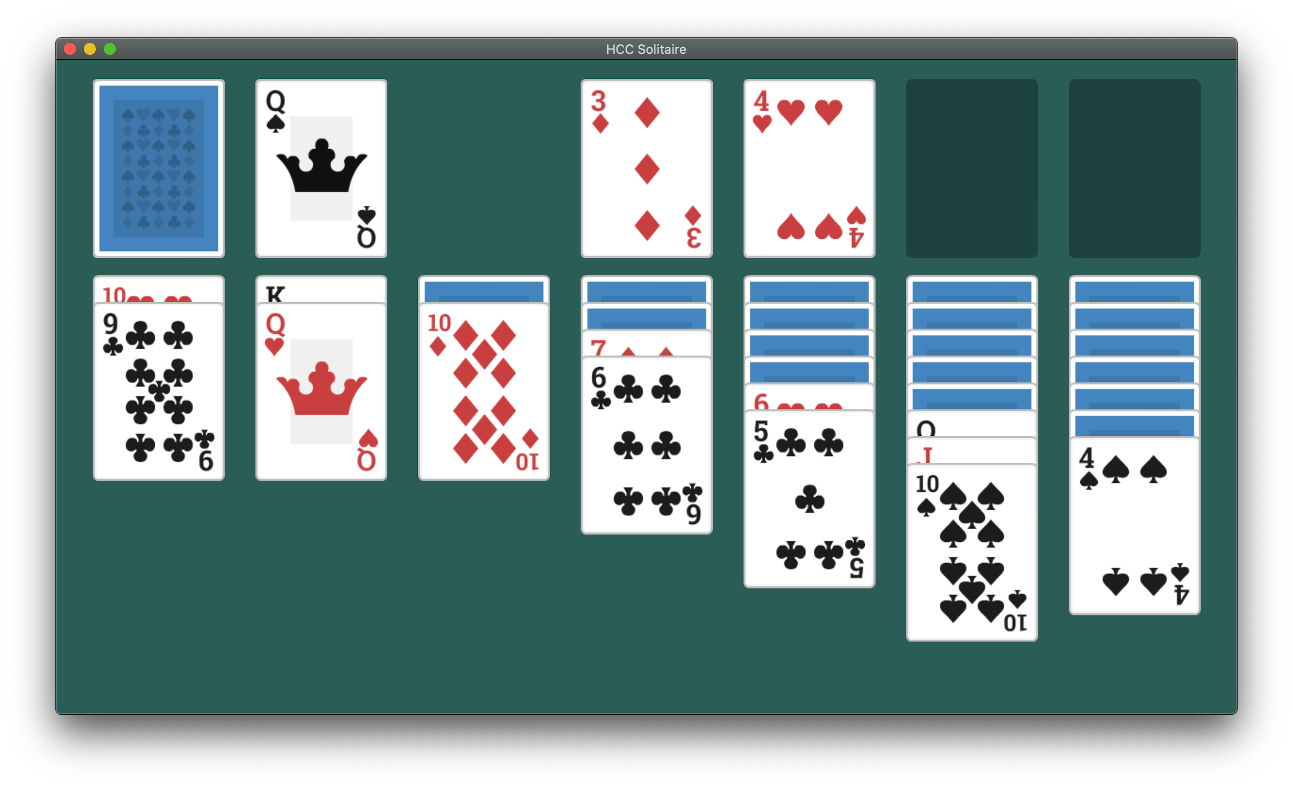
So far, the most common path to releasing a Mac Catalyst app on the Mac App Store has been to adapt and release an existing iPadOS app as a first-time Mac app. However, that’s not the only route to the Mac App Store. Apple allows developers to use Mac Catalyst in a variety of ways, as Steve Troughton-Smith has demonstrated with HCC Solitaire, a Mac-only game built using Mac Catalyst. He and Brian Mueller, the creator of CARROT Weather, have also used Mac Catalyst to release new versions of Mac apps that were previously built with AppKit.
As Troughton-Smith’s HCC Solitaire confirms, developers are not required to have an iPad app on the App Store to release an app on the Mac App Store using Mac Catalyst.
HCC Solitaire! An exploration of Catalyst, for Science™; this is a Catalyst app that exists only for Mac and has no corresponding iOS app. It also happens to be the kind of cute, ultra-simple, ad-free Solitaire game I want to play — maybe you too? https://t.co/8jdiADkGZrpic.twitter.com/dQQjWCsUDR
The game is an implementation of classic solitaire that’s just $0.99 and displays no ads. Perhaps most interesting from a developer standpoint, though, is that you won’t find HCC Solitaire if you search for an iOS or iPadOS version on the App Store. Troughton-Smith built the game using UIKit and the tools provided as part of Mac Catalyst without also creating an iPadOS version.
Brian Mueller’s CARROT Weather.
Mac Catalyst apps can also be swapped in for existing Mac apps. That’s what Brian Mueller did with CARROT Weather, which was launched the day macOS Catalina was released as version 4.13 of his existing AppKit app. Troughton-Smith took the same approach with SameGame, a color-matching game in which you earn points by eliminating contiguous blocks that are the same color, releasing version 2.2 shortly after Catalina’s release.
Steve Troughton-Smith’s SameGame.
I don’t expect either of these approaches to become the main way that Mac Catalyst apps are released, but I’m glad to see that it’s possible. Most developers will be bringing an iPadOS app to the Mac for the first time, but business models, developer backgrounds, the APIs used in an app, and many other variables play a role in the decision of whether to use Mac Catalyst. It’s encouraging to see Apple take a flexible approach and allow developers to experiment because that makes Mac Catalyst useful to more of them. However, as I noted in my Catalina review and elsewhere, that flexibility needs to be coupled with bug fixes, documentation, and rapid evolution of Mac Catalyst for it to become a viable option for a wider audience of developers.
Catalyst, the technology that allows developers to bring their iPadOS apps to the Mac, is off to an uneven start, as Mark Gurman of Bloomberg recounts through interviews with several developers. According to the developers interviewed, there’s a big difference between getting an iPad app up and running on a Mac, and using it to build a high-quality Mac app. According to Gurman:
[PCalc developer James] Thomson said the Mac version of his iPad calculator app initially looked like an iPad app floating on a larger Mac screen, so he had to redesign much of the user-facing software. However, all of the lower-level code pretty much worked out of the box, he said. Lukas Burgstaller said it was initially easy to copy over his Fiery Feeds iPad app, but then he “ran into all sorts of walls” trying to adapt the software to a Mac interface.
Those and other rough edges experienced by developers are exacerbated by a long-standing limitation of the Mac App Store: Mac apps can’t be bundled with iOS and iPadOS apps. That means developers have no choice but to charge separately for their new Catalyst apps, risking the ire of customers.
Although I remain optimistic about Catalyst, it’s off to a rougher start than I’d hoped, as I discuss in my macOS Catalina review. The quality of the relatively small crop of early Catalyst apps demonstrates that the technology holds promise, but Apple needs to move quickly to close the gaps. Otherwise the company risks alienating both developers and users, which would be a significant blow to its Mac strategy.
With last year’s release of the Apple Watch Series 4, it felt as though Apple had finally reached a point of equilibrium on the hardware side of the device. The Series 4 brought the first physical redesign, thinning the Watch out and stretching its slightly larger screen to the corners. It packed a processor that finally felt overpowered rather than underpowered, and it kept the Apple Watch’s all-day battery life going strong. The update rounded out with added health sensors for ECGs, background heart monitoring, Bluetooth 5 support, and a new speaker system. Those advancements joined the cellular capabilities from the Series 3, and have now been joined by the always-on display of the Series 5. I’m running out of feature requests for the Apple Watch.
The hardware may now be in place, but as we all know hardware is only part of the story. On the software side, the Apple Watch found its footing two years ago, but had a lot of catching up to do to reach the level of maturity of its hardware. Iteration is Apple’s specialty, and their increasingly strong understanding of the Apple Watch’s purpose has made the software path clear. Last year’s watchOS 5 brought significant fitness and audio improvements, the addition of web content and more interactive notifications. This year’s update brings us even more.
watchOS 6 flew under the radar at the packed and exciting WWDC keynote this June. It isn’t the most flashy update, but the Apple Watch had enough flashy updates in its early years to last a while longer. This is a year for iteration, and Apple has been iterating on all cylinders. watchOS 6 is a quiet giant, adding or redesigning more first-party apps at once than we’ve seen in years, dropping the largest batch of new watch faces since watchOS 1, providing a new way to track fitness over time, and kicking off a nascent foray into Apple Watch independence. Let’s see how Apple did.
Following years of a judicious union between platforms, it’s time for iPad to embark on its own journey.
In looking back at major iOS releases from the recent past, it’s easy to see how building and positioning these annual updates has become a careful balancing act for Apple.
In last year’s iOS 12, we saw the company focus on improving performance, providing users with tools to understand their device usage habits, and adapting Workflow to the modern era of Siri and proactive suggestions. The strategy was largely successful: iOS 12 was regarded as Apple’s most reliable iOS release of late – a reputation that has resulted in a 90% adoption rate a year later; and the Shortcuts app – the highlight of last year from a user feature perspective – is becoming a built-in (and thus more powerful) app in iOS 13.
For all that Apple accomplished in iOS 12, however, some areas of the experience inevitably had to be put on the back-burner. Besides improvements to Reminders and Files, iOS 12 lacked a long-awaited dark mode (which was rolled out on macOS instead) as well as more substantial tweaks to the ever-evolving iOS 7 design language; chief among iOS 12’s absentee list, of course, was iPad. Even though Apple had trained users to expect major additions to the tablet platform on a biennial schedule (see iOS 9 and iOS 11), the lack of meaningful iPad features in iOS 12 spurred a contentious discussion when it became apparent that new iPad Pro hardware was so far ahead of its software, it legitimized asking whether investing in that hardware was even worth it.
The annual debate that surrounds which features make it into each major iOS release is symptomatic of a complicated truth: iOS isn’t just the operating system that runs on iPhones anymore, and these annual releases are more than a mere collection of updated apps. iOS is the platform for an ecosystem of devices – from our wrists and speakers to cars and TV sets – and its changes have repercussions that ripple far beyond an updated Reminders app or a new icon set.
This, of course, has been the case for a few years at this point, but the nature of iOS as an all-encompassing platform has never been as evident as it is today in iOS 13. For the first time since I started reviewing Apple’s annual iOS updates, it feels like the company is now keenly aware that a new iOS version has to cover an array of themes that can’t be pushed back for scheduling reasons. A single area of attention isn’t enough anymore – not for the Apple of 2019 as an economic, political, and social force, and not for iOS, the engine powering devices that aren’t just screens for apps, but bona fide lifestyle computers.
As a result, there’s something for everyone in iOS 13 and all the recurring themes of Tim Cook’s Apple are touched upon this time around. iOS 13 improves Face ID recognition and promises improvements to app download sizes and performance. Apple is sending strong signals on its commitment to privacy as a feature with a new sign-in framework for apps and enhancements to location tracking controls and HomeKit cameras. iOS’ design language is getting its biggest update in years with dark mode, new tools for developers to express colors and embed glyphs in their user interfaces, updated context menus, and redesigns aimed at facilitating one-handed interactions. We have notable improvements to built-in apps, including the rebuilt Reminders and Health, an overhauled Files app, and hundreds of quality-of-life tweaks that, in big and small ways, make iOS more capable and efficient.
No stone is left unturned in iOS 13 – and that includes iPad too.
The iPad experience has always been largely consistent with the iPhone – particularly since Apple unified core iOS interactions around a screen without a Home button – but also distinct from it. iOS 13 makes this distinction official by splitting itself in a second branch called iPadOS, which uses iOS as the foundation but is specifically optimized and designed for iPad.
It was clear when the new iPad Pro launched in late 2018 that it told only one part of a bigger story about the role of the tablet in Apple’s modern ecosystem. With iPadOS, Apple is ready to tell that full story: while the iPad has always been an extension of iOS, sharing key similarities with the iPhone hardware and software, it’s been evolving – arguably, a bit too slowly – into a different breed of computer that is fundamentally distinct from a phone.
We’ve been able to observe this divergence starting in iOS 9 with Split View multitasking and Apple Pencil, and the transition continued with iOS 11 and its drag and drop-infused environment. It was only natural (and well-deserved) for the iPad to begin advancing in a parallel direction to iOS – informed and inspired by it, but also capable of growing on its own and tackling problems that an iPhone doesn’t have to solve.
From this standpoint, there are two sides to iOS 13: on one hand, an underlying tide that raises all platforms, featuring a distillation of themes Apple comes back to on an annual basis; on the other, a fork in the road, opening a new path for the iPad’s next decade. And against this backdrop, a single question looms large: