
John: The MacStories Selects Awards are our annual celebration of the apps we love and the people who make them. Every year, the MacStories team uses hundreds of apps. Some are familiar favorites, but most are new. So, after many months of testing those developers’ apps, we stop to recognize the best.
This year, as we headed into the final stretch of the year, we decided it was time for the MacStories Selects to honor more than just the apps from the past year. MacStories has been covering apps since Federico published his first story in 2009, and having covered thousands of apps spanning more than twelve years, it’s time to look back at all of those apps and honor the standouts that have withstood the test of time with an annual Lifetime Achievement Award, which you can read about more in a special story that includes a bit of history about the winning app and interview with its developer.
Apps have become part of the fabric of our daily lives, which makes it easy to forget that they’re the result of hard work by creative people. The MacStories Selects awards are our chance to pause and appreciate just how fortunate we are to have such a wealth of fantastic tools available from so many talented developers before we start the new year.
2021 has been an exciting year for apps. The resurgence of note-taking apps ignited by apps like Craft, Obsidian, and Roam Research continued unabated. We also saw new apps successfully remix technologies and approaches and apply them to new domains, and of course, automation continued to be a central theme, with a long list of established and new apps testing the waters of Shortcuts for Mac for the first time.
As a result, we had a wealth of apps to choose from as always for the following awards:
- Best New App
- Best App Update
- Best New Feature
- Best Watch App
- Best Mac App
- Best Design
- App of the Year
Along with the Lifetime Achievement Award and Readers’ Choice Award, which was chosen by Club MacStories members, that makes a total of nine award winners plus seven runners-up for these fourth annual MacStories Selects Awards, which began in 2018. As we did last year, we have also created beautiful physical awards commemorating the winners, which we will be sent to each of the winners this week.

We also recorded a special episode of our podcast AppStories all about the MacStories Selects winners and runners-up. It’s a terrific way to learn more about this year’s apps.
You can listen to the episode below.


We will hold our Monthly Town Hall live event with additional MacStories Selects coverage in our Discord community for Club MacStories+ and Club Premier members tomorrow, December 14, 2021, at 12:30 PM Eastern US time and release it later as a Town Hall podcast episode for those who can’t join live.
So, with those preliminaries out of the way, it’s my pleasure to introduce the 2021 MacStories Selects Awards to the MacStories community.
Table of Contents
- Best New App
- Best App Update
- Best New Feature
- Best Watch App
- Best Mac App
- Best Design
- Readers’ Choice
- App of the Year
Best New App
Noir

Federico: When we come together as a team to evaluate the best new apps of the year, there’s always one factor that we carefully consider: besides being “new”, does the app in question fit into any new App Store categories or trends created by new iOS or iPadOS APIs? Was it possible for developers to create this app already, or is it the result of new technologies that simply did not exist before? And if so, are we sure this app isn’t a fad but something that can be useful for years to come, standing the test of time against potential competitors that may be released in the future?
Noir, a new app created by indie developer Jeffrey Kuiken, is the perfect example of why care about this MacStories Selects award so deeply. Noir is a native Safari extension that automatically enables dark mode on websites you visit, even if those websites don’t offer their own “official” dark mode. Various utilities that accomplish similar goals have come out on the App Store since the release of iOS and iPadOS 15, but here’s what makes Noir special: there are plenty of options to configure the app’s behavior, but, under the hood, the app generates dark palettes of colors for each website automatically, without any manual input required. Noir does so by analyzing the website’s original color scheme and coming up with dark colors that maintain the website’s aesthetic, preserve highlights, and retain a good contrast level.
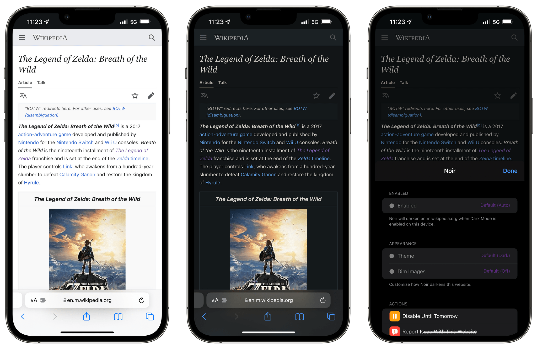
Of all the ‘automatic dark mode’ Safari extensions we’ve tested, Noir generated the most visually pleasing themes: it’s easy to start thinking all websites you open in Safari have adopted great-looking dark modes and forget you actually enabled an extension that intelligently creates them for you. This has happened to me on more than one occasion over the past few months; then I remembered I wasn’t being blinded by bright websites at night anymore because of Noir’s clever optimizations.
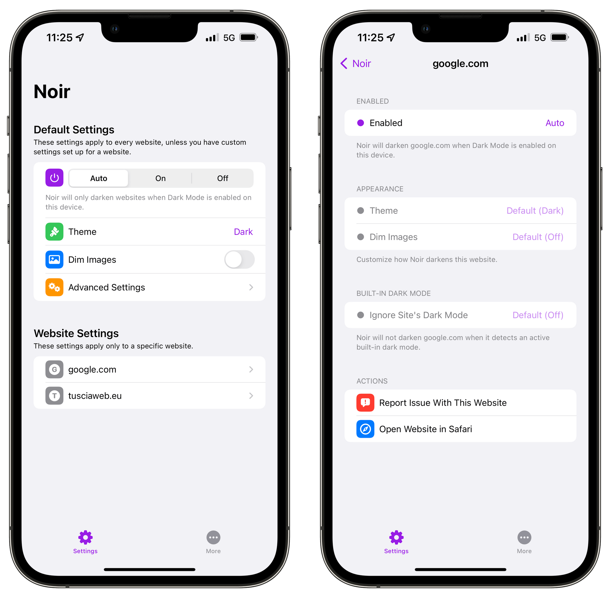
There are several nice touches I appreciate about Noir’s different options for customizing the extension’s behavior and website settings. For starters, you can choose to enforce automatic dark mode conversion at all times or – and this is what I do – activate Noir only when iOS’ system dark mode is active. There’s a handful of other global settings you can also check out: for instance, you can choose to ignore a site’s built-in dark mode, dim images displayed on a page, and pick one among multiple flavors of dark backgrounds. These settings can be tweaked globally, but you can also define website-specific rules that are only applied to individual websites. To top it all off, all this syncs with iCloud across platforms, including the Mac, so your custom dark mode settings will be consistent on each version of Safari you use.
That’s exactly why we love Noir and, ultimately, why we consider it the best new app of 2021: it taps into a new App Store category for iPhone and iPad users in a way that combines the “it just works” factor with deeper customization features that people like us appreciate. You can turn on Noir, leave it enabled, and let it do its thing, or you can go into the app’s settings and customize everything, or you can do a little bit of both. Noir strikes the ideal balance between intuitive design and power-user options, all while serving as the perfect demo for Safari extensions in iOS and iPadOS 15. If you like dark mode and have always been annoyed by websites that don’t natively support it, you can’t go wrong with Noir.
Best New App: Runner-Up
Mela
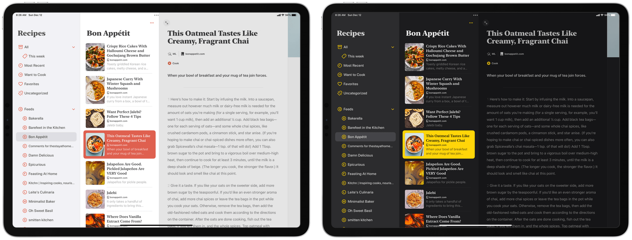
John: One of the things that has struck me over the past couple of years is that the pace of app innovations has picked up again on all of Apple’s platforms after being quiet for a while, especially on iPad. To be sure, there’s still a dearth of pro-level apps that take full advantage of the power of the iPad Pro. However, despite the lack of apps of Logic or Final Cut’s complexity and depth, there are unmistakable pockets of innovation on the App Store in categories like text editors, music apps, RSS clients, and even recipe apps, which saw the debut of this year’s MacStories Selects Best New App runner-up – Mela by Silvio Rizzi.
Mela, which is the winner of our MacStories Selects Best Design of 2021 award, is notable for more than just its delightful interface. More than a decade into the App Store’s history, I didn’t expect one of the year’s most innovative apps to be a recipe app, but here we are. It’s not that there haven’t been new and interesting recipe apps in recent years; there have been and we’ve covered them. However, Mela is different.
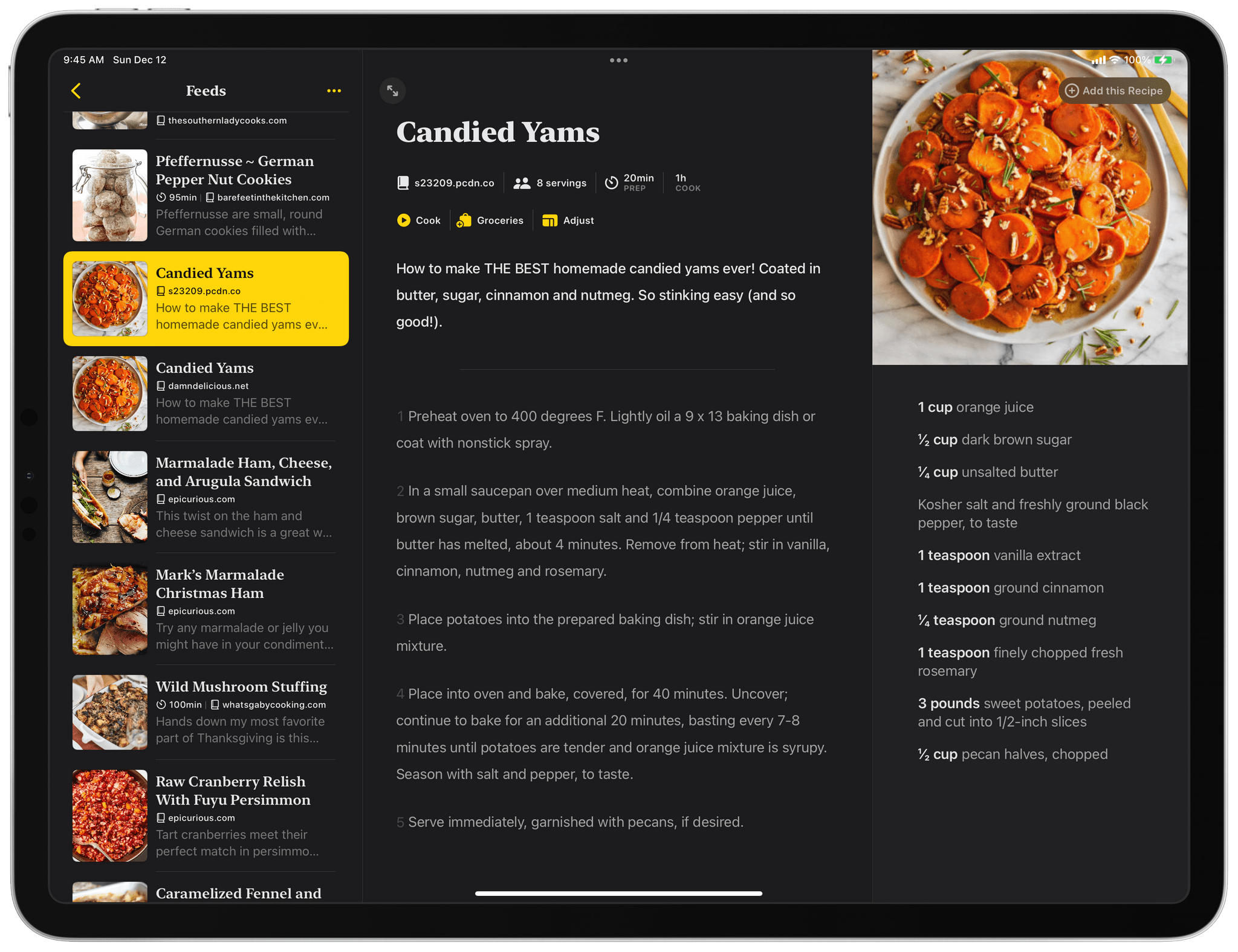
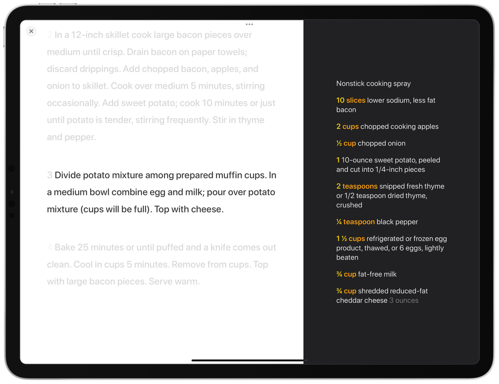
Aside from the app’s beautiful design, which I’ll cover in the context of the design award, the two features that earned Mela a spot as runner-up for the Best New App of 2021 award are its use of RSS and its cooking mode. Mela uses RSS to streamline recipe discovery. Not all recipe websites support RSS, but there are some fantastic ones that do. Once you add some feeds, they’re available to browse individually or as a collection, much like you’d browse headlines in an RSS client. Then, when you find a recipe that looks good, a quick tap of the ‘Add this Recipe’ button imports the recipe into your library.
What’s fantastic about the addition of RSS feeds to a recipe app is that it makes the process of finding new recipes simple. Instead of having to visit multiple sites and wading through other content, Mela delivers recipes directly to its users. It’s an ingenious and efficient use of old technology with a twist.
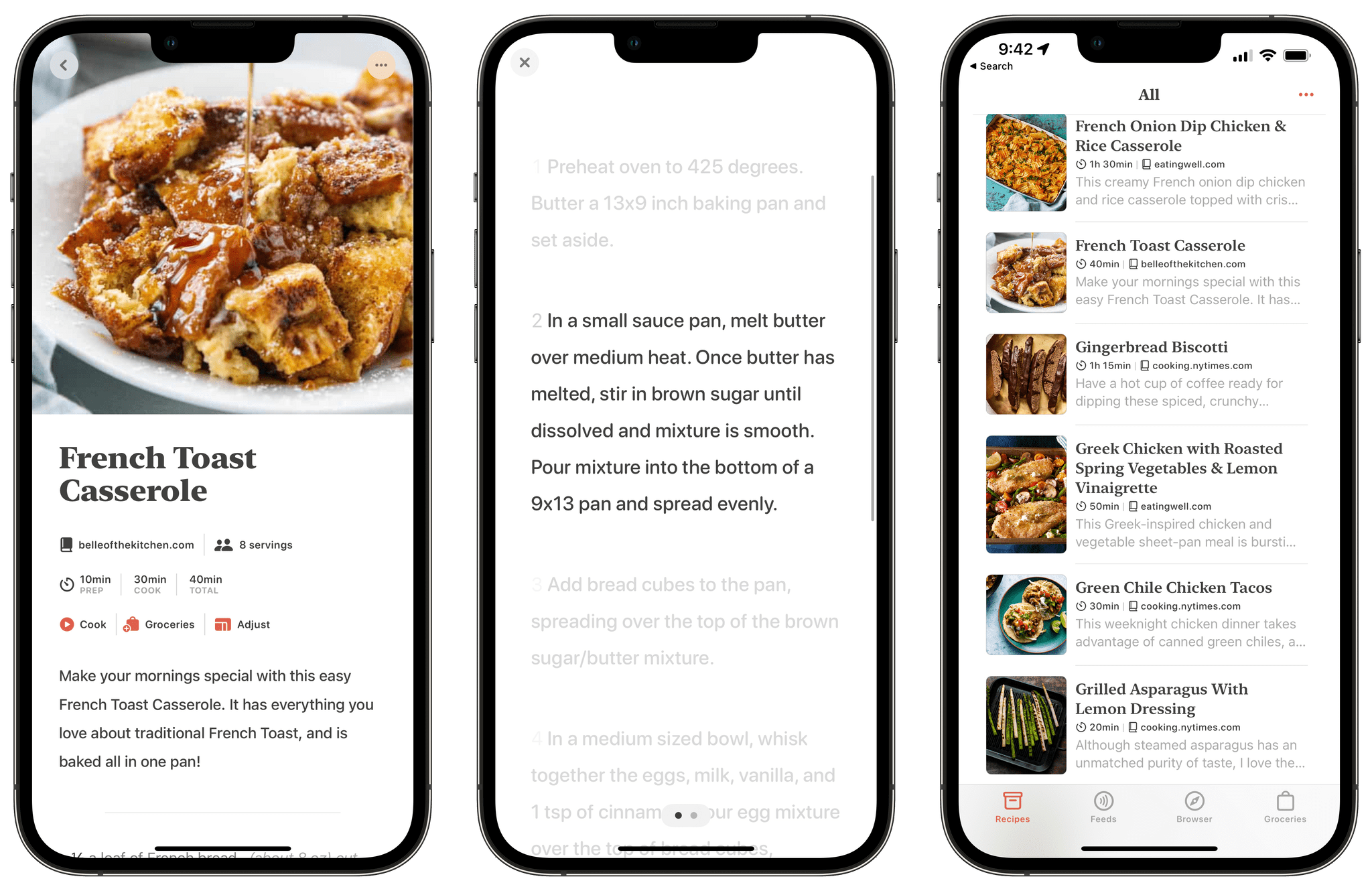
The other feature of Mela that I love is its cooking mode. When it’s time to start preparing a recipe, tap the Cook button, and a new view slides into place. The layout is a little different depending on the platform you use, but on the iPad, which is what I use most often when I’m in the kitchen, the instructions for the recipe are on the left, and the ingredients are on the right in nice big text that’s readable from a distance as you move around the kitchen. Plus, the instructions are highlighted one at a time with any previous or following steps dimmed out but accessible with a quick tap of the screen or the keyboard. The mix of focus and legibility makes Mela a terrific kitchen companion.
Mela is a fantastic example of an app that borrows standard features from one category of apps and remixes them with another. Here, Mela has borrowed from RSS readers, a category that Rizzi knows well as the developer of the RSS client Reeder, and text editors’ focus mode to create something novel in a very different category: recipe apps. Mela is still very much a 1.0 app that doesn’t have the depth of features of some of its competitors, but the advantage it has is a fresh start and a new perspective on ways to improve the category. By making it fun to discover new recipes and easy to follow them when I’m in the kitchen, Mela has found its way into my core set of apps.
- Mela website
- Mela on the App Store: (iPhone/iPad and Mac)
- The MacStories Review
Best App Update
Tweetbot 6

As I wrote a few weeks ago on MacStories, when Tweetbot 6 launched earlier this year, I didn’t exactly pay attention to it. I thought the app looked largely similar to its predecessor, and I couldn’t understand why Tapbots wanted to switch to a subscription-based business model for an app that didn’t look that different. Launching the new version as ‘Early Access’ on the App Store seemed to imply bigger things were on the horizon, but I was underwhelmed.
A few months ago, partly because of my new weekly schedule, I realized I wanted to change my Twitter consumption habits. I was missing too many interesting tweets by not following my timeline all day but, at the same time, I didn’t want to spend all day with Twitter on my iPad Pro. I needed to use timeline sync again, and that’s when Tapbots’ powerful Twitter client came calling back to me.
I’m glad I took Tweetbot for a spin again because what I found is a Twitter client that has been revolutionized by the adoption of Twitter’s V2 API and new business model. The combination of subscriptions and Twitter’s commitment to a more versatile developer API has allowed Tapbots to continuously iterate on Tweetbot throughout 2021, taking Tweetbot’s existing foundation and propelling the app into the modern reality of new Twitter features and iOS/iPadOS 15 changes.
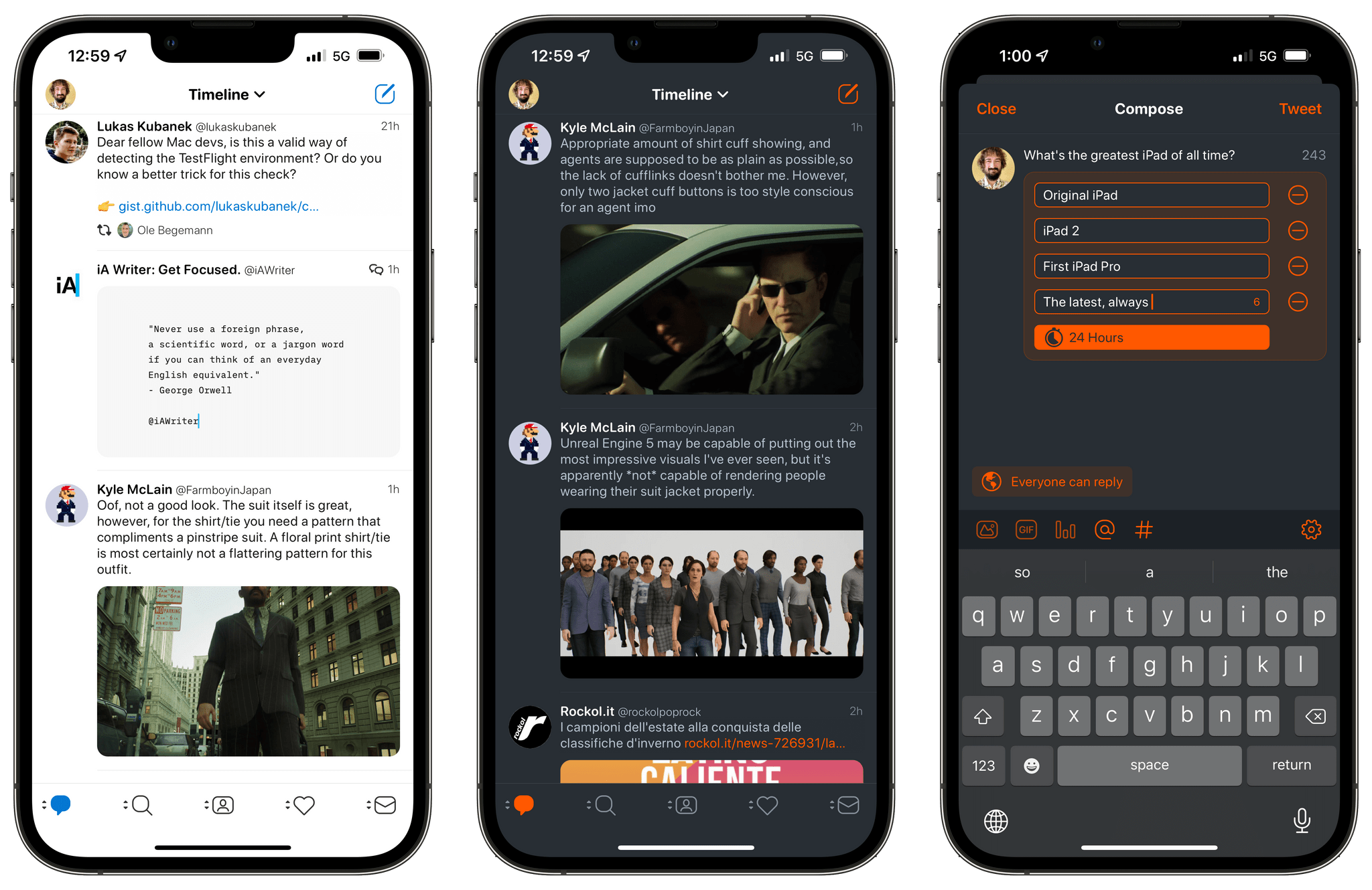
Over the past 12 months, Tweetbot 6 has been frequently updated with support for new Twitter integrations as well as new functionalities native to Apple’s platforms. On both iPhone and iPad, Tweetbot now supports viewing who liked and retweeted your tweets; it correctly displays pinned tweets on profiles; it lets you add accessible descriptions to image attachments; as of version 6.6 released in November, Tweetbot can even create polls and limit who can reply to your tweets. The latter was one of the major additions to conversations on Twitter in 2020, and it’s now fully supported in Tweetbot thanks to the new Twitter API. While several limitations persist when it comes to comparing Twitter and Tweetbot side by side (the algorithmic timeline, for instance, will likely remain exclusive to Twitter’s official app), it’s encouraging to see Tweetbot match several of the key additions to the Twitter service from the past couple of years.
What’s also remarkable about Tweetbot 6, however, and the reason we believe it deserves the Best App Update award, is how Tapbots was able to rejuvenate an App Store classic with constant iteration backed by a sustainable business model. In the past year alone, Tweetbot has gained support for iPad multiwindow and native keyboard commands; brand new timeline widgets to keep an eye on tweets on the Home Screen, including XL-sized ones for iPadOS 15; a new Behaviors menu to customize more aspects of the app; plus, even more custom themes and app icons. The pace of updates picked up again with the release of Tweetbot 6 and, so far, it hasn’t slowed down at all.
It’s not easy to maintain an app like Tweetbot, which attracts hundreds of thousands of users and has always depended on a notoriously fickle company with a rocky developer platform. The stars, however, have aligned with Tweetbot 6, which brought Tapbots’ client into the modern Twitter and iOS era thanks to a thoughtful combination of a new business model, new Twitter API, and attention to the latest iOS and iPadOS features. For all these reasons, Tweetbot 6 is our Best App Update of 2021.
Best App Update: Runner-Up
Sofa 3.0
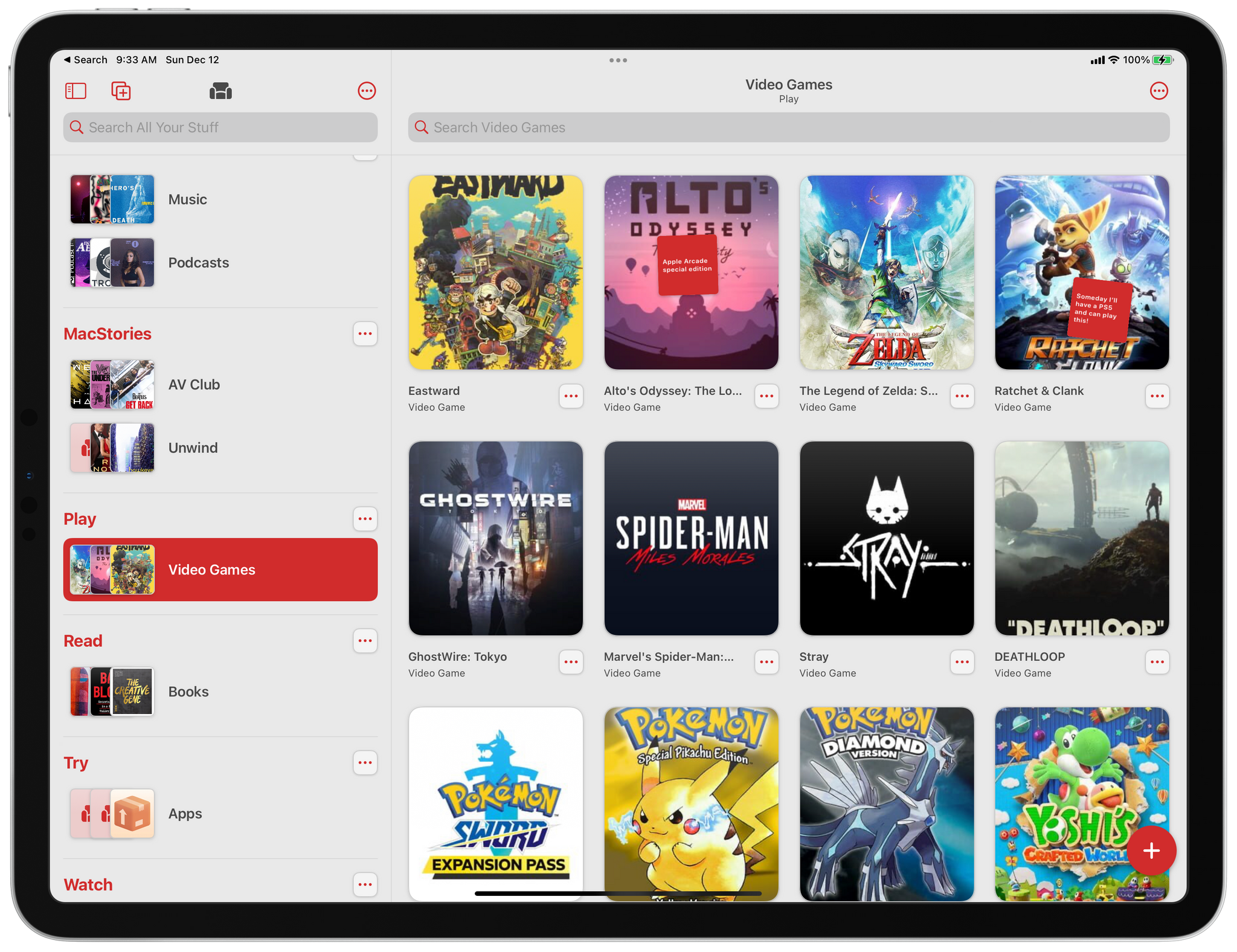
John: Shawn Hickman bills Sofa as a downtime organizer for tracking the books, movies, videogames, and other media you want to try, which is the perfect description. It has things in common with task managers, but the app you use to keep track of what you want to do when you’re relaxing shouldn’t be a buttoned-down list with priority flags and due dates. Instead, it should be fun. A downtime organizer should also be flexible enough to accommodate multiple media types and the many different ways people organize their free time, all of which Sofa handles extraordinarily well.
What makes Sofa work so well is that it offers a loose structure for organizing your downtime without forcing a single approach on users. Even though the app is based on lists, those lists aren’t tied to media types. That means you’re not limited to separate book, movie, and music lists. Instead, you can create a Saturday night list that combines any combination of media types the app supports, for example. It’s an option that acknowledges that when you enjoy some downtime is sometimes more important than what to consume.
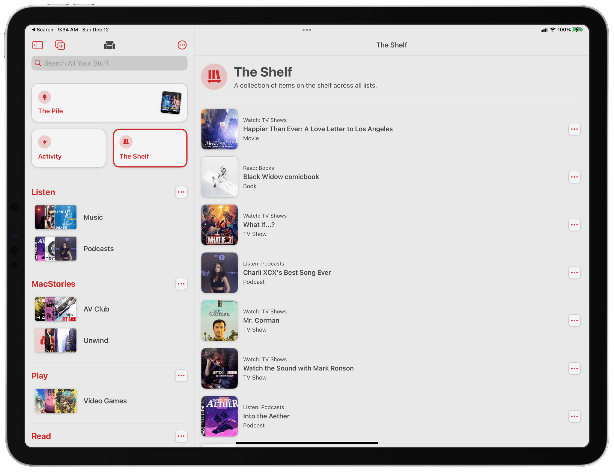
Sofa also uses a loose system for prioritizing items with a special list called The Shelf, which debuted in version 3.0. The Shelf can be used as an ‘up next’ queue, but it’s flexible enough that it can also serve as an ‘in process’ list. Each list you create in Sofa has its own Shelf, which is a dedicated row of media thumbnails at the top of the screen. What makes The Shelf unique, though, is that Sofa also has a standalone Shelf section that’s accessible from its main view and collects the items from each list’s Shelf into a consolidated Shelf, which makes picking what to continue or start simple.
Another addition to Sofa 3.0 that lowers the barrier to getting new material into the app is that it detects the primary type of media in each of your lists. That way, when you search for something to add to a list, the app defaults to searching for the kind of media that you’re most likely to want to add to the list.
Sofa 3.0’s notes feature has also been carefully considered. Users are encouraged to keep notes brief because they appear as a tiny sticky note attached to an item. They’re perfect for keeping track of small bits of information like who recommended something to you, but it’s not intended to house full-fledged reviews or other longer text. As with so many other features of Sofa 3.0, its notes are an excellent balance between being approachable and useful.
It’s that careful balance that makes Sofa 3.0 one of the best updates of 2021. We see a lot of apps for managing all sorts of media lists, and many are hard to tell apart. Sofa has taken a different path from the pack, which I love. The app’s carefully-considered feature set and the fun and personality of its extensive theming system provide a unique and fun experience that you won’t find anywhere else. With version 3.0, Sofa took what was already one of our favorite iPhone and iPad apps and made it the one I keep on my first Home Screen for tracking my media consumption.
Best New Feature
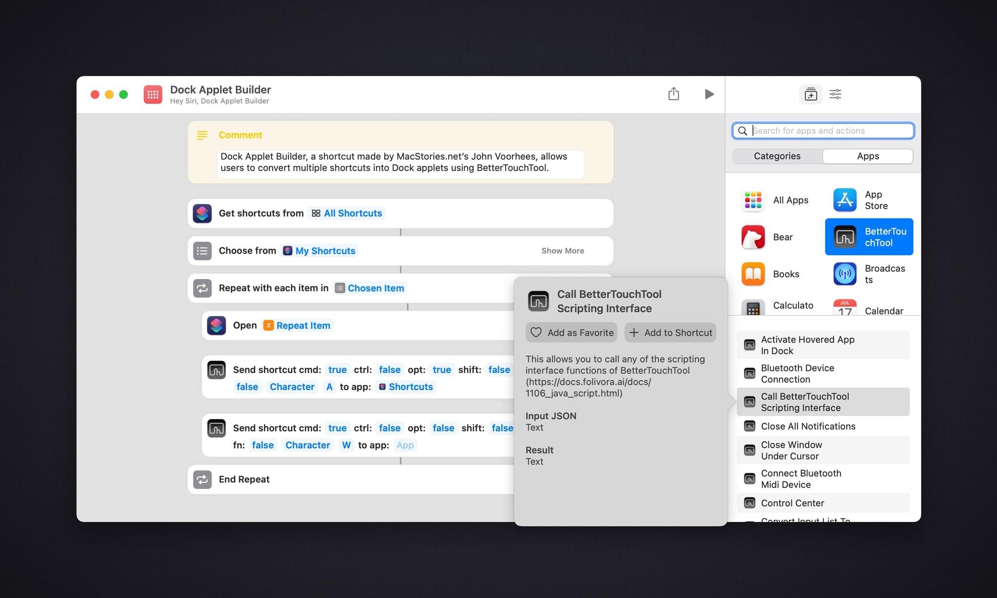
BetterTouchTool’s Shortcuts Actions

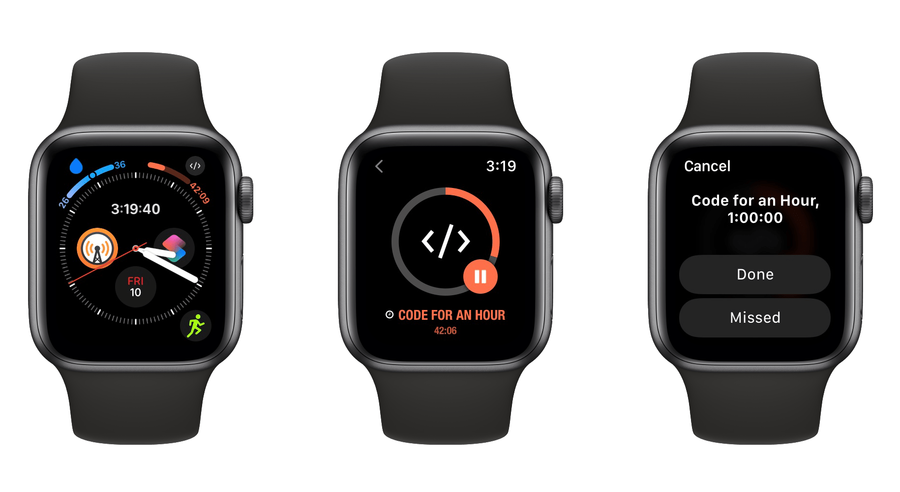
John: I’ve used BetterTouchTool for many years. The app, which started as a way to trigger actions from an extended collection of trackpad gestures, has evolved into a much more capable utility that can kick off a long list of actions based on an extensive set of triggers. That’s made the app a must-have tool for power users for a long time.
When Shortcuts was announced for the Mac, it wasn’t clear whether and how the developers of existing automation tools would adopt it. Given BetterTouchTool’s history of supporting as many triggers and system actions as possible, it should come as little surprise to anyone that Andreas Hegenberg, BetterTouchTool’s developer, easily has the most comprehensive support for Shortcuts of any Mac app I’ve tried.
Hegenberg has created an extensive library of actions that can be used to build shortcuts that incorporate BetterTouchTool’s extensive feature set. What makes the app special, though, is that it can also act as a launcher for shortcuts. The combination creates a vast canvas on which creative automations can be assembled.
Shortcuts for Mac adopted a long list of the most popular Automator actions, which are an excellent starting point for automating macOS with Shortcuts, but there are still gaps. That’s where BetterTouchTool comes in. The app has built an extensive library of actions over many years that fill many of Shortcuts’ gaps.
The long list of actions available from BetterTouchTool has made it the first place I look when I run into a wall trying to implement a shortcut using macOS’s built-in actions. With BetterTouchTool’s Shortcuts actions, you can manipulate windows and other UI elements, control Bluetooth connections, run scripts, manipulate text and images, simulate mouse clicks, trigger keyboard shortcuts, access the clipboard, display custom HUDs, and a whole lot more.
In total, there are over 40 actions available, making the vast majority of BetterTouchTool’s features available as part of Shortcuts. In addition to filling gaps in system actions, BetterTouchTool’s actions greatly expand the possibilities of what can be accomplished with Shortcuts for Mac when they are combined with actions from other Mac apps.
More broadly, BetterTouchTool’s implementation of Shortcuts actions is a validation of Apple’s strategy of embracing existing Mac automation tools and ensuring that the app is available broadly across macOS and to third-party developers. There are still fundamental Shortcuts actions that Apple should make for Shortcuts, but as the company works to stabilize the app itself, it’s comforting to have a robust set of tools from BetterTouchTool.
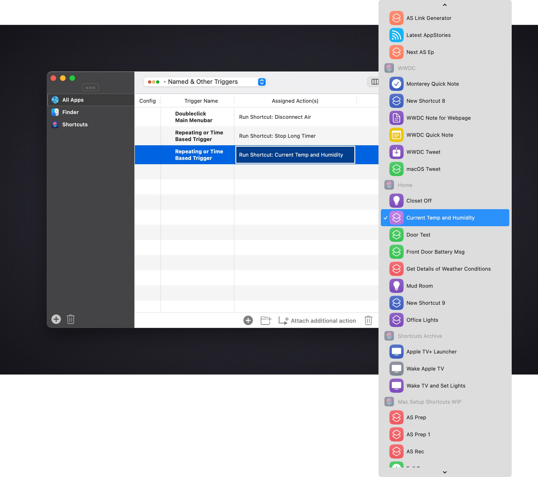
BetterTouchTool also enhances Shortcuts on the Mac by allowing shortcuts to be run based on a BetterTouchTool trigger. I’ve tried a long list of Mac apps that are designed to trigger shortcuts, and no app does it as well as BetterTouchTool. Most apps struggle to display long lists of shortcuts, which manifests itself in slow load times and spinning beachballs. Whatever Hegenberg has done differently works. Large shortcuts libraries load quickly and are organized by folder, making navigation vastly superior in BetterTouchTool than it is in other apps.
By making shortcuts just another action that can be triggered with BetterTouchTool, an entirely new world of triggers is available to run your shortcuts. Apple has already included a long list of ways to run shortcuts on the Mac, but with BetterTouchTool, trackpads, mice, the Siri Remote, MIDI devices, and more triggers are options too. It’s a deep well of opportunity that I expect users will plumb for many months to come with clever and creative automations.
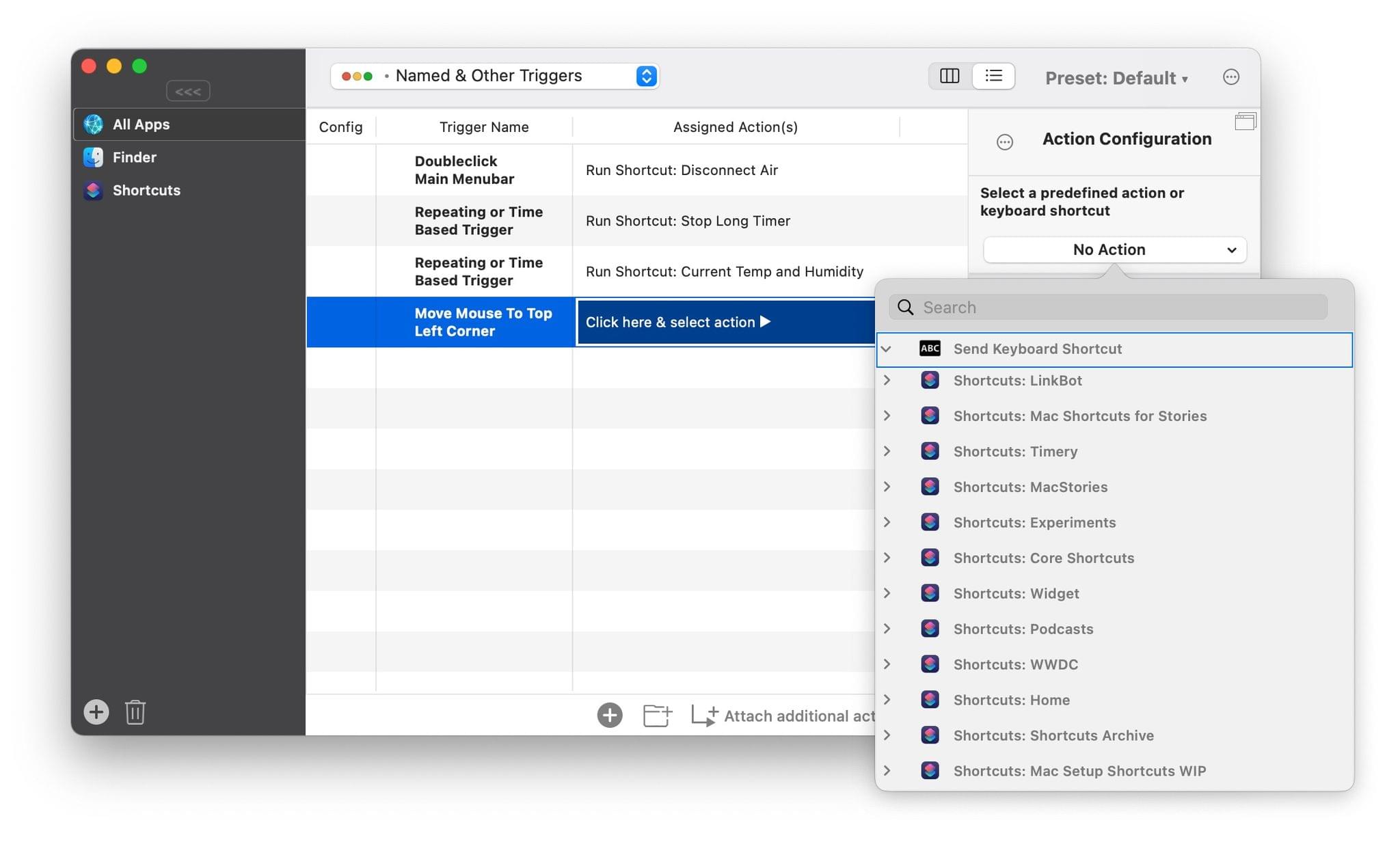
Shortcuts are neatly organized by folder and can be run using BetterTouchTool’s extensive library of triggers.
The journey from WWDC to today has been a roller coaster ride for Shortcuts users, but BetterTouchTool shows off the app’s potential better than any I’ve used so far. BetterTouchTool is as powerful as it has ever been, but its Shortcuts support lets its users combine its strengths with actions offered by other apps, mixing and matching functionality in ways that weren’t possible before.
By the same token, other apps’ features can now be accessed from BetterTouchTool, too, because it can run shortcuts that use those apps’ actions. It’s a self-reinforcing, virtuous automation cycle that uses Shortcuts as the intermediary to connect disparate apps. This is a glimpse of the future promised at WWDC, and one that BetterTouchTool demonstrates is still possible as Shortcuts matures.
Two of the themes that cut across many of the apps picked as MacStories Selects award winners this year are that they’re all apps that are open to adopting Apple’s latest technologies and integrating with other apps. When done well, the result far outstrips the sum of the parts, which is what Andreas Hegenberg has accomplished with the Shortcuts integration in BetterTouchTool and why it’s this year’s MacStories Selects pick for Best New Feature.
- BetterTouchTool website
- Recent MacStories Coverage
Best New Feature: Runner-Up
Yoink’s Clipboard Monitoring
Federico: The App Store’s history is filled with examples of developers who pushed the boundaries of Apple’s platforms to blow past the technological limits of iOS and iPadOS. MacStories has been around long enough to witness the arrival and evolution of some of these innovations and workarounds, which weren’t always met favorably by Apple. A few months ago, for the first time in years, I came across a modern example of this with a feature that, so far, is still available on the App Store and was even featured by Apple: background clipboard monitoring in Yoink.
Apple doesn’t allow Mac-like clipboard managers to run persistently in the background on iPhone and iPad. However, that hasn’t stopped developer Matthias Gansrigler from coming up with an ingenious feature for his shelf app/clipboard manager Yoink to circumvent this system limitation: a custom Picture in Picture mode.
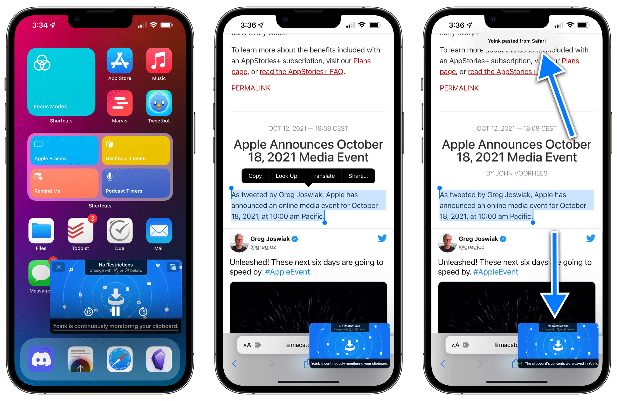
In iOS and iPadOS 15, Apple added the ability for developers to display arbitrary content in Picture in Picture, which is how Gansrigler got the idea for leveraging this technology as a way to let Yoink run interrupted in the background and – following the user’s manual authorization – monitor changes to the system clipboard. The feature is genius: when you enable clipboard monitoring in Yoink, a custom Picture in Picture window comes up displaying not a video, but a message about what Yoink is doing in the background. Once Picture in Picture is running, you can start copying things all around the OS – this works on both iPhone and iPad – and they’ll be automatically archived in Yoink, which is being kept alive in the background by the “video” playing in Picture in Picture. You can even use the pause button to stop clipboard monitoring and skip between different filtering modes for images, URLs, and other data types.
The ability to run a clipboard manager persistently in the background is one of the greatest differentiators between working on iPadOS and macOS. While we continue to believe Apple should make these kinds of utilities possible on iPad too, it’s great that third-party developers are trying to come up with alternative implementations for iPadOS. Yoink’s take on clipboard monitoring powered by Picture in Picture is excellent, and it’s one of our favorite new features of 2021.
Best Watch App
Streaks

Alex: Streaks is a habit tracking app which we’ve covered many times on MacStories. One of the core tenets of the app is checking off daily tasks in order to maintain your streaks, and this is a perfect use case for the Apple Watch.
I’ve argued for years in my watchOS reviews that the best Apple Watch apps are those in which users need to spend the least amount of time. An Apple Watch interaction should accomplish something useful to the user with as few taps and delays as possible — getting them in and out so they can lower their wrist and carry on with their day. Streaks has been nailing this idea for longer than any other Apple Watch app that I remember.
I covered Streaks for Apple Watch all the way back in my watchOS 2 review. At that time, in the very first days of third-party Apple Watch apps, Streaks was already designed for the streamlined, in-and-out interactions that I love on the Watch. The app supported complications, had large tap targets, and didn’t try to jam in any unnecessary complexity. You opened it, checked off your streak, and closed it.
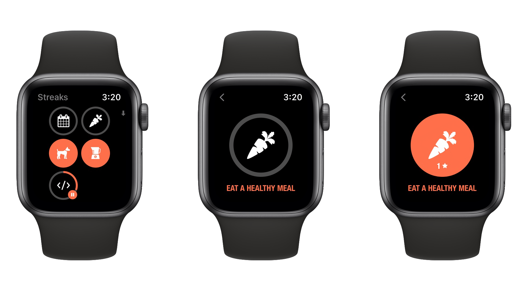
Six years later, Streaks continues to be a shining example of excellent watchOS app design. Simple doesn’t have to mean bland, and Streaks uses colors and iconography to create a friendly and beautiful interface. The app offers complications for launching to its main grid, or for immediately accessing the “next” task from one of its four color-coded pages.
The Streaks app is at its best when paired with a complication on your watch face. Modern Streaks complications have far more capabilities packed in than they used to back in watchOS 2. The settings pane in the Streaks app allows you to customize any of its complication types. You can choose which data points are shown, change the way that the “next” task is selected, and more. The app also includes a small library of watch face setups that you can install if you want to quickly test out a variety of Streaks complication types.
In the Streaks app for Apple Watch, you can tap into any of your tasks to mark them as complete, or to begin a running countdown if they are timed tasks. While countdowns are active, the Streaks complications display the time remaining on your task. Tapping a complication immediately takes you to the task interface where you can pause the countdown or tap and hold to mark it done or cancel it. As a nice touch, if you mark a timed task done on accident, you can tap and hold to undo that action and the timer will continue from where it left off rather than being restarted.
Streaks for Apple Watch is packed with small details which show that developer Crunchy Bagel truly cares about delivering a high quality experience. The watchOS version contains every feature I could want from it, and never feels bloated or slow to use. It is a master class in simplified design for the Apple Watch, and was an easy pick for Best Watch App in this year’s MacStories Selects.
Best Watch App: Runner-Up
Drafts
Alex: Drafts holds a special place in my heart, as it was the topic of my first-ever post on MacStories nearly eight years ago. Over the years, Drafts developer Greg Pierce has never failed to keep the app up to date with Apple’s latest iOS updates. Once the Apple Watch hit the scene, Drafts quickly made a home there as well.
On the Watch, Drafts is another great app with a simple design that masks an impressive degree of complexity. Its main screen allows quick access to an input field where you can create a new draft via dictation, Scribble, or the new full keyboard on the Apple Watch Series 7. Drafts even integrates with the FlickType keyboard if you prefer that for typing on an Apple Watch.
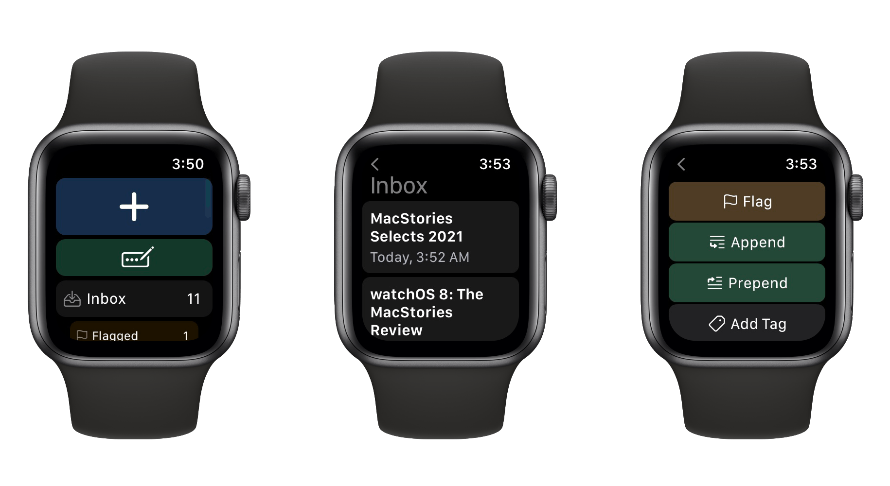
New drafts are added to your Inbox just like they are in the iOS app. You can access your full Inbox on the Apple Watch, and even append to, prepend to, tag, flag, archive, and delete existing drafts from the watchOS interface.
This is a lot of complexity to pack in, but Drafts does it without the app feeling too bloated or slow. The quickest interaction you might want is to create a new draft, and this is the most clearly and easily accessible function in the app. Everything else is a bit hidden away, so you can get to the extra features if you ever really need them, but they aren’t in your way if you don’t.
Drafts of course supports a variety of complications as well. Most important are the complications for jumping directly into the creation of a new draft, as these speed up the app’s main functionality even further.
Unfortunately in watchOS 8, Apple rendered it impossible for third-party apps to immediately launch into voice input mode like they could in previous versions. This means there’s one extra tap needed to get to voice input from the Drafts complications, but it’s still as fast as possible in the current environment. Hopefully Apple will re-enable the old behavior at some point so that we can get back to voice-inputting our drafts with a single tap from the watch face.
Drafts never fails to impress, and its Apple Watch app is definitely worth a download if you haven’t checked it out before.
Best Mac App
Bartender 4

John: Few apps are as deceptively simple as Bartender. I’ve used the app on my Macs for long enough that I don’t remember when I started. For me, Bartender is how the Mac’s menu bar works. It fades into the background in the best possible way.
Of course, there’s a lot more to Bartender than meets the eye when you glance up at your menu bar. Beneath its spare UI lies a wealth of features, many of which debuted this year with Bartender 4 and I covered in my review last spring.
Those power-user features are a big part of why we chose Bartender 4 as the MacStories Selects Best Mac App, but there’s more to it than that. Bartender does more than simply cater to power users. It’s one of those special apps that elegantly scales from users who simply want to hide the menu bar icons they don’t use to those who want to control the apps that appear dynamically via scripts and other triggers. That’s the sort of range that makes Bartender an app that’s just as useful and easy to use for someone who has bought their first Mac to someone who’s used Macs for decades.
Bartender 4’s release in the spring was a major leap forward for the app that has gracefully adapted to design changes in macOS, the introduction of new M1-based Macs, and the MacBook Pro’s notch, all in the span of about 12 months. Many apps would have been content to just keep up with the changes to macOS and Mac hardware, but Surtees Studios, the maker of Bartender 4, also added a long list of new features.
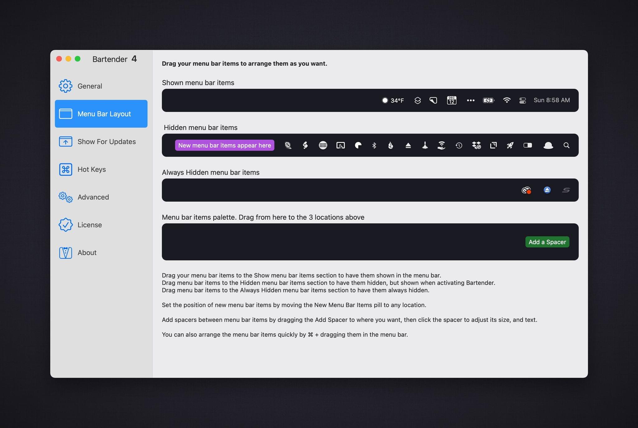
At its core, Bartender 4 is designed to wrangle a messy menu bar. The app divides menu bar items into three categories: items that are visible, those that are hidden but can be summoned on-demand, and those that are always hidden. The General section of the app’s Preferences also includes a fourth section called the Menu Bar Palette, where you’ll find placeholder items to let Bartender know where new menu bar items should appear and where to place spacers. With just a little rearranging in Preferences, it’s easy to tame an overstuffed menu bar.
However, if you poke around a little more in Bartender’s Preferences, you can unlock the true depth of this utility. The spacers I mentioned above are a good place to start. They can be placed between menu bar items to organize them into groups visually. Also, with the release of Big Sur, Apple spaced menu bar items further apart. Bartender lets you revert the spacing to what it was before Big Sur debuted in 2020 or even squish items right up next to each other for the ultimate space savings. Personally, I like the more widely-spaced menu bar, but I’m also glad there are three choices in Bartender.
Another significant feature released with Bartender 4 was Quick Reveal. Hover the pointer over a blank part of the menu bar, and your hidden items will automatically be revealed. The length of the required hover time is adjustable too, which I find helps to avoid inadvertently triggering hidden items.

Hidden items can appear in the menu bar or in the Bartender Bar, a secondary menu bar that drops down just below macOS’s menu bar. Bartender 4 predated the M1 MacBook Pros, but it’s like the Bartender Bar was specifically designed for the MacBook Pro’s notch. Instead of colliding with the notch, hidden items pop into view just below it.
It’s easier to navigate the menu bar and a long list of menu bar items than ever before too. Bartender 4 includes a Spotlight-like search feature that can be assigned to a hotkey. I’ve got the feature tied to ⌃S, which allows me to type a few characters to find a matching menu bar item and hit Return to activate it.
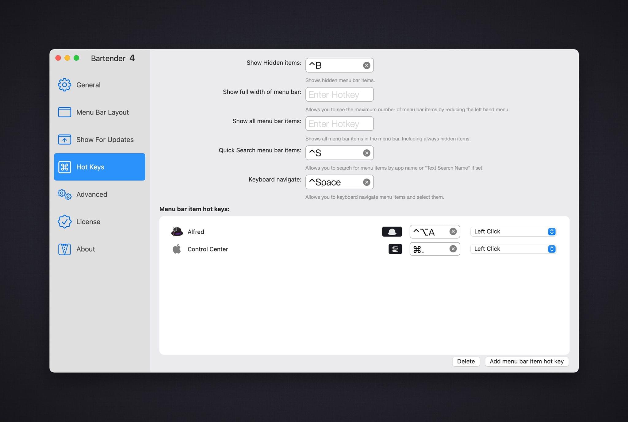
That isn’t the only hotkey that can be set up in Bartender, though. You can also create hotkeys to:
- Reveal hidden items
- Display the full-width menu bar
- Show all menu bar items, including always hidden ones
- Navigate the menu bar with the keyboard
- Open Control Center
- Show Music’s Now Playing item
What’s more, you can add additional hotkeys for any of your other menu bar items, whether or not they are normally hidden. This feature is especially handy for those menu bar icons that are distracting but you need frequently. Use a hotkey, and you can hide them away, but they’re still easily available. Of course, you can tie any of these hotkeys to a Stream Deck. They also create some interesting Shortcuts integration options too.
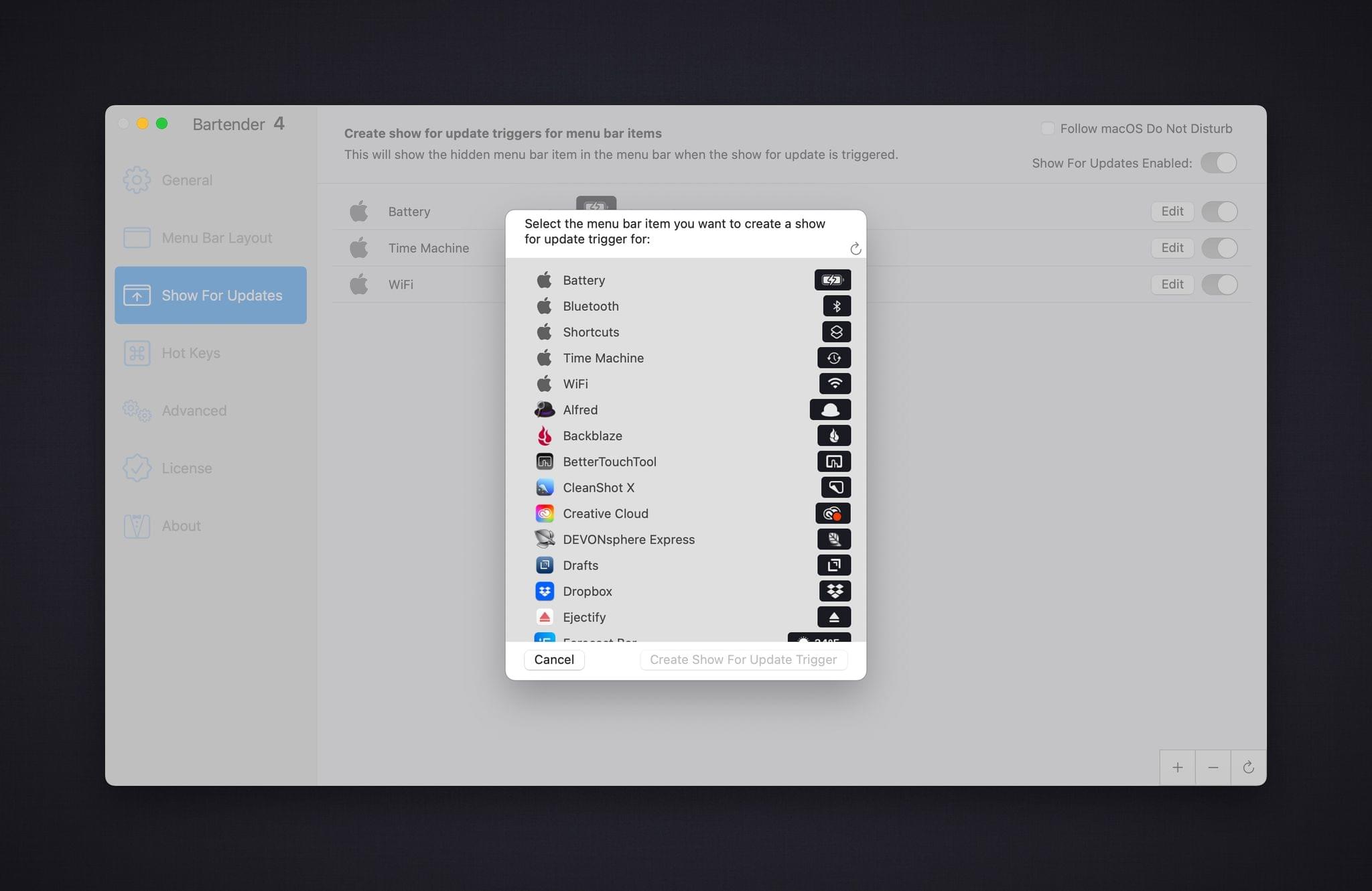
Bartender has some neat automation tricks beyond just hotkeys. You can set up triggers that dictate when an item appears in the menu bar. You can have an item show up when it changes: for example, you could set the Dropbox icon to only appear when Dropbox syncs. You can also trigger items when their appearance changes compared to an image or when a script is run. The image option is handy for items that use color or other image attributes as notifications, and scripts are a nice way to integrate particular menu items into larger automation workflows that involve other apps.
I’ve loved and relied on Bartender for years, but version 4 is by far my favorite version of the app. It would have been easy to stick with the core benefits of Bartender that I already enjoyed and not update, but I couldn’t be happier that I did. With the M1 MacBook Air I bought last fall, I’ve spent a lot more time on a smaller screen, where Bartender is critical. But even when my laptop is connected to a 27” display, I appreciate that Bartender has brought order to what would otherwise be a chaotic menu bar.
Bartender represents a quality that the best apps on all of Apple’s platforms have in common: the ability to offer advanced features for people who want and need them without over-complicating the app. That’s no small feat, which is why Bartender 4 is the MacStories Selects Best Mac App of 2021.
Best Mac App: Runner-Up
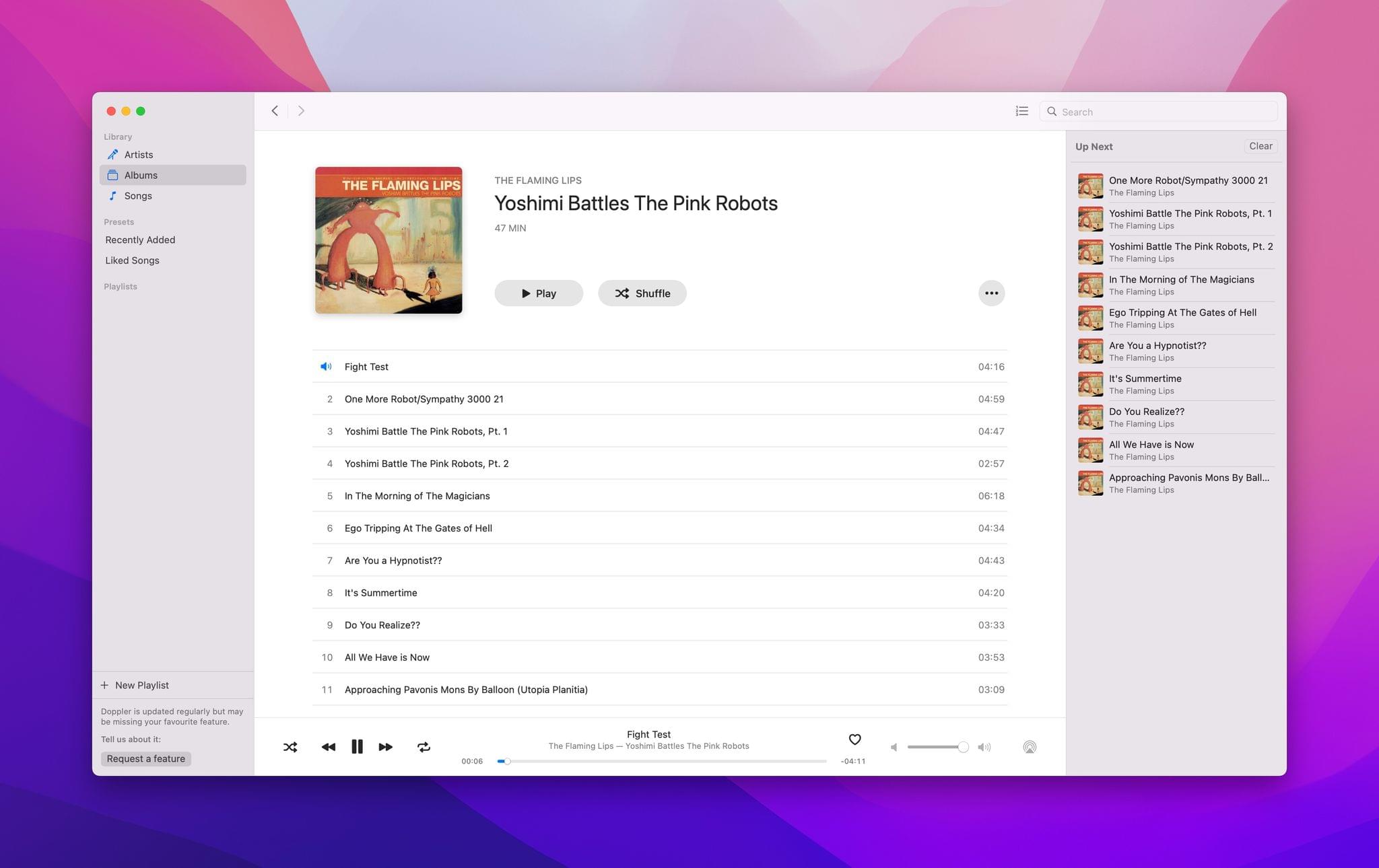
Doppler
Doppler is an app I’ve had my eye on for a long time. The music player, which is focused on people who buy their music instead of using streaming services, debuted on the iPhone. We first covered Doppler for the iPhone in 2018, not long after it launched. That version of the app added a novel feature that allowed users to download music files directly from the web. That feature may have been what caught my interest, but it was Doppler’s attention to detail that made it an app that I continued to follow.
This year, I was excited to see Doppler release a Mac version. I split my listening time across a lot of devices, but my Mac is second only to my iPhone as the source of the music I enjoy, which I think is true for a lot of MacStories readers. With the Mac version of Doppler, developer Ed Wellbrook elegantly translated the Doppler experience on the iPhone to the Mac with a terrific modern design that looks perfectly at home on macOS, which is why we chose it as a Best Mac App Runner-Up for the 2021 MacStories Selects awards.
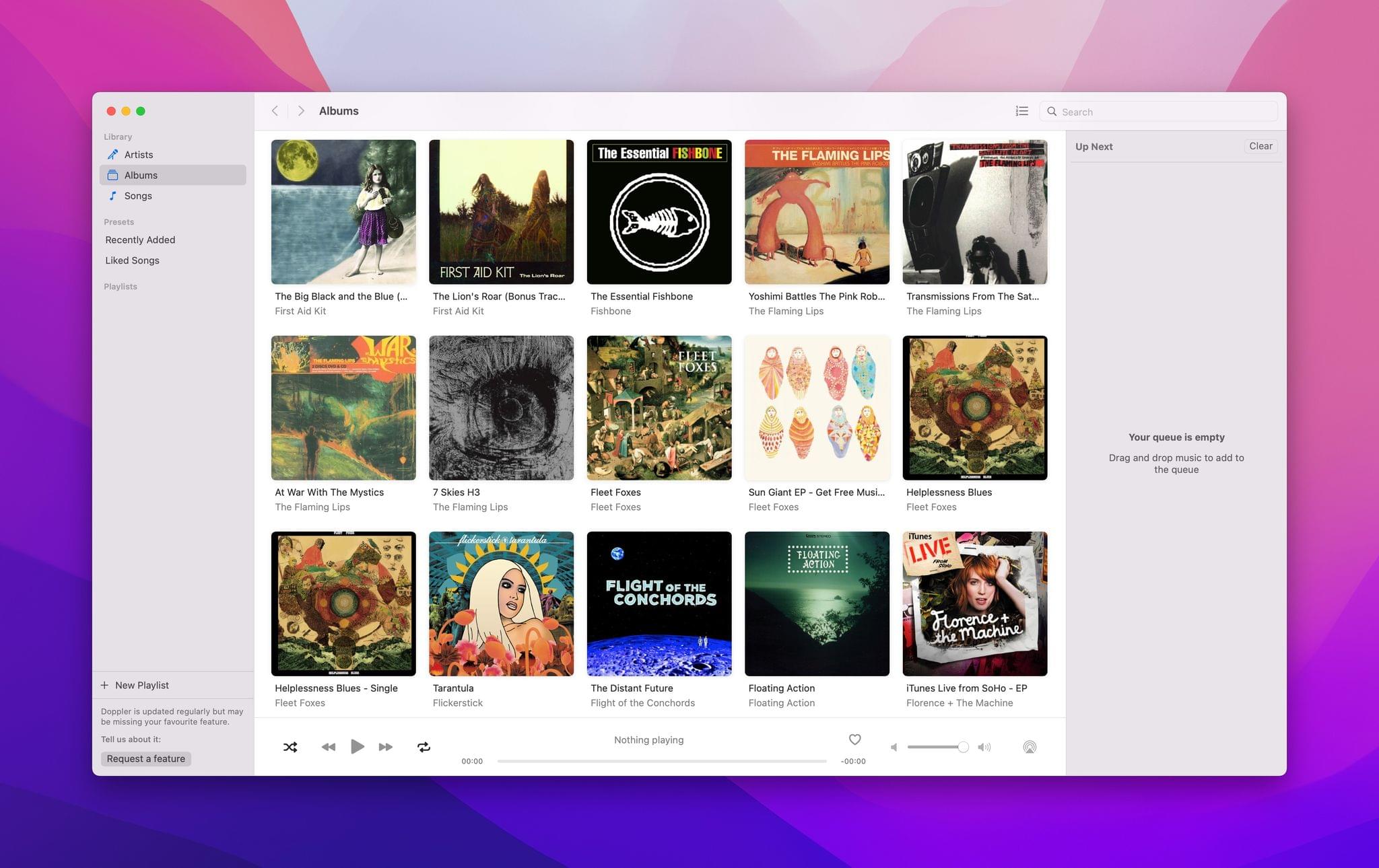
The best apps on any platform are the ones made with a passion for what they do. It’s apparent from the moment you launch Doppler that it has been built by someone with a deep appreciation for music.
The app’s design is impeccable. Controls are simple, clear, and easy to use, with an emphasis is on album art. As I said in my review from July:
Doppler for Mac is a lot like what I’d imagine Apple’s Music app would be like if Music were split into separate apps for streaming and owned music. That’s not likely to ever happen, but fortunately, Doppler has you covered if you own your music.
The app’s structure is familiar but modern. The center of the window is dominated by the category chosen in the left side panel: artists, albums, songs, playlists, and presets that collect recently added and liked music. On the right is another panel that handles your Up Next queue and can be hidden. Playback controls are arrayed along the bottom of the window’s center section.
Doppler for Mac is impressive for more than just its design, though. When I tested Doppler last summer, I threw thousands of songs at it that I’d ripped from CDs years ago. The app handled the import without a hiccup, and where I didn’t have album art, Doppler’s Search for Artwork feature gave me multiple image options for each album. The fact that the app can also handle MP3, FLAC, WAV, AAC, and other formats means you don’t need to worry whether all of the files in your music collection are supported.
Doppler also offers a free companion Mac app for transferring music from your Mac to the iOS version of the app for listening on the go. In my testing, the feature was fast and reliable, allowing me to make my Mac the central hub for my music collection. Doppler also includes Last.fm integration and works with Sleeve, a desktop Now Playing widget that we’ve covered in MacStories Weekly.
We’ve tried a lot of music apps at MacStories over the years, and I can always tell the ones that are built by someone who cares about the listening experience. A good music player is more than a play button that starts up a folder of music files. Music is about the artists and the albums they create. Doppler for Mac takes the polished and refined experience of the app’s iOS version and makes it work equally well on the Mac, a platform that hasn’t seen nearly the extent of innovation in music apps that the iPhone and iPad have, which makes Doppler even more special.
Best Design
Mela

John: Great design has a way of breathing new life into an existing app category, which is precisely what Silvio Rizzi has done with Mela, his recipe app and our 2021 MacStories Selects Best Design award winner. MacStories readers are undoubtedly familiar with Rizzi’s work. His RSS app, Reeder, is a long-time MacStories favorite and past Selects Best Design award winner.
Like Reeder, it’s Mela’s stunning design that makes it special. I wasn’t expecting to be blown away by a recipe app in 2021, but I knew as soon as I added my first recipe to Mela that Rizzi was on to something. Mela doesn’t check every feature list box compared to apps that have been around for years, but it rethinks the process of collecting and using recipes in a fresh new way that immediately grabbed me.
The first place I tried Mela was on my 12.9” iPad Pro, where the app has plenty of screen real estate to breathe. The app is striking. Everything is easy to read at a glance and uses just the right amount of color that adds a bit of personality and style to the app while also highlighting important functionality. I’m especially fond of the app’s dark mode, where the accent color is a bright yellow that looks fantastic against the app’s dark grey background.
Rizzi’s experience with Reeder is on full display in Mela, which I reviewed last spring. The app’s three-column iPad layout takes full advantage of the screen without feeling cluttered. Color and iconography make it clear which elements are interactive and which aren’t, and text is spaced and styled for maximum readability.
Mela’s attention to detail extends to every screen on which it’s available. Not only are the iPhone, iPad, and Mac versions tailored to each of those platforms, but the experience is customized for different iPad screen sizes too. For instance, after you’ve picked a recipe, you can expand the center column to see more of the recipe’s instructions. On the 12.9” iPad Pro, expanding the center column allows the instructions to expand to two columns with ingredients in a third column. On the iPad mini’s smaller screen, though, expanding the center column simply makes it wider because there isn’t room for a third one. It’s a good example of the care that has gone into tuning the experience on every device.
The same sort of attention to detail has gone into the myriad of ways to get recipes into Mela. Dishes can be added:
- Manually
- By scanning printed recipes
- With the app’s share extension
- Using Mela’s built-in browser
- Importing from Paprika
- RSS feeds
That last option is an interesting one that again draws on Rizzi’s experience with Reeder and is one of my favorite features. Instead of having to go elsewhere to find new recipes or browse the web in Mela, RSS feeds from popular recipe websites deliver new dishes to the app automatically, making it exceptionally easy to browse a list of new recipes that can be added with just a couple of taps.
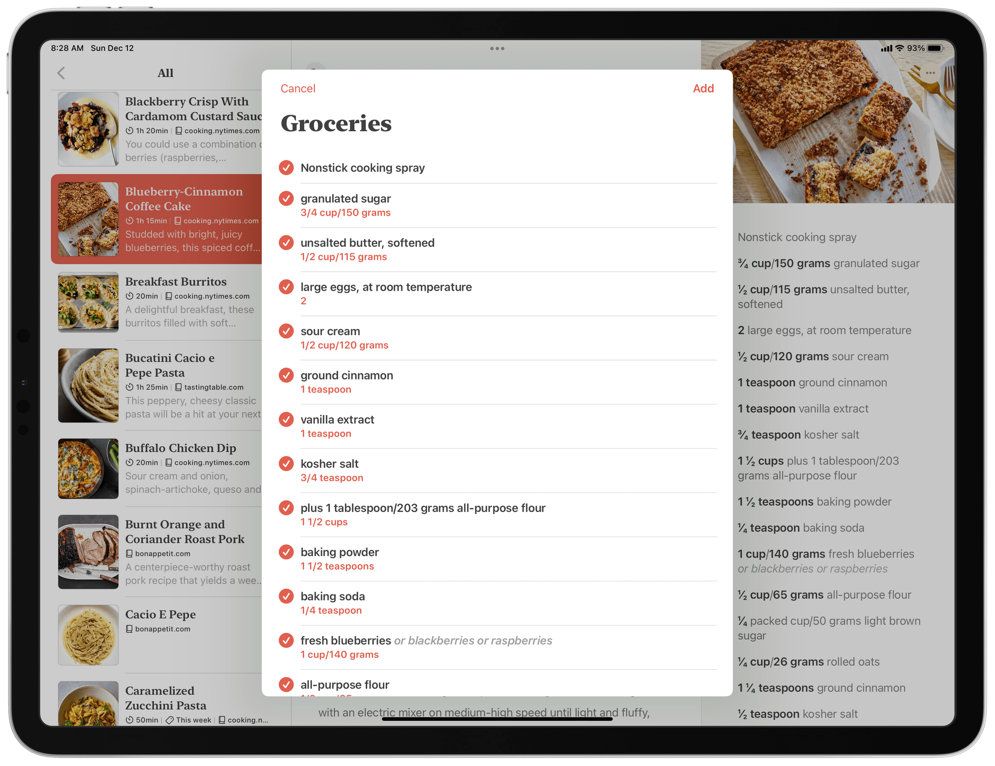
Instead of building grocery list functionality into Mela, the app integrates with Apple’s Reminders app. It’s a design choice I appreciate because the last thing I need is another list-building app. Mela can create its own list in Reminders or integrate with an existing shopping list you use, and with Reminders’ wide adoption among task managers, you can access Mela’s shopping list in another app if you prefer. Just tap on Mela’s Groceries button, uncheck the items you don’t need, and then tap Add, and you’re ready to go to the supermarket.
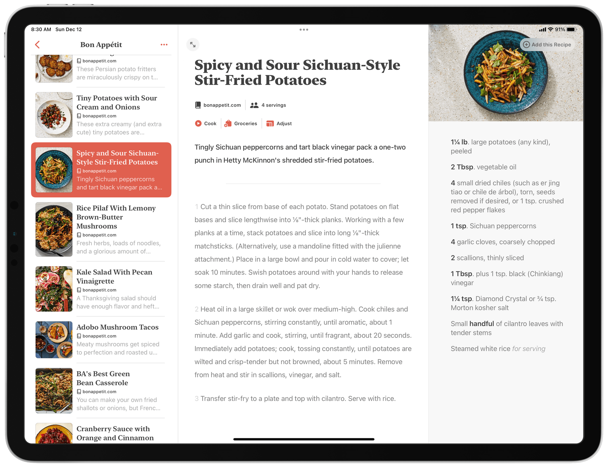
I’ve saved the best part of Mela’s design for last, which is the app’s cooking UI. When you’re ready to make something, just tap ‘Cook’ and an entirely new view slides into place. On the left are your cooking instructions, and on the right, ingredients. Tapping on the lower half of the screen advances the instructions one step at a time while tapping the top half moves back through previous steps. If you’ve got a keyboard connected to an iPad or are using a Mac, you can also use the Space bar and ⇧ + Space to move through a recipe.
The experience is reminiscent of a text editor’s focus mode. Each step is highlighted with other steps visible but dimmed. The instructions are big and legible too. It’s the perfect design for standing in the kitchen at a distance from your iPad or Mac as you cook. The cooking UI is also an important accessibility feature as one reader whose wife is sight impaired explained to me after I published my review earlier this year.
As with my original review, I’ve focused primarily on the iPad version of Mela because that device works so well in the kitchen. However, Mela’s design is just as beautiful and carefully tuned on the Mac and iPhone. The iPhone’s screen size limits its utility in the kitchen, but I’ve found it is an excellent option for browsing RSS feeds of recipes and marking dishes as ones I want to make in the future.
Recipe apps have been around since the advent of the App Store, and many apps that have been around longer than Mela have a deeper feature set. However, after using Mela for just a couple of weeks, I switched to Mela and didn’t look back. The ease of finding new recipes, the app’s excellent parser, and the exceptional cooking UI make Mela a pleasure to use. Instead of a database of instructions, Mela is a beautifully curated collection of my favorite dishes combined with the promise of new favorites waiting to be discovered in my RSS feeds. It’s the perfect balance of utility and delight, which is why Mela is our MacStories Selects Best Design award winner for 2021.
- Mela website
- Mela on the App Store (iPhone/iPad and Mac)
- The MacStories Review
Best Design: Runner-Up
Craft
John: Steve Jobs famously said of design:
Most people make the mistake of thinking design is what it looks like. People think it’s this veneer – that the designers are handed this box and told, “Make it look good!” That’s not what we think design is. It’s not just what it looks like and feels like. Design is how it works.
That’s an apt description of Craft’s design. Sure, the app looks good, but the strength of the design is how the app works on every level.
There are many excellent note-taking apps that make it easy to get words down on a page quickly and without distraction. There’s a long history of focused, minimal writing apps that preceded Craft, from which its design benefits. With side panels full of features that can be tucked out of the way, Craft makes writing a pleasure.
Craft, which we reviewed late last year, is just as adept at making your text look good. Writers who are accustomed to using Markdown syntax benefit from its availability in Craft. What’s nice, though, is you don’t have to use Markdown. Craft meets users where they are, allowing them to pick what they want to use, whether that’s the app’s formatting panel, the popover set of tools, or keyboard shortcuts. It’s a design that’s flexible, adapting to how users want to write instead of insisting on one approach.
What distinguishes Crafts design above all other apps, though, is the ease with which it allows users to structure their writing. Part of the formula that makes Craft work is how easy it is to create outlines and lists. The other part, though, is a combination of backlinks that help users navigate complex hierarchies of notes and Craft’s unique system for creating cards and sub-pages. The two work similarly, but by offering different layouts, colors options, and other styling, Craft lets users organize their writing to suit their own tastes and the demands of what they’re creating.
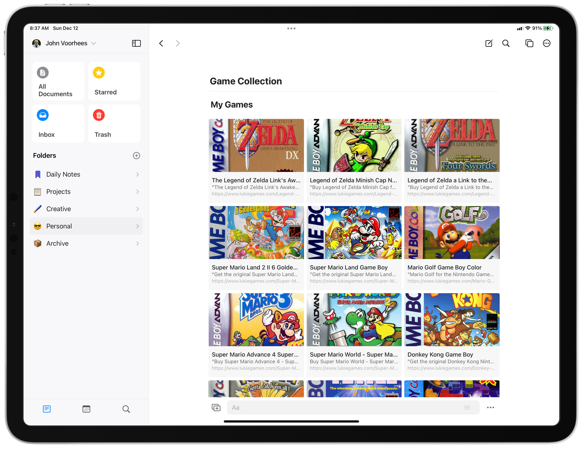
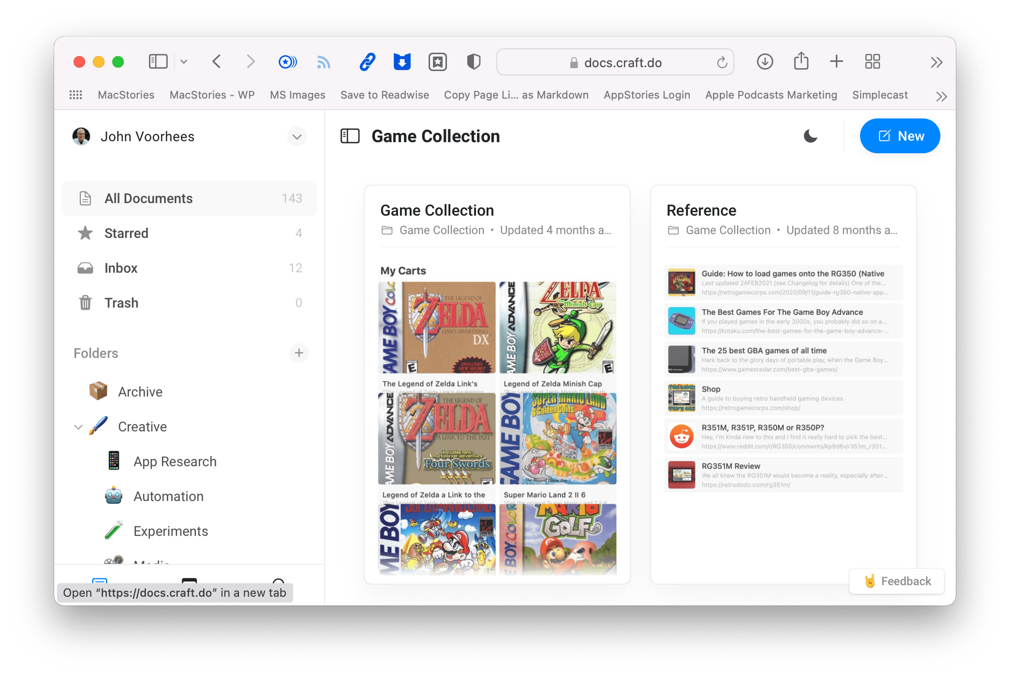
Another touch that I’m especially fond of is the app’s rich link previews, which are reminiscent of rich links in apps like Apple’s Notes apps. Links can be organized in three different layouts. One of my favorite uses of rich links was the way I was able to use them to organize my classic Nintendo Game Boy cartridge collection. Links to one of my favorite second-hand online game shops looked so good as cards in Craft that I used them to visually organize my collection whether or not I wanted to buy the game later. The link previews were simply easier than finding game art and dragging it into the app.
Note-taking is a lot like task management and email processing: everyone has their own approach. What makes Craft’s design so strong is its willingness to provide users with a set of tools to customize their notes to their liking without over-complicating the app. That’s a rare synthesis of design and functionality that is the key to Craft’s success and why it is also our Readers’ Choice Award winner this year.
Readers’ Choice
Craft

John: It’s my pleasure to announce that Club MacStories members picked Craft for the MacStories Selects Readers’ Choice award in a very tight race. For this year’s voting, all Club members were given the opportunity to nominate their favorite app for the Readers’ Choice award. We then put the five apps with the most nominations to a vote for Club MacStories+ and Club Premier members.
The vote was close because there were so many fantastic apps nominated, but it wasn’t surprising that Club members chose Craft. Last year, the MacStories team named Craft the Best New App after it came out of beta late in the year to capture the imaginations of note-takers everywhere. In the year that has followed, Craft hasn’t stood still, methodically releasing a long list of compelling new features that delighted early adopters and won over new users. This year, Craft is also our runner-up for the 2021 Best Design award.
Craft offers a deep feature set and beautiful, native design across every Apple platform that is hard to beat. It’s no wonder that it was also honored by Apple this year as the Mac App of the Year and was a finalist for an Apple Design Award.
Every app, especially a 1.0 version, is a series of trade-offs and compromises. What’s unique about Craft, and what I think MacStories readers appreciate most, is that the choices made by the Craft team at Luki Labs have been spot-on in so many ways that users value.
For starters, Craft launched on the iPhone, iPad, and Mac with compelling versions on each platform. Nowhere is that more evident than with Craft’s Mac app, which is based on Apple’s Mac Catalyst technology. Catalyst got off to a rocky start, and many developers have struggled to use it to bring iPad apps to the Mac that feel at home on macOS. In contrast, Craft feels so natural on the Mac that users continue to be surprised when they hear that the app uses Mac Catalyst. I can’t think of a better example of the technology’s potential or response to skeptics who view apps built with Mac Catalyst as somehow inherently inferior.
It’s also impressive that Craft launched with fully-formed versions across the iPhone, iPad, and Mac. More often than not, new apps launch on one platform, leaving users with the uncertainty of judging what ‘Coming Soon’ to other platforms means. By launching on every platform, Craft eliminated the uncertainty for users who increasingly want their apps available everywhere. In the months since launch, Craft has added a beta web version of the app to the lineup, too, further extending its availability to users.
Luki Labs says Craft’s web app will match the native app’s functionality in the first quarter of 2022.
What sets Craft apart from so many of its competitors, though, is the combination of thoughtful design and features. Craft handles Markdown like a pro but, instead of forcing users to work in an environment that looks like it was designed for writing code, Craft makes your documents look good with a wide variety of formatting and styling options.
Aside from aesthetics, Craft’s documents are structured in a way that makes navigating among pages intuitive. With very little effort, you can break down and organize large amounts of information into easy-to-read outlines, lists, and sub-pages that are perfect for all sorts of use cases. At MacStories, for instance, we use Craft to organize internal technical documentation for Club MacStories.
Collaboration is a big part of Craft too. I have a personal space with my own set of notes, but these days I use Craft to prepare for MacStories podcasts with Federico or plan events like these awards with the entire MacStories team. The process for creating shared spaces with documents edited by multiple users couldn’t be simpler, and in the months that I’ve used it, we’ve never run into a sync issue.
The other aspect of Craft that I know readers appreciate is the ease with which you can get information in and out of the app. One of my greatest frustrations with apps is the assumption that I want every app to be the final destination for whatever information I add to it. That’s true in some cases, but more often, it’s not. As much as I enjoy using Craft, some of what I create there needs to wind up somewhere else eventually, and with Craft, that’s easy to do.
The app supports exporting to Markdown, TextBundle, PDF, Word, and more. Craft also integrates with nine popular apps, including Bear, Drafts, Ulysses, DEVONthink, and Things. That’s a solid list, and it’s the feature set that existed when we asked Club MacStories members to vote for the Readers’ Choice award, but earlier this month, Craft announced it is working on a third-party extension API to allow developers to extend Craft further. That’s excellent news because it promises a deeper catalog of integration options down the road, which will only make the app more valuable to users.
What I like most about Craft’s approach is that it relies on the quality of the app itself and not data lock-in to win over users. That’s a more difficult path to take, but one that serves Craft’s customers better. Judging from how well Luki Labs has done with the app in its first year, I expect that the strategy will result in a lot of long-term loyal customers.
When Craft debuted late last year, it had been a long time since we’d seen an innovative new note-taking app on Apple’s platforms. All of a sudden, the category is hot again, ignited in part by Craft’s success. That’s good to see because it means readers will have a wealth of new options going forward. That competition is good for users, and as we’ve seen with the latest announcement of Craft 2.0 and the app’s upcoming plugin API, Craft plans to be the middle of the fray, taking what is already a reader favorite to new and interesting places.
App of the Year
Obsidian

Federico: In the twelve years I’ve been producing MacStories, I can count the times a Markdown note-taking app or text editor came onto the scene and completely upended my workflow on one hand.
When I started MacStories, text editors that integrated with the original Dropbox API were all the rage, and we saw some incredible innovation from developers who figured out how to work around the limitations of Apple’s file sandbox. Then Editorial came in and revolutionized the Markdown landscape as the first pro app that blended Markdown and automation. As longtime MacStories readers know, I used Editorial for years – and literally wrote the book about it – until it got abandoned and I switched to iA Writer. This excellent Markdown editor was more skewed toward longform writers than note-takers, and it allowed me to create a highly personalized writing workspace based on custom themes, content blocks, and tables of content. There were other experiments in between Editorial and iA Writer, but these are the two apps that defined my writing process for MacStories and the Club over the years.
That is, until I discovered Obsidian.
Created during the lockdowns of 2020 by Erica Xu and Shida Li, Obsidian is the kind of complex, highly customizable writing tool that is hard to pin down to a single category. There’s a fervent community of users who rely on it as a personal knowledge management system – the kind of vision its developers had in mind when they started working on the desktop app. Some use it as a plain text note-taking app that features Markdown and fast search. Others have configured it to act as a powerful text editor with custom export rules and support for multiple panes. And then there are hundreds of thousands of users who, like me, have chosen to embrace its versatile nature in all its aspects, resulting in an all-encompassing experience that has made Obsidian the center of everything they type on a keyboard on a daily basis.
This is precisely what happened to me over the past year, which is why I couldn’t think of any other app more deserving than our App of the Year award.
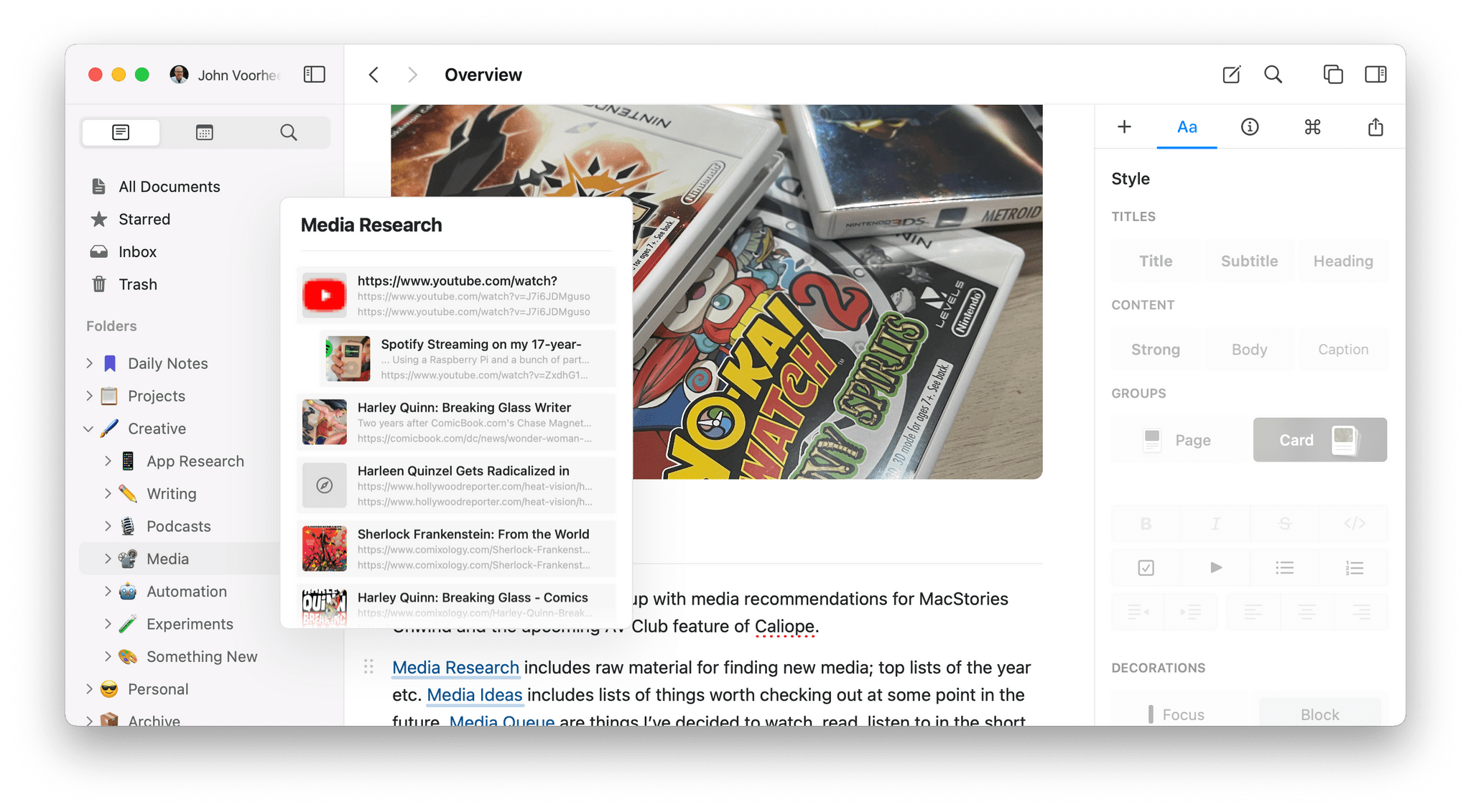
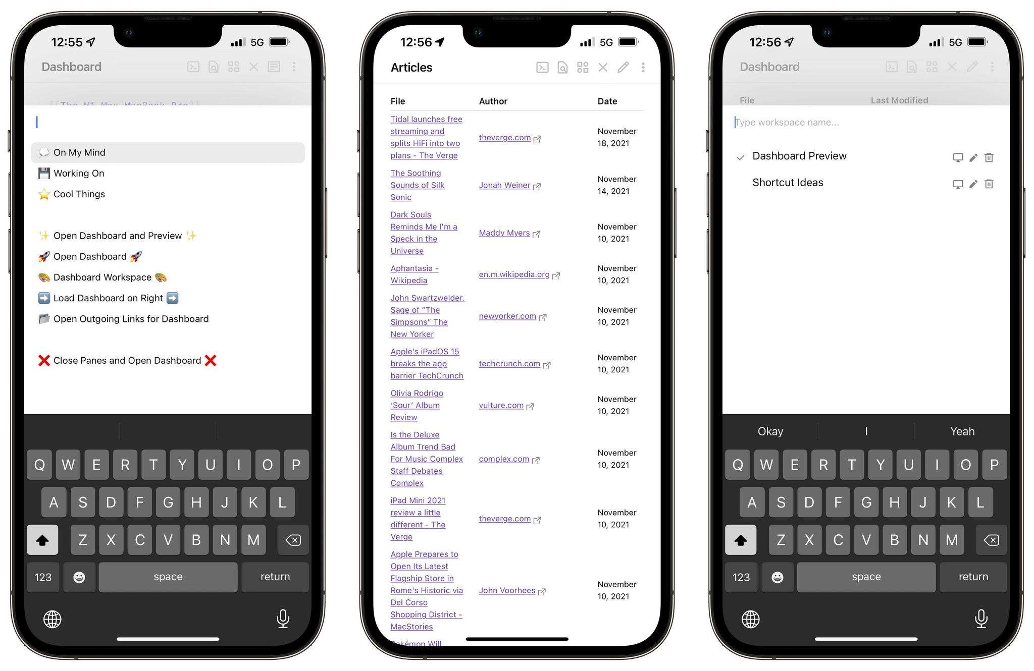
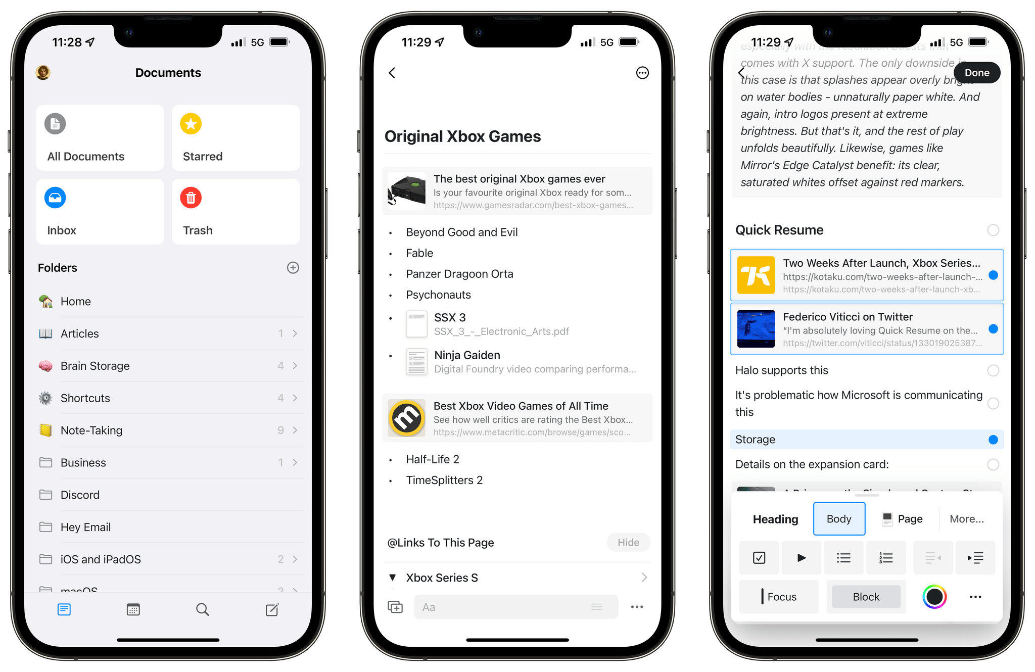
At a high level, think of Obsidian this way: it’s a Markdown app that works by storing plain text files in a folder, which can be located anywhere in the Files app or Finder. We’ve covered the basics of Obsidian in a podcast mini-series for AppStories, and the app’s reliance on the filesystem for all its documents is the key factor to understand here: no matter how much content you’ll add to Obsidian, it’ll always be accessible to you via Finder and Files. Which means that, by design, Obsidian can be integrated with any other app or automation that involves reading documents from the filesystem. At the end of the day, your Obsidian vault is just a folder of text files.
What makes Obsidian, special, however, is the infinitely customizable network of features you can add on top of its relatively blank canvas. Even without going down the rabbit hole of third-party plugins and personalizations, the Obsidian app you can download from the App Store is already a very capable text editor and note-taking app. The app ships with a collection of built-in ‘core’ plugins – functionalities that can be enabled on-demand depending on your specific needs. There are too many to cover here (check out this story I published to get a sense of Obsidian’s built-in plugins), but I think Obsidian stands out from competing note-taking apps and text editors for two built-in functionalities: every feature of the app is exposed as a ‘command’ that can be triggered with a Spotlight-like search UI as well as keyboard shortcuts; and the app can create wiki-style internal links for any note in your vault, which you can decide to open in separate split-screen panes inside the app.
The ability to quickly open multiple panes in Obsidian is one of the app’s greatest advantages over other text editors.
The combination of these core features – keyboard interaction, cross-note linking, and in-app split screen – makes Obsidian, by far, the fastest and most efficient Markdown app I’ve ever used. Obsidian removes friction from the process of turning a bunch of thoughts in your head into a collection of organized digital notes; on top of that, it makes it ridiculously easy to create connections between those notes and jump around from one note to another. Obsidian makes me feel like I’m flying through my notes in a way that no other Markdown app ever made me feel before.
And this is before we even consider what it’s possible to achieve in Obsidian once you start dipping your toes into the world of third-party plugins and themes. As we argued on AppStories, Obsidian is an Electron app, which involves some…questionable aesthetic and functional choices when using it on Apple platforms; but if you’re willing to accept that compromise, the huge upside is the fact that anyone can extend Obsidian by writing plugins based on web technologies such as HTML, CSS, and JavaScript.
The results of these trade-offs are incredible: you can turn notes in Obsidian into a Kanban board or a database query for your vault; you can integrate Obsidian with Readwise and automatically import highlights from your favorite read-later app or Kindle books; you can add native calendar or task management features to the app; there are plugins to add all sorts of visual modifications to the app such as custom sidebars, different word counts, and even plugins to install other plugins. For Club MacStories members, we created plugins to bring native Todoist integration to Obsidian, compile longform Markdown drafts into one file, and quickly insert Markdown links. If you can’t find a specific feature in Obsidian, there’s likely a plugin for that.
It’s impossible to sum up and describe Obsidian in a single short post. The amount of freedom offered by Obsidian when it comes to note-taking and writing in Markdown is unprecedented on Apple platforms. There’s a good reason why Obsidian has taken the note-taking world by storm and has fostered a highly engaged community of users and developers: it’s an incredibly powerful, customizable piece of software that makes no assumptions about you or your workflow, and instead rewards you for shaping your own experience in the app.
Over the course of MacStories’ 12-year existence, I’ve never seen an app provide users with the same degree of control and personalization as Obsidian. That is why, ultimately, Obsidian is our App of the Year for 2021 and the kind of software that will define our workflows for years to come.
- Obsidian website
- Obsidian mobile on the App Store
- Club MacStories coverage:
- My Obsidian Setup, Part 1: Sync, Core Plugins, Workspaces, and Other Settings
- My Obsidian Setup, Part 2: Themes, Mobile Quick Action and Toolbar, and Third-Party Plugins
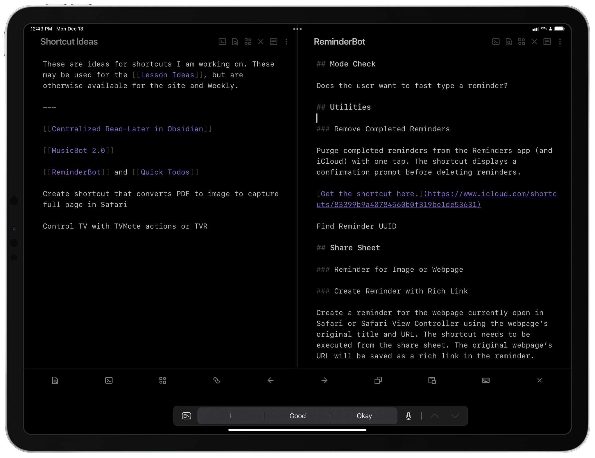
- My Obsidian Setup, Part 3: My ‘Dashboard’ Note for Quick Links, Todoist Tasks, Saving Ideas, and Keeping Track of Current Projects
- My Obsidian Setup, Part 4: Templates for Weekly Posts and Custom Mobile Toolbar
- My Obsidian Setup, Part 5: Appending Text and Webpage Links to Specific Sections of My ‘Dashboard’ Note
- AppStories Series:
App of the Year: Runner-Up
Craft
Federico: What else can I say about last year’s Best New App and the recipient of our Readers’ Choice award in 2021? It’s been a big year for Craft: its developers have iterated on the app at a fast pace with major new additions such as a built-in calendar integration, more export formats, image annotations, and the long-anticipated addition of tables. To wrap up a year that also saw Craft won Apple’s award for Best Mac App of 2021, the Craft team also outlined their vision for Craft X, an extensible platform that will allow users to personalize their Craft experience with native extensions available everywhere.
While Obsidian edged out Craft in our discussions because of its incredible customization features and established, vibrant community of plugin developers, it’s undeniable that Craft is a more polished, more approachable note-taking app that combines some aspects of Obsidian with an Apple-like design that feels at home on iPhone, iPad, and Mac. We’ve enjoyed using Craft at MacStories for its collaboration features: the ability to structure notes with sub-pages and instantly navigate to any note or section of a note with a keyboard is fantastic, and Apple should be paying attention to Craft’s implementation of note links and search.
We’re keeping a close eye on Craft’s extension platform, which we believe is going to be one of the most discussed topics in the note-taking app space over the course of 2022. But for now, we can say that Craft continued to grow in a direction we like in 2021; it’s one of the best apps of the year, and it deserves a mention in this edition of MacStories Selects.