Note-taking apps on Apple platforms have never been in a better place. Apple Notes is a fantastic built-in option with deep system integrations. Bear offers an elegant Markdown experience and powerful note linking features. Agenda takes a unique date-based approach to note-taking. Evernote just launched its long-in-the-works redesign, and Noto provides a great mix of style and substance. There are quality Pencil-based note-takers like Notability and GoodNotes. And certain web-based tools like Notion are starting to put a higher priority on their app experience.
But for all the excellent options already out there, it can never hurt to have another. Especially when that new option is as well done as Craft.
Craft is launching today across iPhone, iPad, and Mac as a new note-taker that blends the block-based approach of Notion with a thoroughly native experience, taking advantage of all the OS technologies you would hope for and throwing in valuable features like real-time collaboration. It’s the most exciting note-taking debut I’ve seen in years.
Document Structure
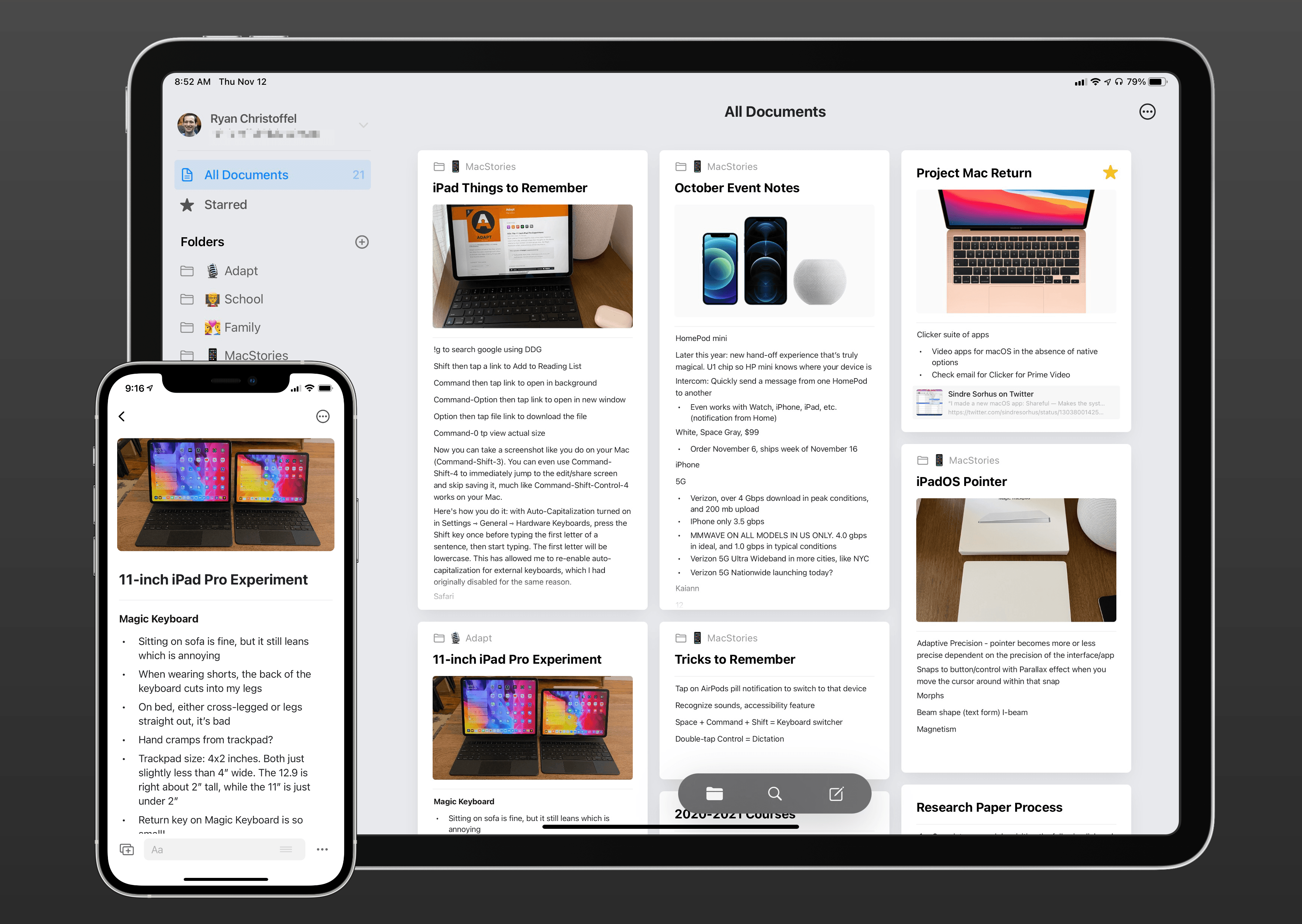
If your brain works at all like mine, the way an app organizes its note database is important to determining whether that app is right for you. For example, tag-based apps have never been a great fit for me, but I love a good folder-based system. Craft takes a unique approach that’s ultimately folder-based but offers much more than what you’d find in an app like Apple Notes.
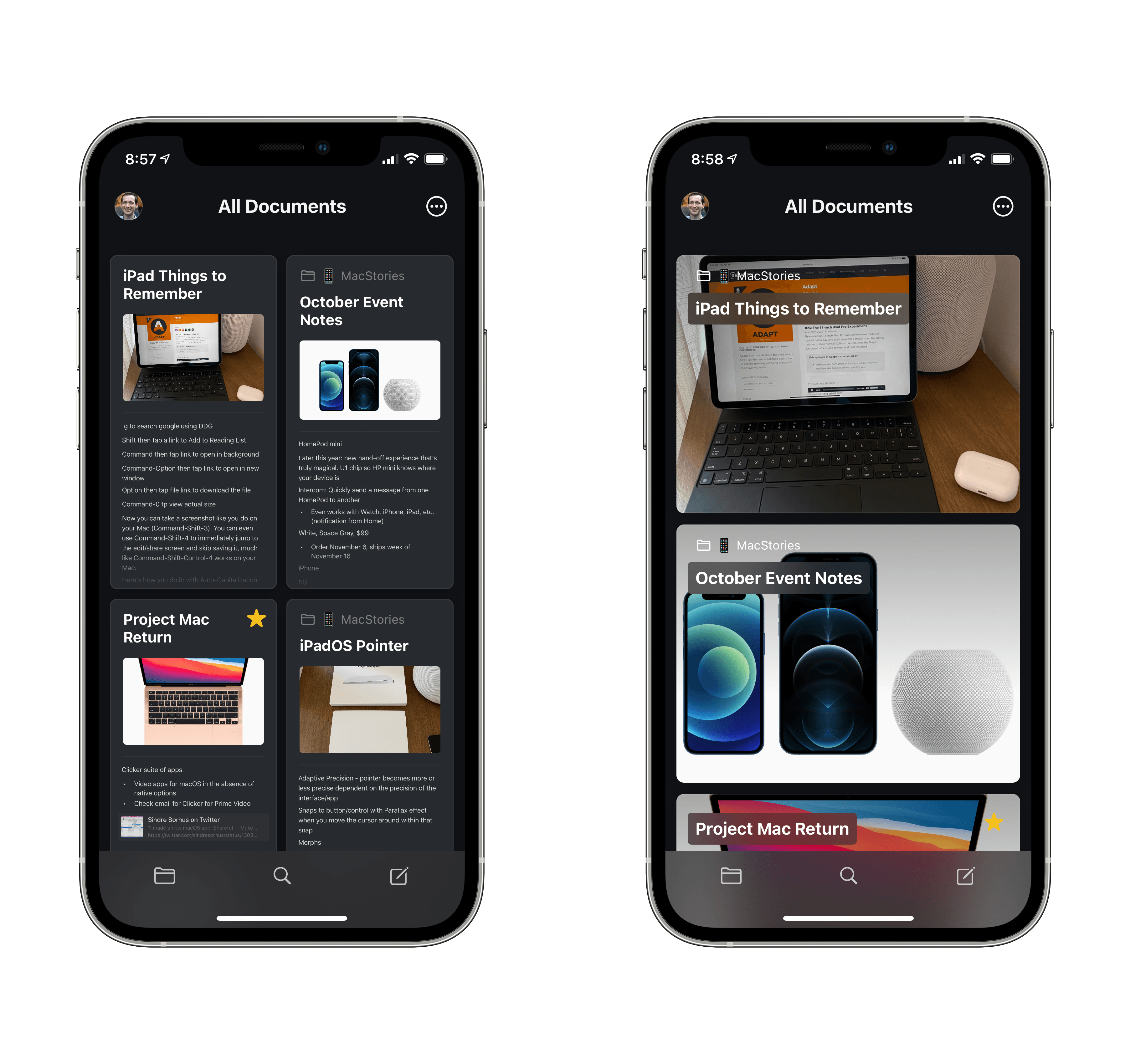
A basic note in Craft is called a page, similar to Notion. Pages are organized into folders, where you can choose to view pages either in a symmetrical grid or one where the layout is more dynamic, with pages having different-sized previews. There’s currently no option for a traditional list layout for viewing your pages.
Simple so far, but inside pages is where things get a little more complicated, and even Inception-like. Pages use a block-based system for content, again similar to Notion. You can add blocks for a wide variety of content types, which I’ll cover shortly, but among those options are ways to use pages as portals into sub-pages. This can happen in one of three ways:
- You can simply add a new page inside a page.
- You can create a card, which is essentially a sub-page with added visual flair and customization options.
- Finally, you can group multiple blocks together to turn them into their own sub-page.
With all three of these options, the page will preview the sub-page’s contents in-line, so you have a preview of what the sub-page contains and can tap or click it to open the full sub-page. These nested pages can have their own sub-pages, which have their own sub-pages, and so on – pages within pages within pages.
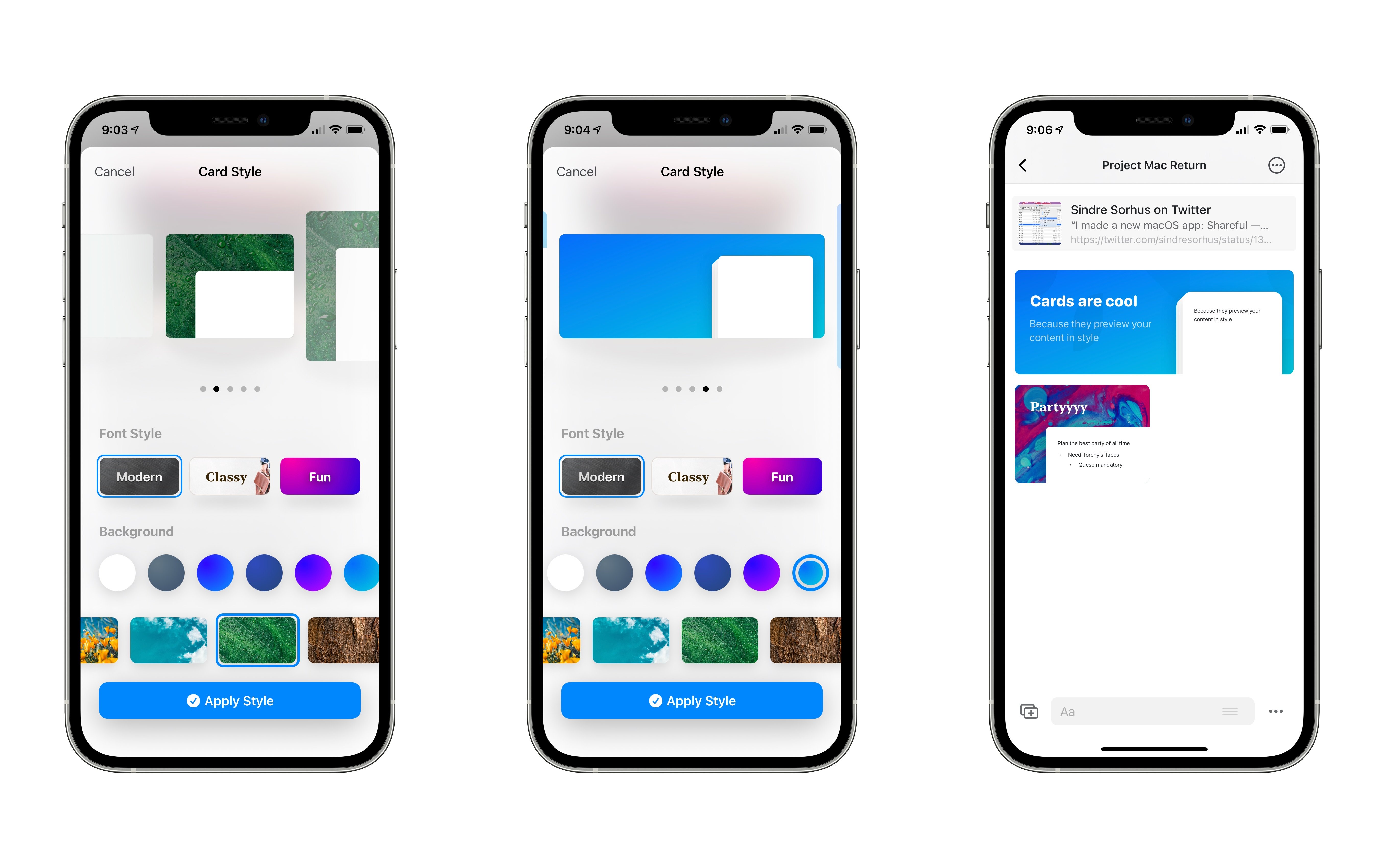
I love the flexibility of being able to create pages inside of other pages, and I’m especially fond of cards and the ability to group blocks. When you create a new card, you’ll see a styling page that lets you choose from one of five layouts for your card, all of varying sizes, and you can set custom fonts, background colors, and background images for the cards. After a card is created, you can click it to fill in the details of the page it contains. You could always just create a new page the standard way, but cards provide more variable sizes and they can make your pages look great.
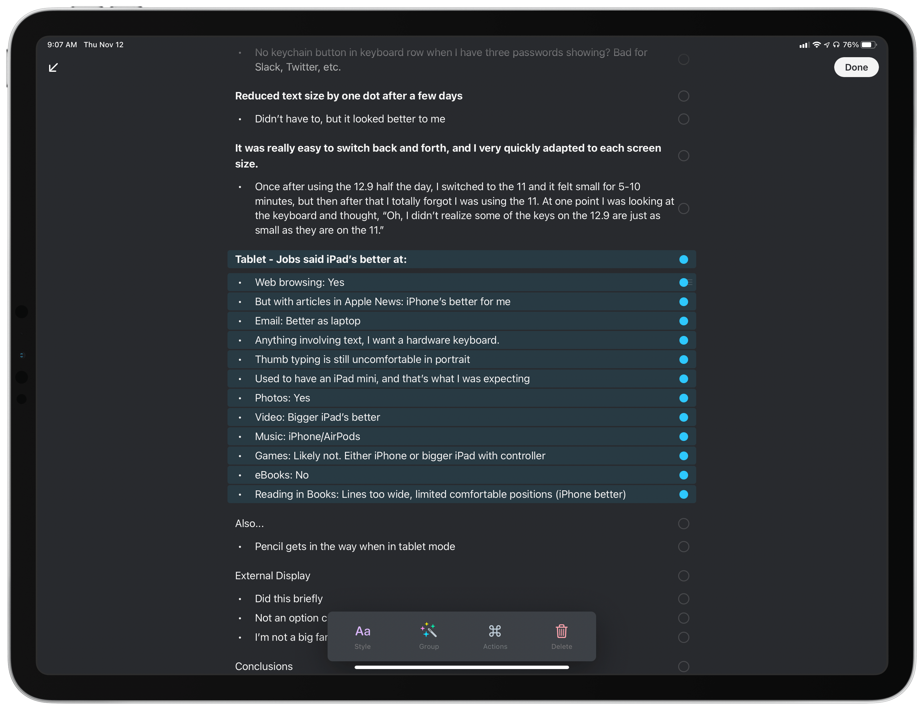
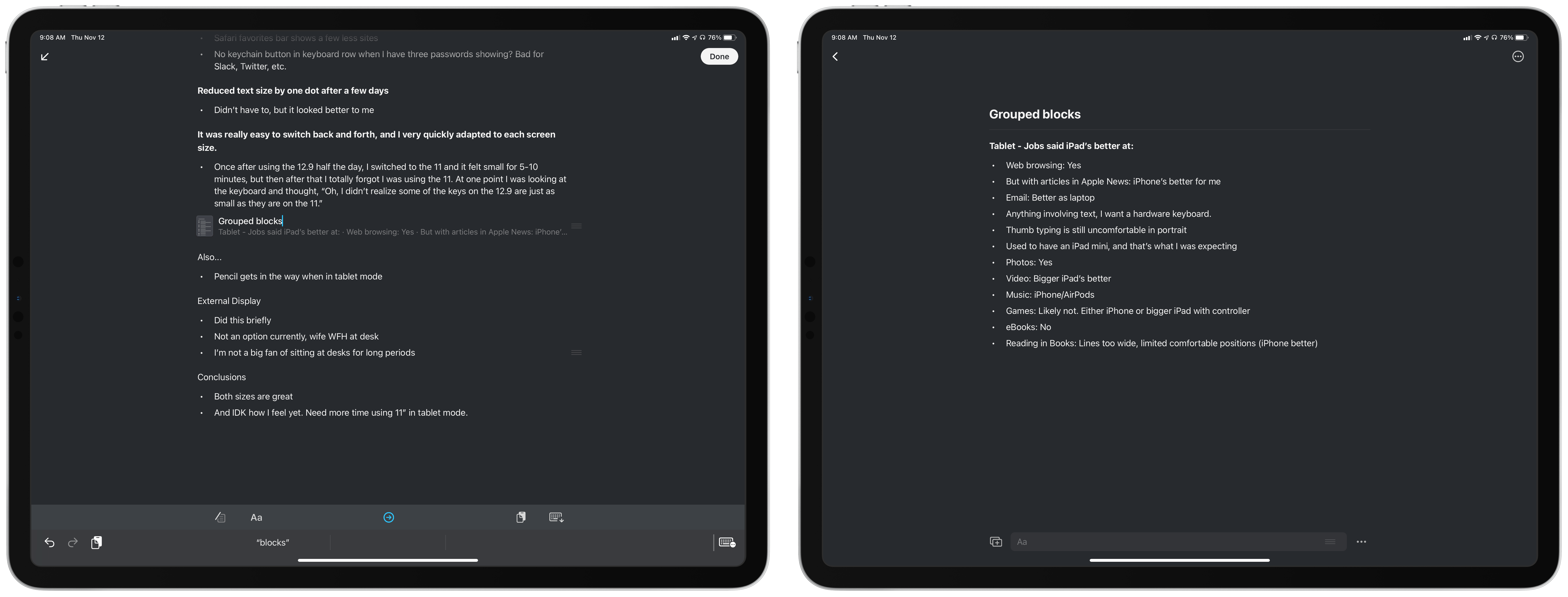
Blocks can be grouped to become their own subpage by selecting multiple blocks and hitting ‘Group.’ This grouping can be reversed after the fact too. This feature provides a lot of power for organizing your notes, such as grouping blocks when a given note grows unwieldy and needs some added structure.
Page Styles
I’ve always been particular about the way my notes look, and Craft really shines in this area, providing a handful of quality options for styling pages to your liking. Behind the three-dot icon in the corner of a page, you’ll see a Page Style option, which enables changing display settings on a per-page basis.
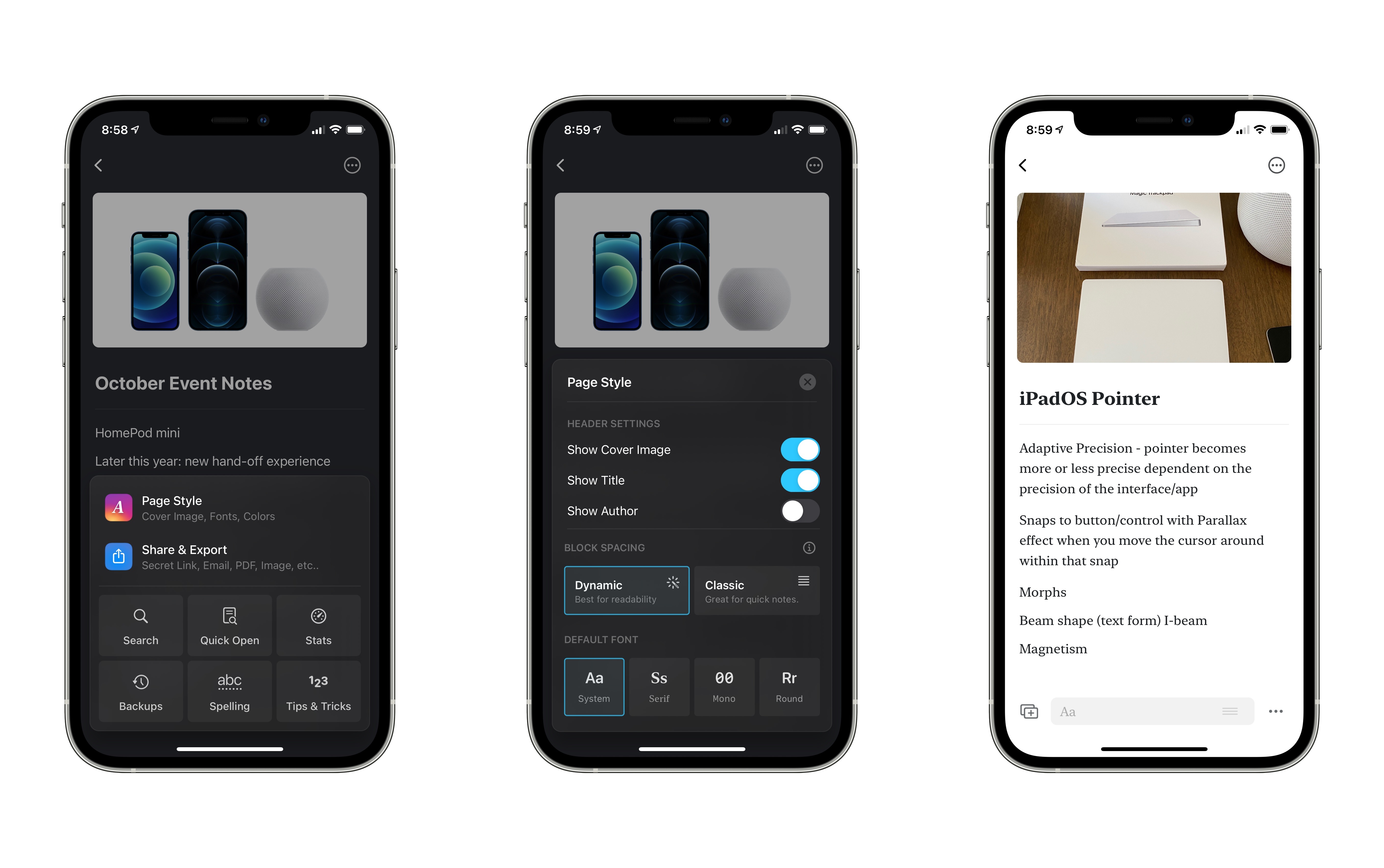
You can adjust toggles to show or hide the page’s cover image, title, and author. Cover images offer a nice touch of personality to notes; you can import your own from Photos, Files, or the Finder, or turn to Craft’s Unsplash integration to use one of the great images available there.
After the aforementioned toggles you’ll see an option to use either Dynamic spacing for blocks or Classic. In my testing both have looked good, but I’ve stuck with the default Dynamic. There’s also an option for page width to be either Regular or Wide. Depending on the device you’re using, you can either have your page’s content fill more or less of its window. I prefer the Regular view when working on iPad, for example, as it provides sizable margin so line length is kept in check, but if you’d prefer to use the full width of Craft’s window you can do that too.
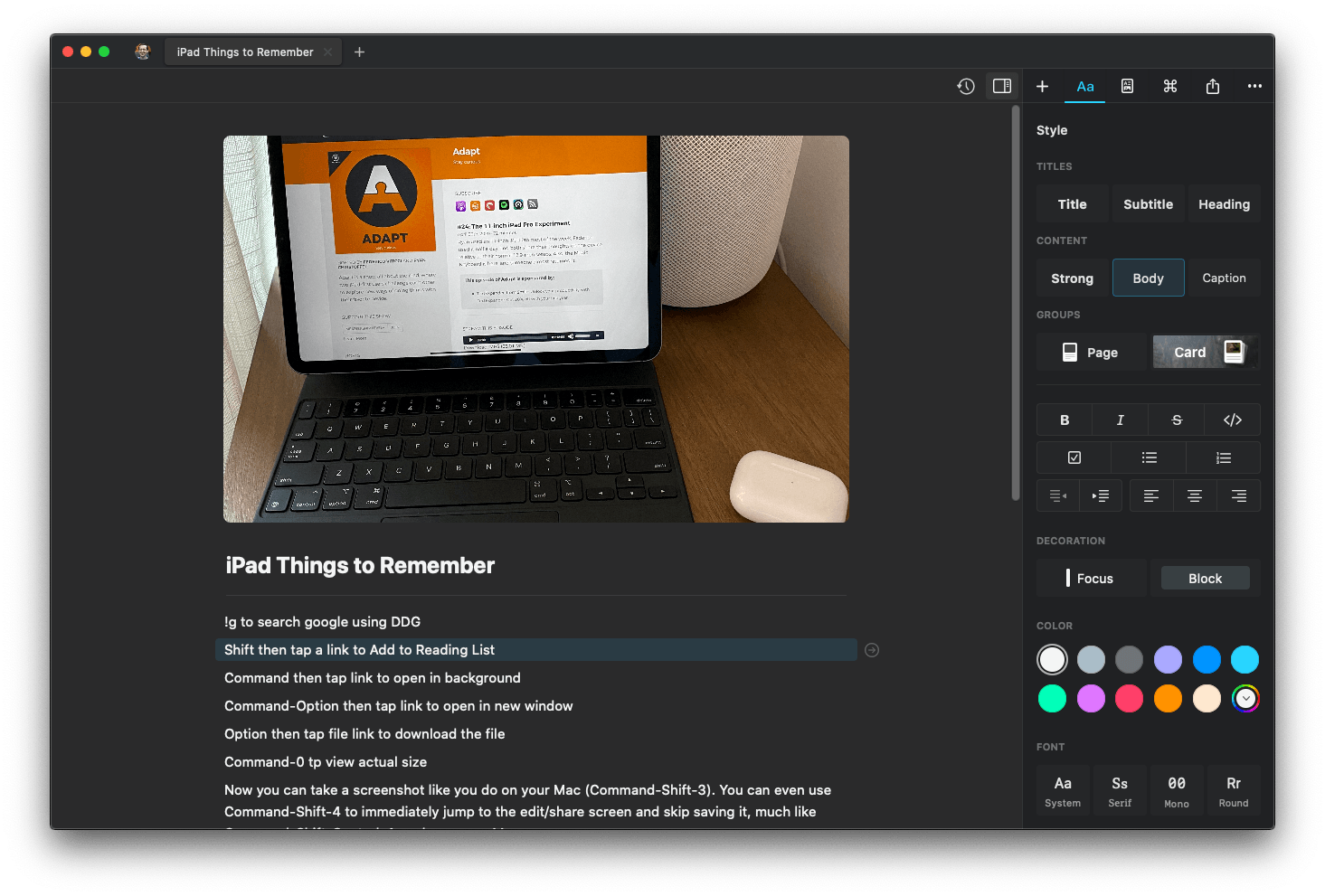
Finally, Craft offers four font options, and they’re all excellent because they exclusively come from Apple’s own San Francisco font family. The default is System, which is the standard San Francisco used throughout Apple’s OSes. Serif is the New York font employed by Apple Books. Mono is SF Mono, and completing the set is Round, which is the rounded version of San Francisco that debuted in the Reminders app last year. Together, these four fonts provide a solid variety of choices and look lovely.
Editor: Block Types, Keyboard Control, and More
With your page’s style set to your liking, it’s time to start crafting your notes. You can of course tap or click anywhere on-screen to just start typing text, and even in-line Markdown is supported if you prefer that over rich text, but you can also use one of the many other block types at your disposal. Options include:
- Lists: Todos, Bullet lists, and Numbered lists
- Media: Images from Photos or Unsplash, documents from Files or Finder, sketches using Markup, document scans, and more
- Snippets: Code blocks, Plaintext blocks, and TeX formulas
- Date & Time inserts
- Block and Focus blocks, which stand out visually thanks to colored framing (for Block) or a quote-style designation (for Focus)
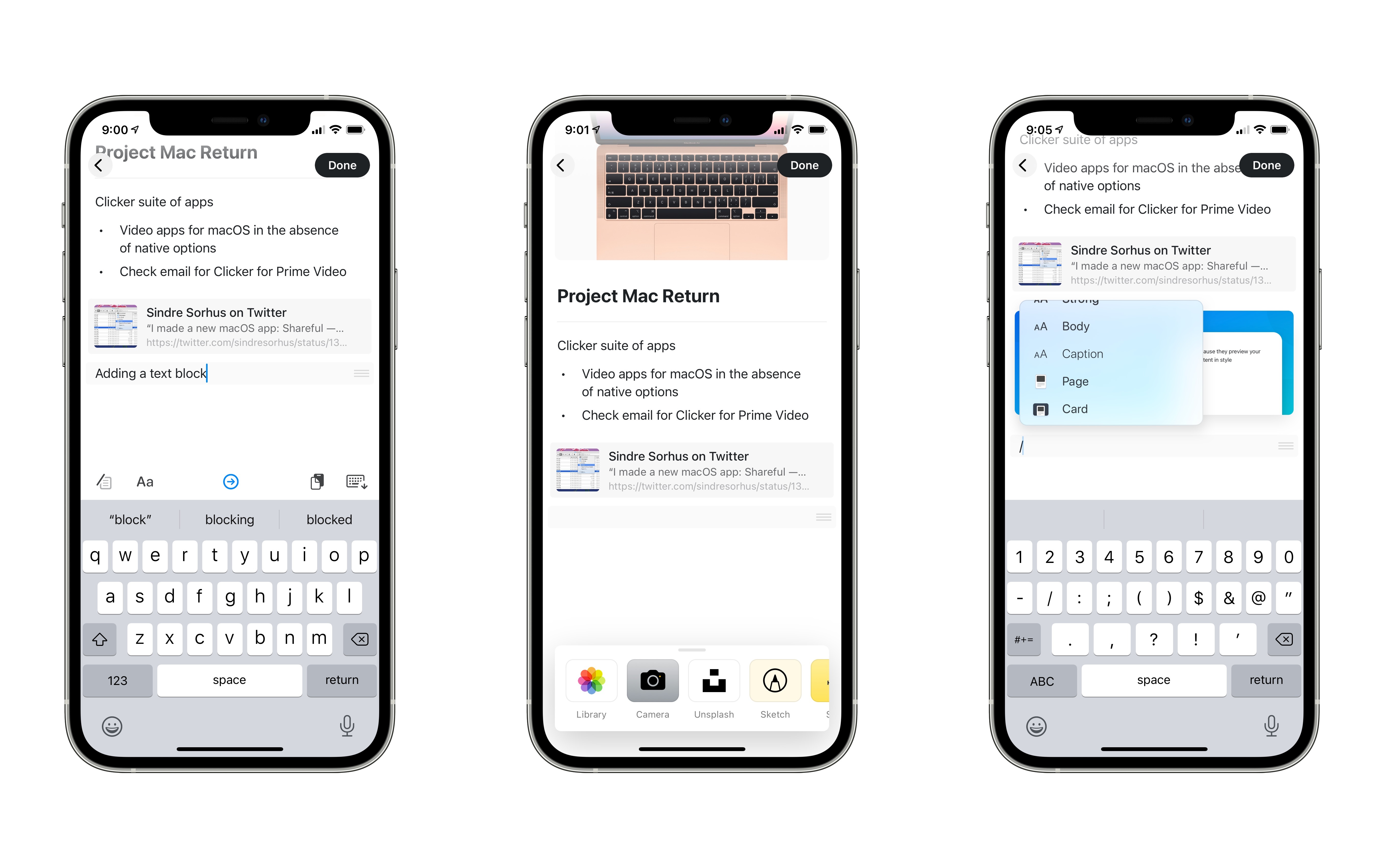
- Additional text styling options, such as font colors, titles, subtitles, captions, and more, and per-block fonts
- Plus the Page and Card options I already detailed
Different block types can be selected by hitting the icon featuring a plus button near the bottom of the screen, or by using a slash command. A simple forward slash (/) presents all of these available block options, plus the ability to adjust text alignment, indent, and other text actions.
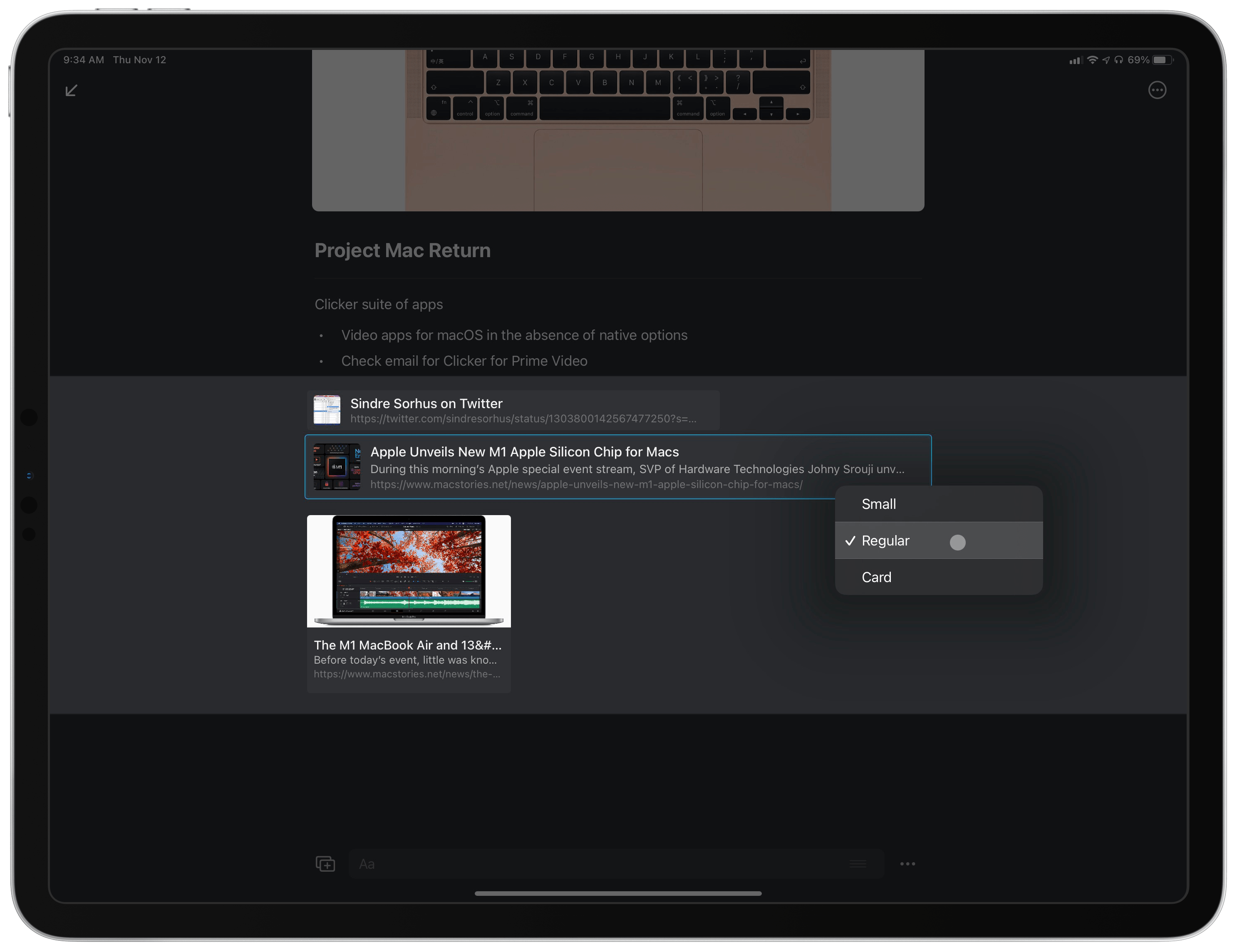
Adding to all of these block types, I love the way Craft handles links. Whenever you paste a URL into the app, it’s automatically converted into a rich link with preview. Every link preview can be customized to Small, Regular, or Card views, and you can even modify the link title and excerpt text that are displayed with the preview, the first time I’ve encountered that level of customization in a notes app. When you tap the link preview, the URL will open in Safari View Controller. In the future I hope a settings toggle is added to default to the full Safari app instead, or whatever your default browser is.
Overall, while Craft’s blocks may not offer nearly the amount of options that Notion’s do, personally I think that may be a good thing, at least for new users. Notion’s vast array of block types and slash commands can easily be overwhelming for those lacking experience with the app. Craft has a much easier learning curve, and for me at least, its set of block options almost entirely covers the range of what I want, with the sole exception being tables, which I hope are added soon. Too many more block types and the app could get cluttered fast.
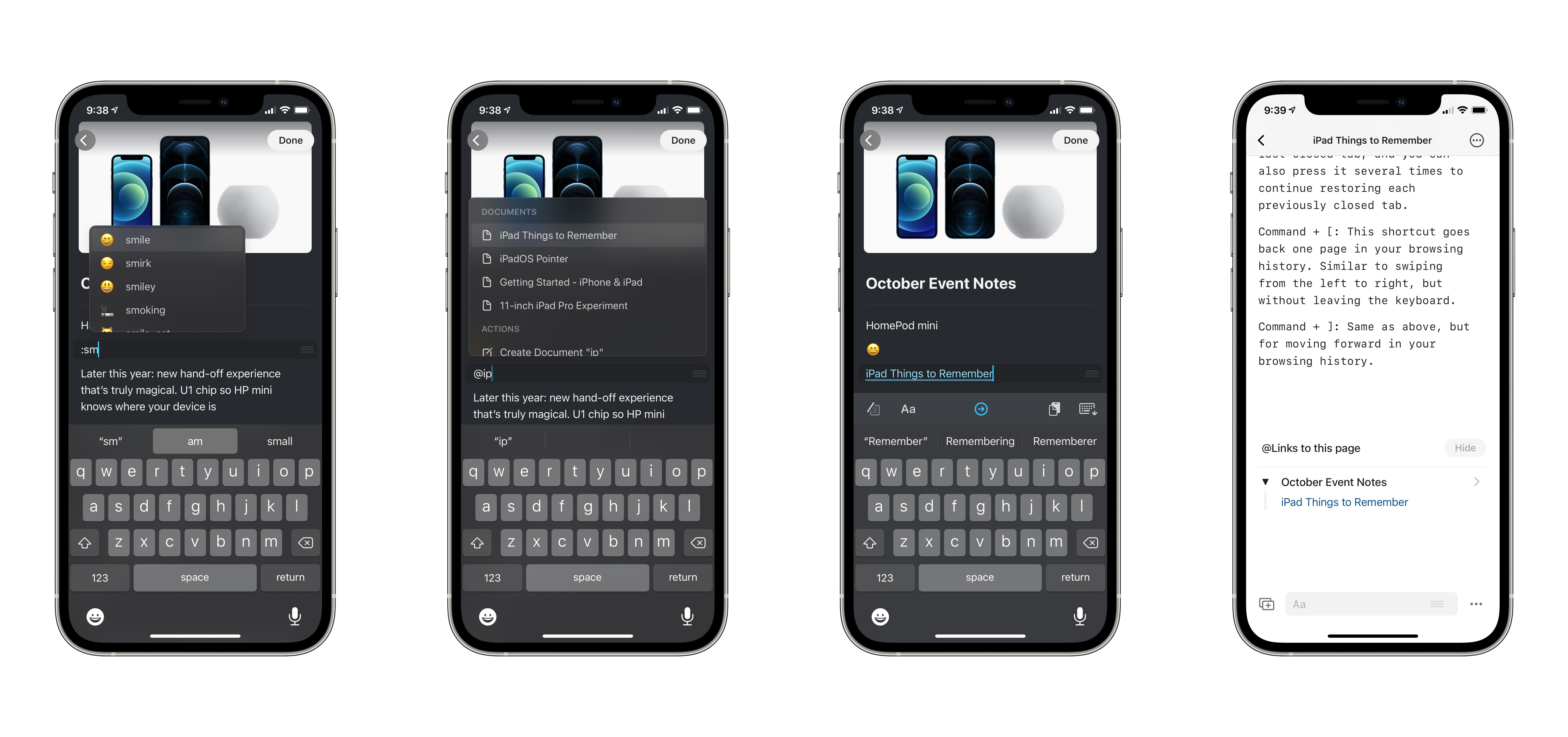
I mentioned using slash commands for adding content blocks, but there are a couple more shortcuts Craft offers for quickly adding content to your pages. You can also type the following symbols for more options:
- : - Emoji search and insertion
- @ - Linking to existing pages
One especially nice detail about page linking is that whenever a page has been @ linked, it will display a running list at the bottom of the page of all other pages that link to it, creating a connection point similar to what services like Roam offer.
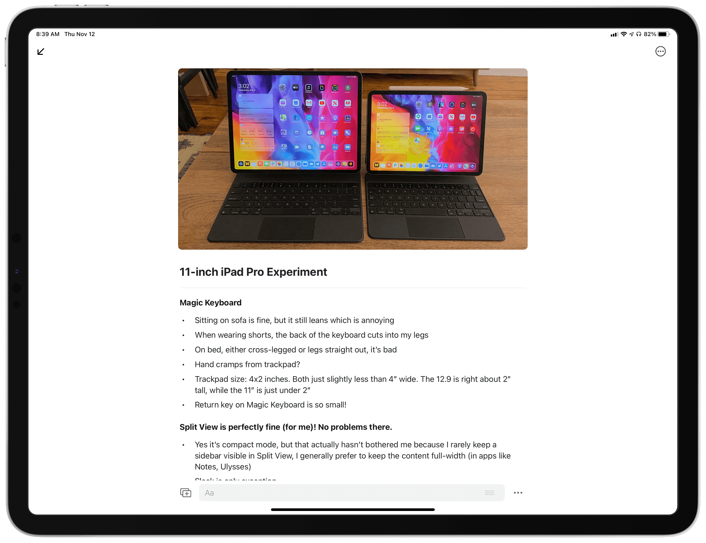
Finally, I can’t complete a section on Craft’s editor without mentioning how it works with an external keyboard. I know that strong keyboard support should be a given for every note-taking app, but far too often new notes apps drop the ball here, especially on iPad. If you’re an iPad user who got worried when I mentioned Craft’s block-based system, I get it, because I’ve spent far too much time dealing with the frustrations such systems have birthed in other apps. I’m happy to report that Craft mostly gets keyboard control right, with one big exception.
For most of the things you might do while navigating the editor with your keyboard, Craft is great. You can move up and down between different blocks using the arrow keys, hit tab and shift-tab to adjust indentation, edit a block by hitting Return when it’s selected, and more. Using shortcut commands like a slash or colon works very well, as you can simply type the slash, for example, then navigate the popup menu of actions with the arrow keys, and hit Return when you’re done without ever leaving the keyboard. Craft gets really close to delivering a top-tier keyboard experience on all platforms, including the iPad.
Where it falls short, though, is in selecting content spanning multiple blocks. On both Mac and iPad, text selection is limited to a single block at a time, so if you try to select some text in one block, as well as some text from the block below it, you won’t be able to do that. Craft’s team has sought to mitigate the issue with a compromise of sorts: if you hold the Option key while text is selected, then use the up or down arrow keys, you’ll enter block selection mode, enabling you to select the blocks above or below your starting text block. The problem with this is that it only works for selecting entire blocks of content. So you could select all the text in one block, and all the text in the block below it, then perform actions like cut/copy/paste, but if you only want to select certain portions of text from one block, along with portions of text from another block, that’s not possible in Craft.
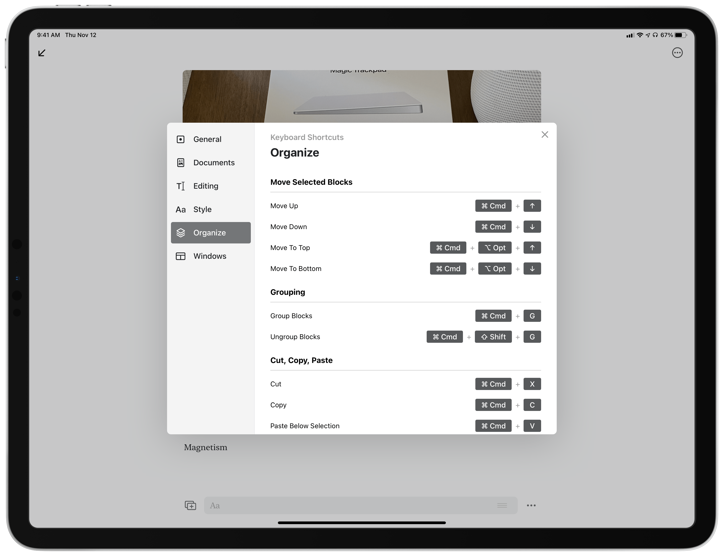
Again, for the most part Craft handles keyboard control extremely well. Besides the basics I’ve already mentioned, and the powerful shortcut commands, the app also offers an extensive set of keyboard shortcuts for doing everything from moving blocks, grouping and ungrouping them, changing styles, adding comments, managing windows, and more. Craft is 90% there toward an excellent keyboard experience, but its block system is getting in the way of a perfect 100.
Native OS Features
Despite bearing many of the markings of a web-first note-taking service, I’m happy to report that Craft offers a thoroughly native experience, taking advantage of all the relevant system features across iPhone, iPad, and Mac.
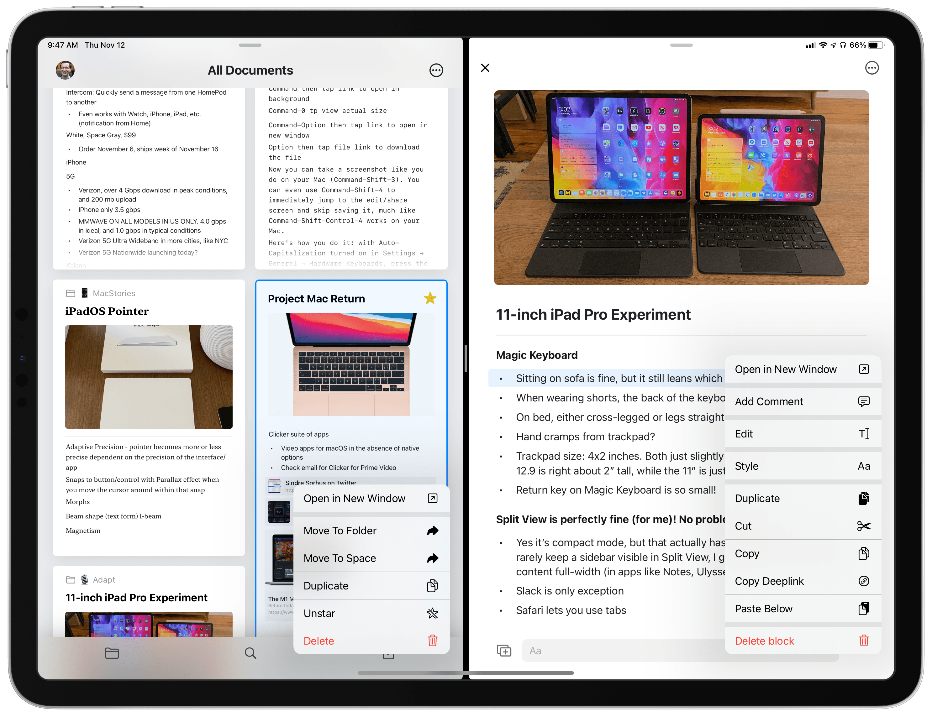
Split View, Slide Over, Multiwindow. Multitasking on iPad is fully supported in all its iterations. You can open Craft in Split View or Slide Over, and the app even supports multiwindow for keeping several different Craft windows open at once, whether side-by-side in Split View or in separate spaces entirely.
Drag and drop. It’s rare to find an app that offers as rich support for drag and drop as Craft. It’s the first notes app I’ve used that was clearly built from the ground up with drag and drop in mind. It starts in your workspace, where documents can be sorted into folders using drag and drop. And of course, since Craft’s documents center around content blocks, drag and drop is a perfect fit for interacting with those blocks.
On iPhone, iPad, and Mac, you can simply grab a block and move it up or down to re-order your content. If you have multiple blocks already selected, then on iPad and iPhone you can pick them all up at once with a single gesture. These touch-first platforms also enable moving blocks between different pages by simply picking them up, navigating to the page you want them, and releasing.
The iPad has the best version of drag and drop, because in addition to everything mentioned above, you can drag any block type to the side of the screen to open it in a new Split View or Slide Over window. And once you’re viewing multiple Craft windows on-screen at once, you can move content between them using drag and drop; this works with dropping Craft content into other apps too, and vice versa. There are alternate ways to perform most of the actions I’ve described, so you don’t have to use drag and drop much if you don’t want to, but I find it a valuable addition that both speeds up common actions and simply feels more fun.
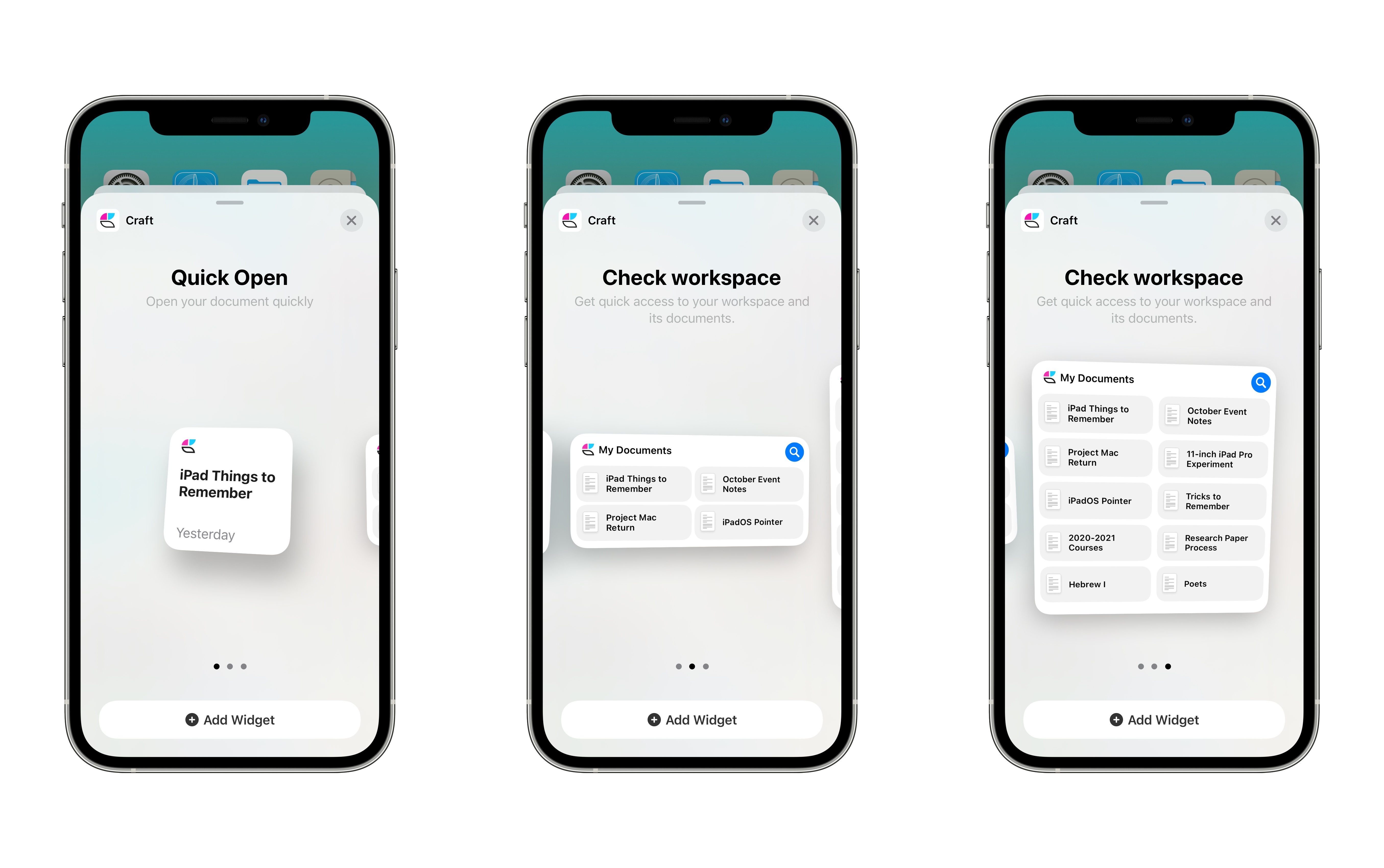
Widgets. Craft offers three widgets on all platforms: a small Quick Open widget which features a single document you can quickly open, and medium and large versions of a Check Workspace widget, which can be configured to show your most recent documents from either a single workspace or spanning all workspaces. The medium widget displays four documents, while the large can show 10.
Pointer support on iPad. Craft is fully optimized for the iPadOS cursor. All the basics are supported, like the cursor snapping to different UI buttons, and being able to right-click certain content to open a context menu. Hovering over select blocks will also cause new content to be displayed, like contextual menus, or even previews of linked pages.
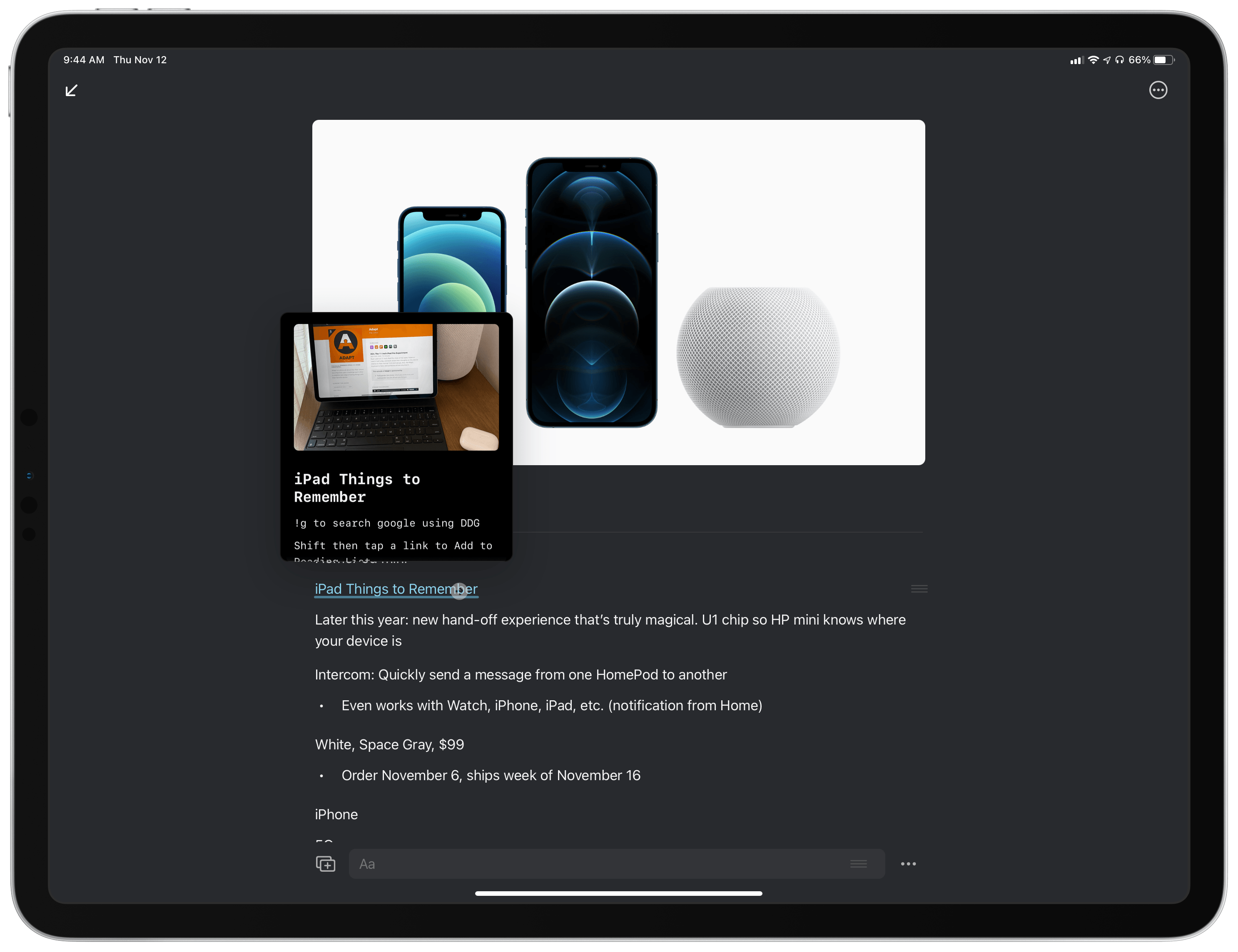
Craft is one of the few apps I’ve seen that has a custom shape behavior for the cursor. Whenever you hover over a block, a little grab handle will appear on the right end of the block. Place the cursor directly over that grab handle and you’ll see it morph into up and down arrows, indicating you can click and drag to move the block up or down.
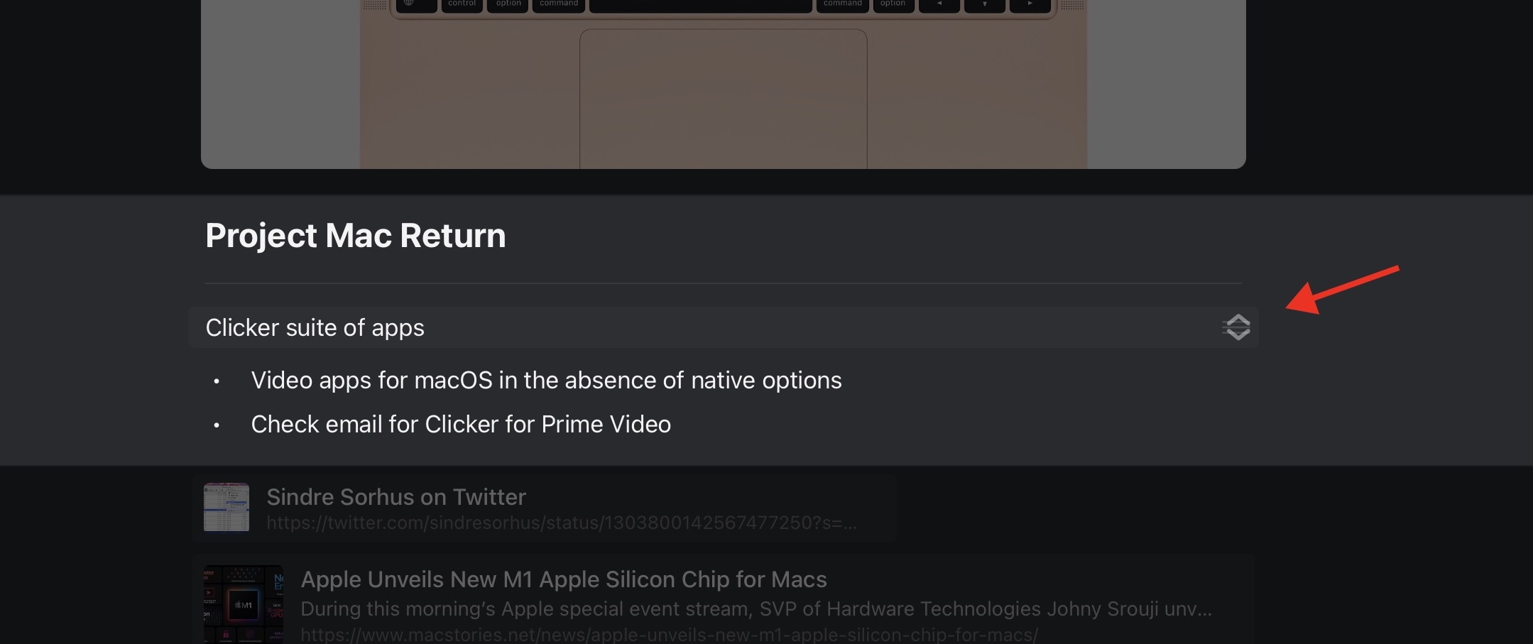
Context menus. On every platform, Craft has gone all-in on context menus as another method for performing common actions, including certain tasks that could otherwise be accomplished with drag and drop. With a long-press or right-click on a note in your workspace, you’ll see options to open it in a new window, move it elsewhere, duplicate, star, or delete it. Once a note’s open, context menus are also available for every individual block on the page, but interestingly a long-press won’t open them, only a right-click will work, meaning they’re only available on Mac and iPad. Block-based menus provide options to style the block, add a comment to it, duplicate it, copy a deeplink to it, open it in a new window, and more. The reason you can’t open these menus with a long-press is that on iPhone and iPad, long-pressing blocks triggers selection mode, where you can select a variety of blocks then perform an action with them, such as grouping them together, changing the style of them all at once, and so on.
Shortcuts. It’s not a large list of actions, but Craft does integrate with the Shortcuts app by providing five actions for automation. Several of these are simple launchers, enabling you to open a specific page or space. The remaining actions, Add to Craft Doc and Create Craft Doc, have a little more power to them. With the former, you can either append or prepend content to a given document, while the latter simply creates a new document in the place of your choosing. It’s not much, but it’s a start.
Light and dark appearance. Both light and dark modes are supported across iPhone, iPad, and Mac, and both modes look great. If you’d like, you can choose to keep the app in one mode regardless of system setting.
Tabs on Mac. One of the main macOS features I wish would make its way to the iPad is tab support in document-based apps. Alas, maybe next year. Mac users will be glad to hear that Craft fully supports opening pages in multiple tabs rather than windows, if that’s your preference. This gives Craft an advantage over Apple Notes on the Mac, which surprisingly doesn’t support tabbing.
PencilKit. I mentioned in passing that you can add sketches to your Craft pages. PencilKit is the technology driving that. Insert a sketch and you’ll see the standard set of Markup tools found when annotating a screenshot or PDF. Currently, Pencil support is only available in standalone sketches, you can’t use the Pencil to handwrite notes in-line.
Additional Features
Collaboration. Craft offers what it calls ‘real-time collaboration,’ which is a term I’m usually pretty skeptical about. But in my limited testing with Federico, the phrase is actually merited here. I would want to use the feature for a lot longer and with more people before making any final judgments, but my early testing is positive: Craft’s real-time collaboration is more Google Docs-esque than most other apps that try collaboration.
Real-time collaboration is available for any and all notes belonging to a shared workspace. Essentially, rather than being able to collaborate on one of your existing notes on a case by case basis, you’ll need to set up a separate workspace that’s shared with certain collaborators, and all pages in that workspace will have real-time collaboration enabled.
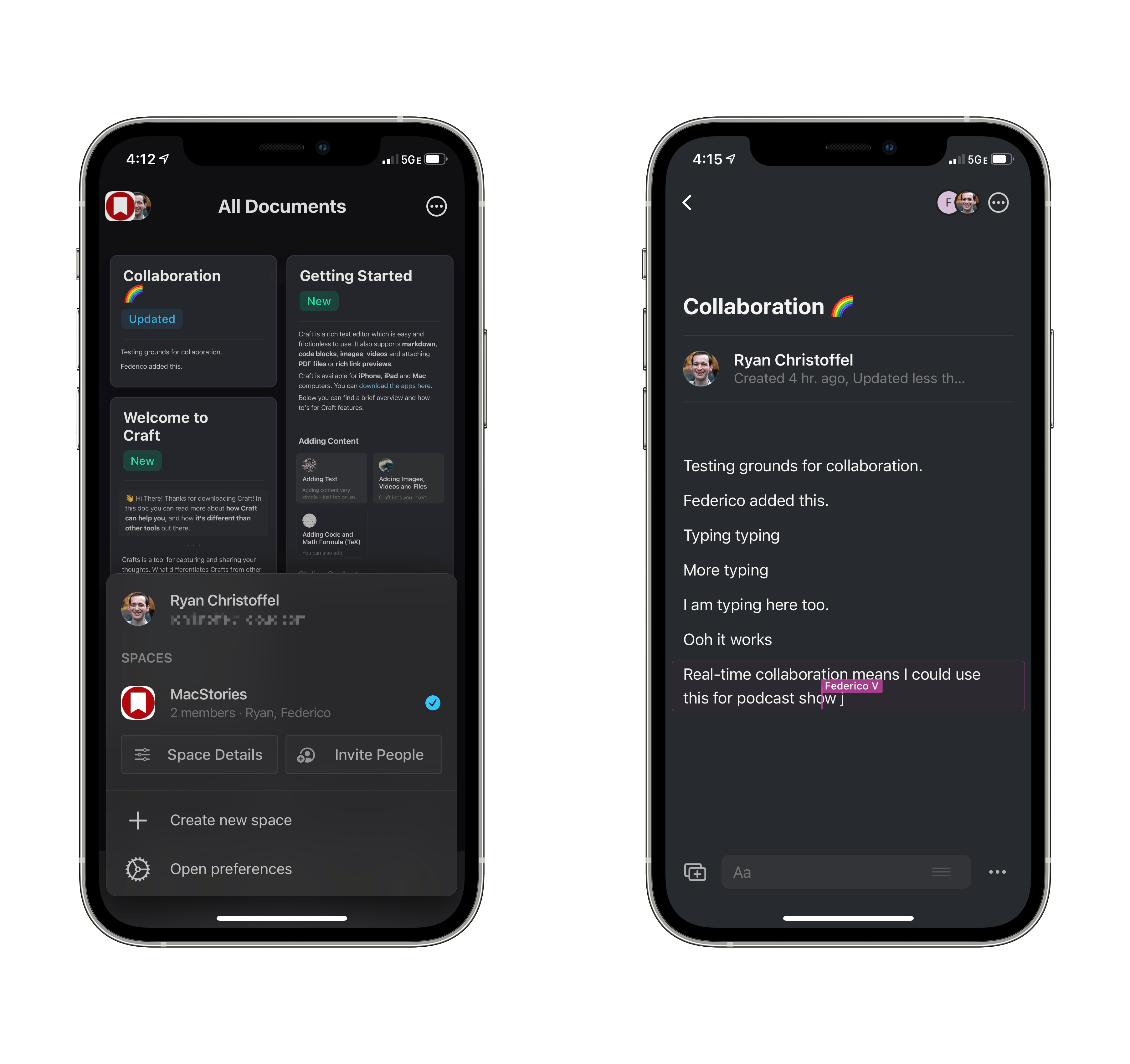
Like in Google Docs, you can see collaborators’ name and flashing cursor on-screen as they type. Again, I haven’t tried it long enough, or with enough people, to offer a fair comparison to Google Docs, but the fact that I can even mention the two apps in the same sentence is an accomplishment. Surprisingly few productivity tools offer the sort of collaborative features that Google long ago mastered, so it’s great to see Craft expand this market.
Public webpage views. Every Craft document can be turned into a public webpage by flipping a single toggle dubbed ‘Secret Link.’ Turning on Secret Link creates a web version of your note you can share with others via a URL, and you have full control of whether viewers can access all other pages linked within the document or not, and whether they can add or see comments. Web versions of Craft documents look beautiful, but what’s especially nice is that people you share with can leave comments even if they don’t have a Craft account themselves. All they have to do is visit the URL, click the comment button that appears next to each block, and leave their name and comment.
Export options. If you need to share your documents but don’t want to do that through a public site, Craft also lets you export a page as a PDF, Markdown file, TextBundle, or print it.
Version history. Every note automatically keeps a backup of its version history, which you can browse so as to restore a previous version. Accessed from the top-right corner of the screen, behind the three-dot icon on iPhone and iPad and the backup icon on Mac, version history doesn’t offer any kind of diffing functionality, but hopefully that’s added in the future. For now, it’s nonetheless a nice feature to have and one that’s rare to find on iPhone and iPad.
Room for Improvement
If you can’t tell already, I’ll come right out and say it: Craft is an impressive new contender to the note-taking market. A lot of care and work has clearly been put into making it a compelling product from day one. But as with every app, there’s always room to improve.
My biggest complaint is that the iPad version lacks the desktop-class layout found with the Mac app. The Mac version carries a multi-column layout with dedicated spaces to view important areas like your workspaces, or style settings, all while still viewing your pages. The iPad app only shows a single view on-screen most of the time, resembling the iPhone app and neglecting Apple’s recommendations for adopting multi-column layouts in iPadOS 14. When viewing your notes, you can optionally add the folder list as a sidebar on iPad, but if you want to see workspaces too, that’ll require opening a popover panel, and while editing a page you can’t view formatting options as a sidebar like on the Mac. Plenty of apps have shown how well multi-column UI layouts work on iPad, so it’s disappointing that Craft’s Mac app has a big advantage here.
A related issue on iPad is that if you’re using a connected trackpad, such as the one built into the Magic Keyboard, in most apps a two-finger swipe enables navigating between different UI panels and screens. The most common use is swiping to navigate back to the previous view. I do this all the time in a variety of apps, but currently you can’t use the same gesture in Craft. Two-finger swipes will activate selection mode when you’re hovering over a block, but in order to navigate back, you’ll need to manually hit the button in the top-left corner.
One more iPad drawback is that when viewing the contents of a folder, Craft places three important buttons at the bottom of the screen: one opens the folder sidebar, another triggers search, and the third creates a new page. Since these line the bottom of the screen, they get obscured by iPadOS’ keyboard row. This is only a problem when working in Split View or Slide Over with a hardware keyboard attached, but for me that’s a very common scenario, forcing me to manually hide the keyboard row to access these important controls. Again, adopting some of Apple’s recommended iPadOS 14 design trends, such as top-of-screen toolbars in this case, would solve the issue.
Sort options are also lacking in Craft. Both in the folder list, and when viewing all your notes, there are zero sort options available. The folder list is sorted alphabetically, but if you use emoji in folder titles like I do, those symbols will mess up the order; pages are sorted by last edited, with no options for manual sort, alphabetical sort, or any other alternative. Sort options need to be near the top of the priority list for future updates.
Craft is the strongest 1.0 note-taking app I’ve ever used. It offers a thoroughly native experience, taking advantage of all the best system features across its respective platforms, while also retaining the power and versatility of modern web-based services like Notion. Real-time collaboration is an especially exciting feature, and I love that even if someone doesn’t have a Craft account, they can add comments to your notes through public webpages.
Assessed on its merits alone, Craft is a fantastic app debut. If you’re in the market for a new solution for notes, I definitely recommend checking it out. It’s not perfect, as my complaint list above makes clear, but the app has an excellent foundation to build on.
The only thing that may give users pause is Craft’s business model: it’s a free download across all platforms, but after you hit 1,000 content blocks you’ll need a Pro subscription to continue editing your notes, and that subscription runs $4.99/month or $44.99/year. That price may be a deal-breaker for some, but if you can swallow it, you’re getting a lot of value in return. In any case, the free tier should provide enough time to test the ins and outs of the app, including its real-time collaboration, to judge its merits yourself.
Craft is off to a wonderful start, and I can’t wait to see where it goes next.
Craft is now available on the App Store for iPhone, iPad, and Mac.