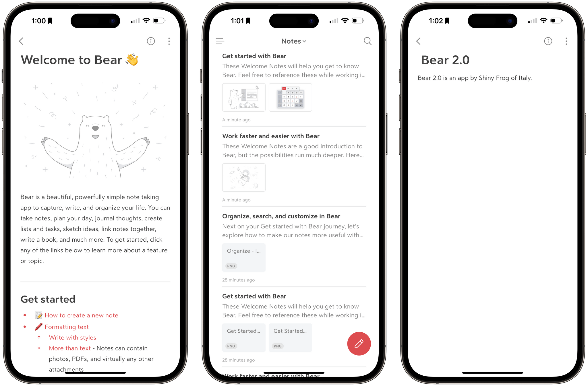
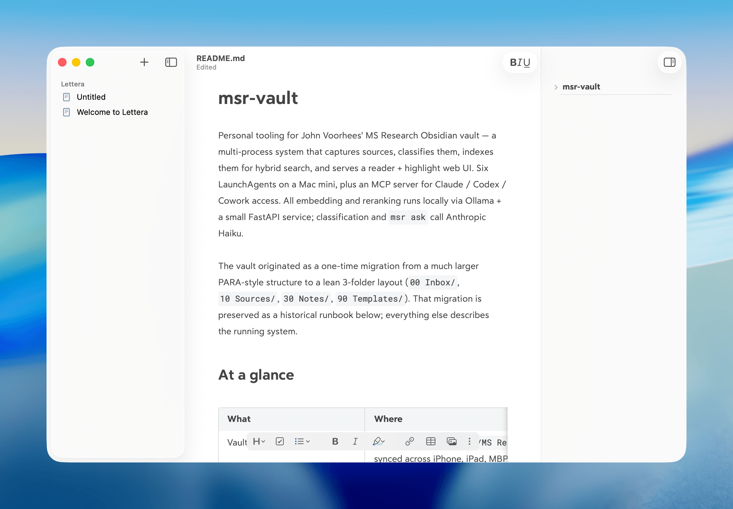
THIS WEEK'S SPONSOR:

Collections

A Powerful Database with iCloud Sync


Posts tagged with "text editor"

iA Writer 6 Adds Cross-Document Linking, Metadata, and More

iA Writer has long been one of the premier text editors on Apple’s platforms. The app’s design is top-notch, and it offers a feature set that makes it among the best options for writing in Markdown. Best of all, the app’s features stay out of your way while you’re writing. They’re easy to access, but they aren’t a distraction. That’s as true of iA Writer 6 today as it was with previous versions.

However, the Markdown text editor market is changing rapidly, with tools for creating interlinked notes and documents in a variety of ways that have quickly become table stakes for text editors and note-taking apps alike. iA Writer 6, which is available on the iPhone, iPad, and Mac, is a response to those changes that fits comfortably with the app’s existing feature set and design. The update doesn’t go as far as an app like Obsidian when it comes to internal links. Nor is it extensible with plugins. However, for many users, I suspect iA Writer’s impeccable design and thoughtful features will outweigh its lack of certain power-user features.

Read more


Automation April: A Three-Part Shortcuts Workflow for Syncing Timestamped Research Notes with Videos

Whenever I review notes I’ve taken on a video, I inevitably want to go back to rewatch parts of it. However, finding the right segment is a slow, cumbersome chore, which is why I’ve created Timestamped Notes, a trio of shortcuts that are optimized for the Mac, but adaptable to iPadOS, to automate the process of creating timestamped notes without interrupting your typing.

There are two scenarios where I use or plan to use these shortcuts a lot. The first is during Apple events when I’m under time pressure to get stories out and don’t have the luxury of scanning through large sections of a presentation as I write. Timestamped Notes got its first real-world test with Apple’s March event and passed with flying colors.

The second scenario where I’ll use Timestamped Notes a lot is during WWDC. I take lots of notes as I watch recorded presentations, but I often don’t revisit the notes I take for days or weeks later. If I need to refresh my memory of what was said during the session by skipping back through the session, Timestamped Notes will be what I use. No matter what kind of video or audio you take notes on, though, if there’s a chance you’ll want to go back to the source material, Timestamped Notes makes finding what you took notes on much easier.

Part of the inspiration for this shortcut came from a series of articles by Jason Snell and Dan Moren on Six Colors. They built a Stream Deck-powered shortcut for taking timestamped notes to highlight portions of podcast audio that needed editing. I built a similar shortcut at the time but abandoned it because it didn’t fit with the way I edit podcasts. However, the experience got me thinking about other ways to use timestamped notes that might fit better in other scenarios, which is what led to Timestamped Notes.

Timestamped Notes addresses three problems:

  • Creating a clean starting point, so your timestamped notes line up properly with the start of the video you watched
  • Providing a simple and fast way to create a timestamp that doesn’t interrupt the note-taking process
  • Converting clock-based timestamps, so they line up with a video’s timeline, which starts at 00:00:00.

The solution was to create three separate shortcuts, which I’ll cover in turn.

Read more


My Obsidian Setup, Part 1: Sync, Core Plugins, Workspaces, and Other Settings

My Dashboard workspace in Obsidian for iPad.

My Dashboard workspace in Obsidian for iPad.

Last month, after a long beta period I’ve participated in for the past few months, the official Obsidian app for iPhone and iPad launched on the App Store. I’ve covered Obsidian and my approach to writing my annual iOS review in it on both AppStories and Connected; because I’m busy with that massive project and an upcoming major relaunch of the Club (hint hint), I don’t have time right now to work on a proper standalone, in-depth review of Obsidian for MacStories. So, given my time constraints, I thought it’d be fun to do a multi-part series for Club members on how I’ve set up and have been using Obsidian as my Markdown text editor and note-taking app of choice.

Read more


Nova Review: Panic’s Code Editor Demonstrates Why Mac-like Design Matters

I’ve been writing code for nearly a decade, and throughout all of that time, I’ve never quite been satisfied with a code editor. Each one I’ve tried has annoyed me in various ways, and eventually, I find myself looking elsewhere.

My code editor is the app I use more than any other. I spend hours in it nearly every day and often keep going deep into the night. The code editor is the main tool of my trade, and I want to be using the best one that I can.

One of my main frustrations with pretty much all of the popular code editors out there (and I’ve tried most of them, including Visual Studio Code, Sublime Text, Atom, IntelliJ, and Eclipse) is that none of them are Mac-assed Mac apps. They’re all clearly cross-platform apps with design senses that differ significantly from those of Mac-first developers.

Read more


Craft Review: A Powerful, Native Notes and Collaboration App

Note-taking apps on Apple platforms have never been in a better place. Apple Notes is a fantastic built-in option with deep system integrations. Bear offers an elegant Markdown experience and powerful note linking features. Agenda takes a unique date-based approach to note-taking. Evernote just launched its long-in-the-works redesign, and Noto provides a great mix of style and substance. There are quality Pencil-based note-takers like Notability and GoodNotes. And certain web-based tools like Notion are starting to put a higher priority on their app experience.

But for all the excellent options already out there, it can never hurt to have another. Especially when that new option is as well done as Craft.

Craft is launching today across iPhone, iPad, and Mac as a new note-taker that blends the block-based approach of Notion with a thoroughly native experience, taking advantage of all the OS technologies you would hope for and throwing in valuable features like real-time collaboration. It’s the most exciting note-taking debut I’ve seen in years.

Read more


Ulysses 21 Brings Revision Mode to iPhone and iPad Alongside Updated Design

Today the latest version of Ulysses, the excellent Markdown text editor, was released for iPad and iPhone. Ulysses 21 comes with two main changes: it brings the previously Mac-exclusive revision mode to iOS and iPadOS, while also introducing design updates that take advantage of new iOS 14 design elements, such as pull-down menus. It’s not a huge update, but it’s a nice one nonetheless for iPhone and iPad users.

Read more


Note Linking in Bear Expands to Include Section Linking

Creating a note link (left) and section link (right).

Creating a note link (left) and section link (right).

One of my favorite features in Bear has always been the ability to link to different notes inside one another. Putting the name of a note inside double brackets, like [[Club 5th Anniversary]], is a clever way to connect and quickly access related notes. I wish every note-taking app offered a similar feature.

The great thing about creating a note link is that you don’t need to remember the titles of the notes you want to link to. Just type the two opening brackets, then a couple characters that are part of a note’s title, and Bear presents a dynamic autocomplete list of suggested notes that best match what you’ve typed. While using a connected hardware keyboard, you can cycle through the suggestions using just the arrow keys and hit Return to select the right one – Bear will then create the link for you by inserting the note’s full title into double brackets. Once a link’s been created, you can tap or click it to quickly open that other note.

Bear has made note linking even better in its latest update, though, by expanding it to enable linking to specific sections of another note, which works by tying into the note’s headers. Every header can now be linked to individually, opening a variety of new possibilities – creating a table of contents is the most obvious option, but there’s so much more that can be done with direct section links.

This expanded functionality for links is worth mentioning because of the valuable utility it provides, but also because of how well it’s been implemented. Building on the existing system of typing two opening brackets then part of a note’s title, all you have to do to link a note section is then type a single forward slash / after you have an autocomplete suggestion highlighted – that note’s headers will all display so you can select the right one from there. If you’re using a hardware keyboard especially, the whole process is so fast and simple. It feels especially nice on iPad, where apps often drop the ball with keyboard support when navigating popup menus. In Bear everything just works the way you’d expect. Thanks to strong keyboard support and an intuitive UI for note and heading suggestions, creating links takes just a couple seconds.


External Keyboards, iPadOS 14, and Obscuring Tab Bars

iPadOS 14 apps use sidebars, but only in certain size classes, so tab bars still get hidden behind the keyboard row.

iPadOS 14 apps use sidebars, but only in certain size classes, so tab bars still get hidden behind the keyboard row.

I love using the iPad as my primary computer, but a long-standing frustration I’ve had involves the keyboard row that lines the bottom of the screen when an external keyboard is attached. I like the row itself, as it usually offers valuable utility such as in Apple Notes, where a text formatting menu is available in the keyboard row. The problem is that iPadOS doesn’t adapt apps’ UI to account for the keyboard row, rather it simply hides the bottom portion of an app – which in many cases means hiding the app’s tab bar or other important controls.

This is mainly an issue when using Split View or Slide Over, not full-screen apps. But most of my iPad use does involve Split View and Slide Over, and I can’t count the number of times I’ve had to manually hide the keyboard row so I could access an app’s tab bar. This is a regular occurrence when writing articles, for example, as I’ll keep Ulysses and Photos in Split View, and the keyboard row that appears when working in Ulysses obscures Photos’ tab bar so I can’t switch tabs in Photos without manually hiding the keyboard row. The row also hides the share icon when viewing a photo, which is what I press many times when writing an article so I can run shortcuts via the share sheet. So as a workaround I have to manually hide the row, a short-lived fix because it then reappears after typing a single keystroke in Ulysses.

In iPadOS 14, Apple is halfway solving this problem. Because apps are being encouraged to switch from a tab bar-based design to one that involves a sidebar, there are fewer occasions when tab bars will be visible. In the iPadOS 14 beta, if I have Ulysses and Photos in a 50/50 Split View, there’s no longer a tab bar for the keyboard row to obscure, because Photos uses a sidebar instead where I can easily navigate to the view I need.

Unfortunately, this is only a partial solution because iPadOS 14 apps still revert to using a tab bar in a compact size class (i.e. when they’re an iPhone-like size). So all Slide Over apps retain tab bars for navigation as before, meaning those important tabs will be hidden any time you’re also working in an app that uses text and thus presents a keyboard row. The same is true for Split View when an app is the smaller app in your multitasking setup. If the app you’re writing in is the larger app in your Split View, the smaller app will have its tab bar obscured by a keyboard row. This is especially problematic for writers, who live in a text editor all day, but it also applies to anyone working in a note-taking app, messaging app, or anything else involving text. iPadOS 14 improves things via sidebars in certain situations, but in many multitasking contexts the years-old problem remains.

But there’s a happy ending of sorts, at least for me. My inspiration for writing about this issue was the discovery of a feature in Ulysses that fixes the problem for me. The app’s View Options inside its Settings panel contains a toggle that has been there for quite a while, I simply never thought to activate it: Hide Shortcut Bar. What this does is perpetually hide the keyboard row whenever a hardware keyboard is attached to your iPad. No keyboard row means no hiding tab bars in other apps while I write.

Ulysses does place some important shortcuts in the keyboard row, but most if not all of them can be triggered via keyboard shortcuts instead, making the keyboard row unnecessary (for my uses at least).

After making this discovery, I dug around in a few other apps’ settings to see how common this feature is. iA Writer offers it, as does Drafts, and possibly many other apps I haven’t tried. It seems more common in text editors than note-taking apps. It’s a shame that the whole keyboard row needs to be hidden just to account for an iPadOS design flaw, but I’m thankful that third-party developers have stepped in to address the issue themselves.

Ulysses is the app I multitask in most frequently, so the ability to keep its keyboard row hidden forever has truly made my day. I tried explaining to my wife why I got so happy all of a sudden, and she didn’t really get it. I don’t blame her.


Ulysses 20 Review: New Dashboard Featuring Advanced Grammar and Style Check, Outline, and Much More

Ulysses 20 for iPad’s new dashboard.

Ulysses 20 for iPad’s new dashboard.

One of the promises regularly made by apps transitioning to a subscription model is that they’ll be able to deliver more regular, incremental updates rather than going untouched for extended periods of time, and they can also focus on adding functionality that existing users will appreciate rather than needing to build something entirely different to attract a new target market. Ulysses has been a subscription app for nearly three years already, and I believe it’s one of the apps doing the best job of delivering on both of those fronts.

A quick search on MacStories will show that I’ve covered Ulysses a lot, in part because it’s my primary Markdown editor, but also because there are consistently several updates per year that stand out as noteworthy and meriting a fresh review. Today’s version 20 is no exception, introducing an advanced grammar and style check ‘revision mode’ on the Mac (coming soon to iPad and iPhone) and a new dashboard view across all platforms. Both enhancements leave what was already great about Ulysses alone, while offering valuable new utility for writers sure to delight existing users and perhaps even draw a flock of new ones.

Read more