Today the latest version of Ulysses, the excellent Markdown text editor, was released for iPad and iPhone. Ulysses 21 comes with two main changes: it brings the previously Mac-exclusive revision mode to iOS and iPadOS, while also introducing design updates that take advantage of new iOS 14 design elements, such as pull-down menus. It’s not a huge update, but it’s a nice one nonetheless for iPhone and iPad users.
Revision Mode

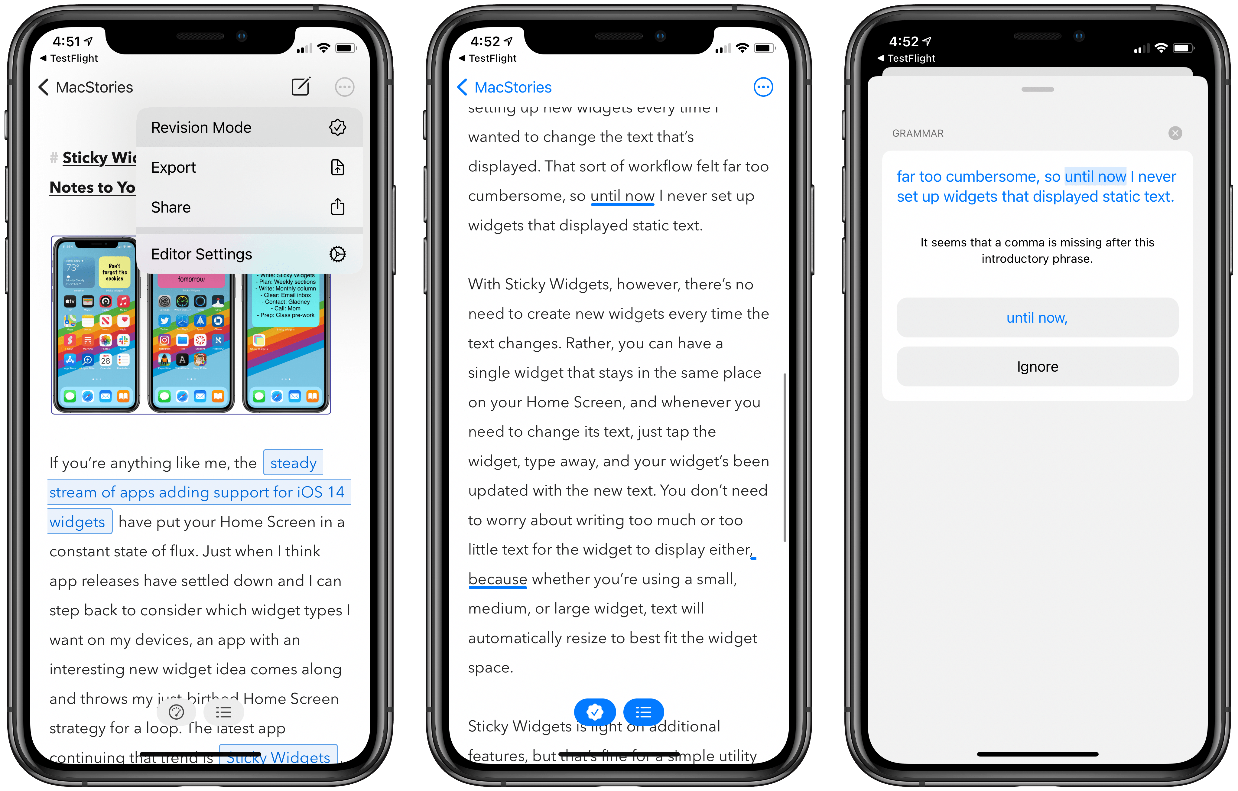
Let’s start with revision mode, which is accessible by tapping the three-dot icon in the upper right corner and selecting Revision Mode from the menu that appears.
The central feature of revision mode is an advanced grammar and style check powered by LanguageTool Plus. As I explained when Ulysses for Mac first introduced revision mode:
When activated, advanced check offers suggestions on a wide array of textual elements, including:
- Capitalization
- Style
- Redundancy
- Grammar
- Punctuation
- Typography, which identifies things like extra spaces in your text.
- Miscellaneous, which involves semantic issues such as suggesting a preposition that more commonly appears with your sentence’s context.
Essentially, Ulysses has taken a Grammarly-like tool and built it directly into its editor, included for free as part of a standard Ulysses subscription
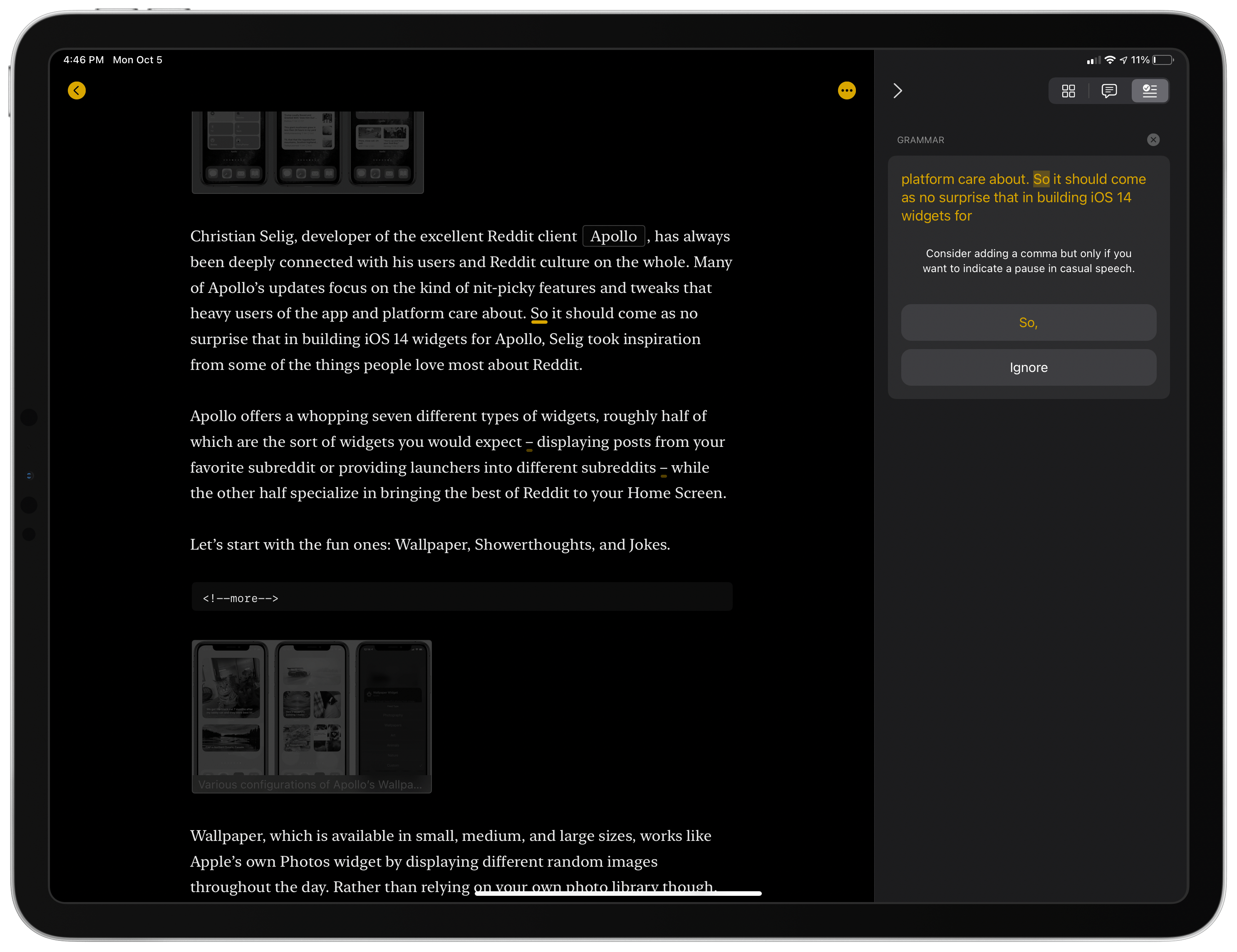
When revision mode is activated, you can browse suggested changes in a list broken down by the categories above, or simply tap ‘All’ then scroll through your document looking for words and phrases that have been underlined for review. Each of these can be tapped to see what change they recommend, offering the option to make the change with a single tap or ignore it. One of my favorite details about Ulysses’ system is that, where appropriate, it includes context around its suggestions, such as in the example below where a comma addition is suggested and the app explains that I should only make that change if I “want to indicate a pause in casual speech.” When I’ve used grammar and spelling tools in the past, there was nothing more frustrating to me than seeing suggested corrections that offered no explanation or context as to why I should accept their revisions. Ulysses shines in this area.
The advanced check features described above require an explicit consent to enable, since they utilize an online service rather than running on-device. Ulysses explains the privacy implications:
When you check a text, it will be sent to our servers, from which it is forwarded to LanguageTool for analysis. You have to explicitly trigger text check per sheet, and it will be run only in sheets where you do this, not in your entire library. While the text is being processed, it is kept on our servers and the servers of LanguageTool. It will be deleted from the servers shortly after the text checking has been completed.
If you’re not comfortable using advanced check, revision mode isn’t entirely devoid of value. Ulysses will still offer spelling fixes using the system’s on-device dictionary, and revision mode additionally aggregates all annotations and comments from your sheet, offering a single hub for all potential revisions to make, whether they’re suggestions offered by LanguageTool’s analysis, the system spell-check, or notes left for you by a collaborator or yourself.
Design Refresh
iOS and iPadOS 14 introduce a few new design norms Apple is promoting, such as pull-down menus and iPad sidebars and multi-column views. As to the latter, Ulysses was already ahead of the game with its custom implementation of a three-column layout on iPad which included a powerful sidebar with collapsible sections. Essentially, the design elements Apple is now promoting in iPadOS 14 are things Ulysses has had for years already. This isn’t the case of a third-party proprietary design feeling janky compared to apps using the official APIs either: Ulysses’ multi-column layout and sidebar feel just like Apple’s own implementations, such as what’s found in Notes and Mail. So there was no reason for Ulysses to make changes to what it was already doing with its sidebar and columns, other than some minor tweaks like the new rounded rectangles that highlight the currently selected sheet.
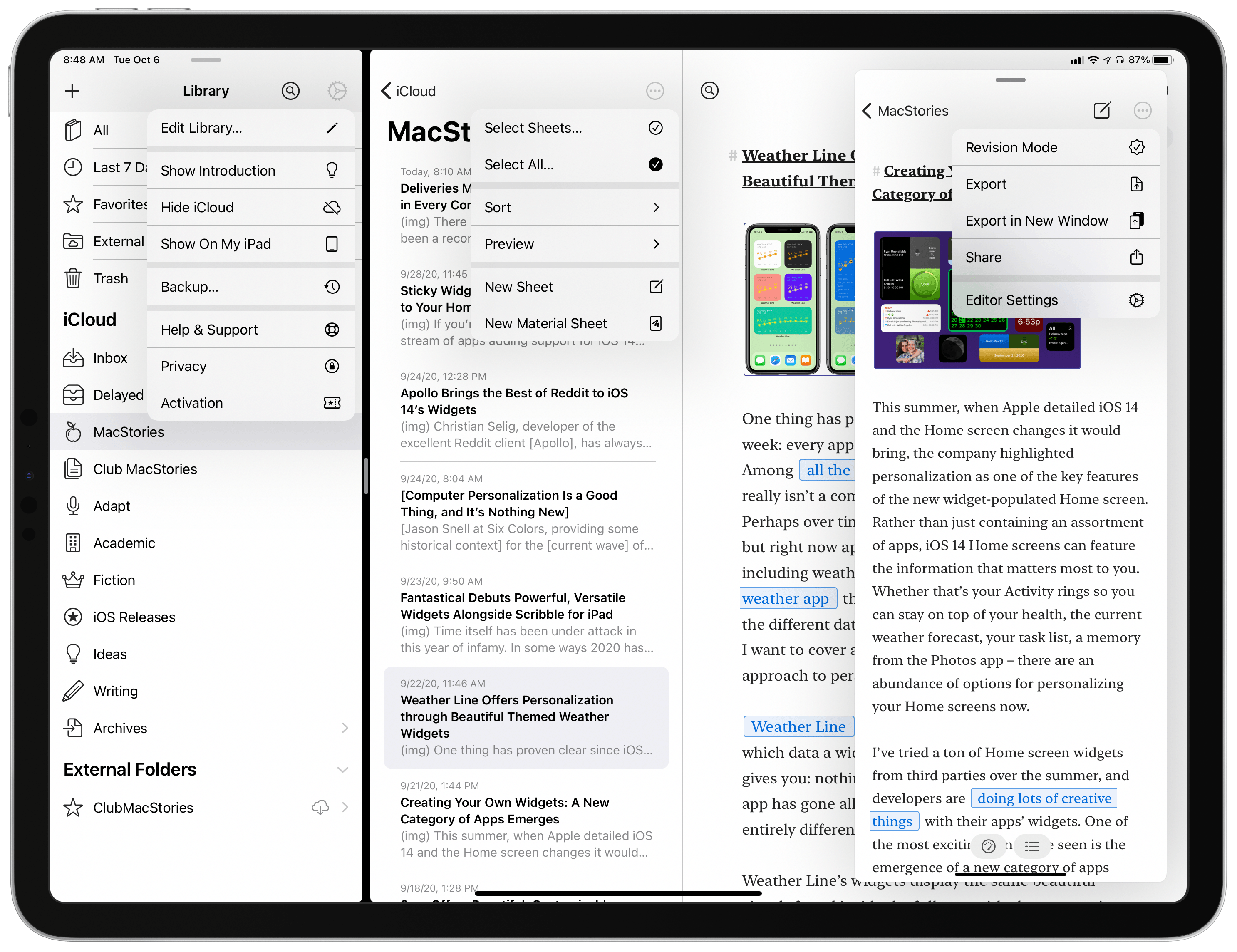
Where the app has changed, however, is in adopting pull-down menus. Similar in design to the context menus introduced in iOS 13, pull-down menus offer a list of menu options in a condensed form, and they’re often best put to use by moving buttons and other interface elements away from the bottom of the UI and into toolbar areas at the top of the screen.
Ulysses has done exactly this with its pull-down menus. Buttons that used to be at the bottom of the screen have moved to the top toolbar, and some items have been condensed into these new menus. In Ulysses’ toolbar the three-dot icons and the settings icon all reveal pull-down menus when you tap or click them, as does the button for choosing your export file type from inside the Export screen. These new menus don’t make a radical difference in everyday use, but they can save a tap or two and make for easier navigation, which are both solid improvements.
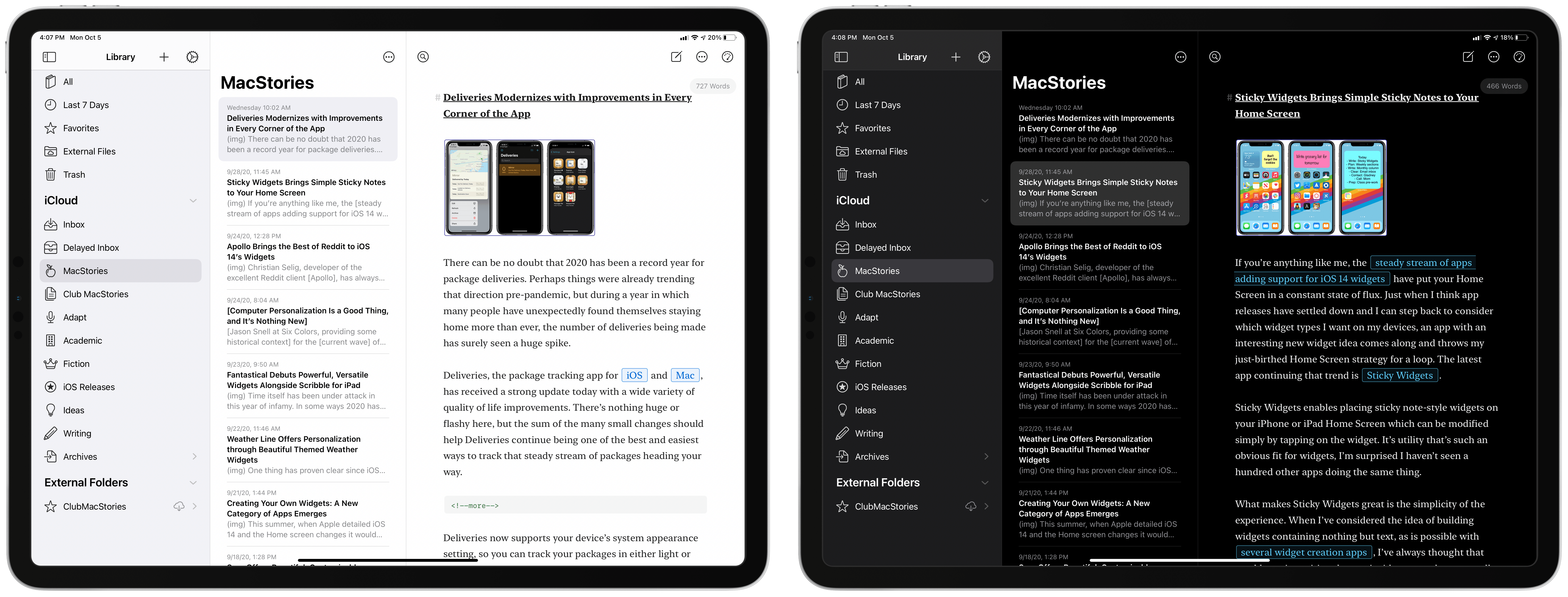
Besides adopting pull-down menus, Ulysses’ interface on iPhone and iPad has also had some color stripped from it. Where the Library formerly featured color glyphs, blue in light mode and yellow in dark mode, now all of that color is gone and the app is left with a neutral monochrome vibe. Perhaps some users will appreciate this design change, but after weeks of beta use I still thoroughly dislike it. My text editor now feels entirely void of life, as though when I’m writing I need to be extra business-like and robotic and thus I’m not allowed to enjoy any color. That sounds a bit dramatic, but it’s how the color-free design strikes me. I’d rather see Ulysses take things in the opposite direction, such as by offering users the ability to choose custom colors for Library icons.
I’m glad it didn’t take long for revision mode to make its way to iPad and iPhone. When I tested the feature for Mac this summer it seemed like a valuable addition, but since I use my iPad far more than my Mac, I’ve scarcely utilized the feature since then. Now, no matter which device I’m using, Ulysses offers this powerful feature everywhere.
The design refresh is more a mixed bag. Since Ulysses was already following Apple’s iPadOS 14 recommendations regarding sidebars and multi-column layouts, even before those recommendations were ever created, not much needed to change in today’s update. Pull-down menus are a nice addition, but I do miss the colors that have been eliminated in the sidebar.
Regardless, Ulysses remains my primary Markdown editor and the addition of revision mode makes it less likely than ever that I’ll change that anytime soon.
Ulysses 21 is now available on the App Store.