This Week's Sponsor:

Kolide

Ensures that if a device isn’t secure it can’t access your apps.  It’s Device Trust for Okta.


Search results for "Register"

Posts in stories

macOS Catalina: The MacStories Review

Ironically, Apple chose to name this year’s update to macOS after an island. Since the iPhone and iOS took off, macOS has sometimes felt like an island isolated from the rest of the company’s OSes, but the goal articulated by the company at WWDC this year was quite the opposite. Apple clearly telegraphed that change is coming to the Mac and it’s designed to bridge the user experiences between each of its platforms.

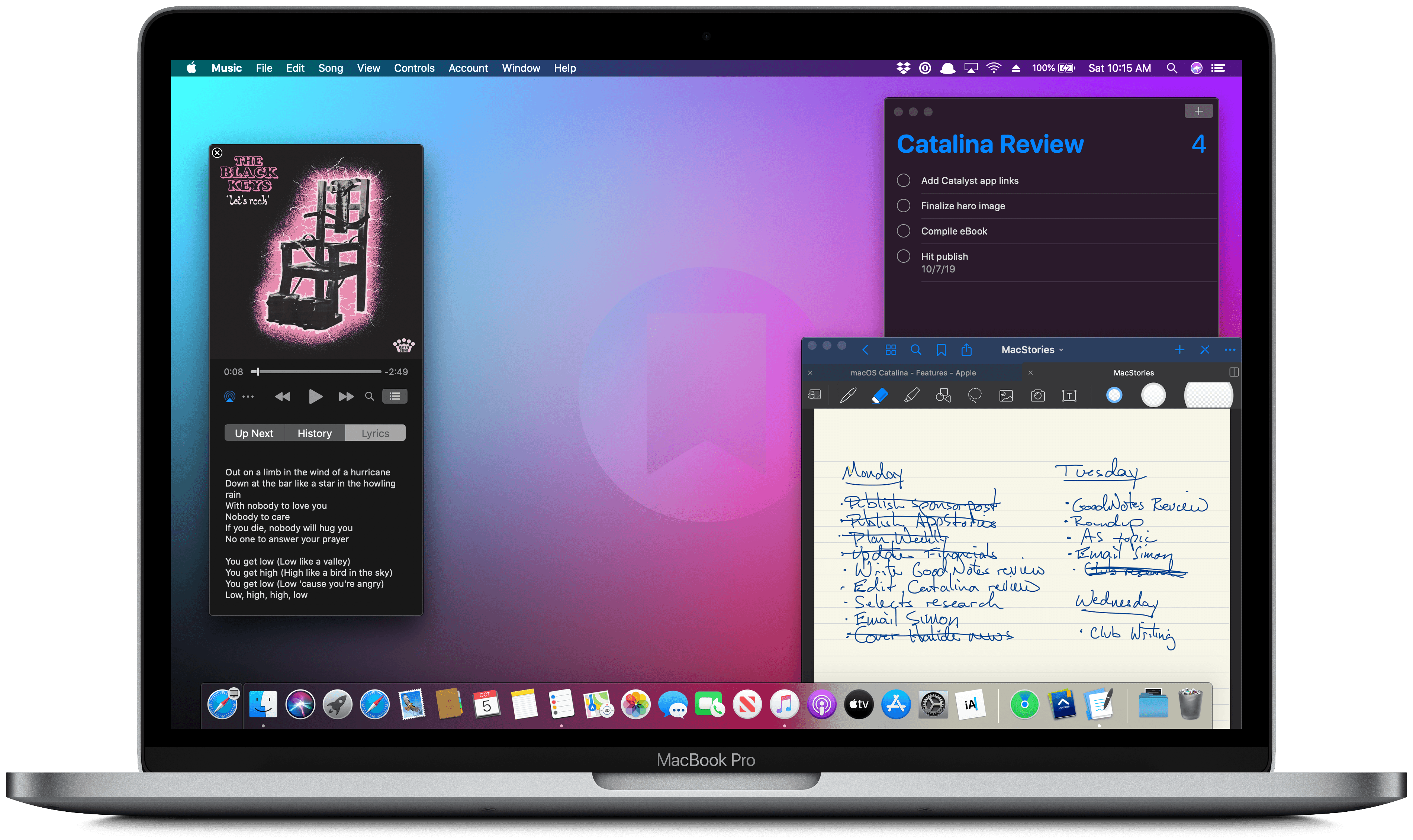
To developers, that message came in the form of Catalyst and SwiftUI. Catalyst, which was previewed as an unnamed ‘Sneak Peek’ in 2018, is meant to make it easier for iPadOS developers to bring their apps to the Mac. SwiftUI has a similar longer-term goal of unifying and streamlining how developers build the interfaces for their apps across a range of devices, for everything from the Apple Watch to the Mac.

The efforts to draw macOS in closer with Apple’s other operating systems run deeper than just developer tools though. macOS may have been the foundation on which iOS was built, but in the years that followed iOS’s introduction, the two OSes grew apart. Identically-named apps were developed on different schedules, which meant they rarely included the same features. Also, system-level functionality like System Preferences, which serves the same purpose as iOS’s Settings app, was unfamiliar, making Mac adoption unnecessarily hard for newcomers. Catalina is an attempt to address those kinds of inconsistent user experiences.

With Catalina, Apple has taken clear, though not always successful, steps to bridge the divide between the Mac and iOS. App functionality has been realigned, System Preferences has been rearranged, and new features have been added to make it easier to move from one platform to the other.

As with other transitional periods in the Mac’s history, this one isn’t going to be easy. However, because the change is driven by a fundamental change in computing, it’s also necessary. We live in a new climate where computing is now dominated by mobile devices. For many people, a smartphone is all the computing power they need day-to-day. That doesn’t mean there’s no longer a place for the Mac, but it’s clearly what’s driving the changes in Catalina.

Apple could have chosen to ignore the shift of the ground beneath its feet and merely maintained macOS, making the kind of small incremental changes we’ve become accustomed to in recent years. However, not adapting is as deliberate a choice as change is, and it carries just as much or more uncertainty for the Mac as a platform because it risks irrelevance.

The Mac isn’t in crisis, but it isn’t healthy either. Waiting until the Mac is on life support isn’t viable. Instead, Apple has opted to reimagine the Mac in the context of today’s computing landscape before its survival is threatened. The solution is to tie macOS more closely to iOS and iPadOS, making it an integrated point on the continuum of Apple’s devices that respects the hardware differences of the platform but isn’t different simply for the sake of difference.

Transitions are inherently messy, and so is Catalina in places. It’s a work in process that represents the first steps down a new path, not the destination itself. The destination isn’t clear yet, but Catalina’s purpose is: it’s a bridge, not an island.

Read more


iOS and iPadOS 13: The MacStories Review

Following years of a judicious union between platforms, it’s time for iPad to embark on its own journey.

In looking back at major iOS releases from the recent past, it’s easy to see how building and positioning these annual updates has become a careful balancing act for Apple.

In last year’s iOS 12, we saw the company focus on improving performance, providing users with tools to understand their device usage habits, and adapting Workflow to the modern era of Siri and proactive suggestions. The strategy was largely successful: iOS 12 was regarded as Apple’s most reliable iOS release of late – a reputation that has resulted in a 90% adoption rate a year later; and the Shortcuts app – the highlight of last year from a user feature perspective – is becoming a built-in (and thus more powerful) app in iOS 13.

For all that Apple accomplished in iOS 12, however, some areas of the experience inevitably had to be put on the back-burner. Besides improvements to Reminders and Files, iOS 12 lacked a long-awaited dark mode (which was rolled out on macOS instead) as well as more substantial tweaks to the ever-evolving iOS 7 design language; chief among iOS 12’s absentee list, of course, was iPad. Even though Apple had trained users to expect major additions to the tablet platform on a biennial schedule (see iOS 9 and iOS 11), the lack of meaningful iPad features in iOS 12 spurred a contentious discussion when it became apparent that new iPad Pro hardware was so far ahead of its software, it legitimized asking whether investing in that hardware was even worth it.

The annual debate that surrounds which features make it into each major iOS release is symptomatic of a complicated truth: iOS isn’t just the operating system that runs on iPhones anymore, and these annual releases are more than a mere collection of updated apps. iOS is the platform for an ecosystem of devices – from our wrists and speakers to cars and TV sets – and its changes have repercussions that ripple far beyond an updated Reminders app or a new icon set.

This, of course, has been the case for a few years at this point, but the nature of iOS as an all-encompassing platform has never been as evident as it is today in iOS 13. For the first time since I started reviewing Apple’s annual iOS updates, it feels like the company is now keenly aware that a new iOS version has to cover an array of themes that can’t be pushed back for scheduling reasons. A single area of attention isn’t enough anymore – not for the Apple of 2019 as an economic, political, and social force, and not for iOS, the engine powering devices that aren’t just screens for apps, but bona fide lifestyle computers.

As a result, there’s something for everyone in iOS 13 and all the recurring themes of Tim Cook’s Apple are touched upon this time around. iOS 13 improves Face ID recognition and promises improvements to app download sizes and performance. Apple is sending strong signals on its commitment to privacy as a feature with a new sign-in framework for apps and enhancements to location tracking controls and HomeKit cameras. iOS’ design language is getting its biggest update in years with dark mode, new tools for developers to express colors and embed glyphs in their user interfaces, updated context menus, and redesigns aimed at facilitating one-handed interactions. We have notable improvements to built-in apps, including the rebuilt Reminders and Health, an overhauled Files app, and hundreds of quality-of-life tweaks that, in big and small ways, make iOS more capable and efficient.

No stone is left unturned in iOS 13 – and that includes iPad too.

The iPad experience has always been largely consistent with the iPhone – particularly since Apple unified core iOS interactions around a screen without a Home button – but also distinct from it. iOS 13 makes this distinction official by splitting itself in a second branch called iPadOS, which uses iOS as the foundation but is specifically optimized and designed for iPad.

It was clear when the new iPad Pro launched in late 2018 that it told only one part of a bigger story about the role of the tablet in Apple’s modern ecosystem. With iPadOS, Apple is ready to tell that full story: while the iPad has always been an extension of iOS, sharing key similarities with the iPhone hardware and software, it’s been evolving – arguably, a bit too slowly – into a different breed of computer that is fundamentally distinct from a phone.

We’ve been able to observe this divergence starting in iOS 9 with Split View multitasking and Apple Pencil, and the transition continued with iOS 11 and its drag and drop-infused environment. It was only natural (and well-deserved) for the iPad to begin advancing in a parallel direction to iOS – informed and inspired by it, but also capable of growing on its own and tackling problems that an iPhone doesn’t have to solve.

From this standpoint, there are two sides to iOS 13: on one hand, an underlying tide that raises all platforms, featuring a distillation of themes Apple comes back to on an annual basis; on the other, a fork in the road, opening a new path for the iPad’s next decade. And against this backdrop, a single question looms large:

Can Apple balance both?

Read more


    Sidecar in iPadOS 13 and macOS Catalina: Working Seamlessly Between an iPad and Mac

    The core experience of using Sidecar is fantastic. Part of the reason is that running an iPad as a second display for a Mac with Sidecar is immediately familiar to anyone who has ever used multiple displays. The added screen real estate, portability, and functionality are part of the appeal too. Of course, there are differences that I’ll get into, but Sidecar is so close to a traditional dual-display setup that I expect it will become a natural extension of the way many people work on the Mac.

    There’s more going on with Sidecar though, which didn’t dawn on me until I’d been using it for a while. One of the themes that emerged from this year’s WWDC is deeper integration across all of Apple’s platforms. As I’ve written in the past, SwiftUI is designed to accomplish that in the long-term across all the devices Apple makes. In contrast, Catalyst is a shorter-term way to tie the Mac and iPad closer together by bringing iPad apps to the Mac and encouraging developers to build more robust iPad apps.

    Sidecar strikes me as part of the same story. Apple made it clear when they introduced Catalyst in 2018 at WWDC that it’s not replacing macOS with iOS. Some tasks are better suited for a Mac than an iPad and vice versa. Sidecar acknowledges those differences by letting an iPad become an extension of your Mac for tasks best suited to it. At the same time, however, Sidecar takes advantage of functionality that’s unavailable on the Mac, like the Apple Pencil. Combined with the ability to switch seamlessly between using Mac apps running in Sidecar and native iPadOS apps, what you’ve effectively got is a touchscreen Mac.

    However, to understand the potential Sidecar unlocks, it’s necessary to first dive into the details of what the new feature enables as well as its limitations.

    Read more


    A Timeline of iOS Accessibility: It Started with 36 Seconds

    On June 8, 2009, at the end of a two-hour WWDC keynote, Phil Schiller was running through a long list of new features and apps that would be available on the iPhone 3GS, due to ship on June 19 of that year. Phil was pinch-hitting as keynote master of ceremonies for Steve Jobs, who was then on leave, recovering from a liver transplant.

    At 1:51:54 in the video, just after he showed off Voice Control and the new Compass app, Apple’s version of the accessibility logo appeared on screen. It’s a stick-style figure with arms and legs outstretched. The icon is still used today.

    “We also care greatly about accessibility,” Schiller said, and the slide switched to an iPhone settings screen.

    For a total of 36 seconds, Schiller spoke somewhat awkwardly about VoiceOver, Zoom, White on Black (called Invert Colors from iOS 6 onward), and Mono Audio – the first real accessibility features on the iPhone OS platform, as it was then called.

    And then it was over. No demo. No applause break.

    Schiller moved on to describe the Nike+ app and how it would allow iPhone users to meet fitness goals.

    I surveyed a number of liveblogs from that day. About half noted the mention of accessibility features in iPhone OS. The others jumped directly from Compass to Nike+. Accessibility hadn’t made much of a splash.

    But in the blindness community, things were very different. Time seemed to stop somewhere after 1:51:54 in the video. Something completely amazing had happened, and only a few people seemed to understand what it meant.

    Some were overjoyed, some were skeptical, some were in shock. They all had questions. Would this be a half-hearted attempt that would allow Apple to fill in the checkboxes required by government regulations, a PR stunt to attract good will? Or would it mean that people who had previously been completely locked out of the iPhone would have a way in?

    You can probably guess what the answer is, now that we have ten years of an accessible mobile platform in the rearview mirror – now that Apple is widely credited with offering the best mobile accessibility experience available. But it didn’t all happen at once, and not every step along the way was a positive one.

    0:00
    1:51

    Excerpt from ‘36 Seconds That Changed Everything.’

    As a companion to my audio documentary, “36 Seconds That Changed Everything: How the iPhone Learned to Talk,” I’ve put together a timeline of iOS accessibility milestones from the past ten years. I’ve focused on Apple hardware and operating systems, though there have also been important Apple app updates, and third-party apps that opened doors to new ways of using iOS accessibly. It’s a list that’s simply too long for this article. And, with a few exceptions, I’ve addressed accessibility-specific features of iOS. Many mainstream features have accessibility applications and benefits, even if they don’t fit here directly.

    Read more


    Hands-On with iPadOS and iOS 13: Changes Big and Small

    iPad and iPhone users are in for a big treat this fall when iPadOS and iOS 13 launch. Each update is a major release that pushes Apple’s mobile platforms forward in big and small ways, making them more powerful for consumers and professionals alike.

    If you haven’t read my iPadOS and iOS 13 overviews yet, the majority of details about each release are documented there. But I’ve been using the beta versions of both systems for a few days now, and while these are just an early look at what the finished releases will be, there are a lot of changes – some very significant, while others are relatively minor – that I’ve been excited to see.

    Read more


    My MacStories Story: How iOS Automation Changed My Life

    Six years ago I was a senior in high school – a laughably short timeline compared to the immensity of growth and change which took place within it. Graduation, all of college, and a lonely move across the country; a career imagined, pursued, and achieved; friends and relationships come and gone. Not many threads of life make it all the way from the start of your late teens through the end of your early twenties, but those that do feel special in a way not much else can. MacStories is one of mine.

    This week we’re celebrating MacStories’ 10th anniversary, and this year marked the fifth anniversary of my first article on the site. It boggles my mind to think that I’ve been part of this incredible team for more than half of MacStories’ life, but that’s nothing compared to the feeling of when it all began.

    Read more


    iPad Diaries: Typing on the iPad Pro with the Smart Keyboard Folio

    iPad Diaries is a regular series about using the iPad as a primary computer. You can find more installments here and subscribe to the dedicated RSS feed.

    I have a love/hate relationship with Apple’s Smart Keyboard for the iPad Pro.

    On one hand, I’ve always been a fan of its small footprint and ability to almost become part of the device itself from both a hardware and software perspective. The Smart Keyboard snaps itself into place and attaches magnetically to the iPad Pro; it doesn’t require you to even think about charging it as the Smart Connector takes care of it; thanks to the trivial magic of magnets, the keyboard and cover stay attached to the iPad as you carry it in a bag, but can be easily disconnected at a moment’s notice should you need just the iPad’s screen. The software experience is equally intuitive and exquisitely Ive-esque: the Smart Keyboard requires no pairing because it eschews Bluetooth altogether, and it integrates with all the keyboard shortcuts supported by iOS and apps. In the latest iPad Pro, the Smart Keyboard is even Face ID-aware: you can double-tap the space bar to authenticate from the lock screen instead of extending your arm toward the screen to swipe up – a welcome enhancement for those who work with their iPad Pro constantly connected to a keyboard.

    There’s plenty to appreciate about Apple’s Smart Keyboard – an accessory designed on the premise of integration between hardware and software, following the same core principles at the foundation of AirPods, Apple Pencil, and (even though some liked to make fun of their peculiar design) Smart Battery Cases. But since its debut in 2015, I’ve been saving a series of small complaints and bigger annoyances with the Smart Keyboard that I’d like to revisit now that Apple has shipped its evolution for the new iPad Pro – the Smart Keyboard Folio.

    Read more


    iPad Diaries: My First 48 Hours with the New 12.9” iPad Pro

    Two days ago, I walked into my local Apple Store and bought the new 12.9” iPad Pro along with a Smart Keyboard Folio, second-generation Apple Pencil, and LG’s UltraFine 4K display (plus, of course, AppleCare+ because these iPads don’t come cheap). As I shared on Twitter and the Connected podcast on Wednesday, I went for a 1 TB configuration (with cellular) in Space Gray, and the display is the monitor I’ll primarily use with a new Mac mini I also plan on buying very soon. It’s been a busy couple of weeks in our apartment: we’ve been doing some renovations and buying new furniture, including a larger desk for my “office” (read: a section of our bedroom). As I’ve shared on my various podcasts for the past few months, getting a bigger desk with a Mac mini and 4K display that would support both macOS and iOS was always part of the plan.

    While in previous years I was able to offer reviews for the new iPad Pros before launch day, that wasn’t possible this year. For this reason, I decided I didn’t want to wait several weeks to prepare an in-depth review of the new iPad Pro and avoid questions from MacStories readers until the story was finished. So in a break with tradition, I’m trying something different this time: as part of my semi-regular iPad Diaries column here on MacStories, I’m going to share a collection of shorter and more topical articles about the new iPad Pro over the next few weeks.

    I believe this generation of iPad Pros is one the most exciting changes to the iPad line in years, and I want to jump straight into the discussion by detailing, step by step, my ongoing experience with the new iPad Pro from the perspective of someone who’s been using an iPad as his main computer for the past five years. I plan to write about iOS, apps, and my iPad Pro workflow soon, but today I’d like to start by explaining my purchase decision and sharing some initial impressions about the iPad’s hardware. Let’s dive in.

    Read more


    Developers’ Decade-Long Rollercoaster Ride: The Business of Selling Apps on the App Store

    The case for native third-party apps on the iPhone was apparent immediately. By creating a device that blends into the background – with functionality entirely driven by software – Apple built a mobile computing platform that could become anything, so long as there was an app to drive the experience. The idea that the iPhone might be limited to a handful of stock Apple apps felt like a horrible waste to developers who were hungry to build their own apps.

    When developers arrived in San Francisco for WWDC in 2007, they were eager for news of a native iPhone SDK. Instead, Scott Forstall took the stage and introduced iPhone web apps as Apple’s ‘sweet solution’. It didn’t go over well.

    Fortunately, Apple’s flirtation with web apps was short-lived. By the fall of 2007, Steve Jobs confirmed that the company was working on an iPhone SDK for third-party developers, which was released in March 2008.

    About four months later, the App Store launched on July 10, 2008, with around 500 apps. Ten years later, the Store offers over 2.1 million. Of course, a lot has happened in between too:

    • 2008: The App Store was launched with roughly 500 free and paid apps and games.
    • 2009: In-App Purchases were added for paid apps, followed by free apps a few months later.
    • 2010: Apple launched its iAd in-app advertising platform.
    • 2013: By its 5th anniversary, the App Store featured over 900,000 apps.
    • 2015: Apple Senior Vice President Phil Schiller took over responsibility for the App Store.
    • 2016: Apple expanded the categories of apps that can use auto-renewing subscriptions, discontinued iAd, and launched a search ads program. Free, time-limited In-App Purchases were also used for the first time to approximate free trials of apps.
    • 2017: Apple redesigned the App Store with daily editorial content.
    • 2018: As of WWDC, the App Store offered over 2.1 million apps and had paid developers over $100 billion in 10 years.

    It’s hard to overstate the meteoric growth of the App Store as a marketplace. Over the course of a decade, the App Store’s history has been dominated by rapid growth and constant change that’s been highlighted by spectacular successes, failures, and controversies. Nowhere has that change been more pronounced than the economics of the App Store. It’s a story that has had a profound effect on the way software is sold and how users relate to the apps they use.

    Read more