For the past three weeks, I’ve been running the developer beta of iOS and iPadOS 15 on my iPhone 12 Pro Max and M1 iPad Pro, respectively. Common wisdom says you’re not supposed to install early developer builds of iOS and iPadOS on your primary devices; I have to ignore that since work on my annual iOS and iPadOS reviews starts as soon as the WWDC keynote wraps up, which means I have to get my hands on the latest version of the iPhone and iPad operating systems as quickly as possible. As I explained on AppStories, putting together these reviews is some of the most challenging work I do all year, but it’s rewarding, I have fun with it, and it gives me a chance to optimize my writing setup on an annual basis.
The result of jumping on the beta bandwagon early is also that, at this point, having used iOS and iPadOS 15 daily for over three weeks, I have a pretty good sense of what’s going to be popular among regular users, which features power users are going to appreciate, and what aspects of the OSes still need some fine-tuning and tweaks from Apple. And with both iOS and iPadOS 15 graduating to public beta today1, I have some initial impressions and considerations to share. You could also see this story as advance work for this fall’s proper review, and you wouldn’t be mistaken: in this article, I’m going to focus on areas of iOS and iPadOS 15 that I’ll also cover more in depth later this year.
Let me cut to the chase: I don’t think iOS and iPadOS 15 are massive updates like iOS and iPadOS 13 or 14 were. There are dozens of interesting new features in both updates, but none of them feels “obvious” to demonstrate to average users like, say, dark mode and iPad multiwindow in iOS and iPadOS 13 or Home Screen widgets in last year’s iOS 14. And, for the most part, I think that’s fine. The wheel doesn’t have to be reinvented every year, and the pandemic happened for everyone – Apple engineers included.
In many ways, iOS and iPadOS 15 remind me of iOS 10 and 12: they’re updates that build upon the foundation set by their predecessors, bringing welcome consumer additions that, while not earth-shattering, contribute to making iOS more mature, intelligent, and deeply integrated with Apple’s ecosystem.
If you’re installing the iOS 15 public beta today and want to show it off to your friends, know this: Live Text in the Camera and custom Focus modes make for the best demos, followed by the new Weather app and rethought multitasking controls on iPad. SharePlay is neat but can feel already dated now that more countries are rolling out vaccinations and returning to a semi-regular social life; the new Safari needs more work; Mail is surprisingly unchanged despite the rise of remote work in the past year. That’s how I would describe iOS and iPadOS 15 in two sentences as of the first public beta released today.
Of course, however, I want to share a bit more about iOS and iPadOS 15 while I’m busy working on my annual review. So for this preview story, I’ve picked three areas of iOS and iPadOS 15 I’ve spent the most time testing and tinkering with over the past few weeks. This year, I’m including a ‘What I’d Like to See Improved’ sub-section for each of the areas I’m covering in this story. I thought it’d be fun to summarize my current criticisms and suggestions for each feature, and it should be interesting to revisit these in the fall when iOS and iPadOS 15 are released.
Let’s dive in.
Focus: Custom Do Not Disturb for Everyone
Of all the new features in iOS and iPadOS 15, the one I’ve been using – and enjoying – the most is Focus, which already feels like it has been part of iOS for years now. In a way, that is sort of true: Focus is the new umbrella term to describe Do Not Disturb and its spin-off modes such as Driving and Sleep, which Apple added in iOS 11 and iOS 14, respectively.
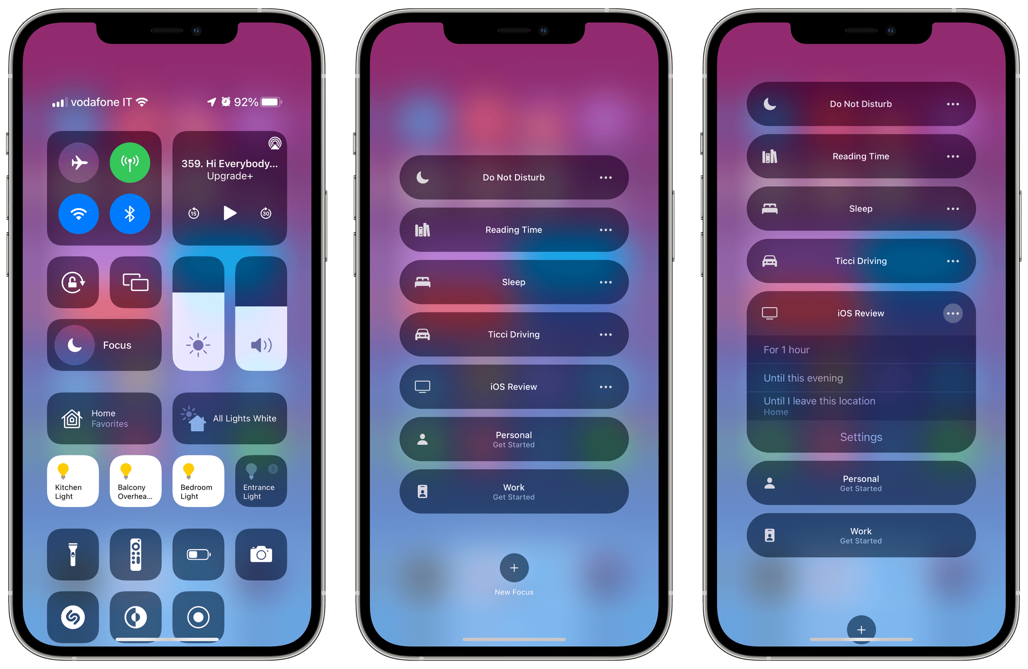
Starting with iOS and iPadOS 15, Do Not Disturb, Driving, and Sleep are three of the many Focus ‘modes’ you can enable on your device; this change is reflected in Settings (where Focus has replaced the old Do Not Disturb page) as well as Control Center, where you’ll find a new Focus button to either activate Do Not Disturb or choose from your list of Focus modes. More importantly, however, is the fact that Apple considerably expanded the notification preferences and customization options available in Focus, and, for the first time, they’re also letting you create your own Focus.
Here’s how you should think about Focus: it’s both a revamp of the standard Do Not Disturb and Do Not Disturb-like modes of iOS and iPadOS with more consistent settings, and it’s also a way to create a custom Do Not Disturb mode that fits your needs at different times of the day. At a high level, the core idea behind Focus is the same as Do Not Disturb, but more fleshed out: when you want to, well, focus on particular aspects of your work or personal life, you can enable a Focus to silence notifications from specific apps or people, trigger automations in Shortcuts, and even rearrange your Home Screens. Focus is Do Not Disturb on steroids, and I believe its flexibility and customizable design will appeal to all kinds of users later this year.
What immediately stood out to me when I started playing around with Apple’s presets for Focus (which include the basic Do Not Disturb, Driving, and Sleep, plus templates for Fitness, Gaming, and Reading) is the number of included personalization options, which were previously either hard to find or not available at all. When you’re setting up a Focus (regardless of whether it’s a built-in or custom one), you can choose to select people and apps that are allowed to notify you while Focus is active. This setup process couldn’t be any easier: you switch between tabs for People and Apps, search for the ones that should be allowed to break through the Focus “barrier” on your device, and that’s it. No need to fiddle with details in contact cards or deal with Screen Time settings.
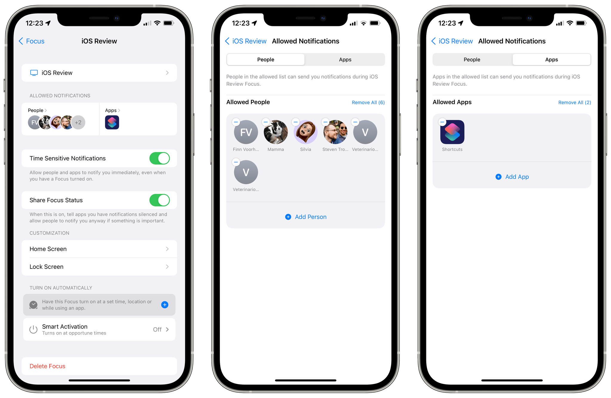
You can select different apps and people for each Focus, and I think this will be one of the reasons why Focus will resonate with people once they get their hands on iOS 15. For instance, I allowed my mom and girlfriend to notify me at night while the Sleep Focus is active, and I also enabled phone calls from Favorites2; for my general ‘Writing’ Focus, however, I chose to allow a wider pool of contacts and apps, so that can I see more messages from important-but-not-critical contacts and services during the day.3 The ability to mix and match people and apps lends itself well to a multiplicity of Focus modes; I can imagine how folks will use this to create different modes for, say, being at the office, working out at the gym, playing games and watching movies, and more. iOS 15 is even smart in that it’ll recognize the same contact across multiple communication services: if you allow your spouse, notifications from them will come through whether they’re using iMessage, WhatsApp, or Mail, which is a nice touch.
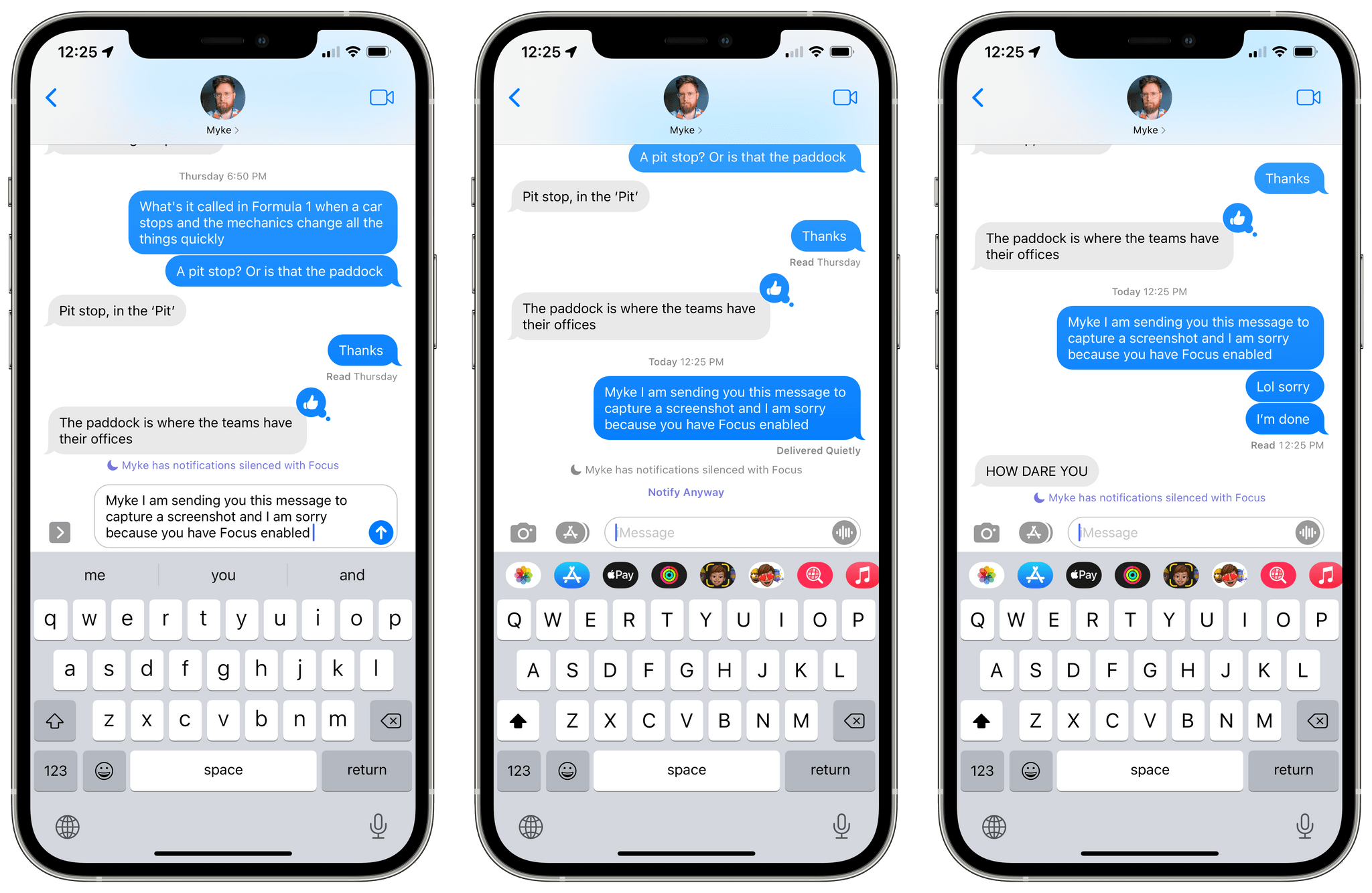
There’s a lot more to Focus than just picking apps and contacts for notifications though. You can decide to share your Focus across devices: this is enabled by default in Settings, and if you leave it on, when you enable a Focus on your iPhone it’ll automatically activate on iPadOS 15 and macOS Monterey too, and vice versa. (I’ve left this on.) Another global Focus preference (which, however, you can override for each mode) is the Focus Status – a way to tell apps and people that you have Focus enabled and are silencing notifications. By default, your Focus status is shared with the Messages app, which displays a purple message inside conversations to let you know who’s got Focus enabled on their device. There’s also an API for third-party apps to read your device’s Focus status and display this information accordingly in their UIs.

If you’re getting strong AIM away message vibes from this feature, you’re not alone. Unfortunately, you cannot customize the Focus status message anywhere in Settings. This is something I hope Apple will address in a future update to iOS 15 so I could put together nicer ‘away messages’ for different modes and people in my life.
With Focus, Apple has also expanded the options available to let specific apps break through the wall of silence and notify you anyway. In iOS 15, apps can register some of their notifications as time sensitive; by default, these include calendar alerts before an event is due or notifications from camera and sensors in the Home app. Time sensitive notifications stick around on the Lock Screen a while longer than regular notifications (up to an hour), ignore schedule delivery for iOS 15’s Notification Summary feature, and you can choose to allow them in Focus as an additional override for important notifications you don’t want to miss.
If developers do the work of properly categorizing their notifications – assuming they don’t abuse this feature – this means you’ll be able to leave an app disabled in Focus for general notifications, but opt in for its time sensitive ones only. You can confirm which apps support time sensitive notifications4 in Settings ⇾ Notifications under the page for each app; amusingly, while several Apple apps already support time sensitive notifications, Mail does not. I guess Apple engineers know better than us when it comes to thinking email is important. Props to them.5
If you’re on the other end of a conversation where someone has silenced their notifications with Focus, you can also choose to become the problem yourself and mark your message as, effectively, time sensitive and ignore the other person’s Focus status. This is achieved in iMessage with a ‘Notify Anyway’ button displayed after sending a message. I joke about it, but I can see why there may be legitimate use cases for choosing to bother someone regardless of their Focus mode, such as personal emergencies. I find the system well-designed, and it has already helped me be more conscious of how many times I ping my friends each day; I now try to avoid texting them too much if they have Focus on, and I prefer to save my messages for when their Focus status disappears. I don’t think you want to be known as a ‘notify anyway person’ by your friends, so my recommendation is to use this option sparingly.
Where Focus really shines for me, however, is in its integration with the Home Screen and the Shortcuts app: you can choose to only show specific Home Screen pages when a Focus activates, and you can also use Focus as a trigger for Shortcuts automations. I’ve been taking advantage of these more advanced functionalities in a couple interesting ways. On my iPhone, I was annoyed by some of the limitations of Apple’s default Driving Mode, so I decided to recreate it as my own Focus called Ticci Driving. This Focus allows notifications from two people and a handful of apps, silencing everything else except time sensitive notifications and calls from Favorites.
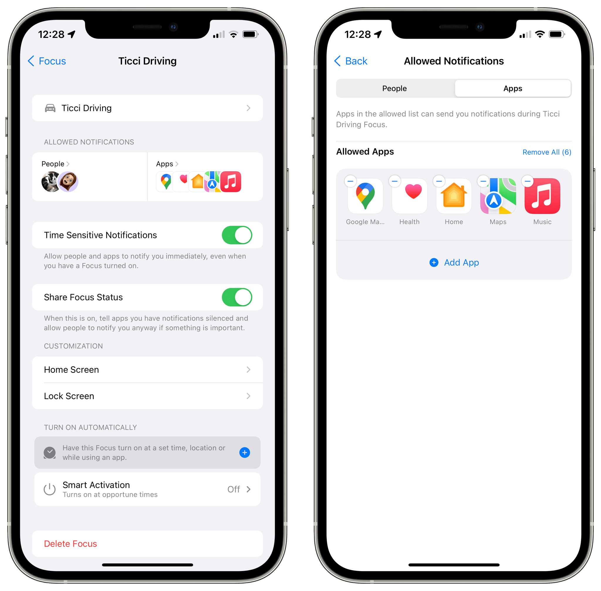
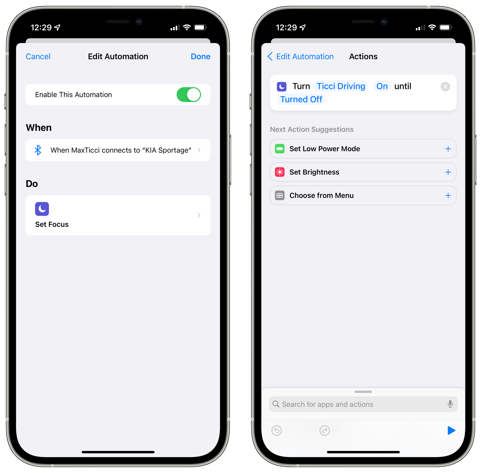
When you’re setting up a Focus, you can choose from a variety of automatic activation methods, which include a ‘smart’ one that is controlled by iOS at ‘opportune times’ throughout the day, plus manual triggers such as a schedule, location, and opening specific apps. I was surprised by the lack of triggers available for Personal Automations in the Shortcuts app; in my case, I want to activate the Ticci Driving Focus every time my iPhone connects to my car’s Bluetooth unit, but Bluetooth isn’t an available trigger in Focus. Fortunately, I was able to set this up as a Personal Automation in Shortcuts and use the new ‘Set Focus’ action to ask me to confirm whether I want to enable Ticci Driving or not. In the future, I’d love to see consistent triggers for Focus and Personal Automations as well as an option to disable confirmation for Bluetooth-based automations.
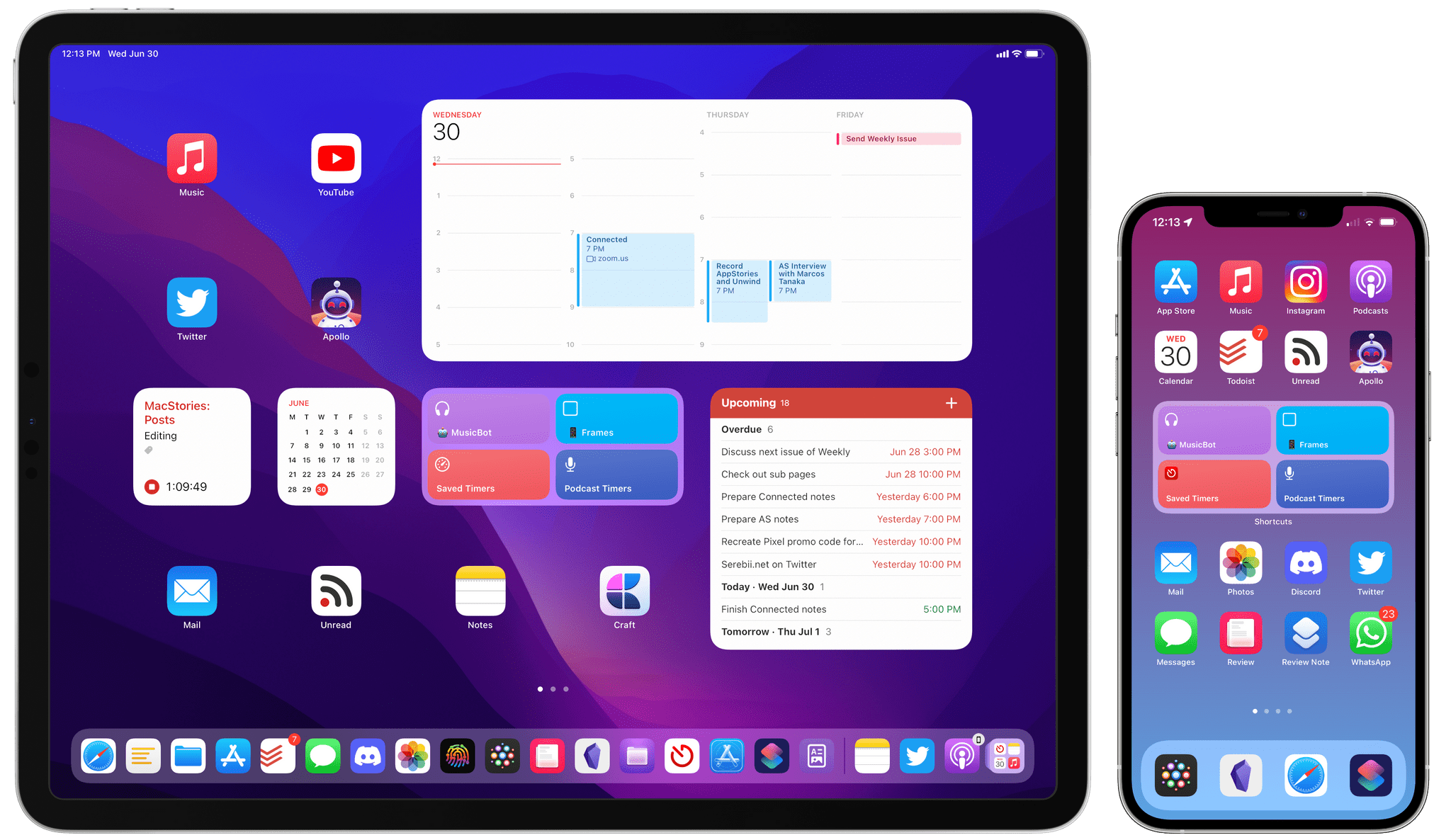
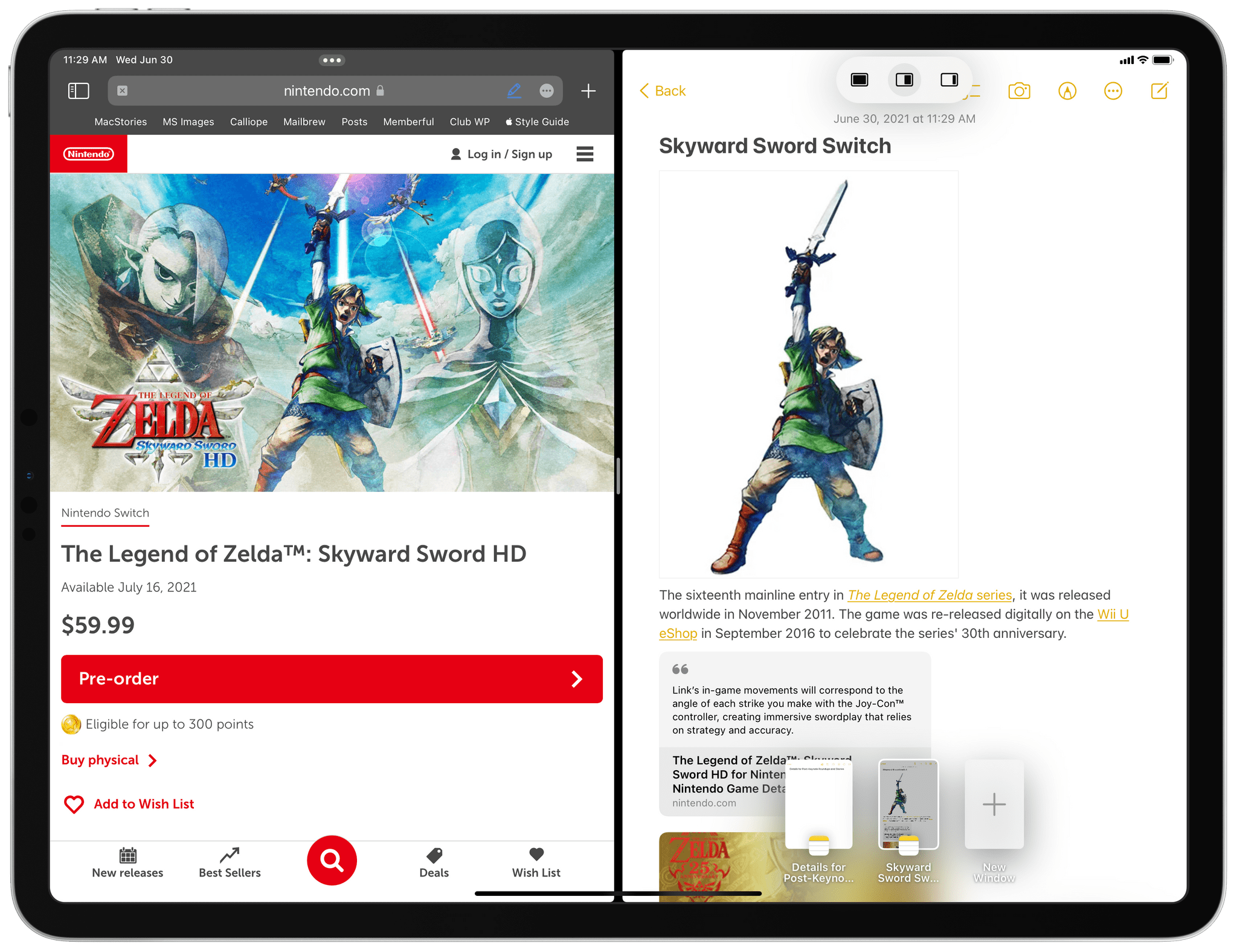
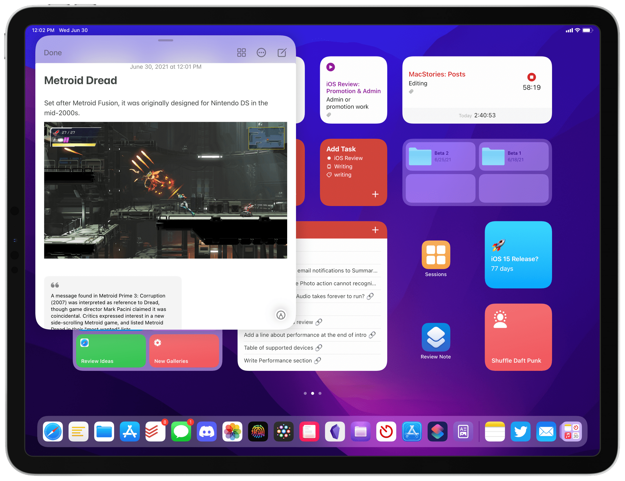
I did something more interesting on my iPad Pro running iPadOS 15: I set up a Home Screen dedicated to the iOS review I’m working on, and I filled it with widgets and shortcuts related to my big annual project; then, I set up a Focus called iOS Review that silences all notifications and hides all my other Home Screens. Now, when I sit down with my iPad Pro to work on the iOS Review and enable its Focus mode in Control Center, all I see is this Home Screen, and it’s glorious:
.](https://cdn.macstories.net/6e71e7d0-f10a-40b2-9f0c-e6e23ada053a-1625044353565.png)
My iOS Review Home Screen for iPadOS 15. You can read more details about this in Issue 277 of MacStories Weekly.
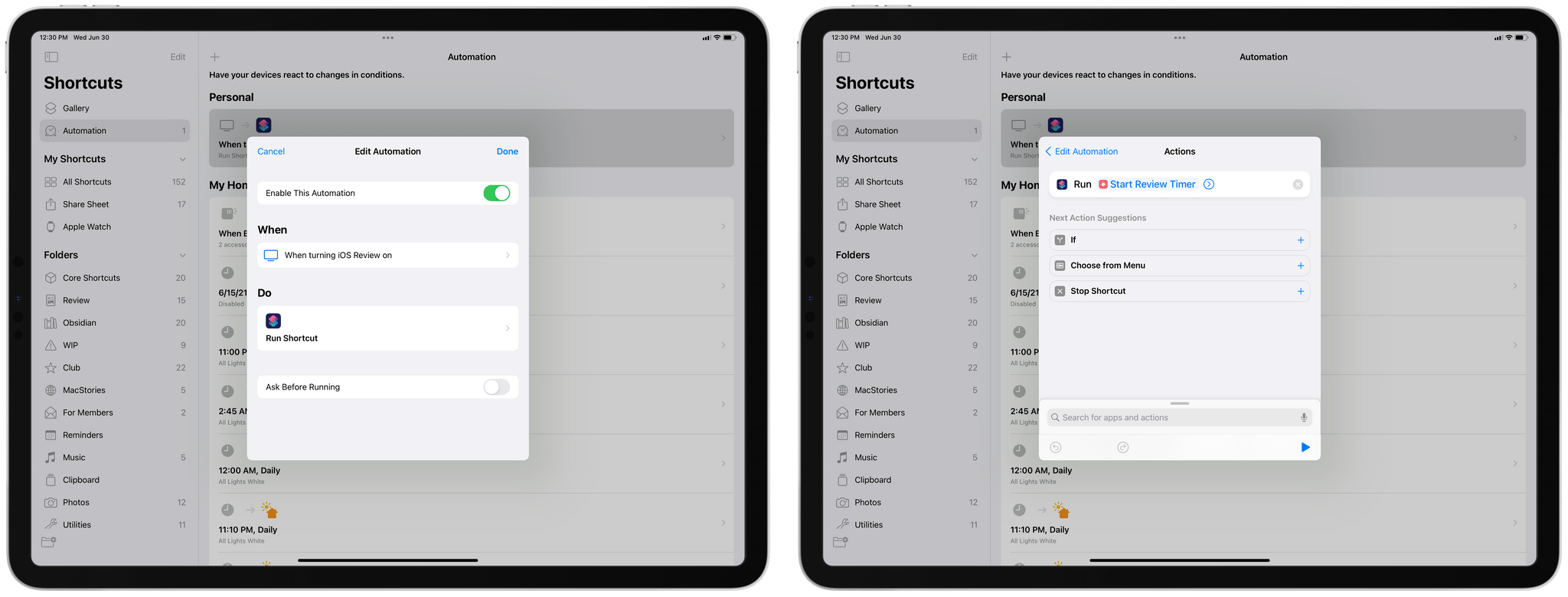
But there’s more: because Focus can be used as a trigger for Personal Automations in the Shortcuts app, I created an automation that asks me to start a timer in the Timery app whenever I activate the iOS Review Focus. This way, I never forget to start tracking my time when I’m writing or editing the review. All the parts of this process are seamlessly integrated with Focus; the only thing I need to do to make all this happen is simply press a button in Control Center.
Apple has been on a long journey to help us reclaim control of notifications and find more, well, focus in our digital lives: from Do Not Disturb While Driving and Screen Time to last year’s Sleep mode and iOS 15’s redesigned notifications (which I’ll explore later this year), Focus is an obvious evolution of Apple’s efforts and their best implementation of Do Not Disturb to date. The versatility of Focus is remarkable, and the integration with Home Screen and Shortcuts will allow users to come up with creative uses of the feature. In the three weeks I’ve been using iOS and iPadOS 15, I’ve found myself liking and relying on Focus a lot more than I initially thought; I have a feeling this feature will be a success.
What I’d Like to See Improved in Focus
- More glyph options when setting up a custom Focus
- Adopt the same triggers for turning on Focus automatically as Personal Automations in the Shortcuts app (e.g. Bluetooth, Wi-Fi, workouts, etc.)
- Offer the ability to customize the Focus Status message
The New Safari: Are the Trade-Offs Worth It?
Conversely, I’m not so sure the new Safari will be an instant success with iPhone and iPad users; of all the features I covered in this story, I wouldn’t be surprised if Safari ends up being the one Apple tweaks the most before the public release of iOS and iPadOS 15. I’ve been struggling to adjust to the new Safari on both my iPhone and iPad, and although I believe there are some good ideas in it, many of them feel rushed and counterintuitive.
Most of my issues are with the iPhone version of Safari for iOS 15, which received its first redesign in over a decade. At least in theory, the new design should be better optimized for large iPhones thanks to a new unified address bar that now floats at the very bottom of webpages instead of being fixed at the top.
The floating address bar automatically minimizes when scrolling a webpage. You can also grab the bar and drag it to switch between tabs or create a new one.
In implementing this easier-to-reach “bottom bar”, Apple did away with a top toolbar altogether; as a result, the company removed several UI elements that were previously displayed at all times in iOS 14’s Safari, including the share and reload buttons, bookmarks, and the button to open website settings such as zoom, content blockers, and Safari Reader options. The bottom bar, at least as of this public beta, forced Apple to hide and reposition affordances, which can now only be accessed as nested options inside a catch-all ‘More’ menu or via hidden gestures. The differences are best demonstrated with comparative images between the old and new Safari, as seen below:
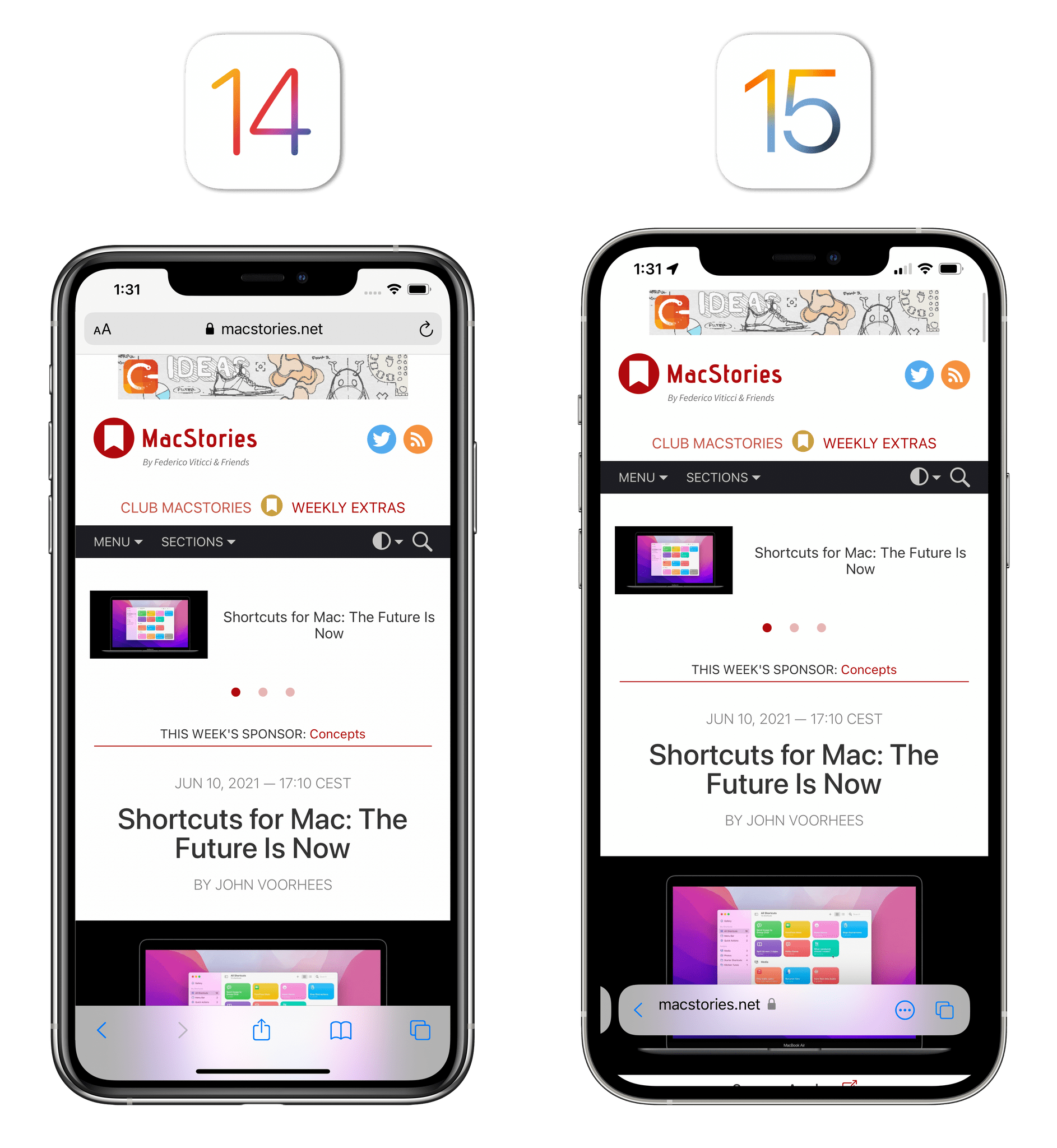
One of the downsides of removing buttons from the new Safari: options that used to be accessible with one tap are now hidden in a long menu.
On principle, I applaud Apple’s decision to rethink Safari, one of their most important built-in apps that I often praised as the company’s “crown jewel” on iOS. My issue with this new Safari for iPhone is that, after a few weeks with it, I still feel like too much usability was sacrificed to make a single unified address bar happen at the bottom of the screen. The obvious advantage of this approach, unsurprisingly, is that tapping the address bar to start a new search or open the start page is now easier than before: if you have a large iPhone, you can comfortably reach the bar with your thumb and begin typing. For me at least, however, Safari’s problems start with this very interaction: the bottom bar floats above the content of webpages, and it auto-minimizes when scrolling a page. Sometimes, as I also showed on Twitter, this design interferes with existing webpage elements such as buttons or web apps that have their own tab bars, like Mailbrew. In a session at WWDC, Apple shared best practices for developers who want to update their websites for the new Safari, but I have to wonder how many will follow suit and change the entire layout of their web apps in time for iOS 15’s release.
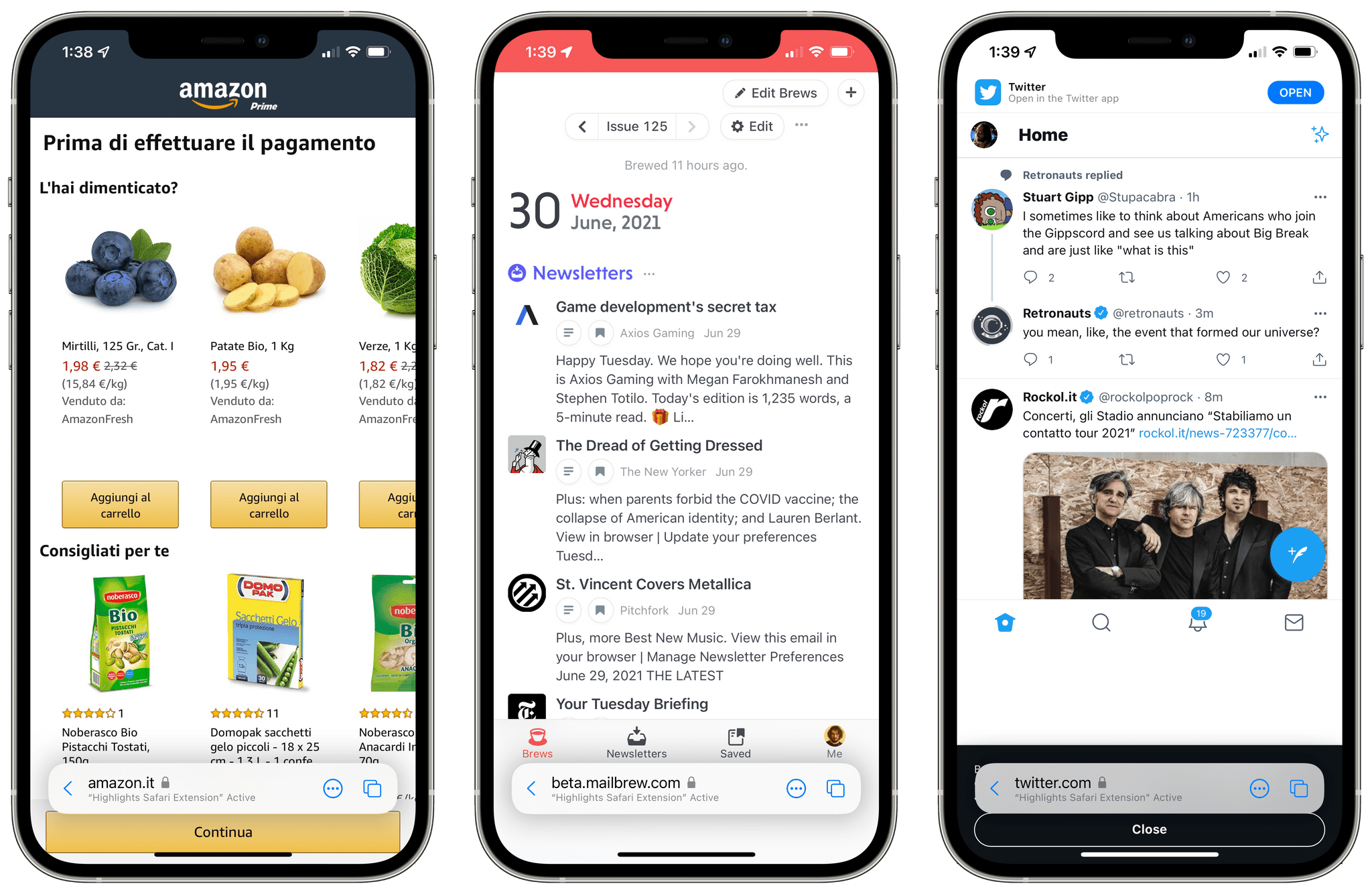
Safari’s floating bar can interfere with webpage elements at the bottom of the screen. In the examples above, I can’t tap the Continue button on Amazon or the Close button for the cookie notice on Twitter’s website (do Safari engineers in America see as many cookie notices at the bottom of every website as we do in Europe?). Web apps with a tab bar, like Mailbrew, also look odd in the new Safari.
Additionally, when you tap the bar, instead of remaining anchored at the bottom of the screen and perhaps sit just above the keyboard, it shoots all the way to the top of the screen. I find this transition distracting and hard to memorize: my eyes are tracking the address bar along the bottom, but when I tap it, I need to change focus and look at the top. This continuous back and forth between two “states” of the bar hasn’t grown on me at all, and I hope Apple finds a way to keep a consistent position, perhaps integrating the bar with the iPhone’s keyboard.
The problems don’t stop at the bar covering webpage elements and jumping up and down onscreen though. As I mentioned above, in designing Safari around a single, dynamic address bar, Apple got rid of an entire toolbar that previously contained frequently accessed controls. This, combined with some perplexing decisions around the share sheet, makes the new Safari feel disorienting for advanced users and newcomers alike.
For example:
- The reload button is gone. You can pull to refresh in Safari now, but that only works if you’re at the top of a webpage.
- The bookmarks button is gone. If you want to open bookmarks or your Reading List on iPhone, the only way to do so now is to open the new, customizable start page. From there, you have to tap the bookmarks button at the very top of the screen, right underneath the system clock, which requires stretching your thumb and feels counterintuitive to the address bar’s convenient placement at the bottom.
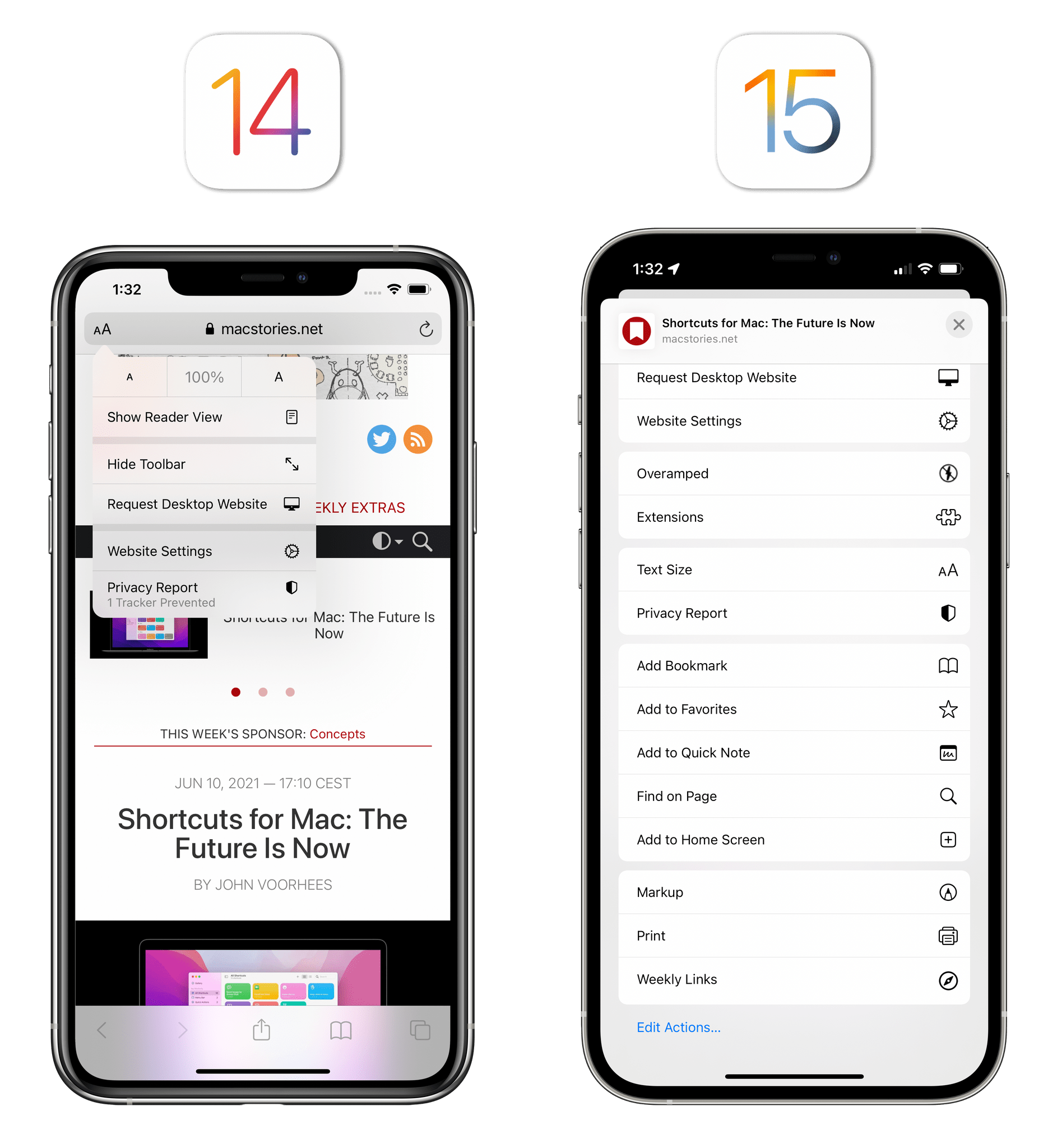
- Share extensions and contact suggestions are hidden by default. Instead, the new Safari uses a hybrid “action menu” that shows four large buttons at the top (Reader, Read Later, Reload, and Share), followed by action extensions, shortcuts, and Safari’s own actions. If you want to share a webpage with an app or someone else on iMessage, you have to open the menu, then tap Share, which expands the menu into a bigger version. This menu needs to be rethought entirely.
- Reader settings and website settings are hard to find. In trimming the list of buttons shown by default in the new Safari, Apple got rid of the ‘aA’ button to load settings specific to Safari Reader or the current website. These options can now be found in the list of custom Safari actions in the ‘More’ menu. If you have a lot of extensions or shortcuts enabled on your device for Safari, have fun finding them.
Perhaps I’m the problem because I was very used to the old Safari and all its features, so I will need a longer adjustment period to learn my way around it. Perhaps other users don’t value certain Safari features as much as I do. But in writing up these impressions after nearly a month spent using the new Safari, I still feel like this new design gave me one positive change (an address bar that is easier to reach) and a whole list of interactions that are now slower and harder to find without affordances.
So I have to ask: is it worth sacrificing everything else in the name of an address bar at the bottom?
Most of these issues extend to the iPadOS 15 version of Safari as well, albeit to a lesser degree. On iPad, Safari now offers an optional sidebar that provides quick access to tab groups (more on this below), bookmarks and Reading List, and Private mode. I like the sidebar, and although I wish it was more customizable6, I’m going to keep it enabled at all times. Sidebar notwithstanding, Safari for iPad sports the same UI discoverability issues from the iPhone version, and actually makes switching between tabs worse due to other design changes.
On both iPad and Mac, the new Safari unifies the address bar and tabs. Rather than having a single address bar at the top of the screen and a horizontal list of tabs underneath it, the address bar has been merged with the current tab.
Here’s why I find this problematic:
- Tabs jump around a lot. When a tab is the current one in the new Safari for iPad, it expands to fill more horizontal space. As a result, other tabs tighten, like an accordion. I find this animation very distracting since there’s always something moving at the top of Safari, and I feel like I never fully know where my tabs are. If you rely on spatial memory to group your tabs visually by remembering their position, this design isn’t going to help you. And if you suffer from motion sickness for certain types of animated UI, I don’t think you can use this feature at all.
- Tabs can get very narrow and hard to click. As a consequence of the new unified tab design, tabs adjacent to the current one can get quite small, particularly if you have a lot of them open at the same time. In fact, they can get so small, I often found myself accidentally closing a tab I wanted to open because clicking it triggered the ‘x’ button on the left side of the tab.
- You cannot see the title of the current tab unless you hover over it. Due to the unified design, you can no longer see the title of the current tab since the domain is displayed up there. You can only see the title of the page if you hover and pause over the address bar. To my knowledge, there’s no way to see the title in the main browser UI if you don’t have a trackpad attached to your iPad.
- You cannot see the reload button unless you hover over the address bar. In another case of a hover-only interaction in the new Safari for iPad, Apple restored the reload button in the second developer beta of iPadOS 15, but it’s only visible when you hover over the address bar. I don’t understand this decision: there’s plenty of space on iPad to show a persistent reload button, and not every iPad user has a Magic Keyboard or mouse paired with their device. As I wrote last year, every iPad feature should be equally usable and accessible with both touch and pointer; the new reload button is exclusive to trackpad users, which betrays the iPad’s whole raison d’être as a modular computer.
- Despite the bigger screen, several UI elements are still hidden. The iPad, particularly in its 12.9” flavor, has a much bigger display than an iPhone, yet some buttons such as share and website settings are tucked away in the ‘More’ menu. Why?
Open a lot of tabs, and clicking them in iPadOS 15 becomes quite challenging since they’re very small.
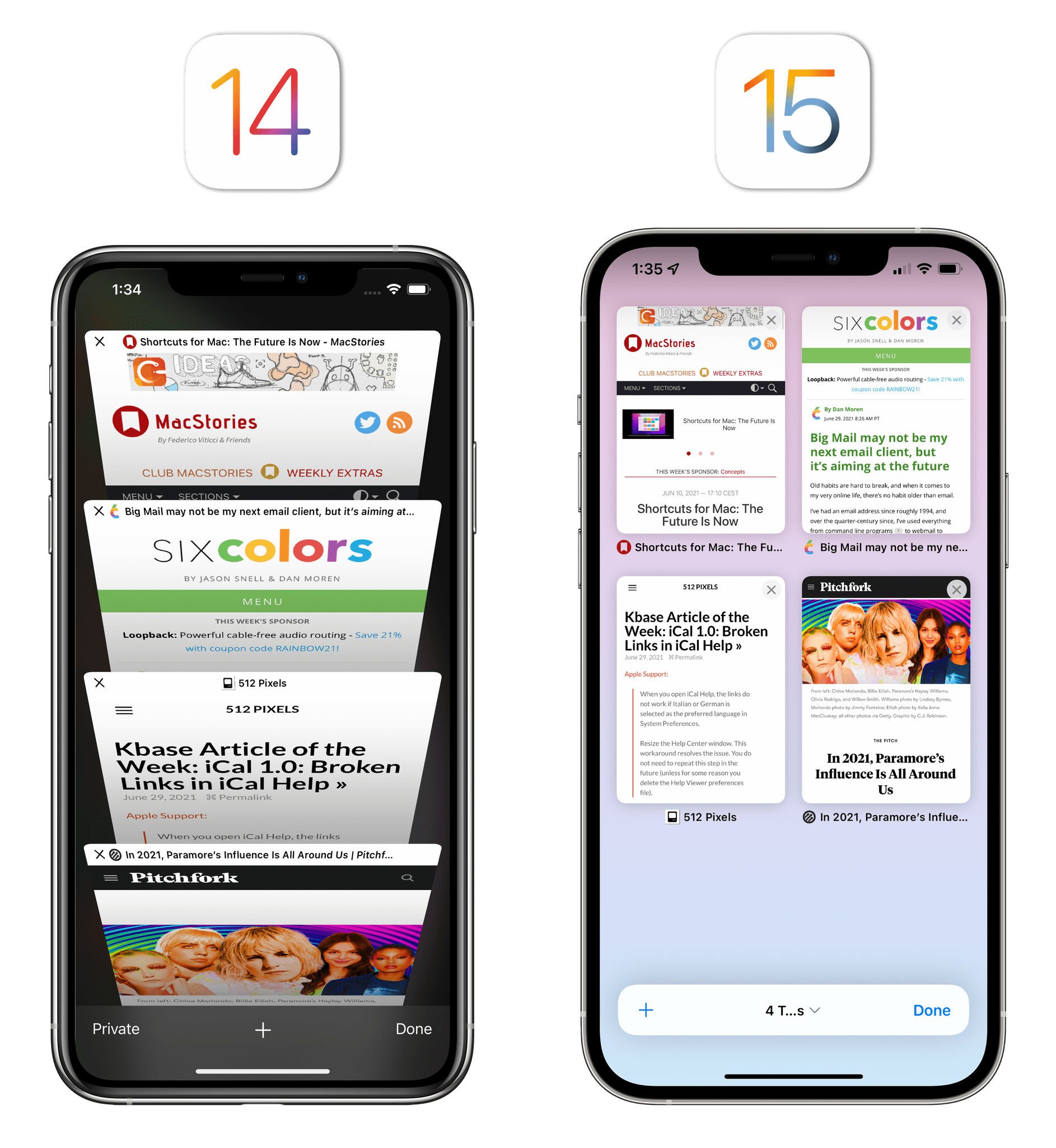
Fortunately, not everything is bad about the new Safari for iPhone and iPad, and I’ve been enjoying and getting used to some of its other additions. On iPhone, the clunky carousel view for tabs has been replaced by a standard grid view (similar to the one found in Chrome and Firefox for iPhone), which I find more useful and faster to understand at a glance.
Speaking of tabs, Apple is also betting heavily on tab groups, a feature that lets you organize tabs by collecting them in a named group, which is easily accessible from the iPad’s sidebar or the iPhone’s new tab menu.
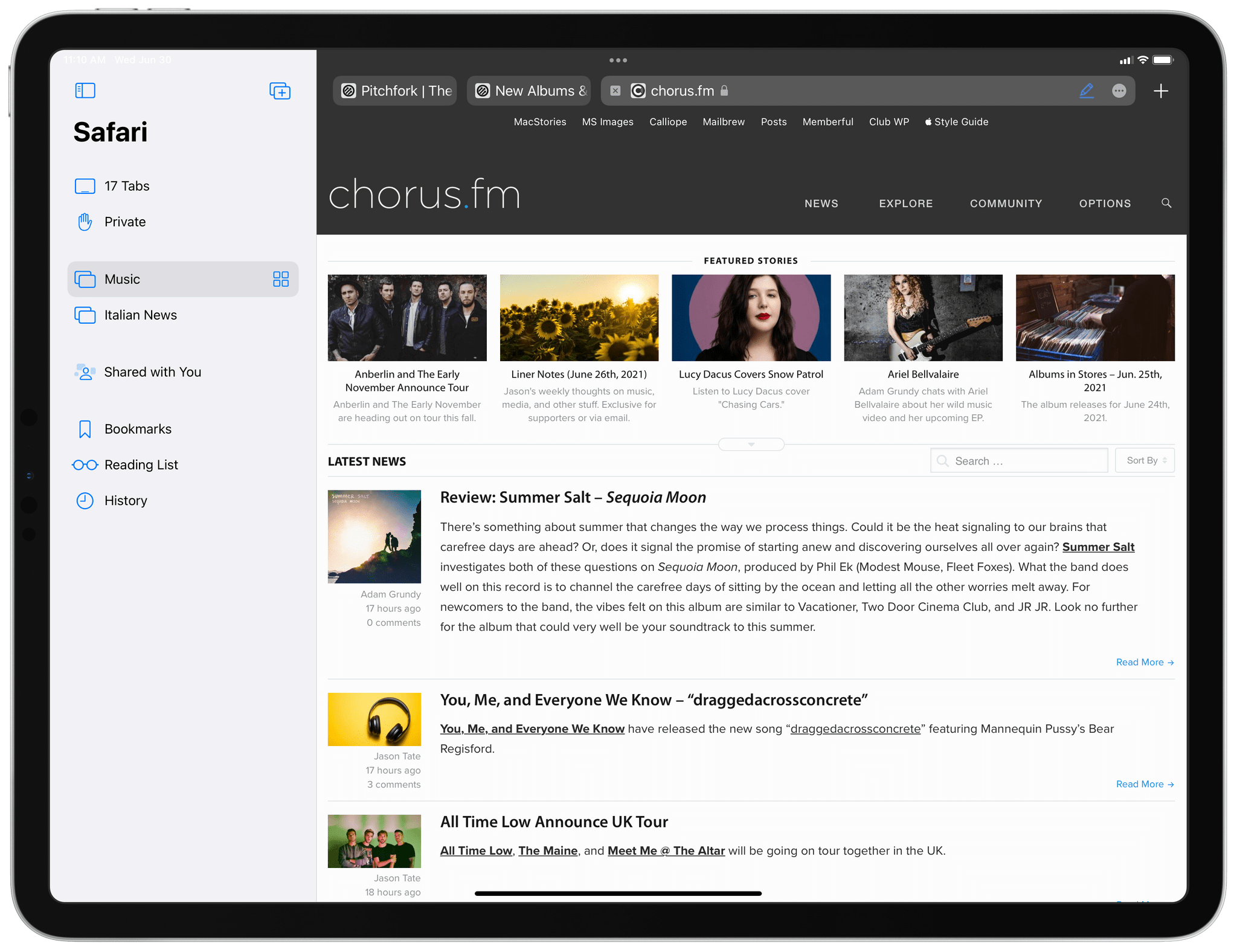
Initially, I was skeptical about tab groups, but the functionality has grown on me as a way to easily reopen groups of websites (I have a group called ‘Italian News’) or swiftly turn a bunch of related tabs into a named group that’s separate from my regular tabs. The latter use case is especially useful when I’m researching a particular topic for MacStories or one of my podcasts: with one click on the address bar, I can move all tabs to a group and de-clutter the general ‘Tabs’ view for everything else. Tab groups are also synced with iCloud by default, and I think they strike a nice balance between the ephemerality of tabs and the persistence of bookmark folders.
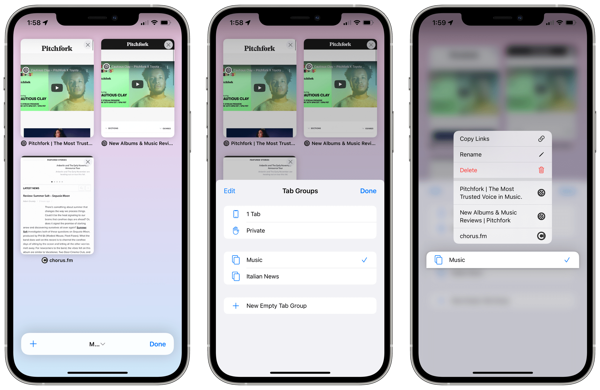
You can see tab groups in Safari’s new tab menu. Disregard the cut-off text label, which is a beta bug.
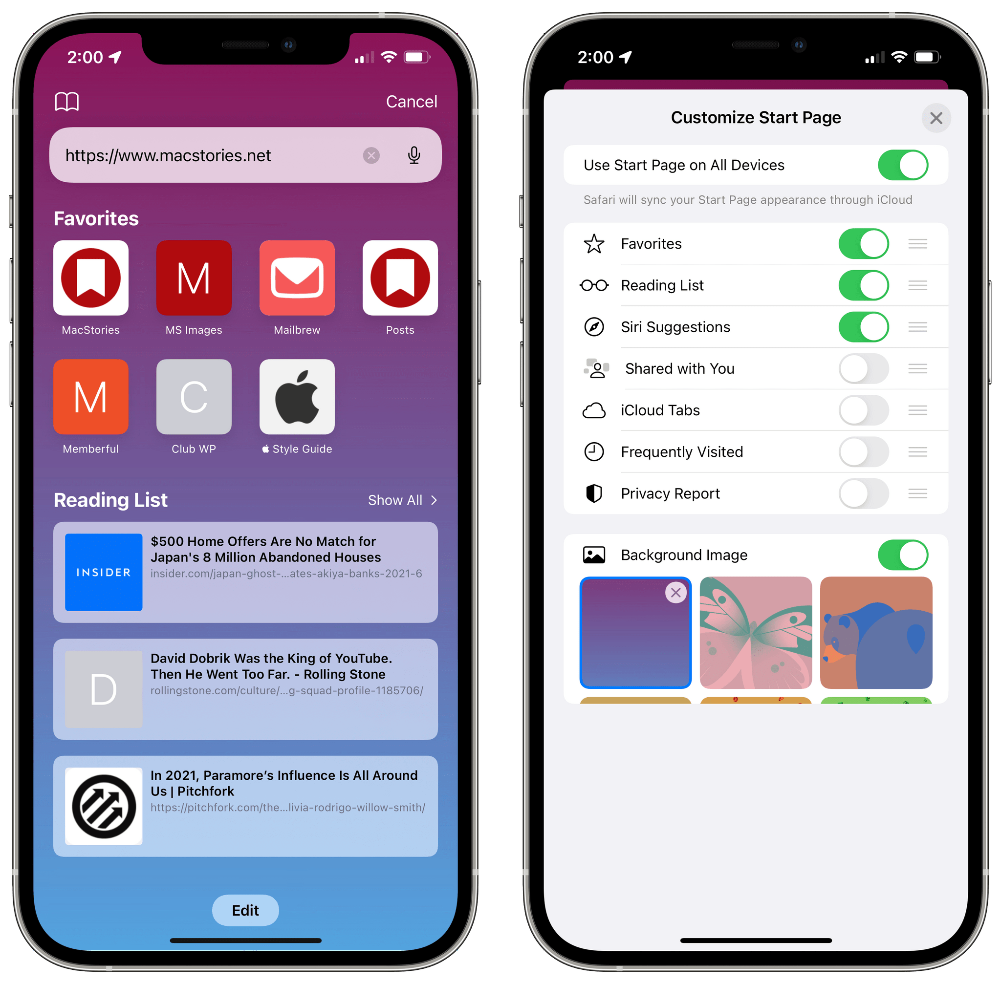
I also appreciate the new, fully customizable start page, which you can personalize by installing a custom background image as well as reordering or hiding sections. In my case, I installed a nice gradient wallpaper, chose to sync the start page between devices, and hid everything except for Favorites and Reading List. I never cared about the other sections, and I don’t foresee using the new ‘Shared with You’ option in Safari, so I’m glad I can turn those off.
Lastly, I want to mention web extensions in Safari for iPhone and iPad, since I believe they’re going to be a big deal later this year once developers can submit them to the App Store.
Originally launched on Safari and the Mac App Store last year, Safari web extensions allow developers to turn their existing Chrome and Firefox extensions into compatible Safari plugins (with some limitations) that can modify the behavior of the browser, including taking over the start page, modifying the contents of webpages, injecting UI elements into the address bar, and altering navigation across webpages. You’ve probably already seen examples of what third-party developers will be able to build with web extensions for Safari on iPhone and iPad, such as adding a proper reload button to the address bar, bringing the power of desktop-like 1Password auto-fill to the browser, or enabling a completely different start page experience.
I have no doubt that Safari extensions will be aggressively adopted on iPhone and iPad later this year thanks to the sheer power of Apple’s ecosystem, and I can’t wait to see how task managers and note-taking apps will take advantage of them. But in the meantime, I can already tell you that two web extensions I’ve been testing over the past couple weeks have drastically improved my browsing experience in Safari.
The first one is Overamped, an extension by indie developer Joseph Duffy that does something I’ve long wanted in Safari: it automatically blocks Google AMP URLs and loads the canonical version of a webpage. After I installed the Overamped companion utility from TestFlight (web extensions, like other extensions on iOS, are provided by apps), enabled the extension in Safari’s Extensions menu8, and granted it permission to operate on google.com and google.it (extensions can also ask for access to all websites if they so choose), I was set. The Overamped extension is always enabled now, and whenever I tap a link to a website that has an AMP version in Google search results, Safari loads the regular version of the page instead. It’s beautiful, it just works, and it finally frees Safari of the absurdity that is Google AMP. Good riddance.
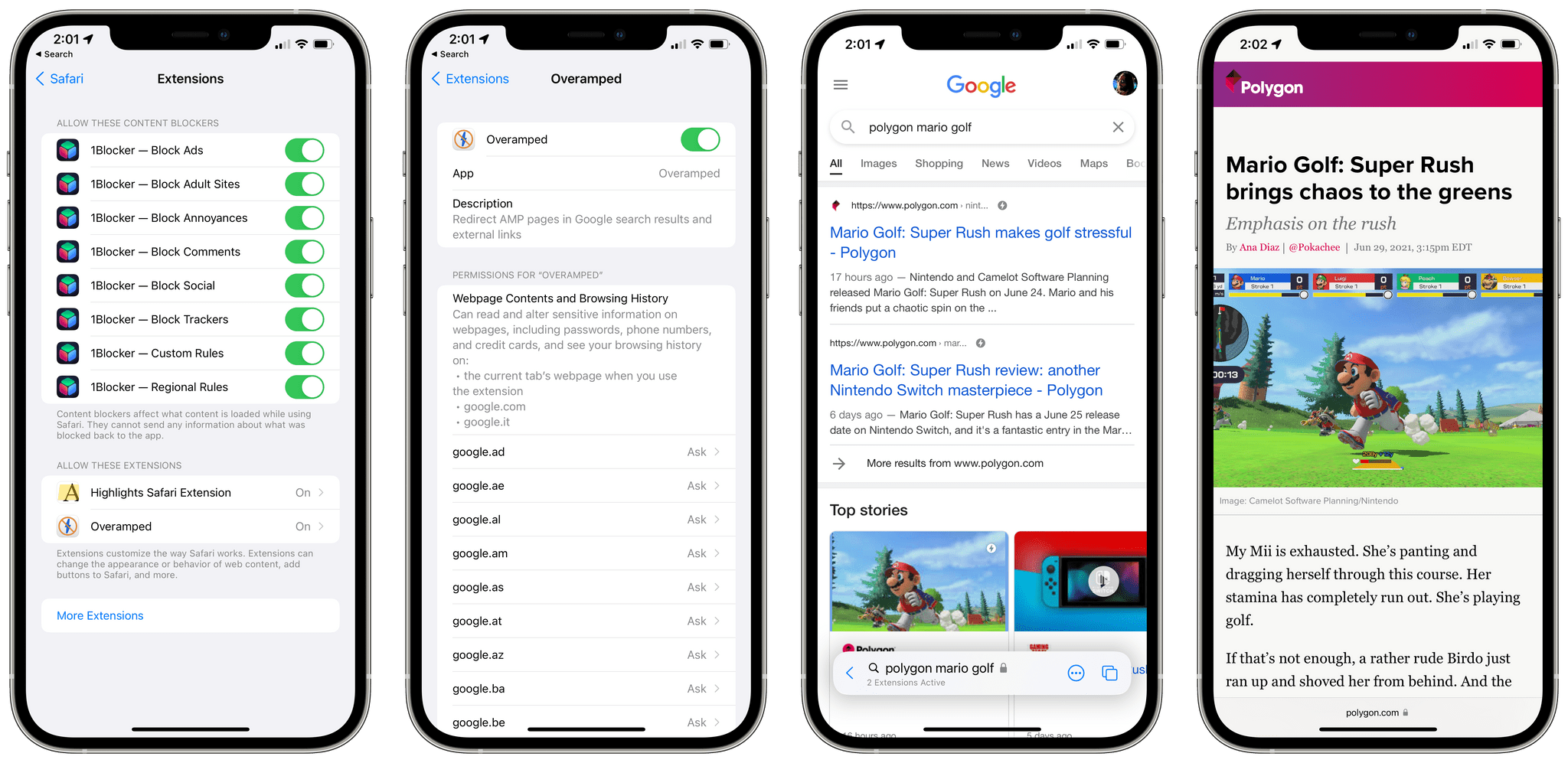
Once the Overamped web extension is enabled, Google AMP URLs are automatically redirected to their regular version.
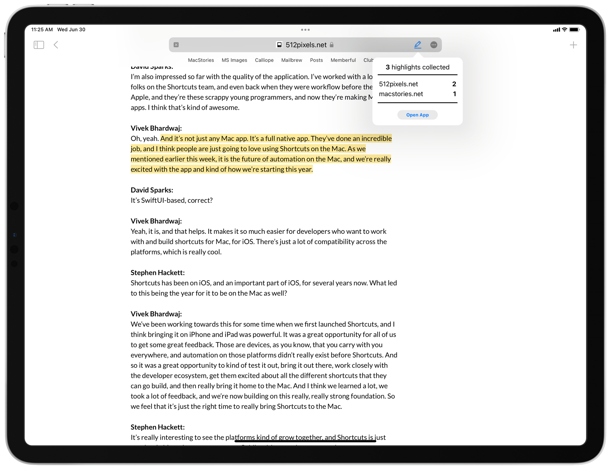
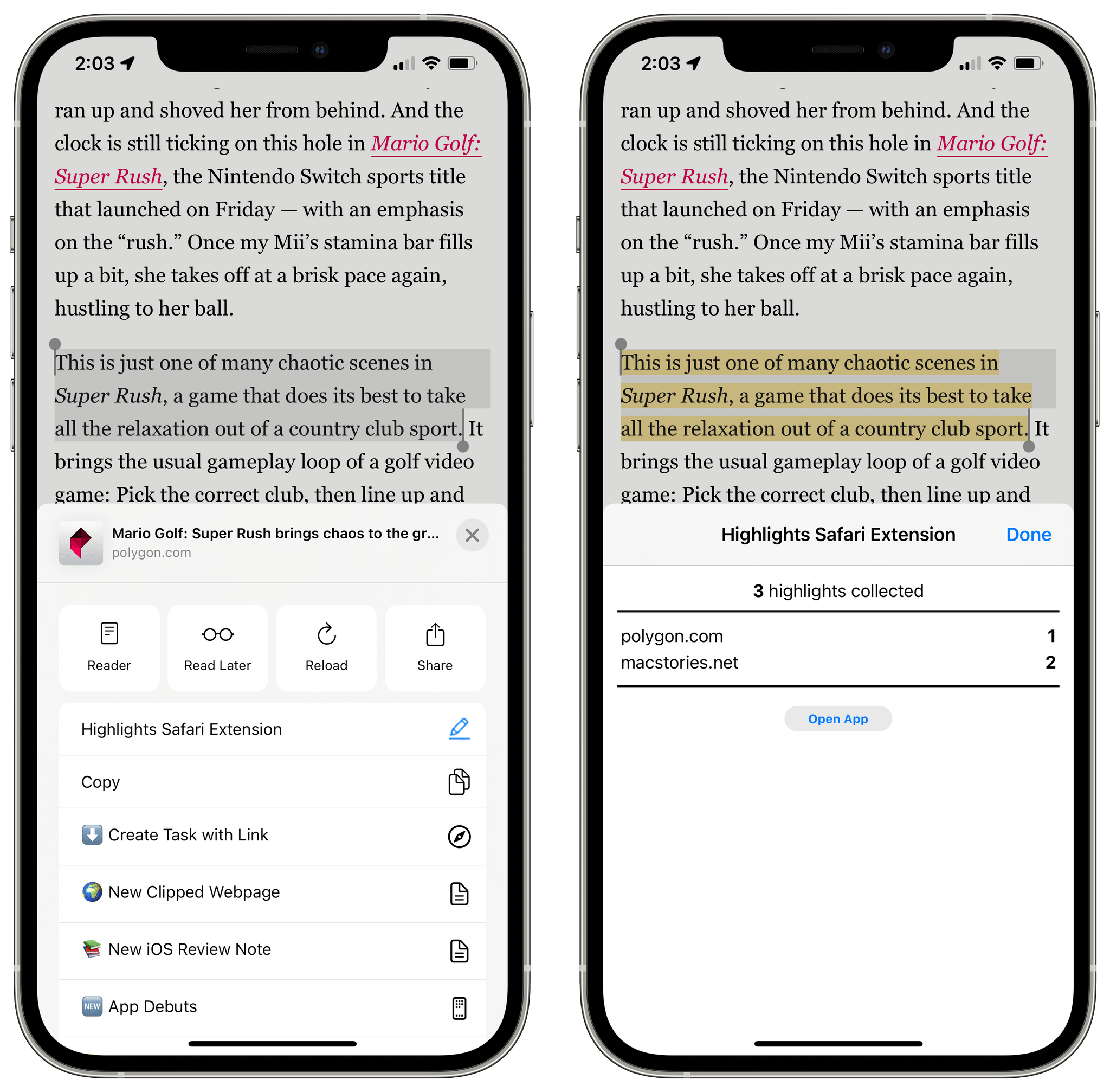
The second Safari web extension I’ve been using is one we’re developing in-house at MacStories. It’s called Highlights, and it’s a proof-of-concept extension created by Finn Voorhees to let me highlight passages of text across multiple webpages, collect them all in a temporary bucket, and export the compiled results as a Markdown-formatted block of text. As you can see in the images below, Highlights can display a persistent button in the Safari address bar, and when you click it, you’ll see a popup with details on the highlights you’ve collected; on the iPhone’s smaller screen, web extensions automatically use a sheet appearance instead, which I think looks nice. Later this year, you’re going to see a bunch of extensions that implement similar designs based on Apple’s API – a popup on iPad, and a sheet on iPhone.
Web extensions were one of my longstanding wishes for Safari on iPhone and iPad, and I was very surprised when Apple announced them at WWDC. I’m excited about extensions’ potential to further customize my Safari experience, and I believe their deeper integration with the browser will open the door to more powerful workflows between Safari and third-party apps, going well beyond what was allowed by share and action extensions before. I guess what I’m also saying is: if you’re a developer working on Safari web extensions, you know where to find me.
The more I use the new Safari for iOS and iPadOS 15, the more I’m left wondering: was it really necessary to redesign the whole experience, get rid of a toolbar on iPhone, hide buttons, and remove the tab bar on iPad and Mac just to have an address bar at the bottom and save some vertical space on webpages? How will users react to this change? Will this new design end up like the much-maligned Safari 4 beta with tabs on top, which was eventually scrapped?
I don’t know the answers to these questions right now; like I said above, I feel like I still need more time with the new Safari. Which, if you think about it, cannot be a good sign after three weeks, right? Again, I’m not sure, but I have a feeling Apple overshot with some elements of this radical new design, and they’re likely going to scale back some of them between now and iOS 15’s public release.
There are some clear benefits to Safari’s unified address bar at the bottom on iPhone: it’s more reachable, it lets you quickly swipe between tabs, and it does put more focus on webpage content. I just feel like, on balance, all the other trade-offs that were necessary to make this possible outweigh what’s nice about the new design. On iPad, the sidebar somewhat compensates for the removal of buttons from the main app’s UI, but the unified tab bar feels like form over function, and I think it needs to be rethought.
Maybe the solution to all this is to make the new Safari design optional with settings and just accept that major browser redesigns can’t work for everyone. I’m curious to see how this goes and what I’ll have to write about Safari in a couple months.
What I’d Like to See Improved in Safari
- Let users customize the placement of the address bar on iPhone
- Let users bring back the separate tab bar on iPad
- Put the address bar above the keyboard when typing a URL or search on iPhone
- Bring back buttons in the main UI (reload, webpage settings, share)
- Make it easier to open bookmarks and Reading List on iPhone
- Offer the ability to customize the iPad’s sidebar with bookmarks and bookmark folders
- Make share extensions and contact suggestions top-level items in the action menu
- Integrate tab groups with Shortcuts with actions to retrieve URLs from a group or quickly reopen a specific tab group
- Allow copying URLs from a tab groups as plain text
iPadOS 15 Multitasking: Discoverability Is Key
To understand the importance of the changes Apple brought to iPad multitasking in iPadOS 15, I think it’s helpful to revisit my argument from the conclusion of the iPadOS 14 chapter in last year’s review:
while I don’t think Split View and Slide Over are the interaction disaster other folks paint them to be, they were designed for touch during the iPad era preceding the Magic Keyboard and pointer; as a result, it’s still awkward to operate multitasking via the trackpad and keyboard in iPadOS 14, which brings no meaningful improvements to Split View and Slide Over management when you’re not touching the screen. If ever there was a solid case against the current implementation of Split View and Slide Over, their lackluster support for the keyboard and trackpad in iPadOS 14 is it. I hope to see meaningful changes on this front with iPadOS 15 next year.
The problems with iPadOS’ former multitasking environment (originally launched in iOS 11) were clear to both novice and advance users: both Split View and Slide Over were hard to discover because they were exclusively operated via hidden drag and drop gestures; for the same reason, they also couldn’t be flexible enough for power users who wanted to control multitasking from a keyboard. Apple sought to fix both aspects of multitasking in iPadOS 15, and the result is a new foundation that scales to all kinds of users and input methods, preparing the platform for whatever is coming next.
A good way to think about iPadOS 15’s revamped multitasking is the following: what you can accomplish with Split View, Slide Over, and multi-window isn’t changing, but Apple is making it easier and faster for everyone to discover and use those features. No, you cannot assemble more complex Split View layouts à la Windows 11, nor can you freely resize windows (unless you’re using Notes, but more on this later) or put specific app windows on an external display. However, managing different multitasking states has been dramatically simplified, and the keyboard has been integrated throughout the whole system with a new set of global keyboard shortcuts to operate Slide Over and Split View, launch apps from the Home Screen, cycle through windows, and more.
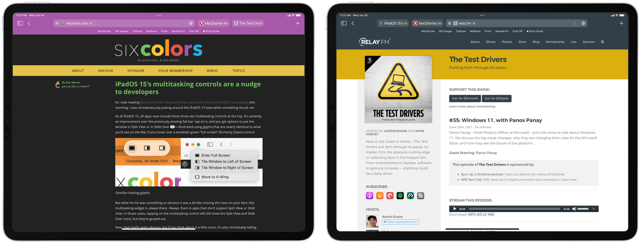
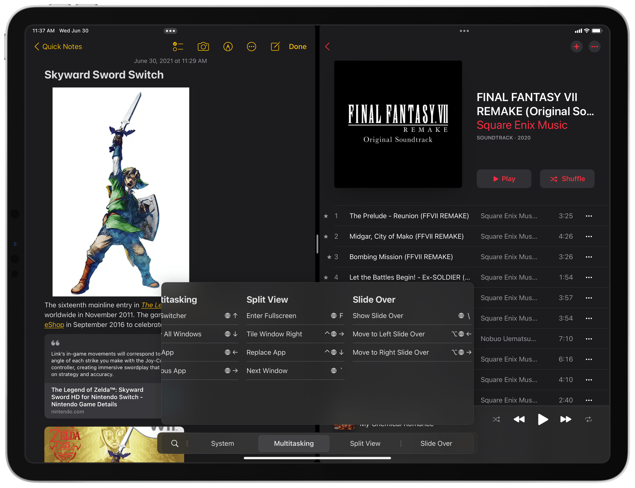
The star of the show here is the new multitasking menu, which is accessed by clicking or tapping the new three-dot indicator at the top of an app window. The menu is a familiar pill-shaped banner that, by default, offers three buttons to make an app full-screen, put it in Split View, or turn it into a Slide Over app. The menu also serves as an active app indicator (it gets darker for the app receiving keyboard input in Split View), a grab control (you can grab it to minimize an app or manage multitasking via drag and drop, the old-fashioned way), and a state indicator (one of the three multitasking icons is highlighted to tell you in which mode the current app is in).
Clicking the iPad’s new multitasking indicator (left, atop the Safari window) reveals a new menu at the top of the screen to manage different multitasking states (right, atop the Notes window).
I like the new menu a lot because it shows you, clearly – with buttons and indicators – what you can do with iPad multitasking (maybe the Safari team should take notes here). The menu builds upon similar controls previously seen on the Mac, and I can see how Apple may expand it even further in the future with additional buttons and Split View configurations (there is a fourth button already; more on this below). Thanks to the menu, you don’t have to read a manual on how to use Split View and Slide Over via drag and drop on iPad anymore; it’s discoverable, equally usable by touch and pointer, and unobtrusive. Even better, you don’t even have to use it: if you, like me, mastered drag and drop-based multitasking after all these years, it’s totally fine to continue using that system if you know where to drop apps for Split View and Slide Over. But now you have another visual, friendlier option as well. Personally, I’m still using drag and drop, but I’m incredibly happy the menu now exists so I can stop explaining drag and drop to my mom every six months.
In the three weeks I’ve been using iPadOS 15 on my primary iPad Pro, I’ve actually enjoyed the keyboard’s integration with multitasking more than the menu itself (something that will surprise literally no one). In iPadOS 15, Apple added a suite of global keyboard commands that use the globe key as a modifier to perform functions such as making the active app full-screen, tiling a window left or right to create a new Split View, moving focus between two windows, operating Slide Over, and more. The list of new system commands is remarkably long, and while I’m still learning most of them and trying to use them daily, there are some that have already changed my typical iPad workflow.
For instance, I can now press Globe-Control-Left to tile an active full-screen app to the left side of the screen; in iPadOS 15, doing so reveals the Home Screen on the other side, so I can use the same launcher to pick a secondary app I want to put in Split View. I can even tap a widget to bring the associated app into a Split View. Alternatively, after tiling an app to one side of the screen, I can hit ⌘Space to invoke search, find the app I’m looking for, and select it to put it on the opposite side of the Split View. These interactions felt immediately natural to me when I first installed iPadOS 15, and they’re saving me a lot of time I would have otherwise spent tediously dragging app icons around. I only wish I could initiate a Split View from Spotlight itself without having to tile an app to one side of the screen first, but that’s a minor limitation.
When you tile a window on one side of the screen, it hides in the corner to let you pick another app from the Home Screen…
The act of finding all these new keyboard shortcuts is itself more discoverable in iPadOS 15 and better suited for iPad apps transitioning to macOS via Catalyst. When you press and hold the ⌘ or Globe keys in iPadOS 15, you now see a redesigned keyboard shortcuts view that organizes commands by category and allows you to filter them by typing or activate them with touch too. The new keyboard shortcuts view looks like an inverted menu bar from the Mac; indeed, if developers adopt this API on iPad, their Catalyst apps will automatically display the same commands in the standard menu bar on macOS.
The keyboard shortcuts view is the perfect example of a concept I’ve shared on multiple occasions here on MacStories: it’s an old idea from the Mac that has been simplified, reimagined, and modernized for iPad in a way that makes sense for the platform. On iPad, hierarchy is flattened, so you don’t have to navigate sub-menus; unavailable commands are hidden instead of being grayed out like on macOS; commands are automatically localized for different languages and keyboard layouts. The result is an ideal blend of the Mac’s classic menu bar and the iPad’s former keyboard cheat sheet: apps are now incentivized to provide more commands because they’re organized in separate categories, which you can easily filter from the keyboard or scroll with the pointer. As you can see in the example below, Parcel, a package-tracking app for iOS and iPadOS, is adding custom categories for its keyboard commands in iPadOS 15; I expect all iPad productivity apps to implement this API later this year.
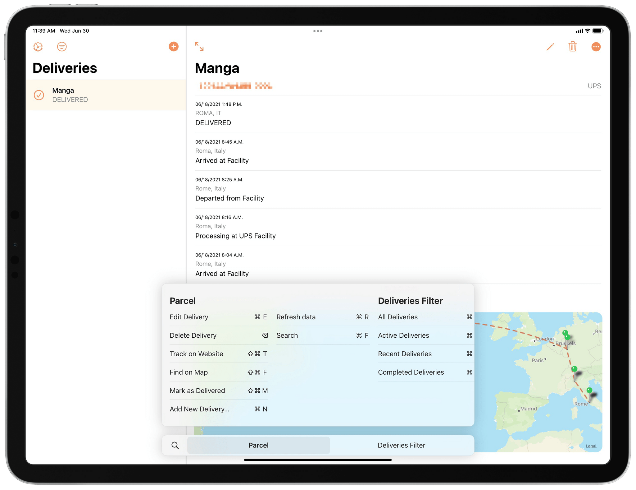
Apps updated for iPadOS 15 can organize their keyboard commands in categories, as shown in this screenshot of a beta version of Parcel.
There are other quality-of-life improvements worth mentioning in iPadOS 15’s multitasking, which I’ve grown to appreciate already:
- Slide Over apps are now shown in the app switcher. You’ll find them on the right side, and you can pick them up like other apps to perform the action in the next point…
- You can manage Split Views from the app switcher itself. At long last, you can now pick up windows in the app switcher and combine them in a new Split View; or you can take one app from an existing Split View and put it back in full-screen. You no longer have to open a specific Split View space to manage it, which is great.
- You can hide Slide Over apps on the left side of the screen. Speaking of Slide Over apps, if you’ve placed Slide Over on the left side, you can hit the ‘Hide Slide Over’ command to hide Slide Over inside the left edge of the screen.
- You can drag down the multitasking indicator to view the Home Screen and pick a different app. No need to learn the keyboard shortcut for tiling windows: simply grab the multitasking indicator and drag it down to reveal the Home Screen on the other side of the screen.
Slide Over apps are shown in the iPadOS 15 app switcher, which also lets you manage Split Views with drag and drop.
I haven’t spent much time using them, but the new center windows and Shelf in iPadOS 15 are also part of this overarching story about making iPad multitasking more visible and intuitive for everyone while offering additional controls to pro users.
Center windows are a new style of prominent window that rather than opening in Split View or full-screen are displayed as “popups” in the center of the screen. You can see examples of center windows in Notes and Mail when opening a note or message, respectively, using the ‘Open in New Window’ button from the context menu or by pinching them open with two fingers. Center windows gain their own button in the multitasking menu (is it different enough from the full-screen button?), and they show up as standalone windows in iPadOS 15’s new window picker UI (see next section).
Right-click a message in Mail to show the context menu (or use Control-Return from the keyboard) in iPadOS 15…
I’m still not completely sold on center windows, but, after a few weeks testing them, I kind of understand where Apple is going with this feature. To get the most out of center windows, you have to open multiple ones to preview different pieces of content in the same app, minimize them into the Shelf, then switch between them with one click. Try this in Notes: open a note in a center window, then click outside of it (or drag the multitasking indicator down) to minimize the window into the Shelf. Repeat the process for other notes, then try switching between multiple center windows from the Shelf. The interaction is very fast, and it encourages you to create multiple windows on your iPad because you can switch between them quickly without going through the app switcher. I like that a center window can be transformed into a regular full-screen, Split View, or Slide Over window too. I’m curious to see how developers will implement center windows in their apps, but I feel like they’re going to be better suited for document-based apps that let you switch between different items.
Center windows can be minimized in the Shelf, which lets you quickly switch between them without navigating outside of the current app.
The aforementioned Shelf is not a clipboard manager – it’s the new name for the iPadOS window picker. The Shelf sits at the bottom of an app as a tray of open windows, which are displayed in varying sizes depending on the mode they’re currently in. The Shelf is automatically displayed for a few seconds when you open an app that already has multiple windows open so you can switch between them at launch, or you can invoke it with Globe-Down or by long-pressing an icon in the Dock and selecting the ‘Show All Windows’ action.
Open an app that has multiple windows, and you see the Shelf, so you can pick a different window. All kinds of windows are displayed in the Shelf, including Slide Over and center-style ones.
I didn’t like the Shelf much initially; now, I think it makes sense in the context of advertising the iPad’s multitasking capabilities to more people by just showing them upfront. The Shelf, as I argued above, pushes me to use multi-window more because it’s always there when I open an app with multiple windows. Apps that don’t support multi-window (and will therefore lack a Shelf) will stick out in iPadOS 15, so I hope this feature will also convince developers to reconsider their adoption of the iPad’s multi-window framework.
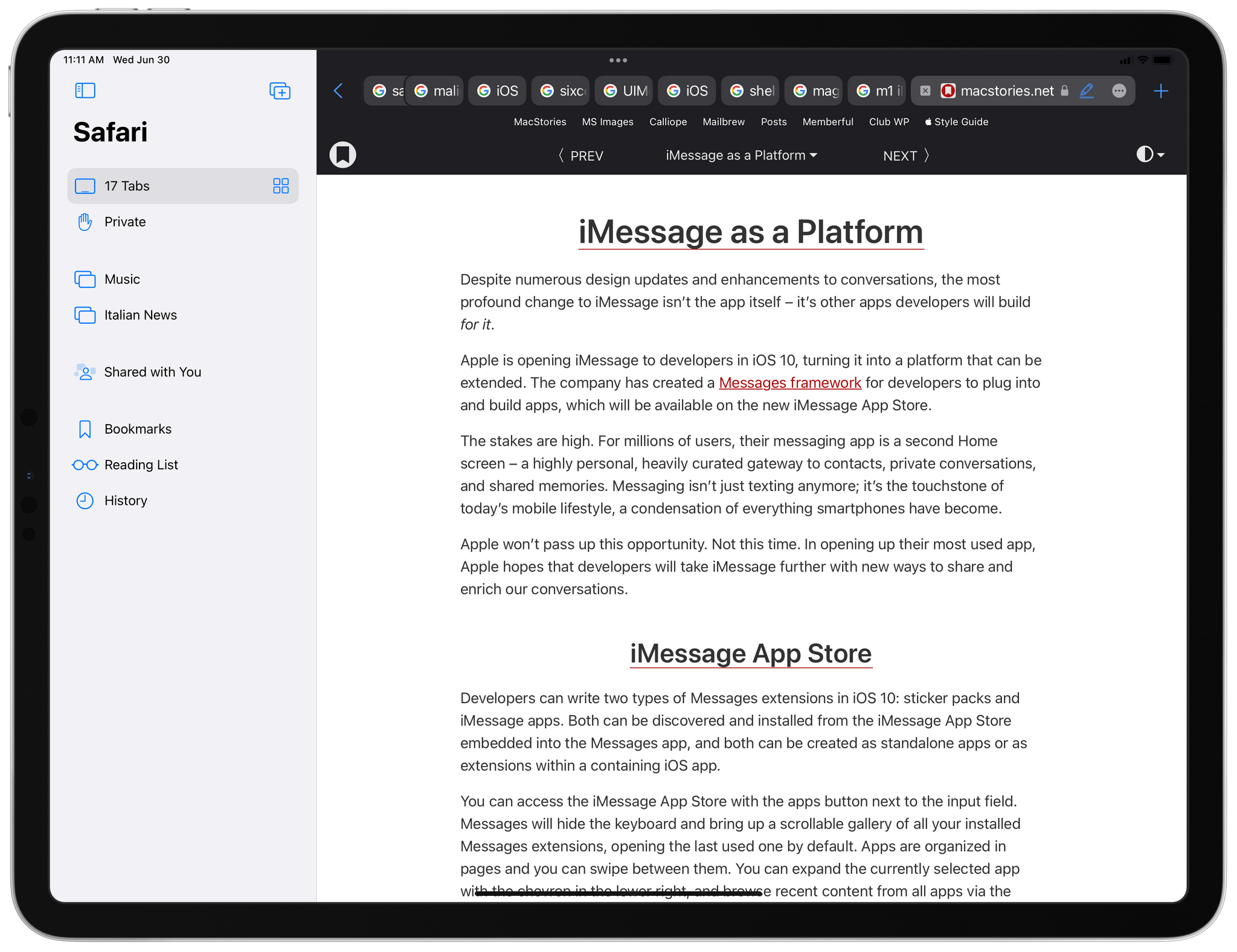
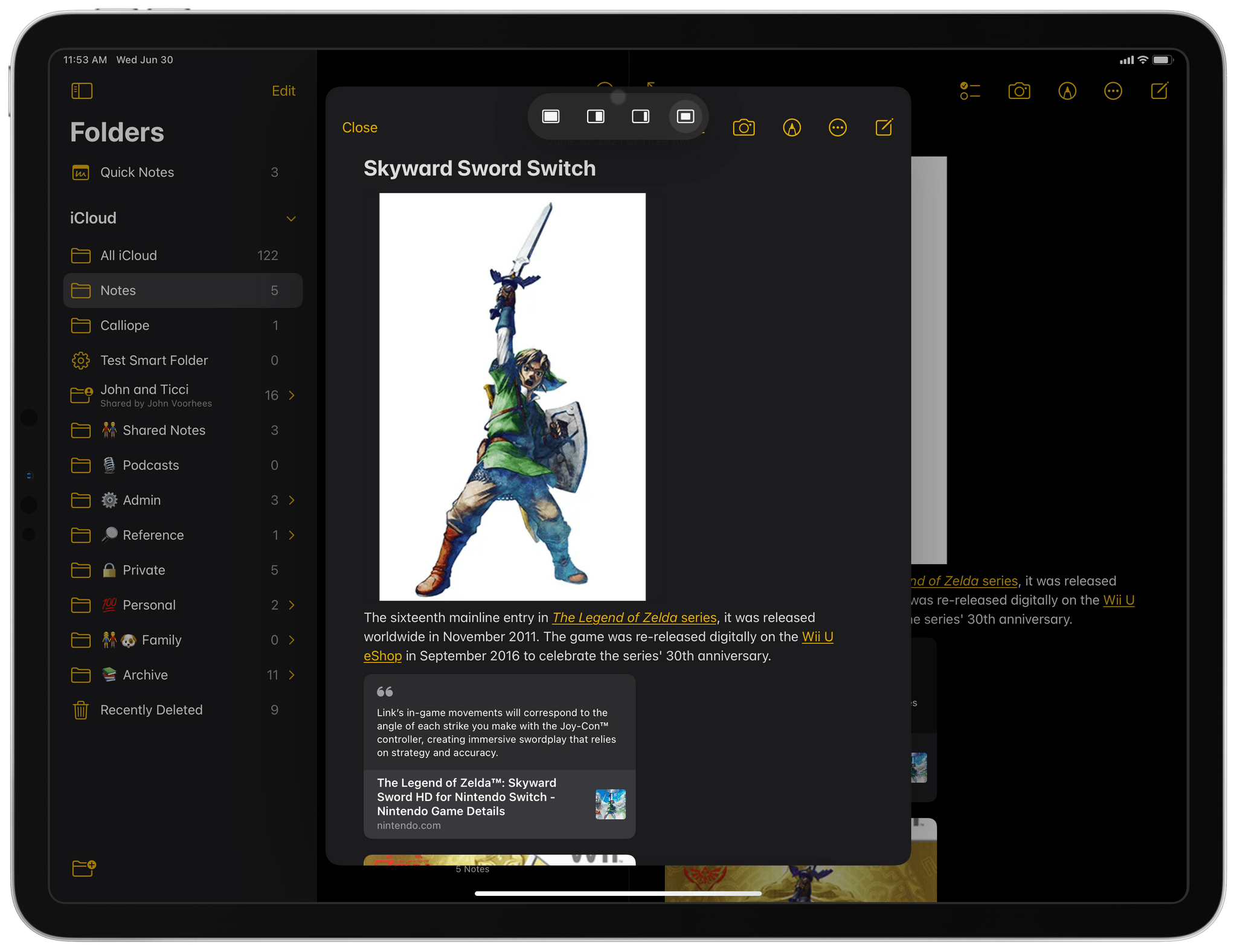
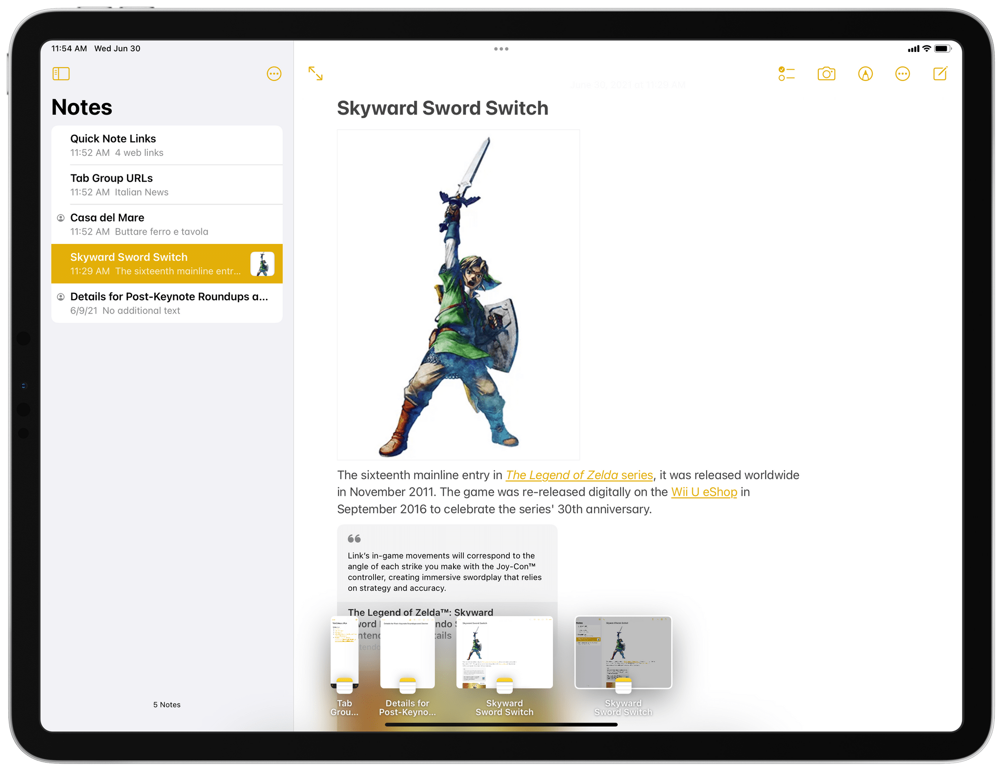
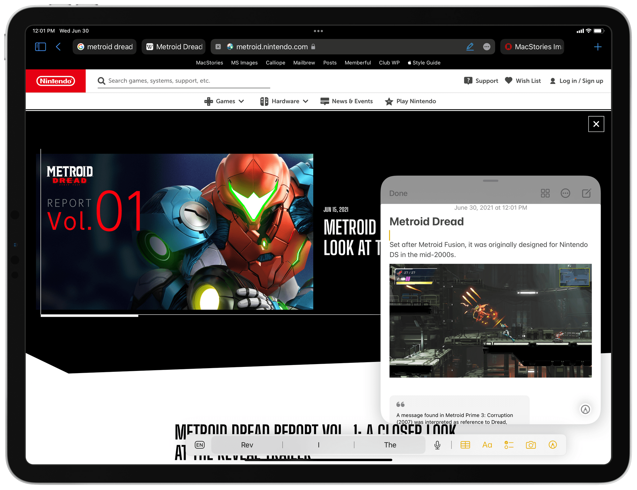
Finally, I want to mention a new iPadOS 15 feature that feels like a Trojan Horse for future iPad multitasking: Quick Note. Available exclusively for the Notes app, Quick Note is a universal capture system that lets you save anything to a new note via a floating panel that supports typing with the keyboard, drawing with the Pencil, or appending links from Safari as well as compatible apps that use the NSUserActivity API. Quick Note is, effectively, an interactive Picture in Picture mode for the Notes app, and it’s some of Apple’s best iPadOS work in years, for a variety of reasons.
Quick Note is the first truly post-Magic Keyboard feature of iPadOS in that it’s launching with support for all the iPad’s possible input methods. To summon Quick Note, you can:
- Press Globe-Q on an external keyboard
- Tap a toggle in Control Center
- Select text in a Safari webpage and hit ‘New Quick Note’ in the copy and paste menu9
- Swipe from the bottom right corner of the screen with your finger or Pencil
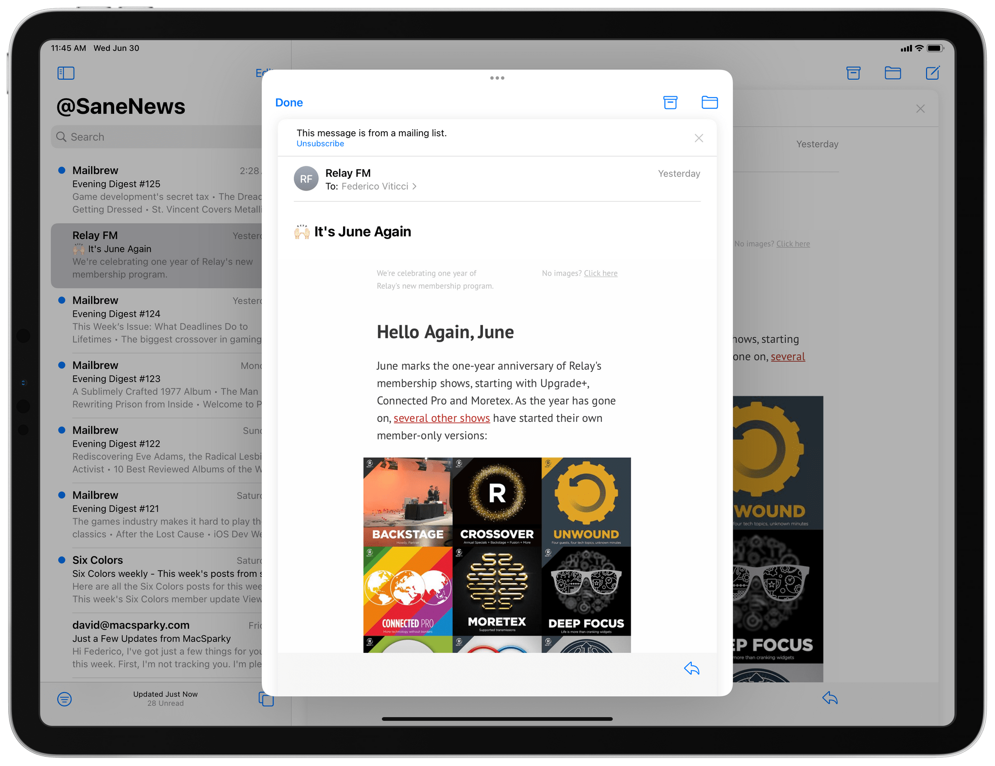
Once the Quick Note window is shown, you can type, draw, and drop things in it; if you’re in Safari or other apps that implement the proper markup for their “user activities”, you can also press an ‘Add Link’ button inside the Quick Note window to save a deep link to a specific piece of content. This is particularly impressive in Safari, where you can highlight passages of text from webpages and archive them as special links in Notes, as well as NSUserActivity-compatible apps such as NetNewsWire and Working Copy, which let you save deep links to specific items with one click. Previously, these deep links were exclusive to Siri and its “remind me about this” command; now, you can capture them with Quick Note and intermix them with your notes.
In compatible apps, Quick Note lets you capture deep links to specific pieces of content or activities.
Besides providing an incredible first-party advantage for Apple Notes since no other note-taking app will be able to match this kind of system-wide capturing method in iPadOS 15, Quick Note may be a promising sign of additional flexibility coming to iPad multitasking in the future.
The Quick Note window doesn’t just look like Picture in Picture for Notes: it behaves like Picture in Picture too. You can resize the floating Notes window with a pinch gesture and fling it across the screen until you’ve found a size and position that works for you. You can hide the window in a corner, swipe between multiple notes in the same window, and when you don’t need it anymore, click ‘Done’ to close it. It’s an interactive, resizable window you can drag around the iPad’s screen. I don’t think it’s too far-fetched to imagine how Quick Note could be Apple’s test bed for a modern take on freeform windowing for iPadOS – one that’s inspired by the Mac but simplified and rethought for iPad, offering the basic advantages of the Mac’s resizable windows in a more streamlined environment.
Maybe I’m reading too much into Quick Note and this is just a universal capturing system for Notes that Apple will (hopefully) bring to iPhone too or open up to third-party apps in the future. But: I want to believe.
In using iPadOS 15, I asked myself the question: why does it always feel like we’re perpetually on the verge of something bigger and better with the iPad? Perhaps it’s because hardware and software are advancing at wildly different schedules, or maybe Apple has a lot of catch-up to do compared to macOS. Whatever the reason, iPadOS 15 doesn’t stray away from tradition: like its predecessors, it brings a lot of welcome changes, but it still leaves me feeling like I haven’t heard the iPad’s full story yet.
This time something’s also different though: unlike iPadOS 13 and 14, Apple did a lot of work in 15 to make pro features discoverable by everyone regardless of their expertise, and they also unified core multitasking interactions around multiple input methods so that one isn’t more “important” than the other.
Whether all this will be enough to move the needle for the pro app ecosystem on iPad is still up for debate, but I’m convinced this new foundation is now ready for whatever’s next – be it more complex multitasking, support for external displays, or even larger iPad Pros.
What I’d Like to See Improved in iPadOS 15
- Offer the ability to add apps to Split View directly from Spotlight with a keyboard shortcut
- Restore ability to reopen closed windows in the Shelf
- Let users trigger shortcuts system-wide with custom keyboard shortcuts
- Add support for opening specific app windows to Shortcuts’ new ‘Split Screen Apps’ action
iOS and iPadOS 15 Public Beta
There’s a lot more I haven’t covered in this preview story for iOS and iPadOS 15, which will have to wait for my full review in the fall. Is SharePlay a gimmick that will be largely ignored like iMessage apps, or does it have a chance to stick around in a post-pandemic world? How will regular users discover and take advantage of Live Text? How much will Apple scale back Safari’s new design, if at all? I still have a lot of questions, but they’ll have to wait for future betas and more in-depth coverage in the future.
From what I’ve seen so far, both iOS and iPadOS 15 feel like foundational updates that refine the overall iPhone and iPad experience without drastic alterations – the only exception being the new Safari. iPadOS 15 gets a lot right with its rebalancing of pro options and discoverability, but it doesn’t necessarily open new workflows for professional iPad users that weren’t possible before – it makes existing ones better. Additions such as smart lists in Reminders, Quick Note, XL widgets, and center windows may be Apple’s quiet hits for power users this year, while Focus and Live Text will probably make for the best demos for everyone else.
As usual, let’s check back on all these in my annual iOS and iPadOS review later this year. It’s going to be a fun ride.
You can also follow our 2021 Summer OS Preview Series through our dedicated hub, or subscribe to its RSS feed.
- For those wondering, it’s the same version as developer beta 2 released last week. ↩
- This is another former Do Not Disturb option that is now part of Focus’ general settings. ↩
- Yes, John, that includes you as well. ↩
- Time sensitive notifications are different from critical alerts, which Apple launched in iOS 12. Critical alerts appear on the Lock Screen too, but they also play a sound even if your device is muted or Focus is on. ↩
- Seriously, however, this is potentially problematic for users who work in large organizations since there’s no way to finely control Mail’s notification settings for Focus. ↩
- Why can’t I pin specific bookmarks or bookmark folders in there? ↩
- Alas, this is currently broken for plain text since the list of links is a block of rich text that doesn’t get automatically converted to plain text by the system. ↩
- You can also find this menu, along with more permission details, under Settings ⇾ Safari ⇾ Extensions. ↩
- This button turns into ‘Add to Quick Note’ if the Quick Note window is already open and you want to append text or links to it. ↩