
Introduction
John: It’s time for the MacStories Selects awards, our annual celebration of the apps we love and the people who make them. Every year since 2018, we’ve paused at the end of a busy year to reflect on the hundreds of apps we’ve tried and recognize the best.
It’s been another big year for apps, driven by the ingenuity and creativity of the developers who make them combined with new technologies introduced by Apple. Note-taking apps were big again, and just as we get ready to put 2022 in the rear-view mirror, the read-later app space has begun heating up like it’s 2010 all over again.
Last year, we kicked off the MacStories Selects Awards with a new Lifetime Achievement Award, which we gave to PCalc by James Thomson whose app will celebrate its 30th anniversary in a couple of days. This year, we’ve got another app that has stood the test of time and had an outsized impact on the world of apps, which you can read about in a special story written by our Alex Guyot, whose history with the winning app makes him the perfect choice to present the award.
It’s also time to pause and honor the best apps of the year in the following seven categories:
- Best New App
- Best App Update
- Best New Feature
- Best Watch App
- Best Mac App
- Best Design
- App of the Year
which were picked by the MacStories team, plus the winner of the Readers’ Choice Award, which was picked by Club MacStories members, for a total of nine awards, plus six runners-up, all of which are covered below.

We also recorded a special episode of AppStories covering all the winners and runners-up. It’s a terrific way to learn more about this year’s apps and includes an interview with our Lifetime Achievement Award winner.
You can listen to the episode below.


So, without further ado, it’s my pleasure to introduce the 2022 MacStories Selects Awards to the MacStories community.

Table of Contents
- Introduction
- Best New App
- Best App Update
- Best New Feature
- Best Watch App
- Best Mac App
- Best Design
- Reader’s Choice Award
- App of the Year
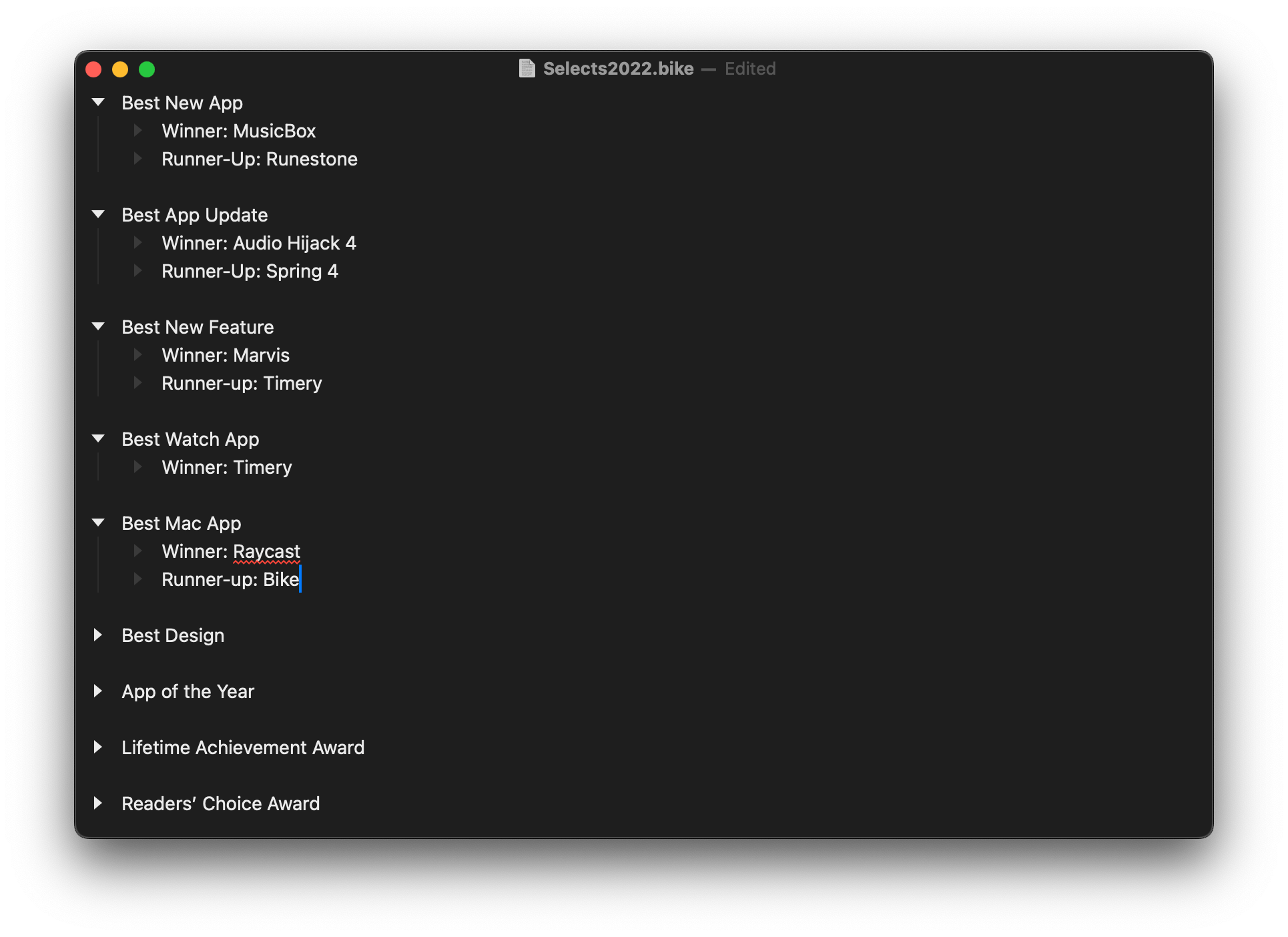
Best New App
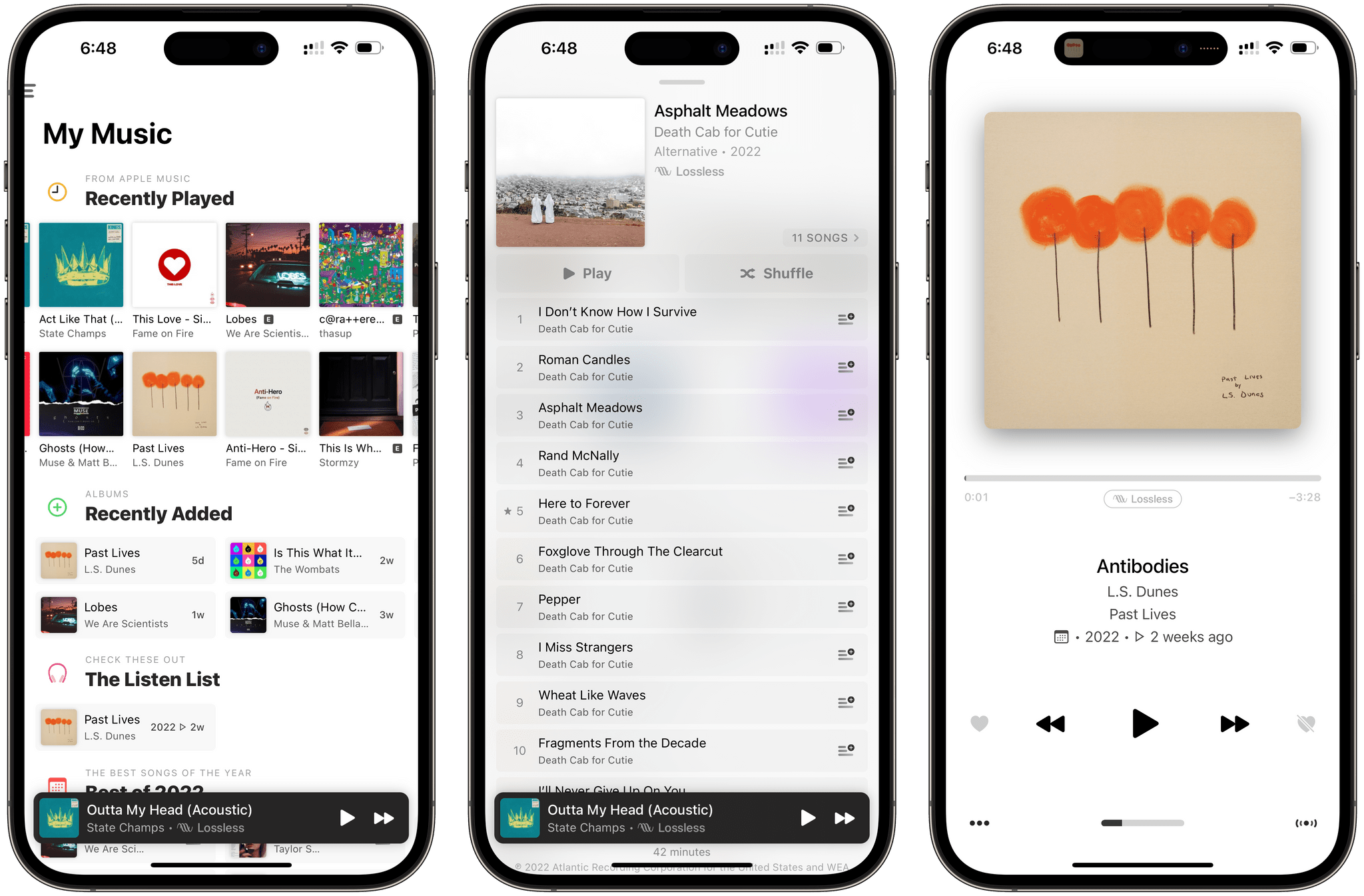
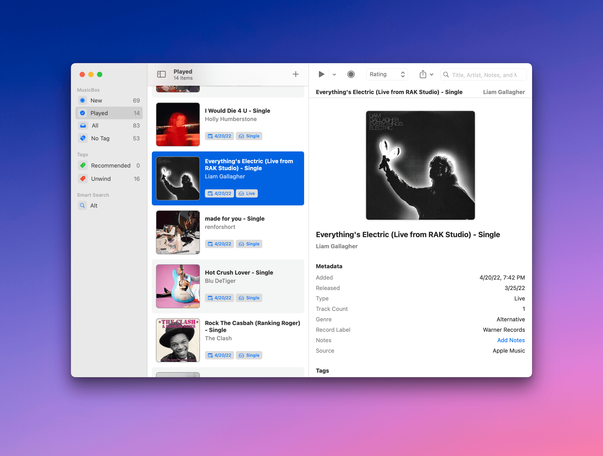
MusicBox

John: MusicBox by Marcos Tanaka is the sort of mashup of ideas that I love. The app lets you save URLs to music from Apple Music and Spotify to revisit later. It’s a little like a read-later app, although it’s just saving links instead of the music itself. However, by incorporating extensive metadata, tagging, ratings, notes, a played/unplayed toggle, and deep Shortcuts support, Tanaka has created something unique and compelling that has the sort of flexibility that allows music fans to tailor it to their specific needs.
For me, MusicBox has single-handedly solved the dilemma of not knowing what to play next. When everything I come across in Apple Music feels stale and boring, I open up MusicBox to scroll through the albums and playlists I’ve saved, and with a couple of taps, I’m listening to something brand new.
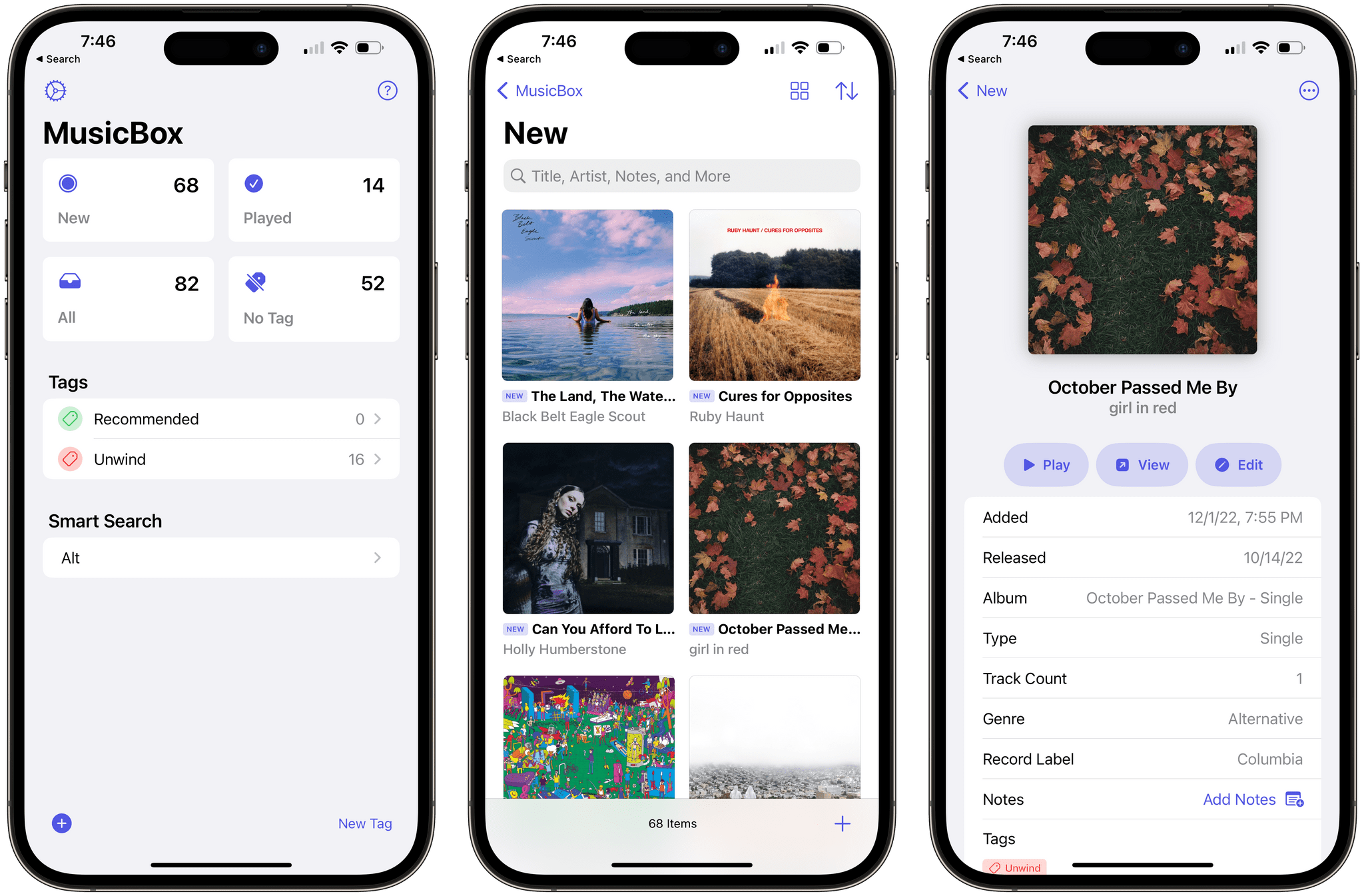
The app, which is available for the iPhone, iPad, and Mac, supports the share sheet for quickly saving music links. I listen to a lot of playlists, which means I’m always coming across something new. That often leads me to follow the track I’m listening to back to the album it came from or the artist’s Apple Music page. I don’t want to interrupt the playlist I’m enjoying, so instead, I use MusicBox to quickly stash my new discoveries away for later. That one simple step has had an exponential effect on the amount of new music I try because now, I never lose track of new discoveries.
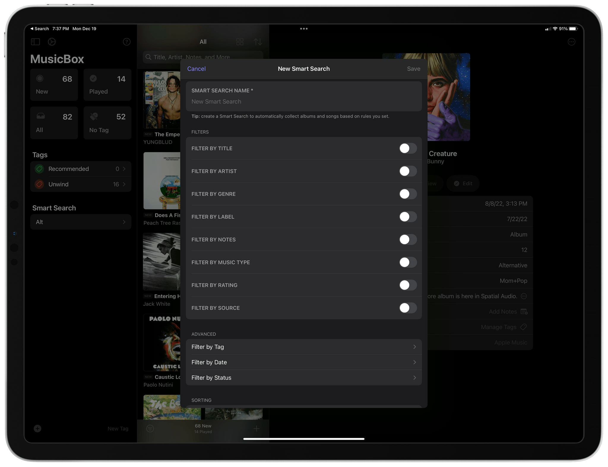
However, the share sheet is just the start of the many ways you can add music links to MusicBox. The app supports adding multiple URLs at once, search, Shazam, and more. What’s more, MusicBox includes a smart search feature that allows you to combine metadata filters into customized lists you can return to later, making it trivially easy to navigate large collections of saved links.
My use MusicBox is pretty simple. I use the app as an inbox, adding what I like to my Apple Music library and deleting links after I’ve listened to what I’ve saved. However, with tagging, notes, and ratings, you can set up all sorts of systems for listening and saving links to your favorite music long-term. For example, you could use MusicBox to help you compile a list of your favorite albums of the year using tags. The app’s notes feature is a great way to add listening notes to links or create reminders for yourself about where you heard about an album. It’s that scalability from simple use cases to complex collection management that makes MusicBox special.
Of course, MusicBox also has excellent Shortcuts support, allowing you to add links and manage your collection using the latest features like predicate filtering. Combined with other actions, MusicBox makes it easy to extract music URLs from a webpage and add them to your collection with just a few taps, for example.
At its heart, MusicBox is a link manager. What sets it apart from other apps is the way it approaches the problem with a focus on the music link’s unique metadata. That lends itself to a design that’s perfect for music fans and what makes MusicBox our MacStories Selects pick for Best New App.
Best New App Runner-Up
Runestone
Alex: Runestone is a text editor and syntax highlighter for iOS and iPadOS. Earlier this year, it joined the excellent lineup of utilities from developer Simon Støvring, and it lives up to the level of quality that has become synonymous with Støvring’s name. Runestone is fast, stable, and can handle large files without missing a beat.
While a number of code editor apps were built in the early years of the iPad, most have long since ceased being developed, and I haven’t seen a notable new entry for years. Runestone refreshingly breaks that trend.
The app is certainly not a full IDE in the style of Xcode, Visual Studio Code, Nova, or other more fully-featured editors found on the Mac. It is essentially a powerful syntax highlighter, but that feature alone is the deciding factor in whether you can write any code at all in a text editor. Without syntax highlighting, coding would be unbelievably more difficult than necessary. With it, I can write code just fine, even if I’m missing all the bells and whistles of an IDE.
I’ve worked with a number of other editors on the iPad over the years, which attempted to do syntax highlighting well, and I’ve never found one that accomplishes this feature with the level of speed, accuracy, and fault-tolerance of Runestone. The iPad is still missing a lot of tools needed to be a true platform option for developers, but a code editor is the most important part, and Runestone is now here to check that box.
Best App Update
Audio Hijack 4

Federico: It’s always challenging for a Mac app – particularly a productivity one used by tens of thousands of professionals who demand consistency and reliability – to reinvent itself without disrupting people’s workflows and causing irreparable damage to its longterm reputation. Releasing major updates to macOS apps these days is a fine balance between staying fresh and maintaining compatibility with users’ existing workflows, which is exactly what Rogue Amoeba has been able to accomplish with their exquisite update to Audio Hijack earlier this year.
Audio Hijack 4, a considerable update to the company’s premier recording utility, is full of advanced functionalities that, frankly, we don’t have to use at MacStories. But they’re there for advanced users who need them, and the list is impressive: there’s a new mixer block to easily mix up to five sources together; there’s a new Live Stream feature to create RTMP live streams; you can automatically run sessions when Audio Hijack launches, integrate with Audio Unit plugins based on version 3.0 of the API, and lots more. If you are an audio professional with a Mac and haven’t played around with Audio Hijack yet, there’s never been a better time to do so.
The reason we picked Audio Hijack 4 as the Best App Update of 2022 is twofold. For starters, Rogue Amoeba has managed to refresh the entire visual identity of Audio Hijack to modernize the app, make it more powerful and more intuitive at the same time, all without confusing existing users like myself. When I upgraded to version 4.0 months ago, I instantly appreciated its new look and clear iconography, but I wasn’t confused by the changes. Everything was in its place, but the UI was clearer than before and the interactions with blocks in the session editor had been streamlined. We see our fair share of app redesigns and relaunches every year and, trust me, this kind of redesign is rare. You can read more about the design process of Audio Hijack 4 here.
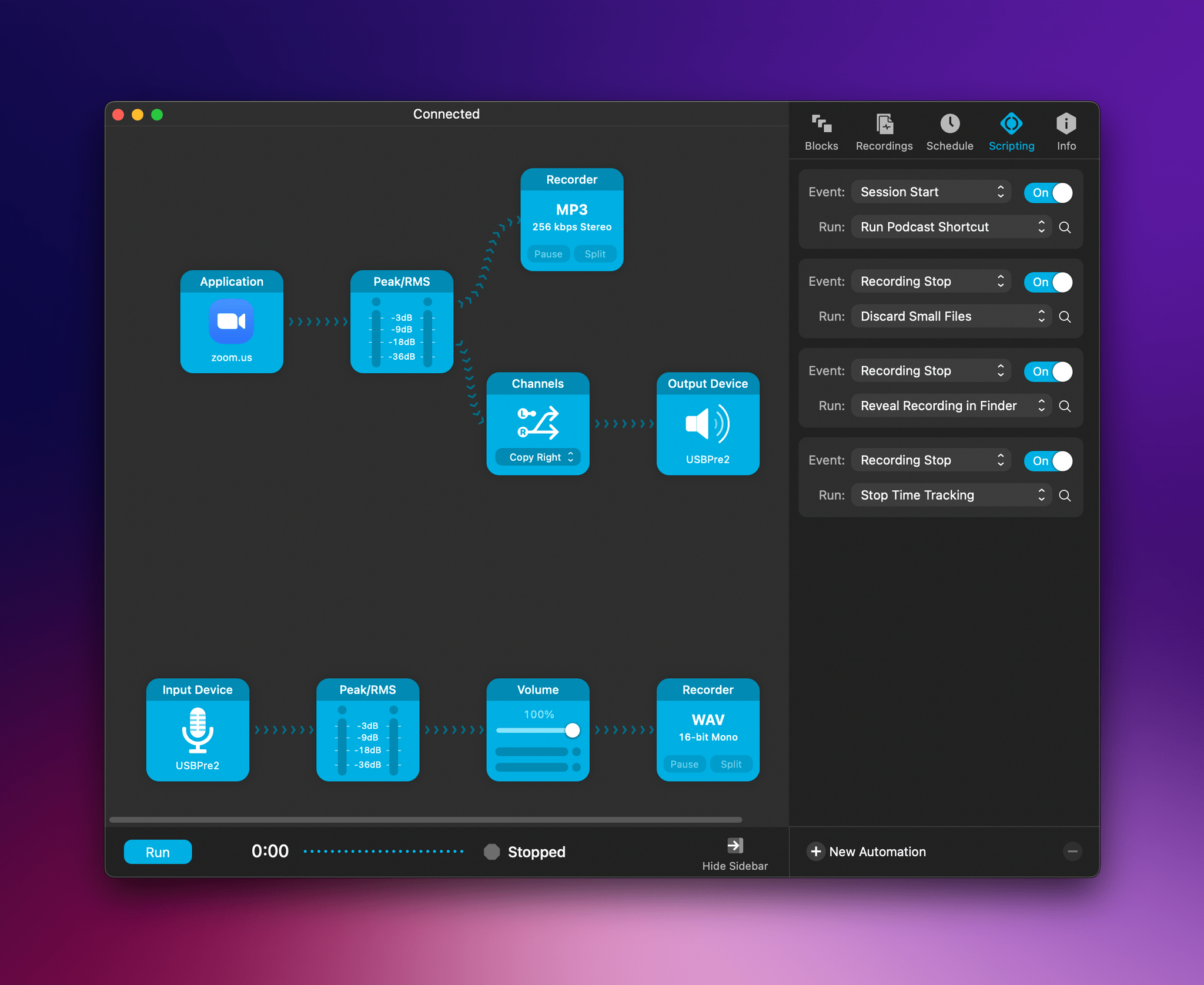
The second reason we’re picking Audio Hijack 4 in this category is its support for automation, which I detailed in an article on MacStories a few months back. With its brand new scripting library, integration with Shortcuts, and support for JavaScript-based automation, Audio Hijack 4 has allowed me to build what I always wanted: an automated system that starts the relevant timer for the podcast I’m recording in the time-tracking app Timery. What I built is just an example of the kind of automation Audio Hijack supports: whether you want to create a system that logs the time you’ve spent recording in a spreadsheet or that automatically names files a certain way and moves them to a specific folder, the app empowers you to do it with version 4.0. This feature alone has removed a whole series of manual steps I needed to follow before recording one of my shows, and it makes me happy every time I see the system working in the background, doing its thing.
I’ve been using Audio Hijack for several years, and with time it’s become one of those must-have utilities that I take for granted – in a good way – because it’s trusted, reliable, and I don’t have to worry about it. But it’s important to recognize when a Mac developer puts in the work for a major update to their app like Rogue Amoeba did, which is why Audio Hijack 4 is the MacStories Selects Best App Update of 2022.
Best App Update Runner-Up
Spring 4
Federico: It feels kind of sad to pick a third-party Twitter client as a runner-up in this category given how the platform’s new owner has successfully managed to turn it into a degraded hellscape worse than it ever was (quite an accomplishment from the guy who also promises to take humanity to Mars, if you believe him), but let’s ignore for a second what happened to Twitter the company and focus on the objective quality of Spring the client.
With version 4.0, indie developer Junyu Kuang was able to improve on the already solid foundation of Spring with incredible innovations such as asynchronous Safari View Controller (an in-app web browser that appears only once a webpage has finished loading in the background), a special split-screen mode on iPhone (so you can see two sections of the app at once), the ability to display edited tweets and edit history, and hover gestures to reveal inline actions that work perfectly with the iPad Pro’s new Apple Pencil Hover mode. It’s too bad that things with Twitter – at least for me – ended the way they did, but if Spring 4.0 is of any indication, I think Kuang’s upcoming work on Mona, a Mastodon client based on Spring, will speak for itself. Spring 4.0 was a beautiful swan song for third-party Twitter clients, but I can’t wait to see how Mona will rise from its ashes.
Best New Feature
Marvis Pro’s Customizable Sections

Federico: In the years I’ve been writing for MacStories, I’ve seen several types of app features come and go.
On Apple platforms, you obviously have a set of features that are “expected” to be part of an app’s experience. These are the widgets, sidebars, windows, and Split Views of our modern era – Apple’s new system features that are announced at WWDC and which developers rush to implement by September. Then you have your “promising trends” – novel ideas invented by a company that slowly but surely make their way into other apps, such as Command-K bars right now. Often, these features turn out to be fads (remember chatbots?); other times, they become established interaction paradigms that, eventually, platform owners copy and ship as new native features of an OS, and the cycle starts again.
What’s always been rare to find is the unique feature – that special something that no other app has. A few examples from over the years come to mind: Editorial’s automation for Markdown; Timery’s saved timers; Spring’s asynchronous Safari View Controller; Overcast’s smart speed; MusicSmart’s album metadata. These are the features we love to celebrate at MacStories, and a new one is joining this excellent group today: Marvis’ customizable sections.
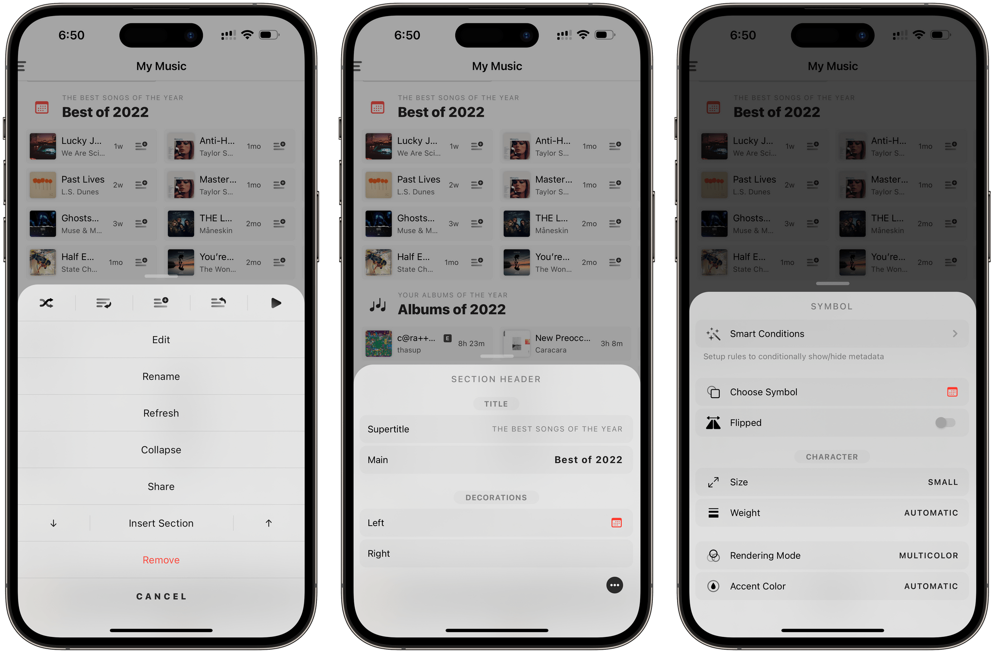
It’s no secret that we love Marvis at MacStories and that we love customization in the apps we use on a daily basis. We’ve seen examples of music players that allow you to create “smart playlists” before, but Marvis’ ability to create custom sections goes beyond the mere ability to display songs in a smart playlist powered by a set of filters. With Marvis, you can design sections that can display songs, albums, playlists, and artists from your library by mixing and matching dozens of filters, sorting options, metadata visualizations, and even UI elements such as SF Symbols, colors, and separators. The amount of freedom seen in this feature is unparalleled on Apple’s platforms and, I would wager, other operating systems as well.
When you create a custom section in Marvis, you can choose the source and, at a macro level, tweak its sorting options and layout modes. But the real power lies in the smart rules you can add (and stack together) to filter that source by any possible criteria you can think of. Date ranges? Check. Artist or album names? Check. Genre or composer name? Also check. The list of supported filters is, frankly, astounding, and it’s why Marvis does have a bit of a learning curve, especially for newcomers who may be used to the limitations of Apple’s Music app.
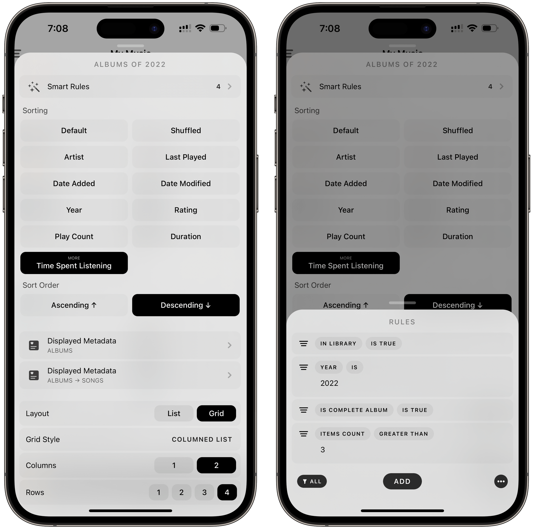
Your patience to play around with Marvis will be rewarded, however, with the freedom to effectively design the music player of your dreams. In my Marvis setup, I created sections for my recently played and recently added albums, my favorite and most played songs of 2022, albums of the year, albums I forgot about, and tracks recently added to a playlist I share with Silvia.
Earlier this year, the app gained another brand new option: the ability to programmatically display sections during the day based on certain conditions. So, I was able to create a section called Night Albums that is displayed at the top of Marvis but only between midnight and 6 AM, which has become an incredibly effective way to fall asleep to music I love when it’s bedtime. In addition, the app received a plethora of new controls for renaming sections and using SF Symbols (with different rendering modes) as icons next to a section’s title, which is also something I’ve spent way too much time tweaking this year (but I love my setup deeply now). Display of pieces of metadata for songs and albums has also been expanded, which means you can now pick and choose the information you want to see next to each item in each section you create in Marvis.
With these examples, I’ve barely scratched the surface of what you can achieve with custom sections in Marvis. Whether or not you listen to a lot of music on a daily basis, this feature deserves recognition because there’s nothing else like it on iOS and iPadOS. No other music player comes even remotely close to the flexibility and power that lies within Marvis’ customizable section engine, which is why we’re picking it as the Best New Feature of 2022.
Best New Feature Runner-Up
Timery’s Live Activities
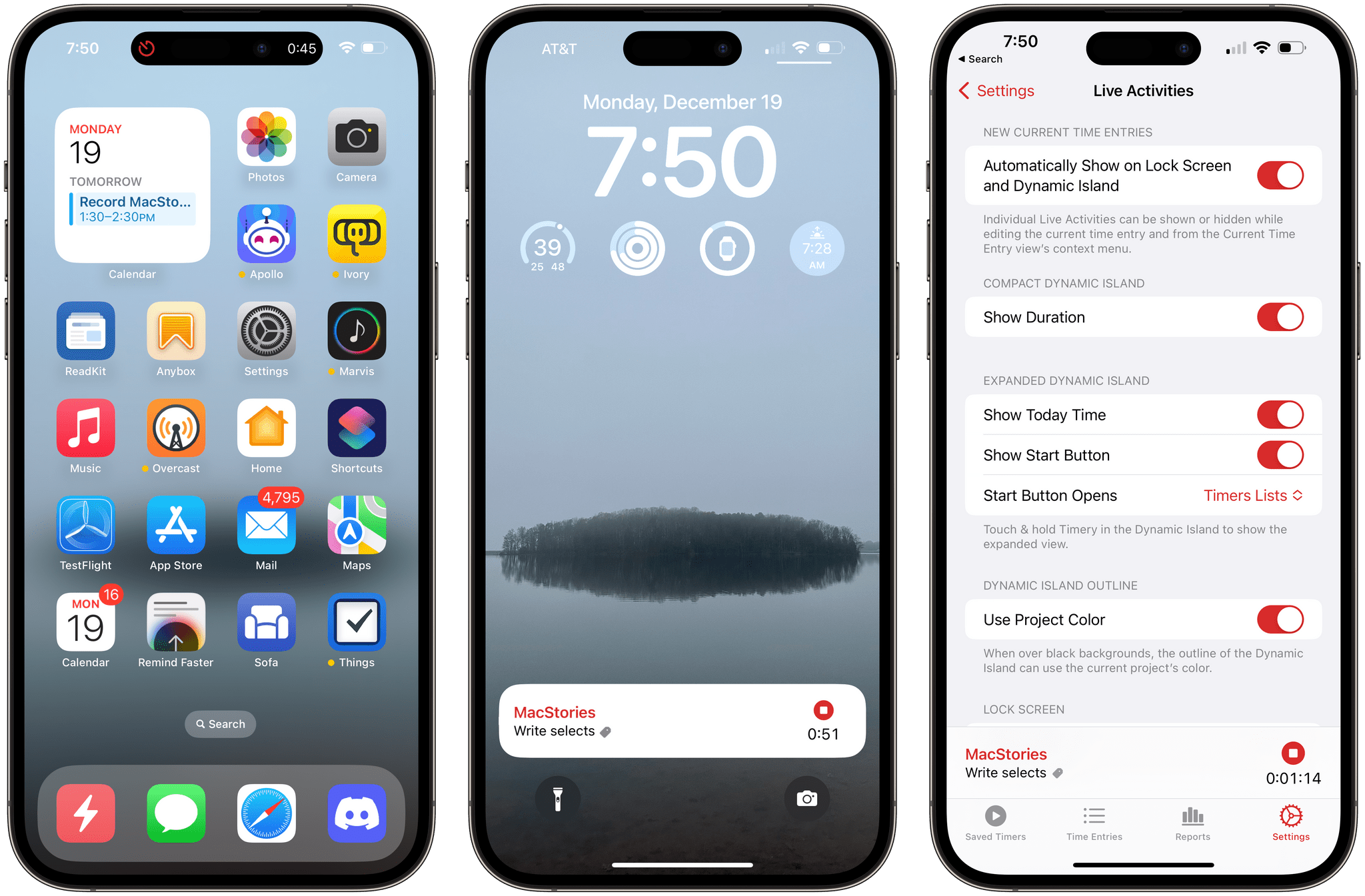
John: It’s not surprising that the release of iOS 16.1 brought with it a flood of Live Activity support. I’ve written a couple of stories about Live Activities and tried even more, but few have been as useful as Timery’s.
It never ceases to happen. I’ve started working on something and immediately forget if I’ve started a timer to track my time. I don’t like to keep my current time in my menu bar or floating above my other windows where I can see it all the time, but it can be even more disruptive to switch apps in the middle of writing.
Timery’s Live Activity has solved that dilemma. Instead of starting a timer on my Mac, I’ve gotten into the habit of using my iPhone. That way, I can put it down on my desk and let it enter sleep mode but still check my timer whenever I want. Because my iPhone is out of my direct line of sight and the distractions on my locked iPhone screen are minimal, this approach has worked really well.
The other aspect of what makes Timery’s Live Activity so good is its customizability. There are settings for the compact and expanded versions of Timery’s Dynamic Island interface, along with options to modify its appearance and what the Live Activity does when tapped. It’s a thoughtful, flexible approach that makes the feature work well for a broad spectrum of users.
Best Watch App
Timery

Alex: It’s no surprise that Timery is just as good a citizen on the Apple Watch as it is on iOS. Joe Hribar’s Toggl client is an excellent depiction of what an Apple Watch app should be. Its simple and straightforward interface opens to a view of your currently active timer, with options to stop it, edit it, or start another timer. If no timer is active, you’ll just see buttons to start another saved timer or create a custom timer.
The features above already cover the majority of the use cases that I would have for Timery on my Apple Watch, but there is plenty more to see as well. Timery for watchOS is made up of four different panel views. The aforementioned view is the default, but to its right is a quick-access list of your saved timers, and to its left is a reports view that shows your total daily or weekly progress. The final view on the far left side shows a list of your previous timer entries.
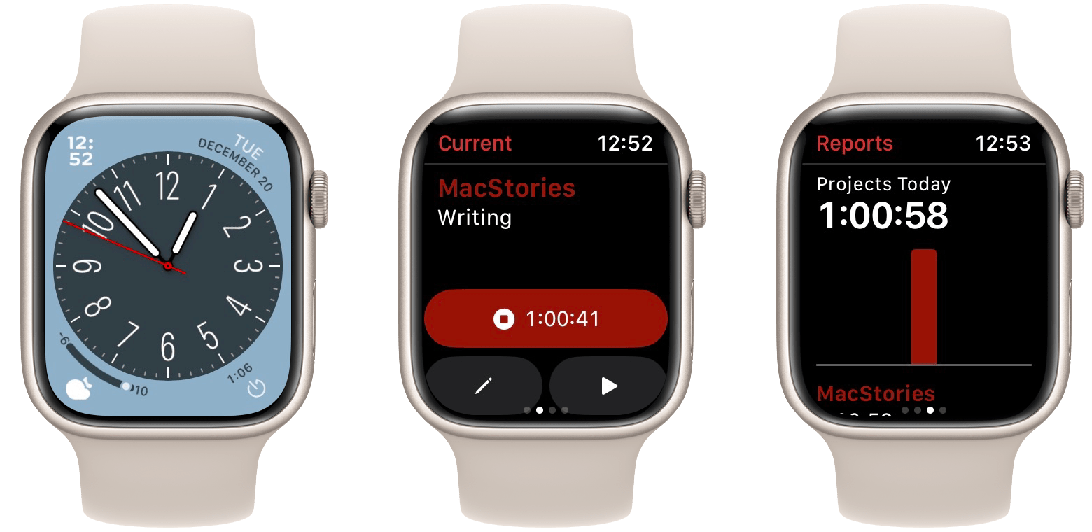
Taking all of these views into consideration, Timery for watchOS is almost as full-featured as Timery for iOS. This is an impressive achievement for an app that remains simple to use and avoids looking cluttered or overwhelming on the tiny Apple Watch screen. It truly feels like the ideal distillation of all of Timery’s features.
My personal favorite aspect of the Watch app, though, is the watch face complication. The app supports watchOS complications for displaying the time of the current timer, the total time clocked for the day, or the total time clocked for the week. You can scope the daily or weekly complication types to either a particular tag or a particular project. If you’re more interested in taking action than viewing data, you can also add complications for starting a custom timer or a saved timer.
Since my job is fully remote, I’ve found it easy for certain weeks to vary wildly between far too many or far too few hours of work. Over time, I’ve discovered that the best way to handle this is to track my work hours as closely as possible. This gives me an idea throughout the week of where I’m at, and as I get later into the week, that knowledge helps me decide whether to push harder to catch up or to lay off and take some time for myself.
Timery’s data widgets have been a great aid in maintaining awareness of my work state throughout each week. It helps me to never end up hitting Sunday and realizing that I need to do a full day of work to catch up; or on the other hand, working a full day Sunday and then realizing that I should have taken some time to myself to play videogames or otherwise relax and rejuvenate.
If you work from home or as a contractor, I highly recommend trying out this strategy and seeing if you can find similar benefits from having this excellent app live on your wrist. There is no better Apple Watch time tracker than Timery.
Best Mac App
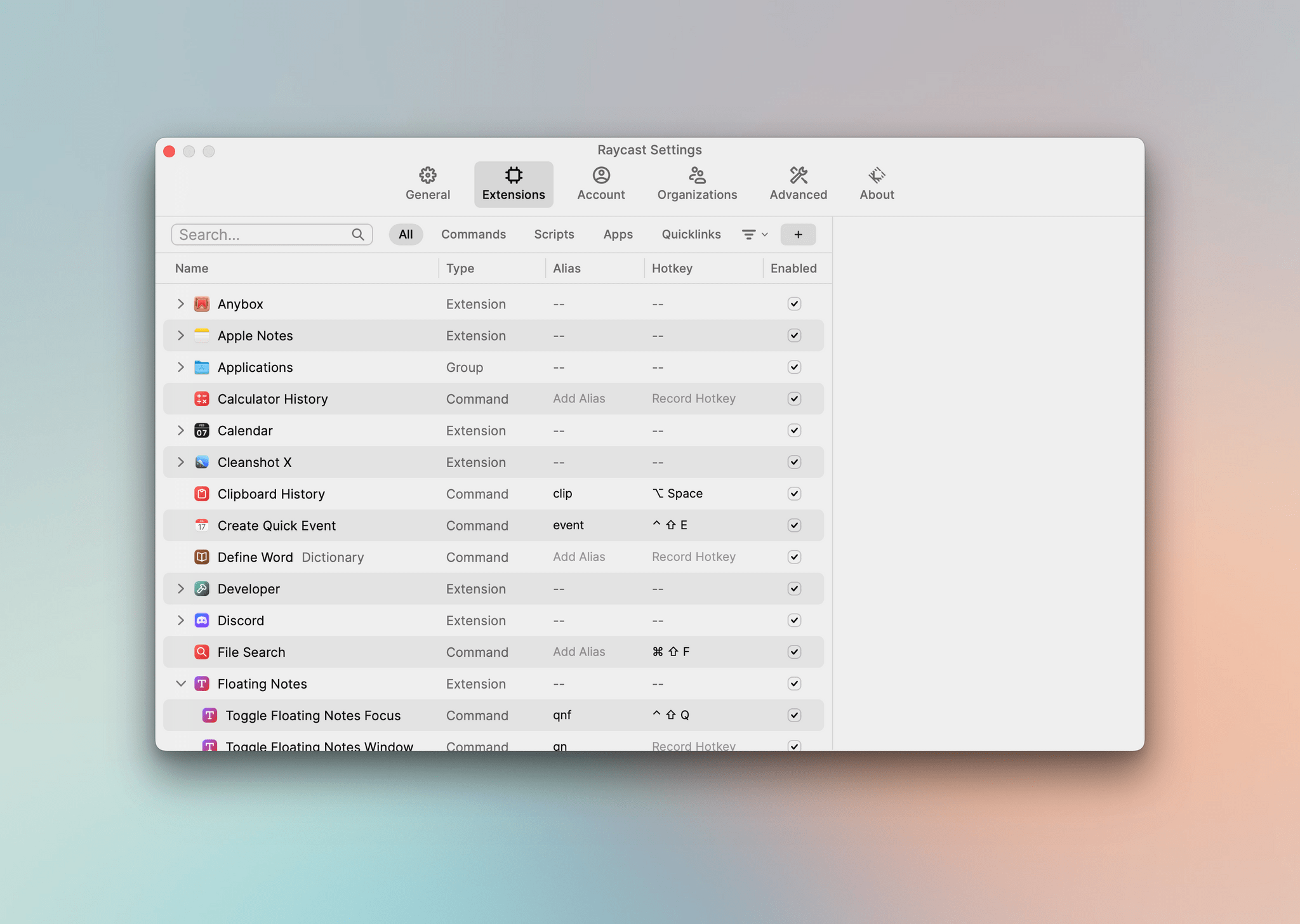
Raycast

John: More than two years ago now, Raycast sponsored our WWDC coverage. It was the early days for the app, and although I’d seen some buzz about it in the developer community, it was still unknown to most Mac users. Oh boy, has that changed.
Back in 2020, Raycast was a lot more limited in what it could do than it is today, but I could see the potential. Other Mac utilities that can launch apps and perform various actions from keyboard commands have been around for years. What Raycast brings to the table that’s different is a fresh take on how that interface should work combined with a community that has developed a vibrant ecosystem of extensions for the app.
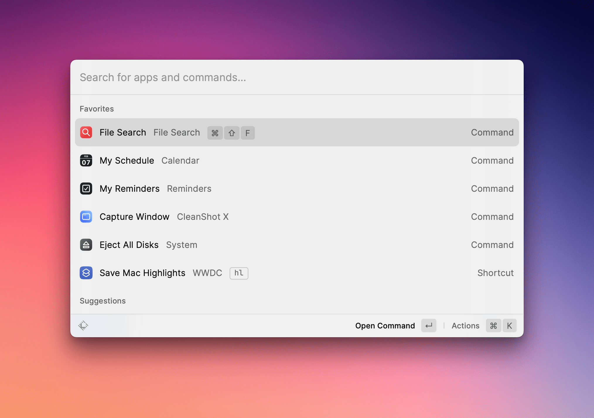
Raycast’s design is the smartest of any app like this that I’ve tried. Like other apps in its category, it’s triggered by a hotkey that displays a search field. From there, you can search for apps to launch and commands to trigger. However, Raycast also lets you set favorites that appear as a list beneath the app’s search field. The app reminds you in its status bar that typing ⌘K will display the actions for any app or command, too, which is a small thing, but a big help when you’re starting out with the app. Combine that with the fact that you can assign aliases for apps and commands that minimize the typing you need to do, and global hotkeys that bypass Raycast’s UI entirely, and what you have is an incredibly powerful tool that scales and meets its users at their experience levels, which I love.
The other big factor that makes Raycast our Best Mac App of 2022 is the community behind it. When I first tried Raycast, it had a handful of extensions built in-house by the Raycast team and a relatively short list of others that were primarily focused on developer tools. Today, there’s an extensive catalog of plugins made for a wide variety of apps and services.
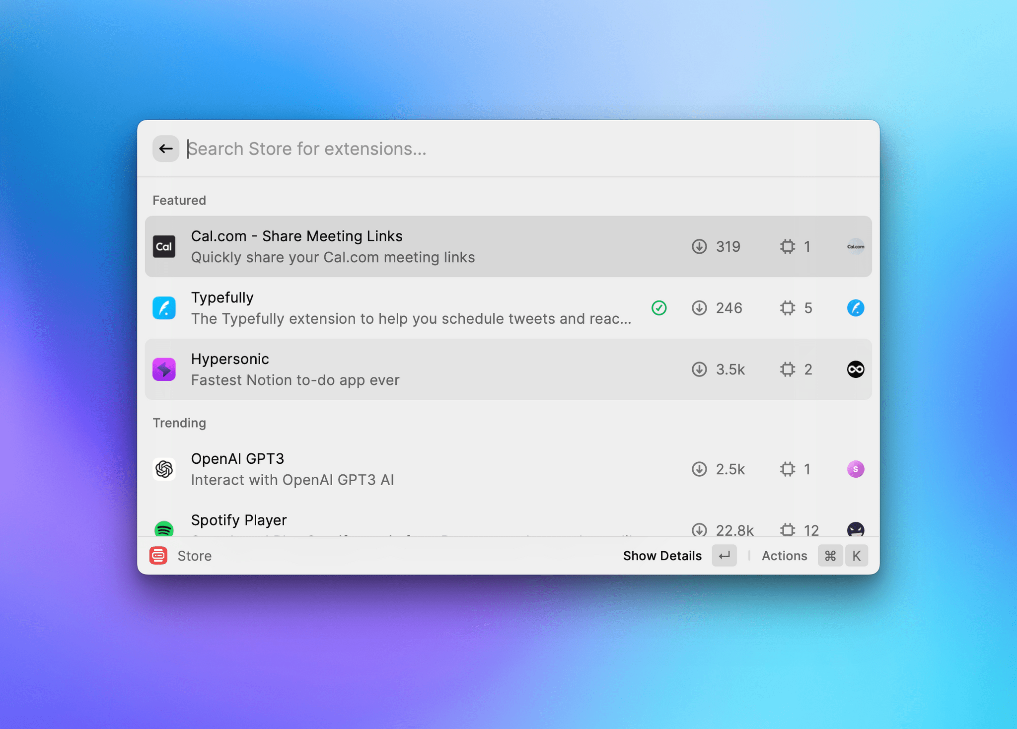
Raycast was smart to focus its attention on developers first. They’re a natural group of users for this kind of tool, and by building an API that allowed developers to build extensions, the same group that was Raycast’s early adopters became the builders who extended the app’s utility. Today, a long list of apps and web services is supported that have been created by the developers of those apps and services and their users. Better yet, those extensions can be browsed and installed from inside Raycast itself.
I’ve only just scratched the surface of what Raycast can do, which is constantly evolving thanks to regular updates from the Raycast team and new extensions created by its community. If you want to learn more, check out the story I wrote for my Macintosh Desktop Experience column earlier this year and, of course, Raycast’s website where you can download the app for free, learn more about it, and browse its catalog of extensions.
Best Mac App Runner-Up
Bike
Alex: In the era of Electron, Catalyst, and SwiftUI, true classic Mac apps are edging ever closer to becoming a lost art. This year though, Jesse Grosjean of Hog Bay Software is fighting that tide with Bike.
Bike is a simple outlining utility that feels more Mac-like than any brand new app that I’ve used in quite some time. Its menus, its preferences pane, and its interface are all perfect encapsulations of Mac software. It opens instantly, scrolls and resizes natively, and can handle enormous outline files with ease. This app does one thing, and it does it well.
Grosjean is the developer behind TaskPaper, and Bike’s text-obsessed approach to outlining will feel right at home for TaskPaper users. While the app’s menus have options for text manipulation, there’s little in them that can’t be done just by typing.
Bike outlines are made up of a series of collapsible lists. Each time you indent an item, it becomes a child of the item above. Collapsing the above item by clicking the drop-down arrow next to it will hide all of its children. Using this simple formula, you can create fairly complex and information-dense outlines for all sorts of use cases.
I’ve been using Bike quite a bit since it came out earlier this year, and it’s been a joy each time. While its simplicity definitely limits it to only certain workflows in my life, I still love to use it whenever I can. I’ve found its outlines to be consistently useful and easy to consult when I come back to them after some time.
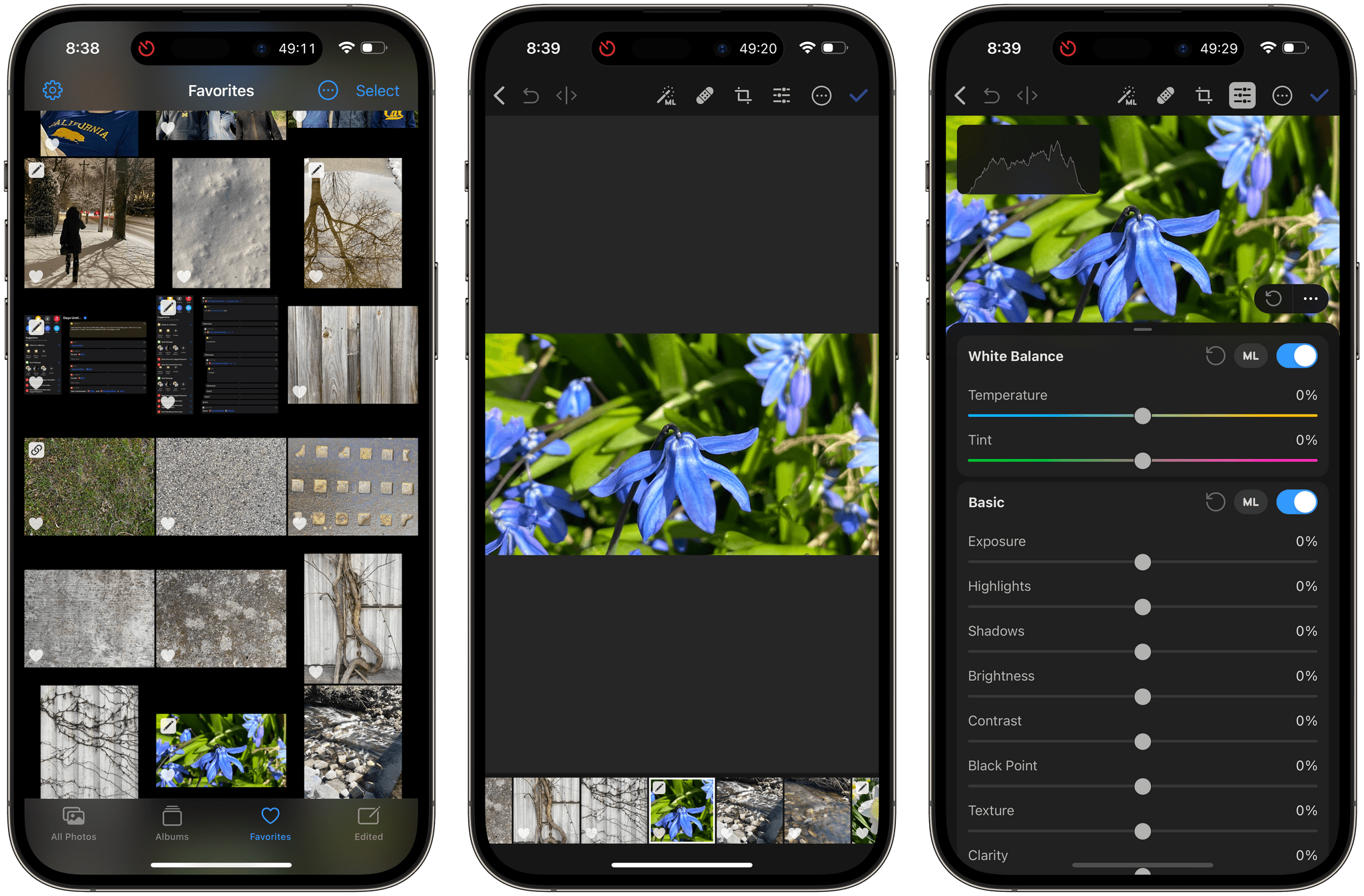
Best Design
Pixelmator Photo

John: Pixelmator Photo was the first app I wrote about after we announced last year’s MacStories Selects awards, and as it turns out, it’s this year’s pick for Best Design.
Photo editing apps are tricky to design, especially on the iPhone. Developers have to fit in a photo browser and a myriad of editing tools, all while maintaining a focus on the photo being edited. That’s a lot, but Pixelmator Photo pulls it off exceptionally well.
The app is currently available on the iPhone and iPad, with a Mac version that’s in the works. Both the iPhone and iPad versions of the app are excellent, but it’s the iPhone where the design is the most impressive, given the constraints of the device’s screen size.
Too many photo editors don’t pay enough attention to the iPhone version of their apps. It’s understandable why. The iPad’s larger screen makes it better for editing images in every way. The trouble is that the iPhone is more portable, has a superior built-in camera, and is the device where most photo sharing happens. So, while the iPhone might be the worst screen for photo editing, I’d argue that it’s paradoxically also the most important.
On the iPhone, Pixelmator Photo starts with its photo browser with a tab bar that lets you choose among All Photos, Albums, Favorites, and Edited images. Picking an image replaces the browser’s thumbnails with the full image, with a horizontal thumbnail strip along the bottom of the screen for moving back and forth among your pictures.
At the top of the screen are common tools like the app’s machine learning-based image enhancement feature, healing tool, cropping mode, and editing controls. With the exception of the photo enhancement button, which is applied immediately, the other tools are modal, each opening a related set of controls along the bottom of the iPhone’s screen. A three-dot ‘More’ button houses the app’s remaining features. There’s a tremendous amount of functionality packed into Pixelmator Photo’s iPhone app, but it works, making it easy to quickly edit and share a photo without resorting to the iPad version or a Mac app.
The iPad version of the app takes a similar approach but makes excellent use of the added space. The toolbar at the top of the app is anchored by the same familiar set of tools found on the iPhone, with the addition of a button for using Pixelmator Photo’s ML Super Resolution feature to increase an image’s size. Many controls remain in the same position at the bottom of the screen, like on the iPhone, but the detailed color and lighting controls move to the side of the screen on the iPad, greatly increasing the number of sliders and toggles that can be displayed at once.
Pixelmator Photo is a fantastic example of functional design that manages to provide its users with a sophisticated set of tools that makes the most of each of the platforms where it’s available.
Best Design Runner-Up
CARROT Weather
Federico: Despite Apple’s efforts in recent years to push developers toward rethinking their iPad apps with a focus on desktop-class design and features, still too few take the time to truly consider the iPadOS platform and how it differs from iOS and iPadOS. Brian Mueller, the creator of CARROT Weather, has been the exception this year.
With version 5.8 of his powerful, customizable, and malevolent weather app, Mueller completely rethought CARROT’s design on iPad by shipping a multi-column layout that takes better advantage of the iPad’s display at any size or multitasking configuration. But that’s not all: any layout in the updated CARROT Weather app can be turned into a 3-column version; each column can be comprised of how many modules you want for data points and visualizations such as temperature, precipitation chance, and more; and each module can be customized in terms of data and appearance to fit your needs and tastes.
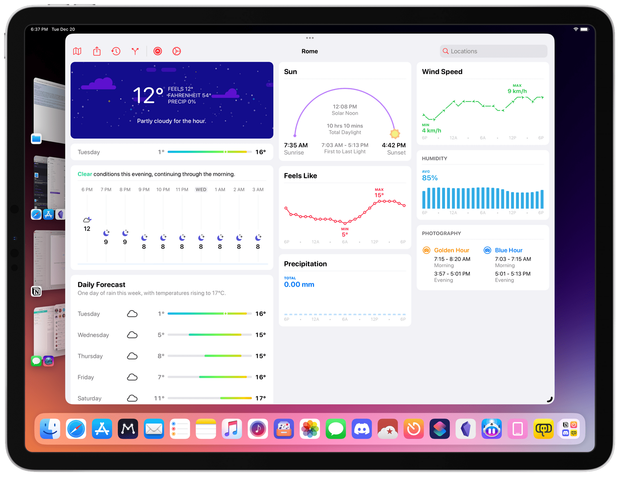
There’s effectively infinite customization in CARROT Weather now, and if you’re an iPad user, it’s even better since you can get more out of CARROT on the larger screen. I wish more iPad app developers would take a page from Mueller’s work on CARROT Weather for iPad this year, which is why the app deserves a mention in this category.
Reader’s Choice Award
CARROT Weather

Alex: This year’s Reader’s Choice award was the closest competition we’ve ever had. As Federico, John, and I watched the results flow in, there were multiple times when we were genuinely unsure who would win. In the end, out of a crowded field of fantastic apps, a perennial favorite emerged victorious: CARROT Weather.
Weather is a crowded category on the App Store. There are countless apps to choose from, each with its own particular angle on displaying essentially the same data. Many of these apps are pretty great, including Apple’s built-in weather app. I’ve probably tried dozens of them over the years, but the only one I keep coming back to time and time again is CARROT Weather.
This isn’t the first time you’ve read about CARROT on MacStories, and it won’t be the last. The reason we keep writing about it is likely the same code reason that our readers selected it for this award: CARROT Weather never stands still.
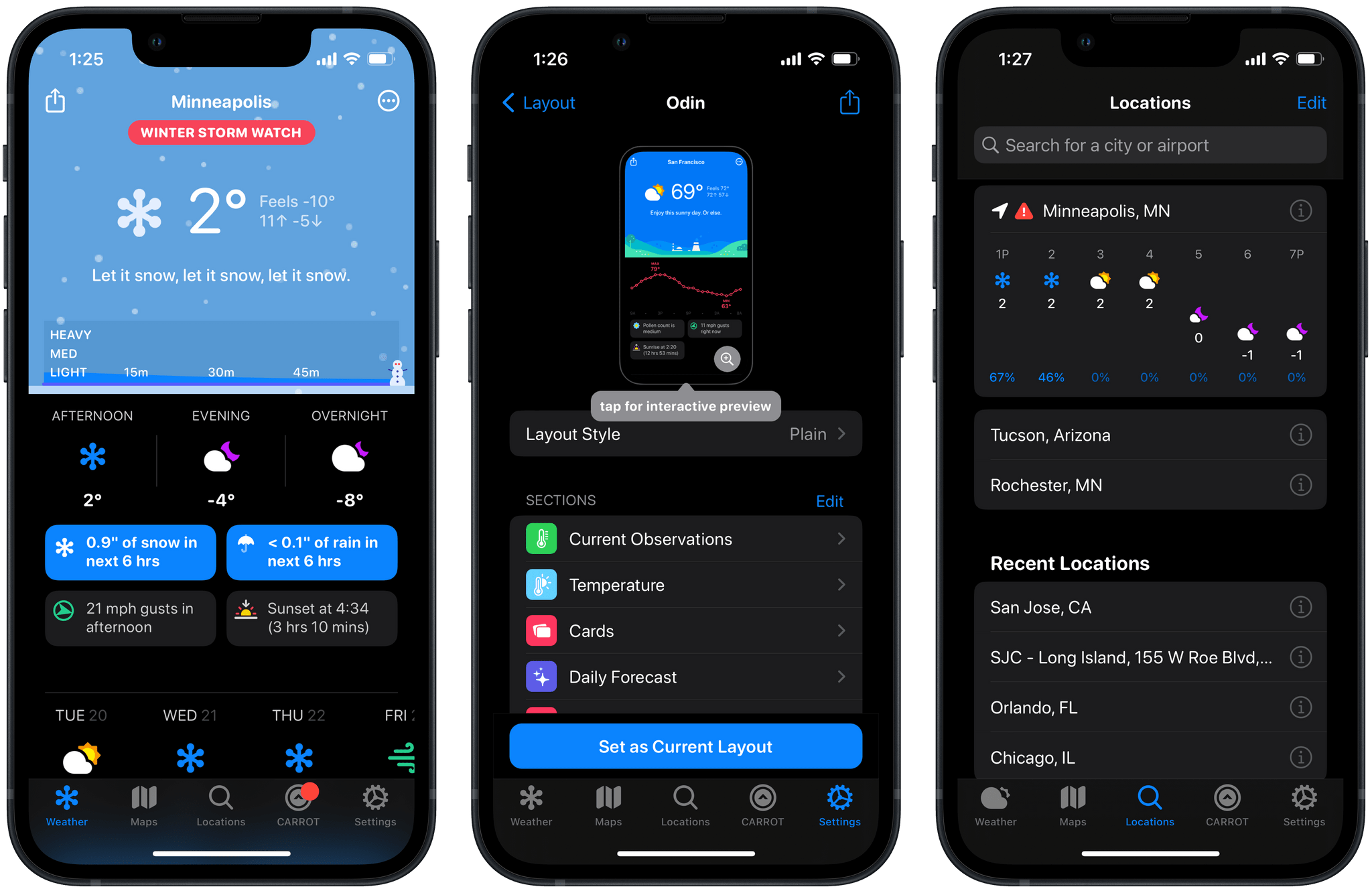
CARROT’s developer Brian Mueller consistently keeps up with the latest and greatest features of iOS, iPadOS, and watchOS. On top of this steady stream of system features, he also finds time to build out advanced customization interfaces, nice widgets, watchOS complications, and even an entire “evil AI” persona for the app’s mascot. CARROT is polished from top to bottom and can be adjusted to fit the weather app needs of nearly any user. Its data sources are hyper-local and have always been consistently accurate for me.
The interface design playground that Mueller built within CARROT is intuitive and functional. It enables a tremendous amount of customization to make sure that you only need to see the data you care about. Dynamic elements, which are only displayed when certain conditions are met, make this even more powerful. Few people would be unable to tailor the app to their needs or preferences.
While CARROT’s impressive new iPad interface won it the runner-up slot for Best Design this year, it was its unique and lasting place in the lives of so many MacStories readers that led it to the much-deserved win here.
App of the Year
Marvis Pro

Federico: Every year when it comes to picking the ‘App of the Year’ for MacStories Selects, there are always a few criteria we consider as a team. Is the app well-designed and a “good platform citizen”, adopting the latest technologies Apple makes available to developers? Is it unique in its category? Did it evolve substantially through the course of the year? Is it better than the competition? And most importantly: do we love using it, and did it have a significant impact on the way we use our devices over the past 12 months?
Rarely have the all the answers to these questions been such a resounding list of “Yeses” as has been the case for Marvis Pro in 2022.
Created by indie developer Aditya Rajveer, Marvis is a powerful third-party client for Apple Music (and your local music library) that has fundamentally changed our relationship with music on Apple platforms. Marvis has been around for a few years at this point, but we feel like the app made great strides in 2022 by truly embracing the feature that sets it apart from everything else (the custom sections I covered above) while also adopting brand new features such as Dynamic Island integration, Lock Screen widgets, and visual customization powered by SF Symbols.
We’ve covered the ability to create custom sections in Marvis extensively on MacStories and AppStories this year, including in this very article, so I don’t want to go over the details of that (amazing) functionality again. So let’s focus on the other aspects that make Marvis an astounding music player. For starters, earlier this year Marvis added the ability to let you design custom headers for sections by choosing from a collection of SF Symbols. When you rename a section, you can add a ‘supertitle’ displayed above the title and choose a decoration, which can be an SF Symbol of your choice. For symbols, Marvis effectively gives you developer-like controls for options such as rendering mode, size, weight, color, and more. It’s an incredibly deep set of features for what is, well, an icon next to the name of a section. Which is the perfect metaphor for what you can expect from Marvis.
As I shared a while back, I’m one of those people who recently rediscovered the joy of scrobbling every song I listen to on any of my devices to Last.fm. (I blame Jason Tate for turning me onto this.) With Marvis, I don’t have to set up any complicated rules or integrations to make this happen: the app natively supports scrobbling tracks to Last.fm, so whenever I listen to a song on Apple Music, it also gets mirrored to my Last.fm account for posterity. Even better: since Marvis uses Apple’s Music app as its player, if I start playback from Siri or the Music app without going through Marvis first, the app will still pick up my listen activity in the background or later, and push the tracks I played to Last.fm.
Another brand new addition to Marvis this year has been its integration with Live Activities and the Dynamic Island in iOS 16. Marvis supports two types of activities so far: a Now Playing widget, and a preview of the song that’s coming up next in your queue. While the Now Playing activity isn’t particularly useful if you’re using Music as the system player (since you have Apple’s superior, interactive Live Activity already), the Up Next activity is a great way to keep an eye on what’s next in your queue without having to open Marvis. This activity is, of course, customizable: you can choose which pieces of metadata should be displayed in it, and you have full control over its data sources and appearance in Marvis’ built-in design tool. Apple didn’t come up with an Up Next Live Activity themselves, but it doesn’t matter if you’re using Marvis.
You see, the reason we love Marvis is that it feels impossible that one person alone made it. There are music players made by entire teams of designers and developers at bigger companies that don’t look half as polished as Marvis and merely have a third of its features. And yet that’s exactly what Marvis creator Aditya Rajveer accomplished: building the definitive player for music lovers on iPhone and iPad.
Ultimately, the reason Marvis is the App of the Year for the 2022 edition of MacStories Selects is an intangible one. Marvis makes us want to listen to music more and helps us enjoy our favorite albums and playlists more. The experience of using Marvis is greater than the sum of its parts. We may try to consider all the criteria we want, but when an app makes us feel this way – consistently over time and increasingly so after each update – we know it’s a gem. Marvis is that kind of app.
App of the Year Runners-Up
MusicBox and Raycast
John: Innovative takes on problems that rethink what is possible with an app through compelling design, mashups of new and existing technologies, and by giving users the tools to take apps in unexpected, new directions are at the heart of what we look for in an app of the year.
MusicBox, which we picked as Best New App of 2022, is a perfect example. As I wrote above, MusicBox is conceptually simple at its core. The app saves links to Apple Music and Spotify content along with an extensive collection of metadata, so users can listen to what they saved later. What sets it apart, though, is how that simple concept is implemented. By giving users access to that metadata via saved searches and shortcuts, MusicBox opens the door wide, allowing its users to make the app their own and build use cases for it that its developer probably never anticipated. It’s also a flexible approach that scales nicely from simple uses to complex systems.
Raycast is a very different app from MusicBox but has a lot in common with it. Although Raycast can do a lot more, touching every app and file on your Mac in some way, the core idea is just as simple. Raycast starts with a search field and a window with a limited number of user-picked favorite commands. What makes that search field so powerful is the ability to open apps, execute commands and apply actions with a few keystrokes. That simplicity is reinforced by Raycast’s use of aliases and global hotkeys that further reduces the complexity of the app through user-defined customization. Add to that Raycast’s extensibility by third parties, and you’ve got a similar flexibility to MusicBox that puts Raycast’s users in the driver’s seat of an app that can be used simply to launch apps or as part of a much more complex workflow, which I love.