This Week's Sponsor:

Kolide

Ensures that if a device isn’t secure it can’t access your apps.  It’s Device Trust for Okta.


Search results for "todoist"

MacStories Starter Pack: Customizing Your Workflows with Deep Links

Editor’s Note: Customizing Your Workflows with Deep Links is part of the MacStories Starter Pack, a collection of ready-to-use shortcuts, apps, workflows, and more that we’ve created to help you get the most out of your Mac, iPhone, and iPad.

In my story yesterday, I covered how I manage links to content I come across every day. Today’s story is also about linking, but it’s not about collecting and processing the content you stumble across. Instead, it’s about creating links between the apps you use to tie your projects and the content related to them together in a cohesive way.

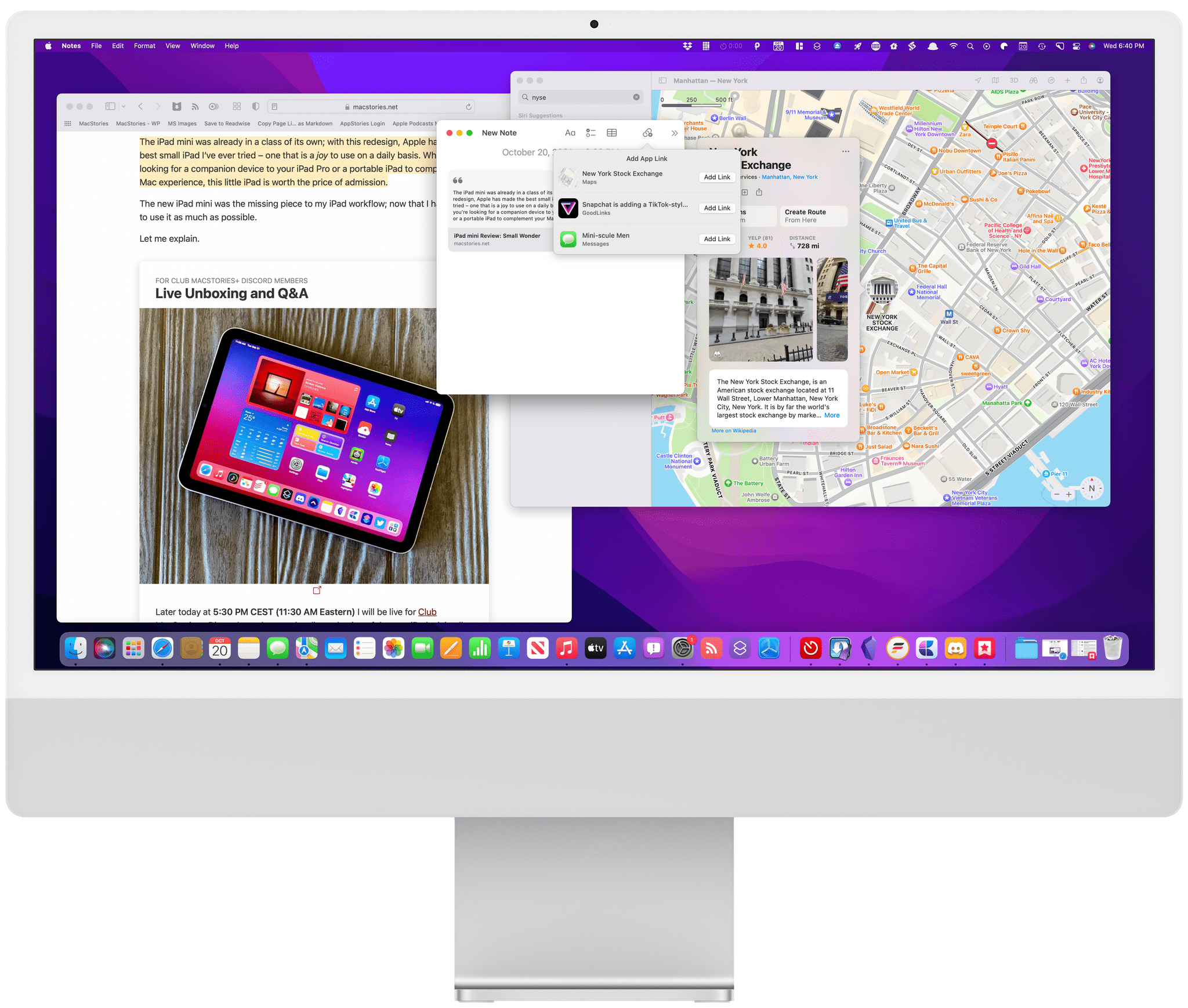
Deep linking between apps isn’t new, but it has seen a resurgence of interest. Part of that seems to be a natural extension of the popularity of internal linking systems in note-taking apps, but it’s also thanks to apps like Hook, the entire purpose of which is to help users link the content inside their apps together more easily.

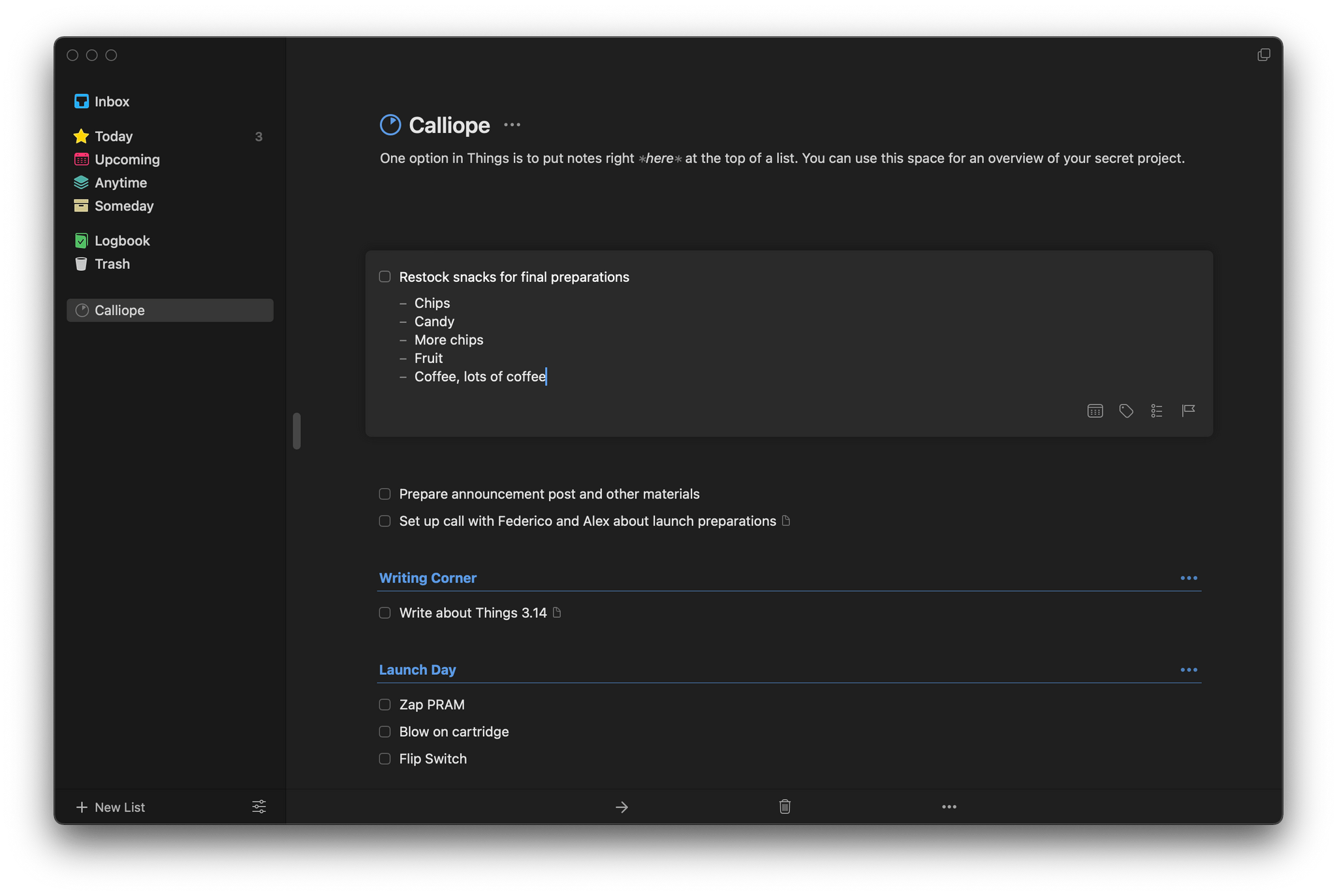
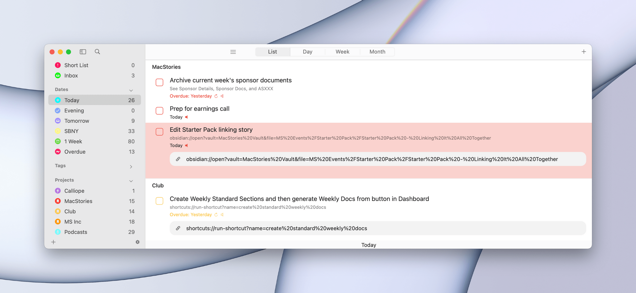
When you step back and think about productivity apps, most involve some sort of list. You’ve got lists of messages in your email client, events in your calendar, documents in your text editor, and so on. Those lists, which serve as inboxes for an app’s content, are a double-edged sword. On the one hand, having everything consolidated and organized into lists is valuable. That’s true of the kinds of links I wrote about yesterday, but even more so for things like upcoming appointments and tasks. Apps like calendars and task managers exist because there are better solutions than a pile of scribbled notes to yourself.

It's easy to get lost in a long task list when you should only be focused on the task at hand.

It’s easy to get lost in a long task list when you should only be focused on the task at hand.

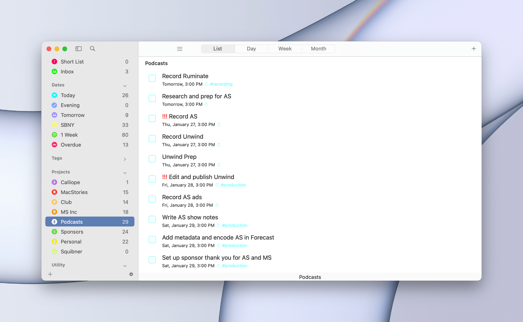
On the other hand, though, any list has the power to distract you the moment you open it. You go looking for one thing but end up browsing everything or following up on something else. Before you know it, you barely remember why you opened the app in the first place. For me, the trick to staying on task when I open any app full of distractions is to find a way to go straight to what I need, bypassing the distractions entirely with the help of a deep link.

Linking to Gmail in Mimestream.

Linking to Gmail in Mimestream.

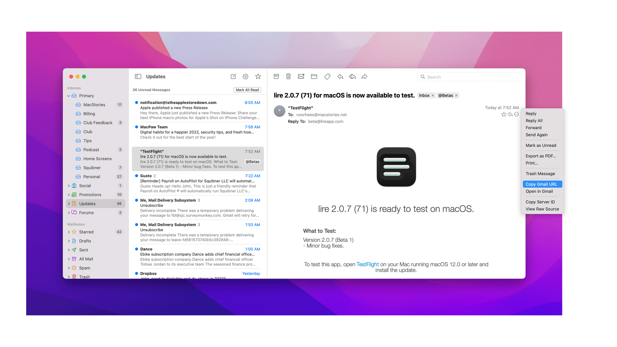
Email is one of the best examples of this sort of setup. As I explained in my story about my email setup on Monday, getting information out of whatever email client I’m using and into Obsidian where I can integrate it with my own notes helps keep my inbox under control. When I pull text out of an email message and paste it into my notes, I do my best to get everything I need. However, when there’s a back and forth conversation about a topic, it can be valuable to go back and see the entire context of the conversation, which I can do by linking to the original message thread.

Read more


MacStories Selects 2021: Recognizing the Best Apps of the Year

John: The MacStories Selects Awards are our annual celebration of the apps we love and the people who make them. Every year, the MacStories team uses hundreds of apps. Some are familiar favorites, but most are new. So, after many months of testing those developers’ apps, we stop to recognize the best.

This year, as we headed into the final stretch of the year, we decided it was time for the MacStories Selects to honor more than just the apps from the past year. MacStories has been covering apps since Federico published his first story in 2009, and having covered thousands of apps spanning more than twelve years, it’s time to look back at all of those apps and honor the standouts that have withstood the test of time with an annual Lifetime Achievement Award, which you can read about more in a special story that includes a bit of history about the winning app and interview with its developer.

Apps have become part of the fabric of our daily lives, which makes it easy to forget that they’re the result of hard work by creative people. The MacStories Selects awards are our chance to pause and appreciate just how fortunate we are to have such a wealth of fantastic tools available from so many talented developers before we start the new year.

2021 has been an exciting year for apps. The resurgence of note-taking apps ignited by apps like Craft, Obsidian, and Roam Research continued unabated. We also saw new apps successfully remix technologies and approaches and apply them to new domains, and of course, automation continued to be a central theme, with a long list of established and new apps testing the waters of Shortcuts for Mac for the first time.

As a result, we had a wealth of apps to choose from as always for the following awards:

  • Best New App
  • Best App Update
  • Best New Feature
  • Best Watch App
  • Best Mac App
  • Best Design
  • App of the Year

Along with the Lifetime Achievement Award and Readers’ Choice Award, which was chosen by Club MacStories members, that makes a total of nine award winners plus seven runners-up for these fourth annual MacStories Selects Awards, which began in 2018. As we did last year, we have also created beautiful physical awards commemorating the winners, which we will be sent to each of the winners this week.

We also recorded a special episode of our podcast AppStories all about the MacStories Selects winners and runners-up. It’s a terrific way to learn more about this year’s apps.

You can listen to the episode below.

0:00
59:20

We will hold our Monthly Town Hall live event with additional MacStories Selects coverage in our Discord community for Club MacStories+ and Club Premier members tomorrow, December 14, 2021, at 12:30 PM Eastern US time and release it later as a Town Hall podcast episode for those who can’t join live.

So, with those preliminaries out of the way, it’s my pleasure to introduce the 2021 MacStories Selects Awards to the MacStories community.

Read more


macOS Monterey: The MacStories Review

OSes are never truly finished. macOS has been continuously evolving for decades, and it would be foolhardy to declare it ‘finished’ in any sense of the word. It’s not.

However, when you step back and look at macOS over time, trends and storylines emerge from the feature list minutiae of each release. For the past few years, no narrative thread has been more important to the Mac and its operating system than their realignment within Apple’s product lineup. It’s a fundamental transformation of both hardware and software that has taken shape over years, beginning publicly with Craig Federighi’s WWDC Sneak Peek in 2018.

The story begins with a Sneak Peek at the end of a WWDC keynote in 2018.

The story begins with a Sneak Peek at the end of a WWDC keynote in 2018.

A parallel story has been playing out with the iPad’s hardware and OS. The iPad’s trajectory has been different than the Mac’s, but today, we find ourselves with two distinct but more closely aligned platforms than ever before. To get there, the iPad has grown into a powerful, modular computer, while the latest Macs now run on the same processor architecture as the iPad Pro and no longer work differently in places just because that’s the way it’s always been.

The journey hasn’t always been easy, especially in the wake of questions about Apple’s commitment to the Mac. The company took those concerns head-on in an unusual meeting with a handful of tech writers in 2017. Still, it was only natural for users to question whether the direction macOS was heading was the correct one.

It didn’t help that those first Catalyst apps that were part of the 2018 Sneak Peek – Home, News, Stocks, and Voice Memos – were rough around the edges and a departure from long-held beliefs about what constitutes a great Mac app. The Mac’s apps had historically been held out as a shining example of the kind of user experiences and designs to which developers who cared about their apps could aspire. Unfortunately, many early Mac Catalyst apps weren’t very inspiring.

The realignment has been rocky for iPad users, too, especially for iPad Pro uses. The Pro’s hardware has been infrequently updated, and the performance of the Apple silicon processors they’ve run on has outpaced what the apps on the platform can do.

Users’ fears have also been fueled by Apple’s institutional secrecy and the multi-year scope of the company’s undertaking. Early communications about Mac Catalyst and SwiftUI left developers and observers confused about the role of each. The situation is more clear today, but at the same time, the question of how to approach building a Mac app is best answered with ‘it depends.’ That isn’t a very satisfying answer. Nor does it help that despite the added clarity, technologies like SwiftUI still have a long way to go to reach their full potential.

Catalina was full of promise, but the road ahead was unclear.

Catalina was full of promise, but the road ahead was unclear.

Yet despite the bumps along the road, macOS has made great strides since that 2018 Sneak Peek. With Catalina, we saw the first steps down a path that pointed the Mac in a new direction. Although sometimes messy, the promise of Catalina was exciting because, as I concluded in that review:

There’s no greater threat to the Mac than resistance to change that exists not because the change is worse, but because it’s different.

Catalina was a counter-strike against the sort of inertia that would have doomed macOS eventually, even though at the time, it was more a promise than a destination.

Big Sur's design changes brought the direction of macOS into sharper focus.

Big Sur’s design changes brought the direction of macOS into sharper focus.

Big Sur picked up where Catalina left off, adjusting course and clarifying where macOS was heading. The update continued the harmonization of user experiences across Apple’s entire lineup, creating a more natural continuum among the company’s products through new design language and updated system apps without abandoning what makes the Mac unique. I don’t mean to suggest that Catalina or Big Sur were unmitigated successes. They weren’t, and some of the missteps of those releases have yet to be addressed, but there was no mistaking where macOS was headed after the release of Big Sur.

Monterey harmonizes system app updates across all of Apple's platforms.

Monterey harmonizes system app updates across all of Apple’s platforms.

Monterey’s focus is all about system apps, a topic near and dear to me. With the technical building blocks in place and a refined design out of the way, Monterey is one of the most tangible, user-facing payoffs of the past three years of transition. More than ever before, Apple is advancing system apps across all of its platforms at the same time. Finally, everything is everywhere.

However, as much as it pleases me to see the groundwork laid in years past pay dividends in the form of new features being rolled out simultaneously on all platforms, Monterey’s payoff isn’t an unqualified success. Every OS release has its rough spots, but this year, Shortcuts is especially rough. As optimistic and excited as I remain for Shortcuts to be the future of automation on the Mac, it’s too frustrating to use at launch. That’s not to say I haven’t enjoyed any upside using Shortcuts on my Mac, and it has improved over the course of the beta period, but it still gets in my way more often than it should.

Alright, that’s enough looking back. Let’s dig in and see where things work, where they don’t, and what lies ahead when you install macOS Monterey.

Read more


Safari Extensions for iOS and iPadOS 15: A Roundup of Our Favorites

With the introduction of iOS and iPadOS 15, Apple has created an entirely new class of utility app on the App Store: Safari web extensions. Mac users have enjoyed extensions for years. However, for iPhone and iPad users, they’re brand new and promise to make Safari more useful than ever by opening up new power-user functionality that extends Safari in ways that Apple hasn’t. Judging from the initial crop of extensions available, I think Safari users are going to be very happy.

Managing extensions from Settings (left) and Safari (right).

Managing extensions from Settings (left) and Safari (right).

There are a couple of ways to install Safari extensions for iOS and iPadOS 15. First, you can go to the Settings app, select Safari, and inside the Extensions section, turn on any extensions you’ve installed and give them permission to interact with webpages. Second, you can enable or disable extensions by tapping on the puzzle piece icon in the address bar and then choosing ‘Manage Extensions.’ The same popover that appears when you tap the puzzle piece icon also lets you ‘Edit Actions,’ picking favorite extensions that will appear at the top of your extensions list in whatever order you drag them into, similar to the way picking favorite share and action extensions and rearranging them works.

Okay, let’s dig into some of the best extensions already available.

Read more


MacStories Unwind: iOS and iPadOS 15, the iPad Mini, and iPhone Camera Reviews

0:00
20:04


Sponsored by: DetailsPro – A Design Tool Made for SwiftUI

This week on MacStories Unwind:

MacStories

Club MacStories

  • MacStories Weekly
    • Coming Saturday:
      • The ‘Making Of’ Federico’s iOS and iPadOS 15 review
      • Two Club-only advanced shortcuts
      • Lots of app coverage

AppStories

Unwind


iOS and iPadOS 15 Review Extras: eBooks, Shortcuts, Making Of, Obsidian Plugins, Safari Extension Beta, and AppStories Live

Today, Federico published his iOS and iPadOS 15 review. The review has become the centerpiece of what is always a busy fall season at MacStories. It has also become a tradition that we release a wide variety of perks exclusively for Club MacStories members alongside Federico’s review.

Read more


iOS and iPadOS 15: The MacStories Review

A quieter release for even stranger times.

In my career as an iOS reviewer, I don’t think I’ve ever seen a response as universally positive and enthusiastic as the general public’s reception of iOS 14 last year. From the “Home Screen aesthetic” popularized by TikTokers to the incredible success of widgets and the resurgence of custom icons, few iOS updates managed to capture the cultural zeitgeist as globally and rapidly as iOS 14 did. The update broke out of the tech community and, perhaps for the first time in decades, made UI personalization a mainstream, easily attainable hobby. For once, we didn’t have to convince our friends and family to update to a major new version of the iPhone’s operating system. They just did it themselves.

The numbers don’t lie: five weeks after its release, iOS 14 was already set to surpass iOS 13’s adoption rate; in April 2021, seven months after launch, over 90% of compatible devices were running iOS 14. Which begs the obvious question: if you’re Apple, you’re planning to follow up on what made iOS 14 successful with even more of it, right?

Well, not quite.

With the world coming to a halt due to the pandemic in early 2020, Apple could have easily seized the opportunity to slow down its pace of software updates, regroup, and reassess the state of its platforms without any major changes in functionality. But, as we found out last year, that’s not how the company operates or draws its product roadmaps in advance. In the last year alone, Apple introduced a substantial macOS redesign, pointer support on iPad, and drastic changes to the iOS Home Screen despite the pandemic, executing on decisions that were likely made a year prior.

Surprisingly, iOS 15 doesn’t introduce any notable improvements to what made its predecessor wildly popular last year. In fact, as I’ll explore in this review, iOS 15 doesn’t have that single, all-encompassing feature that commands everyone’s attention such as widgets in iOS 14 or dark mode in iOS 13.

As we’ll see later in the story, new functionalities such as Focus and Live Text in the Camera are the additions that will likely push people to update their iPhones this year. And even then, I don’t think either of them sports the same intrinsic appeal as widgets, custom Home Screens, or the App Library in iOS 14.


It’s a slightly different story for iPadOS 15, which comes at a fascinating time for the platform.

As I wrote in my review of the M1 iPad Pro earlier this year, Apple needed to re-align the iPad’s hardware and software on two fronts. For pro users, the company had to prove that the new iPad Pro’s hardware could be useful for something beyond basic Split View multitasking, either in the form of more complex windowing, pro apps, or desktop-like background processes; at the same time, Apple also had to modernize iPadOS’ multitasking capabilities for all kinds of users, turning an inscrutable gesture-based multitasking environment into a more intuitive system that could also be operated from a keyboard. It’s a tall order; it’s why I’ve long believed that the iPad’s unique multiplicity of inputs makes iPadOS the toughest platform to design for.

Apple’s work in iPadOS 15 succeeds in laying a new foundation for multitasking but only partially satisfies the desires of power users. Apple managed to bring simplicity and consistency to multitasking via a new menu to manage the iPad’s windowing states that is easier to use than drag and drop. Perhaps more importantly, Apple revisited iPad multitasking so it can be equally operated using touch and keyboard. If you, the person reading these annual reviews, have ever found yourself having to explain to a family member how to create a Split View on iPad, tell them to update to iPadOS 15, and they’ll have a much easier time using their iPads to their full extent.

But after three months of running iPadOS 15 on my M1 iPad Pro, I can’t help but feel like power users will still be left wishing for more. Yes, iPadOS 15 brings extensive keyboard integration for multitasking with a plethora of new keyboard shortcuts and yes, the new multitasking menu and improvements to the app switcher benefit everyone, including power users, but iPadOS 15 is a foundational update that focuses on fixing the basics rather than letting the iPad soar to new heights.


While Apple is probably preparing bigger and bolder updates for next year, there are still plenty of features to discover and enjoy in iOS and iPadOS 15 – some that could still use some refinement, others that already feel like staples of the modern iPhone and iPad experience.

Let’s dive in.

Read more


    Things Adds Extensive Markdown Support and Search for Extended Notes Attached to Tasks

    The intersection of tasks and notes poses an interesting problem. Often, a task requires notes for context and details that can’t be captured with a single line of text. Likewise, notes very often spawn tasks of their own. The difficulty is how to harmonize the two coherently.

    If you’re a Club MacStories member, you know this is something that has bedeviled Federico’s annual iOS and iPadOS review for years. He solved the problem by combining Obsidian with Todoist’s web API linking the two apps together in a way that complements the way he writes.

    Federico’s approach takes advantage of the web technologies underlying those apps. It’s a powerful solution, but it’s not a fully native approach technically or from a design standpoint. The technique is also less suited for someone who isn’t writing thousands of words most days, and instead, just needs to flesh out their tasks with context than the single line of text many apps offer. Fortunately, there are many alternative approaches to the task and note-taking conundrum, including a new one out today from Cultured Code, the maker of Things that I like a lot.

    If you write in Markdown, Things is fully capable for a drafting a story like this one.

    If you write in Markdown, Things is fully capable for a drafting a story like this one.

    Instead of injecting tasks into notes, Things brings a full-featured note-taking solution into version 3.14 of Things. Adding a note to a task isn’t new to Things, but the latest update expands the feature significantly. Using Markdown syntax, you can now create headings, make text bold or italic, and add bulleted and numbered lists, links, code blocks, and highlight text. The formatting is rendered inline, providing a sense of structure and style to notes. For anyone unfamiliar with Markdown syntax, Cultured Code has also created a handy guide.

    Things’ bulleted lists support multiple levels of indentation based on the number of spaces that precede the bullet. Everything is neatly lined up and orderly, although I do have one quibble. I’m used to using the tab key to indent and Shift + Tab to outdent bulleted lists, which is common to most text editors and note-taking apps. Unfortunately, because the tab key is used to move the focus between UI elements in Things, to increase the level of indentation, creating a nested list, you’ll need to back up, add a space, and then move back to where the text of your note goes. I do appreciate, however, how you can cut and paste a bulleted item from one spot to another in a list without winding up with a duplicated bullet at the beginning of the item that you have to delete.

    Bulleted lists are easy to reorganize in Things.

    Bulleted lists are easy to reorganize in Things.

    Because notes attached to tasks can be full-blown documents now, Things has also added the ability to search inside a note. On the iPhone and iPad, tap the More button and select Find in Text. On the Mac, you’ll find the option in the Edit menu, or you can use the keyboard shortcut ⌘⇧F, which also works on iOS and iPadOS. Things offers the option to Find and Replace text too. Finally, Cultured Code has improved its sync engine, making the syncing of notes more efficient and faster, which should benefit anyone who uses it to take extended notes.


    I wish every developer that offered notes functionality in their app would put as much care and attention into them as Cultured Code. Few apps provide formatting, let alone what is effectively a mini Markdown text editor just for notes. It’s the sort of flexibility that sets Things apart from other task managers. I expect the new notes functionality will be perfect for anyone who has felt constrained by the typical one-liner plain text notes found in most alternatives.

    Things is is sold separately for the iPhone, iPad, and Mac for $9.99, $19.99, and $49.99 respectively.