This Week's Sponsor:

Kolide

Ensures that if a device isn’t secure it can’t access your apps.  It’s Device Trust for Okta.


Search results for "todoist"

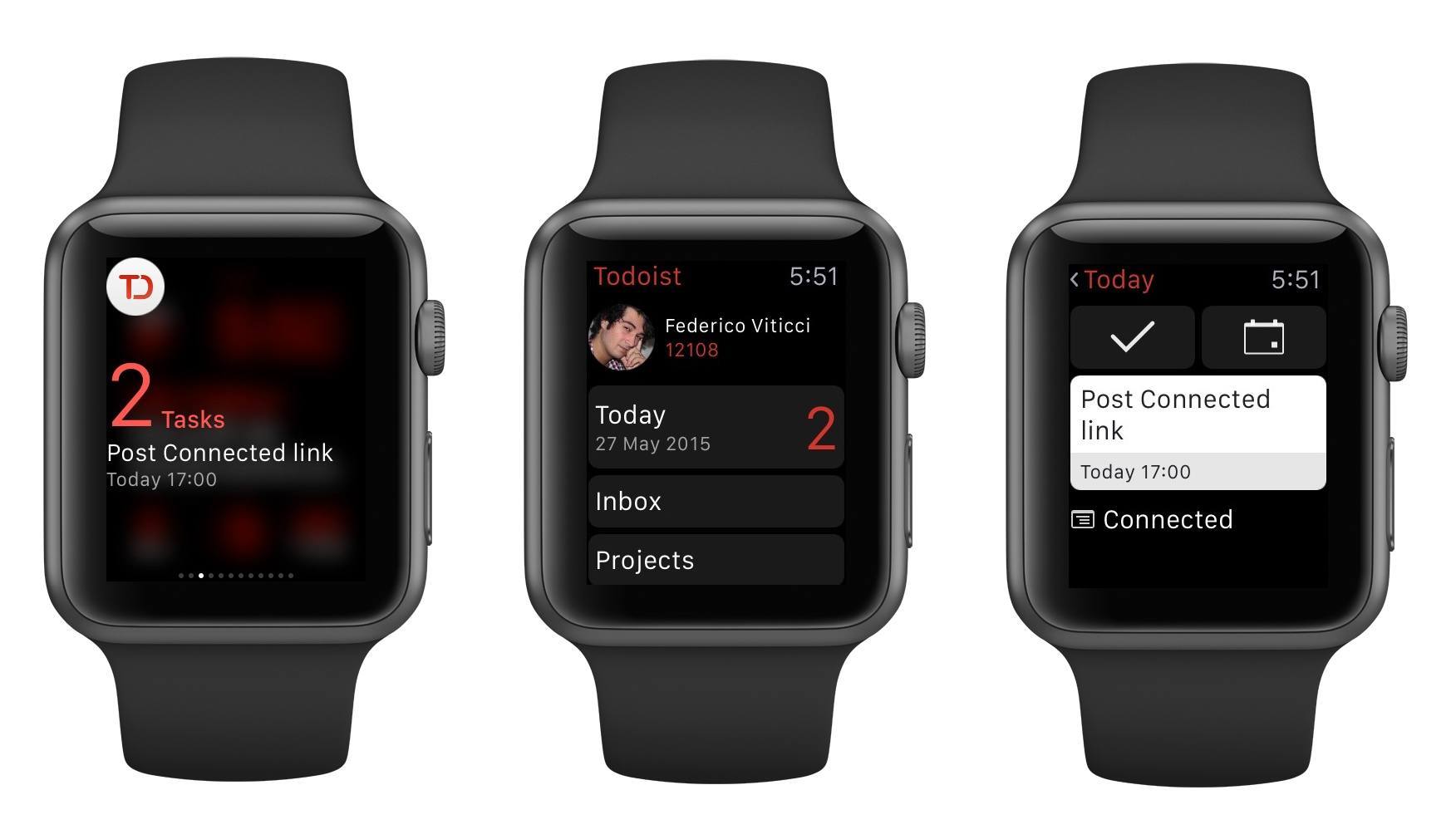
Todoist Comes to Apple Watch, Updates iOS 8 Extension

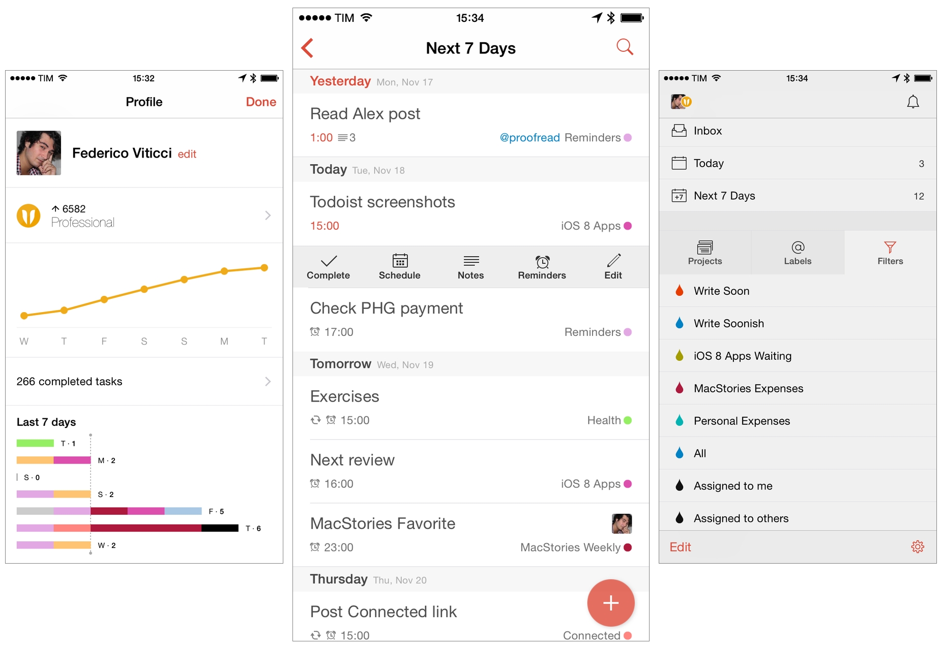
I’ve already written at length about my experience with Todoist and leveraging its powerful features for a more flexible todo list.

I’ve been using Todoist for over nine months now, and I continue to appreciate features such as filters and shared projects, which have allowed me to have a superior visualizations of tasks and to collaborate with others on big projects. And then, of course, there’s the work Todoist has done on its iOS app and third-party integrations, bringing natural language support and a handy extension to the iPhone and iPad and extending the service beyond its own apps to embrace solutions like Sunrise (see your tasks alongside calendar events) and IFTTT’s Do Note (type a new task and tap a button to save it).

I depend on Todoist and I genuinely like the service because it’s focused on doing, not fiddling. Today, that focus is becoming even more apparent with a new app for the Apple Watch and an updated extension that makes it even easier to save new tasks from anywhere on iOS.

Read more


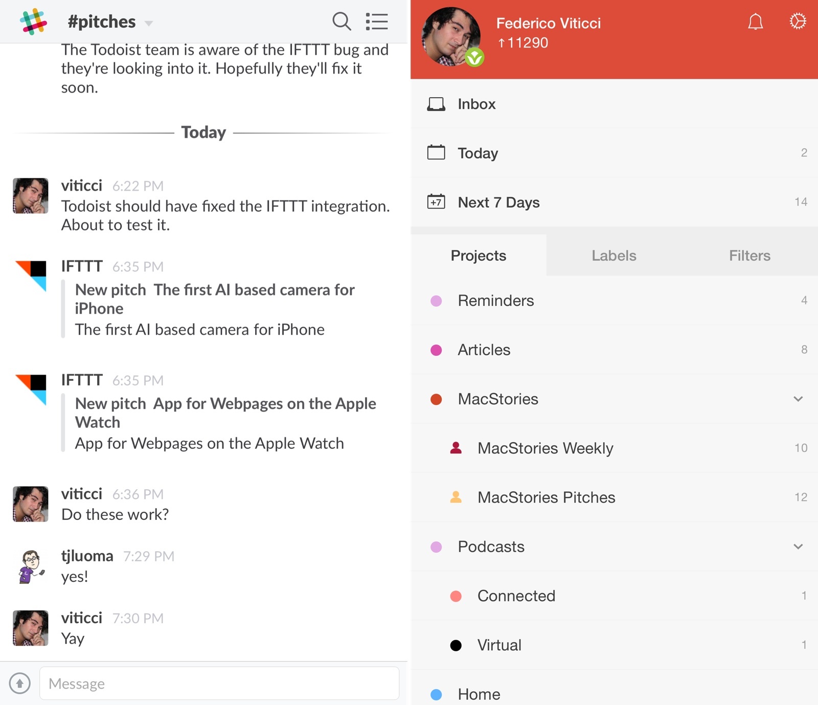
Managing Team Tasks with IFTTT, Slack, and Todoist

I recently decided that I wanted to overhaul the way I deal with email pitches (new apps, hardware accessories, web services, etc.) and I set out to find a solution that would allow me to broadcast an email to my team without having to forward more emails.

The problem:

  • Most email pitches are sent to my personal email address, which teammates can’t access;
  • I can’t stop developers and PR people from sending messages to my personal address;
  • I go through email every day, and I carefully handpick what I would like to see covered on MacStories;
  • I used to forward every email to individual members of our team, duplicating attachments and using conversations as a tracking system to remember who’s interested in covering what;
  • Inboxes got overcrowded, I couldn’t easily keep track of pitches assigned to someone else, and everybody was unhappy.

For years, I envisioned a system that, with one tap, would allow me to put an email message in a folder and forget about it, while it would still be broadcasted to my team so that others could take it into consideration. After weeks of experiments, I chose to leverage web automation and two tools I already use for todo management and team communication: Todoist and Slack.

The solution I landed on is remarkably simple, but it took a while to get it just right and work around a few unexpected bugs.

Read more


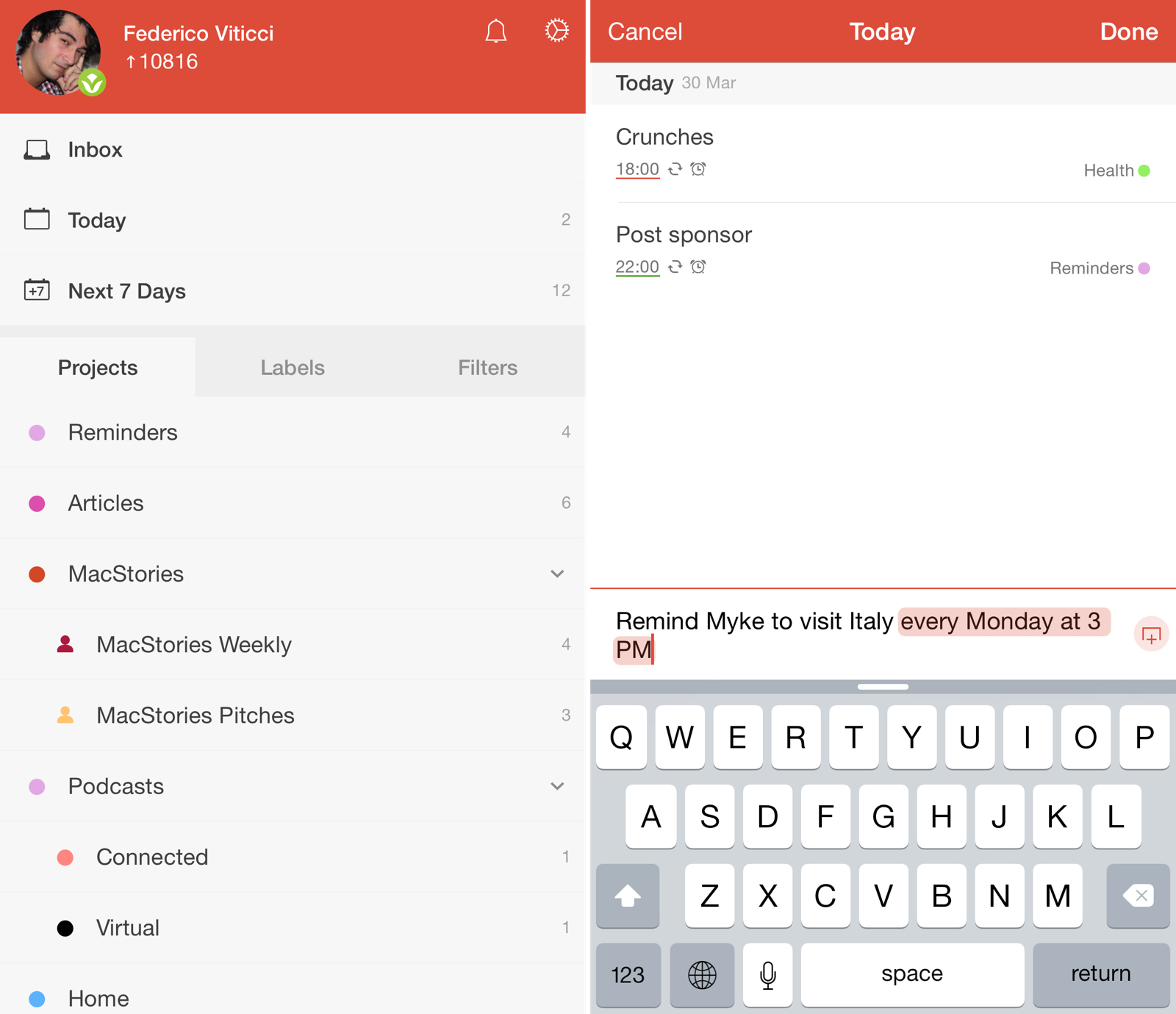
Todoist 10 Brings Intelligent Input, Themes, and New Gestures

Last November, I wrote about my decision to switch from iCloud Reminders to Todoist as my task management app of choice. I concluded:

Todoist strikes a good balance of powerful features and clever implementation that doesn’t push me to customize everything all the time. I’m not writing scripts for task management, I’m not changing icons and themes – I set up a few filters and I’m just focusing on doing stuff. The Todoist app for iOS integrates well with iOS 8, and, overall, I’m thoroughly satisfied with my decision to switch from Reminders to a professional-grade todo system to manage my life.

Over the past five months, I’ve kept using Todoist every day and I’ve enjoyed its reliability and integration with other apps and services. Everything from my original review still stands: while I don’t rely on all of Todoist’s features, its flexibility allows me to scale my tasks and projects at any time. If a big new project comes in and I need to take care of it with my team and have a deeper visualization of my responsibilities, I know I can count on Todoist. If I have to jump from a couple of tasks each day to a few dozen, I can rest assured Todoist can do it.

In spite of my appreciation, though, I’ve been critical of Todoist’s iOS app before, and I’m happy to see the company addressing some of my major complaints in Todoist 10, launching today for iPhone and iPad.

I upgraded to a beta of Todoist 10 a few weeks ago, and, while it doesn’t profoundly change the capabilities of Todoist on iOS, the new version brings some powerful (and long-needed) functionality that will help users be more efficient and spend less time managing todos.

Read more


Todoist App Coming to Apple Watch

This morning, Todoist announced an Apple Watch version of their app. Joe Rossignol writes:

Todoist aims to bring its popular to-do app for iPhone and iPad to the wrist with a simplistic Apple Watch app that will provide task management at a glance. When paired with an iPhone, the app will enable users to view their upcoming tasks and categories, reply to comments, and schedule or mark complete tasks. Todoist tells us that the video below is missing the task filter view, but plans to add the feature soon.

The past few weeks in the tech news cycle have been full of intriguing, but ultimately useless, examples of Apple Watch “concepts”. This is an actual WatchKit app coming soon to Apple Watch.

I’m excited because Todoist is my task management service of choice, and the ability to quickly mark a task as completed or defer it from my wrist could be interesting. The app looks standard – as I suspect most initial Apple Watch apps will be like – but make sure to hit the source link for a short demo video.

Also: considering Todoist’s integration with IFTTT and Zapier, how cool would it be to trigger automated workflows from an Apple Watch?

Permalink


iOS and iPadOS 17: The MacStories Review

In the year when the vision is elsewhere, what do you get the OS that has everything?

Well, last year was weird.

For the first time since I started writing annual reviews of Apple’s two mobile operating systems – iOS and iPadOS – I published a review without the iPad part. Or rather: I had to publish it a month later given the mess Apple found itself in with Stage Manager for iPadOS 16 and its half-baked, embarrassing debut.

I don’t want to go over the specifics of that entire saga again and how we got to a shipping version of Stage Manager for iPadOS 16 that didn’t meet my expectations. Spoiler alert: as we’ll see later in this review, Apple listened to feedback and fixed the most glaring issues of Stage Manager in iPadOS 17, striking the balance between “guided multitasking” and freeform window placement that was missing from last year’s debut. Stage Manager for iPadOS 16 will remain another blip in the iPad’s long and storied history of ill-fated multitasking features. There’s no need to talk about it again.

I want to explain, however, why the past 12 months have been different than usual in iOS and iPadOS land beyond the fact that I couldn’t work on my iPad Pro for the first half of 2023.1

Following the launch of iOS 16 with its Lock Screen widgets and after Apple wrapped up work on the last big-ticket item on the iOS 16 roadmap (Live Activities for the Lock Screen and Dynamic Island, which launched in late October), it felt like the entire Apple community only started thinking about one product for the next six months: the headset. What would later be known as the Vision Pro and visionOS platform became the topic of conversation in Apple-related publications, podcasts, and YouTube channels. Leading up to WWDC 2023, anticipation surrounding the upcoming headset eclipsed anything related to other platforms.

And rightfully so. As I explained in the story that I wrote after I was able to try a Vision Pro at Apple Park, the excitement was justified. It’s always a rare occurrence for Apple to introduce a new hardware product with associated software platform; but to do so with a mind-blowing experience unlike anything I ever tried before in my life is truly something special. Apple had been working on visionOS and Vision Pro for years, and we were all thinking about it and waiting for it at WWDC. And the company delivered.

This context is necessary because the visionOS/Vision Pro development timeline explains what’s going on with iOS and iPadOS 17 this year. Both OSes are grab-bag style updates with a collection of welcome enhancements to different areas of experience. I quipped years ago that modern iOS updates need to have a little bit of everything for everyone; that has never been more true than with iOS 17, albeit for a different reason this time: most likely, because Apple didn’t have time to also deliver big, vision-altering upgrades on the iPhone this year.

iOS and iPadOS take a bit of a secondary role in 2023, happily conceding the spotlight to a new software platform that hasn’t launched yet, but which developers around the world are already testing in person.

To be clear, I am not complaining. iOS and iPadOS 17 may not have an industry-defining, obvious tentpole feature, but in their approach to offering miscellaneous improvements, they’re fun and interesting to cover. Of the two, iPadOS is the one that suffered from lack of development resources the most and whose strategy could be easily summed up as “it’s iPadOS 16, but we fixed Stage Manager”. Which, again, given the circumstances, is absolutely fine with me.

While Apple was busy with visionOS this summer, I was having fun exploring iOS 17’s collection of app updates and, as we’ll see in this review, extensive upgrades to one system feature: widgets.

As always every year: let’s dive in.

Read more


  1. Did I ever tell you the story of how I used a Microsoft Surface in secret as my main computer from January to June 2023 until Apple unveiled the new Stage Manager for iPadOS 17 and everything was good with the world again? How I spent six months in computing wilderness and questioned every single one of my tech decisions? And how I ultimately accepted that I prefer Apple platforms because, at the end of the day, they're made by people who care about great design and user experience? I did, and you can listen to the story here↩︎

iOS and iPadOS 17 After One Month: It’s All About Widgets, Apps, and Stage Manager

iOS and iPadOS 17.

iOS and iPadOS 17.

Apple is releasing the first public betas of iOS and iPadOS 17 today, and I’ll cut right to the chase: I’ve been using both of them on my primary devices since WWDC, and I’m very satisfied with the new features and improvements I’ve seen to date – especially on iPadOS. More importantly, both OSes are bringing back the same sense of fun and experimentation I felt three years ago with iOS 14.

I’ve already written about the improvements to Stage Manager on the iPad ahead of the public beta of iPadOS 17. Without repeating myself, I’m still surprised by the fact that Apple addressed my core complaints about Stage Manager a mere year after iPadOS 16. To describe my past year in iPad land as “turbulent” would be a euphemism; and yet, iPadOS 17’s improved Stage Manager not only fixes the essence of what was broken last year, but even eclipses, in my opinion, the Mac version of Stage Manager at this point.

I love using Stage Manager on my iPad now. There are still features missing from iPadOS 17 that won’t allow me to stop using my MacBook Air but, by and large, the enhancements in iPadOS 17 have allowed me to be an iPad-first user again. It feels good to write that. Plus, there are some surprises in iPadOS 17 that I wasn’t expecting that I’ll cover below.

iOS 17 is not a huge software update: there are dozens of quality-of-life features that I like and – best of all – terrific updates on the widget front. A good way to sum up Apple’s software strategy this year is the following: widgets are everywhere now (including the Watch), they’re interactive (finally), and they’re likely pointing at new hardware on the horizon (you know). As someone who’s been wishing for widget interactivity since the days of iOS 14, I can’t even begin to describe how amazing it’s been to see third-party developers come up with wild ideas for what effectively feel like mini-apps on the Home Screen.

I’m equally impressed by the work Apple has put into some of its built-in apps this year with features that I’ve always wanted and never thought the company would build. You can create internal links to other notes in the Notes app. Reminders has a column view. Podcasts has a proper queue. Even Reading List – of all features – has been updated this year. In using iOS 17, I sometimes get the sense that Apple went through popular wish lists from the community and decided to add all the top requests in a single release.

To quote my friend Stephen Hackett: the vibe is good this year, and it applies to software as well. Let me tell you about some of my favorite aspects of iOS and iPadOS 17 from the past month.

Read more


‘Command-K Bars’ as a Modern Interface Pattern

Maggie Appleton (via Michael Tsai) has written about one of the UI trends I’ve seen pop up more and more lately, and which we mentioned on AppStories several times over the past year: the so-called ‘Command-K’ bars inside apps.

Command bars are command-line bars that pop up in the middle of the screen when you hit a certain keyboard shortcut.They’re also known as ‘command palettes’, ‘command launchers’, or ‘omniboxes’ Traditionally CMD + K, hence the moniker “Command K bars.” But CMD + E and CMD + / have also been strong shortcut contenders.

[…]

They don’t even have to remember its exact name. Fuzzy search can help them find it by simply typing in similar names or related keywords. For example, if I type “make” into a command bar, it’s likely to show me any actions related to creating new items. Even if “make” isn’t part of the action name.

[…]

These bars also do double duty as universal search bars. You’re not only searching through the available actions in an app. You can also search through content like documents, file names, and tasks.

You’ve probably seen these command bars in apps like Obsidian, Craft, Todoist, Arc, Cron, Notion, and lots of others. (On Apple platforms, Things did something similar all the way back in 2018 with a feature called ‘Type Travel’.) It feels like every modern productivity app – especially on desktop – has its own flavor of this interface element nowadays. In a way, this visual trend reminds me of pull-to-refresh before it was standardized by Apple and became a native iOS UI component.

I’m intrigued by Command-K bars as a feature that speeds up keyboard-driven interactions on iPad and Mac while at the same time serving as a search box for an app’s own commands. Think of the typical Command-K bar as a mix of Spotlight, the macOS menu bar, and iPadOS’ keyboard shortcut menu, but as an element that can be invoked from anywhere in an app and dismissed with just a keystroke. As the examples in Maggie’s article show, Command-K bars can be genuinely useful to surface hidden commands and allow power users to save time when using complex apps.

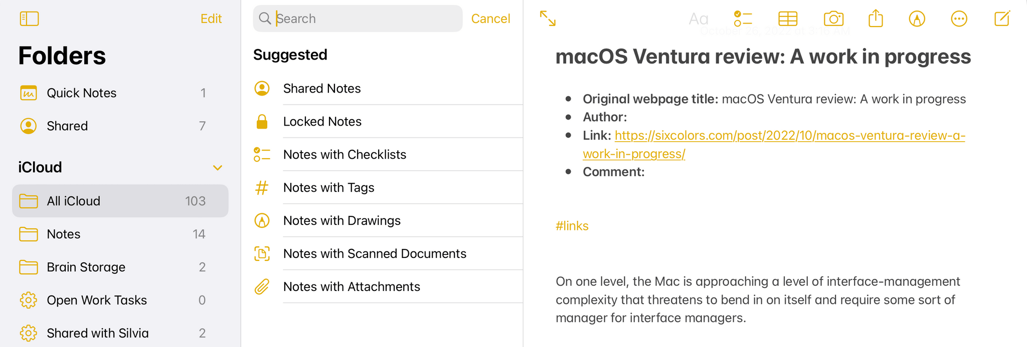
There are plenty of cases where Apple’s apps could benefit from this kind of in-app search makeover. Here’s Notes, for instance, when you activate the ‘Note List Search’ command:

Search inside Notes.

Search inside Notes.

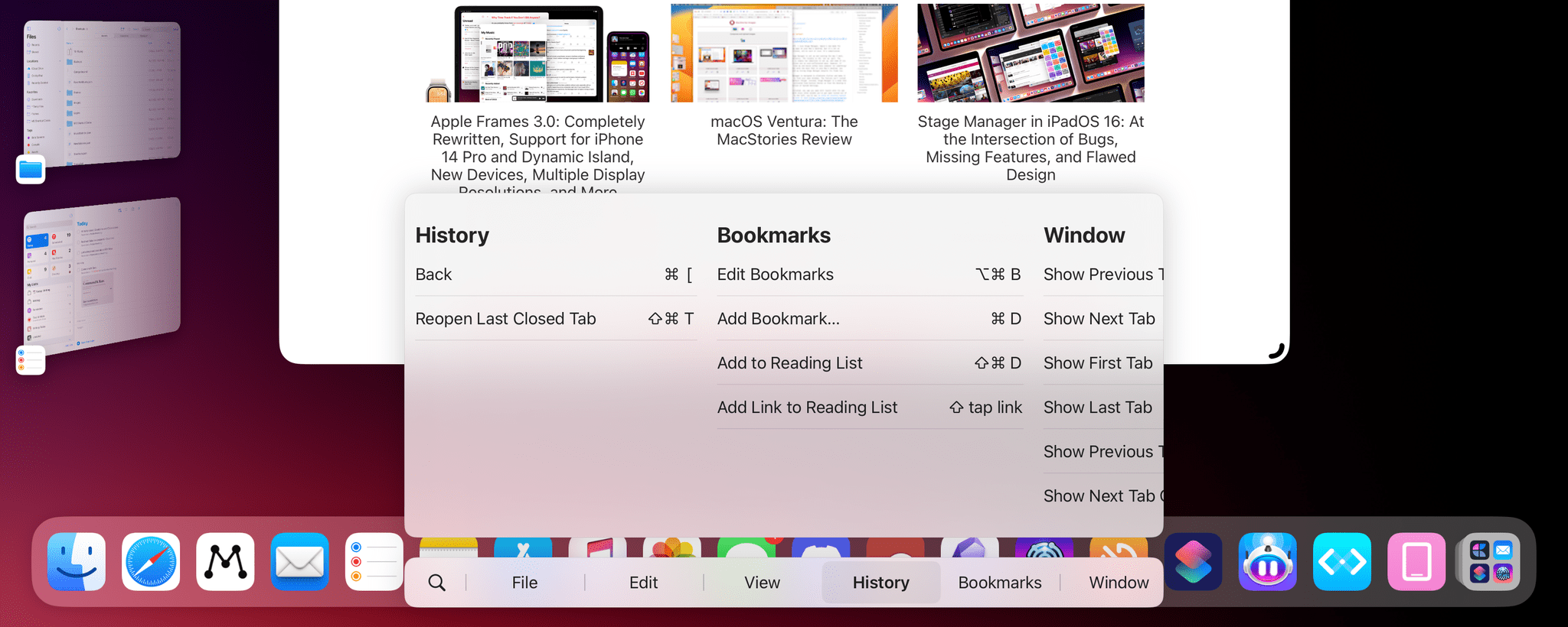
And here’s the rather complex list of keyboard shortcuts supported by Safari:

Keyboard shortcuts in Safari for iPad.

Keyboard shortcuts in Safari for iPad.

I said this on AppStories and I’ll say it again: I think Apple should consider an in-app version of Spotlight that replicates the functionality of Command-K bars and is optimized for keyboard usage on iPadOS and macOS. Modern productivity software is clearly moving in this direction on desktop and the web; I’d like to see Apple apps offer faster keyboard navigation and command discoverability too.

Permalink

Last Week, on Club MacStories: iOS Features That Should Be Apps and Due as a Work Habit Tracker

Because Club MacStories now encompasses more than just newsletters, we’ve created a guide to the past week’s happenings along with a look at what’s coming up next:

MacStories Weekly: Issue 321