Apple is releasing the first public betas of iOS and iPadOS 17 today, and I’ll cut right to the chase: I’ve been using both of them on my primary devices since WWDC, and I’m very satisfied with the new features and improvements I’ve seen to date – especially on iPadOS. More importantly, both OSes are bringing back the same sense of fun and experimentation I felt three years ago with iOS 14.
I’ve already written about the improvements to Stage Manager on the iPad ahead of the public beta of iPadOS 17. Without repeating myself, I’m still surprised by the fact that Apple addressed my core complaints about Stage Manager a mere year after iPadOS 16. To describe my past year in iPad land as “turbulent” would be a euphemism; and yet, iPadOS 17’s improved Stage Manager not only fixes the essence of what was broken last year, but even eclipses, in my opinion, the Mac version of Stage Manager at this point.
I love using Stage Manager on my iPad now. There are still features missing from iPadOS 17 that won’t allow me to stop using my MacBook Air but, by and large, the enhancements in iPadOS 17 have allowed me to be an iPad-first user again. It feels good to write that. Plus, there are some surprises in iPadOS 17 that I wasn’t expecting that I’ll cover below.
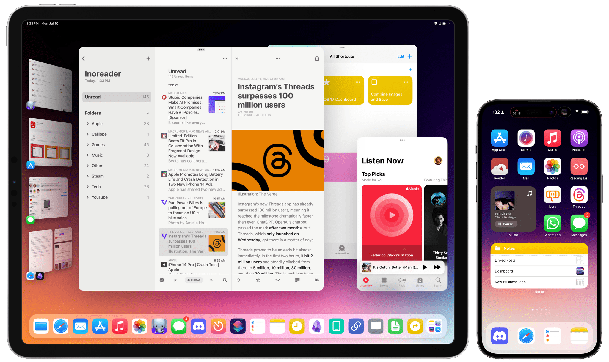
iOS 17 is not a huge software update: there are dozens of quality-of-life features that I like and – best of all – terrific updates on the widget front. A good way to sum up Apple’s software strategy this year is the following: widgets are everywhere now (including the Watch), they’re interactive (finally), and they’re likely pointing at new hardware on the horizon (you know). As someone who’s been wishing for widget interactivity since the days of iOS 14, I can’t even begin to describe how amazing it’s been to see third-party developers come up with wild ideas for what effectively feel like mini-apps on the Home Screen.
I’m equally impressed by the work Apple has put into some of its built-in apps this year with features that I’ve always wanted and never thought the company would build. You can create internal links to other notes in the Notes app. Reminders has a column view. Podcasts has a proper queue. Even Reading List – of all features – has been updated this year. In using iOS 17, I sometimes get the sense that Apple went through popular wish lists from the community and decided to add all the top requests in a single release.
To quote my friend Stephen Hackett: the vibe is good this year, and it applies to software as well. Let me tell you about some of my favorite aspects of iOS and iPadOS 17 from the past month.
Widgets Everywhere
It’s hard not to get the feeling when using iOS 17 that Apple has been building toward this moment for the past several years, starting with the introduction of SwiftUI and widgets in iOS 14. Three years after the debut – and massive success – of widgets on the Home Screen, iOS 17 is the logical culmination of Apple’s efforts: not only are widgets everywhere in the operating system now, but they’re also interactive, and they are transforming apps into modular experiences that go beyond glanceability.
That’s where we left widgets three years ago, and it’s also how Apple pitched Lock Screen widgets last year: in the old era, widgets were supposed to be glanceable and serve as miniaturized previews for data and information contained in apps. This is changing with iOS 17, where both Home and Lock Screen widgets now fulfill two simultaneous roles: they’re still designed to be informative at a glance, but they also support inline interactions that let you perform actions from a widget itself without launching the associated app. I always thought I’d like this type of widgets in theory; now that I have them, I have to be honest: I love them, and they’re my favorite feature of iOS and iPadOS 17.
You don’t have to look far to see some excellent examples of widgets with familiar designs that have been rejuvenated by the addition of interactivity in iOS 17.
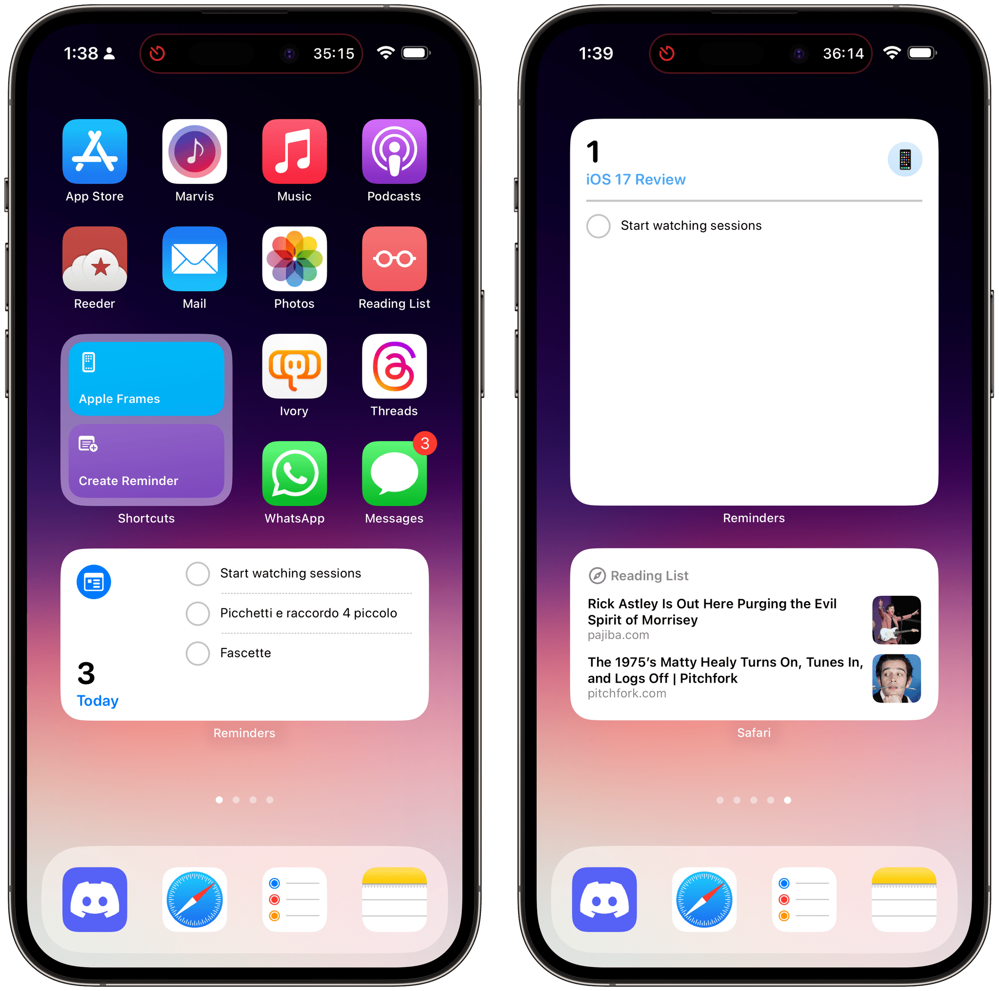
The Reminders widget, for instance, still shows you a list of tasks based on the list you’ve configured to appear in the widget. Those tasks, however, can be checked off directly from the Home Screen or Lock Screen now. You don’t need to open the Reminders app to do it; without losing the context of the Home Screen, you can quickly mark a reminder as completed. The updated WidgetKit framework for developers supports both inline buttons and toggles, meaning that simple interactions such as marking a task as done are possible in iOS 17. Do not expect to see widgets that bring up the keyboard for typing a note or a photo picker for choosing a photo; basic, quick interactions are key in iOS 17. But I’m sure some developers will try regardless.
The new suite of Music widgets are another great showcase of interactive widgets. Like before, they show you a preview of albums or playlists you’ve recently played, but now there’s also a play button to start listening directly from the Home Screen. And since widgets in iOS 17 can animate in-place after an interaction occurs, when you tap that play button and playback starts, it morphs into a pause button, and vice versa.
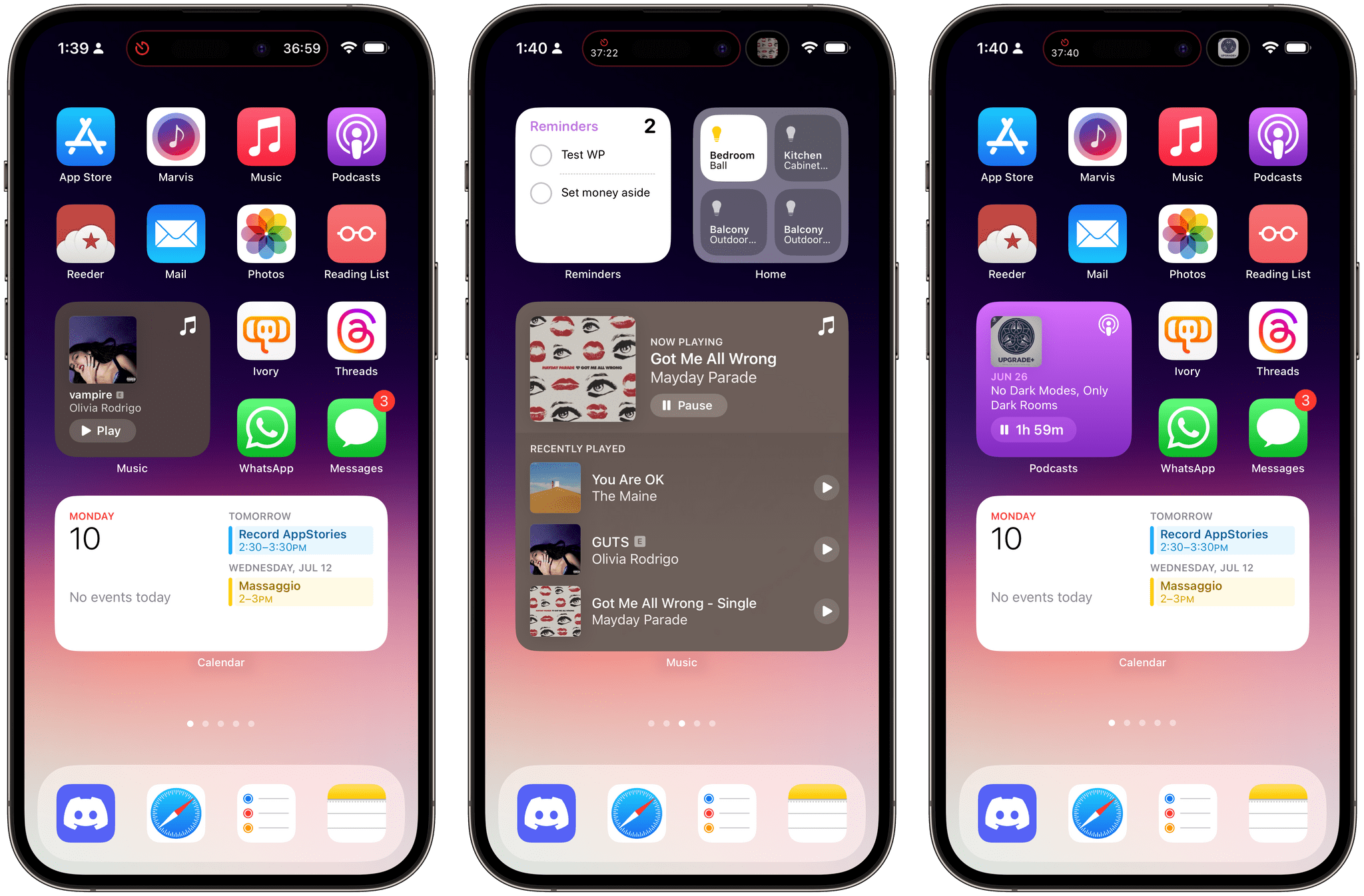
The same is true for the Podcasts widget, which I’ve been using a lot in combination with the Music one in a stack. Taken in isolation, these may not sound like huge savings in interaction time; in practice, they add up over time. iOS 17 widgets create the feeling that app interaction has spilled over to the Home Screen; it’s as if apps are finally integrated with other areas of the OS in a way that goes beyond static previews.
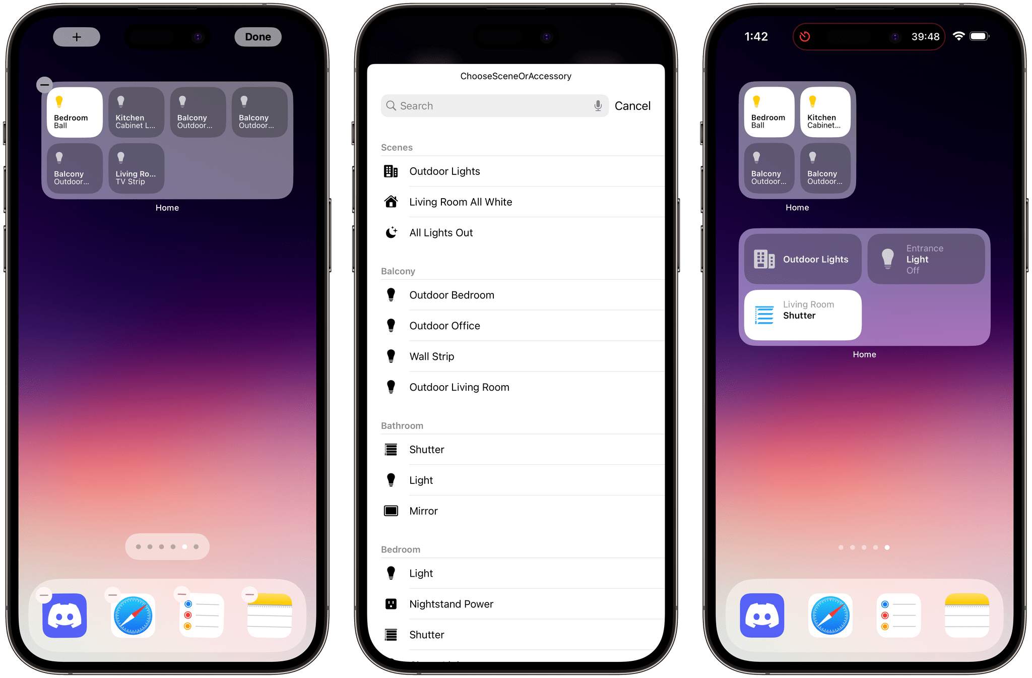
Another personal favorite of mine? The new collection of Home widgets. For years now I’ve lamented the lack of dedicated Home widgets for controlling HomeKit accessories without having to use Control Center or Shortcuts. iOS 17 brings small and medium-size Home widgets that can show a total of four or eight accessories at once, respectively. I use the small one a lot: I set it to show me four fixed accessories (this widget also supports scenes or recommended items) and I rely on it to quickly turn on the living room lights or the LED strip beneath my TV.
I’ve been thinking about this idea: interactive widgets are exactly the kind of interactions I want to have with my iPhone. Sometimes, I know I want to open a full app, so I spend a few minutes (or if it’s Threads, a few hours) in it, close it, lock my iPhone, and unlock it again after a minute because I’m addicted. I think I speak for a lot of us here. But sometimes I just need to do something quickly while I’m doing something else and I don’t want to switch contexts. This is where interactive widgets come in: they are productivity catalysts for self-contained interactions that can happen in the neutral, limbo state of the Home Screen.
This is what I meant above when I mentioned app modularity: to an even greater extent than what Shortcuts has been doing for years, interactive widgets take specific functionalities of apps and make them available as à la carte components that you can mix and match however you want. It shouldn’t be surprising, then, to know that this is possible because App Intents, the technology that powers Shortcuts actions, is being used for actions in interactive widgets, too. This is how Apple rolls.
In terms of third-party interactive widgets, I’ll say this: prepare to have fun later this year. If early experiments I’ve seen are of any indication, interactive widgets are going to fundamentally change how we use popular third-party apps on our iPhones. I can give you a few examples of my favorites so far.
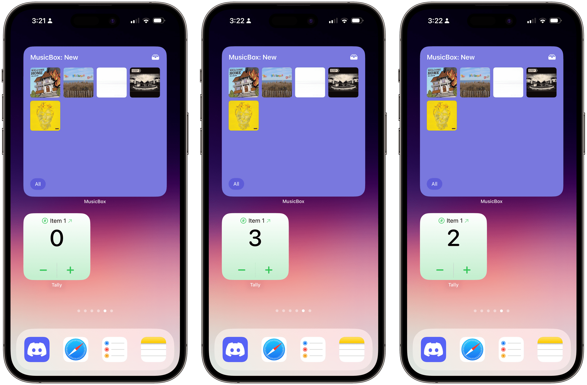
Tally, the simple counting app by Greg Pierce, has a perfect use case for interactive widgets: in iOS 17, you’ll be able to count up and down directly from the Home Screen by simply tapping + or - buttons in a widget. It couldn’t be easier, and this interaction demonstrates why some functionalities shouldn’t require opening a full app these days.
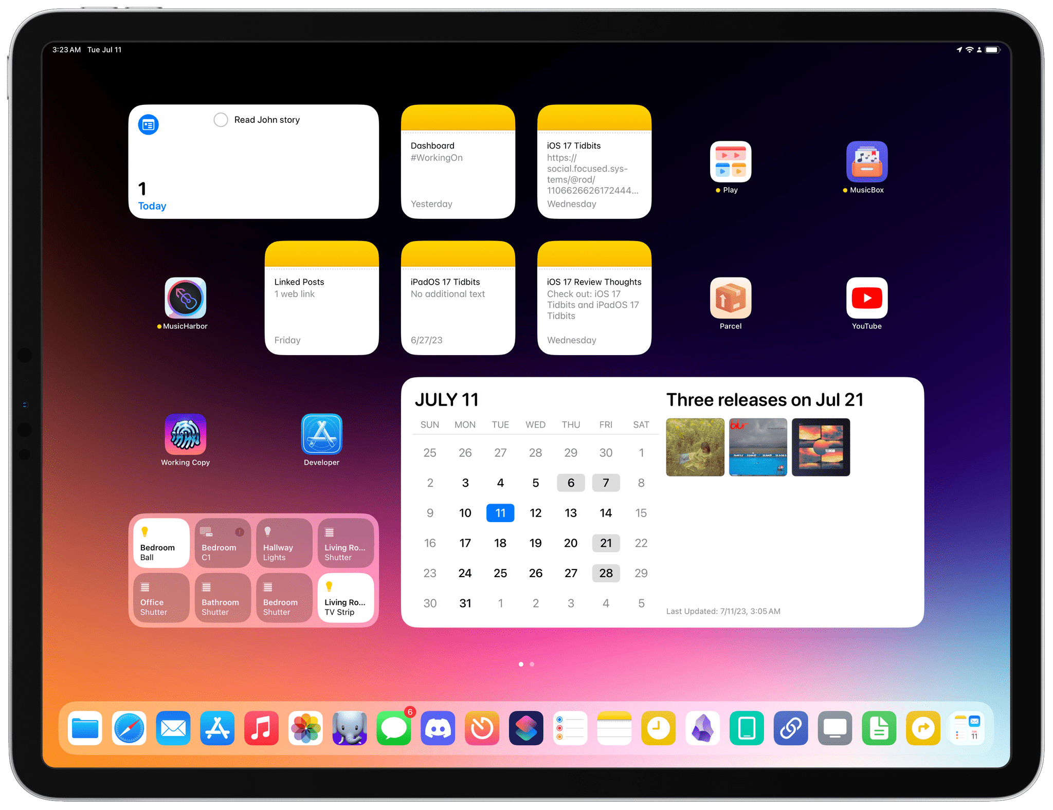
MusicHarbor, the music tracking tool by Marcos Tanaka, is bringing an interactive calendar widget to iPadOS 17. Available in the XL size, this widget lets you tap dates in a calendar on the left side to see associated music releases for the selected day on the right. It’s perfect. Imagine what task managers or calendar clients could do on the Home Screen with a similar idea.
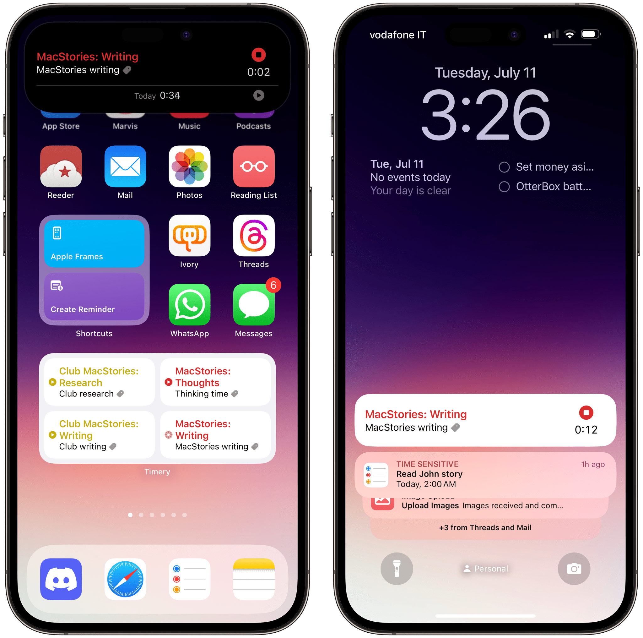
My favorite beta so far, and likely the app I’m going to use most for widgets this year, is Timery. With widget interactivity, Timery will let you start and stop timers from widgets and Live Activities on the Home Screen, Lock Screen, and StandBy (more on this below). Because of this new integration, I now remember to track my time when I’m working more frequently than before since there’s a lot less friction in starting and stopping timers.
A month into iOS 17, I’ve been more impressed by widget interactivity on the Home Screen than the Lock Screen, and I think that makes sense. I see the Lock Screen as the place for glanceable information, and the Home Screen for interactions. Perhaps I’ll be proven wrong by some especially clever Lock Screen widgets, but I think the limited number of widgets on the Lock Screen doesn’t help in this regard.
StandBy Mode
Speaking of the Lock Screen, a feature of iOS 17 that’s been quickly growing on me over the past few weeks is StandBy. This new Lock Screen mode kicks in when an iPhone is charging, is placed in landscape mode, and is in a stationary position; if these criteria are met, StandBy turns your iPhone into a quasi-smart display-like accessory that can cycle through different pages of content including interactive widgets, your photos, and a giant clock. If you think this is Apple experimenting in the open with technologies to build a HomePod with a screen, well, yes.
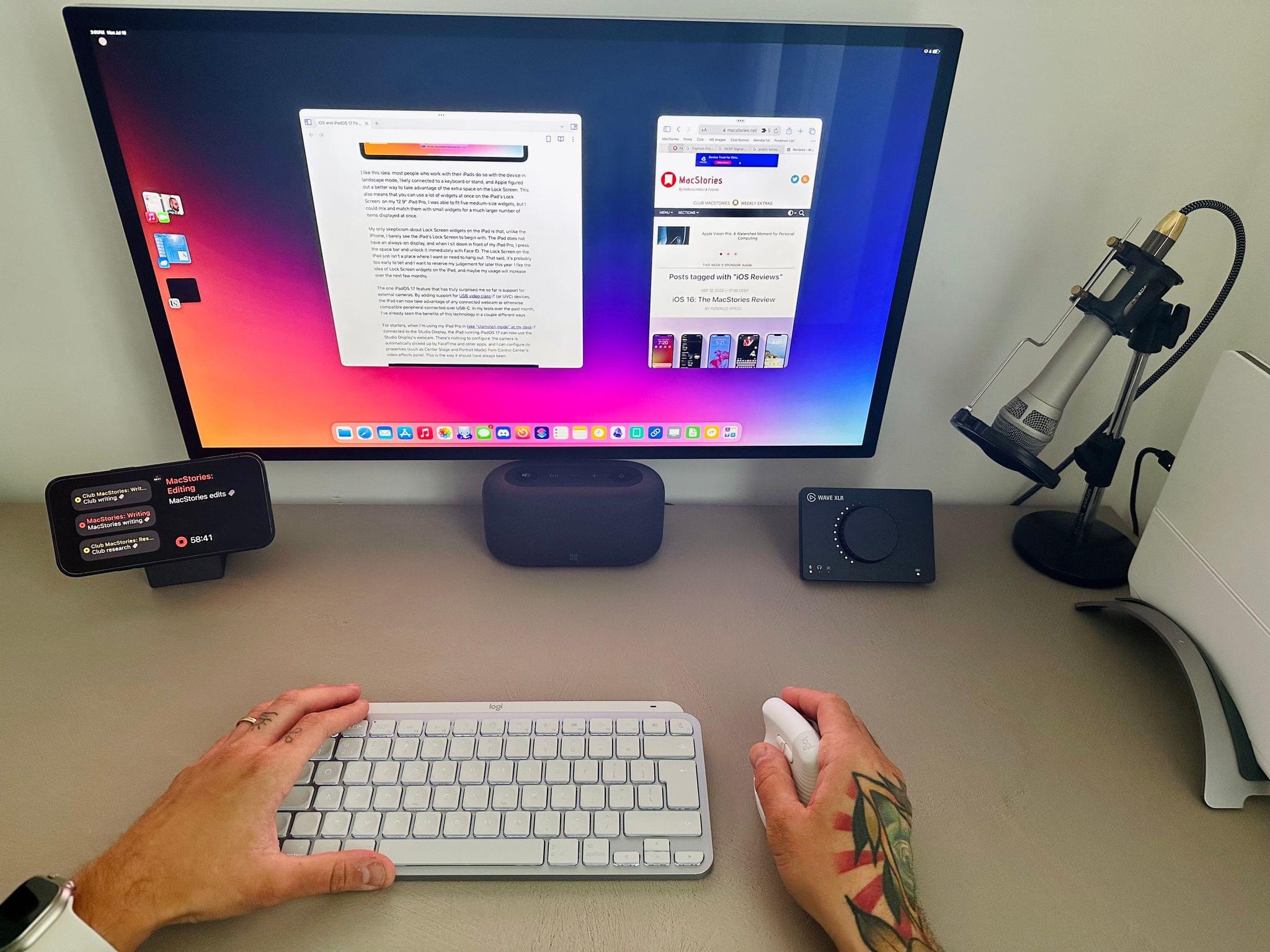
StandBy has been a slow burn for me over the past month, and I’ve learned to appreciate it because of two reasons: we recently placed a few Anker MagSafe cubes around the house, including one on my desk; and I also purchased a portable magnetic battery pack that lets me use StandBy when I’m not working at my desk in the office. The combination of these two factors has ensured that I get access to StandBy more frequently and with more freedom than just seeing it when my iPhone is charging on my nightstand.
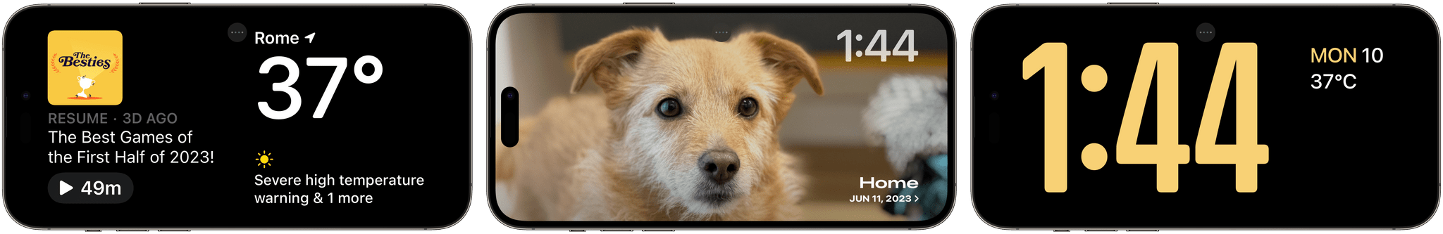
StandBy is comprised of three pages that you move between by swiping horizontally on-screen: widgets, photos, and clock. As you can imagine, the widgets page is the one I’ve been using the most because I’m in love with the idea of turning my iPhone into an interactive smart display when I’m working on the iPad Pro. StandBy widgets are built with the same technology as Home Screen ones, but they’re further optimized for legibility and contrast: they’re bigger, have monochromatic backgrounds, and only two of them can be active at the same time in two separate columns.
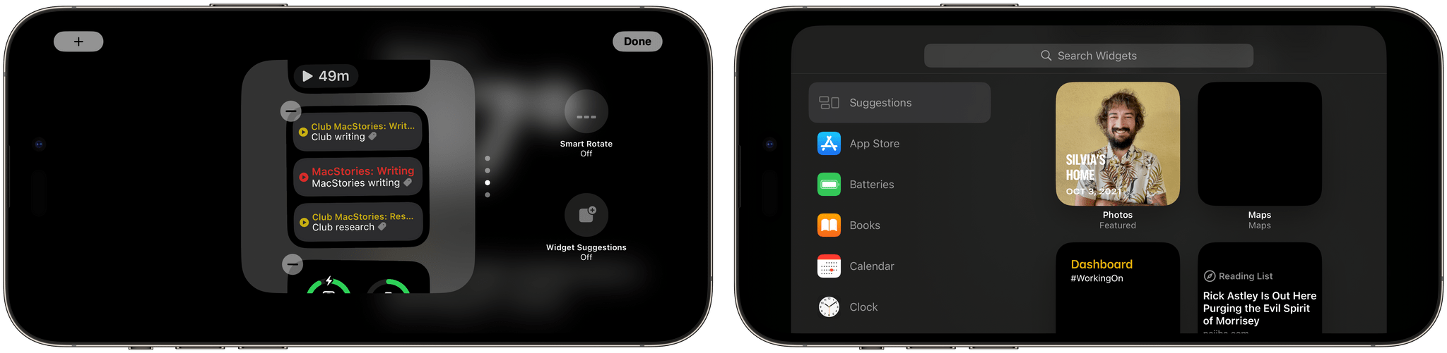
You can place multiple widgets in each column like widget stacks on the Home Screen; columns support the same widget suggestions and smart rotate options seen on the Home Screen too. Even the interface to add and manage widgets is consistent with previous versions of the widget gallery for the Home and Lock Screens.
While I haven’t used the Clock and Photos pages much (although I like how both can be customized), StandBy widgets have been growing on me because they’re unlike anything else Apple devices offer in terms of interactivity and glanceability. They are, effectively, the always-on display and interactive widgets rolled into a new kind of experience.
When I’m writing at my desk, I can keep an eye on the current timer from Timery or check out a list of my tasks left for today. These aren’t just previews: since StandBy widgets are also interactive, I can stop a timer or check off a task directly from StandBy with a single tap. I’ve also enjoyed leaving a monthly calendar open on one side and the Batteries widget on the other. Once third-party developers start flooding the widget gallery with their StandBy widgets, the combinations will be endless.
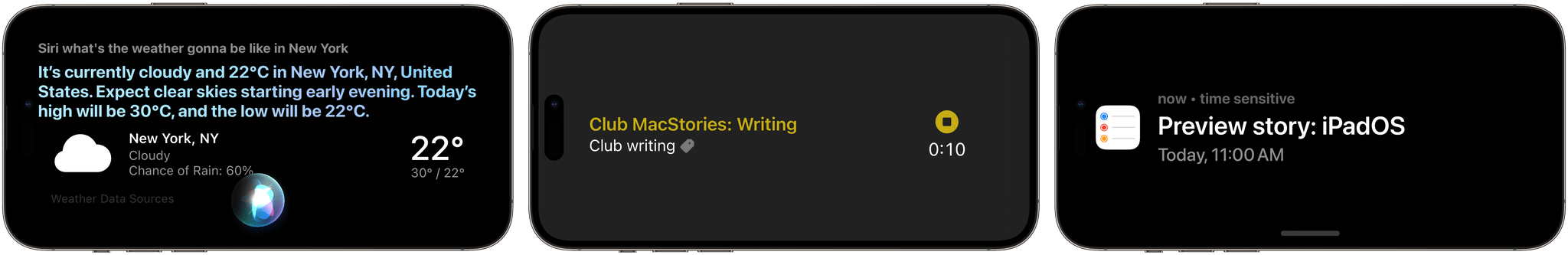
There are other aspects of StandBy I appreciate. In the latest beta, Apple added a new feature that prevents accidental app launches. When you tap on a widget, an arrow indicator appears on-screen; if you want to open the full app associated with the widget, that’s the button you need to press.1 I love how StandBy deals with incoming notifications, Siri requests, and Live Activities (which are also interactive in iOS 17): all of them have special full-screen interfaces that are optimized for fast interactions and glancing at text from a distance.
There’s another feature of StandBy that, unfortunately, I haven’t been able to test yet: MagSafe memory. In theory, for each place you charge your iPhone with MagSafe and use StandBy, the system should remember the page and widget configuration you use. Imagine, for example, StandBy automatically showing you a clock on your nightstand and two specific widgets on your desk.2
I like the sound of this feature a lot, but, in practice, it hasn’t worked for me yet in the iOS 17 beta. Every time I put my iPhone on a different MagSafe charger, it defaults to showing me the most recently used StandBy configuration. I’m assuming this is a bug and this functionality will start working on my iPhone 14 Pro Max soon. Once it does, I’ll have to convince my girlfriend that we need even more MagSafe chargers for our apartment.
The widget story in iOS 17 makes me feel like three years ago, with a palpable sense of excitement based on the feeling that how we use our phone is going to change soon.
With iOS 17, Apple didn’t just slap interactivity on top of widgets and called it a day: interactive widgets are a pervasive system layer that can be found on the Home Screen, Lock Screen, StandBy, and Live Activities. As a result, apps are becoming interactive in more places, ultimately allowing us to be faster, more efficient, and more connected. I know we’ve only seen the tip of the iceberg here, and I can’t wait for developers to start offering interactive widgets everywhere in iOS 17.
App Highlights
Both iOS and iPadOS 17 are full of big and small changes to core apps. It’s impossible to cover them all in a preview story, but I’ve picked three highlights I want to cover today. I’ll cover changes to Messages, FaceTime, Safari, and other apps in my standalone review later this year.
Column View in Reminders
I didn’t think this day would ever come: the Reminders app now supports a Kanban-like board mode to split up your lists in different sections and view them as columns.
Obviously, Apple is not calling this mode ‘Kanban’, but that’s what it is. Specifically, Reminders in iOS and iPadOS 17 lets you create sections inside regular lists, which is a functionality we’ve seen before in the likes of Things and Todoist. By default, lists are displayed vertically, and you can use drag and drop to move tasks between them. However, by pressing the ‘More’ button in the top right corner of a list, you’ll find a new option in iOS and iPadOS 17: the ‘View as Columns’ button. Tap it, and the selected list will switch to a familiar horizontal board layout that you may have seen before in Todoist, GoodTask, and Trello.
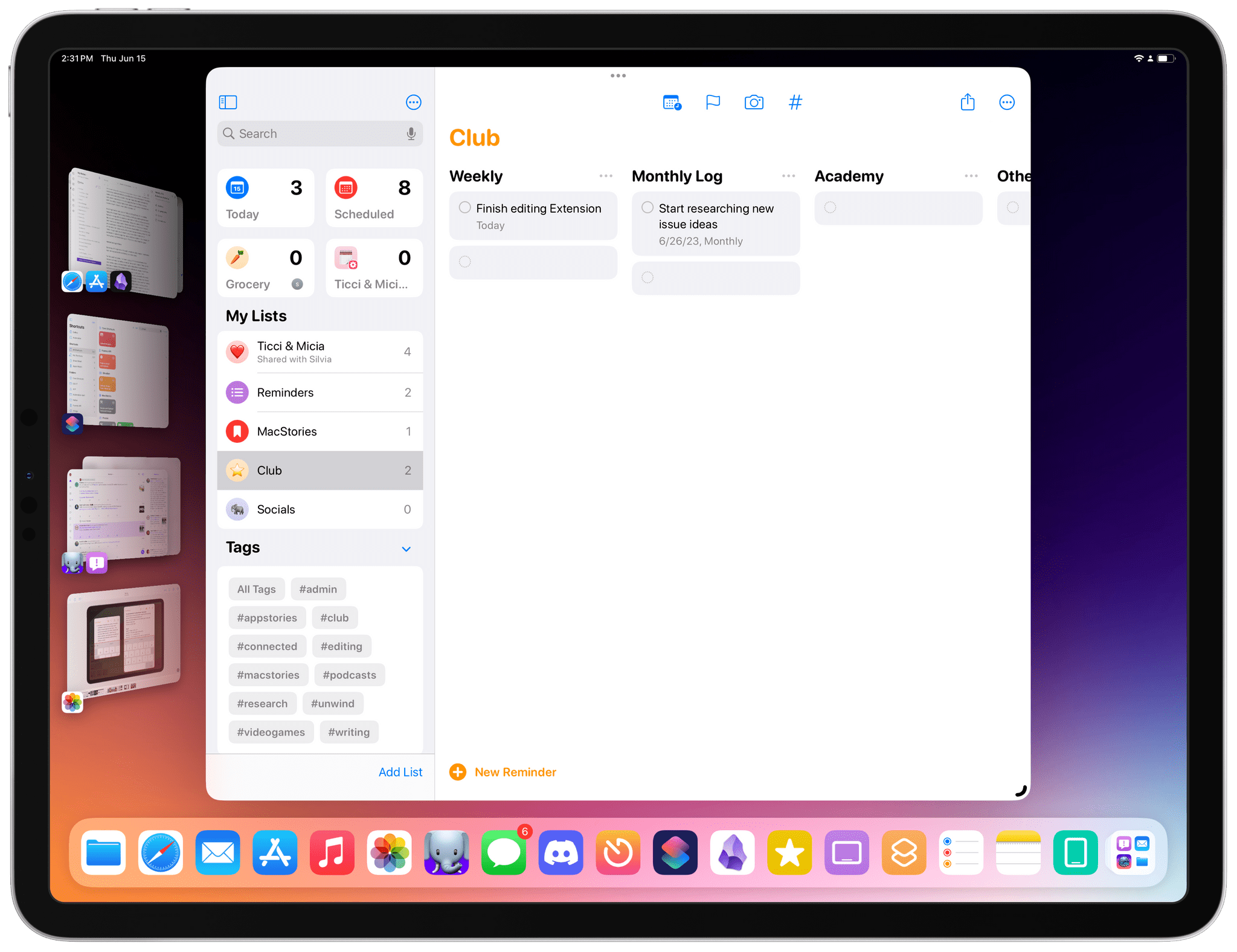
Column mode, as you can imagine, is particularly effective on iPad, where you can take advantage of the large screen in landscape to visualize different stacks of tasks with a clear separation between them. You can still long-press or right-click tasks to access actions for them, use drag and drop to re-assign them to a different section, and create new tasks directly in a specific column by clicking on the empty space at the end of a column. You can freely alternate between list and column mode (which is also supported on the iPhone) at any point; by default, tasks that do not belong to any column/section are saved into an ‘Others’ view in the selected list.
As a longtime fan and user of Trello and GoodTask, I’m incredibly happy that Apple found a way to ship what’s arguably a power-user feature in an app that is used by hundreds of millions of people every day. Column mode in Reminders isn’t as flexible as the one previously seen in GoodTask (there are no automatic columns for days of the week, for instance), but it’s more than good enough for me, and I think it’s going to be a fantastic way to turn Reminders into a professional task manager for more complex projects. As a result, I’m moving back to Reminders again. This time, most likely for good.
Internal Linking in Notes
Speaking of things I never thought would actually happen: the Notes app now supports internal linking to other notes.
For the past few years, I’ve been arguing that Apple needed to modernize Notes by taking a look at the current state of third-party note-taking apps and implementing functionalities that have been become a staple of the experience for millions of people. And if you consider products like Obsidian, Notion, and Craft, it’s undeniable that “wiki-style linking”, or the ability to easily reference another existing note, has become a key feature among note-takers who demand a fast, reliable way to organize and structure their notes. Whether you want to create a table of contents for an essay, a trip itinerary that references other notes, or just need a way to navigate a large collection of notes about a topic, the ability to add a link that takes you to another note is an excellent time-saving tool. And Notes now has exactly that.
There are two ways to add internal links to notes. In a very Apple fashion, the first one is a modern spin on the classic ⌘K keyboard shortcut, which has existed for decades on macOS to turn selected text into a clickable hyperlink. In the new Notes app, the ⌘K hotkey has been repurposed as a menu that lets you either link text to a webpage in Safari or create a link to an existing note inside the app. To add an internal link, simply start typing the title of the note, find the result you’re looking for, and that’s it. Notes will enter a yellow, underlined link that points directly to a note in your library.
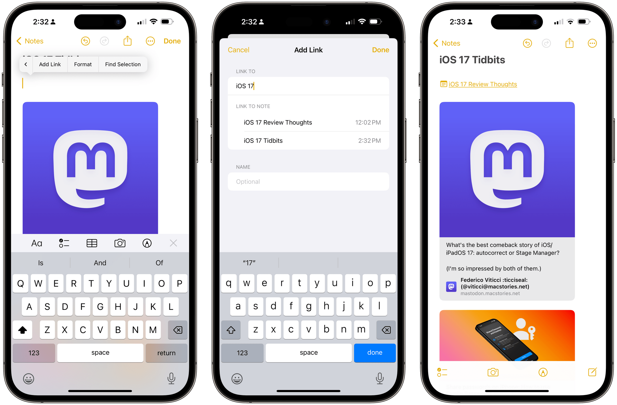
The second way is a so-called ‘accelerator’ – a combination of characters that brings up an inline menu with suggestions. Type >> in Notes, and you’ll see a popup with a list of your most recently modified notes as suggestions. At this point, you can use the menu to quickly insert an internal link to a note or search for it by name.
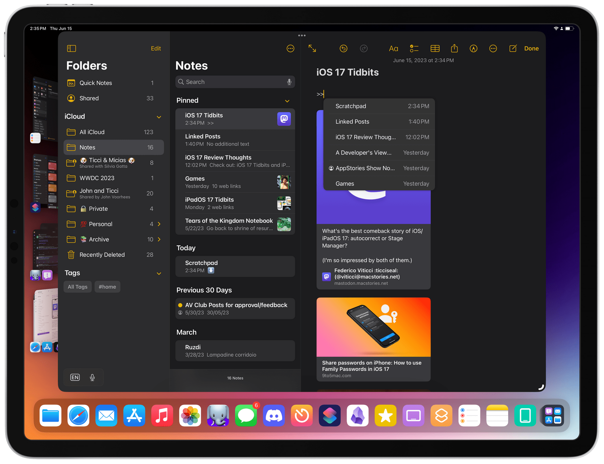
If all this reminds you of double-square brackets in Obsidian, you’re not alone: that’s precisely the sort of interaction that Apple copied and simplified for the Notes app. Even better (and just like Obsidian), if the list of results brought up by the >> menu does not include a note you’re looking for, you can create a new one immediately from there.
Just like Reminders, I think it’s wild that Apple looked at such a geeky functionality and devoted resources to understanding its essence and shipping a version of the feature that can be used by people who have no idea what Obsidian or Notion are.
At the same time, I also know I shouldn’t be too surprised. This is how Apple operates with its built-in apps: they take a look at the market, see what’s popular, and raise the bar with features that abstract complexity and result approachable to everyone. For obvious reasons, Notes still can’t be as flexible as Obsidian with its internal links (there are no backlinks or section-specific links, for example), but like I said above: it’s more than good enough, and it’s the reason why I’m seriously considering Notes for my note-taking needs again.
A Proper Queue in Podcasts
I complained about this on Mastodon a couple months back, and iOS 17 fixed it: the updated Podcasts app now has a dedicated ‘Queue’ feature that lets you build a proper queue of episodes you want to listen to later.
Previously, it was always unclear to me how the Podcasts app would organize episodes between the Up Next screen of recommendations and the episodes listed in the ‘Playing Next’ section of the Now Playing screen. iOS 17 resolves this confusion with an ‘Add to Queue’ button that you can find on any episode you long-press in the app. Once an episode goes into your queue, you can access it from a new, standalone tab of the Now Playing screen that you can open by tapping a new ‘list’ icon next to the AirPlay symbol.
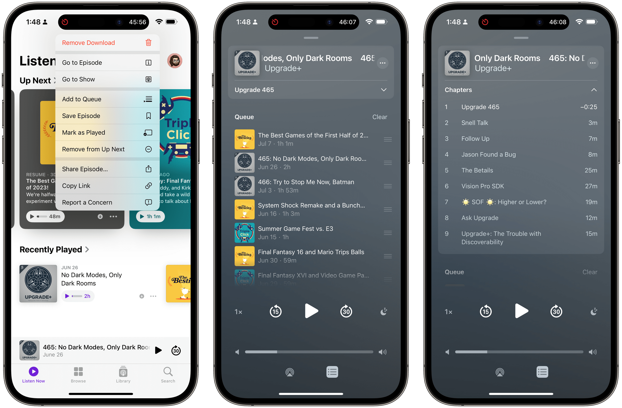
The Queue page is excellent: it shows episodes you’ve manually queued, which you can remove with a swipe or re-arrange with drag and drop; if the episode supports chapters, there’s even a new switcher at the top of the screen that shows you all chapters for the episode and tells you how long each one is.
As a result of these queue-related changes, I found myself using Apple’s Podcasts app as my main podcast player again. The lack of audio effects such as voice boost and trim silence isn’t great (and I continue to think Apple should add them), but there’s something about the app’s native feel, widgets, and integration across the ecosystem that speaks to me now that I have an Apple Watch Ultra and HomePod mini in addition to an iPhone and iPad.
We’ll see how this experiment goes this summer.
iPadOS 17
I’ve already written at length about Stage Manager for iPadOS 17 on both MacStories and the Club, and my opinion hasn’t changed.
Stage Manager in iPadOS 17 is great. Apple listened to feedback, iterated on what wasn’t working for power users, and shipped a much more flexible, stable, and powerful version of Stage Manager that, right now, is a pleasure to work with. I started using Stage Manager again last month and haven’t stopped. The combination of more versatile window placement and keyboard shortcuts (including the ability to Shift-click app results in Spotlight to add them to a workspace) is terrific. If you didn’t like Stage Manager for iPad last year, I urge you to give it another try.
The new version of iPadOS is, as always, largely consistent with what’s changing in iOS. There are interactive widgets on the Home Screen, the same app enhancements in core apps such as Reminders and Messages as seen on the iPhone, and so forth. There are, however, some unique traits of iPadOS 17 I want to point out.
The iPad Lock Screen is getting support for widgets, and I like how Apple is taking advantage of the iPad’s different form factor here. While widgets in portrait mode resemble their iPhone counterparts, the landscape iPad Lock Screen is getting a brand new design with a sidebar on the left that you can fill with widgets:
I like this idea: most people who work with their iPads do so with the device in landscape mode, likely connected to a keyboard or stand, and Apple figured out a better way to take advantage of the extra space on the Lock Screen. This also means that you can use a lot of widgets at once on the iPad’s Lock Screen: on my 12.9” iPad Pro, I was able to fit five medium-size widgets, but I could mix and match them with small widgets for a much larger number of items displayed at once.
My only skepticism about Lock Screen widgets on the iPad is that, unlike the iPhone, I barely see the iPad’s Lock Screen to begin with. The iPad does not have an always-on display, and when I sit down in front of my iPad Pro, I press the space bar and unlock it immediately with Face ID. The Lock Screen on the iPad just isn’t a place where I usually want or need to hang out. That said, it’s probably too early to tell and I want to reserve my judgement for later this year. I like the idea of Lock Screen widgets on the iPad, and maybe my usage will increase over the next few months.
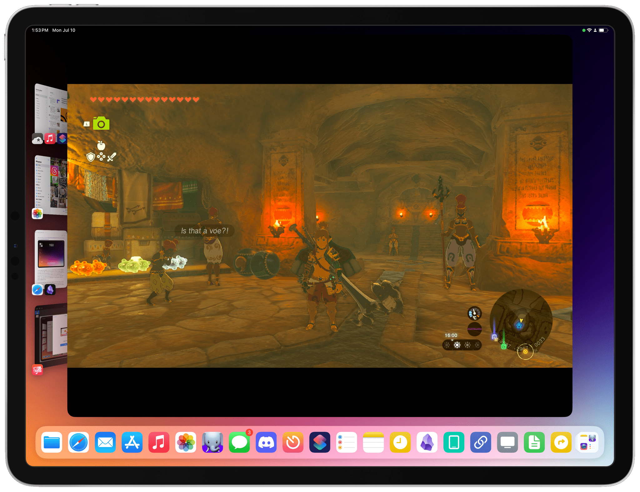
The one iPadOS 17 feature that has truly surprised me so far is support for external cameras. By adding support for USB video class (or UVC) devices, the iPad can now take advantage of any webcam or otherwise compatible peripheral connected over USB-C. In my tests over the past month, I’ve already seen the benefits of this technology in a couple different ways.
For starters, when I’m using my iPad Pro in fake “clamshell mode” at my desk connected to the Studio Display, the iPad running iPadOS 17 can now use the Studio Display’s webcam. There’s nothing to configure: the camera is automatically picked up by FaceTime and other apps, and I can configure its properties (such as Center Stage and Portrait Mode) from Control Center’s updated video effects panel. This is the way it should have always been.
Using FaceTime on the iPad Pro connected to a Studio Display with the Studio Display’s built-in camera.
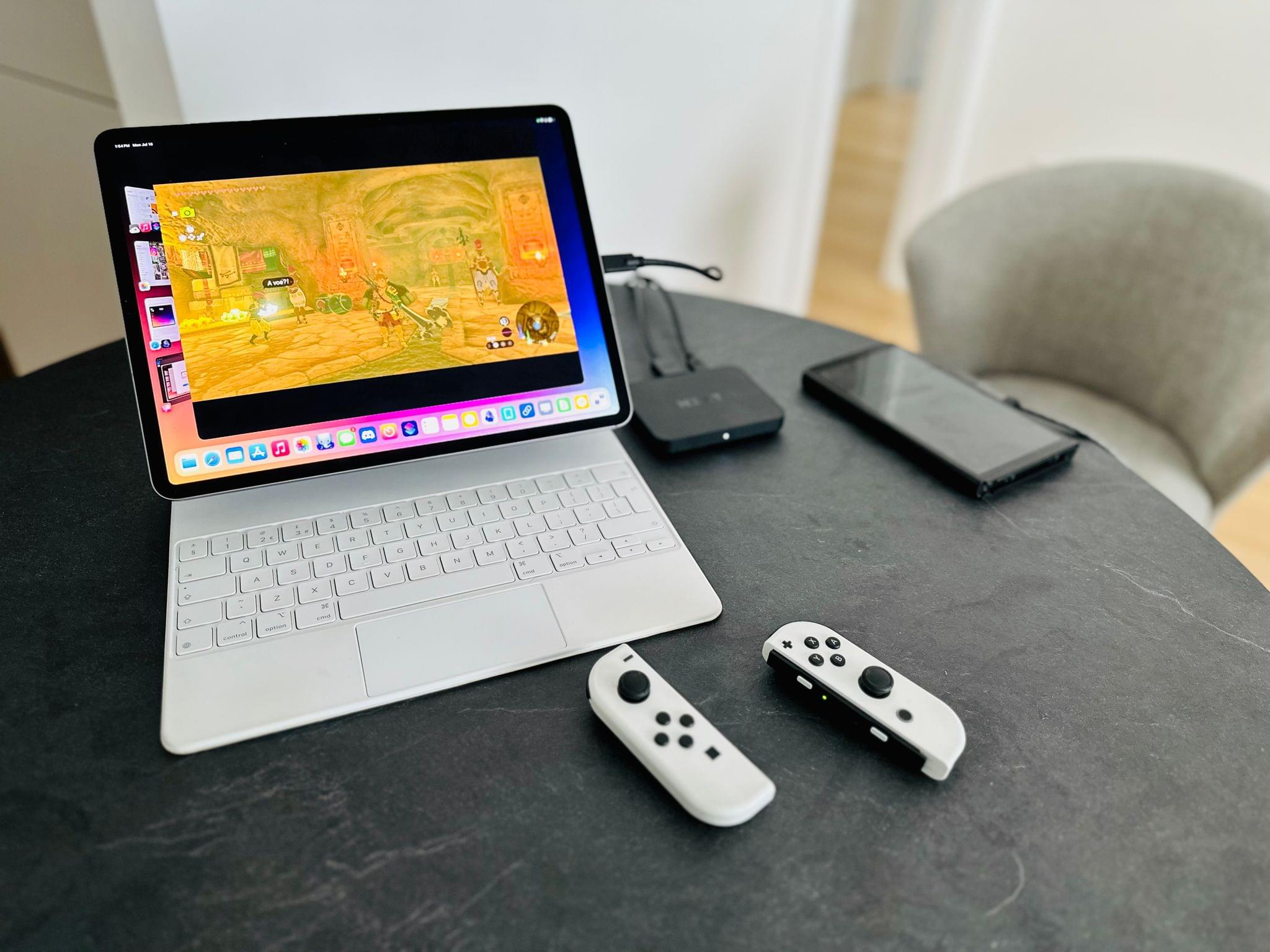
The other unexpected benefit of UVC support on iPad is the ability to use videogame capture cards on iPadOS.
For the past few weeks, I’ve been using Capture Pro, a UVC viewer and capturing tool currently in beta, to display my Nintendo Switch’s screen on the iPad and record footage of Tears of the Kingdom directly on my iPad Pro. The capture card I have (a NZXT Signal 4K30) was immediately recognized by iPadOS with a single USB-C cable, and I can now view Zelda being played on the Switch on the iPad Pro’s display with no latency and proper sound output. It is, frankly, incredible. Expect much more on this front in my iPadOS review this fall.
I’m going to have more to say on iPadOS later this year, but early signs so far are very, very encouraging. There are still things I cannot do on my iPad (alas, there’s no support for better audio routing and external microphones still) and there are aspects of Stage Manager that could be improved, but I get the sense that Apple has truly listened to feedback from iPad users over the past year.
I’m happy to be an iPad-first user again.
The iOS and iPadOS 17 Public Betas
Should you install the public betas of iOS and iPadOS 17? This year, my answer is a resounding “yes”.
If you’re an iPad user and want to get work done on your iPad with greater efficiency than last year, the improved Stage Manager in iPadOS 17 is a no-brainer. The updates to the multitasking system are particularly visible when working with an external display, where more flexible window placement makes the iPad feel like a better fit for a desktop workstation. I wouldn’t underestimate support for UVC-based video capturing tools, either. Whether it’s a USB webcam, DSLR, or game capture card, support for this class of USB devices further extends the iPad’s capabilities into desktop territory. If anything, I’m waiting for someone to figure out how to ship an all-in-one solution to stream real-time gameplay from a Nintendo Switch to Twitch using only an iPad Pro in the middle.
On the iPhone, if you like widgets and customization, and especially if you’ve bought into the MagSafe ecosystem with different chargers, you’re going to have a lot of fun this summer customizing widgets and using StandBy. The biggest compliment I can pay to the iOS 17 beta right now is that it’s causing me a problem: I want to try all the widgets, and I can’t choose which kind of interactivity I want to add to my Home Screen. This is a great problem to have, and it’ll grow exponentially once developers start releasing their widget updates later this year. More than ever, iOS 17 is pointing at another widget gold rush coming to the App Store very soon.
There are a lot of smaller app enhancements and system tweaks I haven’t covered today, but that’s a story for another time. I’ve spent most of my time this month using Notes, Podcasts, Reminders, and Messages, but there are some fascinating changes coming to the likes of Safari, Passwords, and Music that we’ll analyze with the final release of iOS 17.
I’m also keeping an eye on Apple’s new set of intelligence features such as improved auto-correct and new Visual Look Up image identification categories; it’s too early for a definitive judgement, but my experience so far (especially with auto-correct) is extremely positive. For context, I typed most of this story at night with the touch keyboard on my iPad Pro so I wouldn’t disturb my girlfriend sleeping next to me. That hadn’t happened in years. The new auto-correct is already that good. Hopefully it’ll stay that way until September.
What you should know today is that both the iOS and iPadOS 17 betas are in a good place right now, widgets are back, and it’s a great time to be an iPhone and iPad user. You can download the public betas of iOS and iPadOS 17 today.
I’ll see you this fall, ready, as always, with my annual review of iOS and iPadOS.
You can also follow our 2023 Summer OS Preview Series through our dedicated hub, or subscribe to its RSS feed.
- If launching apps from StandBy becomes a habit for people, I expect developers will start properly supporting landscape orientation in their apps. ↩
- This is made possible by the fact that each MagSafe-certified charger has a unique identifier, which iOS 17 can use to tie specific StandBy settings to a charger. ↩