Posts tagged with "featured"

Why 2Do Is My New Favorite iOS Task Manager

There’s only one thing I like more than switching todo apps: writing about it. On the surface, it surely seems like I’ve been doing a lot of both in the past year.

In reality, while I have been guilty of periodically changing the way I organize my tasks in the past – going as far as trying a different app each month – I’ve made an effort to stick with a system, learn it, and use it as much as possible over the past three years. Since 2013, I’ve only replaced my task management app of choice once – when I moved from Reminders to Todoist upon realizing that my life got too busy for Apple’s basic app.

I liked Todoist for reasons that made sense at the time: I was preparing our multi-article coverage of iOS 8; I wanted a task manager that lived in the cloud and could be used to collaborate with other people; and I was intrigued by the idea of filters. Todoist served me well for months, and I was happy to see that others were also rediscovering a service that had been around for quite some time and built a profitable business. If you’re looking for a task manager that does more than Wunderlist and is built for teams and external integrations, Todoist still is my top recommendation.

Around early July this year, I realized that my daily work routine wasn’t the same as the Fall of 2014 and that it was also about to change again with the launch of Club MacStories and my iOS 9 review. On the verge of major alterations to my workflow and personal schedule, I always want to reassess and optimize how I get work done so that I don’t end up fighting a system that’s supposed to help me. Life is ever-changing, and there’s no point in thinking that our approach to manage it should perpetually stay the same.

Primarily out of curiosity but also with a hint of app boredom, I installed 2Do on my iPhone and iPad while I was in Positano1. I had no idea it would become the task manager I’ve felt the most comfortable with since getting an iPhone eight years ago.

Read more


Markdown and Automation Experiments with 1Writer

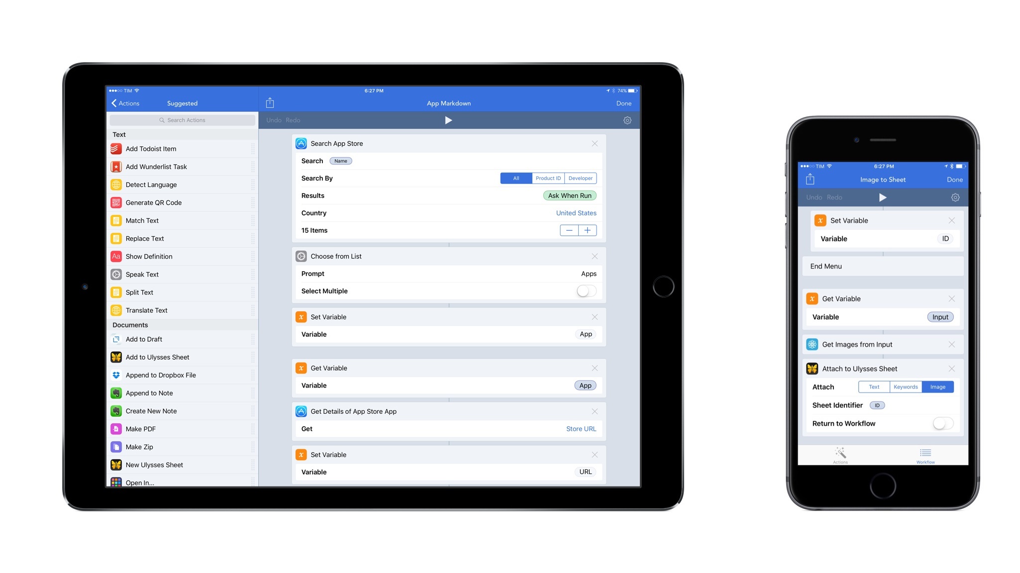
In preparing my reviews of iOS 9 and the iPad Pro, I noticed that my writing process was being slowed down by the lack of multitasking support in my text editor of choice, Editorial. For the past couple of weeks, I’ve been trying to move some of my Editorial scripts and workflows to 1Writer, with interesting results and potential for the future.

I have written about Editorial at length on MacStories, and I still find Ole Zorn’s text editor to provide the most powerful combination of Markdown and plain text automation that’s ever been created on iOS. Over the years, I’ve put together hundreds of workflows thanks to Editorial’s visual actions and Python scripting; while some of them were made for fun and intellectual curiosity, the majority of them helped me save time when doing actual work for this website, Relay FM, and Club MacStories. There is no other app with the same feature set and rich Markdown support of Editorial.

Since iOS 9, however, I’ve been wondering whether part of Editorial’s automation could be taken somewhere else, possibly in another app that offered full integration with iOS 9 multitasking. I may have several workflows in Editorial, but I only use a tiny fraction of them on a daily basis for regular work on this website. I’d rather use a text editor that excels at a subset of Markdown workflows and integrates with iOS 9 than a single text editor with every imaginable workflow without proper iOS 9 integration.

It was this realization that pushed me to give 1Writer another look. I first bought the app years ago, but because I had no excuse to explore the world outside of Editorial, I didn’t try to recreate any workflows in it. This time around, I was motivated to rebuild the core of my setup in 1Writer, so I took a deep dive into the app’s automation engine.

Things will likely change again once Editorial supports iOS 9, but in the meantime I’ve developed an appreciation for 1Writer’s design and features that helped me understand the app better.

Read more


iPad Pro Accessories Review: Apple Pencil, Smart Keyboard, Logitech CREATE Keyboard

Ready to conquer Rome.

Ready to conquer Rome.

A fundamental part of the iPad Pro experience is the new range of accessories created by Apple and the framework the company has opened up to third-party manufacturers with the Smart Connector.

While Apple has been making iPad accessories since the very first iPad, the new Smart Connector has allowed the company to rethink how an external keyboard should connect to the device and interact with iOS, and they’re giving third-parties the ability to do the same with new types of accessories. Meanwhile, the Pencil marks Apple’s debut in the field of pens and styli for iPad, with several unique twists.

Alongside an iPad Pro review unit, Apple also provided me with an Apple Pencil, a Smart Keyboard, and, to my surprise, a Logitech CREATE keyboard case that connects to the device with the new Smart Connector. Because I don’t plan to use these accessories on a daily basis (I’m not an artist, I rarely have to sketch and annotate documents, and I mostly use the software keyboard when writing articles), I have collected a few thoughts in this standalone article.

You can find my impressions below.

Read more


iPad Pro Review: A New Canvas

For the past two years, I’ve been reconsidering my preconceptions on large screens.

Back in 2013, I thought the iPad mini would always be the perfect iPad for me. After the technologically outdated debut of the first iPad mini, the second-generation model iterated on almost every aspect of the device, offering a masterful blend of portability and strengths of the iOS platform. I couldn’t see myself switching to a full-size iPad again.

And then iOS 9 happened. Or rather, it started becoming clear – from multiple angles and sources – what would eventually happen to iOS for iPad, which had long stagnated in a state of close resemblance to the iPhone’s interface. In hindsight, looking back at my iPad’s history through a mere technological lens, upgrading to the iPad Air 2 in 2014 was a safe bet: a year later, the device that seemed even too powerful for iOS 8 would be the only one to fully support iOS 9’s new multitasking features on day one.

I was uncertain about switching from the iPad mini to the Air 2 as a future-proofing tactic for my iOS experience, but the decision paid off. I didn’t know I’d be able to get work done faster and more comfortably on the bigger iPad Air 2 until I got one. The iPad Air 2 became my primary computer.

On both the iPhone and iPad, I’ve discovered that I like big screens and I’m not affected by portability concerns. Moving to the iPad Air 2 and upgrading to the iPhone 6 Plus has been instrumental to assemble a setup that makes me more efficient on a daily basis.

It’s with this mindset that I approached the iPad Pro, which I’ve been using for the last eight days since getting a review unit from Apple last week. Announced in September alongside the iPhone 6s, the iPad Pro has been presented by the company as the future of computing, promising to deliver desktop-class performance in a tablet form factor and expanding the range of input sources beyond multitouch with new accessories.

More practical questions have been making me ponder my taste in iPads again for the past two months. Is the iPad Pro too big for me? Can it really take another leap and outclass the iPad Air 2 in my daily usage of iOS 9? And with an iPad this big, are the portability perks of the 9.7-inch tablet inevitably lost?

I’ve spent the past week trying to find out. I set up a clean installation of iOS 9.1 on the iPad Pro with the apps I use every day (Editorial, Tweetbot, 2Do, Slack, Newsify, Outlook, and Notes – just to name a few), tested several third-party apps with iPad Pro-specific optimizations, and used accessories Apple gave me alongside the review unit – a Pencil, a Smart Keyboard, and the new Logitech CREATE keyboard case. I’ve used the iPad Pro as my only computer in lieu of the iPad Air 2, and I’ve observed how its hardware and software changes altered my workflow and physical interactions.

There’s a lot to discuss about the iPad Pro, and I’ll have to continue unwrapping the nature of this device for weeks to come. But I want to make one thing clear from the outset:

This is less of a “just for media consumption” device than any iPad before it. The iPad Pro is, primarily, about getting work done on iOS. And with such a focus on productivity, the iPad Pro has made me rethink what I expect from an iPad.

Read more


How the 6s Plus Is Reshaping My iPhone Experience

In April, I settled an argument with myself. After years of assuming that a small and compact phone was what I wanted, I realized that the iPhone 6 Plus was the pocket computer for me. The size, harder one-handed operations, software slowdowns caused by memory constraints and resolution downsampling – ultimately, none of those potential 6 Plus issues pushed me to reconsider my decision. I had adjusted to the hybrid nature of the iPhone 6 Plus, and I couldn’t go back.

My physical traits and lifestyle habits meet the prerequisites necessary to use a 6 Plus on a daily basis. My hands are big enough for size not to be a deal breaker; I’m no longer constrained by obligatory one-handed operations; and generally, when I need to use my iPhone, I can use two hands for a better grip or faster interactions, and I don’t mind it.

I say “hybrid” as a callback to how many refer to the 6 Plus, but I don’t mean it in a pejorative light for the iPad. Since I switched to the 6 Plus in February, my use cases for the iPhone and iPad Air 2 have continued to be distinct and well-suited for the nature of each platform.

The iPad Air 2 is my primary computer, which I use to write and publish articles, manage MacStories, play games, read, and every other activity I used to perform on a Mac. The Air 2 has the unique advantage of being a truly portable computer, and it’s my most used iOS device to date.

The iPhone is the pocket computer for everyday life. It’s my camera. It’s my home remote. It’s Twitter and Slack. It’s my health companion. I value my iPad immensely (I wouldn’t be able to write this article without it), but the iPhone holds the key to my mobile lifestyle.

The iPhone is the hub around which everything revolves. Even the iPad – my computer – orbits the iPhone.

Based on lessons from the past few months, I knew getting an iPhone 6s Plus would be the best option for me. As I’ve witnessed, the Plus-sized iPhone and the iPad Air 2 don’t compete with each other in my life: they complement each other’s strengths. While I have sometimes traded one device for the capabilities of the other (such as reading on my iPhone instead of the iPad), I use each device for what it’s best at, and I’ve never once doubted the role of the iPad in my daily workflow. I’m fine with a big iPhone, and I’m doing well with a big iPad. I like big screens. They’re comfy.

As I outlined in my review, the most evident drawback of the iPhone 6 Plus was the inability to keep up with iOS 8. Whatever the reason – and no matter the performance improvements that Apple promised throughout the OS’ update cycle – the iPhone 6 Plus always felt behind iOS 8, exhibiting stuttering animations, constantly purging recent apps from memory, and, generally, being sluggish.

It was reasonable, then, to wait for an S-class upgrade that would iron out the kinks and offer a more complete vision of the 5.5-inch iPhone. More RAM, an updated processor, an improved camera; faster multitasking, faster apps, faster everything. That’s what I wanted. And knowing Apple – or, at least, knowing their penchant for a regular dose of small surprises – I assumed they’d throw in some seemingly minor but welcome new features for good measure as well.

The iPhone 6s Plus delivers on all these fronts, going beyond the “S stands for Speed” philosophy that is inexorably repeated every two years with changes I didn’t expect.

Read more


Tweetbot 4 Review: Bigger Bot

There have only been two great Twitter apps for iPad since 2010: Loren Brichter’s Twitter, and the original Tweetbot for iPad.

As I reminisced last year in my look at the state of Twitter clients, iOS apps for Twitter are no longer the welcoming, crowded design playground they once were. Developing a Twitter client used to be an exercise in taste and restraint – a test for designers and developers who sought to combine the complex networking of Twitter with a minimalist, nimble approach best suited for a smartphone. Twitter reclaimed their keys to the playground when they began offering “guidance” on the “best opportunities” available to third-party developers. Four years into that shift, no major change appears to be in sight.

For this reason, I’d argue that while the iPhone witnessed the rise of dozens of great Twitter clients in their heyday, the iPad’s 2010 debut played against its chances to receive an equal number of Twitter apps specifically and tastefully designed for the device. Less than a year after the original iPad’s launch (and the Tweetie acquisition), Twitter advised developers to stop building clients that replicated the core Twitter experience; a year later, they started enforcing the 100,000-token limit that drove some developers out of business. Not exactly the best conditions to create a Twitter client for a brand new platform.

Largely because of the economic realities of Twitter clients, few developers ever invested in a Twitter app for iPad that wasn’t a cost-effective adaptation of its iPhone counterpart. Many took the easy route, scaling up their iPhone interfaces to fit a larger screen with no meaningful alteration to take advantage of new possibilities. Functionally, that was mostly okay, and to this day some very good Twitter apps for iPad still resemble their iPhone versions. And yet, I’ve always felt like most companies had ever nailed Twitter clients for a 10-inch multitouch display.

With two exceptions. The original Twitter for iPad, developed by Tweetie creator and pull-to-refresh inventor Loren Brichter, showed a company at the top of their iOS game, with a unique reinterpretation of Twitter for the iPad’s canvas. The app employed swipes and taps for material interactions that treated the timeline as a stack of cards, with panels you could open and move around to peek at different sets of information. I was in love with the app, and I still think it goes down in software history as one of the finest examples of iPad app design. Until Twitter ruined it and sucked all the genius out of it, the original Twitter for iPad was a true iPad app.

And then came Tweetbot. While Twitter stalled innovation in their iPad app, Tapbots doubled down and brought everything that power users appreciated in Tweetbot for iPhone and reimagined it for the iPad. The result was a powerful Twitter client that wasn’t afraid to experiment with the big screen: Tweetbot for iPad featured a flexible sidebar for different orientations, tabs in profile views, popovers, and other thoughtful touches that showed how an iPhone client could be reshaped in the transition to the tablet. Tapbots could have done more, but Tweetbot for iPad raised the bar for Twitter clients for iPad in early 2012.

Three years later, that bar’s still there, a bit dusty and lonely, pondering a sad state of affairs. Tweetbot is no longer the champion of Twitter clients for iPad, having skipped an entire generation of iOS design and new Twitter features. Tweetbot for iPad is, effectively, two years behind other apps on iOS, which, due to how things turned out at Twitter, haven’t been able to do much anyway. On the other hand, Twitter for iPad – long ignored by the company – has emerged again with a stretched-up iPhone layout presented in the name of “consistency”. It’s a grim landscape, devoid of the excitement and curiosity that surrounded Twitter clients five years ago.

Tweetbot 4 wants to bring that excitement back. Long overdue and launching today on the App Store at $4.99 (regular price will be $9.99), Tweetbot 4 is a Universal app that builds upon the foundation of Tweetbot 3 for iPhone with several refinements and welcome additions.

In the process, Tweetbot 4 offers a dramatic overhaul of the iPad app, bringing a new vision for a Twitter client that’s unlike anything I’ve tried on the iPad before.

Read more


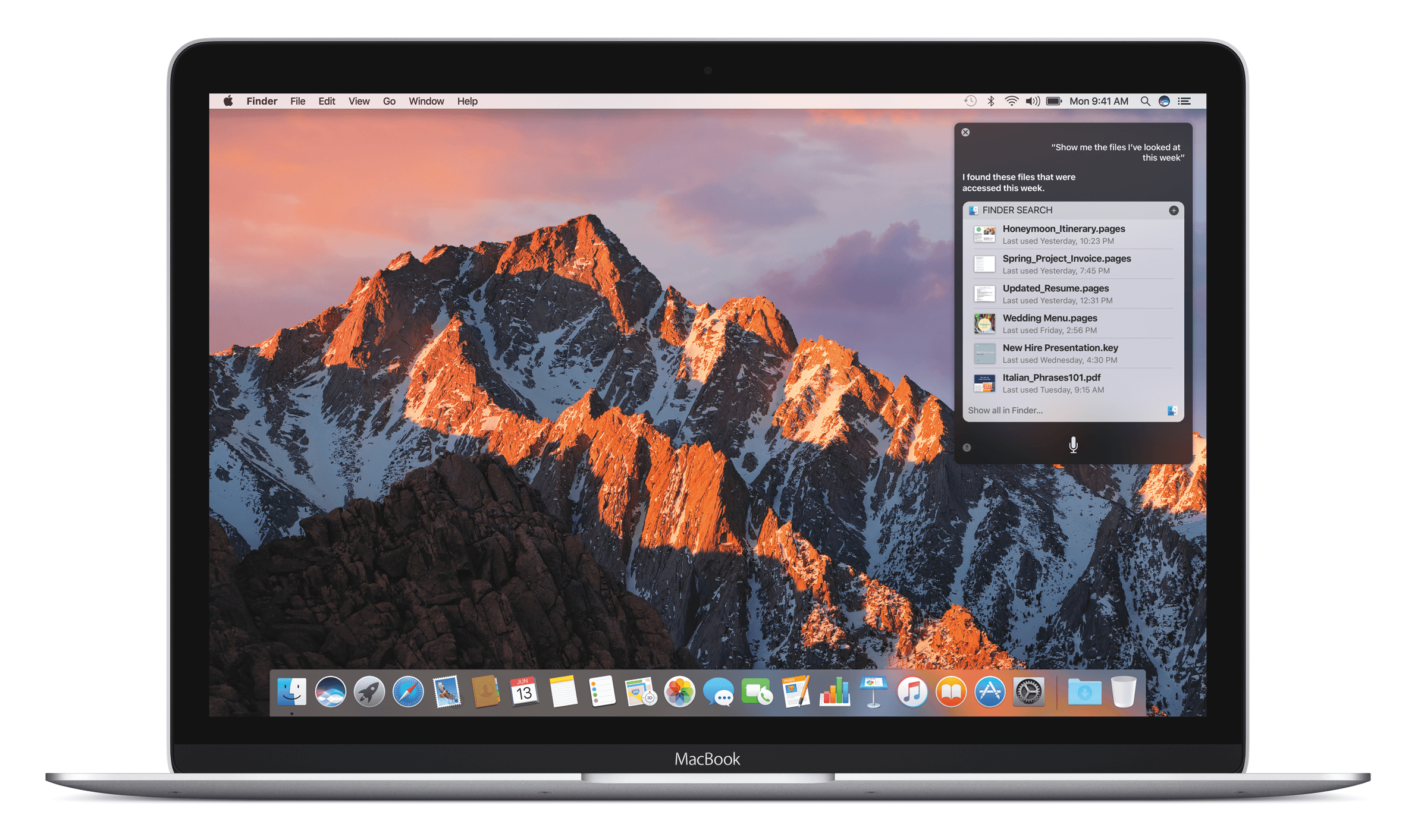
OS X 10.11 El Capitan: The MacStories Review

In 2013 Apple left behind the decade old big cat naming scheme for major releases of its flagship desktop operating system. It set its sights instead on inspirational places in California. Beginning with Mavericks, a California surfing spot, OS X then moved on to Yosemite, the beloved national park. In this year’s new release, Apple eschewed another big move in exchange for seeking greater heights within the bounds of last year’s stomping ground.

Since the introduction of Yosemite last fall, Apple has faced some rough times in the press. While the company is well adjusted to the doomsday chicanery constantly tossed about by the mainstream tech media, this year the calls were coming from inside the house. Well known developers and tech bloggers who have historically been accused 1 of ingratiation with the Cupertino company, were stepping out to bring attention to a growing feeling of dissatisfaction in its software.

Software is a field which has classically been one of Apple’s strong suits. Shave off ten seconds on startup and save a dozen lives. Yet recent years have brought debacles such as Apple Maps in iOS 6 and discoveryd, as well as many smaller issues such as random crashing in iOS, lost music files, and stingy iCloud storage.

The consensus that seemed to be reached when these issue came to a head this January was a plea to Apple to just slow down. While Apple’s hardware division has proven themselves capable of firing on all cylinders year after year, their software division has not quite been keeping up. They could use a year to regroup, focus on existing features, and hold off on any major leaps forward. In essence, a Snow Leopard kind of year.

Thankfully, in what seems to be establishing itself as a pleasant trend of late, Apple has been listening.

discoveryd was reverted in the final update to Yosemite, Apple Music has some homework to do, and Apple Maps has picked up the last of its major missing features. Siri is getting faster, iCloud storage prices have gone down, and Notification Center widgets which launch other apps are being allowed into the App Store.

With the difficult, but necessary changes seen in iOS 7 and 8 and OS X 10.9 and 10.10 out of the way, Apple may finally have a chance to take advantage of some breathing room and address the features they’ve been neglecting.

With all this in mind, it’s no surprise that OS X 10.11 is named after a mountain which can be found inside Yosemite National Park.

El Capitan marks an end to Apple’s relentless march forward, opting instead for a calm retrospective on the applications and underlying frameworks which have been the keystones of the operating system for years. Portentous in its own restraint, 10.11 canonizes those small but significant features that enrich the OS X experience in daily use. Shaving off seconds and bandaging cuts, El Capitan is the operating system we’ve been looking for.

Read more


  1. Without merit, but accused nonetheless. ↩︎

iOS 9: The MacStories Review, Created on iPad

With iOS entering the last stage of its single-digit version history, it’s time to wonder if Apple wants to plant new seeds or sit back, maintain, and reap the fruits of the work done so far.

Last year, I welcomed iOS 8 as a necessary evolution to enable basic communication between apps under the user’s control. With extensions based on a more powerful share sheet, document providers, widgets, and custom keyboards, I noted that iOS had begun to open up; slowing down wasn’t an option anymore.

In hindsight, many of the announcements from last year’s WWDC were unambiguous indicators of a different Apple, aware of its position of power in the tech industry and willing to explore new horizons for its mobile operating system and what made it possible.

Following the troubled launch of iOS 6 and subsequent rethinking of iOS 7, Apple found itself caught in the tension between a (larger) user base who appreciated iOS for its simplicity and another portion of users who had elected iPhones and iPads as their primary computers. Alongside this peculiar combination, the tech industry as a whole had seen the smartphone graduate from part of the digital hub to being the hub itself, with implications for the connected home, personal health monitoring, videogames, and other ecosystems built on top of the smartphone.

WWDC 2014 marked the beginning of a massive undertaking to expand iOS beyond app icons. With Extensibility, HealthKit, HomeKit, Metal, and Swift, Tim Cook’s Apple drew a line in the sand in June 2014, introducing a new foundation where no preconception was sacred anymore.

iOS’ newfound youth, however, came with its fair share of growing pains.

While power users could – at last – employ apps as extensions available anywhere, the system was criticized for its unreliability, poor performance, sparse adoption, and general lack of discoverability for most users. The Health app – one of the future pillars of the company’s Watch initiative – went through a chaotic launch that caused apps to be pulled from the App Store and user data to be lost. The tabula rasa of iOS 7 and the hundreds of developer APIs in iOS 8 had resulted in an unprecedented number of bugs and glitches, leading many to call out Apple’s diminished attention to software quality. And that’s not to mention the fact that new features often made for hefty upgrades, which millions of customers couldn’t perform due to storage size issues.

But change marches on, and iOS 8 was no exception. In spite of its problematic debut, iOS 8 managed to reinvent how I could work from my iPhone and iPad, allowing me – and many others – to eschew the physical limitations of desktop computers and embrace mobile, portable workflows that weren’t possible before. The past 12 months have seen Apple judiciously fix, optimize, and improve several of iOS 8’s initial missteps.

Eight years1 into iOS, Apple is facing a tall task with the ninth version of its mobile OS. After the changes of iOS 7 and iOS 8 and a year before iOS 10, what role does iOS 9 play?

In many cultures, the number “10” evokes a sense of growth and accomplishment, a complete circle that starts anew, both similar and different from what came before. In Apple’s case, the company has a sweet spot for the 10 numerology: Mac OS was reborn under the X banner, and it gained a second life once another 10 was in sight.

What happens before a dramatic change is particularly interesting to observe. With the major milestone of iOS 10 on track for next year, what does iOS 9 say about Apple’s relationship with its mobile OS today?

After two years of visual and functional changes, is iOS 9 a calm moment of introspection or a hazardous leap toward new technologies?

Can it be both?

eBook Version

An eBook version of this review is available to Club MacStories members for free as part of their subscription. A Club MacStories membership costs $5/month or $50/year and it contains some great additional perks.

You can subscribe here.

(Note: If you only care about the eBook, you can subscribe and immediately turn off auto-renewal in your member profile. I’d love for you to try out Club MacStories for at least a month, though.)

Download the EPUB files from your Club MacStories profile.

Download the EPUB files from your Club MacStories profile.

If you’re a Club MacStories member, you will find a .zip download in the Downloads section of your profile, which can be accessed at macstories.memberful.com. The .zip archive contains two EPUB files – one optimized for iBooks (with footnote popovers), the other for most EPUB readers.

If you spot a typo or any other issue in the eBook, feel free to get in touch at [email protected].

Table of Contents

Read more