The Spatiality of iPad Multitasking
With new multitasking features, Apple had to rethink parts of the core structure of iOS for iPad. This has introduced novel challenges and complexities, some of which haven’t been addressed in this release.
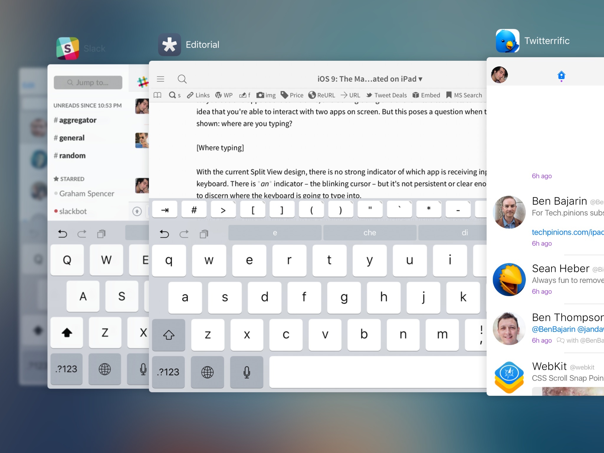
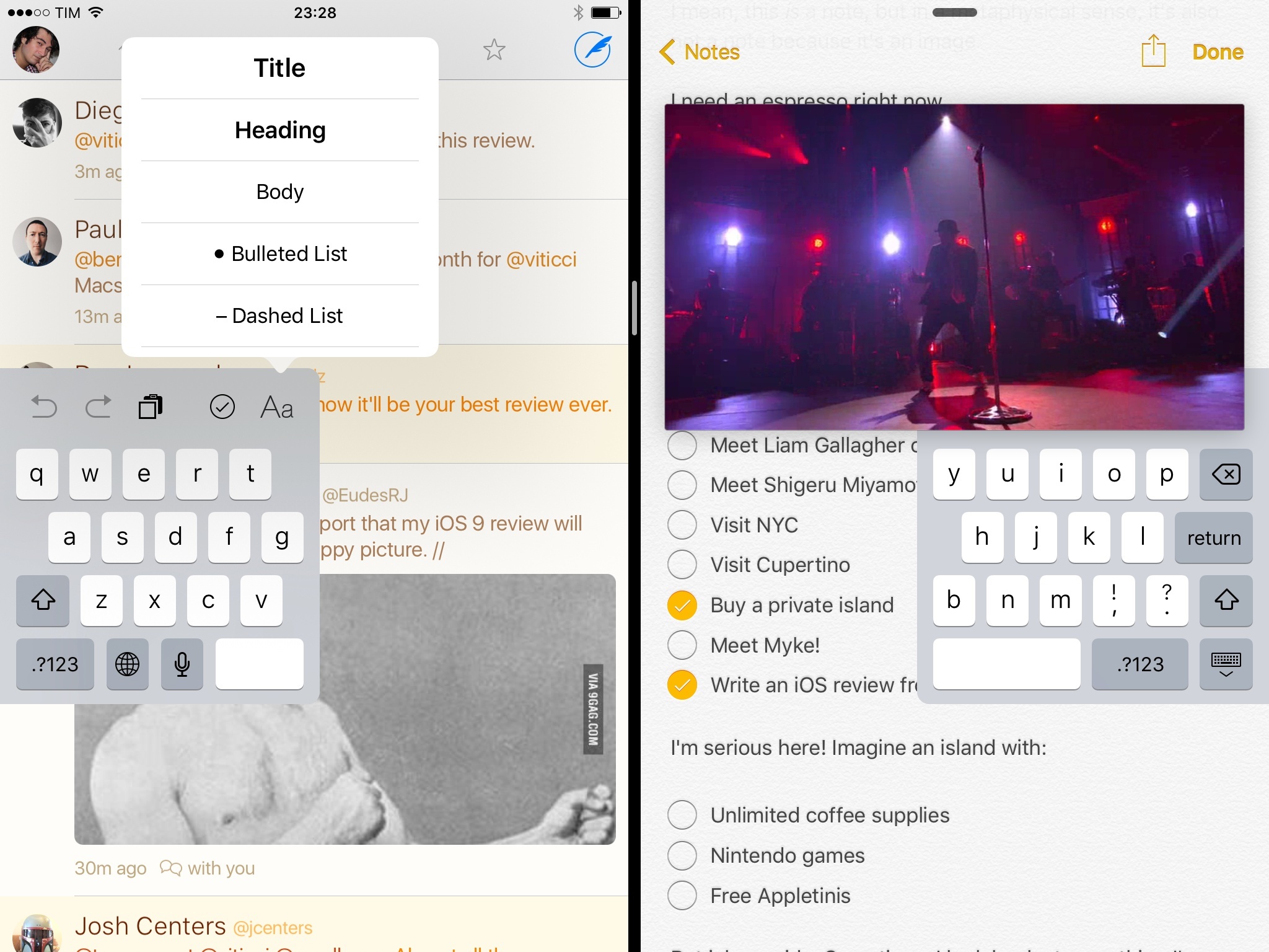
While Slide Over reinforces the idea of primary and secondary app by dimming the primary app in the background, such distinction isn’t available for Split View. There’s a reason for that: Split View is meant to let you use two apps at the same time, and downgrading one of them to a lesser state would diminish the idea that you’re able to interact with two apps on screen. But this poses a question when the keyboard is shown: where are you typing?
With the current Split View design, there is no strong indicator of which app is receiving input from the iOS keyboard. There is an indicator – the blinking cursor – but it’s not persistent or clear enough if you need to discern where the keyboard is going to type into.
I don’t believe this will turn out to be a major problem in practice: in using iOS 9 on my iPad, occasionally typing into the wrong app in Split View hasn’t made me long for the simpler times of full-screen apps. Still, as a mere design critique, I believe Apple could figure out ways to better indicate the relationship between apps in Split View and the keyboard. In the meantime, I’d advise developers to strongly consider unique tint colors for the text cursor to help increase visual recognition.
The concept of active app state (or lack thereof) gets worse when you’re using an external keyboard. Let’s play this game again: which app is listening for keyboard shortcuts now?
A problem that is somewhat eased by the blinking cursor turns into a bigger usability concern when the cursor isn’t displayed but input is still accepted through an external keyboard. With Discoverability and keyboard shortcuts, you’ll end up with a case of Schrödinger’s Split View: an app is both active and inactive at the same time, and your perspective is all that matters. Or, rather, a single touch matters: the app receiving keyboard shortcuts will be the one where the keyboard was last shown. If you put two apps with a text field side by side, you can tap one after the other to change what Discoverability thinks it’s the active app.
This is not obvious, and you can test it by putting two apps in Split View, connecting a Bluetooth keyboard, and holding Command while tapping both apps’ text fields. The Discoverability overlay will move between the two according to what iOS interprets as last-used and therefore actively-receiving-external-input app. Thankfully, there are plenty of ways that Apple could go to improve the visual structure of Split View – for example, the shared status bar could be a good place for an active app indicator.
You can “fake” multiple instances of Safari by putting Safari View Controller next to Safari in Split View.
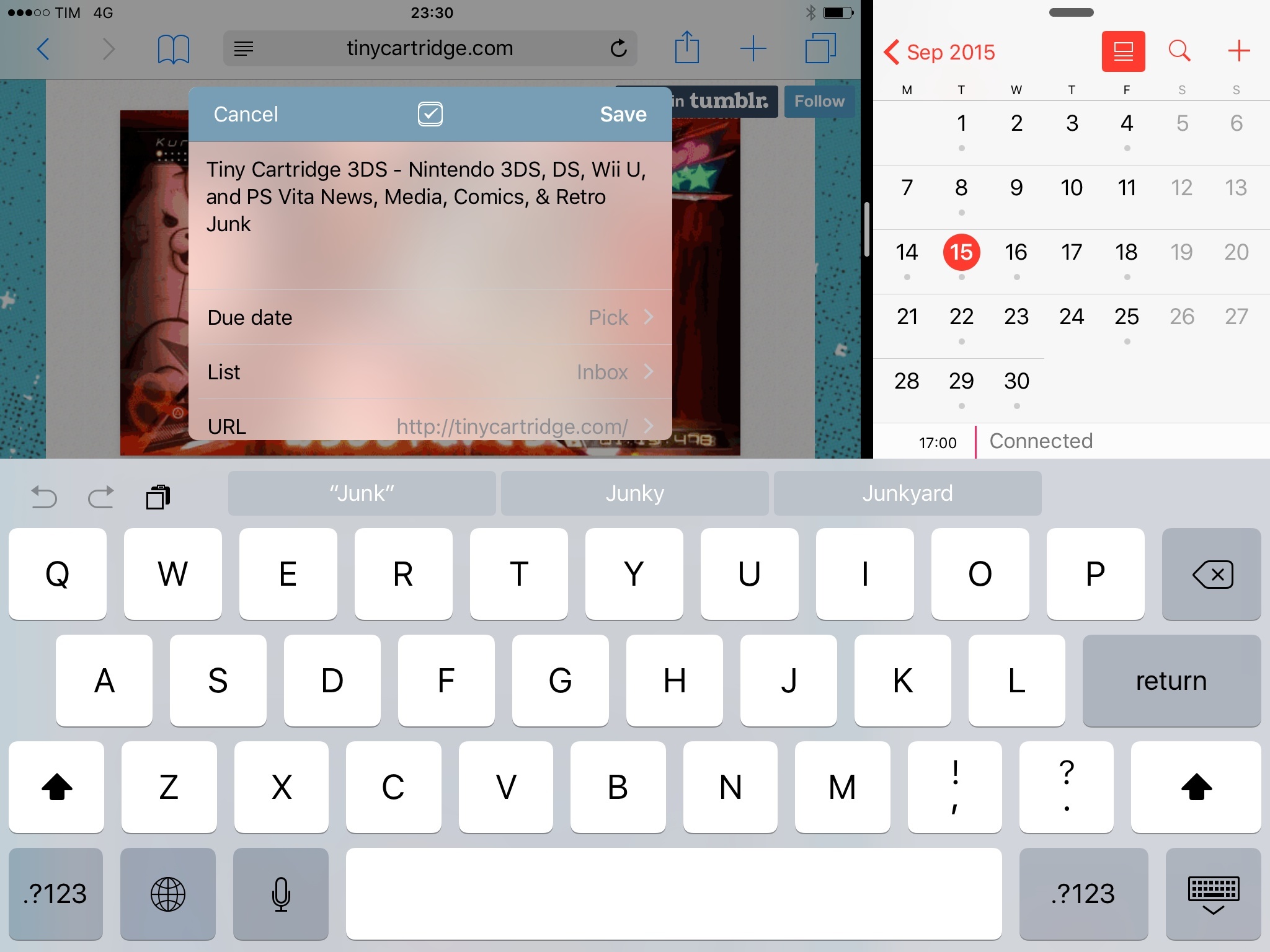
One of the key aspects of Slide Over and Split View is that they cannot show two sections of the same app at once. Only individual apps can be displayed concurrently on screen: you can’t split Safari in multiple views and display both views on screen at the same time. If you were hoping to manage multiple Safari tabs or Pages documents in Split View, you’re out of luck.
Splitting apps into multiple atomic units for standalone views and documents seems like an obvious next step going forward. If Apple wants to do this, the redesigned system app switcher and its heavily card-influenced design32 could be used to group multiple instances of an app together in a stack.
Today, Split View doesn’t support multiple views of the same app. I wouldn’t bet on that always being the case in the future.
Where Apple’s multitasking architecture gets more questionable is in the thread that runs through Slide Over, Split View, and the classic app switcher.
In iOS 9, there isn’t a 1:1 relationship between the app switcher and other multitasking features. The idea of “recent” app is muddled when the system has to account for multiple apps displayed on screen, but Apple could have handled some parts of this differently.
When you put a secondary app in Slide Over or Split View, that app disappears from the system app switcher. Instead of being displayed as a smaller card to the right of the current app, it’s completely hidden from the switcher’s UI. When in Split View, the secondary app is an empty rectangle on the right side of the primary app.
I assume that Apple didn’t want to bring distinct touch targets to each card in the switcher; my issue is that this looks like a bug, and users should have the ability to resume Split View through a preview of both apps. Hiding the secondary app in the switcher is also a mistake as it prevents users from retrieving an app the traditional way.
In an ideal state, iOS would honor the placement of primary and secondary apps. They would both be displayed in the app switcher when active; their position would always be the same as you move across the OS and all of its different ways to launch apps.
On some level, iOS does exactly this: when you’re in Split View and return to the Home screen, opening another app that supports it will launch that app in Split View automatically, bringing in the secondary app from the right side again. This is good design: clicking the Home button when in Split View (and Slide Over) pushes the secondary app into the right edge of the screen before going to the Home screen, a transition that highlights the spatiality of multitasking and the division between primary and secondary app. iOS even remembers Split View if you quit the primary app and open it again, or after a device restart.
Apple made a good call in making Slide Over and Split View as “sticky” as possible, and especially Split View feels like a feature that can be left on all the time. It could be debated whether iOS should offer settings to launch apps and notifications in the secondary app pane33, but this is a good start.
Another problem occurs when the order of recent apps is overridden by the app switcher used in Slide Over and Split View. It took me a long time to figure this out, but here goes: the app switcher used in these two modes doesn’t show the same list of recent apps you see in the system app switcher (the one that comes up with a double-click on the Home button). Instead:
- The Slide Over app switcher only shows apps that support Slide Over (of course);
- Of these apps, the first three icons (from the bottom) are the apps you’ve recently used in Slide Over and Split View;
- From the fourth icon and upwards in the switcher, you’ll see the same order of recent apps as they appear in the system app switcher, regardless of whether you used them in Slide Over and Split View recently.
I couldn’t make out the reason behind this choice initially. Now, I see Apple’s motivation and the kind of experience they’re going for – but it could be a confusing one for those accustomed to a certain spatiality in the app switcher.
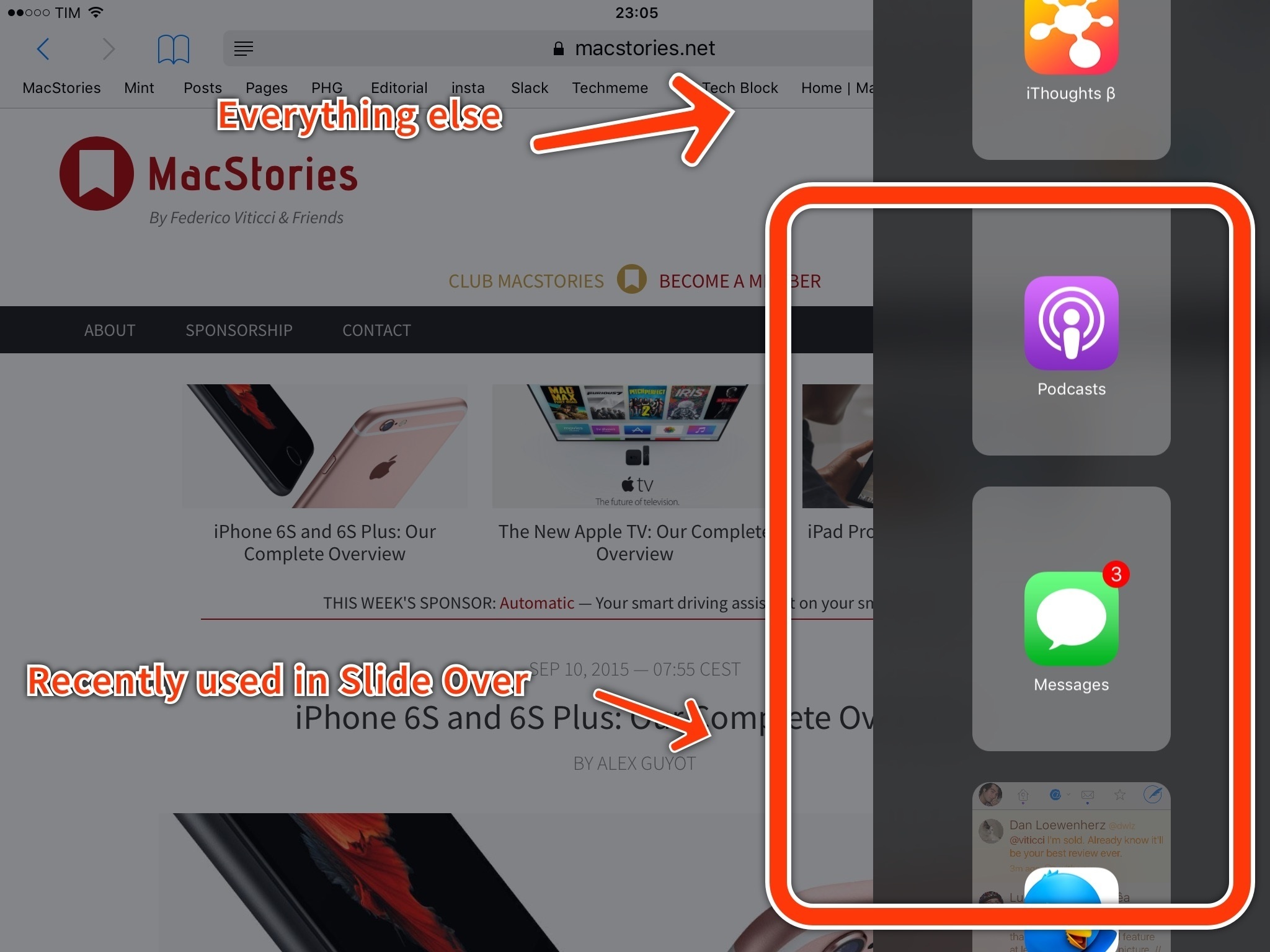
Apple thinks that most users will tend to frequently use the same apps in Slide Over and Split View. Whether it’s an iMessage next to a webpage in Safari or a mind map alongside a podcast episode, the new multitasking app switcher is built on the assumption that frequency of use is more convenient than hierarchy and spatiality at all costs. From a design perspective, it’s an interesting conundrum: would it be better to always display the same order of apps when double-clicking the Home button and swiping from the right edge of the screen, or does the new app switcher deserve its own layer of “recently used” apps that can override whatever you recently used outside of Slide Over and Split View?
It took me a while to warm to this idea, but after a few months I see Apple’s perspective and they have a point. When I’m doing something that requires interacting with two apps at the same time, I tend to go back to the same pair of apps over and over. Mail next to Safari to open links in a web browser (and great to unsubscribe from unwanted newsletters) and Messages next to Calendar; iThoughts in Slide Over when I’m writing in Editorial. I have developed my own workflows and routines for multitasking on iOS 9, and, while on principle the spatiality of the main app switcher should be respected, in practice altering the first three apps to be the ones you last used in Slide Over and Split View leads to a faster, more efficient way to multitask. Moving between apps in Slide Over and Split View is faster because of this design.
The system app switcher itself has been redesigned with cards that display an app’s icon and name at the top of a preview of its last state; along with the new look, the order has been reversed, so you’ll now be swiping right to go back in the list of recently closed apps instead of going left.
I’ve been thinking about the redesigned app switcher a lot, and for a while I couldn’t understand why Apple would want to change the app switcher other than to spice it up. From a design standpoint, I find the new switcher to be nicer and smoother than the old one34, but, on a spatial level, it would make more sense to keep the old left-to-right order to have the Slide Over/Split View app picker fit with the rest of the UI and spatiality of the feature (everything stays to the right).
I still can’t find a single, perfectly solid argument in favor of the redesigned app switcher – just a few possible explanations.
- By moving app names and icons to the top of the switcher, Apple has freed up space at the bottom of the UI, where they can now insert proactive recommendations for apps and Handoff.
- It could be that the company realized that swiping right is a superior metaphor for going back into your list of apps, which are displayed before (to the left of) the app you’re currently using and the Home screen, sort of like a timeline.
- The revised order of the app switcher works better with iOS’ support for back links and the new app-launching animation: back links shown in the status bar point left, backwards in the list of recently used apps; launching apps (and tapping the Safari button for a Universal Link) moves forward now, pushing the current app to the left.
- The new app switcher was made for 3D Touch on the iPhone 6s.
With Slide Over and Split View, Apple has allocated new UI layers to the limited space of an iPad. For the most part, the company has done a good job at keeping the resulting interactions as obvious as possible, but they’ve created peculiar edge cases and questions, too. As I’ve explored above, some of them haven’t been addressed in this first version of iOS 9.0; given their extremely specific nature and, arguably, philosophical problem rather than practical inconvenience, I wouldn’t be surprised if they’ll take a long time to be “fixed”.
The concept of direct manipulation in iOS makes considerations on the spatiality and physical consistency of software intriguing – Slide Over and Split View exist in their own UI and UX space, but they also have to coexist with features and layers that predate iOS 9. Spatially speaking, Slide Over and Split View have managed to find their place on iOS. Can the same be said at a visual level?
The Visual Complexities of iPad Multitasking
Back in the old iPad days, there was a certain romance about opening an app and knowing it would be the one and only app you could look at while it was active. It was a consistent, pure iteration of the iPhone’s app model, glorified for a 10-inch screen and embellished by baroque textures of antique leather materials, fine exotic woods, and futuristic robot servants. It was, in many ways, beautiful.
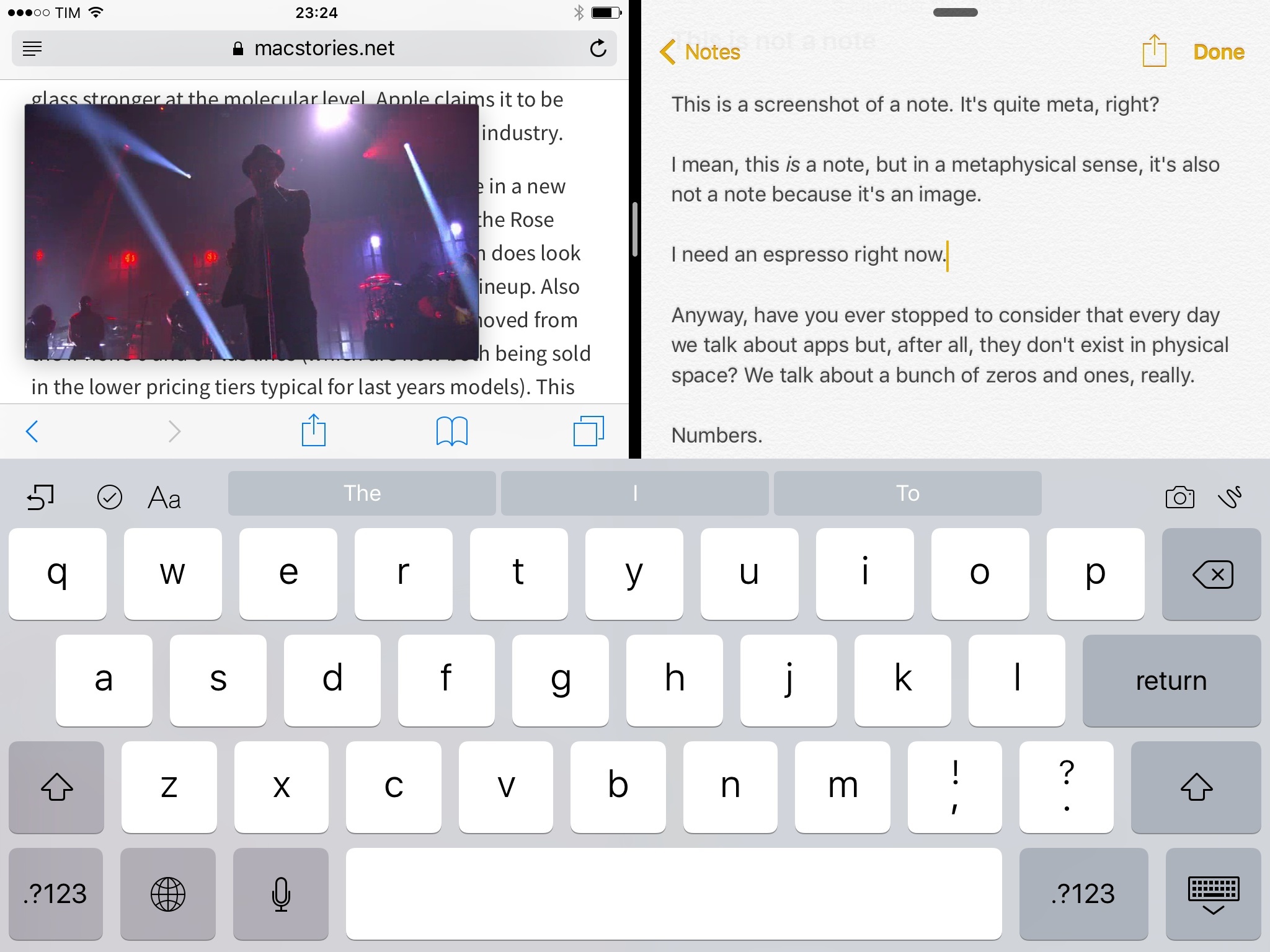
Today, this is what you can achieve if you try really hard to push iOS and Split View to their limits:
Over 10 layers of user interface displayed in a multitasking environment that involves two apps being used at the same time. Is this the same device that launched to reviews praising how fantastic it was to be forced to use one app at a time?
New features always bring new complexity, and true utility is found in the balance of increased functionality and added confusion. iOS 9 multitasking is no exception: it’s powerful, but it also dramatically increases the amount of information being displayed on the iPad’s screen.
We have to ask: is it too much?
If you consider Picture in Picture, Split View, Control Center, extensions, notifications, app menus, Command-Tab, and the system keyboard, an iPad can be as visually cluttered as a traditional desktop computer. Unlike a Mac, the iPad’s screen real estate is limited and the software keyboard is part of the UI, which leaves even less room for app content to be displayed. Because of its touch constraints, iOS on an iPad Air 2 can even seem busier than OS X.
Consider Split View and Picture in Picture. Let’s say you’re working with Notes on the left and Safari on the right while watching a video via Picture in Picture. With both apps shown in landscape mode and the keyboard active, there isn’t much room left for the video overlay, but you can keep it on either side if you don’t always need to look at what you’re writing or researching. There’s already a lot going on.
Now you’re in the middle of your note-taking session, Picture in Picture is playing, and you realize you need to work with an extension in Safari. Picture in Picture is displayed on top of Safari, and you hit the share icon to bring up the share sheet. What happens next?
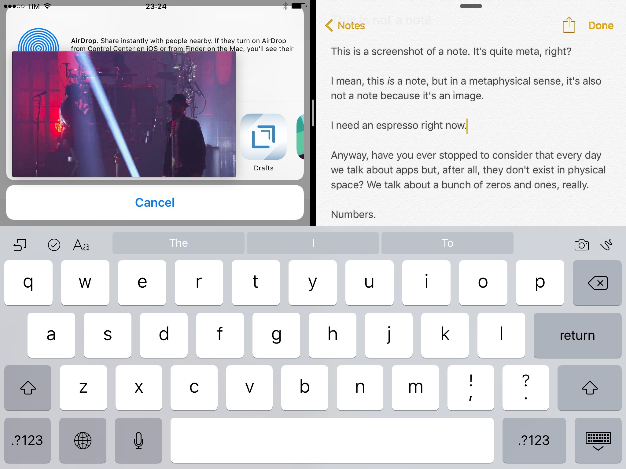
Because Picture in Picture sits on top of anything that is displayed underneath, the share sheet you just activated is fully hidden by the video player, which you’ll need to move to the left – the only possible location at this point – if you want to use extensions. Fair? Yes, because Picture in Picture is purposefully designed to always follow you around. More complex than what we’re used to on iOS? Also a “yes”.
And it’s not just Picture in Picture that raises questions on the visual clutter now possible on an iPad with iOS 9. What happens when you combine the split keyboard – it still exists! – with Picture in Picture and a bunch of share sheets? How about a custom keyboard, Split View, and Command-Tab? There’s a lot of different styles and UI elements claiming their own space at once.
After using iOS 9 on my iPad for the past three months, I’ve wondered if Apple had gone too far in the name of productivity. The iPad used to be the friendly device that could be a calculator, a book, a newspaper, or the web in the palm of your hands. With iOS 9, we’re presented with a device that can show dozens of layers of content at the same time, often from three different apps, with a UI design that doesn’t bring back any feeling of familiarity from physical objects that you hold in your hands.
And that’s okay.
For the iPad to grow up, new challenges and complexities ultimately have to be accepted. The entire point of this discussion – and the thread I’ve tried to develop in this chapter – isn’t to argue that Apple should have built multitasking features with no complexity, but to observe how they reacted to the complexities they were destined to introduce all along.
The iPad can’t be more without becoming more complex, but the way that complexity doesn’t become complicated is under Apple’s control. With no restraint, we might have ended up like this. And to truly appreciate the fine balance struck between functionality and confusion, we need to look back at iOS 7.
If Apple hadn’t redesigned iOS from the ground up with a focus on text, color, clarity, and content, I don’t think iOS 9 multitasking would be as usable as it is today. Modern apps may have lost some of the craft and skills required to recreate realistic visuals, but as a result designers and developers now have to pay attention to aspects of functionality, accessibility, and inter-app communication that were largely ignored or glossed over before.
I’ve been writing about iOS apps for a while, and I’m not affected by any kind of nostalgia for the good old days of skeuomorphic trends. This isn’t about taste: from a mere functional standpoint, iOS today is more legible, clear, and better prepared to support apps that work together.
By hitting the reset button on a design pendulum that had swung too far in favor of photorealism, Apple has created a more uniform, scalable iOS app ecosystem that feels and works as a cohesive force instead of a bunch of fancy toys. It may be less “fun” for designers who don’t have to spend weeks setting up a particular leather texture in Photoshop. But iOS today is better equipped for users of all types and needs, and true care for design is found in how it serves people, not in how much it’s appreciated by fellow designers on Dribbble.
This is evident with new multitasking features in iOS 9 for iPad. When using two apps in Split View, you’re likely not going to end up with a wooden shelf on the left side and a metallic cabinet on the other, all while a small video player with rounded corners floats around the screen projecting heavy shadow effects on top of everything. Instead, using Apple’s apps (and third-party ones) in Split View feels like a unified, consistent experience: two pieces of software based on the same design language, not clashing with each other, distinct but homogenous. The more subdued, unassuming nature of the modern iOS makes sheets of content as well as entire apps feel like part of a whole system – multiple components of the same machine and not competing protagonists of the same stage.
Visual uniformity plays an essential role in making iPad multitasking appear simple and devoid of additional clutter, and it suggests that Apple has been preparing for the increased complexity of iOS 9 for a long time. I wouldn’t be surprised if bigger iPhones and the prospect of iPad multitasking ended up being key factors in the decision process of iOS 7 back in late 2012. Today’s iPad multitasking wouldn’t be possible without an OS that can scale and adapt depending on a user’s task, screen size, language, or preferred device orientation. With the system that Apple has put in place – from San Francisco and the Retina display to the keyboard and extensions – every piece works together.
There is an added complexity to the overall iPad experience when using new multitasking features in iOS 9, but it’s always mitigated by understandable constraints. Whether it’s the two possible sizes for Split View or the magnetic behavior of Picture in Picture, the increased capabilities of iOS 9 on the iPad come with acceptable limitations. There are some instances of Apple trying to be too clever or redesigning features for reasons that aren’t completely clear yet; for the most part, though, Apple has been judicious in its implementation of simultaneous apps and system features.
On paper, iPad multitasking can be visually complex. In practice, you’re not going to always be dealing with overcrowded Split Views displaying multiple menus. iOS 9 multitasking strikes a great balance of optional power tools and the underlying simplicity that has characterized the iPad for the past five years.
I bet it’s going to be even better on a 13-inch device.
- We all miss you, webOS. ↩
- If you're in Split View and tap a link to an app (or a notification), the primary app will switch to show another app, putting up a back link in the top left of the status bar. ↩
- The way the icons subtly fade as you swipe between apps, or how an adjacent card snaps to the right as you quit an app is well done. ↩