Last night I stayed up late to check out Ping in iTunes 10 and catch up with the news I missed during the day. That’s what usually happens when Apple holds an event, not to mention the video livestream. I missed 3 hours of tweets while trying to download iTunes 10 and reading through all the new product descriptions on Apple’s website. I also finally moved my primary work email address to Gmail. Goodbye, Apple Mail. Good riddance.
So I stayed up late, and at 5AM I thought it would be a good idea to start organizing my revamped Gmail a little bit. I left Tweetie for Mac running in the background, fecthing tweets for me. I didn’t even look at it, I was lost in an ocean of labels and Google shortcuts. Then, 60 minutes later, I gave a glimpse at Tweetie. 6 AM, dawn, MG Siegler posts something about Twitter for iPad. The headline says Twitter has killed its website, too, because Twitter for iPad is that good. Right: it’s 6 AM and I’m seeing links pointing to Twitter for iPad, one of my most anticipated apps. Maybe I need some sleep, I’m starting to see things that aren’t even there. Like a proper blogging app for iPad.
I didn’t find a link to a new blogging app, but I did realize that Twitter for iPad was real. Early in the morning - or late in the night, your call - I immediately made up my mind and started looking for it in the App Store. Usually, that’s a bad move. Bloggers need to catch some sleep. Especially on Apple events days. But screw conventions, I’m going after Loren Brichter’s latest creation. Last night, people (namely US iPad users) couldn’t find Twitter for iPad (which is a universal update to Twitter for iPhone, reaching version 3.1) in their iTunes updates. They were swearing on iTunes 10. I fired up App Store.app on my iPad, found Twitter and installed it. I saw the screenshots on TechCrunch and Engadget, it looked good. As I opened, it looked even better. I played with it. Thanks to ActionMenu for iPad, it filled my Twitter passwords in seconds. I took some screenshots. I was excited and grateful to Brichter for providing such a unique experience. Then I went to sleep.
6 hours later
See, I’m a little particular. Unlike most of my friends, I go to sleep at 6AM and wake up by (what should be) lunch. That’s what you get by living in the wrong timezone. Friends and family are now used to it. But this one’s about Twitter. Right. The point is, I wake up and have an espresso while reading the morning news. Google Reader and Twitter, that’s it. Today, after last night’s fanboy excitement, I used Twitter for iPad instead of Osfoora HD or Tweetie for Mac. I haven’t changed my mind: this thing is incredible. But it’s got issues. Can you accept the trade-off?
Twitter for iPad revolves around the concept of columns, but not the ones you may think of. It’s not Tweetdeck: in a way, it’s more similar to Tweetie for Mac. Just like Inception, you “have to go deeper”. It’s not a possibility: you have to, if you want to enjoy the complete experience Brichter and the mobile Twitter team built. It also doesn’t come with realtime updating: guess we’ll have to wait for version 3.5 for that, opt-in. Looking at the big picture, Twitter for iPad blows every other Twitter client for iPad out of the water. I’ll examine the issues I have with the app later, but for now let’s just say Twitter for iPad is based on some incredible new UI and UX patterns.
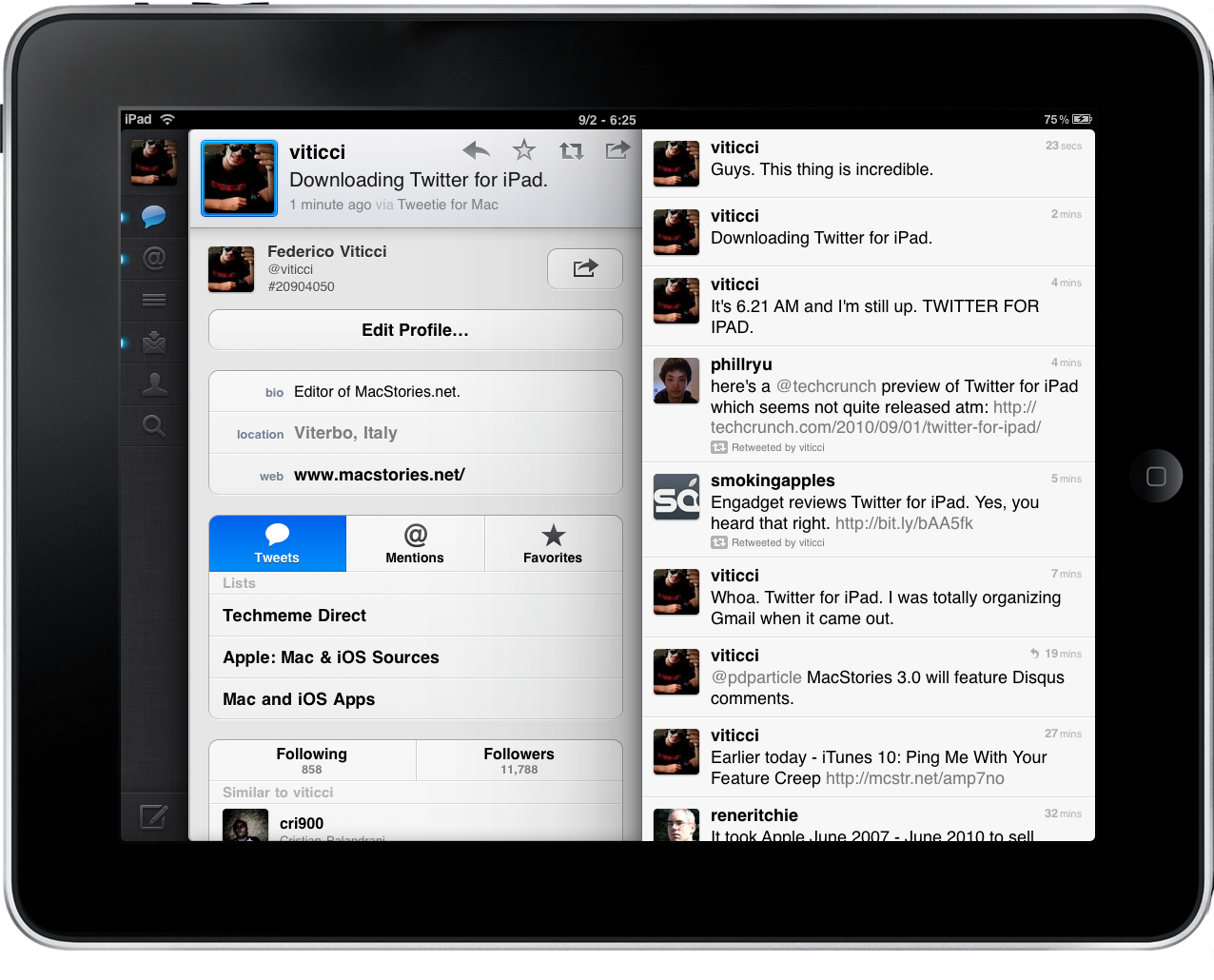
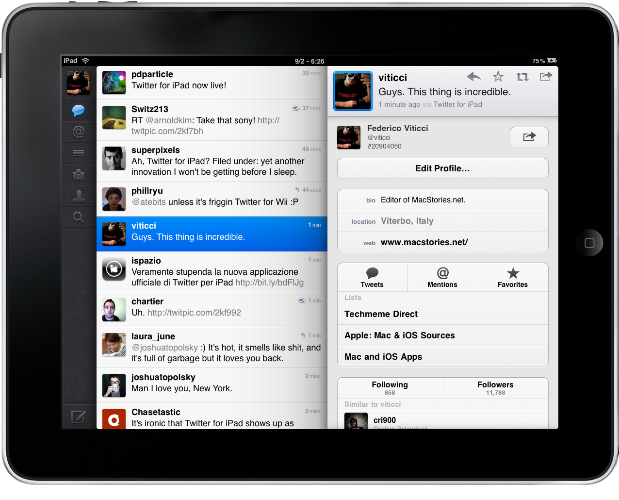
You can use the app both in landscape and portrait mode and, surprisingly enough, the experience doesn’t change that much. The main point is that you have these panels (or columns, or whatever you call them) and you can drag them and swipe them to navigate through tweets, users and links. Just like Tweetie for Mac (I haven’t seen many people notice this yet) you can keep on opening profiles and tweets and conversations without having to leave the core structure, which sits on the left and allows you to quickly switch between the timeline, replies, lists, DMs, your profile and search. Sadly, no Favorites shortcut in the sidebar. You can navigate the timeline, but you can switch at any time to another section. When you switch, though, you lose the panels you opened in the first view. If I have 6 panels in the timeline (say 3 profile and 3 tweets combined) and I hit the Replies icon, I lose those panels if I go back to the timeline. That’s a first trade-off. But let’see how the app works from the start, anyway.
As you enter your credentials (you can even use the app without an account, interesting) you’re presented the timeline view with an “expanded sidebar”; in landscape mode, there’s a large empty space on the right. You can scroll to read tweets, but the fun begins when you tap on one. Unlike Twitter for iPhone, there’s no swipe-on-tweet menu: to perform actions with tweets you have to tap on them, and this opens a new panel. The new panel contains the single tweet view with buttons (reply, fave, retweet / quote and mail / copy link) if it’s a message without any links, a conversation is embedded right below it if it’s a reply to someone. Twitter for iPad automatically loads the conversation below a single tweet, so I don’t understand why Brichter decided to highlight the “In reply to…” status in blue. It seems clickable, but it doesn’t do anything. Weird. When a tweet contains a link, though, things are different: the link is blue, and a new larger panel slides in with the associated webpage automatically loading. You don’t have to tap on a link to view it, you select a tweet and, thanks to the bigger screen of the iPad, the app displays the single view and the webpage. This is clever: the developers thought that when a user selects a tweet with a link, they want to see it. So why not automatically load it? Geeks will argue that sometimes they just wanna fave a tweet for later without having to see the webpage, and I understand them: a setting would be useful for this. But then again, this is a change for the better. A better user experience. Furthermore, you can play around with the panel: you can expand the web view (awesome animation) or drag it to the side, let the page load in the background and read timeline tweets in the meantime. It’s in-app multitasking. Too bad that you can’t select a tweet, jump to the web view and go deeper on the right side by, say, opening the author profile while loading the page. Web view panels don’t seem to support this kind of navigation - another trade-off. Would you prefer an expandable & draggable panel to a constantly squeezed web view? The answer is: you don’t get multiple levels of navigation when you want to consume online content.
Indeed, consuming is one of the app’s main points: built with the typical iPad user in mind, Twitter for iPad lets you easily scroll, swipe, watch videos, read articles and send them to Instapaper. Integrated web views surely come in handy and manage to make people feel comfortable with Twitter’s completely new UI scheme.
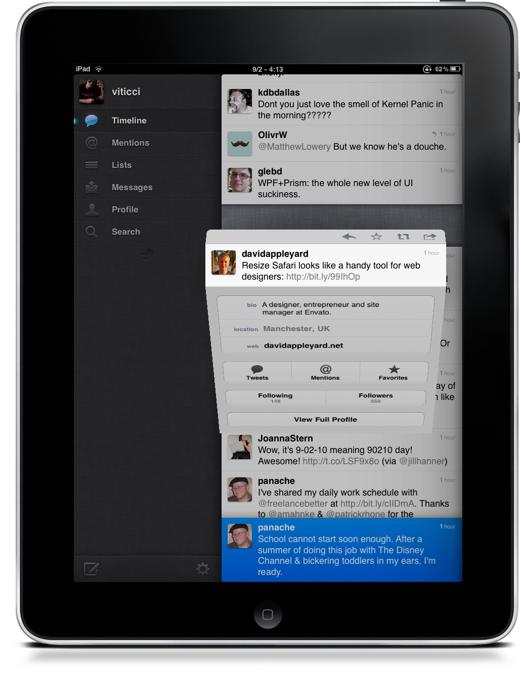
The “slide-to-reveal” concept is not new to iPad users, though: Reeder for iPad introduced it. In the vertical feeds view, you can tap on an unread item to make the entire article slide in, then you swipe it again to go back to the main view. Twitter’s advantage is that no one ever did this for a Twitter clients before, and that it’s got the brand and the visibility to make people think they invented this feature. We, geeks, know the truth. For as much as Brichter could have been inspired by Rizzi’s implementation, Twitter does the multi-level thing - and that’s enough, I guess. Is it all about panels and swiping? Nope. Twitter for iPad has got two more tricks up its sleeve, and two interesting ones I must say. Two-finger pulldown to show conversation in timeline view, and pinch tweet to open a single-view floating panel. Whoa. Honestly, I never saw this stuff before in any other app - props to Loren for the idea. Do they work as advertised? Sort of. The two-finger pulldown is great…no, let me rephrase: it’s awesome and useful. Without having to open a panel to show the conversation, you get this shortcut that dims the background and extends the single tweet cell to load previous replies. You gotta see it in action. The pinch on tweet is impressive, but it’s somehow buggy. I mean, the animation is great: it seems like you “extract” the tweet from the timeline, and it reminded me of Flipboard’s page turning 3D effect. The downside is that the app often doesn’t register your gestures and thinks you want to load a conversation instead. Also, there’s a weird bug that opens the single-tweet panel anyway after you close the floating window. For those of you wondering what this floating thing actually does: it’s a single-tweet view with shortcuts to full profile, following and followers. It’s pretty handy, too bad it doesn’t always work.
I like the way Twtter for iPad handles direct messages: the latest message is at the bottom. But I know why they did this: to enable you too see what you’re replying to when the keyboard slides up. Otherwise, they would have been forced to make the list slides up when the keyboard appears, and that would have been weird. I love the fact that even in the timeline view you can tap on the Messages tab and hold it to see DMs in a popover. And you can even send one inside the popover without leaving the timeline. Awesome.
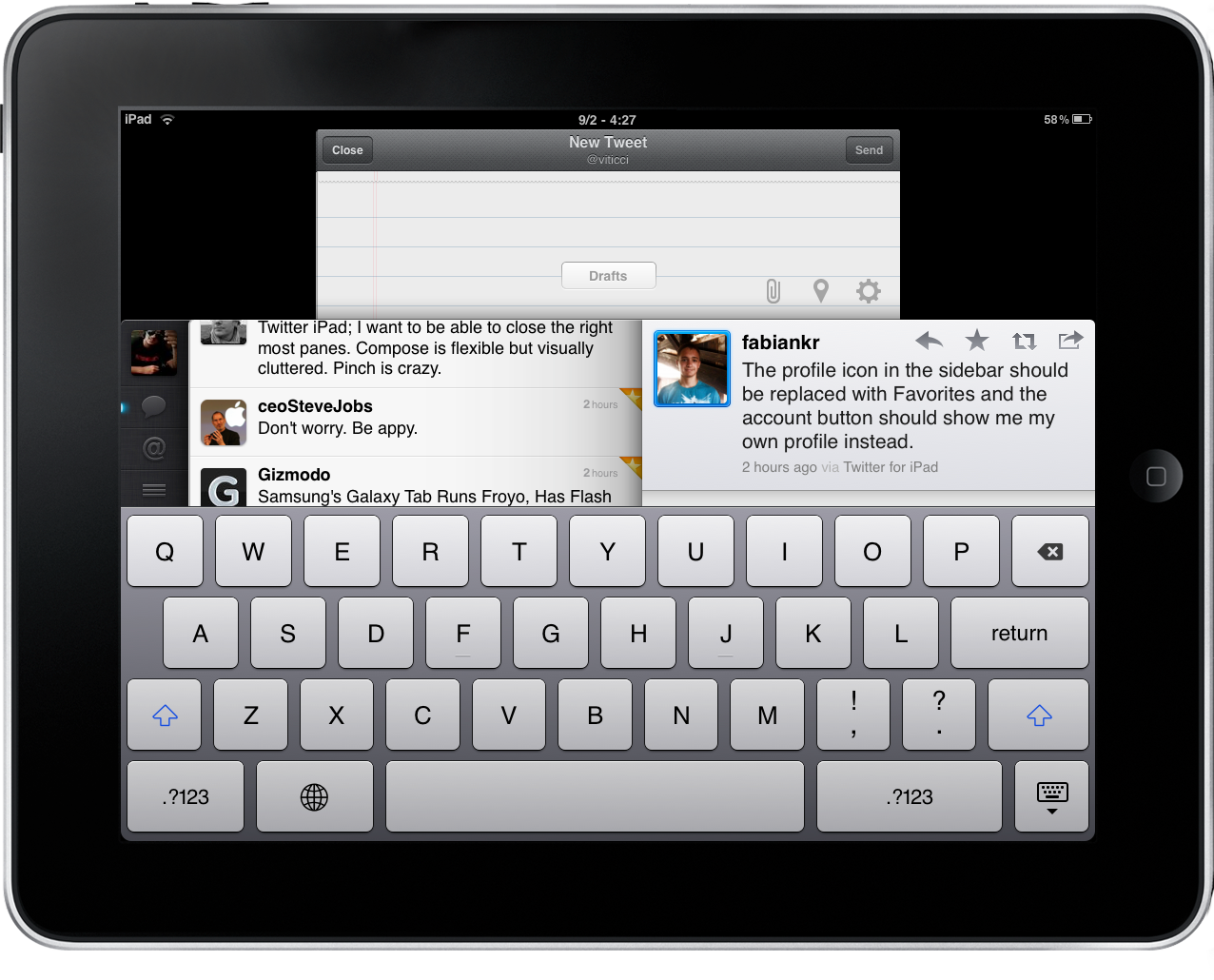
How do you tweet in Twitter for iPad? Good question, and another cool implementation. When you hit the compose button (bottom left corner) the timeline and all associated panels slide down to make room for the compose window on top, which looks like some sort of a notebook. As my friend Jono also noticed, though, there’s no really that much of space to tweet - Twitterrific feels better. It’s a very tiny window, you can scroll it but you can’t expand it. The trade-off is that, again, the experience resulting from this innovation is great. You can scroll the timeline and panels without having to dismiss the compose window. Clever.
Twitter for iPad feels a lot like Twitter for iPhone (it takes many elements from it) and Tweetie for Mac, combined in one single huge app with dozens of brave UI innovations. Brichter and the Twitter team were not afraid of trying new things, and whether the trade-off is acceptable or not it’s totally your call. Twitter for iPad is not meant for power users: there’s Osfoora HD for that. You can’t enter bit.ly credentials, there are no inline images (the app simply loads a web view panel), you can’t save or delete searches, you can’t delete DMs. You can’t see retweets and trends aren’t local. Twitter for iPad is an app for iPad users, those who are always willing to try new things and bought the tablet because they believed in its magic. And when you see Twitter’s panels sliding and popping and moving on screen in a constant flow of information - that’s magical. Twitter for iPad is cleverly crafted from top to bottom. There are some bugs, but it’s one hell of a first release.
Is it the best Twitter for client for iPad, though? No. Just like Tweetie on the Mac for many wasn’t the best desktop client. People like Robert Scoble are going to stick with Osfoora, or Tweetdeck. But if innovation is your thing, then Twitter for iPad is the best, and it’s aimed at you. You, and you, and you. All of you who bought an iPad because you wanted a fresh and new experience.
From this standpoint, Loren Brichter just reinvented the wheel.