This Week's Sponsor:

Kolide

Ensure that if a device isn’t secure it can’t access your apps.  It’s Device Trust for Okta.


Search results for "todoist"

The New Fantastical Review

The new Fantastical.

The new Fantastical.

Over six years after the debut of the second major iteration of Fantastical – version 2.0 for iPhone, which I reviewed in October 2013 – Flexibits is introducing a new version of their popular hybrid calendar client/task manager today. The new Fantastical1, available today on the App Store, is a single app that runs on iPhone, iPad, Mac, and Apple Watch.

In many ways, the new Fantastical is a distillation of themes typically found in the modern productivity app scene: the app is free, and the developers have switched to a subscription model to unlock a variety of premium features. Fantastical Premium – the name of the new service – costs $4.99/month or $39.99/year and brings a collection of brand new functionalities, integrations, as well as enhancements to existing features. Users of Fantastical 2, regardless of the platform they were using, get to carry all existing features into the new app for free, and can try the Premium service at no cost for 14 days.

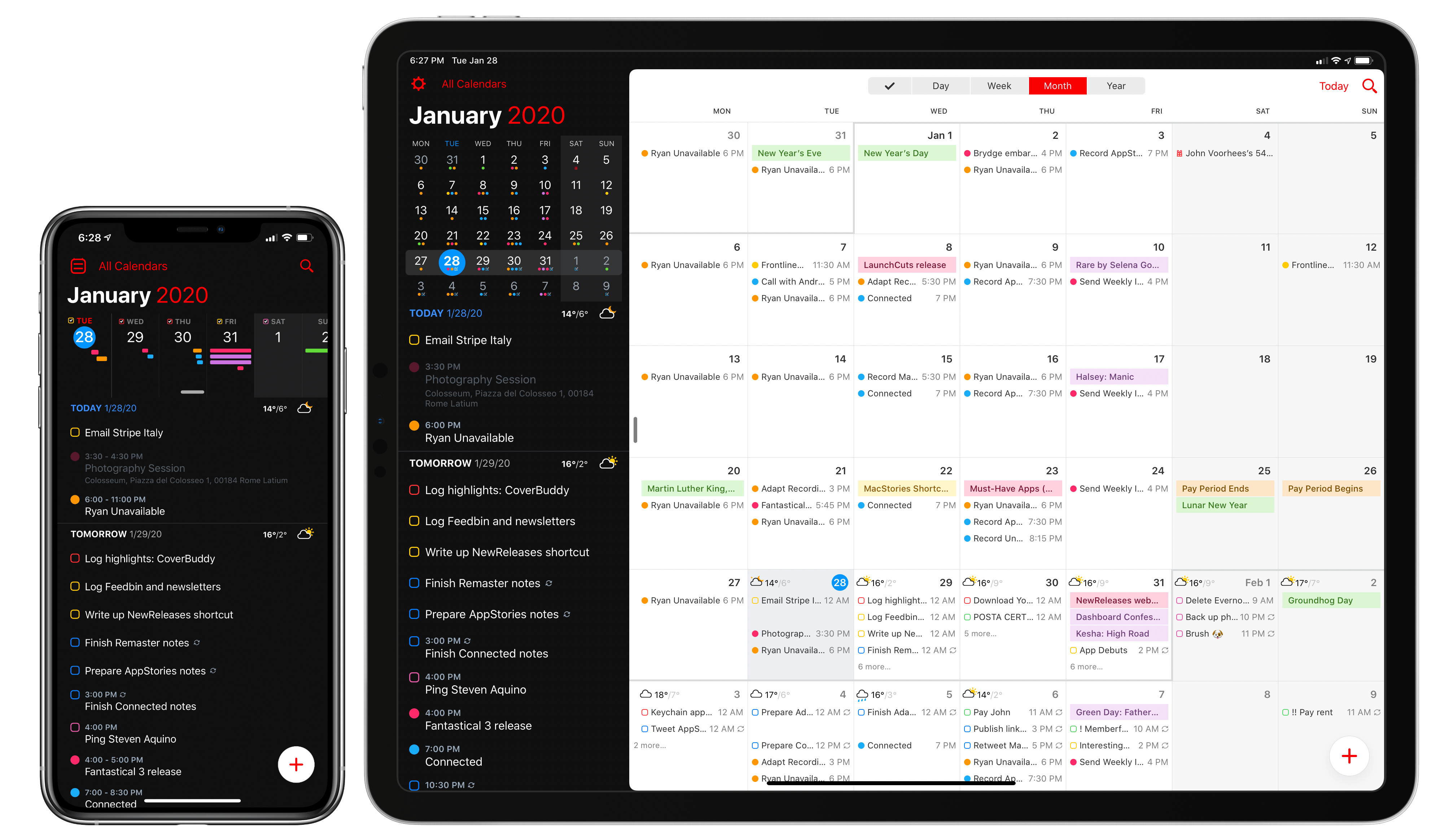
I’ll cut right to the chase: I’ve been using the new Fantastical for the past few months (hence the inclusion in my Must-Have Apps story), and it’s become the only calendar app I need, offering more power and flexibility than any alternative from Apple or the App Store. The free version of the new Fantastical – effectively, Fantastical 2 with a fresh coat of paint and some smaller bonuses – is a capable alternative to Apple’s Calendar app, but the Premium version is where Flexibits’ latest creation truly shines. At $40/year, Fantastical Premium may be a big ask for some users, but as a busy individual who deals with teammates all over the globe and likes Fantastical’s new features, I plan to subscribe.

In addition to the unification of the app across all platforms, design changes, and new premium features, which I will detail below, Flexibits has devised one of the most reasonable, generous upgrade flows from the old, paid-upfront app to the new, subscription-based one I’ve seen to date. There will be backlash from folks who are against subscriptions on principle – a discussion that is beyond the scope of this review – but I believe Flexibits has done a commendable job granting existing users access to all features they’ve already paid for, while replacing Fantastical 2 (the new app is an update over the old version) with something that is faster, visually more attractive, and potentially more useful.

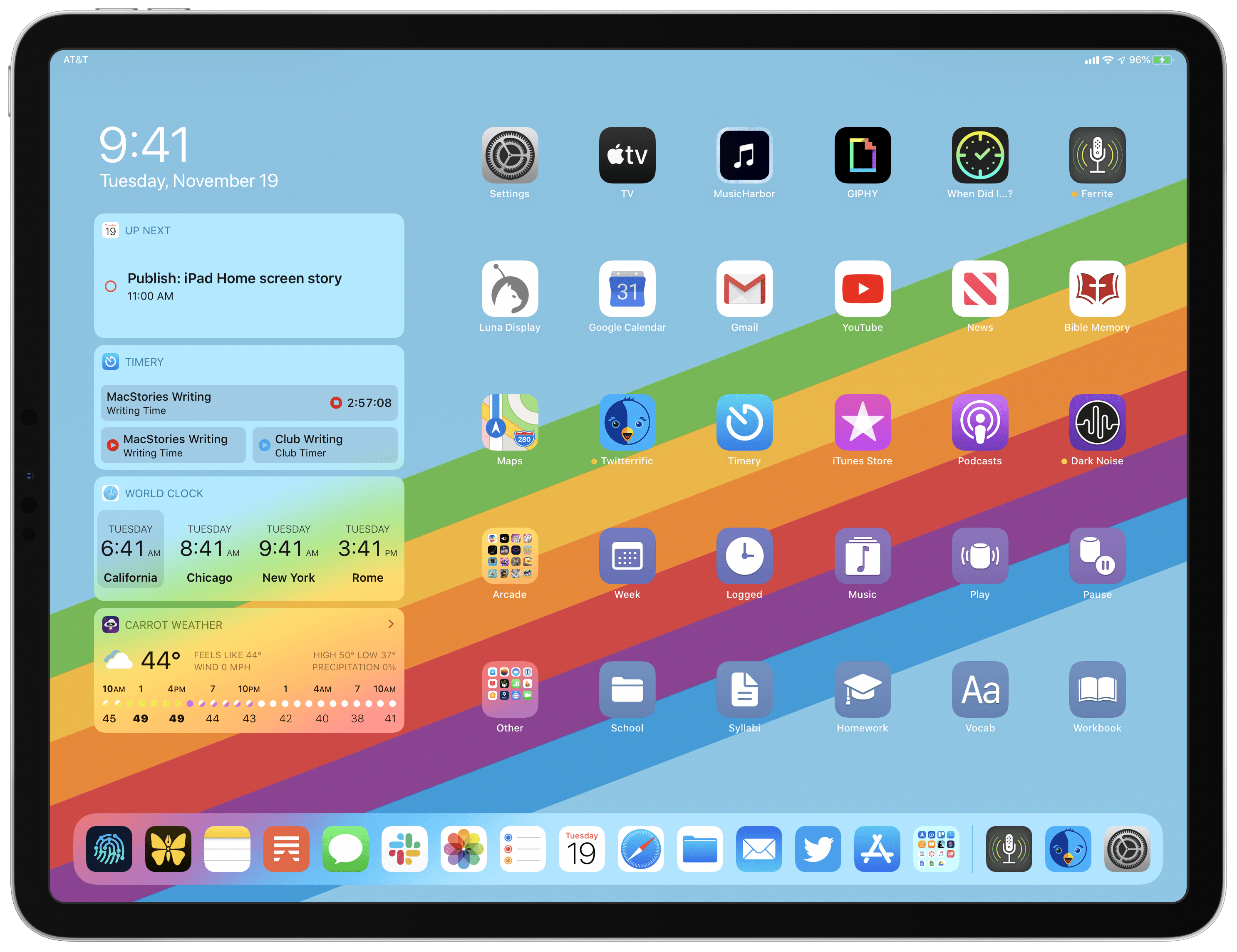
With the new Fantastical, I’ve replaced a series of apps I was using for calendars, calendar sets, and time zones, and integrated everything into a single dashboard, kicking Apple’s Calendar app off my Home screen in the process. Even with a few shortcomings and system limitations, the new Fantastical is, at least for me, the non plus ultra of calendar apps at the moment.

Let’s dig in.

Read more


My Modern iPad Home Screen: Apps, Widgets, Files, Folders, and Shortcuts

My iPadOS Home screen.

My iPadOS Home screen.

For several years after its launch, one of the best and worst things about the iPad was that it was basically just a blown-up iPhone. This meant the device was extremely easy to use and intuitive, but it also meant lots of “computer-like” tasks were difficult to perform on an iPad. When the iPad Pro debuted in late 2015, that began to change. Features like Split View, Slide Over, Picture in Picture, and drag and drop made the iPad a more capable computer than ever. However, despite those advancements, it took until this fall before one of the iPad’s core iPhone inspirations was altered: the Home screen.

Before iPadOS, the iPad’s Home screen was just a larger version of an iPhone Home screen, with no unique advantages to it. That finally changed mere months ago, when iPadOS 13 brought two primary improvements to the Home screen: it could hold 30 icons rather than 20, and it could include pinned widgets.

These two changes alone weren’t radical departures from the Home screen’s iPhone origins, but combined with other discoveries, they unlocked significant new possibilities.

On a recent episode of Adapt, I challenged Federico to try re-creating a Mac-like desktop environment on the iPad’s Home screen, complete with file and folder launchers. What he came up with is exactly what I’d hoped for. This newfound ability, alongside iPadOS 13’s enhancements to how shortcuts work when added to the Home screen, and the debut of MacStories Shortcuts Icons, meant it was time for me to seriously consider a new approach to my Home screen.

What I’ve come up with includes apps, app folders, files, file folders, shortcuts, and of course, widgets. It’s a diverse setup, and it all lives on a single page of icons. Let me explain.

Read more


macOS Catalina: The MacStories Review

Ironically, Apple chose to name this year’s update to macOS after an island. Since the iPhone and iOS took off, macOS has sometimes felt like an island isolated from the rest of the company’s OSes, but the goal articulated by the company at WWDC this year was quite the opposite. Apple clearly telegraphed that change is coming to the Mac and it’s designed to bridge the user experiences between each of its platforms.

To developers, that message came in the form of Catalyst and SwiftUI. Catalyst, which was previewed as an unnamed ‘Sneak Peek’ in 2018, is meant to make it easier for iPadOS developers to bring their apps to the Mac. SwiftUI has a similar longer-term goal of unifying and streamlining how developers build the interfaces for their apps across a range of devices, for everything from the Apple Watch to the Mac.

The efforts to draw macOS in closer with Apple’s other operating systems run deeper than just developer tools though. macOS may have been the foundation on which iOS was built, but in the years that followed iOS’s introduction, the two OSes grew apart. Identically-named apps were developed on different schedules, which meant they rarely included the same features. Also, system-level functionality like System Preferences, which serves the same purpose as iOS’s Settings app, was unfamiliar, making Mac adoption unnecessarily hard for newcomers. Catalina is an attempt to address those kinds of inconsistent user experiences.

With Catalina, Apple has taken clear, though not always successful, steps to bridge the divide between the Mac and iOS. App functionality has been realigned, System Preferences has been rearranged, and new features have been added to make it easier to move from one platform to the other.

As with other transitional periods in the Mac’s history, this one isn’t going to be easy. However, because the change is driven by a fundamental change in computing, it’s also necessary. We live in a new climate where computing is now dominated by mobile devices. For many people, a smartphone is all the computing power they need day-to-day. That doesn’t mean there’s no longer a place for the Mac, but it’s clearly what’s driving the changes in Catalina.

Apple could have chosen to ignore the shift of the ground beneath its feet and merely maintained macOS, making the kind of small incremental changes we’ve become accustomed to in recent years. However, not adapting is as deliberate a choice as change is, and it carries just as much or more uncertainty for the Mac as a platform because it risks irrelevance.

The Mac isn’t in crisis, but it isn’t healthy either. Waiting until the Mac is on life support isn’t viable. Instead, Apple has opted to reimagine the Mac in the context of today’s computing landscape before its survival is threatened. The solution is to tie macOS more closely to iOS and iPadOS, making it an integrated point on the continuum of Apple’s devices that respects the hardware differences of the platform but isn’t different simply for the sake of difference.

Transitions are inherently messy, and so is Catalina in places. It’s a work in process that represents the first steps down a new path, not the destination itself. The destination isn’t clear yet, but Catalina’s purpose is: it’s a bridge, not an island.

Read more


Things Adds Multiwindow, iOS 13 Dark Mode, Shortcuts, New Share Extension, and Reminders Import

Today as Apple releases iPadOS into the world, Things 3 for both iPad and iPhone has fully updated to add multiwindow functionality on iPad, integration with iOS 13’s system dark mode, shortcuts with parameters, a share extension that introduces key new functionality, and finally a new Reminders Import feature for moving easily all your reminders into Things. There’s a lot to explore, so let’s dive in.

Read more


iOS and iPadOS 13: The MacStories Review

Following years of a judicious union between platforms, it’s time for iPad to embark on its own journey.

In looking back at major iOS releases from the recent past, it’s easy to see how building and positioning these annual updates has become a careful balancing act for Apple.

In last year’s iOS 12, we saw the company focus on improving performance, providing users with tools to understand their device usage habits, and adapting Workflow to the modern era of Siri and proactive suggestions. The strategy was largely successful: iOS 12 was regarded as Apple’s most reliable iOS release of late – a reputation that has resulted in a 90% adoption rate a year later; and the Shortcuts app – the highlight of last year from a user feature perspective – is becoming a built-in (and thus more powerful) app in iOS 13.

For all that Apple accomplished in iOS 12, however, some areas of the experience inevitably had to be put on the back-burner. Besides improvements to Reminders and Files, iOS 12 lacked a long-awaited dark mode (which was rolled out on macOS instead) as well as more substantial tweaks to the ever-evolving iOS 7 design language; chief among iOS 12’s absentee list, of course, was iPad. Even though Apple had trained users to expect major additions to the tablet platform on a biennial schedule (see iOS 9 and iOS 11), the lack of meaningful iPad features in iOS 12 spurred a contentious discussion when it became apparent that new iPad Pro hardware was so far ahead of its software, it legitimized asking whether investing in that hardware was even worth it.

The annual debate that surrounds which features make it into each major iOS release is symptomatic of a complicated truth: iOS isn’t just the operating system that runs on iPhones anymore, and these annual releases are more than a mere collection of updated apps. iOS is the platform for an ecosystem of devices – from our wrists and speakers to cars and TV sets – and its changes have repercussions that ripple far beyond an updated Reminders app or a new icon set.

This, of course, has been the case for a few years at this point, but the nature of iOS as an all-encompassing platform has never been as evident as it is today in iOS 13. For the first time since I started reviewing Apple’s annual iOS updates, it feels like the company is now keenly aware that a new iOS version has to cover an array of themes that can’t be pushed back for scheduling reasons. A single area of attention isn’t enough anymore – not for the Apple of 2019 as an economic, political, and social force, and not for iOS, the engine powering devices that aren’t just screens for apps, but bona fide lifestyle computers.

As a result, there’s something for everyone in iOS 13 and all the recurring themes of Tim Cook’s Apple are touched upon this time around. iOS 13 improves Face ID recognition and promises improvements to app download sizes and performance. Apple is sending strong signals on its commitment to privacy as a feature with a new sign-in framework for apps and enhancements to location tracking controls and HomeKit cameras. iOS’ design language is getting its biggest update in years with dark mode, new tools for developers to express colors and embed glyphs in their user interfaces, updated context menus, and redesigns aimed at facilitating one-handed interactions. We have notable improvements to built-in apps, including the rebuilt Reminders and Health, an overhauled Files app, and hundreds of quality-of-life tweaks that, in big and small ways, make iOS more capable and efficient.

No stone is left unturned in iOS 13 – and that includes iPad too.

The iPad experience has always been largely consistent with the iPhone – particularly since Apple unified core iOS interactions around a screen without a Home button – but also distinct from it. iOS 13 makes this distinction official by splitting itself in a second branch called iPadOS, which uses iOS as the foundation but is specifically optimized and designed for iPad.

It was clear when the new iPad Pro launched in late 2018 that it told only one part of a bigger story about the role of the tablet in Apple’s modern ecosystem. With iPadOS, Apple is ready to tell that full story: while the iPad has always been an extension of iOS, sharing key similarities with the iPhone hardware and software, it’s been evolving – arguably, a bit too slowly – into a different breed of computer that is fundamentally distinct from a phone.

We’ve been able to observe this divergence starting in iOS 9 with Split View multitasking and Apple Pencil, and the transition continued with iOS 11 and its drag and drop-infused environment. It was only natural (and well-deserved) for the iPad to begin advancing in a parallel direction to iOS – informed and inspired by it, but also capable of growing on its own and tackling problems that an iPhone doesn’t have to solve.

From this standpoint, there are two sides to iOS 13: on one hand, an underlying tide that raises all platforms, featuring a distillation of themes Apple comes back to on an annual basis; on the other, a fork in the road, opening a new path for the iPad’s next decade. And against this backdrop, a single question looms large:

Can Apple balance both?

Read more


    iOS 13: The MacStories Overview

    iOS 13 is the latest major version of Apple’s mobile software platform, unveiled earlier today during the company’s WWDC keynote. Contrasting with last year’s iOS 12, which focused largely on performance improvements and brought fewer new features than usual, iOS 13 promises to continue the theme of strong performance while also adding a wide array of enhancements across the board. From a systemwide dark mode, updates to Shortcuts, a long-awaited redesign for Reminders, enhancements to an unprecedented number of system apps, and much more, there is a lot to take in here.

    What’s not included in iOS 13 is iPad-specific updates, but that’s because Apple has split off the iPad’s version of iOS into its own dedicated software platform: iPadOS, which you can read our complete overview of here.

    As for iOS 13, despite not including the variety of iPad improvements Apple has built, it remains a substantial release meant to take the mobile computing experience to a whole new level. Let’s dive in.

    Read more


    Reminder and GoodTask: Third-Party Upgrades to Appleā€™s Reminders

    Reminder (left) and GoodTask (right)

    Reminder (left) and GoodTask (right)

    Apple has long prided itself on being a company that carefully weaves hardware, software, and services together to offer a holistic user experience. Because of this, every purchaser of Apple products benefits from the built-in apps and services that accompany those products. And on the two most popular sellers, the iPhone and iPad, one of those bundled apps is Reminders.

    At its core, Reminders is a simple list and to-do app that can be surprisingly powerful thanks to features like repeating tasks, location-based reminders, collaborative lists, and note support. Many times over the years Reminders has been my primary task manager and served me fairly well. It may not be as capable as alternatives like Things, but the app remains an appealing tool for those whose needs are light, and who value the ease afforded by Apple’s built-in ecosystem.

    Unlike most of Apple’s other iOS apps, Reminders is built on a framework that’s accessible to third-party developers. Though developers can’t build apps that hook in directly with your Messages or Notes databases, Reminders is a different story. The underlying system powering Reminders is calendar-based, meaning it’s not tied to a single first-party app. Just as Fantastical and Timepage offer access to your existing iCloud calendars, developers can similarly build entire replacements for the Reminders app utilizing your existing collection of lists and to-dos. Two such apps, Reminder and GoodTask, serve as perhaps the best third-party Reminders clients on the App Store.

    Each app takes a different approach to enhancing Reminders, with one focusing on modern design while the other offers power user features and flexibility; both, however, retain some of the benefits of staying in the Apple ecosystem while improving upon the first-party Reminders app.

    Read more


    Examining Dark Mode Implementations of Mac Productivity Apps

    As I noted in my review of macOS Mojave, there’s a lot more going on with Dark Mode than dark gray window chrome. There were two sessions at WWDC dedicated to Dark Mode. Some apps are easier to adapt to Dark Mode than others from a technical standpoint, but beyond the coding, developers have to grapple with many design issues that affect apps differently.

    As with many new features Apple introduces, there’s the way the company would like to see Dark Mode implemented and then there’s the way third-party developers use it in practice. Part of the variety you find is driven by the particular needs of each app. Other differences reflect compromises that are necessary to adapt existing designs to Dark Mode. Sometimes, however, developers intentionally ignore Apple’s recommendations, choosing to take a different path.

    In my Mojave review, I collected some representative examples of apps that were ready with Dark Mode implementations when the OS update shipped. Since then, many other apps have been updated. I’ve spent time with many of them and have begun to see some design and implementation patterns among the early adopters that are interesting to compare to similar system apps by Apple. It’s also useful to consider how these variations will impact the experiences users have with these apps.

    In the sea of dark gray floating before my eyes, I’ve identified a handful of app categories that illustrate some of the subtle differences between the apps I’ve tried. There are many other good examples, but email clients, task managers, text editors, and note-taking apps are categories that best illustrate how Dark Mode is being used by the first wave of developers to put the feature into practice.

    Read more