This Week's Sponsor:

Textastic

The Powerful Code Editor for iPad and iPhone — Now Free to Try


Posts in stories

Headland Review: Fight Your Way Through a World of Imagination

Headland is a new game for iOS and Android by the award winning game studio Northplay. The game revolves around a young boy exploring a world of his own imagination; fighting enemies and hunting down the missing shards of his robot friend’s “imagination core.” I played through Headland over the last few days and found it to be a well-made and overall quite enjoyable experience.

I really like that Headland plays in portrait orientation. Most games like it run in landscape, which is fine, but it’s nice to have a change. On my iPhone Mini I can actually play Headland entirely one-handed, which makes the game feel more light and casual even though its gameplay is engaging. Playing two-handed on my iPad Pro was still fun though since I could support the device with a single hand and play with the other.

The key to this is the game’s excellent controls, which are intuitive and only require a single finger at any given time. To move your character, you place your finger anywhere on the screen and then rotate it. This is essentially a joystick movement control, but it works so much better because the joystick will appear underneath your finger wherever you place it. My struggle with most touch-joystick games is that I end up placing my finger off-center from the stationary joystick and then I move in an unwanted direction. This never happens in Headland.

Read more


MacStories Selects 2020: Recognizing the Best Apps of the Year

John: The MacStories Selects Awards are our annual love letter to apps and the people who make them. Apps have become ubiquitous, seeping into every corner of our lives. They help us find a job and home, get work done, blow off steam, order a meal, and everything in between. With so many apps available in the App Store, though, it’s easy to take them and their creators for granted, which is why as the year comes to a close, we step back and pause to celebrate the MacStories Team’s favorite apps and the people who make them.

To say that bringing an app to life from idea to a fully-formed 1.0 is tough is a vast understatement, and 2020 hasn’t made the process any easier. However, as we survey the past year, the depth of innovative apps makes it clear that many developers poured themselves into their apps in 2020. The result was a list of MacStories Selects candidates that was longer than in any prior year of the awards.

We had a wealth of excellent apps to choose from this year for the seven categories the MacStories Team chose:

  • Best New App
  • Best App Update
  • Best New Feature
  • Best Watch App
  • Best Mac App
  • Best Design
  • App of the Year

Along with the Readers’ Choice Award, which was chosen by Club MacStories members, that makes a total of eight award winners plus twelve runners-up. These are the third annual MacStories Selects Awards, which we debuted in 2018. As we did last year, we have also created beautiful physical awards commemorating the winners, which we will be sending out to each in a couple of weeks.

We also recorded a special episode of our podcast AppStories all about the MacStories Selects winners and runners-up. It’s a terrific way to learn more about this year’s apps.

You can listen to the episode below.

So, it’s with great admiration and respect for the developers who have persevered through a tough year to produce some of the best apps we’ve ever used that we present to our readers the 2020 MacStories Selects Awards:

Read more


macOS Big Sur: The MacStories Review

Big Sur is a big deal. The OS picks up where Catalina left off, further rationalizing Apple’s product lineup through design, new ways to bring apps to the Mac, and updates to existing system apps. The approach realigns functionality across Apple’s platforms after years of divergence from their common foundation: Mac OS X. The result is an OS that walks a perilous line between breaking with the past and honoring it, acknowledging the ways computing has changed while aiming for a bold future.

macOS, which OS X has been called since 2016, is a mature operating system, so more often than not its annual updates are incremental affairs that don’t turn many heads. Big Sur is different. It’s an update that promises a future that’s connected to its past yet acknowledges today’s mobile-first computing landscape and harmonizing user experiences across devices.

Big Sur also clarifies Apple’s Mac strategy, the contours of which began to emerge with Catalina. It’s a vision of a continuum of computing devices that offer a consistent, familiar environment no matter which you choose while remaining true to what makes them unique. In practical terms, that means a carefully coordinated design language and a greater emphasis on feature parity across OSes. Conceptually, it’s also an opportunity for macOS to shed the perception that it’s a legacy OS overshadowed by iOS and reclaim a meaningful place in Apple’s lineup for years to come.

Together, the changes to macOS set the table for Apple’s M1 Macs, the next big step in the Mac’s modernization, and easily earn Big Sur its designation of version 11.0.

Read more


Using Soor’s Widgets and Magic Mixes

Soor's iOS 14 widgets.

Soor’s iOS 14 widgets.

As I detailed in a recent episode of AppStories, I’ve spent several weeks tweaking my iPhone’s Home Screen and playing around with different approaches to widgets and app icons. The layout I eventually settled on (which you can find in the AppStories show notes) takes advantage of dark mode to create the illusion of widgets “blending” into the wallpaper – specifically, the Soor widgets at the top of the page. Given how I believe Soor’s developer Tanmay Sonawane has taught Apple a lesson when it comes to building Apple Music widgets for iOS 14, and considering the app’s most recent update, I thought I’d write about these widgets in more detail.

Read more


Hands-On with the HomePod’s New Intercom Feature, Alarms, and Siri Tricks

With yesterday’s releases of iOS 14.1 and HomePod Software Version 14.1, which could really use a catchier name, Apple has introduced several new features announced last week at its iPhone 12 and HomePod mini event. Most readers are probably already familiar with what’s in the updates based on our iPhone 12 and HomePod mini overviews, so I thought I’d update my HomePods and devices to provide some hands-on thoughts about the changes.

Most of the new features are related to the HomePod. Although proximity-based features are exclusive to the HomePod mini, which features Apple’s U1 Ultra Wideband chip, some of the other functionality revealed last week is available on all HomePod models.

Read more


iPad Air Review: Forward-Looking

The new iPad Air.

The new iPad Air.

Ever since its launch in late 2015, the 12.9” iPad Pro has been my primary computer. The combination of a large display – the largest Apple makes for iPads – with software that properly takes advantage of it (see: Split View, multiwindow, multicolumn) makes the 12.9” Pro an ideal blend of laptop-like usability and tablet modularity. If you’re looking for power and flexibility, the 12.9” iPad Pro is the ne plus ultra of the iPad line.

Before the iPad Pro, however, it was the iPad Air 2 that convinced me the iPad could be a suitable replacement for a MacBook. In my review of the iPad Air 2 in early 2015, which I published just a few months before the iPad Pro’s debut, I called the device a “liberating” experience, noting how it struck a balance of high portability and versatility that enabled me to get more work done from more places. In spite of the iPad Pro’s superiority – especially in terms of display size – I’m always going to have a soft spot for the iPad Air as the device where my modern iPad journey began.

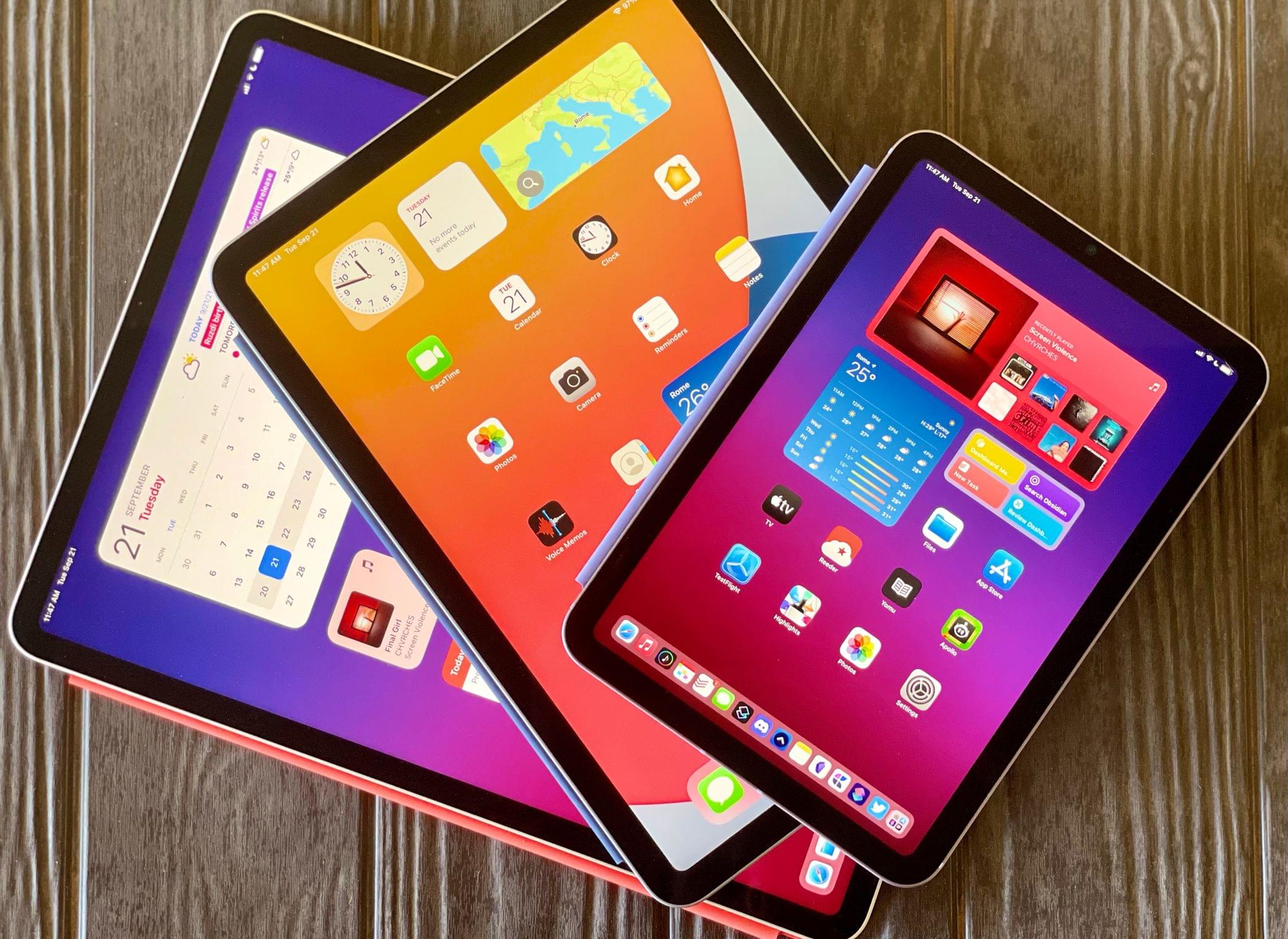
For the past few days, I’ve been testing Apple’s latest iPad Air, which comes out this Friday starting at $599 for the 64 GB, Wi-Fi model. While the 10.9” Air won’t replace the 12.9” iPad Pro as my primary machine, I’ve been impressed by this iPad for a different reason: the iPad Air democratizes the notion of “pro iPad”, bringing key features of iPad Pro to more customers, while at the same time looking ahead toward the future of iPad with hardware not seen on the current iPad Pro lineup. The iPad Air sits at the intersection of old iPad Pro features trickling down to the rest of the iPad line and new ones appearing on this model first. This makes the iPad Air a fascinating device to review, as well as a compelling alternative to another iPad of similar dimensions: the 11” iPad Pro.

Five years after the iPad Air 2, I’m intrigued by an iPad Air again. Let me explain why.

Read more


iOS and iPadOS 14: The MacStories Review

Even with (unsurprisingly) smaller releases, Apple is pushing forward with bold ideas across all platforms.

How do you prepare a major new version of an operating system that now spans two separate platforms, which will be installed on millions of devices within a few hours of its release, amid a global pandemic? If you’re Apple, the answer is fairly straightforward: you mitigate the crisis by focusing on a narrower set of features, perhaps prioritizing bug fixes and stability improvements, but then you just have to do the work.

In my time as an iOS (then iOS and iPadOS) reviewer, I never thought I’d have to evaluate an OS update with the social and political backdrop of iOS 14. Let’s face it: when the COVID-19 outbreak started fundamentally changing our lives earlier this year, at some point many of us – including yours truly – thought that, among more serious and severe repercussions, our tiny corner of the Internet would see no new phones, OS updates, videogame consoles, or other events over the course of 2020. Or that, at the very least, changes in hardware and software would be so minor, they’d barely register in the grand scheme of things as tech companies and their employees were – rightfully so – adjusting to a new, work-from-home, socially distant life. Yet here we are, over a year after the debut of iOS and iPadOS 13, with brand new versions of both operating systems that were announced, as per tradition, at WWDC a few months ago. Remove all surrounding context, and you wouldn’t guess anything has changed from 2019.

Context is, however, key to understanding Apple’s background and goals with iOS and iPadOS 14, in a couple notable ways.

First, I think it’s safe to assume slowing down to reassess the state of the platform and focus on quality-of-life enhancements and performance gains would have worked out in Apple’s favor regardless of the pandemic. In last year’s review, I noted how the first version of iOS 13.0 launching to the public wasn’t “as polished or stable as the first version of iOS 12”; in a somewhat unpredictable twist of events, managing the iOS 13 release narrative only got more challenging for Apple after launch.

Late in the beta cycle last year, the company announced certain iOS 13 features – including automations in Shortcuts and ETA sharing in Maps – would be delayed until iOS 13.1, originally scheduled for September 30th. Following widespread criticism about bugs, various visual glitches, and stability issues in iOS 13.0, Apple moved up the release of iOS 13.1 and iPadOS (which never saw a proper 13.0 public release) by a week. Despite the release of a substantial .1 update, the company still had to ship two additional patches (13.1.1 and 13.1.2) before the end of September. Before the end of 2019, all while the general public was lamenting the poor state of iOS 13’s performance (just Google “iOS 13 buggy”, and you’ll get the idea), Apple went on to ship a total of eight software updates to iOS 13 (compared to iOS 12’s four updates before the end of 2018). The record pace, plus the mysterious removal of features that were originally announced at WWDC ‘19, suggested something had gone awry in the late stages of iOS 13’s development; it wasn’t long before a report covered Apple’s plans to overhaul its software testing methodology for iOS 14 and 2020. The pandemic may have forced Apple to scale back some functionalities and deeper design changes this year, but it’s likely that a decision had been made long before lockdowns and work-from-home orders.

Second, context is necessary because despite the pandemic and rocky rollout of iOS 13 and its many updates, Apple was still able to infuse iOS and iPadOS 14 with fresh, bold ideas that are tracing a path for both platforms to follow over the next few years.

On the surface, iOS 14 will be widely regarded as the update that brought a redesigned Home Screen and a plethora of useful quality-of-life additions to the iPhone. For the first time since the iPhone’s inception, Apple is moving past the grid of icons and letting users freely place data-rich, customizable widgets on the Home Screen – a major course correction that has opened the floodgates for new categories of utilities on the App Store. In addition to the upgraded Home Screen, iOS 14 also offers welcome improvements to long-standing limitations: phone calls can now come in as unobtrusive banners; Messages borrows some of WhatsApp’s best features and now lets you reply to specific messages as well as mention users; Siri doesn’t take over the entire screen anymore. There are hundreds of smaller additions to the system and built-in apps in iOS 14, which suggests Apple spent a long time trying to understand what wasn’t working and what customers were requesting.

iOS and iPadOS 14 aren’t just reactionary updates to criticisms and feature requests though: upon further examination, both OSes reveal underlying threads that will shape the evolution of Apple’s platforms. With compact UI, the company is revisiting a principle introduced in iOS 7 – clarity and content first – with fresh eyes: the UI is receding and becoming more glanceable, but the elements that are left are as inviting to the touch as ever – quite the departure from Jony Ive’s overly minimalistic, typography-based approach. We see this trend everywhere in iOS 14, from phone calls and Siri to widgets, new toolbar menus, and Picture in Picture. Intents, the existing technology behind SiriKit, Shortcuts, and intelligent Siri suggestions, is also at the center of widget personalization. Intents already was one of Apple’s most important frameworks given its ties to Siri and on-device intelligence; iOS 14 proves we haven’t seen all the possible permutations and applications of Intents yet.

Then, of course, there’s iPad. In iPadOS 14, we see the logical continuation of pointer and trackpad support introduced earlier this year in iPadOS 13.4: now that users can control an iPad without ever touching the screen, Apple is advising third-party developers to move away from iPhone-inspired designs with apps that are truly made for iPad…and somewhat reminiscent of their macOS counterparts. We can see the results of this initiative in modernized system apps that take advantage of the iPad’s display with a sidebar, multiple columns, and deeper trackpad integration – new options that every iPad app developer could (and, according to Apple, should) consider going forward. Although some of the iPad’s oft-mentioned ongoing struggles remain unaddressed in iPadOS 14 (see: multitasking and window management), Apple is embracing the iPad’s nature as a modular computer this year, and they feel comfortable leaning into lessons learned with the Mac decades ago.

The context of 2020 is what makes iOS and iPadOS 14 so fascinating and, to a certain extent, fun to review. On one hand, we have two major OS updates that may or may not have been impacted by the global pandemic in their focus on fewer groundbreaking additions and more consistent improvements across built-in apps; on the other, just like any other year, we have a suite of overarching themes and potential implications to dissect.

But for all those users still pausing over that ‘Install’ button, pondering whether updating their most important communication and work-from-home devices is worth it, there’s only one consideration that matters:

Will this go any better than last year?

Read more


    Apple’s iPhone 12 Lineup: The MacStories Overview

    Today during its streamed event from Apple Park, Apple debuted its flagship iPhone 12 lineup consisting of four separate devices, the largest number of new models ever debuted at once:

    • iPhone 12 mini
    • iPhone 12
    • iPhone 12 Pro
    • iPhone 12 Pro Max

    The iPhone 12 and 12 mini are the more affordable options, while the two Pro models add premium features, most notably better camera systems, at an additional cost. All four devices share a lot in common, however, such as the new A14 processor, support for 5G networking, a fresh physical design inspired by the iPad Pro, camera upgrades, support for new magnetic accessories, and more.

    The iPhone 12 and 12 Pro will be available for pre-order this Friday, October 16 starting at $799 and $999, respectively, and ship on October 23. The iPhone 12 mini ($699) and 12 Pro Max ($1,099) won’t arrive until a few weeks later: their pre-orders open November 6 and they’ll arrive in customers’ hands on November 13.

    Which model is right for you? Here’s a full overview of everything new for each device.

    Read more


    Creating Your Own Widgets: A New Category of Apps Emerges

    This summer, when Apple detailed iOS 14 and the Home screen changes it would bring, the company highlighted personalization as one of the key features of the new widget-populated Home screen. Rather than just containing an assortment of apps, iOS 14 Home screens can feature the information that matters most to you. Whether that’s your Activity rings so you can stay on top of your health, the current weather forecast, your task list, a memory from the Photos app – there are an abundance of options for personalizing your Home screens now.

    I’ve tried a ton of Home screen widgets from third parties over the summer, and developers are doing lots of creative things with their apps’ widgets. One of the most exciting trends I’ve seen is the emergence of a new category of apps entirely centered around widgets. While most widgets will come built in to the apps you already know and love, some developers have built brand new apps for the sole purpose of enabling users to create and customize widgets in a hyper-personalized way. The best widgets I’ve tried offer configuration settings so you can tailor them to your exact needs, and these new apps take that idea even further, offering widget creation tools relating to a variety of traditional app categories – like weather, photos, health and fitness, productivity, and more – but in a single centralized app.

    Leading the pack in this regard is Widgetsmith from David Smith, which not only covers one of the widest array of different widget types, but also features a power user-friendly scheduling option that sets it apart. The App Store hosts a growing number of other widget creation tools too, such as Widgeridoo, Widget Wizard, Glimpse, and Health Auto Export.

    Because each app specializes in providing its own custom set of options, there’s no limit to the number of apps worth trying. Widget needs can be highly personalized, so it’s no surprise that the apps designed for creating widgets all offer their own takes too.

    Get ready to upgrade your Home screens.

    Read more