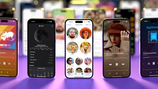
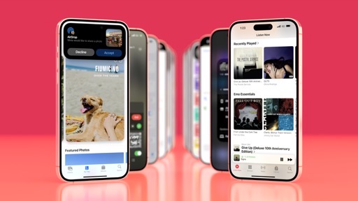
Apps
New versions of iOS and iPadOS are about more than new system features and updated designs. With an ever-growing library of built-in software, the most interesting updates are often found in the apps we use every day.
Phone and Contacts
Who would have thought, just before iOS 17 was announced at WWDC, that Apple was going to devote serious marketing and engineering resources to…the Phone and Contacts app? And yet that’s exactly what they’ve done in iOS 17 with the addition of contact posters and voicemail transcriptions.
Contact Posters
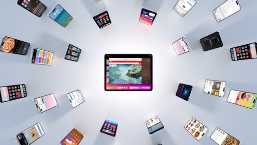
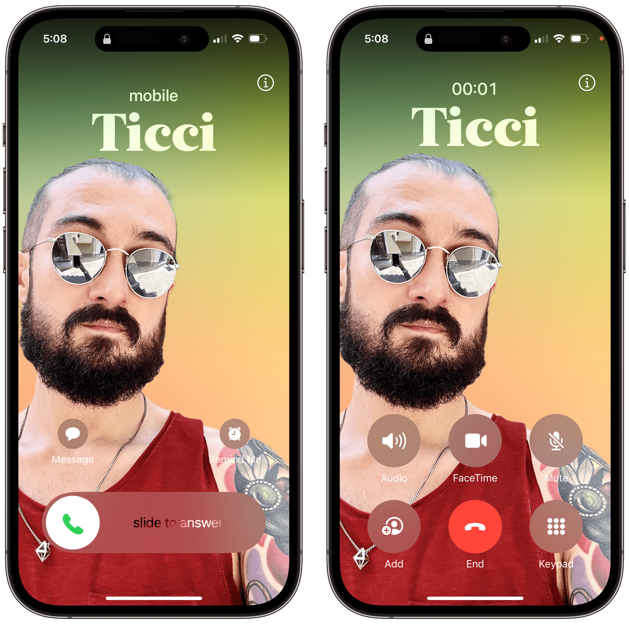
In iOS 17, you can create a contact poster, which is essentially a combination of a profile picture and artwork that will represent you when calling other people on the phone, FaceTime, and other apps compatible with the CallKit framework.
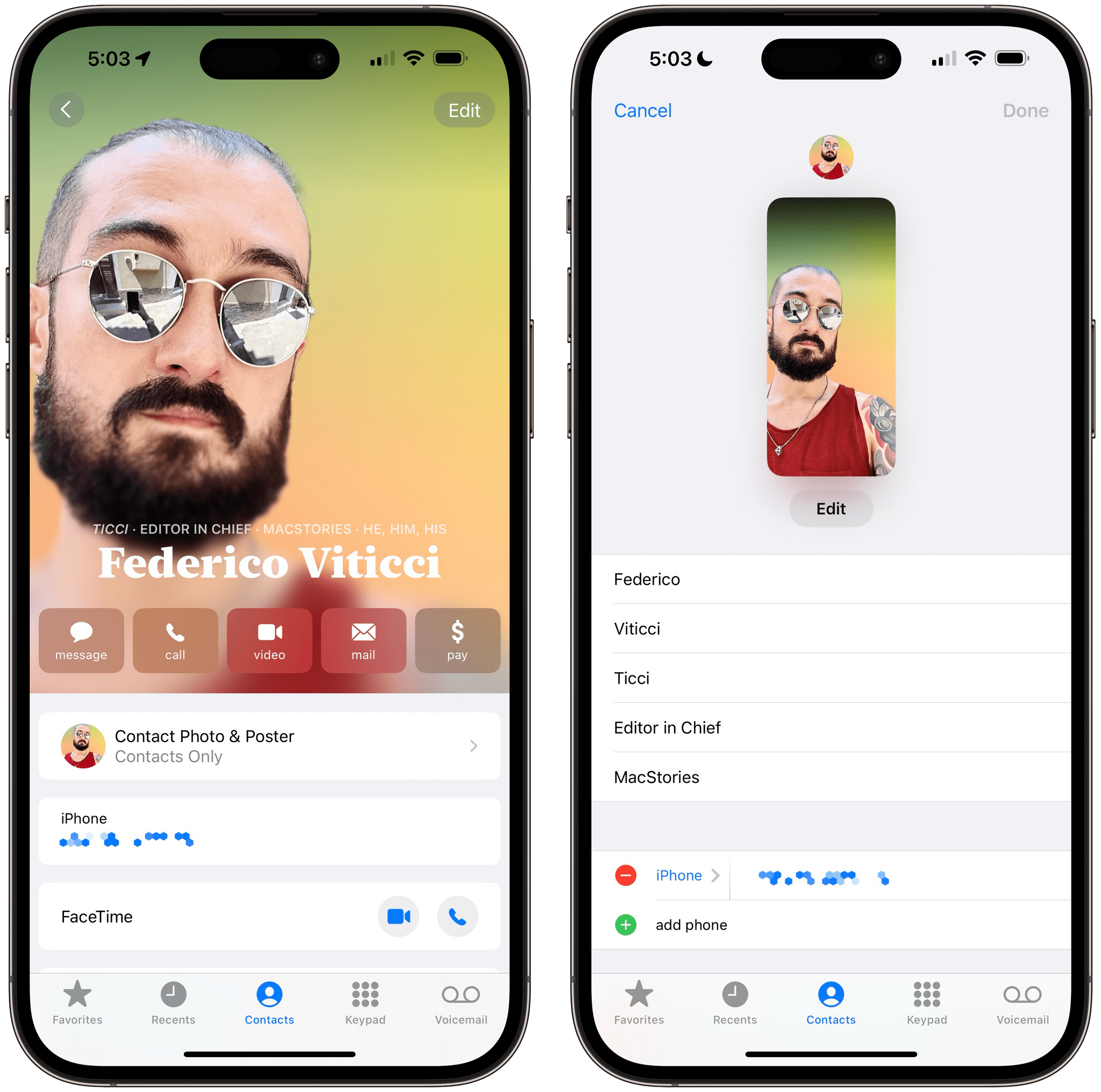
You can create a contact poster for your contact card at the top of the Contacts app. What you’ll find is, essentially, an interface largely reminiscent of Lock Screen customization: you can create multiple contact posters with different styles for the font, background, and profile picture you want to use. You can choose between Memoji and photos of you, and you can swipe between different photographic styles for colors and lighting. As you can see from the images below, the UI and interactions are exactly like customizing the Lock Screen.
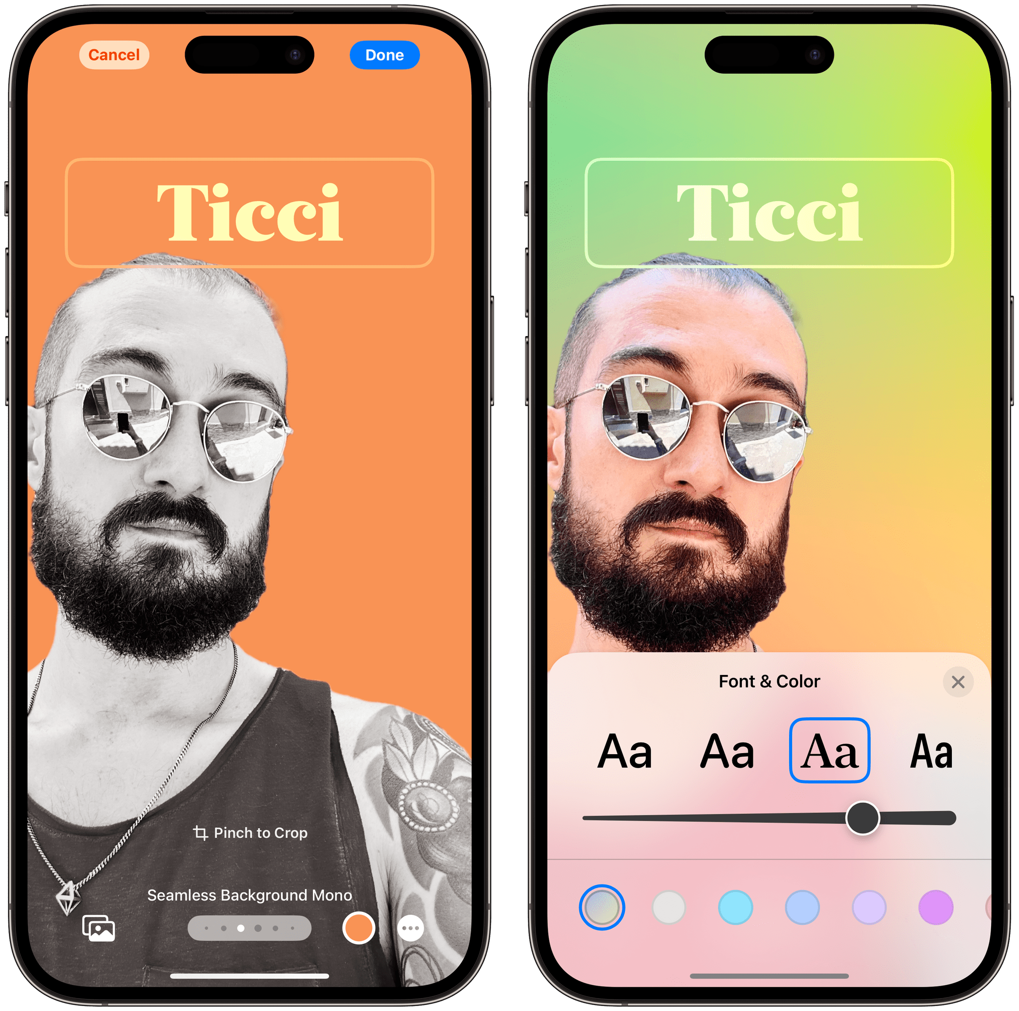
I wasn’t sold on contact posters initially, but now that I’ve spent some time creating a few of them and swapping them over the summer, I get it. They’re fun. Contact posters give you a consistent visual identity across every communication app on the system – whether it’s FaceTime, AirDrop, or services that integrate with CallKit like WhatsApp and Zoom.
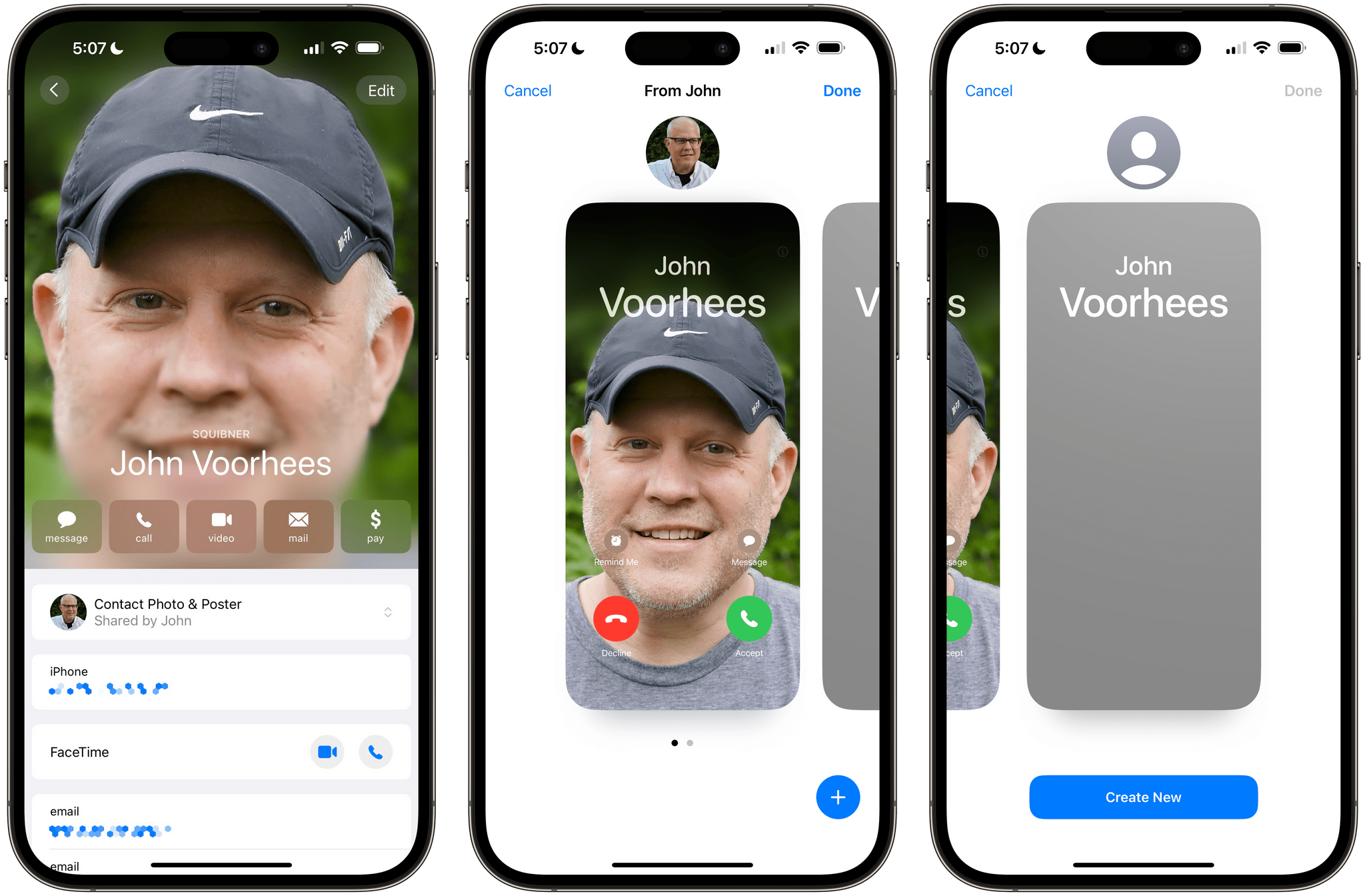
When viewing someone’s contact page, you can see the poster they made for themselves, or you can choose to make a new one that will stay on your devices only.
When a call comes in from one of my friends who’s created a contact poster on iOS 17, I like that I can see a little bit of their personality and taste in the poster they’ve chosen for themselves. Just like profile pictures before, you can choose to automatically share your poster with your contacts; you can either accept someone else’s poster or override it with your own poster for them.
The poster stays on after you’ve picked up a call, too: in-call controls have moved to the bottom half of the screen, so they’re both easier to reach and they make room for the poster at the top. If you think about it, that’s pretty much what Apple did when they moved notifications to the bottom of the Lock Screen to make the wallpaper shine.
Voicemail Transcriptions
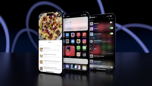
Available in English only at launch, the Phone app now supports live voicemail transcriptions that let you see what a person is saying while leaving a voicemail so you can decide whether you want to pick up the call or not.
Even though I haven’t received a real voicemail in…I don’t know, 10 years – I like this idea, in theory. As you can see from the screenshots below, I tested this feature with John, who called me and left me a voicemail. As he was talking, I saw iOS 17 transcribe “it’s John calling” into “it’s John Colleen” and “give me a ring” into “give me a wreck”.
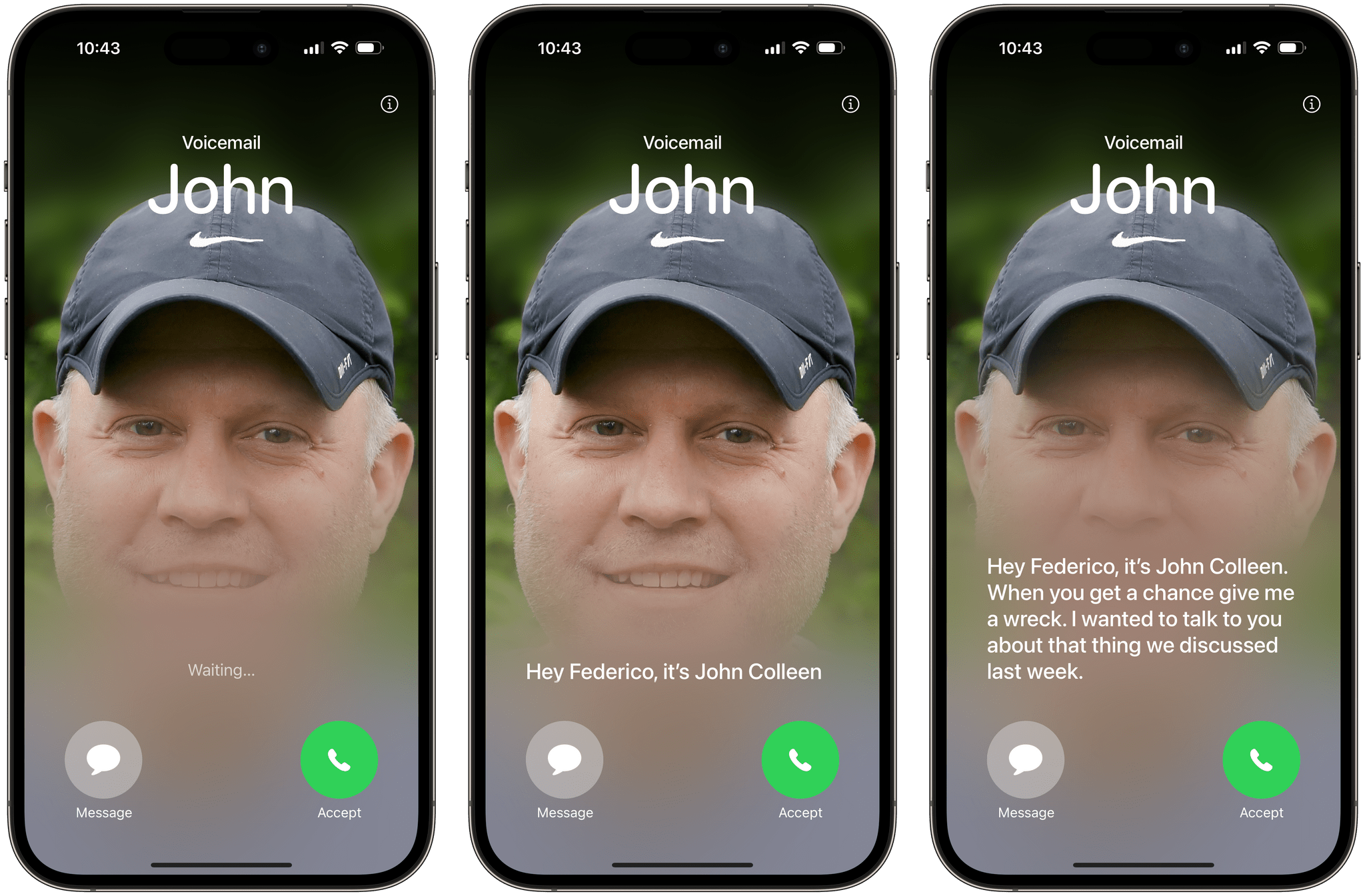
Now, I find it hard to believe that John already picked up a southern accent after his recent move from Illinois to North Carolina. I would say that Apple probably needs to improve their voicemail transcription engine a little bit but, hey, your mileage may vary.
Reminders
Apple’s Reminders app has joined Safari in my personal list of best pieces of consumer software ever created by Apple.
I’ve been covering Reminders’ progressive and consistent evolution over the past few years, and I continue to be impressed by the vision that drives its annual updates. The Reminders team manages to strike an ideal balance between keeping the app approachable and adding power-user functionalities, albeit rethought and simplified in a classic Apple way.
Reminders is my default task manager, and now more than ever thanks to its iOS and iPadOS 17 features, I think it arguably is the best task manager on Apple’s platforms, period. There are some technical issues that should be addressed as soon as possible, but Reminders’ appeal is stronger than ever.
Columns and Sections
I didn’t think this day would ever come: the Reminders app now supports a Kanban-like board mode to split up your lists in different sections and view them as columns.
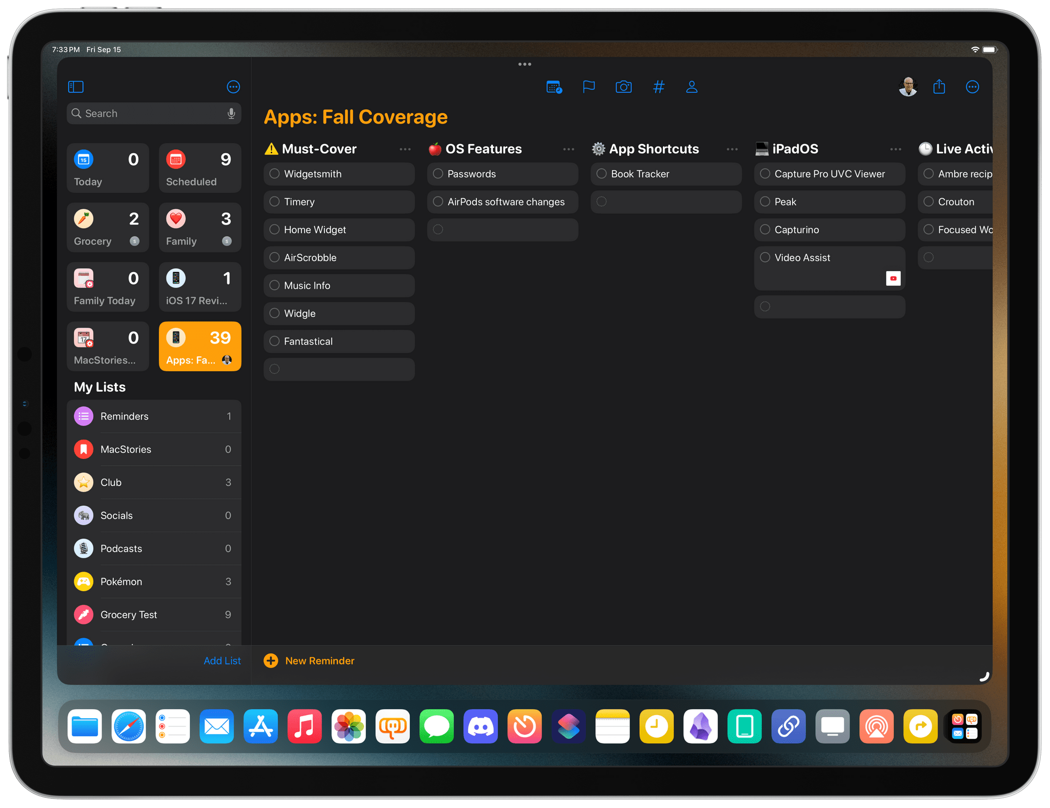
Obviously, Apple is not calling this mode ‘Kanban’, but that’s what it is. Specifically, Reminders in iOS and iPadOS 17 lets you create sections inside standard lists, which is a functionality we’ve seen before in the likes of Things and Todoist. To create a new section, head over to a regular list (i.e. not the Today or Scheduled views), tap the ‘…’ button in the top-right corner, then select ‘New Section’.
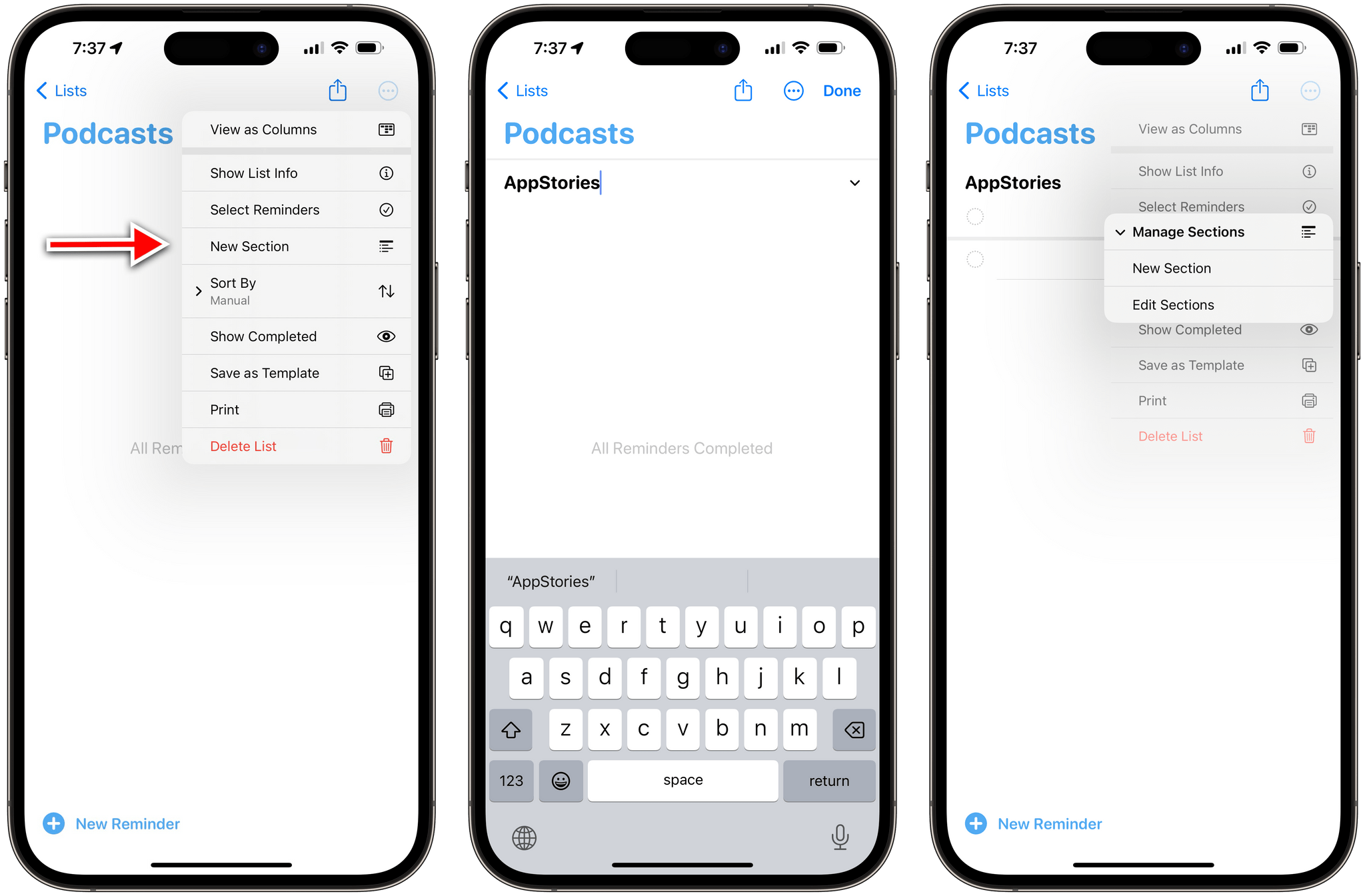
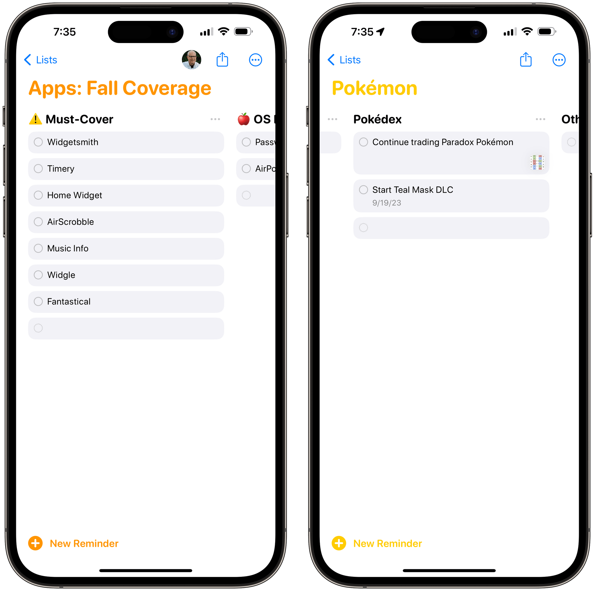
By default, lists are displayed vertically, and you can use drag and drop to move tasks between them. However, by pressing the ‘More’ button in the top right corner of a list, you’ll find a new option in iOS and iPadOS 17: the ‘View as Columns’ button. Tap it, and the selected list will switch to a familiar horizontal board layout that you may have seen before in Todoist, GoodTask, and Trello.
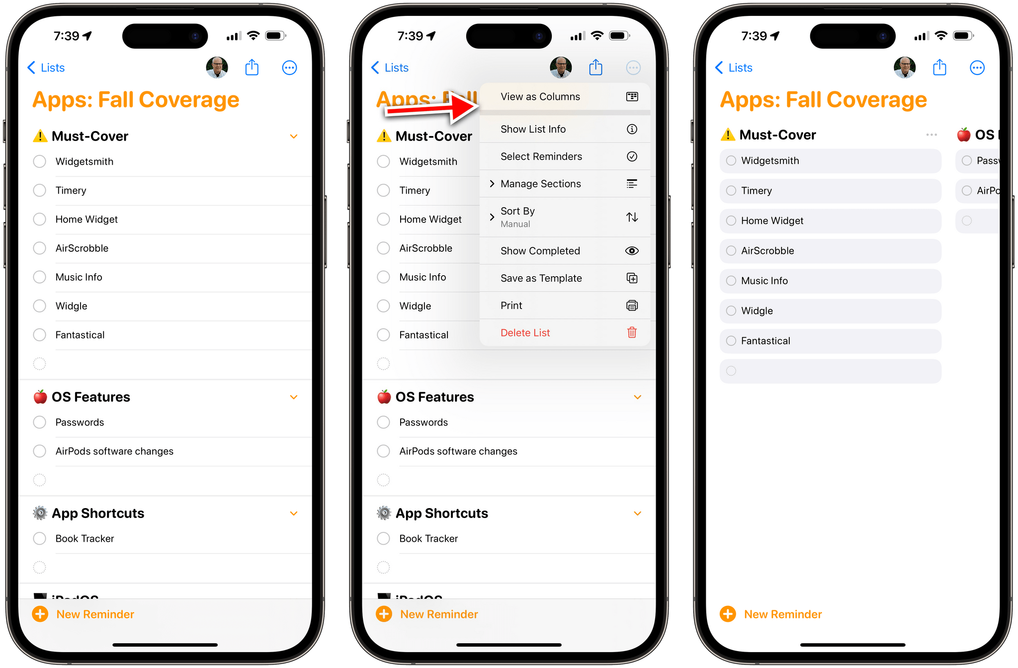
Column view is supported on iPhone, too. You can switch between list and column view whenever you like.
Column mode, as you can imagine, is particularly effective on iPad, where you can take advantage of the large screen in landscape to visualize different stacks of tasks with a clear separation between them. You can still long-press or right-click tasks to access actions for them, use drag and drop to re-assign them to a different section, and create new tasks directly in a specific column by clicking on the empty space at the end of a column. You can freely alternate between list and column mode (which is also supported on the iPhone) at any point; by default, tasks that do not belong to any column/section are saved into an ‘Others’ view in the selected list.
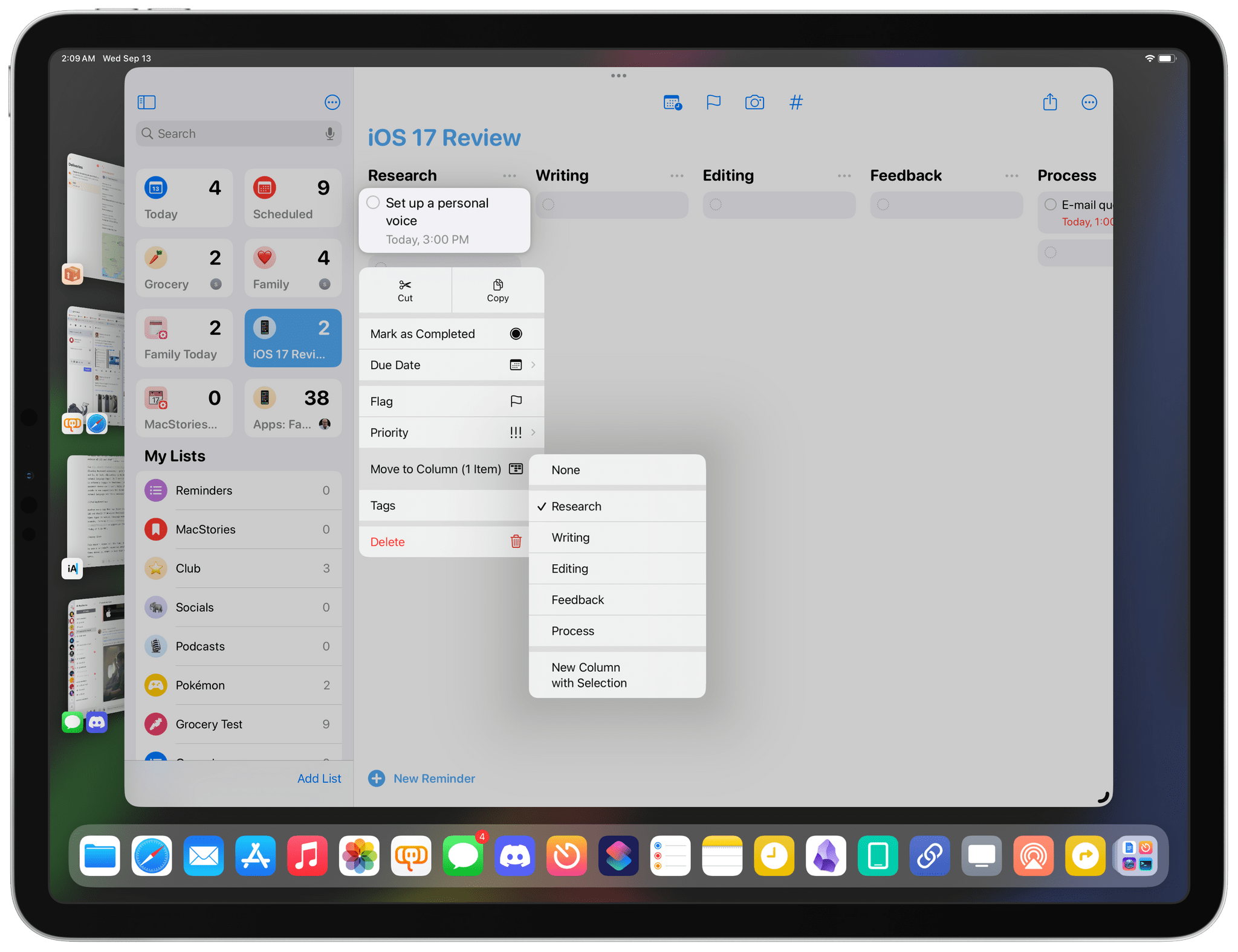
As a longtime fan and user of Trello and GoodTask, I’m downright ecstatic that Apple found a way to ship what’s arguably a power-user feature in an app that is used by hundreds of millions of people every day. That said, column mode in Reminders isn’t as flexible as the one previously seen in GoodTask, which pioneered the idea of blending Kanban-style layouts with the Reminders database. Columns in Reminders for iOS and iPadOS 17 are entirely dependent on sections: if you don’t create a section first, you won’t be able to, say, automatically group reminders by due date and view those groups as columns. In GoodTask and Todoist, you can group tasks by day and use that grouping setting to power a list or column layout; in Reminders, you can only create sections manually.
This is most evident in the Today and Scheduled views. These two areas of Reminders have “sections” for different times of the day and days of the week, but they’re custom sections that predate iOS 17’s native sections.
For this reason, it’s impossible to view times of the day or days of the week as columns in these screens of Reminders. I would love to manage my week with days displayed as columns, like a weekly planner, but I can’t. I hope Apple fixes this soon.18
Title Suggestions
When entering a new reminder in iOS 17, you’ll notice that the app may offer suggestions for previously-entered tasks that you can re-add with one tap.
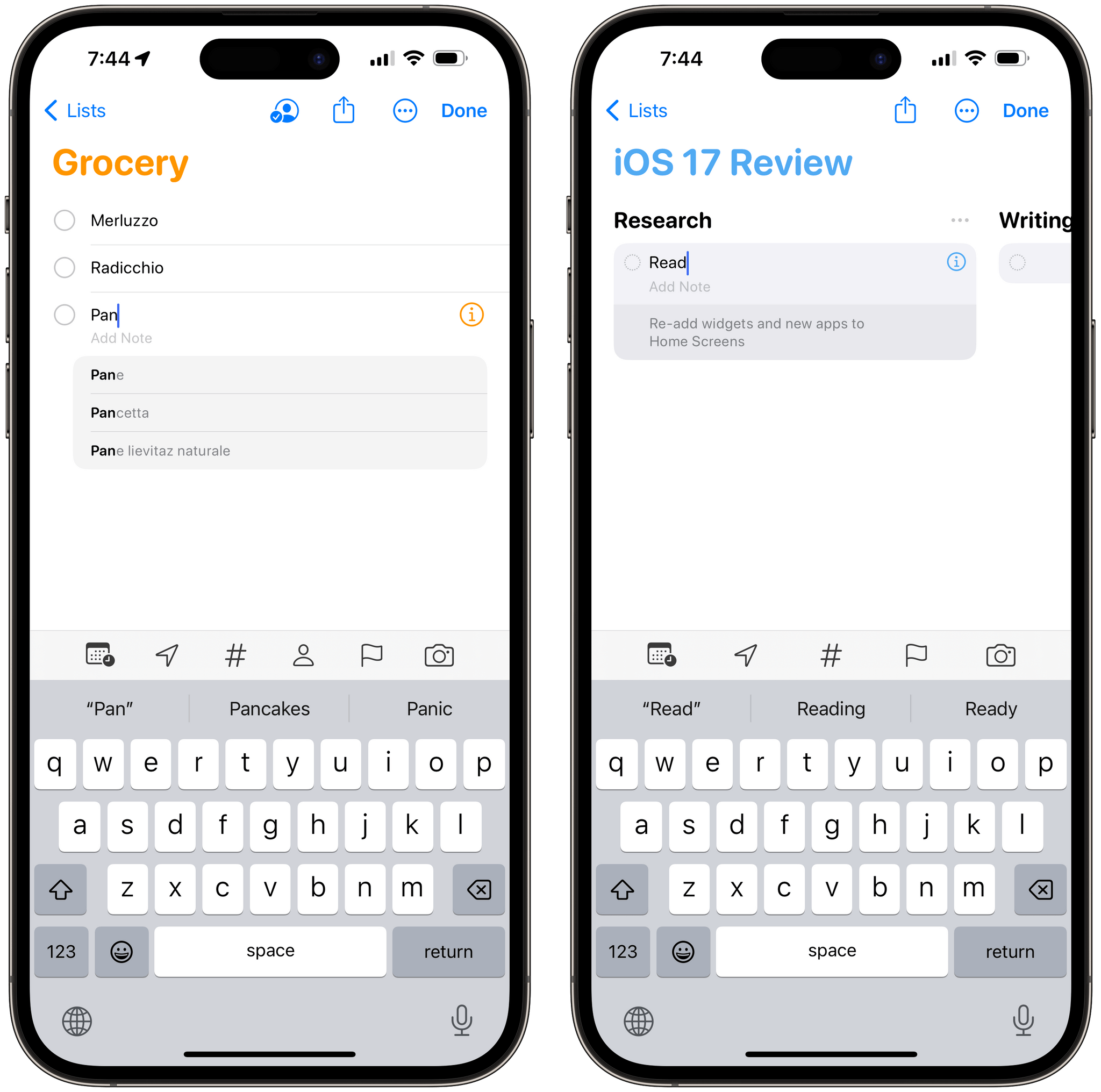
Reminders does this by looking at completed tasks for each list and offering suggestions for words that match a previously completed item. I’ve found this helpful for the grocery list I share with my girlfriend: we add the same items to the list over and over, so the ability to save time when re-entering products we need to buy is convenient.
Grocery Lists
Speaking of groceries and sections, Apple is Sherlocking an entire category of apps with a feature update to Reminders in iOS 17: automatic sorting of items added to a grocery list. Reminders is now capable of sorting your tasks into sections for produce, pasta, breads and cereals, wine and spirits, and more. It does so automatically like other third-party apps we’ve seen before, and it supports grocery lists shared with other people in your household.
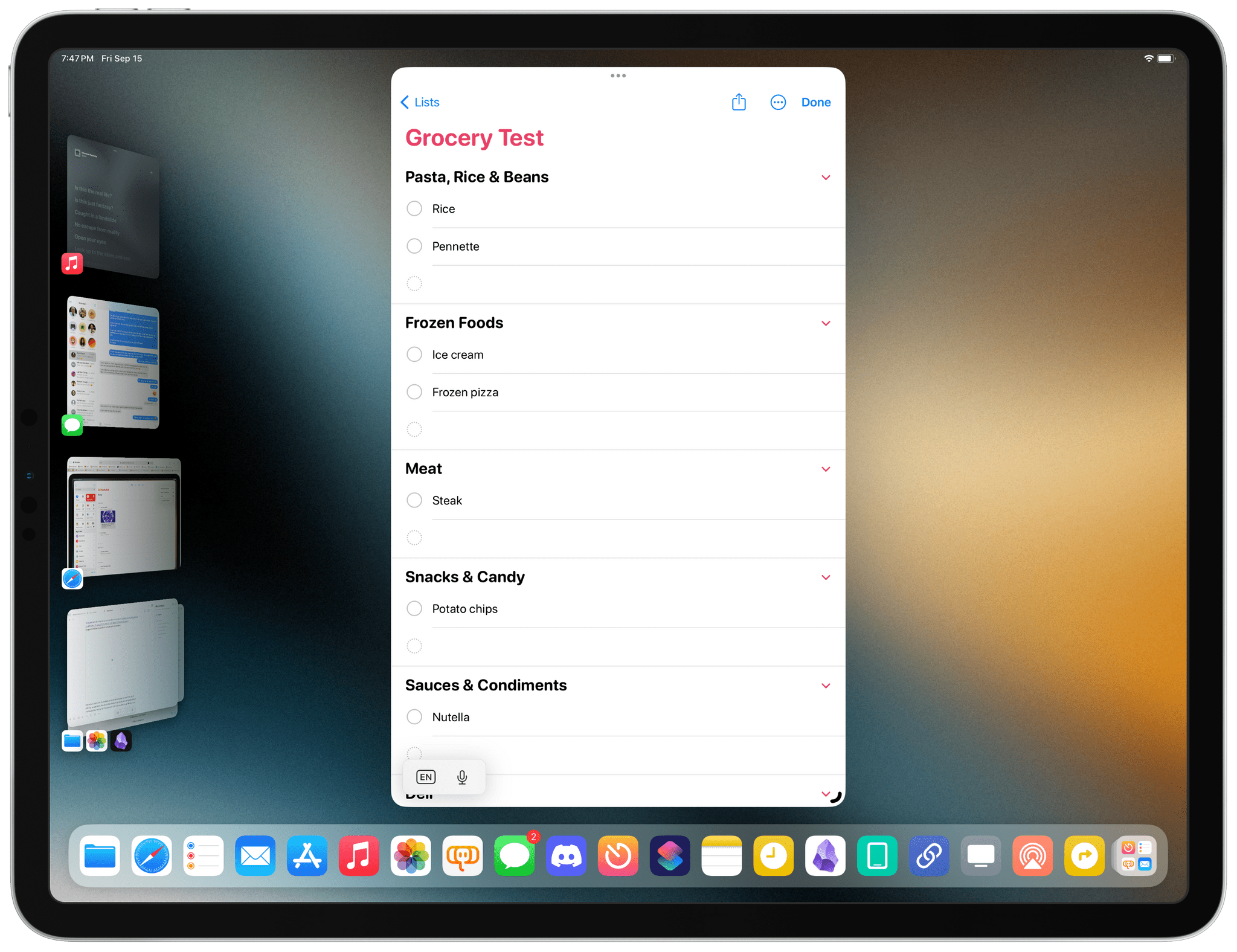
There is one setting you need to change to enable this new Reminders mode: you have to change a list’s type to ‘Groceries’, as pictured below:
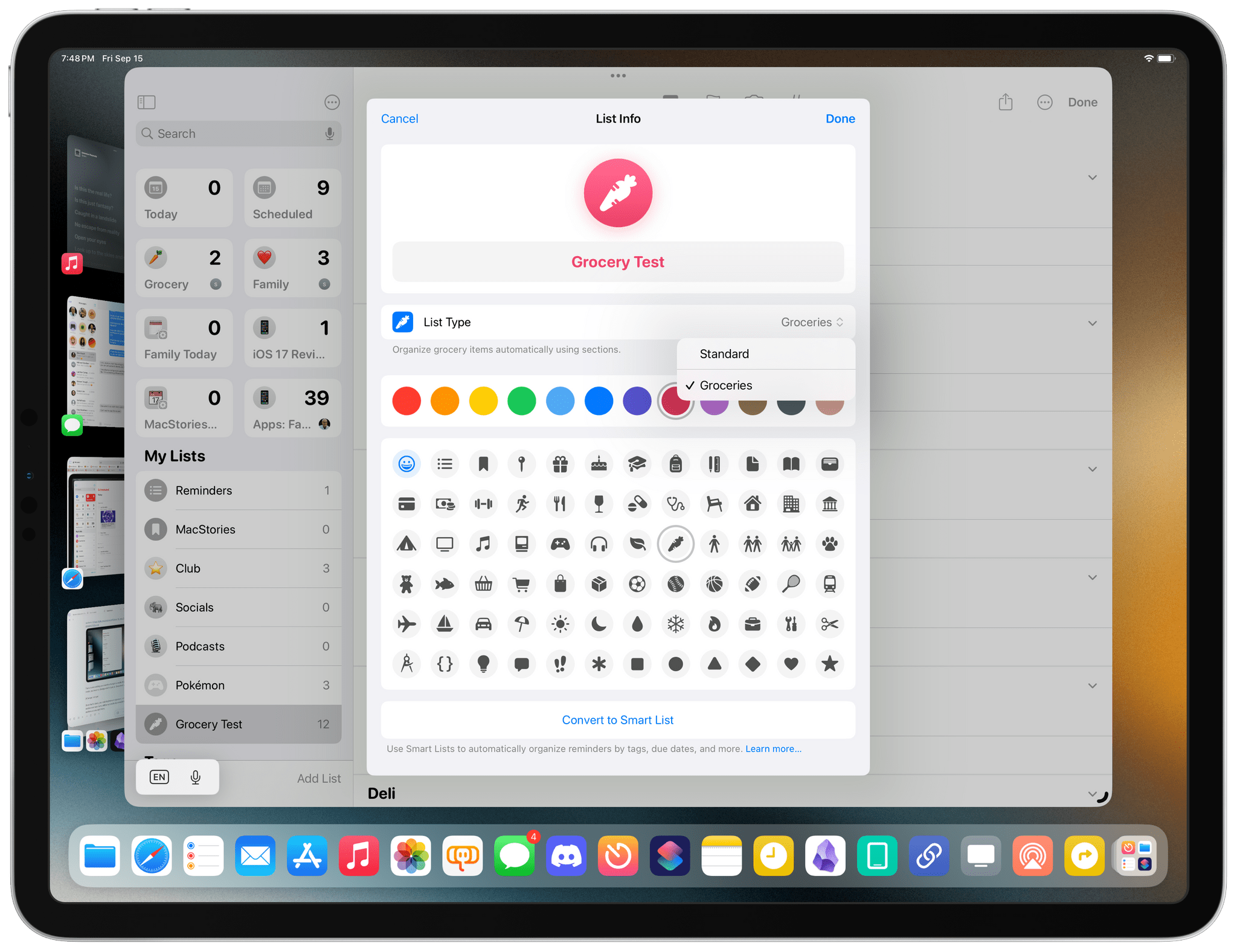
Once that’s done, your existing items in a grocery list will be grouped by section and new items will be automatically sorted into the related sections as you add them.
Based on what I’ve seen with test lists and heard from friends who’ve been using this feature, Apple has done a good job here. Reminders may not be as fancy as the dedicated Grocery app and won’t learn the layout of a supermarket as you shop (Grocery does this), but, as with other features in Reminders, it’s good enough for most people. I think folks who use Reminders for shared grocery lists are going to love it.
However, I can’t use this feature because of a surprising limitation: it doesn’t support multilingual families. I use my devices in English, but I live in Italy, and I speak Italian at home. When Silvia and I put together a grocery list, I enter “mele”, not “apples”. Unfortunately, the Reminders app is locked to the device’s language, and the new grocery list type does not support multilingual recognition.
I’m quite bummed about this because Apple does have multilingual support in the system keyboard, and the company knows there’s a good percentage of users out there who work in one language and speak another at home with their families. Ideally, I should be able to use Reminders in English but enter my groceries in Italian, and the app should understand what I mean. Otherwise, what’s a Neural Engine if not for having your fettuccine properly sorted into a grocery list section?
Early Reminders
Reminders for iOS and iPadOS 17 supports the equivalent of “start dates” in other task managers: with early reminders, you’ll be able to add a first alert to a task that has a proper due date set for a later time.
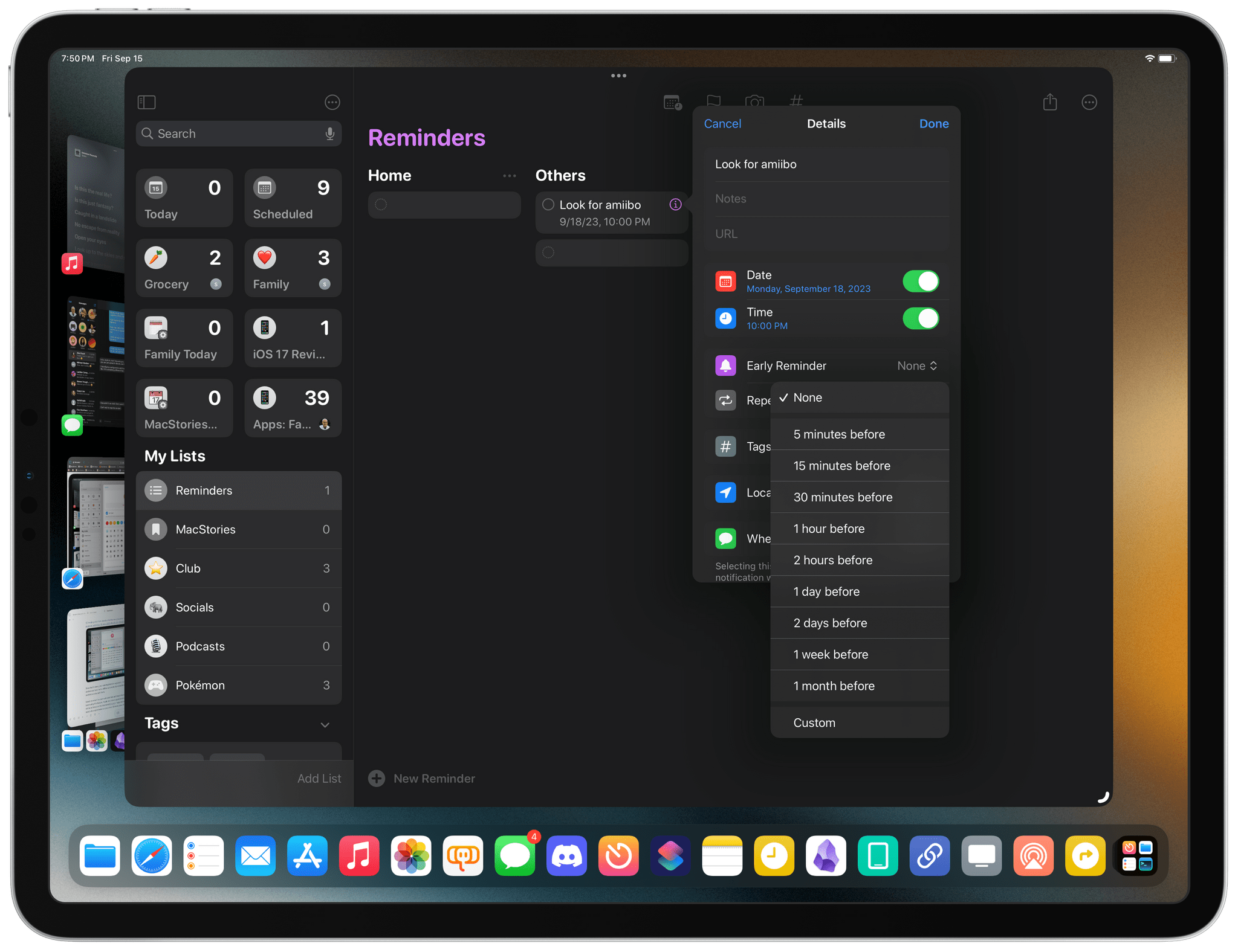
You can choose from a variety of built-in alert times for an early reminder, ranging from 5 minutes to 1 month before, with the ability to create a custom schedule as well. Alas, unlike other task managers, these early reminders do not support surfacing tasks without notifying you, and they’re not available as smart list conditions either.
Issues
I’ve encountered a few bugs and technical issues in the Reminders app throughout the course of the beta that I reported to Apple months ago, but which still made it to the final release of iOS and iPadOS 17.
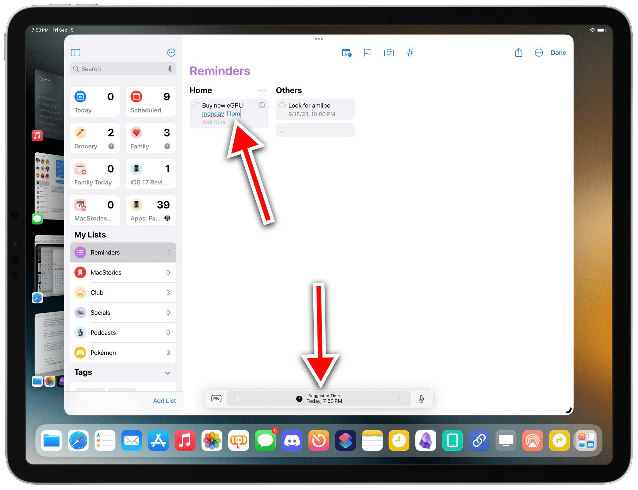
The iPad floating keyboard accessory gets in the way of Reminders too and is, in fact, disrupting my workflow for entering tasks with natural language input. As I mentioned before, this UI element is extremely buggy; in Reminders, it often disappears for no apparent reason and I can’t bring it back. As a result, I am unable to see suggestions for dates and times entered with natural language next to a reminder’s title.
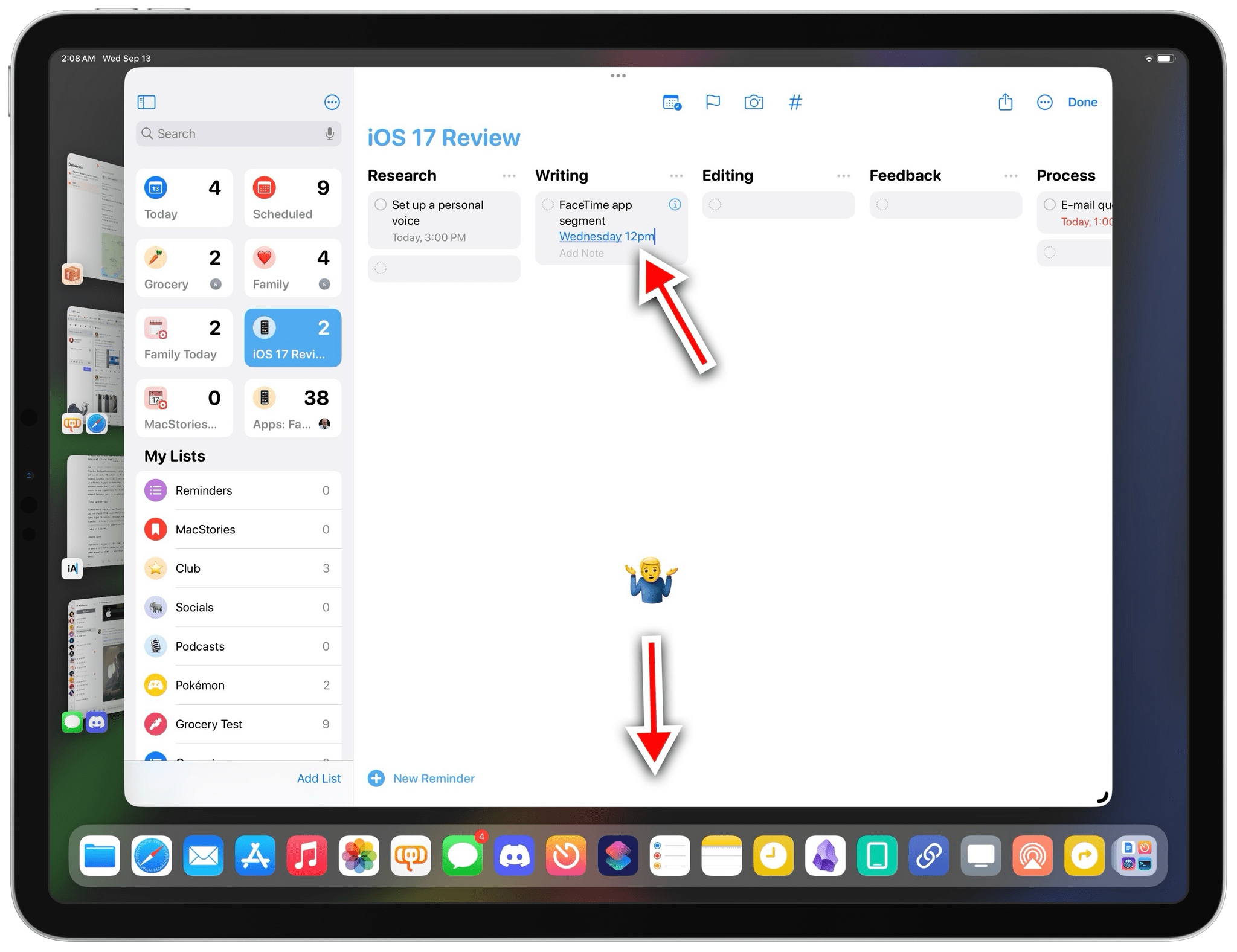
Another nasty bug that has found its way to the final release of iOS and iPadOS 17 involves Reminders sometimes getting dates and times typed in natural language completely wrong. Like, for example, turning a suggestion for ‘Wednesday at 12 PM’ into ‘Today at 9:33 PM’.
This bug has been with me the entire summer, and it shipped in the final version of iOS and iPadOS 17.
This doesn’t happen all the time, but when it does, it forces me to open a reminder’s inspector panel and enter due dates and times manually, which is less than ideal. I hope a fix is in the works.
Despite some technical issues and the unfavorable comparison against power-user tools such as Todoist and GoodTask, Reminders is more than good enough for me at this point as a professional task manager for complex projects. Thanks to iOS and iPadOS 17, I moved back to Reminders again – this time, most likely for good.
Notes
Speaking of new features I never thought would actually happen: the Notes app now supports internal linking to other notes. Plus, there are some PDF-related updates too.
Internal Linking Between Notes
For the past few years, I’ve been arguing that Apple needed to modernize Notes by taking a look at the current state of third-party note-taking apps and implementing functionalities that have been become a staple of the experience for millions of people. And if you consider products like Obsidian, Notion, and Craft, it’s undeniable that “wiki-style linking”, or the ability to easily reference another existing note, has become a key feature among note-takers who demand a fast, reliable way to organize and structure their notes. Whether you want to create a table of contents for an essay, a trip itinerary that references other notes, or just need a way to navigate a large collection of notes about a topic, the ability to add a link that takes you to another note is an excellent time-saving tool. And Notes now has exactly that.
There are two ways to add internal links to notes. In a very Apple fashion, the first one is a modern spin on the classic ⌘K keyboard shortcut, which has existed for decades on macOS to turn selected text into a clickable hyperlink. In the new Notes app, the ⌘K hotkey has been repurposed as a menu that lets you either link text to a webpage in Safari or create a link to an existing note inside the app. To add an internal link, simply start typing the title of the note, find the result you’re looking for, and that’s it. Notes will enter a yellow, underlined link that points directly to a note in your library.
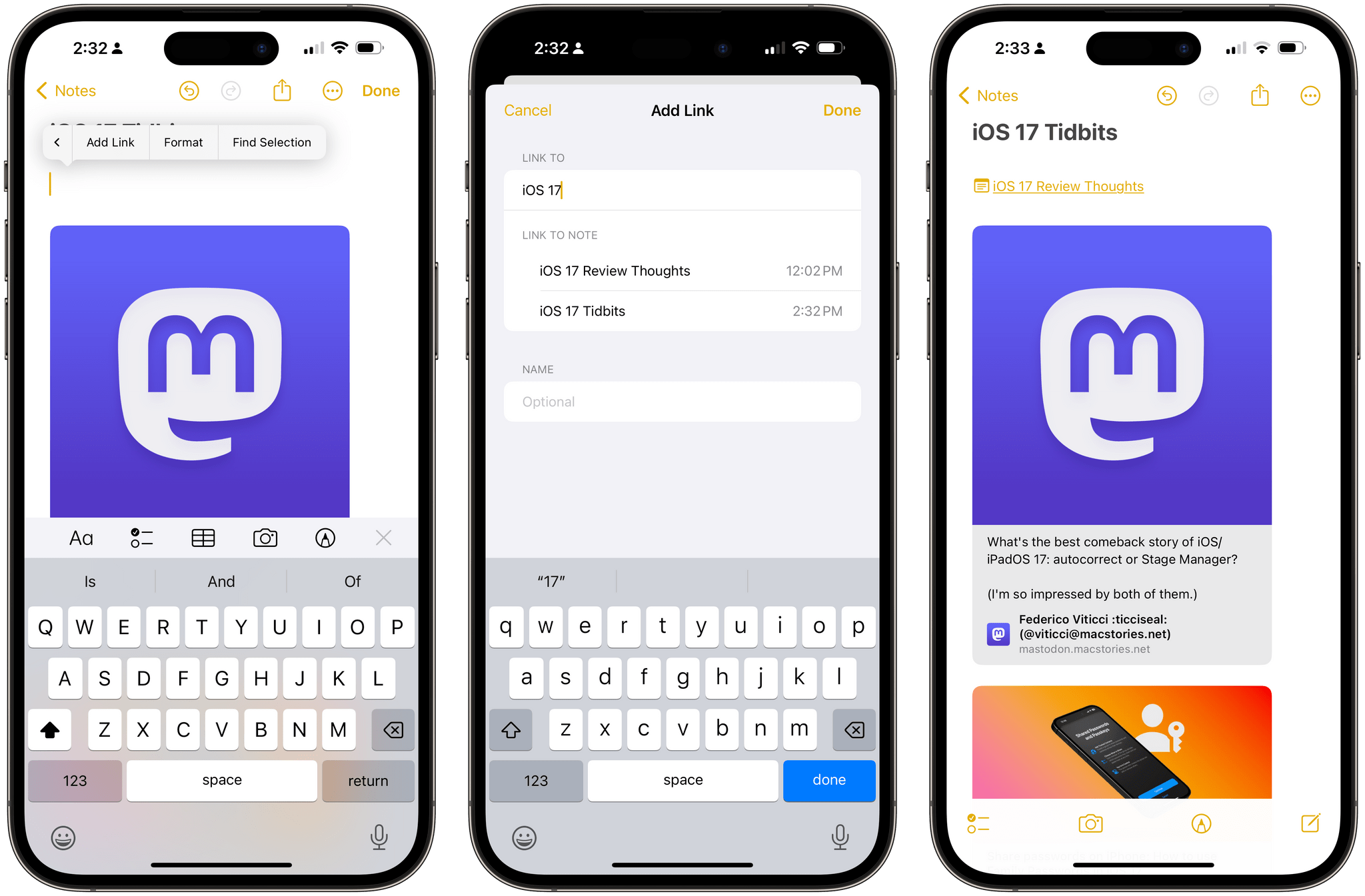
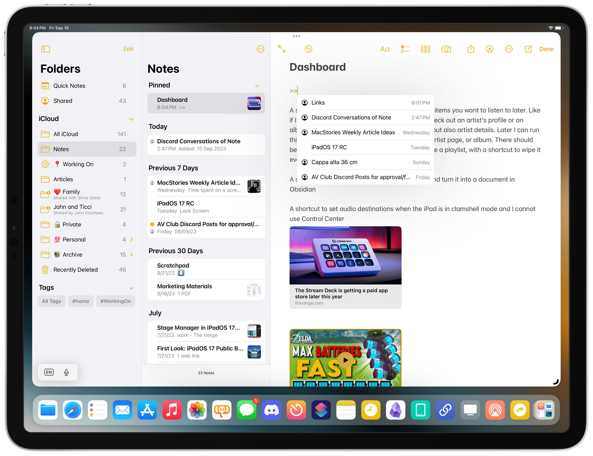
The second way is a so-called ‘accelerator’ – a combination of characters that brings up an inline menu with suggestions. Type >> in Notes, and you’ll see a popup with a list of your most recently modified notes as suggestions. You can use the menu to quickly insert an internal link to a note or search for it by title.
If all this reminds you of double-square brackets in Obsidian, you’re not alone: that’s precisely the sort of interaction that Apple copied and simplified for the Notes app. Even better (and just like Obsidian), if the list of results brought up by the >> menu does not include a note you’re looking for, you can create a new one immediately from there.
Just like Reminders, I think it’s wild that Apple looked at such a geeky functionality and devoted resources to understanding its essence and shipping a version of the feature that can be used by people who have no idea what Obsidian or Notion are.
At the same time, I also know I shouldn’t be too surprised. This is how Apple operates with its built-in apps: they take a look at the market, see what’s popular, and raise the bar with features that abstract complexity and can be approachable to everyone.
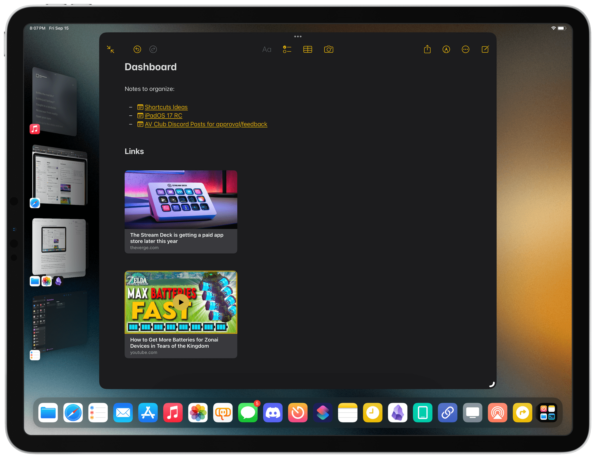
Internal links can be a very effective way to create tables of content by directly pointing to another notes in the app.
For obvious reasons, Notes still can’t be as flexible as Obsidian with its internal links (there are no backlinks or section-specific links, for example), but like I said above: it’s more than good enough. While I may not be able to use Notes for my work-related note-taking since I rely so heavily on Obsidian’s backlinks and tabbed interface, I think the updates in iOS and iPadOS 17 will result in a lot of switchers from competing apps.
New PDF Viewer
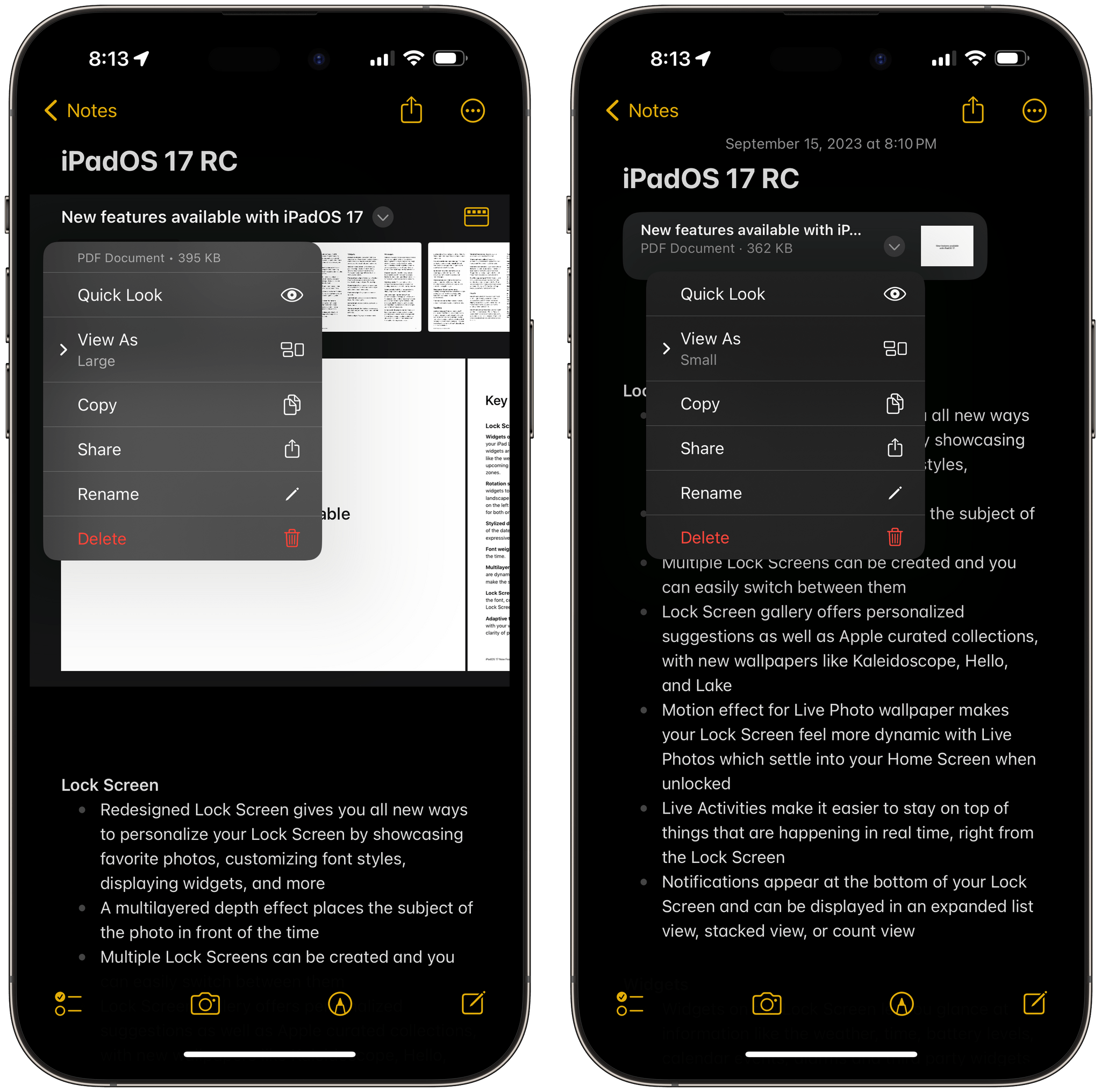
Notes’ built-in PDF viewer has been redesigned in iOS and iPadOS 17: now instead of showing PDF attachments within a note as single-page previews, inline PDFs are displayed as special “containers” that let you scroll a document’s pages directly from the main note without opening the PDF in full-screen.
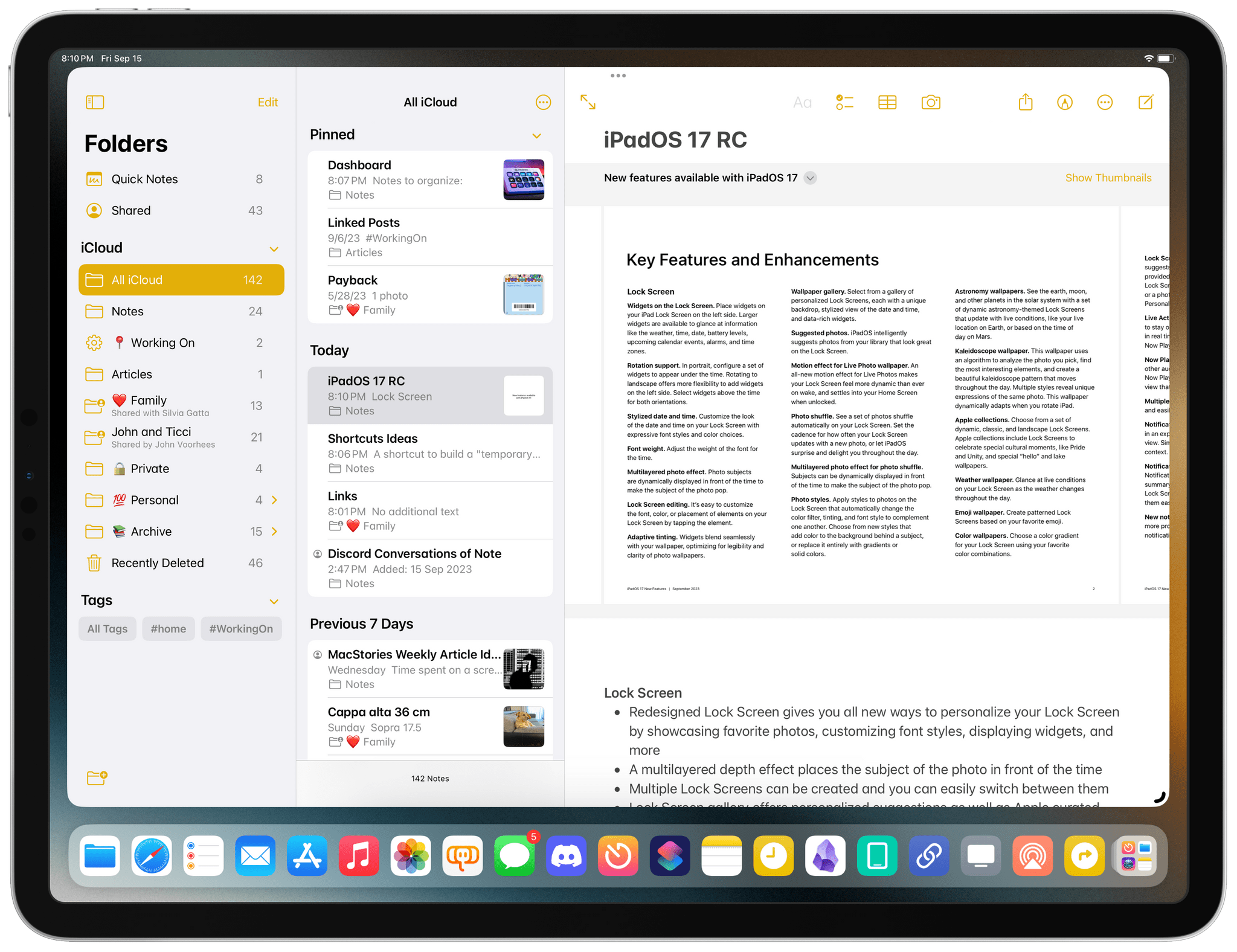
I like this approach a lot since it noticeably reduces the time spent opening PDF previews just to scroll between pages. Additionally, the new attachment design lets you opt into displaying individual page thumbnails in a scrollable drawer above the document, and you can take action on specific pages directly from the main note view with quick actions for copying a page, rotating it, or even inserting a new page.
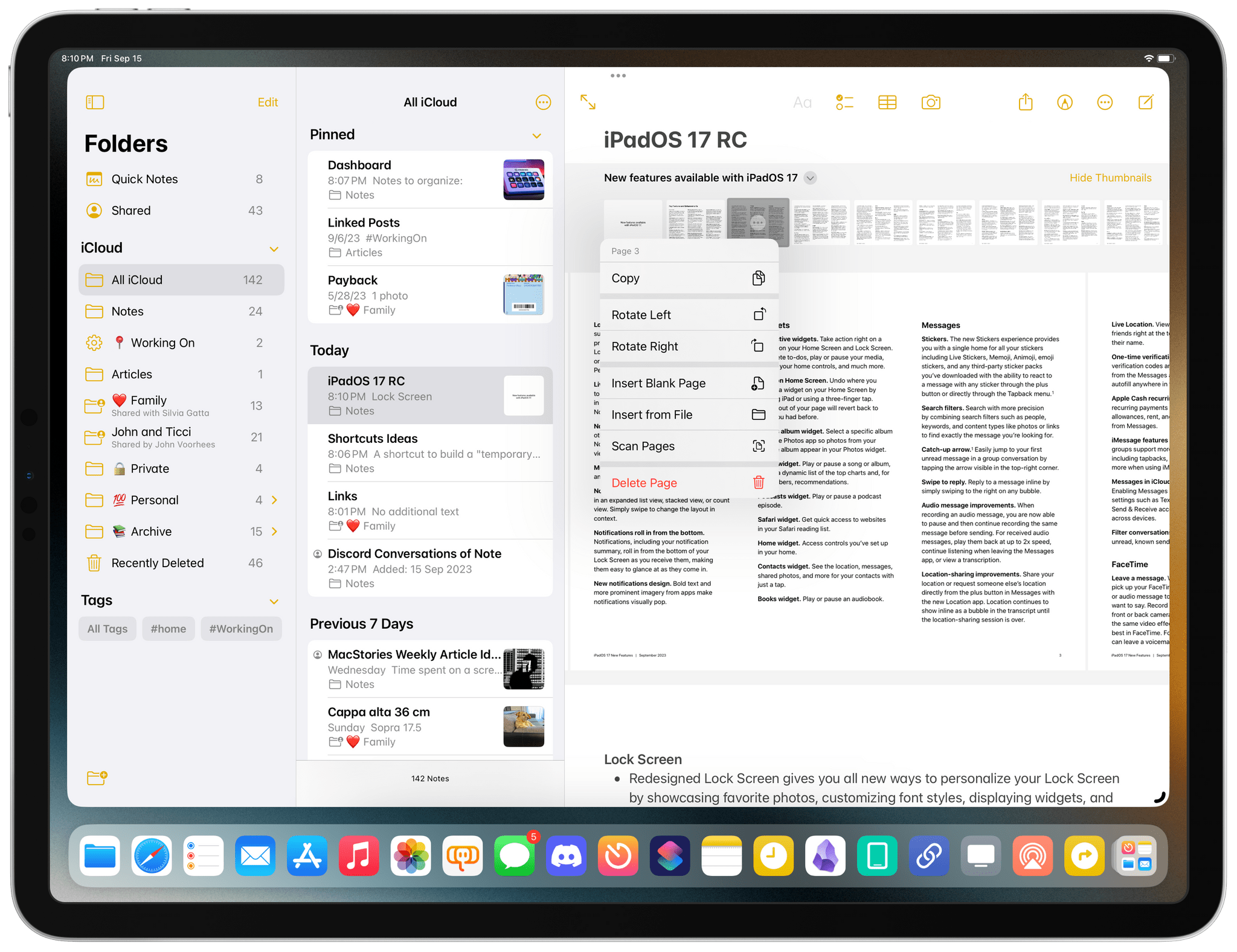
Other PDF options are available by pressing the disclosure button next to the document’s title:
My girlfriend and I share a folder of notes that contain dozens of PDF attachments from the architect who’s designing some furniture for our house. For this reason, I’ve appreciated the ability to quickly skim and preview pages without opening full Quick Look previews for PDFs. I think this change will also go over well with students who keep and annotate documents in Notes on a regular basis.
Formatting Updates
This year, Notes also received two formatting enhancements: you can now enter blockquotes in your text, and you can turn text into a new ‘Monostyled’ font (SF Mono).
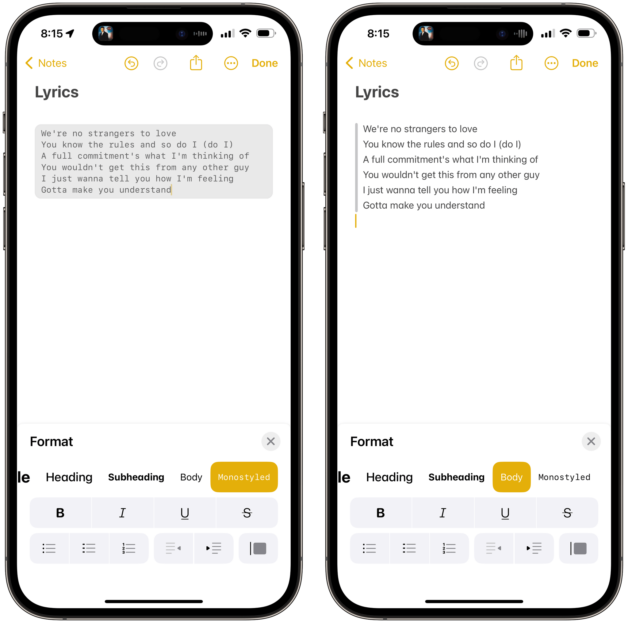
Alas, monostyled blocks do not support syntax highlighting for code snippets, which would have been sweet to store bits of reference code in Notes.
Sadly, Apple’s Mail app keeps not getting the same annual product treatment as Notes and Reminders. While those productivity apps continue receiving excellent upgrades and new features on a yearly basis, Mail catches up with modern email clients…every once in a while, and just barely so, and fashionably late.
Case in point: this year – 16 years after the launch of Mail for iPhone OS 1.0 – the app is getting the ability to create hyperlinks in messages. Hyperlinks! And even then, it likely is because the feature is based on Notes’ support for creating links to other notes or webpages.
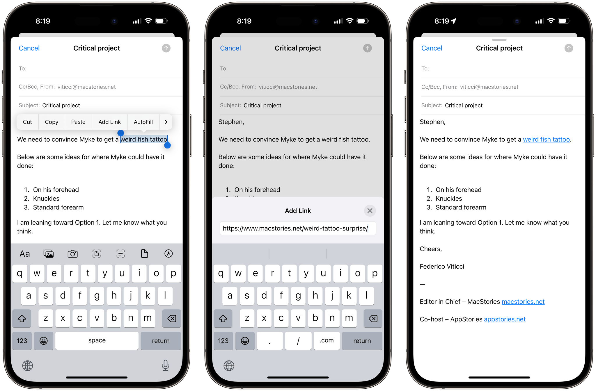
When you select text in a Mail message now, you’ll find the same ‘Add Link’ button seen in the Notes app to add a link to the selected text. On iPad, you can press ⌘K on an external keyboard to do the same with a hotkey. Once the link is added, you can tap next to it to reveal a menu with options to remove or edit the link, open it in Safari, or turn it into a rich link preview.19
That’s about all there is to Mail this year. Hyperlinks: what a concept.
- Speaking of which: please, Apple, please let me customize what Reminders means by "morning, afternoon, and evening". Reminders saved for 6 PM do not belong to the 'Evening' section – they're afternoon ones. I understand that some Americans eat dinner at 6 PM, but the rest of the world – and especially Europe – doesn't. There should be a preference for this. ↩
- This inconsistency is so annoying: in Mail, you can turn a pasted link into a rich link snippet; in Notes, where the 'Add Link' menu is even more powerful, you can't. ↩