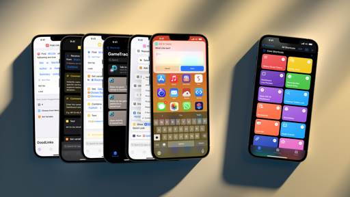
Apps
New versions of iOS aren’t just about splashy new system features and new designs; with an ever-growing collection of built-in software, the most interesting updates are often found in the apps we use every day.
Books
After a quiet couple of years, the Books app has received a series of substantial enhancements in iOS 16. Like the majority of people on Earth, I don’t consider myself a voracious reader, but each year I hope I can become one. For this reason, I’m always intrigued by updates to the Books app because maybe this time I’ll be able to appreciate them.
The audiobook listening experience has been improved with a redesigned full-screen player but, more importantly, the addition of a mini player at the bottom of the screen, similar to the Music app. The mini player has buttons to play/pause and skip back by 15 seconds; it also works for audiobook previews from the Audiobooks Store, so you can listen to an audiobook sample while you’re still browsing around to make up your mind.
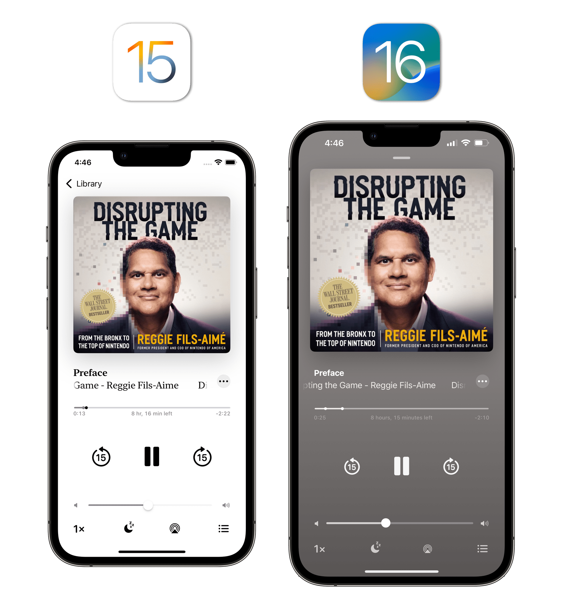
Amusingly, the full-screen audiobook player uses the old iOS 15-style design for progress and volume bars and hasn’t adopted the new ones seen in Music and the video player for iOS 16.
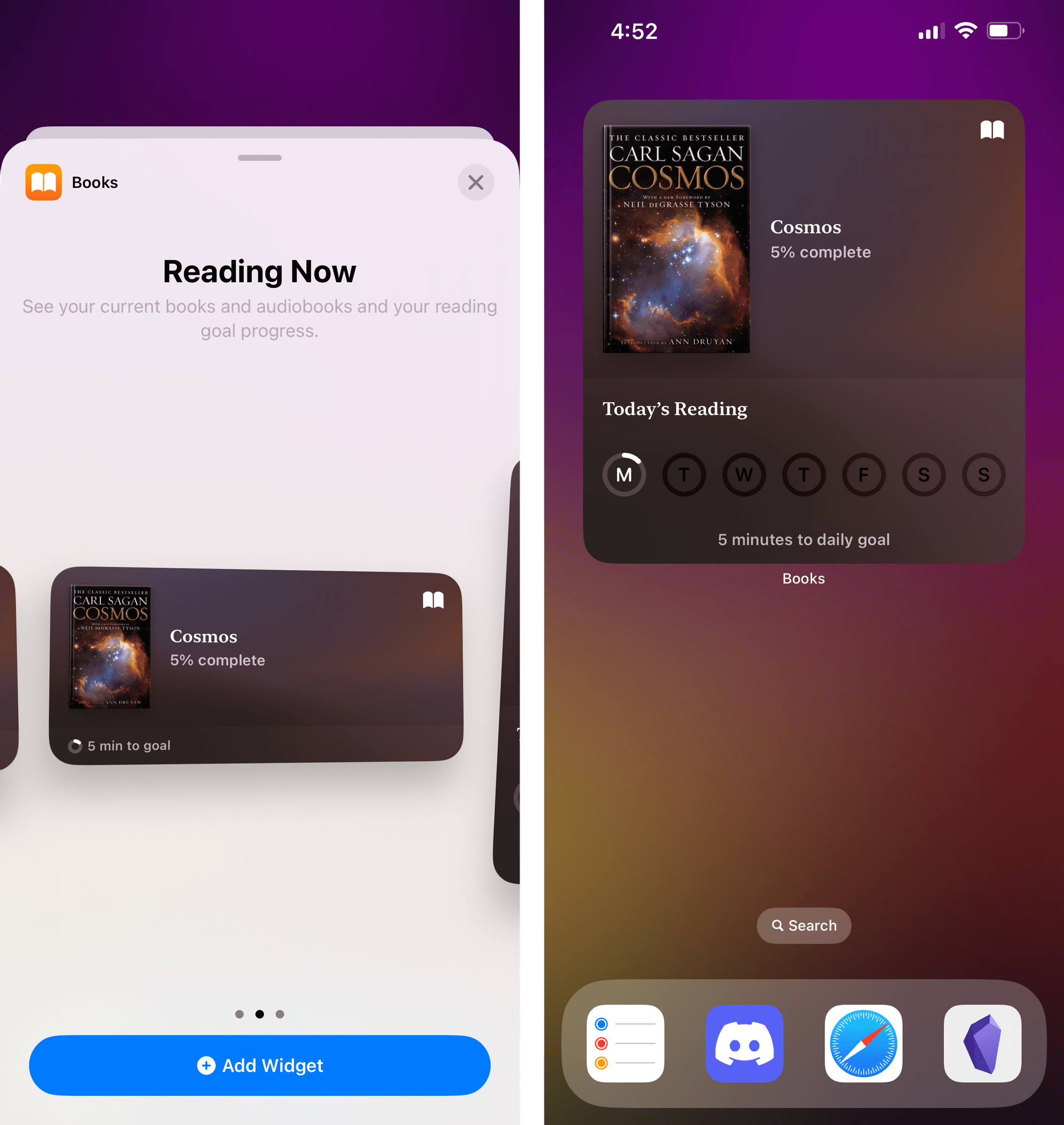
Also, Apple added widgets for the Books app. If you read a lot, you’re going to like the large widget, which shows you the book you’re reading now, how many minutes you’ve read today, and your weekly progress.
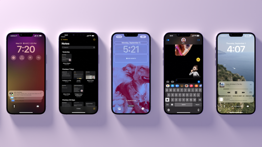
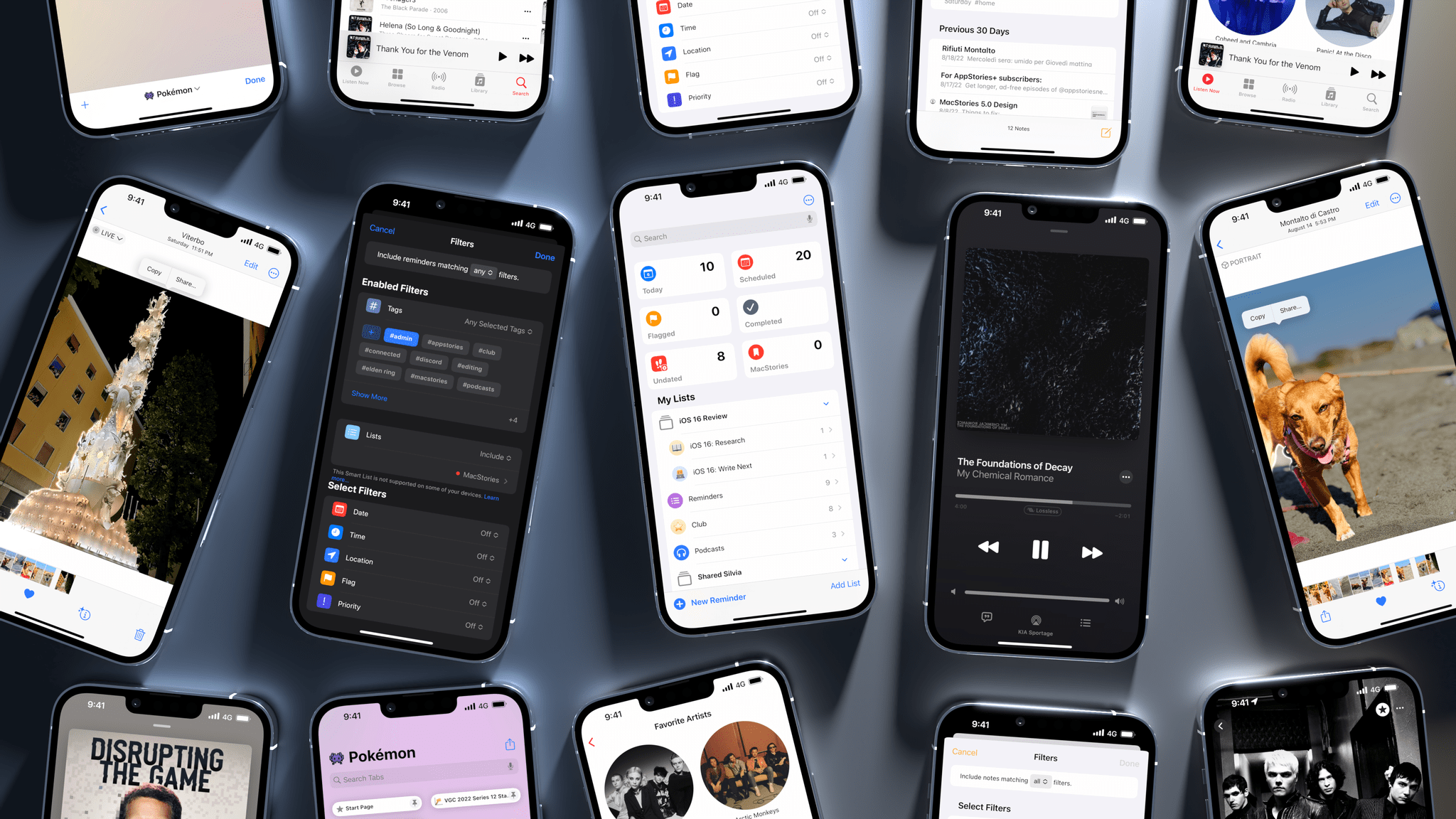
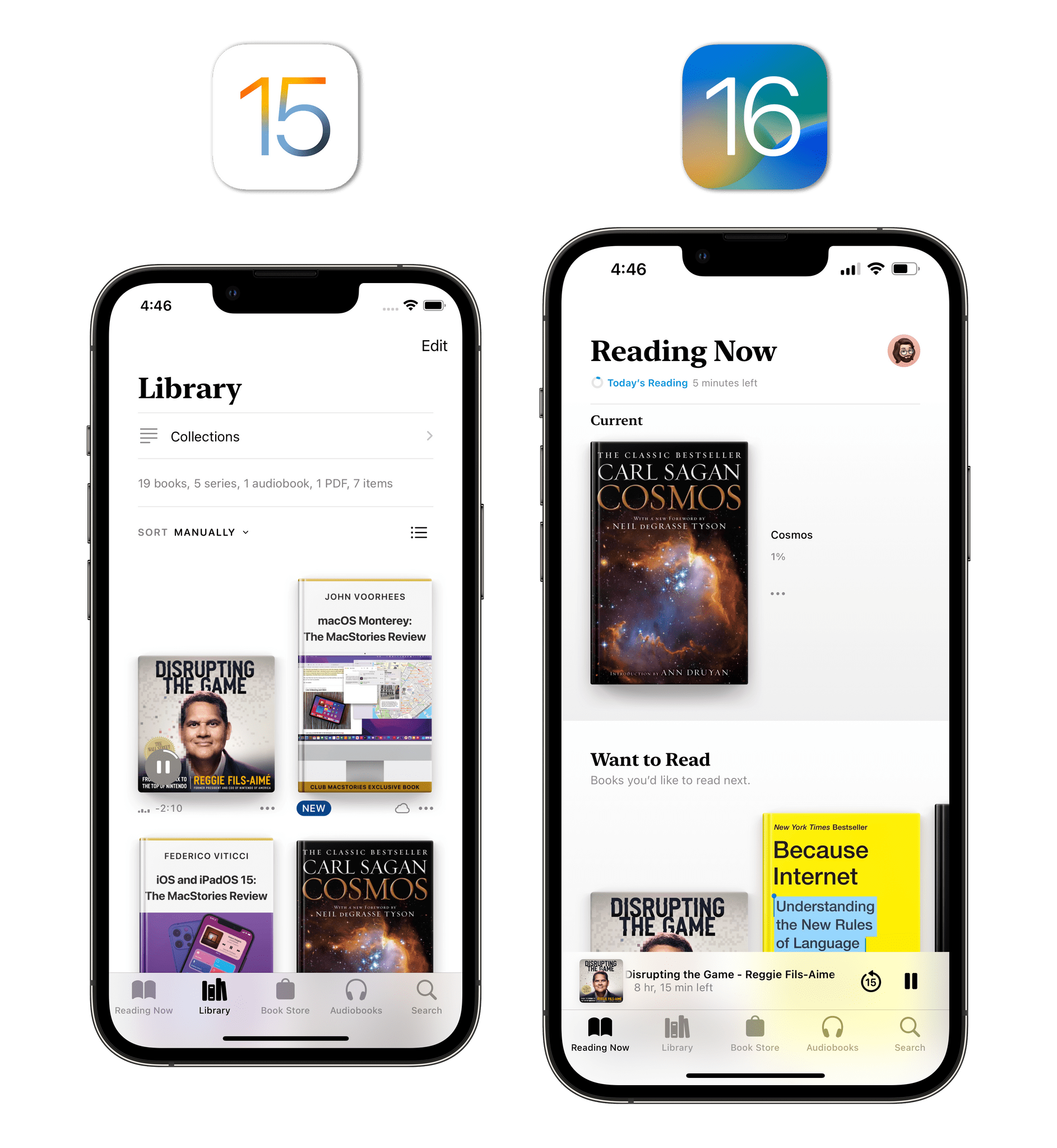
The biggest changes to the Books app this year, however, are in its core component: the reader interface. In iOS 16, the Books reader has received the “Safari treatment”: all UI elements have been moved to the bottom of the screen and integrated into a single button that reveals a menu containing options that were previously at the top of the screen, such as search, your bookmarks, and font settings. It’s a dramatic redesign of the Books UI, as you can see in the comparison images below:
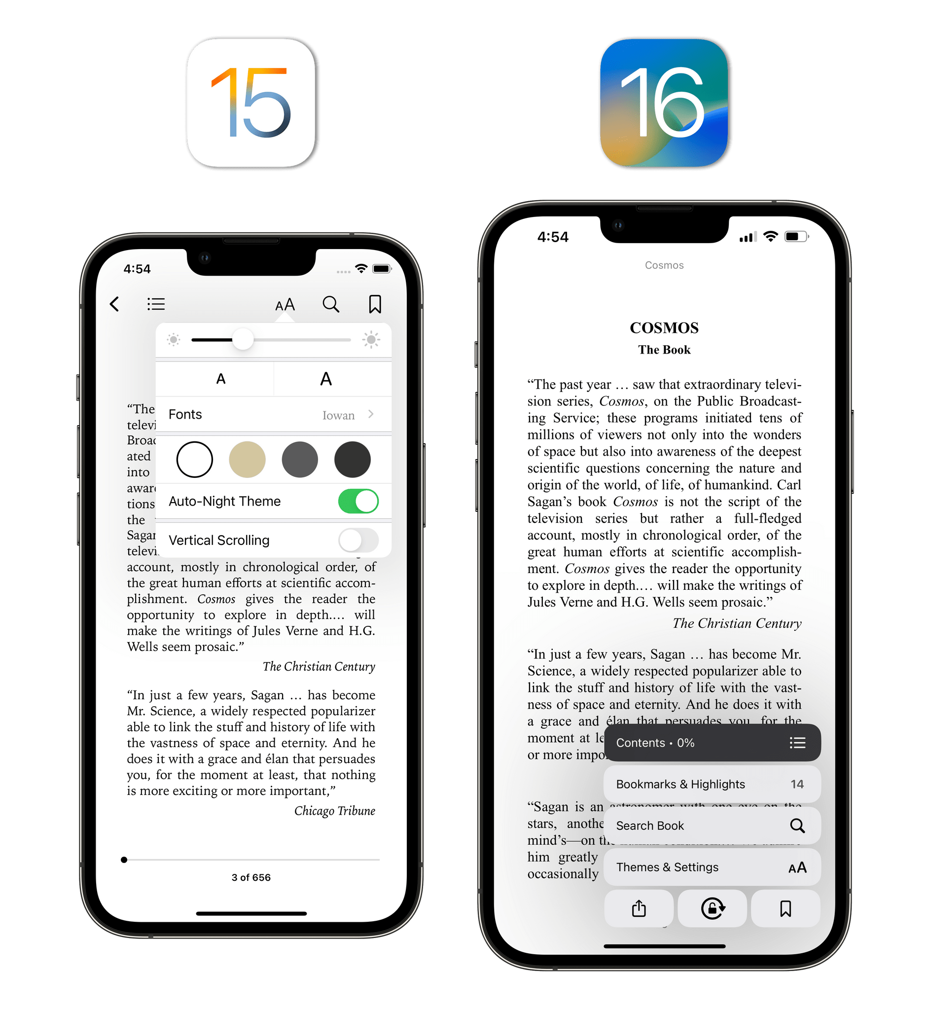
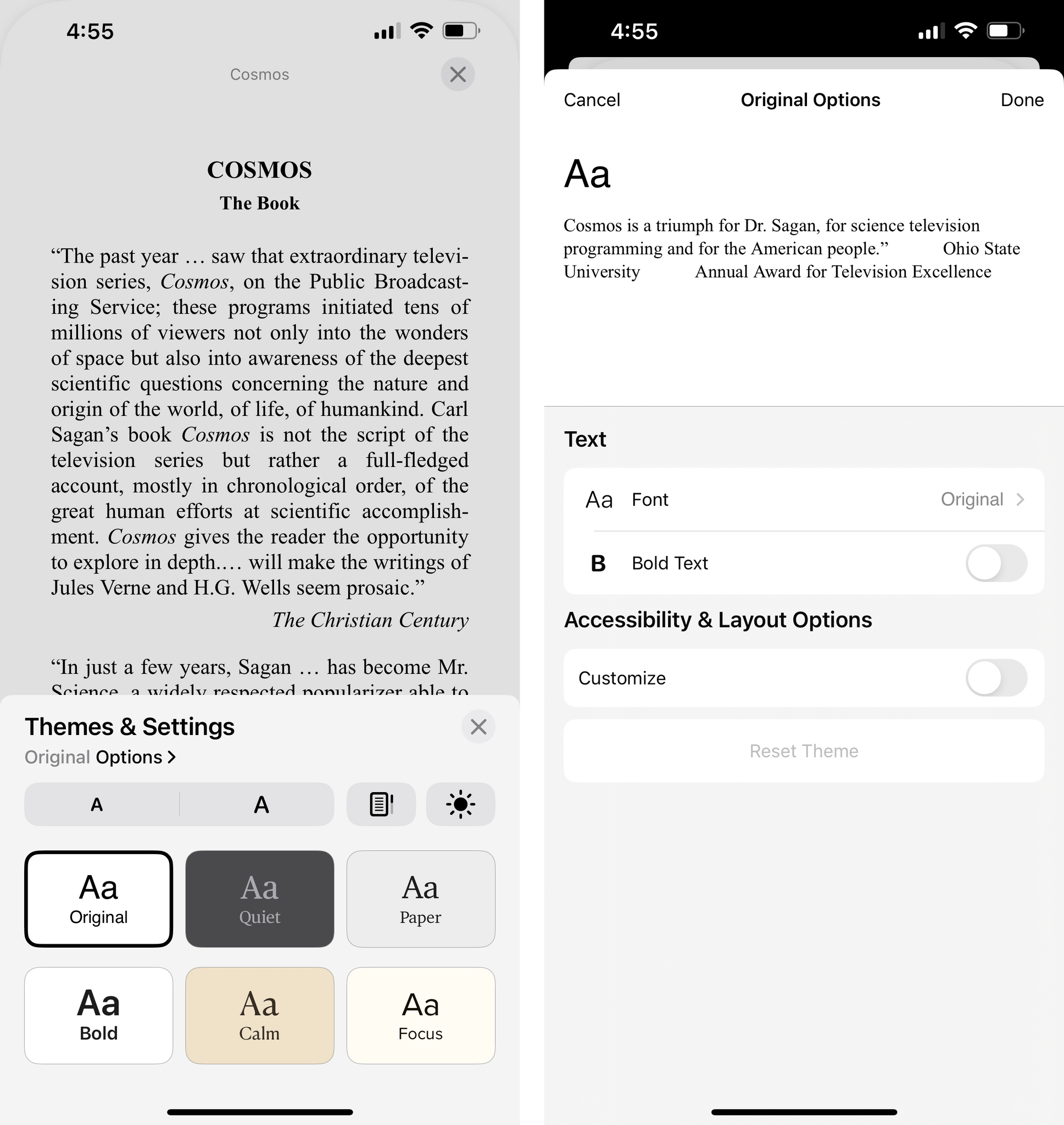
What I find fascinating about this is that this type of a menu is a completely new element that has no precedent on iOS: it’s a button that invokes a list of more buttons, one of which is a slider (the Contents one, which you can swipe to flip through a book quickly). It gets better: the Themes & Settings panel reveals a sheet at the bottom of the screen with multiple themes as well as a nested Options page where you can dig even deeper and choose from more fonts than before, configure spacing and justification, and preview your changes inline. There’s a lot going on in the Books UI.
Like I said, I’m not a committed reader, so I can’t comment on the merits or issues of this design with the same passion that drove me to criticize, then praise, Safari’s redesign last year. I find this new design…shocking at first, but well done, maybe? I’m curious to hear what folks who read a lot of books every year think of this design in the iPhone app.
Calendar
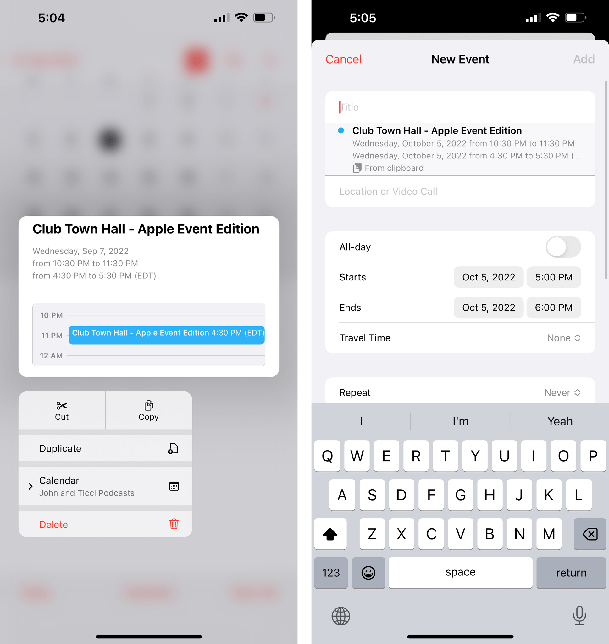
As we’ve seen elsewhere in iOS 16, Apple has adopted pull-down menus more extensively in built-in apps this year, including Calendar. In the inspector for a calendar event, tapping on fields such as Repeat or Calendar will no longer take you to a separate sub-page; instead, you’ll stay in the event details screen and the selected menu will open inline.
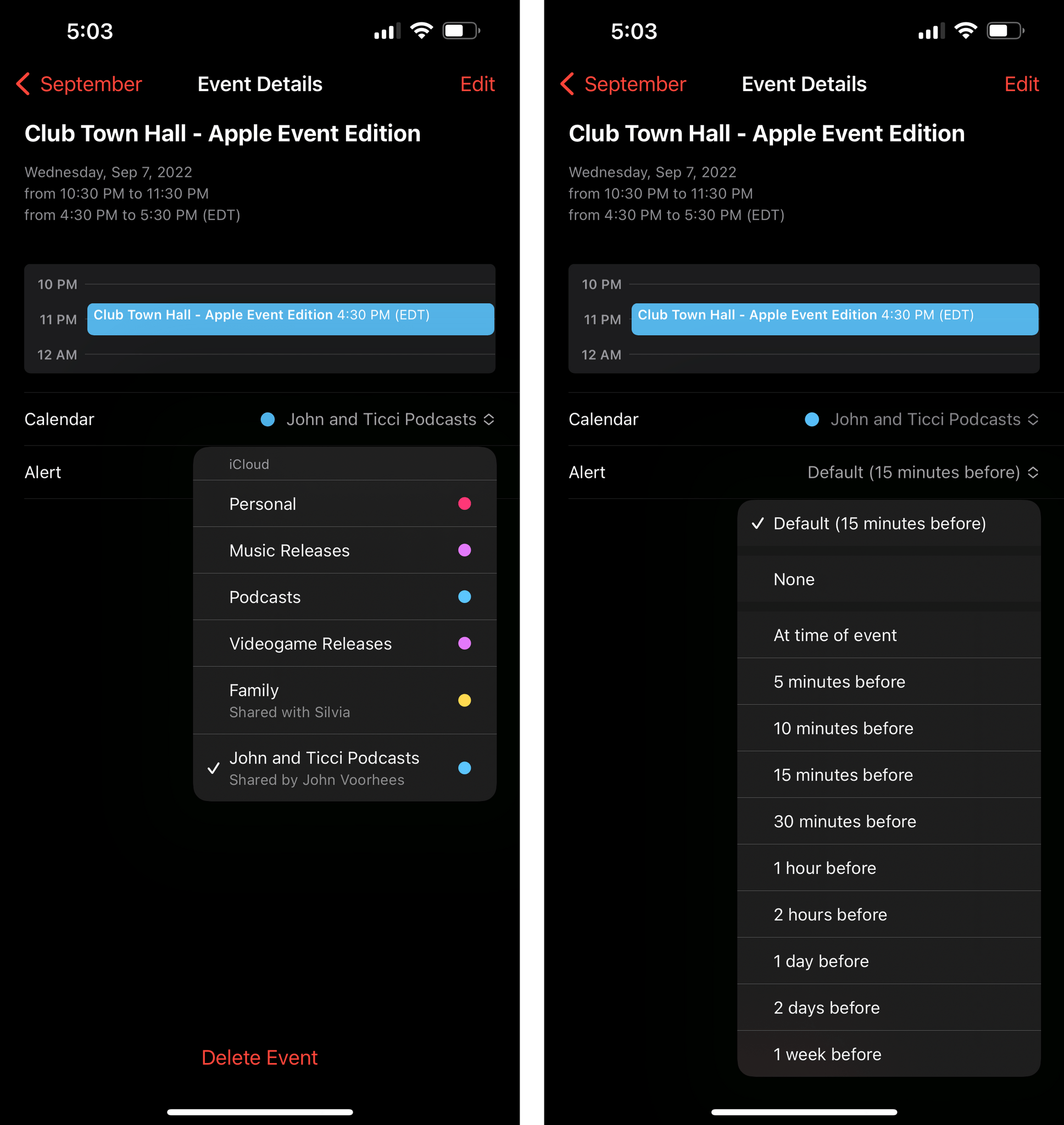
There is a new context menu shown when you long-press an event: this menu, which uses new iOS 16 APIs to include three shortcuts at the top (I’ll focus on this in my iPadOS 16 review), adds new options for copying events, pasting them, and moving them between calendars.
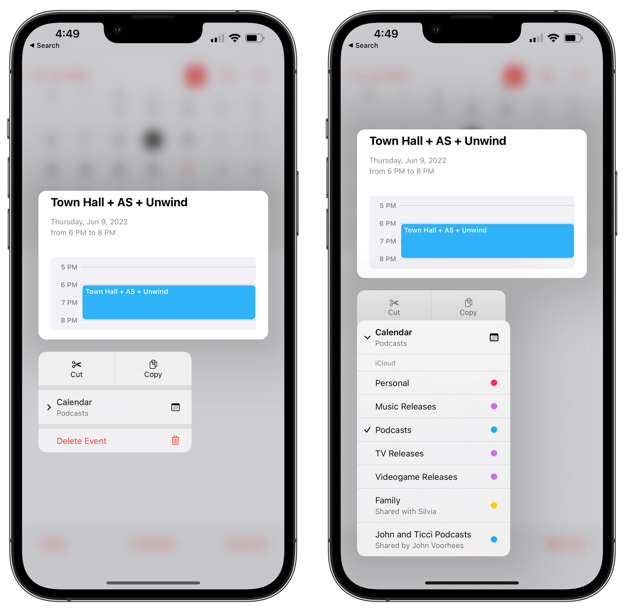
In iOS 15, long-pressing an event only gave you an option to delete the selected item. Now, besides having a much faster way to assign an existing event to a different calendar, you can also paste events elsewhere in the Calendar app by selecting an empty block of time and pasting the copied event. In a nice touch, if you don’t paste but decide to create an event manually, the ‘New Event’ page will still detect the copied event in your clipboard and offer you to use it as a template.
Camera
Except for the new functionalities coming to the iPhone 14 Pro line, there are two notable changes for the Camera app this year.
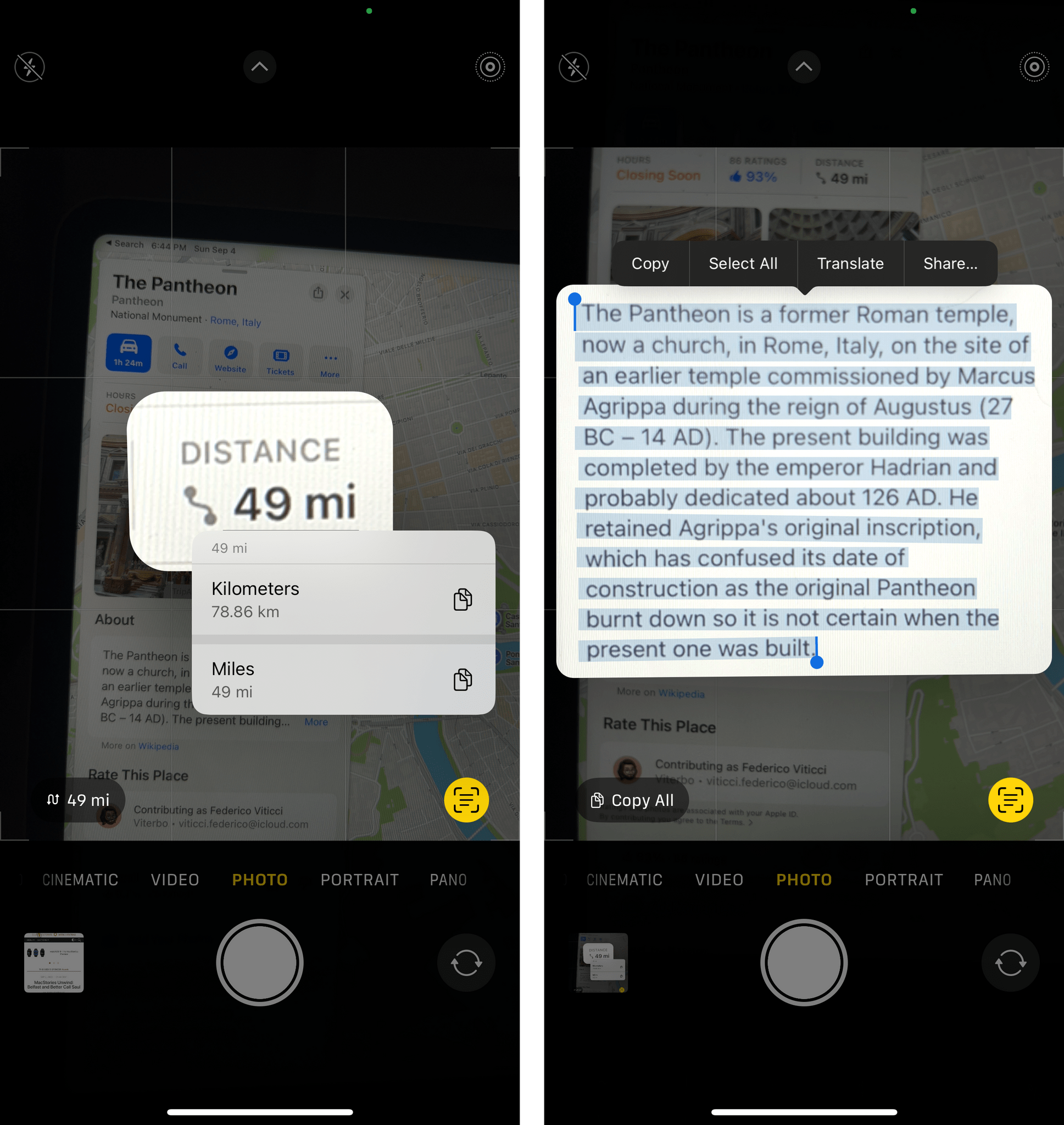
The first one, which I’ll cover in the Photos section and Everything Else chapter as well, is improved support for Live Text. In the iOS 16 camera, when you focus the frame on text recognized in an image you’ll see data detectors pop up at the bottom of the viewfinder. There are shortcuts to copy all text, navigate to a recognized address, translate text, and more. Live Text continues to be incredible and its integration with the Camera app is even better this year.
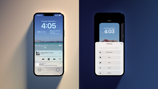
Second, on iPhone 13, 13 Pro, and 13 Pro Max, the Camera app now supports foreground blur in portrait photos. This means you can blur objects in the foreground of an image to get a more realistic depth-of-field effect in your portrait shots. As you can see in the comparison shots below, if you have the right subject and composition, this option looks quite nice and adds a bit more gravitas to the subject you’re focusing on.
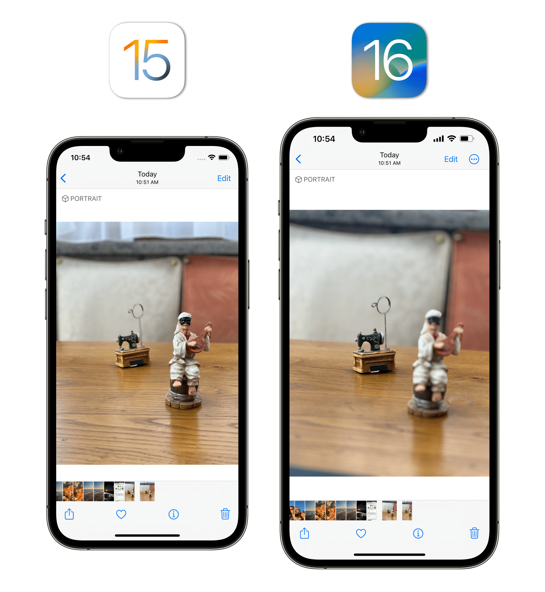
Portrait mode foreground blur as seen on an iPhone 13 Pro Max (right). Notice how the white figurine on the right gets blurred in iOS 16.
FaceTime
Besides the transparent UI I covered in the Design chapter, pretty much nothing has changed in the FaceTime app after last year’s big redesign and rollout of SharePlay. The one new functionality this year is the ability to hand off a FaceTime call from an iPhone to a Mac running macOS Ventura.
Home
My girlfriend and I bought a house this year, and we moved in two months ago. As you can imagine, I haven’t had the time to settle into my new workspace just yet between going on vacation and extended delivery times for furniture, so I haven’t had the time to play around with new HomeKit accessories or the redesigned Home app for iOS 16.
Fortunately, our John also moved, but he’s had the time to rethink his whole HomeKit setup and dive into the new Home app for iOS and iPadOS 16. So if you want to learn more about everything that’s changed – and where the Home app still falls short – make sure to read his story here.
Alright, who had ‘Major updates to the Mail app’ on their WWDC bingo card this year? I tip my hat to whoever did: your patience has been rewarded in what is, arguably, the biggest update to Mail since its introduction in 2007.12
In iOS 16, Apple has completely revamped Mail’s search to make it faster, more reliable, and intelligent thanks to search suggestions and tolerance for typos built-in. There’s the ability to schedule emails to send later and follow-up reminders for emails that you haven’t gotten a response for in a while. You can also create reminders to snooze messages for later and be reminded to check them out when you have time.
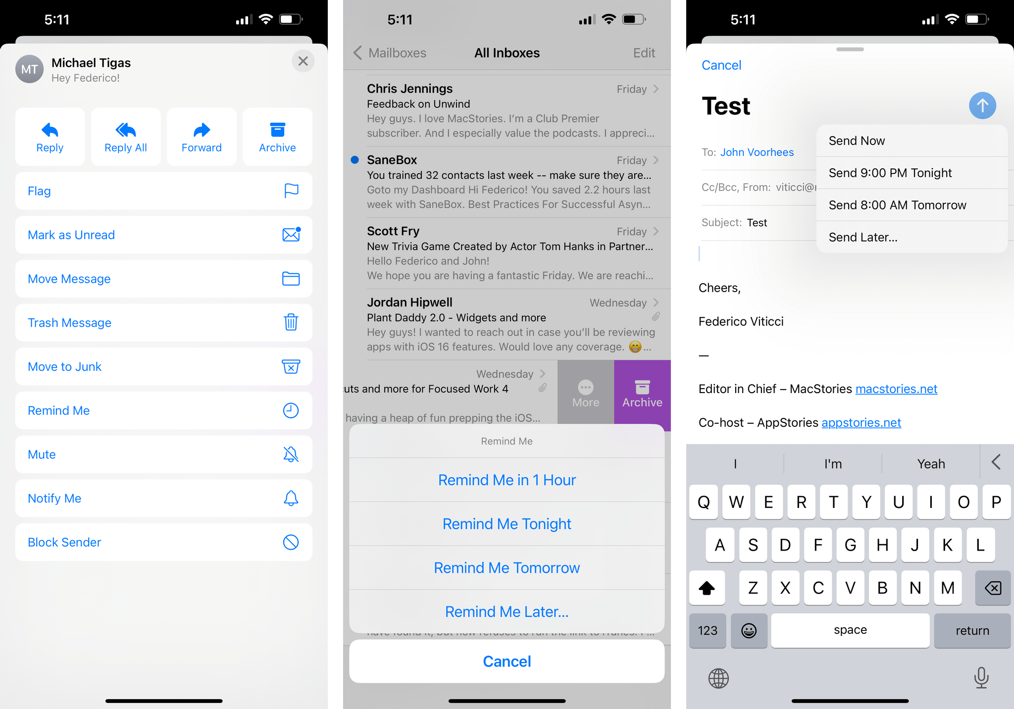
Mail’s update is so important, and, for the most part, surprisingly well done, we thought it deserved its own standalone article on MacStories, which John published a few days ago here. I’ve had this feeling since I first tested the new Mail app in June: I can’t believe Apple finally modernized it and did a good job with it. There’s still work to do, but I’m happy to be using Mail as my default email client again.