Design
As has been the case in the past few years, there’s no overarching design theme in iOS 16 – a single idea that spawns several features throughout the system, each one consistent with a unified vision. That’s not to say iOS’ design is incoherent now: it’s just that the time for sweeping redesigns has been over for a while at Apple HQ.
So, in keeping with the tradition of recent years, iOS 16 offers a grab bag of design iterations and refinements in separate areas of the OS, which modernize apps and enable new interactions that weren’t possible before. Let’s take a look.
The New Video Player
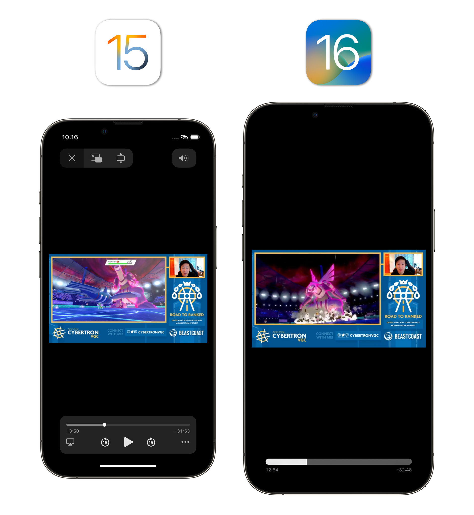
The system video player has undergone a major redesign in iOS 16 that eschews the dedicated floating box of controls at the bottom in favor of a more minimal look with playback controls overlaid on the video itself.
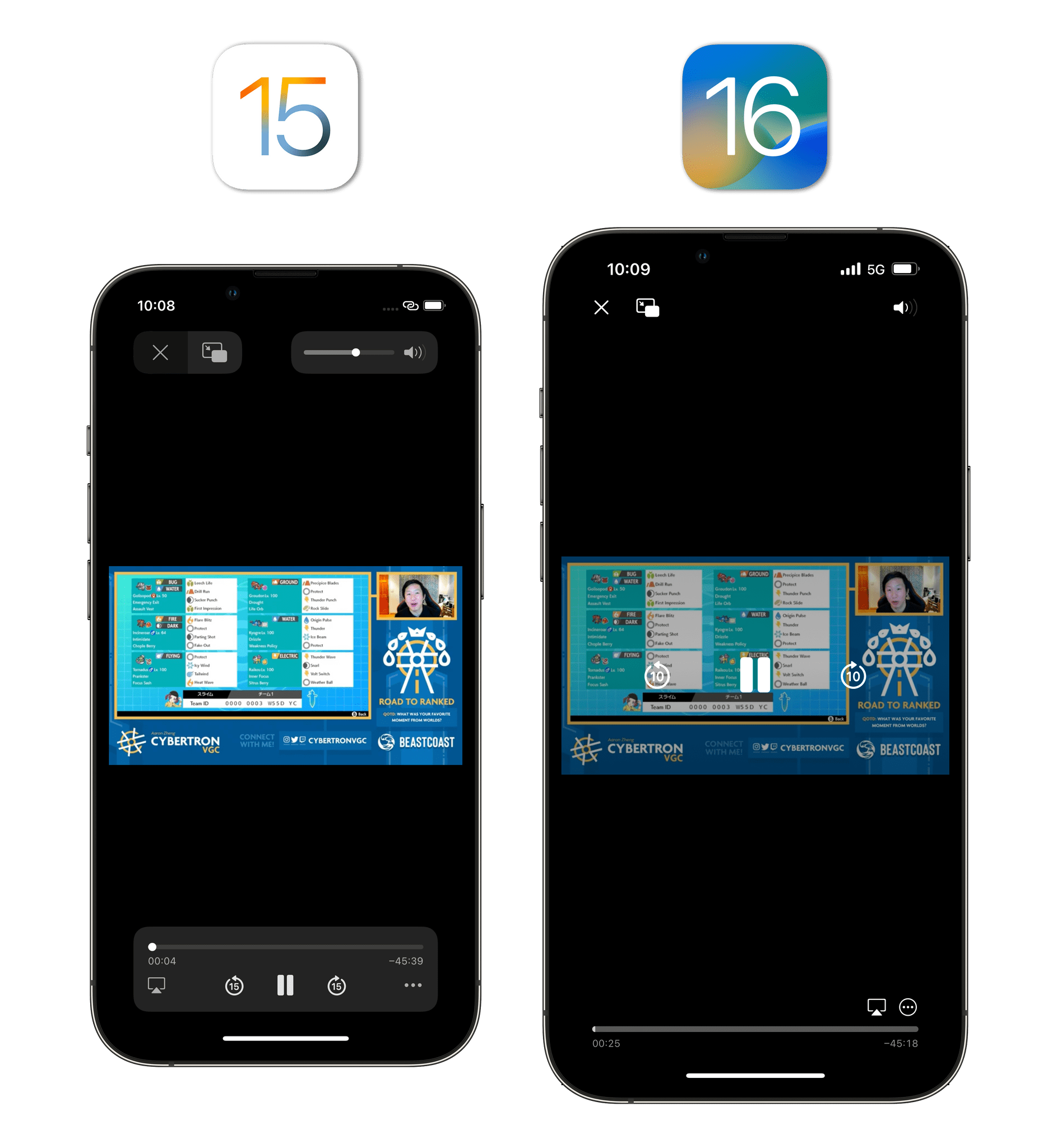
There are a few notable aspects of the redesigned video player. The first, obviously, is the striking new look that makes the progress bar more compact, integrates play/pause and skip controls as an overlay of the video, and as a result gives videos more room to breathe – especially in portrait mode. One could argue that in getting rid of the bottom-oriented controls, Apple is going against its own trend to place key interactive elements within thumb’s reach. The way I see it, Apple’s video player is now more consistent with this little service called YouTube, which they tell me is quite popular when it comes to video consumption these days. To pause a video, you just tap the screen once and tap again in the middle; to skip backward and forward manually, there are buttons next to the play/pause one.
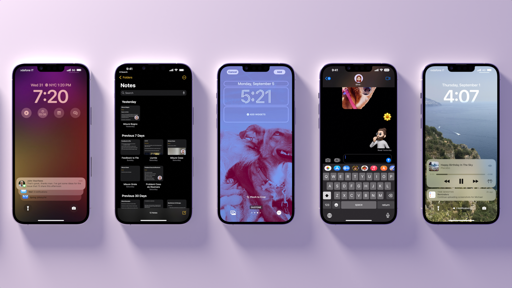
The progress bar has also been simplified. You can still grab it to scrub through a video, but, unlike iOS 15, there’s no longer an indicator that serves the dual purpose of telling you where you are in a video and acting as a “grab item” for your finger. This may seem like a regression but, in practice, after a few months, I prefer the iOS 16 progress bar: it has better contrast between the watched and unwatched parts of a video, and it grows thicker than before when you’re holding it with your finger to scrub through a video.
When scrubbing through a video, the player’s UI disappears and the progress bar grows thicker in iOS 16.
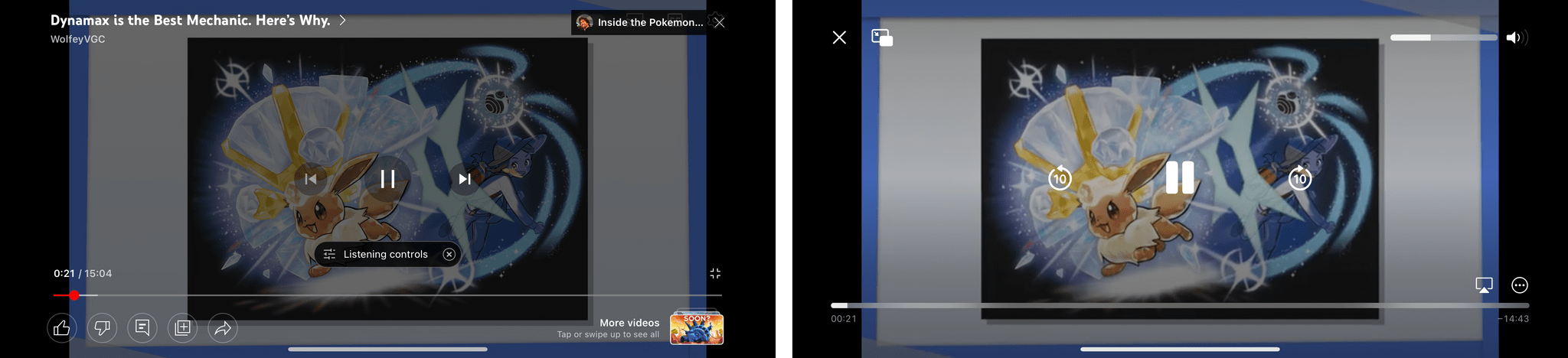
The best feature of the video player in iOS 16 is another one, though. Forget the minimal look and progress bar: what I love about the iOS 16 video player is that you can hold down anywhere onscreen with your thumb and swipe through it with simple gestures. This “quick scrubbing” mode is smooth and even responsive to the velocity and acceleration of your finger throwing the video around, allowing you to increase the speed at which you’re moving in a video with simple swipes. Here’s what I mean:
Swiping through a video with the new video player.Replay
After trying these new gestures, going back to the iOS 15 video player feels broken for me now. Of course I should be able to flick through a video by swiping anywhere I want. And when something makes me feel like that, it’s usually a good sign.
Redesigned Edit Menu
Wasn’t it strange that, despite iOS’ appearance now being split between light and dark appearances, the copy and paste menu always defaulted to a dark design, even in light mode? We took that element for granted because that’s what it looked like when it debuted in iPhone OS 3.0, but someone at Apple must have felt that its design was anachronistic too. So in iOS 16, the copy and paste menu – which Apple likes to officially refer to as the ‘edit menu’ now – has a light appearance in light mode.
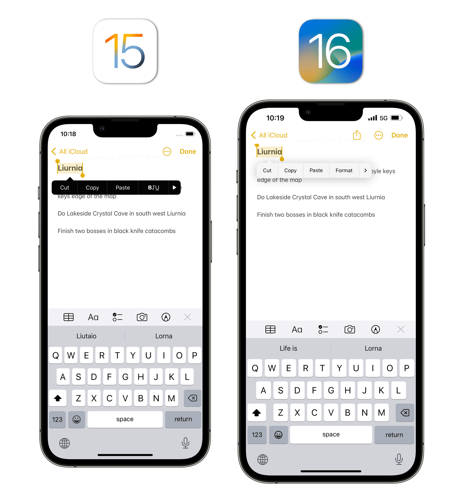
There’s a longer conversation to be had about the edit menu fundamentally changing its structure when activated via the pointer rather than touch, but we’ll talk about that in the context of iPadOS 16 next month. For now, you should know that the edit menu is white when dark mode is disabled; it has nicer animations for nested menus (such as formatting controls in Notes); and it comes with more buttons for new data detectors supported in iOS 16, which I’ll cover in the Everything Else chapter.
Pull-Down Menus in More Places
Apple is continuing to drop old-school action sheets in favor of pull-down menus in iOS 16. The more modern, compact, and faster pull-down menus are now used in more places throughout the system, including the Calendar inspector for events, the Shortcuts variable picker, and setting priorities for a reminder. Action sheets look really old by now, so Apple is on the right track here.
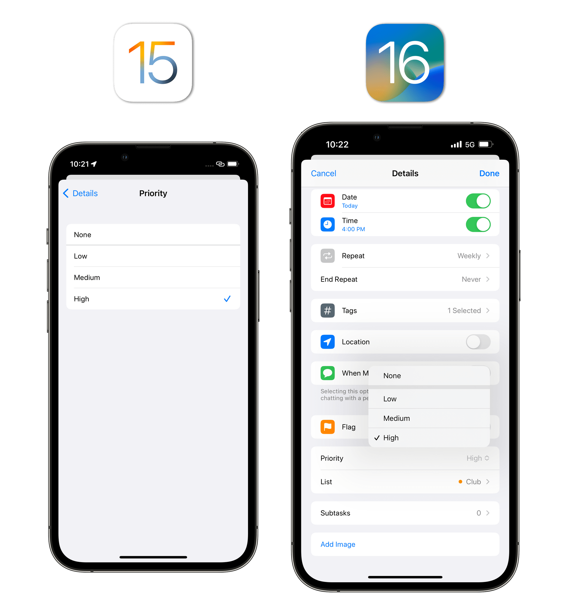
In iOS 16, pull-down menus are used in more places, which makes navigation in apps faster as you’re navigating into fewer nested pages.
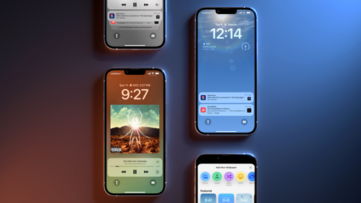
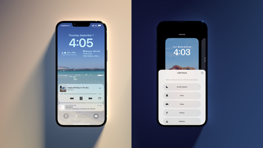
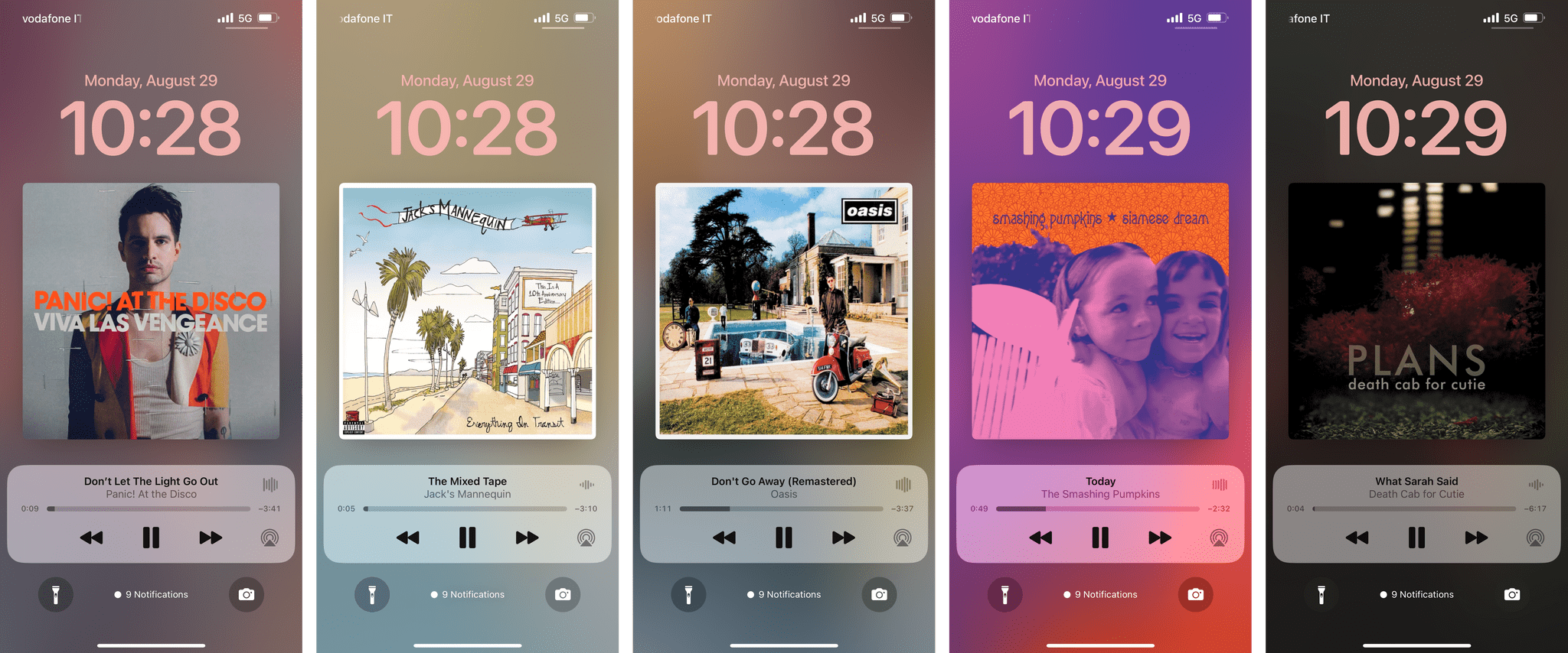
Now Playing and Music Artwork on the Lock Screen
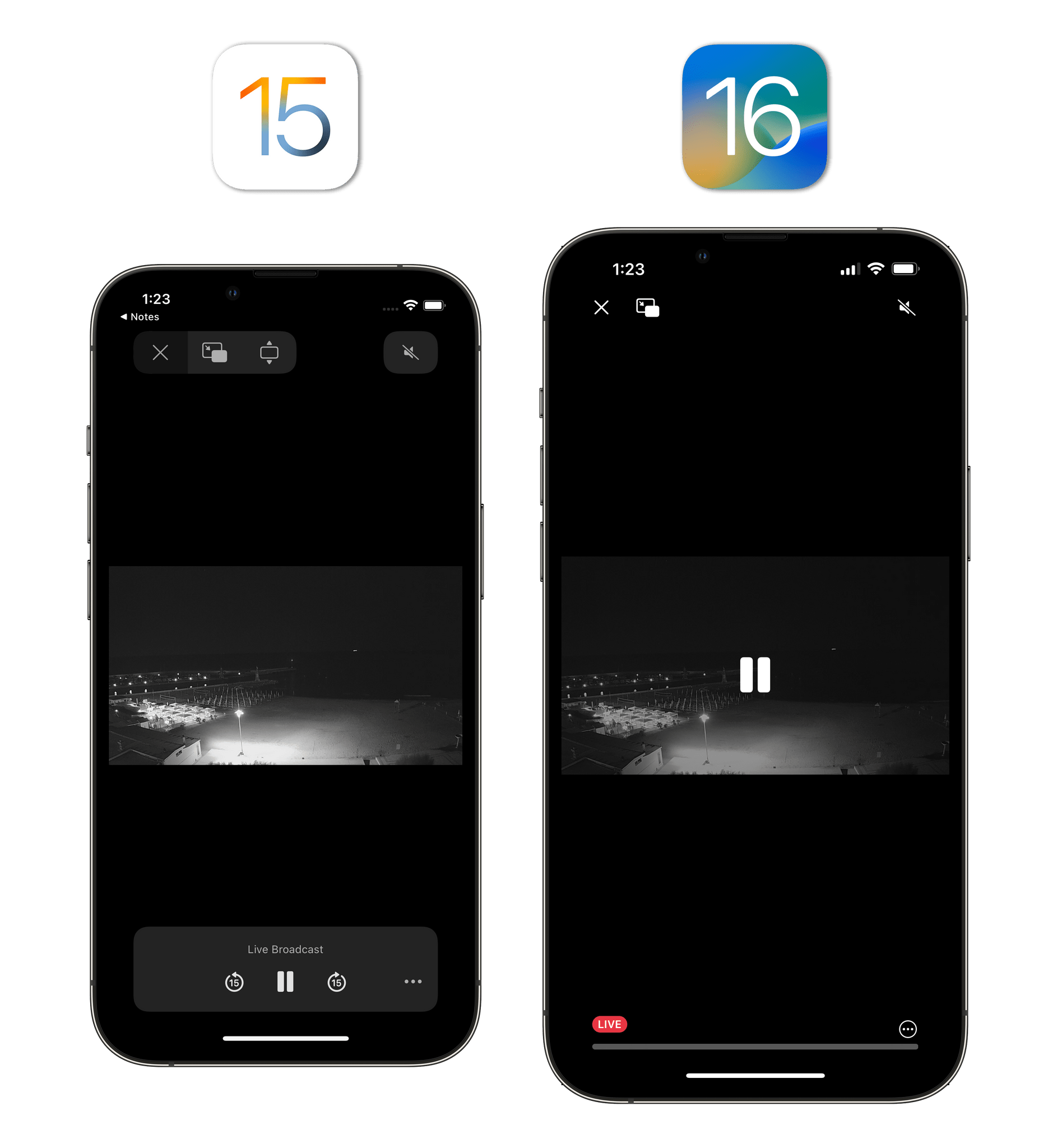
The Now Playing controls for the Lock Screen have been redesigned and rewritten in iOS 16 to be an interactive Live Activity.4 The Now Playing “widget” is docked at the bottom of the Lock Screen, so it’s easier to reach, and it uses the new, simplified progress bar we’ve seen in the redesigned video player. (It also relies on the same, simplified scrubbing behavior.) Everything is a bit more compact than before, which has also been made possible by getting rid of the secondary bar for volume control (just use the physical volume buttons or open Control Center, I guess).5
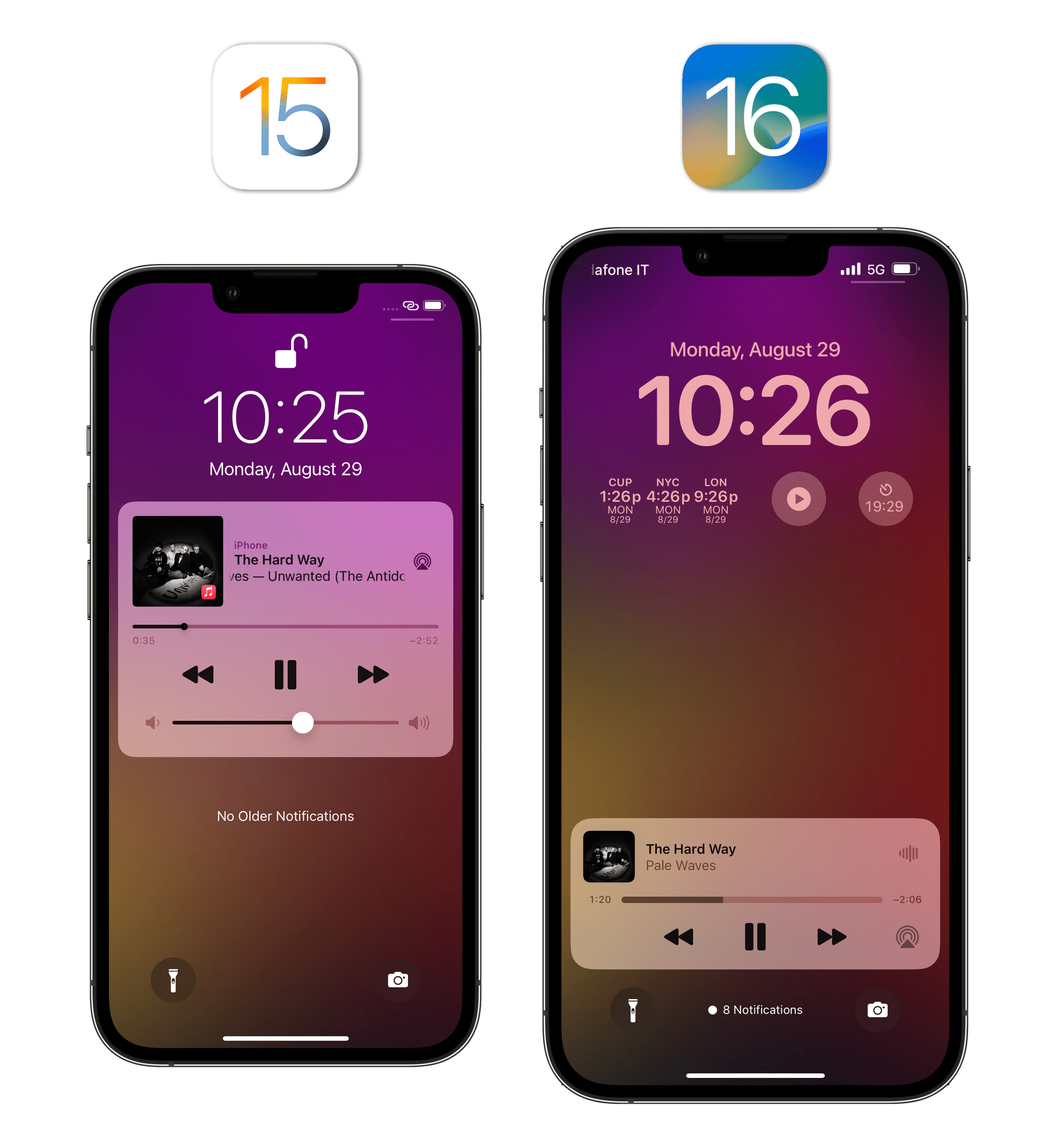
There are two things you should know about the redesigned Now Playing controls on the Lock Screen. The first one is that you can tap the small artwork to swap your Lock Screen wallpaper and widgets with a much larger version of the artwork of the song you’re listening to. When you do this, the Lock Screen takes on the primary colors of the artwork, hides your wallpaper and widgets, but keeps your custom font and font color. I love doing this because it suddenly makes my Lock Screen look like an iPod.
(Side note: Apple, if you’re reading this, can you please figure out a way to integrate real-time music lyrics with the music Lock Screen? Sincerely, the guy who learned English by listening to Oasis and The Smashing Pumpkins.)
The second thing you should know is that the tiny waveform visualizer in the upper right corner of the Now Playing controls isn’t some fake thing based on generic waveforms that doesn’t change depending on the song you’re playing. It’s a small thing, but that mini visualizer is based on real frequencies and adapts to the rhythm and flow of the current song.
That’s a real visualizer. Sound on.Replay
So here’s what’s going to happen. You’re going to open Music and search for 1979 by The Smashing Pumpkins. You’ll hit Play, head back to the Lock Screen, and take a look at the Now Playing waveform visualizer. It’s going to look different after the first 8 seconds. That’s neat. Then you’re going to play D’you Know What I Mean? by Oasis and appreciate how the visualizer follows along to Alan White’s drums. And once you see that, you’re going to wonder why the Music app itself doesn’t have this visualizer too.
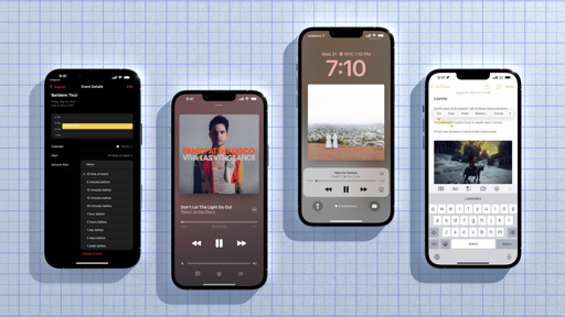
Redesigned Progress and Volume Bars in Music
The system-wide video player isn’t the only place where Apple adopted a minimal look for the progress and volume bars. The Music app also has them in iOS 16:
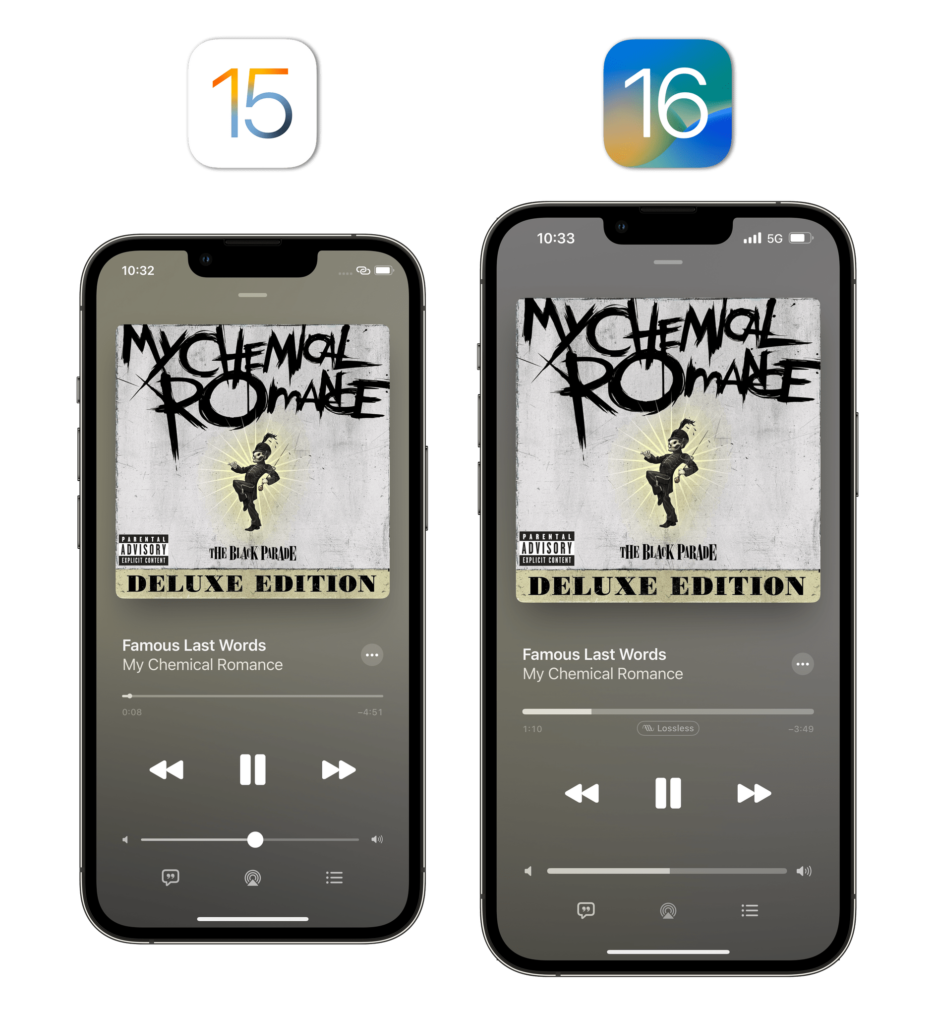
Initially, I wasn’t a fan of this design – I missed the “grabbers” in both bars too much. Over time, however, it has grown on me. Apple refined the new look, and I think they’re now striking a fair balance between a more simplistic appearance, gestures, and iconography (the volume icons are larger than iOS 15, for instance, and they glow when you’re grabbing the volume bar – just like numbers in the progress bar).
Batch Operations for Multiple Files and Items
This has to be one of my favorite new interactions in iOS 16: in apps that support this technology, you can now perform batch operations on multiple files at once by selecting them and holding down with your finger to invoke a context menu. The selected items will be grouped into a stack and you’ll be able to, say, add multiple images to an album at once or compress selected documents into a .zip archive.
Selecting multiple photos and files at once in iOS 16.Replay
This kind of operation is supported in multiple apps across the system such as Files, Photos, Mail, Notes, and Shortcuts. Alas, it’s not supported in Reminders, where I would have liked to select multiple tasks at once and reschedule them from a context menu.
Transparent FaceTime Call UI
Following last year’s update (remember effects?), Apple subtly “redesigned” FaceTime in iOS 16 to make its interface less obtrusive. The double quotes are necessary because all they did was getting rid of the box around the call controls at the top of the screen and make that area transparent.
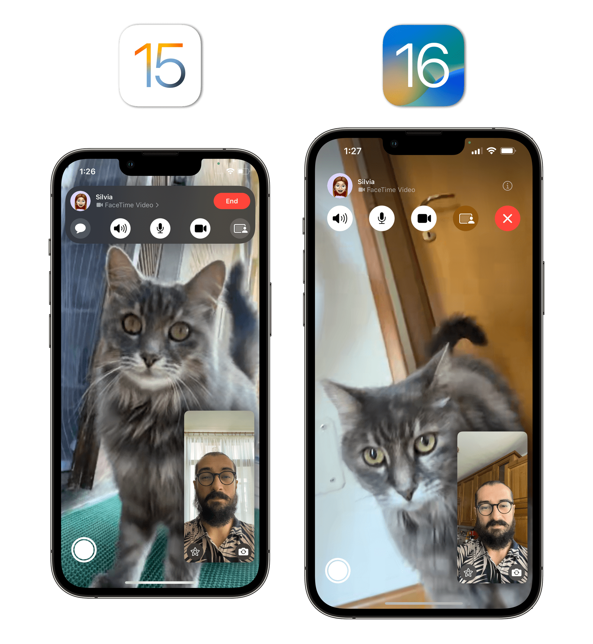
The result is that I can see more of my hair and top of my head now. Did Craig ask for this redesign?6
Battery Percentage Is Back
After a few years of absence, Apple restored the ability to view your iPhone’s battery percentage in the status bar with iOS 16. Unfortunately, I don’t know what Apple was thinking with this one.
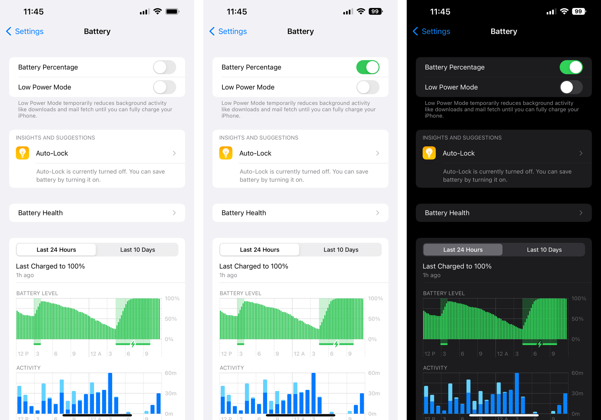
If you decide to enable the Battery Percentage setting in Settings ⇾ Battery, you’ll get a new battery icon in the status bar where its current percentage value is displayed inside the battery icon. So far so good: it’s an approach that makes sense to save some space. The issue with Apple’s design is that the battery icon stays in a completely filled-in state even if the actual battery left is, say, 55%. So whether you’re at 100% or 55%, the battery icon will always look completely full. The battery’s “juice” will only change color and shape when power gets below 20%.
I find Apple’s design confusing: the battery glyph always says one thing, while the numeric value says another, which adds friction when trying to parse how much battery is left at a glance. There could have been several alternatives to this design, and I think Apple should revisit their take on battery percentage.
SF Symbols 4
The expansion of Apple’s built-in collection of glyphs for developers continues in iOS 16. This year, Apple added over 700 new symbols (including my favorite – the frying pan – plus official versions of the Apple, PlayStation, and Xbox logos), variable colors based on percentage values, and automatic rendering modes so that developers don’t have to worry about applying hierarchical rendering manually anymore. As always, the best app to see everything that is new in this area is the excellent Adaptivity by Geoff Hackworth.
New SF Symbols in iOS 16 include workout options, new types of HomeKit-related glyphs, and…a frying pan.
Expanded San Francisco Font Family
In addition to SF Symbols, the San Francisco font family is also growing in iOS 16 to accommodate three new weights: Compressed, Condensed, and Expanded.
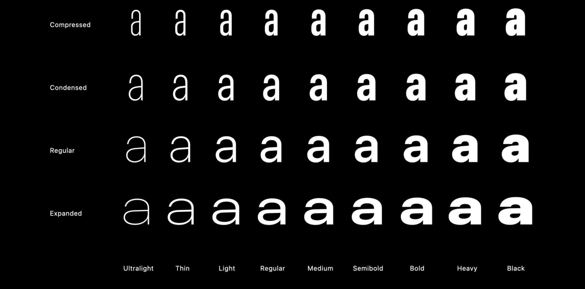
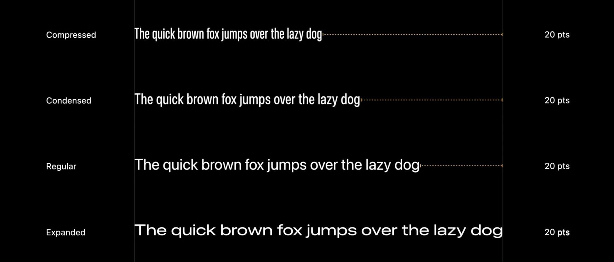
The new weights are consistent with SF Pro’s existing traits, and they’re already being used by Apple in apps such as Photos (for Memories covers), News headlines, and Maps. I’m curious to see how and where third-party developers will take advantage of these new stylistic choices.
- This is a first example of Apple using a private API for its own apps in iOS 16. Live Activities for third-party apps will officially roll out to developers later this year, with a pretty big asterisk: they won't be interactive like Apple's. ↩
- Unless you're streaming music to connected speakers via AirPlay. In that case, the secondary volume bar appears. I don't understand the discrepancy. ↩
- Even if he did, I think the reason behind this change is making room for the Dynamic Island on iPhone 14 Pro. ↩