Your Photos and Photo Shuffle
With iOS 16, Apple is also putting great emphasis on your photos as a means to turn the Lock Screen into a personal, beautiful space that is uniquely yours. In fact, I’d even venture to say that photos on the Lock Screen are more important than other wallpapers because of what they reinforce: that modern iPhones can take great pictures, which in turn will make for great Lock Screens. In a way, the Lock Screen is turning into another way for Apple to sell people on new iPhones.
There are three ways you can create Lock Screens featuring your photos:
Manually Picking Photos
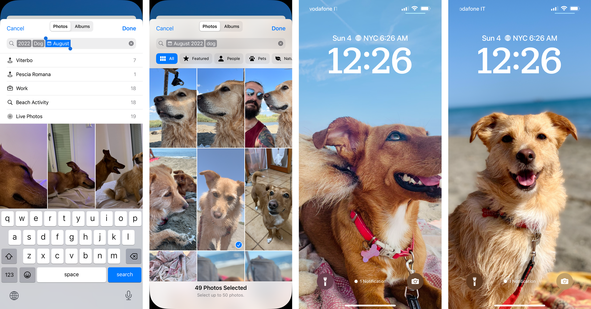
Obviously, you can pick a photo to use as your Lock Screen wallpaper. To do this, select the ‘Photos’ option in the wallpaper gallery and you’ll be presented with a brand new flavor of Apple’s Photos picker which integrates your entire library, albums, and new smart categories into a single design.
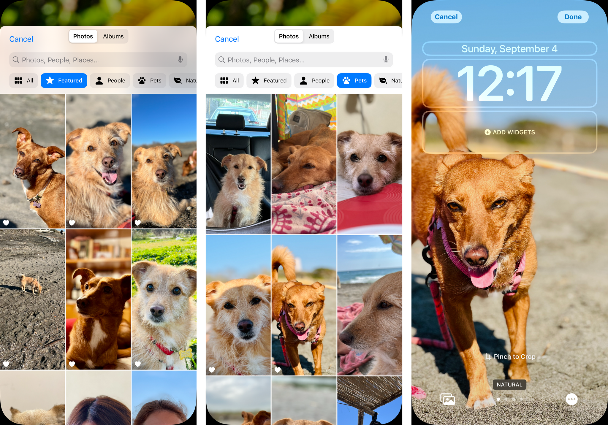
This photo picker takes advantage of on-device image analysis performed by your iPhone and Siri’s intelligence to do a couple things. First, it presents you with a list of ‘Featured’ images that are a collection of random photos iOS thinks will look nice on your Lock Screen. I’m not sure how the algorithm works, but it typically does a good job for me. I see photos of Silvia, my dogs, the beach, and the dog park in here, and the subjects tend to be front and center, well lit, and either smiling or looking directly at the camera. I assume this is an evolution of the technology that has powered the Photos widget for a while; it gets the job done.
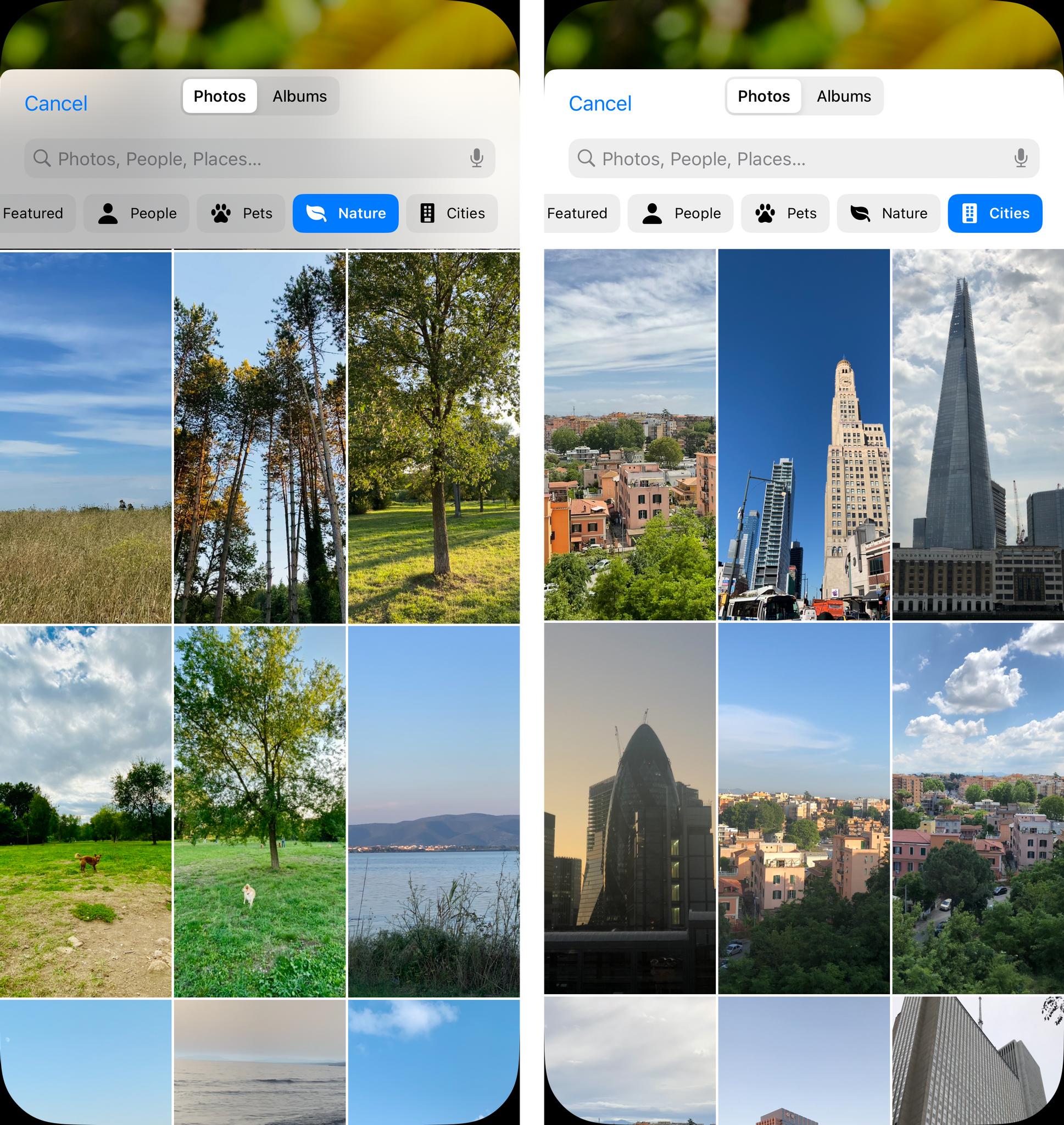
At the top of the picker, you’ll find an Albums tab, a search bar that supports the same search features of the main Photos app, and a strip of filters for the kind of content that looks great as a Lock Screen wallpaper. You can filter your photo library by people, pets, nature, or cities. Note that these filters won’t show you all matching items from your library in chronological order: they will show you a subset of featured photos for those categories.
Suggested Photos
The wallpaper gallery also has a scrollable section of suggested photos that are, effectively, a different way to browse more featured photos personalized for you. I generally like the options offered here.
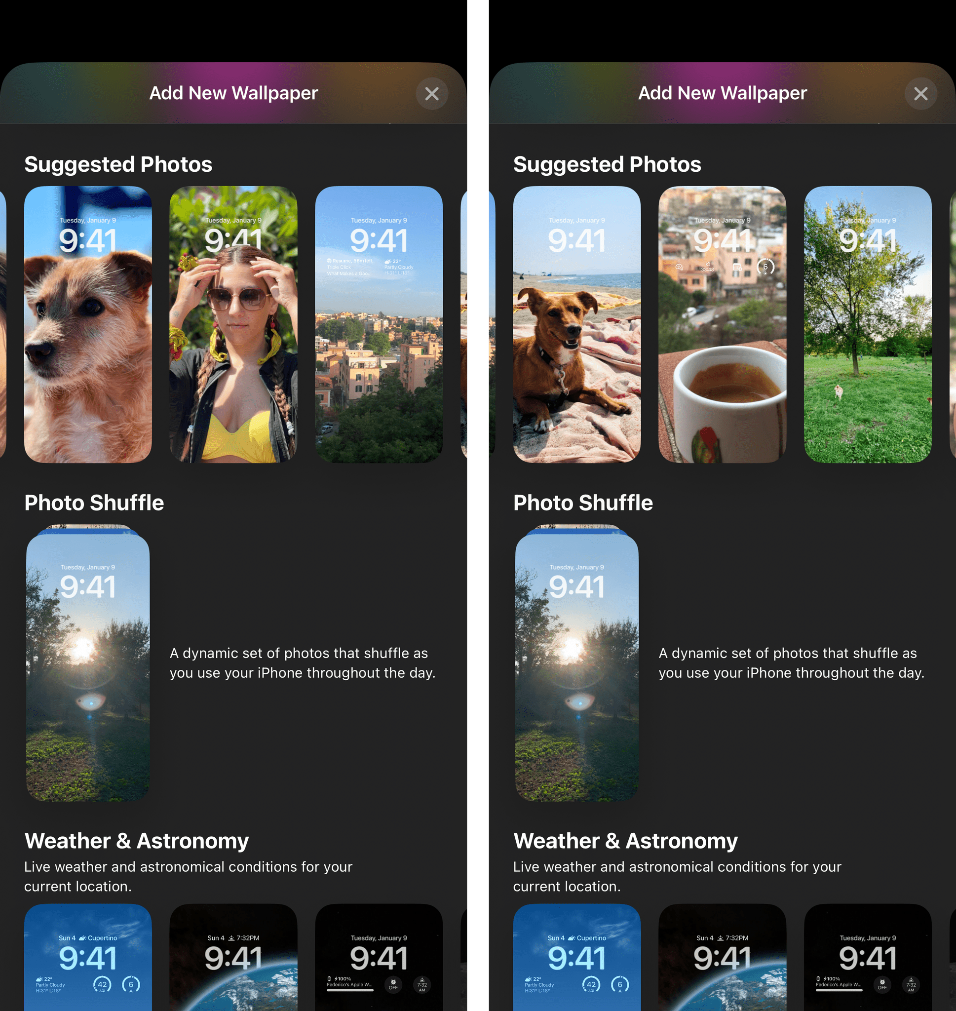
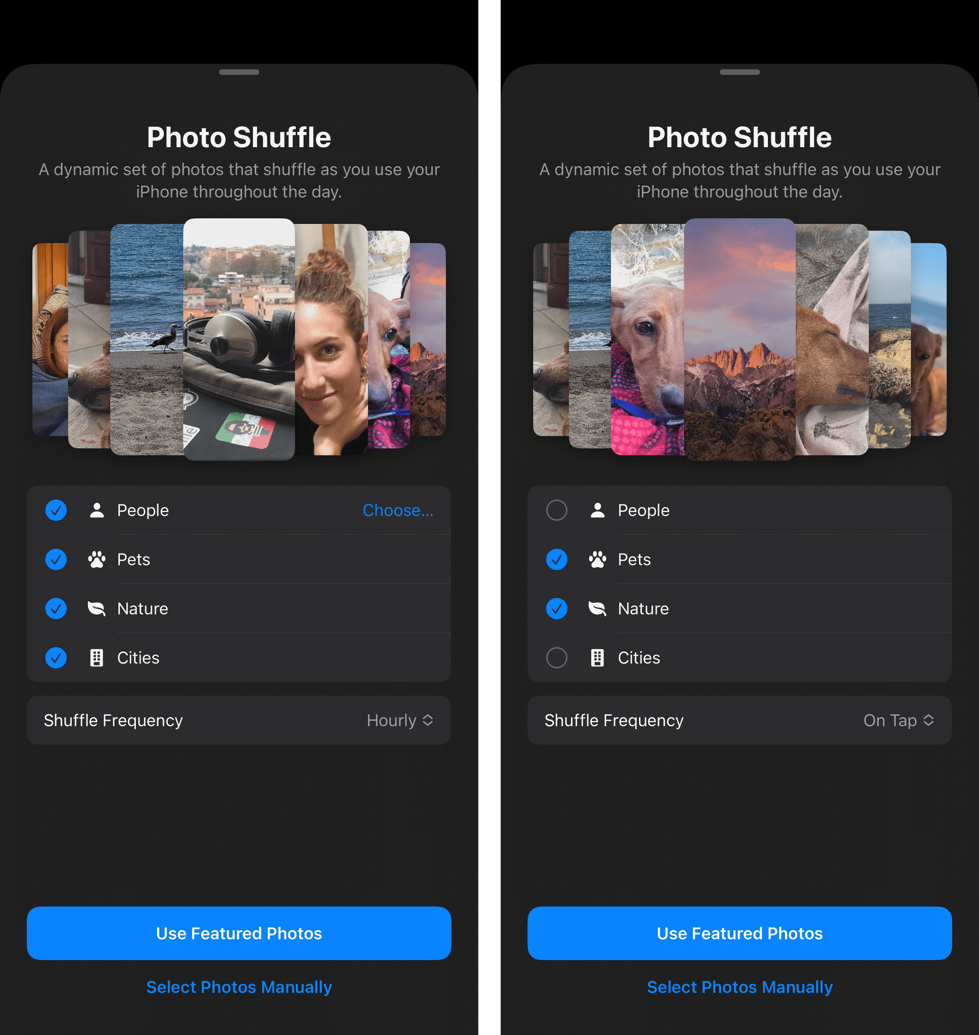
Photo Shuffle
The third way to use photos on the Lock Screen is also one of my favorite features of iOS 16. With the photo shuffle mode, you can make your Lock Screen shuffle through a set of photos on a regular interval during the day. This way, you won’t have to pick a single wallpaper for the Lock Screen, and you can treat yourself to multiple wallpapers without having to create multiple Lock Screens. It’s a win-win for those of us who get bored with the same wallpaper but also don’t want the overhead of multiple, discrete Lock Screens.
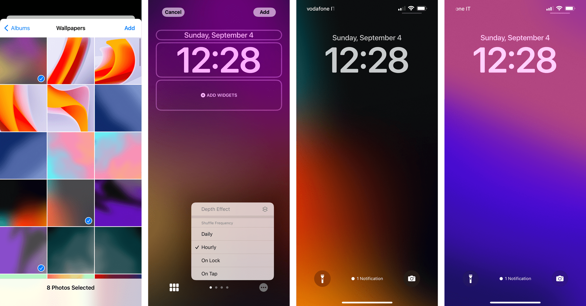
There are two ways to set up a photo shuffle. The first method is choosing the photos you want to shuffle manually. You can select up to 50 photos for a single shuffle on one Lock Screen, and you can choose one among four shuffle frequencies:
- On Tap
- On Lock
- Hourly
- Daily
I’ve created two manual shuffles so far. The first one is a selection of photos of Zelda and Ginger that shuffles hourly. I’ve chosen some of my favorite photos of them over the years, and I can revisit the list over time by adding images to or removing them from the shuffle.
The other shuffle I manually created is a selection of 50 of my favorite abstract wallpapers from my Wallpapers album. This one is set to refresh daily. I prefer this system to the old method I employed that involved a Shortcuts automation: this approach is native to the Lock Screen and lets me curate the images I want to use and adjust its shuffle frequency with just a couple of taps.
You can also set up an automatic photo shuffle that takes care of selecting images for you. In this case, the categories are the same ones found in the photo picker I mentioned above: People, Pets, Nature, and Cities. You can select the people you want to see shuffled, but that’s it in terms of control. Everything else will be decided by the system based on what it considers a “good” photo and ideal Lock Screen candidate.
What I like about Photo Shuffle is that it’s “curated randomness”: you’re always going to see a subset of your photos, but the system rotates through them, making your Lock Screen feel new and different according to the refresh interval you’ve set. It’s an ingenious addition to make the Lock Screen more personal with minimal effort. Plus, it goes especially well when combined with the next feature of the iOS 16 Lock Screen.
The Depth Effect
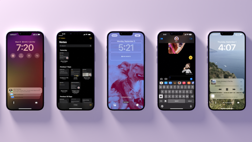
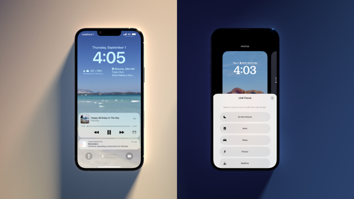
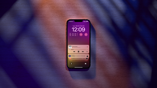
As you play around with different photos on your Lock Screen, you may notice that certain subjects get placed in front of the time – as in, they’re literally superimposed on the clock. You may have seen this in Apple’s marketing shots (they’re very proud of this feature), and here are a few examples of what I mean:
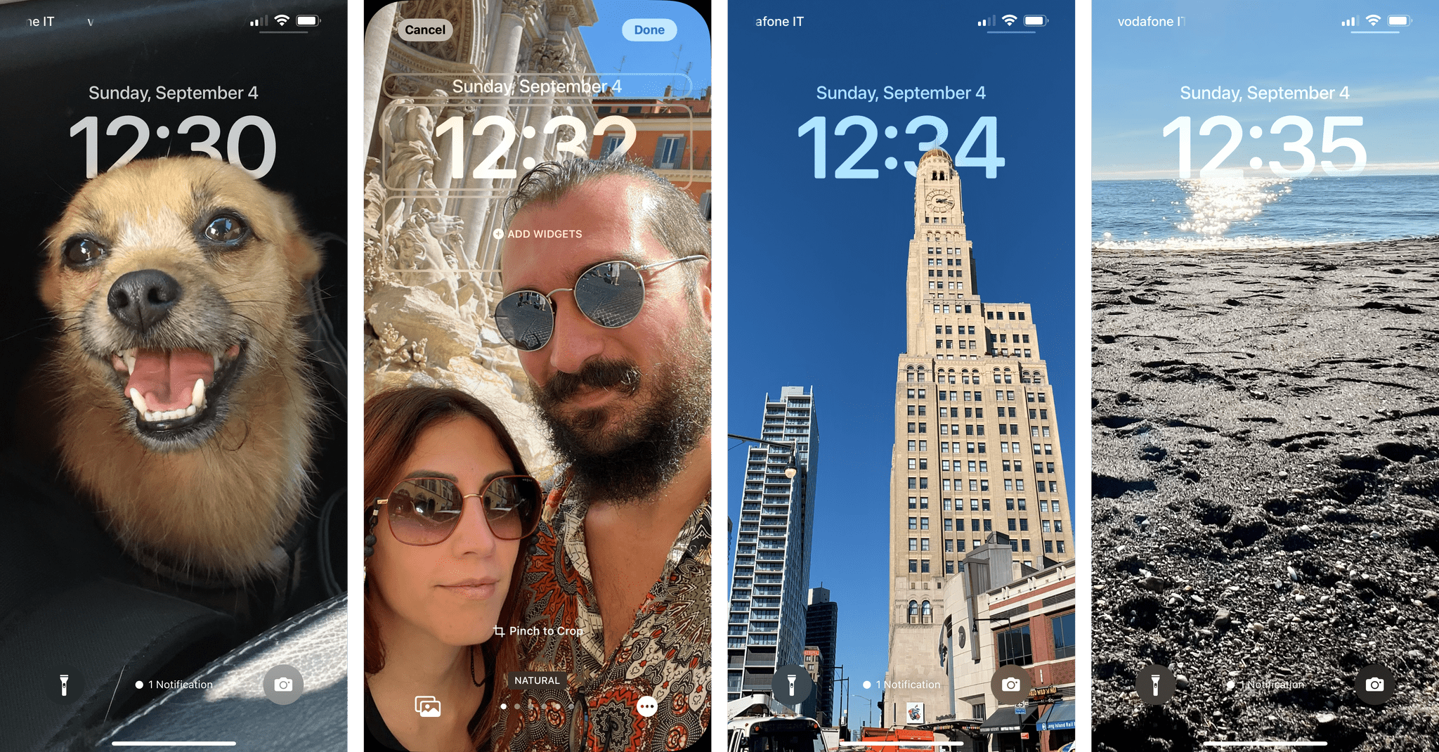
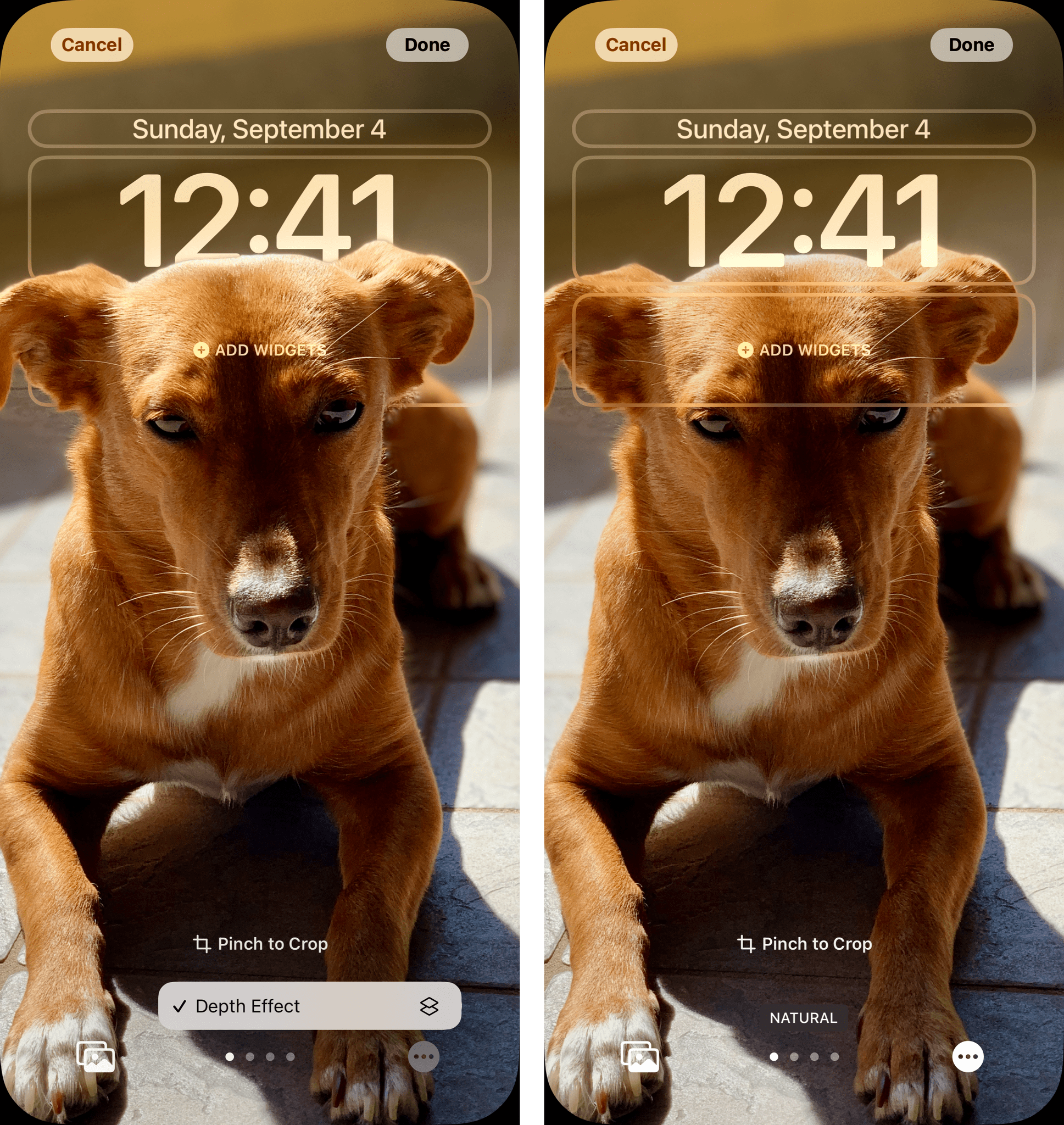
This is called the “depth effect” of the iOS 16 Lock Screen, and it’s meant to give subjects a starring role by thoughtfully placing them on a layer in front of the time. While, yes, this is a fun gimmick that some people may even dislike, there are some fascinating details about how it all works behind the scenes.
The multi-layered depth effect does not require pictures that were taken in Portrait mode. Instead, iOS 16 performs an on-device image analysis and determines on an image-by-image basis whether there’s a clear-enough separation between the subject of a photo and its background. If Apple’s algorithm deems an image suitable for the depth effect, you’ll find it enabled in the bottom-right menu of the wallpaper creation screen:
In my tests, I noticed that, besides Portrait mode, images don’t even have to be that recent to qualify for the depth effect. For instance, a relatively low-quality selfie I took on a boat in 2014 still worked with the depth effect, as you can see below:
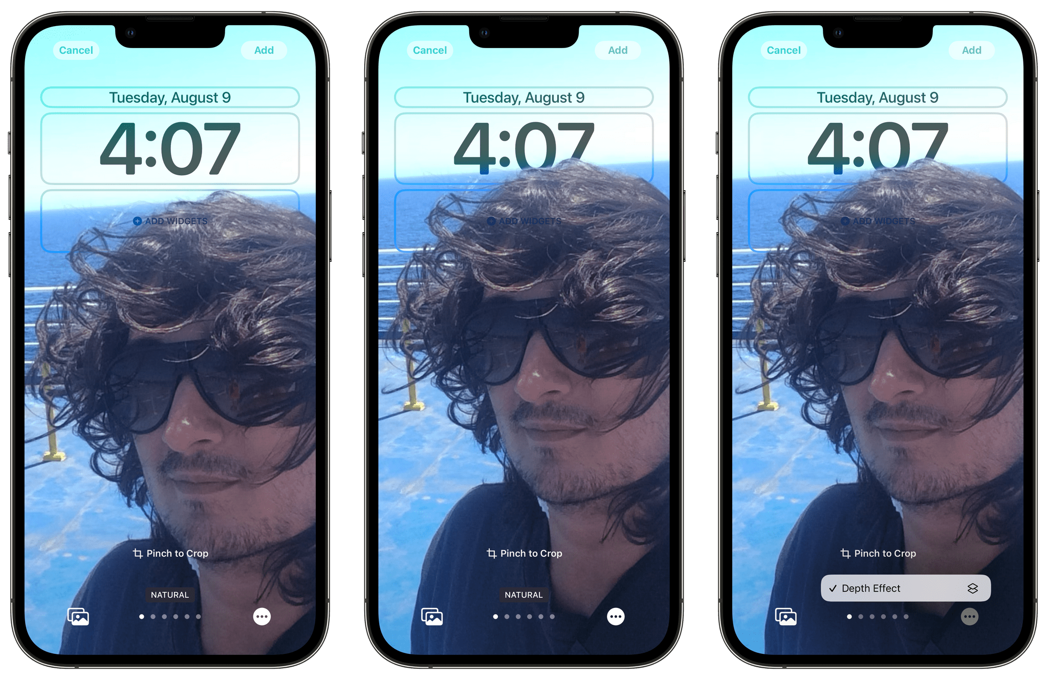
You can pinch to crop an image while you’re choosing a wallpaper, which will let you play around with the exact positioning of the layer on top of the time. It’s fun to experiment with this and understand where the “cut-off point” lives according to Apple; if you reach it and cover too much of the clock, the depth effect will be disabled until you free up more space again:
Playing around with the depth effect.Replay
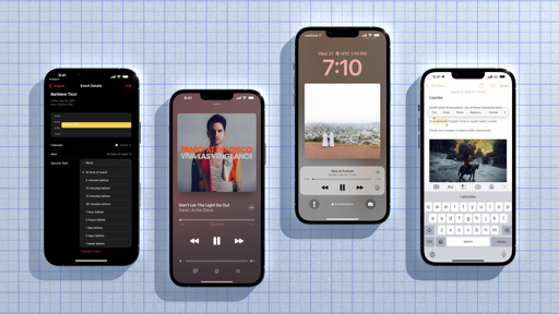
As with the Color wallpapers, you can also swipe horizontally on photos to change their styles. There are some fun options available if the photo supports the depth effect: with the Studio filter, you can mimic Portrait mode’s Studio Lighting effect by better illuminating the subject and removing the background altogether; Black & White removes the background and switches the entire photo to duotone; with Color Backdrop – and this is where the magic happens – you can change the color of the entire background of the image.
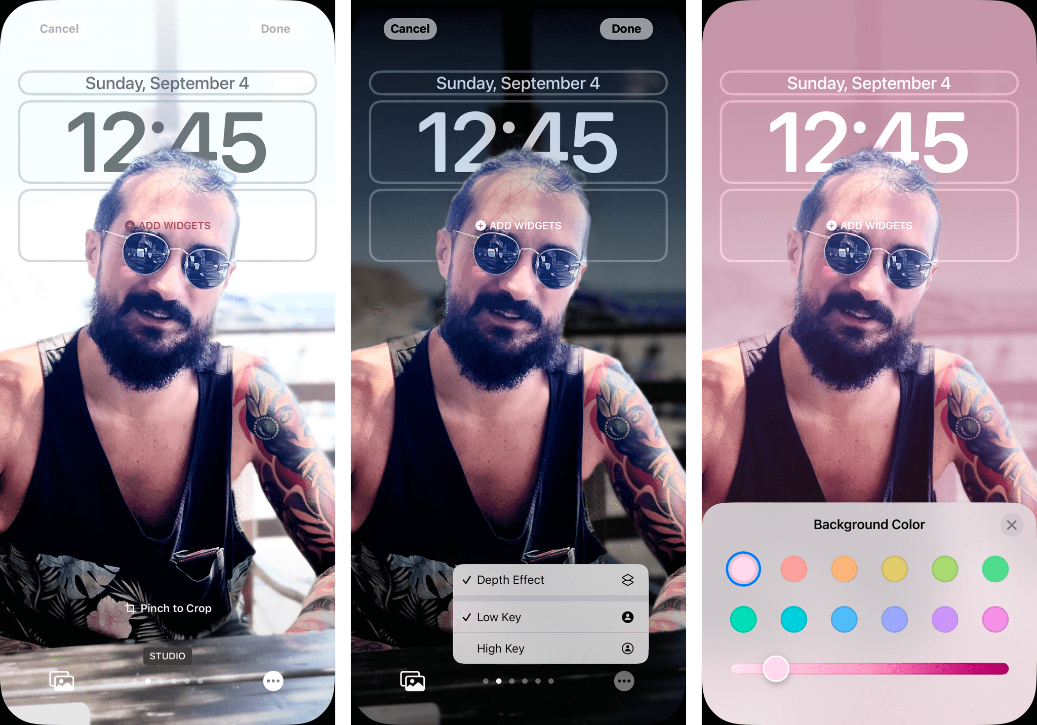
Apple clearly put a lot of thought into creating these photographic options for the depth effect on the Lock Screen, and it shows. With the right conditions, the visual effect generated by the depth effect can be stunning, and all of this is made more impressive by the fact that the image separation tech employed by Apple is independent from the depth mapping technology used by Portrait mode. If that isn’t enough, consider that this new multi-layering tech (which is used elsewhere in iOS 16, as I’ll explain in the Photos and Shortcuts chapters) even supports transparent layers. In the image here, you can see how I was able to place sunglasses in front of the time, but the time was still visible through the transparent lenses of the sunglasses.
There’s one important detail you should know about the depth effect: it won’t be supported if you use widgets below the clock. That’s a bummer, but it makes sense: it’d be weird if people’s faces, dogs’ ears, or, say, tall buildings could just sit in front of widgets, defeating the entire purpose of putting them on the Lock Screen. You can continue using an inline widget above the clock while the depth effect is active, which helps, but essentially you’ll have to choose between widgets and the depth effect going forward.
Setting a Home Screen Wallpaper from the Lock Screen
In addition to letting users customize their Lock Screens, Apple is also trying something else in iOS 16: making it easier to pair a custom Lock Screen with an associated Home Screen.
Of course, you’ve long been able to a set a custom Home Screen wallpaper on your iPhone, but what’s new this year is what Apple calls a ‘wallpaper pair’. There are a couple of ways to pair your Lock Screen with a Home Screen that goes well with it; in a nice touch, Apple sprinkled in some fun options for personalization here too.
When you’re done customizing a Lock Screen in iOS 16, you’ll be asked if you want to create a matching wallpaper pair with the Home Screen or if you want to further customize the Home Screen. The first option, which is highlighted by default, uses the same wallpaper on the Lock Screen and Home Screen, which tells me Apple finds this the most elegant approach for most people.
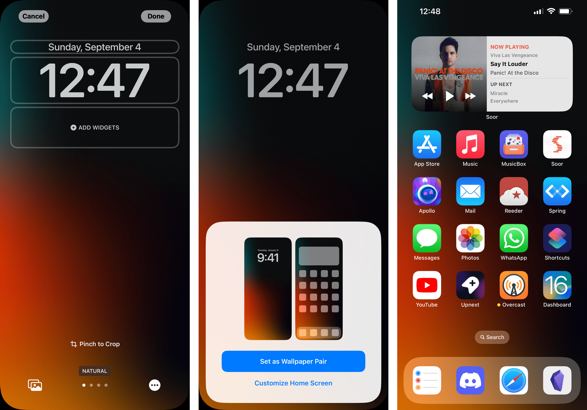
Personally, while I can appreciate the consistency of the same wallpaper across multiple screens, I typically want to have a more neutral wallpaper that plays well with my app icons and keeps their names legible on the Home Screen.9 For people like me, Apple added the second step, which lets you customize the Home Screen upon setting a Lock Screen. When you hit Customize, the Lock Screen flies out of the way and leaves room for a preview of the Home Screen with a new design tool that contains some welcome options.
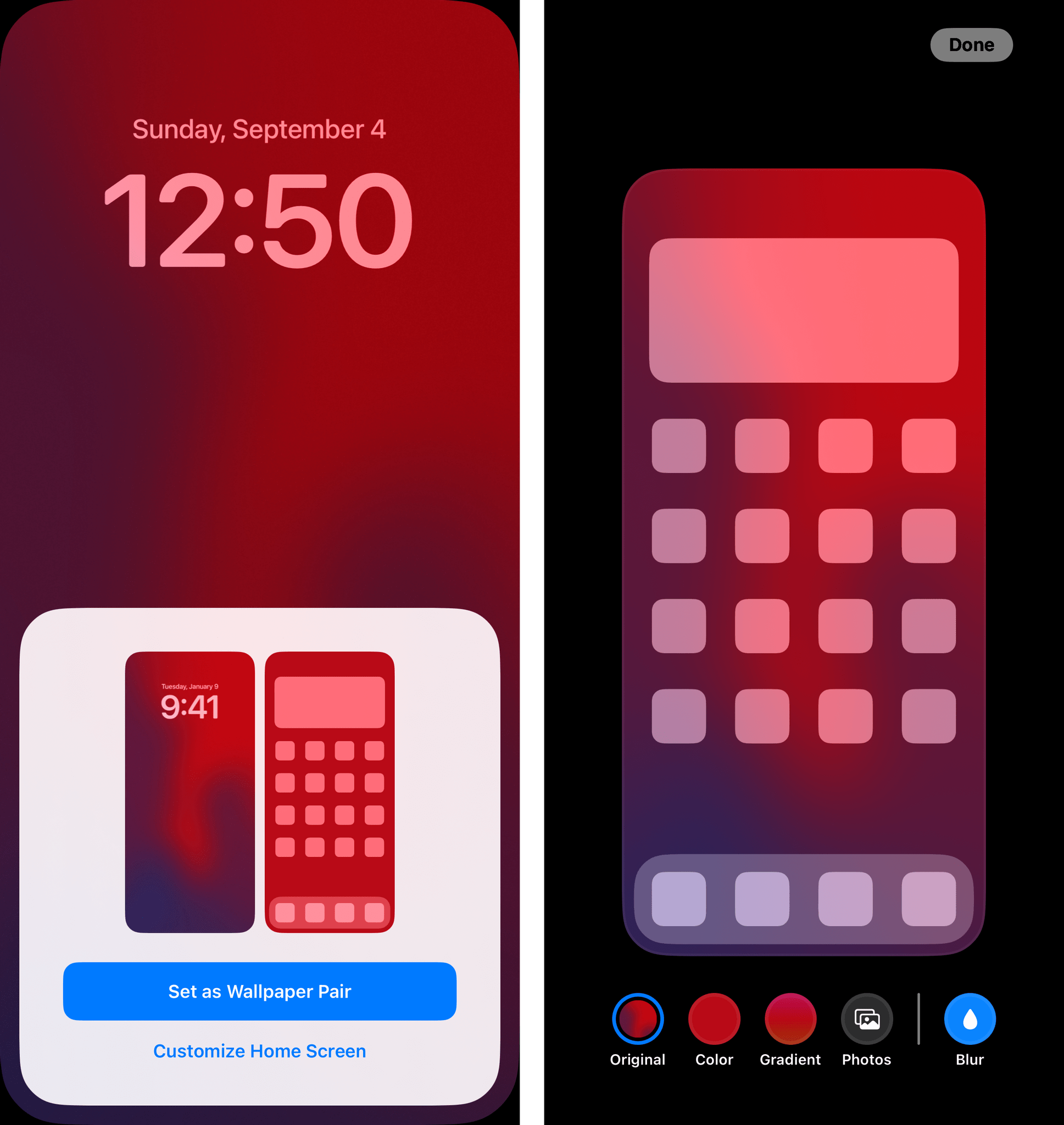
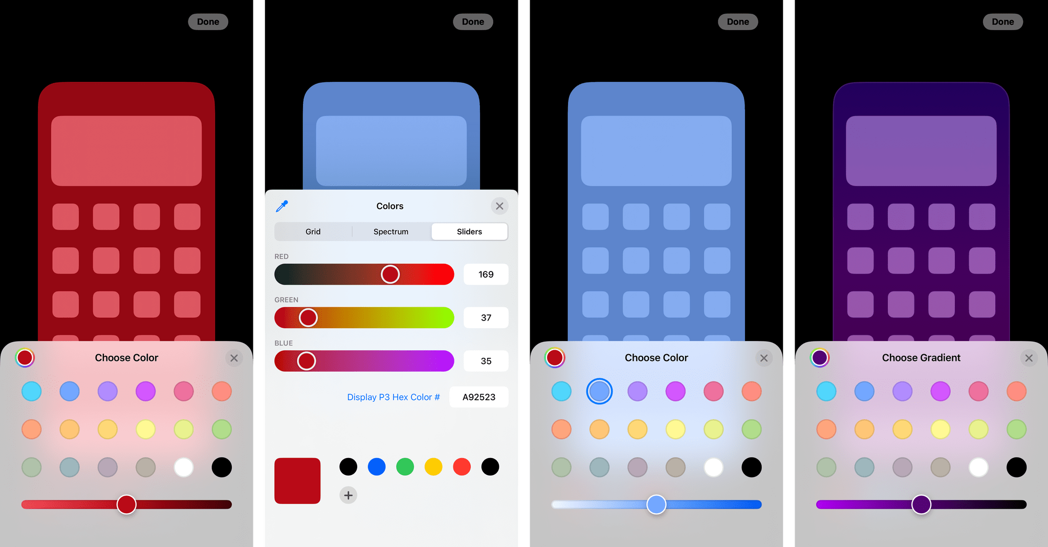
Along the bottom of the screen, you’ll find buttons to use the same Lock Screen wallpaper on the Home Screen (it’s the option labeled ‘Original’), pick a solid color, create a new gradient with the color picker, or manually choose an image from your photo library. Once again, you have no idea how happy I am that Apple now makes it so easy to generate a gradient-based wallpaper as part of iOS itself.
To overcome the aforementioned issue of unreadable app names on the Home Screen, Apple also added a ‘Blur’ toggle that is only available for the Original and Photos types that, well, blurs the wallpaper so that icons and text labels can stand out more prominently. This is a thoughtful touch in my opinion, allowing you to strike a nice balance between a consistent Lock-Home Screen wallpaper set that has a slightly blurred version on the Home Screen. I use this a lot.
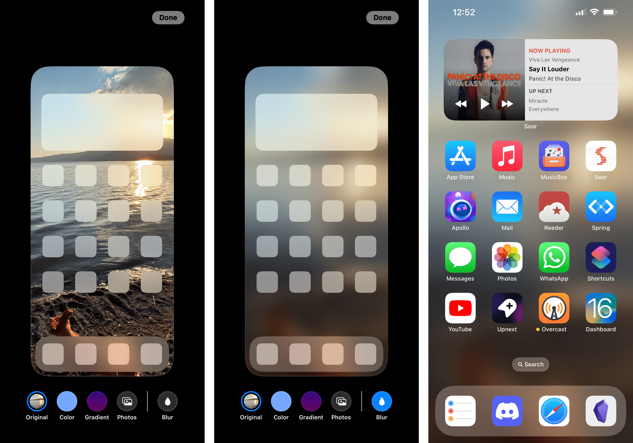
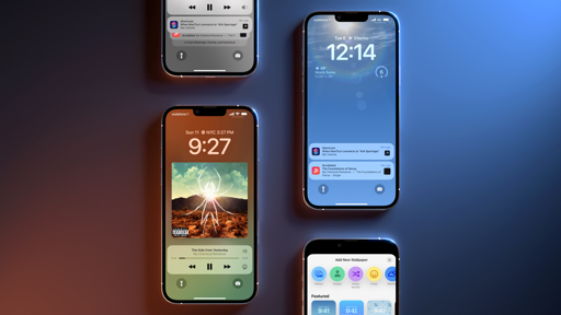
Besides the Lock Screen itself, everything I just covered is also available from within Settings under the Wallpaper section. This redesigned page now shows you a side-by-side preview of your Lock Screen and Home Screen with two ‘Customize’ buttons to personalize each independently. So whether you’re unhappy with your Lock Screen widgets or Home Screen wallpaper, you can customize everything from Settings without having to go back to the Lock Screen.
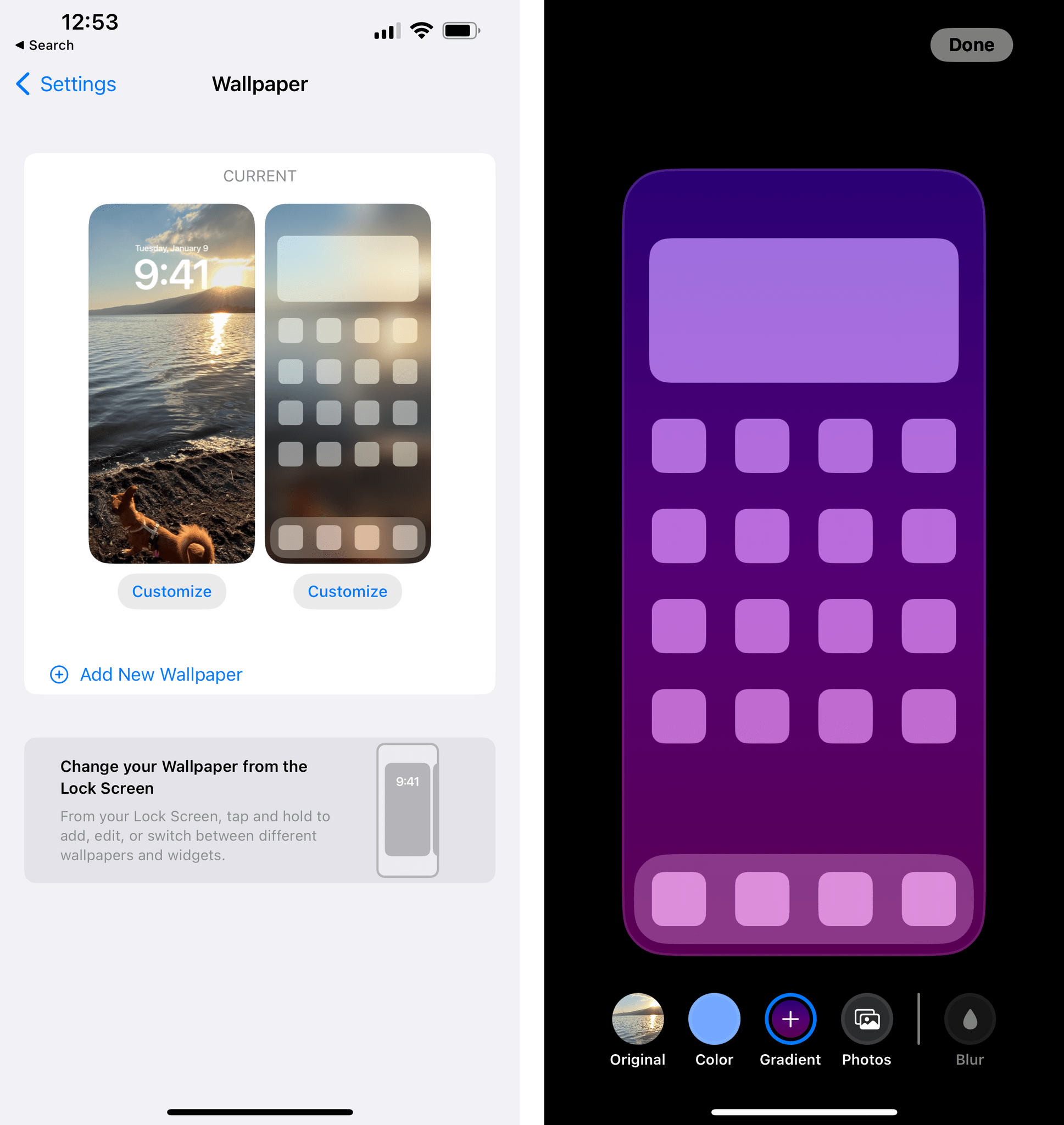
In my opinion, this is handy for changing your Home Screen wallpaper and trying all the new color options Apple has built. This page also includes an ‘Add New Wallpaper’ button, which will reopen the wallpaper gallery to replace your current Lock-Home Screen pair with a new one. In this case, the old Lock Screen will not be deleted.
Customizing the Clock
So far, I’ve only covered the wallpaper part of Apple’s new Lock Screen customization efforts in iOS 16. Before we get to the other protagonist of this story – widgets – there’s another aspect that deserves attention: customizing the clock’s font and font colors on the Lock Screen.
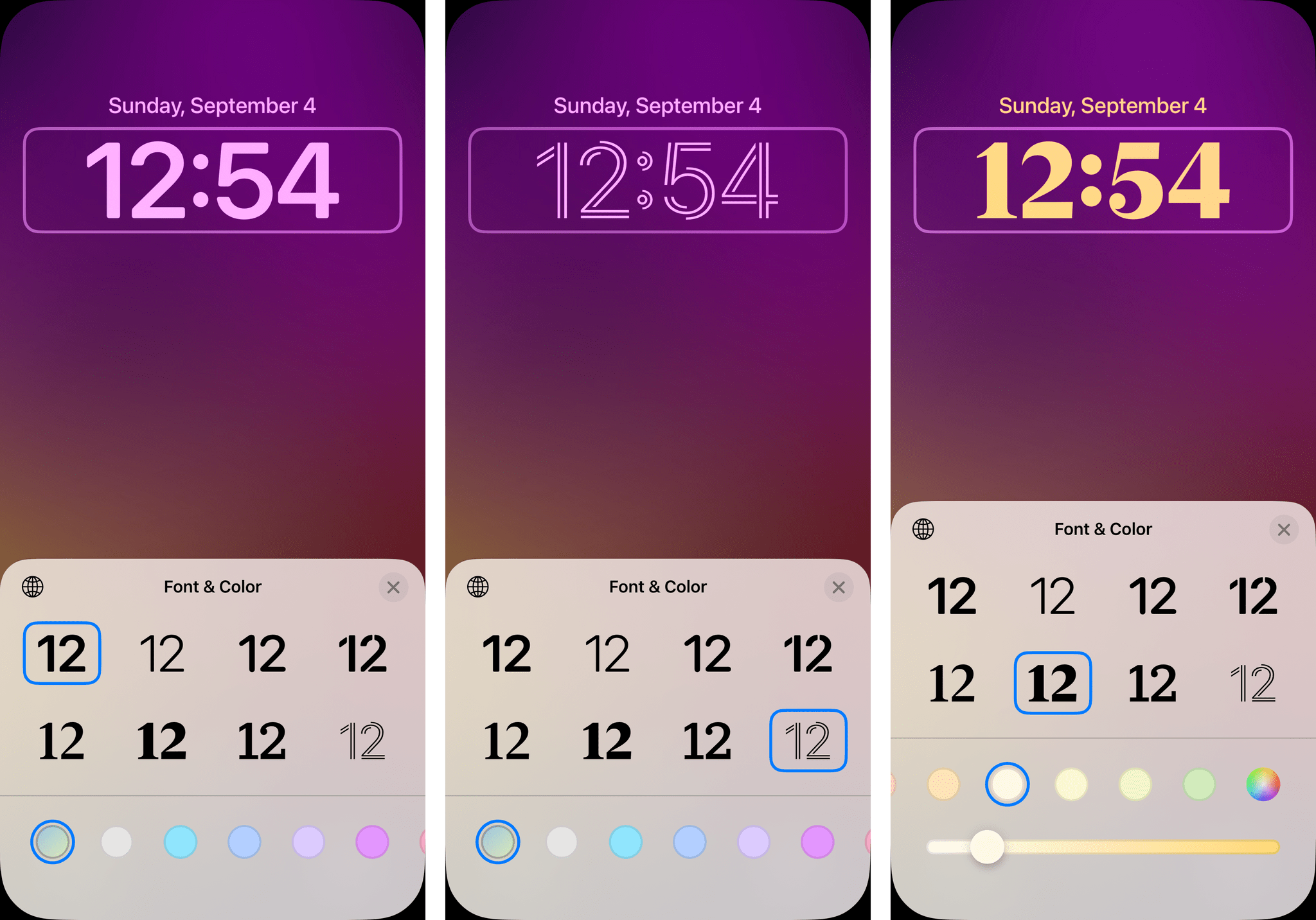
While in Lock Screen customization mode, tap the system clock and you’ll open the new Font & Color panel. In here, you’ll find a total of eight different fonts you can use for the clock and clock alone (the font of widgets won’t change). Technically, these are seven new font options since the eighth one is the classic clock font that’s been with us for years. Some of the new fonts include a couple of serif options, a rounded font, and a cool line-based one. Note that these fonts are unlabeled and that you can switch between Arabic, Arabic Indic, and Devanagari clocks by tapping the Globe icon in the upper left corner of the panel.
Changing the clock’s font is fun, but playing around with colors is even better. Using the same system we’ve seen for creating gradient-based wallpapers, you can tweak the color of the clock and widgets by choosing from a palette of colors selected by Apple or picking your own via a color picker.
Although custom colors will be applied to the clock, widget glyphs, and widget text, they are not supported by the iPhone’s status bar and other system icons or text such as the padlock icon for Face ID, the Home bar indicator, or the flashlight and camera buttons at the bottom. These are some odd limitations in an otherwise very well thought out feature that plays extremely well with wallpapers. I’m sure that millions of people will spend way more time than previously anticipated picking the font-color combo that’s just right for them. But having those colors not apply to the status bar and other elements of the Lock Screen feels wrong and makes those parts of the Lock Screen look out of place. I hope Apple fixes this in a software update.
- People who use photos or complex geometric wallpapers that make app names unreadable on the Home Screen: why? Is it a piece of performance art? ↩