Maps
Maps is having a relatively quiet year with iOS and iPadOS 17 since its changes revolve around catching up with Google Maps for one feature and having deeper integration with contacts and Find My friends.
In Maps for iOS and iPadOS 17 you can now download maps offline, which is something Google Maps has supported for a long time. When you search for a location, you’ll find a ‘Download’ button in the updated Maps app; tap it, and you’ll be able to choose and resize the area you want to make available offline. The bigger the area, the larger the download.
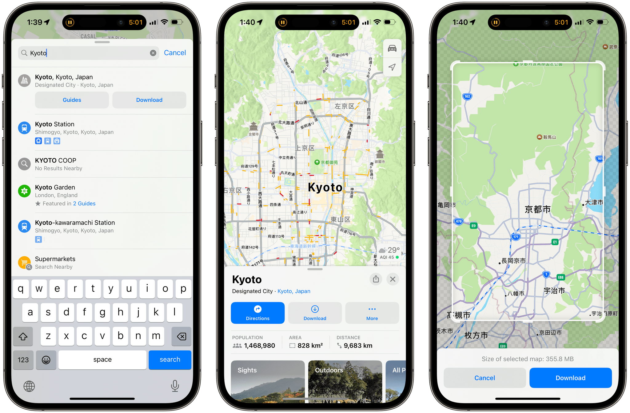
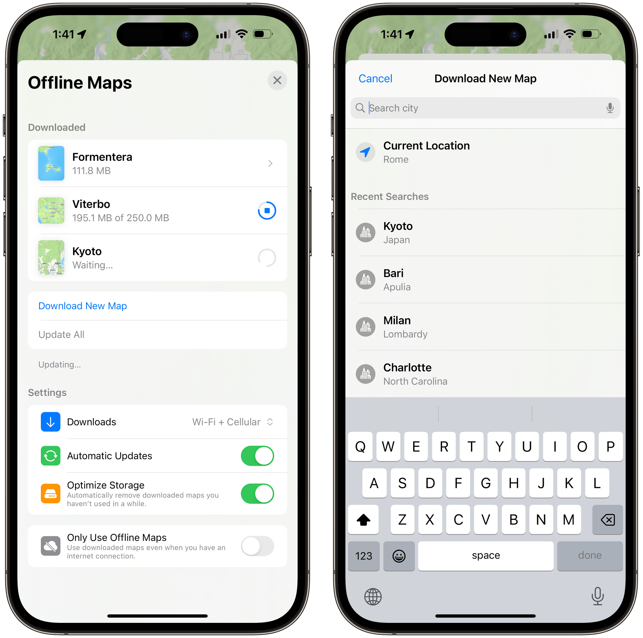
Once a map is downloaded, the ‘Download’ button gets replaced by ‘Offline’, which you can press to view a list of all your offline maps. This screen lets you rename, resize, and delete maps; you can also search for new maps manually and control whether downloads should happen on cellular too or if you want to use automatic updates for downloaded locations. You can even opt in to only use downloaded maps even if you have an Internet connection to save on data usage.
I was recently on vacation in Formentera, and offline maps came in handy for those times when cellular coverage was spotty or nonexistent on the island. When Maps couldn’t reach Apple’s servers, it showed a message saying that it was using offline maps and everything kept working just fine. In theory, iOS 17 should even suggest you pre-emptively download maps for locations it thinks are going to have poor cellular coverage, but I haven’t seen these messages pop up when I was planning routes to Es Pujols, Cala San Vicente, and other places between Formentera and Ibiza. Anyway, I’m glad Apple Maps now has offline maps since it’s a feature I always liked using in Google Maps, but I’m increasingly preferring Apple’s app to Google, so it’s good to have offline support now as well.
Also new in Maps this year, you can search for contacts directly in the app. If those contacts are sharing their location with you, you’ll see the option to navigate to their shared location or view them in the Find My app. Unfortunately, Apple Maps won’t give me turn-by-turn directions to get to John’s place in North Carolina (or Virginia, where he was last weekend).
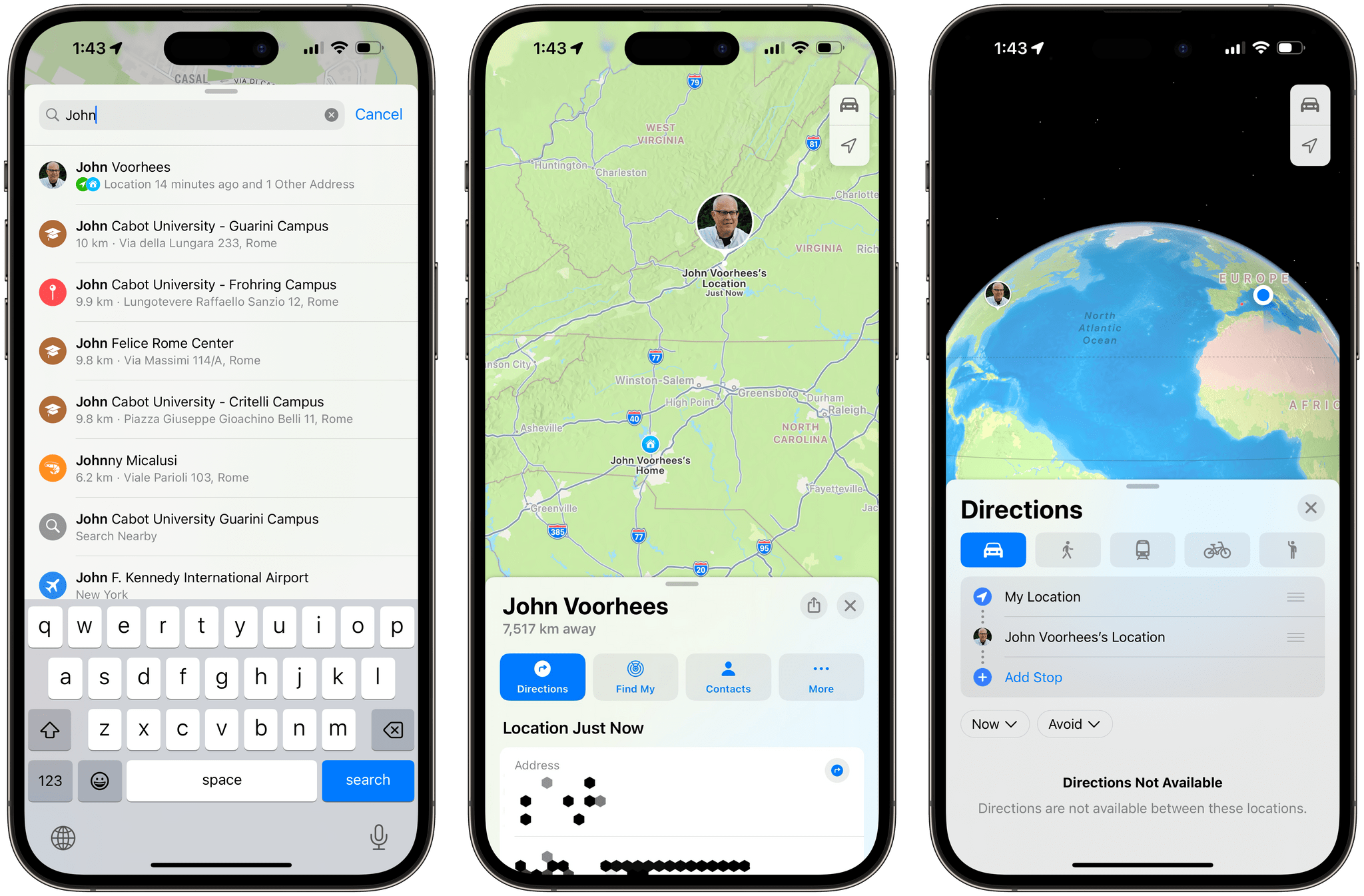
Furthermore, if you start navigation to someone’s shared location from the Messages or Find My apps, you’ll get a suggestion in Maps to send them your ETA. I’m not sure what the use case is for looking up someone’s shared location in Maps (if a person is so close to you they’re sharing their location with you all the time, I would assume you know how to navigate to their house without using Maps?), but the feature works, so why not.
Podcasts
I have a complicated relationship with Apple’s Podcasts app: for years I’ve wanted to use it as my main podcast player, but I couldn’t because it didn’t have a proper queuing system nor audio effects to enhance voices and trim silence in episodes. My nerd prayers have been partially answered this year: Apple redesigned the Podcasts app with a queue and updated Now Playing screen, but they still haven’t added audio effects.
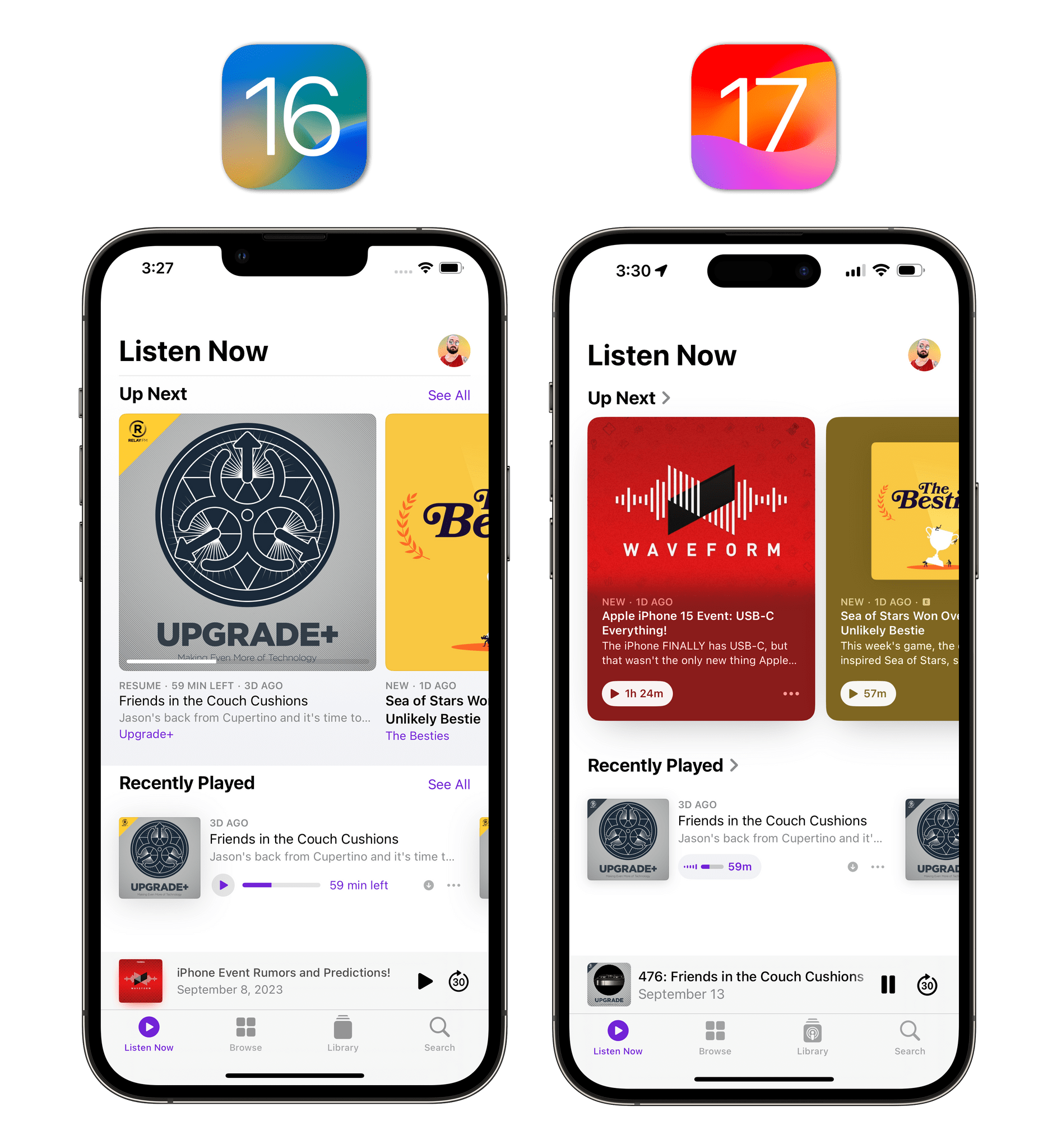
Let’s start with the Listen Now page, where episodes featured in Up Next have received a new card-like appearance with dedicated buttons for resuming playback and opening context menus. I prefer this look since it’s more inviting to the touch and each card is personalized to the show’s artwork.
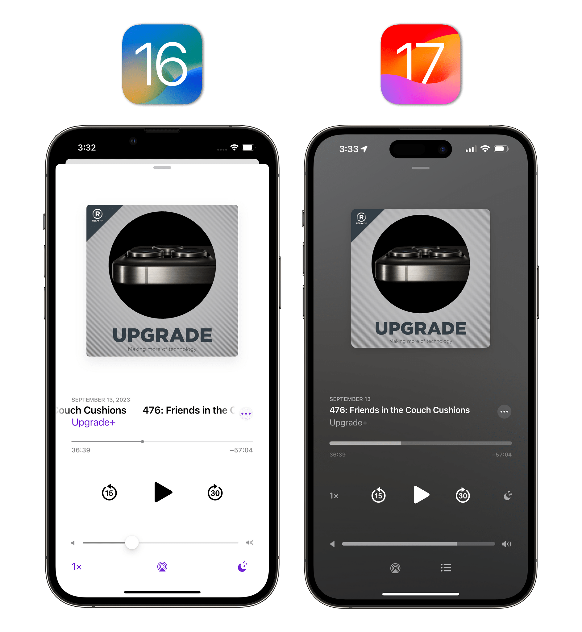
The biggest changes in the Podcasts app – and the reason why I’m happy with this year’s update – are in the Now Playing screen. As soon as you open it, you’ll notice that the screen’s background is not a boring white anymore but instead takes onto the appearance of key colors from the show’s artwork – just like Apple Music. It’s a beautiful effect from a visual standpoint.
Furthermore, shows that offer compatible artwork will appear with a great-looking full-screen effect (similar to the Music app) that makes the Now Playing screen look even more unique and tailored to each show:
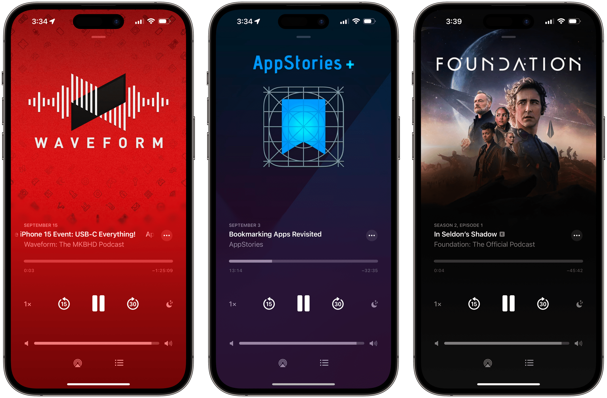
iOS 17’s Podcasts app also brings support for episode-specific art, which allows shows like the excellent Into the Aether to display different artwork for every episode:
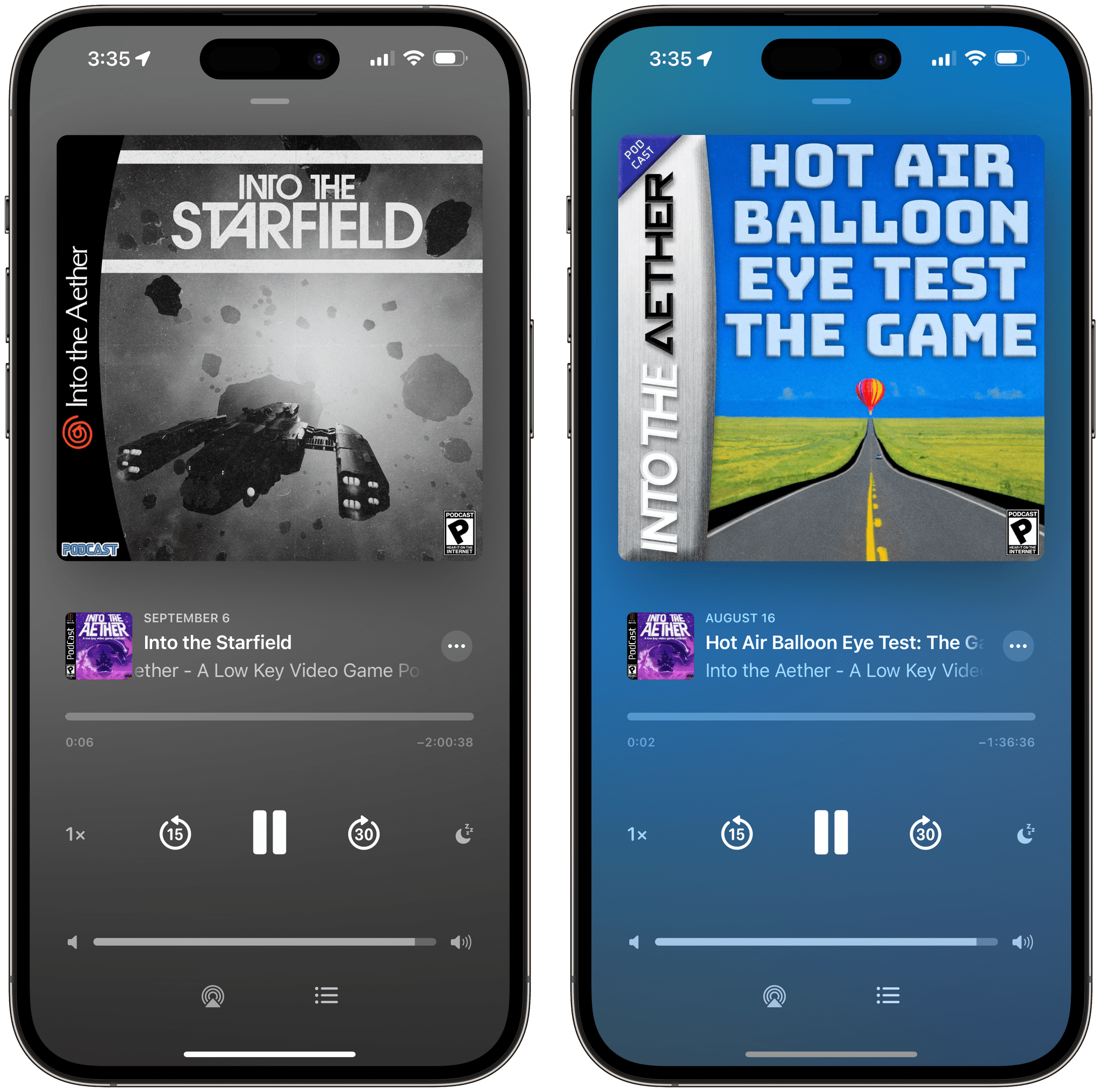
My favorite part of the Now Playing screen, however, is how Apple reorganized different components around a brand new queuing system. You’ll notice Podcasts now comes with a ‘list’ button in the bottom-right corner of the Now Playing screen that, just like the Music app, opens a screen with your queue. This is a standard queue where you can add episodes from anywhere in the app and rearrange them vertically with a gesture. Nothing gets added in automatically and there’s finally a clear separation between Up Next and the queue; this is a regular queue with no surprises about it, and it’s all I wanted.
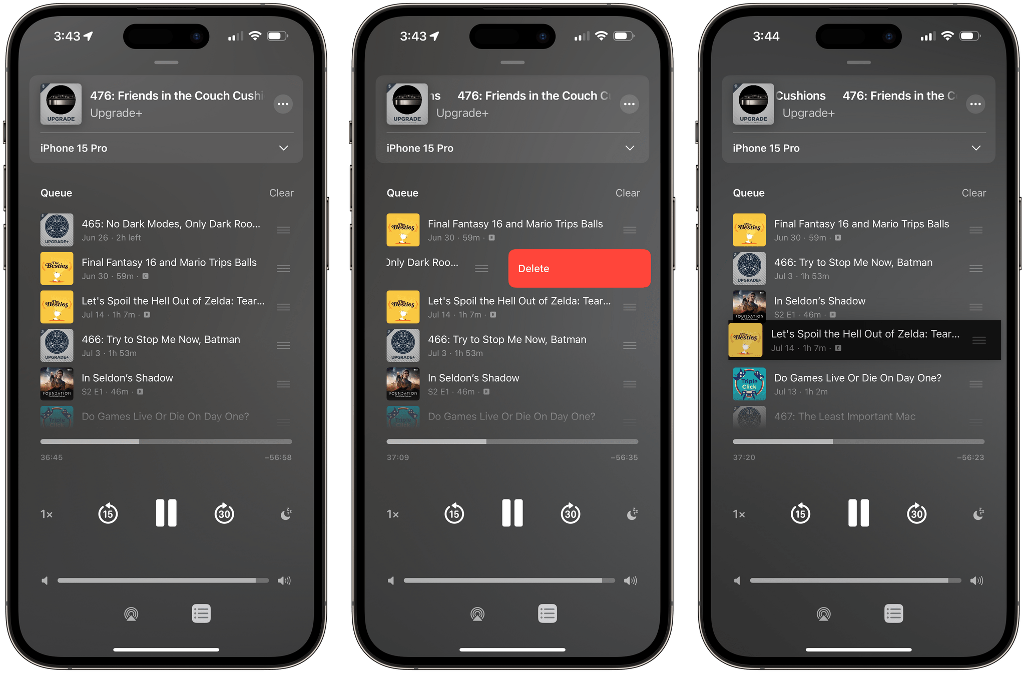
In iOS 16, the list of episodes playing next and chapters contained in the episode were buried and hidden underneath the Now Playing screen: you had to swipe up (something most people would never discover) to find more content in the Now Playing screen. This has changed in iOS 17. The episode currently playing lives in a special section at the top of the ‘Queue’ screen and comes with an expandable menu to navigate chapters of an episode. When collapsed, the menu simply shows you the title of the current chapter.
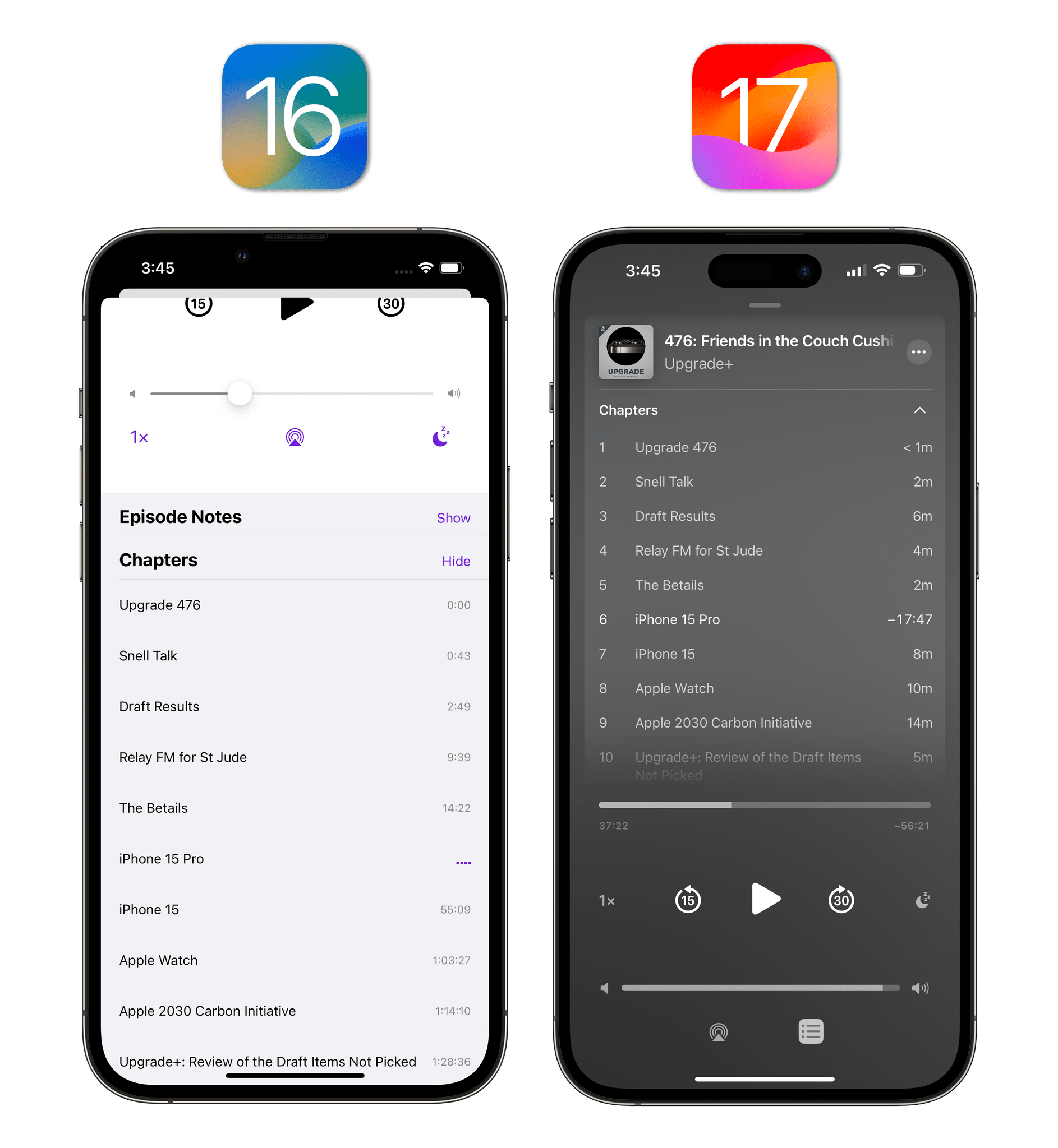
Previously, you had to scroll below the Now Playing screen to view episode chapters. Now, they’re a top-level control in the Now Playing screen.
Slowly but surely, the Podcasts app is becoming one of the most interesting Apple apps to observe and cover every year. Evolution is pretty much constant and the app is a fascinating combination of Apple’s native app expertise and services expansion.
Speaking of which, one of the new features in Podcasts later this year will also be the ability listen to stories from Apple News+, podcasts from Apple Music, and audio content from compatible third-party services inside the Podcasts app. These upcoming integrations paint a fascinating picture: Apple is starting to see their Podcasts app as an all-encompassing audio experience that incorporates standard RSS feeds but also goes beyond them by including other sources of audio content that may not necessarily qualify as “podcasts” on their own.
There are still aspects of the app itself that I think Apple must improve. The lack of audio effects for voice boost and trim silence (which, as I repeat every year, Apple has already shipped in Voice Memos) is a glaring omission compared to third-party podcast players. I’m optimistic that Apple is working on this, so I’m keeping my fingers crossed for a debut in 2024. Additionally, I’d like to see further improvements to the queue: for instance, the queue should be more persistent and not automatically mark an episode as played if you tap something else in the queue. I also wouldn’t mind having Shortcuts actions to fetch episodes from your queue and manage them with automations.
Normally, I would give the Podcasts app a try again for this review and immediately switch back to Pocket Casts. But this year, I’m feeling the pull of the Podcasts app because it also looks fantastic on watchOS 10 and I’m a fan of its clean design on iPhone and iPad. For the first time in several years, I may actually stick around even without audio effects.
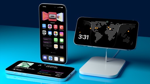
Clock
If there ever was a time to use the word “Finally” in this chapter, it’s now:
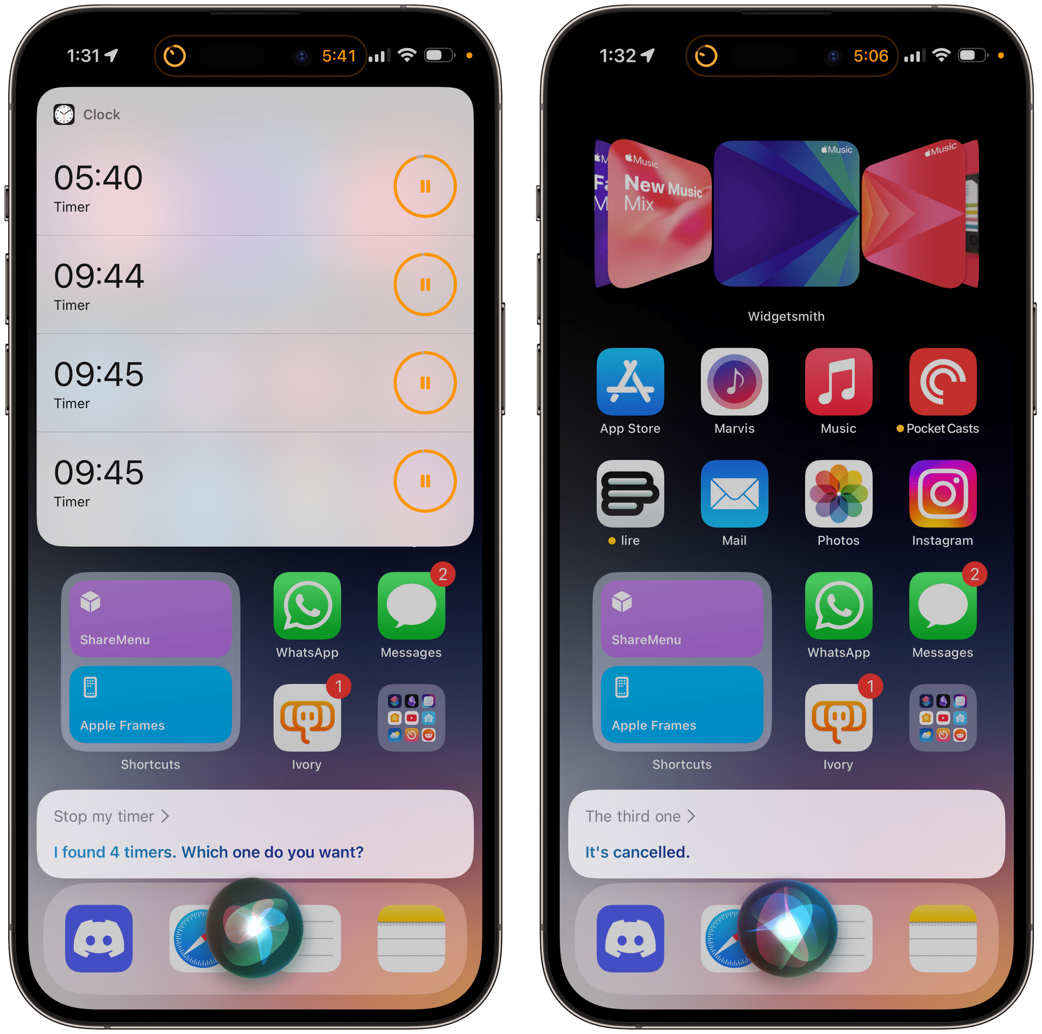
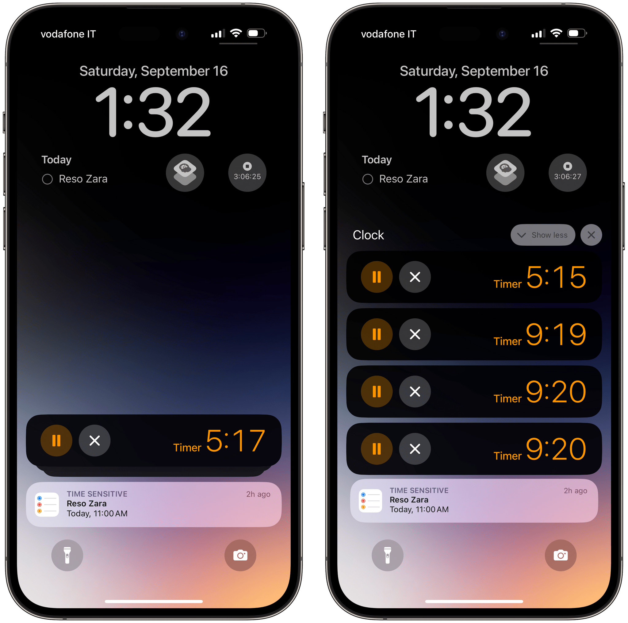
The Clock app for iOS and iPadOS 17 lets you have multiple timers at the same time.
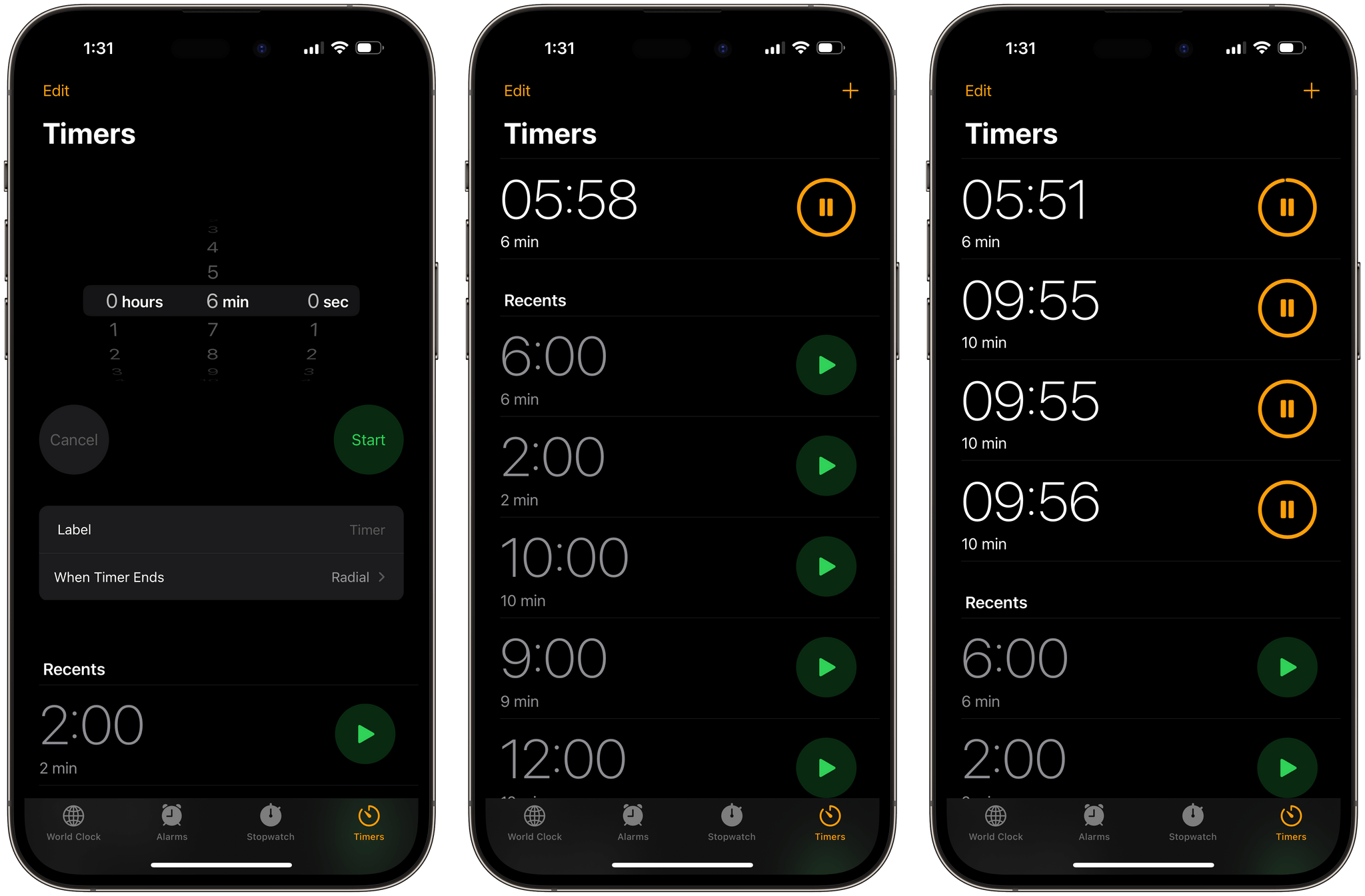
It all starts with the rightmost tab of the Clock app, which has ben helpfully renamed from ‘Timer’ to ‘Timers’. It’s plural now, so you know Apple means business. In the updated screen, you’ll notice a ‘+’ button in the top right to create a new timer manually, plus a new list of recently used timers that you can recreate with one tap by pressing the play button next to them. I know it seems impossible after 16 years of iPhone, but trust me, it’s fine: if you have a pasta timer already going, you can start another timer for your oven, and it’ll stack underneath the first one.
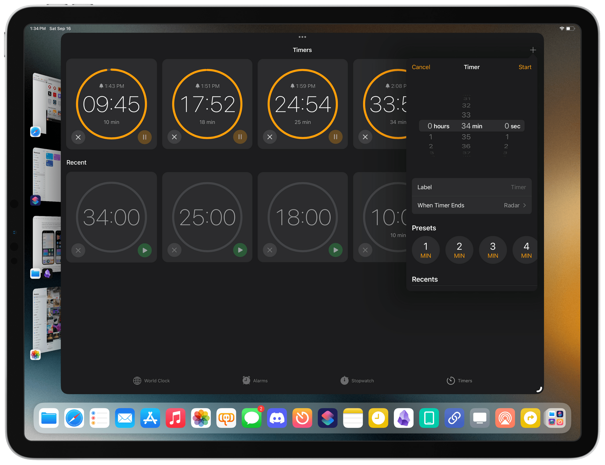
Sarcasm aside, Apple took its sweet time with this feature, but it’s actually well done. Each timer can be labeled and assigned a different tone for when it ends, and you can even use Siri to add and manage multiple timers via voice or with a brand new UI.
I have never personally felt the need to have multiple timers going at the same time, but I know it’s been one of the most widely requested features for the Clock app for over a decade at this point. For those wondering: it looks like you can have up to 500 timers going at the same time.
Home
Besides interactive widgets on the Home and Lock Screens, the Home app received a minor update in iOS and iPadOS 17 with two new features, one of which I can’t test: activity history and redesigned controls for some accessories.
Activity history is the functionality I haven’t been able to test, and not because it requires the new, Matter-compatible Home architecture (which we do have in our home). With activity history, members of the home can see who locked/unlocked the door and when, plus an activity log for garage doors, contact sensors, and security systems. We have none of these accessories in our HomeKit setup (our alarm system is proprietary), so I haven’t been able to test this feature at all.
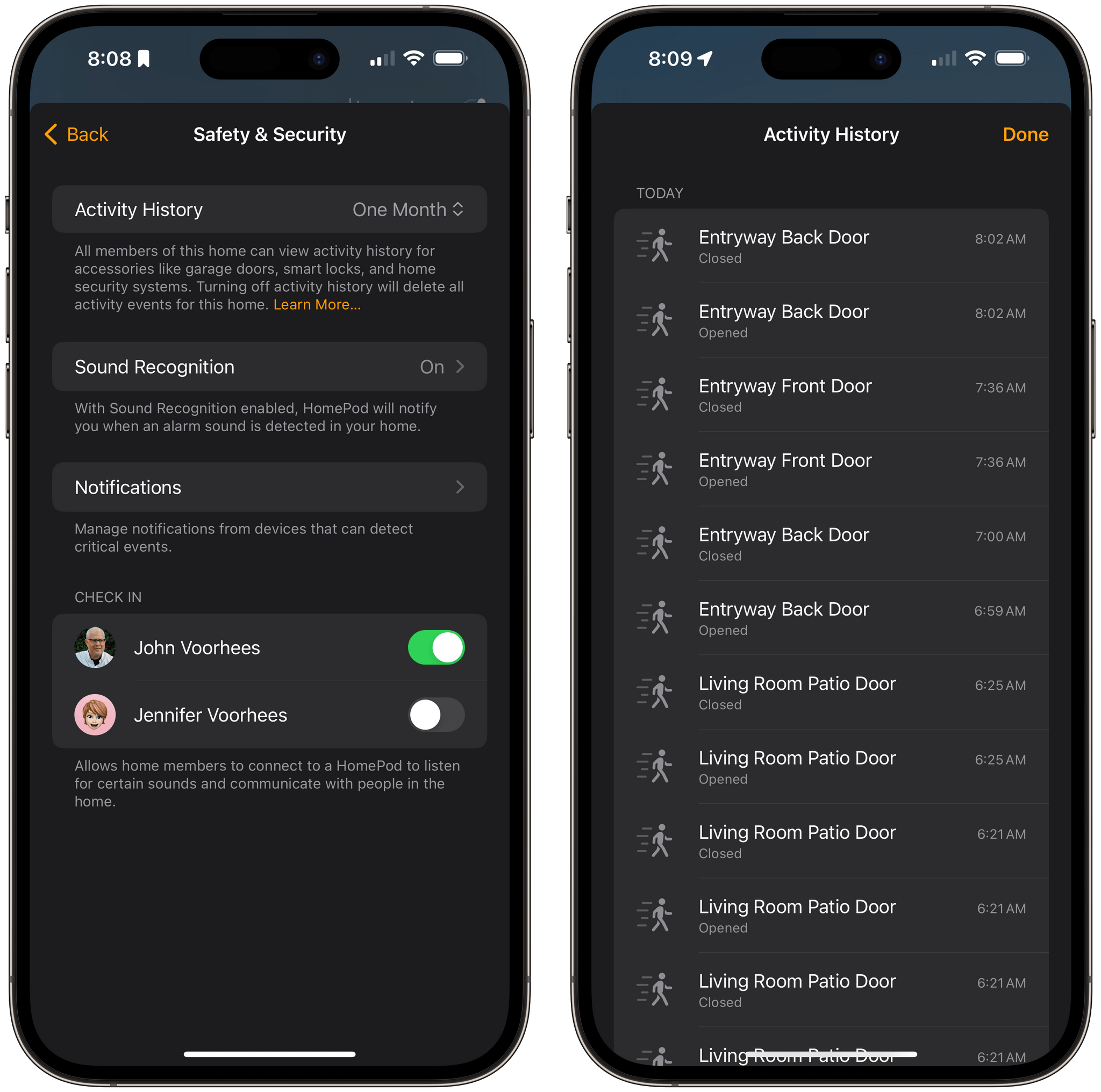
I can tell you, however, that if you’re not seeing activity history after upgrading to iOS 17 and ensuring you have an updated HomeKit hub and are using the new Home architecture, it’s because you need to enable the feature in Home ⇾ Home Settings ⇾ Safety & Security ⇾ Activity History, where you’ll find a toggle to turn it on for all members of the home for one month.
Color pickers for lights and thermostat controls have also been redesigned in iOS 17. The new picker features a scrollable row of colors with the last item being a new control that integrates a full-blown color picker with a setting to enable adaptive lighting.
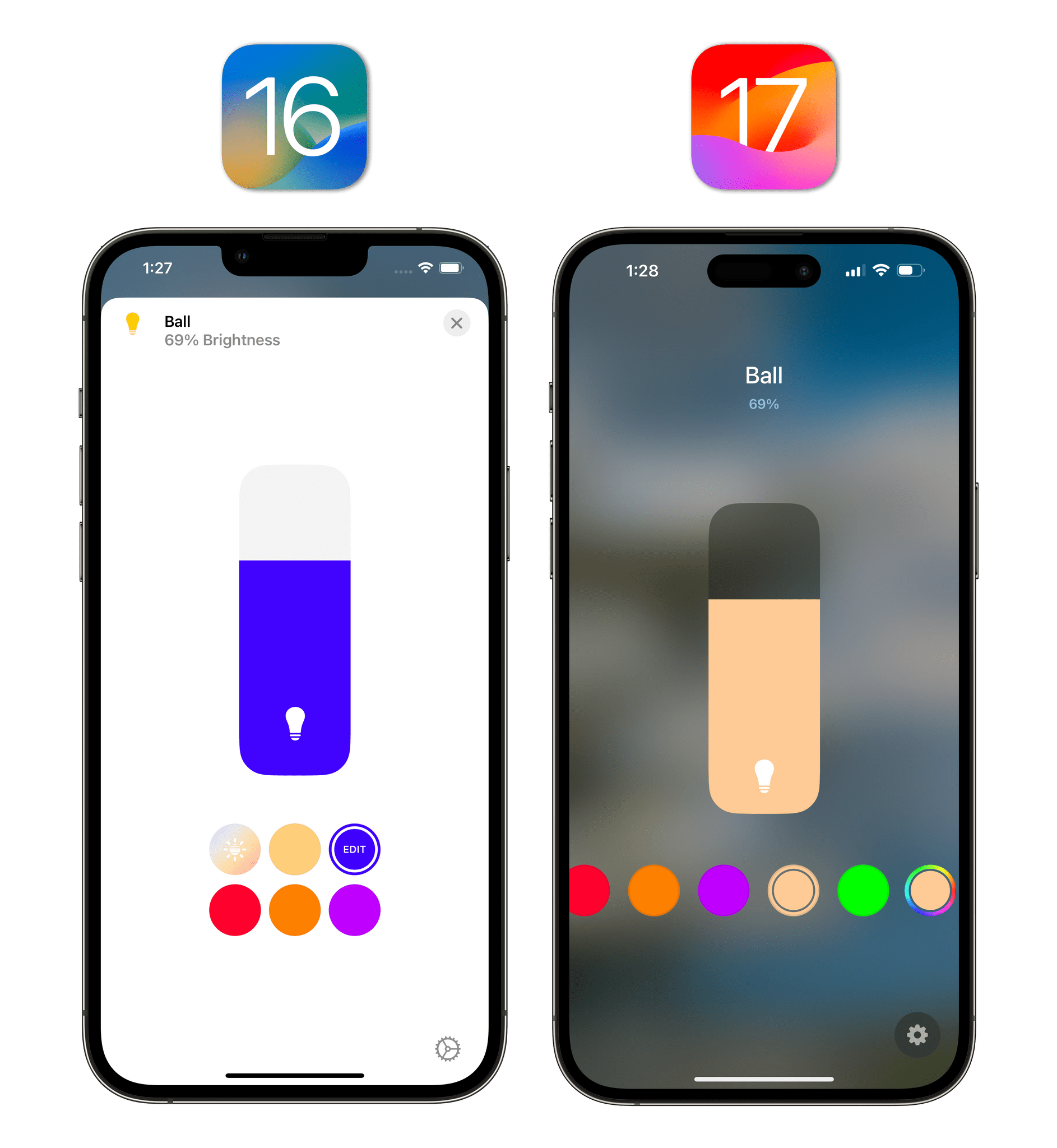
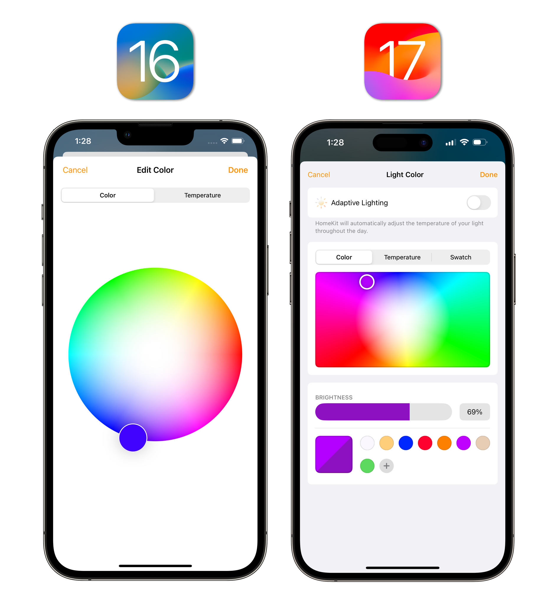
I like the new design (it is consistent with other native color pickers for iOS and iPadOS) and I appreciate that it lets me save a palette of my favorite colors for future usage.