Widgets and StandBy
We left widgets three years ago as this massive phenomenon that took the world by storm. Three years later, I still see friends who spend hours tweaking their Home Screen aesthetic, and it’s not unusual to bump into someone who doesn’t read MacStories or listens to AppStories and yet is familiar with a certain developer with an Underscore in his name. Home Screen widgets, despite their limitations at the time, went mainstream.
Apple followed up on that success with iOS 16’s Lock Screen widgets, which tried to replicate the fame of their Home Screen siblings by focusing on customization for the screen we see every time we pick up our iPhones.
While ‘Lock Screen aesthetic’ maybe didn’t turn out to be as massive a trend as the Home Screen, anecdotally speaking, I see plenty of heavily customized Lock Screens every day. Perhaps Lock Screen widgets didn’t go viral on TikTok, but Apple continued to invest in the same technology that powered Home Screen widgets – WidgetKit – by extending its capabilities and configuration options to the Lock Screen. Start small and iterate on a piece of technology over time: this is how Apple rolls.
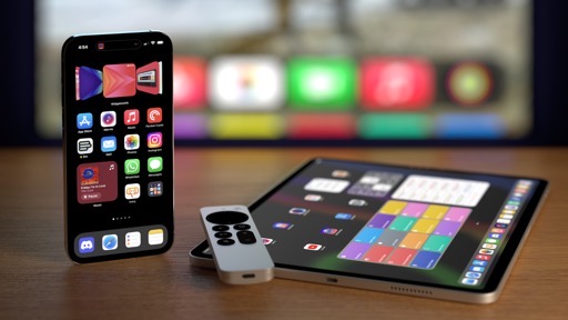
This year, Apple is doubling down on widgets with a twofold approach. On the one hand, they’re embracing the next logical step for widget evolution by enabling interactivity within widgets, both on the Home Screen and Lock Screen. On the other, they’re doing something unexpected: with iOS 17, iPadOS 17, macOS Sonoma, and watchOS 10, Apple is putting widgets front and center (almost) everywhere on its platforms. In the process, they’re integrating widgets with another key technology they’ve built and refined over time: App Intents.
The result is an exciting blend of new features, design changes, and third-party frameworks that is going to kickstart yet another ecosystem of apps that, besides personalization, may fundamentally alter how we interact with our devices.
Home Screen Interactions
The easiest way to understand widget interactivity is this: now in addition to being glanceable, widgets can also include buttons and toggles that you can tap to make something happen inline without launching an app. “Pressing a button” may not sound like the most revolutionary of changes, but in the context of what it means for you, it’s a remarkable addition that drastically shifts how we think of interacting with apps.
Let’s talk about the technical aspects first. Two years ago, I noted how the very nature of widgets – little views powered by SwiftUI and a timeline-based approach – was likely to blame for their limitations. iOS 14’s Home Screen widgets could only display information and update every once in a while because (and I’m simplifying here) that’s how complications worked on the Apple Watch. Widgets were based on a similar read-only update mechanism that reloaded when necessary to show you new information on the Home Screen. You couldn’t perform any action within widgets because they had been designed to be small UIs with periodic, read-only updates.
In iOS 17, widgets are still built with a timeline-based approach, but there’s a new component: actions powered by App Intents. If you recall, this is the same framework that Apple has been extending over time starting with Siri and the Shortcuts app. Now, a widget can embed one or multiple actions in the form of buttons that, when pressed, guarantees a reload of the widget to display something new and refresh its UI without taking you elsewhere. If a widget is interactive and has a native button in iOS 17, when you click it, you won’t be taken into the widget’s associated app: you’ll stay on the Lock Screen or Home Screen and see the widget refresh.
Using interactive widgets for iOS 17.Replay
This implementation is clever in a variety of ways. From a design standpoint, supporting limited interactions powered by SwiftUI means you won’t suddenly find a widget on your Home Screen that looks like a mini text editor or an email client. Widgets can’t be scrolled, they can’t bring up the software keyboard, and they’re not meant to be elements that contain complex UIs. They’re still glanceable and the same design considerations as iOS 14 still apply, only now they also support limited interactions to save you a bit of time every day.
From a technical perspective, this is also a smart ecosystem play on Apple’s part. The biggest advantage Apple has compared to, say, Microsoft and its Surface line of products or even Google with Android is a rich, vibrant ecosystem of big companies and indie developers that are incentivized to embrace the latest platform technologies every year and, as a result, make more powerful apps that lead to more enticing hardware purchases. But there’s only so many new technologies you can ask developers to learn and adopt every summer, which is why Apple, as we’ve seen over the last few years, has erred on the side of re-using and extending established frameworks.
The latest installment in this time-honored tradition is leveraging App Intents as the foundation for widget interaction. Whether you’re a user or developer, chances are high you’re already familiar with App Intents: they power Siri integrations for apps, actions in the Shortcuts app, Focus Filters, actions for the Apple Watch Ultra Action button, and, starting this year, actions in widgets. Why require developers to support a new API when the same technology can be modularized into different components?
This is the modern Apple way, and never has it shone as brightly as it does with widget interactions in iOS 17. As I’ll show you below in my list of third-party examples, prepare to see a deluge of interactive widgets on day one of iOS 17 – some with more “basic” interactions like checking off tasks and logging your habits from the Home Screen, and others with wild, creative takes on widget interactions that I’m sure not even Apple is expecting. And that’s largely been made possible by Apple’s relentless refinement of their developer tools in lieu of constant reinvention.
Apple’s Interactive Widgets
Before we take a look at interactive widgets from third-party developers, let’s start from what Apple offers with the interactive widgets you’ll immediately find on your devices after upgrading to iOS and iPadOS 17. As is always the case with Apple, they haven’t created a lot of widgets for the occasion, which is a shame, but they still serve as decent examples of what you can expect.
Once I heard at WWDC that iOS 17 was gaining interactive widgets, my mind immediately went to the Music app and a Now Playing interactive widget that would match the one seen on Android. iOS 17 does in fact bring an interactive Now Playing widget for the Home Screen…sort of. The updated suite of Music widgets for iOS 17 (Recently Played, Recommendations, and Top Charts) include a Play button that lets you start music playback for the selected item directly from the Home Screen.
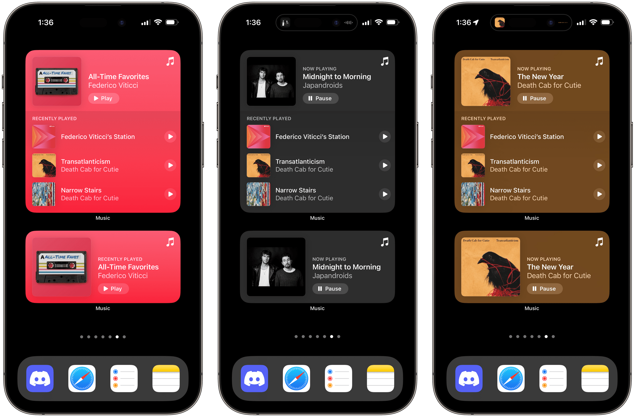
Different types of Music widgets. The default color (pink, pictured left) changes depending on the artwork of what’s playing.
Performance is remarkable: as soon as you tap the play button, music starts playing in the background, and the button switches to a ‘Pause’ one. The widgets reload quickly when tracks change and are a good example of what it means to refresh a widget’s view when an action is performed with a button.2 Unfortunately, unlike their Android counterparts, these widgets don’t have any other controls for skipping tracks. Especially with larger configurations, I would have liked to see Apple try a little bit harder with additional inline controls that went beyond playing and pausing music.
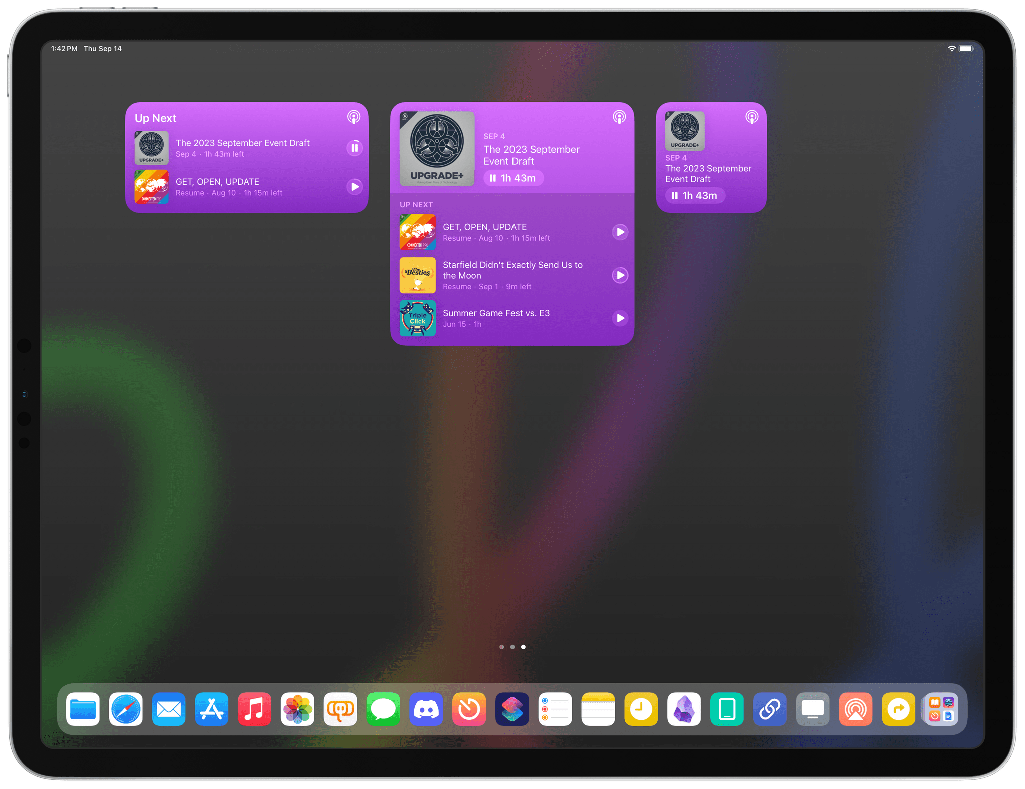
The new interactive widgets for Podcasts and Books are based on the same template as the Music ones. Respectively, they embed buttons to control playback for episodes and audiobooks. They’re not exactly groundbreaking, and, once again, I would have liked to see more here (why not embed playback speed controls in the widget?). Still, they get the job done, and I’ve found the Podcasts one useful in the medium and large sizes to start playback for episodes in my queue.
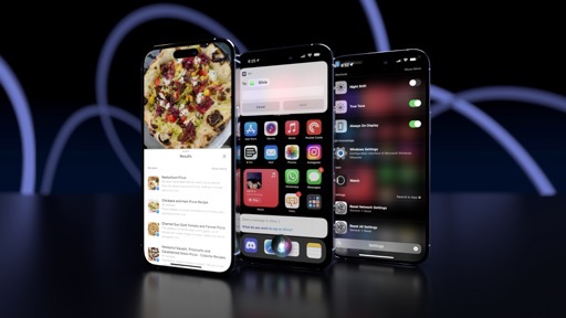
The updated Reminders widget does what you think an interactive Reminders widget should do: it lets you check things off from your Home Screen (and Lock Screen too, as we’ll see below.) Tap a task from a list displayed in the widget and it gets completed – simple as that.
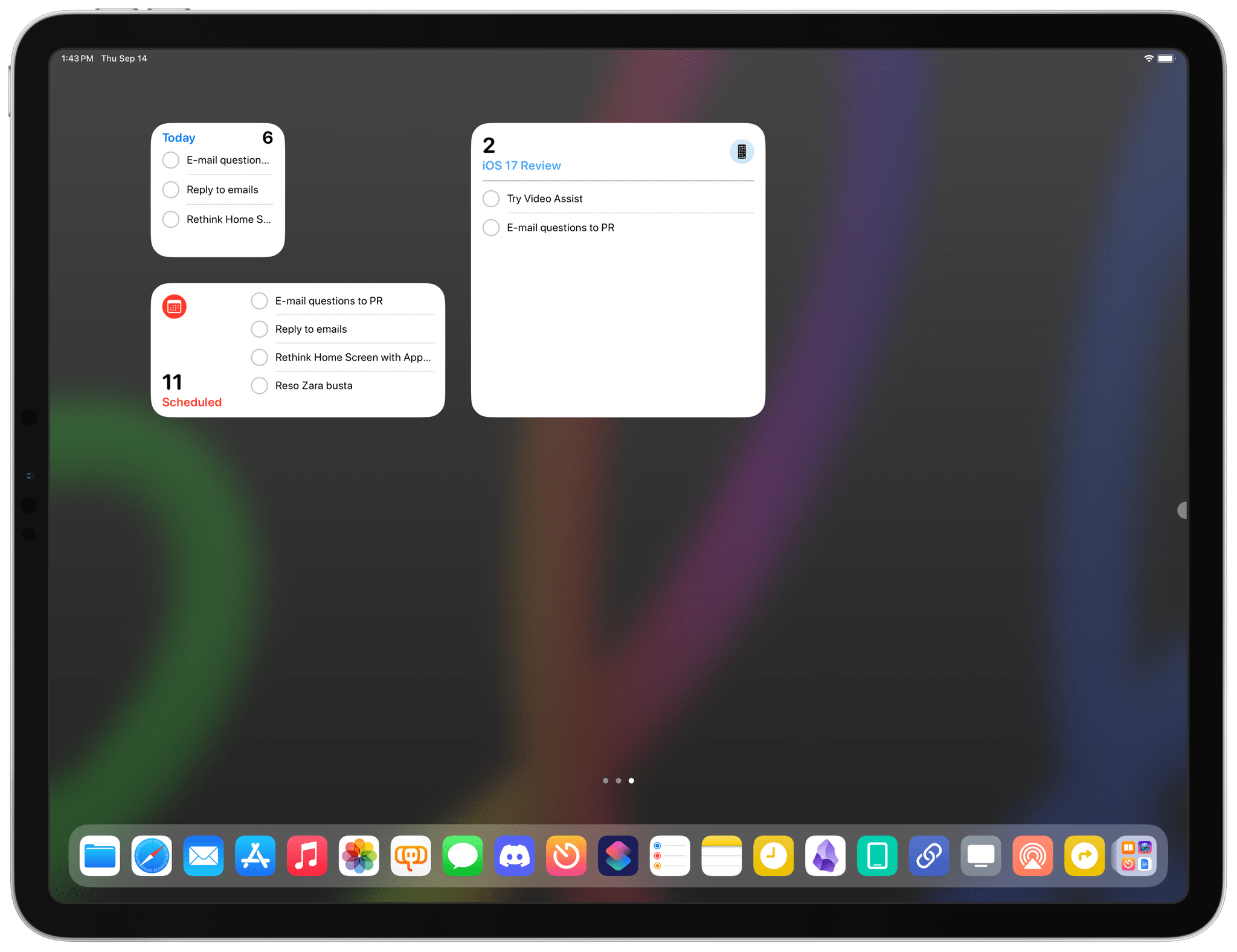
I’ve been using the Reminders widgets a lot on my devices and, despite their simplicity, they have made me a bit more efficient every day since I no longer have to open the Reminders app just to mark a task as done. Those interaction savings add up over time. The only real tragedy here is that the iPad didn’t get an XL Reminders widget that displays sections of lists as columns, Kanban-style (more on this in the Reminders chapter).
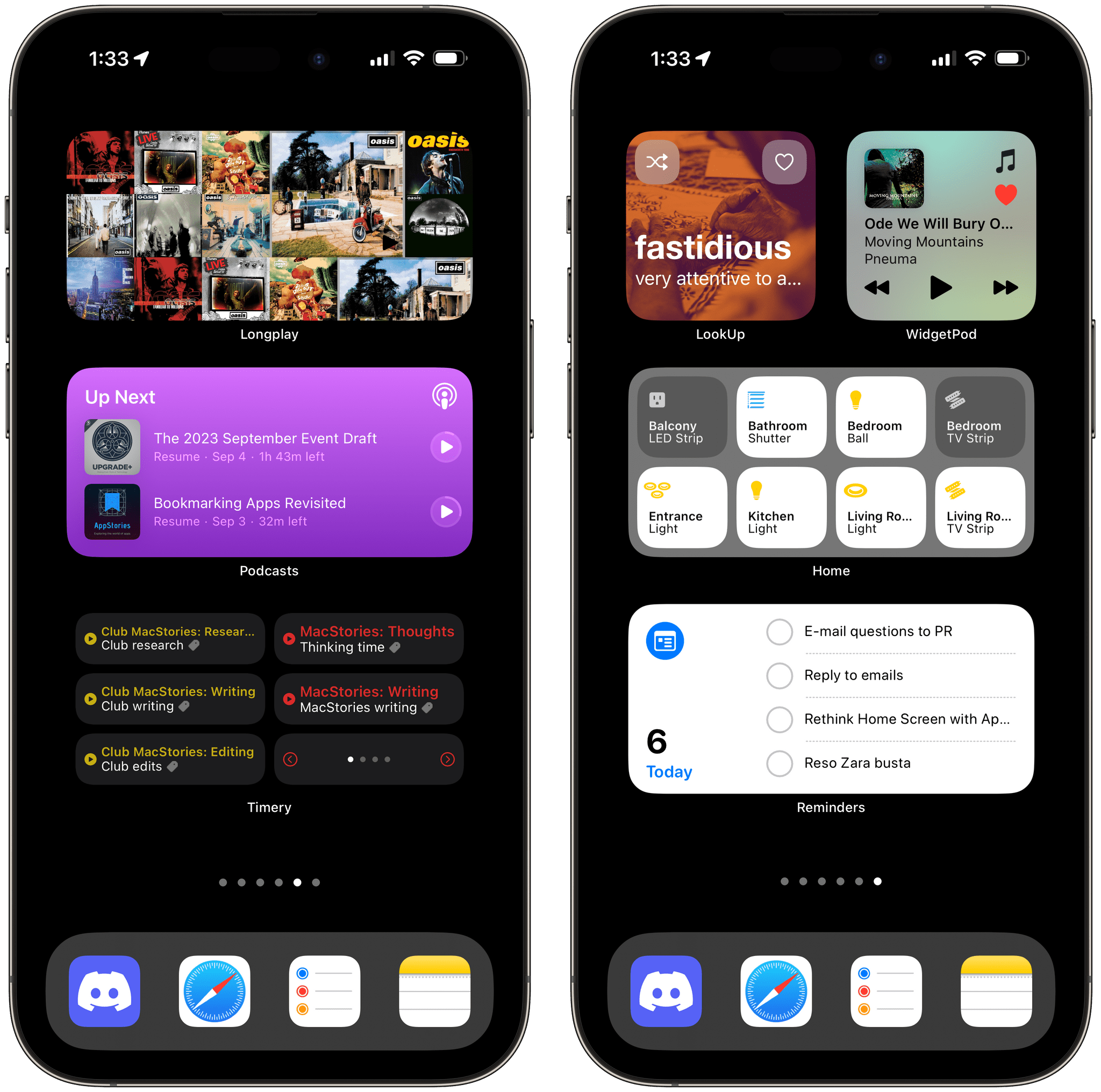
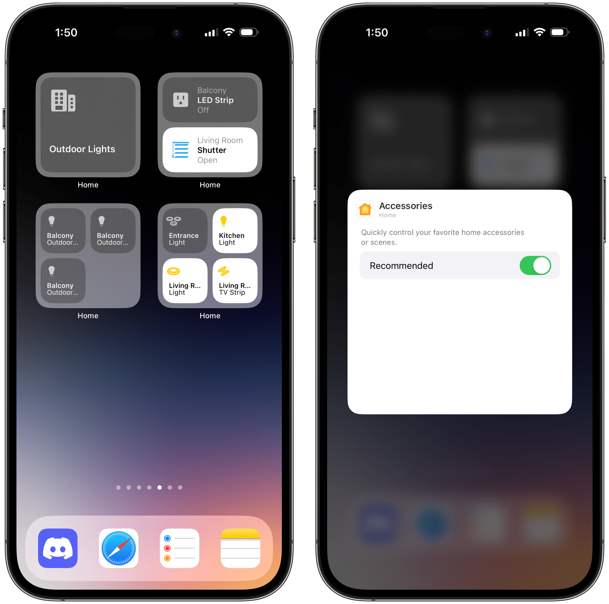
Arguably the true stars among Apple’s interactive widgets, the new Home widgets for iOS 17 are one of my favorite additions to the operating system this year and a terrific example of how interactive widgets on the Home Screen can be useful on a daily basis. The Home app now offers two ‘Accessories’ widgets (small and medium size) that allow you to either pin specific accessories to the widget or view a list of recommended accessories based on time of day and other signals (just like the recommendations you see in Control Center). Then, you can simply tap an accessory in the widget to turn it on/off or toggle its state.
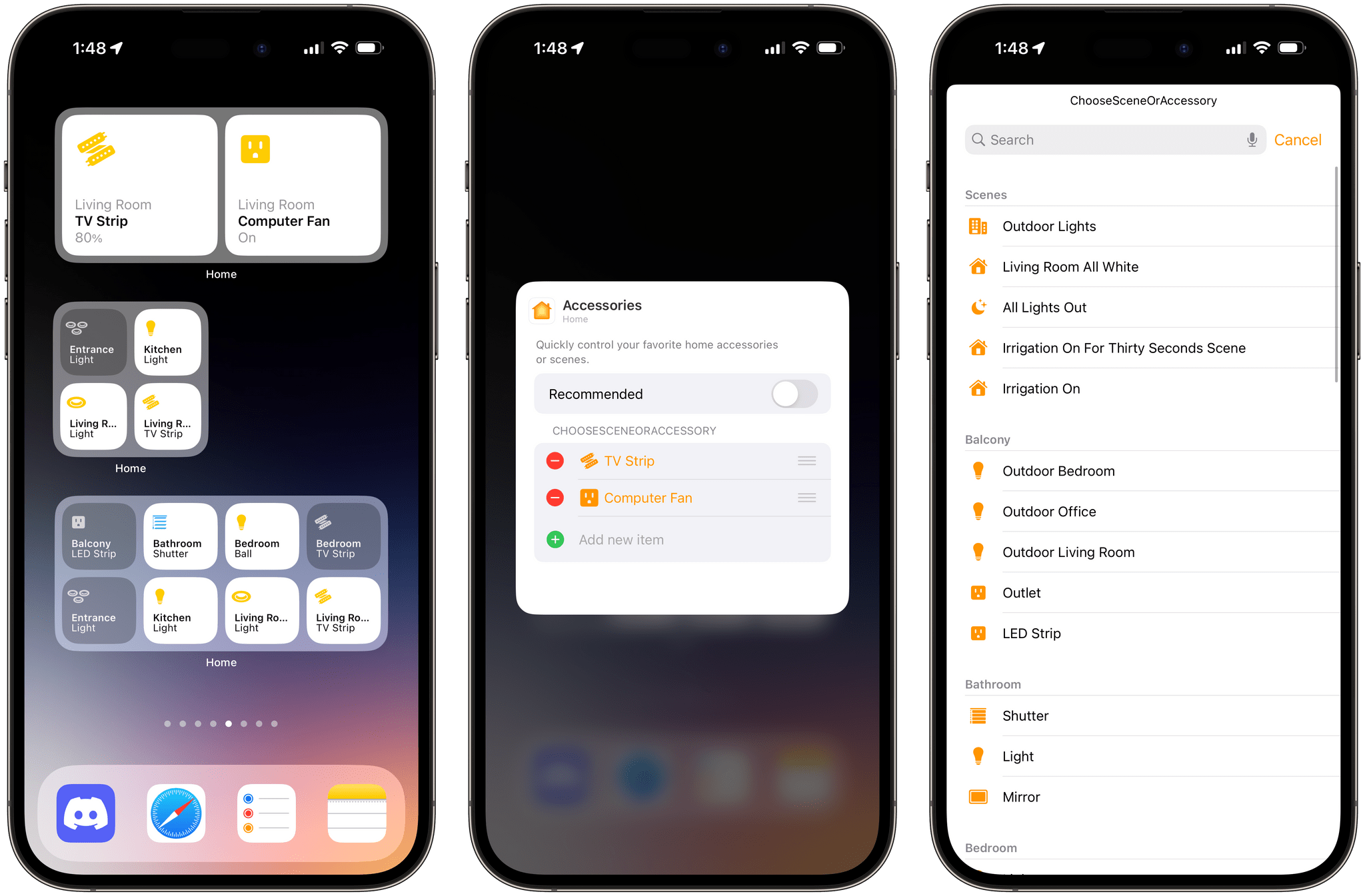
The new Home widgets support showing recommended accessories or loading a specific set of accessories and scenes you can configure.
I went deep into HomeKit for my new home over the past year, and I’ve tried to make every possible part of my apartment compatible with Apple’s Home app. For this reason, I find the interactive Home widgets a glorious addition to my Home Screen in iOS 17. I can control my lights, TVs, shutters, and scenes directly from a widget, which loads accessories and their states quickly and reliably. In my tests, pressing the button for a light in the Home widget turns on the selected accessory just as quickly as doing so from Control Center or the Home app itself. The changed state is reflected immediately in the widget, which works both when I’m home and outside of my Wi-Fi network.
Using the interactive Home widget.Replay
The other side of the coin here is that the Home widgets highlight the new limitations of widgets: since only basic tap actions are supported for widgets in iOS 17, you can’t have, say, a slider that lets you tweak the intensity of a light’s brightness or a color picker embedded within the Home widget. This will be a topic of discussion for the next couple of years until Apple enables more complex interactions in widgets; for now, you should keep in mind that the Home widgets can only toggle things on and off (or open and closed, in the case of shutters).
The small Home widgets also highlight another important change for small-size widgets in iOS 17: they can have multiple touch targets.
Previously, small widgets only supported one touch target, which always took you into the widget’s associated app. Now, thanks to interactivity, a small widget can have multiple touch targets in the form of separate buttons. For instance, Home’s small widget lets you configure up to four accessories displayed at once:
This is a great use of space and information density, and I wish Apple used this approach consistently in iOS 17. In fact, there is also a new small ‘Shortcuts Folder’ widget that supports multiple shortcuts. However, this widget only supports showing up to two shortcuts at once instead of four, which is a limitation I don’t understand. Still, I fully expect developers to take advantage of multiple buttons in small widgets this year, and, as we’ll see later, some have already started doing so with some pretty amazing results.
- I have to wonder if the Music widget is using any sort of private API/entitlement to reload this quickly. I noticed that when using a Music-based alternative player such as Marvis or the latest version of Widgetsmith, when I start playing a song in those apps, the Music widget reloads immediately as well because those apps are front-ends for the system Music player. Is this just the nature of the Music framework, or did Apple make an exception for the Music widgets? In any case, starting playback in Marvis and seeing changes reflected in real-time in the Music widget is pretty sweet. ↩