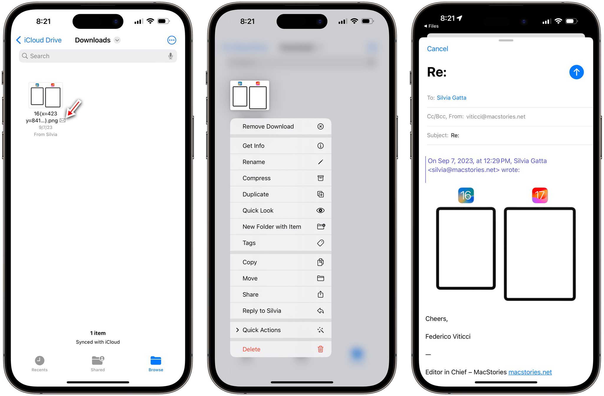
Files
There’s one new feature in the Files app this year: when you save an attachment from Mail to Files, the attachment is displayed with a tiny mail icon next to its name in the Files app. When you long-press it to reveal a context menu, you’ll see a ‘Reply to…’ button that lets you reply to the sender with the context of that specific attachment (which will be quoted in your reply) directly from the Mail app.
Safari
As with Notes and Reminders, evolution in Safari never stops. While this year’s updates to the system browser may not be as earth-shattering as the redesign in iOS 15 (which, in hindsight, turned out to be a good idea), there are still several additions – especially for folks who want to read articles in Safari – worth covering.
Reading List Is Still Alive
It hasn’t received a major update in years, but the Reading List feature of Safari is still alive and part of the system browser with a dedicated section.
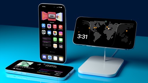
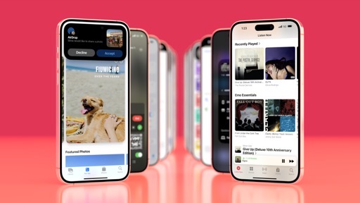
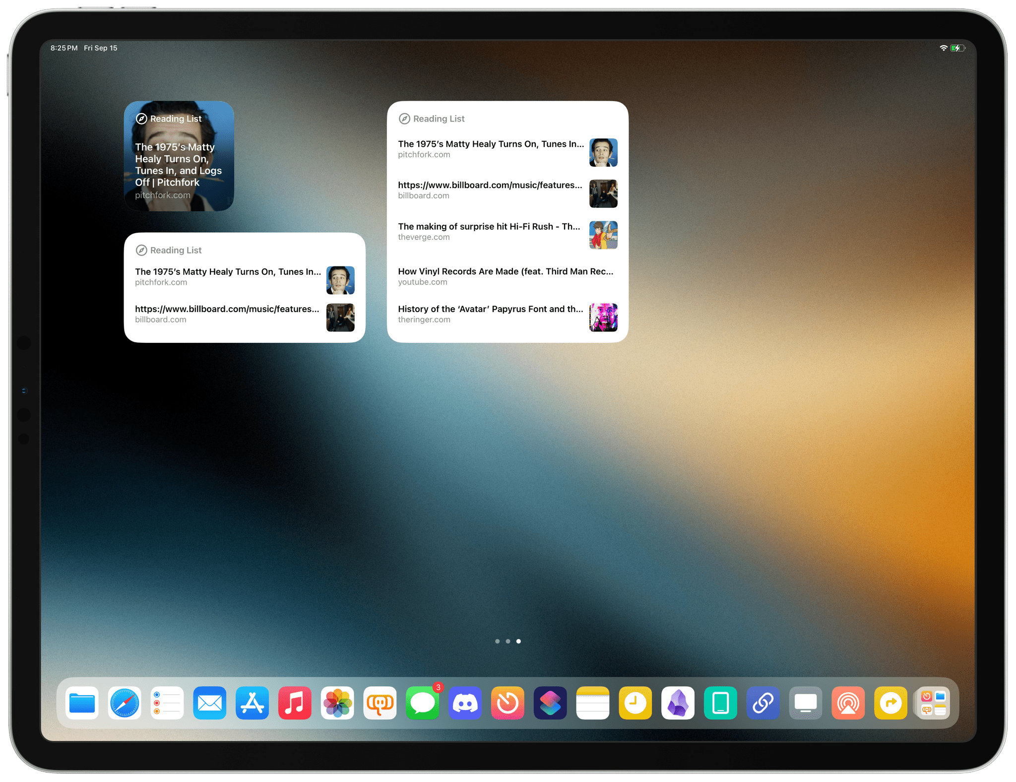
There is one new Reading List feature this year: widgets. For the first time, you can install a Safari Reading List widget on your iPhone or iPad Home Screen that lets you easily access your unread articles and open a selected one in Safari. The small-size widget even uses the first image from the story as its background, which is a nice touch.
While I’m happy to see Reading List widgets as a sort of confirmation that Apple is still aware of Reading List’s existence, I wish the company had done more. For instance, it’s still impossible to tag articles in Reading List, which means you can’t configure the widget to show you a specific subset of stories (which is something you can do with, say, GoodLinks).
More importantly, however, the way these widgets have been designed doesn’t quite work for me: by default, Reading List widgets show you unread articles, and as soon as you tap one and open it in Safari, it gets automatically marked as read and removed from the widget – even if you haven’t actually read the story in its entirety yet.
Still, despite the lack of substantial updates, the core benefit of Reading List remains: it’s integrated everywhere system-wide, syncs in the background across devices with iCloud, and it’s a feature of Safari itself. The latter point means I can read my articles while taking advantage of Safari extensions and all my shortcuts enabled for share sheet use.
Listen to Articles
Reading in Safari comes with another great new perk in iOS and iPadOS 17: the ability to listen to articles. This functionality allows you to catch up on unread articles on the go by listening to them rather than reading, which can be very handy if you’re, say, grocery shopping while wearing AirPods or driving. Articles are spoken aloud by Siri’s improved voice, which, at least to my ears, sounds more natural and pleasant (in terms of cadence and pronunciation) than Matter or Readwise’s similar text-to-speech features. I would say, however, that Siri doesn’t sound as good as Omnivore’s ultra-quality voices, currently in beta.
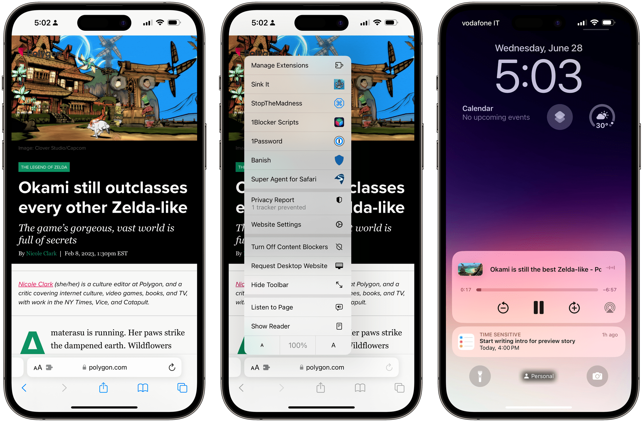
The ability to listen to articles can be triggered in two different ways. The first one is a new ‘Listen to Page’ button in Safari’s action menu, which lets you start playback, pause it, and resume it. As soon as you start listening to an article, Safari appears as a media app in the Now Playing widget on the Lock Screen and Control Center, just like any other audio app.
Alternatively, you can say ‘Siri, read this’ and the assistant will start reading the selected page in Safari. As you can imagine, Safari Reader needs to be available for the page you’re on, meaning that the system needs to recognize it as a valid article. I’ve long found Safari Reader to be a more flexible and reliable text parser than competing services; based on my tests so far, Siri has never failed to pick up a story I’d previously saved in Reading List.
So that’s another advantage of using Safari and Reading List to save articles for later in iOS 17: you can listen to stories with the same assistant – and the same voice quality – that you use for other quick tasks, especially while wearing AirPods. There’s room for growth with this feature (for example, you can’t just ask Siri to “read one of my stories”; you have to open Safari first, then ask Siri to read the selected page), but it’s a good start.
Profiles
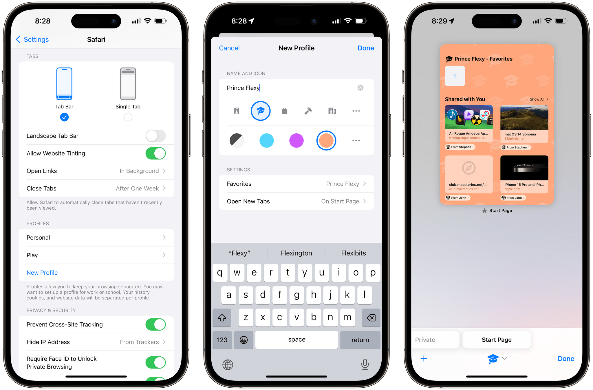
The biggest, non-reading-related addition to Safari this year is something that I’ll rarely use (if at all), but which I think a lot of other people will: profiles.
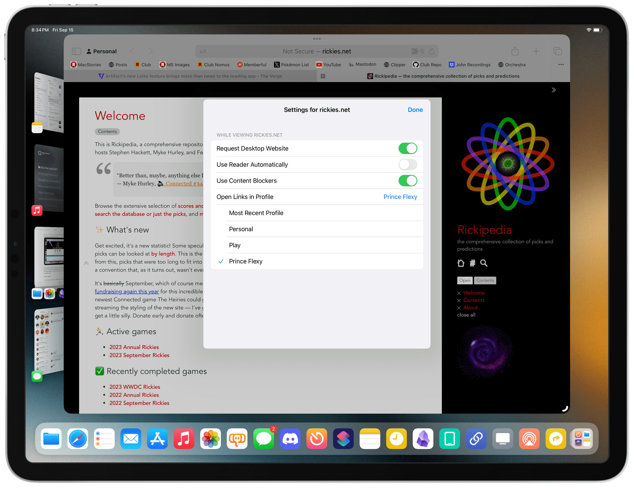
In Safari for iOS 17, iPadOS 17, and macOS Sonoma, you can create multiple Safari profiles and keep your browsing activity and data completely separated between them. Each profile has its history, cookies, extensions, tab groups, bookmarks, and settings for new tabs and favorites. Profiles sync with iCloud, so you can use them across all your devices, and they’re also available as Focus filters, which means you can tie a specific Safari profile to a specific Focus mode.
The obvious use case for profiles in Safari is to wall-off your personal browsing activity from work-related usage of the browser. Instead of having to use private mode to temporarily avoid leaving traces of what you’re doing in Safari, now you can create discrete ‘Personal’ and ‘Work’ profiles, for example, and keep everything separate while using Safari’s regular browsing mode.
Creating profiles is easy: just head over to Settings ⇾ Safari ⇾ Profiles and create one. When creating a profile, you can choose from 40+ different icons and 12 colors; you can then assign a specific group of favorites, choose where to open new tabs, and select the extensions you want to use.
By default, Apple creates a ‘Personal’ profile for you that cannot be deleted. Once you create a custom one, the tab overview page in Safari for iPhone (more on this in a bit) will gain a button at the bottom of the screen that shows the icon of the currently selected profile. Tap it, and you’ll get the updated tab group sheet, this time with an additional entry for ‘Profile’, which you can use to switch between all your Safari profiles.
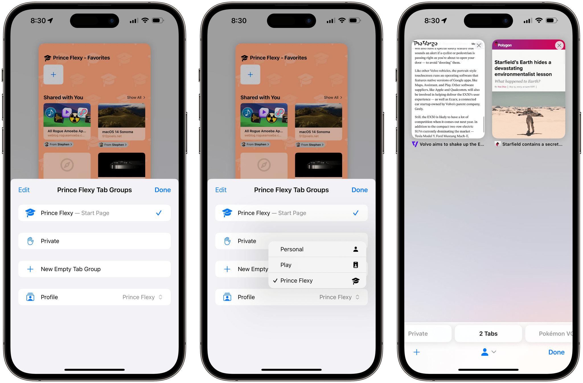
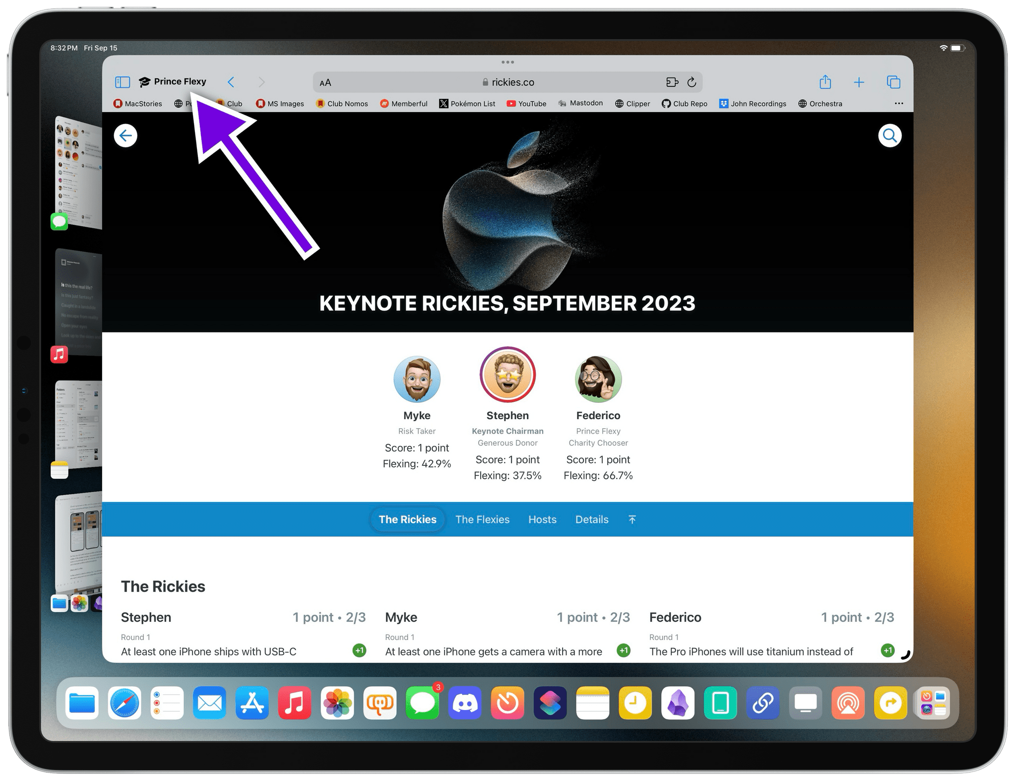
On iPad, you can switch between profiles at the bottom of Safari’s sidebar. If the sidebar is hidden, the current profile will be shown as a button in the leftmost corner of the toolbar, which opens a popup to switch between profiles and load tab groups.
Switching between profiles on iPad can be done from this button or at the bottom of the left sidebar.
Profiles extend to website settings, too. In a welcome addition for those who want to keep work and personal profiles completely separate, you can tweak a website’s preferences to always open links from that domain in a specific profile:
I’m not the target customer for profiles: I’m self-employed and run my own business, so I can’t exactly fear that my boss is going to find out that I’ve spent too much time on Serebii or Mastodon. Work and play always end up in the same bucket for me.
I can confirm, however, that profiles in Safari work just as advertised, and I think they’re going to be a hit for people who have always wanted to keep their personal browsing separate from whatever they have to do at work. Many of those users have so far adopted solutions such as using an alternative browser at work; now they can use Safari both at home and the office, without giving up the convenience of Apple’s privacy-conscious approach and the rich ecosystem of extensions and shortcuts that exist for Safari.
Private Mode Changes
Speaking of privacy, there are some pretty notable changes to private mode in iOS and iPadOS 17. Again, I barely use this mode since I don’t need to keep anything private to anyone but me on my devices, but still: Apple’s additions are pretty neat.
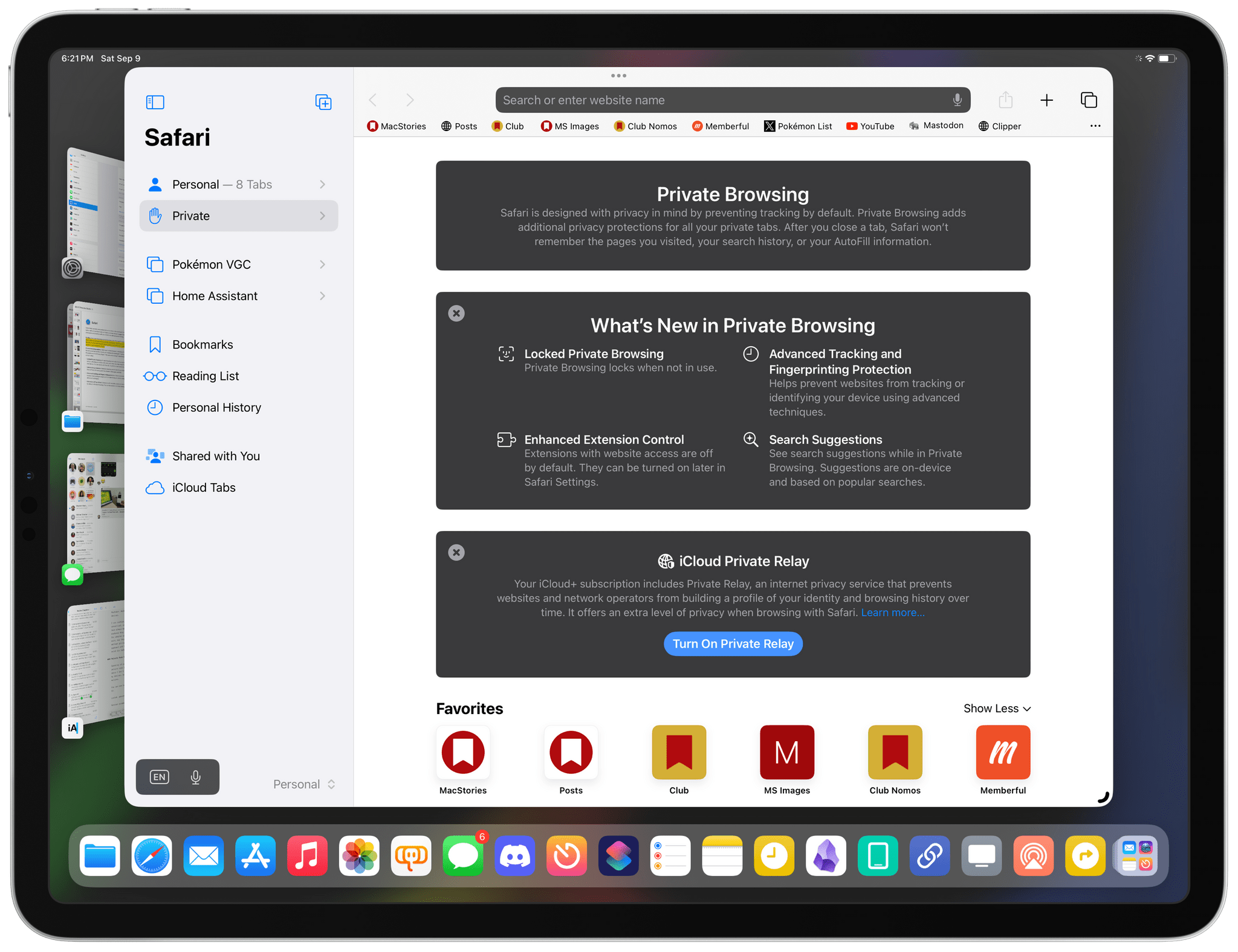
You can now lock private browsing in Safari with Face or Touch ID. This option can be configured in Settings, but, by default, if you open some private tabs, exit Safari, then come back to it later, you’ll need to authenticate to view your private tabs again.
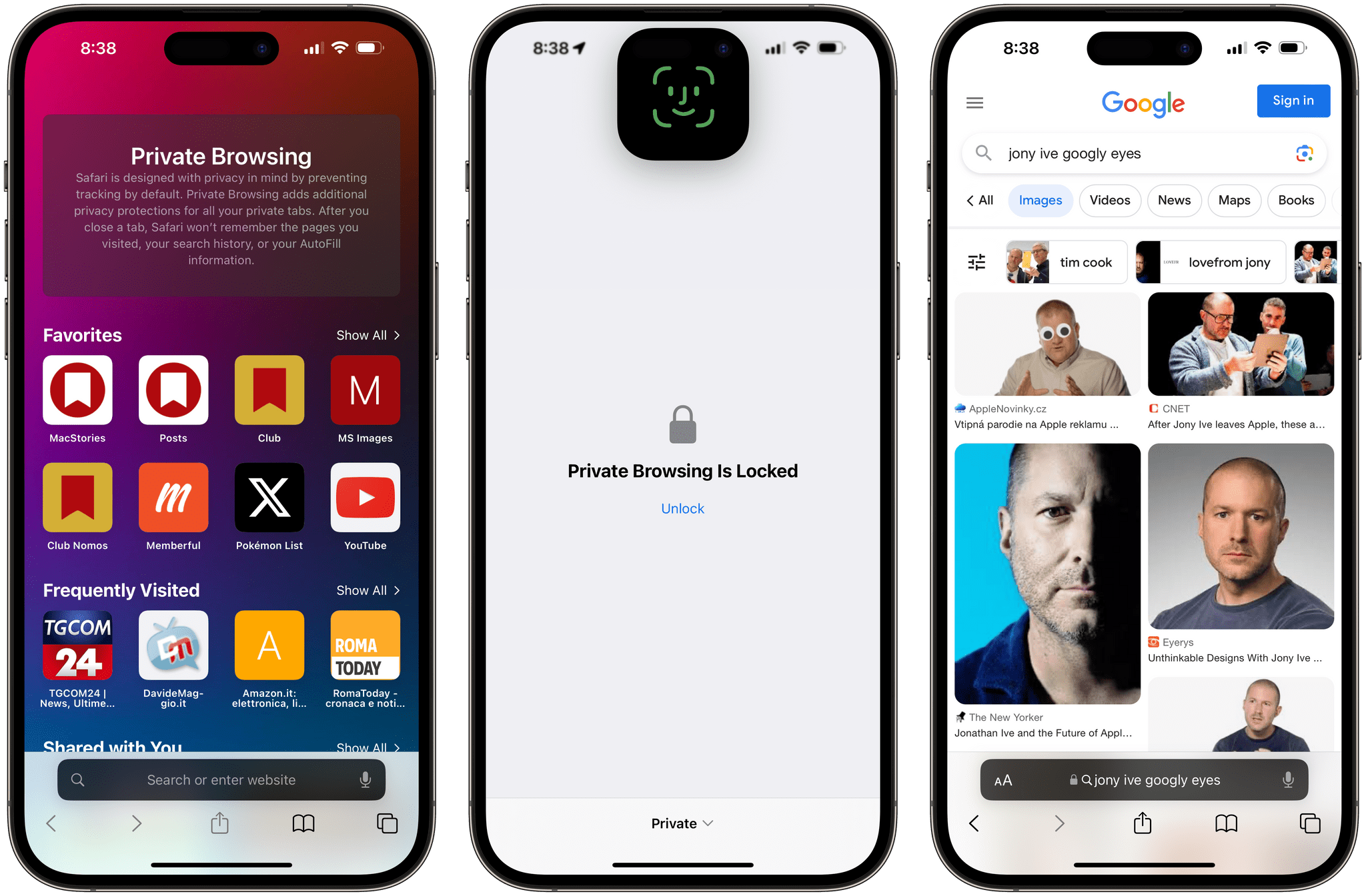
But that’s not everything Apple has done with Safari’s private browsing this year. Private mode now blocks tracking parameters used to identify opened links in Safari (it literally strips them from URLs as you navigate) and rich links in Messages and Mail; it also prevents known trackers used to identify you or “fingerprint” you from loading. Furthermore, extensions that require website access are off by default when switching to private browsing. If you want to use them, you’ll have to enable them yourself in Safari’s preferences. You can also set a unique search engine for private browsing now.
To me, these feel like reasonable and customer-oriented improvements that only deepen Safari’s commitment to preserving your privacy and offering great performance when browsing the web. I wish more companies followed Apple’s approach.
Other Safari Changes
Here are some other Safari changes this year worth noting:
Icons in the favorites bar. In Settings ⇾ Safari ⇾ General, you’ll find a new option to show icons for websites in the Safari favorites bar on iPad. This toggle is enabled by default, and I love how colorful it made the Safari toolbar on my iPad Pro:
Redesigned history clearing window. The ‘Clear History and Website Data’ button in Settings ⇾ Safari now brings up a completely redesigned sheet with more options than iOS 16:
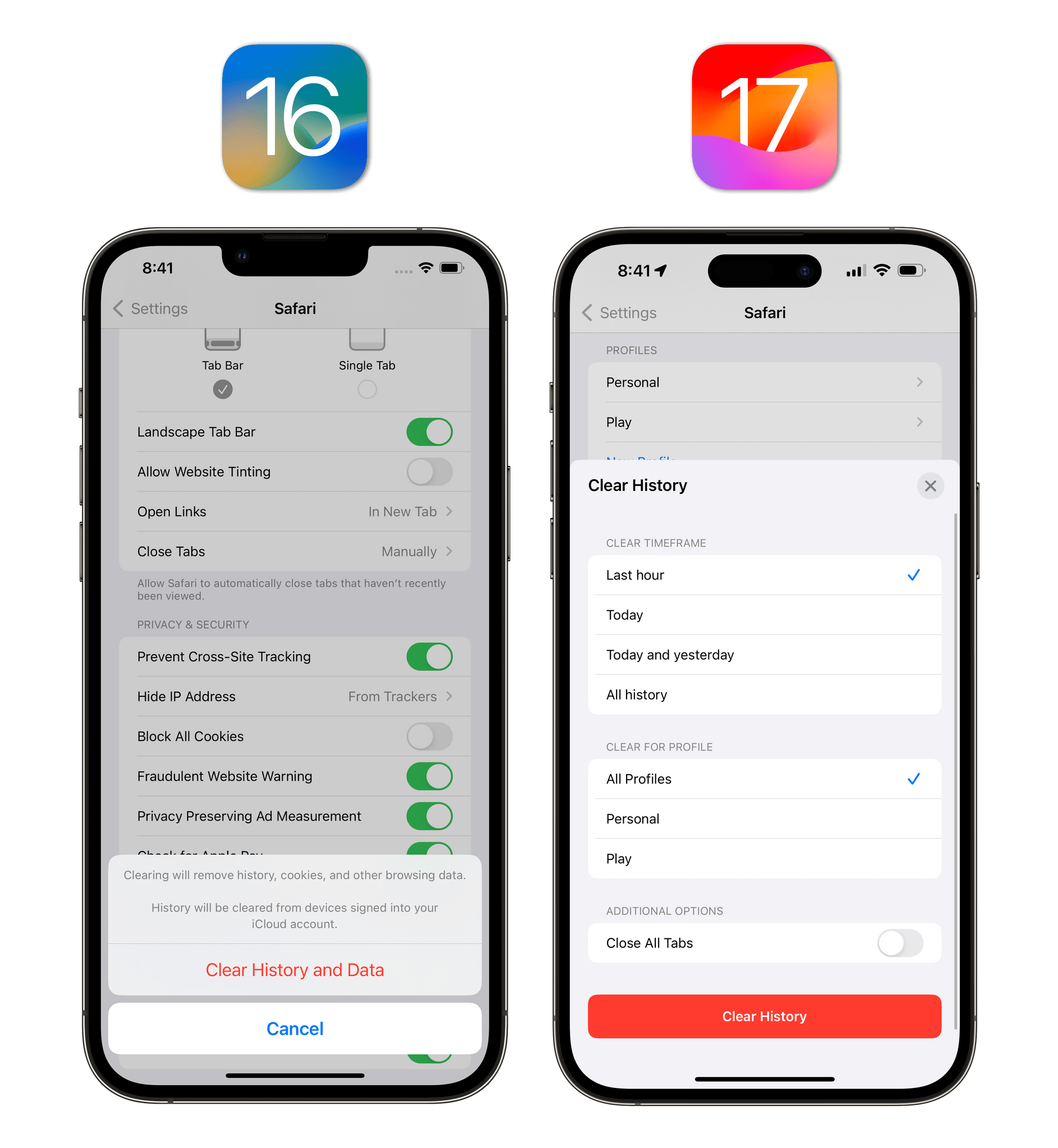
As you can see, you now have a “clear timeframe” to choose from, you can opt to clear data for specific profiles only, and you can optionally close all tabs. I like this increased granularity.
New tab view mode for groups and private mode. A notable UI change in Safari for iOS 17 is that you no longer have to switch between regular browsing, tab groups, and private mode by opening a menu: you can simply swipe between these areas from the redesigned bottom toolbar of the tab overview page.
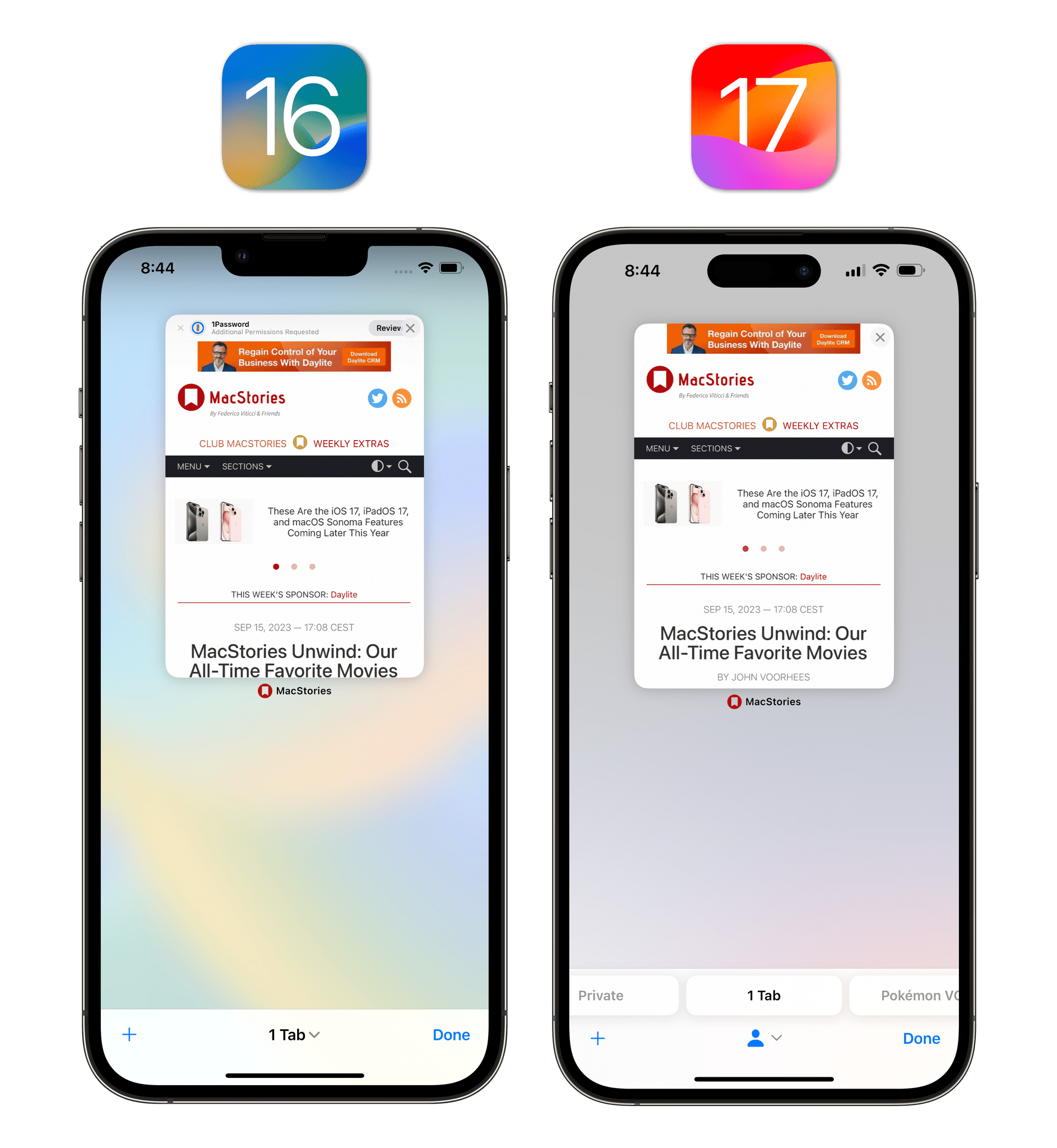
This is one of those design changes that instantly make sense: you already switch between individual tabs by swiping, so why not use the same gesture to move between groups of tabs and browsing modes? Switching between groups this way seems so natural after three months of iOS 17 betas, going back to the iOS 16 switcher feels archaic.
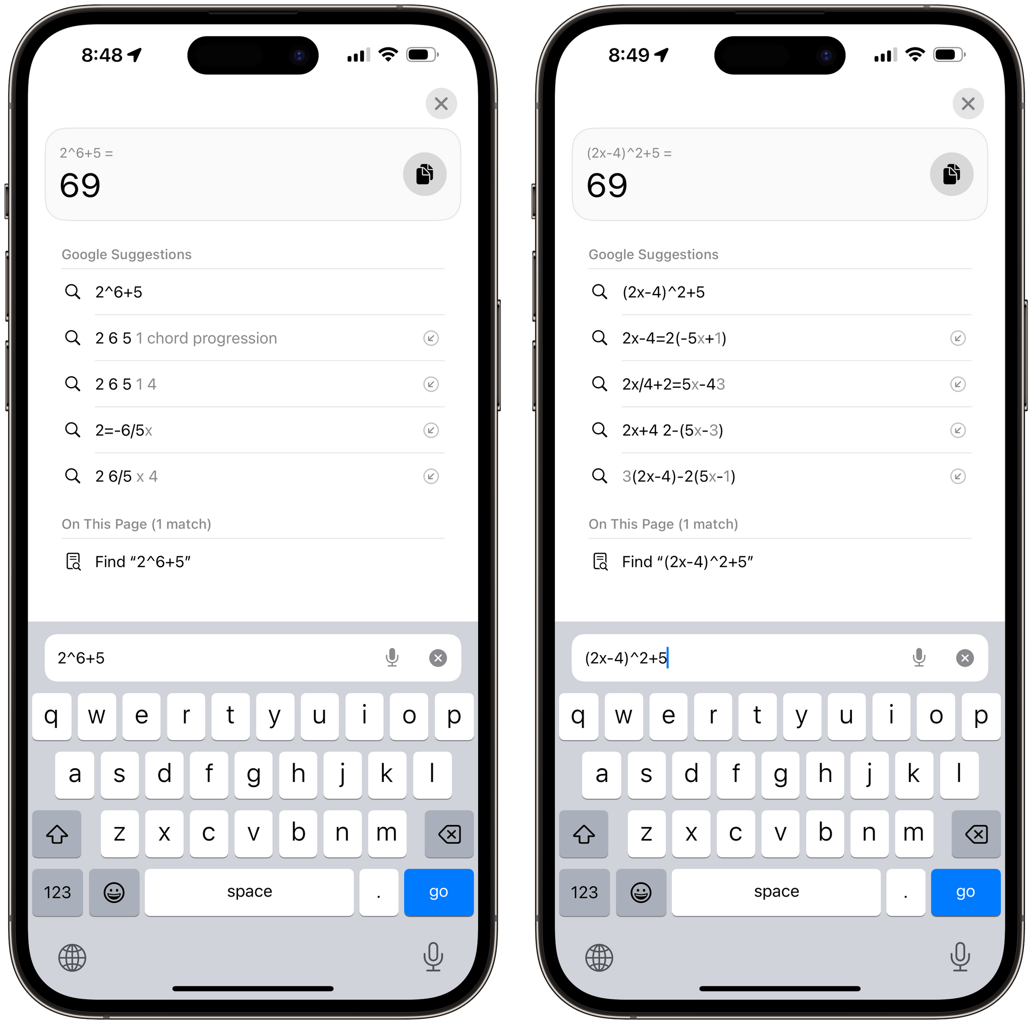
Perform calculations in Safari’s address bar. If you type a simple calculation in Safari’s address bar, you’ll get a special preview snippet with the result of the expression. You can tap it to search for the same calculation on Google (which will also give you a result, plus a calculator UI), but Safari also embeds a clipboard button to quickly copy the result and paste it elsewhere.
Messages
Free of gatekeeping accusations from the European Union (for now), Apple is doubling-down on iMessage and the Messages app this year with interface updates that match well-known WhatsApp interactions, a much improved voice message experience and, more importantly, an entirely reimagined app picker that embraces custom stickers created from photos.
Updated UI
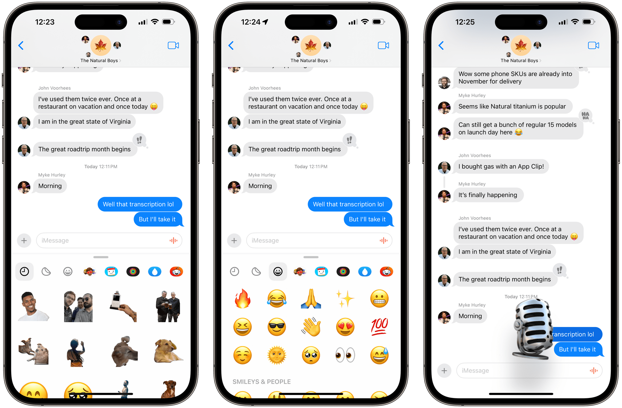
Coming from iOS 16, the first thing you’ll likely notice in an iMessage conversation is the vastly simplified compose area at the bottom of the screen. Gone are the dedicated apps and camera buttons displayed above a drawer of app icons; instead, iOS 17 only shows a compose field that contains a microphone button for dictation/icon for voice messages, plus a single ‘+’ button.
Tap it, and you’ll see the brand new app picker that contains all the core integrations of iMessage.
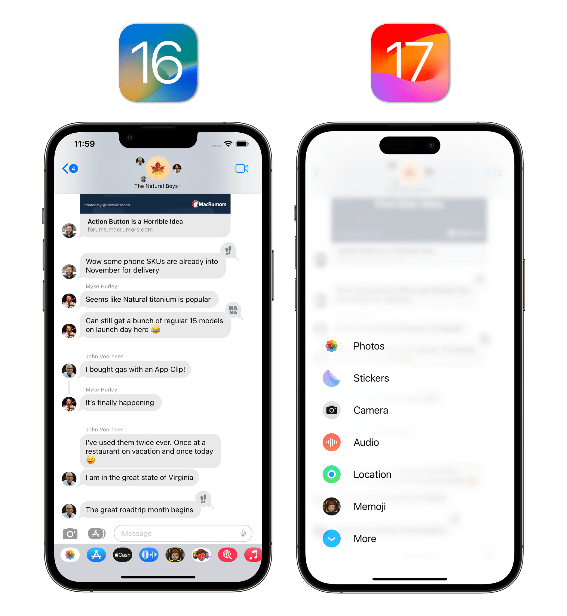
I know, I know: the animation, size, and icons of this app picker are totally unlike any other UI element made by Apple. I mean, look at the thing’s sheer size on an iPad:
I understand the concerns regarding this UI element’s inconsistency, but, at the same time, isn’t iMessage also the very service that sets iPhone apart from the competition and the reason why Apple cares so much about keeping it locked to their ecosystem? If you ask me, not only does the new app picker look fun and polished, but it’s also the right thing to do to make it look so different from everything else.
Looks aside, what ultimately matters is the app experience, and the new Messages app delivers on this front with some reasonable and practical upgrades.
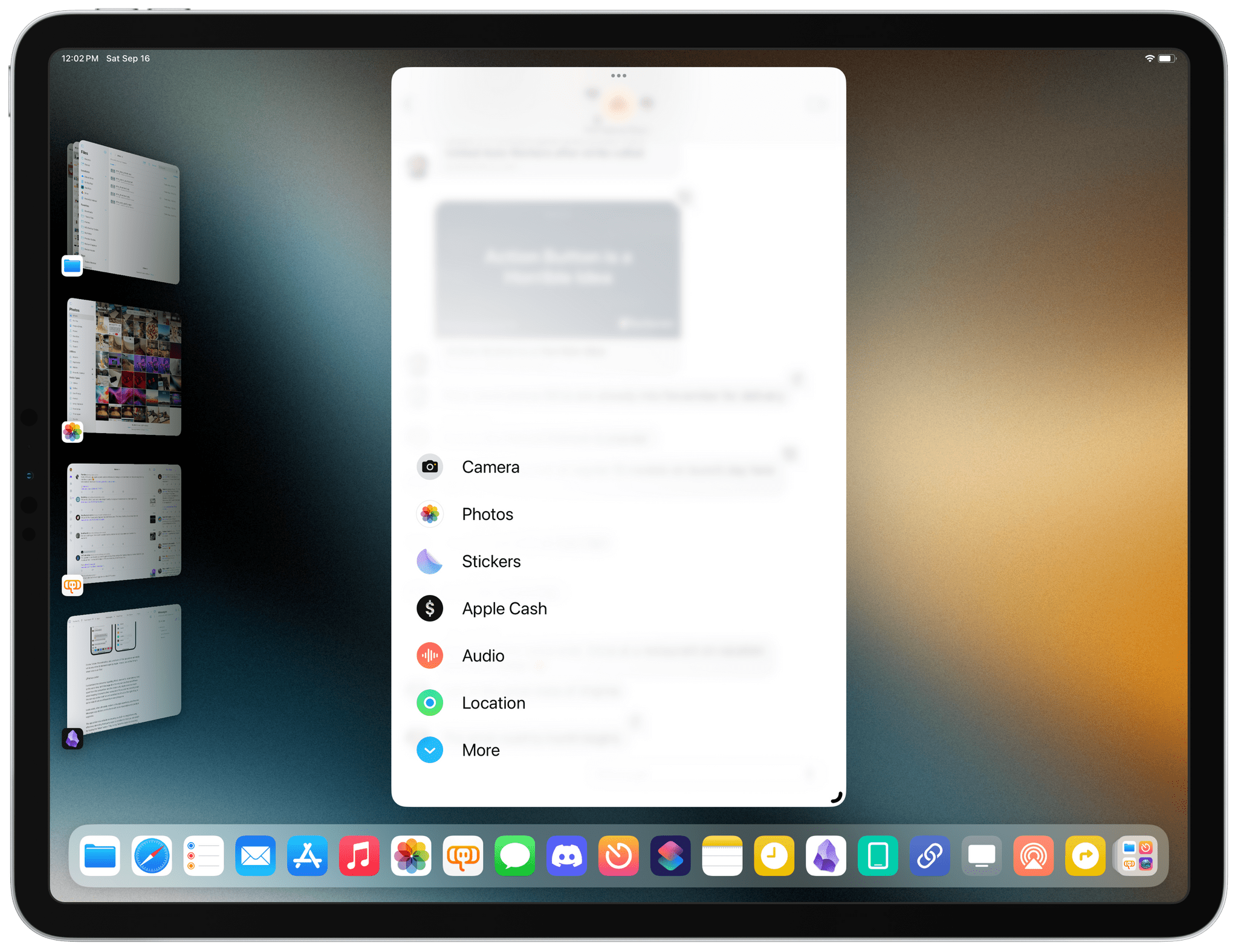
The app picker now defaults to showing you built-in integrations only, effectively demoting third-party apps to a hidden list that you can reveal by tapping the ‘More’ button. This, to me, feels like Apple is accepting the reality that third-party iMessage apps and games largely failed. If you want, you can take an iMessage app from the secondary screen and pin it to the first page: just drag and drop it where you want it, and it’ll sit there alongside the other default apps. For instance, I had to do this with the Music and Memoji apps, which ended up on the second page after updating to iOS 17.
You can long-press apps in the iMessage app drawer to reorder them with drag and drop, which is what I’m doing with the Stickers app (left). Who’s going to pin Digital Touch to their first iMessage app drawer screen?
It’s not just that Apple is hiding third-party apps by default: iOS 17 also gives you a way to hide iMessage apps without having to delete their associated main app. To do this, go to Settings ⇾ Messages ⇾ iMessage Apps, and turn off the ones you never want to see in the app drawer again. In case you’re wondering: no, you can’t forever turn off the iMessage App Store, the #images app, or Digital Touch. Someone at Apple is still sending unprompted heartbeats to other people, I guess.20
Now, you may be wondering: but what about sending images, which is the thing we do the most on iMessage? The app drawer has a hidden trick up its sleeve: long-press the ‘+’ button, and you’ll open the photo picker directly, without having to select the ‘Photos’ app first.
Besides the Check-In app, which we covered in a standalone article on MacStories, the other new integration of iMessage in iOS 17 is the ability to share your location or request another person’s.21 Just like in WhatsApp, you can either share a static pin to your current location as a Maps link, or you can share your live location indefinitely, until the end of day, or just for one hour. I do this all the time with my friends on WhatsApp, and because they’re on WhatsApp, I’ll never get to use this iMessage feature in real life; still, I’m glad Apple added it.

The Messages team also took inspiration from Meta’s work on WhatsApp with the new quick reply gesture: swipe right on a message in the transcript to reveal a reply icon; let go of the swipe, and you’ll start typing a direct reply to the message. This feature feels like a 1:1 copy of the same WhatsApp behavior, and I’m glad Apple took “inspiration” from it because now I have one consistent interaction across iMessage and WhatsApp to reply to something. This gesture is much faster than having to long-press a message to start a reply.
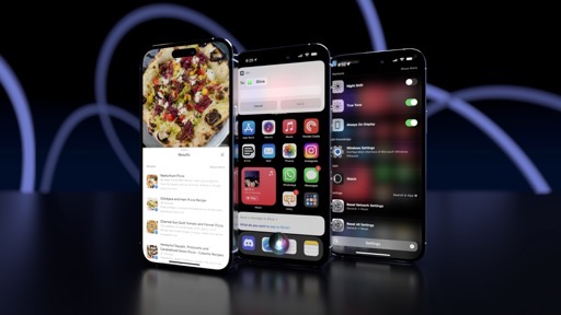
Lastly, I love the new search experience for iMessage in iOS 17. Based on Apple’s previous work for the Photos and Files apps, search in iMessage now supports filters for people, keywords, and content types such as links, photos, and locations. You can combine these filters in a single search query to narrow down results to exactly what you’re looking for, such as all the photos you shared in the group family thread, or links you sent to a coworker.
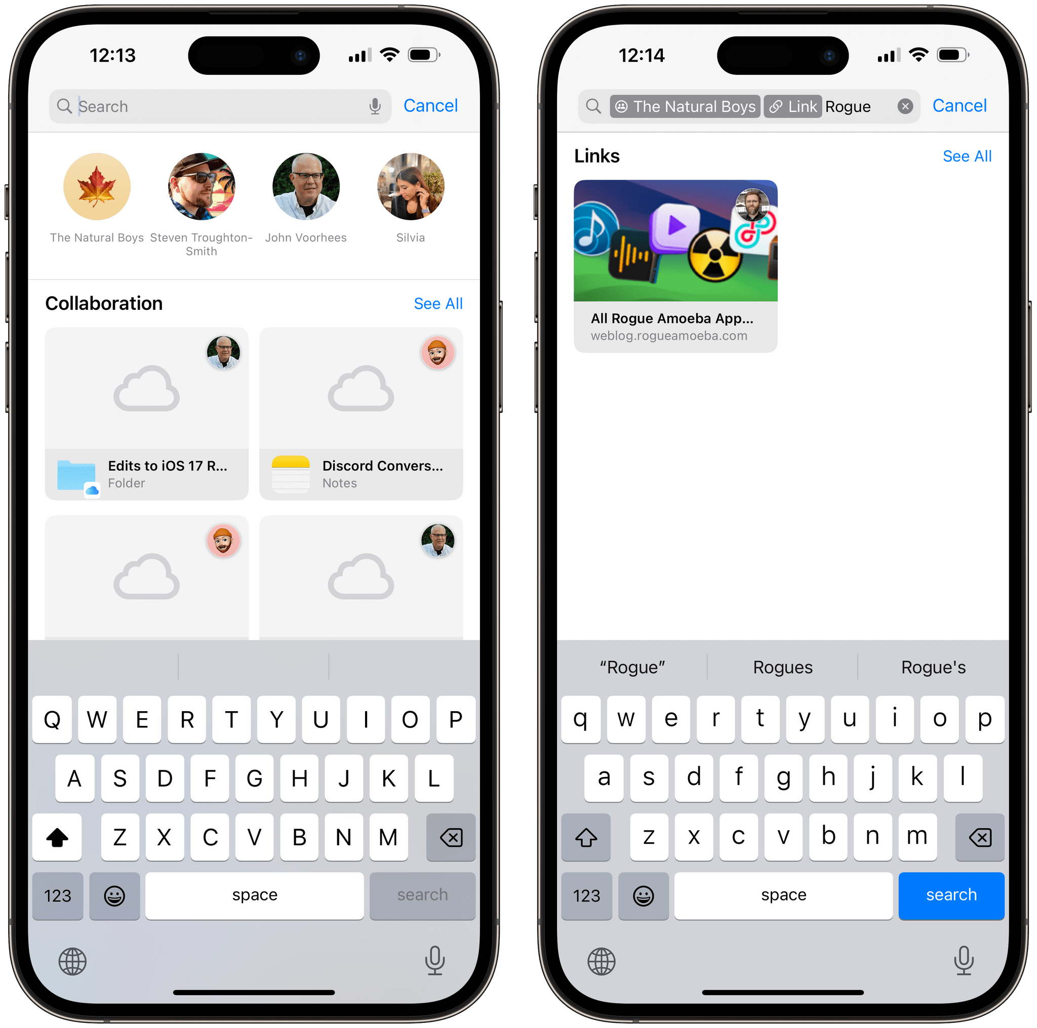
This search UI is well done, and I’d love to see more from Apple here. For example, I would like native filters for dates and documents sent to other people too.
Voice Messages
I love the new voice message experience in iOS 17, and I’m bummed at the same time because I’ll never get to use it since Americans aren’t into leaving voice messages and my Italian friends are all on WhatsApp. With some relatively simple additions, Apple has managed to build the best voice message experience around, and I continue to hope this asynchronous communication system will eventually catch on globally.
The recording UI has been redesigned and it’s a masterclass in packing tons of intuitive interactions and features into a very small interface element. I’m not kidding when I say that how recording voice messages works is some of Apple’s best UX work in years. You still tap and hold to start recording a voice message: as you long-press, the compose field grows taller, plays some haptic feedback, and turns into a real-time waveform. Here’s the great first change of iOS 17: you can stop a recording without losing the audio you’ve recorded so far.
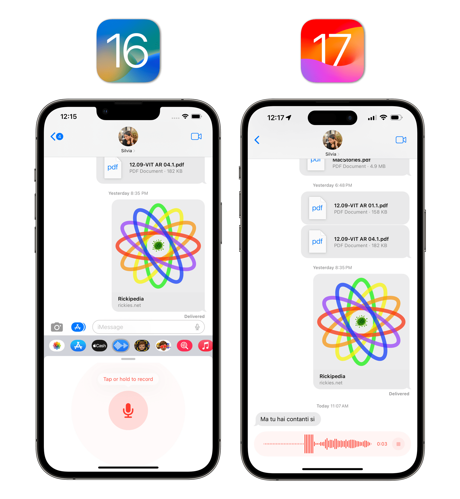
The ability to stop a recording unlocks two more features: you can listen back to what you’ve recorded before sending, and you can add more audio to the same recording. To listen, hit the play button; as the audio plays, you can even scrub through the audio with a delightful animation that reminds me of the old audio scrubber in the Castro podcast client from many years ago. The genius part is the plus button at the end of the waveform: pressing this lets you record more audio without losing the previous segment, which is a fantastic way to send long voice messages in multiple “sessions” if you’re doing something else in the meantime.
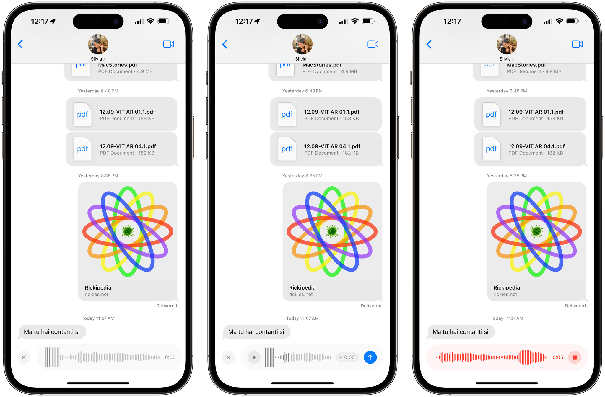
From a sender’s perspective, I find these interactions much easier and more polished than WhatsApp’s, but there’s more. When you receive a voice message, you now have the ability to play it back at 2x (something else that I do all the time on WhatsApp, although I would have preferred to see a 1.5x option in Messages too), save the audio message to the Voice Memos app, and even view an inline transcription of the voice message.
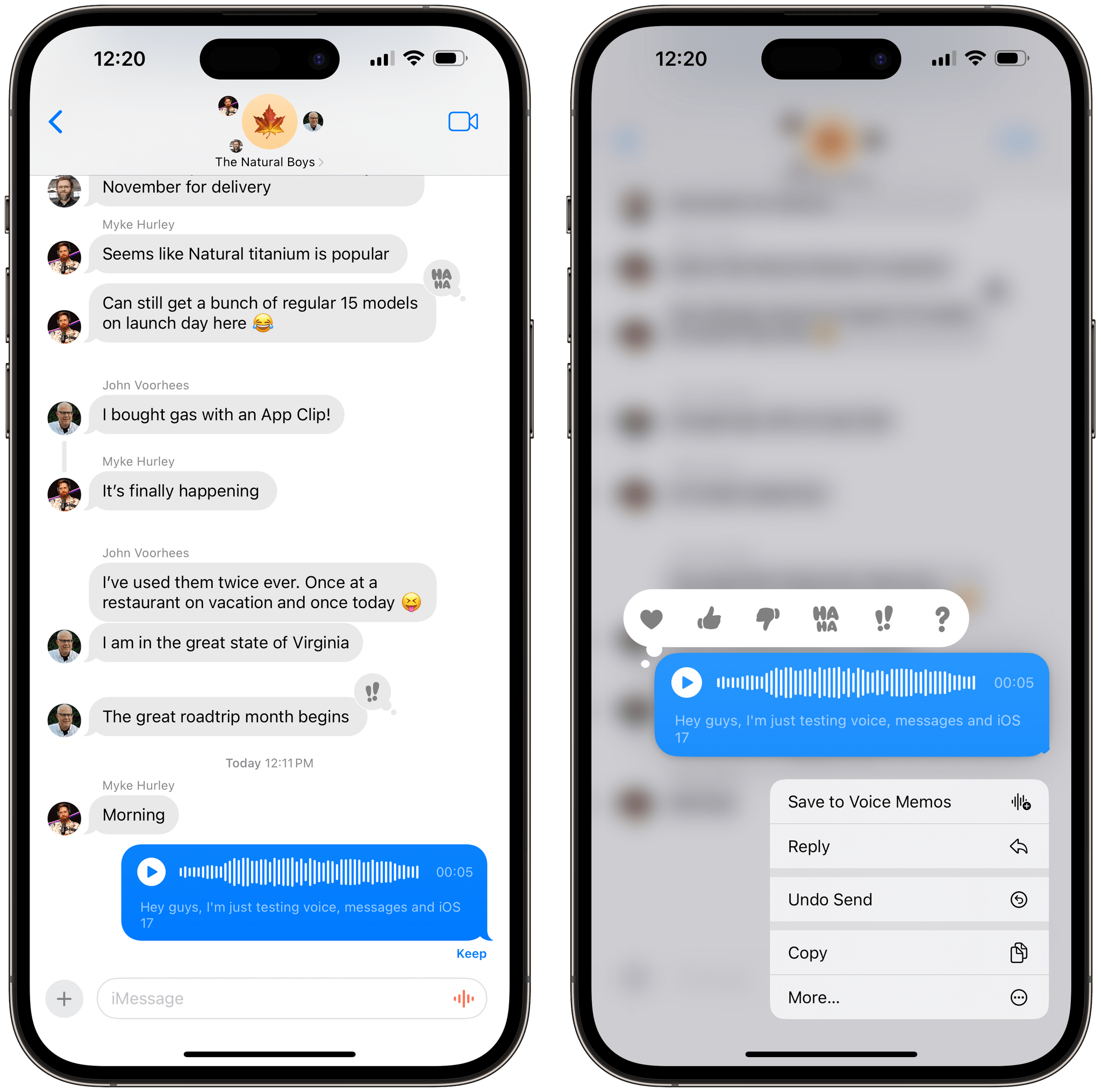
The ability to read a transcription of a voice message is useful if you can’t listen to it right away, and it’s something Apple can deliver thanks to on-device, private processing of a voice message’s contents. In my tests, I noticed that transcription only worked in English, and it showed up almost immediately as soon as I sent a voice message.
Stickers
It’d be easy to say that Apple Sherlocked the Sticker Drop app in iOS 17, and while that’s true, Apple has also gone far beyond the popular third-party app with its take on creating custom stickers out of photos. With iOS 17, Apple is turning stickers into system-wide decorations that are supported in Messages, Markup, and even the keyboard.
At a surface level, the idea is simple enough: just like we all speculated last year, the feature of the Photos app that lets you lift a subject from an image can now be used to make stickers out of objects, pets, and people. The only difference is that I didn’t imagine the lengths Apple would go to integrate this functionality with Photos and other parts of iOS.
First of all, there’s a redesigned sticker drawer in the Messages app organized in three main sections: your custom stickers created from images; emoji stickers, which are new this year; and sticker apps, which are still supported but semi-hidden down the list of options in the drawer, just like the third-party iMessage apps I mentioned above. Before I get into custom sticker creation, I should point out that emoji stickers are lovely and I find sending giant emoji faces as emoji very funny sometimes. My only criticism is that the emoji panel in the sticker drawer should have a search field like the emoji keyboard.
If you want to create a custom sticker, all you need to do is press the ‘+’ button and look for whatever you want in a photo picker that supports filters, search, and albums. Whether it’s a Live Photo of your dogs, a picture of a delicious pizza, your kid making a funny expression, or any other subject, you can select a picture, wait a few seconds, and iOS will isolate the main subject from the background. This is especially impressive with Live Photos, which play in full-screen and switch to a background-free animation as soon as iOS 17 is done processing the subject. Tap ‘Add Sticker’ and voila: you just created a custom sticker from a picture in your library.

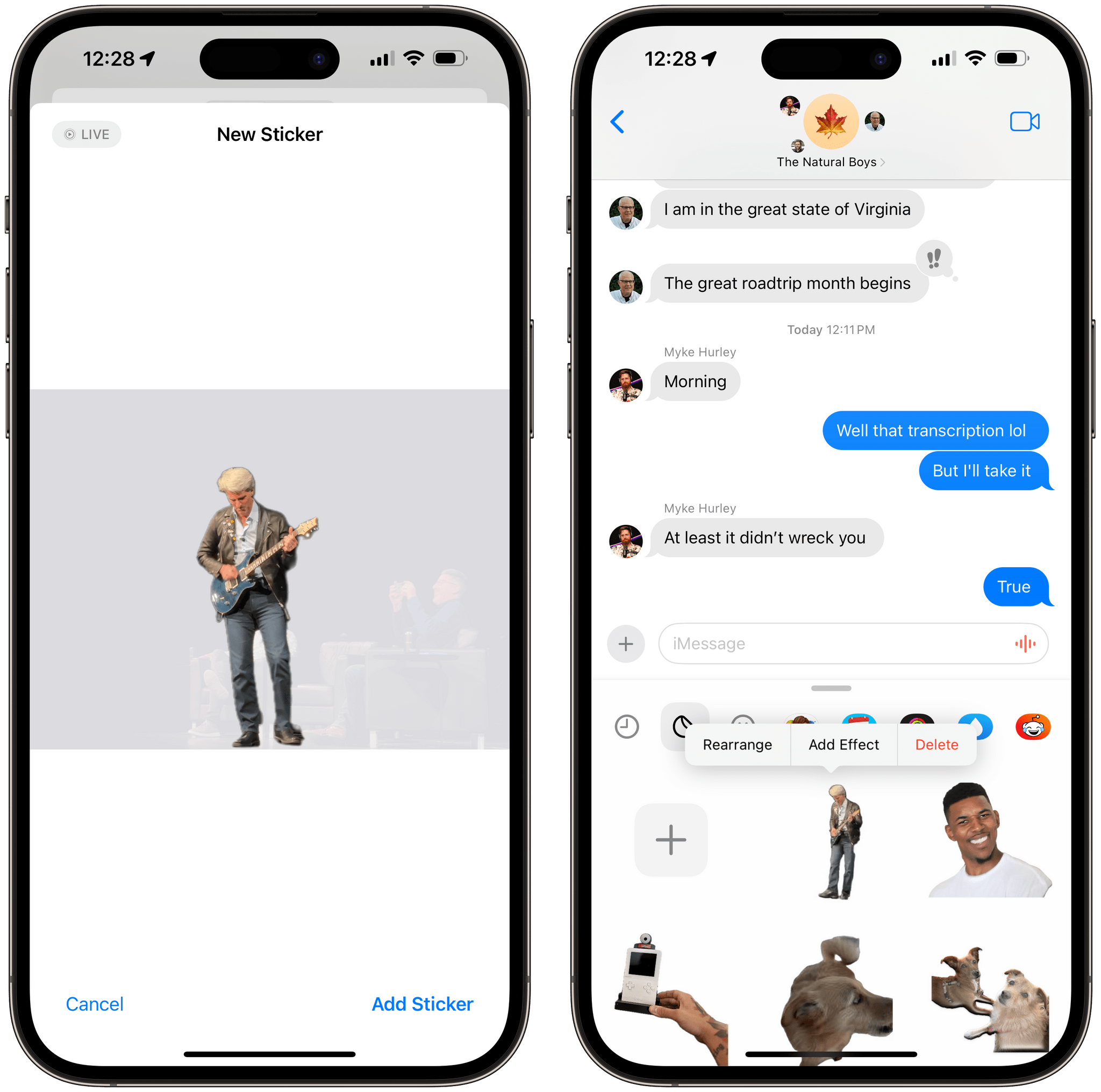
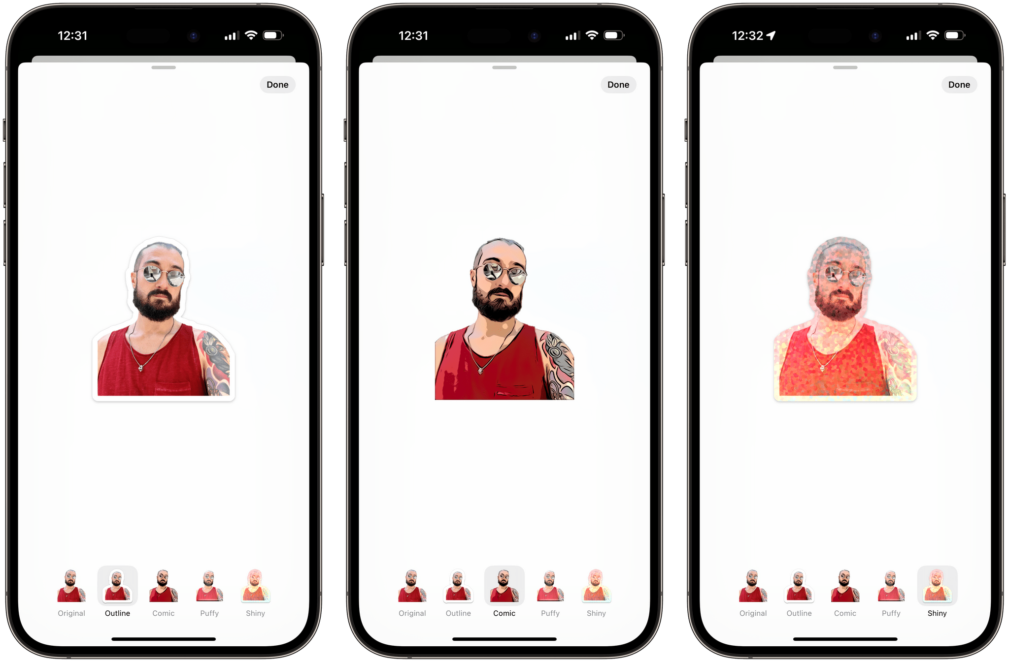
As you can guess, what’s remarkable about Apple’s implementation is that they’ve relied on machine learning to launch animated stickers that anybody can create without messing with animations, GIFs, or any other file format. You just pick a Live Photo and you’ve got a live sticker that you can peel and attach to a message in less than 10 seconds. And there’s more: if you long-press a custom sticker, you can even add outline, comic, puffy, and shiny effects to it. Adding an effect to a live sticker will turn it into a static one; the last two (puffy and shiny) use your iPhone’s gyroscope to animate the lighting effect on the selected sticker.
Now, I would have been perfectly content with Apple shipping this brand new Stickers app in iMessage and calling it a day. But for some reason, the company decided they wanted to go the extra mile…for stickers and turn them into a system-wide enhancement that you can access from all sorts of places.
Let’s start with the Photos app. When you lift a subject from a picture, you’ll find a new ‘Add Sticker’ button that lets you create a sticker from the context of the image itself. If multiple subjects are recognized, you can select them all. Press the button, and the sticker will immediately fly into the consolidated sticker drawer.
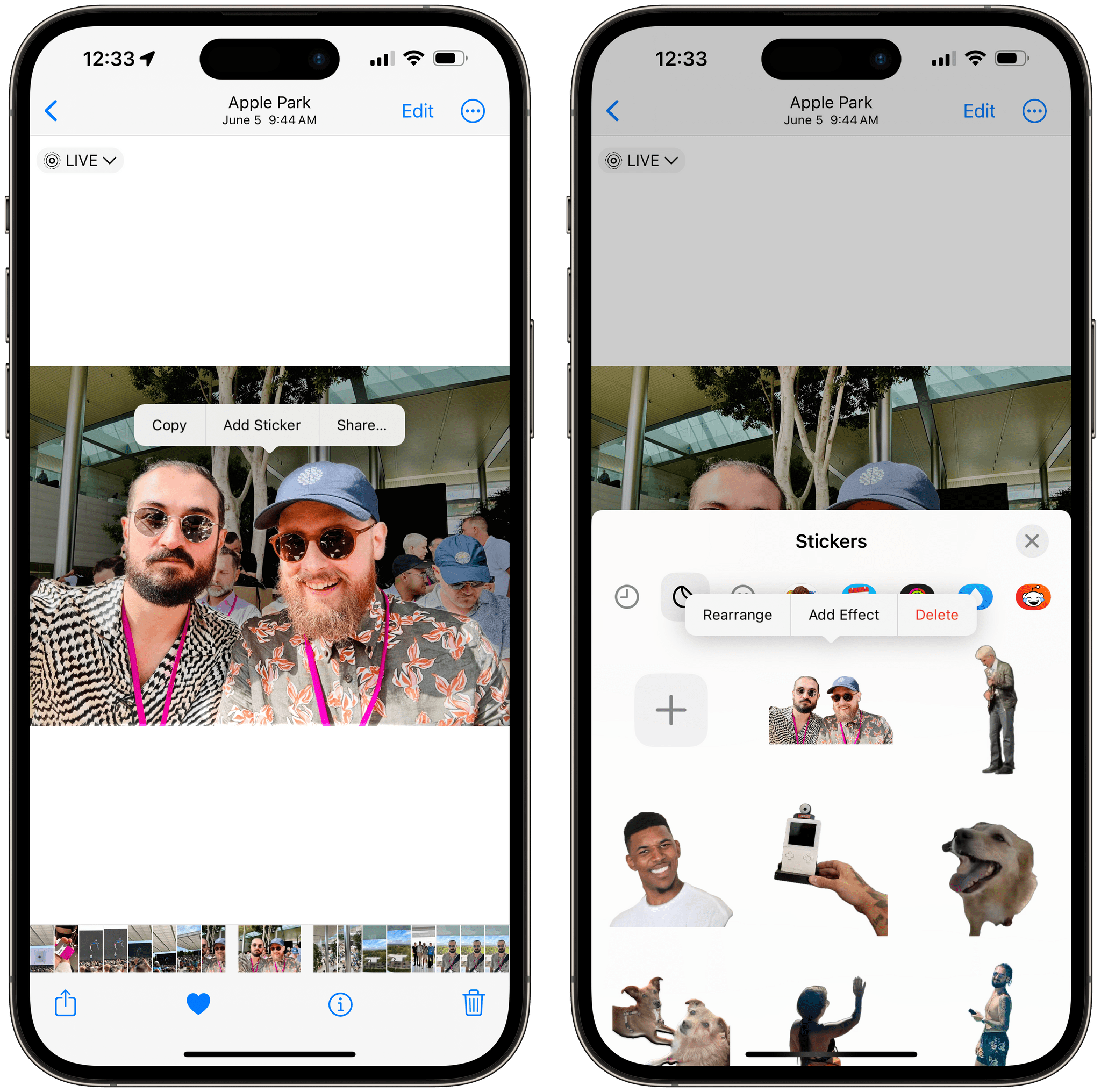
But let’s say you’ve come across just the right image that was shared in an iMessage group thread and think, “you know, I bet this picture of Eddy Cue and Tim Cook at Oktoberfest would make for a perfect sticker”. In any Quick Look preview on iOS and iPadOS 17, you can select a subject of any photo, click ‘Add Sticker’, and you can give an old meme a new life as a sticker that will live on forever.

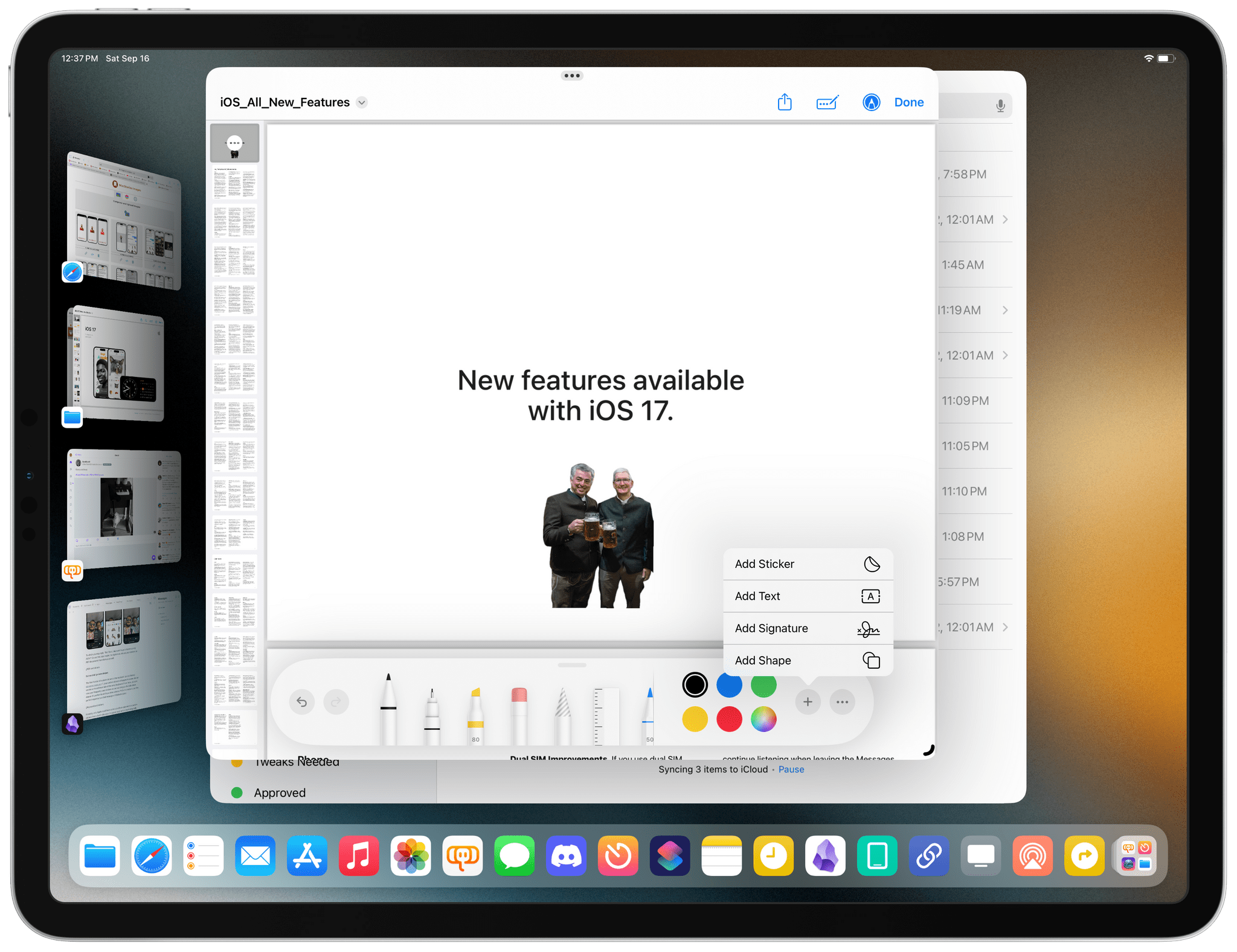
Let’s go deeper. Let’s say you’ve assembled a collection of useful stickers that you want to use to enhance existing images. Well, the native Markup image editing UI of iOS and iPadOS now supports the sticker drawer as well, which means you can attach any sticker you want to any image without using any third-party app.
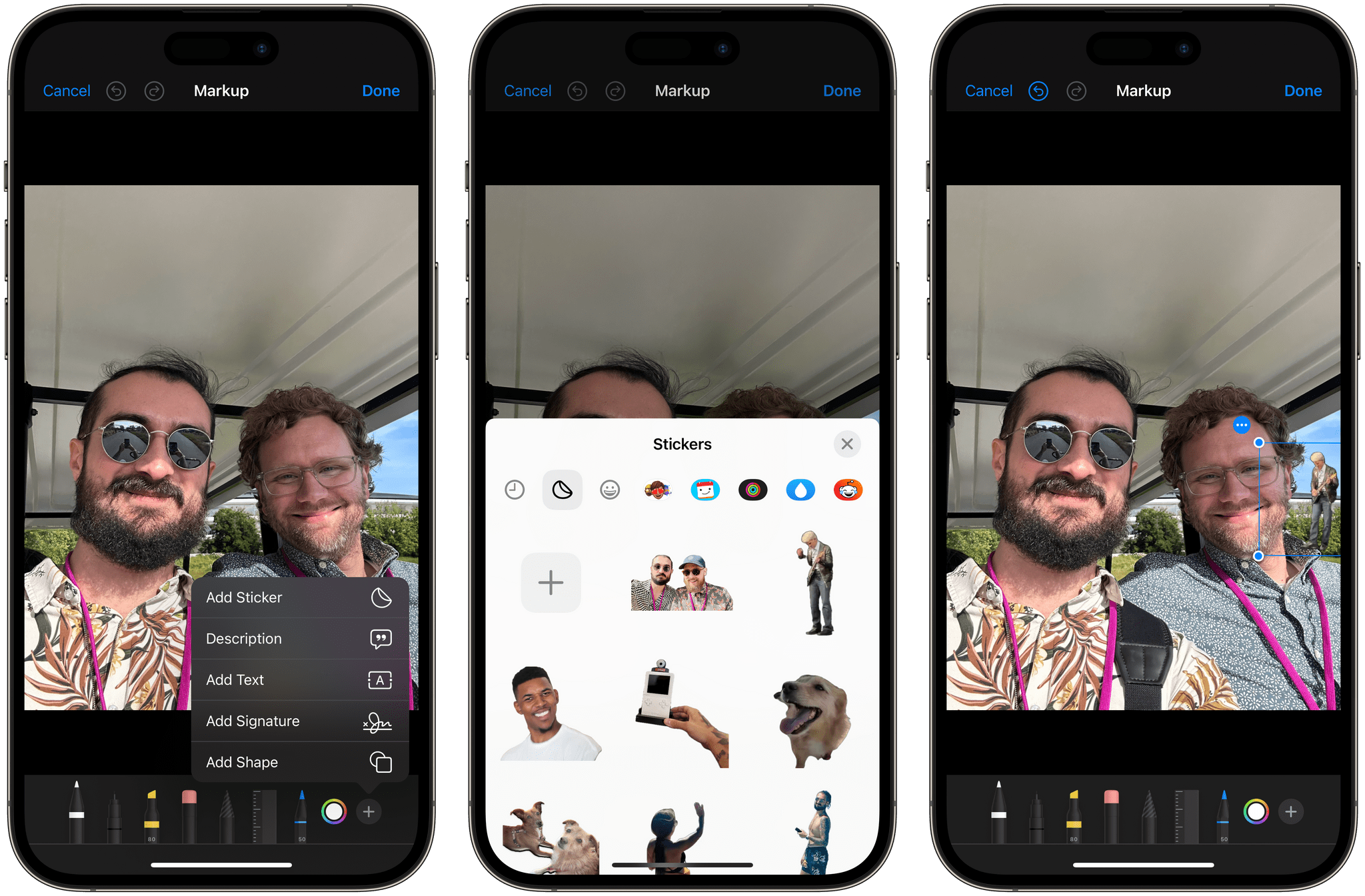
To which you may reply: “But Ticci, I also want to put stickers on my PDFs!”. Do not fret, dear reader, for Apple now lets you put stickers on PDF documents from Markup as well:
But we shall go even deeper.
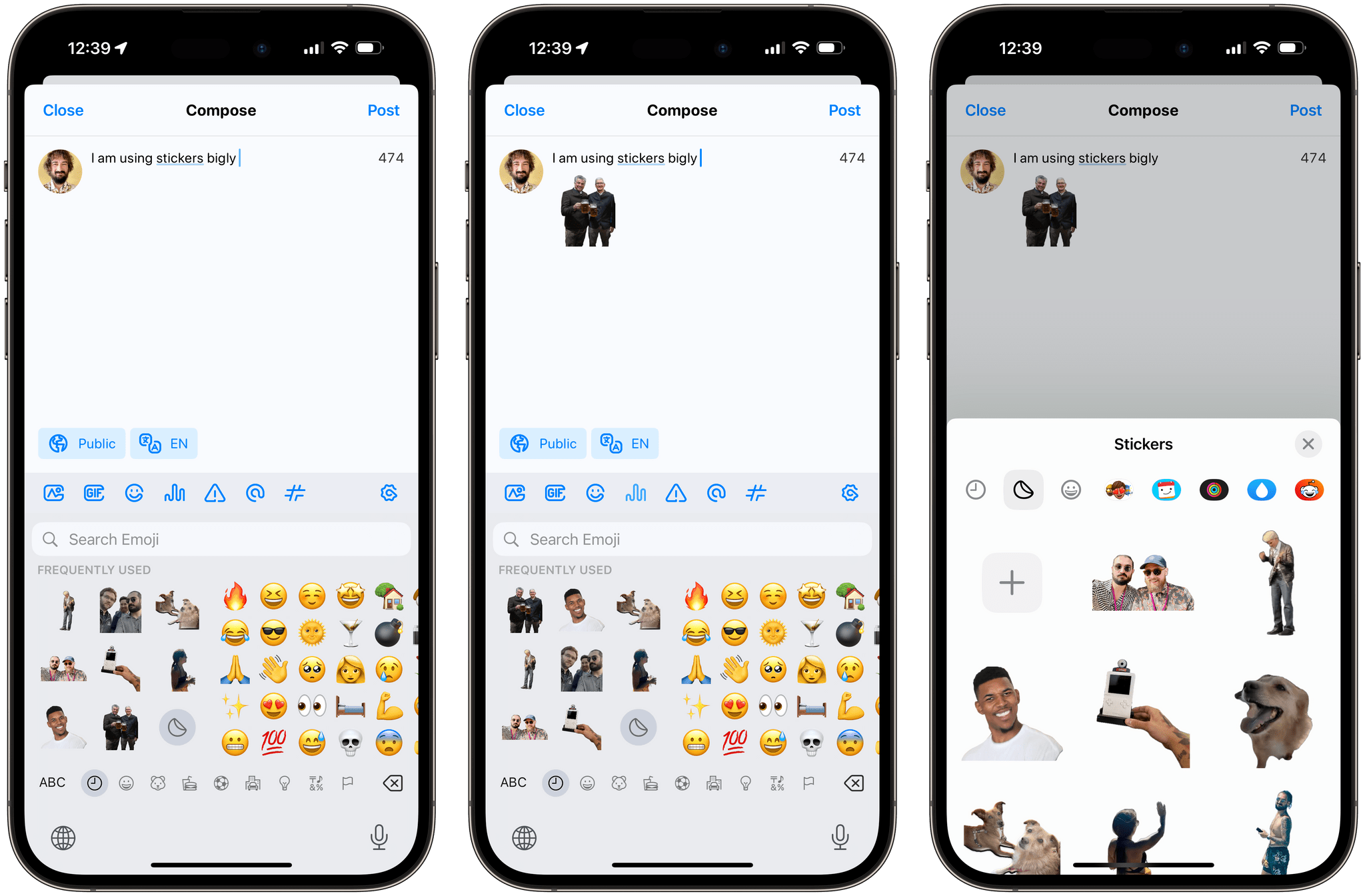
The final frontier of custom stickers is the keyboard: just as Memoji pioneered years ago, your custom stickers will appear in a new sticker section at the leftmost side of the emoji keyboard. From here, you can view your frequently used stickers as well as bring up the full sticker drawer. It’s perfect for all those times when a PNG of a meme is just the perfect response to a Mail message or Mastodon post.
Honestly, only Apple could have come up with an approach to custom stickers that is both ridiculous (in a good way) and so technologically impressive. These are stickers, after all. But this is exactly what I love to see from Apple: very frequently, the company has a way to turn a trivial feature into a little marvel of engineering whose technology disappears behind the scenes and makes you think it’s obviously supposed to work this way. Custom stickers and the new sticker drawer are a great example of this approach and, I believe, something millions of people will spend hours playing with.
FaceTime
There are some interesting new features in the FaceTime app this year. I’m not sure I’ll remember to take advantage of them, and a couple of these additions feel like silly gimmicks in my opinion, but it’s nice to see Apple continuing their work on FaceTime across all platforms.
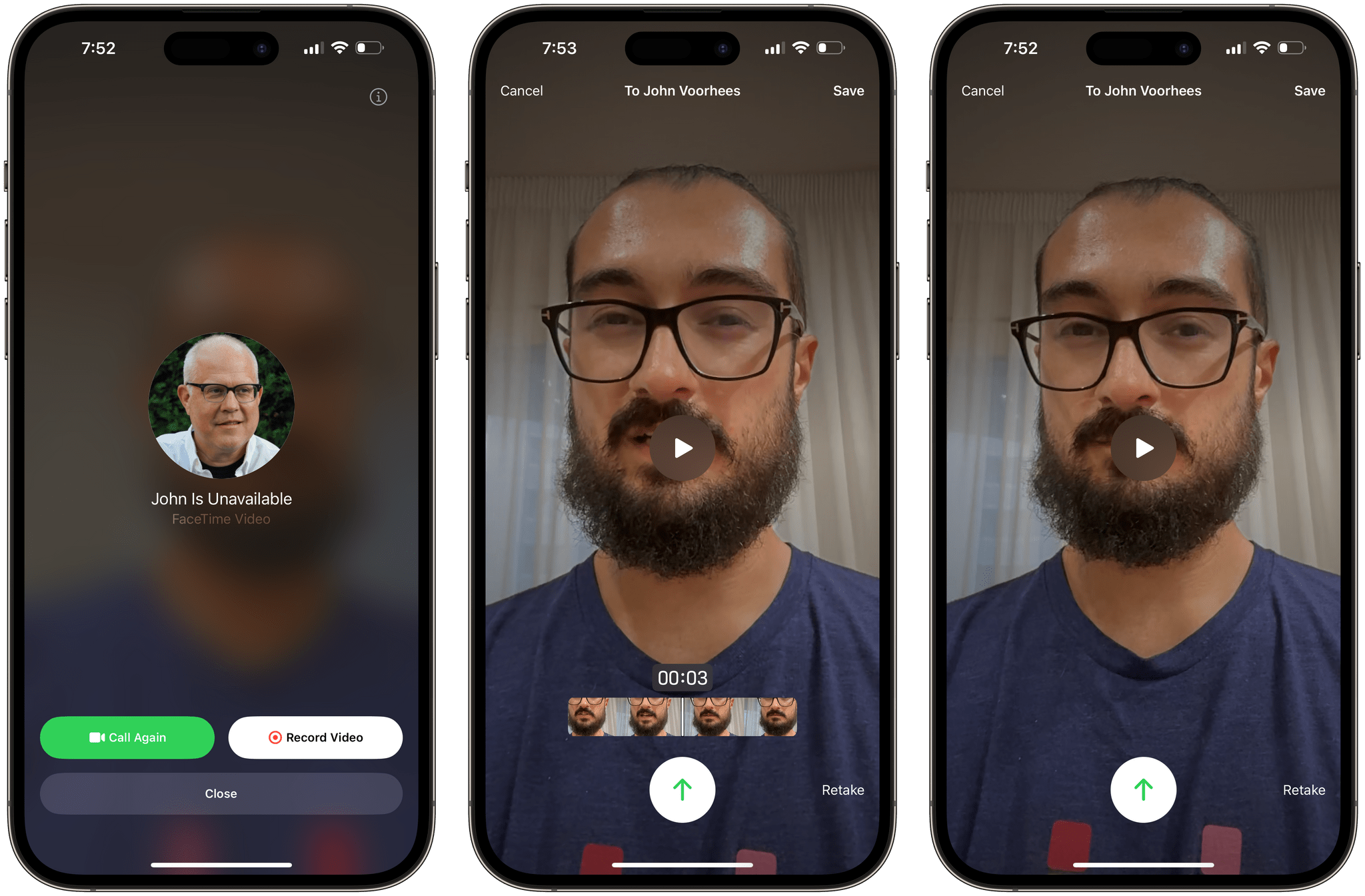
My favorite new feature for FaceTime is the ability to leave video messages if someone doesn’t pick up a call. If the person is unavailable, a new screen will come up and offer you to call them again or record a video message. Record a short video, send it, and the other person will find it in their Recents list of calls, where they can watch the message you left. I haven’t experienced this for myself, but if you have a video message waiting for you, you should also see a corresponding banner in the related iMessage conversation.
This is another of those features that I never imagined but instantly made sense the moment I tried it. It’s like a modern spin on leaving a voicemail for someone, only you do it in the context of FaceTime as you were ready to be on a video call with someone. I wonder if The Youth will use it.
Apple is also enhancing the suite of video effects for FaceTime with two new features: Studio Light (previously seen in macOS Ventura with Continuity Camera) and Reactions.
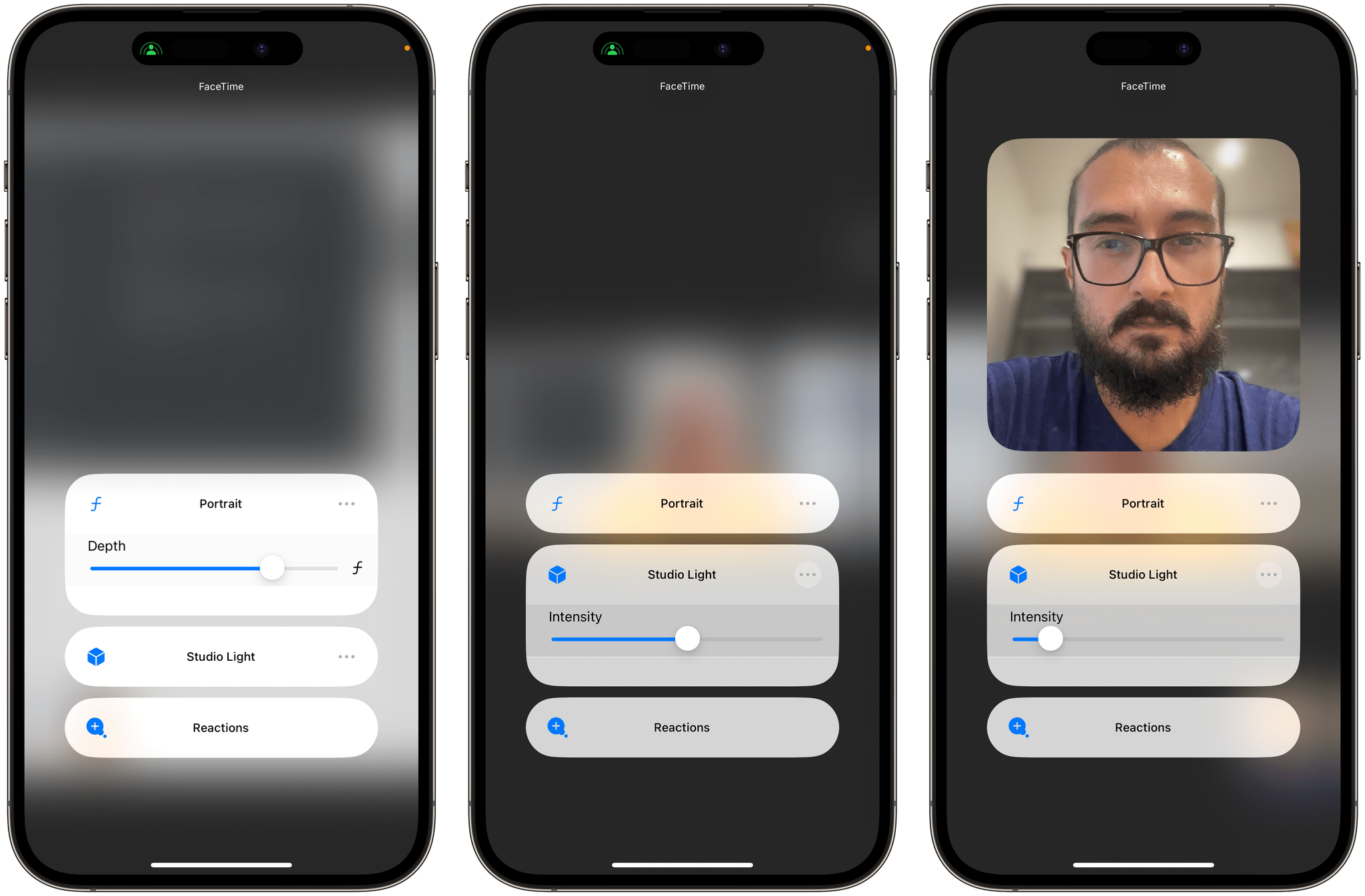
Studio Light is a known entity at this point; you’ve probably seen the effect in FaceTime for macOS before and it’s the same filter you can use when editing Portrait pictures in the Photos app. To access it while using FaceTime on iOS 17, swipe down to open Control Center, select the Studio Light tile, and you’ll be able to turn it on/off as well as tweak its intensity level. From the same Control Center tile, you can also adjust the amount of background blur when using Portrait mode for video calls.
Reactions are, in my opinion, a gimmick that is fun to try the first time, but which won’t have a practical use case beyond their novelty effect. The idea here is that FaceTime can recognize hand gestures and layer some 3D animations onscreen when a particular gesture or pose is recognized. Here’s the list of reactions and associated gestures:
- Hearts. Form two hands into a heart, and red hearts appear around your hands and body.
- Balloons. Flash the victory sign (peace sign) to display balloons around you.
- Fireworks. Give two thumbs-up, and fireworks fill the background behind you.
- Confetti. Perform double victory signs (peace signs), and confetti appears.
- Laser beams. Form your fingers into horns.
- Rain. Give two thumbs-down to turn your background into stormy rain.
- Thumbs-up and thumbs-down. Approve or disapprove with a single thumbs-up or thumbs-down.

Like I said, I think these are fun, but I don’t think reactions are something I’ll find myself actively performing on a regular basis. I’m mostly interested in the tech that made these possible and whether it’s based on Apple’s work for hand gesture recognition on visionOS (I assume it is).
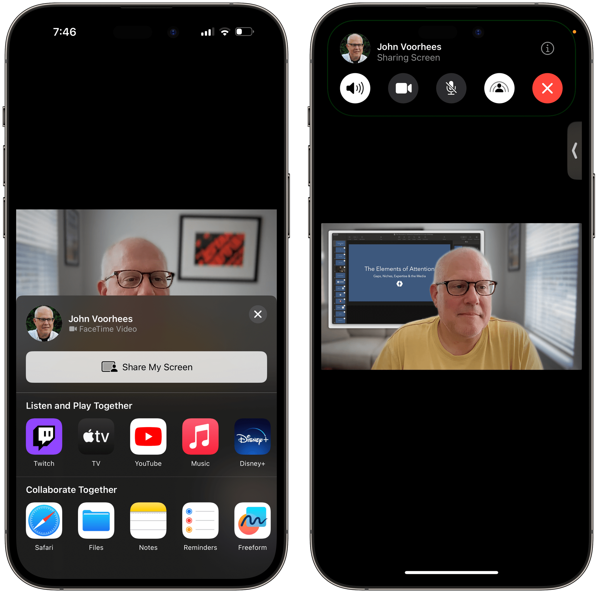
As part of the improvements to SharePlay this year, Apple redesigned the ‘Share’ menu that you can invoke while on a FaceTime call. Previously, the menu was a small popup you could scroll to find SharePlay-enabled apps and launch them; now, it’s a share sheet-like element with separate sections for ‘Listen and Play Together’ and ‘Collaborate Together’.
Earlier this summer, Apple also advertised the ability in iOS 17 to interact with Siri while on a phone or FaceTime call. In theory, others on the call should be able to hear you speak to Siri but not Siri’s response to you. Unfortunately, I haven’t been able to bring up Siri at all during a call, neither by saying ‘Siri’ nor by long-pressing the side button.
The best new feature of FaceTime, however, is support for Continuity Camera on Apple TV. But we’ll cover that separately in our future tvOS 17 review (a first on MacStories this year).