StandBy
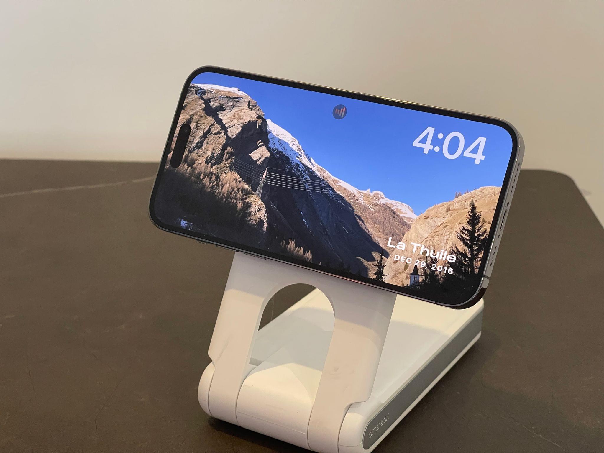
StandBy is a new full-screen experience that activates on the Lock Screen while the iPhone is charging and turned on its side. With StandBy, the iPhone’s Lock Screen transforms into an interactive, widget-based, glanceable smart speaker-like mode that, frankly, feels like a not-so-veiled prelude to a future HomePod with a screen. Speculation aside, StandBy has been one of my favorite additions to iOS 17, and it has changed how and when I charge my iPhone during the day by turning a boring activity (who was ever excited about…charging?) into something useful.
StandBy kicks in when an iPhone is charging, placed in landscape mode, and in a stationary position; don’t go around driving with the iPhone in landscape mode on a MagSafe car mount thinking that StandBy will activate, because it won’t. (Guess who tried?) If all these criteria are met, StandBy’s full-screen experience activates and lets you cycle through different pages of content including interactive widgets, your photos, and a giant clock. To move between multiple pages, you just swipe horizontally.
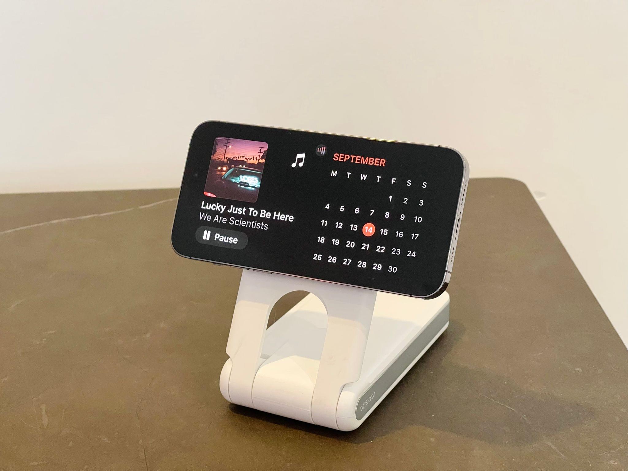
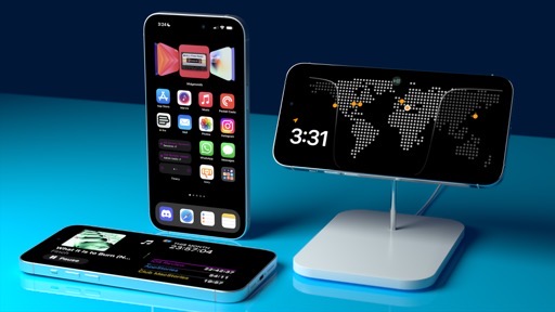
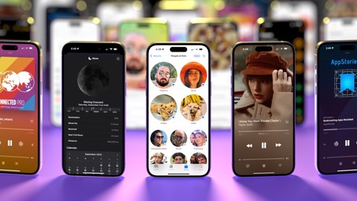
StandBy is comprised of three pages: widgets, photos, and clock. As you can imagine, the widgets page is the one I’ve been using the most because I’m in love with the idea of turning my iPhone into an interactive smart display when I’m working on the iPad Pro. StandBy widgets are built with the same technology as Home Screen ones, but they’re further optimized for legibility and contrast: they’re bigger, have monochromatic backgrounds, and only two of them can be active at the same time in two separate columns. Think of them as small Home Screen widgets in terms of style and layout, but always with a dark background and blown up to a bigger size.6

Examples of StandBy widgets. These are not Home Screen widgets; developers need to specifically add support for StandBy.
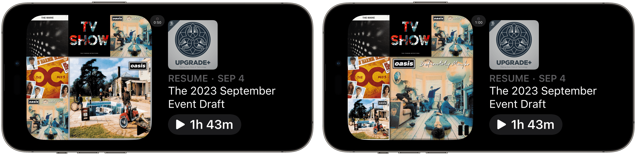
StandBy widgets are interactive; in this case, the Longplay one can start playing an album from the Lock Screen.
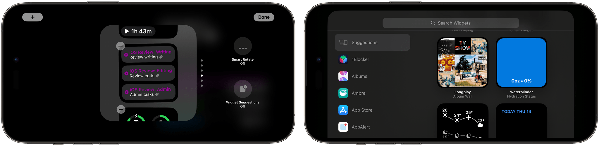
You can place multiple widgets in each column thanks to Smart Stacks, just like on the Home Screen; columns support the same widget suggestions and smart rotate options seen on the Home Screen too. Even the interface to add and manage widgets is consistent with previous versions of the widget gallery for the Home and Lock Screens. Being based on Home Screen widgets, the StandBy ones are also interactive, which means everything I wrote above applies here as well.
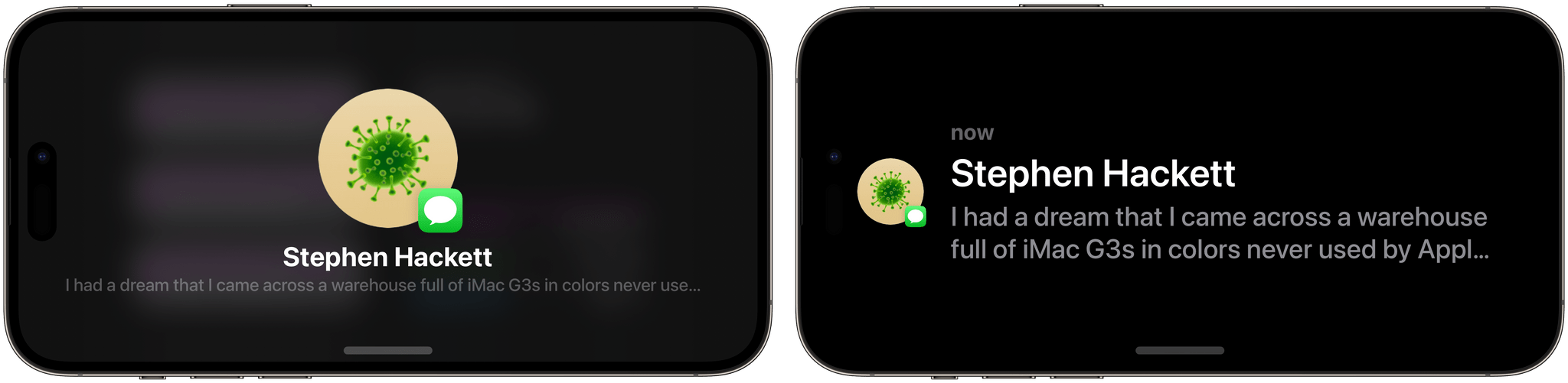
In a nice touch, if you tap on a widget that wants to open an associated app, rather than immediately leaving StandBy, iOS 17 will pop up a temporary ‘launch indicator’ that you need to press to confirm you want to leave StandBy to open an app. I like this interaction since it prevents accidental StandBy exits if you bump your iPhone and tap a widget without meaning to open an app.
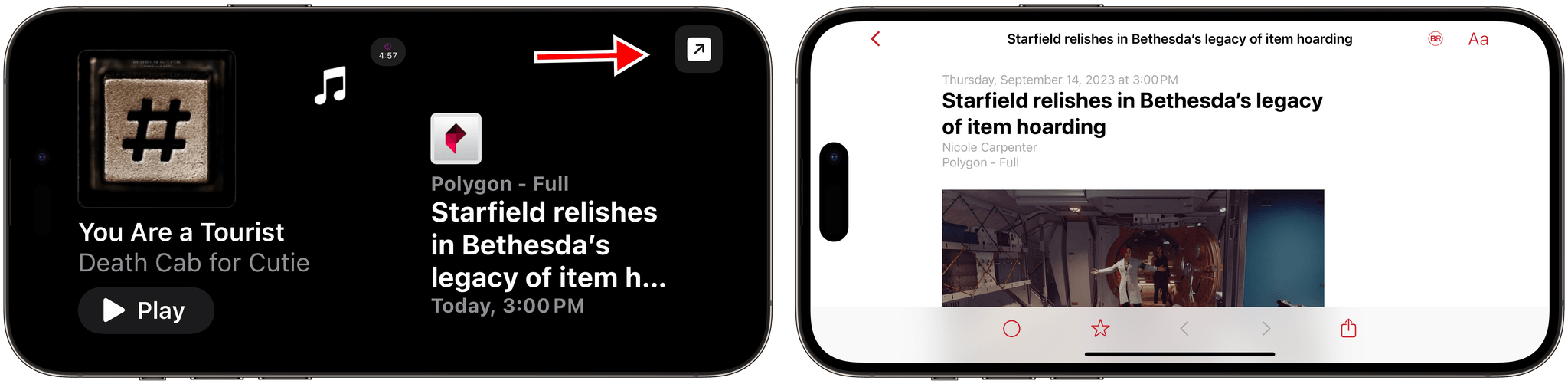
When I tap the Lire widget, StandBy displays a launch button (left); by tapping that, the Lire app launches, showing me the article I selected.
I haven’t used the Photos and Clock pages much since I prefer the glanceability and actions offered by widgets, but I also like how they can be customized. I can see why a lot of people may prefer the more passive approach of a smart display that rotates through photo albums or shows you a beautiful clock.
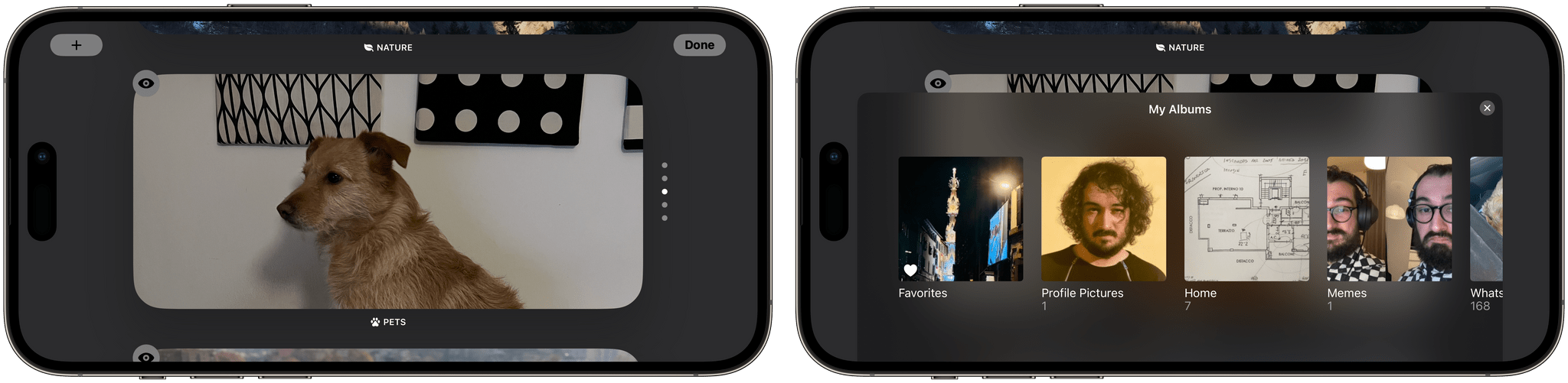
In the Photos page, iOS 17 loads some default categories (such as Featured photos, Cities, Pets, and Nature), but you can choose to load any album from your Photos library to display in StandBy, such as your favorites. You can tap on a photo to view details such as location and date taken; this overlay will also give you a button to open the original picture in the Photos app.

You can flick between different photo sets with a vertical swipe, and, like widgets on the first page, you can customize this page by long-pressing and selecting a new album with the ‘+’ button.
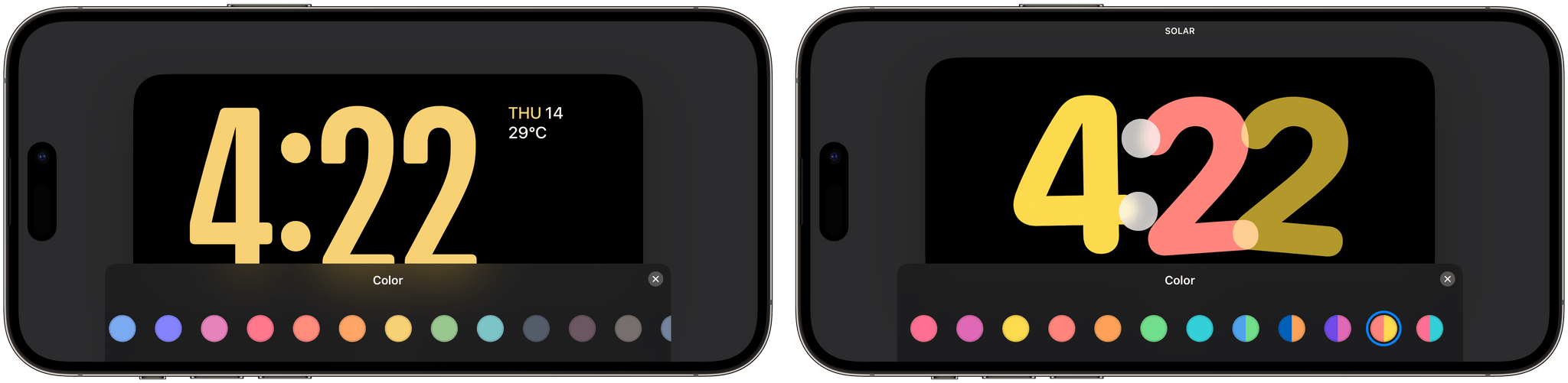
In the Clock page, you can move between five different clock styles:
- Digital
- Analog
- World
- Solar
- Float

Each of these clocks can be customized with a different color palette choosing from a combination of solid colors, gradients (for Solar), and duotone options. A detail that I love is that the Clock page will include details about your next alarm (if set in the Clock app), which serves as a nice reminder if you’re using a StandBy clock on your nightstand.
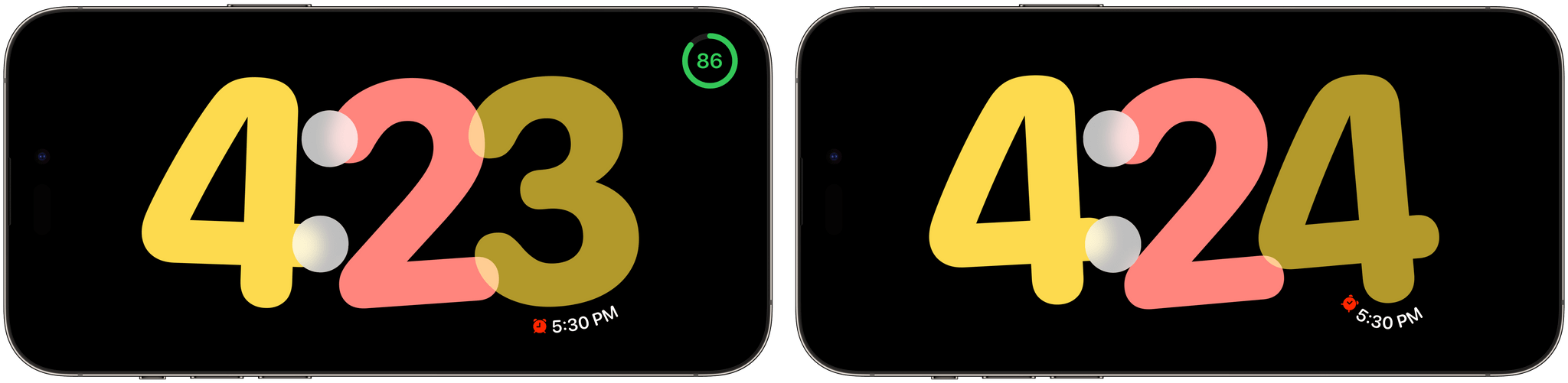
The Float clock is my favorite thanks to its large, rounded font that playfully animates in-place when the minute changes; in this page, your next alarm is placed in the bottom-right corner of the clock and follows the curvature of the number above it, with a different shape based on what number it is. This is the kind of attention to detail that I appreciate from Apple.
In Settings ⇾ StandBy, you’ll find a variety of options that control the behavior of this mode, including how it deals with notifications (more on these below) and low-light environments.
For starters, StandBy can be outright disabled if you don’t want to use it. Then, you can choose whether you want StandBy to use a night mode that shifts everything to a red tint that’s easier on the eye with low ambient lighting, which is reminiscent of a similar mode on the Apple Watch Ultra. Night mode is enabled by default, and I think it’s the right choice to make it easier to check out StandBy at night without bothering someone sleeping next to you if they’re sensitive to light sources. This is especially useful if you want StandBy to work with the iPhone’s always-on display (another setting you can disable); I’ve always left it on for the three months I’ve been using StandBy with my iPhone 14 Pro Max.
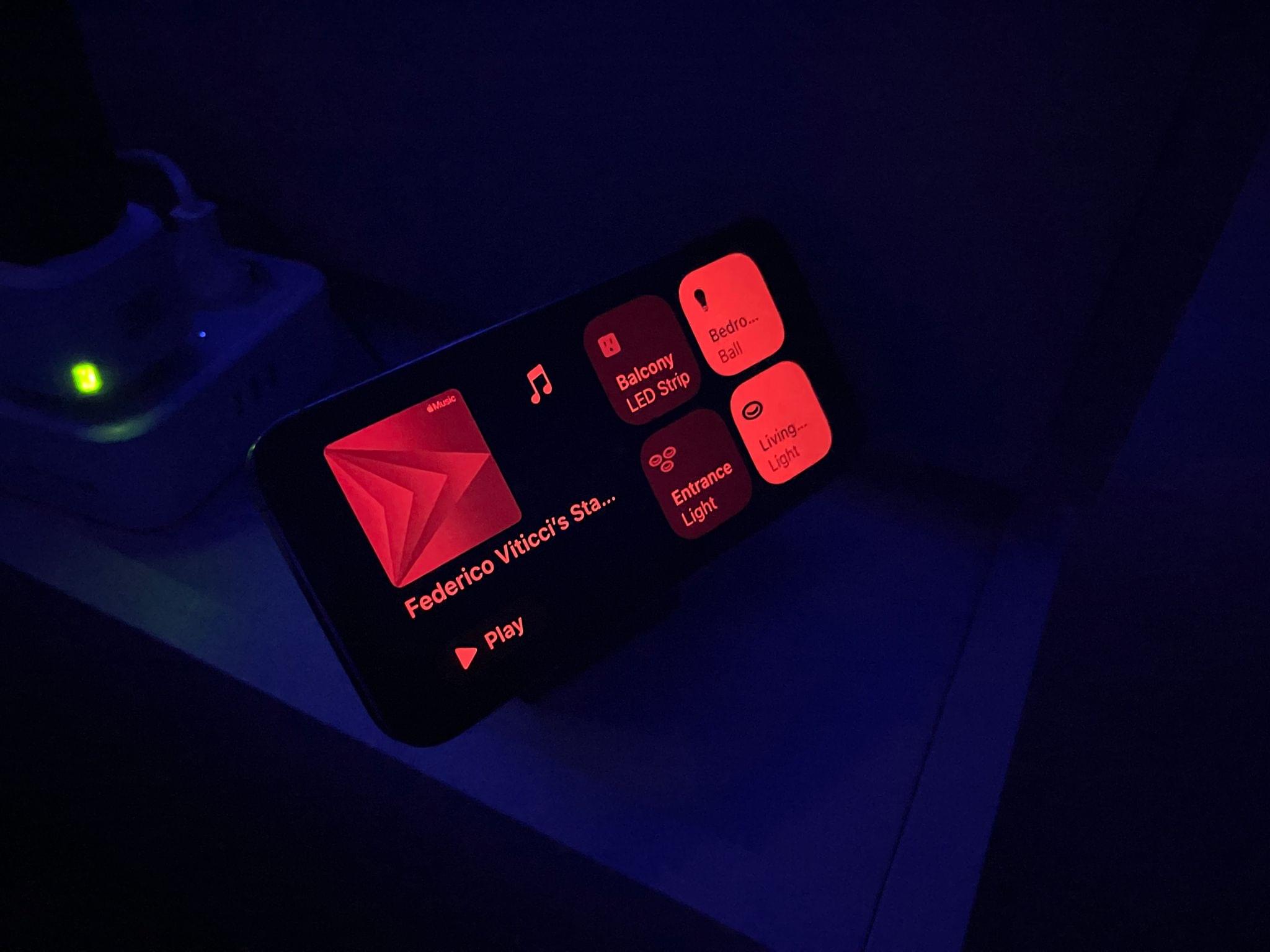
The view of my nightstand with StandBy in low-light mode. There’s a motion-to-wake setting for StandBy too.

Furthermore, you can choose to show all notifications in StandBy or opt to only receive critical alerts; like the regular Lock Screen, there’s also an option to pick whether StandBy should hide a notification’s preview until you tap on it.
StandBy and Notifications, Live Activities, and Siri
How StandBy deals with notifications, Live Activities, and Siri requests is another topic that deserves its own mention since I think it hints at how a future, dedicated StandBy device will work.
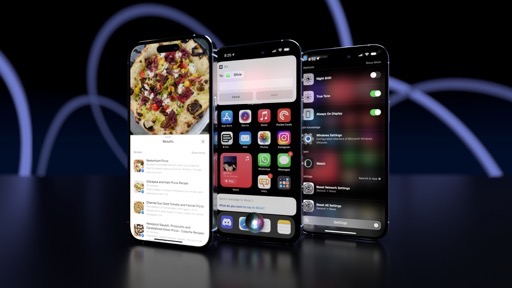
When a notification comes in and if Do Not Disturb is not enabled, it’ll briefly take over the entire screen with a nice animation that shows you the contents of the notification in full-screen. This design makes it easy to read notifications at a distance (say, if your iPhone is placed somewhere on your desk or kitchen counter); if you tap on it, the associated app will open.
Live Activities are also first-class citizens in StandBy, and they even go full-screen while in this mode. Ongoing Live Activities are displayed with the same small, circular preview indicator that you normally see in the minimal presentation style of the Dynamic Island (see how Apple builds stuff once and reuses it down the road?). Tap on the preview, and the Live Activity opens in full-screen with a dedicated layout made for StandBy.
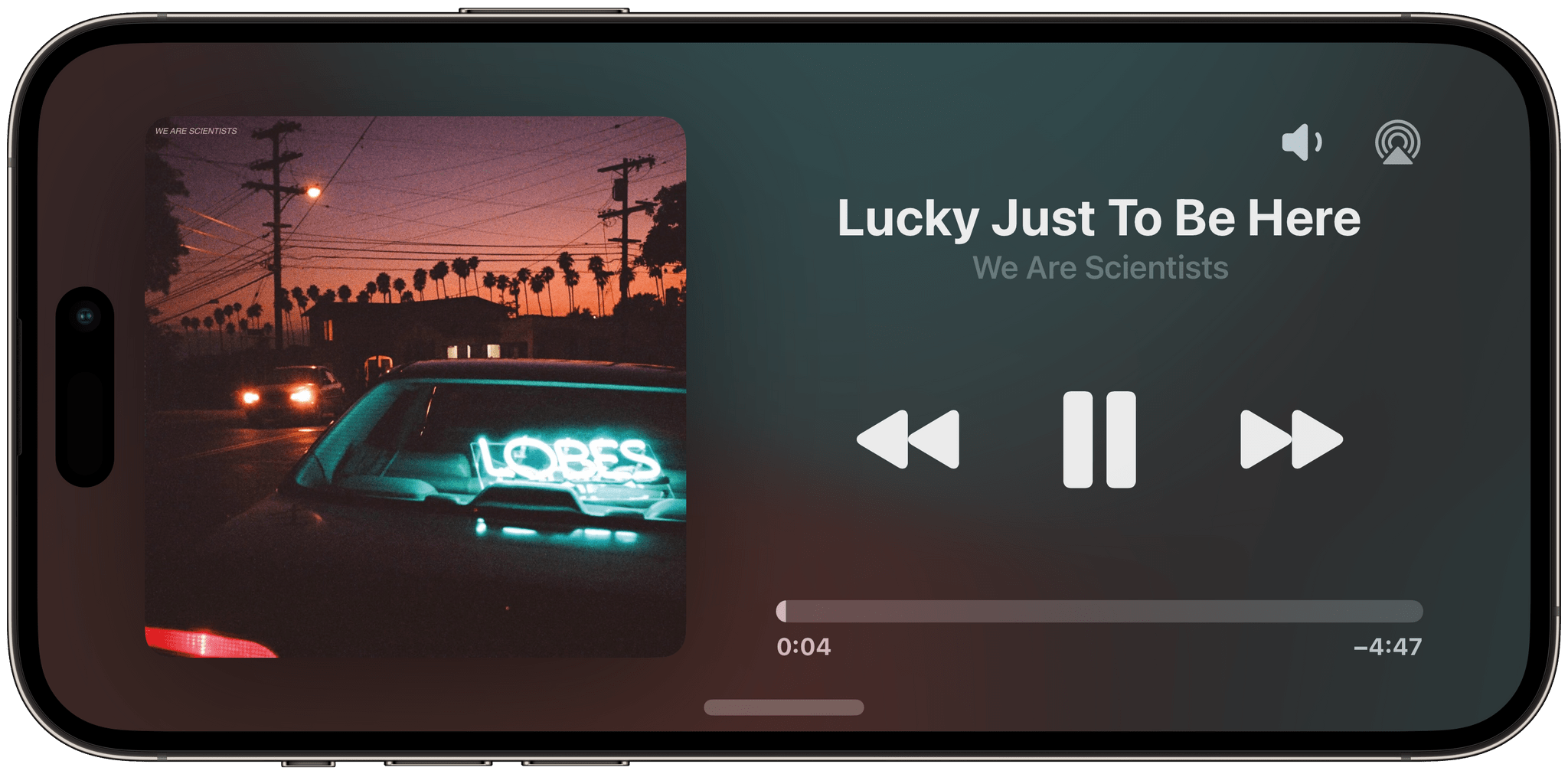
The Now Playing activity in full-screen. It’s fair to assume this is what the music playback UI of a HomePod with a screen may look like.
A great way to try this without using third-party apps is the Now Playing activity for Music and Podcasts: if something is playing (or if you start music playback from a widget in StandBy itself7), you’ll see an animated activity preview at the top of StandBy; tap it, and the Now Playing activity will open in full-screen inside StandBy. This activity is, of course, interactive and offers playback and volume controls as well as an AirPlay picker.
To return to the regular StandBy view from a Live Activity, you can swipe up on a horizontal bar at the bottom of the screen, which is similar to the Home indicator in iPhone apps.
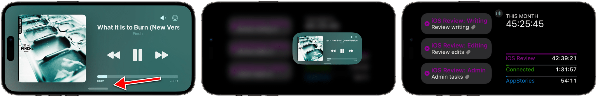
When closing a full-screen activity, it’ll fly back into its minimized state. The animation is delightful.
Here’s the best part: StandBy, like the Dynamic Island and Lock Screen, supports multiple, stacked Live Activities too. As you open the first activity in full-screen, if another is ongoing, you’ll see its minimal preview at the top. Tap it, and you’ll open the second activity in full-screen with the option to cycle back to the first one.
When multiple activities are ongoing, StandBy lets you cycle between them by tapping the minimized indicator.
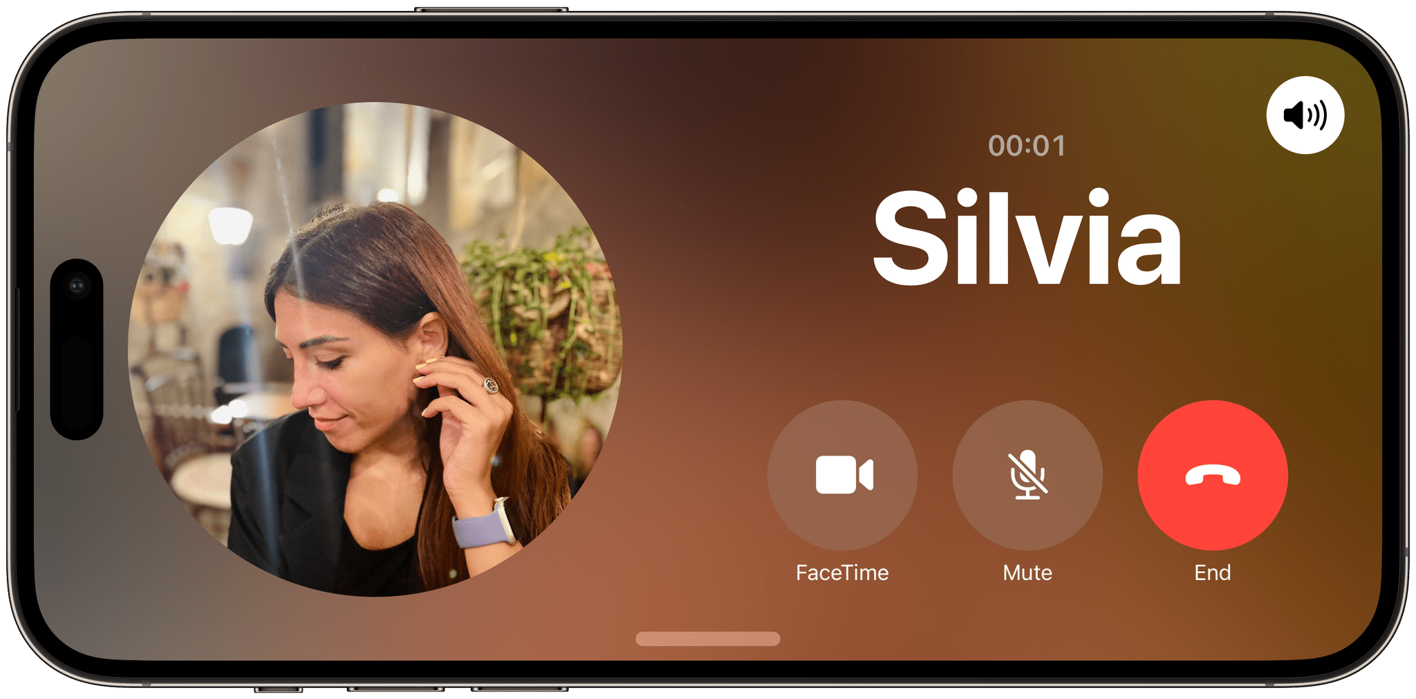
Phone and FaceTime calls are supported, too, as special full-screen activities in StandBy. The UI is optimized for landscape usage with large buttons for picking up a call, sending it to voicemail, or accessing FaceTime controls. Like other activities, you can swipe up a call to minimize it and return to StandBy’s main pages.
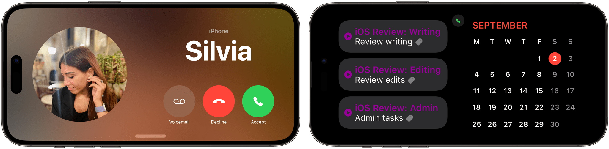
A phone call in StandBy (left) and the minimized activity (right). You don’t need to exit StandBy for voice calls.
I didn’t think this was going to be the case when I started using StandBy in June, but the combination of interactive widgets and Live Activities make it a self-contained area of iOS where, realistically, I can use apps and get some things done without ever leaving the Lock Screen. From controlling music, podcasts, and HomeKit accessories to starting timers and reading the latest news headlines, I’ve found myself placing my iPhone in StandBy on a MagSafe charger next to my iPad Pro and leaving it there for hours without ever needing to open my Home Screen. This is precisely what I meant when I said that, with StandBy, Apple found a way to turn a useless part of the iPhone experience (charging it) into something, well, useful.
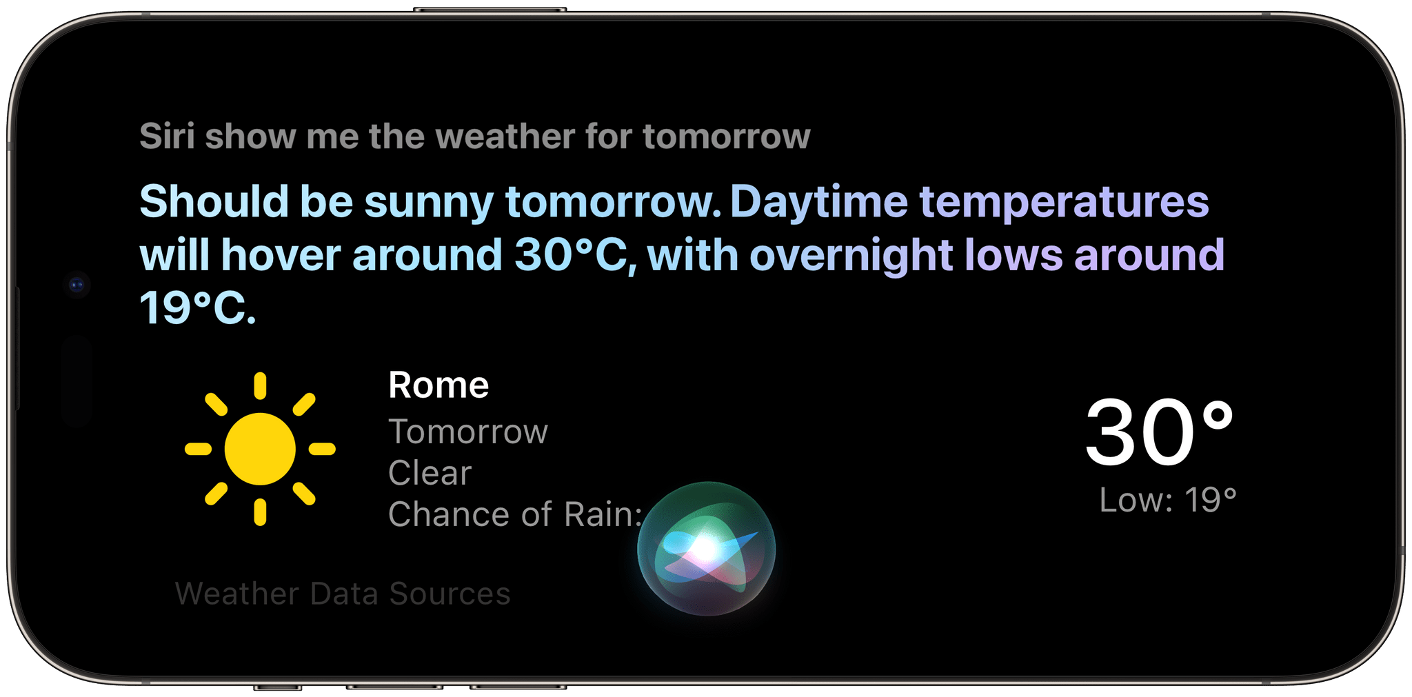
Since I’m convinced that, with StandBy, we’re witnessing Apple building a HomePod with a screen in public, I should note that the Siri experience in this mode is also top notch. When you activate Siri, it takes over StandBy with a special full-screen UI that shows your transcribed request and Siri’s visual response. As we’ll see later in the Siri section, the ability to invoke it by only saying ‘Siri’ and support for back-to-back requests make Siri in StandBy the best way to use Apple’s assistant to date.
Of all its potential permutations, StandBy’s widgets and Live Activities mode is the one that’s grown on me the most: it is unlike anything else Apple devices offer in terms of interactivity and glanceability.
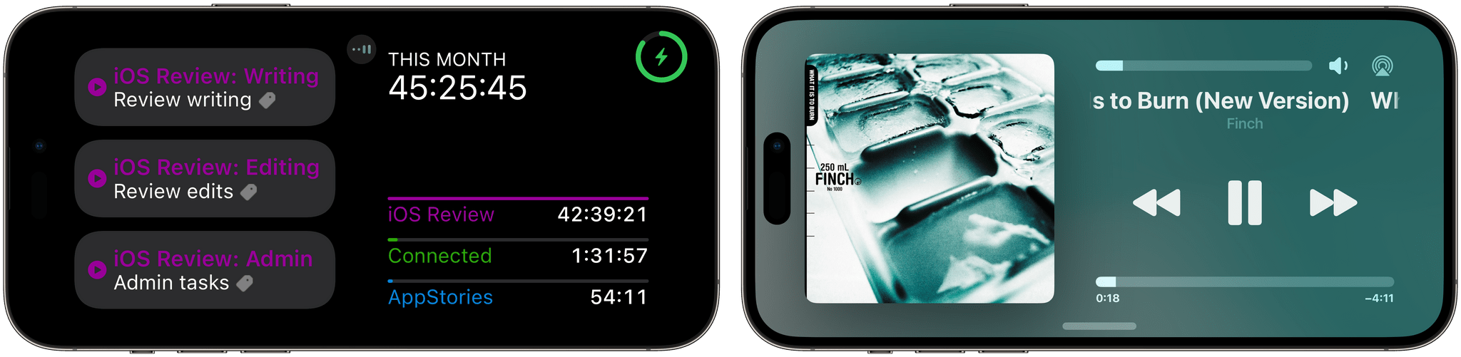
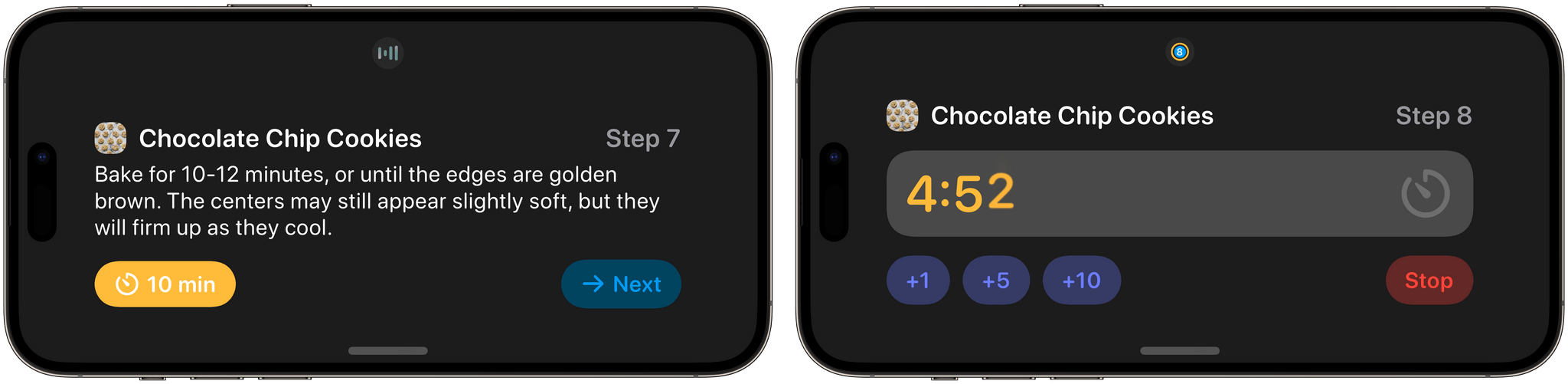
When I’m writing at my desk, I can keep an eye on the current timer from Timery or check out a list of my tasks left for today. I’ve also enjoyed leaving a monthly calendar open on one side and the Batteries widget on the other, or controlling Apple Music playback on my HomePod from the Now Playing Live Activity on my iPhone. Every once in a while, I find myself tapping a widget in StandBy to open an associated app9, but more often than not, I just leave StandBy there for hours while I get work done, and I love it.
StandBy has turned my locked iPhone into a useful, persistent companion for a new kind of multitasking that far exceeds the capabilities of the regular Lock Screen. If this is what we can expect from a HomePod with a screen, and if Apple plans on launching an ecosystem of third-party apps for it, I think we’re in for a fun ride.
- This is literally how I've seen developers create StandBy widgets this summer: take small Home Screen widgets and perform the necessary layout adjustments for StandBy. ↩
- Which requires Face ID authentication to start playing content. ↩
- This is made possible by the fact that each MagSafe-certified accessory gets assigned a unique ID that you can find in Settings ⇾ General ⇾ About when a charger is connected. In theory, iOS 17 should use this ID to remember the StandBy page preference for each charger. For this review, I used three separate Anker 3-in-1 MagSafe cubes and the OtterBox portable MagSafe battery. ↩
- This is why I think more developers should start thinking of offering landscape layouts for their iPhone apps: tapping a StandBy widget and being taken into a portrait-only app is no fun. ↩