Getting OS updates installed on end user devices should be easy. After all, it’s one of the simplest yet most impactful ways that every employee can practice good security.
On top of that, every MDM solution promises that it will automate the process and install updates with no user interaction needed.
Yet in the real world, it doesn’t play out like that. Users don’t install updates and IT admins won’t force installs via forced restart.
Let’s talk about the second problem first. Sure, you could simply schedule updates for all your users, and have them restart during non-work hours. But this inevitably leads to disruptions and lost work. This, in turn, leads to users (especially executives) who simply demand to be left out of your update policy. The bottom line is: any forced restarts without user approval will lead to data loss events, and that makes them so unpopular that they are functionally unusable.
There is another class of tools that claim to get users to install updates themselves, through “nudges.” These reminders pop up with increasing frequency until users relent or the timer runs out. This is an improvement, since it involves users in the process, but users still tend to delay updating as long as possible (which for some tools can be indefinitely).
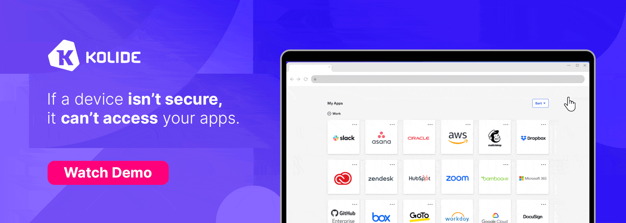
At Kolide, OS updates are the single most common issue customers want us to solve. They come to us because we have a unique (and uniquely effective) approach to device compliance.
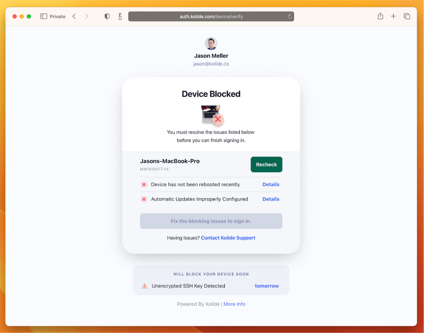
With Kolide, when a user’s device–be it Mac, Windows, Linux, or mobile–is out of compliance, we reach out to them with instructions on how to fix it.
The user chooses when to restart, but if they don’t fix the problem by a predetermined deadline, they’re unable to authenticate with Okta. (At present, Kolide is exclusive to Okta customers, but we plan to integrate with more SSO providers soon.)
If your fleet is littered with devices that stubbornly refuse to update, then consider these two principles:
- You can’t have a successful patch management policy without involving users.
- You can’t get users to install patches unless you give them both clear instructions and real consequences.
Installing OS updates is a top priority for both security and IT, and when you make it part of conditional access, you can finally get it done without massive lists of exemptions or massive piles of support tickets.
To learn more about how Kolide enforces device compliance for companies with Okta, click here to watch an on-demand demo.
Our thank to Kolide for sponsoring MacStories this week.