Posts in stories

For iPad, Accessibility Gives ‘It’s Just a Big iPhone’ New Meaning

Perhaps the most common complaint hurled against the iPad over its first decade of life is that it‘s little more than a bigger iPhone. At a fundamental level, the criticism is certainly valid: by and large, the iPad runs the same software as the iPhone. The penchant for bemoaning this bigness emanates from discontentment over the fact that substantial improvements to the iPad’s software have come at a glacially slow pace. Until last year, meaningful upgrades tailored to the tablet were few and far between.1 As much as Apple has extolled the iPad for being “unlike any computer,” the truth is the product stagnated for quite a while in terms of software.2 For better or worse, the company has been preoccupied with savoring every last drop of mother’s milk from the cash cow that is the iPhone. The iPad was left to wither thirstily when it came to its own growth, and it suffered for some time as a result.

In actuality, the iPad being more or less a scaled-up iPhone isn’t necessarily an entirely bad thing. The reason is iOS; familiarity breeds comfort – Apple shrewdly created the iPad’s user interface (and to lesser extents, Apple Watch and Apple TV) to largely resemble the iPhone. Especially for less nerdy users, the consistency across devices makes for a seamless, less intimidating experience. From icons to text to features to the touchscreen, the iPad being so similar to the iPhone means acclimating to the device takes minimal time and effort. From an accessibility standpoint, easy acclimation sets the tone for an enjoyable user experience. The foremost reason this is important is that the easier it is to acclimate to a device, the easier it is to find and configure mission-critical accessibility features.

Thus, it’s not at all unreasonable to look at what was heretofore a pejorative assessment – the iPad is nothing but a big iPhone – and turn it into a positive. One of the unheralded aspects of the device’s success is how its approachable, intuitive nature has made it a hit in accessibility-centric contexts such as special education classrooms and as a communicative aid. Such advances get right at the heart of the oft-cited Steve Jobs quote on the so-called intersection of technology and the liberal arts, when he said, “It’s in Apple’s DNA that technology alone is not enough.” Assistive technology obviously caters to the humanities part of the liberal arts, and it’s not hard to see how the iPad’s roots as ostensibly a bigger iPhone can be an asset rather than a liability. You just have to be willing to keep an open mind.

Read more


The iPad at 10: Emerging from the Shadow of the iPhone

The trouble with looking back over a long period is that time has a way of compressing history. The clarity of hindsight makes it easy to look back at almost anything and be disappointed in some way with how it turned out years later.

We certainly saw that with the anniversary of the introduction of the iPad. Considered in isolation a decade later, it’s easy to find shortcomings with the iPad. However, the endpoints of the iPad’s timeline don’t tell the full story.

It’s not that the device is short on ways it could be improved; of course, it isn’t. However, the path of the iPad over the past decade isn’t a straight line from point A to point B. The iPad’s course has been influenced by countless decisions along the way bearing consequences that were good, bad, and sometimes unintended.

The 10th anniversary of the iPad isn’t a destination, it’s just an arbitrary point from which to take stock of where things have been and consider where they are going. To do that, it’s instructive to look at more than the endpoints of the iPad’s history and consider what has happened in between. Viewed from that perspective, the state of the iPad ten years later, while at times frustrating, also holds reason for optimism. No single product in Apple’s lineup has more room to grow or potential to change the computing landscape than the iPad does today.

Read more


Gnarbox Review: Exceptionally Versatile Portable Storage for iPhones, iPads, and the Mac

The Gnarbox 2.0 is ruggedized, portable SSD storage designed with photographers and videographers in mind. I’ve tried lots of different portable storage solutions in the past, and what distinguishes the Gnarbox is its ability to operate as a standalone device and as an accessory to a computing device. The mix of fast, rugged storage, an onboard operating system, wired and wireless connectivity, and complimentary software isn’t cheap. The entry-level Gnarbox is $499. However, the Gnarbox offers both the peace of mind of in-the-field backups and image and video pre-processing, making it a compelling choice for anyone who captures lots of photos and video while away from their main computing device.

Versatility and reliability are what you’re buying when you get a Gnarbox. I’ve tried other WiFi-enabled backup solutions, including Western Digital’s My Passport Wireless SSD, but in the weeks that I’ve been using a 256GB Gnarbox 2.0 that the company sent for testing, I’ve found that it’s built better, is more capable, and is easier to use than any other portable storage I’ve tried.

Read more


Shortcuts Rewind: Dates, Calendars, and Beyond

For this installment of Shortcuts Rewind, I’m going to focus on date and calendar actions. I’ll also touch on some of the Shortcuts actions that Apple Maps offers and explain dictionaries.

I wanted to cover date and calendar actions early in the Shortcuts Rewind series because they’re the sort of actions that come in handy over and over in a wide variety of shortcuts. Plus, date-based shortcuts are useful to lots of people. After all, everyone deals with schedules and meetings to some degree.

With Shortcuts, dates become modifiable building blocks that go hand-in-hand with events that the app allows you to decouple from your calendar app and recombine in new ways. It’s a powerful pairing that, along with an understanding of dictionaries, can be extended to other contexts over and over.

You can download each of the three shortcuts I cover at the end of each section of this story or by visiting the MacStories Shortcuts Archive, where you’ll find these and over 200 other shortcuts. Once you download one of the shortcuts, opening it on an iPad side-by-side with this walkthrough is a terrific way to learn how each works. Another technique that is effective is to rebuild each shortcut from scratch yourself, as you follow along below.

Read more


Reading Newsletters with Feedbin and Reeder

As I’ve mentioned in previous Club MacStories newsletters as well as my Must-Have Apps story, I used the holiday break as an opportunity to do some cleanup of various kinds of digital cruft on my devices. I reorganized apps on my Home screen; I deleted old shortcuts with LaunchCuts and installed custom icons for my frequently used ones; I fixed metadata for certain albums on my Sony Walkman (a process I want to write about on the site) and moved all my Pokémon links to Raindrop.io. When I was done with apps and links, I turned my attention to email – specifically, newsletters.

It should come as no surprise that I love newsletters. I (partially) make a living out of sending two of them on a regular basis! Obviously, I believe in the strength, convenience, and personal approach of the medium, especially because my favorite writers – whether Jason Tate from Chorus.fm or Jason Snell from Six Colors or Dieter Bohn from The Verge – all tend to have a casual, looser writing style in their newsletters that feels like they’re writing directly to me.

The problem: despite automatic filing of newsletters performed by SaneBox into a folder called ‘SaneNews’ in my Gmail account, I realized that I don’t really like reading newsletters in an email client. I don’t like spending time in an email client these days, period. For professional reasons, I receive a lot of email on a daily basis, so I find it hard to concentrate and read a longform newsletter in an app that is filled to the brim with messages and not exactly built around focused reading.

As I was thinking about ways to improve this (I considered using a second email app just for newsletters, for instance), I remembered that Feedbin, my RSS service of choice, offers the ability to give you a unique email address you can send newsletters to. Emails sent to your personal Feedbin email address will end up in the service’s queue alongside your other regular RSS subscriptions, and you can then choose to file the “source” behind a newsletter however you see fit – for example, by creating a folder in Feedbin called ‘Newsletters’. Feedbin has more details on this functionality here. Given how I’ve been trying to consolidate all my reading into Reeder by way of the app’s support for RSS and a read-later account, I thought it’d be interesting to try throwing newsletters at it as well.

Read more


Shortcuts Rewind: Linking Tricks Using Markdown and Rich Text

Editor’s Note

Over the past several years, Federico has built hundreds of shortcuts that are sprinkled throughout the stories he’s written. Last spring we debuted the MacStories Shortcuts Archive, a one-stop destination that collects all of those shortcuts organized by topic, so readers can find them easily.

There’s no better way to learn how to build your own shortcuts than by downloading someone else’s, which is what makes the Archive such a valuable resource to readers and one of MacStories’ most popular features. Still, it can be hard to pick up best practices and patterns or other tips and tricks from experimentation and tinkering.

That’s why today we are introducing a new series on MacStories called Shortcuts Rewind to add context to the shortcuts in the Archive. Periodically throughout the year, we will pick a few shortcuts from the Archive that we think would benefit from a further explanation, whether that’s to help new Shortcuts users learn the basics, to illustrate a particular technique that can be used across multiple shortcuts, or to automate a task that you might not have thought was possible.

Tying Shortcuts Rewind together is a new graphical approach to explaining shortcuts. As you’ll see, we’ve created a system that dispenses with distracting UI elements and breaks shortcuts into logical sets of actions. The approach allows us to simultaneously provide step-by-step instructions alongside commentary that we hope will help readers achieve a deeper understanding of Shortcuts and assist them in building their own automations.

Let’s get started.


For this first installment of Rewind, I wanted to start with a trio of relatively simple shortcuts that illustrate the power of Shortcuts’ ability to streamline the transformation of one type of content into another. All three shortcuts can be found in the Text section of the Shortcuts Archive, but there are also links to them below. The foundation of this process is the Content Graph, a core part of Shortcuts dating back to its origins as Workflow. The idea is a simple but powerful one that eliminates complexity for the user, handling much of the data compatibility and conversion chores behind the scenes with little or no effort on the part of the user.

At the heart of the three shortcuts discussed below are transformations between plain text, rich text, and URLs. Thanks to the Content Graph, Shortcuts has the flexibility to create powerful text and link handling functionality.

Read more


A Fix for iPad Multitasking

Concept by Silvia Gatta.

Concept by Silvia Gatta.

The iPad’s primary appeal the last 10 years has been its resemblance to the iPhone. If you can use an iPhone, you can use an iPad – at least in most respects. Where that’s no longer true is multitasking.

I love the functionality enabled by iPad multitasking, but the current system is unnecessarily complex. I don’t believe the iPad should revert to its origins as a one-app-at-a-time device, but I know there’s a better way forward for multitasking.

My proposal for a new multitasking system employs a UI mechanic that already exists across both iPhone and iPad. Without losing any of iPadOS 13’s current functionality, it brings the iPad closer to its iPhone roots again and makes multitasking accessible for the masses.

Context menus are the key to a better multitasking system.

When you long-press an app icon in iOS and iPadOS 13, a context menu appears and provides various options. These menus, I believe, are the perfect home for multitasking controls.

Read more


The iPad at 10: A New Product Category Defined by Apps

When Steve Jobs strode onto the stage at the Yerba Buena Center on January 27, 2010, he carried with him the answers to years of speculation and rumors about an Apple tablet. Everyone at the event that day knew why they were there and what would be announced. Jobs acknowledged as much up front, saying that he had a ‘truly magical and revolutionary product’ to announce.

Thanks to the iPhone, everyone at the Yerba Buena Center also had a vague notion of what Apple’s tablet would probably look like. Mockups and phony leaks were all over the web, and tablets weren’t new. Everyone expected a big slab of glass. Beyond that, though, few rumors were in agreement about what the tablet’s hardware specs would be.

Source: The Verge.

Source: The Verge.

It was correctly assumed that Apple’s tablet would fit somewhere in between an iPhone and a Mac both physically and functionally, but where exactly was a mystery. That made the OS and the apps the stars of the keynote and critical to the way Apple’s tablet would be used and how it would be perceived for years to come.

Before Steve Jobs revealed Apple’s new tablet to the world, though, he paused – as is still customary during most Apple keynotes – to set the stage and provide context, which is where I will start too. Ten years ago, the tech world was a very different place, and Apple was a very different company. Not only is it fun to remember what those days were like, but it helps explain the trajectory of the iPad in the decade that followed.

Read more


My Must-Have Apps, 2019 Edition

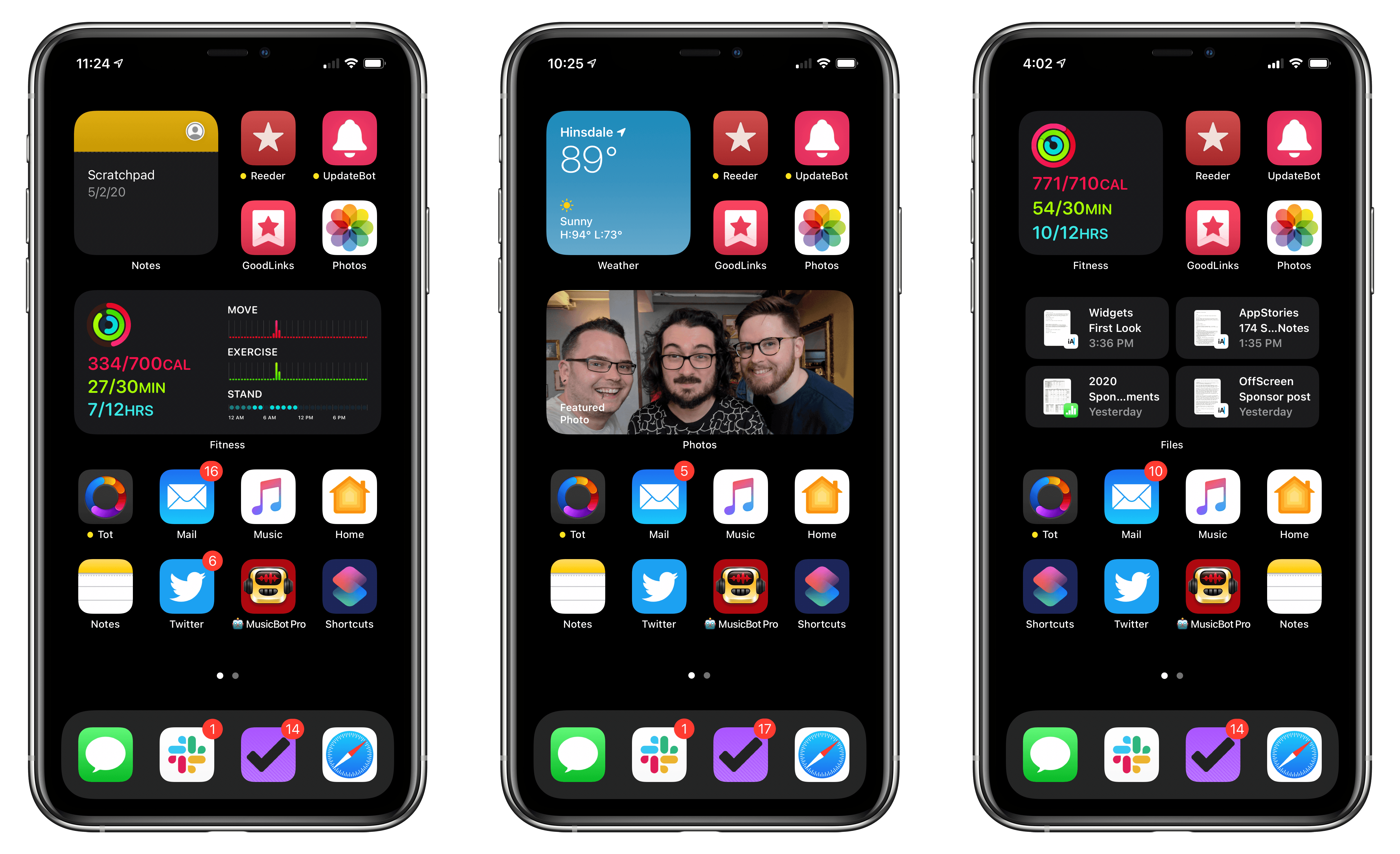
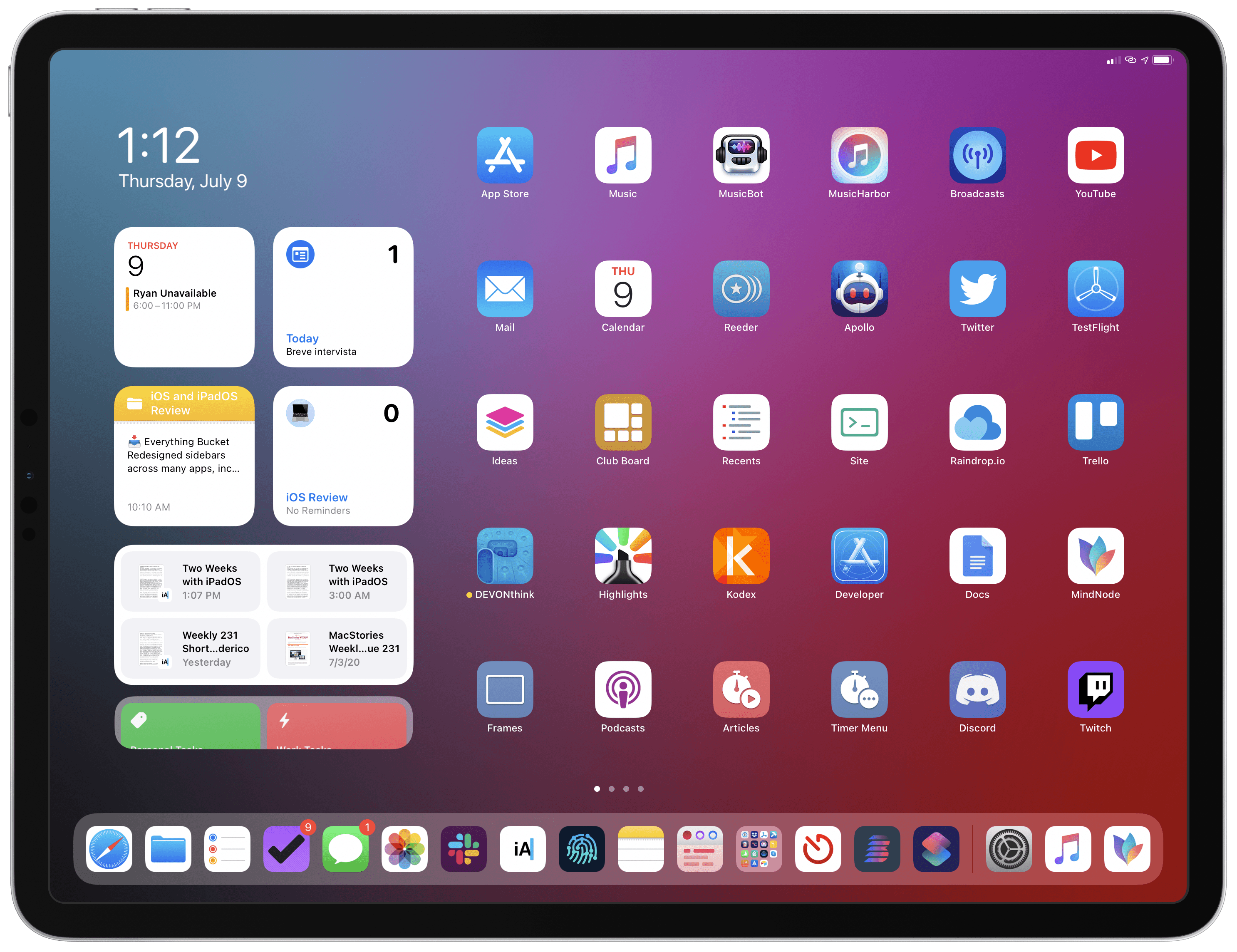
My Home screens.

My Home screens.

Every year in late October, I start putting together a rough list of candidates for my annual ‘Must-Have Apps’ story, which I’ve historically published in late December, right before the holiday break. As you can tell by the date on this article, the 2019 edition of this story is different: not only did I spend the last months of the year testing a variety of new apps and betas, but I also kept tweaking my Home screen to accomodate MusicBot and new Home screen shortcuts. As a result, it took me a bit longer to finalize the 2019 collection of my must-have apps; in the process, however, I’ve come up with a slightly updated format that I believe will scale better over the next few years.

In terms of app usage, 2019 was a year of stabilization for me. Having settled on a specific writing workflow revolving around iA Writer and Working Copy, and having figured out a solution to record podcasts from my iPad Pro, I spent the year fine-tuning my usage of those apps, refining my file management habits thanks to iPadOS’ improved Files app, and cutting down on the number of apps I kept tucked away in folders on my iPhone and iPad.

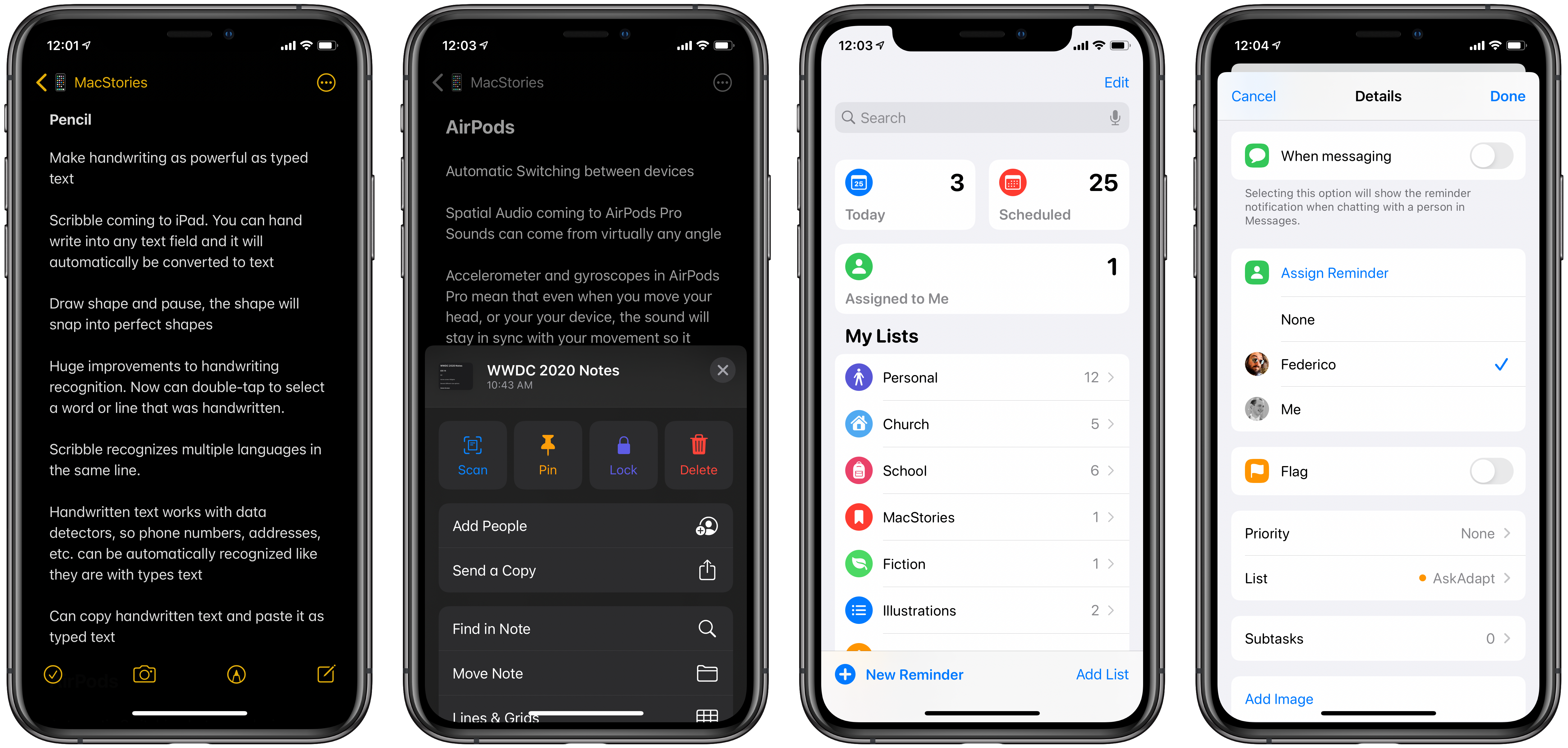
Two themes emerged over the second half of 2019, though. First, thanks to various improvements in iOS and iPadOS 13, I increased my reliance on “first-party” Apple apps: I embraced the new Reminders app and its exclusive features, stopped using third-party note-taking apps and moved everything to Notes, and switched back to Apple Mail as my default email client. I’ve written about the idea of comfort in the Apple ecosystem before, and I’ve seen that concept work its way into my app preferences more and more over the course of 2019.

The second theme, unsurprisingly, is my adoption of a hybrid Home screen that combines apps and shortcuts powered by our custom MacStories Shortcuts Icons. Following changes to running shortcuts from the Home screen in iOS 13, I realized how much I was going to benefit from the ability to execute commands with the tap of an icon, so I decided to mix and match apps and shortcuts on my Home screens to maximize efficiency. Thanks to the different flavors of MacStories Shortcuts Icons (we just launched a Color set), I’ve been able to assemble a truly personalized Home screen layout that puts the best of both worlds – my favorite apps and custom shortcuts – right at my fingertips.

For this reason, starting this year you’ll find a new Home Screens section at the beginning of this roundup that covers the first tier of my must-have apps – the “ultimate favorites” I tend to keep on the Home screens of both devices. Because I like to keep my iPhone and iPad Home screens consistent, it made sense to start grouping these apps together in their own special section. These are the apps I use most on a daily basis; I’m pretty sure you’ll find at least a couple surprises this year.

This entire story features a collection of the 50 apps I consider my must-haves on the iPhone and iPad, organized in seven categories; whenever possible, I included links to original reviews and past coverage on MacStories. As for the traditional list of awards for best new app and best app update: those are now part of our annual MacStories Selects awards, which we published last December and you can find here.

Let’s dig in.

Read more