This Week's Sponsor:

Copilot Money

Copilot Money, The Best Money Tracker, Launches on the Web – Limited-Time: Get 26% Off + 2 Months Free


Posts in reviews

Reddit Client Alien Blue for iPad Receives Major 2.0 Update

When I’m not writing, reading, or talking to my team, one of the things I like to do online is casually check on Reddit for the latest meme, links to interesting news, or more serious discussion that can only take place thanks to Reddit’s unique nature and community. And when I’m not using my computer, which is “most of the time” these days, I like to do so using Jason Morrisey’s Alien Blue, a Reddit client for iOS that I recently re-reviewed in its newest iPhone version, and that today received a major 2.0 update on the iPad.

Just like the 2.5 update for iPhone, Alien Blue HD 2.0 includes several interface changes to make the Reddit browsing experience more pleasant, as well as various new features that take advantage of the iPad’s larger screen. For instance, Alien Blue HD is already Retina-enabled for the new iPad, with the exception of launch images, which will be updated soon. But the biggest change in this version, new coat of interface paint aside, is the new panel-based navigation that allows you to seamlessly move through Alien Blue’s main sidebar – which lists Reddit sections and subreddits – and posts, comments, and web views. Inspired by Twitter for iPad’s panel-based UX, but much simpler to use, Alien Blue lets you swipe through panels to move around in the interface, or simple pinch on these panels to dismiss them. In fact, the entire app has been tweaked to allow for more gestures, as listed below:

  • Double-tap header for fullscreen
  • Hold-tap on Posts list to show post options
  • (Alternative) 2-finger swipe to show post options
  • 2-finger tap to upvote items
  • 3-finger tap to downvote items
  • 2-finger left swipe over comments to collapse to root
  • Drag Posts list up to load more

I’ve found myself using the double-tap and 2-finger tap gestures a lot, and I think they contribute to making the app faster and easier to use. A visual guide for gestures is available in the Settings screen as well.

There are several improvements and optimizations that found their way in this 2.0 update. The app now supports larger thumbnails, and you can view videos alongside comments in any thread. The post and comment interfaces have been redesigned, alongside the new pull-to-refresh gesture that works similarly to its iPhone counterpart (the subtle animation is pretty amazing). Image links and YouTube videos are now displayed more elegantly, and a new “Optimal” setting for web views enables webpages to scale intelligently to fit Alien Blue’s window. There’s more: you can now delete posts, and links to subreddits open directly within Alien Blue. The app sports Evernote integration to let you save posts in any of your notebooks, and you can check out a submitter’s details right from a post you’re viewing. There are new tags for NSFW posts, and Facebook and Twitter sharing have been fixed. There are dozens of little improvements and fixes in Alien Blue HD 2.0, so I recommend you check out the release notes for the complete list.

More importantly, I like how Alien Blue’s experience is still intact in spite of the interface changes and new navigation schemes. You can still switch to Canvas view to browse images as large thumbnails, and there are several themes to choose from in the Settings. The new UI doesn’t add weight to the app in terms of performance, as Alien Blue still scrolls smoothly and updates fast on the iPad 2.

Alien Blue HD 2.0 offers a rich and intuitive Reddit experience in a native app that comes with many options to interact with Reddit content and links submitted to the site. Even if you don’t spend hours on Reddit every day, the app still offers an incredibly polished experience that I recommend you consider if you’re planning on browsing Reddit from your iPad.

Alien Blue HD 2.0 is available at $3.99 on the App Store.


iA Writer for iPhone Review

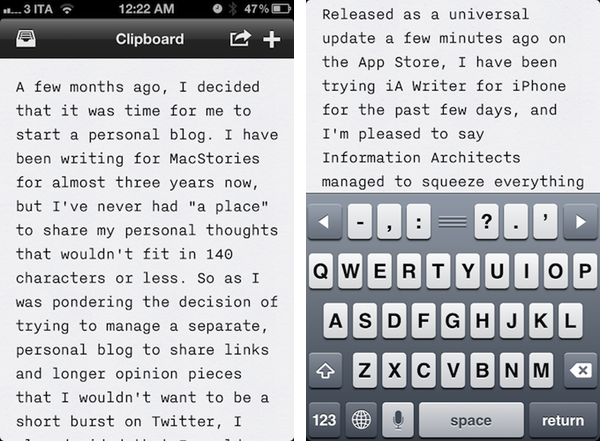
A few months ago, I decided that it was time for me to start a personal blog. I have been writing for MacStories for almost three years now, but I’ve never had “a place” to share my personal thoughts that wouldn’t fit in 140 characters or less. So as I was pondering the decision of trying to manage a separate, personal blog to share links and longer opinion pieces that I didn’t simply want to be short bursts on Twitter, I also decided that I would write such weblog exclusively from my iPad. The experiment has been a success so far, and that’s largely thanks to iA Writer, which starting today is also available on the iPhone.

Released as a universal update a few minutes ago on the App Store, I have been trying iA Writer for iPhone for the past few days, and I’m pleased to say Information Architects managed to squeeze (almost) everything that makes iA Writer great on the iPad and Mac (our coverage) into the iPhone’s smaller screen. Not only does iA Writer look great on the Retina display – it’s also functional and easy to use.

There isn’t much to say about iA Writer if you’re familiar with the iPad and Mac versions. It’s a minimalist take on plain text writing that focuses on letting you write without distractions with great typography, and only the essential features. There’s no cluttering interface with too many options. If most text editors and writing tools want you to feel connected with the web by adding social sharing functionalities, search look-ups, and various integrations with different services, iA Writer wants you to feel disconnected from the Internet’s noise to reconnect exclusively with what’s in front of you: text. Your words.

It’s called iA Writer for a reason – it’s about you, the writer, and the app, the digital writer. Everything else is secondary. That’s how I see this app.

This concept has been ported well to the iPhone. iA Writer can sync documents with iCloud and Dropbox across devices, and both are fairly reliable at keeping changes up to date and ready to be modified. Dropbox, as usual, can be slightly more “manual” in that iCloud is “invisible” in pushing and receiving changes automatically, all the time. Fortunately, iA Writer for iPhone has also a sync button, so if you’re not sure about the latest change fetched from the app, you can always hit Refresh and check that you’re getting the latest version of a document before you start writing. In my tests, iA Writer for iPhone was able to push changes to the same document already open on other devices, and I’m pretty satisfied with how iCloud sync turned out on iOS and OS X.

The core of iA Writer’s experience has been preserved in making the leap to the iPhone, but something’s got to give when you’re porting an app to the smaller screen. Either that, or iA simply didn’t have time to squeeze in more features – I don’t know, but as it stands now iA Writer for iPhone lacks Focus mode, and support for visual Markdown previews, which are both supported on the iPad and Mac. The iPhone app does, though, feature a custom keyboard with often-used keys placed in an extra row that also contains a drag handle to dismiss it (I love this aspect of the app), and arrows to navigate. The typing view of iA Writer 1.5 is now full-screen, which I think is incredibly better on iOS devices than being forced to always see window chrome. I do wish there was a gesture to quickly close a document without having to pull down the keyboard first, and I would like to see character count and reading time become available on the iPhone as well. I’m a big fan of the app’s separate storage for iCloud and Dropbox.

Ultimately, it comes down to the writing experience, and iA Writer excels at this because it is an app that wants you write more by seeing less. This first version of the iPhone app might not be as powerful as its Mac counterpart, but it sure is a pleasure to look at on the Retina display as what really matters, in the end, is that you’re looking at your own words, and nothing else.

iA Writer 1.5 is now available at $0.99 on the App Store.


Favs: The Mac App I Wanted For My Internet Favorites

Favs, a new app for Mac I initially wrote about when it was in beta in February, is now available on the Mac App Store. And I don’t say this very often, but Favs is exactly one of those things I was looking for, and needed, as I had wondered why no one on the Internet had come up with it yet. In my article, I explained the main concept of the app:

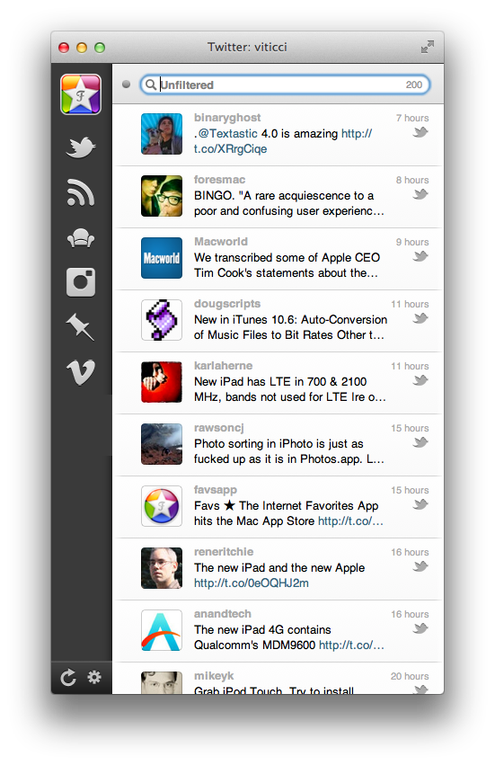
A few weeks ago, I tweeted I’d like to see some sort of Twitter client with its only focus being on Favorites — I keep Twitter open all day, and I save a lot of links. Prior to ending up in my Evernote or Pinboard accounts, the tweets I want to “save for later” are marked as favorites, which, I believe, provide an easy way to use a built-in Twitter functionality for general-purpose “bookmarks” that I may or may not consider for a post or more serious bookmarking in a second service. As you can see, I have a lot of favorites. The same is true for other services I use on a daily basis, such as Google Reader, Vimeo, YouTube, or Instagram: I like to be able to “star”, “like” and mark things as favorite so a) the service knows the stuff I’m interested in and perhaps will leverage this data sometimes in the future or b) perhaps other apps will. And while I’m still waiting for the ultimate app that looks at your Internet favorites and delivers content intelligently to you every day (albeit Zite is on the right path), it turns out someone has built a functional and nice-looking desktop aggregator called Favs.

The app is mostly unchanged from the latest public betas, but there are some notable additions here and there. For one, the updated list of supported sources now includes:

  • Delicious
  • Dribbble
  • Facebook
  • Flattr
  • Flickr
  • Github
  • Google Reader
  • Instagram
  • Instapaper
  • Pinboard
  • Readability
  • Read It Later
  • StackOverflow
  • Twitter
  • Vimeo
  • YouTube
  • Zootool

Coming from the beta, the sidebar icons also seem more polished, the animations a little faster. As you can see, Favs is yet another app that uses Tweetie’s old navigation concept for switching between sections; for as much as I can’t stand ideas being shared around between apps without considering an app’s unique nature, I think some elements do work across different software, and become standards.

Favs can be viewed in normal mode, with a web view for your Internet favorites on the right, or in compact mode. I particularly appreciate the latter, as you can then use Quick Look (hit the space bar or CMD + Y) to preview items in seconds. This works for articles, images, videos – anything you can mark as favorite online becomes an item in Favs.

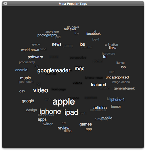
Another nice feature of Favs is the tag cloud. If you save a lot of items online like I do, it’s likely that you’d be interested in a way to later search for a specific entry within all those articles and Instagrams. Whilst I use Greplin to do most of the heavy lifting for me, I like Favs’ basic tag and search features – Favs is capable of fetching a lot of items through APIs, and keeping a searchable list of old favorites is a welcome addition.

There are a few things I’d like to see in a future version of Favs. More keyboard shortcuts, for example, and a revamped sharing system that allows me to easily pass links to other services, like Reeder does. Right now, Favs’ sharing features are limited, but you can always rely on Copy Link and Services to automate the process of sharing links. Last, as I previously wrote, I think an iOS version of this would be fantastic, especially on the iPad.

Services like Instapaper and Pinboard empower you to “read later” and “bookmark” the things you like. Favs runs at a higher level, collecting favorites from other services that already enable you to save favorites. As I said, this kind of app is a web nerd’s dream come true for me, so I recommend you check out Favs at $4.99 on the Mac App Store.


Path 2.1

Released earlier today on the App Store following a media event where CEO Dave Morin gave out some interesting tidbits about the company, Path 2.1 is a substantial update to the social networking app that aims at build a beautiful journal of our daily lives. Sarah Lacy at PandoDaily has liveblogged the most interesting details: over 100 million moments have been shared on Path, with over 1 billion pieces of “feedback” on them (I assume these include comments and reactions); Path is announcing an API for third-party developers to integrate their services and apps with, and Nike is an initial partner (the API is private for now). The Verge is also reporting that Path has listened to the suggestion of hashing users’ data, and will do so in an upcoming 2.1.1 release.

What we have today is Path 2.1 – I have tried the new version, and it’s pretty good. I haven’t been able to test Nike integration as I’m not a user, but I’ve taken the new music recognition functionality for a spin. Similarly to how Shazam works, Path 2.1 lets you hold up your iPhone’s mic to a music source, and wait a few seconds for the app to contact an online service (in Path’s case, Gracenote) and return the title of the song alongside other information (album, artist, etc). Path’s implementation of this is unsurprisingly great-looking, but Gracenote’s database isn’t nearly as powerful as Shazam’s. For instance, the app recognized The Shins and Coldplay, but failed fetch The Uprising and Tell Me What It’s Worth. Overall, I like the interface of this new music feature; I hope more databases will be added in the future.

Path 2.1 also comes with improvements to existing lenses and a new one, called Pow. I have never liked Path’s approach to filters and custom lenses, but I’ll admit the ones in this new version look better. What I do like is the new control for exposure and focus, which, unlike many apps, makes it extremely clear what you are moving on screen.

Path 2.1 is a good update – here’s to hoping Path will stick around long enough to get more friends of mine to use it. You can get version 2.1 here.


iPhoto for iOS Review

iPhoto for iOS was released on the App Store earlier today, and after an enthusiastic introduction at Apple’s media event in San Francisco, the latest photo editing app from Cupertino received a controversial “welcome” on various blogs and Twitter streams as users got their hands on the all-new interface and photo management system. So what’s all the fuss about iPhoto for iOS?

I have been trying the app on my iPad 2 and iPhone 4S (running iOS 5.1, of course, as it’s a requirement) for the past few hours, and I think that it is very powerful. As I’ll illustrate in a bit, Apple did manage to squeeze some advanced photo editing and refinement technologies in the mobile version of iPhoto, putting it on the same level if not above iPhoto for Mac when it comes to editing, making quick adjustments, and interacting with your photos. Once mastered, the new gestures and tap commands can be quite powerful, although the app can have a steep learning curve. I also believe, however, that iPhoto for iOS suffers from a serious file management problem, in that it’s the best example of iOS’ lack of a centralized file system where apps are able to easily “talk” to each other and share files or modifications to them.

I want to get this out of my system before I get to the (very) good stuff. If you were hoping to see Apple coming up with an effortless way of importing photos avoiding duplicates and manual management, well, I’m sorry, you’ll be disappointed with iPhoto for iOS. This version of iPhoto is yet another data silo that is self-contained, and won’t simply “sync” the changes it makes to photos out of its closed environment.

I say “simply”, because there are exceptions in iPhoto for iOS, as it doesn’t use the exact same system of iPhoto for Mac when it comes to finding photos on your device. Because iOS devices come with a systemwide “Camera Roll” that’s accessible by other apps, Apple engineers had to make sure iPhoto could access such location – and here’s where I started to run into issues. Read more


ListBook Goes Universal, Adds iCloud Sync

When I reviewed the first, iPhone-only version of ListBook from noidentity last year, I called it “a good alternative to Apple’s Notes app for most iPhone users”. In the past 12 months, however, Apple shipped iOS 5, a major revision of its mobile operating system that, among other things, includes a native list-making app called Reminders. The writing was on the wall for developers of third-party list apps: Apple likes to “borrow” ideas from successful applications every once in a while, and simple todo lists are just something too common to ignore for a possible system integration. As usual after Apple comes out with its own take on a previously third party-only idea, many rush to declare Product X has been “sherlocked” by Apple. It happens every time. The opposite is quite true: Apple’s take on such ideas and workflows often creates an even bigger market for developers, raising the public’s awareness on a particular kind of software, leading more people to seek out alternatives and different takes from other developers.
The new ListBook, released today, falls exactly under this category. With a simple interface, lists, and iCloud sync, one could easily think it’s a Reminders clone with a price tag on top of it (the app is sold at $1.99 on the App Store). As I mentioned above, those looking for a different take on Reminders – which will also gain a desktop counterpart on Mountain Lion – will be pleased to find in ListBook some clever features implemented in a way that makes switching between the iPhone and iPad version as effortless as iCloud allows.

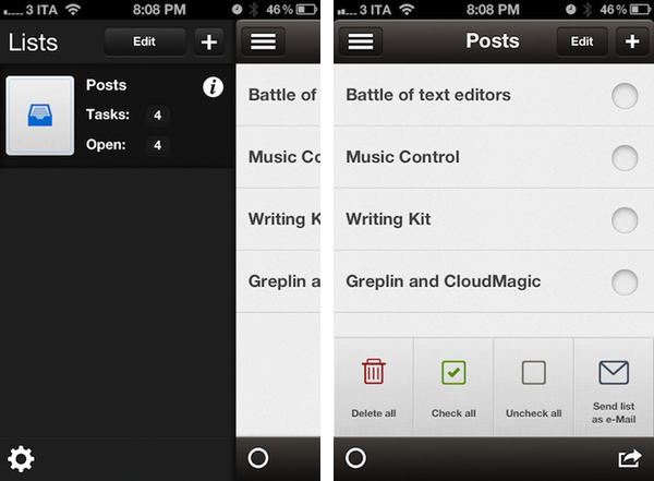
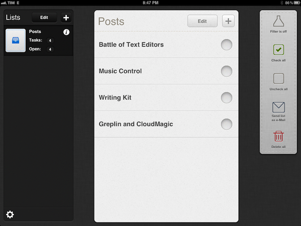
ListBook makes lists. On the iPhone, these lists are accessible from a button in the top left corner that you might have seen elsewhere recently;  on the iPad, the app uses a split interface that’s quite attractive and works fine.

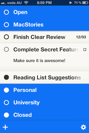
Lists can be assigned an icon (the selection is nice), and you can disable Home screen badges on a list basis. Each list shows how many items you entered in total (tasks) and how many of them haven’t been completed (open). Because ListBook isn’t strictly GTD, but wants to combine text-based lists with a simple todo management system, completed items will stay in a list until you delete them permanently – a Filter button lets you view only “open tasks” if you prefer such view. This view setting, alongside lists and todos, will sync across devices using iCloud, and in my tests sync has been fairly responsive – it takes only a few seconds to see new items appear on another device, even if the app is already in the foreground.

Overall, I think ListBook 3.0 is a great update and the right path to follow for the developers, especially with iCloud, which would open the door to a possible Mac app in the future. If you like well-crafted user interfaces (the icon is also very polished and not blue or red), a simpler approach to list creation and supporting indie developers, you should give ListBook a try – it’s $1.99 on the App Store. For people who are just looking for a basic todo list app that syncs across devices, however, hitting the Buy button on this one might be a little hard. Apple’s Reminders does more, is integrated with Macs and PCs, and it’s free. Those users will be more than fine using Reminders, and I don’t blame them – Apple’s utility covers various aspects of list management very well, it’s got Siri support, and will gain a desktop version this summer. If, for some reason, you don’t like Reminders, or are simply intrigued by third-party apps in general, you should still try the new ListBook – it’s very nice and gets the job done.


Studio Neat, Makers of The Glif, Release Their First iOS App, Frames

When Thomas Gerhardt and Dan Provost set out to reinvent the market for tripod mounts and stands for iPhone in 2010 with The Glif, little did they know their idea would spur a new generation of creators and designers that seek out resources and funds for innovative iPhone-related projects through crowd-sourcing funding platform Kickstarter. Back when Kickstarter was still relatively “small” – the quotes are necessary here, as the site was already well known among creatives, but clearly not as popular as the service that’s now backing projects exceeding $2 million in funding – Studio Neat became an example in the tech and Apple communities of a great idea (tripod mounts for iPhone) combined with a fantastic everyday product (the iPhone’s camera) for a successful funding campaign. And Studio Neat, unlike others, even gave the whole fund-through-Kickstarter thing a second shot, coming back with an equally popular campaign – this time for an iPad stylus, The Cosmonaut. Both The Glif and The Cosmonaut turned from ideas and funding campaigns into commercially available products and feasible businesses, allowing Tom and Dan of Studio Neat to revamp their website and offer their iOS accessories directly to customers, tweaking The Glif’s package along the way with a Plus version that builds on the original vision, adding more iPhone camera-related goodness to the mix. Today, Studio Neat decides to try something new – not another Kickstarter campaign for a new iOS accessory, but a brand new iOS app available on the App Store called Frames.

Clearly meant to work best in conjunction with The Glif, Frames is an iPhone app to create stop motion and time-lapse movies with an intuitive interface. With a beautiful icon and an elegant dark design with thumbnail-based navigation, Frames makes it extremely easy to capture various “frames” – a sequence of still images – to play them back at a certain speed to achieve the effect seen in stop motion movies.

The app itself is fairly simple, and anyone will be able to pick it up immediately without necessarily being an expert in stop motion animations and editing. A main Projects view lets you create new videos and export them to the Camera Roll at 720p in a native format that can later be recognized by apps like iMovie (something you might want to consider as Frames can’t add music or text to your videos). Once in a project, you can scroll through frames at the bottom, and adjust the number of frames per second with a slider – you can go from 1 FPS up to 120 FPS. A Play button lets you roll the video so you can get an instant preview of what you’ve accomplished, whilst tapping on a + button opens the camera interface to add new stills to a project, choosing between stop motion mode (manual shutter) and time-lapse (automatic shutter: you set a time to lapse between stills, and the camera takes care of the rest).

The camera of Frames comes with a grid view, onion skinning, possibility of switching between rear and front-facing camera, AE/AF lock, and overall clear design that explains how many frames you’ve taken in a given amount of time very well.

I’ve been using Frames on my iPhone 4S, and I’m thoroughly impressed by how Studio Neat managed to turn stop motion into a streamlined process that takes advantage of the iPhone’s hardware to produce great results. Whilst you’d be able to achieve similar results with a video editing application if you know where to look and what to tweak, the focused approach of Frames (something that apps generally share) and its $2.99 price tag more than justify the purchase – personally, I can say I’ve been having fun making time lapse movies using Frames’ easy-to-understand menus and options, whereas a full-featured video editing app or manual process would have probably turned me away in frustration.

Frames is a “neat” utility to create stop motion movies without the complexity of regular video editing. You can get the app at $2.99 on the App Store.
Read more


Hazel 3.0 Adds Nested Rules, UI Improvements, and New Actions

I spend a lot of time refining my workflows with the naive intention of heightening my productivity, but it always has an adverse effect. I know this is not a new problem, and a lot of my Mac nerd friends also fall victim to the “tweak now and it will help me later” facade. What I have come to realize is – productivity is about having tools that you can trust and rely on to provide stability in times of hectic disarray. For my own personal workflow I have relied on Hazel for quite some time now (our own Federico Viticci previously wrote about it here). Hazel has become the backbone that provides stability to my trusted system: I have so many automated processes ranging from managing my monthly utility bills to just doing general cleanup that I could not easily accomplish without it.

Today Noodlesoft has released Hazel 3.0, and with it come some much needed interface improvements, a heap of new features, and under-the-hood changes for a completely redesigned engine for detecting file changes. Let’s take a closer look at some of the highlights added to this release.

The first thing I noticed when I launched Hazel 3.0 is that it looks a lot like the previous version. That is not a bad thing, but the changes were not completely obvious at first. Then I noticed the new little eyeball icon in the section to add folders. When clicked, this icon displays a quick dropdown preview of what files match the rules for the folder you have selected. So, at this point I am about three seconds into using the new version of Hazel, and I’m already in love with just one of the many new features. Those using the previous version of Hazel would probably agree that the old method of previewing rules felt buried in sub-menus, and it is great to see that moved to the forefront of the UI.

There have been some other general interface improvements you just do not notice until you start using the program. For example, when editing an embedded script you can now adjust the size of the editor window. This alone is a huge help for long scripts that previously would have been easier to write in an external text editor. Speaking of script editing, perhaps my favorite visual improvement is the new popover design for script editors and option windows when creating new rules. This solves one of my biggest peeves with the previous version: when too many options had been expanded, the old slide-down windows would extend right past the bottom of the screen. It was probably only an issue on smaller laptop-size screens, but it was frustrating nonetheless. The new popovers are a great solution, and they really make Hazel feel at home on Mac OS X Lion.

The list really does goes on and on with tweaks to improve usability. In fact, so much of what makes Hazel 3.0 great is how it gracefully solves quirks I experienced in previous versions of the app. For instance, another frustration (now solved) was the inability to reorder conditions for matching rules. It is hard to explain why you would need to do this until your start creating and editing rules, but just know that version 3.0 does this superbly. In fact, I worry that new users will not be able to fully appreciate the effort that went in to improving the new release – they will simply have to live in blissful ignorance I suppose.

More interesting than the visual upgrades are the new features added to Hazel’s rules section. New features are always the cornerstone of any great software upgrade and Noodlesoft did not disappoint. Newly added actions include Import into Aperture and Sync. I don’t personally use Aperture but I am definitely excited to see the sync option. Unfortunately it is only a one-way sync action so it really only saves me the time of writing a script to run rsync. In fact, rsync is packaged into Hazel and that is how it accomplishes its own sync feature. Regardless, this is definitely a win for the average user.

Another feature I was pleasantly surprised to see was the option to specify custom conditions via scripts. This basically allows you to write a shell script or AppleScript and test the file in anyway you want, then just return the value 0 to indicate the file is a match. This is so neat because it really brings an entirely new level of flexibility to how people can use Hazel. The structured rules Hazel ships with are great for most situations but now I have the ability to write my own. A simple example: I can write a shell script to grep the contents of a file and look for some specific information with regular expressions or in a way more powerful than Hazel’s stock “contents contains” action. I can not wait to really sink my teeth into that feature.

Hazel 3.0 doesn’t stop there, as rules can now be nested and/or grouped in any combination you see fit. This was probably the most requested feature and Noodlesoft did a fantastic job with the implementation. To add a nested rule you simply hold the Alt/Option key while clicking the (+) to add a rule condition; you can also simply click and hold down on the (+) to find the new add a nested rule option. Obviously, the potential uses for more complex conditions are limitless and I am sure many people will upgrade just for this addition.

One more thing worth highlighting is the new engine for detecting changes. Users should notice a decrease in time it takes Hazel to pick up on file changes, because, according to the developer, Hazel no longer needs to poll the disk as it relies on its new prediction engine to only wake when needed. This should result in less resources used and possibly even longer battery life for laptop users.

There are probably a hundred more changes I have not mentioned (i.e. scheduling rules) but you will have to download Hazel yourself to experience all it has to offer. Hazel 3.0 is an excellent upgrade and it is available as a single license for $25 or a family license for $45 directly from Noodlesoft’s website, and it is also available as a $10 upgrade fee for previously licensed users.


Quick Review: Reflection

I was reminded by this TUAW article last night that a simple solution to enable AirPlay Mirroring from iOS to OS X didn’t exist – this is something I’ve been fantasizing about since the original iOS 5 came out and the iPhone 4S further cemented my belief that AirPlay Mirroring is an amazing solution to project apps and games on a bigger screen. Fortunately, in the same article TUAW’s Erica Sadun pointed to Reflection, a new app by developer David Stanfill (the same guy behind AirParrot), which enables just that: it turns your Mac into an AirPlay receiver for Mirroring, not just audio and video playback as other tools (like AirServer) do.

I bought Reflection right away because, like I said, this is something I’ve been looking forward to, and whilst I don’t think this method can replace higher quality HDMI connections just yet, it sure provides a handy way of getting an iOS device’s screen onto your Mac. Sort of the opposite of apps like Skala Preview, only working natively with iOS 5 and a desktop app that handles the incoming video stream.

Speaking of which, quality of WiFi and video can obviously become a major deal-breaker for many – especially developers or bloggers who are looking at Reflection as a way to record iOS screencasts and demoes with the comfort of a Mac and the tools it makes available for video recording and editing. Now, I’m no video expert, but I’m fairly certain some sort of lossy compression is applied when mirroring an iOS device to the Mac through Reflection – but I’ve only spotted this loss in quality (example) a few times. Once installed, Reflection allows you to set some default settings for all incoming connections: you can set a receiver’s name, force full-screen mode (Lion’s native one) on all new Mirroring sessions, and optimize the app for different device types. These include standard iPhone resolution (320x480), Retina iPhone (640x960), iPad (1024x768), Hi-Res (1920x1080) and Any Device (1280x720). Similarly, devices can be mirrored inside a “frame”, and you’re also given the option to force orientations with keyboard shortcuts – unfortunately, the frames provided in Reflection don’t look nearly as great as ScreenTaker’s, so here’s to hoping for better graphics in a future update.

As I mentioned above, performances haven’t really been an issue with Reflection and my iPhone 4S/iPad 2 on the two local networks I tested the app with (powered by an AirPort Extreme and AirPort Express), but I have some points to make in regards to usage and why you should try or avoid Reflection.

  • If you’re looking for pixel-perfect reproductions of your iOS display on your Mac, consider something else. Reflection may experience the occasional drop in quality (or simply crash – it happened to me only twice though), and you don’t want to record your screencasts and promo videos over and over.
  • If you just need a quick way to demo iOS apps on your Mac, buy Reflection.
  • If you create your presentations on an iPad and have always looked for a way to easily mirror them on the Mac with no cables, get Reflection.
  • I have been using Reflection to play Temple Run and Whale Trail (iPhone versions, because I like the controls better) on the Mac’s screen, and performances have been pretty great. Games are playable, there are some minor slowdowns here and there but nothing that truly impacts the experience. Reflection crashed once while mirroring Temple Run.
  • Generally speaking, iPhone games at Retina size to a Mac in full-screen mode can be a good alternative to buying Mac versions of the same games again. I’d recommend playing puzzle/adventure or more relaxed games this way, avoiding more frenetic games (action, sports) due to the possibility of slowdowns and crashes. But: I can confirm GTA III for iOS mirrored to the Mac seems like the future.
  • I have also tested the Plex app (for iPad) mirrored to the Mac with content from a Mac mini in the US with basically zero lag. Keep in mind Reflection supports the full AirPlay Mirroring experience, which includes audio.
  • Reflection is a great way to keep often-used or dashboard-like apps for iOS on the Mac’s screen – but you’ll want to click on them, so remember this is AirPlay Mirroring, not VNC.

As you can tell, I’m impressed by Reflection. It is already a very stable and responsive “hack” to get AirPlay Mirroring on the Mac, and I’m sure the few bugs I’ve encountered will be addressed soon with an update (as well as performances in general). Reflection won’t give you 100% reliable color reproduction and pixel state-of-the-art, but if you’ve been looking for a way to “just get” Mirroring on OS X, I can’t think of a single reason why you shouldn’t (at least) try Reflection.