Writing on a New Canvas: Widgets, Wallpapers, and Lock Screens
Nobody Puts Widgets in a Corner
Widgets are everywhere this fall, but nowhere is that more true than the Mac. Not only are Mac widgets interactive, like they are on the iPhone and iPad, but they’re no longer hidden away in Notification Center. Not everyone is going to like the aesthetic of having widgets on their desktop, but I absolutely and unconditionally love it. Widgets are finally useful on the Mac, and I can’t get enough of them.
There’s a lot going on with widgets in general and even more going on with Mac widgets, so let’s break it down, starting with what’s unique to the Mac. OS X Yosemite introduced Apple’s modern take on widgets to the Mac nearly a decade ago, tucking them out of the way in Notification Center, which in recent years required you to click on the clock in the Mac’s menu bar to access them.
) to a new Today view that became Notification Center.](https://cdn.macstories.net/1401736954-osx_design_notification_today_2x-1695286432183.jpg)
In 2014, Yosemite moved widgets from Dashboard to a new Today view that became Notification Center.
I’ve never liked Notification Center on the Mac. The way notifications are handled has issues of its own, but widgets were not only hidden away but shoved into a corner buried under a list of your notifications. As a result, I barely used widgets before I installed Sonoma in June.
With macOS Sonoma, widgets have been given room to breathe on your desktop for the first time since Apple discontinued Dashboard, migrating widgets to Notification Center. Depending on the size of your Mac’s screen, there’s plenty of room to spread out your widgets in any way you want, and thanks to some clever design touches by Apple, the entire arrangement is easy to keep neat and tidy.
There are plenty of Mac users who don’t like to have files sitting on their desktops, let alone widgets. If you prefer that kind of minimalist approach, you’re in luck because widgets can still be tucked out of the way in Notification Center, although you won’t be able to put extra-large widgets there.
I understand the appeal of working on a desktop that’s an unbroken expanse. It looks great and is arguably less distracting. However, for me, the utility of seeing the widgets I rely on and interacting with them throughout the day far outweighs anything an empty desktop has to offer.
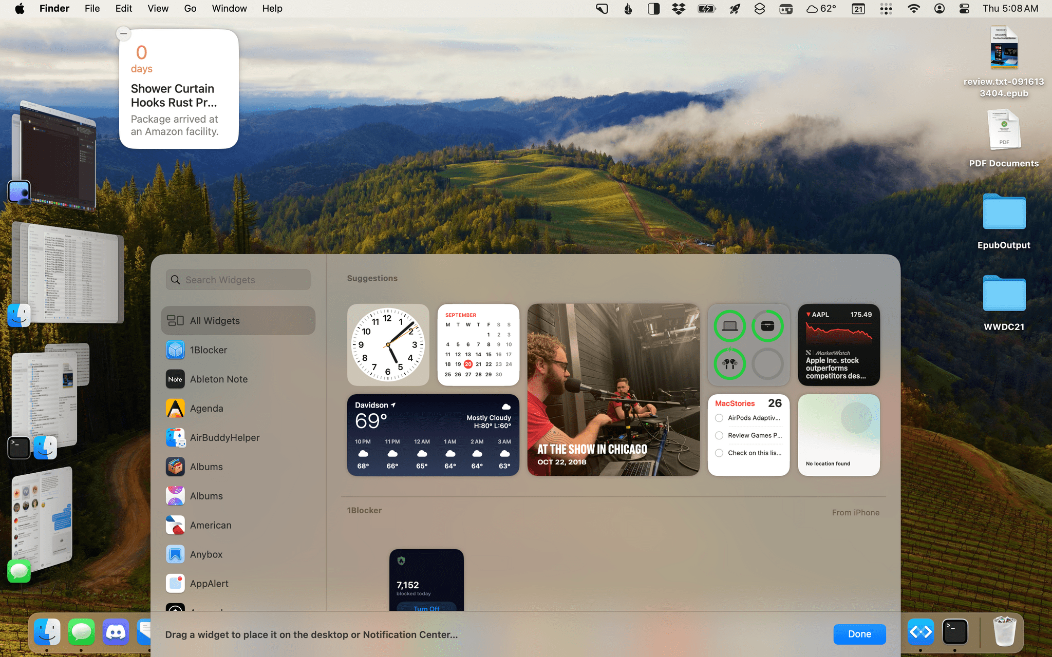
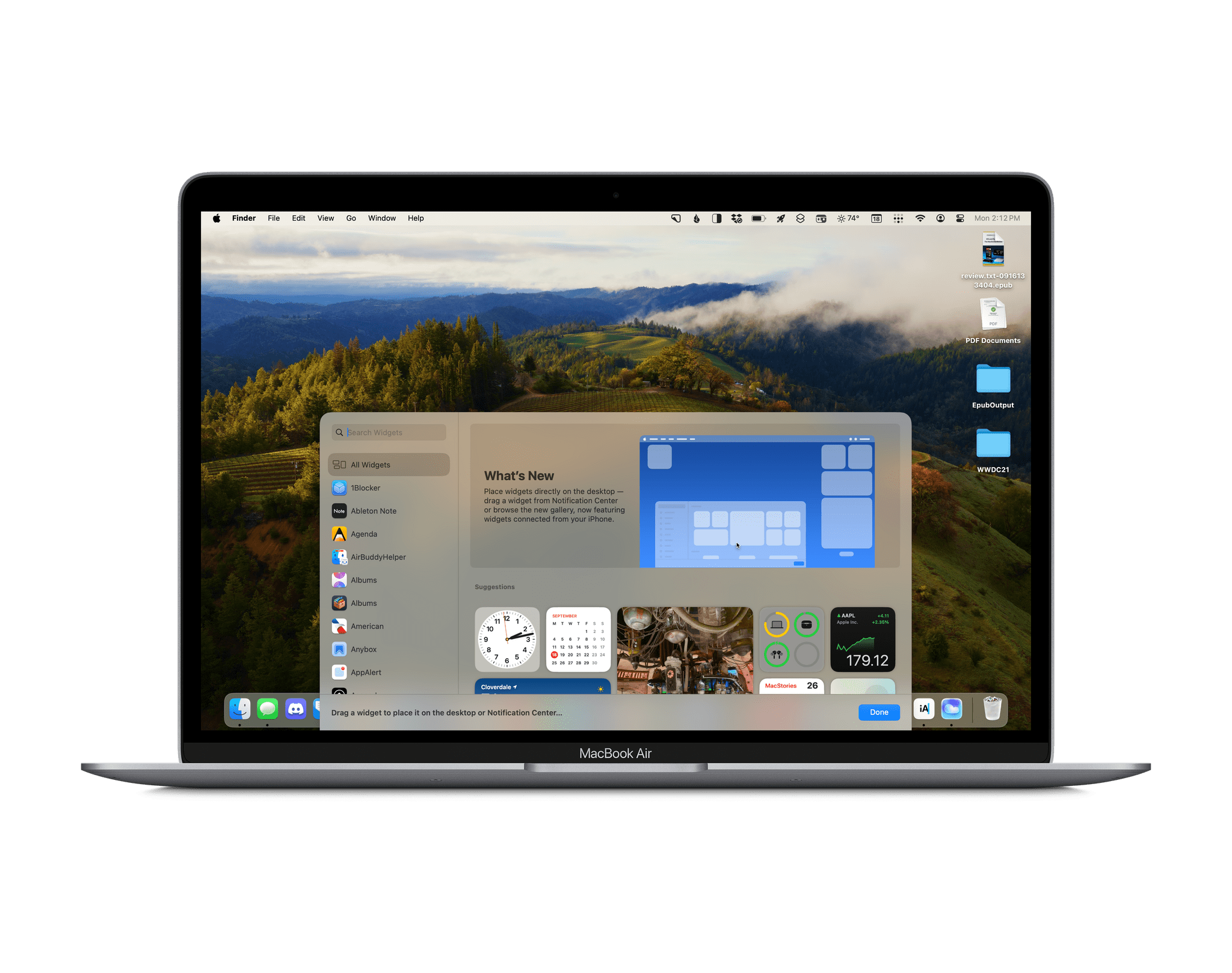
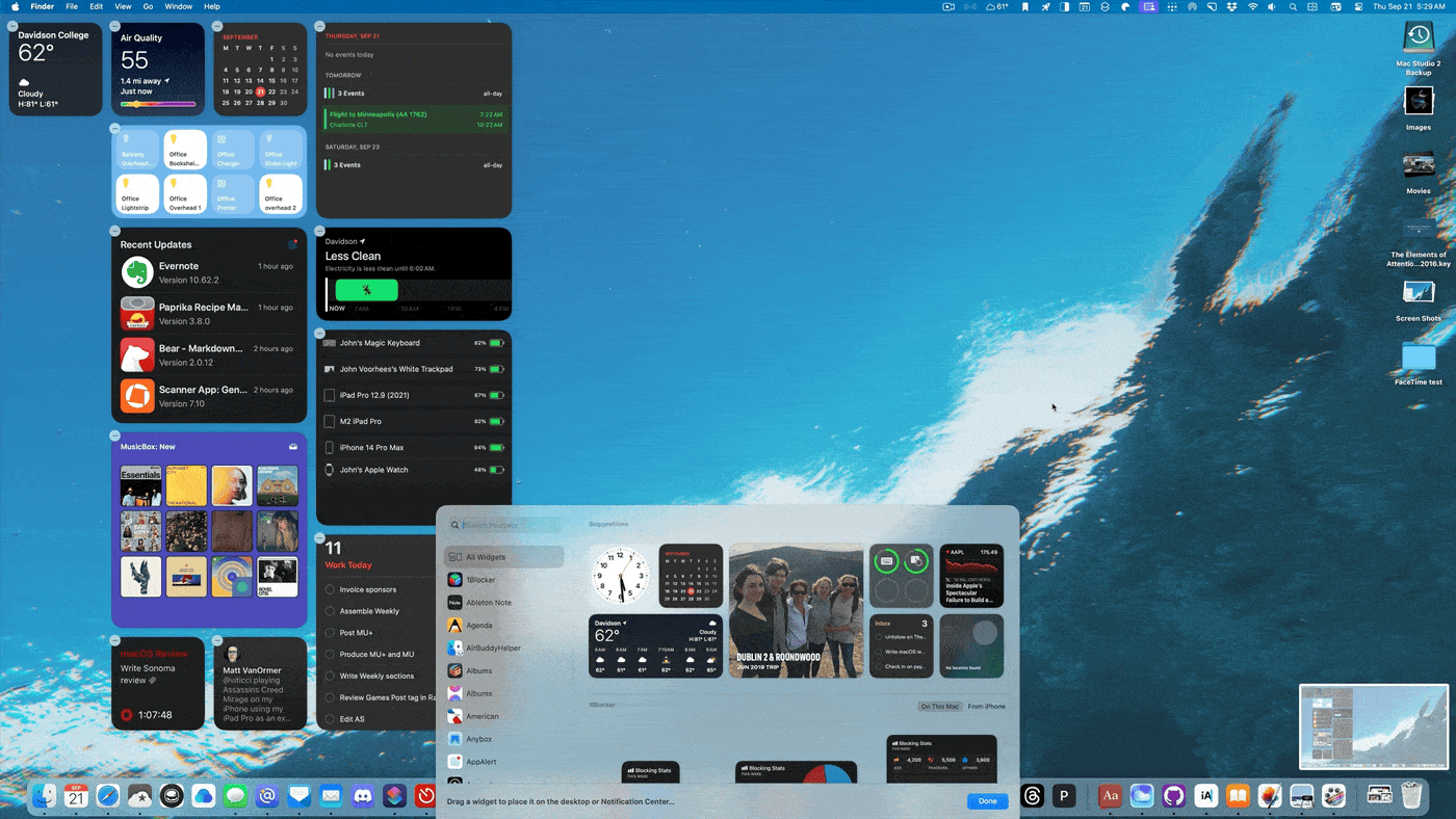
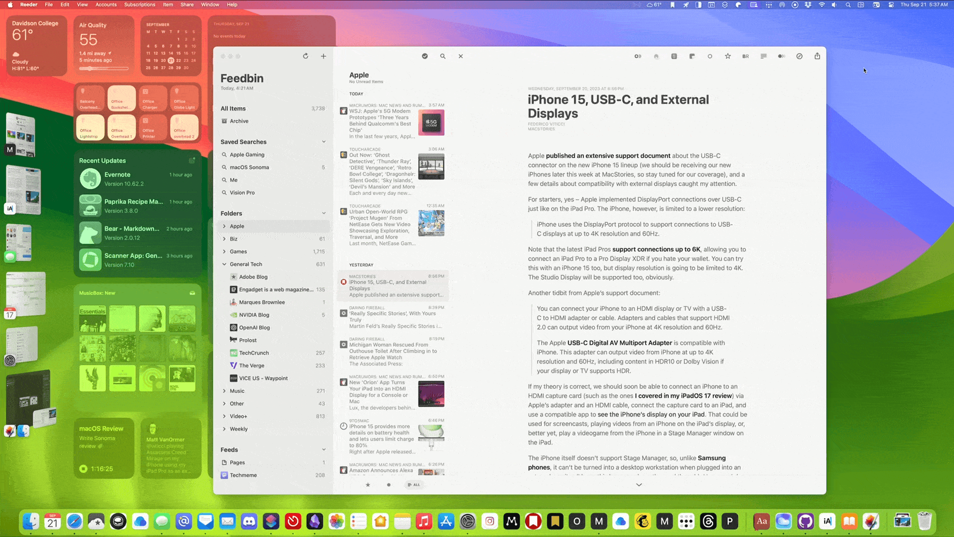
Apple has created an entirely new UI for managing your Mac’s widgets that has a lot in common with the iPhone and iPad. Right-click on the desktop or open Notification Center, and in either case, pick ‘Edit Widgets.’ A panel will slide up from the bottom of your screen. On the left of the panel is a sidebar with a search field and an alphabetical list of all of the apps that offer widgets. On the right are images of the widgets themselves, with each size and type offered organized with Suggestions at the top, followed by the apps in alphabetical order.
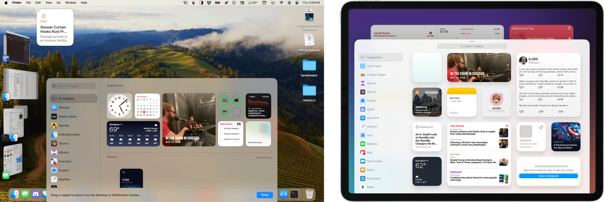
On the right side of the panel, some blocks of widgets say ‘From iPhone.’ That’s because the catalog of widgets from which you can choose has been expanded with macOS Sonoma. Not only can you pick widgets offered by the Mac apps installed on your computer, but if you have an iPhone on the same Wi-Fi network or nearby, all of your iPhone widgets are available, too. Curiously, iPad widgets aren’t available on macOS Sonoma, perhaps because doing so would result in a lot of duplicate widgets.
The inclusion of iPhone widgets on the Mac was a big surprise at WWDC, but it makes a lot of sense, especially when considered in the context of iOS 17’s StandBy mode. By putting iPhone widgets on your Mac desktop, you get the benefits of the glanceable information they offer on the iPhone, while still using StandBy on your iPhone uninterrupted.
However, there are a couple of downsides to iPhone widgets being available on the Mac. It’s the professional hazard of someone who writes about apps like I do, but I have a lot of apps on my Mac and even more on my iPhone. I’m undoubtedly an outlier, but the result is that the list of apps and widget previews in Sonoma’s widget panel are long. Search and the sidebar list of apps make it faster to navigate, but scrolling is choppy at times. I expect that if I had fewer apps the situation would improve, but as it is, the interface feels a little broken on my Mac.
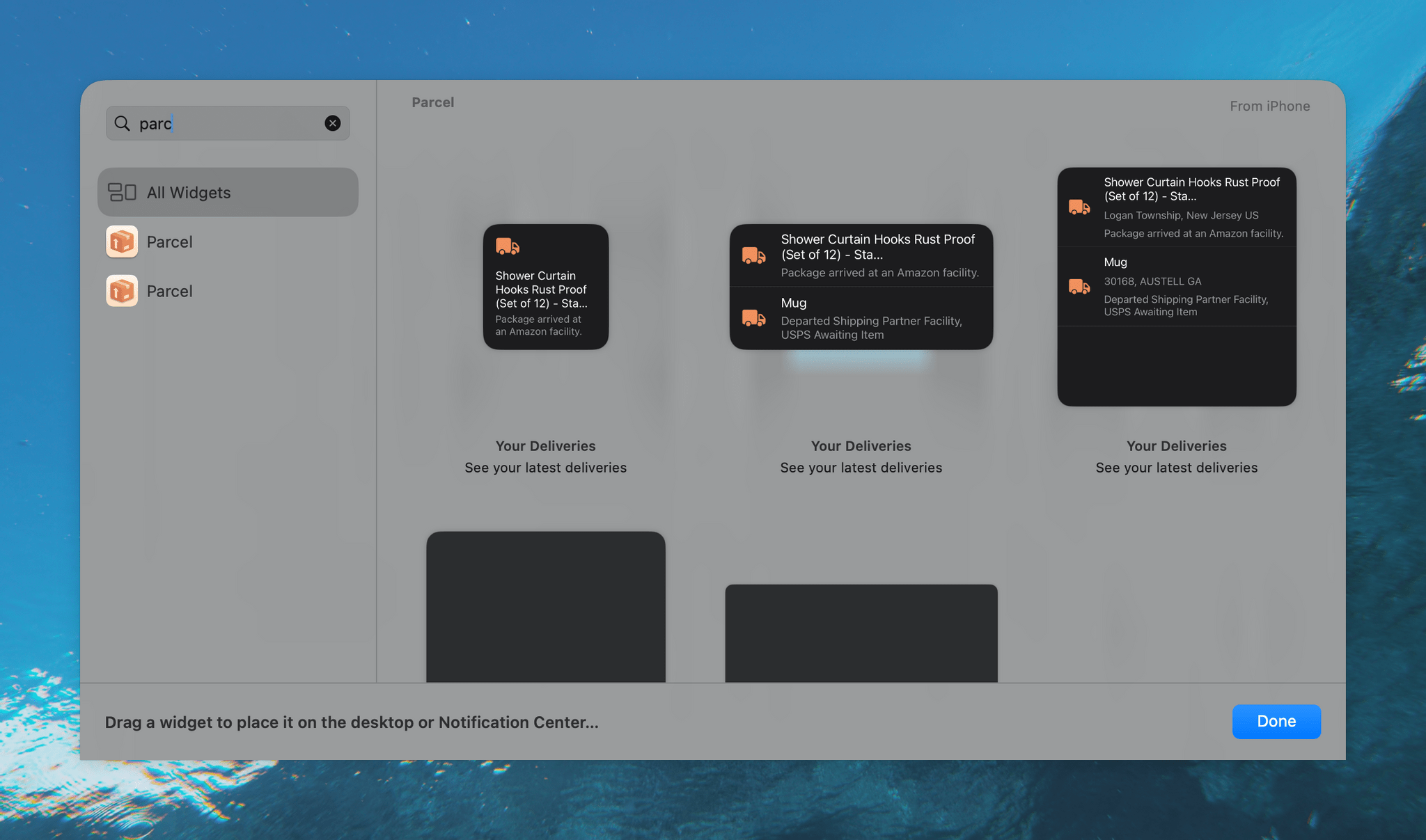
The other problem is that because some apps offer separate iPhone and Mac apps, you’ll sometimes see two entries for an app in your list of widgets. If you do, pick the Mac one because iPhone widgets come with some limitations. For example, the delivery tracker Parcel has separate iPhone and Mac apps. The app’s widgets look the same, but if you pick the iPhone version and click on a delivery, the app will tell you that you need to open the iPhone app for more details about your package. However, if you use the Mac version of the same widget and click on a particular delivery, the app will open immediately with that package selected. Fortunately, the list of widgets labels the ones that are from your iPhone, so it’s not hard to choose the Mac version if you see two widgets for the same app. I can’t help but wonder whether having two widgets that look the same but behave differently will lead more developers to release Universal versions of their apps.
Apple’s designers have come up with a clever tiling system to avoid your widgets becoming a jumbled, disorganized mess. When you drag a widget to the desktop near another widget, an outline appears, showing where it can be placed in relation to your other widgets. However, if you drag a widget to a spot far away enough from other widgets, you can drop it anywhere you want. Also, if you have folders and files on your desktop, moving a widget over them will cause the folders and files to flow around the widget so they’re not obscured. Another way to avoid widgets competing with your folders and files is to activate Stacks, which organizes your files and folders into neat piles along the right edge of your desktop.
What you can’t do with widgets on the Mac is overlap them or stack them the way you can on the iPhone or iPad. I feel like I have plenty of room to place widgets on the Studio Display’s 27” screen without stacking, but that limitation will undoubtedly be a problem for some 13” MacBook Air users (myself included), especially if you’re used to being able to assign different widgets to multiple Home Screens on a similarly-sized 12.9” iPad Pro. That’s because you can’t place a unique set of widgets per Space on a Mac. So, if you were hoping to create different sets of widgets and assign them to project or task-specific Spaces, you’re out of luck, which is a shame and something I’d love to see Apple address in a future update.
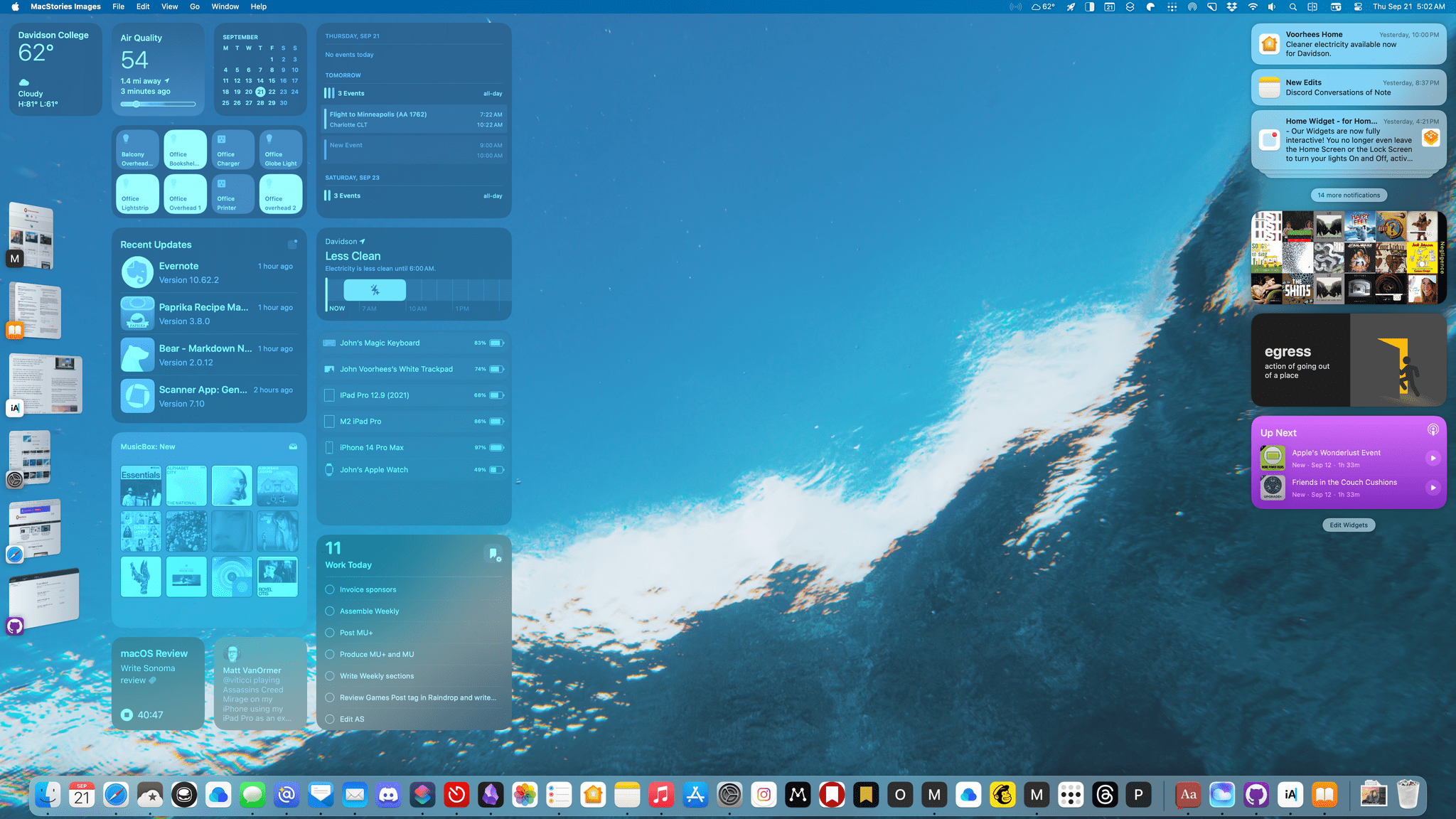
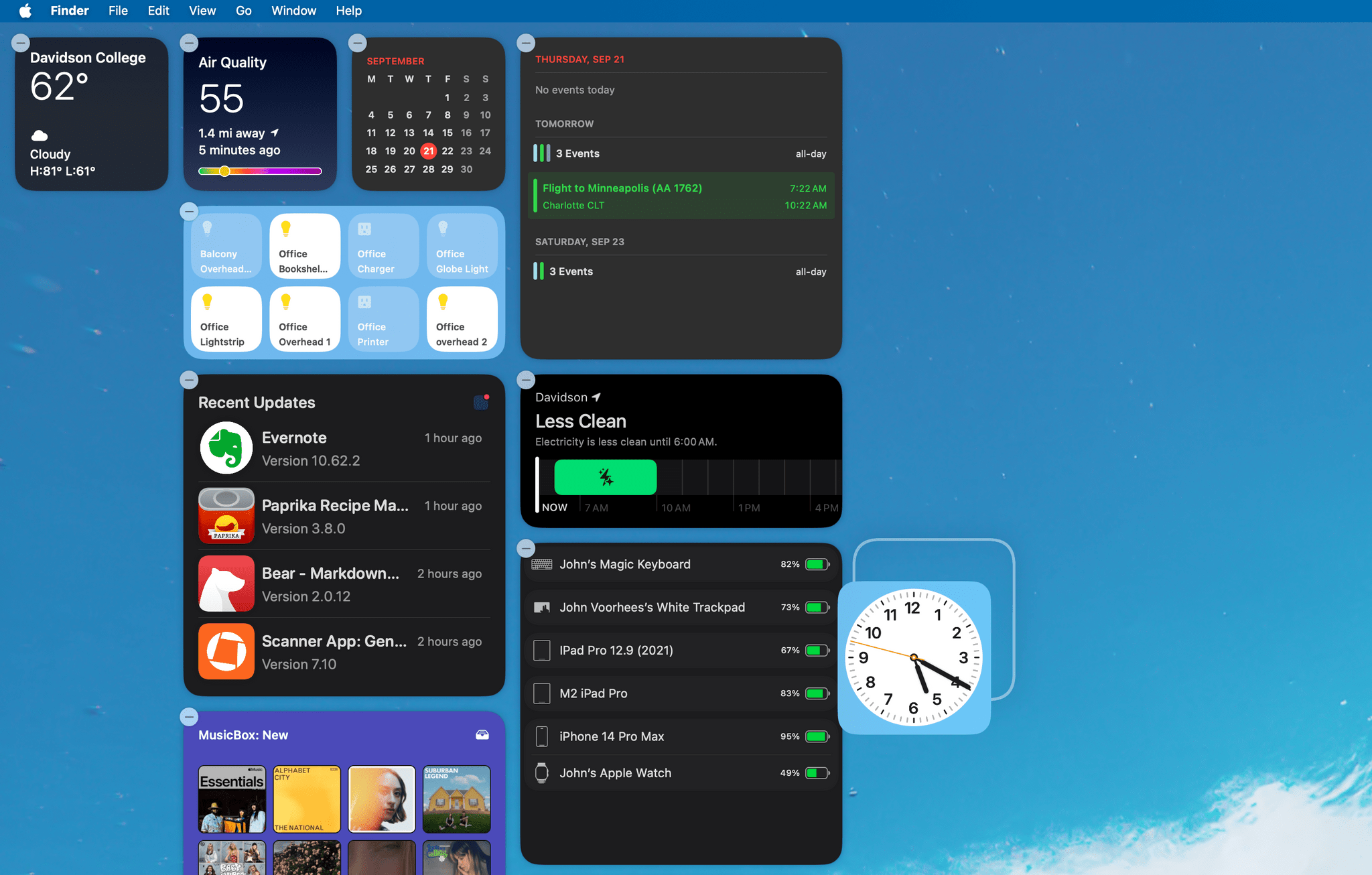
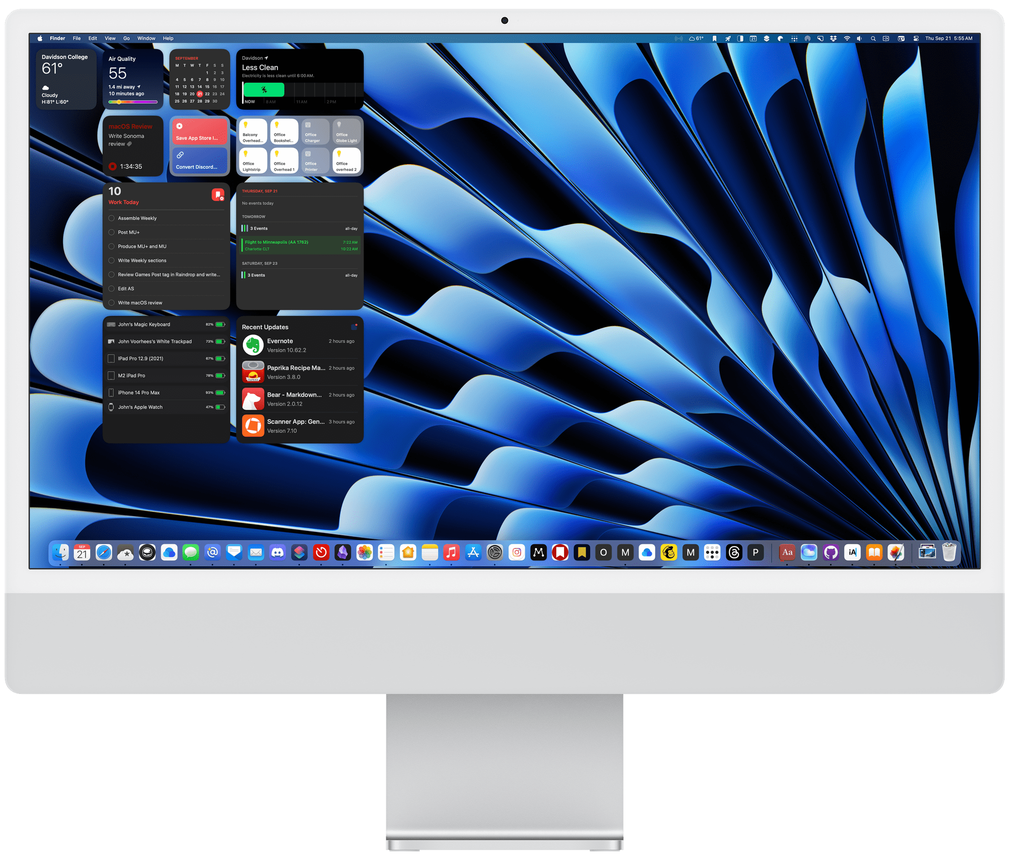
Limitations aside, simply having widgets where I can see them has been a game changer. I’m especially happy with how well widgets work with Stage Manager, which I’ve been using full-time since last fall’s Ventura’s release. I usually don’t cover Stage Manager’s strip with apps, so I can see what’s available to me. On the Studio Display, that leaves a bit of space at the ends of the strip that is perfect for widgets. The top corner is where I’ve put a small Weather app widget with the current conditions and predicted high and low temperatures. The rest of the widgets are loosely arrayed in the top left corner of my screen in an orderly grid, thanks to Sonoma’s layout system.
Widgets fade into the background when a window is active, but they are still interactive and take on the colors of your wallpaper.
I’m also a fan of the way widgets fade into the background when an app is active, taking on the color scheme of the wallpaper behind the widgets. Some may find this distracting, but for me, it’s not been any more distracting than having information in the menu bar or other app windows peeking out from behind whichever one I’m currently using.
When I want to see a widget that’s covered up, I can click on an open space on the desktop, which whisks all windows away into Stage Manager’s strip. Alternatively, I’ve set the top right corner of my screen as a Hot Corner that reveals the desktop, which has a similar effect. Whichever way I choose to clear my desktop temporarily, doing so not only reveals all of my widgets but returns them to their full-color glory, allowing me to focus on the information each has to offer.
But widgets on the Mac’s desktop have more to offer than just up-to-date information on things like the weather, your calendar, or packages making their way to your home. As on iOS and iPadOS 17, macOS Sonoma widgets are interactive, even if they’re faded out in the background. That allows me to do things like adjust the lights in my office or turn off a battery charger when I see from another widget that a device is fully charged. Other times, I’m checking off tasks in Reminders or starting a timer in Timery. What all of these widget interactions have in common is that they’re the sort of things I repeatedly do throughout the day. Over the course of the summer, I’ve discovered that bringing these micro-tasks to my desktop is far less distracting than grabbing my iPhone to do them.
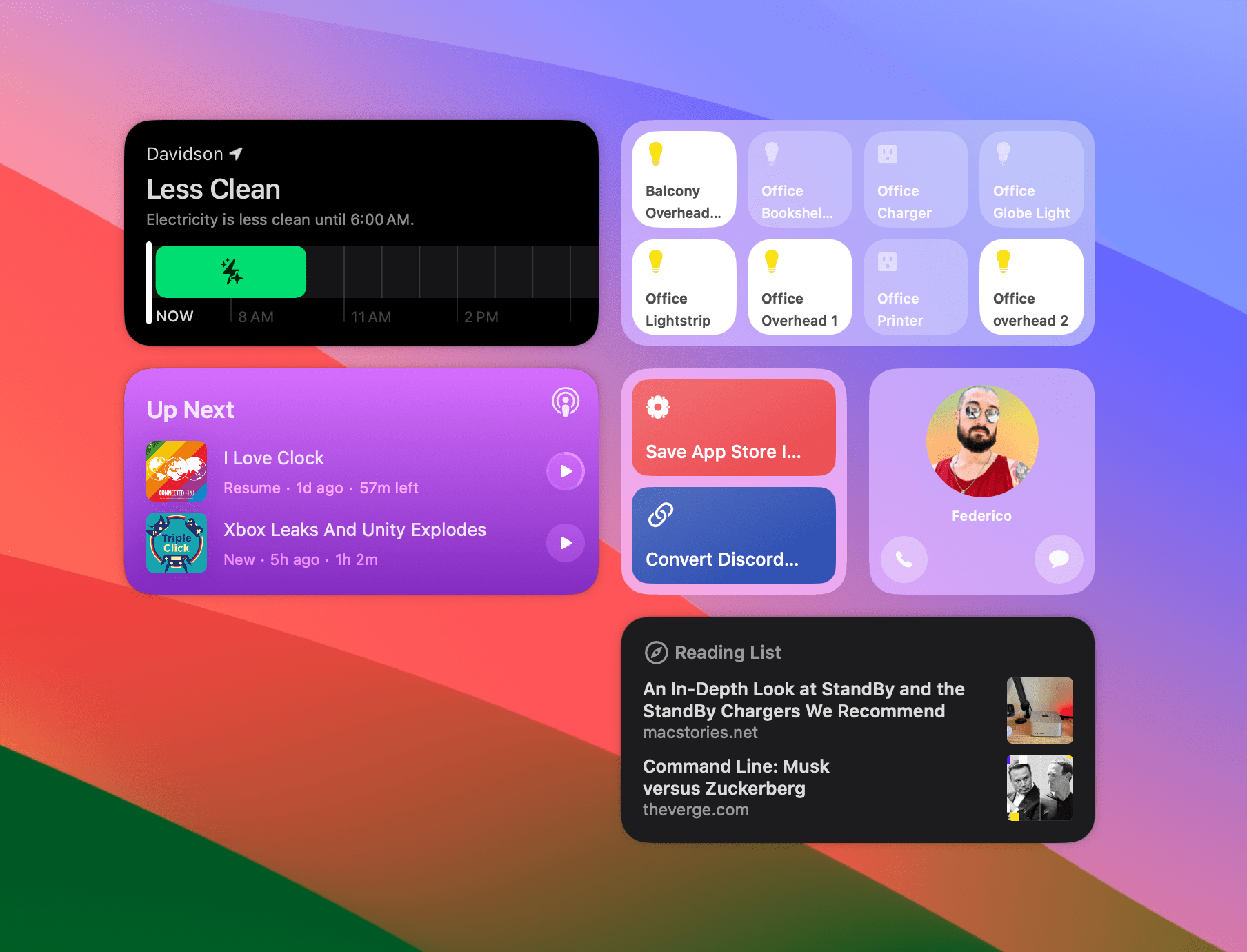
Along with moving widgets to the desktop and making them interactive, Sonoma also introduces new and updated system widgets. The one I use the most is one of the two new Home widgets. The widget comes in small and medium sizes, which accommodate four and eight actions, respectively, and can control individual HomeKit accessories or activate scenes. If your needs aren’t met by the eight tiles available in the medium-sized widget, you can add additional Home widgets to cover more devices and scenes, but I also recommend checking out Home Widget by Clément Marty, which I recently reviewed on MacStories.
The other Home widget comes in small and medium sizes and is a timeline showing when it’s estimated that the energy in your area will be cleaner, using a new Home feature called Grid Forecast. By keeping track of when energy will be cleaner, you can defer tasks that require a lot of electricity to a time when their environmental impact will be less. I’d love to see this feature built out as part of Shortcuts to allow me to shift my electricity usage automatically. Apple has also introduced Contacts, Shortcuts, and Safari widgets for the first time on the Mac, each of which is the same as its counterpart on iOS and iPadOS 17.
Apple Podcasts has added interactivity, too, allowing users to play and pause episodes from its widget. In a future update, Apple has promised a Music widget for the Mac, which would be a first for the OS. According to Apple, the Sonoma Music widget will include playback controls, allow users to follow top charts, and offer music recommendations for Apple Music subscribers. There’s been no word yet on when the Music widget will debut.
Of course, the new interactive widgets can be offered by third-party developers, too. We’ve already covered some of the apps that feature interactive widgets on MacStories and will continue to cover them throughout the fall.
Until Sonoma, widgets on the Mac seemed like a half-hearted experiment. Hiding them away in Notification Center allowed Apple to check the feature parity with iOS and iPadOS boxes, but that’s about it. As originally conceived, widgets were meant to provide glanceable information to users, so tucking them away where they couldn’t be seen at a glance defeated the whole purpose of them.
With interactivity and moving widgets to the desktop, Apple has placed a bigger bet, of which widgets are just one part. As Federico explained in his iOS and iPadOS 17 preview story,
Widgets are transforming apps into modular experiences that go beyond glanceability.
[T]o an even greater extent than what Shortcuts has been doing for years, interactive widgets take specific functionalities of apps and make them available as à la carte components that you can mix and match however you want. It shouldn’t be surprising, then, to know that this is possible because App Intents, the technology that powers Shortcuts actions, is being used for actions in interactive widgets, too.
When you look at widgets and features like Live Activities, Focus modes, and App Shortcuts through this lens, it’s easy to see similar modular solutions playing out on visionOS, a HomeKit hub device with a screen, and other products Apple might be considering. All are built on top of App Intents, the technology that underpins Shortcuts, which is fascinating, but it is widgets that have begun to emerge as the glue among Apple’s hardware platforms.
Those connections among devices have fundamentally changed how I work. I find myself using a combination of Mac desktop widgets, iPadOS widgets on my iPad Pro using Universal Control, and my iPhone in StandBy mode. That may sound like a lot, but as a substitute for grabbing my iPhone or iPad and risking getting sidetracked, having the right widgets arrayed across multiple devices working in concert is a far better solution.