This Week's Sponsor:

Copilot Money

Copilot Money, The Best Money Tracker, Launches on the Web – Limited-Time: Get 26% Off + 2 Months Free


Posts in reviews

Readability for iOS Review

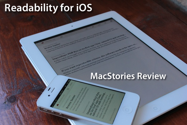
The official Readability app for iOS, available today on the App Store, had a complicated history with Apple and its approval process. Since Readability relaunched last year with an ambitious focus on publishers and “read anywhere”, the service struggled to get its native app for iPhone and iPad approved by Apple due to an initial controversy with iTunes app subscriptions, which were seemingly reserved to “publishing apps” only, and weren’t meant to be accessed by any third-party developer. With the app stuck in a limbo, Readability went back to the drawing board and developed a full-featured HTML5 web app for mobile devices, whilst releasing additional tools for the web and Kindle at the same time. Months passed, and Readability – which in the meantime put together a quite impressive list of advisors and supporting developers – announced an updated strategy with free access for everyone, and a paid option for users willing to actively and directly contribute to the sites they are reading the most in Readability. With the new free plan, Readability also announced they had submitted a new version of their iOS app to Apple. Three months later, the app is now live on the App Store.

I have been able to test the app – a collaboration between Readability and development and design studio Teehan + Lax – for the past week, and I’m fairly impressed by this first version. But let’s go back to the main point: what’s Readability? And how does the native iOS app complement the ecosystem the developers have built in the past 12 months?

Much like Instapaper, Read It Later, or recent entrants in this scene like Evernote Clearly, Readability’s goal is to declutter webpages to offer an elegant, comfortable reading view on any device. Meant for web articles, Readability can fetch a webpage’s text and images, strip out unnecessary elements like ads, and reformat everything with a focus on beautiful typography, a clean layout, and the possibility of syncing this reformatted content to mobile devices like an iPhone, iPad, or Android handset. Like the services mentioned above, Readability works in any web browser thanks to a bookmarklet or extension, as well as compatible third-party apps that have been updated to include a “mobilizer” functionality or a “send to” action to forward URLs directly to a Readability account. As you can see from Readability’s website, the list of apps supporting the service includes excellent names like Tweetbot (our review) and The Early Edition 2.

With the proliferation of read-later tools and apps we’ve witnessed throughout 2011, why would anyone switch from, say, Instapaper or Read It Later to Readability, which is a rather new player in the field? Well, for one, Readability isn’t exactly new to this market, as the company behind it, arc90, licensed the original codebase for its reading technology to Apple for the Safari Reader feature seen on the Mac and iOS. Second, to differentiate its product from the plethora of available read-later browser companions and mobile apps, Readability spiced up its offering with a unique “support the publishers” spin that, as we detailed, allows users to pay for Readability and give 70% of their subscriptions back to the websites they read.

Readability explains:

Here’s how it works: Every time you use Readability to read an article, a portion of your monthly contribution is earmarked for that publisher or writer. For example, if half of the stories you read in a given month come from The New York Review of Books, half of your earmarked funds will be allocated to The New York Review of Books.

With these differences in mind, I was excited to try the finally-approved Readability iOS app, and see how it would compare to Instapaper, which is my go-to app and service when it comes to saving articles for later, as I wrote in my review of version 4.0. From an Instapaper lover’s perspective, let me get this out of the way right now: if you’re used to all the features Instapaper offers – especially on the iPhone and iPad – you’ll be disappointed to find in Readability for iOS a “simple” app to read the articles you’ve saved from a browser. There is no discovery, no Friends integration, no support for forwarding liked items to Pinboard or Evernote. On the other hand, Readability’s simplicity and focused approach might just be what you’ve been looking for, so let’s dive in. Read more


OmniOutliner 1.2 for iPad Sets the Stage for iCloud Sync

OmniOutliner 1.2 Document Browser

OmniOutliner 1.2 Document Browser

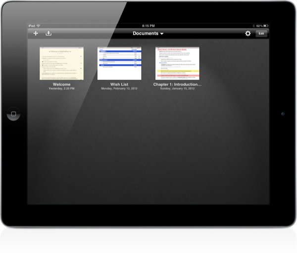
The Omni Group have removed the carousel in OmniOutliner 1.2 for a new document browser that closely resembles Pages’. Giving a broader overview of your outlines, the new file browser makes it much easier to scroll through dozens of documents without having to individually file past each one. The new file browser doesn’t let you create folders or sync to the cloud, but the original WebDAV and iDisk implementations are still available for online storage.

Read more


Vimeo 2.0 for iOS Review

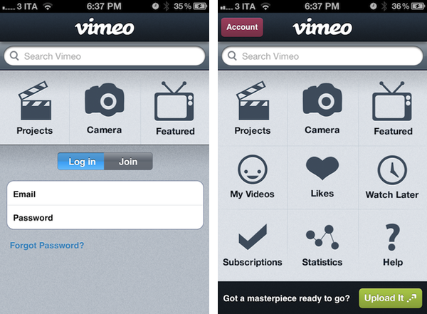
Released earlier today for free on the App Store, version 2.0 of Vimeo’s iOS app aims at making video discovering and editing more intuitive and accessible on the iPhone and iPad. With a brand new interface that was originally previewed in January, Vimeo 2.0 for iOS packs a new grid design on the iPhone that makes it easy to navigate the various sections of the site whilst retaining all the functionalities of the previous version (our review) and also adding new ones, but more importantly, it now allows iPad owners to completely manage their Vimeo accounts with options to browse videos, load subscriptions, check on the Watch Later queue, and even shoot, edit, and upload new videos straight from the device.

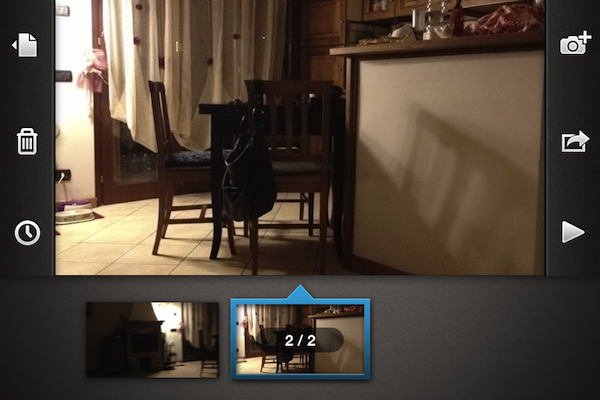
I took the app for a quick test this morning, uploading a video you can check out after the break. The (very) quick video was shot with a Canon EOS 550D, imported on the iPad through the Camera Connection Kit at 720p as .MOV file, edited in Avid Studio, then passed to Vimeo for upload. Interestingly enough, the Vimeo app couldn’t recognize my .MOV file in the Camera Roll, whilst Avid Studio successfully found it, allowed me to edit it, and exported it again at 720p to the iPad’s library. iMore has a good comparison of Avid Studio Vs. iMovie for the iPad. I prefer Avid Studio as well.

Vimeo for iOS puts great focus on discovery, sharing, and uploading of your own videos. Whereas the editing interface of the iPad is largely similar to its iPhone counterpart (meaning you’ll be able to easily drop media onto the editing timeline, add effects and transitions – but don’t expect the complexity of other apps like iMovie and Avid) with options to shoot new videos or load existing ones off the device’s Library, the remaining sections of the app have been reworked to fit better on the iPad’s larger screen. Upon firing up the app, you’ll be brought to the main Featured area, which lists featured videos and Vimeo staff picks, enabling you to start playing a video in the lower portion of the screen – all whilst being able to read descriptions, like a video, or save it for later. My Videos and Likes are also available in this page’s tab bar at the top.

The app works both in landscape and portrait modes, albeit I’ve found to enjoy it more in landscape given the additional screen real-estate. Videos can be played in standard definition or HD, just like on Vimeo’s website. Most of the functionalities of Vimeo.com have been ported over to the app, including comments, sharing options (for Facebook, Twitter, Tumblr, WordPress, and email), Creative Commons information, and stats. Overall, I thoroughly enjoyed the way Vimeo designers converted the design of Vimeo.com to a native client – I also found the iPhone’s grid UI scheme to be particularly easy to navigate.

There are a couple of interesting things about this app. For one, Vimeo has embedded a link to purchase a Vimeo Plus subscription into the app’s Settings, but this link simply points to Vimeo.com and not, say, Vimeo’s own Upgrade page. It’s still a curious choice given Apple’s history with Amazon and links pointing to external stores (which, apparently, Vimeo isn’t doing here as they simply redirect users to the website’s homepage). In the same Settings UI, you can check on your weekly upload limit, remaining HD uploads, and overall stats. You can allow only WiFi uploads, clear the file cache, and reset the app from a sub-menu in the Settings.

Whilst the Help section opens an awkwardly small Help Center webpage inside a popover menu, much better is the functionality offered by the Stats tab, which lists your Top Plays by number of views, date, and country. The Edit section, which is project-based, mirrors the feature set of the iPhone app, allowing you to import videos from your Camera Roll, edit them, then upload them to Vimeo. From this area, you can also delete projects, render and export, or simply add new projects by hitting the + button in the top right corner.

I think Vimeo’s second attempt at delivering a rich iOS experience is a good one. The iPad app still has some rough edges, and its editing capabilities aren’t obviously on par with more powerful offerings from the App Store, but it’s sufficiently good for quick edits, and pretty great at browsing and discovering new videos. It also makes for a sweet “catch-up solution” thanks to its lean back Watch Later feature integrated right into the app. The updated iPhone app, on the other hand, is cleaner, easier to use, although it could be deemed as slightly unoriginal after all the apps that have adopted a grid design in the past years. Still, the even-so-less-innovative Home screen grid implementation works fairly well for this kind of app.

Vimeo 2.0 is a great update, and an overall good app. Give it a try for free on the App Store, and check out an extremely quick attempt at capturing the essence of the app after the break. Read more


Exploring MoneyWiz: Complete Personal Finance Control On Your iPad

It wasn’t originally a New Year’s resolution to keep better track of my spending, but by the way things have turned out, it almost seems as if it was one. Early in January I began looking for a good Mac app for exactly this task. Originally I had hoped that Saver, an app I reviewed last year had since released an iPad app that I had not heard about – I really liked the app but wanted it on the iPad or Mac. Unfortunately Saver is still iPhone only, so I looked around a bit longer, asked around and tried a few apps on the Mac. I wasn’t thrilled with what I found. They all seemed a little to complex for what I wanted, so I kept looking. I forget how, but I eventually stumbled upon MoneyWiz which is available on the iPad and iPhone (at the time it was called SilverWiz). The developers haven’t yet released a Mac version (they’re working on it and expect to launch it in Spring this year), but they did give me an early look at the recent update to MoneyWiz for iPad (version 1.3), which launched late last week.

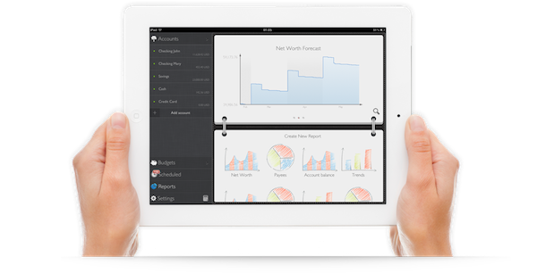
MoneyWiz for iPad does a couple of things: it keeps track of your expenses, allows you to set budgets (and track your progress), and provides you with the ability to create reports on various aspects of your financial situation. More importantly, I found MoneyWiz to be very flexible, not overly complex like some of the Mac apps I tried, and, at the same time, full of a wealth of features that should be sufficient for most individuals. Read more


Adobe Photoshop Touch Review

When I first heard that Adobe was bringing Photoshop to the iPad sometime last year, I was sceptical. I presumed it would be a very limited app compared to the powerful desktop app, or maybe just a slightly improved version of Photoshop Express. At best I thought it might give you some good editing tools to fix and correct photographs, perhaps with some layer support and effects. I didn’t think Adobe could pull off creating a great tablet version of Photoshop, and I wasn’t sure the iPad would be a good fit for the tasks in Photoshop.

So when I finally got to try out Adobe Photoshop Touch, I was intrigued to see what Adobe had accomplished. After a couple of hours playing around in the app (it accidentally went live yesterday, then Adobe pulled it) I’ve come away very impressed with what Adobe has accomplished. Photoshop Touch is a powerful and capable version of Photoshop for the iPad, without a doubt. To me, it is the latest iPad app that has demonstrated that the iPad is for more than “content consumption” — that’s just an old myth now.

It’s the apps that make the iPad great and Photoshop Touch is perhaps the prime example of the potential of the device and how flexible it is at becoming a great machine for a whole slew of different tasks, from reading, to writing, to viewing to editing and now, to using Photoshop for more than just basic photo edits. Sure, Photoshop Touch is still not as powerful as the desktop version, in fact it’s quite a distance away from reaching such parity — but it all comes down to the car Vs. truck analogy that Steve Jobs rather famously explained. Photoshop on your Mac or PC is still available for when you need to do complicated and advanced tasks, but for a lot of other tasks, you could probably migrate to the iPad and Photoshop Touch.

Enough with the introduction, let’s dive into our review of Photoshop Touch.

Read more


Buzz: My New Phone App Replacement and Contact Hub

I’m not typically one that likes to replace Apple’s core iOS apps with third-party alternatives, but Savvy Apps’ latest iPhone app, Buzz, allows me to access my contacts faster than Apple’s own Phone software, and I had to leave a spot for it in my Dock.

For the past two weeks, I’ve been testing Buzz, the latest production by iOS design and development firm Savvy Apps by Ken Yarmosh. Similarly to Agenda, also by Savvy Apps, Buzz comes with its own clean, custom UI focused on presenting text against a light background that contributes to increasing readability and finding things in seconds. Whilst I believe Agenda benefits more from this design aesthetic because of how it handles information density (a calendar app can get pretty busy), the same focus on clarity and simplicity works equally well for Buzz, which is a quick dialer/contact management app that emulates many of Apple’s Phone functionalities in a completely new interface.

Think of Buzz as a minimalist take on Apple’s Phone app, aimed at enhancing a few important functionalities, leaving out many others that are (at least in my workflow) rarely used. Whilst Phone.app obviously offers control over recently missed phone calls, the voicemail, and your system favorites, Buzz takes the “quick shortcut” aspect of apps like Launch Center and Matt Gemmell’s Favorites, combines it with group management and native integration with the Address Book, and comes up with a rather unique implementation that allows for a very lightweight usage, or deeper full-blown contact interaction. I believe many out there will find it hard to completely give up on the native Phone app – especially for the Recents view – but I found Buzz to be enough for me and, if anything, a better solution for my daily Address Book needs. Read more


Storify for iPad Review

Since its release in April 2010, the iPad has been widely regarded as a “consumption device” not really suited for “content creation”. Whilst we have already examined the issue with dismissing the iPad as a device that’s not capable of doing the same things a computer can – and my friend Shawn has a good take on why “content” generally is an awful marketing umbrella – the Storify iPad app, coming today for free on the App Store, is yet another example of how the iPad is changing the way we create through unique interfaces built around touch and the strengths of iOS.

Storify is an interesting service. Per se, Storify isn’t strictly focused on allowing you to create original content (images, text, or a combination of both) that you can share with your friends; rather, Storify is a curation tool that, among other services, leverages Twitter and the openness of the web to let you create “social stories” based off elements shared by people you follow, or just about anyone else on the Internet. Storify wants to tell stories by “curating social media”. I have covered the topic of curation – especially Twitter curation – several times on MacStories, and I recently mentioned Storify in my review of Tweet Library, an iOS app by Manton Reece that enables you to create collections of tweets for future reference. As I detailed in the article, Storify integration in Tweet Library means you can easily collect tweets from a variety of sources (people you follow, Twitter lists, favorite tweets – Tweet Library does a great job at breaking up Twitter sections in neatly organized “sources” panels) and publish them online as a bundle on Storify. The first official Storify iPad app, however, brings the full feature set of Storify (or at least the majority of its online functionalities) to the tablet, mirroring the web counterpart available at storify.com to allow you to create visually rich social stories that go beyond collecting data from Twitter.

I have been able to test Storify for iPad in the past weeks, using it to create and edit stories that I’ve embedded on MacStories such as this one, or this one. When I first talked to Storify CEO Xavier Damman about their upcoming iPad client, I wondered how well the team had managed to port the desktop user interface and experience of Storify, which is largely based on drag & drop, to the iPad. Furthermore, the Storify web app benefits from the desktop nature of the web browser, which makes it easy to switch between dozens of tabs, collect links, snippets of text, and images, or simply open links from other applications without having to worry about “switching back” using a multitasking tray, such as the one we have on iOS. These are all problems a native iPad app should somehow address, I thought, as it’s not just as easy and quick to switch between the browser and multiple sources on an iPad, and I wouldn’t want the Storify creation process to become slow or, worse, cumbersome. It turns out, the Storify team solved the problem with converting mouse interaction to multitouch, and quite beautifully. Read more


Screens 2.0 Review

I’ve always been a huge fan of Edovia’s take on VNC, Screens. Originally released in late 2010 for the iPad, Screens was also ported to the iPhone and later the Mac, allowing iOS and OS X users to connect to remote machines using standard VNC protocols (Lion logins are also supported by Screens), as well as Edovia’s own ScreensConnect utility to assign a unique hostname to computers behind networks that allow for outside access. To get an overview of Screens, you can take a look at some of your previous coverage.

Today Edovia is releasing a series of major updates to Screens for iOS and Mac, as well as ScreensConnect, which is now available at screensconnect.com to create a unique Screens ID for your Mac or Windows machine. I have been able to test the new Screens suite prior to its App Store release, and it’s still my favorite utility to quickly access my remote Mac mini, iMac, or MacBooks (Air and Pro) on my local office network. With its touch-driven UI, ease of use, and wide availability across devices (Mac, iPhone, and iPad for the Screens client; Windows and OS X for the desktop ScreensConnect utility), Screens is one of the most accessible VNC apps available on the App Store.

Since its release, I’ve always liked two things about Screens: touch controls and zero configuration. Once you download Screens, you’ll be able to search for computers that are advertising their screen sharing capabilities on a local network (on a Mac, make sure Screen Sharing is active under System Preferences -> Sharing), or add a machine that’s been configured to be reached using ScreensConnect. In the “Nearby & remote computers” window (a popover on the Mac), you’ll see computers from your local network, as well as those with an antenna icon next to them, indicating that they accept remote connections through ScreensConnect. The beauty of ScreensConnect, which is a free utility, is that it should make your computer accessible from outside your local network with literally no configuration, as the software takes care of (most) router settings and establishes a secure connection between a remote computer and Screens. As explained from the app’s Help section:

We could bore you with technical mumbo-jumbo but in a nutshell, Screens Connect monitors network changes, configures your router and sends this information on our server through a SSL encrypted connection so that Screens knows were your computer is and connect to it.

A note on ScreensConnect: whilst most modern routers support UPnP and NAT-PMP (required by Screens’ remote connection), some do not, so make sure you have a compatible model before considering Edovia’s Screens for its ScreensConnect functionality alone. I, for one, got ScreensConnect working just fine with my Fastweb connection in Italy (through Apple’s AirPort Extreme), as well as Telecom’s Alice (through an AirPort Express). Performance, as usual, depends on your Internet connection, so don’t expect ScreensConnect to magically improve speeds – there’s only so much smart connection scaling (from millions of colors to hundreds) can do.

Screens 2.0 comes with a new UI. Gone is the wooden texture of the previous versions, leaving room for a darker, more elegant background that will surely make your computer’s desktops pop. Whilst the change in visual presentation is welcome, much more functional is iCloud integration in version 2.0, which now allows you to keep your stored screens in sync across devices – and it’s just not “sync”, I was able to create a new screen on the Mac app, wait a few seconds, and see it coming up automatically on the iPhone and iPad, which were running Screens 2.0. Support for iCloud is fairly impressive and a godsend, because, honestly, adding the same screens over and over on multiple devices wasn’t really a great experience.

Alongside bug fixes, improved security and performances, and better support for wake-on-lan, Screens 2.0 comes with some additional new features. When controlling a computer, for example, Screens now displays a unified bottom toolbar that collects a series of shortcuts – including two types of keyboards, and an action button to grab a screenshot of the remote desktop (a new feature), disconnect, and open the Settings. On the iPad, this toolbar can be configured to become a swipe gesture area whilst in landscape mode, allowing you to associate a variety of commands to left or right swipes. The same app/Mac/window shortcuts can be configured with three and four finger gestures to perform directly on screen, and the selection here is very rich – for instance, you’ll be able to set up shortcuts to send the contents of your clipboard, or launch Mission Control.

Also new in Screens 2.0: you can reorganize screens in grid mode on the iPad, you can send the remote screen to an Apple TV using AirPlay Mirroring, and SSH Keys are now supported for SSH Tunneling. On the Mac, you won’t obviously get the iOS version’s custom keyboards and gesture support, but Screens 2.0 will support iCloud and auto-resume for ongoing connections.

With a new UI, better handling of remote connections, gestures, iCloud support, and a very intuitive touch-based VNC control system, Screens 2.0 is a fantastic update. ScreensConnect works as advertised, the iPad app benefits from the screen real-estate, and, overall, the app is very easy to use and configure. Screens, however, doesn’t come cheap, as the iOS app (universal) and Mac app will set you back $50 when combined. If you’re willing to pay for quality software and believe Screens’ feature set is right for you (make sure your router can work with ScreensConnect!), I’d personally recommend starting with Screens 2.0 for iOS today. Read more


Review: Osfoora for Mac

Osfoora Default Timeline.png

Osfoora Default Timeline.png

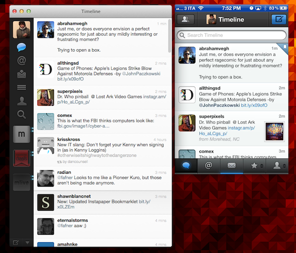
I have been a heavy user of Twitter for Mac since it was first released over a year ago. While certainly not perfect, for me, it is the gold standard of desktop Twitter apps. As such, it is impossible for me to be objective when reviewing a new client, as I will inevitably end up comparing it to Twitter for Mac (hereafter Twitter.app), so I’m telling you here and now that I didn’t even try to do otherwise. As a result, much of this review consists of comparisons between Osfoora and Twitter.app, and the best I can hope for is that other long-time Twitter.app users find it useful. So let’s get into it. Read more