This Week's Sponsor:

Copilot Money

Copilot Money, The Best Money Tracker, Launches on the Web – Limited-Time: Get 26% Off + 2 Months Free


Posts in reviews

Strophes

I have a good ear for the English language, but most of the times when I’m listening to music I still want to know exactly what a song says. Unfortunately, for the past years I had to cope with poor solutions to check out a song’s lyrics on the Mac; even worse, all of those methods sported no kind of integration whatsoever with the services I use to listen to music on a daily basis. It’s not just about iTunes anymore: today, my library is on Rdio, new releases are streamed every Tuesday, and I may casually check out a YouTube video or two as I look for that old live set or creepy 80’s Italian music video. Music comes from multiple sources, yet there hasn’t been a single, integrated app that could help in displaying lyrics on the desktop without using ugly and ad-filled lyrics websites.

Developed by Italian Alfredo Delli Bovi, Strophes wants to be the beautiful Mac app that’s integrated with the music apps you’re already using.

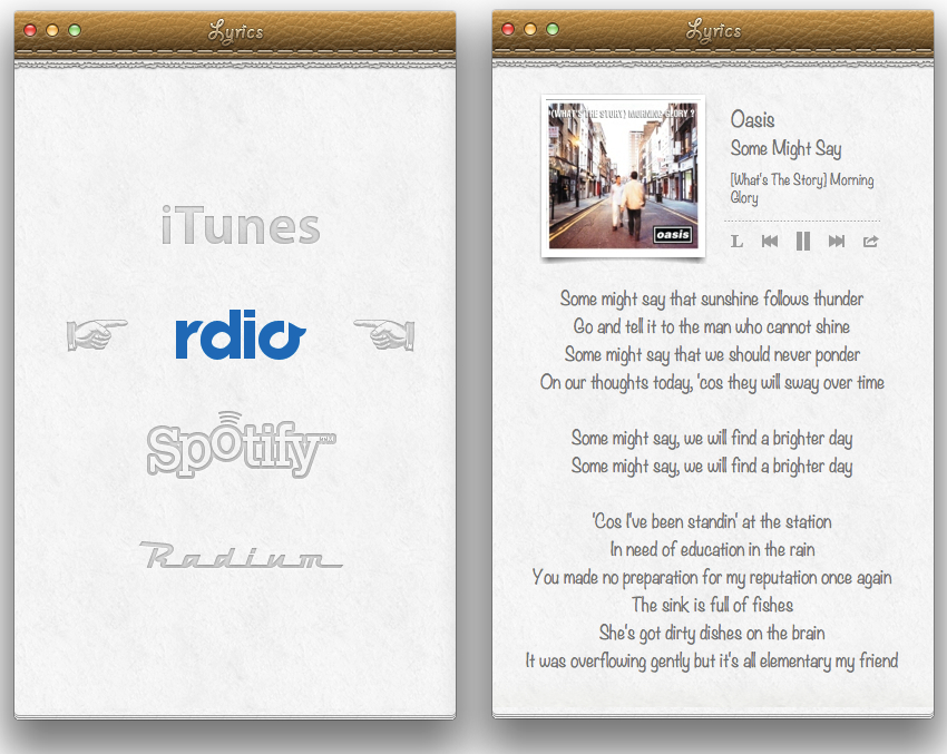
Before I delve into the app’s feature set, though, it is worth mentioning how Strophes’ deep skeuomorphic roots will likely fence several users off as they will look at bits of torn paper and stitched leather in disbelief and utter despise for interfaces mimicking real life object. Personally, whilst I am not the biggest fan of Apple’s Calendar and Find My Friends, I recognize how, to most users, Strophes’ appeal lies in its strong resemblance to recent Apple trends and design patterns. In that regard, Strophes almost feels as the app Apple would create if they were to offer their take on displaying song lyrics, which is to say – Strophes is a natural fit for the Mac platform, and, more importantly, it just looks better than any other lyrics app I’ve tried.

Strophes works with a variety of music players, such as Rdio. The full list includes iTunes, Spotify, and Radium as well; through an optional Safari extension – which needs to be downloaded from Strophes’ website – you’ll also be able to load lyrics for videos playing on YouTube.com. Strophes is extremely simple in the way it works: it plugs directly into your active music player, checks for the song that’s playing, and displays lyrics inline fetching them off the Internet. The app uses a lyrics database to find lyrics, and it also displays album artworks and artists information above the actual lyrics. Strophes can control music players, too, but I prefer to keep The Iconfactory’s Take Five on my Mac for those playback and pausing duties. Strophes automatically loads another song as the music player changes, and, as far as features are concerned, it can also visualize an artist’s bio through last.fm integration, and translate lyrics.

In my tests, Strophes has been reliable. Working in tandem with Rdio, it only failed to find lyrics a couple of times; when it did, it provided a link to open lyrics in the web browser. Most of the times, the app loaded lyrics just fine and within seconds.

Strophes is, by far, the best lyrics app I have found on OS X, and it works with the apps I am already enjoying to listen to my music library. You can get Strophes at $4.99 on the Mac App Store.


Reeder 3.0 Review

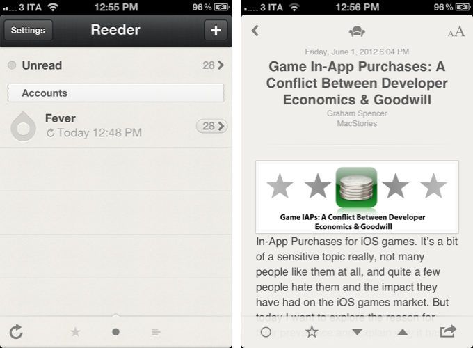
In 2009, reading news on the iPhone was different. The App Store was only one year old; Twitter wasn’t the information network adopted by mass media and millions of users we interact with today; there was no iPad, no universal apps, and no Flipboard. In 2009, reading news on an iPhone meant having to choose between few decent Google Reader clients, some Twitter apps, and lots of “mobile optimized” web apps.

Then in late 2009, Reeder came around. Created by Swiss developer Silvio Rizzi, I remember writing one of the first public reviews of Reeder for iPhone, which unlike the majority of contestants in the space at the time, sported a highly custom “sepia” interface that would later went on to define Reeder as a brand. Crafted with care and an eye for speed, Reeder not only stood out because it was beautiful to look at – the app was fast, visibly more responsive than Byline and NetNewsWire, easy to navigate in spite of its new UI paradigms, and focused on letting the user easily share links on other networks and services. Reeder 1.0 wasn’t perfect; version 2.0, released a few months later, fixed some glaring omissions of its predecessor (namely, lack of saved state), and introduced an even faster syncing engine and more link sharing options.

Reeder took off. The success of the iPhone app allowed Rizzi to become one of the most well-known names in the indie iOS developer community, redefining iPad RSS readers with a brand new version of Reeder, and then again capturing a large portion of the OS X market with the highly-anticipated Reeder for Mac.

In spite of its obvious merits, it is hard to pinpoint the exact reason behind Reeder’s rise to the top of Google Reader clients. There are hundreds, if not thousands, of Google Reader apps on Apple’s App Store now. Rizzi isn’t the “fastest” developer around (Reeder for iPhone was last updated in November 2011), and many valid RSS clients have been released in the past two years, some of them combining traditional RSS functionalities with deeper social integration to offer more compelling, modern alternatives to standard Google Reader syncing and browsing. Yet Reeder has managed to maintain its top position as the go-to Google Reader client for millions of iPhone users.

That’s not to say, however, that Reeder’s constant success and popularity don’t have to account for the profound change in news reading habits that occurred in the past two years. Sometime around 2010 – and I tend to associate this shift with the release of the iPad – a new breed of apps begin grazing the surface of established mobile news reading trends and conventions. Flipboard turned the world of RSS aggregators upside down with embedded discovery and direct integration with social feeds; Twitter clients got more capable, leveraging mobilizers and read-later services to provide a better experience with URLs; Zite brought automatic and intelligent curation to a platform based on RSS, while popular news organizations like CNN and NYTimes kept improving their own iOS apps.

In 2012, people don’t find their news exclusively through Google Reader anymore. That wasn’t true in 2009 either, but the growth of the App Store has certainly catalyzed the process: news travel fast, on a variety of channels, on multiple aggregators, in real-time and in multiple forms. We have become news gatherers.

Reeder 3.0, released today, holds true to its roots of a Google Reader client, but tries to modernize the overall approach and feature set with support for a new service, improved Readability syncing, more sharing options, and a refreshed look. In the first major rewrite of the app since 2010, is Reeder still relevant? Read more


Never Miss Cool Movies With Todo Movies

I suppose we all know that phenomenon: you’re watching a cool movie trailer and think “Boy, I just have to see this thing!” and then, several months later you realize that you forgot about it and it has already been released and everyone watched it in the cinema. To avoid that, I usually follow films or directors on Twitter or add them to my Facebook stream because those are the websites I visit every day. There are also some people who even set up reminders for release dates of things like books, music records or films. To outsource this reminding and give film lovers a companion to never forget any film you want to watch or miss a release date, Taphive introduced Todo Movies for iPhone.

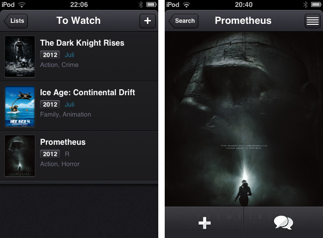
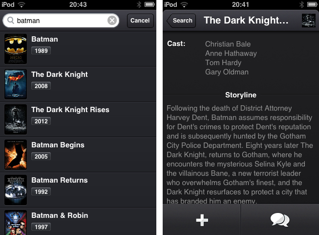
The app just serves the purpose of searching for movies using a simple search through the TMDb movie database, and afterwards adds those films to a list containing all the movies you want to watch. The search works seamlessly, but there is no live search while typing and until you hit the “search” button, you get a “no results” below the entering panel, which is always a bit confusing.

When you found a film you want to add to your list, tap on it to bring up the single movie window, which is almost completely filled up with a Retina-ready film poster, a move I really like, since this view transports the atmosphere of the respective film very well. From here you can either directly add it to your “To Watch”-list, or investigate its details a bit more by tapping the list button in the top right corner. If you do so, the screen flips and you can look at the film details like main actors, director, or a small summarization of its storyline.

The evolving lists of movies to watch and those you’ve already watched can then be sorted alphabetically, and after adding or release date. Optionally, you can let the app display the “unwatched” count as an icon badge using the apart from that nonexistent settings. If a movie you add is still about to be released in the future, you can let Todo Movies notify you using an iOS notification, when it’s finally out. The still awaited movies are also highlighted using a slight blue colored month info right besides the year they are released; this sets it apart from the otherwise monochrome UI.

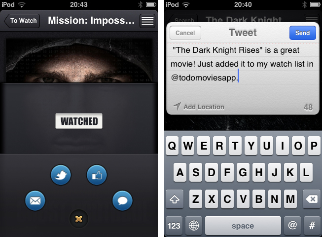
Which brings me to (at least to me) the coolest feature of Todo Movies: its UI. You’ve already seen some screenshots of it, and I have to say that it’s way better when you use it. I very rarely cannot say anything bad about an app’s design, but this time, I couldn’t find any styling flaw at all. The transitions between windows are smooth, and the buttons are perfectly combined in both look and colorization. And the highlight for all UI fanatics lies within the sharing options, which can be brought up by tapping the speech bulb button in the single movie window. I deliberately did not mention this until now, because it’s one of the coolest thing I’ve seen to date: the sharing buttons for Twitter, mail, Facebook and iMessage are arranged around a central dismiss. When you tap that “x” dismiss button, they smoothly start rotating and this way roll back into the center; afterwards, the buttons hide and up comes the main investigation window again.

This feature alone showed me that Todo Movies was worth of my time. Not just its UI, but also its feature set justifies the app’s price. The only feature besides the search confusion I mentioned above I could imagine the devs to add is a kind of a “hot” or “coming soon” page as a starting points for new users or less nerdy people who remember every trailer they saw. But otherwise, I recommend this app to every movie lover out there. It looks gorgeous, works flawlessly and works the way it’s supposed to do. You can purchase Todo Movies for just $0.99 on the App Store.


Reviewed: The iPhone Half of Track 8’s Universal Update

The Metro flavor — that recognizable blend of Swiss minimalism and Segoe typography — is still, by far, one of the most intriguing design languages to be employed. Perhaps Microsoft’s edgy futurist appeal will wear off as Windows 8 PCs and tablets normalize the trend of text driven interfaces, but the current novelty of Metro driven applications continues to leave us entranced and occasionally optimistic about the future of UI design. In stark contrast to skeuomorphic or icon driven designs of iOS and Android families, one has to wonder if Microsoft’s modern brainchild could find itself comfortably at home when integrated with other platforms and without clashing with the native’s traditional mechanisms of in-app navigation and interaction.

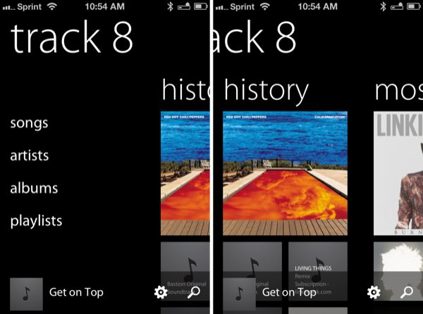
The now defunct Zune brand never made an appearance on iOS, and for good reason, but Ender Labs’ Track 8 trendy reimplementation of the Windows Phone 7 music player on the iPad had left us considering if both the aesthetic and function of a Metro designed application could be capitalized on iOS. Track 8 intentionally ignores the conventions of iOS, extending Microsoft’s interface onto the dimension of Apple’s touchscreen displays.

Originally conceived for the iPad, Track 8’s second version (yes, 2.0) delivers a few important enhancements. An AirPlay button is now built into the app, presenting itself only when an AirPlay device is available above the shuffle and continuous playback buttons on the Now Playing Screen. Per navigation, a navigational gripe is resolved thanks to the inclusion of a long press on the back button to return to the main menu. Additionally, artist backgrounds can be restricted to downloading only over Wi-Fi via a toggle in the settings. While all of these additions, especially the long press, greatly improve the Track 8 user experience, it is the app’s Universal signification that denotes the 2.0 convention and Track 8’s appearance on the iPhone.

Read more


vjay: Impressive, Fun Real-Time Video Mixing On iPad

In late 2010, German software maker Algoriddim released djay for iPad, a powerful portable audio mixing solution that went on to win an Apple Design Award at last year’s WWDC. With a combination of advanced features, intuitive UI design, and a care for attention to detail, djay became one of the most well-known DJ solutions with seamless interoperability across the Mac and iOS. However, because I am no audio professional, I sometime found myself slightly overwhelmed by the feature set of djay – the app certainly requires a bit of basic audio knowledge to get the most out of its settings such as visual mixing with waveforms, beat-matched looping, and pre-cueing.

For the past week, I have been testing Algoriddim’s new iPad app, vjay, and not only I haven’t found myself scratching my head in front of some complex setting or obscure audio terminology – I had fun using the app, taking advantage of the complex tech that the developers embedded in a $9.99 package to, ultimately, provide an engaging experience for the users. vjay is powerful, but, in a way, more accessible than djay.

As the name suggests, vjay works with videos. And perhaps it is the app’s focus on visuals, rather just waveforms, that increases its “wow” factor and accessibility to users who, like me, aren’t exactly mixing and syncing tempos on a daily basis. Furthermore, I also believe that, from a mere technological standpoint, vjay’s video capabilities offer a more tangible, visibly outstanding showcase of the iPad’s engine. More than djay, I found vjay to be a perfect mix – no pun intended – of powerful technology and user-friendliness.

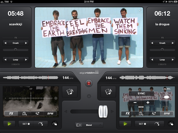
vjay can mix videos in real-time. Taking the underlying concept of djay and bringing it to a different type of media, vjay comes with a split interface displaying two content sources at the bottom, and a large, central visual preview at the top. At the bottom, you can pick videos (and even audio) from two separate “add media” buttons that are directly connected with your Camera Roll, video and music library, iTunes Store, and pre-bundled content offered by Algoriddim as a demo to get you started. In my tests, I decided to pick two .mp4 videos from my friends @AldrinBand that I had previously synced to my iPad, and see what vjay would allow me to do with them. Read more


Hands On: OmniPlan for iPad


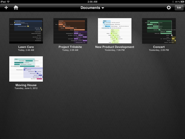
Back in February, I had the opportunity to talk with The Omni Group’s CEO Ken Case about their next iPad venture, OmniPlan. OmniPlan is a well known and powerful project management software that includes features like Gantt charts, smart scheduling, change tracking, team collaboration, and so much more. Today The Omni Group is releasing a full featured version of OmniPlan specifically designed and optimized for the iPad.

I remember asking Ken if the iPad version of OmniPlan was intended to be used in addition to the Mac version for complete project management; however, he was adamant that the iPad app would be “as complete as possible”. From the screenshots he provided at that time, it definitely seemed as if all the features that serious project managers would need were already finding their way in to the app. Three and half months later, the app is complete and it truly came together beautifully. Read more


Agenda 3.0: Fast Event Creation, Custom Repeats and More

Agenda, by Savvy Apps, is a fantastic and minimal calendar replacement for iOS (universal) with many built-in options. We’ve covered Agenda a few times already but the new 3.0 update adds some excellent new features and updates.

The first, and most important update is a custom event creation screen that’s much faster than the default iOS one. It has a simplified layout that lets you access event elements without going into second and third screens. This means you only need to tap once to access the event title, start & end time, alerts, location, and notes. You can swipe between calendar months and the animation is very slick!  The dots beneath the calendar identify what month you are in - past, present or future. Agenda now imports your contacts from iOS so once an event is created, you can attach them by tapping the calendar icon and choosing what contacts you want to add to your event for things such as text, email, calls, or status taps.

Another great feature that Agenda now has is a set of customizable repeat options. While on the event creation screen, tap the icon next to the repeat section to choose dates for ending repeating events, create repeating events for specific days or dates of the month, and much more.

Defaults, defaults, defaults! I wish more apps had a larger set of defaults — it makes data entry much easier if there is a predefined set of options. You can now pick defaults for calendar, event alert sounds, view, duration, alert, and all day alert time via Agenda’s built-in Settings > Defaults menu.

iPad users also get a few new options: swiping right or left will now change views, year and week view now move up or down instead of right or left and you can now change settings to a smaller modal view.

To read the complete release notes for Agenda 3.0, Savvy Apps has a listing for your viewing pleasure. They also have a great little Tips & Tricks section on the Agenda page to help you enter events even faster. If you don’t like the new “Fast Event Creation” screen you can always toggle back to the native iOS event creation from Agenda’s settings, but the new way is so much easier and more fun!

Agenda 3.0 is a great upgrade to a great product — anytime you can streamline manual data entry into one screen gets a big thumbs up from me. The Tips & Tricks are worth 2 minutes of your time to read so that you can fully understand the new “Fast Event Creation” screen. Agenda is a universal app and available in the App Store for 99¢, while existing users get the 3.0 update for free.


Trickster Keeps Your Recent Files and Applications at your Fingertips

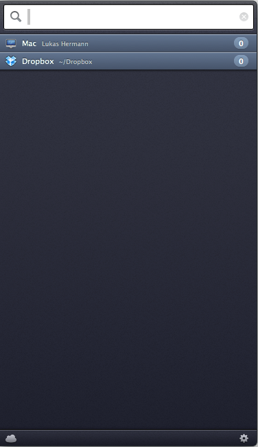
Remember Stacks? These days I keep my Dock hidden at the bottom of my display, with Stacks occasionally providing quick shortcuts to downloads and recent documents. My workflow is funny since I don’t quite want to work in full-screen mode in most applications, but I still want to have windows fill the display. This way I can still bring up my Twitter app without switching to another window, I can use a hot corner to temporarily hide windows as I access whatever mess is on my Desktop, and I can quickly bring up the Dock without swiping down twice. Too, I have the benefit of bringing up a Finder window when I need it — more often than not I’m accessing the Downloads folder from a stack for press kits, images, and files I grap from our work channel. Trickster, a rebranded Blast which I reviewed a couple years ago, fixes having to go through the motions of unhiding the Dock, opening my Downloads stack, then clicking the “more” button or on the file itself. Basically, Trickster is a quick-access panel for applications, documents, music, photos, and video that supplants Stacks and All My Files in the Finder.

Read more


Melo Simplifies Scrobbling to Last.FM

In times of paid music streaming services with more and more people using Spotify or rdio, the concept of last.fm seems outdated. Sharing music on a network not called Facebook, without having the ability of having music, friends and sharing options in a single, easy to use app has become less intriguing. But still, I consider the idea of last.fm a very striking one; always seeing the whole music archive of your friends provides a huge basis for discovering new music and artists, more than Spotify and its limited discovering options via friends and “apps” like the Domino Records showcasing. For actually listening to music, last.fm is still not the right choice. And this new menubar app called Melo for last.fm is not going to change that, but it simplifies the most basic feature of last.fm: archiving all played songs, called scrobbling.

Melo is solely connected to iTunes and the devices connected to it (Apple TV, iPod, iPad etc.). Using it with other services like Spotify is still not possible. Every song you play in iTunes (or imported from the devices and is then synced back to the Mac) automatically gets scrobbled by Melo. Its interface only consists of a drop down window with a bright grey frame, displaying the name and artist of the currently playing track. Additionally, using the two big, nicely pictogrammed button left and right to the track information, you can love the current track (this way it is not just scrobbled, but also added to your favorite song list on last.fm), and reach out to your own profile, which is then opened in your browser for deeper investigation of its status.

In the app’s Preferences, which are opened using the small button on the right side of the center area, you can exclude media from being scrobbled (presets include audio books and voice memos) using an Automator-like workflow; you can choose if the app should be automatically opened at start, and from here you can quit Melo, too. That’s it. Melo is not reinventing anything, it just eases up scrobbling with last.fm. It looks very nice, it’s intuitive, and it works flawlessly. If you dislike the native last.fm app, or are just using the scrobbling feature without being interested in any other feature of the service, Melo is for you. The only problem with the app is, its price may be a bit too steep for what it does. Melo can be purchased on the Mac App Store for $3.99