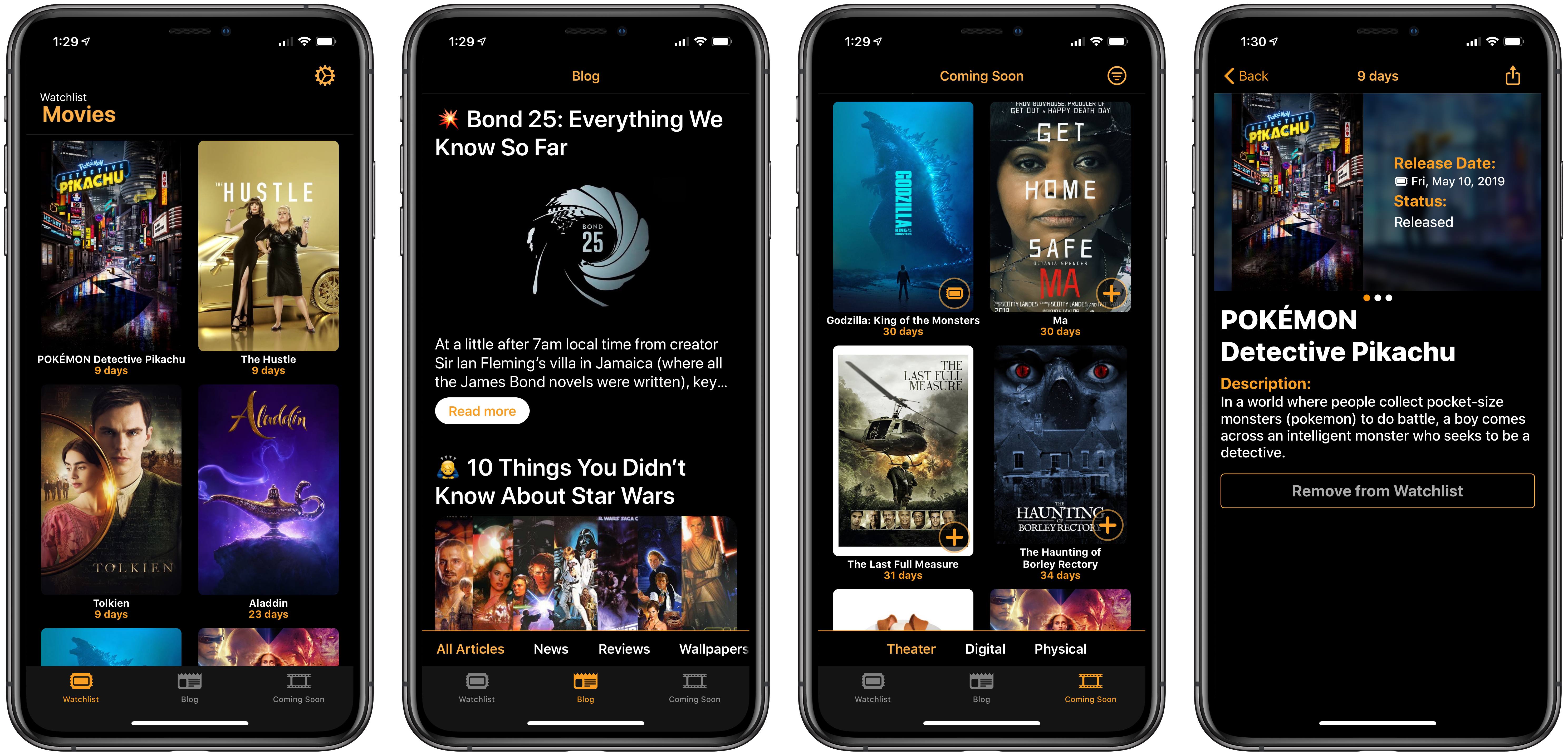
Most of the apps I cover for MacStories relate in some way to productivity, a theme that extends to the apps normally dominating my iPhone’s home screen. Writing and note-taking apps, task managers, communication apps, and tools like Shortcuts all help me get things done each day. However, sometimes what I want from my phone isn’t a productivity tool, but an app that specializes in something related less to work and more to fun. For example, a movie tracker. Kernel is a new app that does just that.
Posts tagged with "featured"
Kernel Review: Modern Movie Tracking

Access Extra Content and Perks
Founded in 2015, Club MacStories has delivered exclusive content every week for nearly a decade.
What started with weekly and monthly email newsletters has blossomed into a family of memberships designed for every MacStories fan.
Club MacStories: Weekly and monthly newsletters via email and the web that are brimming with apps, tips, automation workflows, longform writing, early access to the MacStories Unwind podcast, periodic giveaways, and more;
Club MacStories+: Everything that Club MacStories offers, plus an active Discord community, advanced search and custom RSS features for exploring the Club’s entire back catalog, bonus columns, and dozens of app discounts;
Club Premier: All of the above and AppStories+, an extended version of our flagship podcast that’s delivered early, ad-free, and in high-bitrate audio.
MindNode 6 Review: Refined Mind Mapping
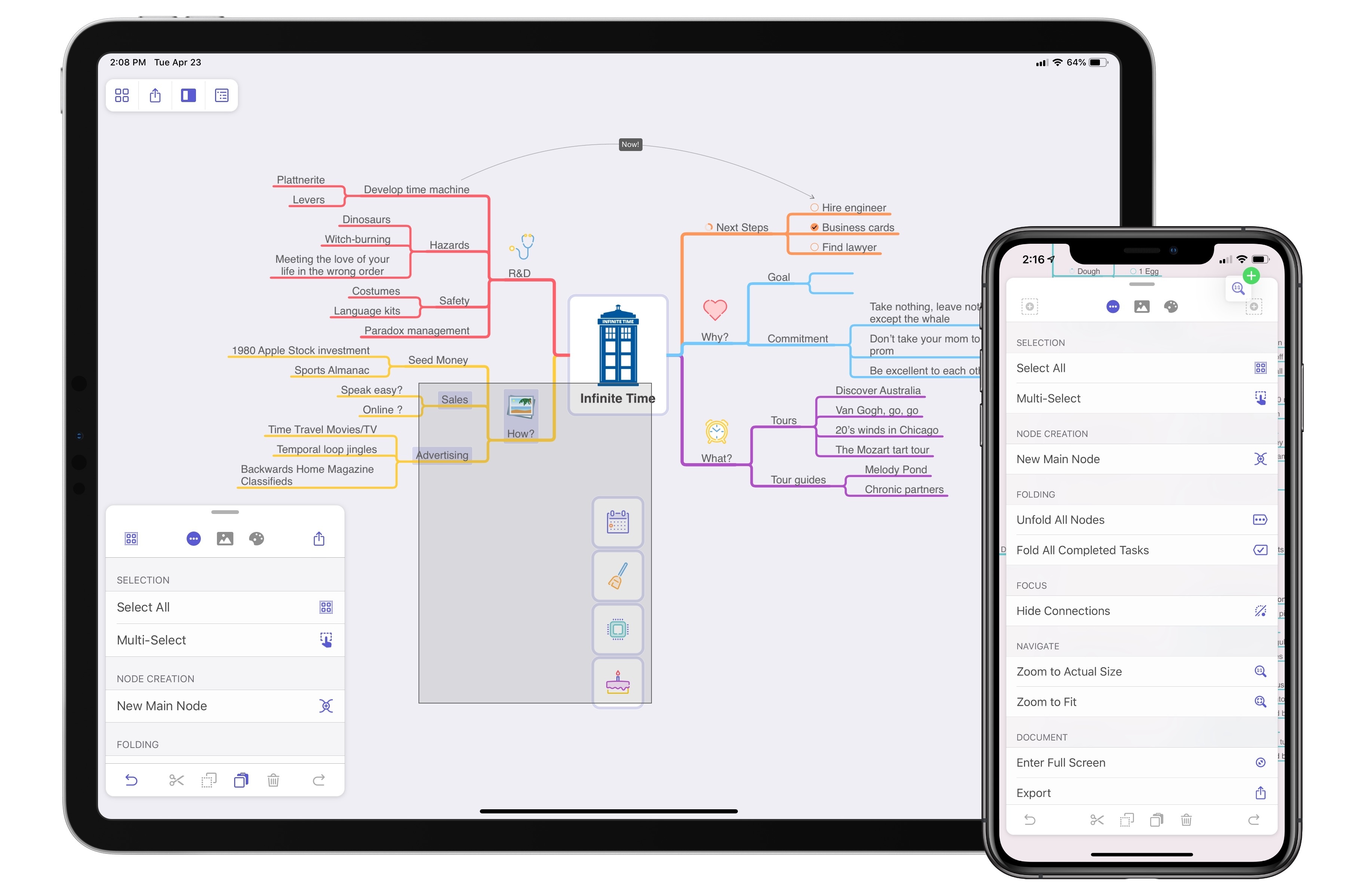
When MindNode debuted its last major version, it brought a major revamping and modernization of the core app experience. The update was a resounding success in my view: adopting the document browser, an adjustable panel system, and drag and drop made MindNode a shining example of modern iOS design; at the same time, additions like quick entry mode and a slate of new, easy to decipher iconography made MindNode more accessible to the mind mapping novice.
Where MindNode 5 brought major evolution and a fresh foundation, today’s version 6 for iOS and the Mac is able to build on that foundation with refinements and advancements that make the app more versatile and expand existing features in new ways. I’ve grouped those improvements into two categories: focus aids and efficiency aids.

Access Extra Content and Perks
Founded in 2015, Club MacStories has delivered exclusive content every week for nearly a decade.
What started with weekly and monthly email newsletters has blossomed into a family of memberships designed for every MacStories fan.
Club MacStories: Weekly and monthly newsletters via email and the web that are brimming with apps, tips, automation workflows, longform writing, early access to the MacStories Unwind podcast, periodic giveaways, and more;
Club MacStories+: Everything that Club MacStories offers, plus an active Discord community, advanced search and custom RSS features for exploring the Club’s entire back catalog, bonus columns, and dozens of app discounts;
Club Premier: All of the above and AppStories+, an extended version of our flagship podcast that’s delivered early, ad-free, and in high-bitrate audio.
CalZones Review
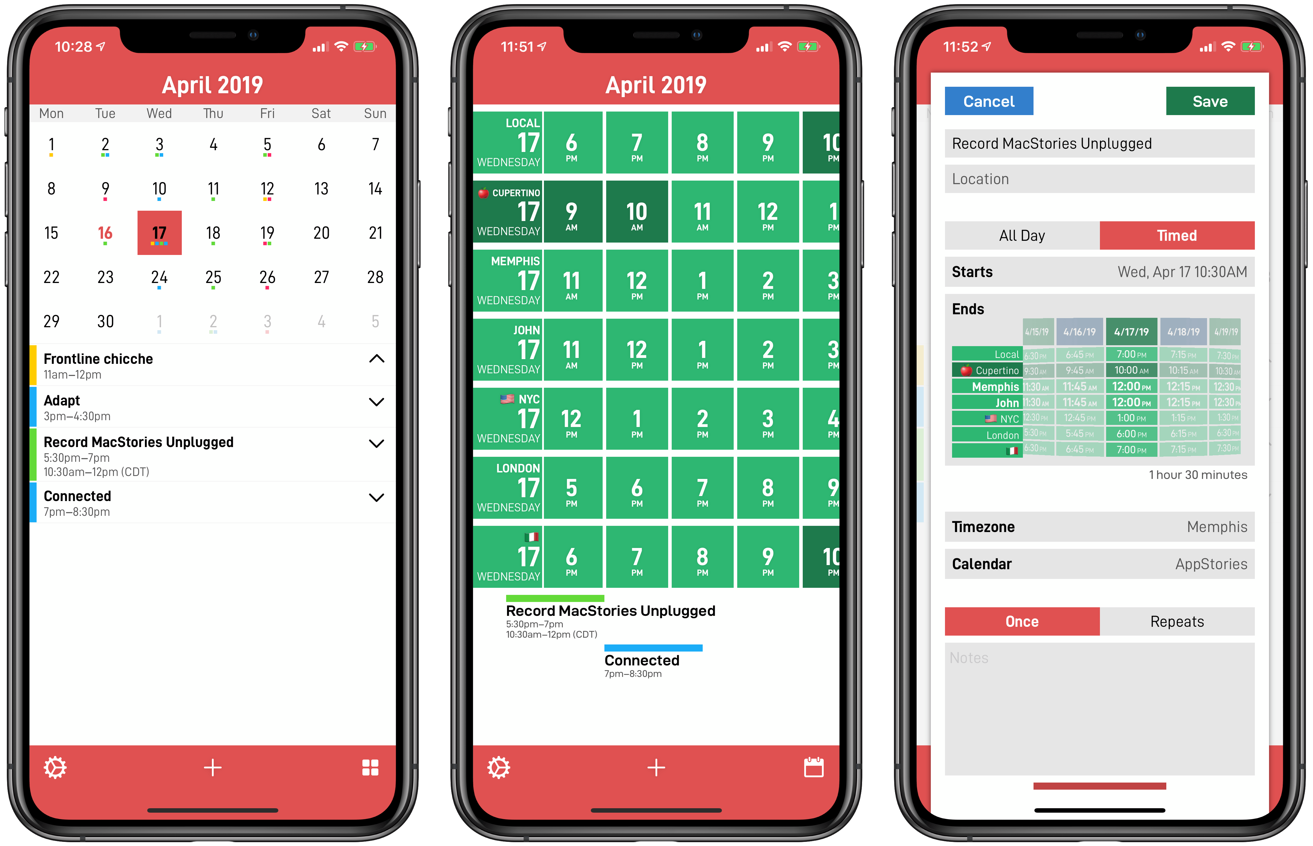
I’ve always struggled to find apps that understand how people work across multiple time zones. In the 10 years I’ve been writing MacStories, I’ve come across dozens of time zone conversion utilities (and I even created my own with Shortcuts), but as someone who works remotely with people all over the globe, I know there’s more to time zone management than just performing a quick conversion. Perhaps you’re planning a Skype call with three more people, each living in a different time zone; maybe you have to coordinate a product launch and need to know at a glance what “3 PM GMT” means for your customers in New York, San Francisco, Rome, and Sydney. CalZones, the latest app by _David Smith, is the first iOS app I’ve ever used that fundamentally gets how people work and schedule events across multiple time zones. It’s almost like CalZones was made specifically for me, and it’s an app that speaks directly to my heart.
CalZones, available today on the App Store as a Universal app, is based on a simple, ingenious concept that, to the best of my knowledge, has never been done on the App Store before: the app combines a time zone viewer with a calendar client, enabling you to compare times across multiple cities as well as view and create calendar events that display start/end times in multiple formats. By fusing time zone comparisons and calendar events into one product, Smith was able to create an app that is greater than the sum of its parts because it solves a problem that neither traditional world clocks nor calendar clients could fix before.

Access Extra Content and Perks
Founded in 2015, Club MacStories has delivered exclusive content every week for nearly a decade.
What started with weekly and monthly email newsletters has blossomed into a family of memberships designed for every MacStories fan.
Club MacStories: Weekly and monthly newsletters via email and the web that are brimming with apps, tips, automation workflows, longform writing, early access to the MacStories Unwind podcast, periodic giveaways, and more;
Club MacStories+: Everything that Club MacStories offers, plus an active Discord community, advanced search and custom RSS features for exploring the Club’s entire back catalog, bonus columns, and dozens of app discounts;
Club Premier: All of the above and AppStories+, an extended version of our flagship podcast that’s delivered early, ad-free, and in high-bitrate audio.
Announcing the MacStories 10th Anniversary T-shirt and Pin
We’re very fortunate at MacStories to have a terrific group of loyal readers. As MacStories turns 10 and has become known not just for the site, but also Club MacStories and AppStories, it felt like the perfect time to celebrate with MacStories’ very first official merchandise, which is available from macstoriesmerch.com, a Cotton Bureau storefront that we’ve set up for this and any future sales. I can already sense a few of you typing ‘finally’ into your Twitter clients, but as the saying goes, ‘good things come to those who wait,’ and I think you’ll like what we’ve got for you.
The MacStories 10th Anniversary T-shirt
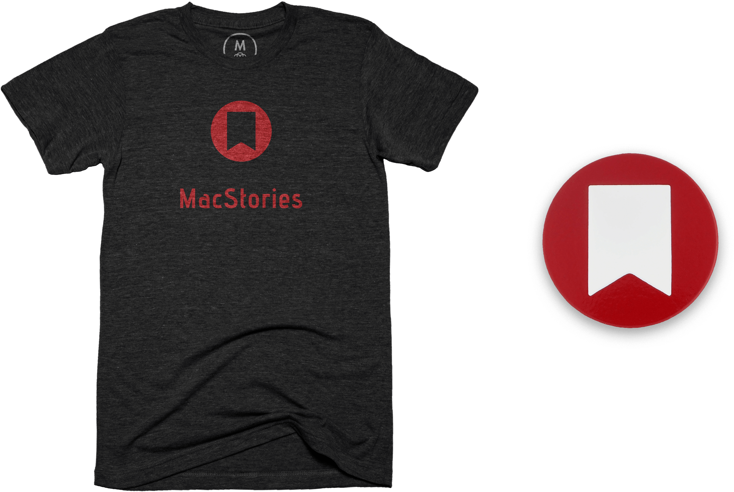
The first item is the MacStories 10th Anniversary T-shirt, which features the site’s classic bookmark logo and distinctive typography. The shirt, offered through our friends at Cotton Bureau, comes in three styles: Vintage Black Tri-Blend, Black 100% Cotton, and Light Blue 100% Cotton in both men’s and women’s cuts and a wide range of sizes for $30.
The MacStories 10th Anniversary Enamel Pin
The second item is the MacStories 10th Anniversary Enamel Pin. The pin features MacStories’ iconic bookmark logo in the perfect shade of MacStories red for $15.
The shirts will be available to order for two weeks and the pins will be for sale until supplies run out, so don’t wait. Two weeks is not long and we expect the pins to sell out fast.
If you have any questions about shipping, orders, payments and the like, please visit Cotton Bureau’s FAQ for more details.
We’d like to expand what we offer in the future, but that depends entirely on demand and interest from you. So let us know what you think on Twitter (@MacStoriesNet) and send us pictures of your new MacStories shirts and pins in the wild when they arrive. We’re excited to get them in your hands soon.

Access Extra Content and Perks
Founded in 2015, Club MacStories has delivered exclusive content every week for nearly a decade.
What started with weekly and monthly email newsletters has blossomed into a family of memberships designed for every MacStories fan.
Club MacStories: Weekly and monthly newsletters via email and the web that are brimming with apps, tips, automation workflows, longform writing, early access to the MacStories Unwind podcast, periodic giveaways, and more;
Club MacStories+: Everything that Club MacStories offers, plus an active Discord community, advanced search and custom RSS features for exploring the Club’s entire back catalog, bonus columns, and dozens of app discounts;
Club Premier: All of the above and AppStories+, an extended version of our flagship podcast that’s delivered early, ad-free, and in high-bitrate audio.
10 Years of MacStories
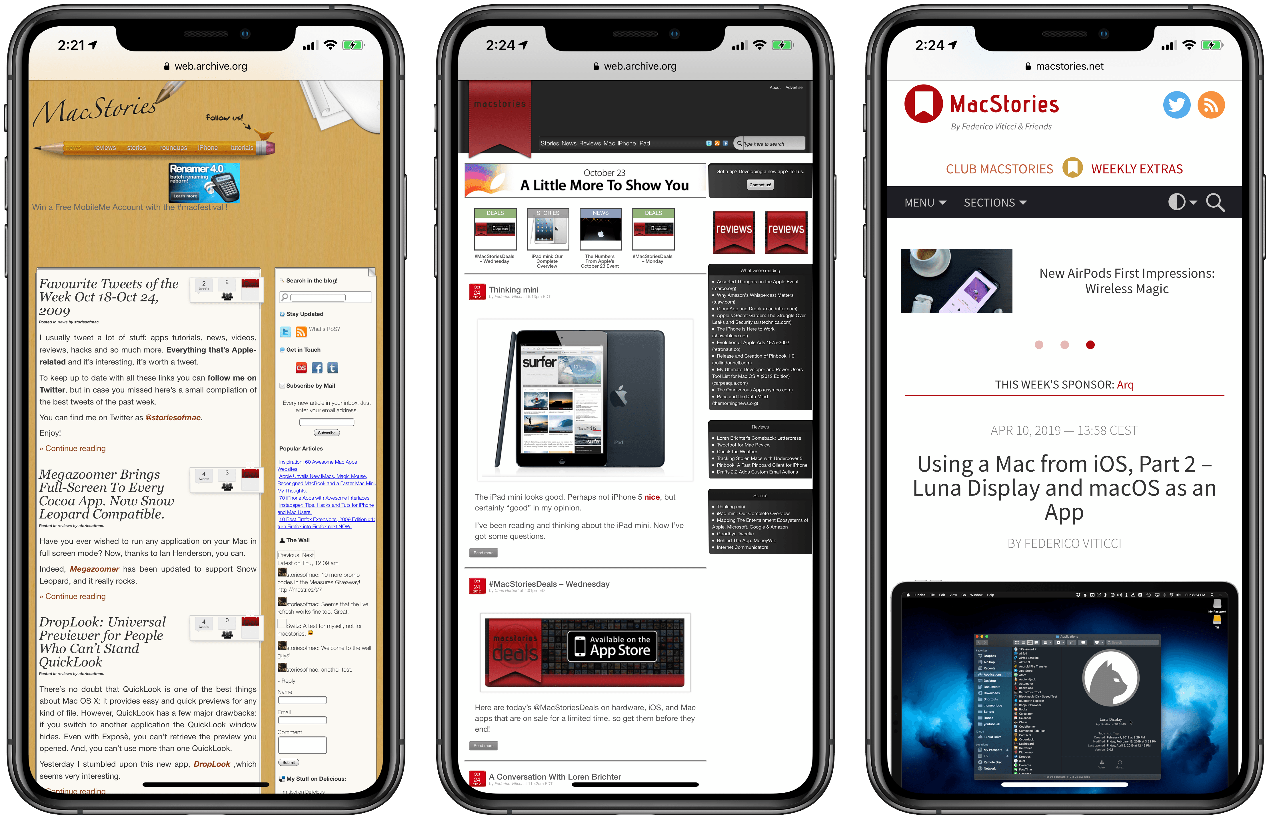
Later this week on Saturday, April 20, MacStories will turn 10 years old.
It was Monday, April 20, 2009 when, fresh out of a job from which I had gotten fired, I decided to publish the first official post on my self-hosted blog after a few weeks of running a free WordPress.com website. I was 21. My English was terrible and, at the time, MacStories was written in two languages, English and Italian – probably to hide my discomfort as a non-native English speaker. If you want to hear this story (and my entire background) in much greater detail, John interviewed me on this week’s special episode of AppStories.
Since that first post about web browsers, MacStories has been on my mind every day and it remains the most important thing I’ve ever built in my adult life. In many ways, MacStories has come to define me.
As you might guess, I’ve struggled to come to terms with the meaning of this anniversary. I don’t like celebrating work-related anniversaries. I don’t think our readers appreciate excessive self-congratulatory content and I’d rather focus on getting work done every day. I prefer to let other people compliment us if they ever feel compelled to do so; otherwise, I just want to focus on providing a service to our audience, because that’s what I’m ultimately here to do: to make sure that MacStories and our related properties can be useful and inspiring for our readers around the world.
Ten years, however, does feel like an extremely long time in Internet years. For this reason, when I started thinking about this looming milestone sometime last year, I knew I had to do something special for this anniversary – just this once – to look back at the past decade of MacStories, reflect on the things I’ve learned along the way, and plan ahead for the future.
Here’s the short version: this week is going to be extra special on MacStories. We’re launching our first official merchandise today (macstoriesmerch.com) and there will be a series of retrospectives published on MacStories throughout the week (keep an eye on this tag). In addition, we will be launching a couple of new perks exclusive to Club MacStories members.
Now, allow me to share some thoughts about creating MacStories and what this website has meant for me over the past 10 years.

Access Extra Content and Perks
Founded in 2015, Club MacStories has delivered exclusive content every week for nearly a decade.
What started with weekly and monthly email newsletters has blossomed into a family of memberships designed for every MacStories fan.
Club MacStories: Weekly and monthly newsletters via email and the web that are brimming with apps, tips, automation workflows, longform writing, early access to the MacStories Unwind podcast, periodic giveaways, and more;
Club MacStories+: Everything that Club MacStories offers, plus an active Discord community, advanced search and custom RSS features for exploring the Club’s entire back catalog, bonus columns, and dozens of app discounts;
Club Premier: All of the above and AppStories+, an extended version of our flagship podcast that’s delivered early, ad-free, and in high-bitrate audio.
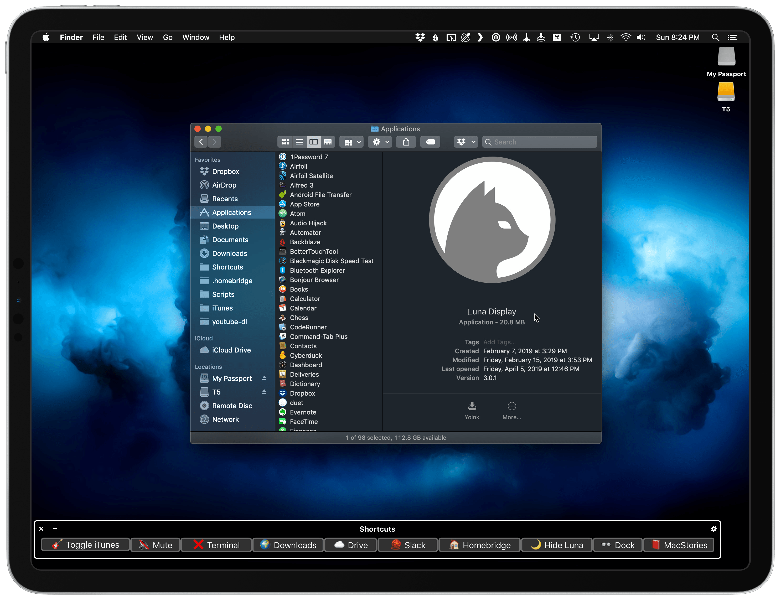
Using a Mac from iOS, Part 2 – Luna Display and macOS as an App
iPad Diaries is a regular series about using the iPad as a primary computer. You can find more installments here and subscribe to the dedicated RSS feed.
In the first part of my ongoing experiment with controlling and accessing a Mac from the iPad Pro, I covered FileExplorer – the app I use to open Finder locations from iOS’ Files app – and shared a collection of shortcuts to control certain macOS features via Siri and the Shortcuts app. I also described my podcasting setup and how I’ve been taking advantage of Keyboard Maestro to automate window resizing across my two displays connected to the Mac mini. Today, I’m going to cover one of those two external displays – the iPad Pro running the Luna Display app – and how I’ve been using it to have “macOS as an app” on my iPad Pro. If you find this idea of reducing macOS to an app that runs on the iPad upsetting, the rest of this article likely isn’t going to make you happy. If you’re intrigued, however, strap in because I have a lot to share.

Access Extra Content and Perks
Founded in 2015, Club MacStories has delivered exclusive content every week for nearly a decade.
What started with weekly and monthly email newsletters has blossomed into a family of memberships designed for every MacStories fan.
Club MacStories: Weekly and monthly newsletters via email and the web that are brimming with apps, tips, automation workflows, longform writing, early access to the MacStories Unwind podcast, periodic giveaways, and more;
Club MacStories+: Everything that Club MacStories offers, plus an active Discord community, advanced search and custom RSS features for exploring the Club’s entire back catalog, bonus columns, and dozens of app discounts;
Club Premier: All of the above and AppStories+, an extended version of our flagship podcast that’s delivered early, ad-free, and in high-bitrate audio.
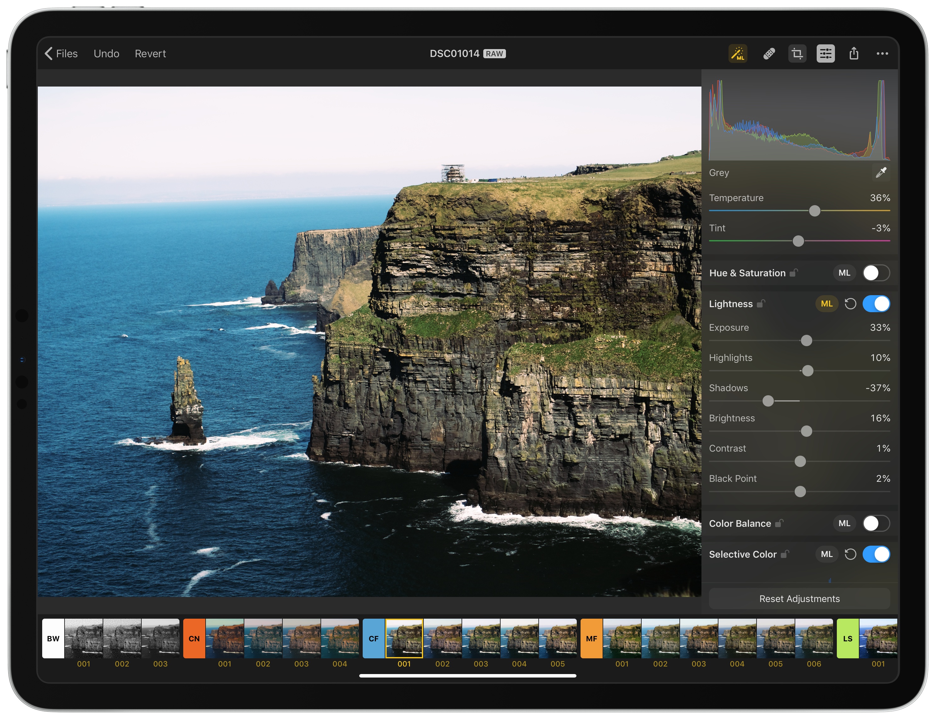
Pixelmator Photo: The MacStories Review
The Pixelmator team has released Pixelmator Photo, a pro-level photo editing tool that couples the core functionality of Pixelmator Pro for the Mac with the strengths of the iPad. The result, though not without a few caveats, is a sophisticated set of image editing tools wrapped in a straightforward UI that, with its support for RAW and other image formats, makes Pixelmator Photo my new favorite photo editor.

Access Extra Content and Perks
Founded in 2015, Club MacStories has delivered exclusive content every week for nearly a decade.
What started with weekly and monthly email newsletters has blossomed into a family of memberships designed for every MacStories fan.
Club MacStories: Weekly and monthly newsletters via email and the web that are brimming with apps, tips, automation workflows, longform writing, early access to the MacStories Unwind podcast, periodic giveaways, and more;
Club MacStories+: Everything that Club MacStories offers, plus an active Discord community, advanced search and custom RSS features for exploring the Club’s entire back catalog, bonus columns, and dozens of app discounts;
Club Premier: All of the above and AppStories+, an extended version of our flagship podcast that’s delivered early, ad-free, and in high-bitrate audio.
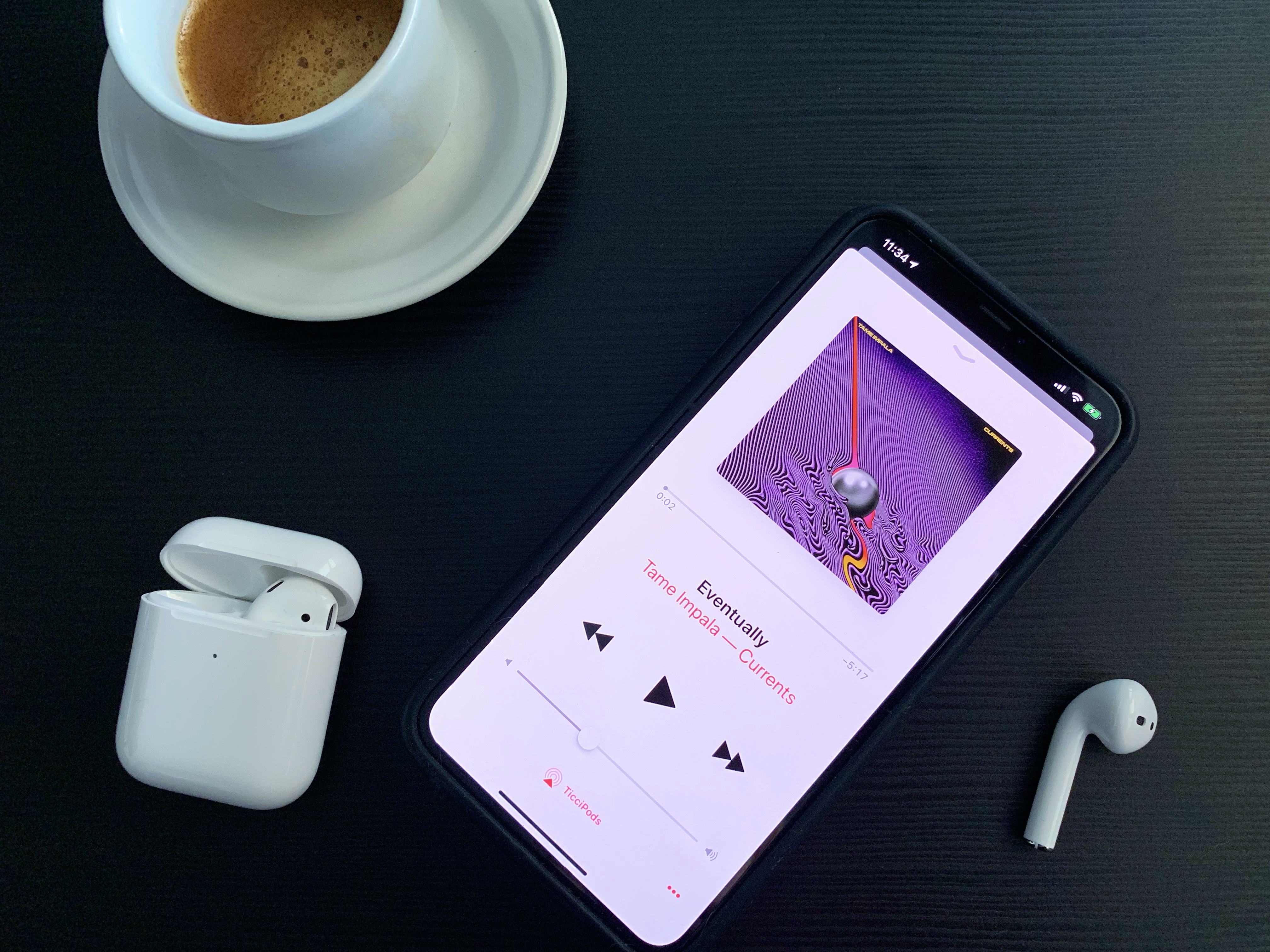
New AirPods First Impressions: Wireless Magic
I don’t think I need to extol the virtues of AirPods in 2019. Over two years after their debut, Apple’s truly-wireless earbuds, in addition to providing users with a convenient, seamless way to stream music and podcasts to their ears, have become a cultural phenomenon that has spurred some of the greatest memes of Tech Twitter in recent history. Everybody loves AirPods – provided their unique size and design fit their ears – and, most of all, everybody likes to say how much they love their AirPods.
This article is no different, but there’s a small twist in the usual narrative that prompted me to write this story after receiving my second-generation AirPods yesterday.

Access Extra Content and Perks
Founded in 2015, Club MacStories has delivered exclusive content every week for nearly a decade.
What started with weekly and monthly email newsletters has blossomed into a family of memberships designed for every MacStories fan.
Club MacStories: Weekly and monthly newsletters via email and the web that are brimming with apps, tips, automation workflows, longform writing, early access to the MacStories Unwind podcast, periodic giveaways, and more;
Club MacStories+: Everything that Club MacStories offers, plus an active Discord community, advanced search and custom RSS features for exploring the Club’s entire back catalog, bonus columns, and dozens of app discounts;
Club Premier: All of the above and AppStories+, an extended version of our flagship podcast that’s delivered early, ad-free, and in high-bitrate audio.
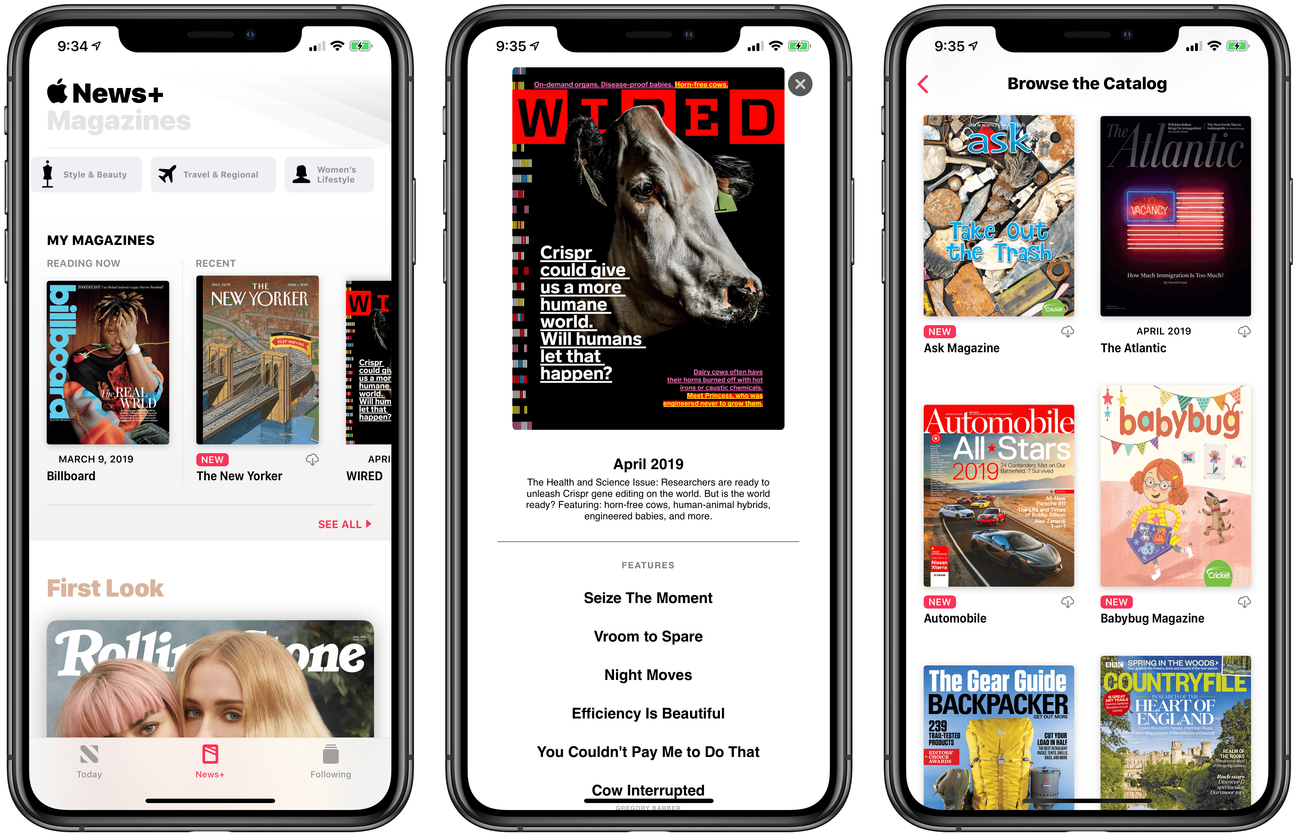
Apple Announces Apple News+ Service for Magazines: Our Overview and First Impressions
At the “It’s Show Time” media event held earlier today at the Steve Jobs Theater in Apple Park, Cupertino, Apple took the wraps off the highly anticipated Apple News+ subscription service, which will allow users to gain access to over 300 magazines inside Apple News for a single monthly fee of $9.99. Unlike the other services announced by the company at the event, Apple News+ is available now in the United States and Canada as part of the iOS 12.2 and macOS 10.14.4 software updates.

Access Extra Content and Perks
Founded in 2015, Club MacStories has delivered exclusive content every week for nearly a decade.
What started with weekly and monthly email newsletters has blossomed into a family of memberships designed for every MacStories fan.
Club MacStories: Weekly and monthly newsletters via email and the web that are brimming with apps, tips, automation workflows, longform writing, early access to the MacStories Unwind podcast, periodic giveaways, and more;
Club MacStories+: Everything that Club MacStories offers, plus an active Discord community, advanced search and custom RSS features for exploring the Club’s entire back catalog, bonus columns, and dozens of app discounts;
Club Premier: All of the above and AppStories+, an extended version of our flagship podcast that’s delivered early, ad-free, and in high-bitrate audio.

