Posts tagged with "featured"

NetNewsWire Review: The Mac RSS Client, Rebooted with a Solid Foundation for the Future

After Google Reader disappeared, a lot of people drifted away from RSS readers. For many, social networks like Twitter filled the void, leading some observers to declare the death of RSS. However, a funny thing happened in the aftermath of Google Reader’s demise. New sync services arose, and RSS readers flourished on iOS, where competition to provide users with new and innovative ways to read their favorite feeds has been fierce.

However, feed reader options haven’t been nearly as robust on the Mac. As I’ve noted before, many of my favorite RSS readers for iOS don’t have Mac counterparts, and those that do haven’t been developed with the same regularity we’ve seen on iOS. It’s into this landscape that NetNewsWire 5 launches today.

If you’ve been using RSS for any length of time, you’ve undoubtedly heard of NetNewsWire, but may not be aware of its long history. The app’s roots stretch back to 2002 with NetNewsWire Lite 1.0, which Brent Simmons developed. In 2005, the app was purchased by NewsGator, then Black Pixel bought the app in 2011.

Simmons began working on a new open-source RSS reader called Evergreen in 2015. But then in 2018, he reacquired the rights to NetNewsWire from Black Pixel, bringing the app back to where it started for the first time in 13 years.

NetNewsWire comes with a built-in set of feeds to get newcomers started.

NetNewsWire comes with a built-in set of feeds to get newcomers started.

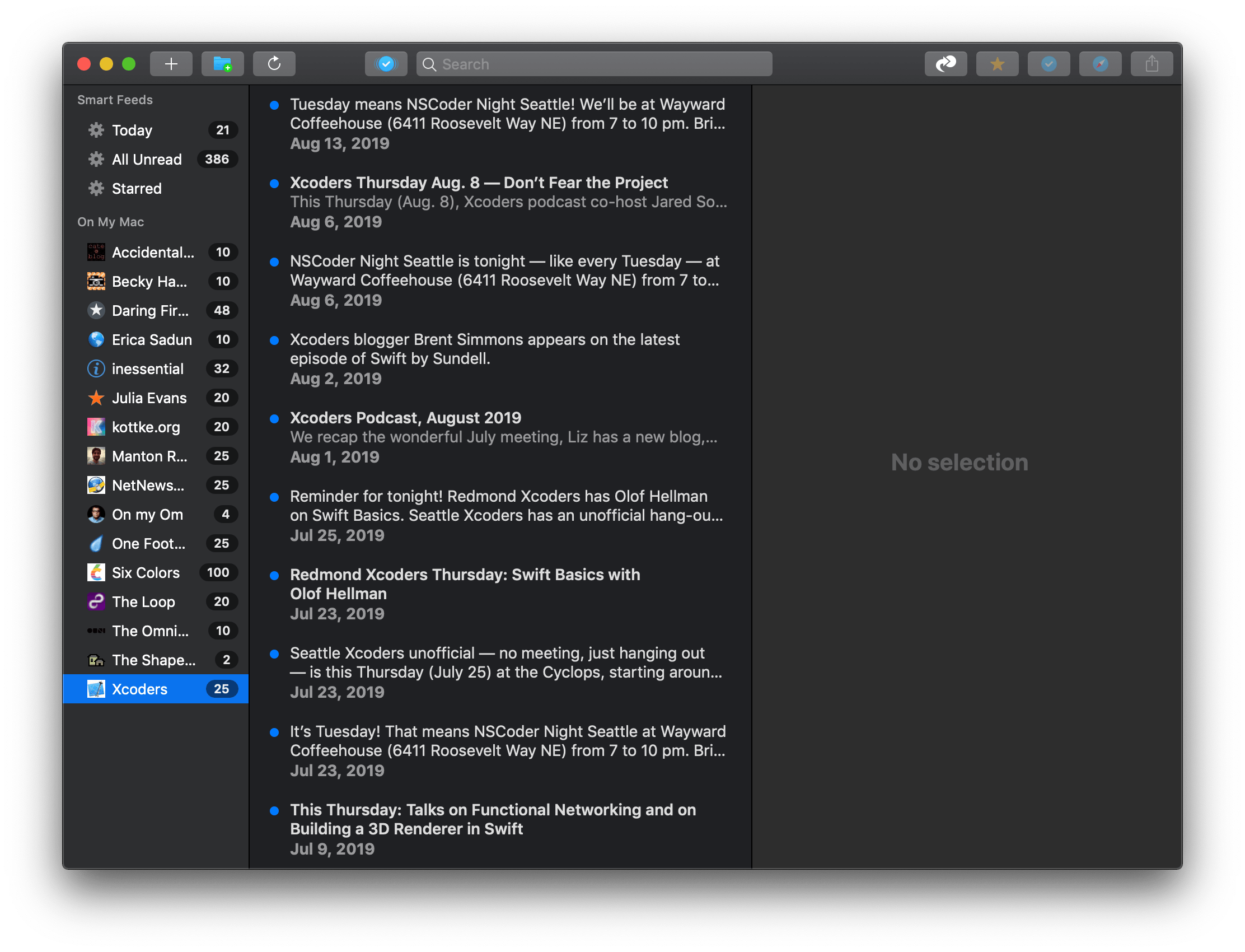
NetNewsWire 5 is an all-new, free app rebuilt from the ground up using Evergreen’s code, but bearing the name of Simmons’ original feed reader. The time and hard work by Simmons and other contributors to the open-source project are apparent. NetNewsWire 5 is a thoughtfully-designed, fast app with powerful search. The app won’t be my primary Mac feed reader until it has more syncing options or the planned iOS version is released, but if your feed reading is limited to the Mac or you use Feedbin to sync your feeds to iOS, NetNewsWire is an excellent choice.

Read more


Sign In with Apple: Goodbye Account Management

I love trying new apps and services. It may be part of my job at MacStories, but even if it weren’t, I would still constantly be on the lookout for interesting, creative products that can benefit either my work or leisure. In recent years it seems like there’s always a fresh stream of apps and services to check out. Often when I try something new, however, I’m immediately confronted with the obstacle of a login screen. At which point there’s a choice to make: do I go through the hassle of creating an account for this service, or – if the option is available – do I simply authenticate via a third party like Google or Facebook? Sadly, neither option is ideal.

Creating a new account for every service you try is a major pain. It’s made easier with the aid of iCloud Keychain and 1Password, but while those tools eliminate lots of friction, they can be a little clunky, and in the end you’re still trusting your data to the (usually unknown) privacy policies of the service you sign up for.

Third-party login buttons solve the convenience problem, mostly. They may require entering your credentials for that third-party service, but at least you don’t have to create and remember new credentials for multiple services. The data privacy issue can be a question mark with these buttons though; when you authenticate through, let’s say Facebook, do you really know exactly what data you’re sharing with the new service? Or how the service will use that data? As consumers continue losing trust in Facebook itself to secure their data, why would they trust a service that taps into their Facebook data?

Sign In with Apple is a modern alternative to the current mess of login methods, offering Apple users a solution that addresses the current options’ shortfalls. It makes account creation and sign-in trivially simple – even more so than buttons from Google or Facebook – while also keeping your data in the hands of a company with a decent privacy track record.

When apps update to adopt Sign In with Apple, I suspect many users’ initial thoughts will be some variation of what immediately popped into my mind after trying it for the first time: “Where has this been all my life?”

Read more


Sidecar in iPadOS 13 and macOS Catalina: Working Seamlessly Between an iPad and Mac

The core experience of using Sidecar is fantastic. Part of the reason is that running an iPad as a second display for a Mac with Sidecar is immediately familiar to anyone who has ever used multiple displays. The added screen real estate, portability, and functionality are part of the appeal too. Of course, there are differences that I’ll get into, but Sidecar is so close to a traditional dual-display setup that I expect it will become a natural extension of the way many people work on the Mac.

There’s more going on with Sidecar though, which didn’t dawn on me until I’d been using it for a while. One of the themes that emerged from this year’s WWDC is deeper integration across all of Apple’s platforms. As I’ve written in the past, SwiftUI is designed to accomplish that in the long-term across all the devices Apple makes. In contrast, Catalyst is a shorter-term way to tie the Mac and iPad closer together by bringing iPad apps to the Mac and encouraging developers to build more robust iPad apps.

Sidecar strikes me as part of the same story. Apple made it clear when they introduced Catalyst in 2018 at WWDC that it’s not replacing macOS with iOS. Some tasks are better suited for a Mac than an iPad and vice versa. Sidecar acknowledges those differences by letting an iPad become an extension of your Mac for tasks best suited to it. At the same time, however, Sidecar takes advantage of functionality that’s unavailable on the Mac, like the Apple Pencil. Combined with the ability to switch seamlessly between using Mac apps running in Sidecar and native iPadOS apps, what you’ve effectively got is a touchscreen Mac.

However, to understand the potential Sidecar unlocks, it’s necessary to first dive into the details of what the new feature enables as well as its limitations.

Read more


CarPlay in iOS 13: A Big Leap Forward

CarPlay fascinates me because it’s a relatively rare example of a successful Apple software product that isn’t tightly integrated with the company’s hardware. Of course, CarPlay runs from an iPhone, but it also relies on automaker media systems to deliver its experience to users in their cars. This lack of integration shows in cars with slower media systems; however, even when automakers’ hardware provides a subpar experience, CarPlay’s simplified but familiar interface and access to content already on users’ iPhones is superior. So much so in fact that Apple says CarPlay has managed to capture 90% of the new car market in the US and 75% worldwide.

I first tried CarPlay three years ago, when I leased a Honda Accord. As I wrote then, Honda’s entertainment system was slow, but the experience was nonetheless transformative. Easy access to the music and podcasts I love, multiple mapping options, and access to hands-free messaging all played a big part in winning me over.

When my lease was up earlier this year, CarPlay support was at the top of the list of must-have features when we began looking for a new car. We wound up leasing a Nissan Altima, which has a faster entertainment system, larger touchscreen, and better hardware button support for navigating CarPlay’s UI. The hardware differences took a system I already loved to a new level by reducing past friction and frustrations even though the underlying software hadn’t changed.

Just a few weeks after we brought the Altima home though, Apple announced that it would update CarPlay with the release of iOS 13 this fall. In a jam-packed keynote, CarPlay got very little stage time, but I was immediately intrigued by the scope of the announcement. CarPlay hasn’t changed much since it was introduced in 2014, but with iOS 13, iPhone users can look forward to not only significant improvements in its design, but a new app and other features that make this the biggest leap forward for CarPlay to date.

Read more


Creating Home Screen Icons with Launch Center Pro 3.1 and the Shortcuts App

This fall when iPadOS 13 launches, it will bring an updated Home screen that incorporates pinned widgets and a denser arrangement of apps. The changes aren’t as revolutionary as iPad power users may have hoped when they heard whispers of a redesigned Home screen, but they’re a start. While the addition of widgets is valuable in its own right, in my beta testing of iPadOS I’ve also discovered a lot of potential for the larger set of icons the Home screen can now hold – particularly when combined with a new feature just added to Launch Center Pro.

Debuting today, Launch Center Pro 3.1 centers around a major upgrade to the app’s icon composer that provides countless options for creating custom icons. While the use cases for this icon creation tool are vast, I was intrigued by one specific possibility: designing icons that could be exported as image files and used by Apple’s Shortcuts app when adding shortcuts to the Home screen, since Shortcuts allows choosing custom images for Home screen shortcuts. Combined with several key OS changes, and the icon creation tool in Launch Center Pro, it’s a better time than ever to add shortcuts to your iPad or iPhone Home screen.

Read more


How I Edit Podcasts on the iPad Using Ferrite

This has been a year of new creative projects for me. In addition to some personal endeavors that have yet to see the light of day, I joined Federico as the co-host of Adapt, a new iPad-focused podcast on Relay FM. Learning the art of expressing my Apple takes in speech rather than text has been an adventure in itself, but I’ve also grown to cultivate a very different skill: audio editing.

When I was charged with editing this iPad-focused podcast, I naturally turned to an iPad-based editing tool: every episode of Adapt has been edited in Ferrite Recording Studio, and I’ve never even tried using another app. Most podcasters I’m familiar with edit in Logic, but my Mac mini is purposely utilized as little as possible, so I knew when I dove into podcasting that I wanted an iPad-based solution if at all possible. On multiple occasions I’ve heard and read Jason Snell extol the virtues of Ferrite, so that was the app I turned to.

Getting started with podcast editing, even with an app like Ferrite that’s built for it, can be extremely intimidating. There are lots of settings, and unless you have previous experience working with audio, you likely have no idea what any of them do. I learned a lot from Ferrite’s user guide in the early days, and the aforementioned Jason Snell articles on Six Colors. And before long, I found an editing setup that worked well for me. Now, I want to share it with you.

Read more


Apple Maps in iOS 13: Sights Set on Google

Apple’s path to a home-brewed mapping solution has been long and perilous, but it’s almost arrived.

12 years ago the iPhone launched with Google powering its pre-installed navigation software; five years later, the botched debut of Apple’s own Maps app led to the firing of a key Apple executive; Apple Maps has steadily improved over the years, but seemingly its biggest weakness is that it has never truly contained Apple’s own maps. The app is Apple’s, but the maps have always come from other sources.

Last year, Apple announced a coming change that had been years in the works: Maps would soon contain the company’s own maps, and they would be transformative. The new maps started rolling out in the US last fall with iOS 12, and Apple claims they’ll cover the entire US by the end of 2019.

Timed with the spread of its first-party mapping data, Apple is giving the Maps app a big upgrade in iOS 13 that represents the company’s biggest push yet to overtake Google Maps as the world’s most trusted, go-to mapping service. Apple Maps in iOS 13 represents – if you’re in the US at least – Apple’s purest vision to date for a modern mapping service. Here’s everything that it brings.

Read more


A Timeline of iOS Accessibility: It Started with 36 Seconds

On June 8, 2009, at the end of a two-hour WWDC keynote, Phil Schiller was running through a long list of new features and apps that would be available on the iPhone 3GS, due to ship on June 19 of that year. Phil was pinch-hitting as keynote master of ceremonies for Steve Jobs, who was then on leave, recovering from a liver transplant.

At 1:51:54 in the video, just after he showed off Voice Control and the new Compass app, Apple’s version of the accessibility logo appeared on screen. It’s a stick-style figure with arms and legs outstretched. The icon is still used today.

“We also care greatly about accessibility,” Schiller said, and the slide switched to an iPhone settings screen.

For a total of 36 seconds, Schiller spoke somewhat awkwardly about VoiceOver, Zoom, White on Black (called Invert Colors from iOS 6 onward), and Mono Audio – the first real accessibility features on the iPhone OS platform, as it was then called.

And then it was over. No demo. No applause break.

Schiller moved on to describe the Nike+ app and how it would allow iPhone users to meet fitness goals.

I surveyed a number of liveblogs from that day. About half noted the mention of accessibility features in iPhone OS. The others jumped directly from Compass to Nike+. Accessibility hadn’t made much of a splash.

But in the blindness community, things were very different. Time seemed to stop somewhere after 1:51:54 in the video. Something completely amazing had happened, and only a few people seemed to understand what it meant.

Some were overjoyed, some were skeptical, some were in shock. They all had questions. Would this be a half-hearted attempt that would allow Apple to fill in the checkboxes required by government regulations, a PR stunt to attract good will? Or would it mean that people who had previously been completely locked out of the iPhone would have a way in?

You can probably guess what the answer is, now that we have ten years of an accessible mobile platform in the rearview mirror – now that Apple is widely credited with offering the best mobile accessibility experience available. But it didn’t all happen at once, and not every step along the way was a positive one.

AppStories+ Deeper into the world of apps
0:00
1:51

Excerpt from ‘36 Seconds That Changed Everything.’

AppStories+ Deeper into the world of apps

As a companion to my audio documentary, “36 Seconds That Changed Everything: How the iPhone Learned to Talk,” I’ve put together a timeline of iOS accessibility milestones from the past ten years. I’ve focused on Apple hardware and operating systems, though there have also been important Apple app updates, and third-party apps that opened doors to new ways of using iOS accessibly. It’s a list that’s simply too long for this article. And, with a few exceptions, I’ve addressed accessibility-specific features of iOS. Many mainstream features have accessibility applications and benefits, even if they don’t fit here directly.

Read more


Secure ShellFish Review: Adding Your Mac, or Another SSH or SFTP Server, to Apple’s Files App

All my cards on the table: until I tried Anders Borum’s new app, Secure ShellFish, I had no idea what an SSH or SFTP server even was. I’ve never had the need for a file server, and have thus considered it one of those technical computing concepts that’s over my head and exists only for a certain type of user. My guess is that many other people feel the same way, not just because of the concept of servers itself, but also because the tools available for configuring and accessing servers can tend to be overly complex. Secure ShellFish, on both iPad and iPhone, aims to be the opposite: it makes configuring servers easy, and accessing them even easier because it’s built around integration with Apple’s Files app.

Read more