This Week's Sponsor:

Copilot Money

The Apple Editor’s Choice App for Managing Your Money


Posts tagged with "featured"

My Modern iPad Home Screen: Apps, Widgets, Files, Folders, and Shortcuts

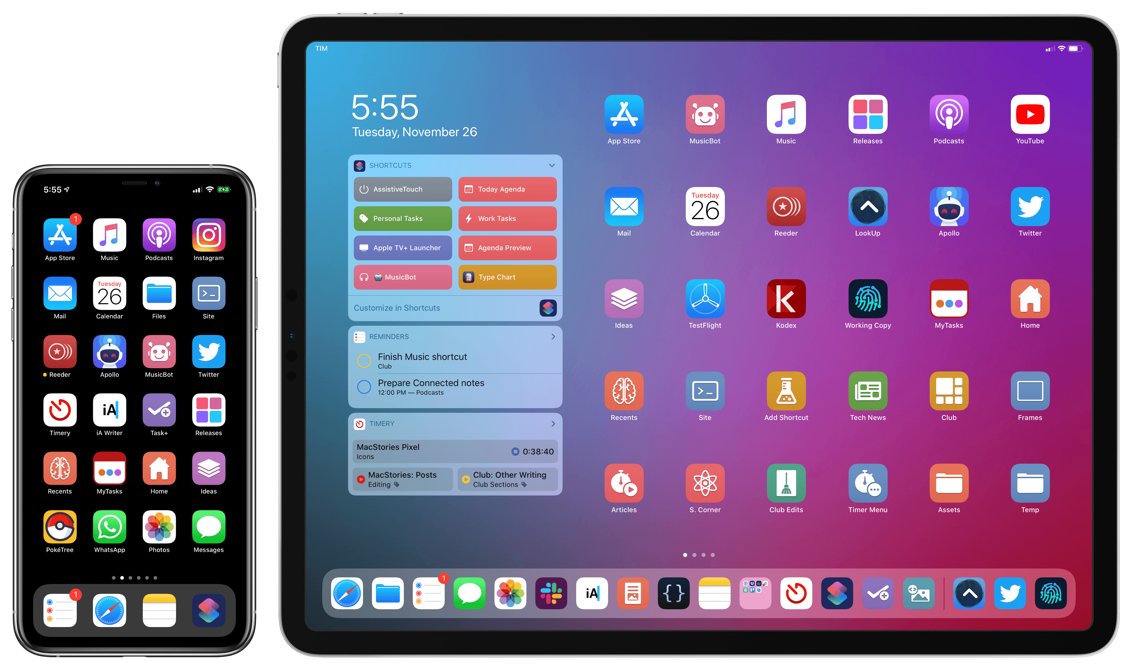
My iPadOS Home screen.

My iPadOS Home screen.

For several years after its launch, one of the best and worst things about the iPad was that it was basically just a blown-up iPhone. This meant the device was extremely easy to use and intuitive, but it also meant lots of “computer-like” tasks were difficult to perform on an iPad. When the iPad Pro debuted in late 2015, that began to change. Features like Split View, Slide Over, Picture in Picture, and drag and drop made the iPad a more capable computer than ever. However, despite those advancements, it took until this fall before one of the iPad’s core iPhone inspirations was altered: the Home screen.

Before iPadOS, the iPad’s Home screen was just a larger version of an iPhone Home screen, with no unique advantages to it. That finally changed mere months ago, when iPadOS 13 brought two primary improvements to the Home screen: it could hold 30 icons rather than 20, and it could include pinned widgets.

These two changes alone weren’t radical departures from the Home screen’s iPhone origins, but combined with other discoveries, they unlocked significant new possibilities.

On a recent episode of Adapt, I challenged Federico to try re-creating a Mac-like desktop environment on the iPad’s Home screen, complete with file and folder launchers. What he came up with is exactly what I’d hoped for. This newfound ability, alongside iPadOS 13’s enhancements to how shortcuts work when added to the Home screen, and the debut of MacStories Shortcuts Icons, meant it was time for me to seriously consider a new approach to my Home screen.

What I’ve come up with includes apps, app folders, files, file folders, shortcuts, and of course, widgets. It’s a diverse setup, and it all lives on a single page of icons. Let me explain.

Read more


Toolbox Pro Review: A Must-Have Companion Utility for Shortcuts Power Users

When I covered the updated Shortcuts app in my iOS and iPadOS 13 review earlier this year, I argued how, thanks to parameters, Shortcuts actions provided by third-party apps could become native features of the Shortcuts app.

With his debut app Toolbox Pro, released today on the App Store, developer Alex Hay has taken this idea to its logical conclusion: Toolbox Pro is a new kind of “headless” app – a utility whose sole purpose is to complement and extend Apple’s Shortcuts app with over 50 new actions, providing a native implementation of functionalities that Apple hasn’t brought to Shortcuts yet. After having used Toolbox Pro for the past couple of months, not only is the app a clever idea well suited for Shortcuts’ parameter framework, but it’s also a must-have for anyone who relies on Shortcuts on a daily basis.

Read more


FoodNoms: A Privacy-Focused Food Tracker with Innovative New Ways to Log Meals

FoodNoms is a new privacy-oriented food tracking app that tackles the tedium of logging what you’ve eaten in innovative ways that make it one of the most promising apps in this category that I’ve seen in a long time.

Too often during the year, I find myself eating what’s easy, not what’s healthy. When I sense that happening, the first step I take is to open a food tracking app and log what I’ve been eating. The process imposes the discipline to help get me back on track with healthier eating habits. However, I don’t usually stick with food tracking long, mostly because I find the process tedious.

With FoodNoms, I’ve found it easier to stick with food tracking than ever before. The app’s database of foods seems a little limited compared to other apps I’ve used, and I’d like to see more ways to visualize trends over time added to the app. Still, those limitations are largely made up for by the ability to log portion accuracy and scan nutrition labels, along with the multitude of other ways to log meals. Add FoodNoms’ privacy focus, and I expect it’s going to win over a lot of people.

Read more


How I Keep Track of New Music Releases

I was reading Jason Tate’s (as always, excellent) Liner Notes column at Chorus over the weekend, and his comments on Apple Music’s approach to highlighting new releases resonated with me:

Every Friday I open up the Music app, go to the For You section, scroll all the way down to the bottom and look at the “New Releases” section. This section looks at your library and shows you new albums from the artists you have in your collection. It’s a quick way to see if I’ve missed anything big that I need to post about or want to listen to, as I prepare for this newsletter. There are a few things about this section that drive me nuts: it’s very hidden and hard to get to, it’s laid out weirdly and often misses artists I have in my collection, and it doesn’t have any way to show me singles from artists I like that were released or songs that are on upcoming albums from artists I like that were released over the past week. This entire section could be designed so much better and be so informative. They have all of the information needed to put together an incredibly useful page of new music that I’ve already signaled I’d like to know about, but don’t. The weekly New Music Playlists are nice, and often do include some things I want to know about, but they also are usually full of stuff I’ve already heard and have played multiple times. This missing feature is the single most frustrating part of Apple Music for me.

As much as I like using Apple Music (especially now that it offers time-synced lyrics), I’ve always been disappointed by its treatment of new music releases. I agree with every single issue mentioned by Tate: the ‘New Releases’ section is tucked at the very end of the For You page and laid out as a horizontal carousel that requires a lot of swiping; you can view the ‘New Releases’ page as a grid, which has sections for different weeks, but, in my experience, it only aggregates highlights for new releases from some of my favorite artists. The ‘New Music Mix’ playlist is not terrible, but it often comes loaded with stale data – songs I’ve already listened to multiple times and which shouldn’t qualify as “new” weeks after their original release date. Furthermore, I’ve found notifications for new releases for artists in my library unreliable at best: I occasionally get notifications for new albums, but never for new singles or EPs.

For people who want to stay on top of every new music release from their favorite artists, the tools available in Apple Music alone aren’t enough. And I understand why Apple doesn’t want to invest in this aspect of the service: not everyone runs a music-focused publication or needs to know about every single release for hundreds of artists every week. Since the unfortunate demise of Record Bird – the app that encapsulated my ideal new music release discovery tool – I’ve been building a new system to stay on top of music releases, and I’d like to explain how.

Read more


How To Open the Apple TV+ Front Page and Individual Shows Directly in the TV App

Update, November 7: The shortcut has been updated with links to all currently announced Apple TV+ shows. You can find the updated download link below and in the MacStories Shortcuts Archive.


I was listening to the latest episode of Upgrade, and, among several fair points about the shortcomings of Apple’s TV app for iPhone and iPad, Jason Snell mentioned an issue that stood out to me: if you don’t know where to look, it can be hard to tell where exactly the Apple TV+ service lives inside the Apple TV app. This sentiment was echoed earlier today in this article by Benjamin Mayo at 9to5Mac:

Apple has made very few changes to the TV app design and feature set to accommodate the TV+ launch. TV+ is shoehorned in as just another source of content with very little consideration. With other streaming services, if you want to commit to their world and explore everything they have to offer, you can just open the dedicated app and never touch the TV app. With TV+, that’s simply not possible.

There is a channel section of the TV app that is dedicated to TV+ content — but it’s far from perfect. Finding the TV+ section requires a lot of scrolling, meandering past several screens worth of Watch Now recommendations for everything in the iTunes catalog.

I’ve been watching The Morning Show over the weekend (which I surprisingly liked a lot; I’m going to start For All Mankind and See next), and even though I’m used to the TV app’s quirks by now, I recognize that its navigation should be improved. And in particular regarding the new Apple TV+ service, I do believe that it’s somewhat buried in the TV app experience – by default, Apple doesn’t offer a single, easy way to open a “page” with Apple TV+’s complete catalog. So, I had to figure out a solution on my own.

Read more


Hands-On with HomePod’s New Music Features for HomeKit, Shortcuts, and Handoff

New HomePod features.

New HomePod features.

Following the announcement of AirPods Pro earlier today, Apple also released iOS, iPadOS, audioOS, and tvOS 13.2. Among various features (which we’ve detailed in a separate story here), one of the key improvements in this suite of software updates is extended flexibility of the HomePod’s music playback abilities.

In fact, by updating to the latest version of Apple’s software, you’ll gain a variety of new audio-related functionalities for HomePod, ranging from the ability to wave an iPhone atop the speaker to hand off audio to brand new integrations with the Shortcuts app as well as HomeKit scenes and automations. In this post, I’m going to go over all the different ways you can control audio playback on Apple’s Siri-integrated speaker, explain new shortcuts that can be built with these features, and share some first impressions based on my initial tests with today’s changes. We’re going to cover HomePod’s other new functionalities such as multi-user support and ambient sounds later this week. Let’s dive in.

Read more


MacStories Shortcuts Icons Receives Free Update with 50 New Glyphs

I’m happy to announce that MacStories Shortcuts Icons, our custom icon set for adding shortcuts to the Home screen, has received an update today that adds 50 new glyphs.

The update is available now for free for existing customers (just download the file again with the link in your original email receipt); for new customers, the update is part of the standard MacStories Shortcuts Icons purchase, which is available at $14.99 for a total of 350 custom Home screen glyphs.

All sales are final. You can read our license and terms of use here.

For those who may have missed it last month: MacStories Shortcuts Icons lets you customize the look of your shortcuts added to the Home screen by choosing from hundreds of glyphs designed specifically with Shortcuts users in mind, going beyond what’s provided by Apple in the Shortcuts app.

Read more


Eternal City, Modern Photography: The iPhone 11 Pro in Rome

The Colosseum at night. Shot on iPhone 11 Pro using the wide lens, with night mode enabled. Unedited. Zoom in for details.

The Colosseum at night. Shot on iPhone 11 Pro using the wide lens, with night mode enabled. Unedited. Zoom in for details.

In many ways, the iPhone 11 Pro’s camera system feels like the culmination of over a decade’s worth of judicious, relentless improvements. Not only is the device’s camera the best and smartest Apple has ever shipped, but it also affords the most photographic freedom, allowing non-professional photographers like me to produce amazing shots with minimal effort.

Read more


    macOS Catalina: The MacStories Review

    Ironically, Apple chose to name this year’s update to macOS after an island. Since the iPhone and iOS took off, macOS has sometimes felt like an island isolated from the rest of the company’s OSes, but the goal articulated by the company at WWDC this year was quite the opposite. Apple clearly telegraphed that change is coming to the Mac and it’s designed to bridge the user experiences between each of its platforms.

    To developers, that message came in the form of Catalyst and SwiftUI. Catalyst, which was previewed as an unnamed ‘Sneak Peek’ in 2018, is meant to make it easier for iPadOS developers to bring their apps to the Mac. SwiftUI has a similar longer-term goal of unifying and streamlining how developers build the interfaces for their apps across a range of devices, for everything from the Apple Watch to the Mac.

    The efforts to draw macOS in closer with Apple’s other operating systems run deeper than just developer tools though. macOS may have been the foundation on which iOS was built, but in the years that followed iOS’s introduction, the two OSes grew apart. Identically-named apps were developed on different schedules, which meant they rarely included the same features. Also, system-level functionality like System Preferences, which serves the same purpose as iOS’s Settings app, was unfamiliar, making Mac adoption unnecessarily hard for newcomers. Catalina is an attempt to address those kinds of inconsistent user experiences.

    With Catalina, Apple has taken clear, though not always successful, steps to bridge the divide between the Mac and iOS. App functionality has been realigned, System Preferences has been rearranged, and new features have been added to make it easier to move from one platform to the other.

    As with other transitional periods in the Mac’s history, this one isn’t going to be easy. However, because the change is driven by a fundamental change in computing, it’s also necessary. We live in a new climate where computing is now dominated by mobile devices. For many people, a smartphone is all the computing power they need day-to-day. That doesn’t mean there’s no longer a place for the Mac, but it’s clearly what’s driving the changes in Catalina.

    Apple could have chosen to ignore the shift of the ground beneath its feet and merely maintained macOS, making the kind of small incremental changes we’ve become accustomed to in recent years. However, not adapting is as deliberate a choice as change is, and it carries just as much or more uncertainty for the Mac as a platform because it risks irrelevance.

    The Mac isn’t in crisis, but it isn’t healthy either. Waiting until the Mac is on life support isn’t viable. Instead, Apple has opted to reimagine the Mac in the context of today’s computing landscape before its survival is threatened. The solution is to tie macOS more closely to iOS and iPadOS, making it an integrated point on the continuum of Apple’s devices that respects the hardware differences of the platform but isn’t different simply for the sake of difference.

    Transitions are inherently messy, and so is Catalina in places. It’s a work in process that represents the first steps down a new path, not the destination itself. The destination isn’t clear yet, but Catalina’s purpose is: it’s a bridge, not an island.

    Read more