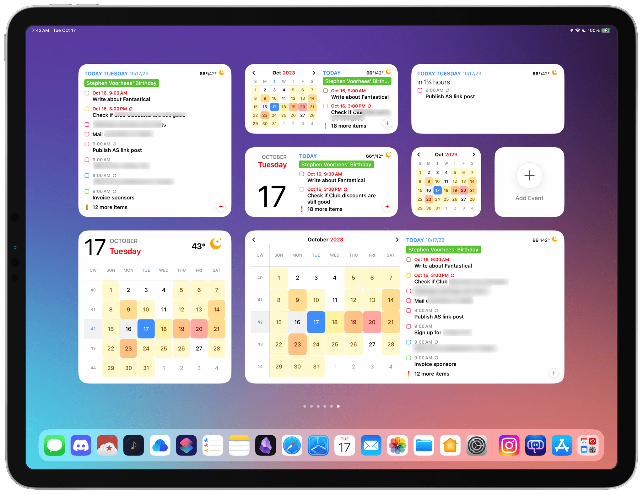
Calendar apps are ones that most people check more than they use. More often than not, all I need from my calendar app is to know what’s happening today. Many people go a step further, combining their tasks with their schedules to plan their days, making quick checks of their calendars even more crucial to their work day. Fantastical has both kinds of users covered with its latest update.
Posts tagged with "widgets"
Fantastical’s Widgets Pair Interactivity with Superior Design
TV Remote: Control Your TV From Your Lock Screen, Home Screen, and Live Activities
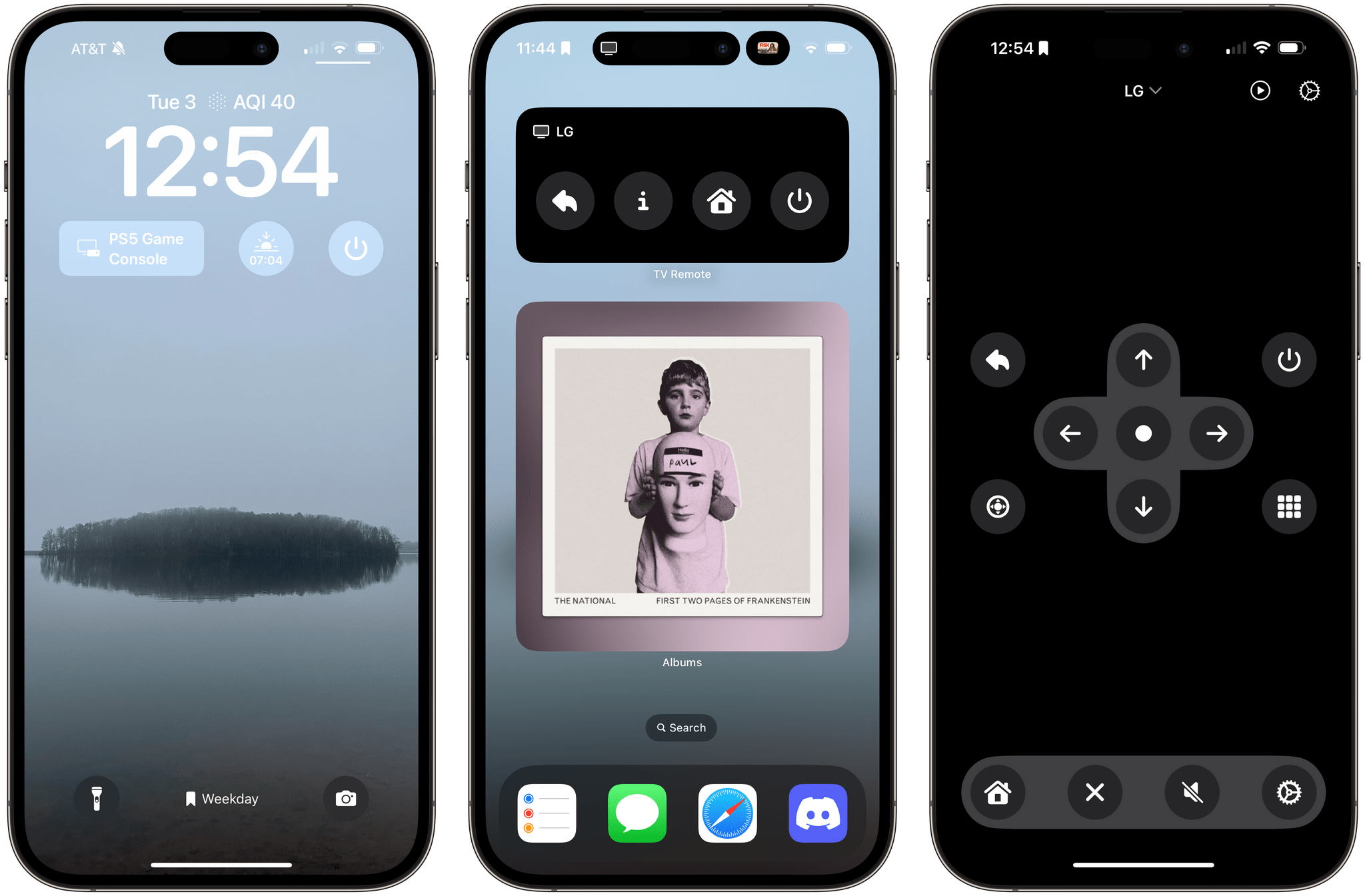
Developers have come up with endlessly clever uses for interactive widgets. I love testing them all, but one type is beginning to stick more than others. It’s the widgets for apps that require quick interactions when you’re in the middle of something else. Turning off the lights in my home office when I’m finished working for the day, toggling work timers as I switch from task to task, and then checking off those tasks as I complete them are all perfect interactions for widgets that require minimal switching away from whatever I’m doing. Hopefully, that means fewer distractions and, in turn, a more productive day.
But not everything is about peak efficiency and checklists. Sometimes, you just want to relax, which widgets can help with, too. One of my favorite apps to help with that, which recently added interactive widget support, is TV Remote by Adam Foot. Foot’s app is one I already used with my LG C2 TV, but it’s the app’s new widgets that have graduated it to a regular part of my TV routine.
Hue Widgets’ Interactive Widgets Are the Easiest Way to Control Complex Hue Lighting Scenes
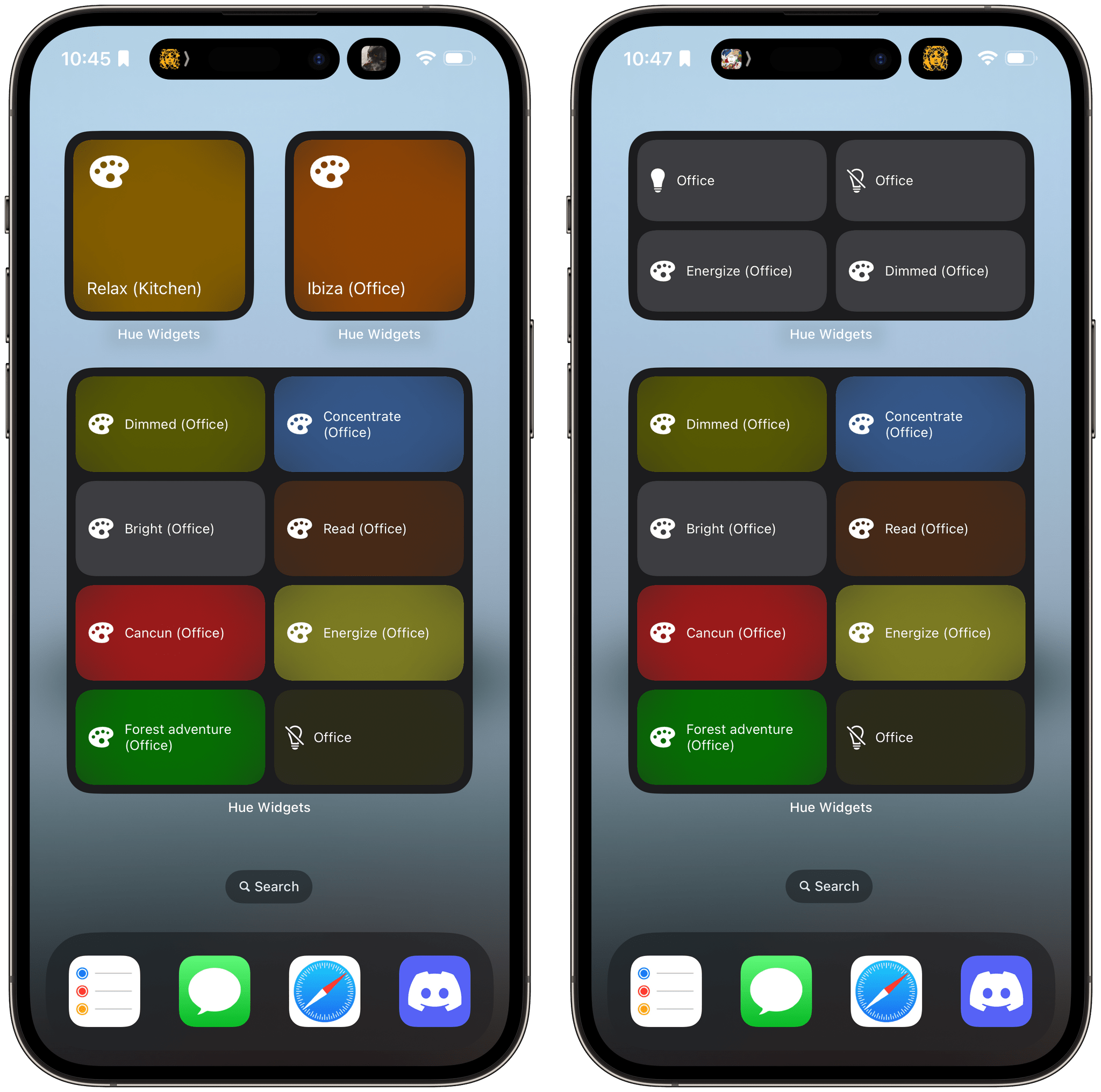
I’ve never been a big fan of the Philips Hue app. It has improved over time, and I appreciate its fine-grained control over my lights and its Shortcuts support, but the app has always felt a little clunky. That’s why I was happy when I discovered Hue Widgets over a year ago now. It’s a simple widget creation tool that lets you activate your Hue lights and scenes from your iPhone’s Home Screen, which is a much easier and nicer experience than using the Hue app. Better yet, with iOS 17, the app’s widgets are interactive, so lights and scenes can be triggered without ever opening the app.
Many Hue lights support features you can’t control from Apple’s Home app. For instance, many Hue lights can create animated and multi-color gradient lighting scenes that aren’t supported by HomeKit. These extended features can be accessed in the official Hue app, but it doesn’t have widgets, which is a faster and easier way to control your lighting and where Hue Widgets comes in.
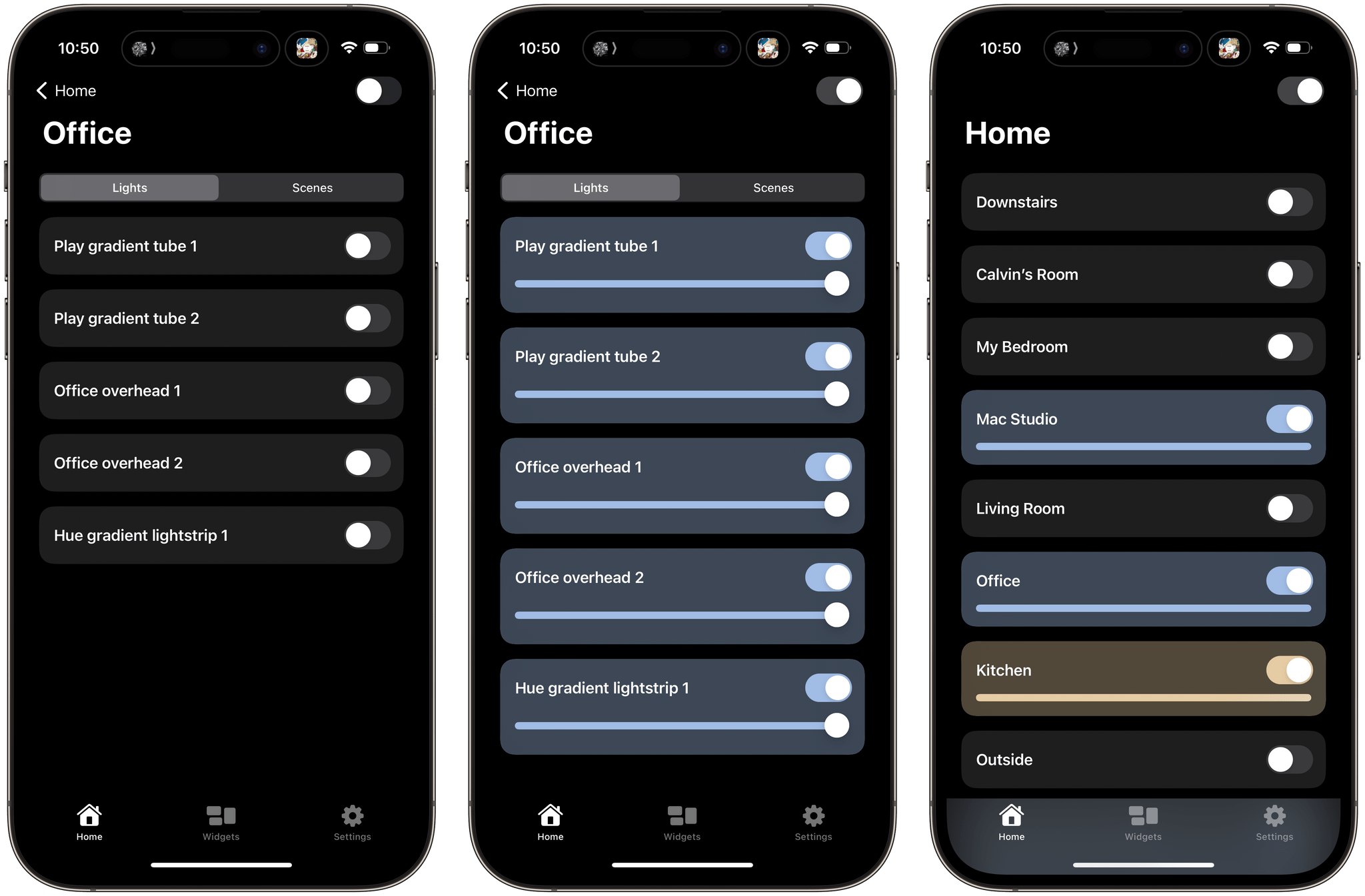
The Hue Widgets app has two main tabs: a list of the rooms in your home, and an interface for creating widgets. The Home tab allows you to turn on an entire room or zone’s lights or control them individually, turning lights and scenes on and off and adjusting brightness levels, light temperatures, and colors. The official Hue app works similarly, but Hue Widgets’ interface is simpler and faster.
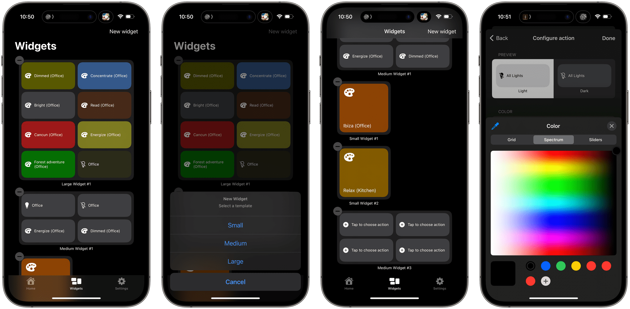
However, I’ve spent most of my time in the Widgets tab. Here, you can set up small, medium, or large widgets to control your Hue lights. The small version of the widget controls one light or scene, while the medium and large sizes control four and eight, respectively. After you pick the widget size you want, it appears in the Widget tab’s main interface. Then, tapping on each widget’s tiles walks you through picking a room and light or scene to control. Hue Widgets also lets you assign a color for each tile in your widget. It’s a quick and simple process but requires you to set up your lights and scenes in the Hue app first because Hue Widgets acts as a controller for the Hue app, not a replacement. When you’re satisfied with the widgets you’ve designed, return to your iPhone’s Home Screen to add one of the widgets you built, choosing the size you created in the app.
One thing I wish I could change in Hue Widgets is how it names widgets. Each is named automatically along the lines of ‘Small Widget #1’ and ‘Small Widget #2.’ If you create a lot of widgets, this isn’t ideal because it makes it hard to remember which widget is which. I’d prefer to assign more memorable names myself. I’d also love to see Hue Widgets on the iPad, where it could offer an extra-large widget.
.](https://cdn.macstories.net/wednesday-27-sep-2023-11-00-17-1695827189031.png)
Hue Widgets pairs nicely with Home Widget, which I recently reviewed.
I was a fan of Hue Widgets before iOS 17, but having tried the interactive versions of its widgets, I can already tell I will be using them a lot more than before. Paired with the recent addition of Matter support for Hue hubs, which seems to have improved the responsiveness of my lighting, Hue Widgets has become a core part of my growing home automation setup.
Hue Widgets is available on the App Store for $1.99.
Widgle’s Four Photo-Based Widget Games Deliver Simple, Fun Interactive Diversions
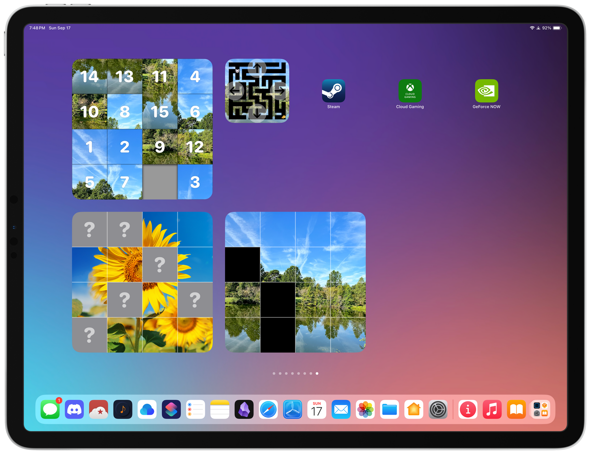
Widgle is a collection of four simple puzzle games for the iPhone and iPad that integrate with your photos. As I mentioned in connection with Widgetsmith’s Tile game, interactive widgets’ system-imposed button and toggle limitation severely constrains the kinds of games that can be built as a widget, but that doesn’t mean they can’t still be fun. Widgle’s four games, a tile sliding puzzle, a maze, a lights out-style game, and a matching game each come in small and large sizes.
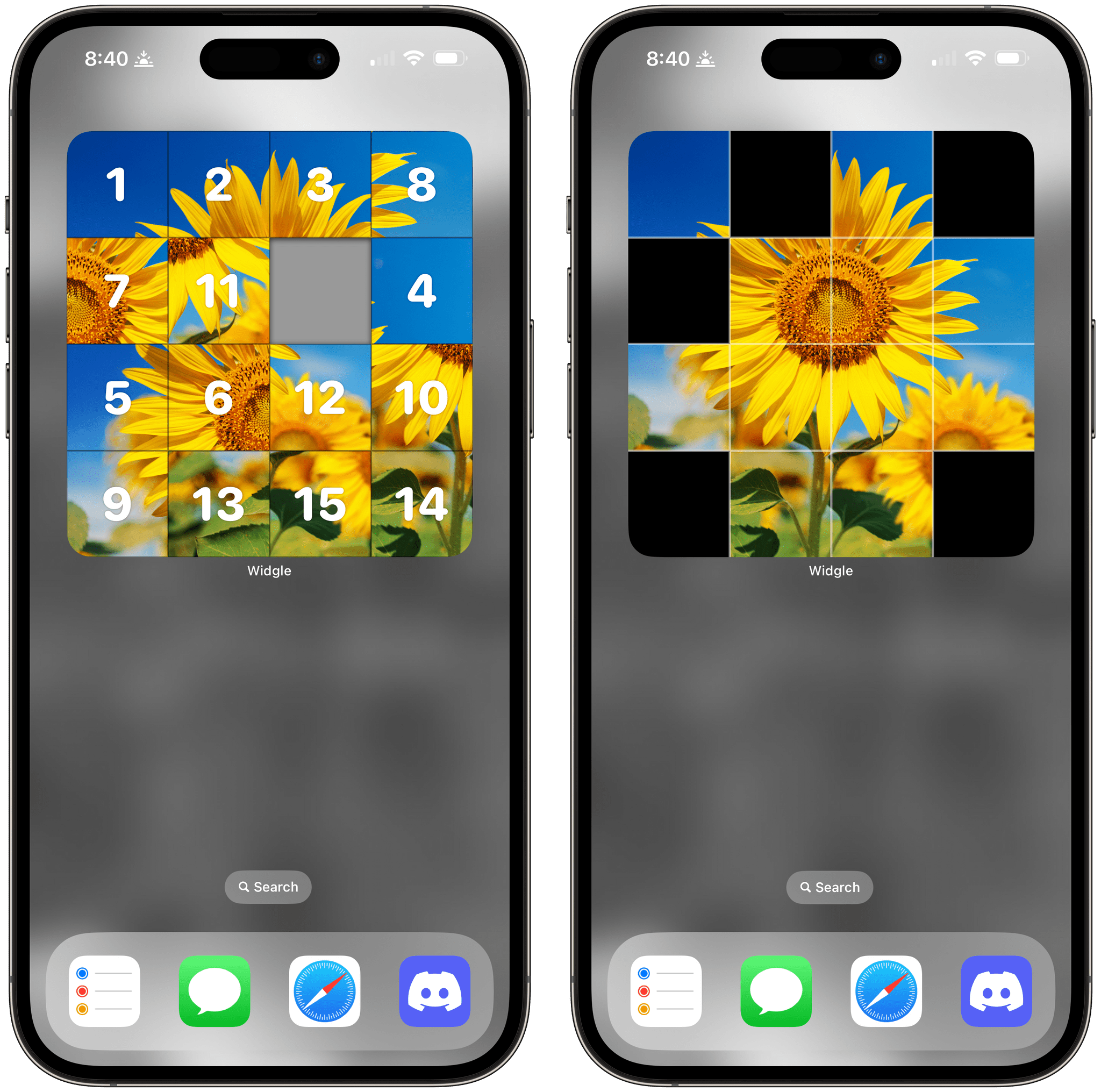
The Tile Slide game uses a photo of your choosing, scrambles the tiles, and overlays numbers, which can optionally be turned off in the widget’s settings. There’s one free space, and by tapping tiles, you can try to put them back in the correct order, reassembling your image. There are four grid options, too, a couple of which are only available in the large version of the widget.
Lights On begins with one of your photos divided into a grid with some of the squares missing. Tapping on a square inverts the others around it, and with some careful poking, you can reassemble your entire photo so it includes no blanks. Like Tile Slide, there are four grid size options, with two exclusive to the large-sized widget.
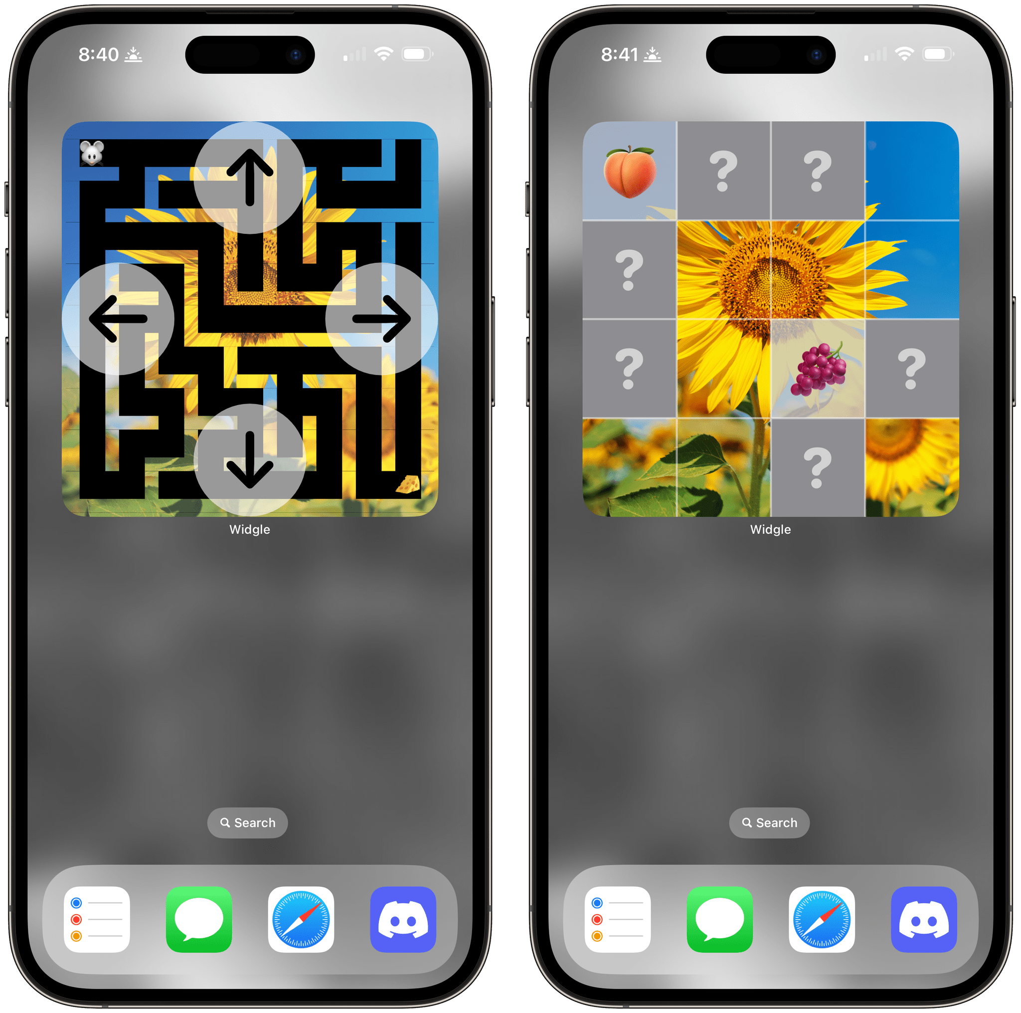
Maze Master overlays directional arrows around the edges of the widget, so you can guide your character through a maze backed by one of your photos. There are three difficulty levels to choose from and six different emoji characters available.
Finally, Match Up starts with a grid of squares with question marks in their centers. Tap squares to reveal the hidden emoji underneath. Find a matching pair of emoji, and the squares reveal part of one of your photos.
As I mentioned at the top. Widgle’s games are very simple classics, but I’ve still enjoyed idly playing with them when I need a break. The inclusion of photos, which can be picked in the main Widgle app, makes each game feel more personal.
Widgle is available on the App Store as a free download with an In-App Purchase of $1.99 to customize the puzzle with your photos.
Home Widget Unlocks HomeKit Device Control That Apple’s Home App Doesn’t Offer
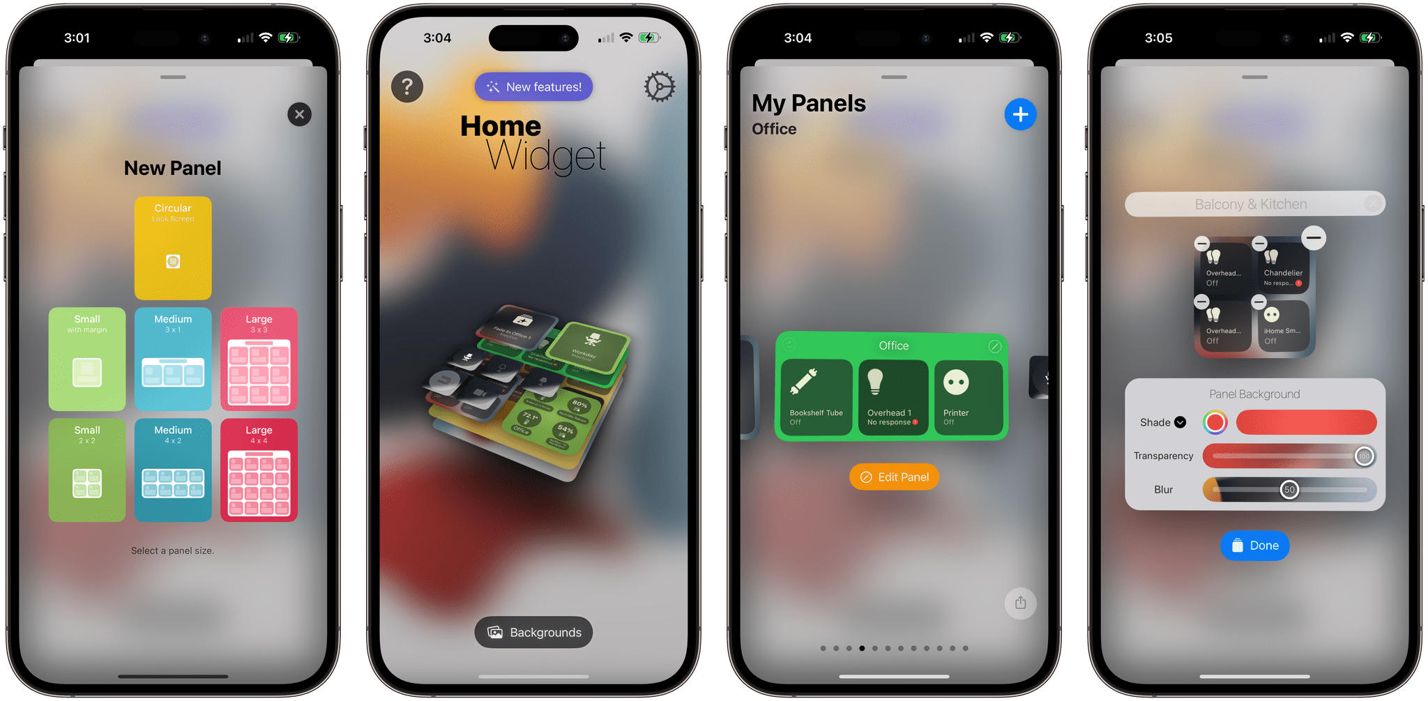
You might have wondered what would become of widget-focused apps like Home Widget when Apple announced at WWDC that a Home widget was coming to iOS 17, iPadOS 17, and macOS Sonoma. I did too. But, even though the Home widget works well, it’s limited, leaving room for developers like Clément Marty to take their widgets to an entirely different level.
If you’re a home automation nerd, you’ll quickly run into the Home widget’s limitations. For instance, it’s great for toggling lights on and off, but it can’t dim your lights or change their color. Home Widget goes beyond the binary choice of on or off across a spectrum of features, making it indispensable for home automation fans.
Let’s see what it can do.
Timery’s Updated Widgets Enable Starting and Stopping Timers, Pagination, and More
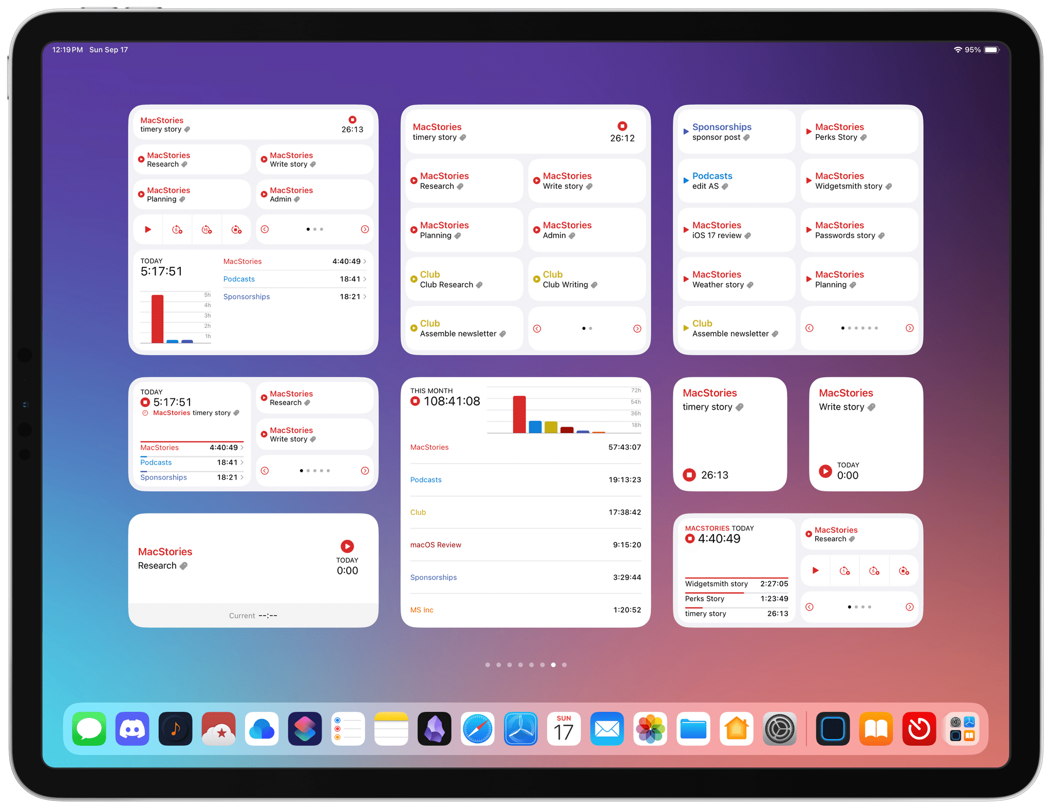
It’s interesting to compare Timery 1.6, Joe Hribar’s time tracking app for iPhone, iPad, Mac, and Apple Watch, with Widgetsmith. David Smith’s app uses interactivity across a wide range of different types of widgets, allowing for a highly personalized approach to your Home Screen. Timery is a little different. It’s just as customizable, if not more so, but in a deep, focused way that makes it hands-down the most customizable and useful way to track time from a widget.
If you had asked me how I used Timery in the spring, I would have said I primarily use the Mac app. That’s changed drastically over the summer. My answer now is that I’m primarily a Timery widget user.
What I love about the app’s widgets is that they allow you to create a set of widgets that work how you use the app and nothing more. One of Timery’s strengths has always been its rich set of features that make it valuable to a broad cross-section of users. However, that means there is more to Timery than most people need. But with the app’s widgets, it’s possible to pare the app down to just the components that are essential to you, which is the ultimate in customization.
That doesn’t mean you won’t use the main app ever again. Some people may, but I certainly haven’t. Instead, it’s been more of a focus shift that allows me to continue whatever I’m working on, switching timers as needed on the fly from whichever device I have handy at the moment without opening the app most of the time. Timery’s update is a stellar release, which also comes with a new watchOS app that fans of the app are going to love.
Widgetsmith Pushes the Boundaries of Widget Interactivity
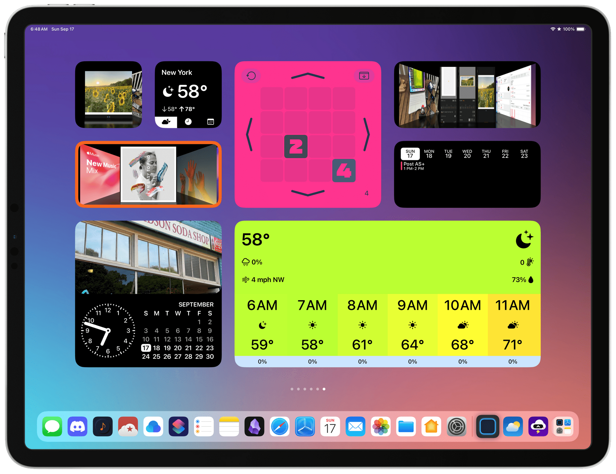
It’s clear from David Smith’s iOS 17 update to Widgetsmith that he intends for the app to hold its position among the most customizable widget creation tools available. That’s exactly what he’s done with a long list of new widgets, customization options, and features that push interactivity to the limit of the technologies Apple provides.
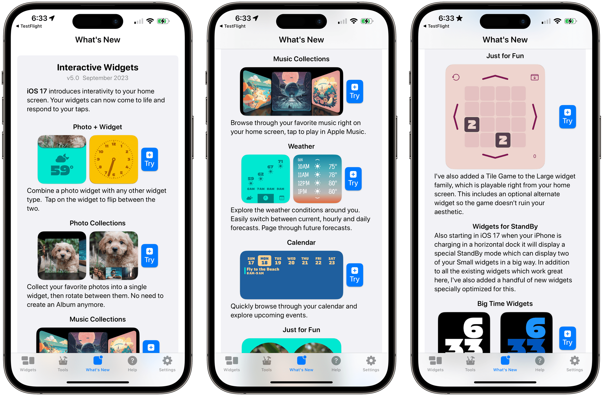
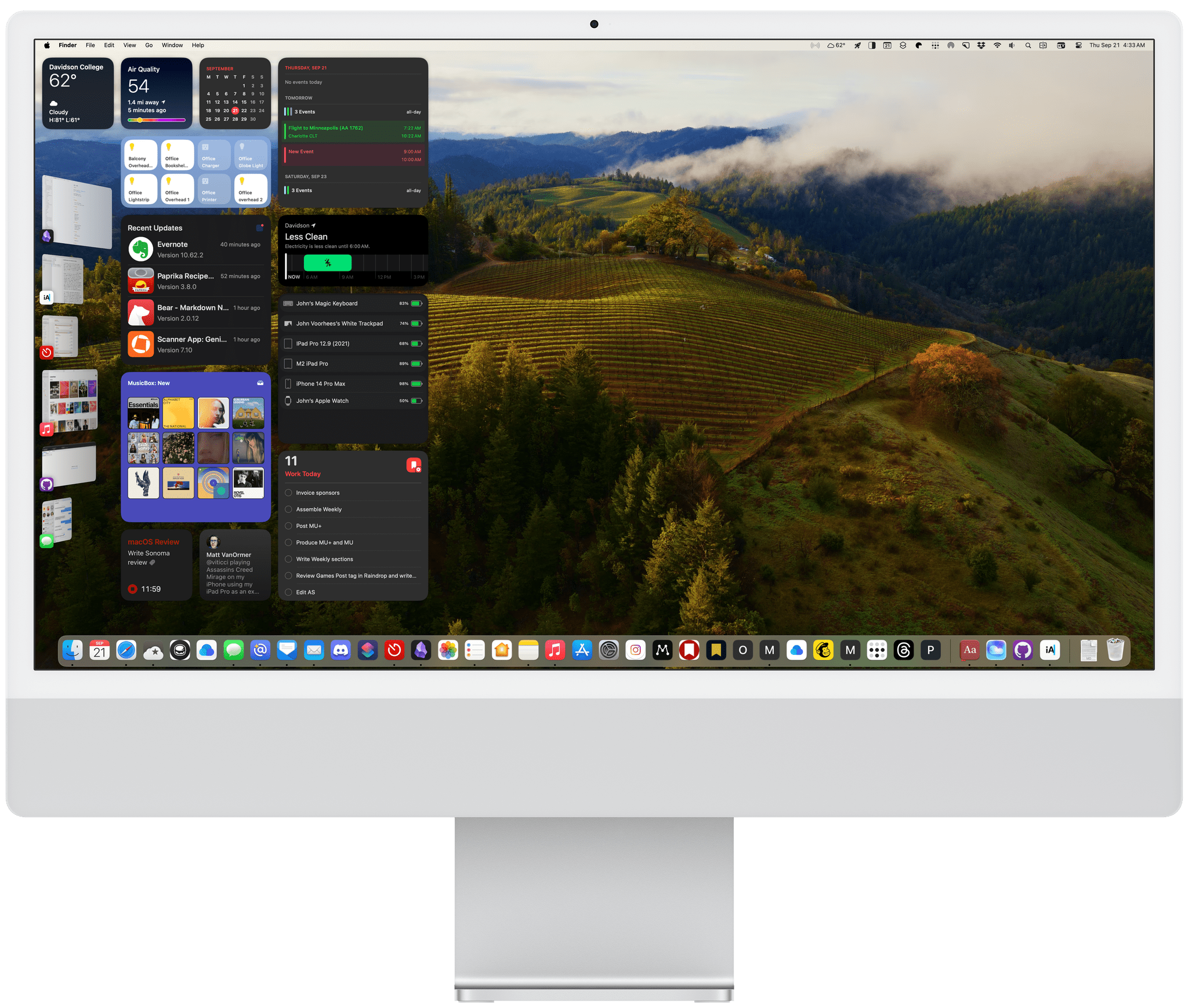
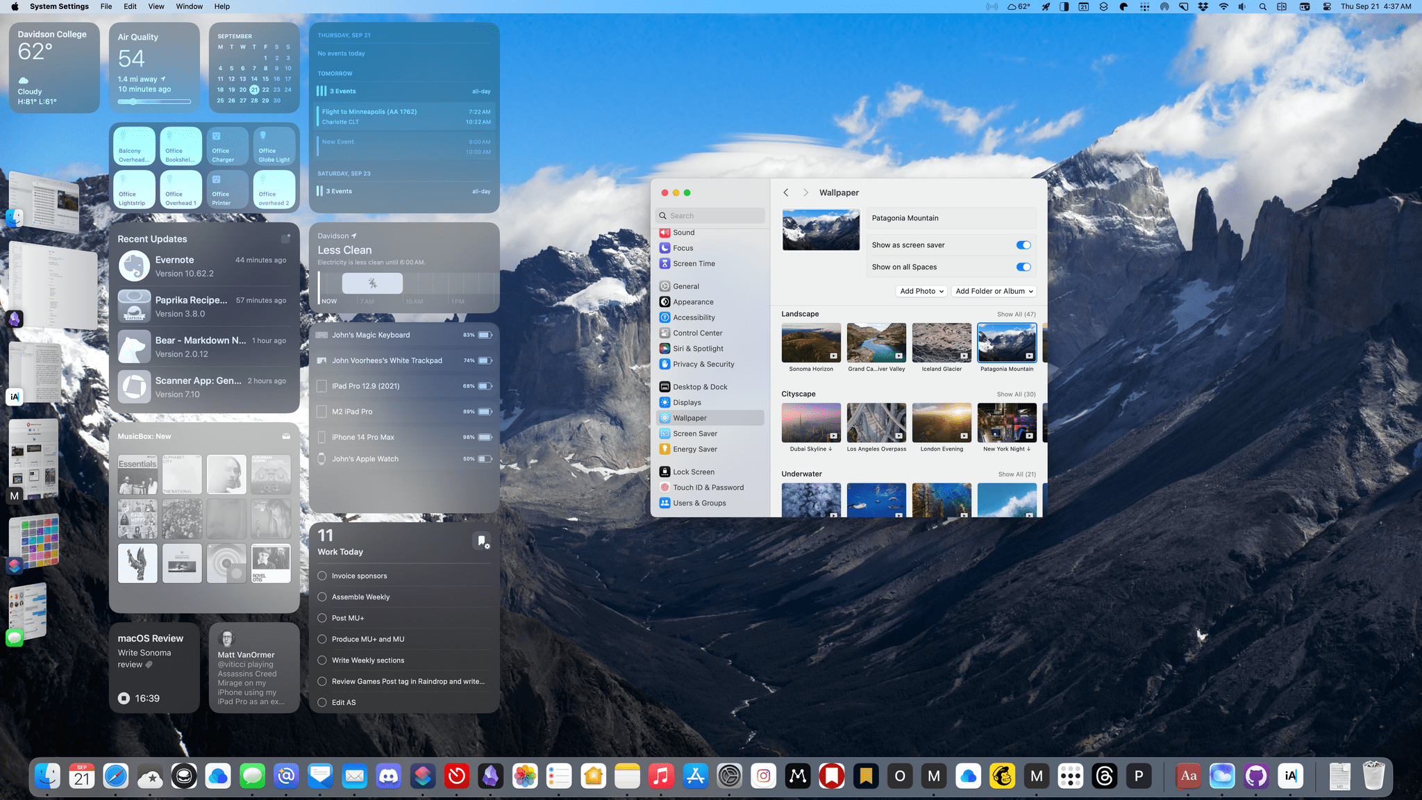
The new widgets focus on weather, calendar events, photos, and a game. The number of permutations available is vast because there’s so much to customize. The image at the beginning of this story is just a small sample of what is possible, but with adjustable colors, fonts, and other elements, the combinations that can be created are nearly endless. So, let’s dig into the highlights.
iOS and iPadOS 17 After One Month: It’s All About Widgets, Apps, and Stage Manager
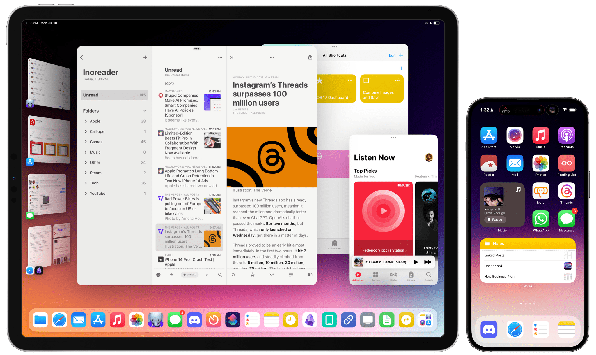
Apple is releasing the first public betas of iOS and iPadOS 17 today, and I’ll cut right to the chase: I’ve been using both of them on my primary devices since WWDC, and I’m very satisfied with the new features and improvements I’ve seen to date – especially on iPadOS. More importantly, both OSes are bringing back the same sense of fun and experimentation I felt three years ago with iOS 14.
I’ve already written about the improvements to Stage Manager on the iPad ahead of the public beta of iPadOS 17. Without repeating myself, I’m still surprised by the fact that Apple addressed my core complaints about Stage Manager a mere year after iPadOS 16. To describe my past year in iPad land as “turbulent” would be a euphemism; and yet, iPadOS 17’s improved Stage Manager not only fixes the essence of what was broken last year, but even eclipses, in my opinion, the Mac version of Stage Manager at this point.
I love using Stage Manager on my iPad now. There are still features missing from iPadOS 17 that won’t allow me to stop using my MacBook Air but, by and large, the enhancements in iPadOS 17 have allowed me to be an iPad-first user again. It feels good to write that. Plus, there are some surprises in iPadOS 17 that I wasn’t expecting that I’ll cover below.
iOS 17 is not a huge software update: there are dozens of quality-of-life features that I like and – best of all – terrific updates on the widget front. A good way to sum up Apple’s software strategy this year is the following: widgets are everywhere now (including the Watch), they’re interactive (finally), and they’re likely pointing at new hardware on the horizon (you know). As someone who’s been wishing for widget interactivity since the days of iOS 14, I can’t even begin to describe how amazing it’s been to see third-party developers come up with wild ideas for what effectively feel like mini-apps on the Home Screen.
I’m equally impressed by the work Apple has put into some of its built-in apps this year with features that I’ve always wanted and never thought the company would build. You can create internal links to other notes in the Notes app. Reminders has a column view. Podcasts has a proper queue. Even Reading List – of all features – has been updated this year. In using iOS 17, I sometimes get the sense that Apple went through popular wish lists from the community and decided to add all the top requests in a single release.
To quote my friend Stephen Hackett: the vibe is good this year, and it applies to software as well. Let me tell you about some of my favorite aspects of iOS and iPadOS 17 from the past month.