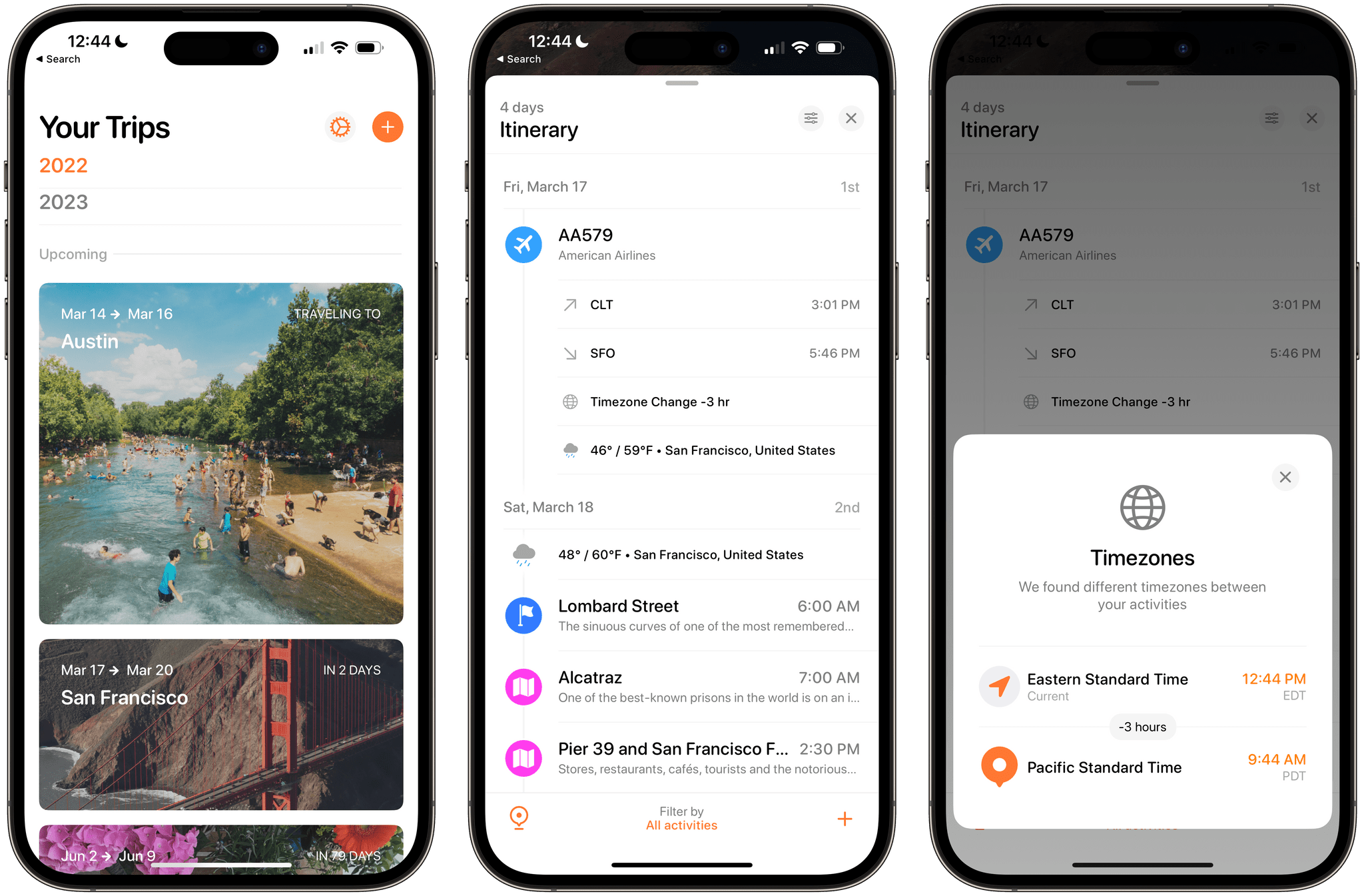
Tripsy is more than just an app for storing details about your upcoming trips. It does that and does it well, but it’s also a great way to revisit old trips and get inspired about places you want to visit in the future. We’ve covered Tripsy before, so for more on what the app can do, I recommend checking out our reviews of version 2.10 and version 1.0. With version 2.15, which debuted this week, Tripsy is focused on trip itineraries, adding several ‘quality of life’ features along with better organization for multi-location trips, and improved customization.
Posts tagged with "iOS"
Tripsy 2.15 Adds Weather Forecasts, Time Zone Support, and Other Customization Options
Apple Music Classical to Launch on March 28th
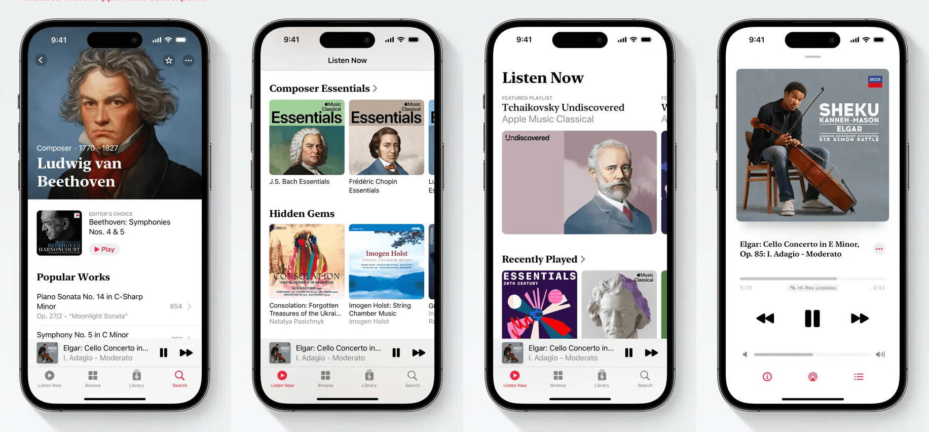
On March 28th, Apple will launch Apple Music Classical, a free app that’s already available for pre-order that will offer a catalog of over 5 million classical recordings to Apple Music subscribers at no additional cost.
The app, which will be iPhone-only at launch, has been anticipated for months. Apple acquired Primephonic, a classical music streaming service in August 2021, and said at the time that it would release an Apple-branded classical music streaming service the following year. 2022 came and went without a new app, but references to the new service began appearing in iOS beta releases, leading observers to believe that a release was imminent.
Apple says that Classical’s 5 million tracks, which include thousands of exclusives, is the largest in the world and has “complete and accurate” metadata. The company also says in the app’s release notes:
Apple Music Classical also makes it easy for beginners to get acquainted with the genre thanks to hundreds of Essentials playlists, insightful composer biographies, deep-dive guides for many key works, and intuitive browsing features.
Classical’s search will also be optimized for the genre, include editorial content, and be streamed at up to 192 kHz/24-bit Hi-Res Lossless, with thousands of tracks supporting spatial audio with Dolby Atmos.
Users can pre-order the free app today from the App Store, which will be downloaded to their iPhones on March 28th when the app goes live.
David Smith’s Widgetsmith reaches 100 Million App Store Downloads→
.](https://cdn.macstories.net/widgetsmith100-1678303196956.png)
Source: david-smith.org.
100 million of anything is a lot, and 100 million downloads on the App Store are rare. Rarer still, and perhaps unprecedented, is 100 million downloads of an app made by one person.
When it comes to apps, I can’t think of a single app made by an indie developer that has reached the milestone that David Smith did today with Widgetsmith. The app, which was released in September 2020 alongside iOS 13, lets users create personalized Home Screen widgets using photos, text, weather data, and more. Since its release, the array of customization options has continued to expand, and last fall, Lock Screen widgets were added to the mix. Most recently, Widgetsmith was updated with gradient backgrounds.
It’s been remarkable to watch Widgetsmith take the app world by storm. Thinking back to the summer of 2020 when Federico and I were testing Widgetsmith, I remember liking it, but I know neither of us had the slightest inkling that it would go viral the way it did not long after its release. Congratulations, Dave. Widgetsmith’s success is well-deserved.
Don’t miss Dave’s post on his website about Widgetsmith’s milestone. Also, the latest gradient background update to the app is available now as a free update on the App Store.
Apple Frames 3.1.1 with Support for Passthrough Mode→
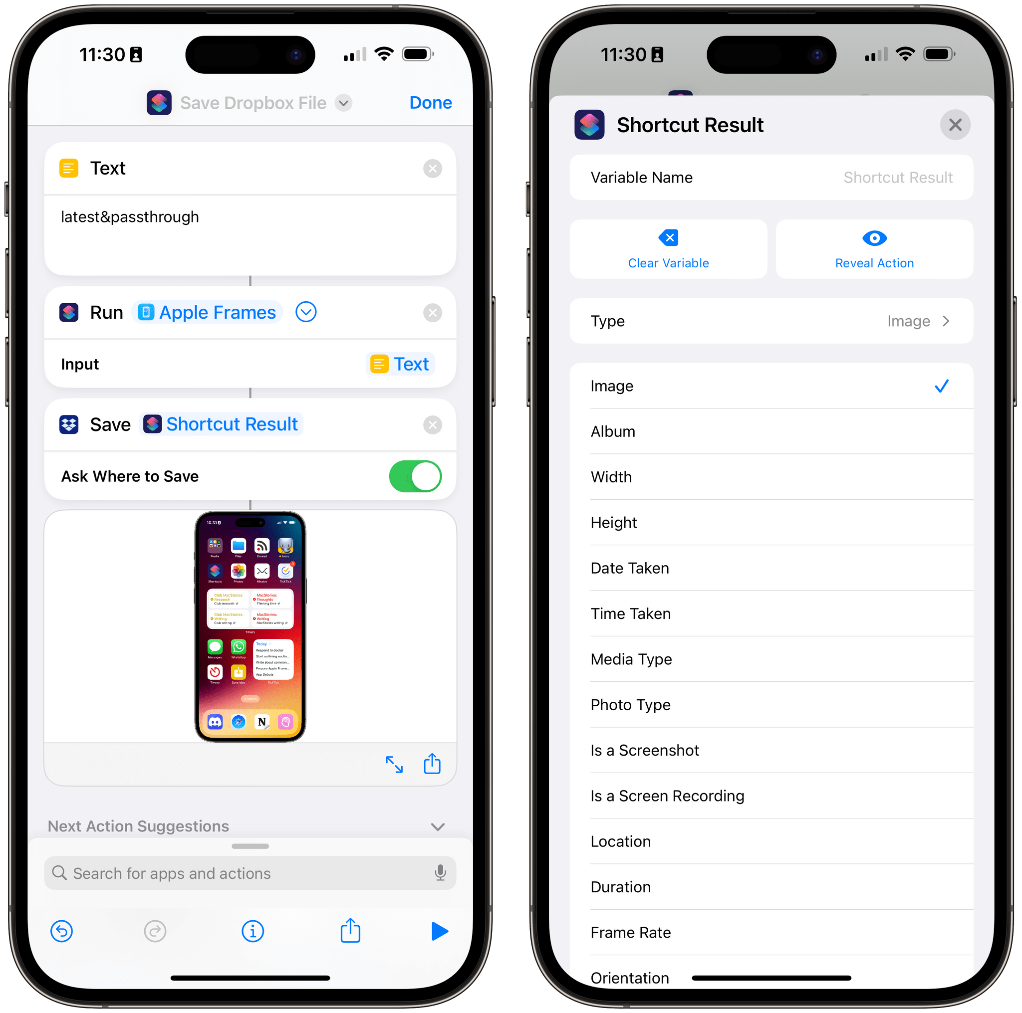
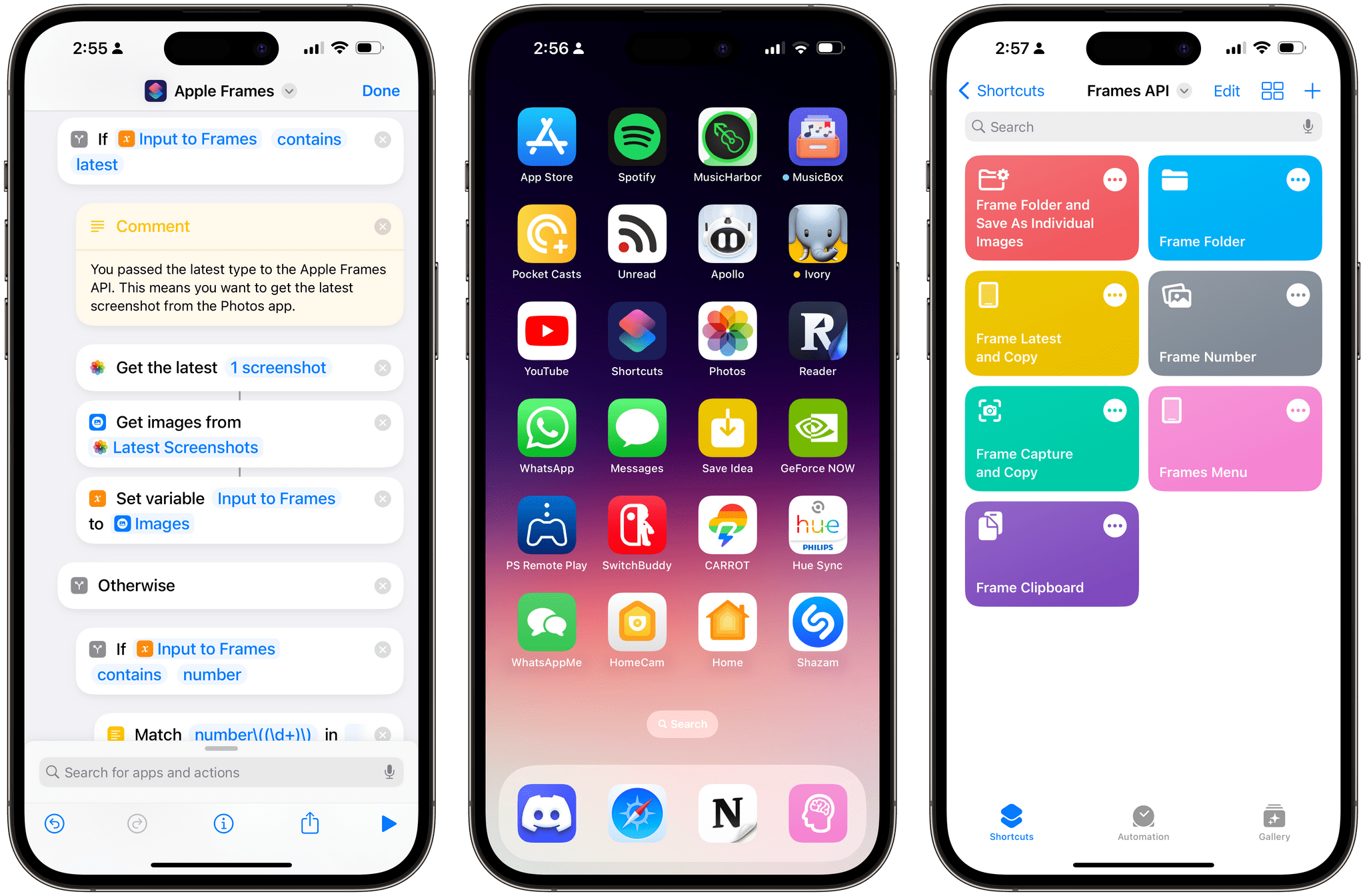
I just released a small update to Apple Frames 3.1, which came out earlier this week, with a new output command: &passthrough. With this output command for the Apple Frames API, you’ll be able to generate a framed image (from whatever source you like) and simply pass its result to the next action in a shortcut as a native image variable.
I wrote about this as part of my Extension column in MacStories Weekly today, where I also covered the ability to run Apple Frames from the command line on macOS. Here’s the excerpt about version 3.1.1 of Apple Frames and the new passthrough mode:
As I was researching this column for Weekly, I realized there was an obvious candidate for an output command I did not include in Apple Frames 3.1: a passthrough command to, well, pass framed images along as input for the next action of a shortcut.
Here’s what I mean: when you run Apple Frames from a helper shortcut using the ‘Run Shortcut’ action, that action produces an output variable called ‘Shortcut Result’. If you’re running Apple Frames as a function, thus turning it into a feature of another workflow, it can be useful to take the framed images it produces and use them as a native variable in other actions of the shortcut. The problem is that the output commands I launched with Apple Frames 3.1 all involved “storing” the framed images somewhere, whether it was Files or the system clipboard.
This is no longer the case with the
&passthroughoutput command I added to Apple Frames 3.1.1, which you can redownload from the MacStories Shortcuts Archive or directly from this link. If you run the Apple Frames API with this command, framed images will be passed along as native output of the shortcut, which you can reuse as a variable elsewhere in a shortcut that’s invoking Apple Frames.
And:
Any shortcut or longer workflow that involves running Apple Frames in the background and retrieving the screenshots it frames can take advantage of this method, allowing you to bypass the need to store images in the clipboard, even if temporarily. Essentially, passthrough mode turns Apple Frames into a native action of the Shortcuts app that returns a standard image variable as its output.
This is the only change in version 3.1.1 of Apple Frames, and I’m excited to see how people will take advantage of it to chain Apple Frames with other shortcuts on their devices. You can download the updated version of Apple Frames below.
Apple Frames
Add device frames to screenshots for iPhones (11, 8/SE, and 12-13-14 generations in mini/standard/Plus/Pro Max sizes), iPad Pro (11” and 12.9”, 2018-2022 models), iPad Air (10.9”, 2020-2022 models), iPad mini (2021 model), Apple Watch S4/5/6/7/8/Ultra, iMac (24” model, 2021), MacBook Air (2020-2022 models), and MacBook Pro (2021 models). The shortcut supports portrait and landscape orientations, but does not support Display Zoom; on iPadOS and macOS, the shortcut supports Default and More Space resolutions. If multiple screenshots are passed as input, they will be combined in a single image. The shortcut can be run in the Shortcuts app, as a Home Screen widget, as a Finder Quick Action, or via the share sheet. The shortcut also supports an API for automating input images and framed results.
Pedometer 5.0 Update Adds Map-Based Workouts, Live Activities, Accessibility Improvements, and Apple Watch Ultra Integration→
](https://cdn.macstories.net/untitled-1677705093938.png)
Source: david-smith.org
David Smith announced the release of Pedometer++ 5.0 today, and it looks like a big one. Smith says 5.0 has been rewritten from the ground up using SwiftUI and includes:
- Dynamic Type support
- Workout tracking, which was previously Watch-only, is now available on the iPhone too
- Live Activities that display distance and duration data or a map and distance preview are available in multiple styles
- Map-based routes can be added by transferring GPX files to the iPhone app using the iOS share sheet, which then syncs them to your Apple Watch
- Saved and favorite routes can be added to the Apple Watch too
- Once on the Watch, routes can be used in a new maps-based workout tracking mode, which displays them live
- The Apple Watch Ultra’s Action button can be used to start a walk quickly or to switch between map and metric views in the Watch app
I’m looking forward to giving this update a try. I’ve enjoyed using Footpath’s map integration as I explore North Carolina, and I’m curious to see how the apps compare.
Pedometer++ 5.0 is available as a free download on the App Store. Some features, including workouts, require a subscription.
Apple Frames 3.1: Extending Screenshot Automation with the New Apple Frames API
Update, March 3: Version 3.1.1 of Apple Frames has been released with support for a new passthrough output command. This post has been updated to reflect the changes. You can redownload the updated shortcut at the end of this post.
Today, I’m happy to introduce something I’ve been working on for the past couple of months: Apple Frames – my shortcut to put screenshots captured on Apple devices inside physical device frames – is getting a major upgrade to version 3.1 today. In addition to offering support for more devices that I missed in version 3.0 as well as some bug fixes, Apple Frames 3.1 brings a brand new API that lets you automate and extend the Apple Frames shortcut itself.
By making Apple Frames scriptable, I wanted to allow power users – such as designers and developers who rely on this shortcut to frame hundreds of images each week – to save valuable time without compromising the accessible nature of Apple Frames for other people. This is why all of the new advanced features of Apple Frames are optional and hidden until you go look for them specifically. Furthermore, even if you do want to use the Apple Frames API, you’ll see that I designed it in the spirit of Shortcuts: it does not require any code and it’s entirely powered by simple, visual ‘Text’ actions.
I’m incredibly excited about what Apple Frames can do in version 3.1, so let’s dive in.
Fitness App Gentler Streak Adds Wellness Tracking
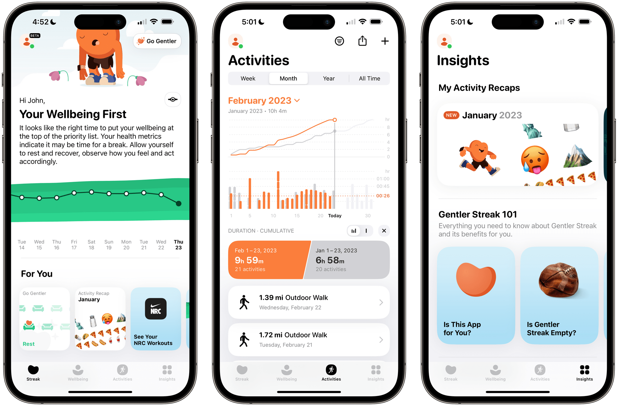
Gentler Streak, the fitness app for the Apple Watch and iPhone that takes a holistic approach to training and recovery, has been updated to version 3.0 to incorporate additional health metrics, so users can get a broader picture of their overall wellbeing. I’ve had less than a day to test-drive the new features, but what I’ve seen so far looks promising.
Gentler Streak uses trend analysis to help guide your workouts. Your daily and 10-day activity trends are plotted within a band of intensity to help guide whether you should work harder or rest. The app also tracks individual workouts, your activity over time compared to previous periods, and includes insights and tips for maintaining a healthy life.
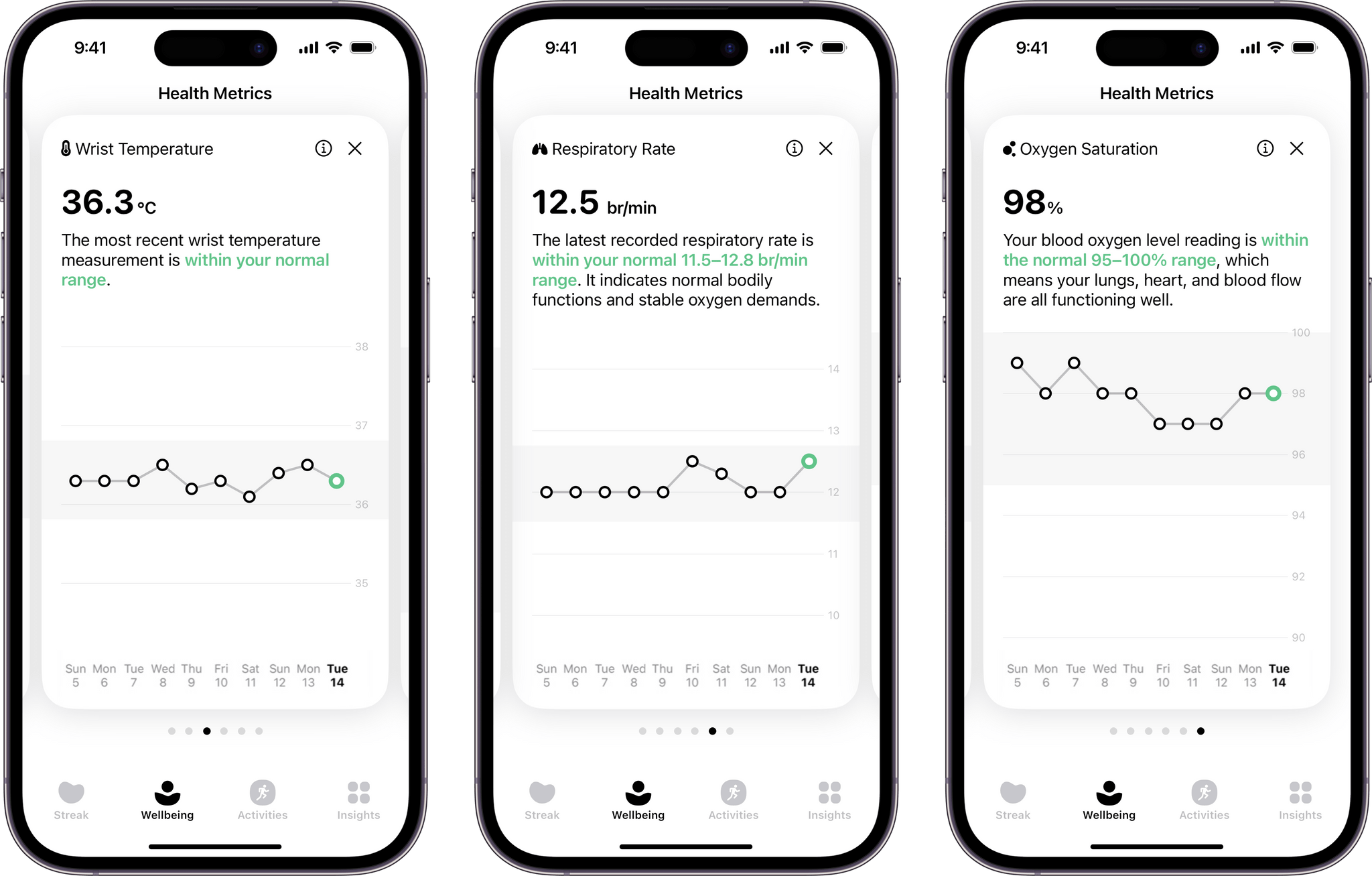
With today’s update, Gentler Streak is adding a new tab to the iPhone that tracks seven health metrics: sleeping heart rate or resting heart rate when SHR is unavailable, sleep duration, heart rate variability, respiratory rate, oxygen saturation, and wrist temperature. The app then uses that data to help guide your workout plans. For example, I didn’t get as much sleep as usual last night, so Gentler Streak suggested I take a break from working out today.
Each statistic in the Wellbeing tab is presented as a card-like widget that includes the current data, a 10-day trendline, and an indicator of whether the measurement is within normal ranges. Tapping on a card expands it for a bigger view that offers more information about what’s being measured and your results.
I’ve been using Gentler Streak for about a month and have found that its approach has kept me more motivated than closing my Fitness app Activity rings has. I still track those, too, but Gentler Streak is where I go to ensure I’m on track with my fitness goals while remembering to give myself a break now and then. It’s too soon to say what the Wellbeing tab will mean to my overall experience with the app, but I like what I’ve seen so far and plan to write more about Gentler Streak soon.
Gentler Streak is free to download from the App Store but requires a subscription to unlock some features.
Social Media Management Utility Buffer Adds Mastodon Support
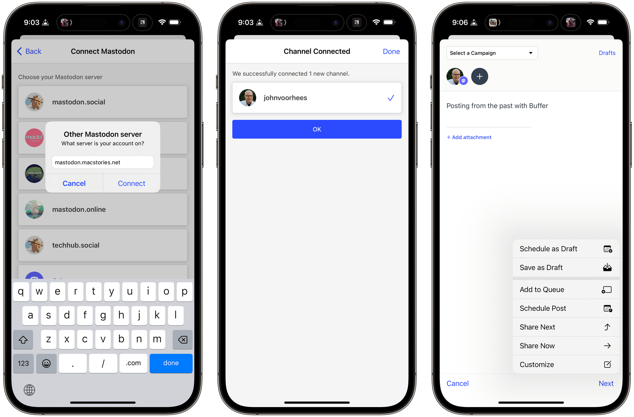
One of the things I immediately missed when I moved to Mastodon was the ability to schedule posts. This isn’t something I do a lot. However, with a busy editorial calendar at MacStories, I’ve used a variety of services over the years, including Buffer, to allow me to set up draft posts in advance when we’ve got a big story or episode of AppStories coming up. Losing that convenience wasn’t the end of the world, but it introduced friction I hadn’t had to deal with in years.
That’s why I’m glad to see Buffer has added Mastodon support to its web and iOS apps today. I’ve been testing Buffer’s beta for the past day, and the best part of the update is that there’s not much to say about it because it’s so easy to use. If you’ve used Buffer before, the process is similar to any other scheduled post you’d create: draft the post, add any media and hashtags you want, and then schedule it. If you want, you can also use Buffer to cross-post to other services.
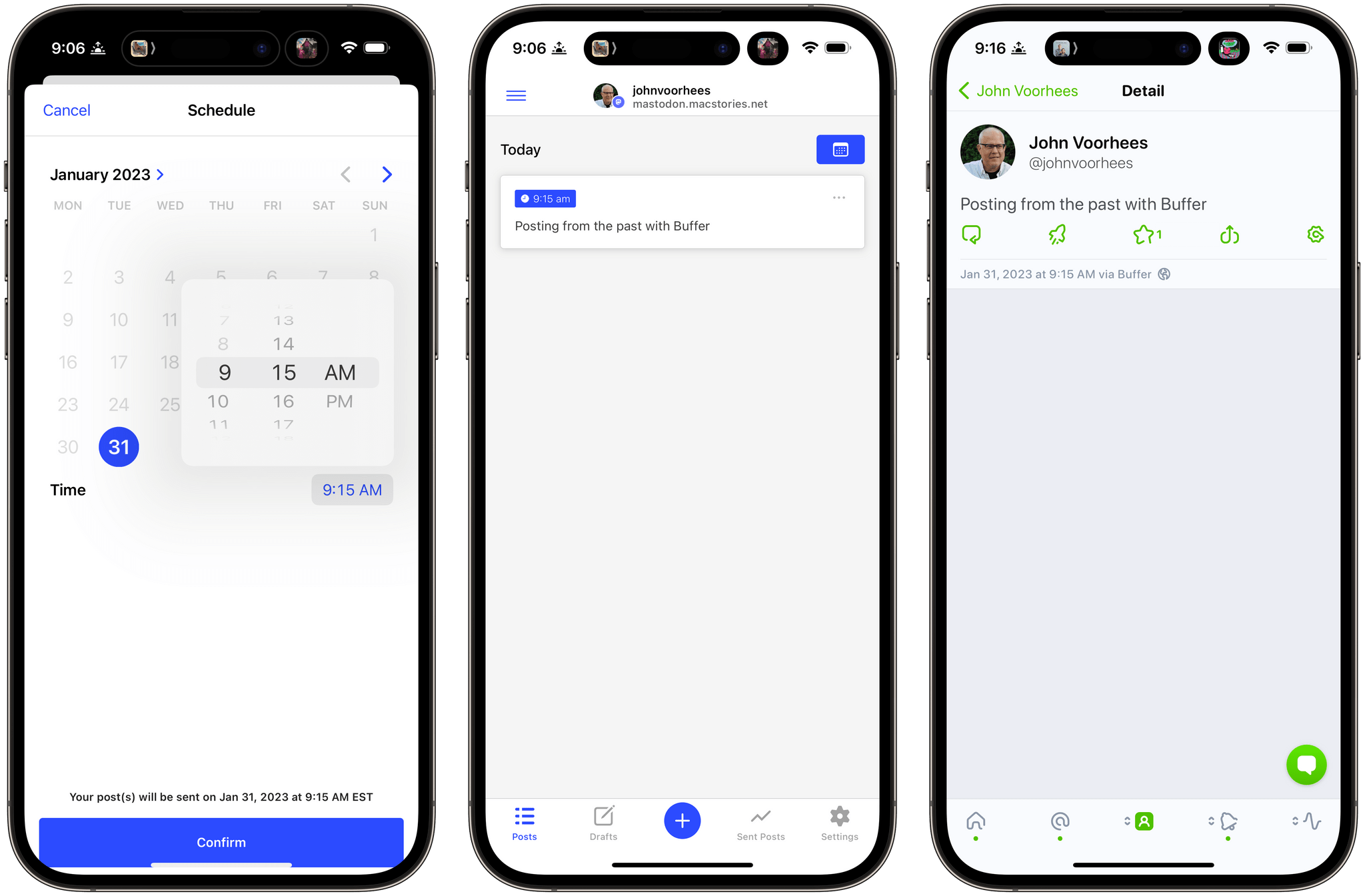
Managing posts for multiple accounts has always been the sort of thing that can disrupt my other work. It’s too easy for me to get distracted and wind up browsing my timeline after I post something from one of our company accounts. With Buffer’s new Mastodon integration, I’m looking forward to creating those posts as part of our production workflow and avoiding getting sucked into my timeline when I have more pressing tasks.
FoodNoms 2 Refreshes Its Design and Adds Refinements to Nutrition Logging and Goal Tracking Throughout
It’s been over two years since FoodNoms, the nutrition tracking app for the iPhone, iPad, Mac, and Apple Watch by Ryan Ashcraft, debuted on the App Store, and I reviewed it. Over the past two years, the app has steadily improved, refining its database of foods, adding Home Screen widgets, and a lot more. With version 2 out today, FoodNoms has taken its biggest step forward since its launch with a long list of new features and a refreshed design.
At its core, FoodNoms lets you set goals, track what you eat, and monitor your progress toward your goals. There are a lot of apps that do something similar, but what sets FoodNoms apart is its design, ease of use, and emphasis on privacy.