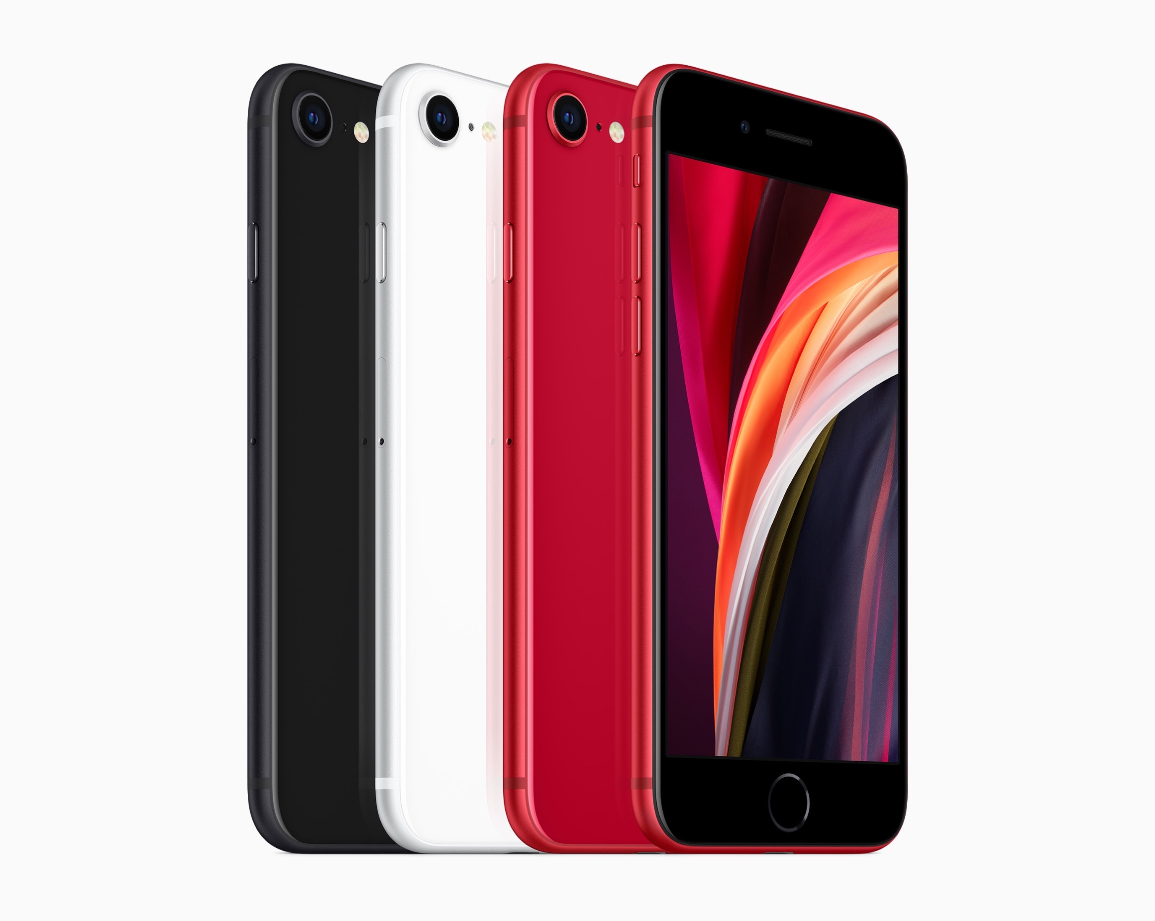
Today Apple announced the successor to 2016’s iPhone SE, a new model that retains the same name and goal of being the budget option for customers. The new iPhone SE will be available for pre-order this Friday, April 17, it ships one week later on April 24, and starts at $399, the same price the original SE had when it launched. Unlike that original model, though, the new SE carries an altogether different form factor. While the original SE was based on the iPhone 5’s 4-inch design, the new SE resembles the iPhone 6/7/8’s 4.7-inch design. This makes it notably larger than the previous iPhone SE, but still smaller than any of the flagship iPhone 11 line.
The 2020 iPhone SE, like its predecessor, contains modern specs but in a classic iPhone body. It has the same A13 Bionic processor found in the more costly iPhone 11 and 11 Pro models, but cuts costs in other ways such as by offering Touch ID rather than Face ID authentication, and a single 12MP rear-facing camera rather than the dual- or triple-lens arrays on Apple’s flagship models. The presence of Touch ID in particular makes the device an attractive option not only for users on a tighter budget, but also those who really don’t want to lose the Home button the next time they upgrade devices.
Club MacStories: Weekly and monthly newsletters via email and the web that are brimming with apps, tips, automation workflows, longform writing, early access to the MacStories Unwind podcast, periodic giveaways, and more;
Club MacStories+: Everything that Club MacStories offers, plus an active Discord community, advanced search and custom RSS features for exploring the Club’s entire back catalog, bonus columns, and dozens of app discounts;
Club Premier: All of the above and AppStories+, an extended version of our flagship podcast that’s delivered early, ad-free, and in high-bitrate audio.
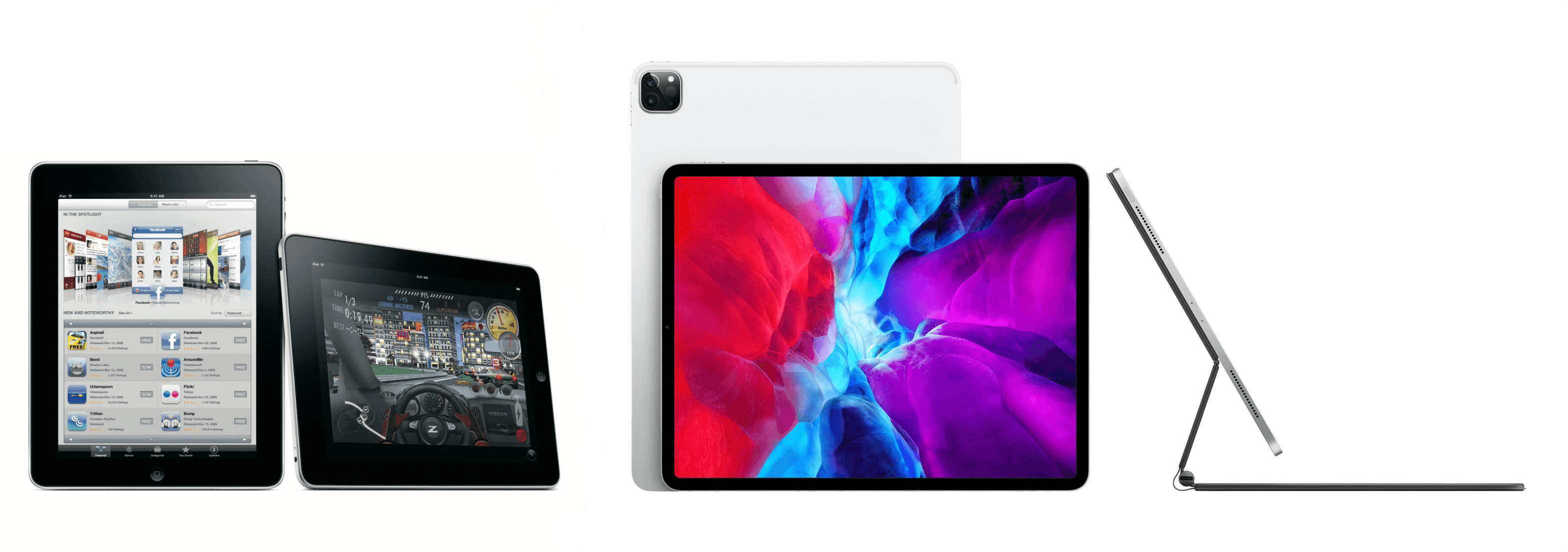
When I started my iPad-only journey in 2012, I was stuck in a hospital bed and couldn’t use my Mac. It’s a story I’ve told many times before: I had to figure out a way to get work done without a Mac, and I realized the iPad – despite its limited ecosystem of apps and lackluster OS at the time – granted me the computing freedom I sought. At a time when I couldn’t use a desk or connect to a Wi-Fi network, a tablet I could hold in my hands and use to comunicate with remote colleagues over a cellular connection was all I needed. Over time, however, that state of necessity became a choice: for a few years now, I’ve preferred working on my iPad Pro and iPadOS (née iOS) in lieu of my Mac mini, even when I’m home and have access to my desk and macOS workstation.
The more I think about it, the more I come to this conclusion: the iPad, unlike other computers running a “traditional” desktop OS, possesses the unique quality of being multiple things at once. Hold an iPad in your hands, and you can use it as a classic tablet; pair it with a keyboard cover, and it takes on a laptop form; place it on a desk and connect it to a variety of external accessories, and you’ve got a desktop workstation revolving around a single slab of glass. This multiplicity of states isn’t an afterthought, nor is it the byproduct of happenstance: it was a deliberate design decision on Apple’s part based on the principle of modularity.
In looking back at the past decade of iPad and, more specifically, the past two years of the current iPad Pro line, I believe different factors contributed to making the iPad Pro Apple’s first modular computer – a device whose shape and function can optionally be determined by the extra hardware paired with it.
The original iPad Pro showed how Apple was willing to go beyond the old “just a tablet” connotation with the Apple Pencil and Smart Keyboard. Three years later, the company followed up on the iPad Pro’s original vision with a switch to USB-C which, as a result, opened the iPad to a wider ecosystem of external accessories and potential configurations. At the same time, even without considerable software enhancements by Apple, the creativity of third-party developers allowed iPad apps to embrace external displays and new file management functionalities. And lastly, just a few weeks ago, Apple unveiled iPadOS’ native cursor mode, finally putting an end to the debate about whether the iPad would ever support the desktop PC’s classic input method.
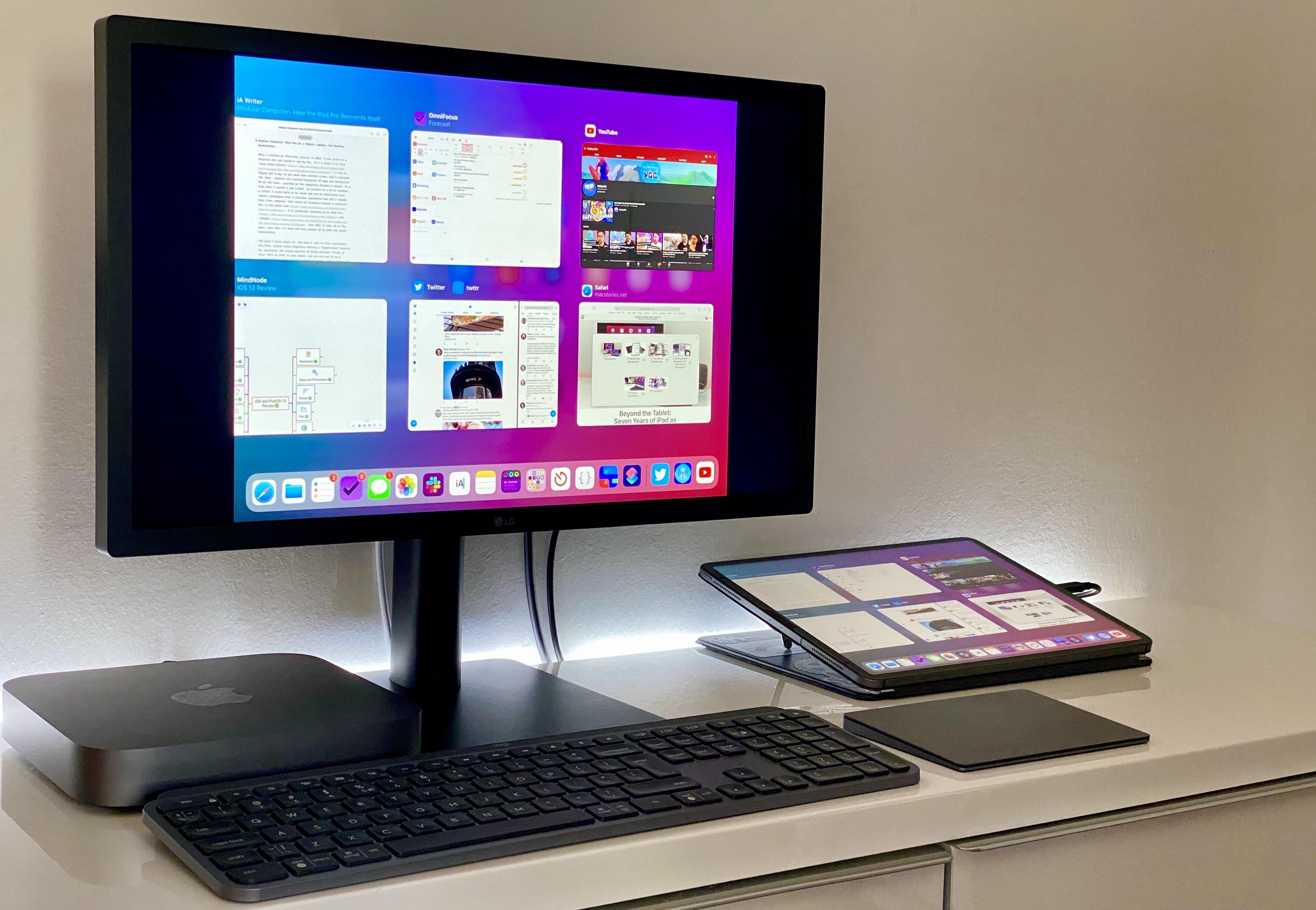
The intersection of these evolutionary paths is the modern iPad Pro, a device that fills many roles in my professional and personal life. Ever since I purchased the 2018 iPad Pro1, I’ve been regularly optimizing my setup at home and on the go to take advantage of the device’s versatility. I’ve tested dozens of different keyboards, purchased more USB-C hubs than I care to admit, and tried to minimize overhead by designing a system that lets me use the same external display and keyboard with two different computers – the Mac mini and iPad Pro.
At the end of this fun, eye-opening process, I’ve ended up with a computer that is greater than the sum of its parts. By virtue of its modular nature, I find my custom iPad Pro setup superior to a traditional laptop, and more flexible than a regular desktop workstation.
So how exactly did I transform the iPad Pro into this new kind of modular computer? Let’s dig in.
Club MacStories: Weekly and monthly newsletters via email and the web that are brimming with apps, tips, automation workflows, longform writing, early access to the MacStories Unwind podcast, periodic giveaways, and more;
Club MacStories+: Everything that Club MacStories offers, plus an active Discord community, advanced search and custom RSS features for exploring the Club’s entire back catalog, bonus columns, and dozens of app discounts;
Club Premier: All of the above and AppStories+, an extended version of our flagship podcast that’s delivered early, ad-free, and in high-bitrate audio.
Make no mistake, whether it’s a Mac, iPhone, or an iPad, I prefer big screens. I think most people do. A big, bright screen makes reading easier, and a larger canvas for the apps you use is rarely a downside.
Still, there’s a reason we carry mobile phones when a tablet, laptop, or desktop could accomplish the same tasks: portability. Smaller is often better, even as the compromises start to pile up when you shrink a device.
Portability is why foldable phones have captured the imaginations of so many people. They promise the portability of a traditional smartphone with a screen that’s closer to a tablet’s.
Just over one year ago, in March 2019, Apple released two new iPads: a 10.5-inch iPad Air and the first new iPad mini in over three years. The 5th-generation mini was a big surprise, largely because the mini hadn’t been updated in so long, leading many people to write it off as dead.
Perhaps an even bigger surprise, however, was the mini’s hardware. The design didn’t change, but the 5th-generation mini upgraded the device to an A12 processor, the same chip in the then-current iPhone XR and XS. The update also added a Retina laminated screen with True Tone, P3 color support, and the highest pixel density of any iPad. The mini doesn’t support ProMotion, it only supports the first-generation Apple Pencil, and still relies on Touch ID for security. Still, in terms of raw horsepower, the mini is more similar to the 10.5-inch iPad Air than it is different, allowing it to hold its own in Apple’s iPad lineup despite its diminutive size.
The previous fall, I had ordered a 2018 12.9-inch iPad Pro and fell in love with it for writing and other tasks. As much as I enjoy the iPad Pro’s big display, though, it’s not suited for every task. For example, the size of the iPad Pro makes it awkward for reading in bed. Also, although I love to play games on my iPad Pro with a connected controller, that only works well if the iPad is sitting on a table.
When the mini was introduced, I immediately wondered whether Apple’s smallest tablet could be the perfect complement to its largest iPad Pro: a powerful but tiny device that could work well where the Pro doesn’t. I also figured the mini could be a great ‘downtime’ device for activities like games, reading, chatting with friends, and watching TV, movies, and other video content. So, I sold some old gear I no longer used and bought a mini with 256GB of storage, so I’d have plenty of space for games and locally-downloaded video.
The plan was for my new mini to serve almost exclusively as my downtime iPad. What’s happened in practice during the past year is very different than I anticipated originally. My use of the mini has expanded far beyond what I’d expected, despite the compromises that come along with its small size. The iPad Pro remains the device I rely on for most of my needs, but as we approached the iPad’s first decade, the time felt right to consider how far the mini has come and how this unassuming device fits so neatly into the spaces between the other devices I use.
Club MacStories: Weekly and monthly newsletters via email and the web that are brimming with apps, tips, automation workflows, longform writing, early access to the MacStories Unwind podcast, periodic giveaways, and more;
Club MacStories+: Everything that Club MacStories offers, plus an active Discord community, advanced search and custom RSS features for exploring the Club’s entire back catalog, bonus columns, and dozens of app discounts;
Club Premier: All of the above and AppStories+, an extended version of our flagship podcast that’s delivered early, ad-free, and in high-bitrate audio.
John: It’s hard to understate the importance of the iPad’s large screen. Early critics dismissed the device as a big iPhone, but that criticism revealed a fundamental misunderstanding of the product.
By jumping from the iPhone’s small 3.5-inch display to one that approached 10 inches, the iPad delivered a canvas that allowed Apple and third-party developers to rethink not just the concept of mobile apps, but of apps altogether. The additional screen real estate allowed developers to flatten and spread UIs in a way that made new uses possible. That, in turn, led to richer, deeper experiences for everything from reading a comic book to managing complex projects and automating repetitive tasks, allowing users to interact directly with the software beneath their fingers.
After years of using the very best apps developers have to offer on the iPad, it was remarkably easy for Federico, Ryan, and I to come up with a list of the iPad apps that have been the most impactful for us during the past decade. There’s a lot of factors at play in arriving at these apps. Some forged a path by adopting the latest Apple technologies in a unique way that set an example for apps that followed. Others are apps that define a category that takes unique advantage of the iPad’s hardware. These are also apps that work on the iPhone or Mac too, but are most at home on the iPad’s unique platform.
Although there is no single formula for which iPad apps have been the most impactful, one thing each app in this collection shares is a rich, personal experience. These are apps inspired by and reflected in the image of Steve Jobs sitting onstage in a comfortable black leather chair swiping through photos. The iPad and the apps that run on it have come a long way since then, but the intimacy of directly manipulating apps that transform a slab of glass into anything a developer can imagine hasn’t changed, and remains what makes the iPad so special.
Club MacStories: Weekly and monthly newsletters via email and the web that are brimming with apps, tips, automation workflows, longform writing, early access to the MacStories Unwind podcast, periodic giveaways, and more;
Club MacStories+: Everything that Club MacStories offers, plus an active Discord community, advanced search and custom RSS features for exploring the Club’s entire back catalog, bonus columns, and dozens of app discounts;
Club Premier: All of the above and AppStories+, an extended version of our flagship podcast that’s delivered early, ad-free, and in high-bitrate audio.
From the start, the iPad has always been rife with potential. This is partly because it launched as a new type of product category, with unexplored use cases prompting users towards a different computing experience. But it’s also because the device’s very nature – a slab of glass that becomes its software – evokes countless possibilities.
To celebrate 10 years of iPad, I spoke to the developers of many of the device’s best apps across areas of productivity and creative work. They’re the people who make that slab of glass into something new, realizing the iPad’s potential but also showing, by their constant work of iteration and reinvention, that there’s always more that can be done.
In sharing their stories from the last decade, the people I spoke with outlined some of the best and worst things about iPad development, memories of their reactions to the product’s introduction, and dreams for where its future might lead. All throughout, it’s clear how much excitement remains for the iPad’s potential even 10 years on.
Club MacStories: Weekly and monthly newsletters via email and the web that are brimming with apps, tips, automation workflows, longform writing, early access to the MacStories Unwind podcast, periodic giveaways, and more;
Club MacStories+: Everything that Club MacStories offers, plus an active Discord community, advanced search and custom RSS features for exploring the Club’s entire back catalog, bonus columns, and dozens of app discounts;
Club Premier: All of the above and AppStories+, an extended version of our flagship podcast that’s delivered early, ad-free, and in high-bitrate audio.
Perhaps the most common complaint hurled against the iPad over its first decade of life is that it‘s little more than a bigger iPhone. At a fundamental level, the criticism is certainly valid: by and large, the iPad runs the same software as the iPhone. The penchant for bemoaning this bigness emanates from discontentment over the fact that substantial improvements to the iPad’s software have come at a glacially slow pace. Until last year, meaningful upgrades tailored to the tablet were few and far between.1 As much as Apple has extolled the iPad for being “unlike any computer,” the truth is the product stagnated for quite a while in terms of software.2 For better or worse, the company has been preoccupied with savoring every last drop of mother’s milk from the cash cow that is the iPhone. The iPad was left to wither thirstily when it came to its own growth, and it suffered for some time as a result.
In actuality, the iPad being more or less a scaled-up iPhone isn’t necessarily an entirely bad thing. The reason is iOS; familiarity breeds comfort – Apple shrewdly created the iPad’s user interface (and to lesser extents, Apple Watch and Apple TV) to largely resemble the iPhone. Especially for less nerdy users, the consistency across devices makes for a seamless, less intimidating experience. From icons to text to features to the touchscreen, the iPad being so similar to the iPhone means acclimating to the device takes minimal time and effort. From an accessibility standpoint, easy acclimation sets the tone for an enjoyable user experience. The foremost reason this is important is that the easier it is to acclimate to a device, the easier it is to find and configure mission-critical accessibility features.
Thus, it’s not at all unreasonable to look at what was heretofore a pejorative assessment – the iPad is nothing but a big iPhone – and turn it into a positive. One of the unheralded aspects of the device’s success is how its approachable, intuitive nature has made it a hit in accessibility-centric contexts such as special education classrooms and as a communicative aid. Such advances get right at the heart of the oft-cited Steve Jobs quote on the so-called intersection of technology and the liberal arts, when he said, “It’s in Apple’s DNA that technology alone is not enough.” Assistive technology obviously caters to the humanities part of the liberal arts, and it’s not hard to see how the iPad’s roots as ostensibly a bigger iPhone can be an asset rather than a liability. You just have to be willing to keep an open mind.
Club MacStories: Weekly and monthly newsletters via email and the web that are brimming with apps, tips, automation workflows, longform writing, early access to the MacStories Unwind podcast, periodic giveaways, and more;
Club MacStories+: Everything that Club MacStories offers, plus an active Discord community, advanced search and custom RSS features for exploring the Club’s entire back catalog, bonus columns, and dozens of app discounts;
Club Premier: All of the above and AppStories+, an extended version of our flagship podcast that’s delivered early, ad-free, and in high-bitrate audio.
The trouble with looking back over a long period is that time has a way of compressing history. The clarity of hindsight makes it easy to look back at almost anything and be disappointed in some way with how it turned out years later.
We certainly saw that with the anniversary of the introduction of the iPad. Considered in isolation a decade later, it’s easy to find shortcomings with the iPad. However, the endpoints of the iPad’s timeline don’t tell the full story.
It’s not that the device is short on ways it could be improved; of course, it isn’t. However, the path of the iPad over the past decade isn’t a straight line from point A to point B. The iPad’s course has been influenced by countless decisions along the way bearing consequences that were good, bad, and sometimes unintended.
The 10th anniversary of the iPad isn’t a destination, it’s just an arbitrary point from which to take stock of where things have been and consider where they are going. To do that, it’s instructive to look at more than the endpoints of the iPad’s history and consider what has happened in between. Viewed from that perspective, the state of the iPad ten years later, while at times frustrating, also holds reason for optimism. No single product in Apple’s lineup has more room to grow or potential to change the computing landscape than the iPad does today.
Club MacStories: Weekly and monthly newsletters via email and the web that are brimming with apps, tips, automation workflows, longform writing, early access to the MacStories Unwind podcast, periodic giveaways, and more;
Club MacStories+: Everything that Club MacStories offers, plus an active Discord community, advanced search and custom RSS features for exploring the Club’s entire back catalog, bonus columns, and dozens of app discounts;
Club Premier: All of the above and AppStories+, an extended version of our flagship podcast that’s delivered early, ad-free, and in high-bitrate audio.
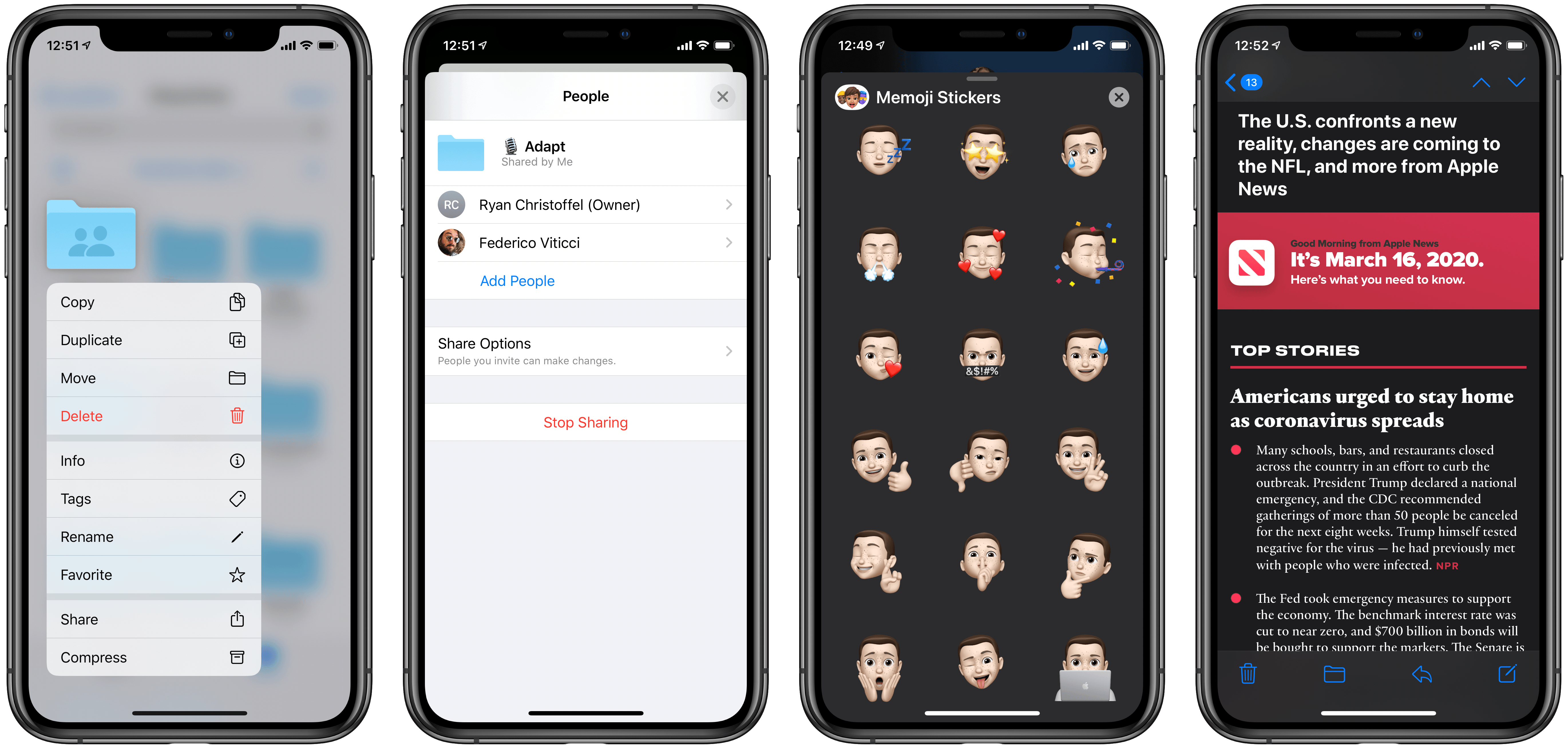
Today Apple released the latest updates for its suite of software platforms, most notable of which are iOS and iPadOS 13.4. Timed with the release of the latest iPad Pro models, the hallmark features include brand new systemwide support for mouse and trackpad on iPad, plus a handful of external keyboard enhancements. Shared folders for iCloud Drive is the other big addition – first announced at WWDC last June then delayed out of the initial 13.0 release, iCloud users may finally be able to consider reducing their Dropbox dependency. Beyond those highlights, Apple has also included smaller OS tweaks in a variety of areas.
Club MacStories: Weekly and monthly newsletters via email and the web that are brimming with apps, tips, automation workflows, longform writing, early access to the MacStories Unwind podcast, periodic giveaways, and more;
Club MacStories+: Everything that Club MacStories offers, plus an active Discord community, advanced search and custom RSS features for exploring the Club’s entire back catalog, bonus columns, and dozens of app discounts;
Club Premier: All of the above and AppStories+, an extended version of our flagship podcast that’s delivered early, ad-free, and in high-bitrate audio.
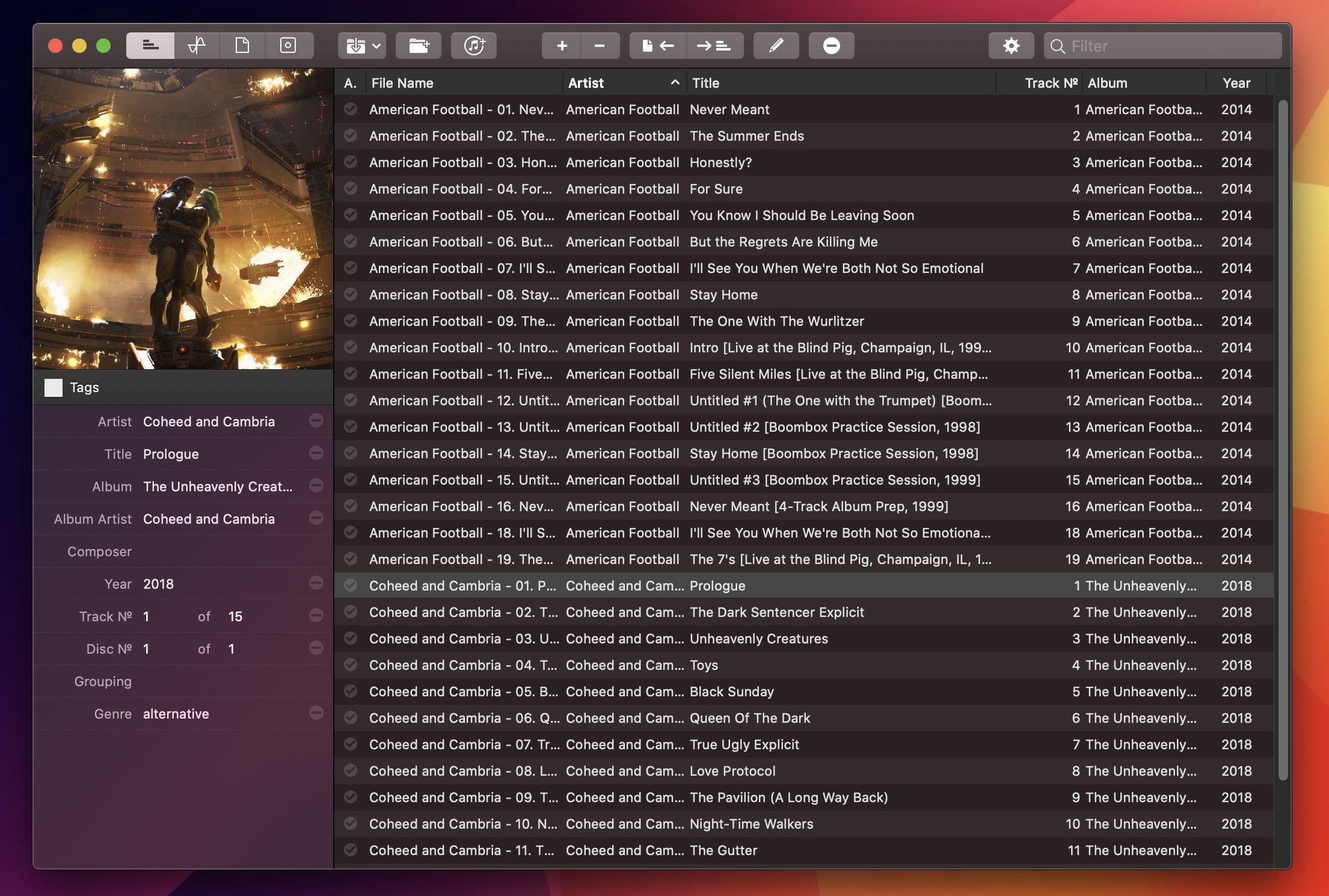
For the past year, I’ve been using a high-res Sony music player to listen to my personal music collection. I detailed the entire story in the December 2019 episode of our Club-exclusive MacStories Unplugged podcast, but in short: I still use Apple Music to stream music every day and discover new artists; however, for those times when I want to more intentionally listen to music without doing anything else, I like to sit down, put on my good Sony headphones, and try to enjoy all the sonic details of my favorite songs that wouldn’t normally be revealed by AirPods or my iPad Pro’s speakers. But this post isn’t about how I’ve been dipping my toes into the wild world of audiophiles and high-resolution music; rather, I want to highlight an excellent Mac app I’ve been using to organize and edit the metadata of the FLAC music library I’ve been assembling over the past year.
Club MacStories: Weekly and monthly newsletters via email and the web that are brimming with apps, tips, automation workflows, longform writing, early access to the MacStories Unwind podcast, periodic giveaways, and more;
Club MacStories+: Everything that Club MacStories offers, plus an active Discord community, advanced search and custom RSS features for exploring the Club’s entire back catalog, bonus columns, and dozens of app discounts;
Club Premier: All of the above and AppStories+, an extended version of our flagship podcast that’s delivered early, ad-free, and in high-bitrate audio.