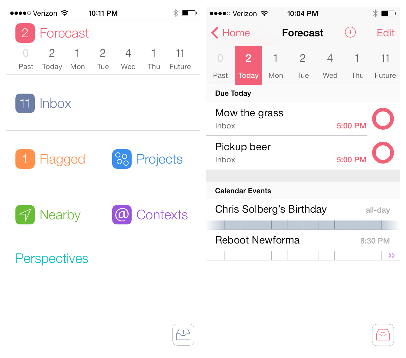
When I pictured what OmniFocus 2 for the iPhone would look like on iOS 7, I pictured simplified monotone icons in a table-view structure that the app has had since it was first released. The reason is probably because when I think of OmniFocus I think of powerful and quality software, however a bold interface is not a characteristic that would ever come to mind. When I opened OmniFocus 2 for the first time, I was shocked. Not to sound dramatic – I did not fall out of my chair – but it honestly took me a few seconds to absorb what I was looking at. Read more
Posts in reviews
OmniFocus 2 for iPhone: Background Sync and a Bold Redesign
Screens 3 Review

Edovia’s Screens is a MacStories favorite because it’s so ridiculously easy to use. In short, Screens lets you access your Mac or PC from your touchscreen iOS device. You can remotely connect to any of your computers, launch apps, and remotely control your personal computers at home or across the Internet. It’s great for troubleshooting a friend’s computer, accessing headless servers, or simply for moving important documents into Dropbox when you’ve forgotten to do so before heading to work.
For Screens 3, I tested the app with a desktop PC running Windows 8 and a MacBook Air running OS X Mountain Lion. Connecting to a Mac is pretty straightforward, but connecting to a PC can be tricky depending on its configuration.
Drafts 3.5 Brings Refined Interface for iOS 7, Action Improvements
Drafts for iOS has singlehandedly reinvented, alongside Editorial, my iOS workflow. With a combination of URL schemes and custom actions, direct Dropbox and Evernote integration for saving text, callbacks, and a fervent community of passionate users pushing the app to its limits, Drafts has become an extremely powerful iOS notepad without losing its basic simplicity. Drafts is the perfect example of an app that is easy to use and approachable but that power users can tweak and enhance if they know where to look.
With the release of iOS 7, developer Greg Pierce has decided to make Drafts 3.5 an iOS 7-only app that includes an updated design and some new features for power users. This will likely be a controversial decision among users who won’t update to iOS 7 right away, but I certainly understand the motivation of wanting to move forward as fast as possible by promptly embracing our iOS 7 future.
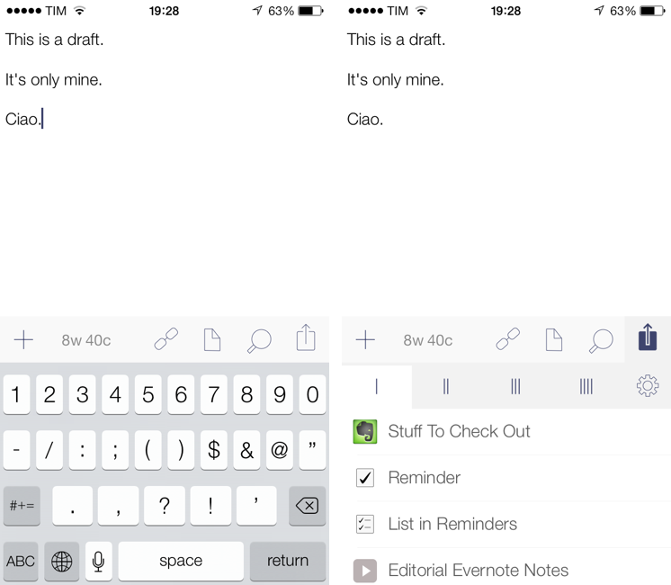
Drafts didn’t have much custom UI to begin with, so this new version’s most visible changes are the keyboard, which defaults to the iOS 7 one, and the revised icons and menus that match iOS 7’s new design trends and guidelines. Icons are thinner, the Settings’ cells run from edge to edge, the On/Off switches are new, the status bar blends with the writing area, and there’s a lot more whitespace. After having used Drafts 3.5 for a few months, I would say that, in the transition to iOS 7, it has lost less than Pierce’s other app, Terminology, in terms of identity and personality. Drafts was already spare and clean-looking – iOS 7 just makes it official and takes the app’s whitespace up a notch. Overall, it’s still the same Drafts, now with new icons and an updated keyboard.
The additions to Drafts 3.5 should please power users and those who rely on Drafts as an application launcher more than a note-taking app. Read more
Pocket Casts for iOS 7 Review

Over the years, I’ve moved my podcast subscriptions to different apps to see which one would fit my listening habits and needs better. I have tried Instacast, Downcast, even Apple’s free Podcasts client with iTunes sync for a while, but never settled on a specific solution for more than six months. The possibility to export a set of subscriptions as OPML to other apps makes it easy to switch, just like it is simple to move RSS feeds from one client to another. But while I have remained loyal to Reeder and Mr. Reader for years now, I’ve never been able to stick with a podcast client for too long. Every time I tried a new app I would say that it was going to be the one for me, but then I encountered an issue, or perhaps a feature was added to a competitor – and I was back exporting my OPML subscription list and relocating to another home.
For the past month, I’ve been testing Pocket Casts 4, developed by the Australian team of Shifty Jelly. Pocket Casts 4 has been approved by Apple, and it will be released on the App Store as soon as Apple will flip the switch for iOS 7 apps on iTunes. Pocket Casts 4 is a Universal app sold at $3.99, and it’s a free upgrade for existing owners of Pocket Casts 3.
While I recognize that I tend to be some kind of an app nomad when it comes to podcast clients, Pocket Casts 4 has some excellent features that work for the way I like to listen to podcasts and organize them. Read more
Amount, A Simple Unit Converter Ready for iOS 7
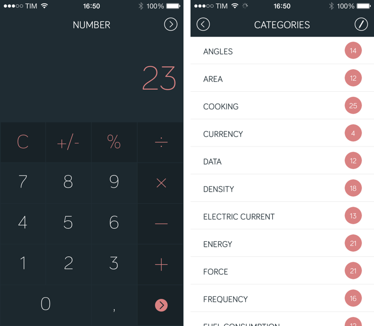
Amount (developed by Marco Torretta) is a unit converter app for iPhone that takes a unique approach in how it lets you enter numbers and pick a unit to convert. The app was updated yesterday to offer a new layout, and it’s ready for iOS 7 with a status bar that blends with the calculator’s dark display (it’s also still compatible with iOS 6 devices, but without the new status bar design).
The main screen of the app is called Number and it’s a standard calculator that lets you enter an amount to convert. Because it’s a calculator, you can use it to do simple operations, and I like how numbers and clearly separated from other keys through color. My only complaint is that there are no sound effects when pressing keys, which can be confusing if you’re not looking directly at the display but still would like to hear feedback from the app. Read more
AroundMe Gets Redesign For iOS 7
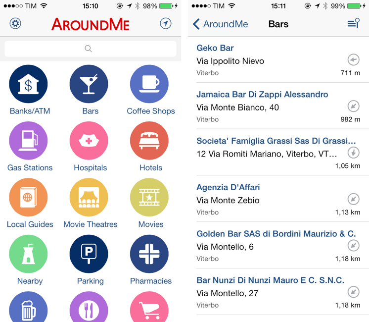
Created by Italian developer Marco Pifferi, AroundMe has long been one of my favorite location-based apps for the iPhone and iPad. In fact, AroundMe is one of the oldest iOS apps I own, as Pifferi always supported the app through the years with free updates and additions that took advantage of Apple’s new OSes and features. With a simple interface and feature set, AroundMe allowed you to easily find nearby places (bars, restaurants, hospitals, hotels, etc) with a rich database and built-in directions for Maps and Google Maps.
AroundMe’s version 7.0, released this week, brings a completely redesigned UI and animations that make the app ready for iOS 7, which is officially coming out on Wednesday. Read more
Calendars 5 Review

Of all the apps that I try and evaluate every week, there is one category that I can’t stop testing: calendar and reminder clients. I’m always looking for the perfect blend of events and todos in a logical presentation that makes sense for how I organize my day, with support for features like natural language input and custom repeats as well as more advanced functionalities such as URL schemes and app integrations. For this reason, I couldn’t say no to Readdle when they asked me to test Calendars 5, their new Universal app available today on the App Store. Calendars 5 is the successor to Readdle’s popular Calendars+, and it’s sold as a new app at $4.99. Read more
Reeder 2 Review

Reeder had a rough transition to the post-Google Reader world. Following the shutdown of Google’s RSS reading service on July 1 (something that Google had announced in March), Reeder – one of the most popular, if not the most popular Google Reader client for iOS – received an update to add support for Feedly and Feed Wrangler on July 2, but developer Silvio Rizzi couldn’t ship updates to the iPad and Mac counterparts in time. For this reason, after making Reeder for iPad and Mac free downloads, Rizzi was forced to remove them from the App Store, promising that they would come back, eventually, with support for new RSS reading services.
A household name of the iOS third-party scene, I first reviewed Reeder 1.0 back in 2009 and followed the app’s evolution as Rizzi found himself developing a client used by hundreds of thousands of Google Reader users. Rizzi, an indepedent developer from Chur, Switzerland, has always maintained a fairly slow pace of updates and releases, taking his time to bring Reeder to the iPad (the app wasn’t ready on April 3, 2010) and to the Mac. After a lack of updates that endured seven months, Reeder for iPhone made a comeback last year with Reeder 3.0, which started moving away from Google Reader – possibly prescient of disruptive changes coming to the service – with support for Shaun Inman’s Fever. And yet, after version 3.0 hit the App Store, Reeder went silent again, leaving many wondering as to whether it would ever see substantial updates again.
Reeder 2, released today at $4.99 on the App Store, is a new app that aims at making Reeder ready for the new era of RSS readers but that, at the same time, keeps one foot in the past with familiar interface choices and functionalities. Read more
NoteCube: A Fast Note-Taking App For Evernote
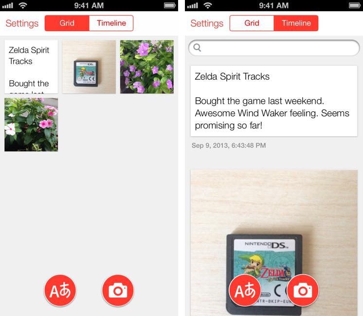
Developed by Japan-based rakko entertainment (the same team behind FastEver), NoteCube is a $0.99 iPhone app that lets you quickly take text and photo-based notes and sync them with Evernote. I have been using NoteCube on my Home screen lately, and I think it provides a great way to quickly send bits of text and images to your Evernote account. Read more