If you’ve followed my work for long, you’ve probably picked up on the fact that I’m a nostalgic person. I love to relive old memories, share old stories, and look at old pictures. It’s just the way I am.
That’s why I’m a big fan of Apple’s Memories feature built into the Photos app. You’re telling me my phone can deliver a slideshow of great pictures from my library anytime I want, and with a cheesy soundtrack to boot? Count me in. Photos is an amazing app for resurfacing pictures that otherwise might have been forgotten.
But there’s always been one feature I felt was missing from Photos: a roundup of every picture you’ve taken on a particular date in past years. While automatically-generated memories are great, I don’t want to limit my nostalgic photo viewing to the pictures my phone thinks are the best. I want a way to review all my pictures from the past, and an “on this day” approach is one that works well in other contexts, like journaling. Why not photos?
Enter a new app for the iPhone and iPad from developer Florian Grossmann fittingly called On This Day. It’s a simple, nicely-designed way to revisit photos you took on a particular date in previous years, and it’s quickly become a go-to for me. In fact, On This Day is now a part of my regular morning routine because it enables me to quickly do something I love to do: look at old photos and reminisce about fun moments, amazing trips, and milestones in the lives of myself and my loved ones.
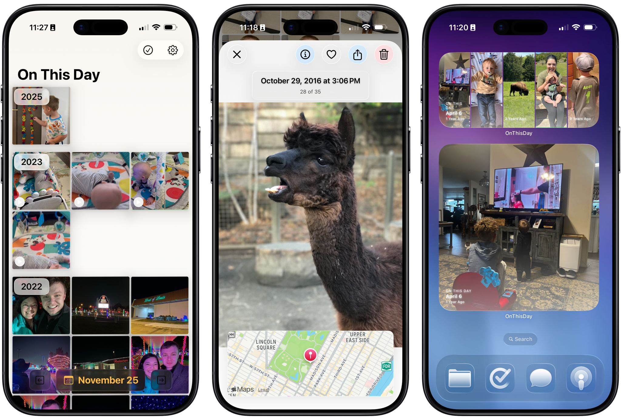
The app’s UI is a simple grid of pictures, much like the one you’re used to seeing in Photos, except instead of showing every picture in your library, the app only includes images and videos from a particular date, which is displayed at the bottom center of the screen. The grid is broken up into years by headings that stick to the top of the screen as you scroll, ensuring you always know which year you’re browsing. By default, scrolling down the screen moves you backwards in time towards older photos, though you can reverse this order in the app’s settings.
Tapping on a picture will open it in a full-screen view that not only allows you to see the photo in finer detail, but also to learn more about it and act on it. I like how much information and functionality is packed into this simple screen. At the top of the screen is the photo’s time and date (as well as a count of how many photos you took on that particular day), and at the bottom of the screen, the app shows the location of where the photo was taken on a map. If you prefer to view your photo without these overlays, a single tap will dismiss them, and you can swipe left and right to move between photos in the full-screen view.
In the upper-right corner of this view, there are four buttons: Info, Favorite, Share, and Delete. Favoriting a picture in On This Day adds it to your Favorites collection in Photos. This can come in handy since the app doesn’t have the ability to actually open an image in Photos; the developer says this is due to technical limitations of the Photos app itself. But at the very least, you can favorite a photo to refer to later in the Photos app as a workaround.
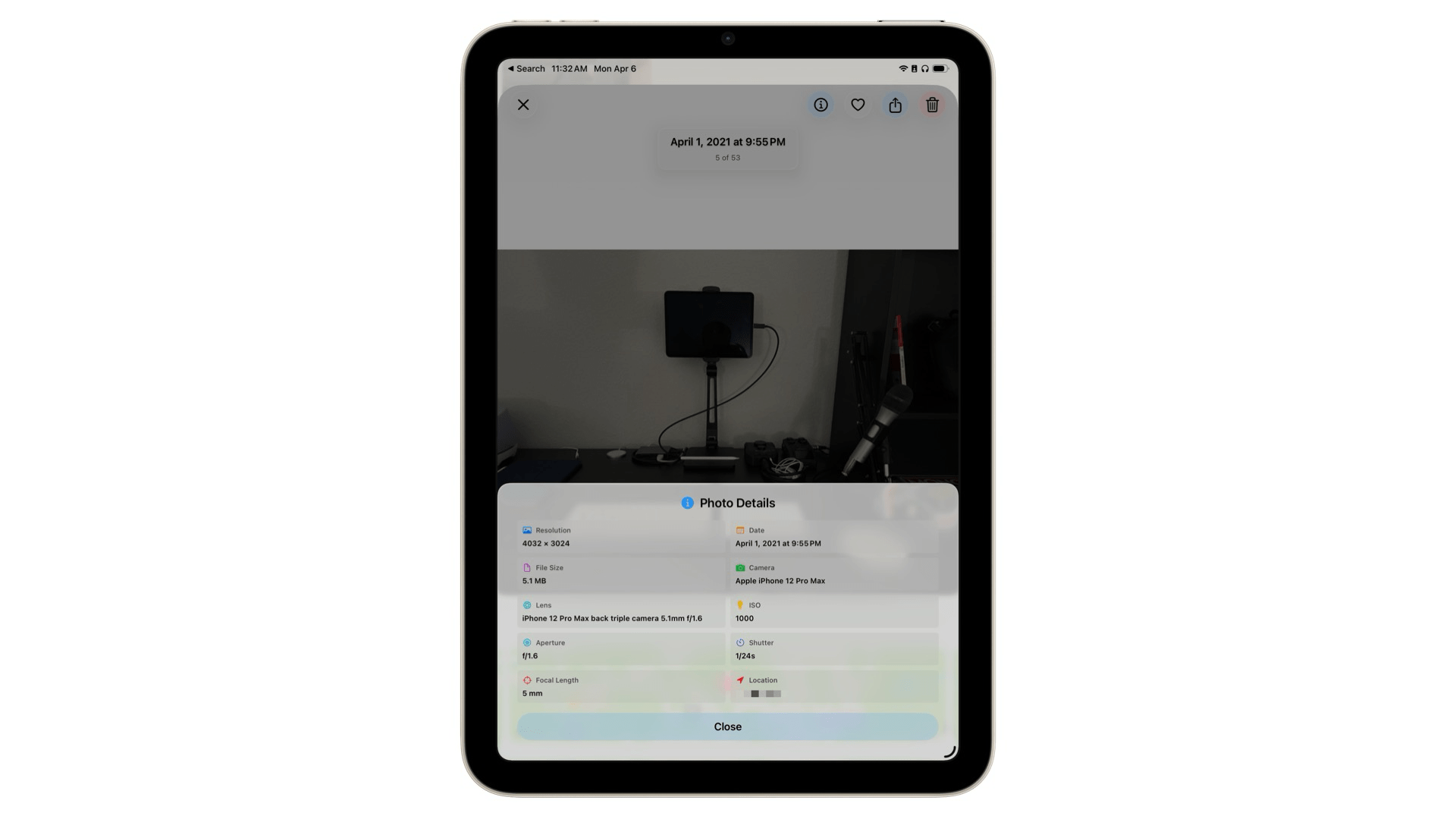
If you want to dig into the technical details of a picture, you can tap the Info button to open the Photo Details pane. There, you’ll find the photo’s resolution, camera and lens information, focal length, and more. It’s great to have this data close at hand when reviewing photos, especially if you want to see which iPhone you were using at a particular time in the past.
This core functionality is all I’ve ever wanted out of this kind of tool. It’s fast, it’s easy to use, and it’s designed well to help me find the photos I want and then get out of the way so I can fully enjoy them. It fits right in with current iOS aesthetics, as well, with Liquid Glass headings and buttons that blend naturally with your photos and adapt to the varying content behind them. The experience of reviewing pictures in On This Day is simply great, and I enjoy opening the app every day to see what memories it has to offer.
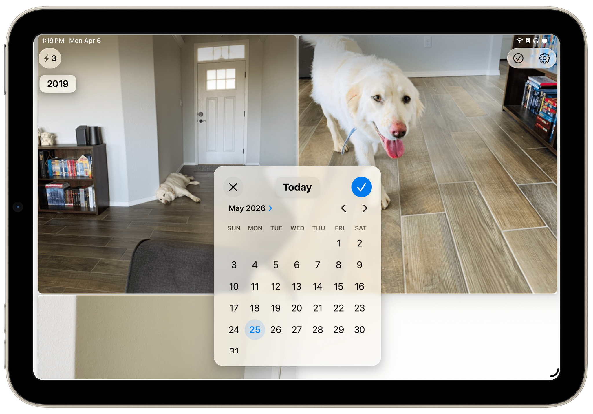
If you want to review photos from other days, you can do so by tapping the arrow buttons on either side of the date at the bottom of the screen or by tapping the date itself to open up a calendar to select from. Once you’ve navigated away from the current date, the app will offer a Today button above the calendar to quickly get you back to your starting point.
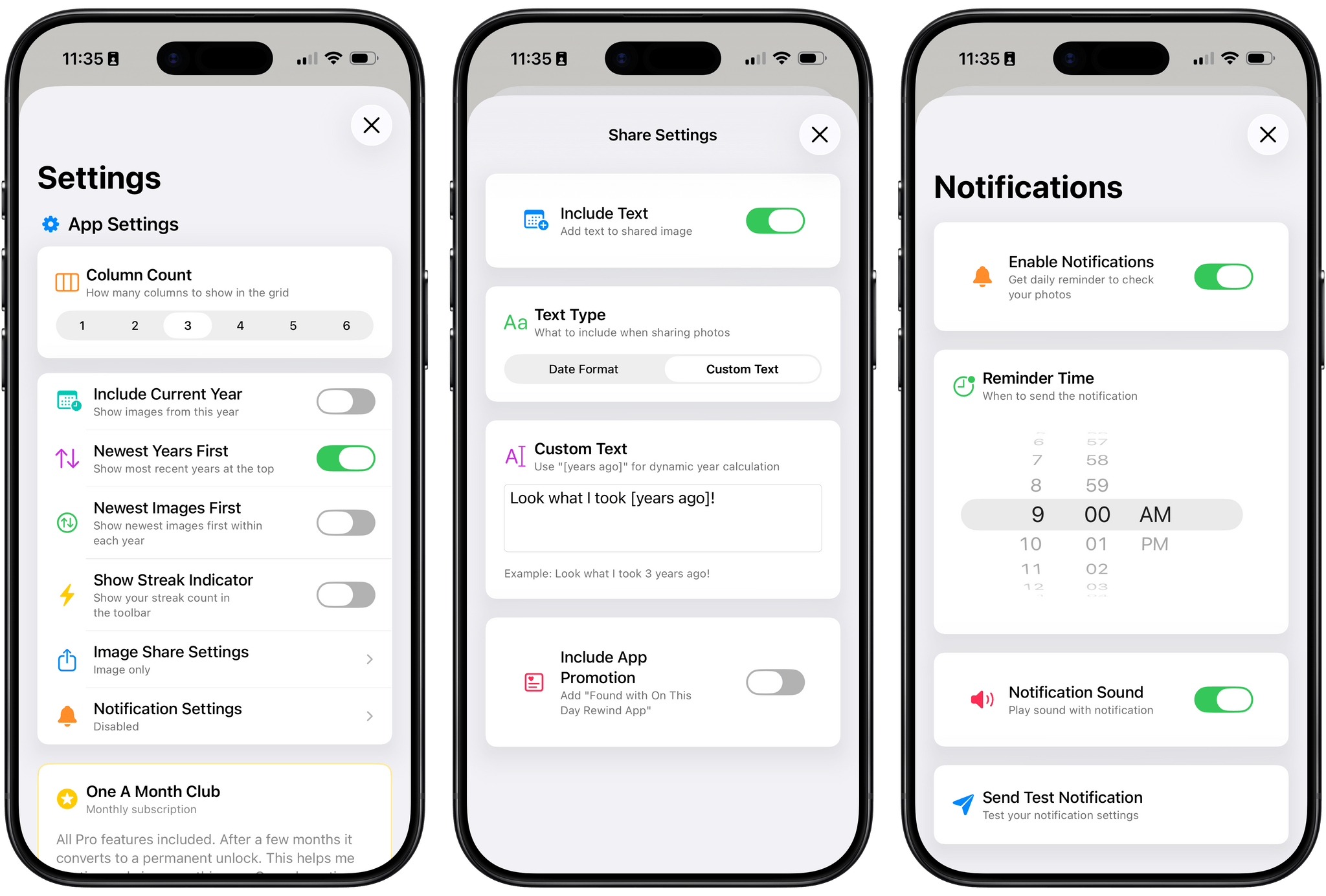
The app’s settings include a number of customization options, too. There, you can adjust the density of the photo grid, change how images are ordered, disable the optional streak count, and schedule notifications to remind you to review your photos each day. On This Day also offers the unique ability to decide what content the app sends when you share a photo; you can include the date in various formats, customized text, or no text at all. For me, part of the fun of looking at old photos is sending them to other people, so I appreciate the option to customize what gets shared.
Finally, On This Day also offers widgets in small, medium, large, and extra-large sizes so you can see photos from past years right on your Home Screen. You can adjust how many pictures appear within a widget, and photos can be displayed in full color even if, like me, you’re a user of the Clear or Tinted appearance for app icons.
This is the sort of app that I’ve been wanting on my devices for a long time, and the fact that it’s been made with such care and attention to detail just makes the experience of using it that much sweeter. I love revisiting old photos in the app every day, and if you’re the type of person who’s built up years of pictures in your library and delights in having them resurfaced for you, I think you’ll enjoy it, too. I recommend giving it a try.
On This Day is available on the App Store for iPhone and iPad as a free download, and the iPad version can also be run on the Vision Pro. The app displays photos from the past three years for free. You can unlock all past years and the app’s full range of customization options with a one-time payment of $4.99 or a $0.99/month subscription.