I enjoy taking lots of photos. Over the years, I’ve dabbled with DSLRs, but more often than not these days, I use my iPhone because it’s always nearby.
I’ve historically used Apple’s built-in Camera app. It has the advantage of being available from the Lock screen, which is a big plus because it lowers the barrier to getting up and running with the camera. Later, I would go back and pick out the best shots, edit them a little in the Photos app, and share a few.
Over the past couple of weeks though, I’ve been moving between Apple’s Camera app and Obscura 2, which was released today by developer Ben McCarthy. I’ve used manual camera apps in the past, but always wound up going back to Apple’s option in the end.
Obscura has been different. I’ve found myself going back to it repeatedly because I enjoy the way it approaches taking pictures and editing them so much. I don’t expect I’ll stop using Apple’s Camera app altogether; it’s just too convenient. However, when I leave the house with the intention of finding something interesting to photograph this summer, I’m going to use Obscura.
One of the things I like most about photography is that it’s a creative outlet that’s just for me. Sure, I share some of the pictures I take, but it’s entirely for fun.
One of the issues I’ve always had with pro camera apps is that many take the fun out of photography for me. They have intimidating UIs that throw lots of photography jargon and controls at you in a way that sends me looking for a manual. It feels too much like work.
Obscura doesn’t dispense with camera-speak entirely, but it succeeds by presenting the complexities of manual camera features in a simple, thoughtful UI. Instead of sending me looking for support pages, I found myself experimenting with Obscura’s controls, learning what each does by doing, which has been an enjoyable, organic process.
Design
Obscura’s UI is much improved from past versions, which crammed a lot of functionality below the viewfinder and hid filters behind a swipe gesture that made them hard to discover. The new UI relies on a Control Wheel reminiscent of the mechanical mode dials you see on cameras. It’s an apt metaphor that’s useful because it’s familiar without straying into gimmicky territory. Translating complex systems like this on an iPhone’s screen is one place where I feel like a little old-fashioned skeuomorphism goes a long way towards helping users understand what’s going on.
 and Obscura 2 UI (right).")
There are seven controls arrayed in an arch above the shutter, exposure, and focus buttons:
- Filters
- Camera
- Grid
- Spirit Level
- Flash
- Timer
- Format
The currently-selected control sits at the top of the arch with two additional, slightly faded-out controls seated on either side of it. As you swipe across the controls, they rotate into view, repeating in an infinite loop just as a physical dial would. As you rotate the dial, Obscura responds with a satisfying haptic tap on supported iPhones that adds to the illusion that you’re manipulating a physical dial.1
Each control has sub-controls that are manipulated the same way. The place where the Control Wheel especially shines though is when you tap the Exposure, Focus, ISO, or SPD buttons. In these modes, the Control Wheel transforms into a series of tick marks around the curved dial. It’s a design that feels even more analog than when you’re switching controls. The haptic feedback is more pronounced too, though that may be an illusion created by the fact than the dial is divided into more gradations that the Control Wheel.
In total, there are 11 different controls available in the camera view, some of which have sub-controls. That’s a lot of complexity, but it works because most of the controls are tucked away out of sight by the Control Wheel, while simultaneously being a quick thumb flick away at any time.
Controls
The Exposure and Focus buttons flank the shutter button. Tapping either brings up the Control Wheel to manually adjust each. There’s also a small back button to exit exposure or focus mode and another button to return to automatic exposure or focus. The ISO and SPD buttons work similarly.
From the main camera view, the seven available controls are mostly self-explanatory. Filters includes 19 new built-in filters. There’s a sepia filter that can be unlocked by sharing Obscura, and Analogue and Black & White Filter packs that can be purchased for $1.99 each as In-App Purchases. There’s a wide variety of filters available, many of which I like a lot compared to other camera apps. Tapping on any filter previews it in the viewfinder in real-time.
The Camera control is used to switch between wide-angle and telephoto lenses and the front-facing camera. Grid can add an overlay to the camera viewfinder based on the rule of thirds or a square for framing Instagram-friendly images. Spirit level can be used in combination with a grid to help ensure the horizon of your picture is level. There are also controls for the Flash and Timer, which has 3, 5 and 10-second options. Finally, there’s a Format control for switching between HEIC, JPG, RAW, Depth effect, and Live Photos.
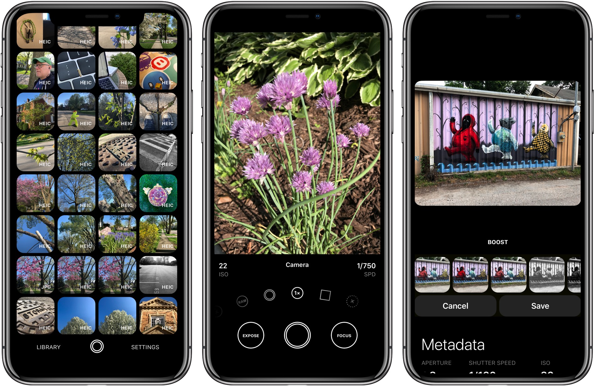
Library
The other main interface of Obscura is your photo library. Swiping down from anywhere in the camera view animates the library into view shrinking the control area so that all that remains is a narrow strip with a mini shutter button that returns you to the camera view, and a button to open the app’s settings.
Swiping up reveals all your photos in reverse chronological order as a grid of thumbnails with a label indicating the file type. Swiping down, scrolls through a list of your albums.
Each image you open includes several action buttons: Edit, Share, Fav, Copy, Hide, and Delete. The two most prominent are Edit and Share. Edit lets users apply any of the app’s many filters to an image and save the changes back to that file or as a copy, which is a nice touch when you want to create different versions of the same photo with different filters applied.
Filters are the only available editing tool, however. You cannot crop, adjust color, brightness, or other aspects of an image. Filters are also effectively toggles, meaning there is no slider for adjusting the strength of the effect. As an app that is first and foremost for taking photos, not editing them, I understand why the editing tools are limited, but by making the filters available to apply to any photo in your library, I can’t help but wish I could do more.
Fav, Copy, Hide, and Delete all act as you would expect and are a useful way to manage your photos within Obscura. Because the changes are mirrored to your photo library, you’ll see any changes made if you open Apple’s Photos app. Below an open image is a long list of metadata about the photo with a ‘Copy Metadata’ button at the bottom of the screen. Currently, tapping the copy button crashes Obscura, but a fix is lined up for release in the first post-launch update.
Settings
Obscura 2 is highly customizable. From the library view, you can access a long list of ways to tweak everything from what pressing the up and down volume buttons on your iPhone does in Obscura to what single, double, and triple tapping the viewfinder does. Among other things, users can also adjust how their photo library is displayed, change where haptics are used, and pick from nine different app icons.2
Pricing
Obscura 2 is a new app. That means existing and new users alike have to purchase the $4.99 app if they want to use it. For new users, the decision should be easy if Obscura sounds like an app that you’d like to try.
For existing users who are being asked to pay again, the calculus is different and will depend on how you value what’s been updated. My favorite part of Obscura 2 is the new design, but the update is more than a re-skinning of the prior version. There’s utility in the design changes that make it substantially easier to use, and there are many new features like new filters, the spirit level, depth capture, simultaneous multi-format image capture, the metadata viewer, and better library management tools to name a handful of things. In my estimation, that makes Obscura worth paying for again, but, of course, it’s also the sort of thing that can vary significantly from person to person.
There are many, many manual photo apps on the App Store. Most include the same basic set of controls making favorites a matter of personal taste as much as anything. What sets Obscura apart from alternatives is its intuitive design and tasteful filters. It’s hard to beat the convenience of the built-in Camera app, especially when you’re on the go, but if you’ve ever wanted to experiment with controlling everything that can be adjusted using a manual camera app, Obscura is a great place to start.
Obscura 2 is available on the App Store.
- Obscura uses haptic feedback throughout the app, which I like because it makes the app feel more tactile like a physical camera, but you can adjust the haptics in the app’s settings if they’re too much for your taste. ↩
- Speaking of which, I love Obscura’s new default app icon. It retains a connection with the old icon while hinting at the new Control Wheel feature, which makes it a great complement to the new design. ↩