I’ve been keeping a journal in Day One since at least 2015, and I’ve got to say, the practice has become very engrained in my otherwise chaotic daily routine. Whenever I get asked about journaling, I always say that it’s a habit that can take any form you like. It can take place in a paper journal, in an app as written entries, as voice notes, or even as captioned photos in a photo diary. The reason I stuck with Day One over the years is because the app is incredibly flexible. It kept up with me during periods of my life when it was harder to write down my daily thoughts, and easier to type a couple of bullet points every day instead. I believe the best journaling tools are those that can adapt to you, not the other way around. But still, when Apple announced they were building their own Journal app, built right into iOS 17, I was excited by the prospect of switching things up in this little habit of mine.
This week, Apple released the Journal app as part of iOS 17.2. As expected, the app is unfortunately only available on the iPhone. Nevertheless, Apple’s first entry in this category is very interesting, to say the least, as it revolves almost entirely around a system of smart journaling suggestions and prompts. I’ve been using it alongside Day One for a couple of weeks now, to both get an idea of what Apple’s approach to journaling is like, and to see how it intends to bring journaling to a wider audience.
Let’s jump in.
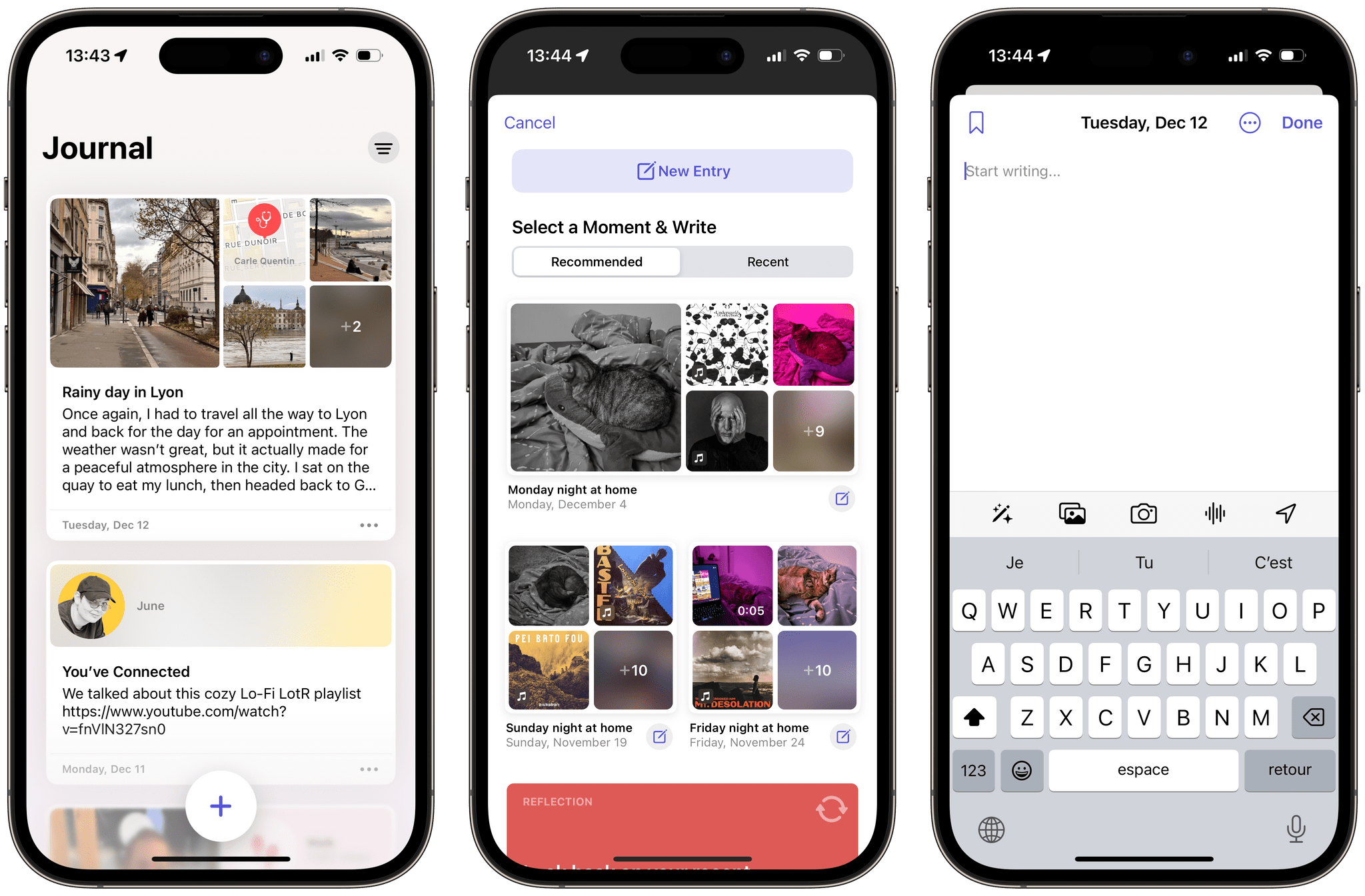
Design-wise, the Journal app is simply beautiful. It doesn’t look like any other built-in iOS apps, but it doesn’t feel too alien either. Each entry is a card that sits on top of a softly colored background. As you scroll, the cards flow behind a prominent ‘+’ button at the bottom of the screen. When I first started playing with the app, I kept scrolling the cards up and down just because I wanted to stare at the blur effect that’s applied when they disappear offscreen. It’s satisfying.
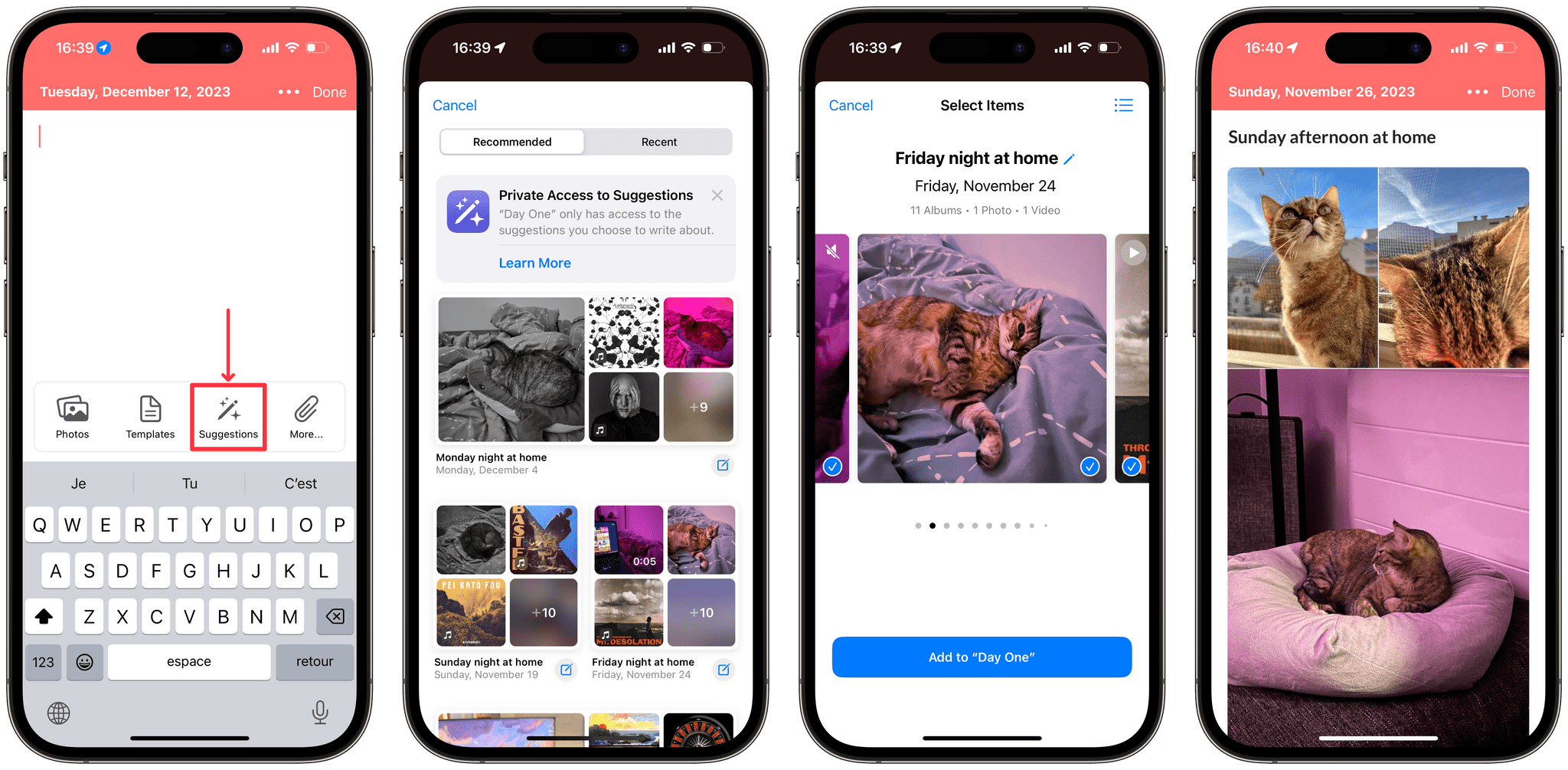
Tapping the ‘+’ button brings up the app’s main highlight: a full-screen dialog with journaling suggestions, reflection prompts in the form of open questions, and a button to start with an empty entry. The suggestions intelligently try to group together your photos, workouts, places you visited, contacts you’ve interacted with, or even music you’ve listened to. This genuinely makes for great starting points to start writing. As I traveled to Lyon this week, I came back home to find the app suggesting that I make an entry about the trip. The suggestion had already combined a selection of photos I took during the day, the music I listened to on the train, a location pin in Lyon, and even a mention of my unusually high steps count. In Day One, I would typically have spent a few minutes selecting which photos to include in the entry, before struggling for a while to decide on what to write about the day. Here, the photos — and more! — were ready to be commented on.
I think this is where Journal succeeds the most at making journaling more accessible: the app lets you spend more time writing entries, and getting started on them quickly, rather than having you spend time collecting the bits and pieces of your life, and formatting them manually.
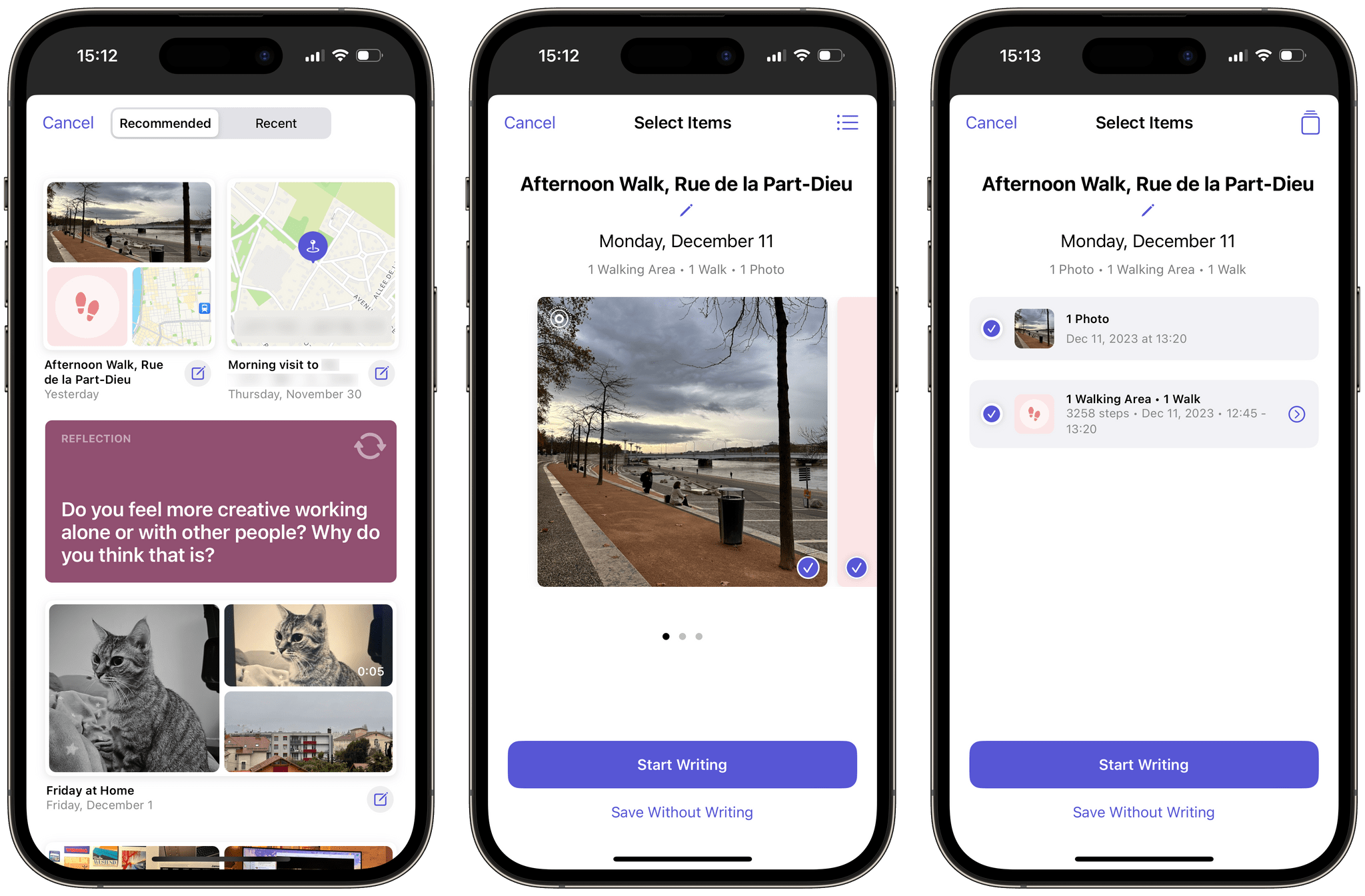
After tapping a suggestion, the app lets you select which suggested items to keep in the new entry. You can also tap ‘Save Without Writing’ to directly save the suggestion as a new entry.
Sadly, the ‘New Entry’ field itself is bare bones, to say the least. Apart from the expected ability to set the date and time of the entry, there are no immediately-apparent text formatting options. The toolbar above the keyboard lets you insert suggested items, photos, voice recordings, or a location.
While it is possible to highlight text to format it to bold, italic, or underlined, it is impossible to manually insert a link. If you paste a URL, it cannot be tapped to open in Safari. The only way to open a link is to select it, swipe horizontally on the actions tooltip, and then tap ‘Open link.’ You can, however, add a link to a Journal entry from Safari via the share sheet, but doing so will create an entirely new standalone entry with a rich link, with no way of appending it to an existing one. If this issue sounds familiar to you, it is because, until recently, the Mail app on iOS had a similar limitation where it didn’t let you create hyperlinks. Unlike the Journal app, though, at least pasting full URLs in Mail would make them tappable.
Another odd limitation, which I think is worth mentioning if you like to include a lot of photos in your journal entries, is that the Journal app will only allow you to add up to 13 photos per entry.
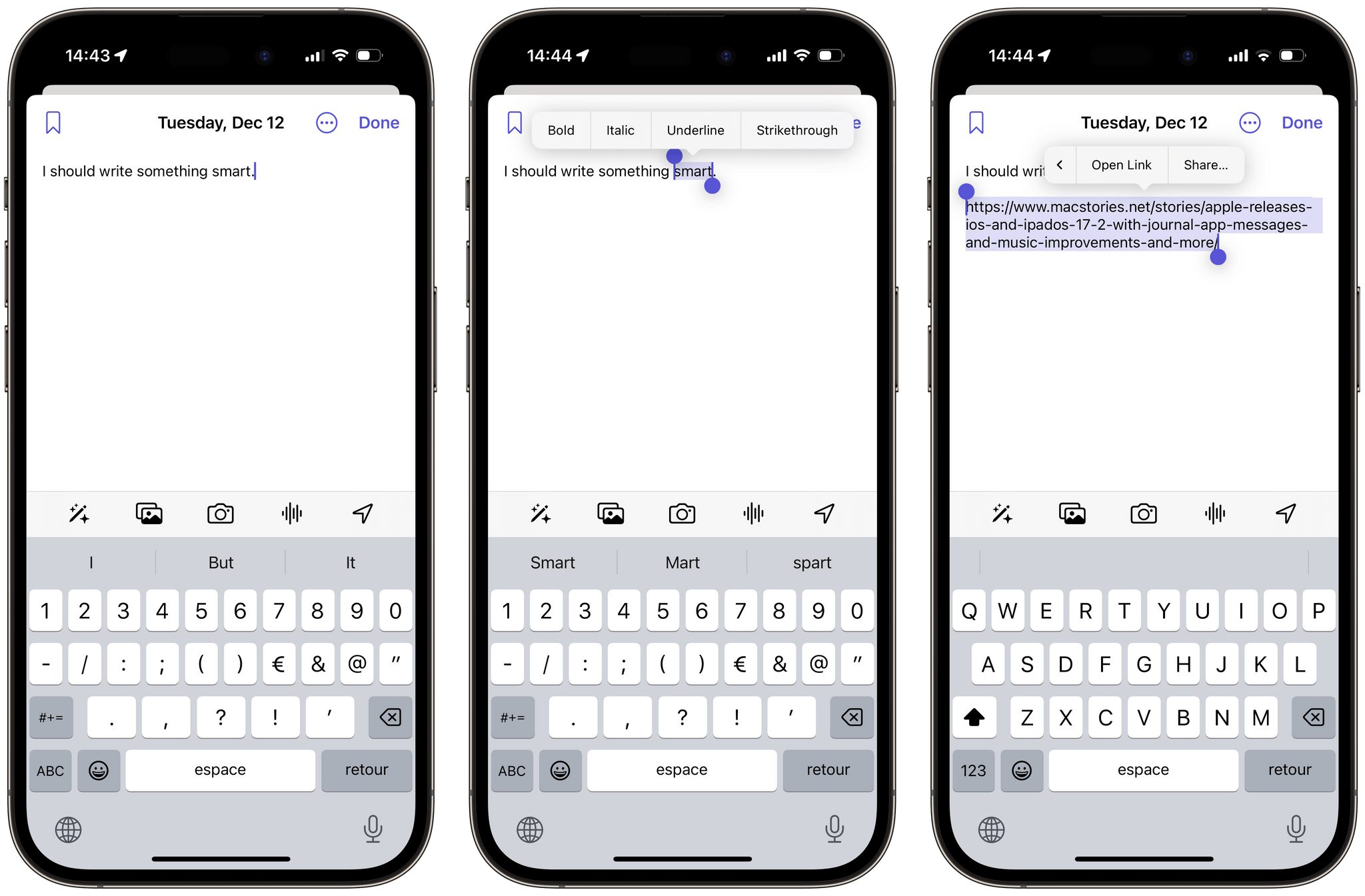
Text formatting in the Journal app is limited to ‘Bold’, ‘Italic’, ‘Underline’, and ‘Strikethrough’. Pasted URLs can’t be opened, unless you select them, then tap ‘Open Link.’
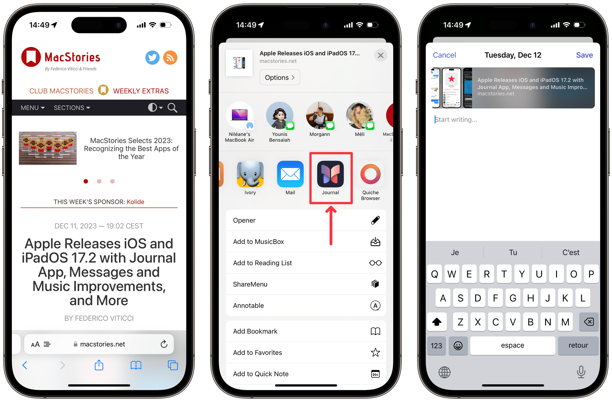
Links can be added to Journal via the share sheet, in which case they are inserted as rich links in a new entry.
Despite the limited formatting options, entries in Journal always look great. Items you include are arranged in a compact grid that’s complimented with subtle gradients.
Weirdly enough, though, there is no way to view an entry in a standalone view. Nothing happens if you tap an entry. Instead, you tap items that are contained within an entry — which will expand them to a full-screen view. This means the only way to read your journal is to scroll through the main view of the app. Browsing through your entries in the Journal app feels a lot like scrolling through your own private social media timeline as a result. This is very different from other journaling apps, like Day One — where journal entries can be viewed on their own, and where your list of entries is designed to resemble a summary rather than being the main way of reading through your journal.
I actually really like Apple’s direction with this browsing experience. I found myself spontaneously reading through my recent entries more often than I ever did in Day One.
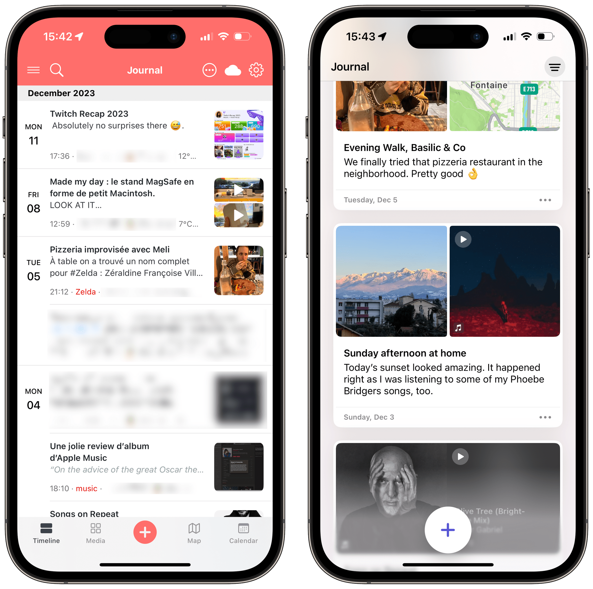
Day One’s timeline of entries (Left) is meant to resemble a summary, whereas Apple intends the Journal app’s timeline (Right) to be the only way to read through your entries.
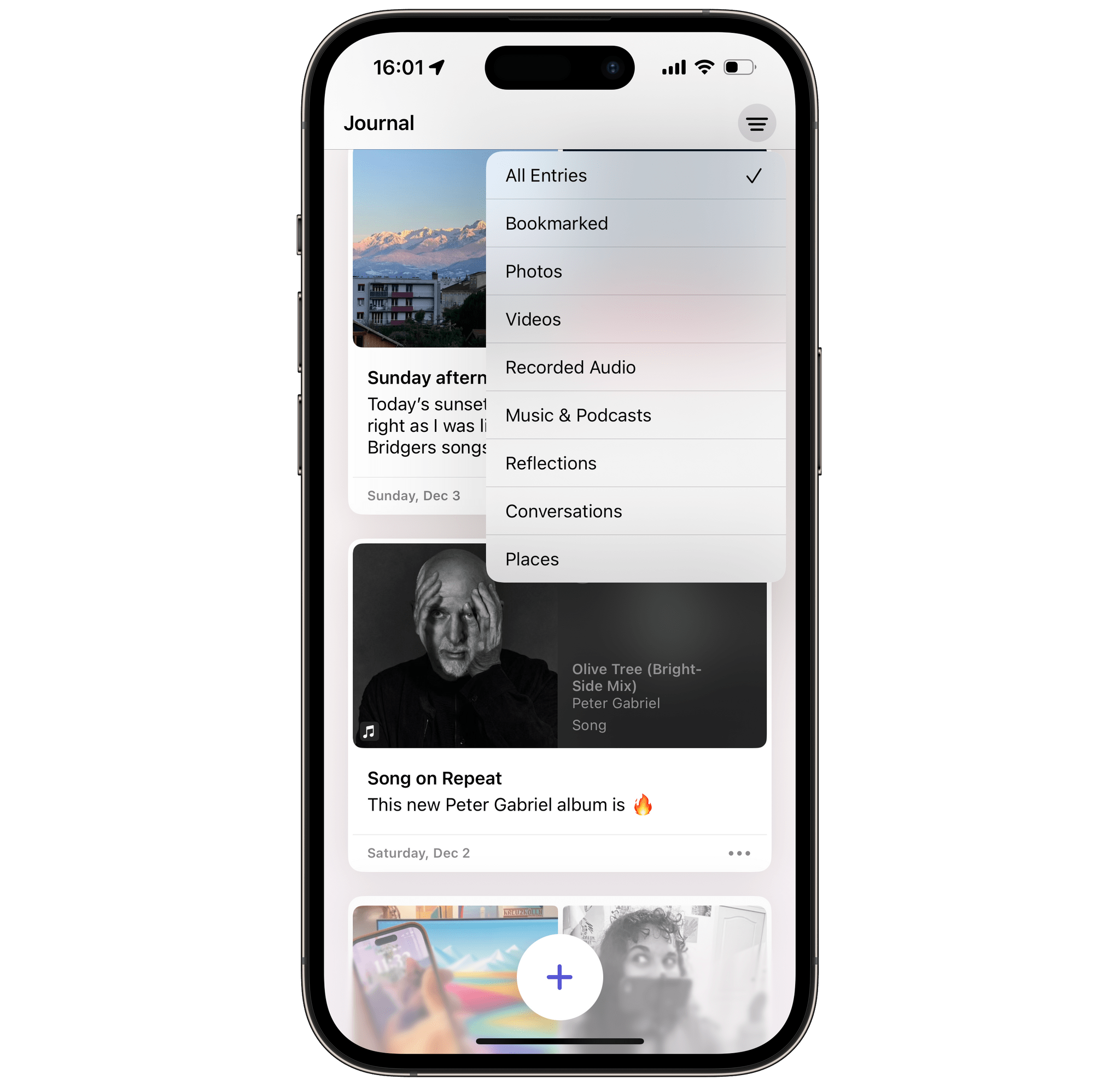
Unfortunately, in its current state, I don’t think this UI will scale well as you keep using it over months and years. You can filter entries by content type — or only display bookmarked entries, but that’s it. There are no tags, no folders, no compact view, and no way to browse by date.
What I’m missing, most of all, is a search field. Journal doesn’t offer any Home Screen widgets, isn’t integrated with Spotlight, and doesn’t provide any Shortcuts actions to retrieve entries by keywords. So, unless Apple addresses this in the coming months, I’m worried my journal entries will just keep piling up in the app’s main view, and the oldest ones will become more and more difficult to scroll down to. This is especially critical considering how Apple’s approach to proactive prompts and suggestions encourages writing multiple short entries per day instead of what would have been single, long-form entries in apps like Day One.
Currently, the app’s settings are limited to letting you set a journaling schedule, locking Journal behind Face ID, and skipping the suggestions dialog when tapping the ‘+’ button. However, if you head into Settings → Privacy & Security → Journaling Suggestions, you can actually tweak what kind of data you want to be surfaced in your journaling suggestions. This section in Settings also has a toggle to ‘Prefer Suggestions with Others’, which is supposed to prioritize moments spent with your contacts, as well as a toggle to allow your journaling suggestions to be discoverable by other people that spend time with you. I haven’t noticed a big difference yet when I toggled these features during the beta, but I’m very keen to see how it does in the long run to suggest moments I spend with my partner.
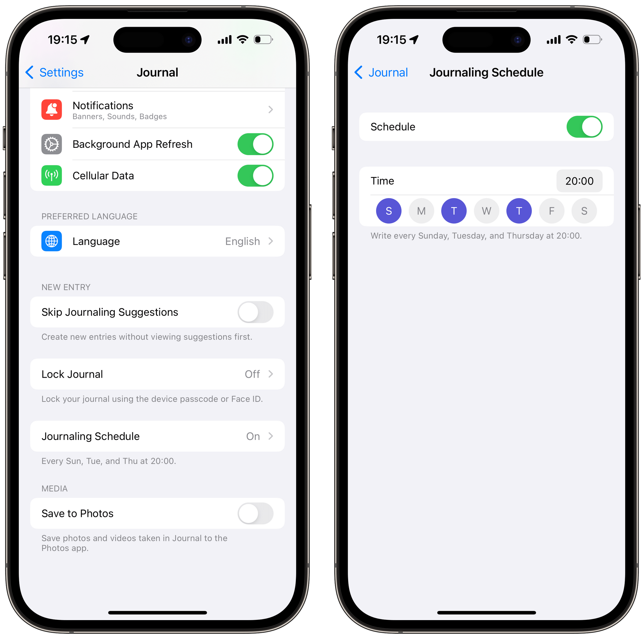
The Journal app’s settings are limited to letting you set a schedule, locking Journal behind Face ID, saving new photos to the Photos app, and skipping the suggestions dialog when creating a new entry.
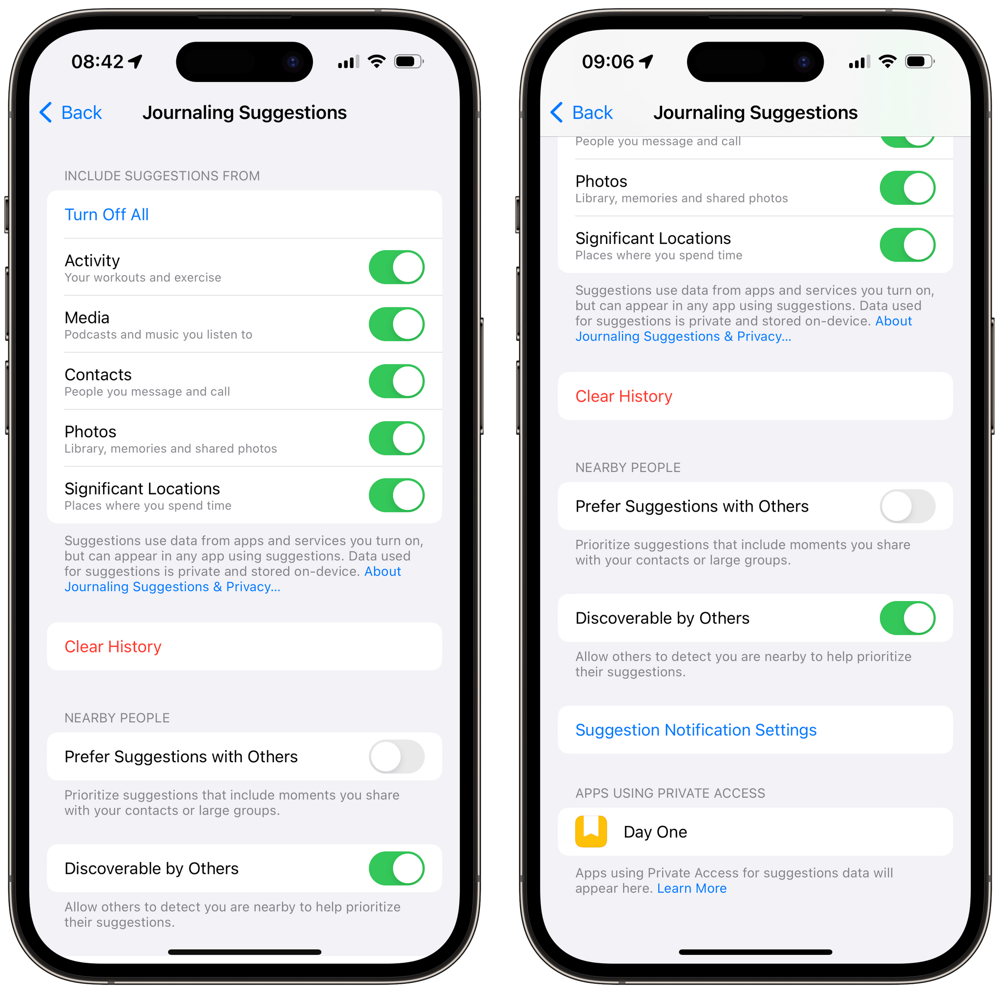
Journaling suggestions can be turned off by data type in the iOS privacy settings. This is also where you can manage access to journaling suggestions by third-party apps.
Remarkably, Apple’s new journaling suggestions can also be used in third-party apps. Although developers cannot contribute to suggestions populated by the appropriately named Journaling Suggestions API, they can still incorporate Apple’s journaling suggestions in their own apps. As a result, shortly after iOS 17.2 was released, the indie journaling app Everlog and Automattic’s Day One both released updates to offer the new journaling suggestions directly from their compose fields. Day One was already able to suggest entries if you gave the app the right permissions — such as allowing the app to access your location at all times to suggest entries based on the places you visited. But the new API means third-party apps can now benefit from Apple’s on-device intelligence, instead of having to rely on invasive permission requests. Through the API, apps can only access the suggested data after you’ve inserted it.
This is very neat, so much so that it immediately made Apple’s Journal app’s main appeal fade away for me. Its best feature was suddenly available in the journaling app that I was already using.
It is not too surprising, then, to read Day One founder Paul Mayne — in a statement as part of Apple’s press release — welcoming the new app and its API, rather than deploring Apple’s competing entry in the category:
“The Journal app is an exciting development for us because it introduces the benefits of digital journaling to a wider audience and ushers in a new chapter for the practice. (…) We have integrated the Journaling Suggestions API into the Day One app to give our users an even richer experience that puts privacy at the forefront, and we can’t wait for them to try it.”
I believe Apple is on the right path to open journaling to a wider audience. The design and the interface of the Journal app are welcoming, easy to understand, and the proactive suggestions truly make a difference in overcoming the usual obstacles people can face when getting started. This is where Apple’s Journal app is already excelling, despite its shortcomings.
I’m aware that Apple’s home field advantage is playing a part here, too. I don’t think I would feel as lenient with a new third-party journaling app if it launched without tags, a search field, or any proper way to browse my entries. After using an advanced journaling app like Day One for years, my expectations are understandably pretty high. But I think Apple should keep in mind that flexibility is as good a synonym for accessibility as simplicity is. If Apple can bring the Journal app to the iPad and the Mac, and if they keep updating it to make it more flexible in terms of formatting and browsing entries, perhaps they will truly have built a journaling app for all.
In the meantime, I can’t wait to see how developers take advantage of the new Journaling Suggestions API. I have a feeling it could play a part in powering a variety of interesting new features, even beyond third-party journaling apps.