Interface, Navigation, and the Smart Stack
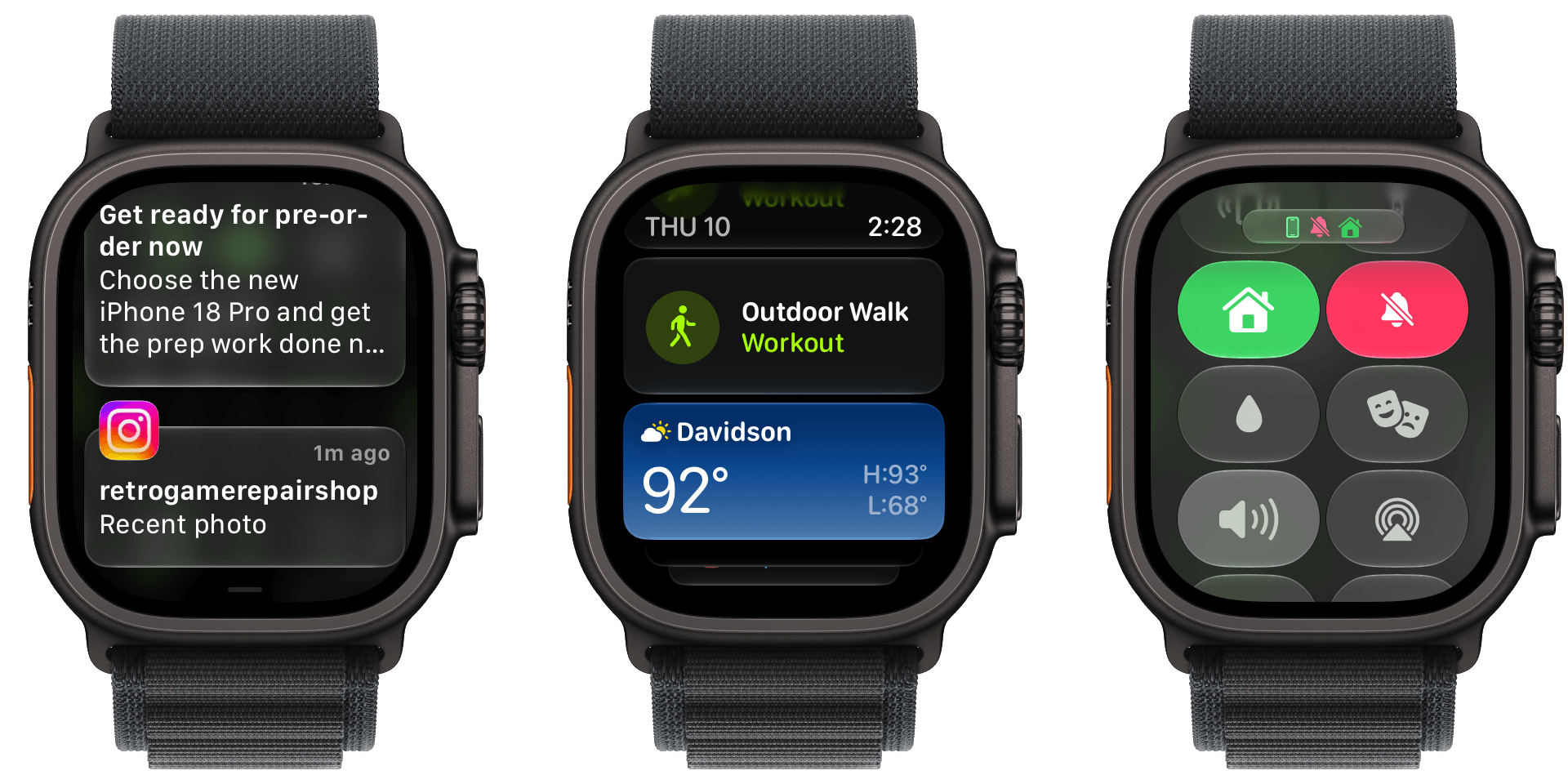
I like Liquid Glass on all of Apple’s devices and didn’t have any issues with its first iteration in watchOS 26. However, with the latest update, my Apple Watch Ultra 3’s UI is ever so slightly more readable. Smart Stack suggestions and notifications don’t bleed through each other as much, and app icons are sharper.
On a small screen like an Apple Watch, you may never notice the difference, but there’s a sharpness throughout the UI that’s reminiscent of the sharpness you see in app icons on iOS, iPadOS, and macOS. Edges are more defined and colors are diffused less, making everything a little crisper. It’s a subtle change, but a good one.
The watchOS 27 change most users will notice first is the change to the way you navigate through the OS’s UI. The App Switcher is gone, replaced by the simpler Dynamic App Grid. And although I expect the App Switcher will be missed by some, I don’t miss it at all. Sure, it was a little hard to break the Digital Crown double-press habit at first, but as someone who returns to the same handful of apps repeatedly, I find the new design makes more sense.
Before watchOS 27, the App Switcher was invoked with a double press of the Digital Crown. That revealed a Rolodex-style view of your recent apps that you could move among by turning the Digital Crown. The UI served as a shortcut between frequently used apps that avoided returning to the app grid or list views on your Watch, which can be crowded if you have a lot of apps installed.
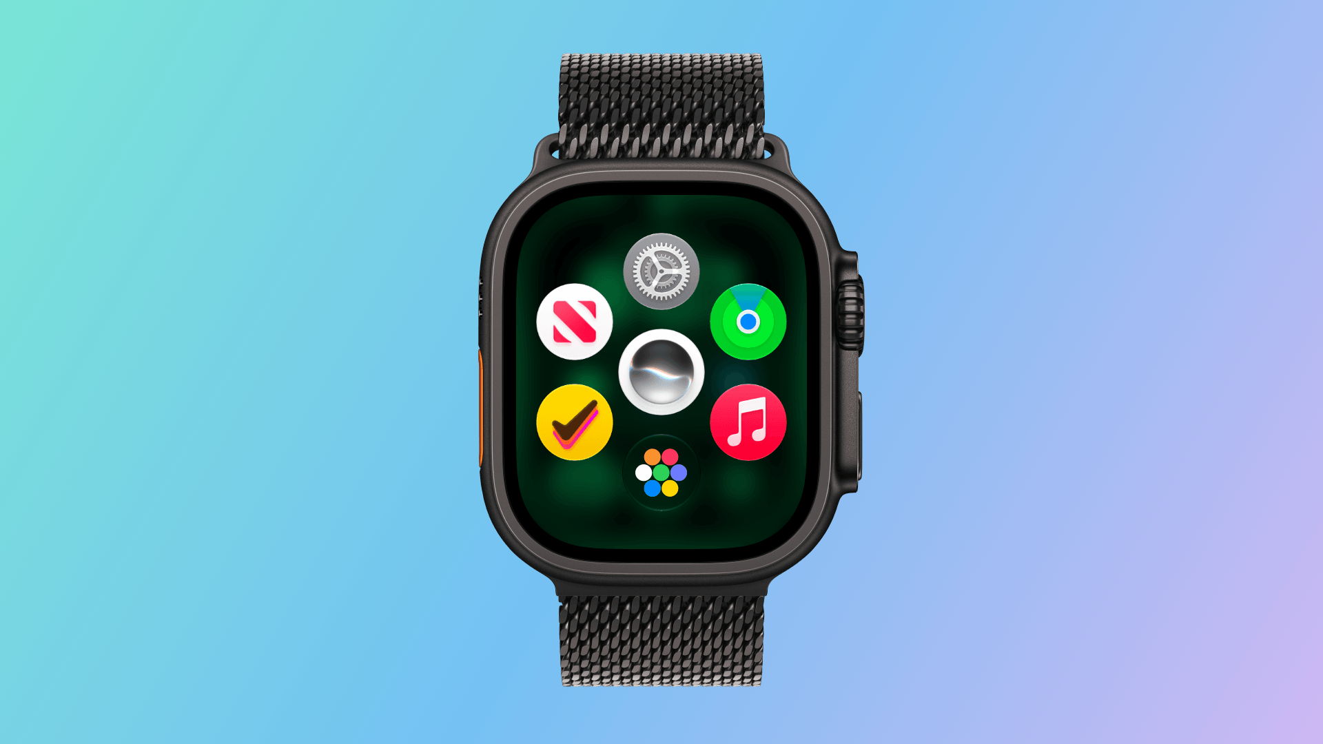
Now, whether you single- or double-press the Digital Crown, the new Dynamic App Grid appears. At its center is the new Siri app. Below that is the icon to take you to the app list or grid view depending on how your Watch is set up. Apple says that the remaining five icons that circle the Siri icon are placed based on recency and frequency of use.
I’ve been using watchOS 27 all summer, and my recently used apps have barely changed. Currently, those apps include Settings, Alarms, News, Maps, and Moshi, an app I use for monitoring AI agent projects.
I don’t think I’m alone in being a creature of habit when it comes to the Apple Watch apps I use. Having those five apps just one Digital Crown press away is far easier than pressing twice, scrolling to find what I want, and then tapping into an app. Between the Dynamic App Grid and the expanded Smart Stack, there are plenty of ways to get to the apps you use the most, which I love. What the Dynamic App Grid gives up in predictability is more than made up for by the simpler gesture and UI.
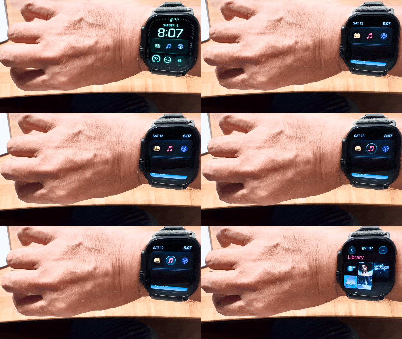
watchOS 27 adds a new single tap gesture for selection, which allows you to do a lot more simply with gestures. For example, a double tap gesture with your thumb and index finger opens the Smart Stack to the first card. Double tap again to move to the next card or, if a card has multiple items that can be selected, to the next item on the card. Once what you want is selected, a single tap will open it. The existing wrist flick gesture is then used to return to the watch face.
The Smart Stack is now stacked with more types of cards, too. Apple has added cards for birthdays stored in Contacts, your car’s parking location, a prompt to change an alarm before a holiday, a shortcut to resume a Siri conversation, transit card balances, pinned Messages conversations, Theater Mode, and more. It’s a nice expansion that has made my Smart Stack feel more useful all summer because there’s always something relevant to me there.
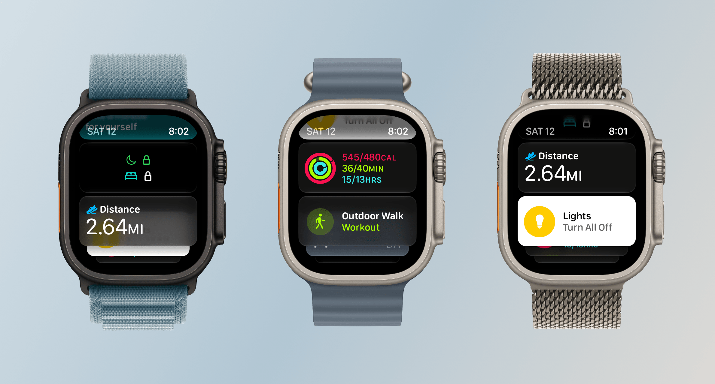
The other change announced just last week is the addition of the Siri Modular face, which I immediately installed on my Apple Watch Ultra 3. The watch face displays the top Smart Stack item in a large complication in the middle of your Watch. It’s a nice touch, but because you can’t dismiss the media playback card without turning off Live Activities, that one has wound up on my watch face more frequently than I’d like. Still, when an app like Moshi reports that an AI agent’s task has been completed, it’s nice to be able to see a snippet of the message directly on my watch face. It also strikes me as a great way to keep track of tasks with a deadline from task manager apps like this review’s sponsor, Finalist.
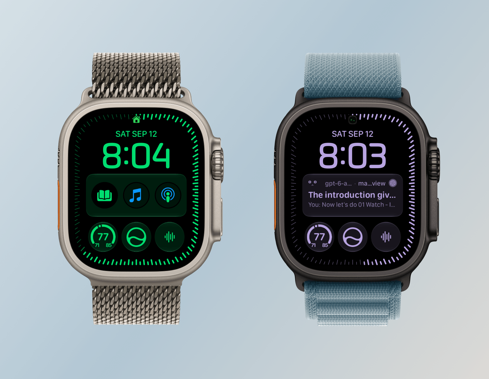
So, on balance, I like what Apple has done with watchOS 27’s navigation. The Dynamic App Grid takes a little getting used to, but I appreciate its simplicity. The Smart Stack, single tap gesture, and new Siri Modular watch face combine to make the Smart Stack more useful than ever too. Watch interactions are meant to be short, and watchOS 27 nails that goal.