Customization is back, and Apple’s having fun again.
When is the last time your iPhone truly surprised you?
The answer to this question is a fascinating Rorschach test that can say a lot about a person’s relationship with Apple’s mobile platform. Some might say it was over a decade ago, when they feasted their eyes upon the Retina display for the first time in 2010. Some might say it happened when the iPhones got bigger – and sales skyrocketed – with the iPhone 6 lineup in 2014. Others might argue that it happened with Face ID on the iPhone X, or the first time they tried Portrait or Night mode, or perhaps when they first took an ultra-wide shot.
My point is: if you ask someone about the last time an iPhone truly surprised them, chances are they’ll reply with a hardware feature. That’s not a shocker: Apple prides itself upon the tight integration they’ve been able to achieve between the iPhone’s hardware and iOS; they’ve successfully managed to turn their design philosophy into a selling point of their entire ecosystem.
People buy iPhones because they know they’re going to work well for a long time, and, usually, because the model they’re getting has a cool new gimmick they want to try. For this reason, it’s not absurd to postulate that, by and large, the iPhone’s software serves to enable hardware sales and subscriptions. I do not mean this pejoratively: I like Apple’s approach, otherwise I wouldn’t be writing annual reviews about their operating systems. But I also recognize that on the iPhone (the situation is the exact opposite on iPad) the software now largely takes the backseat compared to hardware and services.
Which is why whenever the iPhone’s software truly surprises me, I get excited.
Software-related surprises are more rarefied on iOS these days, but the kind of people who are reading this story can point to a few examples in our recent history. Apple buying Workflow, turning it into a system app, and outright claiming that Shortcuts is the future of automation was a surprise. The extent to which Apple integrated dark mode in iOS 13 was a surprise.1 The arrival of two iPad features – Picture in Picture and inter-app drag and drop – on iPhone felt like a surprise. But, of course, no modern feature comes close to the surprise that we all witnessed with iOS 14 two years ago: a renewed focus on user personalization with custom Home Screen widgets and the ability to create multiple Home Screens.2
That’s why, following last year’s welcome (if perhaps a tad uninspired) quality-of-life update that was iOS 15, I’m excited about a new version of iOS again.
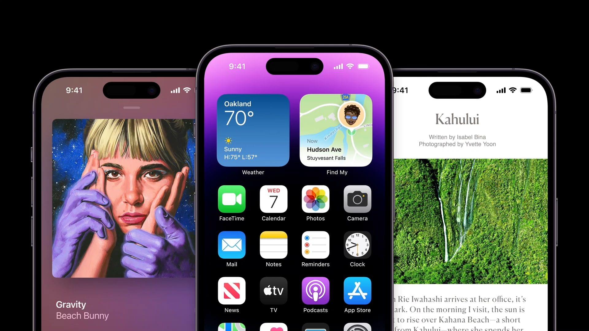
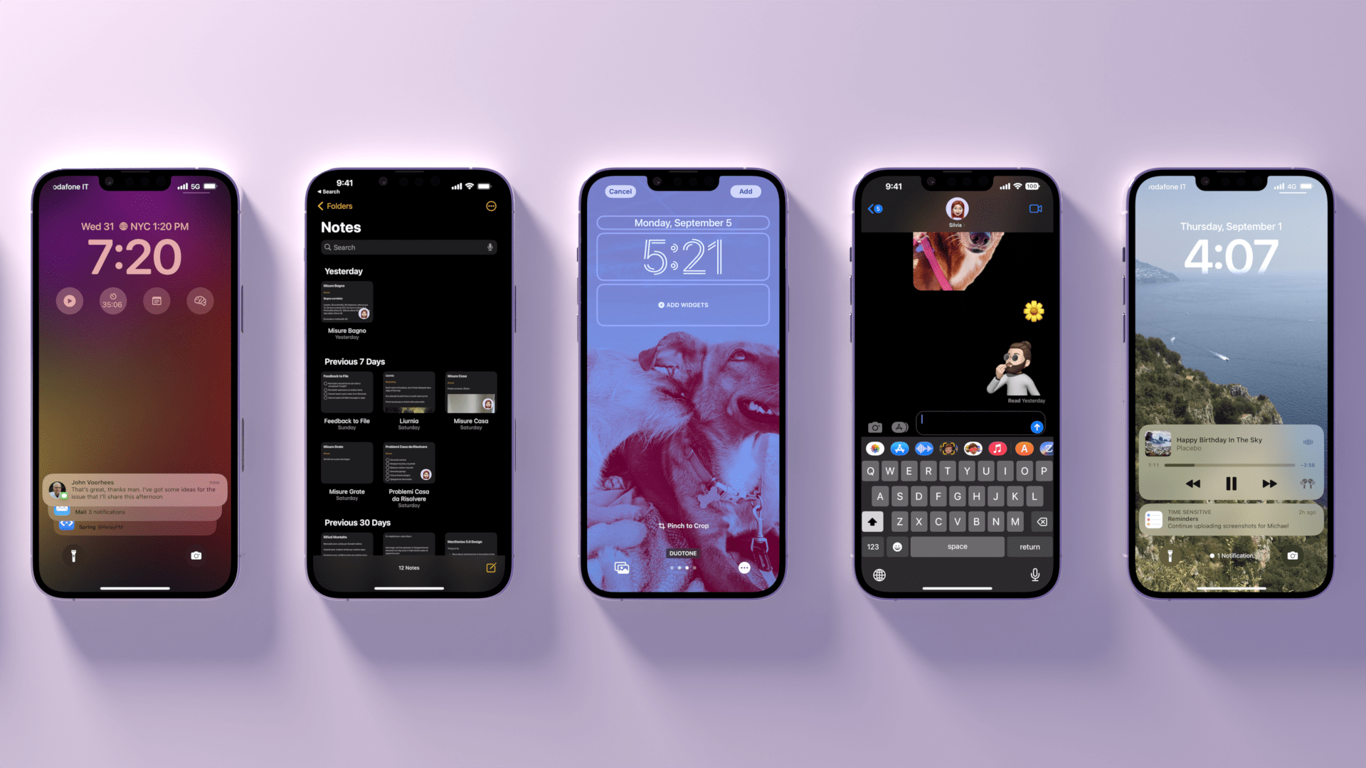
iOS 16, launching today for a variety of iPhone models dating back to the iPhone 8, marks Apple’s triumphant return to user personalization, with a twist: while in 2020 customization might have felt like a happy consequence of Apple’s engineering, this time the company has intentionally marketed iOS 16 as an update that will make an iPhone feel truly your own. As we explored in June and July, the first thing you see on your iPhone – the Lock Screen – is fundamentally changing in iOS 16. With the ability to create multiple Lock Screens, choose from a diverse collection of wallpaper sets, and customize each one with widgets, you’ll now have endless possibilities for the screen you always see when you pick up your iPhone.
Sure, there’s an argument to be made for Lock Screen widgets also being developed in service of new hardware, but I don’t think that takes away from the breadth of this feature and how Apple created a whole narrative around wallpapers, widgets, photos, and Focus modes this year. As you’ll see, the customizable Lock Screen will be the main character of this review: I’ve had a lot of fun exploring different permutations of my Lock Screen this summer, and I’ve been able to test dozens of widgets from third-party developers, which I’ll also showcase in this story.
In keeping with my theory that modern iOS updates always need to have a little bit of something for everyone, there’s a ton of other (some bigger, some smaller) features I’ll be covering in this review.3 Messages, one of my most used apps on iPhone, has received a substantial update with the ability to edit and un-send messages, making it, in some ways, even superior to WhatsApp for me now. Mail – of all apps – has gotten a major upgrade with modern features such as scheduled send and, almost unbelievably, a revamped search that actually works. Reminders has officially turned into a serious task manager with even more filters for smart lists and the ability to create and share templates with others.
The new Lock Screen takes center stage this year and everything else pales in comparison to the massive update it received, but, overall, I find iOS 16 a more fun and useful update than iOS 15.
So, as with every September: let’s dive in.
- Then again, wasn't that in service of OLED displays? ↩
- Perhaps the iPhone 14 Pro's Dynamic Island will be another major surprise for iPhone users. Fascinatingly, it's going to be a unique blend of hardware and software that shows how Apple has been playing the long game with their design strategy for the past few years, which is now paying off. However, the iPhone 14 Pro is not out yet and I haven't tested the Dynamic Island, so that's beyond the scope of this review. ↩
- That's in addition to the apps and features we've already covered in our annual OS Summer Series on MacStories. ↩