I was as surprised as anyone when Apple announced that Logic Pro was coming to the iPad. I was excited too. Logic Pro is an app I use every week to produce MacStories’ podcasts, and I’d wanted the freedom to do that work on the iPad for a very long time.
However, my excitement was tempered by skepticism about whether the kind of work I do would be supported. Logic Pro for the Mac is designed for music production. It’s a very capable podcast production tool, too, but editing podcasts uses only a tiny fraction of Logic Pro’s tools. With the focus on music production in Apple’s press release announcing the iPad version, I wondered whether the subset of production tools I use would find their way onto the iPad or not.
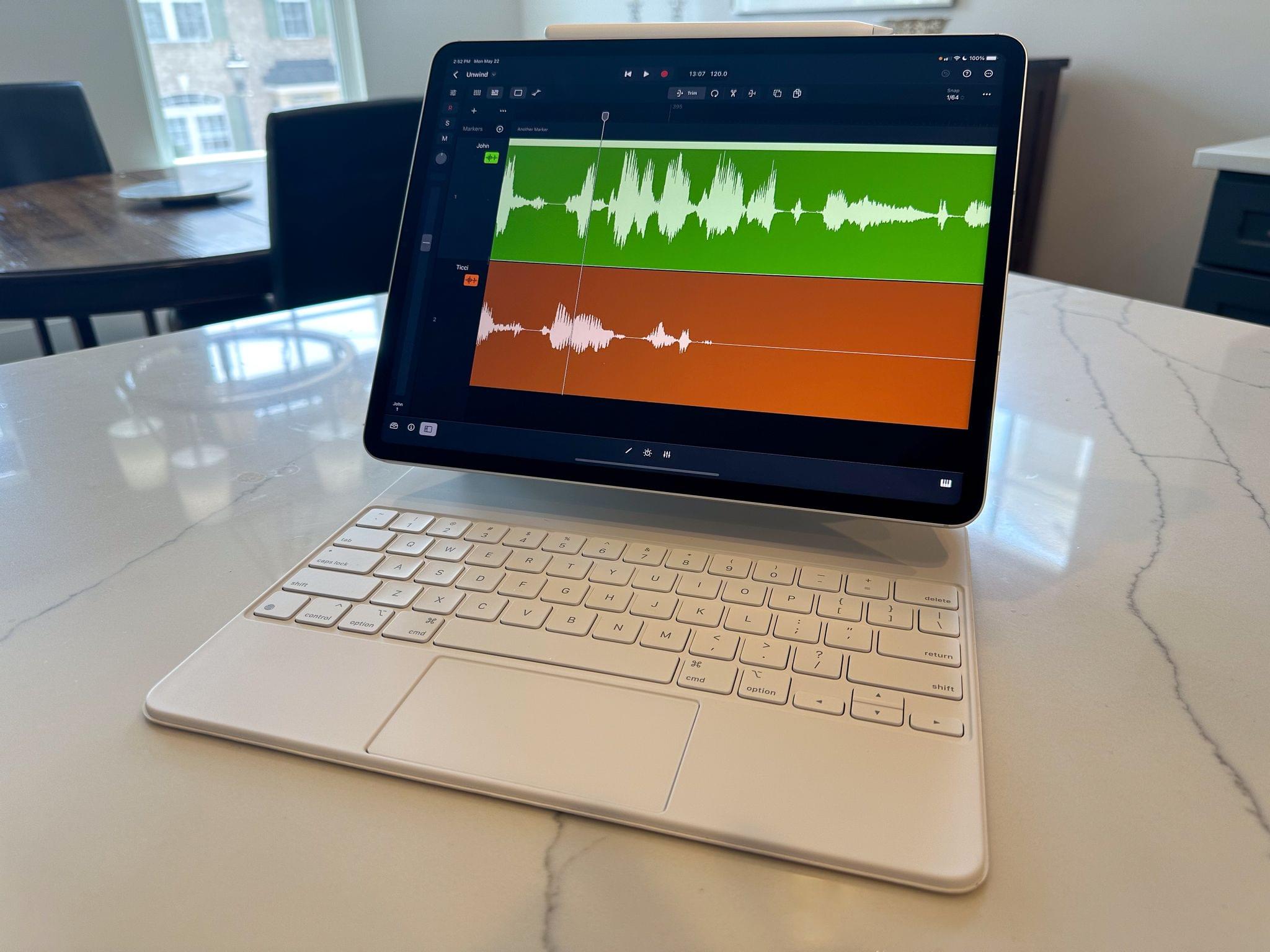
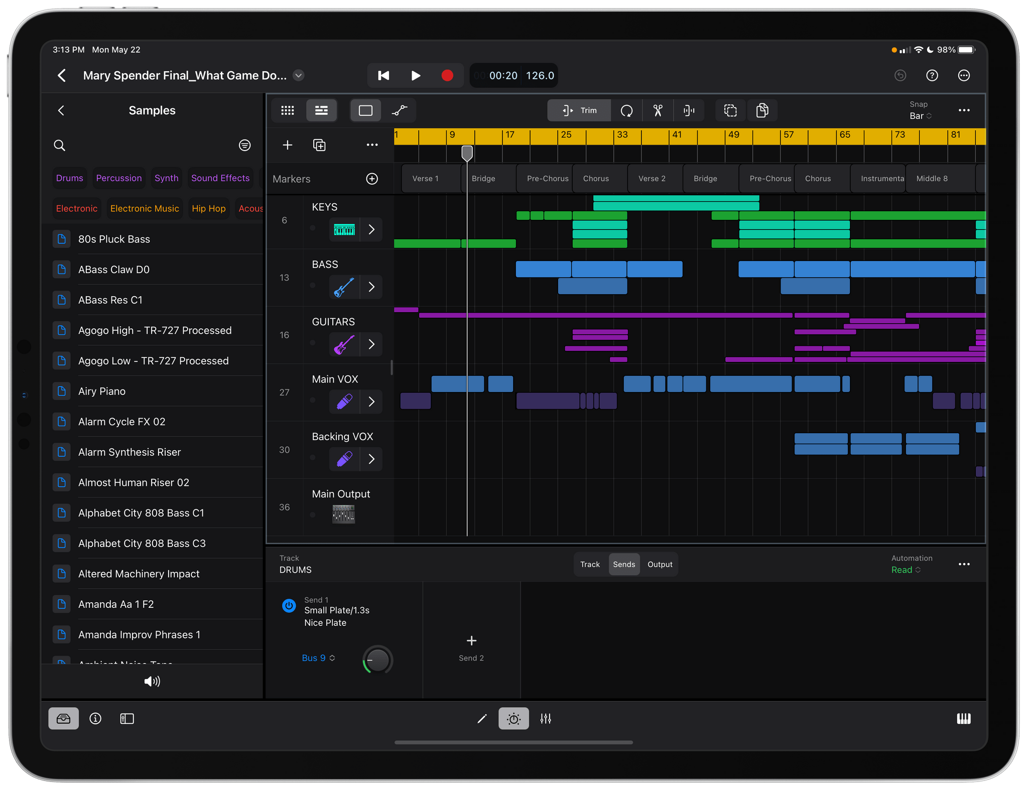
So, when Apple offered to send me a 12.9” M2 iPad Pro with a Magic Keyboard and Apple Pencil last week to test Logic Pro for iPad, I jumped at the chance to see what it could do. Since last week, I’ve played with Logic Pro’s music-making tools, which I’ll cover below. They’re impressive, but I’ve spent most of my time putting the app through a more personal, real-world test: podcast editing. After some initial exploration of Logic Pro’s UI to get my bearings, I created a project, dropped in the audio tracks from last week’s episode of MacStories Unwind, and started editing.
What I found is that Logic Pro for iPad is a remarkably capable alternative to the Mac version. The app comes with limitations and frustrations, like any first version of a complex new app, but it’s also the real deal. Logic Pro for iPad isn’t a companion app to the Mac version. The iPad version doesn’t match the Mac app feature-for-feature, but it’s not a watered-down version of the desktop version either. Instead, Logic Pro for iPad delivers on the promise of the iPad’s hardware in a reimagined way that we haven’t seen enough of with so-called ‘pro’ apps.
There’s a lot of ground to cover between my podcasting experiments and the music production features of Logic, so let’s dive in.
Read more


](https://cdn.macstories.net/banneras-1629219199428.png)